Had a great time on Saturday evening, as a bunch of Uni Watch readers from near and far gathered at the Devil’s Den in Philly. Here’s how it went down…
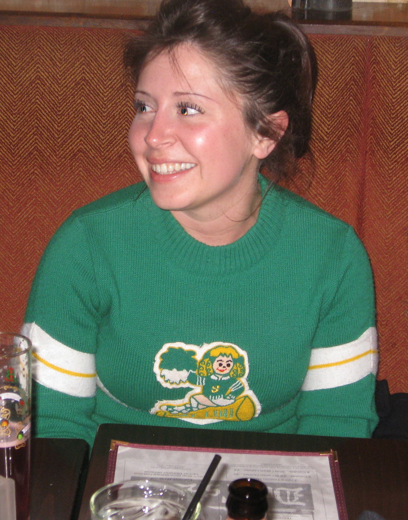
The coolest uni-related garment on display, hands down, was the incredible cheerleading sweater being worn by Jenny Sweet, who drove in from Pittsburgh with her beau, Jason Bernard (you can click on all of today’s inline photos to see larger versions, and my apologies to everyone for the rather sloppy red eye correction):
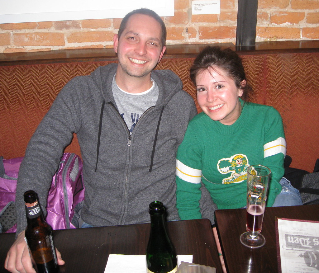

The Pittsburgh contingent also included Doug Keklak and his wife Stacy, who I hadn’t had the pleasure of meeting before:


The Yinzers weren’t the only out-of-towners in attendance. In a nice surprise, Joe Hilseberg drove up from Baltimore and brought along his father, Joe Sr., an extremely gracious gentleman who I really enjoyed talking with:
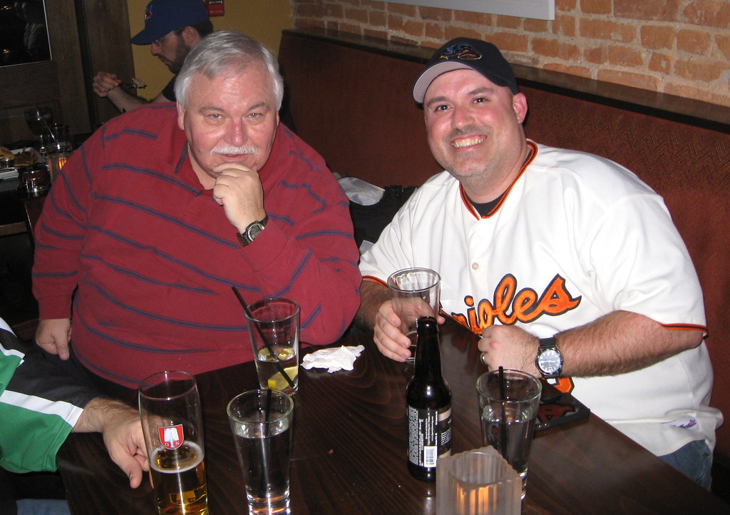
The Hilsebergs brought along a bunch of show-and-tell items, including this really groovy Orioles necktie:


And Joe also brought me a little taste of Baltimore, in the form of a very generous gift — a case of Natty Boh:
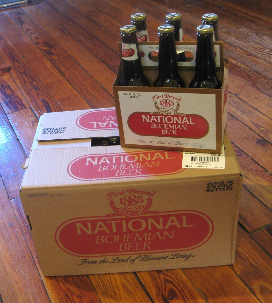
(That sound you just heard in the background was a pool of saliva forming at Robert Marshall’s feet.)
I was particularly happy to see Peter Capolino — the man who transformed Mitchell & Ness from a conventional sporting goods operation into the premiere throwback company — and his lovely wife Fran:

Peter went positively bonkers over some of the game-used jerseys that Joe Hilseberg brought along, incidentally, but unfortunately I didn’t get any photos of those.
Several of Peter’s former Mitchell & Ness employees were also on hand, including Jared Wheeler (at left) and Morris Levin (at right):
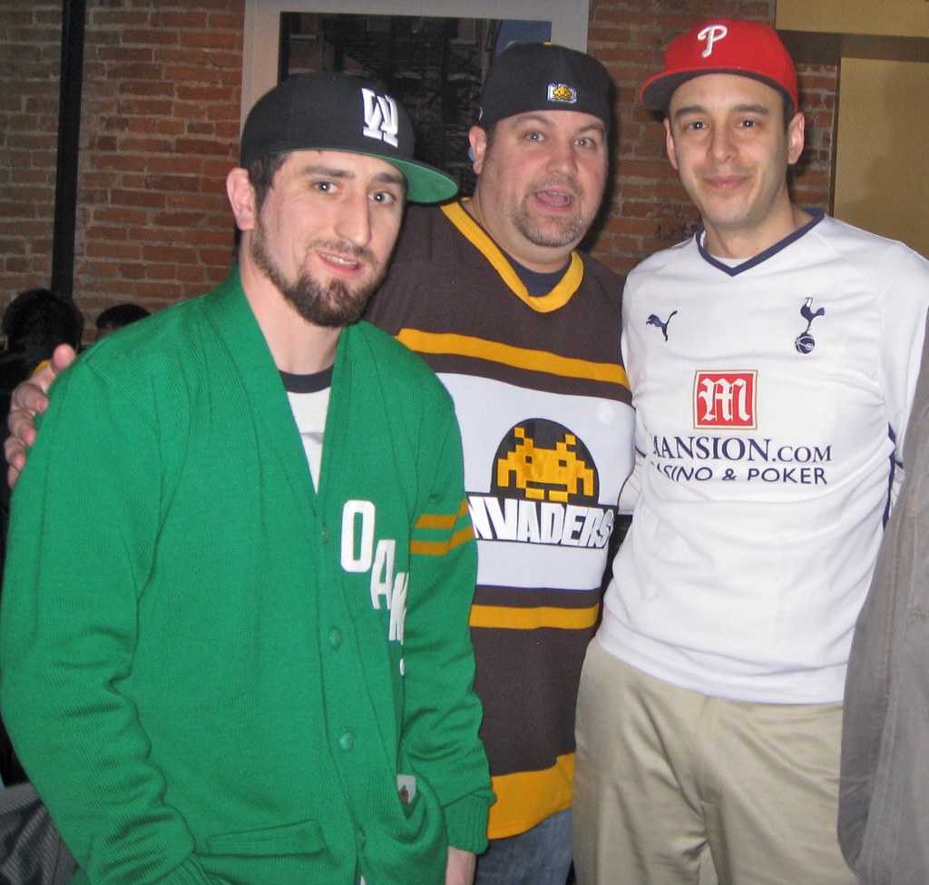
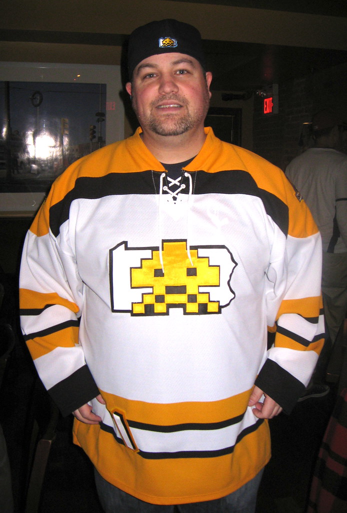
One guy who not on hand was Ryan Connelly (another Yinzer), but he was there in spirit, because some of his DIY Invaders gear was being worn by Terence Kearns (who drove in from NYC) and by Phil (who came with me):
As for me, I figured it’d be good to wear something appropriate for eastern Pennsylvania, so I broke out my Kutztown University jersey (with matching accessories, natch):
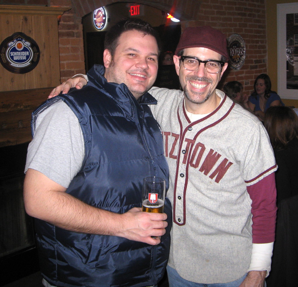
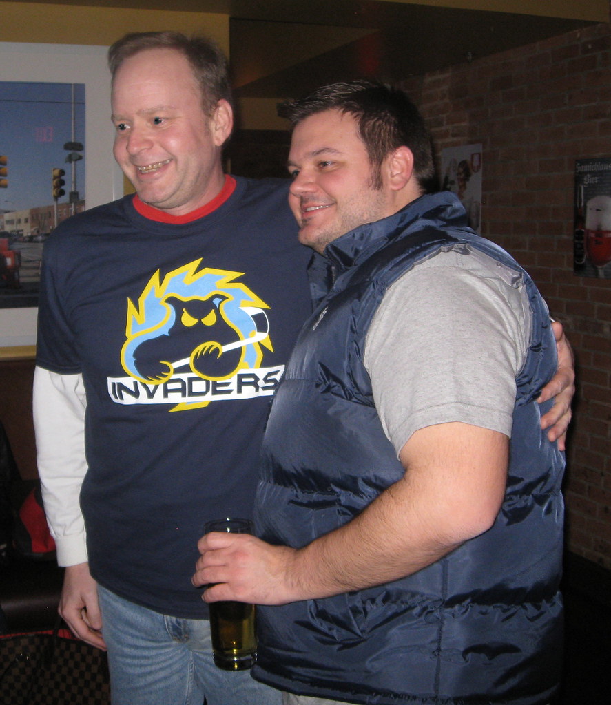
There were lots of other people on hand, but I did a bad job of taking down people’s names this time around. So with apologies to everyone who I haven’t called out by name, here’s a slideshow of additional photos I took:
And here are some more pics, taken by Terence Kearns’s ladyfriend Cynthia Soto:
An interesting side note: Shortly after Phil and I arrived, I glanced up at the bar’s TV and noticed Kansas State and Texas playing one of the all-time ugliest women’s basketball games. K-State was wearing pink with purple trim, and Texas had black with pink and orange trim (plus a sweatback). I was about to call everyone over to see, but then the bartender changed the channel. Fortunately, this epochal moment has been preserved in this photo gallery.
Finally, the reason Phil and I were in town in the first place was that the USA Curling Nationals were taking place in Aston (about 20 miles southwest of Philly). Our friend Dean Gemmell, who gave both of us our first curling lessons about two years ago, was on the winning team, which means he’ll get to represent America at the World Championships in Switzerland in April and also has an automatic berth in the competition to determine the 2014 USA Olympic team. Dean is an absolute peach of a guy, and Phil and I are both super-happy for him.
If you want to know more about our curling weekend, here’s a little piece I whipped up for ESPN yesterday, and you can see a bunch of Phil’s photos here, here, and here.

Collector’s Corner
By Brinke Guthrie
The year 1971 was a big one for me. My family moved to Dallas, and I got to walk into the brand-new Texas Stadium to see the Eagles/Cowboys for my birthday. You know, like when Billy Crystal talks about walking into Yankee Stadium for the first time?
Magic.
Anyway, when researching this edition of Collector’s Corner, I kept coming across items from that year. So I thought, let’s just stay with that theme. All our stuff this week comes from that year, beginning with a terrific-looking “Illustrated History of the NFL” poster. That’s a pretty good start, right? Here’s the rest of our 1971 time capsule:
• Here’s a new one, at least to me: an NFL Color By Number kit.
• It was a very good year for those Mattel Instant Replay Discs. Didn’t know they did more than the NFL, but it sure looks like it! MLB, NBA, and Indy racing. Now we just need a player.
• Here’s a huge lot of MLB stickers.
• Just wake up, baby: How about an Oakland Raiders travel alarm clock?
• These sticker albums were great. They had one for every team. I had one of them — can’t remember which team, but I think maybe the White Sox, for reasons I can’t imagine.
• You might have some luck bidding on these Chiquita NFL stickers. They’re usually a hot item, but the auction title doesn’t say, “NFL,” which might keep the price down, because it won’t show up in as many people’s searches.
• Here’s a cool-looking NFL Promo Players Guide. Looks like Craig Morton on the cover.
Seen something on eBay or Etsy (or anywhere else) that you think would make good Collector’s Corner fodder? Send your submissions here.
Uni Watch News Ticker: When the Mets promoted Ike Davis to the majors in 2010, I made some crack about how the combination of Davis and Jon Niese allowed the Mets to lead the league in young beak-nosed players. But that’s no longer the case, because Niese has gotten a nose job. I’m trying to think of other major-level athletes who’ve gone the rhinoplasty route and am coming up empty. Anyone..? Yanks outfielder Danny Tartabull had “cosmetic facial surgery” back in 1993, but it’s never been clear (at least to me) whether that was a nose job or something else. … As you may recall, a few weeks ago the Brewers announced their 2012 promotional schedule, which included this tidbit: “[T]he Brewers will wear … a ‘Birraioli’ jersey (the Italian translation of ‘Brewers’) on Italian Heritage Day [July 1].” That caught the attention of Marco Scurati, who lives in Italy. Here’s what he wrote to Tyler Barnes, the Brewers’ VP of Communications: “Do you know ‘birrioli’ doesn’t exist in any dictionary of the Italian language? It’s a slang expression referring to beer lovers (in the sense of heavy drinkers). The right translation for ‘Brewers’ would be ‘Birrai.’ Why did you choose the other term?” And here’s the response he got: “We are likely going to use ‘Birrai’ on the jerseys. We have consulted several universities as well as other officials on the translation, and, as you stated, Birrai is most appropriate.” … U. of Texas baseball wore throwbacks the other day (from Matt Motl). … Reprinted from yesterday’s comments: New uni number assignments for the Phillies. … LSU baseball is wearing purple stirrups with gold accenting — a nice touch (from Mark Jones). … Patrick Ewing sneakers are poised for a comeback (from Alex Melendez). … Yesterday I mentioned how some of the Notre Dame jerseys in the movie Rudy had NOBs that matched up with some members of the crew that worked on the film. Here’s a follow-up from Greg McDonald: “About seven years ago I rented a furnished apartment in Arlington, Virginia, and found an authentic ND helmet in the closet, with ‘Dornan’ written on the inside. Not only was that the name of the guy that owned the place, but having viewed Rudy roughly 5000 times throughout my life, I recognized the name from one of the jerseys laid on Dan Devine’s desk when the players are giving up their spots. So the next time I talked the owner, I asked if he played at ND and all of that. Turns out his cousin was an equipment manager in South Bend when they were filming Rudy. He said they made up jerseys for basically anyone and everyone they knew during filming, and by some crazy stroke of coincidence his jersey ended up being one of the more prominently featured ones in the film. As for the helmet, it was just his old high school helmet that his cousin got a hold of and turned it into an Irish helmet.” … In a vaguely related item, here’s a guy with a serious Notre Dame memorabilia collection (from Warren Junium). … This is pretty cool: The uniforms for the East Bay Pit Bulls — that’s in the new ABA — have a chain-link fence theme (from Bill Trovinger). … Major find by Chris Callan, who’s come up with a spectacular photo showing an early Globetrotters uni I’d never seen before. How sweet is that?! Awesome stuff. … Here’s something new: Striped stirrups for Notre Dame (from a very excited Dan Cichalski). … Here are all the Final Four logos since 1979. … Micah Roberts notes that players at Cubs camp are wearing 5950s, while the coaches are wearing BP caps. I wonder if this is one of those deals where they’re trying to make it easier to spot the coaches amidst the mass of humanity during spring training. … New cleats for Ichiro. “Top photo shows the home spikes for 2012,” says Jeremy Brahm. “Bottom picture shows the road spikes.” … Mark Penxa, whose sensational illustrations have been featured here several times over the years, has embarked on the third and final phase of his “Stealing Signs” project. Details here (big thanks to Adrian Acosta). ”¦ The classic football book The Pros includes a photo showing a Giants player with an unusual facemask setup (the guy at far right). I immediately thought of that photo when Matt Hoelscher sent me this screen shot from Super Bowl XV. It’s a little hard to see, but the guy in the background is Eagles WR Charlie Smith. ”¦ Here’s an oddity: Brian Cushing wore a Jaguars helmet during a 2009 Senior Bowl practice session. “Weird for two reasons: Everyone else was wearing their college helmets and he was drafted by the Texans,” notes Andy Henderson.
Great uni-watching morning in the NYTimes today. First, an article on wood-shaft golfing, complete with obligatory but still beautiful argyle-centric photo:
link
Plus a hockey report that shows the Washington Nationals racing presidents mascots on the ice, in Washington jerseys, at the Islanders-Senators game:
link
Brilliant socks. I might have to reconsider my general golf apathy.
Speaking of the Times, I’m sure this has been mentioned here, but just in case, Robert Lypsite’s link on their inaugural spring training includes link.
Those President mascots are cool!
On a non-uni note…
From the Times link, another athlete, when asked how he feels about something, refers to himself not as “I,” but”You.”:
Asked what he was thinking as he was benched, Poulin sighed and said: “You’re just disappointed. You’re just frustrated. You’re just going through a lot of emotions and are just sick to your stomach. You’re just mad at yourself. You want to make those saves, and you want to be in the net and win.”
I see this so often. This is weird, right?
I hear that kind of formulation – both the “we” and the “you” instead of the “I” – a lot from athletes at all levels. Also from the military personnel I know.
I’m sure a psychologist could offer really interesting insight into what it means, but I’ve always assumed it’s something to do with a context where team commitment is emphasized much more highly over individual status. If there’s no “I” in “team,” then there’s probably a “you” or a “we” in the answer to a question about one’s performance.
What’s weird to me is when athletes speak of themselves in the third person, not the first or second.
When asked to reflect on his performance, the “you” makes total sense if you consider how he’s phrasing it.
“You want to do this for the team in retrospect. You want to make this impact for the team in retrospect.”
It sounds normal to me.
But if someone asks you, Teebz, how you felt about…say…letting your family down because you forgot to buy chips at the store or whatever, wouldn’t your reply be, “I felt terrible. I know I let them down. I should have been more thoughtful. I am dissapointed in myself. I wanted to please my family and I failed.”
You’d think that a person would speak that way, yes. Oh, wait, I just did it there. You try to say “I”, but many of our idioms are built around an overt or implied second person. So it’s natural when speaking idiomatically or in idiomatic cliches, to “you” your “I”s. When you say, “You want to make those saves,” it’s saying both that “I want to make those saves” and “any person would want to make those saves.” And the first pronoun you use pretty much dictates how all the rest of the pronouns in the thought are gonna fall. So the first time you reach for the general case, it’s gonna be a while before you get back from “you”land to the shores of “I” even if you’re trying, which as an exhausted athlete in the locker room after a tough game, you’re probably not.
But…he wasn’t asked what others feel about letting the puck through the net so often. He was asked how HE felt about it. A face to face conversation with someone.
In your example, Scott–“You’d think that a person would speak that way, yes.”–I believe the “You’d” is referencing me and yourself and others who might be pondering this. Right? Had I asked you directly what you thought about this, wouldn’t your response have been, too me, more on the lines of: “I think a person would speak that way, yes.”
The goaltender was asked not about the sportswriter’s, his teammates and his own collective feelings, but his own.
i-tc, I hear you. My last was mostly an extended joke about pronoun use. I absolutely would answer as you say you expect.
I think the thing here is that the goaltender was asked to assess his own state of mind. It’s not all that uncommon to respond to that kind of query by trying to take a higher-level view of oneself and explain what one is thinking from a sort of outside perspective. So instead of just, “I feel terrible for missing those saves,” it takes the form of “You try to make the saves, and when you don’t, you just feel terrible.” The “you” in that thought isn’t so much “you, the person I am speaking to,” but more like a less awkward version of the generic pronoun “one.” It’s about asserting a kind of universality and objective-rather-than-subjective point of view.
And it’s really not that uncommon. When we say, “You win some, you lose some,” we usually mean, “I win some, I lose some.” Likewise with things like “you do what you can,” or “this weather just gets you down.” If you – er, I mean, if one listens for it in everyday conversation, one will note that the second person is more commonly used to express first-person experiences than one might think.
Yeah, I get it….sorta… (and, trust me, I’m smiling as I write and read these exchanges) and I am apparently a lone voice in the wind, but …Poulin’s response still sounds odd in this particular context, as phased by the author of the Times article.
It’s as if Poulin, when asked a simple question, stepped out of his body and painted a picture of what it might be like for a goaltender to live through a poor performance and suffer the humiliation of being benched. That’s…uh, noble and artful and all…but why can’t he, instead, just take responsibility for his poor play.
It’s not “You win some, you lose some.” It’s :”I win some and I lose some. And I really lost this one.”
Or as it goes in my all-time favorite Peanuts cartoon:
Linus Van Pelt: You know what they say: You win some, you lose some.
Charlie Brown: Gee, wouldn’t that be nice.
The article about this year’s Phillies jersey numbers mentions Papelbon giving Bastardo a Rolex for his #58. Is this the highest number that’s ever been “bought” in baseball? Usually 58 is a number people are itching to get rid of.
Receiver Charlie Smith of the Eagles wore that special face mask during the 1980 season to project a broken jaw. Another different facemask during that Philadelphia-Oakland Super Bowl belonged to Burgess Owens of the Raiders. The former Jet defensive back was wearing a white facemask, a carryover from his days as a Jet.
Speaking of weird face masks, how about that cage mask for Harry Swayne: link
Also, for goofiest mask of all time: link
Oh and those two one bars: link
Wow, that looks like the logical end result of the Canty special. He’s almost got a full cage just on the neck extension.
My earliest recollection of interesting facemasks belonged to the Saints’ Rickey Jackson:
link
and Vencie Glenn, of the Chargers:
link
link
I always wondered about Burgess Owens’ mask; I thought it was his Jets mask but could never be sure.
Charlie Smith: link
I wonder if cushing broke his helmet and the jaguars helmet was all they had on hand.
I ref with his brother. I will try to get the story!
BTW, a question for UW:
Since Nike is now the official outfitter for the NFL, will they be redsigning the Officials’ Uniforms as well?
Almost certainly not. The change a few years back was so they could trademark (or copyright or whatever…) their ref’s look, now that they have, there’s no need to go and overhaul that identity.
Hedo Turkoglu was rumored to have undergone nasal surgery to alleviate breathing issues. Part of that rumor was that the surgeons also crafted him a new nose too.
Hmm… link has some link…
The sameness of the most recent logos (2007-2013 inclusive) detracts from their unique elements, in my opinion. I can understand that the NCAA would want some sort of brand continuity, but the same font for “Final Four” is disappointing. (Though, at least they haven’t gone totally bland like the Super Bowl…)
That Jazz logo was based off the ’93 All-Star game logo, which itself may have inspired that FF logo…
Well, that makes a bit more sense, then.
Seeing all of those logos took me back to being a kid and having to have the “Final Four Mini-ball” from Pizza Hut every year.
I’m in awe of Mark Penxa. When I draw baseball players, they look like cartoon characters.
Me too! Just a fantastic style!
NATTY BOH!!!!
From the land of Pleasant Living!
nice party pics. i am reminded of the song “Driver’s Seat”…”Jenny was sweet, she always smiled for the people she’d meet”
The chain-link pattern for the Pit Bulls gives me a huge ick factor. I get that they’re going for a kind of junkyard-dog thing, and not actually intending to be all like, “neglected animals in cages” or “dogs in fighting pits”, but to really pull that off I think they need both a name that speaks more specifically to a role than a breed, and also for this to be 30 years ago, when people were cooler with the idea of locking up dogs in little chain-link enclosures. As it is, this strikes me as being in the same ballpark as the Eagles putting a DDT spraycan on their helmets, or the Cubs adopting a steel-jaw bear trap as their logo.
On the other hand, I’m a fan of uni patterns beyond just pinstripes, so that’s something positive.
Pattern needs to be a bit more subtle, though. Appears to be full black, which busies up the uni too much with the predominantly black script/number elements. A medium gray chain-link pattern would let the important uni elements pop and also look more like actual chain-link mesh. It’d also work better on the team’s black road unis than the bold white pattern they use with white script/number. Plus, gray is a prominent color in the team logo.
I think they should change their name to Bees and claim it’s a honeycomb pattern.
Yeah, if they want to play up the ‘junkyard dog’ over the ‘fighting dog’ they should really have gone with Rottweilers instead of Pit Bulls. Not getting into the actual nature of breeds or more personal things like that, the subconscious response to ‘pit bull’ and ‘chain link fence’ together is almost certainly ‘animal abuse,’ rather than ‘tenacity.’
Even just “Bulldogs” would make it general enough I think. Basically, you want people to think “Chopper, sick balls!” or “Zeus, Apollo, patrol!” Instead, the jerseys make me think about Michael Vick.
Kurt Busch from NASCAR had a nose job. Ben Roethlisberger had his face put back together after his motorcycle accident a few years ago.
Yeah, but Roethlisberger’s facial was reconstructive, not cosmetic. Similarly, boxers often have plastic surgery, but again that’s reconstructive. Aside from Niese and Tartabull, have any athletes had elective cosmetic facial surgery?
How about figure skaters?
link
Are we counting Bruce Jenner?
I know Kurt has his ears pinned back, not too sure about his nose, unless it was after it ran into Jimmy Spencer’s fist.
link
And Big Ben had to get corrective nose surgery after taking Haloti Ngata’s hand to his face.
It’s not plastic surgery or reconstruction, but link in 1971 by the same man who fixed Frank Sinatra’s thinning locks. Cost? $900.
I also make mention of Wayne Rooney’s hair restoration in the article which cost a cool $48K USD. Ouch.
Re: the Brewers’ Italian jerseys, while I’m glad that the team is interested making them as accurate as possible, it sure sounds like “birrioli” would appropriately describe most of the people who will be wearing those jerseys…
Number updates from Sawx camp:
Andrew Bailey keeps #40 from Oakland
Kelly Shoppach in #10
Ryan Sweeney in #12
Nick Punto in #5
And I thiiiiink Cody Ross is wearing #7?
RGIII goes with the three stripes.
link
I knew there was a reason I love RGIII…
Seems like a natural fit.
Why on earth would the Longhorns NOT wear these full time?
link
Agreed. Flawless look.
that would look good as their football uni (sans bagginess, of course) too
…a headspoon on a football jersey?
yeah, and sleeves…what a concept
/clearly the sarcasm tags are broken again
I remember those color-by-number kits well, as I had a lot of them when I was a kid…..for your information, they came in hockey and basketball sets as well. I still remember (i think) the number of the colors: 2 for orange, 3 for red, 13 for blue, 15 for green. I remember being frustrated because the red pencil would be all used up before we colored all the pics, while others (orange) were barely touched.
Thanks for the memories.
Nike released new Team USA basketball uniforms. Straight Baller!!!!! As usual, Nike is DOMINATING the competition. Certainly one of America’s truly great corporations.
In the not-too-distant future, all clothing will be Nike.
/and all restaurants are Taco Bell
Can’t Wait. NIKE FO’ LIFE.
In the not-too-distant future…
Next Sunday, A.D.?
Only if I can call you “Joel”.
link
here they are
Well those are boring.
I wonder which is actually lighter – these new uniforms and all their hyped up recycled materials, or a normal uniform with the shorts simply made 3 inches shorter.
That’s a hideous set of lettering. I don’t really understand rolling out a new logo, then days later, rolling out a new jersey with lettering that’s nothing like the lettering in the new logo.
When they say 96% recycled polyester, what they actually mean is that the shooting shirts and warmups will actually be red white and blue leisure suits.
Did Nike get permission from Suzuki to use their S logo on that jersey?
I’m guessing the Cushing thing had something to do with the fact that his team was coached by Jack Del Rio, also a former USC linebacker.
The new USA Basketball uniforms and the full gamut of technology, which they are dubbing the “Summer of Innovation,” for the 2012 London Olympics from Nike:
link
link
“Full gamut of technology”? Puh-leeze. It’s a loose-fitting shirt and shorts made from cloth.
Team name rendered in unrecognizable script with no basis in heritage or history? Check. Women outfitted differently from men in the same sport? Check. Overt use of “Pro Combat” branding to outfit a team in what is supposed to be an amateur competition to foster international peace? Check. Team dressed in bizarre hues that have no relation to actual team colors? Che- wait, wha? Team USA dressed in red, white, and blue, no platinum or energy green in sight? Major Nike fail.
You don’t know sh*t!!!!! Nike has forgotten more about uniform technology and design than you will EVER know.
Nike OWNS YOU.
…so you’re an Adidas man?
Oh wait, you’re that asshole who keeps pestering Paul, aren’t you?
Get a life – Nike sucks dick.
Joe Johnson has simply taken my spot!
Joe, I understand that you like Nike. I, myself, am a Nike fan. But there’s a fine line between being a Nike fan that isn’t a troll, and being a Nike fanboy that is a troll… or at least comes off as one. Even though Adidas can suck me (sorry, Jason), just because something is made from Nike doesn’t mean it’s automatically good.
For example, I love Zildjian cymbals, but I’m not gonna sacrifice sound over brand. Sabian’s Vault Radia Cup Chimes make for far better bells than the Zil-Bels. I’m not throwing shade at Zildjian, but I’m stating a point that not everything that your favorite brands pump out is gonna be a hit.
As far as these unis go, while they’re not hideous, Nike could’ve done a better job on these. I’m not trying to put an end to you commenting, but you should keep in mind that you’re not on a typical Nike blog that hypes up every little thing and has thousands of comments saying “SO FREAKIN’ LEGIT!!!”.
Nike OWNS YOU.
Not me. You, I’m sure, were purchased dirt cheap. And Nike overpaid.
It’s okay, Terry. I’m not jealous of whatever it is you and adidas do behind closed doors. ;)
I just wish we’d all stop feeding this troll.
Nike has forgotten more about uniform technology and design than you will EVER know.
Agreed. Given the crap that Nike foists on teams, the company has clearly forgotten a great deal about uniform technology and design.
The key being the “design” part. By and large, Nike does not do design. Design by definition prioritizes function and client needs. Nike don’t play that game. Nike does brand extension for itself, and Nike does art projects. The actual functional needs of athletes playing the game, and client brand identities, don’t seem to enter into it anymore.
Which is what makes the USA basketball jerseys so refreshing. Despite a fair bit of gratuitous douchebaggery, they look like Team USA unis, not Nike unis.
I like the triangle arching on the “USA” script. It’s something different that still looks like a basketball thing. Much better than what they’re doing at the college level by putting football wordmarks that are way too small on the basketball jerseys.
When I said full gamut of technology, I was mostly referring to the second link.
I’ll admit that I am a Nike fan, but was not very impressed with the majority of their presentations. However, the one technology that stood out to me was Flyknit; a one-piece, seamless, knitted last for the upper of a shoe. With all the textile/embroidery junkies here, I thought it might spark someones interest.
link
The cap situation at link looks like Buck is wearing the Road 5950, the other coaches are wearing the Home 5950, with the players wearing the BP caps.
Those white panel hats really stand out from the rest.
Real Madrid wearing a sponsorless jersey tonight in Moscow for their Champions League match against CSKA Moskva. My guess is that Russian law bans advertising for Internet gambling sites (such as BWin, which sponsors Real Madrid).
anyone else notice the SEC logo that ESPN showed during the tOSU v that school up north basketball game
it may be swill, but it is my swill, and perfect on a humid 100 degree day. so yeah, a puddle formed. if you had storage space i would tell you to save it for a heatwave Q this summer.
looks like a great gathering, too bad i live 5 billion miles away and couldn’t attend.
Me and you both, Comrade.
FYI, I had my furry aviator’s cap on today with the promise of an inch of snow. My head was extremely warm and comfy. ;o)
those hats are the best. i am thinking of using stirrup swatches to cover each individual pannel turning into a quilt of stripes, making it a real hat of the revolution. if i am successful i can do it for yours. unfortunately i am pretty good by hand, but that is a sewing machine project sooooooooo we’ll see.
anyone but rack and i wearing the paczki stirrups today?
5 billion miles away II: paczki boogaloo…i am just going to have to buy a jelly doughnut and call it a paczki today. not even the bakeries will have a decent one around here today.
Nice Breakin 2 reference. A friend of mine does that with every “two”, too. However, he includes the “Electric”. I guess you replaced it with paczki though. Not bad.
if you had storage space i would tell you to save it for a heatwave Q this summer.
I was thinking of doing just that. I’ll stow it in the vegetable crisper (a space that doesn’t get much use in my fridge, trust me)….
Another great thing about Natty Boh bottles is the Rebus puzzle under the cap.
george~
cold beer if for when it is 98/100 humidity and degrees and you are drinking american yard beers. do you get that sort of heat there consistently? again, i don’t quaff my winter beers cold, i don’t even need my early or late summer beers cold proveded thery are not yard beers, the difference betwixt a hamburger and a steak but at the height of a 3 week heat wave, yes, i like my water-beer/yard beer ice cold, and you would too. and i appreciate your razzing, i do, but english beer varieties are not exactly the world’s gold standard any more then regional U.S. yard beer.
serve it so cold that ice crystals are just beginning to form, and drink it with a somewhat spicy food. that is pretty much the boh at his best.
When Joe H. was in Pgh last summer, he introduced us to the “Boh-tini” (Natty Boh in an Old Bay-rimmed glass). That was pretty good too.
I’m not generally a fan of serving beer in frosted glasses. Most beer, even most lager, isn’t supposed to be that cold. But Natty Boh and Lone Star are exceptions. You want that first shock of the pour to crystallize against the glass.
Stirrup-constructed bomber hat = Genius.
you are right on that arrrrrr matey, most beer you do not want to be that cold, unless you are in a 98% humid 100 degree climate, then you want a “yard” beer or “yardie”, and you want it ice cold. around here a boulevard pilsner would fit that bill in august. but i skip the glass. i will use a tulip on my winter beers, but in the height of the summer just give me the bottle or can.
as for the hat, thanks. just before the winter freeze or whatever wee called it, that was the plan, but i couldn’t get things together with the seamstress who had the studio across the way from mine in what seems like 20 years ago, so it has been in the okay, how do i modify this hat stage for a couple years.
another thing i want to do scott is make revolutionary hat pins for the diehards like <a href="link. obviously the imagery would be stirrups and not a star with a hammer and sickle, but it would be the same idea, then again i still have not mailed out some of my christmas/holiday gifts to people here, or modified that hat, or photographed my table hockey stuff, not to mention my thin resources, etc. so this one could be a bit in the future.
Here’s the link for the revolutionary hat pin:
link
I love it, and volunteer to help out any way I can.
couldn’t find paczki, so i might as well make some goÅ‚abki for dinner.
Cold beer?
(Shakes head in a despairing sort of way)
“I’ll stow it in the vegetable crisper (a space that doesn’t get much use in my fridge, trust me)…”
~~~
i’ll vouch for that
Singer from Sleigh Bells in a modified Jordan jersey. Kind of clever…
link
Where does one purchase one of those DIY Invaders hockey jerseys? A must have.
the USC equipment staff had sent his gear late to the senior bowl, so the jacksonville jaguar staff had to outfit him with gear. usctrojans.com/blog chronicled the fiasco but the link is now dead.
Now THIS – link – is athletic aesthetics.
That’s so weird! I feel like I just read about this somewhere…
Touché.
Happy Paczki Day!!! Now who remembered their stirrups?
eh?
I had a good time at the Uniwatch Party! Unfortunately, my girlfriend was sick, so I had to leave early and didn’t get in a picture. But I had a good time talking to Andy (I think), Morris, Jordan and Bill!
I wore my 1948 Phillies full uni (pants an all) and my girlfriend had on a cool 1940’s era Lancaster Red Roses jersey (that had an awesome patch that I didn’t get a chance to show Paul).
Hopefully I can make it to the next one, even if its not in Philly!
Sorry I didn’t get a photo of you, Matt — the full-uni look was killer!
New USA basketball jerseys suck – link
Stop posting things that have already been posted. Especially things that have already been posted twice. :-)
Always nice to see the turnouts at the gatherings.
The yinzers sure do get around don’t they?
unfortunately
Well, you can’t fault them for wanting to get the fuck out of Pittsburgh once in a while, can you?
Hey I didn’t know Andre Dawson played for the Globetrotters! (front row, far left). He’s apparently a lot older than I thought as well.
In all seriousness, link.
Virginia Tech is wearing some retro-themed uniform using the Duke template off of the Nike Team Uniform Builder. They’re playing Virginia on ESPNU.
Late to the party today…
“anyone but rack and i wearing the paczki stirrups today?”
I wore mine. I also ate about 5 PÄ…czki. And I’m thinking about one more.
“Another great thing about Natty Boh bottles is the Rebus puzzle under the cap.”
I though that was Ballantine. Or maybe they both do that.
And (in what is possibly the worst photograph ever taken of me) I got yer revolutionary hat pin link.
get a haircut,
hippiecommieI guess now would be a bad time for me to mention how shitty those Team USA basketball unis look.
Some stuff about that Giants helmet:
link