
Click to enlarge
Yesterday I opined that Sunday night’s game “wasn’t exactly the most uni-notable Super Bowl.” But that comment is now in serious need of revision, because reader Ryan Dunsmore has spotted something we all missed — something that instantly catapults Super Bowl XLVI into the uni-verse’s most rarefied air.
Dunsmore’s find is shown in the screen shot above. Do you see what he saw?
Having trouble? Here, let me highlight it for you.
That’s Pats offensive guard Logan Mankins. As you can see there, the Flying Elvis decal on his helmet had a mustache — a very personal bit of customization for Mankins, who sports a similar mustache himself.
Allow me to anticipate some of the questions that may now be forming in your head:
Come on, couldn’t that just be a shadow, or even a Photoshop job?
I wondered that too, but the Elvis ’stache is plainly visible in this Getty photo. It’s the real deal, kids.
Did he also have the mustache on the other side of his helmet?
Good question. I’ve only been able to find one photo that shows his helmet from the other side, and it’s inconclusive . If anyone DVR’d the game, feel free to spend a few hours poring over the footage so we can get the full scoop.
Had he been wearing the mustache prior to the Super Bowl?
From what I can tell, no — but I can’t tell all that much. Offensive linemen tend not to be heavily photographed, so it’s hard to put together a game-by-game photo log on Mankins (much less to do so while focusing exclusively on the left side of his helmet). But he was definitely ’stache-free on Dec. 11 and back in the preseason. That isn’t saying much, but it’s a start.
Have you checked with the Pats?
Not yet, although I plan to make some calls later today. Frankly, I’m not optimistic — a team that just suffered a last-minute Super Bowl loss probably won’t look too kindly on inquiries regarding uniform minutiae. But I’ll try.
How the hell did this Ryan Dunsmore guy spot this anyway?
“I just noticed it,” he says. “I catch the strangest details in every game I watch, much to the chagrin of my family and friends. When its Uni Watch-worthy, I usually take a photo with my iPhone and it comes out poorly. But this time it came out really well.”
Nicely done, Ryan. Congrats on a sensational find — one that will go down in Super Bowl and Uni Watch history.
Meanwhile, what shall we call this little episode — Logan’s Fun? Mankins’ Manchu? The Flying Fu? The floor, dear readers, is open.
Collector’s Corner
By Brinke Guthrie
In honor of the Giants’ victory on Sunday, here’s a nice selection of terrific Giants outerwear — all from different suppliers! Here we have jackets from Pro Player, NFL Gameday by Turbo Sportswear, Apex, Nike, Starter, and a cheesy women’s sweatsuit from an unknown maker.
Not a Giants fan? Here are the rest of this week’s eBay finds:
• (Gasp).
• Hmmm, sure looks like Ted Williams on this New York Baseball Giants patch, eh?
• Man, this 1980s NFL calculator watch (“Your favorite team insignia here!”) is too cool.
• Deck out your fridge NHL-style with this set of 1970s NHL logo magnets!
• Toast your favorite team with this 1970s NFL “Wall Decor & Coaster Set,” though I don’t see where a wall has anything to do with them. Maybe you hang them up..?
• Converse apparently made Phil Esposito “Street Hockey Shoes” in the 1970s. Boy was I good at that game.
• Nothing says “sixth grade in the 1970s” quite like this NFL pencil pouch.
• And if you’re keeping your pencils in an NFL pouch, you may as well sharpen them with this Steelers helmet pencil sharpener.
• Nice lot of team issued NFL and MLB stickers here. And you can’t beat these 1970s MLB Big Signs, either.
Seen something on eBay or Etsy (or anywhere else) that you think would make good Collector’s Corner fodder? Send your submissions here.
Super Bowl Roundup: Got lots of submissions yesterday relating to readers’ Super Bowl parties, post-Super Bowl fallout, and so on, so we may as well put them all in one place:
• Alberto Sánchez threw a Super Bowl party in Mexico City. He liked Friday’s post about Nick Schiavo’s DIY gridiron, so he made some stencils and spray-painted some logos near his back-yard grill. “But what we’re really proud of is this,” he says. “We have a huge wall painting in a party room in the house, depicting some of the most famous Mexican film stars. We replaced some of the faces with Super Bowl-appropriate heads.”
• Steve Speicher DIY’d himself an Eli Manning jersey for the big game. “I picked up a new plain white tee and some red acrylic paint,” he says. “I spent some time getting the design down in Photoshop in order to make stencils, and then painted the shirt on Saturday afternoon and Sunday morning.”
• Dan Gustafson sent along an absolutely sensational infographic on Super Bowl-winning quarterbacks.
• Andy VanPelt saw these Eli and Tom paper cutout thingies on a co-worker’s desk yesterday. “They have stats printed on the back and have a penny taped to the bottom to keep them upright,” he says. “No idea where they’re from, though.”
• Alan Kreit reports that Brian Boyle of the Rangers is a Pats fan, but he apparently lost a Super Bowl bet.
• James Huening’s family made a football-shaped cake for the game. “My insistence on mixing in vanilla frosting with the chocolate fudge frosting to give it a more realistic pigskin color was perhaps a bit misguided, as we let the kids do the decorating,” he says. “Let’s just say they were not quite as interested in mimicking an NFL football as I was.
• Several readers pointed out that Danny Woodhead’s hair was sticking through his helmet vent. But only Aaron McHargue made the connection between Woodhead and Madonna, who also had some hair poking out where it didn’t belong.
Membership update: A new batch of designs has been added to the membership card gallery (including Robert Wheeler’s gorgeous Lakers throwback design, shown at right). The printed/laminated versions of these cards should mail out by the end of the week.
As always, you can get your own membership card — and people who are already members can get stickers based on their card designs — here.
Uni Watch News Ticker: If you skip ahead to the 21:20 mark of this podcast, you’ll hear Steve Johnson of the Bills revealing that the team will be adding blue pants to the rotation next season (big thanks to Buddy Walker). ”¦ Also from Buddy: “Jarnell Stokes, who joined the Tennessee basketball team in January, has such large feet (size 20) that he has to wear a black pair of shoes while everyone else wears white. Also, the SEC logo beneath the collar has been missing from his jersey.” … The Braves have finally announced the alternate uniform we all knew about already. … While researching something else, I came across Wikipedia’s very interesting page on the rules and history of NFL television coverage. Lots of good info in there — recommended. … Always fun to look at those crazy Marquette basketball uniforms from years past. … New soccer kits for Canada (from Sean Kautzman). … Almost there, but I’m not celebrating until they make it official. … “Since it was Super Bowl Sunday, UCLA head gymnastics coach Valorie Kondos Field invited all fans to dress up like their favorite superhero,” says Erkki Corpuz. “The visiting team — Stanford — took her up on it.” … Remember when the Wizards misspelled Andray Blatche’s name last year? Here’s a clever fan who’s honored that jersey typo with the team’s new jersey (from William Yurasko). … People keep “discovering” that Giants punter/holder Steve Weatherford wears his wedding ring on the field, even though I wrote about it months ago (from Mark Kapolowitz). … Another college baseball team with very nice striped stirrups: Southeastern (from Stephen Davis). … Greg Riffenbugh has written an open wish-list letter to Nike’s NFL division. … Wow — doesn’t get much purdier than this (thanks, Moose). … Darren Rovell just got taken to the cleaners — literally (thanks, Brinke). … Here’s how those Iowa throwbacks looked on the court over the weekend (from Jim Goeke). … “My brother bought a toy Zamboni for my son as a birthday gift,” says Jimbo Huening. “He ordered it from the Frank J. Zamboni Co. Check out the packing tape they used to seal the box.” … All my life I’ve been waiting for a shop with this name, and I didn’t even realize it (thanks, Kirsten). … More chatter — mostly just meaningless speculation — about the Panthers’ uniforms (from Russell Bowman). ”¦ The Springfield Falcons gave away this bobblehead of Don Orsillo in a Falcons jersey the other night. “Before he was the play-by-play announcer for the Red Sox, he worked the p.a. at Falcons games,” explains Daniel Daponde. ”¦ Nike is now entering the realm of prosthetics (from Leo Thornton). ”¦ Here’s a weird one: a T-shirt featuring what appears to be test prints from the sleeves of a Bears jersey. Aaron McHargue found that at his local Goodwill for $3. ”¦ Hmmm, did Jeremy Lin of the Knicks drink a blue Slushie during a timeout? Or maybe it’s that blue Gatorade? (As noted by Mikhail, who didn’t give his last name.) ”¦ Blurry photo, but Kyle Mackie got a shot of someone wearing a backpack that’s shaped like a giant Cal baseball cap.
Don Orsillo’s main job with the Springfield Falcons was radio play-by-play.
I remember those NHL magnets…they were with a “standings board” that was being sold back in the 1980’s. I have a Caps magnet on my fridge and a few others in a box somewhere.
Impossible for those NHL magnets to date from the 1970s: they include Calgary Flames and New Jersey Devils magnets.
Not to mention the four WHA teams who joined in 1979.
It’s got to be the 1982-83 season at the earliest, since it includes the NJ Devils. They were the Colorado Rockies the previous year. So call it a 1980s set.
I am sort of wishing for a game featuring the Pats’ “throwback” threads and the Fu Manchu on Pat the Patriot.
link
Wow. That’s good, TJ.
Johnny On The Spot!
Outstanding. Well done, sir.
the Bills revealing that the team will be adding blue pants to the rotation next season
Good. I don’t know why they didn’t do that last year. Maybe by 2015 they can change the facemask to it’s proper color.
The blue pants had better be road-only. Never at home.
Never at home, or never with the blue jersey?
There is an ever so subtle difference.
/mono-blue at Dallas is acceptable under your stated terms ;)
Blue pants on the road, white at home.
No mono-blue.
Someone tell that link that Kurt Warner is #13, not #12.
And Trent Dilfer wore #8 when he won with the Ravens. But overall, absolutely great infographic. Love it.
I noticed that too. An unfortunate error for such an otherwise terrific piece of work.
Looks like it’s been fixed.
Thanks all. Not sure how I mangled those two guys numbers. Anyway, all fixed, and glad you dig it!
This is a real-super nit-pick, so forgive me in advance… Going back to Super Bowl V, should Earl Morrall (#15) be considered the “Winning” quarterback rather than Johnny Unitas? I know Unitas was the “Starting” QB, but got hurt and was pulled in the 2nd Quarter.
I know Unitas fans want to strangle me, but I wanted to give Morrall some love…
Pink ice link not working
typo on “Nike’s NFL divisoin” above
Typo now fixed; pink ice link removed (I checked the original reader submission — link is now inoperative, which is odd).
If that was from the San Antonio Rampage (who played in pink uniforms and on pink ice this past weekend), they still have photos on their site.
“… Wow – doesn’t get much purdier than this (thanks, Moose … ”
Really really really one of the best unis I’ve ever seen. Really. Thanks, RPM.
And all sorts of love to Alberto Sanchez. Whose head went on the body of Dolores Del Rio?
Conn, no joke: When I added that to the Ticker, I thought to myself, “Conn is gonna LOVE this.”
Hockey sweater or Alberto’s mural?
The sweater.
Fellow UniWatch hockey fans, I’m looking to add to my Hockey Room decor at my house with a frame filled with different patches worn on NHL jerseys in the past. I have a few in mind I am going to search for, but would also like some suggestions of your favorites that I could look for.
Thanks for your help and I will post some pictures once the final product is complete.
If you really want to go all out, Jim, there is one set I can suggest – a complete set of NHL All-Star Game patches would be pretty impressive.
the other choices would be if you have a favorite player ~ you could obtain all the patches he wore in his career. [I saw a Redwings jersey with Lidstrom’s #5 and patches from all the CUP Finals and All-Stars games on the strip at the bottom]
Or you can collect all the patches worn by your favorite team ~ I trying to do that with the Washington Capitals.
How about an All-Star patch with a Washington theme?
The link. I’ve only seen a couple of these online, and never have seen one in real-life.
Well according to the seller, they have 10 of them. Better buy ’em all!
City of Washington has got it going, well with nhl and nba unis anyways (redskins are cool too though). Caught a glimpse of Caps vs MTL on Sat. Caps had their 80’s (Dale Hunter) unis-solid. As well saw the Wizards (even though their nickname still puzzles me) dazzling uniforms, but I do recall a reader posted that the numbers are tough to see from a distance, I am in agreement.
Got one of link?
infographic has the wrong number for Kurt Warner of the Rams he was #13 not #12
Wow… where do I start?
–link picture is fan-freaking-tastic.
TOM: “I can’t believe you guys were dropping balls left and right at the last minute. I can’t even look at you right now.”
CHAD: “Says the person with the bombshell of a wife who likes to throw shade at us for no good reason.”
–link.
-One word: link.
-College basketball throwback uniforms are always sullied by link. I just don’t get why teams that normally wear uniforms with SoD-style fitted tops wear baggy tops when wearing throwback uniforms (Xavier, Memphis, Villanova, Detroit, and now Iowa). Nike should come up with a stock crew-neck template on the Team Uniform Builder with SoD measurements so this ill-fitting crap doesn’t happen in the future (Arkansas men’s basketball does a link of this).
-I really liked the link on the Sole Collector page. Took about six years to perfect it, but hey: Rome wasn’t… something, something, I forget how the rest goes.
“-Awesome jacket is awesome.”
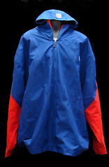
That’s actually one of the reasons that I’m looking forward to Nike making NFL merchandise again. Those jackets were outstanding, even if I hated the custom logo they stuck on link.
“Madonna, who also had some hair poking out where it didn’t belong.”
You made me look.
I wonder what the “Losing” Super Bowl QB Infographic would look like. I bet it would be somewhat similar looking.
Get busy.
Dilfer #8 not #12 on Infographic!
The Eli and Tom cutouts were in the USA today and could be printed off the website.
to do list:
fly to KC… pick up Moose… drive down to Mexico City… party at Alberto Sánchez’s house!
Just another fun, original idea the NFL will surely outlaw.
That’s already outlawed as an equipment violation. Either he’s getting away with it because of how hard it is to spot until you actually do or he’s paying his $5,000 a week.
On the NFL’s TV rules, I’ve moved to Providence RI in the last year and a half and having been looking into them too because they effect us in a weird way. Interesting case study in how the rules work out.
Providence is actually closer to Foxboro and Shaving-Supplies Stadium than Boston is. Still, Boston is considered a primary market and Providence a secondary. This means that we aren’t liable to miss a Pats game due to not selling out (which is never an issue anyway). The negative part is that games do not play on a local channel when on ESPN or NFL Network. You have to hope you can get reception from a Boston channel. Finally, it does mean we get an extra game most weeks, because a game can be shown opposite the Pats game.
All very quirky given how close my apartment is to Foxboro. There are literally millions of Bostonians who live two or three times further from the stadium than I do, yet have a totally different set of rules because they are in the “primary market.”
On another note, I think it should be called the Fu-Mankchu.
Same thing kinda happened in Kenosha, WI (and maybe Racine/Milwaukee and other areas in Southern Wisconsin but I only know about Kenosha) where we got both Chicago stations and Milwaukee stations.
We always got both Bears and Packer games regardless of time they were on. The Milwaukee channels showed Packers but didn’t have a game opposite them. But the Chicago stations showed the Bears and didn’t show a game opposite them. The result: 4 game each and every week Sunday afternoon (I can’t remember ever getting more) Even if the Bears and Packers were on at the same time you at least had both those games you could watch. The only thing I could think is when they played each other, maybe there wasn’t a game on opposite then.
It was like having a mini Sunday Ticket for free. It really spoiled me when I moved away and realized it wasn’t like this everywhere. I never really noticed where I grew up, either cause I didn’t watch as much or we weren’t a “home” market for anyone.
This was almost 10 years ago so I’m not sure if its still like that or not.
It also allowed us to get about 8 different Simpsons episodes a day which was great as a college kid before DVRs…
I used to live in northwest Illinois, so I got Packers from Madison, Bears from Rockford and Vikings from Dubuque, IA. It was awesome.
Pat Manchu.
I believe the paper cutouts on the desk from a USA Today insert from Friday’s issue…
(Or those pesky Papakura people have really upped their game…)
Ack! Too late!
This has absolutely nothing to do with today’s content… but a couple weeks ago, a few people (possibly Vilk, can’t remember) were tossing around the idea of the Houston Astros using a more astronaut-like uniform with a “mission patch” logo. I finally got enough free time to create this: link as a potential Astros patch concept. Thoughts?
The
That may be the best design I have seen in some time. LOVE IT!
Any chance you could mock it up onto a jersey as a sleeve patch?
Great work (bis), TJ.
Awesome!
-Jet
Did a home white tweak below, but here’s your logo (with the name cut off) on my orange alt:
link
That was the idea behind link some weekends back. I love your concept, but a couple of critiques:
1. The triangle shape is too Space Shuttle era for me. I understand that at this point, the Space Age has been over for decades, and we pat ourselves on the back for launching a couple of astronauts the equivalent of a bus ride from Houston to Dallas to a useless space station that by some definitions isn’t even outside the atmosphere, so low does it orbit. So there’s a natural tension between the futuristic origins of the team name and the retro nature of anything to do with manned space exploration. But the direct reference to the link falls too far on the retro side for my taste. I think a round or mostly round shape will give you a stronger mission-patch feel.
2. I really dig the notion of putting an orbit around the H instead of the old H-on-a-star treatment. But I think it would be much stronger if it was a star, not a baseball, orbiting the H. More direct tie back to the old team logo, and a more direct reference to the “Astros” name.
That hair splitting aside, I still love what you’ve done here.
Wow…. you have NO CONCEPT of manned spaceflight and the science we do on the International Space Station. The atmosphere does not define space. Manned spaceflight is awarded at 50 or 62 miles, depending on the agency (an actual numerical definition doesn’t even exist). For the record, ISS orbits at about 250 miles. If you escape Earth’s gravity (which I guess you define space as interplanetary space), you can’t continue to orbit the Earth… Spaceflight to the ISS is not trivial – and when it becomes trivial, people die. Just on the Space Shuttle ALONE, the US has launched 852 people into space! Add Mercury, Gemini, and Apollo to that (which happens to include launching 27 people TO THE MOON)! Far from a couple…
I hope you don’t have kids, they will never be allowed to dream.
For those of who know me that were wondering why I took so long to respond to this post… I was busy helping those “bus riders” expand the capability of the ISS to grow into an even more amazing research facility than it ALREADY IS!!!
Keep up the good work, Susan!
Oh, and not every pre-shuttle patch was round:
link
link
link
link
Thanks Jim! Slightly less than half were NOT CIRCLES.
71 circles
64 other (oval, polygon, shape of vehicle or vehicle element, or just plain “other”)!
;)
For the record Susan, I don’t point out that it’s been nearly 40 years since we sent a human further than a bus ride from Houston to Dallas, or that ISS research has to date produced vanishingly few peer-reviewed articles – which is to say, science – because I just love having an underfunded space program with no vision and no launch vehicles. Yay national impotence!
No, rather, I point this out because it’s a sad reality, and I wish it were otherwise. We should be exploring and planting manned research stations on the moon like we do Antarctica. We should be experimenting in maned missions to outer planets, and we should have real R&D going into extrasolar propulsion.
The awful truth is that we don’t have any of these. Refusing to pretend otherwise doesn’t make me anti-space. It makes me pro-reality. And the reality is that we have a manned space program that can’t send people into space – not 852, not 27, but zero – hasn’t sent anyone beyond near-earth orbit in 40 years, and won’t do so again until it’s been at least 50. I don’t say these things because I approve of them. In fact they outrage me. I say them because they’re true.
Fair enough… although, I still disagree with your assessment of ISS research and all research we did in LEO. Just because NASA and engineers often have a hard time relating the benefits, advancements, and spin-offs to the public, doesn’t mean they aren’t numerous.
I am also outraged that we can not put our own man into space – simply because of politics. Hell, everyone but Obama and Buzz Aldrin want to go to the moon!
yeah, um…no
tex wins this round arr
And may I say “currently put a man into space”. One thing for sure, America DOES NOT give up!
that’s really cool, The! great work
Splendid!
Awesome work, The. You should submit it to the team.
A heads-up about sending unsolicited artwork to a professional team: My responses have ranged from a form letter thanking me for my effort (the Twins) to having the artwork returned (the Astros) to having it kept, without acknowledgement (the Capitals). Don’t wind up like the poor Ravens’ fan who had his insignia plagiarized!
I could see that patch on an Astros uni…and now so can you:
link
I could see it on a real uni, too.
Hey, aren’t you the guy who makes fun of NBA teams putting a basketball in each logo (NTTAWWT)? And yet you have a baseball in this logo. ;)
You are going to dig Josh Lewin. I got to hear him call Rangers games a few times. Funny guy who had to absolutely carry Tom Grieve, whose color work would put a meth addict in a coma.
Thanks all for the number fixes on the Super Bowl QB graphic. I knew I should’ve ran it past uni-watch reader first!
Also, Johnny Unitas should have two shoulder stripes per arm just like Peyton does.
Reminds me of when Todd Marinovich drew in another eye patch on his Raiders helmet decal to represent sunglasses
Here’s the links to the two desktop cutouts of Manning and Brady.
link
link
Good idea Teebz, I was thinking of something similar, but with Stanley Cup Finals patches.
Is that really a FuManchu that Mankis is sporting???
link
This is like the distinction between a goatee and a van dyke, which almost everyone gets wrong, but the wrong way has become so ingrained in the vernacular that it’s sort of supplanted the right way.
In other words: Yeah, he’s not really wearing a Fu. But he thinks he is, and so does nearly everyone else.
I agree, but it bothers me when this happens with words. Guess I’ll have to use the white-out on the dictionary again…
Robert Wheeler’s membership card design is a real beaut!
Agreed.
It came out awesome. I’m stoked!
Paul’s kind of calendar:
link
Awesome,
link
The BAND Fu Manchu has a song called “Weird Beard”, if you’re looking for a name for that epic uni moment.
-Jet
My camp counselor summer 1970 was nicknamed ‘Weird Beard.’ I think there was a Louisville DJ @ the time and he took the name. Groovy man, rock on.
UPDATE
You can find anything on Google. And he was on WAKY, no less.
link
Associated Press photo appears to show Fu on the other side of Mankins’ helmet.
Man, people sure are beating the Welker drop to death.
Discussing whether its a Buckner moment for Boston.
I’ll guarantee you Brady would say, “Ah, shit, I shoulda thrown that better.”
And Welker would answer, “Yeah, well, whatever; I still shoulda caught the damn thing. Got both hands on it.”
Welcome to the talking heads football “blame game”.
Jesus, it’s football. Like we’ve never seen such a thing before?
Brady could just as easily blame himself for underthrowing that long interception. I’m surprised no one’s talking about that as a hidden play that changed the outcome.
Speaking of such things, watch the replay of the Hail Mary. Gronkowski, if healthy, might have caught the ball. Watch how he pushes off to lunge (or tries to). Anyone who has ever had a bum ankle can see he’d doing the one-and-a-half-legged hobble move, and just can’t quite react the way he’d like.
What the hell, it was a fun to watch (if not all that well-played) game with plenty of drama.
Mostly, though, we have to wonder how long it will be before another player gets the winning Super Bowl TD falling on his butt while trying NOT to score it.
I agree; it was a great game, even in the recent era of great super bowl games. I was just saying people shouldn’t just focus on two bad drops as the reason the game fell the way it did.
Agreed 100%. But everyone has no problem ignoring Brady’s interception now do they..
especially gisele
Having fun with the Catch of the Day, thanks! Somehow I get the feeling you’re also a lileks.com fan?
Actually, I didn’t know about that site. But I have a feeling I’m going to be spending some quality time there — thanks!
You’re welcome. He focuses on a lot of things that would seem to punch your non-sports-related buttons.
My daily routine is uni-watch.com first, lileks.com second!
Years ago I alerted Mr. James Jim Jimmy Lileks to this site, but I didn’t think to return the favor.
DARREN ROVELL wants you to know THIS IS A FAKE TOWEL BEING SOLD AT THE PARADE TODAY heh
link
It doesn’t look like a fake towel.. I mean, it *is* a towel, isn’t it?
Oh, it *looks* like a towel, but can we be sure it is one? QUICK — someone pick one up and run an absorbency test!
MLB umpires will be wearing a patch in memory of Marty Springstead, who passed away last month:
link
Perhaps Mankins was paying homage to his former college coach. Pat Hill from Fresno State was recently fired and will be the O Line coach for the Falcons next season. Hill’s FuMan was immortalized by a Boise radio station with the following:link
I found link at the bottom of today’s post. Thought it was gonna have some real info on the Cowboy’s uniforms, but it’s just fan based speculation and photoshop’s.
As much as I hate the Cowgirls, I really do like link. Hope Nike makes an attempt to go this route.
I’m not a fan of the blue sleeves. I’d rather see the sleeves match the jersey and be striped.
Whatever they do, please fix the damn color mismatches. Go back to charcoal tinted pants for both home and road instead of having two different (both ugly) pants. Ditch the light blue, go back to navy for everything. In fact, just wear this:
link
Amen. Tinkering has spoiled an excellent uniform. Really, the only thing I like about this team.
ya know…i THOUGHT that looked familiar and now i know why
the landry hat link
here’s when that originally appeared on Uni Watch
Oh, if anyone cares, the link to my football cake pic appears to be effed up, so link.
Anybody else notice the lights reflecting in Mankins’ helmet looks like the original Patriots’ helmet design?
Oh, and those Iowa throwbacks are schaweet!
Photos from the University of Minnesota Gopher Baseball Pro-Alumni Game at the Metrodome:
link
A couple notes: Kerry Ligtenberg in the “Black Jays” uni (he was there in 2004); Mike Merila in the ’90s-era Padres home uni
Nice. Thanks for that.
guessing the answer is no, but were the penis stickerd (ie, super bowl logos) on the helmets this year new? I don’t remember seeing those in the past.
Not even vaguely new — been going on for quite a few years now.
The Packers had the Super Bowl XXXI logo on the back lip of their helmets.
link
link
As far as patches go, it is kind of weird that teams wore patches in Super Bowl XXV, but then not again until SB XXXII, and then every year after that. Anybody know why that is?
Not sure if any of you reads the AV Club, but their TV-listings segment “What’s On Tonight” includes:
NHL Hockey: Kings at Lightning (NBC Sports, 8 p.m.): This meeting of the Los Angeles Kings and the Tampa Bay Lightning has no greater consequence to the 2011-12 NHL season, so let’s gawk at the horrifying third jerseys each team donned in the mid-1990s. Little known fact: That Kings jersey features a detachable sash.
One of my favorite patches
link
When the Giants returned to NY after the Super Bowl, Ahmad Bradshaw exited the plane with his helmet in his hand, complete with the mouthpiece jammed in the top.
link
You rock, Ryan Dunsmore! That’s such an excellent find. I was sporting a handlebar moustache for a few weeks last month.
Also, hate to nitpick Paul… but the difference between a Fu Manchu and handlebar (or horseshoe) moustache is not as vague as a van dyke vs. goatee.
A Fu Manchu specificly requires no hair in the middle. Two distinct, unconnected parts of the ‘stache. Often extending beyond the jawline.
I’ve never seen someone mix-up a Fu Manchu with a handlebar moustache.
Actually a Fu Manchu is a mustache that goes straight across the upper lip and whose tails are grown out beyond the lip and allowed to droop instead of being shaped like a Dali or a handlebar, which is itself different from a horseshoe. A mustache that doesn’t have any hair in the middle of the lip is a G.G. Allin.
Thanks Christopher.
I love my card!
Another great post Paul. I’m in love with the Super Bowl infographic.
Nice letter from Greg over to Nike. What can be done, to fix some real stinker uniforms out there? But I have to respectfully disagree with this: “And this may be a surprise to some, but I still hold that Seattle’s redesign was one of Reebok’s few (if only) successes.” This uni design is an abomination, followed closely by several other teams. Are you listening Vikings?
He’s also wrong about the Browns helmet. No matter what he and The Jeff think, that helmet isn’t going to change, nor should it. Even if it is ugly, it is too deeply ingrained as the symbol of the team.
As much as I respect the Browns’ blank helmet, I’m not so fond of using it as a logo. If the Eagles can have an eagle head instead of the helmet wing and if the Vikings can use a viking head instead of the helmet horn, the Browns can use something else. Brownie the Elf would be a great, albeit “too cute,” logo, while the “B in the football with the stripe” is perfectly good.
I hate the B-football logo. I agree that they need a different logo than the helmet, but they currently don’t have a better one. I was saying they aren’t going to change the actual helmet, as the writer was suggesting.
That should say “as the writer was suggesting they should.” (Still no edit button)
Right on, Mike. For decades, NOBODY had anything on their helmets aside from stripes and whatnot, yet they still used logos.
He’s not suggesting that the Browns should update their helmet. He’s saying that when depicting a Browns (or any other team’s) helmet, the image should be true to what is actually worn on the field nowadays.
At least that’s how I read it.
The NFL has set up a website featuring some pretty cool looks at the evolution of NFL equipment, along the lines of their Super Bowl ad. link
A few stereotypes are being fed into…
link
link
You’d think the NFL would be smarter about the players/teams they chose to highlight.
Also, like every picture of a QB getting blown up is of a Giants’ QB. Hilarious.
Suh = dirty.
Clark = dirty.
No problems here.
Although this might be even better:
link
Thanks for hipping me to the sweet transistor radio! What a steal at $30.
Did you get it?
Super.
City of Washington has got it going, well with nhl and nba unis anyways (redskins are cool too though). Caught a glimpse of Caps vs MTL on Sat. Caps had their 80′s (Dale Hunter) unis-solid. As well saw the Wizards (even though their nickname still puzzles me) dazzling uniforms, but I do recall a reader posted that the numbers are tough to see from a distance, I am in agreement.
Miami
HeatFloridians in action tonight against the Cavs:link
link
I’m really digging the throwbacks this year.