Did you know there’s a Little League museum out in Williamsport, Pennsylvania? I guess it makes sense, but I hadn’t been aware of its existence until reader Sam Sharp sent me a bunch of photos that he took during a recent visit. I like a lot of these quite a bit, so let’s take a closer look, beginning with this Canadian uni (you can click on all of these images to see larger versions):

What I especially like about this uniform is the piping on the belt tunnels — rare for a youth uni. Wish we could get a better look at the piping across the shoulders, though.
Here’s a very similar jersey — maybe even the exact same stock model — that was worn by a team from Pennsylvania:
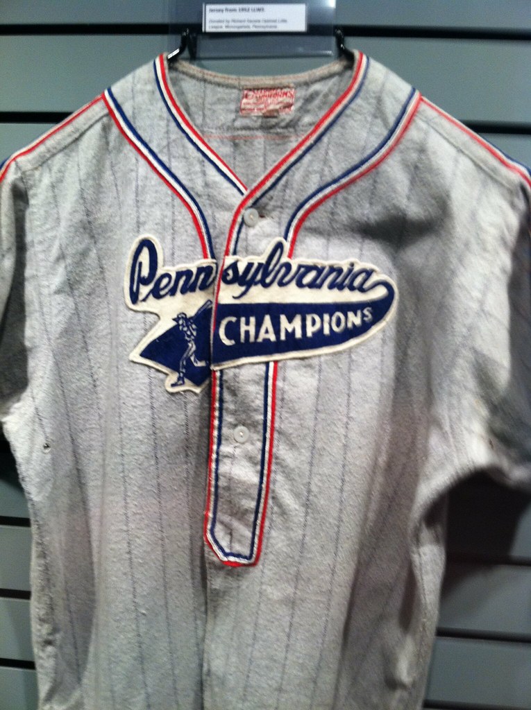
Love that swinging batter at the base of the swash. How cool would it be if a big league team did that today? Eh, but they’d probably mess it up by showing the hitter wearing pajama pants.
And here’s yet another version of this same basic design, this time with the Little League logo at the base of the swash:
Next up is a team that wore its sponsor — Lundy Lumber — on the front of the jersey:
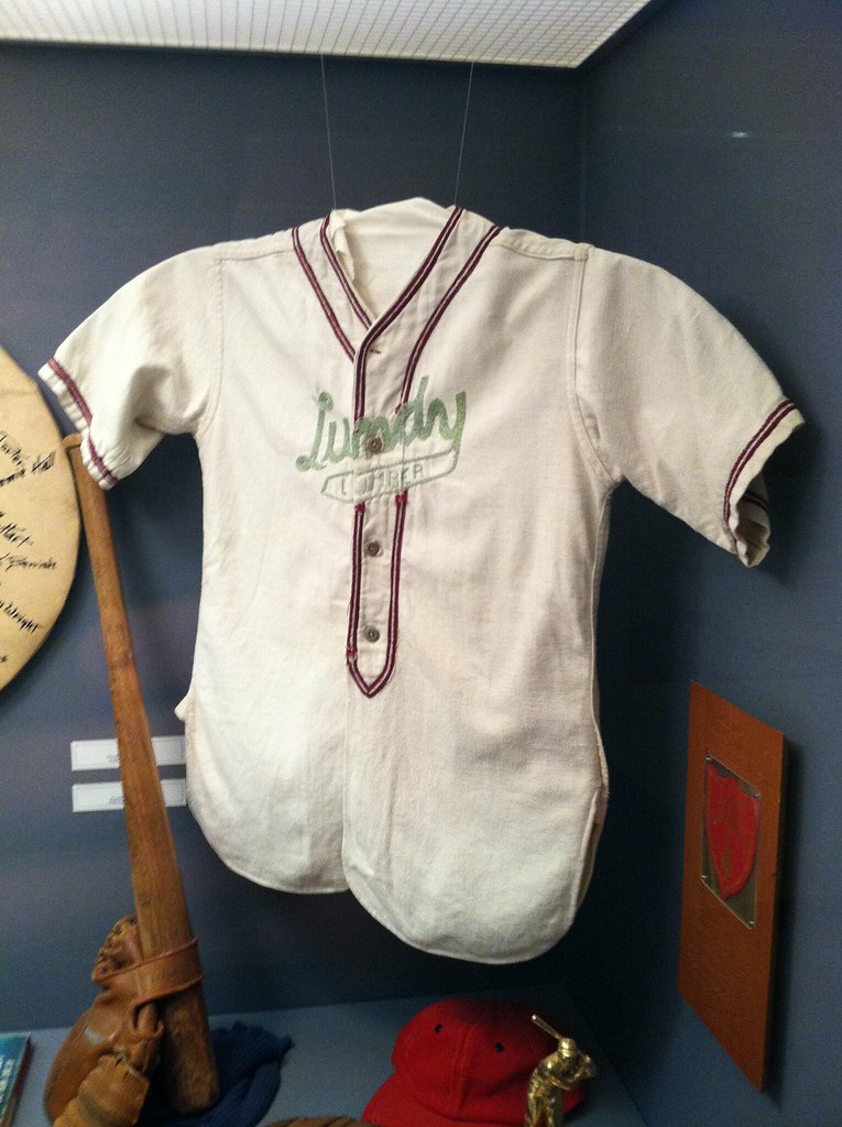
Oddly enough, I saw a vintage youth jersey with this same exact color pattern — red and light sea green — during my recent trip to Cleveland. I initially assumed that the green had originally been darker and that it had faded over the years, but now I’m wondering if the lighter green was a standard color back in the 1950s.
I really like these displays of old gloves and helmets:
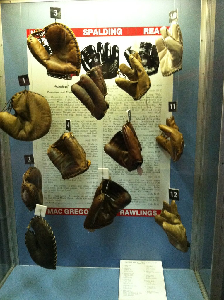
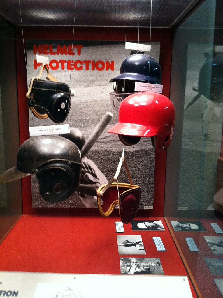
Just goes to show how much you can achieve with simple fishing line, right?
Always good to see stirrups represented in a museum like this:

Softball is also represented at the museum, as you can see in this uniform:

Here’s an unusual satin cap, with a good story behind it:
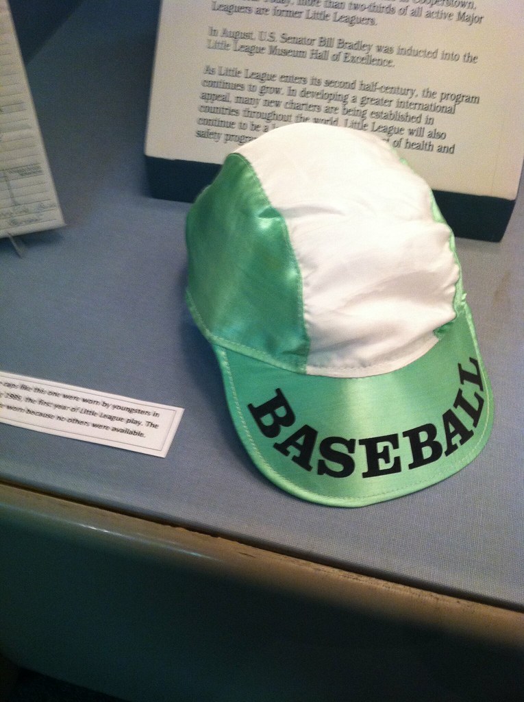
“It was handmade and worn in Poland after the fall of communism,” says Sam. “The exhibit said all players wore different hats, essentially just what their moms could make.”
And here’s one more cap — a rather nondescript one, at least at first glance:

So what’s the significance of this cap? “It was the hat worn Lycoming Dairy, the winner of the first Little League World Series,” says Sam.

Collector’s Corner
By Brinke Guthrie
With Super Sunday fast approaching, we’re leaning toward the Giants and the Pats in this week’s edition of Collector’s Corner.
We’ll kick off with this nice-looking 1970s Patriots helmet buggy, still in the package. Some yellowing on the decal, which is to be expected given its age. We’ve also got a 1970s, Patriots helmet pencil sharpener. Is that Bert Jones on the card?
Running down the rest of this week’s finds:
• PL, check the collar tag in this 1960s Giants sideline jacket.
• Before Bill Belichick became known as Angry Homeless Hoodie Man, he displayed a clean-cut stylish look, as you can see in this framed photo and this ad for Starter.
• Here’s a totally rad New York Giants candy dish.
• Patriots fans can light things up with this 1970s light switch plate. I wanna say that’s Earl Campbell in that graphic.
• This 1970s Giants helmet plaque from Placo looks to be in excellent shape. Hang it next to this 1960s Giants poster by Dave Boss.
• Here’s something you don’t often see: a 1970s Giants cork board (feels like a Sears item to me, although the listing makes no mention of that). And this Giants push pin with the oft-maligned 1975-only “NY” logo pairs nicely with it.
• And just to toss a bone to the non-football fans out there, two Red Sox-related items from reader Warren Junium: an ATM sign from Fenway Park, and a custom-made Theo Epstein guitar.
Seen something on eBay or Etsy (or anywhere else) that you think would make good Collector’s Corner fodder? Send your submissions here.
PermaRec update: If you read the original Slate articles last fall, you’ll definitely want to check out the latest news on the Permanent Record blog.
Uni Watch News Ticker: The Astros aren’t changing their name after all. ”¦ Some good gossip about upcoming uni tweaks for the Seahawks. And some follow-up info here. … This is pretty amazing: The NFL’s own iPhone app used the outdated conference logos for its Pro Bowl scoreboard. “Can Chad Bengal fine Roger Goodell for this?” asks Caldwell Bailey. … New uniforms for the Chunichi Dragons (from Jeremy Brahm). … Bob Ludlum, along with his son and nephew, created a really nice miniature Giants gridiron on his front lawn. “Took less than three hours of work, although the three trips to Lowe’s for paint added some time,” he says. … Responding to yesterday’s info on glass cutter gloves in the CFL, Jason Cutts writes: “I think the website you were looking at was a bunch of Saskatchewan homers patting themselves on the back. I believe the first CFL player to wear glass cutters was Dave Sapunjis. Another fun fact: The technology was patented, where nylon was applied to the back of the gloves, and they were called cutters. It’s true that Flutie brought the gloves to the NFL and many Buffalo receivers started wearing them. I recall hearing that the NFL bought out the patent after being sued or at least threatened.” … Joel Hackler recently attended a local semi-pro basketball game in Bloomington, Illinois, and one of the teams — the Sauk Valley Predators — had sleeved undershirts with a pattern to match the shorts. Pretty slick for semi-pro. … New college lacrosse uniforms for Denver (from Nick Coppola). … There’s increasing progress on the initiative to lift FIFA’s ban on hijabs for female soccer players (from Morris Levin). … Good article/slideshow on the evolution of cheerleaders (thanks, Brinke). … “Pumas UNAM (National Autonomous University of Mexico by the Spanish acronym) is celebrating 50 years of playing in Mexico’s soccer top division,” says Omar Jalife. “To commemorate that, they made a retro jersey with smaller sponsorship. They removed the iconic Puma from the chest, since the big Puma is from later on. That’s why you will see only the U on the chest.” … Excellent slideshow of the Cardinals’ birds on the bat here (from Gary Moore). … I don’t ever remember seeing Mike Ditka wearing a Bears logo on his slacks until now. The funny thing is, that’s almost the same spot where the Cubs wear a logo on their road pants, so maybe it’s a Chicago thing (Brinke again). … Matt Shepardson was watching an old episode of the original, Japanese-produced version of Iron Chef from the 1990s (or as we like to call here at Uni Watch HQ, Iron Chef before Iron Chef sucked) and noticed something odd: Iron Chef Thai was wearing a T-shirt with an NBA sleeve logo. … The Indiana Ice wore Indianapolis Checkers throwbacks last Friday (from Nile Smith). … Aaron Scher took a bunch of photos during a recent visit to the Lake Placid Olympic museum. … UTEP hoops will wear a “noche Latina” jersey this Saturday (from Chris Avila). … Oh baby, look at the amazing sock stripes that the Marshall hoops team wore in 1961. Click through all the thumbnails in the right-hand column for the full delicious effect (mega-thanks to Brice Wallace). … Bizarre find by Andrew Levitt, who writes: “I discovered a 1991 video game that features the Reebok Pump! It’s called Drac’s Night Out by Parker Brothers (“The Game That Pumps You Up”) for the Nintendo Entertainment System, although it was never released officially. You play as Dracula, using his Reebok Pumps to walk to his girlfriend’s house to suck her blood, and no, I’m not joking.” … A huge haul of vintage NFL pom-pom caps here (from Jeff Flynn, Jr.). ”¦ The NFL will take out a house ad during the Stupor Bowl to address the issue of player safety and proper equipment. ”¦ Meanwhile, with the Stupor Bowl in town, Indianapolis is awash in Roman numerals (from Rob Wheeler). ”¦ Mike Menner wore a Minneapolis Millers throwback jacket to TwinsFest last weekend. “Upon seeing my jacket, a ticket rep told me that the Twins were planning to wear Millers throwback jerseys a couple times this season. He said dates hadn’t been set, but maybe in late June and again after the All-Star break. He also said they would like to get Willie Mays (a onetime Miller) to come to Target Field.” ”¦ How about a nice flannel suit? They take away that “Tired Feeling” — you know (thanks, Kirsten). ”¦ New preseason uniform for the Rakuten Golden Eagles. “First time I’ve seen that for a Japanese baseball team,” says Jeremy Brahm. ”¦ Also from Jeremy: New logo for the Richmond Tigers of the Australian Football League. ”¦ Fascinating story about whether a guy who paints and sells scenes of Crimson Tide football needs to have a license. Recommended reading. ”¦ Amusing typo on LeSean McCoy’s Pro Bowl T-shirt (good spot by David Ryan). ”¦ Stop whatever you’re doing — seriously, stop right now — and watch this video of a five-year-old child reacting to corporate brand logos. Guaranteed to be the most charming two and a half minutes you’ll spend today (über-thanks to James McNamara):
Paul,
What do you think of the new tennis uniforms at Syracuse? Going with numbers…weird for tennis as this is the first I’ve seen this. At least Cuse kept the blue as the primary accent color.
link
Wow — interesting! Never seen tennis with uni numbers before.
No numbers on the team roster, however:
link
When I was on the track team in high school, we competed against another school who had numbers on their shirts. I remember being jealous of them, because for me, numbers on jerseys are essential. You’ve got the school name and colors, which you share with all your teammates, and your number, which is just for you (now, but also connects you to everyone else who wore it, past and future).
I would have been happy even with those bib-style pin-on numbers that you have in road races!
Interesting. Another example of a sport that really doesn’t need numbers adding them. I wonder if it ever goes the other way…a sport realizing after years of having numbers that they’re essentially extraneous?
I was thinking it might have something to do with who is playing #1 singles, #2 singles, etc. But looking at this doubles picture, no idea considering the players are #8 and #15….. link
I thought the same thing Eric…but there’s also the traditional #44 floating in the season pictures as well.
I don’t know if tennis needs numbers on jerseys or not, but wouldn’t swimming benefit from numbers on the sides of the caps? Seems like an obvious idea. Has this been done already?
My high school tennis team in the 1980s wore numbers.
Didn’t get to choose ours, though, since they were all hand-me-down jerseys and we got stuck with whatever number was on our size.
Both South Williamsport, where the official Little League museum is located and the World Series is played, and neighboring Williamsport, are full of great baseball history. Williamsport has a minor league baseball team that plays in one of the oldest parks still used for professional baseball, and across the street from Historic Bowman Field is the original Little League World Series field, which also boasts its own museum.
Love the Little League post. I recently watched the movie “The Perfect Game” about the 1957 Mexican team that won the LL WS. Interesting story, but the movie (acting, cinematography) was quite bad. Lots of good uniforms in the movie, including the 1956 Cardinals script jersey shown in the ticker slideshow.
link
link
Re: the 5-year old’s reactions to corporate logos–seems like his/her strongest/quickest identifications were Disney and Nike.
I will be sad for the rest of the day.
Oh, but that little girl — doesn’t she sound amazing? Can I adopt her right now?
She wins the Internets. Not even Chuck Norris can take her crown.
That’s a Jenny Slate production. She’s the one who does the Marcel the Shell videos. She and her fiance put out a bunch of things on the AdamLaddVideos channel.
that little girl is destined to run the biggest ad agency on Madison Avenue.
No question. Future = pre-ordained.
I liked it from the get-go, but “those are baby toys” put this over the top.
if anything, it shows us what sharp, clean, (mostly) unchanged, simple logos like Nike, Apple and McDonalds have, eh? target too, but that wasn’t identified by the kid.
-captain obvious
p.s.
my favorite was “parade elephant”
I sort of liked “peace sign” because it reminded me of link I once posted in response to the ticker item re the Superdome’s naming rights.
By far my favorite comment by the 5-year-old is when she says the McDonald’s logo looks like “an M made out of fries”. This simple similarity between the logo and a product the company sells never dawned on me before. Leave it to a 5-year-old to see it right away!
yup she nailed it…although there is no connection to the arches and the fries- the arches were an architectural consideration.
Now, where IS “Mr. Speedee?”
Great video, I think it’s funny to think about how some of those companies try so hard to be recognizable, I would love to see the faces of the marketing people when she just saod cheetah 3 times in a row for puma, jaguar, and another one I’m forgetting right now.
But the best line in my opinion was for xbox: “that’s the logo on the thing that controls the TV at Ryan’s house”
-Jake
Her first cheetah was the greyhound logo. Hilarious and telling at the same time.
That’s a cheetah. And a cheetah. And a Cheetah.
I’ll back you on the Nike all day, but to be fair: what 5-year-old girl doesn’t love Disney stuff? They have princesses. PRINCESSES.
The best part- the GOP logo. “That’s a parade.”
Yes, indeed it is.
My favorites were NBC’s peacock as a rainbow turkey (ought to be the network’s new slogan!) and her response to the GE logo. She named it instantly, to which I immediately thought, “How does anyone under maybe 30 even recognize that logo?” and then she explained, “that’s where grandpa works.” At her age, I’m pretty sure I wouldn’t even have recognized the McDonald’s arches, but I definitely knew the logos for the Guaranty Bank and Trust (where grandpa worked), Merchant’s National Bank (mom), and CBS (dad).
My favorite: “Babies are lit-tle.”
But really, I loved just about all of them.
If you take a look at the main photo with the NFL safety ad story, that is some really inaccurate CGI. The scoreboard in the back in Lambeau Field wasn’t put up until at least 1972 (Sayers retired in 1971), the lights are in the wrong place (and look nothing like Lambeau’s lights at the time), and so forth…meaningless in the greater forward march of civilization, of course, but hitting a raw nerve for a few of us.
What’s with the article insisting on using periods in “N.F.L.”? No one refers to it that way. That was as annoying to me as the historical inaccuracies.
That’s the Times house style, which I find to be very inconsistent.
I understand that “RICO” is pronounced as a word, and shouldn’t get periods. But the use of periods in names pronounced as a collection of letters is all over the map; we have “I.B.M.” but “ICBM”, and “N.F.L.” but “NCR”.
That kid reacting to the logos is the cutest thing that I’ve come across all month. Thank you SO MUCH for the vid (both James McNamara and Paul).
You’re very welcome.
The one thing I dislike about the video — and I dislike it quite a bit — is the extremely annoying music in the background, which seems like a serious miscalculation on the father’s part. Wish there was a way to mute it without also muting the girl.
Absolutely, Paul. That’s my beef with a good deal of the Youtube videos out there – annoying, unnecessary music.
-Jet
It’s a common mistake, not trusting the material.
Hell, that’s my beef with a good deal of movies and television out there. If you’ve got Maurice Jarre or John Williams or Damon Albarn composing original music for you, Great! Play that score nonstop during every moment of the film. Otherwise, less music, more dialogue, incidental sound, and silence, please. If you need to heighten the emotion, write a better scene, or edit the scene you’ve got more effectively. Don’t just slap music on it.
The 5 year old was cute. “The” Nike. Hilarious.
The photos from Lake Placid’s Olympic Museum caught my eye. On one caption (link) the caption is “they used to give award certificates along with the medals”. It is a little-known fact that they still do. Every Olympian who finishes in the top 8 of any event receives a diploma. e.g. link
One more thing: “A huge haul of vintage NFL pom-pom capts here”
“caps” is spelled wrong.
Got it. Thanks.
Looks like the link are going with an approximation of Syracuse’s original link uni.
Re: the Cardinal’s slide show- I just wrote a whole thing with links and everything- then deleted it by mistakenly pasting some bullshit here- and can’t get it back! I’m livid! So once again I ask:
What’s the deal with this jersey?
link
link
I’m too pissed to try and format it. From Home Run Derby, 59-60 off season.
Birds-on-bat AND the jersey tomahawk? Hell yes.
That jersey is odd. Must be a prototype they came out with between the 56 and 57 seasons.
The navy cap was introduced in 56 and that font was introduced in 57, sans-piping.
My guess is that they originally had the piping to match the thin red stripe on the pants, but for whatever reason decided to go with a “clean” jersey.
I always wondered why the 1957-1971 Cardinals uniforms had a red stripe on the pants leg, but no stripes on the jerseys. This may answer the question
Yes but the show was taped in late 59 – early 60. A few years late for a 56 prototype. Plus the prototype’s would have been in St.L, if they still existed. The closest thing I can guess is it’s a Cardinal minor league jersey that was closer to LA for the taping and had Ken Boyer’s number on it.
Doing some research here link
The closest minor league team that was named the Cardinals to the old Wrigley Field in LA would have been the 1959 Hobbs, NM Cardinals.
More likely it would have been a uniform pulled from a studio vault and modified. Or even created from scratch, by someone not terribly familiar with the Cardinals?
It’s possible that classic Cardinal embroidery was shipped west and placed on a blank jersey. But why not a “blank” jersey? For all we know, those may not be red lines.
Hobbs, N.M. sounds likely, there’s got to be photo’s somewhere of that team. Or maybe the Cardinals planned a jersey change in 1960, then changed their minds.
Funny thing is, I grew up in Erie, Pa and have lived the last 15 years in Philly. Pretty much every time I drive to or from home I try to break up the boring, boring drive on I-80 in Williamsport, for the museum. I was walking around in Philly maybe 10 years ago and a guy on the street asked me for some change so he could get to Wlliamsport and I said “Oh, Little League Hall of Fame?” and received a total blank. Guess what? No change today, buddy. It is also located near a great highway sign “Highest Point on I-80 East of the Mississippi”. It’s all downhill from here.
“… (N)ow I’m wondering if the lighter green was a standard color back in the 1950s…”
No, it wasn’t.
Williamsport High also has one of the cooler nicknames: Millionaires.
There were once more millionaires per capita in Williamsport than anywhere in the world.
Lenox HS (Berkshires, Massachusetts) also nicknamed Millionaires because of erstwhile summer houses of super-rich Bostonians and New Yorkers. Still a nice-looking town, what with Tanglewood and all.
Wow… with such hoity-toity nicknames, I bet most other schools get a certain satisfaction out of beating Da Millionaires, whether it be football or tiddly winks.
Of course, the rich kids still get to go home and be, you know, rich. So there’s that.
Not many rich kids left in Lenox, I can tell you.
Same with Williamsport, that’s name from a time long gone…when the lumber industry was king there.
“… Bob Ludlum, along with his son and nephew, created a really nice miniature Giants gridiron on his front lawn. ‘Took less than three hours of work, although the three trips to Lowe’s for paint added some time,’ he says. …”
Very cool. I also like the paper cut-outs of snowmen taped to the windows.
“… Jason Cutts writes: ‘I think the website you were looking at was a bunch of Saskatchewan homers patting themselves on the back’…
Saskatchewan is far and away my favorite Province. If some of the guys bragged a little, it makes for a tiny compensation for the under-appreciation they get from the haughty Ontarians.
“… Excellent slideshow of the Cardinals’ birds on the bat here (from Gary Moore). …”
Wow.
By Ontarians, I believe you mean Torontonians.
I personally don’t know for sure what player was the first to wear glass cutter gloves in the CFL, but Jason Cutts didn’t provide any evidence to support his claim that Dave Sapunjis was first. That photo of Sapunjis is dated 1995; CFL players started wearing the gloves in the 80’s.
link
I think to settle this debate someone needs to hunt down that halftime segment/interview they did on Jeff Fairholm and see if it really does talk about him bringing the glass cutter gloves up to the CFL from the University of Arizona.
Thanks, my wife changes them for every “Holiday/Season”.
We have hearts up now for Valentine’s Day
Don’t worry. This is my last comment.
For a while, it has been customary for the Media Day before the Super Bowl that the players sport that years draft caps. Since New Era will be making the draft caps, it looks like all the players are wearing generic, black, Reebok Super Bowl XLVI hats for media day today.
I know media day hasn’t “officially” started yet, but those are the only hats I have been seeing worn by the players.
Strike that. After watching for a while now, I have seen generic white hats, along with sideline caps from last year with the XLVI logo slapped on it as well.
This is awesome…the Cardinals museum website has a slideshow of the evolution of the “birds on bat” wordmark
link
Gee, I wonder what MLB team inspired the Chunichi Dragons’ new white jerseys?
link
Been that way for a link.
They’re not the only ones – the link and link have both been inspired by American clubs.
I still say Tokyo Giants sounds much cooler than Yomiuri!
Our Saskatchewan Roughriders, led by Fairholm and Narcisse (in those very glass cutter gloves), were busy winning a Grey Cup in 1989, while Dave Sapunjis was still playing at the University of Wstern Ontario. He wasn’t even drafted by the Stampeders until 1990. Pat Pat.
“Meanwhile, with the Stupor Bowl in town, Indianapolis is awash in Roman numerals”
–this link is broken…or my mac doesn’t like it
I was just about to submit a comment asking if anyone knew if the Cutters brand of football gloves were named after glass cutter gloves. For the hell of it I went to the Cutters website, and sure enough, the Cutters brand IS named after glass cutter gloves! Here’s the key info:
“How did Cutters get started?
After a hand injury on the football field in the 1990s, Cutters’ founder had to wear a glove if he was to continue playing ball. Not satisfied with any available football gloves on the market, he came across industrial gloves used by glass handlers and cutters. These gloves did the trick — they not only allowed him to finish the season, but led to years of research to develop the concept into high-performance sports gloves. This was the launching pad for Cutters Gloves.”
A think a Uni-Watch interview is in order.
The above information is located in the FAQ here on the Cutters site:
link
I was hoping for something in regards to Breaking Away.
Why would you want to wear a flannel suit in the summer? Did they use even heavier cloth for winter suits back then?
My high school civics teacher used to theorize that the reason so many of the compromises at the Constitutional Convention went the South’s way was that it was a hot summer spent in sweltering closed rooms (true), and at the time northerners generally wore wool suits (true) while southerners often wore cotton in summer (true). So the southern delegates were more willing to sit it out and argue their case while northern delegates were more eager to reach agreements and get done with the day’s business (conjecture).
Fanciful, sure, but canny politicians like LBJ and Churchill have been known to pull just that sort of stunt.
It’s Canada. In winter, they have to wear suits made from 3 layers of heavy tweed.
I had the exact same thought. Wool can be fine for summer (fresco being a light open weave that’s better than many linens and most cottons) but flannel?
“New college lacrosse uniforms for Denver (from Nick Coppola).”
Nicolas Cage is a UniWatch reader?!
Yeah, I’ll believe the NFL is concerned about player safety when they ban all helmet-to-helmet hits, not just ones on QBs and “defenseless receivers” (the definition and enforcement of which seems to change almost weekly).
How often do you see a RB go head-first into a collision with a LB, who also happens to be leading with his helmet? How in the hell is that legal but slapping a QB on the helmet isn’t?
Exactly.
Technology will not solve the problem. No helmet is going to keep a fast-moving brain from ramming into the inside of a suddenly-stopped skull. Helmets are made for protection…they’re not supposed to be a weapon. Ban all helmet-to-helmet hits. Ejection, not a 15-yard penalty, is the appropriate call.
Agreed, Jim. Back when I played football (10-12 years ago), leading with your helmet was called “spearing,” was considered really dirty, and warranted a retaliatory punch in the nuts on a later play. Now it seems like it’s the de facto tackling style in the open field.
I’ve been saying it for over a year – instead of trying to improve polycarbonate helmets, we should be banning them.
Back to leather helmets, or a gridiron version of a link. Once players can’t kick the consequences of their collisions down the road, they’ll stop leading with their heads.
+1 to Chance. And not just helmets, but most of the rest of the body armor players wear. There aren’t particularly great comparative studies, thanks to the sports being popular in different parts of the world, but the best data I’ve seen suggests that among high-school athletes, American football players suffer concussion at something like five times the rate of New Zealand rugby players. Clearly, rigid helmets and pads are not helping.
How in the hell is that legal but slapping a QB on the helmet isn’t?
Because teams have many tens of millions of dollars invested in the long-term success of their QBs, and they have no such investment in their RBs or LBs, almost all of whom are easily replaceable with equivalent talent at zero marginal cost. The rule doesn’t exist to protect player health, it exists to protect team investment. Simply put, QBs are brands; LBs and RBs are commodities.
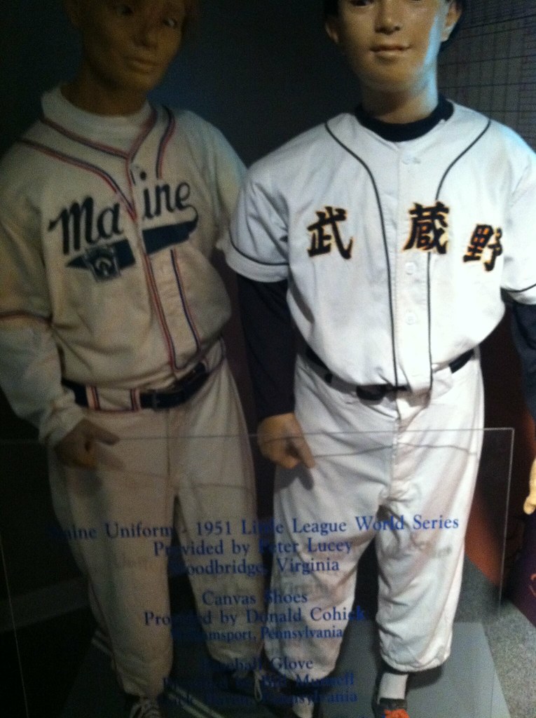
In case anyone’s wondering, the Japanese jersey, opposite the one from Maine with the Little League logo on it, is from the city of Musashino, just west of Tokyo. It’s also near Chofu, which sent a Little League team to the LLWS a few years ago.
Marlins unis in action
link
Still not a fan of softball tops, but the home whites have really grown on me.
I just don’t like the logo. It’s WAY too big!
I saw a jet flying overhead near the airport in Louisville today that looked very familiar. It looked alot like Maryland’s (in)famous UA pride unis. A quick Google search led me to this: link
Looks like someone was eying the Maryland aesthetic well befote Under Armour.
That Bill Belichick framed photo is actually a card in one of those individual card holders, but if it WERE a photo, I’d be all over that for 2.99. What a great gag gift for a Browns fan.
In regards to the player graphic on the Patriots light switch cover….I think it is Sam “Bam” Cunningham. Great nickname, and Randall’s older brother.
How in the name of I.M. Hipp did I not know until today that Sam “Bam” Cunningham is Randall Cunningham’s brother?
And perhaps just as importantly, WHAT ELSE DON’T I KNOW?!?!?
[Second question rhetorical — and would take a really, really long time to answer were it not :-]
Countdown to Hell Day: 61 days.
Possible new WVU Football jersey?
link
Will gray be moving in to Football more like in hoops?
Football is where it started:
Oregon link
Oklahoma State link
Washington State link
I said Gray was the new black over a year ago, and I was only talking about college football.
Also, note a theme – NIKE. Team Nike Strikes again.
Nike:
Our Identity > your identity
Sorry for the Ricko-type posts, but how about this for a Nike slogan:
“There’s no “I” in team…
… But there is one in Nike.”
Don’t forget link.
or TCU – link
or boise state – link
Don’t forget the link.
Dunno about that, lots of hoops teams (including WVU) had gray unis where gray is not a school color as far back as the late 80s. In the examples above, I consider OSU the wild card as gray is not a school color for them. Clearly what is a school color is not relevant for Oregon, and for Washington State Gray/Silver is a color that’s been part of their unis for a long time (Pants/Helmets). Gray is not a color at WVU, but as I said WVU has had gray hoops unis at least twice. Late 80s under Catlett, and the last couple of years under Beilein.
There’s a good reason gray has been part of Washington State’s unis for a long time. The school colors are crimson and gray.
Hmmm…
Blue helmet/gray jersey/blue pants = good
Blue helmet/gray jersey/gray pants = good
Gray helmet/gray jersey/blue pants = good
Gray helmet/gray jersey/gray pants = good
I like where this could potentially be going.
All due respect, but no. Just. NO.
The school colors are Blue and Gold. That’s where the colors stop. White is acceptable to me, but I don’t want to get into all the “color vs. absence of color” talk.
I’m a Mountaineer through and through. I hate to say it, 9-13 be damned, I’d rather see the all gold uni than this crap.
A colorful graphic + beer ingredients = awesome.
link
Now I’m thirsty and hungry for bacon.
For what its worth, E Chapman is still around and going strong in Vancouver, its current store is only about a block from the location shown on that tag.
link,,1,1.7&panoid=82cp_o3OgzphbUlyc2IGaw&hq=chapmans+mens+wear+vancouver&t=h&z=17&cbll=49.285751,-123.116478
Those pants Ditka is wearing were on sale in an old NFL catalog I used to receive in the mail. I remember all the teams had pants with a logo on them. Those pants were part of a logo collection, it may have even been called the logo collection, or some other lame name with logo in it. But you could get pants, polo shirts and even shoes with a logo similar to the one Ditka wears here.
To see them as a kid we laughed and laughed, why would anybody wear them? Later the NFL got the best of me and convinced us all (well most of us…) that Zubaz pants were cool. On the one day in the world they were cool I bought them and wore them. Shameful.
On the one day in the world they were cool…
There was no such day.
Thanks for the heads up on the pom pom hats!
No SB references today?
Let me be the first.
Teddy picks the G-Men.
link
My friend who’s a Bears fan recently (out of obvious jealously) revealed his dislike of the NY Giants logo on their helmets saying it’s the ugliest in the league. I told him at least we didn’t steal the Reds logo.
im a football coach and we are looking to get a set of knee high striped socks made for next season basically like the white and blue ones worn by the patriots occasionally, but in white and red to go with out uniforms
link
don’t know if you will check this thread again, but you can get in touch and i can help. rpmarshallart at gmail dot com.
Indiana Pacers wearing some snazzy throwbacks against the Nets right now.
pics: link link link link
What was the reason for Astros thinking of changing team name?
To give people a reason to talk about the Astros.
Coach Chambers of the PSU basketball team honored Joe Pa by wearing the same style black Nike shoes. Plus, be cuffed his pants too.
link
Random find: an auction site with some (sadly completed) auctions on some game used USFL stuff. Cool to see those old uniforms again. link