First some quick housekeeping: We had some technical problems on the site on Saturday night and Sunday morning. They’re mostly fixed now, but one lingering issue is that you should look closely at your name and e-mail address when commenting, because some browsers are auto-filling other people’s names and addresses. I think this problem has now been solved, but be careful, just in case.
Now then, some uni-notable details from the weekend’s NFL playoff action:
• The Packers don’t wear captaincy patches during the regular season, because they rotate their captains each game. But they always name a set of postseason captains and added the patches for the playoffs.
• I was very surprised that the Packers didn’t wear any kind of memorial for coach Joe Philbin’s son. I’m not saying they should have worn something — just saying I thought they’d do so.
• What’s worse than a team with the leotard look? Two teams with the leotard look. Just another indication of the dysfunction in contemporary NFL hosiery. Gimme some contrast between the pant and sock, please!
• Ray Lewis and Arian Foster, taking a page from the world of soccer, exchanged jerseys after the Ravens/Texans game.
• In the 49ers/Saints game, I noticed that Justin Smith of the Niners is another player who goes bare-handed and finger-taped. (And yes, as several readers noted, Smith — a Missouri native and Mizzou grad — also has an Anheuser-Busch tattoo. We’ve discussed that here on the site before.)
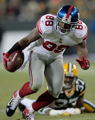
• Frank Gore apparently made some hosiery adjustments at halftime. Not sure if he changed from Capri-length red tights to leg-warmers, or if he was wearing leg-warmers all along and they simply slipped down. Either way, not good. Meanwhile, in the photo on the right, look at fullback Bruce Miller in front of Gore — biker shorts, but no exposed skin, even with that big-ass knee brace! Much better.
• The Niners went with red end zones for the playoffs, something they’ve been doing for postseason games since the 1981-82 season.
• It’s a little hard to see, but they also added red outlining to the yard-marker numbers. Is that also a postseason tradition at Candlestick? If so, I hadn’t been aware of it until now.
• The Sky Sports studio set had the wrong Niners helmet. That’s the one they used from 1996-2008.
(My thanks to Jason Goede, Derek Linn, and Aaron McHargue for their contributions.)
Aussie Open Preview
By Brinke Guthrie
The Australian Open starts today, bringing with it a flurry of new looks for the players on both sides of the draw. Among the top men, galactic No. 1 Nola Djokovic rolls out a new look from Sergio Tacchini. Details on Roger Federer’s and Rafael Nadal’s Nike looks are here. Rafa has also switched to a heavier Babolat frame, and here’s the obligatory shot of Federer’s shoes, complete with the requesite number of Aussie Open trophy icons.
Federer also seems to be sporting a new PJ. Never heard of the term “PJ?” A common practice is for a player to paint an older model frame with current cosmetics, hence the term “PJ” for “paint job.” (The definitive article on this questionable marketing practice is here.)
Andy Murray will be sporting tangerine togs from Adidas. Speaking of Adidas, this seems to be a popular players-only shirt Down Under.
Current U.S. Open women’s champ Sam Stosur, who’s Australian, is sure to be a heavy crowd favorite in Melbourne, and has switched from Lacoste to Asics shoes/clothing, so see ya later, gator.Yes, I know Lacoste’s logo is a crocodile, not an alligator, but gator rhymes. While we’re at it, did you know “Asics” is an acronym? It’s Latin for “Anima Sana In Corpore Sano,” which means “A sound mind in a sound body.”
Speaking of Aussies, Lleyton Hewitt has had an across-the-board Yonex deal (shoes, clothing, racquets) but has been practicing in Adidas sneakers. Uncommon, but not unprecedented, as there have been occasions in the past where shoe companies let their endorser wear another brand, depending on the surface of the event.
Serb Jelena Jankovic has moved from the relatively unknown Chinese line Anta to Fila for clothing and shoes. (There appears to be some kind of corporate connection between the two.) She also appears to be using a blacked-out Wilson after years with Prince. Russian Vera Zvonareva also moves to Fila, from K-Swiss.
A closer look at Wozzy’s Adidas line is here, and look at these Stella McCartney signature sneakers: $200 a pop! It seems she’s been with Adidas for a long time.
Can’t talk about women’s tennis attire without mentioning American Bethanie Mattek-Sands, who always brings a rather, um, unconventional style to her game. And Maria Sharapova’s Nike outfit, as well as the Ana Ivanovic and Caroline Wozniacki Adidas lines, can be found here.
Finally, there’s Serena. That photo is from a practice session yesterday. Would she wear kinesio tape in a real match? Sure, she’s done it before. The only surprise is that she hasn’t color-coordinated it to her outfit. Yet.
But would his NOB include “Jr.”?: Today is Martin Luther King, Jr. Day. I don’t know about you, but I always found King a confusing figure when I was a little boy, mainly because of his name, which was a mouthful: the Rev. Dr. Martin Luther King, Jr.
First there was that whole “Reverend Doctor” thing — I didn’t know what that meant. Was he, like, a medical doctor? Was it even possible to be a minister and a doctor at the same time? Then there were his first and middle names, Martin Luther. I didn’t know anything about the Protestant Reformation, but I vaguely recognized that Martin Luther had been an important historical figure. Was King somehow related to him? That was confusing, since King was black and I intuitively assumed that Martin Luther had been white, so how could a white and black man be related? (Yes, there were all sorts of mistaken assumptions embodied in that line of thought, but I was only eight or whatever.)
And what about that surname, King — it sounded like an honorific, sort of like Esquire or Ph.D. So was he, like, a super-duper Martin Luther? Martin Luther King? Or maybe he was somehow connected to royalty? And then he had the Jr. at the end, just to add one last bit of complexity. It took a long time (well, probably a year or two, but everything seems like a long time when you’re a kid) before I realized that his name was simply Martin King and that all the other stuff was basically window dressing.
By any name, he remains the greatest American of my lifetime (or, arguably, anyone’s), and we’ll probably never see his likes again. Happy birthday, Martin.
Photo call for kids in uniform: Looks like I’m going to put together an ESPN slideshow consisting of readers’ childhood photos of themselves in uniform, similar to (and in some cases repeating) the images we’ve recently run here on the blog. If you have good images of yourself as a uni-clad kid, let’s have a look-see. And if you’ve already submitted photos for use on the blog but don’t want them used on ESPN, speak now or forever etc. Thanks.
Uni Watch News Ticker: A few small MLB developments: (1) In addition to the new “SF” alternate road jersey, the Giants have also added a headspoon to their primary road jersey. Disappointing. (2) Although the new pinstripe-free Rockies road jersey hasn’t been officially unveiled, it has leaked on various retail sites. (3) Another leak: the Braves’ new retro home alternate. Not bad, but also unnecessary. And that crossed-tomahawks sleeve patch is waaaay too Blackhawks-esque. … Latest example of comic book marketing: At a time when practically everyone involved with football is trying to get players to stop using the helmet as a weapon, Schutt has come out with a new helmet model called the Vengeance, which it is promoting with the line, “NFL and college-level football players will soon have the opportunity to face their foes head-on with Vengeance.” I’d love to point out all the things wrong with this, but someone else has already done a very good job of that. Recommended reading (big thanks to Rocky Lum). ”¦ Nike has taken a major step in Japan, becoming the official outfitter for the Pacific (baseball) League. “And so it begins,” says C. Trent Rosecrans. “It should be noted, though, that the two Japanese baseball leagues operate much more independently than the National and American Leagues do. The Central League has more of the traditional teams, including the Yomiuri Giants, by far the most popular team in the country and comparable to the Yankees. I know they, like the Yankees, had a deal with Adidas at one time. Not sure if they still do.” ”¦ Someone had a clever take on Ohio State’s merit decals (from Brig Slaughter). … “I believe this is the first photo we’ve seen of Union’s new kit,” says Enrico Campitelli Jr.. … New logo for Stephen F. Austin (from Chris Mycoskie). … “Marc Vandermeer, ‘Voice of the Houston Texans,’ appeared on a Kansas City sports radio show this morning,” says Brady Graham. “He was asked if he likes the team’s red-on-red uniform. He stated he prefers red-on-white and offered that his favorite is blue-on-blue.” … The Rockets will reportedly bring back their pinstriped uniforms as throwbacks next season. … Good video clip of the Lambeau turf being painted for Sunday’s playoff game (from Geoff Poole). … After reports of a locker room split regarding who should be the Penguins’ captain, the players all wore Cs for practice the other day. But if you look at the photo you’ll see that Evgeni Malkin actually wore a K, as is customary in Russia. … Hmmm, this isn’t interesting: a Saints helmet with a gold fleur de lis. It appeared on Ellen Degeneres’s show the other day (as spotted by Ari Cohen). … Check it out: BFBS hits the world of tobacco products. … Nebaska A.D. Tom Osbourne prefers traditional uniforms. Key quote (emphases mine): “‘I think many of these clothing companies would appreciate it if you would do something unusual or bizarre or change up because it calls attention — I guess — to their brand,’ Osborne said. ‘Personally, I don’t see where it adds a lot of value if people think the uniforms are really outlandish. Apparently there is a value to the companies. But we’ve always been fairly traditional here.'” Leaving aside the question of whether you like or dislike Nebraska’s uniforms, the important thing here is that Osbourne has nailed the truth of the situation, which is that the Nikes of the world care little about the schools except as vehicles for their own branding agendas (from Gil Neumann). … Alan Kreit pointed me toward a page filled with awesome old NY Rangers pics. Of particular interest: Ching Johnson with some makeshift headgear; Bert Gardiner with the old-style cup extension on his chest protector; Jean Ratelle gunning for a hair tonic endorsement contract; and a great shot of the old MSG. To see the full set of photos, look here. ”¦ “My son is in the Hanover (N.H.) Youth Hockey Association’s ‘Learn to Play’ program,” says Tris Wykes. “One of his fellow players wore knitted hockey socks today. His mom thought I was insane when I became all excited and took that photo.” ”¦ At a Cubbie convention over the weekend, Tony Campana still had last year’s Ron Santo patch but Starlin Castro didn’t (from Bryan Redemske). ”¦ Harvard and Union wore retro hockey uniforms for Friday’s Frozen Fenway game (from Seth Horowitz and Casey Hart). ”¦ Here’s a good illustrated timeline of Formula 1 race suit evolution (from Jeremy Brahm). ”¦ Also from Jeremy: “The soccer team Shimizu S-Pulse are celebrating their 20th anniversary season this year and their uniform is a bit of a throwback to their first uniform. This page shows the different uniforms the team has worn, from a globe, to leaves, to a normal look, and back to the globe.” ”¦ Gotta love this: a suitcase full of stirrups! (Nice find by Eric Stangel.) ”¦ Here’s a good time-lapse video of the Prudential Center being turned over from Devils mode to Nets mode to Seton Hall mode (from Will McGillis). ”¦ If you’re into industrial decay, as I am, here’s the mother of all abandoned building explorations: the former Soviet space shuttle launch site (mega-thanks to Robert Tusso). ”¦ Here’s a very informative rundown of NFL facemask styles. ”¦ A single-gloved MLBer I’d forgotten about: Junior Griffey went single-gloved for a single plate appearance in 2009, as a tribute to Michael Jackson (from Steve DuHamel). ”¦ Whoa, here’s something really interesting: a Ford Motorcraft tequila sunrise jersey! ”¦ Please Kill Me Now Dept.: During Saturday night’s Miss America pageant, Miss Oregon introduced herself by saying, “From the home state of Nike, I’m here to just do it.” John Muir thinks the swooshkateers paid her to say it, but nobody watches the Miss America pageant anymore (except, apparently, John Muir), so the price couldn’t have been too steep. ”¦ John also points out that the Islanders wore white at home on Saturday for Pat Flatley Night, so we’ll cut him some slack. ”¦ Here’s a head-scratcher: Seth Horowitz is currently staying at a hotel where the TV in the bathroom is, for some reason, NBA-branded. That would be weird enough, but the punch line is that this hotel is is Taichung, Taiwan! ”¦ The inventor of the flak jacket has died. “He also invented the prefabricated tennis court (a bust), inflatable running shoes (he successfully sued Reebok over the Pump shoe), and stadium seats with solar panels,” notes Jeff Ash. “Check out the last graf of the obit for the only piece of protective gear he wouldn’t make … or test.” ”¦ “This is my friend Charlie Biando wearing a vintage Falcons sweater he picked up recently at a thrift store in Chattanooga,” writes Morris Levin. “There is no tagging — size, manufacturer, or otherwise. But so cool.” Indeed. ”¦ Bruce Menard sent along a scan of the Dodgers’ 1955 Christmas card, which featured preliminary art showing their championship ring design. ”¦ Here’s a really nice 1918 college football uniform catalog with a killer cover illustration. It’s similar to a 1924 catalog that I already have, so I’m gonna pass. ”¦ NFL.com posted a photo gallery from the 1982 NFL championship game (i.e., the game with The Catch). While clicking through the pics, a few things stood out for me: I love the two Niners fans at lower-right in this shot (and yes, they’re mocking Cowboys QB Danny White in effigy); you can really see how ridiculously oversized the 49ers pants stripes were in this shot; pretty rare to see the starting QB serving as the holder for placekicks; look at that panopoly of sock stripeage! ”¦ New football uniforms in the works for Texas-San Antonio (from Fred Goodwin). ”¦ A fan at the recent Pens/Lightning game had a rather unusual NOB (from Timothy Burke). ”¦ The Ontario Warriors, who will be playing in the American Indoor Football league, are sponsoring a logo design contest. Short notice, as submissions must be sent by Jan. 20 (from Hugh McBride). ”¦ “While I was walking to my gate at Honolulu International last Friday, I couldn’t help but notice the display case of items commemorating the career of ‘Hawaii’s Two-Sport Superstar,’ Wally Yonomine,” says Claude Jacques. “All kinds of uni-related goodness.” ”¦ Here’s an eBay seller offering a treasure trove of old CFL programs. ”¦ How cool would it be if Kansas State went back to this helmet logo? (Nice find by Jeff Flynn, Jr.) ”¦ “Krish Joseph of the Syracuse basketball team is really into sneakers,” Glynn McGehee. “He wore Christmas-colored shoes earlier this season and explains why in this video clip.” ”¦ Also from Glynn: The Ramblin’ Wreck accompanies the Yellow Jackets everywhere — apparently even on the ice at hockey games.
Paul, to add to your confusion about MLK: he was actually named “Michael” at his birth (as was his father, MLK Sr., before he changed his name to Martin Luther King).
MLK Sr. changed his and MLK Jr.’s names from “Michael” (link)–probably in 1934 or 1935, when MLK Jr. was five or six.
Interesting. The Rev. Mike King. Other unknown famous names: Gen. Hiram Grant, Gen. Dave Eisenhower, President Tom Wilson, President William Blythe III, President Leslie King, President John Coolidge, Pesident Steve Cleveland.
I had much the same experience as Paul as a boy with Rev. King’s name, but as a kid who was called by his middle name, I was more concerned with the issue of why most famous people only seemed to have two names, not three. George Washington, Abraham Lincoln, Thomas Jefferson – I think John Paul Jones was my hero for a while mainly because he had a middle name.
MLK was a confusing figure for me as well as a young kid…no doubt helped by the fact that maybe three black kids at most attended my school in my lily-white corner of Ohio.
When I asked my daughter, who attends a fabulous melting pot of a public school pre-k, if she understood why she didn’t have to go to school Monday, she told me “It’s the King’s birthday!”.
Really enjoying the discussion, and writeup on MLK, Jr.
In my top 5 for football stadiums ever built, The Kingdome!
Paul – FYI, you have a minor ticker coding issue:
and a great shot of img3.imageshack.us/img3/4275/466753229o.jpg”>the old MSG
Thanks! Now fixed.
The tOSU would’ve been funny if it was tattoo’s and dollar signs. Never let facts get in the way of a good story.
I see money bags and tattoo designs, as well as pot leaves and cars (also elements of the Ohio State story). But don’t let observation get in the way of a good dig.
I see the money and tattoo designs. Pot leaves and cars were elements proven wrong. That was my observation. Money and tattoos alone would’ve been funny.
If we take it in context of the various violations, what does Chthulhu represent? Is it against NCAA regs to unleash eldritch horrors upon the world?
For uni purposes, I’m now rooting for either a 49ers-Ravens or a Patriots-Giants Super Bowl. Either loud and gold-trimmed or stately red-white-and-blue-and-gray. Other thoughts about the best uni matchups?
If the Ravens wear whatever the hell they call that black/purple/black combo from yesterday (the running bruises?), they would without question be the worst uni in the superbowl. Damn that was ugly. On a side note on the Ravens, can a team wear their alternate unis for the super bowl?
I like both NFC squads unis pretty well, slight nod to the Giants, so either of those team would be a good uni Super Bowl. Not really a fan of either AFC squads unis, the Flying Elvis red facemask Pats helmet sucks, adn the only Ravens combos I like are the Alt jerseys and the white over black combo (even with the leotard look). I believe the AFC wears dark this year, so I guess the best Super Bowl uni wise to me would be Pats in Navy vs. Giants in white. Unless the Ravens can wear there alts, then I pick the Ravens Giants.
I think the worst Superbowl uniform would go to the Cardinals or the ’96 Patriots.
The Ravens purple over black just needs different socks.
I’m hoping for 49ers/Ravens – yeah the Patriots do have the better uniform, but I’m a bitter Raiders fan who still hates New England for the Tuck Rule game.
I hope the Ravens wear the black pants. What they wore on Sunday is what they should wear at home all the time, except for the occasional all black for a Sunday night or Monday night game.
while the ravens can’t wear their black tops (alt) in the playoffs, no such restrictions exist on pants…but they’ll be the road team in NE, so we’ll probably see the ravens in this, although they’ve also been known to wear their white trou in new england
either way, the much better conference championship uni matchup will the the 49ers v. g-men…and hey…a gray facemask will rep the NFC in the super bowl!
It is not possible to describe in words how much better the Ravens look in that white-over-white photo. I know it’s subjective but, man….anyone with eyes….
Hooray for gray, too.
This weekend, I noticed that the 49ers have a few guys on their team named Smith, and made me realize that I don’t think I’ve seen teams include the player’s first initial in a while.. Then I watched the Ravens game, and saw Ray Lewis wearing “R. Lewis”
Is this the type of thing that is up to the team now? I remember in the late 90s, early 2000s, it seemed like it was standard across all teams.
First initials have been optional since 2007 — which just happens to be the season Kyle Brady joined the Patriots, so Reebok would’ve had to recall and reletter a few jillion Tom Brady jerseys if the old rule requiring initials for same-surnamed teammates had been enforced.
Coincidence? You be the judge.
See, I’d rather have the “incorrect” Brady jersey. I’m still kicking myself for not ordering a Milan Lucic jersey when he first started with the Boston Bruins, before his mid-rookie season switch from #62 to 17.
That outdated 49ers helmet reminded me – I live fairly close to the headquarters of the DeBartolo Corporation, which basically owns the 49ers. They have a big 49ers logo on the front of the building, as well as a team flag on a pole out in the parking lot. The flag still has the old helmet, with the red mask and black trim.
Well, it is the better looking helmet.
*hides*
Seconded.
-Walter
“Anima” seems a bit of a stretch. The familiar quotation is “Mens sana in corpore sano”.
I don’t like the new Giants’ striping (?headspoon) either, but at least they could have used the orange-and-black stripings of 1947 and 1948.
The Braves’ alternate looks like what they wore their last year in milwaukee.
I’m not a fan on the new SF Giants road uni either. Personally, I think the previous on is a million times better. The piping (headspoon) isn’t necessary with the stripes at the end of the sleeve.
The Braves uni looks a lot like the current one. The should at least go NNOB with that one.
On that site with the old Rangers photos, third one down: dark-on-dark from 1949, Redwings in red and Rangers in blue.
-Jet
Paul that Ratelle, Gilbert and Richard pic is just fantastic. Thanks for the link.
You said the Giants new road uni is “disappointing” because of the headspoon? Because it looks bad, or because its been done so many times? I think it looks great; I’ll take it over the previous SF road design any day.
-Jet
I agree with “disappointing,” in my case because the headspoon is so badly executed. Which it is. The giants added a very thin black headspoon, but left their thicker orange-and-black piping on the sleeve ends. It’s the equivalent of wearing a purple striped shirt with red plaid pants. Either one would be fine, but together they clash. In the Giants’ case, adding the new trim element without changing the old trim element to match or at least complement is lazy, and as such, it is bad design. Which is disappointing, since this is a team with a recent history of very good design.
“It’s the equivalent of wearing a purple striped shirt with red plaid pants. Either one would be fine…”
smh
Or instead of “lazy” they are going back to a look they used to wear because other teams have more recently copied their trim styling, like the Angels, Padres (prior to their recent change for the upcoming year), Nationals, Pirates, etc.
It’s imitative of other teams, after having an established look of their own.
-Walter
Thank you Walter.
Hardly. So many other teams have copied their trim styling (which when they debuted them, were unique), so they switched it up to something no other team is doing (which just so happens to be the style they used to wear in the 80’s/early 90’s with the SF on the left chest).
I like it. No one else combines the two different trim elements, so they are unique again.
The SF on the chest is not the issue. The mismatched piping is. That is lazy design. (Well, it’s lazy design at best. It’s possible that rather than being an example of phone-it-in halfassery, it actually is the best work that the designers and their client could come up with, in which case it’s not lazy but incompetent. I prefer to be generous, and assume that everyone involved could have done better, so I say it’s lazy.) Anyway, sure, lots of teams have followed the Giants down the rabbit hole of thin three-stripe piping. But if the Giants really intended to switch it up to “something no other team is doing,” then they have, objectively speaking, failed. Narrow headspoons are kind of a thing right now – the Giants will now be the third team in their own division to wear a narrow headspoon. Plus, the Giants are actually keeping the narrow three-stripe piping that we’re supposed to credit them with moving away from due to its copycat ubiquity.
I’ll give the Giants points for switching away from an overused trim styling when they, you know, actually stop using that very same trim styling on every jersey in their locker!
It looks bad! The Giants had one of the best road unis in baseball and they had to go and gum it up!
It looks like they also “fixed” one of my pet peeves with sleeve piping–they moved it up from the end of the sleeve to slightly above–allowing the grey to show at the ends.
The link to the Braves retro home alt isn’t working
-Jet
Now fixed.
link
Yikes, another headspoon!
-Jet
I wish they’d done something along the lines of the link for their alts. Those are just so garish that they work.
I really like the UTSA helmet and gloves.
i bet that guy with the unusual NOB at the hockey game owned the company and was looking for a little advertising. He stood up like 50 times in the game just so you could see his sweater
My dad, now retired, used to be a sixth-grade science teacher, and was prone to spoonerisms. The name of the great civil rights statesman inevitably came out as “Martha Lootin’ King, Junior”.
-Walter
Just like Dear Leader, I’m upset by the leotard look in football. Even if the Ravens took the minimal step of wearing purple socks, or the Saints ochre/wheat/old gold socks, there would be some visual relief.
-Walter
Just like Dear Leader…
Hold it right there. I’m short, but I’m not that short.
I’ve always preferred Fearless Leader.
Haven’t experienced any residual weirdness, either at home yesterday evening or here today.
I’m amused Malkin went with the Cyrillic “К” (for капитан, or “kapitan“).
There’s a thing I saw yesterday (forget where it is, I’m sure the Uni Watch Comment Board Magic will happen and someone will link it below) where you can add a “C” to your Facebook (and probably Twitter) image to show support for Crosby. Interestingly enough, it’s a somewhat generic block “C” (though done in white with black and Vegas gold outlines); if I’d have made it, I would have made it to resemble the actual angled, rounded-end “C” that they’ve been using since the 1995-96 alternate. I’d probably have even gone so far as to add the zigzag stitching and the glacier twill pattern!
I still swear that I saw a version of that 1996 alternate that used that angled, rounded-edge font for the #OB and possibly even the NOB, even if it was just held up as a prototype and the Pens never actually used it on ice… if anybody, ANYBODY can come up with a pic of that prototype third, I’d be eternally grateful. (Then again, my sister still insists to this day that she saw the scene of Luke and Biggs on Tatooine in the initial release of Star Wars back in 1977, when she was still 5… it was included in a photo storybook, but official sources continue to deny it was ever included in an official release.)
Since when does Georgia Tech have an ice hockey team? I would suggest that the Ramblin’ Wreck was wheeled out for an Atlanta Thrashers game, but that won’t be happening anytime soon. Anyone know what’s going on in that last ticker item?
A lot of the southern schools have non-varsity club teams. The web site for Ga. Tech Hockey says that they played FSU’s club team in Savannah last Friday night (1/13). This is borne out by the “Savannah Tire” sign in the background of the photo. More info on GT Hockey link
The Ramblin’ Wreck was in my hometown for the Savannah Tire Hockey Classic. It’s become a fairly big deal for the club hockey teams of several Southern schools to get together and play. Teams this year were FSU, Florida, South Carolina and The Citadel besides the two Georgia schools.
They played my alma mater, the UGA Ice Dawgs, for the Thrasher Cup (ironically enough, huh) and won. I expect the Wreck was in town to give south Georgia alums the chance to see it up close and personal.
1. Apparently the new thing in baseball is that every team has to have a headspoon. San Fran mucked up a perfectly good jersey. And now the Braves have, what, five jerseys?
2. Tom Osborne nailed it, and has always been a class act.
3. MLK is the greatest American of our lifetime and, except for Mother Teresa, the closest thing to Jesus walking the face of the earth that we have seen.
No, Mother Teresa was a religious nutjob who intentionally let the poor people she was “helping” suffer painfully to “bring them closer to God”.
MLK was a far better person than that.
i thought that was tebow
I thought it was Charlie Whitehurst.
“Suitcase Full of Stirrups”, you’ll recall, was the album that featured the studio version of “Rubber Biscuit”. ;)
Crack-up.
I have a Target storage bin full of stirrups. That count for anything?
Holy crap! I’m not the only one that thought of that?
I’m not sure if this has been mentioned already, but the yard numbers always look more spaced out on the field at Candlestick. Is this just something to do with the stencils they use? Other stadiums the numbers always seem to be closer to the yard line.
I don’t know the answer but that always bothers me!
The most interesting part of the ’82 championship game pics for me was the throwback to sleeves on a football jersey. Especially since these are the sleeves we’ll be seeing in this year’s NFC championship game.
link
49ers did have a red jersey minus stripes in the early 70s, when sleeves were longer.
wasn’t that their mesh “warm weather” jersey? dolphins had one of those too, yes?
In the case of the Dolphins, Bears and Vikings there was a season or two when their dark jerseys were sans stripes regularly.
For the Niners, was indeed just a hot weather thing. Elbow-length sleeves with no stripes or TV numbers (as I recall).
And I believe it was only the home reds.
Not a fan of Ontario’s design contest. Unless I can get 50 contractors to design a house for me for free, and the winner gets to put a sign in front crediting them.
Spec work hurts artists in the long run.
Even silly one off
stuntscontests like this?Philbin’s son was convicted on two charges os sexual assault. He served six months in jail. This might be the reason why the Packers distanced themselves from it. Was there a moment of silence before the game? I didn’t see one.
Nope. No moment of silence before, but lots of stunned silence after the game. LOL
I am looking back at some old 49ers highlights and it appears that the numbers do have an outline during the playoffs
It’s a classy move whenever a team outlines the numbers.
I sure hope King’s NOB wouldn’t include ‘Jr.’ I think adding Jr to an NOB is up there with the apostrophe catastrophe. It bugs me to see Lenzelle Smith Jr go with Smith Jr. on his NOB for tOSU basketball. Jr doesn’t define the surname. His father is Lenzelle, therefor he is Lenzelle Jr. or Lenzelle Smith Jr. But not Smith Jr! Obviously it’s a way to differentiate yourself when you have such a common surname, but that doesn’t make it right. *shakes fist*
What bugs me even more is when broadcasters refer to a player with the “Jr.,” as in “Griffey Jr. is 3-for-4 tonight” or “A long fly ball in the gap, Griffey Jr. racing after it…”
His surname is Griffey, the end. (And yes, Mr. Smartypants, maybe including the “Jr.” might have been appropriate during the handful of games when the father/son Griffeys played together on the same team. But that’s an exceptional circumstance.)
Naturally, one of the prime offenders in this category is Wayne Hagin….
yeah (and i agree with “griffey jr”)
but isn’t his nickname pretty much “junior”? wouldn’t he be the (admittedly, not welcome) exception?
I usually refer to him as “Junior Griffey.” But from an announcing standpoint, his surname is still Griffey.
Well, the alternative would have the “The Two-th,” right?
When Ken Griffey Sr. was playing, the announcers had to differentiate Jr. and Sr., so the listeners/viewers would not get confused.
However, when there is only one, on the roster, it can be redundant to say Griffey Jr. at the plate.
Griffey Jr. had always had Junior as a nickname with the Mariners, so Dave Niehaus could always fall back to Junior as opposed to Griffey.
Don’t forget Al Unser Sr. and Jr., or Big Al and Little Al. Al Unser Jr.’s son, Al Unser III went racing, they had already planned to give the kid the nickname Mini Al. He said I want to be called “Just Al.”
link
I thought I saw ‘Hardaway, Jr.’ on the back of a Michigan basketball jersey the other day. Looked odd to me.
It’s there… which is odd when you consider Tim’s dad went to UTEP, thus there’s no reason in particular to distinguish him from his father at Michigan. I just don’t get it.
As for the Griffey thing, I’m with Paul… even when he wore his dad’s number in Cincinnati, the NOB was confined to just “Griffey”, and even when they were together on the Mariners, they didn’t go “Sr.” or “Jr.” on their NOBs; the only distinction on the uniform was the number (30 for Sr., 24 for Jr.). Any announcer saying “Griffey Jr.” just comes off as a tool.
I thought it was odd when Notre Dame added NOB to their name for the bowl and Mike Golic Jr. was “Golic Jr.” but his brother was “Golic” — I guess that was right, but it seemed funny. Seems they should have had first initials to differentiate them instead.
“Golic Jr.” is just way too close to “Garlic Jr.” for my tastes…
The “King Jr” thing got me thinking, and suddenly I no longer believe first initials on back can be justified, either. At least, not when there’s a number. I mean, really, the NOB is just decoration, anyway; it’s not like the refs are peering at the athlete’s shoulders to get the spelling of the name right before they make the call. As long as Mike King and Luther King each wears a different number, then the purpose of the exercise is served just as well with unis that say KING 24 and KING 37. Making one or both of their jerseys read M KING 24 or L KING 37 adds no useful information not already available.
The Russian Space Shuttle pics are fascinating.
link
link
360 view link
Of course, I realize tourists at the Russian facility may be walking off with copper tubing, high tech butt pillows, etc.
The Babbelfish translation reveals
link
golly are those shuttle photos WAY cool.
makes me want to get out my Matt Mason Space Station.
link
That’s MAJOR Matt Majon…
Really good article on the alleged inner-workings of the Chiefs. Yikes. Gestapo-city.
link
Faaaascinating article. Interesting that the one guy who isn’t unhappy with the new work environment is the equipment manager!
Jersey Central’s web site won’t come up. A little help wouldn’t hurt. I love me so piping (headspoon?).
I love me SOME piping and softball jerseys, too.
I had no idea Puma had a logo before their present swoosh logo?
link
A heel? No kind of cleat?
We sure those are soccer boots?
Maybe for a referee, but hard to imagine for a player.
I’m sure the knowledgeable soccer crowd here will provide some background.
they look super-lightweight and comfortable
In the mid 70’s, the PUMA logo was a cartoon drawing of a cat leaning over a block PUMA. they also had the familiar shoe design we all know. So I got a can of, I think, Desenex, to sprinkle in my soccer shoes, and it had a coupon for a free PUMA T-shirt. So I got it, and my dad, known to try to antagonize me on purpose my staying obviously stupid things, said, ‘You’re wearing their logo? How much are they paying you.’
He was serious. Typical.
More here:
link
link
link
Steel-toed soccer boots? Were they made for Vinnie Jones?
I rewatched The Bad News Bears last night. I never realized how nice the team’s uniforms were, considering how much trouble Buttermaker had finding a sponsor. They had a double headspoon and sewn-on lettering and numbers.
Chico’s Bail Bonds “let freedom ring”… best sponsor ever.
Looking through the SI gallery of ‘The Catch’ game shows one of the little details that fascinated me as a child. Many of the players have a strip of clear tape around their upper calf. Only later in life did I realize it was to keep their socks up to avoid a fine.
Re the CotD, there’s one of these parked at an ice cream shop just around the corner from my house:
link
Has the CotD changed since you posted this? link.
~~~~~~~~~~~
I’m so tired of seeing “Land of Lincoln” on my license plates. I’m really hoping the next generation of plates say “The Sucker State” instead.
And how great would it be to see Missouri replace “Show Me” with “Puke”?
I like their invention of Arizonia, but I’d be really reluctant to use their term for New Mexico.
That is interesting. What year is it?
Apparently. Just before 2pm EST today, it linked to a gallery of old-timey ice cream trucks.
I was looking through ebay at the other photos posted by the seller of the Rangers photos and came across this amazing 1920s photo of Ace Bailey in his maple Leafs’ sweater (a real sweater, not the jersey): link that’s a sweater to rival baseball’s best!
Sorry to break this to you guys, but Outman has been traded.
link
How will you feel about Outman with PURPLE stipes?
Sadly the Rockies have only plain black as an option. The first year had the team logo on the stirrups, but striped stirrups just haven’t made it to the home clubhouse in my hometown.
The talk of tennis rackets being a “PJ” or not reminds me of professional hockey players’ sticks. Some of them are “PJ”s as well.
Jason Spezza and Paul Stastny used to use wood sticks painted like their one-piece composite counterparts. As did Teemu Selanne.
Last season, most players who were using an Easton Stealth RS stick (The all-black stick that was available to buy in September) in the playoffs and the stretch drive were repainted Synergy SE16’s or Stealth S19’s.
When you go to a LHS (Local Hockey Shop) in Canada that sells “Pro Stock” sticks, it’s often nothing like the real stick. It has no warranty, and has a player’s curve and name stamped on it. You usually have to look at the price tag to see what kind of stick it is, as opposed to it’s “PJ”. There was a story a year or two ago about Warrior pro-stock sticks painted as high-end Warrior sticks but were actually just re-painted low-end Bauer models.
Sticks ordered for professional players are tinkered with so precisely that they aren’t really sell-able to the general public. Length, kick-point (the bend of the shaft when you take a shot) and the curve are a couple of things that are played with on a professional player’s stick.
Manufacturers in hockey also do that mostly with gloves as well. For instance, Joe Thornton uses a pair of Eagle PPF gloves, but they are re-stitched with the CCM logo on it, as he has a CCM sponsorship deal.
Interesting to see the trend of re-painting and re-branding (literally) of equipment in other sports as well.
My favorite “PJ” was when Adidas were having Bastien Schweinsteiger try out Adipro 11 prototypes, but were doing them up to look like the Adipure 4 that was available last season:
link
I have heard of paint-job tennis shoes, tho I have nothing to confirm this.
… “While I was walking to my gate at Honolulu International last Friday, I couldn’t help but notice the display case of items commemorating the career of ‘Hawaii’s Two-Sport Superstar,’ Wally Yonomine,” says Claude Jacques. “All kinds of uni-related goodness.” …
*****
Yowser. Wally’s story is fascinating. Nice stuff in the exhibit. Cool!
That was my favorite part of today’s post, I really liked that Seibu Lions jersey had some subtle
Green and Orange collar and cuffs.
The link for Jelena Jankovic loops back to the main entry for me.
heehee… this guy:
link
reminds me of this guy:
link
Derek Smalls.
remember at luton palace we were talking about writing a rock musical based on the life of jack the ripper?
Saucy Jack.
we’re not doing a free form, jazz exploration in front of a festival crowd.
link
Not to mention getting second-billing to a puppet show!
Haier made NBA branded TV’s a few years back. Im guessing that TV came from that line and they just never changed it
Braves new cream-colored alt uni leaked:
link
Maybe this will replace the ugly red softball top (if there is a God..).
Oops.. who has 2 thumbs and is a dumbass for not seeing my previous comment in the ticker??
This guy!
Outman to Rockies is apparently final.
FYI “The Jeff”, MLK was a very religious man who believed in God, same a Mother Theresa.
It ain’t about the belief in God.
MLK was striving for civil rights and equality.
Mother Teresa, well… link
MLK was a very religious man who believed in God
A minister? Who was religious and believed in God? What’ll they think of next…