Click to enlarge
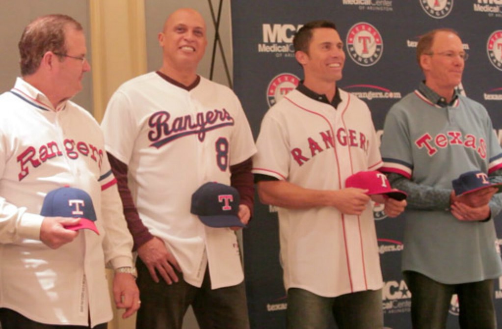
Next year marks the Texas Rangers’ 40th anniversary, and the timing couldn’t be better. If they had hit a significant birthday back in, say, 2007, we all would’ve said, “Have they really been around that long? How have they managed to make so little impact on the field or in the public mind?” But at present they’re the two-time defending American League champs, so the throwback retrospective that they announced yesterday feels earned and appropriate.
A few notes:
• The Rangers’ inaugural 1972 home whites featured one the oddest-looking details in MLB uni history: that little ranger’s badge at the base of the R. It’ll be kinda fun seeing that again. (And remember, the R and the S that bookend the chest insignia stand for then-owner Robert Short, as I confirmed in this ESPN column a few months ago.)
• The arching of the letters on the powder blue throwback looks seriously off. Let’s hope they get that fixed. (And for those who have issues with the Rangers wearing powder blue at home, they have a history of doing that, as we determined a year and a half ago.)
• Interestingly, two different versions of the anniversary logo are floating around (note the differences in the “Anniversary” script; click for larger view):
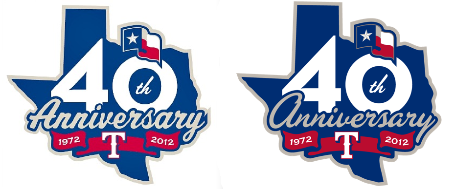
The one on the left was tweeted from the unveiling event by ESPN Dallas columnist Richard Durrett, so it must have been on display somewhere in the room. But the one on the right, which I strongly prefer, is the one they displayed as a patch. Hope that’s the one they stick with. Either way, too bad Rick Perry pushed through that law that says Texas gets to secede unless every new uni element features the state flag. The patch design would be way less cluttered without it.
Oh, and speaking of MLB: New road uniforms on the way for the Rockies, but you didn’t hear it from me. (Instead, you heard it from this guy.)

Because you can’t spell “Santa” without “Satan”: The clock is counting down to the blessed day when Jesus Claus will bring menorahs to all the little Kwanzaaites, or however that works, which means I’ll finally be able to stop reminding you about the following points:
• If you want to buy someone a Uni Watch membership as a gift, full details on how to do that are available here.
• From now through the end of the year, if you order two sheets of stickers based on your membership card design (that costs $26), you’ll also get a free sheet of Uni Watch logo stickers (a mix of all three colors). Instrux for ordering stickers can be found here.
• Speaking of the circular Uni Watch logo stickers, my recent offer still stands: If you want three of these stickers (one of each color), send a self-addressed stamped envelope to Paul Lukas, 671 DeGraw St., Brooklyn, NY 11217. If you want to enclose a coupla bucks or a barter offering, that’d be nice, although it isn’t required.
• T-shirts, beverage coasters, coffee mugs, and the like are available at the Uni Watch shop on Zazzle.
Uni Watch News Ticker: Say whatever you like about Ron Artest, but this looks pretty fucking cool. … Here’s a bunch more of those NFL toothbrushes (from Max Weintraub). … Martin Biron’s mask for the Winter Classic isn’t very throwback-y. Eh, whatever, he probably won’t get in the game anyway. … Brad Wasserman was at a recent Florida Panthers game and saw a display of what appears to be some original design sketches for the team’s logo. … Bowling and barbecue: two great tastes that taste great together (big thanks to Ben Marciniak). … Got an idea for a good sock design? Send it to these guys. If they like it, they’ll put it into production and give you $200 to boot (thanks, Kirsten). … Great job by Curtis Worrell of Helmet Hut, who’s come up with an old Jim Brown helmet with a great story behind it. … Ed Dittberner notes that several CMU basketball players have been wearing shin padding. … While looking for those CMU pics, I noticed that Tre’Von Willis of UNLV wears blacks tights. … Yesterday I asked about the story of Penn State’s original colors being black and pink. Quite a few readers confirmed that the story is true, but Paul Bielewicz took things a step further with this story: “That story was recently corroborated for me by a current co-worker who was a recent Penn State football player (2008-2010). In fact, he said Nike had designed prototype Pro Combat unis in black and pink and shown them to the team. At some point, somebody poo-pooed them before they made it to the field — I don’t remember if he said it was the players, or Paterno, etc.” … Gee, ya think West High School in Arizona had big enough lettering on its 1955 baseball jeseys? (From Kenn Tomasch.) … Grayson Shelton would like to see Arkansas-Little Rock revive its long-dormant football program and has come up with some design concepts for what the team might look like. “Any historical photos on the defunct UALR program would be interesting too,” he says. “I know they won the Junior Rose Bowl in 1949 and played in the Junior Sugar Bowl in 1948 when they were Little Rock Junior College, but I haven’t found many pictures.” … Here’s another team-themed Xmas tree, this time from Brian Anderson, who’s obviously a Packer backer. … New rugby kit for the Vodacom Bulls. “Sort of looks like an old, static-y TV,” says Caleb Borchers. … The Lake Erie Monsters will wear Cleveland Crusaders jerseys tomorrow (from Tom Pachuta). ”¦ More news regarding Minnesota’s new football uniforms: They plan to reveal the new design one annoyingly small piece at a time, beginning with a partial view of what appears to be a matte maroon helmet (from Jeremy Formo). ”¦ “Walmart stores here in Arkansas are selling Cotton Telecommunications Bowl tees that feature the Razorbacks’ Riddell Speed helmet and the hammer merit stickers,” says Stacy Jones. “Never seen something like that on a tee at Walmart before.” Me neither, but then I’ve never shopped at a Walmart before. ”¦ Here’s a weird one: The top-right spoke in Brad Marchand’s jersey crest appeared to be white instead of yellow last night (screen shot by Rich Rutherford).
“In fact, he said Nike had designed prototype Pro Combat unis in black and pink and shown them to the team. At some point, somebody poo-pooed them before they made it to the field – I don’t remember if he said it was the players, or Paterno, etc.” … ”
One of the fears we always had about the post-Paterno era was that Nike would start doing stupid things to the uniforms. Given the unimaginable circumstances with which the Paterno era ended, I can only imagine that the Nike folks will be given free reign to stomp on university’s athletic traditions.
Good. Let ’em.
Their uniform tradition isn’t *that* strong anyway. They’ve had all sorts of tweaks through the years. They had a period of using helmet numbers, their facemask went from gray to blue, they’ve changed shades of blue – going from nearly royal to dark navy, they’ve had pant stripes which then disappeared, and they’ve gone back & forth between having the collar & sleeve cuffs being colored or matching the jersey. They have NOT worn the same uniform for 50 years.
Granted, I don’t think anyone wants to see Nike make Penn State into Oregon 2.0 or anything, but a little bit of uniform modification or a pink & black fauxback is hardly the end of the world.
However strong you feel it is, it’s definitely one of the top five strongest on-field brands as far as college football goes. The Cowboys have made many tweaks over the years, but their on-field brand is still among the strongest. A team’s on-field brand isn’t defined by the minutiae; it’s defined by the bones. In this case, it’s the white helmet, blue stripe and jersey, white numbers and pants, black shoes.
You really think they’re a top 5? Historically, they’re not even that good of a team. When I see a blank white helmet, I don’t automaticallyh think Penn State, I think clip art. Blank gold or silver, on the other hand, is obviously Notre Dame or OSU, respectively.
I’d say that Alabama, LSU, Ohio State, Michigan, Notre Dame, Georgia, USC, Florida, Florida State, Miami and Texas are all easily “stronger brands” than Penn State.
I’d put it up there. They’re definitely instantly recognizable as Penn State.
The Jeff, if you’re talking strong uni-traditions, you’re also skewing east ….what about Nebraska, Oklahoma, or USC?
And I think your mileage may vary on the solid gold helmets. My personal first association is Navy.
Ah, you said USC. My bad.
White helmet with blue stripe / plain deep blue uni with white block numbers in college = screams Penn State. Nobody else has a blank white helmet or their look. They do a lot with less. Why would anybody want to mess with that? It’s a very sharp looking set and sometimes blue is very difficult to pull off in football; especially with helmets. Not every single college needs to change for the sake of change, whether they’re prestigious or not.
Let’s not forget someone who hates all-things white considered.
Penn State top 5? Nah. Top 10? Maybe, just. (And even though half my family is Midwestern Irish Catholic, solid gold helmet says Navy to me, too, but that may just be lingering bitterness about Lou Holtz.) Penn State may have the strongest identity in all of football composed entirely of such simple elements, though, and that’s something.
It really depends on how anxious PSU is to disparage the events of the recent past, and how much the alumni need to be placated.
Pink and black would have been a huge improvement.
Biron’s mask looks to be a throwback to John Vanbiesbrouck (former Ranger who will be playing in the alumni game). That is, if you consider the 80’s/90’s an era that qualifies for the throwback term.
And now that I think of it, maybe they mislabeled it and that is Vanbiesbrouck’s mask for the alumni game?
Looks like Gilles Gratton’s mask from the 70’s actually.
I was going to say Gratton as well. Yes, Biron had a similar mask last year, but this one is a little less demonic looking (“normal” eyes instead of red), and both can be seen as throwback-inspired.
Never knew Beezer to have a big-cat mask in New York – the mask I remember had bees swarming over the Manhattan skyline (his Panthers mask cannot count as a Rangers throwback, after all).
I was thinking the same thing, that is a tribute to Gratton. who would sit in his crease ans growl at the other team. I bet the fact that the Rangers’ “faux-backs” more than slightly resemble the 1976 uniforms had something to do with it.
Biron’s mask is a “throwback” tribute to Giles Gratton, the former Rangers keeper.
Not so much a throwback in that Giles played for the Rangers for only one year in 1976-1977.
link
There you go, knew it looked familiar.
Her guys, hopefully someone can recall this better than I can. I think it was a few months back I saw a link to a place that makes custom backs of jerseys (as art). I’ve tried searching but I’m getting a ton of results, so maybe someone remembers this. I’m working on making posters for my son’s room with his name on various team jerseys and I just wanted to look at some reference pieces for inspiration.
Also, anyone know what size MLB teams (notably Red Sox) use for their numbers? I saw the NFL ones in the recently posted style guides but MLB teams didn’t have specifications for number sizes
I believe you either mean this:
link
Or this:
link
The first one is printed on heavy paper stock; the second one is uniform fabric.
did you mean this?
Exactly the links I was looking for, thanks guys!
Doesn’t surprise me that the U of MN Golden Gophers are unveiling the uni one tease at a time…beyond coach Jerry Kill, what else is remotely interesting about the Yellowish Nocturnal Rodents during bowl season?
Typo alert: that’s Brad Marchand of the Bruins, not Andrew.
And that might just be a lighting effect, the spoke looks fine here…
link
Holy crap, Daniel Alfredsson’s stache makes him look like a real life Swedish Chef.
It’s BRAD Marchand. Who is Andrew Marchand?
Andrew Marchand is a guy I used to play softball with (and an excellent chess player). Accidentally/reflexively inserted his name into that Ticker item. Now fixed!
Andrew Marchand was also what Bill Simmons thought he was called.
Get it right guys, the correct name is “Nose Face Killah”.
Andrew Marchand is a reporter on ESPN Radio in NYC.
hey ricko…
are those blue tops going to be worn with white pants or blue pants?
Phil is referring to this (which I’ve just added to the main text):
link
Further details here:
link
Not uni-related, but pretty cool…
(link)
I wish they’d stop calling those dominoes. Dominoes have dots on them. Those are just plastic tiles.
/still cool to watch though
there is no need for argument…there’s no argument at all
Grandkids are going underground?
Van!
My favorite part is when the E = MC^2 part fails. Stupid foreigners, get an iPad.
Wasn’t Einstein German?
Reminds me too much of the Red Scare.
“Either way, too bad Rick Perry pushed through that law that says Texas gets to secede unless every new uni element features the state flag.”
This just made my day.
Mine, too.
Those Panthers sketches look like tattoo flash. I could see them hanging in a tattoo shop right next to the skull with dagger and snakes tat.
They looked familiar, and then I remembered why: link
Still, good to see, and it’s good to have additional views of these designs.
The Biron mask is definitely a Gilles Gratton ‘tribute’ mask. Gratton may have only played for the Rangers for one season, but that was ‘most’ of his career — 41 out of a total of 47 NHL games. The mask is notable however because it is one of the most ‘artistically’ significant masks in NHL history — perhaps second only to the Cheevers mask.
The Cheevers – you know the one, all the stiches – is considered the first mask of any type to have ‘artwork’ on it. Gratton’s mask is notable as the mask that changed the game of artwork on masks from clumsy graphics on masks to full fledged pieces of art. Designed and painted by legendary mask maker Greg Harrison, the Gratton mask ushered in the era of using the mask as a canvas for more than a few colored stripes and a team logo. For those who love goalie masks, it is a major piece of history, and kudos to Biron for honoring a true contributor to the art of masks.
Your buddy at Third String Goalie even calls it the greates mask ever: link
I think I have to agree with Third String Goalie.
these were my favorites:
roy:
link Roy
belfour:
link Belfour
young:
link
barasso:
link
oops! pietrangelo’s, not young’s… get them mixed up. LOL
If puck marks were considered artwork, the stitches were certainly unique and it qualified Cheevers as having the first artwork. But link with truly having something painted onto his mask in an artistic design, paving the way for more elaborate designs such as Gilles Gratton’s mask.
In fact, he said Nike had designed prototype Pro Combat unis in black and pink and shown them to the team. At some point, somebody poo-pooed them before they made it to the field – I don’t remember if he said it was the players, or Paterno, etc.”
I doubt it was Paterno. He generally reserves his poo-pooing for ON the field.
Once again, Uni Watching has invaded my dreams. I had a dream last night that I was on the Steelers’ preseason roster. The first preseason game must’ve been away, because we were wearing white jerseys. My name plate read “JASON BERNARD IV” (so, FNOB + a make believe suffix), and my number was 166.00 . It was pretty cluttered. And I called my mom to tell her what number to look for on the sidelines. “Look for 166.00!”
You may want to see someone about that… that’s definitely not normal.
That sounds like an awesome, and completely sane, dream. Last night I woke up realizing I was dreaming about writing use-case scenarios for online PDF functionality. (Don’t ask.) That is the kind of dream that signals a need for professional intervention!
However, no way does FNOB and suffix make it onto a Steelers jersey. J BERNARD or BERNARD IV, not both. Seriously, people, let’s not cross the line from healthy fantasy into dangerous delusion, eh? [Kidding! in case that’s not obvious.]
Did the Steelers go back to their block font, or at least stop making the numbers italic?
If so, it’s a dream I can believe in.
Mark – it was the modern font. There was no element of time travel. I’m okay with that, though. The new font doesn’t bother me the way it does others.
Rogers – it really was something. The FNOB+S wrapped the whole way around to the outer edges of my pads. But I was even more intrigued (in-dream) by the .00 of my number!
Appalachian State wore gold in baskeball last night, first time in many years.
link
Bad start for the Gopher uniform unveil. Looks like they’re sticking with the maroon helmets.
What’s wrong with maroon helmets? Maroon isn’t exactly an overused color like black, navy, or white.
I don’t think there’s anything wrong with maroon. Plus, it’s a fun word to say.
Maroon.
Kind of like “Gophers!”
Yeah, but aren’t they the Golden Gophers? Me? I liked the white helmet link but could live with this link
The Gophers have a tradition of losing with the Maroon helmets. Plus they tend to look like USC in maroon helmets. Wish they would have gone with white or yellow/gold.
This is the one team I’d like to see in yellow helmets and jerseys.
PLUS, these uniforms are, once again, being designed by Nike. And I think Nike’s designers (well, it’s not JUST Nike, but they’re the worst) are influenced more by video games than by football games.
That Arkansas Cotton Bowl tee is odd in that it makes no mention of who the opponent is (Kansas State). Looks like they are playing against…themselves.
Exactly what I thought… hilarious!
So this is what the Texas Rangers TBTC match-ups will look like (slightly cleaned up & mocked) in chronological order:
link
Note in 1976 they switched the sansabelt strip pattern from red/white/blue to blue/white/red so we’ll see if they notice that (probably not). And of course we’ll have our checklist with the the sleeve patch & stirrup issues. Never did like the Rangers in red.
The Houston and Minnesota dates will be some of the best uni games of MLB season. I have some strong doubts that they’ll do right by the Angels and Tiges, though, since those are exactly the type of pullover jerseys that modern TBTC games always get horribly wrong.
The cap the Rangers demoed for the Dodgers-script-era unis seems one New Era fabric shade too dark to me.
The first things that come to mind to be the most neglected is sansabelt, we could probably not even hope for that. Next would be thick collar / sleeve trim tho it looks like they’re close on the 70s ones. Then pants stripes, then the pullover, then the cap logo, which the Angels will probably end up with the fat-halo of 1989-92 (or some kind of wrong variation of the big-A). Then batting helmets, which are just wishful thinking.
It’s these kind of things just deprive a really fun promotion into a frustrating aesthetics nightmare of laziness, poor research and oversight. Do it right or don’t do it at all. I get there’s limitations to certain materials, but there’s no excuse for a wrong wordmark or cap logo; not in this day & age. If New Era can churn out 8 billion fashion caps a year, they can get these right.
great Rangers news–I ws there for the first season in DFW, loved that little badge inside the R.
The goalie mask is a throwback to Rangers goalie Gilles Gratton. Guy was a bit out there to say the least. I think he wore the mask in the mid-70s but only for a season or 2.
Those Cleveland Crusader hockey unis look pretty sweet. Interesting that the dominant color is purple, as it is for the Holy Cross Crusaders of Worcester, Mass.
Of course, the word “crusader” is a bit dicey these days. Arabs and Kurds, in particular, aren’t so crazy about commemorating armed invaders from afar, and George Bush got into a heap of trouble when he talked about the “war on terror” as a “crusade.” One might ask whether there are many Arab- or Kurdish-American minor league hockey fans who might take offense, but the Arab community in Detroit is big and complex, and… Well, anyway, it’s a one-day thing for the hockey guys. For the Worcester folk, dropping “Crusaders” would probably result in a steep decline in alumni giving, so I figure that tag will hang around for the foreseeable…
Love the way Phil sneaks in those pop song moments. Just TRY to throw one past me, baby.
might be putting just a tad too much thought into that…
Considering the WHA Cleveland Crusaders never had any backlash towards their names, I’d say honouring a team from the past shouldn’t present any backlash either.
Sometimes a uniform is just a uniform, Connie. :o)
i’m gonna take morphine and die, conn
Great, if typically oversnarky Slate piece on vintage t-shirts. Sports/uni quotient Blue, or Guarded:
link
We’ve shopped at Sock it to me Socks (the guys you linked today, Paul) – and we’ve been happy with their products and designs. I bought a pair of Meat socks (black socks with red t-bone steaks on the sides) and I rock them whenever I can. Unfortunately, they don’t sell those anymore.
Did those ’72 Rangers jerseys have names on the backs?
I hope not, and *really* hope that the team didn’t add them like some teams have done with their fauxbacks.
Did those ’72 Rangers jerseys have names on the backs?
Yup:
link
USC Upstate went BFBS last night vs. Ohio State
link
link
link
The catch of the day was “great”
I don’t get it. Do actually like it, or are you secretly saying that you don’t?
I love it – I’m just playing along with the theme of “misplaced” quotes.
I am not going to ever call that idiot Metta World Peace.
Signed,
Hercules Q. Einstein
You don’t have to. I just like the idea of seeing that NOB on the court.
link
That was my first thought, too. I actually mentioned it to the NBA execs when I was up there last week, in fact. Apparently, none of them had made that particular connection (or maybe they were just humoring me).
Ditto.
What’s with the Artest hate? Since the big fight, he’s turned himself around and is a generally good guy. A little kooky, sure.
I like him.
Ditto.
Not Uni related, but State Farm is getting a new logo in January. First change in almost 60 years.
Details:
link
They did a good job I think.
Logo creep showing up in the criminal world now too!
link
For those that may care. The AFL just released it’s top 25 uniforms in the history of the league and the ability to vote for your favorite if you’re registered:
link
I’ll admit I’ve been an AFL from from the start but a lot of these are pretty much meh to me. Other than a few teams the newer looks the teams have gone with aren’t better than older ones that should’ve been put on this list. And I say this as a retro/throwback hater.
Would have like to have seen the Ft. Worth Calvary, Las Vegas Sting, and Pittsburgh Gladiators on that list of top 25 unis.
Should be “Cavalry,” not “Calvary.”
Two Saints players — OG Carl Nicks and DB Malcolm Jenkins — were named to the USA Football 2011 All-Fundamentals Team. Check out link for the occasion. I don’t think that I’ve seen a helmet with a 3D graphic on the sides like that before.
What an atrocious NFL uni matchup tonight.
I thought I was told earlier this year that politics had no place on uni watch. What happened to that?
what politics?