Click to enlarge
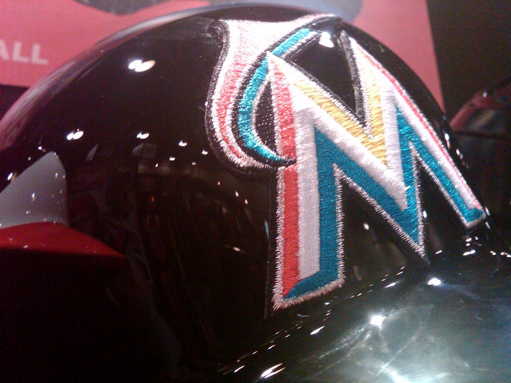
Tyler Kepner is at the MLB winter meetings, where he spotted something very interesting: a Marlins batting helmet with a raised/embroidered logo, just like the one used by the Cubs. I’m trying to confirm whether this was just for display purposes or if the Marlins will be going with this logo format on the field, but I’m pretty sure it’s the latter.
And speaking of MLB headwear, Tyler also spotted a pair of black A’s caps. But I double-checked with Oakland equipment manager Steve Vucinich, who confirmed that they’re not going back to black (actual quote: “No, no, and NO!”), so those caps must’ve just been old stock. Phew.
New ESPN column today — the annual holiday gift guide. Enjoy.

Culinary Corner: On Saturday I went to Fleisher’s to pick up a coupla pork chops. While I was there, I noticed they had these little lamb sirloin roasts in the display case. They looked vaguely like these, but a bit smaller. I’d never seen such petite lamb roasts before, and I was intrigued, so I bought one. It was 1.66 pounds, or about the same as two decent-sized steaks.
The roast sat in my fridge for a few days until last night, when I decided to make it for dinner. First I put a little bit of olive oil in a heavy skillet and seared the roast on its top, bottom, and both ends — about a minute per side. Then I removed it from the heat. While it cooled off, I made a paste, a simple paste by mixing together the following ingredients (the measurements are approximate, as I was just improvising):
2 tablespoons olive oil
3 or 4 garlic cloves, pressed
1 tablespoon dried rosemary
1/2 tablespoon dried thyme
1/2 tablespoon kosher salt
1/2 tablespoon pepper
Yes, fresh herbs would’ve been better, but I hadn’t thought ahead to buy any, so I used dried. Anyway, I mixed everything together to make a paste, which I then slathered all over the seared lamb. Then I put the lamb on a small rack and popped it into a 350-degree oven for 45 minutes.
Holy fuck — it was so good! If I’d known it was going to turn out so perfectly, I would’ve taken photographs during the entire process. Instead, I didn’t think to reach for my camera until I’d already eaten about half of the thing. Looking forward to leftovers tonight. Baa-aaaa-aaa!
Uni Watch News Ticker: Anyone know what was up with the patch Junior Hemingway was wearing last weekend? The other Michigan players weren’t wearing it (as noted by Juan Martinez). … Here’s another high school team using the Phil Simms-era Giants as a model for their helmets: the Tri-Valley Bears from Grahamsville, New York (from Tom Faggione). … I’m not a sneakerhead, but Aaron Klett says this photo of Mark Ingram shows him wearing Warrior custom Burn 5 lacrosse cleats. “Generally, lacrosse cleats are pretty much football cleats, so it’s not too much of a surprise, but interesting to see nonetheless,” he says. “Guess it’s a matter of time before the NFL gets wind of this and puts an end to it.” … Yet another college hoops team going gray: East Carolina (from Matt Holt). … Here’s more about those white shoes Tiger Woods was wearing the other day (from Charles Neiswender). … New third kit for the Portland Timbers, plus here’s an article on their uniform history (from Michael Orr). … Buried deep within this story is the news that the Twins and Royals will play a throwback game next season “with the Twins donning 1954 Minneapolis Millers uniforms and the Royals wearing Kansas City Blues uniforms.” Both of those teams played in old American Association. … Two college wrestling teams will compete for a WWE-style belt. All of which makes me wonder: When was the first championship belt awarded? Was it for boxing, wrestling, weight lifting, bodybuilding, something else? … Here’s something you don’t often see: a vintage set of women’s zebra-wear. … New soccer ball for MLS (from Patrick Runge). … Yesterday I mentioned how great the three-part New York Times series on Derek Boogaard has been. Here’s an excellent article about the guy who wrote it. … Did you know there was such a thing as the Pop Warner Super Bowl Championship Game? There is! And here are the helmets that the kids will be wearing while their parents act like jackasses in the stands (from Ronnie Poore). … Interesting article on how the co-founder of the St. Louis Tea Party quit the organization, and then her husband demanded that the group stop using the logo that he designed (from Robert Silverman). … Speaking of non-sports logos, look at these great submissions for the recent competition to design a human rights logo. Click on the “We have a winner!” link at top right to see which one they chose (big thanks to R. Scott Rogers). … BYU — okay, BYU-Idaho, but it’s kinda the same thing, only the lake isn’t salty — has banned skinny jeans. … Here are some gift ideas that didn’t make it to my ESPN gift guide (blame Kirsten). … Marseille and Dortmund provided some color-vs.-color Champions League action the other day. “Looks like a Crayola box exploded,” says Kevin Hastings. … The mighty Fleer Sticker Project recently ran an excellent piece on the intersection between the NFL and IHOP (thanks, Brinke). … The Mets have signed Jon Rauch, who’s 6’10”. Former Met Eric Hillman was also 6’10”, which I believe makes the Mets the only team ever to have had two players of such stature. ”¦ As an aside, Rauch used to be listed as 6’11”, but all the major roster listings — MLB, ESPN, Baseball-reference.com, etc. — now have him at 6’10”. At this rate, he’ll be my height by the end of the century or so.
That patch Junior Hemingway was wearing has to do with the “honor” of wearing Desmond Howard’s(as a buckeye fan, man do i hate that guy)#21
As he wears #21, Junior Hemingway is wearing the Michigan Football Legends patch for Desmond Howard. This is the “soft” retirement of the #21 jersey, in that it allows it to be worn by Michigan players while still honoring the player who wore it. The write up can be found here:
link
A close up of the patch:
link
I want to know what happens when they start having multiple “great” players with the same number. How many patches can you put on one jersey?
/In other words, this is a stupid way of honoring anyone.
Respectfully, it’s not. The standard for Michigan Football Legend is pretty high, like “Heisman Trophy” winner or “Consensus All-America”. The argument is that Michigan doesn’t have the retired numbers posted anywhere in the stadium, and the five retired numbers were being lost to history, so this was a compromise. It also ties in very nicely with the legacy of the #1 jersey for Michigan wide receivers.
Besides, if you’re worried about multiple players needing to be honored, well, these are the problems you want to have.
I’m with Jeff. I think it’s remarkably stupid. Seriously, what if Hemingway wins the Heisman or is a consensus All-American? What then?
Either retire his number or don’t. Is winning a Heisman trophy worthy of such an honor? Either it is or it isn’t. Why half-step?
And why not display the retired numbers in the stadium? Surely it can’t be because it would defile the integrity of the building. Adding lights and 1000s of seats already accomplished that.
Nobody loves Michigan like Michigan.
I agree as well. Personally, I’m totally against retiring numbers at all, and love the fact that my favorite college team doesn’t. I enjoy thinking of ALL the greats that wore a certain number, not just the Heisman winner.
Chris, I couldn’t agree more. I’d like to see that become standard in all sports. Have a great player whose number you want to remember? Then make sure people are always wearing it in the future.
“Nobody loves Michigan like Michigan.”
Ha. Isn’t that kinda the point of being a fan of a school or team?
“Have a great player whose number you want to remember? Then make sure people are always wearing it in the future”
BAD idea! retire numbers for great players! i’d hate to see the next chris borque or milan kraft come up to the penguins wearing #66. or… i don’t know… ANY pirate wearing #21! bad-i-dea…
That’s not a bad idea, actually. It’s what English soccer clubs do – reserve storied numbers for players of whom great things are expected, and who them have to earn them.
I can think of an American example – Cecil Cooper was a beloved Milwaukee Brewer, and his #15 (my number in litle league) was taken out of circulation when he retired. It was kept out of circulation for almost fifteen years until Ben Sheets, the club’s first round draft pick and hoped-for ace, made it to the majors. The club made a big deal about presenting him with this number that they had been keeping aside.
Contrast that with the Packers’ #5, which could have been retired for Paul Hornung but has just been held out of circulation (save for 1987 when Don Majkowski briefly had it).
cecil cooper’s number was taken out of circulation. he was retired, his number wasn’t oficially. totally different.
one steeler’s number is retired. there sure as hell are some choice numbers you won’t see on their backs on gameday though…
like i said, bad idea
@Bernard – if Hemingway wins the Heisman, then put two patches on the jersey, or have both of their names in the patch. The next player who wears #21 has to give two presentations on both Hemingway and Desmond. I don’t really see a problem with two “Michigan Football Legends” sharing a number.
I personally think it’s a great idea. There is talk of unretiring the retired numbers, so that anyone who wears #11 in the future will know the history of the Wistert Brothers, and share it with their teammates in a presentation. And instead of a retired number, those players will be well known as “Michigan Football Legends.”
After 132 years, 77 All Americans, and 3 Heisman winners, it’s a pretty sane way to keep jerseys in circulation for a team of 85 scholarship players and more walk-ons that play in a sport with further restrictions on numbering of uniforms, while still honoring those who wore those uniforms before.
As for the look of the stadium – yea the luxury boxes changed that. The lights don’t really bother me, and while the luxury boxes have certainly changed the look, I would rather them make money off of those than off of ad-space. And there’s still no space in the stadium for advertising – all the honoring is done in the concourses.
More explanation here:
link
Michigan used to always be about #1. That was the go to number for a guy who they thought could be a special receiver. No patches. Just give #1 to the WR who you think will carry on the tradition. The Buckeyes used to do that with #36 at linebacker. Marek, Cousineau, Spielman, et. al. That hasn’t been the case recently as more and more younger players want their own number and don’t care enough about tradition to go along with that.
I get Michigan using #21 as the new ‘special’ number, but why compound that with the patch? Seems like a ‘hey, look at me’ thing. The number on the jersey is the biggest element. That should be enough. Yes?
I get Michigan using #21 as the new ‘special’ number, but why compound that with the patch? Seems like a ‘hey, look at me’ thing. The number on the jersey is the biggest element. That should be enough. Yes?
It should be… but we live in the “look at me” era. Teams go out of their way to draw more attention to “clutter” like that. It’s asinine if you ask me.
It’s not really a “hey look at me” things at all – it’s more of a “hey look at the history of our program, and the guy who wore this jersey before me and all the wonderful things he did on and off the field.” The guys who wear it give a presentation to the team every year on what that player did. It’s honoring the legacy and history of the program.
Junior Hemmingway wears a commemorative patch for Desmond Howard. Every time a player wears #21 at Michigan, they will wear that patch.
Chris Young, also 6’10”, pitched briefly for the Mets in the spring. So that’s three! There are also rumors they’ll be bringing him back even though he missed most of the season with an injury. So there’s an outside chance they’ll have two 6’10”-ers on the same roster…
Wow — I didn’t realize Young was that tall!
Paul, skinny jeans aren’t “banned”. It might be on the way to becoming banned but from the article, it sounds like they’re encouraging students not to wear the article.
“The Testing Center has not made any new standard, nor has there been a ban of a particular piece of clothing. The effort of the Testing Center as well as with other employees and students is to encourage others in their commitment to comply with the Honor Code.”
“wear the skinny jeans.”
According to friends at BYU-I, the Testing Center is indeed enforcing this rule. Students whose jeans are deemed “too skinny” are being turned away from the center and asked to change before returning to take their exams.
Too bad skinny jeans can’t be banned EVERYWHERE.
Case by case basis my friend.
No man should ever, ever wear them…ladies, however, knock yourselves out.
I assumed the part about ladies was implied.
My daughter is a high school senior, so we’ve been touring college campuses. Since we’re Mormon, BYU and BYU-I were included in the visits. Up in Rexburg, there are posters all over campus, reminding students of the BYU-I dress code. They all include a photo and a little slogan illustrating the violation — a student in torn jeans gets “All Worn Out?”, a girl in beach sandals is admonished “Don’t Flip-Flop”, another girl, wearing a skirt whose hemline is ever so slightly above her knees is asked, “Crossing The Line?” — with the words “KNOW THE CODE!” In Provo, a sign outside the games room at the student center states, “THE BYU GAMES ROOM SUPPORTS THE HONOR CODE. PLEASE OBSERVE DRESS AND GROOMING STANDARDS.” Back in my college days, BYU set up secret check points to monitor dress and grooming code compliance: anywhere you had to show your ID was a potential checkpoint.
In 1981, as a freshman, I was actually cited for a violation of the honor code. My crime: wearing sweatpants to the campus bowling alley. I was also told I needed a haircut.
My daughter has applied to Texas A&M.
“Then I put the lamb on a small rack and popped it into a 350-degree over for 45 minutes.”
Minor spell-check.
Also, the patch on Junior Hemmingway’s jersey — *looks at above comments* — Dammit… -_-
Thanks. Now fixed.
Yep, the Pop Warner SuperBowl is played every year right here in Orlando at Disney’s..er, ESPN’s Wide World of Sports complex.
That IHOP board looks like Butkus to me (with some helmet altering).
Why are the noses so long on those shorts?
Oh, by the way, the patch on Junior Hemmingway’s jersey…
Cool catch of the day. I really like the link.
Have you heard about the patch on Junior Hemmingway’s jersey?
This may have already been covered here, but MLB has enacted a dress code for members of the press. They are apparently the first US league to do this.
link
I read that as well. So, they are policing the people that write about their sport, but they’re more or less not policing the dress off the actual players in the league? Unbelievably terrible.
Wait so they care about what the press wears, but let Jeff Loria dress his team in absolute nonsense? WTF.
That St Louis Tea Party logo is a great example of the gulf between concept and execution. It’s a great logo idea that’s ruined by poor execution. It’s literally hard on the eyes with those red stripes buzzing in the blue blob. Make the whole thing red with white stripes & star and blue text, and bam, it would be a logo worth the two sides fighting over. (Well, the Arch/handle needs to be bolder, and the typography reset as a strong horizontal element below the teapot, with a more elegant type, but still, the basic point stands that it’s a strong concept with weak execution that could have been very easily improved from D-plus to a B.)
“… Interesting article on how the co-founder of the St. Louis Tea Party quit the organization, and then her husband demanded that the group stop using the logo that he designed (from Robert Silverman). …”
Scott is the man. Agree with his analysis in toto, but I’m a gut-seeker’s delight when it comes to grades. I’d say it was a C+ that could been an A-.
“… Speaking of non-sports logos, look at these great submissions for the recent competition to design a human rights logo. Click on the “We have a winner!” link at top right to see which one they chose (big thanks to R. Scott Rogers). …”
Scott again! What an interesting contest. There were some quirky entries that I would have pushed (that crude little hand waving image on the first page was cool), but among the finalists, I think they did pick the best. “We have a winner” button is upper left, by the way.
Careful, Connie, I’m a native Midwesterner, and any praise stronger than “eh, not bad” is liable to send me into a shame spiral that ends with gorging on hot dish and Leinies while listening to Prairie Home Companion with the lights off.
As a political animal and design buff, I gotta say I’m really disappointed with the 2012 presidential campaign so far. Not commenting on candidates or issues, but the logos and branding are terrible this time around. Especially after 2008, where both parties had some excellent logos and design, with the best logo winning each party’s nomination and two strong branding packages competing for the White House. The Obama 2012 mark feels lackluster to me, at least compared to 2008. And on the Republican side, only Cain and Huntsman had/have anything approaching interesting design. The rest of them feel like county election clip-art yard signs, with terrible kerning, toothpasty swooshes, and gradients being the norm. There’s a lot of great design going on in politics & advocacy at the moment, but federal candidates seem to be taking a step back from interesting design. Kind of like how MLB design mostly declined in the early 2000s, while the minor leagues were filled with innovation and good design.
Shouldn’t any Tea Party logo involve a crate of tea? Not a tea pot? The actual Boston Tea Party wasn’t a tea party. It was a rebellion. It was a rejection of tea and the tax it represented. Using a tea pot makes it seem like a bunch of revolutionaries sat around a table and had a dainty discussion over the inconvenience of taxes. Screw that noise. They dumped that shit over board and made a mess of things! Because that’s how the revolutionaries rolled dammit! Action, not tea sipping.
Well, tea bags weren’t invented until the 20th century, but that hasn’t link so far.
Good eye. I picked out all those same tidbits, Arr Scott.
Another high school that uses the Simms-era Giants model is Lompoc High in California:
link
“while their parents act like jackasses in the stands” Seriously? What a pathetic, mean spirited comment. Sure, every group/sport has players/parents that set a bad example but to call all the parents attending this jackasses is flat out wrong. Yeah, let’s just call every parent with a kid playing Pop Warner football a jackass..great idea! And before you say it, no, I don’t have a kid playing Pop Warner football. That’s just an ugly, narrow-minded comment.
Well, you’re basically right, John, but don’t get too mad. I am one of those loser parents who goes to his sons’ ball games, and, yeah, most of us behave ourselves.
But there are jackasses galore. Paul painted with too broad a brush, parents are humans too, it’s mostly good, but I’ve met me some beauts.
But Paul, darlin’. Hyperboles R Us and all that, but one more remark like that and you can expect a visit from my friends Vito and Dominic.
parents are humans too
Ah jeez, next you’re gonna tell me you believe in Santy Claus…
Your lump of coal is on the way, baby.
I thought it was humorus. Take it lightly. I’m sure he’s not talking about “you” (whomever might take offense to casting a broad net with the LLBB parent comment. In the time I’ve been reading Paul’s work on here and the mothership, I feel that he is very thoughtful on how he says things and at times utilizes comments that are way off kilter to evoke a laugh. Paul, keep doing what you are doing. I’ll keep reading!
Have you ever seen that evil TV show, about the little girls in the dance academy, with the Bronko Nagurski in drag director, and the scheming, utterly vile stage mothers? The only reason that someone hasn’t come out with a similar show about parents of little leaguers is that the result would be so depressing, so oppressive, so utterly absent of any redeeming social value, that its airing would usher in the Apocalypse.
Of course there are some good and supportive parents whose kids play youth sports. I’m sure that a few members of the Romanian Secret Police were nice guys, too.
It’s a poisonous brew, the mixture of aging adults nursing foiled dreams, aggressive and hypercompetitve coaches, the fantasy that little league prowess will eventually result in the Big Payoff of professional superstardom, and prepubescent kids being forced to shoulder the pressure of insane expectations. With all due respect to those of you who are good, supportive parents, organized youth sports are a blight on our society.
It’s no different than any other part of society. Does road rage make driving a blight on our society? Does a Giants fan getting pummeled at Dodger Stadium mean Major League Baseball is a blight on our society? Let’s not diminish the bad some people do, but let’s not blow it out of proportion, either.
That being said, I’m not complaining that my son chose to not play any sports this year…
Different sport, yes, but there’s a reason that posters like link, link and (my personal favorite) link exist.
So broad brush, wide net, stereotyping or whatever Paul may have been doing — he’s not totally out of line with this one.
(And I DO have kids that play youth sports.)
Jim, those posters are still some of my all-time favorite PSAs.
Also that should be noted: Hockey Canada’s video PSAs dealing with the same subject.
link
link
link
link
link
link
Those are pretty great.
Note to self: ***DON’T READ COMMENTS ON YOUTUBE***
I’d love to see the NHL come out with something like link only with two players instead of two parents.
Read the Derek Boogard feature last night. If I wasn’t already anti-fighting, that would have made me so. Paul’s right…that’s Pulitzer-worthy stuff.
Sorry…Boogaard.
Jesus that Miami Marlins logo is ugly. It looks like something you’d find on the Disney World monorail.
Bingo, we have a winner! Not a MLB logo, a stadium logo, a BASEketball team logo, or a company brand but a Disney World monotrail logo. That’s exactly what it looks like.
That monorail example has, in fact, already been displayed a while back. I’d link it here, but I suck at that stuff.
I’m cool with it except for the SIZE.
I agree, it is way too big and there are way to many of them on the uniforms. The sleeve patch needs to go.
I wish they went with either the fish or the M, not both. It was already a pretty large & vertical logo with the M.
And look how big it is on the batting helmet: going almost way back to the top center! The marlin may not even show up on TV.
It looks like it should be the logo on the smokestack of some ugly modern cruiseship.
That’s funny. My initial reaction upon seeing that logo when it was leaked was that it reminded me of something you’d see on a convention center’s letterhead, or something of that nature. I still see it that way.
Ministry of Magic?
Not sure what the big deal is with the Marseille vs. Dortmund uniforms. Dortmund are in their traditonal Yellow and Black, and Marseille were in their third kit (which is subduded for them), because the game was at Dortmund.
Marseille’s third uniform changes colors from time to time to reflect the color of one of their several supporter’s groups. This year, they’re wearing orange, the color of their “South Winners” group.
link
(go the section about “Supporters”)
No “big deal” – just pointing out an interesting and colorful uni match-up.
Gonna take a look at the Marseille vs. Dortmund pic…OWWW MY EYES!
I was researching about the Florida Marlins a few years back about their rather tall rotation when I came across this 2009 article.
link
Sorry if it does not link I am terrible with html.
Link works fine, Matt.
Hey Paul, thanks for the recipe. sounds delicious. and where did you get those “The Dining Car” plates? they are cool
where did you get those “The Dining Car” plates?
Bought them years ago from these guys:
link
No longer available, alas.
If you ever want to get rid of those plates, you have my address…
I know a certain soon-to-be-4-year-old who’d love one of those for his birthday or Christmas or just for no particular reason. *hint, hint*
Thanks to the internet nothing is ever “truly gone for good”, although they do seem to be out of stock on this one.
link
Visit a train show. They usually take place at county fairgrounds, armories, etc. Do a google search for train shows in your area, they have china and plates and artifacts, etc. Be prepared though, things like china are getting rare and will cost some dough, finding full sets is also rare.
I’m surprised the NFL doesn’t sic their legions of lawyers on Pop Warner for using the term “Super Bowl”
At least they didn’t use the Motion W on the Warner name or Wisconsin would be all over them.
I believe there is some sort of affiliation between the NFL and Pop Warner.
There HAS to be some association. Nothing that big would ever get by the NFL lawyers… who go after churches for having “Super Bowl” parties.
Those Timbers’ thirds are fooking awesome. I love the retro Alaska Airlines lettering. The only thing that kills it for me is the gross new logo on there. I’d attempt to remove it and replace it with an old crest if it’s possible.
Reportedly, Adidas considered that, but the old logo is now part of their “lifestyle brand”, not their sports team brand.
So they keep their clear lines of product demarcation and we get the new logo creep.
But that didn’t stop Adidas from using the old trefoil logo on those Notre Dame and Michigan throwbacks that they wore back in September.
The Michigan AD demanded that the trefoil logo be used. adidas wouldn’t have done it otherwise.
With the name change to the Miami Marlins, this should definitely be the official team song: link
Puck Daddy Blog on Yahoo has a story of a guy who made a chain mail hockey sweater. crazy
Wow!
link
Yeah, I think this is one of the extremely rare cases where the word “epic” actually applies.
I was just reading this on my newsfeed. Outstanding work!
If the Royals and Twins are wearing American Association throwbacks, why can’t my Brewers? It’s only been fifteen years since they did that.
Holy shit. link is literally link.
Actually, looking again at that main page on the catch of the day, I parked right in front of link this morning (an angled spot facing the “Ed’s Sign” sign) because I had to pick up something at the Glad Cleaners behind the TV shop.
The back of my car was pointed toward link.
And… to make this “uni-related” … what was I picking up at the cleaners? My son’s link. (In case anyone’s wondering, the nameplate needed to be sewn back on — we don’t have it cleaned professionally).
Oh, and link is even closer to my house than the Apollo Plastics.
Man, I really do love the northern portions of your town. Does one say “North Chicago?”
North Chicago? Nah, that’s a whole ‘nother town about 30 miles north of here. Home of the Great Lakes Naval Station — it’s closer to Wisconsin than it is to Chicago.
I live on the Northwest Side.
Today’s COTD is fantastic – I’ve always had a strange interest in that kind of thing…
Agreed. Love the Central Camera neon sign… brings back memories of college (Photography major, Columbia College Chicago.)
Jon Rauch and Randy Johnson were teammates on the DBacks, so I think the Mets are beat on that front.
Ah, fuck — really? I didn’t realize that….
Randy Johnson and Ryan Anderson were the Big and Little Units in Seattle. Both listed as 6’10” as well.
Used to happen every once in a while that Rauch would immediately relieve Johnson. I remember the announcer, one time, remarked, “How often can you roll out a 6’10” starting pitcher, and follow him up with an even taller pitcher?”
Any photos of the cubs helmet mentioned?
Here’s the logo appliqué that the Cubs use:
link
And here’s how it looks on the helmet:
link
link
Here’s a good view of it being knocked OFF of the helmet:
link
They’ve been wearing this style for decades:
link
Other teams used to go with the raised helmet logo as well:
link
link stayed on.
I like the M hat, I just don’t see why they added the weirdly placed Marlin also.
I like the hat also except for the gigantic “M” logo, that thing is far too big.
link
St. Louis University High School (SLUH) has been using the Simms-era Giants theme for awhile as well. But does it count if the colors aren’t exactly like those from the era?
link
Not sure why the link goes to a busted site, but hopefully this works…
link
Guess one of the Florida papers picked up on it, but this is the first thing I thought of when I saw the new Marlins logo…
link
MLB dress code…for the media.
link
pssssst….mlb!…..your ON FIELD product looks like SHIT……
See-through undergarments and miniskirts…whaa? What the hell was going on in those post-game press conferences?
I like Jack McKeon. If I was a sportswriter I’d wear a white shirt, coat and tie with a little card that says PRESS in my hatband.
Yet another college hoops team going gray: East Carolina
If they had outlined the lettering the way they did the numbers, it would just be GFGS. Instead, that’s a really bad-looking jersey.
I always thought that HR had a great Human Rights logo.
link
No logo.
Wait a minute. Don’t blow no bubbles? Nevermind.
Via Puck Daddy, somebody out in San Jose made a Sharks erm…sweater? out of chain mail.
link
Today’s ESPN column is up:
link
Brilliant.
Never mind the lamb cuz it looks like its not cooked enough for me… I’m too busy diggin’ the DINING CAR plate!!!!
-Jet
I realize not everyone likes their meat as rare as I do (read: not everyone likes meat as much as I do). So you just leave it in the oven a few mins. longer, no biggie.
Looks awesome, Paul. Wish my wife wasn’t a semi-vegitarian… that’s a lot for one person!
Yeah, but it keeps, or you can make sandwiches, or whatever — cook it once and it’ll feed you for a few days.
not everyone likes their meat as rare as I do (read: not everyone likes meat as much as I do)
Ahh, no. Just because you enjoy giving the animal a sporting chance to get up and walk away from the light flesh wound you call “cooking” does not mean you like meat more than those of us who know that a properly cooked steak contains juices that are warm, not cold, to the palette. Why go to all the effort of turning the oven on if you’re just going to eat it à l’Americaine anyway?
(Kidding! I agree with chefs who refuse to cook meat above medium. So I’m not actually objecting to Paul’s meat snobbery, just objecting to drawing the line to one side of my own taste rather than the other. Don’t include me out, as the man said.)
Now in my book, that’s just stupid. You’re in the service industry, you should do anything reasonable to make the customer happy. Asking for a blue plate when every piece of china is white: not reasonable. Extra bacon for a price: reasonable if available. Asking for a
n overcooked-to-fuckwell-done steak: sigh, reasonable, but I would never do that and I wonder why anybody would. To each his own, I guess…Agree with Mike, if people like their steak well-done, make it for them. Its not like they’re not going to enjoy it (I wouldn’t enjoy it, but the person obviously will!)
My mom likes everything well-done. Comes from the fact that she lived in the sticks of Western Australia in the 40s-50s.
link
Just kidding. Although, I do harbor some guilt.
Two ways of looking at it. (A) You’re in the service industry, and the customer is always right. (B) You’re a craftsman, and you cannot in good conscience serve something you know to be bad. The former is the correct response for anyone who calls himself a “cook.” The latter is the correct attitude for anyone who calls herself a “chef.”
Awesome looking lamb & another great culinary installment, Paul. Mmm.
Rare to medium rare meat tastes the best to me, unless it’s burgers of course – that needs to be well done. I gotta try some of that marrowbone you speak highly of.
It is literally true that the more you cook something, the less it tastes like itself. That’s not a subjective judgment; it’s an objective truth. Rare meat tastes more like meat than well-done meat. (Raw meat tastes meatiest of all, which is why some of us like steak tartare, although there are cultural and medical reasons not to do too much of that.)
So when I say, “I realize not everyone likes their meat as rare as I do (read: not everyone likes meat as much as I do),” that’s not a diss — it’s a simple fact. I really like the earthy, mineral-driven complexity of flesh, and the best way to experience that is to cook it rare.
Paul, I think I might need to start “happening by” your end of the neighborhood right around dinnertime…
I don’t know, think the winner of the human rights logo kinda reminds me of this:
link
Not exactly inviting, is it?
With all the Michigan talk today, it reminded me of a question I was curious about. I was watching the 1997 tOSU/Michigan game last night on ESPN Classic. I’ve lived my whole sports life in SEC country so I’m not as well-versed in the Midwestern Conference’s uniform history as that of the SEC. I remembered though how much I used to like the massive TV numbers that tOSU sported then. When and why did they move away from those? Was it simply a matter of moving to the new stretchier fabric? Any help B1G fans?
Those seemed to have gone away when they became a Nike outfitted school. Those big numbers (note the unique 2 and 7) were a Champion trademark.
Could be, but I did notice the Nike check in the game I was watching (1997).
Little nuance that has always bugged me; those three adidas stripes down the sleeve stop because of the MLS logo on one side. Why couldn’t they just put the stripes all the way down the sleeve an just sow the patch over top (even if the stripes are raised)?
R.I.P. Col. Potter.
Or that crazy Gen. Steele from an earlier season.
Or Bill Gannon.
Somewhat related to that.
And to today’s date.
And to the Army-Navy game coming up Saturday…
The Pearl Harbor Survivors organization has announced it is disbanding. No longer enough members to keep it going.
I think about Dad. He died on Halloween 13 years ago. He’d have been 98 three weeks ago. That generation has been dying off for a long while now.
I remember the one time I drove past where Mom and Dad’s home had been up north (where they retired). It’s been built over, like they were never here.
But, as Tom Brokaw wrote, “They won the war. They saved the world.”
So, yeah, they were here. All of them in that generation.
No “12/7” patches or stars & stripes unis today?
BYU isn’t in salt lake you idiot.
He didn’t say it was you idiot. BYU is a lot closer to the Great Salt Lake than BYU-Idaho plus, just like the Great Salt Lake, BYU is in Utah!
TROLL!
There is nothing in Salt Lake except salt, you pot.
That wrestling belt looks like a chip and dip bowl!
RE: Reyes, from ESPN.
Wearing the new look of the Marlins — a cap with a blue, white, orange and yellow “M” with a swoosh that looks like it could be a logo for a fast food chain — Reyes’ dreadlocks dangled onto the white jersey of the team, which was renamed from the Florida Marlins as it prepares to move into its $515 million downtown ballpark next season.
It appears as Reyes’ bank account swells, his hair will shorten.
“We have team rules. Period,” Loria said. “Everybody adheres to them.”
Samson said he arrived at 11:56 p.m. for the initial meeting.
“Jeffrey walked into the Hotel Carlyle with a long overcoat because it was about 12 degrees out, and under the overcoat was the Jose Reyes new Marlins jersey that had not been released yet,” he said. “A few other people in the bar thought that this was some sort of strange, freaky show, because the owner of the team stood up and literally went like this, and underneath was Jose Reyes’ jersey,” Samson said, pulling apart his jacket by the lapels.
link
oh the humanity! its not even october anymore