.
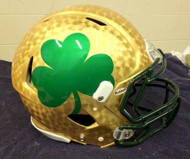
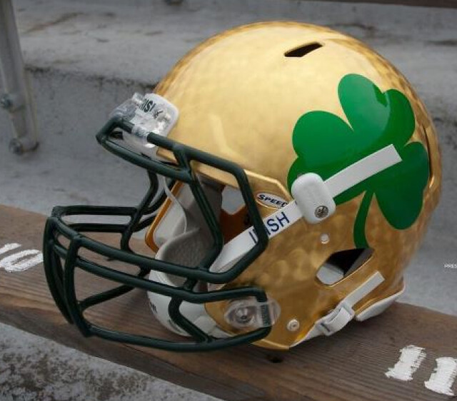
Over the past two months, I’ve told about 20 different interviewers that the current trends in college football uni design basically boil down to the fact that 17-year-olds respond to shiny objects. As you can see above, the folks at Notre Dame have apparently taken that concept a bit more literally than I’d intended. That’s the helmet they’ll be wearing against Maryland this weekend. Green jerseys, too. Hmmm, I have a feeling I don’t want to know what Maryland will be wearing.
And as long as we’re talking about college football: Rutgers has already worn three different helmet designs this season, but apparently that isn’t enough. It’s a well-intentioned gesture, but I always think these stunts do more to cheapen the flag than to honor it, plus the “Me too” factor is now off the charts. Disappointing.
New ESPN column today — the annual college hoops season-preview edition. Enjoy.
Very sad to hear about the death of Joe Frazier, a proud man who deserved better than to spend most of his adult life being cast as Muhammad Ali’s straight man.
From a uniform standpoint, Frazier is an interesting case. He’s generally perceived as the meat-and-potatoes alternative to Ali’s flash and showboat antics. But Ali wore the plainest of plain attire for the vast majority of his fights (usually white trunks with black trim), whereas Frazier wore some of the flashiest gear of his era. In his first fight against Ali in 1971, Frazier wore green trunks with a gold pattern — outlandish for its time.
If you look at that photo, you’ll see both fighters were wearing standard brown gloves. But by the time Frazier defended his title against George Foreman in 1973, he was wearing orange gloves with green thumbs — unheard of!
By most accounts, Frazier was bitter about laboring in Ali’s shadow and never felt he got enough credit for his achievements. But I’ll gladly give him credit for being a pioneer in boxing attire, as well as for his prodigious talents in the ring. R.I.P.
Collector’s Corner
By Brinke Guthrie
Today happens to be my 13th wedding anniversary, and I received a singing Giants Tony Bennett bobble. It’ll make a nice addition to my bobblehead collection. This one, however, is a bit out of my reach financially. Say Hey, indeed.
In other eBay finds:
• Nice Bucs/NFL Alumni sweater here. Wonder who wore this? With a size of 21″ armpit to armpit, it must have been a kicker.
• Had this! A 1970s MLB magnet standings board.
• Had these! Great NFL goalpost/helmet set. Is that Herschel Walker on the box front?
• Had these too! The “Americana” ABA sneaker from Adidas. And my mom paid $29.99 for ’em in 1972. I thought she was nuts to pay that much.
• Remember these 1970s MLB and NHL patches from Kraft? Had these too!
• A Joe Montana nutcracker, no kidding, submitted by the Hungry Hungry Hipster. HHH also passed along these Raiders and Steelers sneakers.
Seen something on eBay that you think would make good Collector’s Corner fodder? Send your submissions here, or tweet them here.
Uni Watch News Ticker: Remember that Dodger Stadium 50th-anniversary logo that surfaced last week? The Dodgers will indeed be wearing it as a patch next season, but with slightly different colors (from Michael Smith). ”¦ Here’s the latest Winter Classic speculation. Hope this one’s accurate — the Rangers design is a beauty, and I like that keystoned captaincy designation on the Flyers jersey. … Christoph Niemann, one of the best illustrators out there, produced a series of New York Martahon illos while running the full 26.2-mile course. ”¦ “I noticed on Saturday that many of the Longhorn players were wearing small awareness ribbon stickers on the back of their helmets,” writes Jason Willis. “Some were pink, some yellow, some blue, and some green. There may have been a few more colors, but these were the ones I saw the most. I believe the stickers are for various forms of cancer that have affected the players’ lives. Info on what the various colors mean can be found here.” ”¦ Here’s a really interesting breakdown on the history of the YMCA logo. It doesn’t include the current logo, however, several variations of which can found here (from HHH). ”¦ Derick Gallagher pointed out something I’d missed regarding the Bills’ white-at-home move two days ago: Although they were wearing their usual road uniform, they wore their home socks. … Antrel Rolle of the Giants was risking a fine on Sunday by wearing Miami eye-black stickers (screen shot by Ryan Perkins). … Great DIY project from Anthony Pellegrino, who writes: “My son was recently diagnosed with a condition called plagiocephaly, which is basically a flat spot on the back of his head from sleeping on his back, and so he is wearing a corrective helmet to allow the head to grow correctly and round out. The helmet comes only in white, and thus looks pretty medicinal and serious. So I decided to spruce it up and turn it into a Giants football helmet. As you can see, I first taped off the striping and logo, then touched up the logo and painted the striping, and then covered the whole thing in a glossy sealant. Not bad, huh?” … Tim McNulty spotted a bizarre passage in this article about design Trace Hurns: “He called them ‘First Love Bats.’ The idea was to have infants hug the bats long before they ever hugged their mothers. They would bond with the bat over their first two months. The bats would be filled with luck and positive energy and then sold for over five thousand dollars each. Many of the best hitters in the 1970s used these bats claiming that they felt a sort of pure joy when they used them.” Hmmm. Sounds fishy, on several levels. Anyone know more? … News flash reprinted from yesterday’s comments: The Tooth Fairy doesn’t exist. … Whoa, check out how Brown’s football team used to have pin-on uni numbers (nice find by Dan Ulrich). … How bad are things for the Redskins right now? This bad. The heart on the nameplate is a nice touch (from Jason Mott). … And how good are things right now for the Packers? This good (from Brady Phelps). … Reprinted from yesterday’s comments: The L.A. Galaxy had an NOB typo the other day. … Here’s a video clip showing Michigan State hoops players wearing their Carrier Classic camo uniforms (from Todd Tindall). … Here are Puma’s soccer kits for the Africa Cup of Nations (from Stephen Wong). ”¦ Yesterday I mentioned that California University of Pennsylvania had worn two different jerseys in their game against Edinboro last Saturday — the first half in black and the second half in red. According to this article, the team’s 20 seniors were given the chance to vote on what the team would wear that day, and they split right down the middle, so the coach decided to do the halftime switcheroo. Personally, I’m surprised the officials allowed it. ”¦ Mary Hassett reports that fire trucks in Anaheim all carry an Angels-esque logo. “Made me think of the Green Bay cops and their Packers badges,” she says.
If I recall correctly, back in the day, the champion wore white in all bouts. Maybe that is why Ali always wore white.
Also, why a Winter Classic jersey with Dubinsky wearing the C. He is not the captain; Ryan Callahan is
i might be mis-remembering or i might be wrong, but i believe the champion was given first choice of pant color — and most chose white — but i don’t think there was ever a requirement
traditionally, champ wore white, so that was just one of the visual identifiers (and possibly an intimidation factor) that said, “hey…i’m the champ”
if memory (faulty as it is) serves, tyson was one of the first to eschew the white pants for his (then) classic black pants/no socks look
So Tyson went BFBS?
Maybe we should all just focus our angst on him. Poor guy…
I’ll just take my frustrations out on him with my incredible link
Ghana is also a Puma-kitted club in CAN 2012. There is a picture of their new jersey here: link
link
Apparently the unveiling of Puma’s CAN kits was in the UK in collaboration with a museum display on African soccer art.
Attention Notre Dame: You finally have a good helmet. Leave it alone now.
(link)
I think these were done by Troy Lee Designs (a specialist in automotive work). Hence the circular pattern in the helmet, reminiscent of the way gold was applied to race car numbers in the past.
Looks like the vast majority of comments posted on the news article like the Rutgers flag helmet.
Point being..?
Point being that many people likely don’t feel that this cheapens the flag.
Oh, I’m sure they don’t. But I’m not particularly interested in taking a poll; I’m interested in saying what I think.
I suspect most Maryland fans loved the uniforms they wore back on Labor Day, and that most Lady Gaga fans loved her last album, etc. Popularity (or lack thereof), especially within a self-selected fan base, isn’t a particularly effective basis for making cultural analysis.
Most of the guys who wore light blue tuxes with ruffles to their proms loved them when they wore them, too.
The ND helmet should be in a museum. Put a small shamrock somewhere on the uniform and leave it at that. You are messing with the most iconic helmet in sports. They looked darn good in person last Saturday night.
How is Notre Dame the most iconic helmet in sports? What, because of that movie? They’re not even distinctive in their plain-ness, seeing how Navy wears the same helmet only with a blue facemask. When a high school team wears a plain helmet, no one says they’re ripping off Notre Dame – unlike how a team with a star on it’s helmet would be said to be ripping off the Dallas Cowboys, even if the star is red.
link
Suggestion for Rutgers: Want to demonstrate your patriotism? Then skip the cheap stars-and-stripes graphics and do something to honor the memory of Rutgers football great John Alexander. Before college, Alexander went with link and then interrupted his college career to serve as an officer in WWI. A salutary example for a generation who doesn’t seem to be able to distinguish between patriotism and flag-waving.
Of course Frazier wore garish colors and patterns.. he was a black man in the 60s and 70s.
RACIST!
There were tons of black boxers during that period (including the most iconic black boxer of them all, Ali), but nobody wore trunks like the ones Frazier wore that night in 1971.
Um, Paul? You’re not an alter ego of Easterbrook, are you?
Beg pardon?
It’s the Cal-of-Penn thing. Gregg Easterbrook loves him some Cal-of-Penn. Don’t worry; us regulars can tell you two apart.
If it’s any consolation to Paul, I’ve been accused of being Gregg Easterbrook twice in my writing career. Though to be fair, both times I was writing anonymously (once as a newspaper editorialist, once as a pseudonymous blogger), which makes the Easterbrook-alter-ego thing a little more plausible.
I think it is easier for people to stand up and support this to appear patriotic or whatever. It is far more difficult to question or call out the whole notion of the stars and stripes logo as being a cheap ploy to sell merchandise. People who do question these antics are often shouted down as being haters of America or freedom or unpatriotic. Not to mention the fact that this is so overdone and commonplace now, the effect has been largely diluted. So I think this has to be taken into account when you view the comments. It doesn’t necessarily mean it’s the majority opinion. I agree that many people don’t feel this cheapens the flag or what it stands for. But I would imagine that many people do.
Although it doesn’t say this in the article that I linked to, I believe I read someplace yesterday that Rutgers is NOT selling any merch connected to this design.
And to make it clear: I am not accusing them of doing a cheap merchandising ploy. I just think endless iterations of the stars/stripes pattern waters down its meaning and power.
I think the NFL should drop the pink one season and go for Autism Awareness-esque unis.. Tim E. – could you conjure up a uni design just to see how painful that would be on the eyes?
um, tim e
could you not do that
Well, a full uni designed around it wouldn’t be much different or worse than Maryland’s flag uni. But, yeah… an Eagles player with rainbow-puzzle socks would just be wrong beyond words.
Can’t be Herschel Walker on the NFL goalpost/helmet set. He’s running forward.
I remember being so excited when the Vikings acquired Herschel for 12 players, 37 draft picks, and the town of Vergas, MN (okay, so maybe it wasn’t quite that much)…
But then anytime he was about to get hit near the line of scrimmage, he’d end up turning backward to avoid the hit as if following the “if I can’t see them,they can’t see me” philosophy.
Looks like Walter Payton on that box to me, based mainly on the Bears-style numerals and sleeve stripes. Plus, Herschel wasn’t in the NFL until 1986 (long after the Bengals had dropped the helmet wordmark in favor of the tiger stripes).
Note that there appear ot be numerals on the sleeves as well as the shoulders. There’s clearly a “4” on the RB’s right sleeve and what appears to be a whited-out “3” on his left.
Can’t be Walker because he would have been in high school at that time (late ’70s judging by green Jets helmet). Mainly though, the facemask gives it away; Walker never wore an old-school cage like that in the link or link link, or at link.
Looks like Walter Payton to me, judging by the facemask and the numeral font.
Walker’s link.
This helmet will be a one-shot for ND. The plan is to use the off-site home games (next year vs Miami in Chicago, 2013 vs Arizona State in Arlington) as the venue for these…unusual designs. Expect green jerseys for all of them.
I’m not a fan of these helmets, but unlike many ND fans on other fansites, I’m not going to use this to fuel another psychotic rant on how the world is coming to an end.
The stems of the shamrocks should curl forward, though.
From the piece on Trace Hurns and Baby Bats:
“Design Fancy is a series of short stories about fictional designers who make fictional things. The stories (and the objects) are by Matt Brown. Special Thanks for Dan Deruntz for some of the photos and more.”
Ah. Thanks for clearing that up.
Thank you. That was mistifying.
Well that’s embarrassing. Sorry for the misinformation. I do most of my online reading in an RSS reader and somehow the disclaimer didn’t make it to me. A good reminder to check my sources before exposing myself as a gullible fool. Still, a strange story becomes quite a funny one, when understood as satire.
What a shame. I was looking forward to exposing and then making fun of the major leaguers hoodwinked into buying bats, “filled with luck and positive energy.” Jokes on me.
First off, I, myself, am black so that was definitely not a racist comment at all.
Second, it wasn’t necessarily a reference to other black BOXERS of the time… link
– Had this! A 1970s MLB magnet standings board.
I had all four sports, including the NFL ones you could get at IHOP. Boy, do I wish someone would release contemporary sets for the major team sports (now adding MLS).
interesting choices for colors. since all are only two-color, the maker had to decide which 2 colors to use for each team. The Expos one looks weird.
Also, must be glare, but the Pirates one looks like it has a white hat in one photo and black in the other.
PENN STATE FOOTBALL JERSEY MODIFICATION:
Patch will be on jersey starting next game.
link
I can’t tell if that’s a Jerry Sandusky joke or not, and if it is, whether it’s tasteless or not. I thought it was, but I think a lot of tasteless jokes are funny.
I should say I thought it was funny, not that I thought it was necessarily tasteless.
The thumbs up/down is a bad idea, but how about an edit button?
Wish I could “like” your recommendation of an edit button.
Moderation ate my comments on the Puma CAN 2012 so I’m going to try this without supporting links. The site you’ve liked to has only some of the Puma CAN 2012 kits. There are another half dozen teams or so in addition to those pictured. The kits were unveiled at an art museum in London that is running a temporary exhibit on African soccer art.
RIP Smokin’ Joe Frazier. You may not have invented the iPhone or iPad, but you could rearrange someone’s face with only one punch. For that I say God bless.
Has there ever been as great a time in the history of boxing as the 60s and 70s? Great heavyweights, great middleweights, there were even some great flyweights. I couldn’t name more than three professional boxers today, but thirty years ago, there was Ali and Frazier and Foreman, and Hagler and Mancini and Duran, and Sugar Ray Leonard, and Danny “Little Red” Lopez, and about a million other guys.
Absolutely boxing’s best years. Don’t forget Ken Norton. AndHoward Cosell at ringside. There was the unforgettable ’76 Olympic team, too, with Leonard, Randolph, Davis Jr. and the Spinks brothers.
Please tell me this is not real
link
God I hope not. The Marlin’s now soon-to-be old uni set and logo was one of my favorites in baseball. Now that it is going to be gone, the MLB shop has most Marlin gear on clearance. Sort of a catch 22. I am sad i will never see it again on the field, but glad I can scoop some gear up for cheap while it is still available.
Are they REALLY going to have orange fronts and black/navy backs on their sleeves????? ;^)
For the 11,756th time, those concepts have been floating around the web for well over a week now. Not legit.
Yeah, who the crap is this “Robbman”, anyway? Aside from items relating specifically to these mockups, I can’t find anything about this guy.
Besides, John Baker’s number 21 for the Marlins.
Okay, so through sheer random chance, I happened to find the answer to my own question: link.
So, basically, he posted his concepts based on everything he’d heard to that point, the thread died out after three days, and someone somewhere managed to find these concepts and run with them as if they were the genuine article. Whatever.
The cap logo is real. The uni is not.
Correct.
It’s GOT to be real! I saw it on Uni-Watch.com!!!
Hopefully they will not be taking a page out of the Rangers book and have Miami Miamis home unis.
Not sure what other’s thoughts are on the new Irish helmets, but I must say I quite enjoy them. However, there is one ‘fly in my lemonade’ that is bothering the hell out of me and that is that damn plastic thingy that is holding the chinstrap on. It’s right on the shamrock and draws my attention away from the rest of the helmet. [scowls and shakes his fist in the air out of frustration].
Neither of those Winter Classic jerseys are legit, either, except for the keystone captain patch.
Really? That’s a pity.
I am willing to bet that those jerseys are not far off from what the real deals will look like.
That would be a fair assessment for the Rangers. Not as much for the Flyers.
So is a Quakers-style script Flyers jersey, with a keystone kaptain patch, still a possibility? Please please please?
No.
That’s probably the direction I would have gone, though, if I were calling the shots.
Curious how you know either way?
Not exactly related to the Anaheim fire trucks or GB police, but my dad used to work up in the Bronx on Engine 68, the closest fire house to Yankee Stadium. I remember seeing one of the versions of this engine in the ’96 NYY parade.
link
Ok, that fire truck looks way cooler than the Anaheim ones. And I hate the Yankees.
Paul, I think you can stop checking on the bats and baby story. This was the disclaimer at the bottom of the page.
“Design Fancy is a series of short stories about fictional designers who make fictional things. The stories (and the objects) are by Matt Brown. Special Thanks for Dan Deruntz for some of the photos and more.”
Nearly 1/3 of the MLB teams are expected to wear a commemorative patch for 2012:
Astros-50th anniversary
Cardinals-2011 World Series champions (home uniforms only)
Dodgers-Dodger Stadium 50th anniversary
Mariners-35th anniversary
Mets-50th anniversary
Orioles-Camden Yards 20th anniversary
Rangers-40th anniversary
Red Sox-Fenway Park 100th anniversary
Royals-2012 All Star Game
Still not known if the Marlins will wear a commemorative patch for the first year as the Miami Marlins in a new stadium. They will have a new team logo patch, as will the Padres and 1-2 other teams.
I’d be surprised if the Cardinals didn’t do something for Bob Forsch, too.
Not to mention a patch for anything else that happens between now and next April. Like if some team’s assistant equipment manager’s second cousin gets shingles or something …
I usually like Puma’s soccer designs, but are they going for a faux-collar look with the neck striping? Kinda meh.
Wow, lots of goodies in the ticker today:
Really digging the Islamic style pattern on the link jersey.
The link patch is gorgeous, reminds me of the Yankee Stadium link patch. Has the Mets 50th patch been unveiled yet? Did I miss it?
There’s a YWCA around the corner from me in DC, always admire the link in the brickwork when I pass
Best stadium patch I’ve seen.
not sure who that *generic* NFLer is in that set (who it has been determined was not herschel walker)…
but he is apparently wearing reedidas super stretchy pants
You know, those pant stripes are the only thing that make me question it being Walter Payton. They seem closer to the ultra-wide stripes that the 49ers had, and the rest of the uniform still works.
I think the pant and helmet stripes are intended to present Sweetness as a “generic” player, but I’d be willing to bet my second dog that it is WP. It even looks like his face.
The Bears wore some pretty wide stripes during some of the Payton era.
New unis for AFL’s Tampa Bay Storm (and there are no Zubaz prints as a part of the new design).
link
Wow, no black. Nice.
“Sleek and Intimidating” REALLY??
Haven’t been around lately. Can anyone fill me in on why the Bills wore white at home last week? Was there a specific rationale? And had this been announced for a while? Any info is appreciated.
Dave Mac,
Try this page:
link
Nice writeup on Joe Frazier Paul.
Ahhhh, thinking back as a kid and tuning into the big fights on ABC Wide World of Sports. Spanning the globe to bring you the constant variety of sport!
You know, Frazier did indeed play Margaret Dumont to Ali’s Groucho Marx, and Ali’s treatment of him was unfair, but one of the most unfortunate episodes of his career had nothing to do with Ali. I will never forget the sight of him in that ABC Superstars swimming pool, desperately flailing his arms and legs, sinking like he was made out of granite. What made him agree to that?
I love the plagiocephaly helmet — it’s a clever idea, and the little guy looks great in it.
We have a couple at our church, whose son was born with hydrocephaly. He’s in a helmet, too, one that looks like it’s made out of the same material. His is designed to look like a BYU football helmet. It’s ridiculously cute, and I’m not even a BYU fan.
A sad exchange took place yesterday.
STAGE ONE (Immediately following a love-in on the merits of the Spain national soccer team):
George Chilvers | November 7, 2011 at 9:00 am | Reply
Do you know, too, that you will never see the Spanish players singing their national anthem before the game?
Know why?
There aren’t any words :)
STAGE TWO (An intention to appear witty spurs me to write the non-existent lyrics of the Spanish national anthem, in an attempt to lampoon both anthems in general and Spanish nationalist history in particular):
Connie | November 7, 2011 at 12:17 pm |
Actually, the Spanish anthem (“Himno a la Patria Sagrada”) does indeed have words, but they are regarded as a wee bit inappropriate for these times. More or less faithful translation:
“O! Sacred fatherland, your honor we uphold!
We drink your health with the blood of the Moor;
From the bones of the Goth we grind your bread!
On distant shores trembles the heathen savage
Who fears the lash of your noble race!
O! Sacred fatherland, pardon our little ones.
Catalan and Basque and Lusitanian alike,
And grant them the grace to furrow thy fields
In the sight of your princes of Castille and Leon!…”
STAGE THREE (Parody revealed to be insufficiently funny):
George Chilvers | November 7, 2011 at 2:15 pm |
Hi Connie
You know I would never knowingly contradict you, but the Spanish anthem is the “Marcha Real”.
There were brief lyrics (during Francoist times) but they were abandonded. In 2008 the Spanish Olympic Committe, having heard Liverpool FC’s “You’ll never walk alone” (or as we say, in recognition of Liverpool’s high unemployment rate “You’ll never work again” (I’m a Scouser so can say this))decided the Spanish anthem should have lyrics.
A competition was organised, but the idea was poo-poohed widely, and so the Marcha Real is still without lyrics.
STAGE FOUR (Chagrin of Your Correspondent).
Oh dear! I occassionally have a humour bypass. Sorry!!
My team is languishing adrift at the foot of the Premier League with games against Arsenal, Chelsea, Liverpool and Man United coming up. Where’s the valium???
But to be fair to you (and to me) it sounded a convincing anthem. Compared to many real ones ;)
Ah, George… You are too kind. As a feeble gesture of a soccer wannabe, five years ago I decided to root for Newcastle because I liked the rust-belt Northeast England motif and the Magpies nickname, and because I wanted to appear less out-of-it to my soccer-obsessed sons. Then a quick NU decline, even unto dread relegation, and now look at ’em…
So maybe there’s hope for Wigan. But at a price. Wigan will bounce back only through a massive infusion of big money, from either Qatar or your Yank friends here at UW. Paul, Phil, and I are now forming a consortium to buy the franchise and appoint you to some lofty-sounding “Senior Advisor” position. Stay tuned.
So what about this college basketball preview link? Paul, did you just fake us all out??
Forgot to mention. New Notre Dame helmet is crap.
/s/ Son of ND offensive lineman (reserve) Class of 1932.
New ESPN column is up. Actually, the ESPN crew is still making a few tweaks to it, but I’m about to go outside to smoke some short ribs, pork butt, and duck breast (nearly 70 degrees here today — Indian Summer cookout!), so here’s the link now:
link
“You wake up one day, and you go, ‘I’m not comin’ into work today!’ Your boss goes, ‘Why not? You sick?’ ‘No! It’s too gray!’
“Then you wake up and it’s the grayest day you’ve ever seen! And the next day, it’s even grayer! And that’s usually Valentine’s Day, and that’s the day you look at your wrists and go, ‘Hey, maybe I should slit ’em to see color!'”
– Lewis Black
Does it make me a bad person that just about the only b-ball unis linked in the article that I liked even a little bit were those Xavier one-offs that they won’t be wearing?
Somehow, gray for gray’s sake doesn’t bother me nearly as much as black for black’s sake. And maybe it’s just coincidence, but pretty much all the typographic changes look like downgrades to me, including Baylor and especially Wyoming. I love what Purdue has done, though, but there’s no idea so good that bad execution can’t ruin it. Purdue almost needs a contrasting-color shoulder yoke that goes down, Steelers’ Batman uni style, to include the wordmark. Or maybe just better outlining, or even completely swapping the colors to black with gold outline on white, gold with white outline on black, and so forth. Save gold with black outline for the gray alternate.
No, you’re not a bad person. College basketball uniforms are just not very likable today. They all look clunky and cut from the same template. There’s an absence of fluidity, creativity and, well, joy, in these outfits.
Those few uniforms that still have conventional trim around the collar and shoulders and all the way down the shorts (and that’s A LOT of material to cover, I know) are a little easier to look at.
A great preview, as always, Paul.
Way to go, Akron…now your unis are as drab as your arena.
The hoops team really could have used a new place before the football team. They actually have a better shot at postseason success, but noooo.
Butler still looks good, but those old unis were classic.
Have to read the rest later.
La. Tech, New Mexico and Radford do indeed look better.
Wish Xavier could wear those scrimmage unis during the season.
Ah, Election Day is over (take your yard signs down quickly, please) and basketball is here. It’s the Most Wonderful Time of the Year!
Great college b-ball roundup on ESPN. Serious question Paul… you tend to (generally) dig less flashy uniforms. Calling out color-on-color in baseball as bad, and digging the traditional grey road/white home uniforms.
Why is it such a bad thing in college hoops? I mean, I’d understand if neon green were the trendy color. But grey goes with everything.
Is it merely just because its trendy?
Personally I don’t love or hate it… but I like that its a truly neutral color as a trend.
Gray has its place … I just don’t think the basketball court is one of them.
Traditionally, road grays in baseball looked nice because the old wool flannel fabrics created the look of a TEXTURED gray — a surface with nap, a heathered color tone, etc. Today’s gray is just a flat, unvaried sea of plainness, even at the ballpark. But especailly on the basketball court.
Also, I think gray fares rather poorly with indoor lighting.
But if you’re a road team on Cal State Bakersfield’s blue court, the gray might actually be a good thing…
Paul, Thanks for the bit about Frazier and Ali. Every story today on the major networks insists on mentioning Ali as much as Frazier. Yeah, its a historic and important combination… but come on, the dude passed away… lets focus a little more on HIM.
Thanks a lot for using my comments post about Rutgers white helmet yesterday as a part of the main article for your site today…Oh wait, you didn’t give me any credit…which is about the fifth or sixth time I have contributed without receiving credit for it…maybe I should stop all together.
Yes, because it’s all about you. And because you are obviously the only person on the planet who sent that in (aside from, you know, the three dozen other people who did so). And because there’s no way I might ever be aware of that, um, on my own…..
Actually, Paul, I was the first one to tell you about the Rutgers helmet, in a communication from two days ago that alluded to certain information about Phil’s run-in with Long Island law enforcement officers that — wisely, I believe — you chose not to ventilate in public. I understand.
jeebus, connie…i thought that sorta thing was kept permanently sealed if i had stayed out of trouble for a few dozen years…
Does no one read the link?
It’s not a sports logo, but the Olympia Fire Department uses the Olympia Beer wordmark. Of course, just about everybody here in town now uses some variation of the Oly font…
link
Paul, I love your comments about the Rutger’s flag logo cheapening the flag, and I completely agree. I know you (and many other uni watchers) have voiced similar opinions about the pink movement in the NFL, mainly that it is a good cause but is completely overdone and a marketing stunt, and again I feel the same way. But there is a point to me saying all of this.
Last night while studying for an exam with a fellow college student over monday night football I decided to voice my opinions about the pink, never even considering the option that he may disagree with me. I expressed my dislike for it and how long it lasts and how out of hand it’s getting. The reason I gave was that if their intentions were really as humble as they lead the public to believe then they would donate more money, still raise awareness, and not sell stupid pink shit all October long. I thought this was a pretty straight forward argument and that there was nothing wrong with what I said but the response I got I was not expecting at all.
He was outraged that someone could hold that opinion. He told me that his girlfriends mom was recently diagnosed with breast cancer and that it was an issue that was very personal to him, which I completely respect, I myself know survivors. He then told me that he was planning on getting a tattoo with a pink ribbon among other things on his back, wow. He went on to say that he thinks that all the awareness is a fantastic thing and that no pink is too much pink and that he didn’t share any of my opinions at all. He thinks that every sport should do it and that pink uniforms wouldn’t bother him either.
I had to reiterare myself by saying what I had already said, that it was a very good cause but the execution is what I had a problem with. We agreed to disagree and there are no hard feeling between us but he caught me extremely off guard.
So there definitely are varying opinions out there. Mine still stands though. If the NFL really cares that much why don’t they donate 100% of their october profits to breast cancer awareness? Hell that might be enough to cure breast cancer all together.
If I could add my twopennyworth about this.
All awareness is OK – but when overdone the point can be lost.
Breast cancer awareness is a good thing, obviously. But there is a craze sweeping through Facebook of women posting notes like “I am going to live in Las Vegas for 24 months”. The length of stay and location are dictated by your date of birth – November is “Las Vegas”. This is supposed to elciit a response of “you’re doing what?” – which the the situation is explained that it’s a ploy to raise breast cancer awareness etc.
What annoys me about this is that it is a “secret among women” – we aren’t supposed to know what’s going on.
I have a friend who a year or so ago was diagnosed and treated for breast cancer. Fortunately after treatment HE is OK at present. But the “pink thing”, the “girlies together” stuff I’m afraid annoys me.
Breast cancer does not just affect women.
This is an American link (note the colours of the ribbon):
link
there’s a bit of kerfluffle about england not being allowed to wear poppies on their jerseys for saturday’s match against spain
link
Words cannot express how people feel about this.
I’m actually going to the game and I shall be wearing my poppy. FIFA has become a joke – a bad joke, but a joke nonetheless.
It would appear we didn’t provide enough in a brown envelope for Blatter :(
Go get ’em, George. Eleventh hour, eleventh day, eleventh month: if Blatter were a good European, much less a good fellow, he’d wear one himself.
“…17 year olds like shiny objects..”
LMAO!!
That 26.2 Miles, 45 Sketches piece in the Times is awesome, everyone should check it out.
It clearly says on the bottom of the article with the baby bats that the whole article was fake.
man…i actually looked at two things in brinke’s cc today…happy anniversary, bg (the bg is for big guy)
anyways…
did it bother anyone else to see the teams not properly aligned, division-wise?
i didn’t have that, but i did have 24 mini-pennants growing up, and i kept meticulous track of the standings when i was a young-un…totally pissed me off in 77 when they added toronto & seattle because i couldn’t find the same style mini-pennants, and had to go with some OCD-effingup substitutes…grrr
yeah, i had a lot of problems then…and now
This country has a serious Muhammad Ali cult…
The above reply belongs to Christopher F.’s comment above.
Yes, Phil, the misaligned divisional thing bothered me, too.
And, I miss the 12-team leagues, with two divisions, no wild cards, and no interleague play. Them was the days…
It bothered me even more that there was the one football helmet that didn’t have a logo or stripes in the goalpost set. I couldn’t tell if it was orange or red, so I couldn’t tell if it was a Browns helmet with the stripes missing or a Chiefs helmet with everything missing. I stared at that picture for ten minutes, straining, until I decided if I couldn’t tell then I should probably start paying attention in class.
don’t let THE hear you say that…he’s gonna start petitioning for the browns to add that “CB” or something equally inane to their otherwise perfect helmet
Why would that help? This helmet was completely blank. If the Browns had a logo all it would do is add three words to my previous problem.
Well they should, dammit!
…but your monitor color is probably just a little too dark. That blank helmet is the same color as the properly stickered Bengals helmet
According to that YMCA logo site, the YMCA’s 1967-2010 logo “is the second most recognizable logo in the world (first is McDonald’s arches).”
I highly doubt it’s 2nd. How’d they come to that conclusion???
I thought (seriously) that the Nike Swoosh was #1 or #2.
Then again, Coca-Cola is supposed to be up there, too.
I think it depends on who’s making the claim.
Lotta YMCA’s in the Middle East, are there?
The Coca-Cola ribbon? The Christian cross? The interlocking NY? Hell, even the Starbucks logo is probably more widely recognized than the YMCA.
What a ridiculous statement. I do not represent the “rest of the world”, but I am a sample, and (as evinced by me frequenting this site) am “logo aware”.
I can honestly say that the YMCA logo rings no bells for me. I’m not sure if I’ve ever in fact seen it before. YMCA England use a different logo, and to be honest that isn’t greatly known either. We certainly wouldn’t recognise the US version.
link
US logos that are instantly recognisable (bearing in mind that with globalisation it is hard to define what is a “US logo”? :-
MacD of course.
Disney (both the signature and “Mickey’s ears”)
Apple
Nike
NASA
Coca Cola
NY Yankees (although perhaps many who wear it don’t always know what it is)
Google
KFC, and
Ford
And that’s without thinking too hard. YMCA second most recognised? What absolute drivel!!
OK, we’ve conclusively established that someone on the internet said something rather silly. Once we all catch our breath, maybe we could move on?
But why? Some sense of proportion? C’mon… Blasting wankers at the Y is good sport, and where else can we do it?
My my, late-night posts (comparatively speaking) from Connie! Piling up overtime at the office, or slow night at home?
isn’t Conn across the pond this week?
Hey Paul. Go check out Rutgers message boards (scarlet nation.com). They think you hate Rutgers because you dislike the helmet. It’s ridiculous and I’m a Rutgers fan! I stuck up for the site by the way
Why stop there? My brief comments about a piece of football equipment clearly demonstrate that I hate the entire state of New Jersey. It’s so obvious!
well…seems as though (even if only for the 15 minutes they so desperately
deservedcraved) you had the entire state of maryland ready to kill you…why not add joisey?
Shouldn’t New Jersey be used to everypony hating them by now? The state is home to Snooki, for god’s sake.
In New Jersey’s defense, only 2 of the mane 8 are from there.
Why doesn’t even one pony love New Jersey, is there no place to graze?
One for you fontophiles:
link
St. Louis Blues are wearing white at home after a long pregame ceremony honoring Pavol Demitra and Igor Korolev.
This is presumably due to the fact that they both played for the Blues when white at home was the norm and Korolev played for the Hawks when they wouldn’ve worn red on the road.
link
Mr. Anthony Pellegrino, cheers to you and your cute son, the corrective helmet looks great, plus you couldn’t have picked a better team.
Good luck and go Giants.
Daniel Tosh from “Tosh.0” is wearing some Howard university gear tonight, including a pretty cool cardigan.
Howard *University
a wee while ago this site mentioned a new throwback jersey for the NY Giants this season, any news about that?
No longer happening.
aww that’s a shame, I was looking forward to see what they would come up with