People, I’m gonna be frank with you: I watched about 20 minutes of football yesterday. Here’s why: I began the day with a New York City Marathon brunch party hosted by my friends Joan and Jason. From there I went to an amazing birthday party for my friend Amy Fritch (who, as you may recall, road-tripped through Scotland with me last year). That was followed by yet another birthday party, this one for the awesome Laura Forde (who cat-sits for me, just as I do for her). And then from there I went to my friend Freddy’s 78-rpm record hop (with free pizza!).
That, people, is a full day, so please forgive me if I missed any details from yesterday’s gridiron action. Fortunately, there were lots of uni-notable college details from Saturday to catch up on. Here’s the full weekend rundown:
• The Saints wore their gorgeous throwbacks.
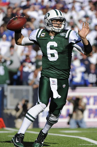
• Everyone knew that the Bills would wear white at home. What we didn’t know was that the Jets would wear solid green on the road. Ewww.
• The Cardinals wore their BFBS alts. Double-ewww.
• Moon over Tempe! That’s Early Doucet of the Cardinals, proving that the NFL may have rules against marijuana but they still have issues with crack.
• As you may recall, last week Steven Jackson had a Rawlings logo on his neck bumper, which was a no-no. Sure enough, yesterday he had a Rams logo.
• Did anyone out there realize that the NFL’s web site has a “Uniform Monitor” column? News to me!
• Turning to Saturday’s college action, Max Smith of Kentucky was going FNOB.
• Many, many readers noticed that TJ Jones of Notre Dame had a backwards ND logo.
• Vanderbilt went with black helmets.
• Someone on the Longhorns had a droopy horn.
• During the Cal/Washington State game, Cal DE Trevor Guyton wore No. 6 instead of his usual 92. It was a tribute to a childhood friend who played at WSU before becoming paralyzed in a car accident.
• From that same game: Has WSU been wearing these odd socks all season long?
• Jake Hurley was late getting his Duck Tracker updated in time for yesterday’s post, so here it is today.
• In Saturday night’s game between Kansas State and Oklahoma State, KSU head coach Bill Snyder was wearing a Pacific Life Holiday Bowl jacket. The Wildcats last played in that game in 2002 — and before that, 1999 — so this jacket was conceivably a decade-ish old!
• Two notes from the Baylor/Mizzou game: Glasco Martin IV has RNOB, and Terrance Ganaway appears to have played without socks.
• No photo, but California University of Pennsylvania — a small D2 school — reportedly wore red jerseys for one half of their game against Edinboro and black for the other half.
• And of course Phil and Terry had lots of additional NCAA coverage in yesterday’s post.
(My thanks to all contributors, including David Cline, Alan Feller, Daniel Fontenot, Doug Keklak, Bill Kellick, Mark Lum, Kyle Mackie, Matt Mitchell, and Kevin Vaughn.)
Party reminder: Uni Watch party this Saturday, Nov. 12, 2pm, at Sheep Station in Brooklyn. See you there.
Sticker reminder: Remember, if you’re a Uni Watch Membership Program enrollee, you can order a sheet of stickers based on your membership card design. Full details here.
Uni Watch News Ticker: A new study suggests that leather football helmets are just as good as modern ones, at least when it comes to concussions. … New Euro 2012 kit for Spain (from Kenny Loo). … “Staubach” isn’t that long a name, but the Cowboys had trouble fitting it on a jersey at one point (screen shot by Ryan Perkins). … Everyone’s all excited about this Virginia Tech teambuilder page. … Hmmm, a Bruins baseball jersey. “I saw it at a local discount department store,” says Ben Marciniak. … Reprinted from Friday’s comments: Here’s an admirably detail-driven look at various versions of the Orioles’ cartoon bird logo, which has had a lot more variations that I’d realized. Highly recommended reading. … Back in October I did an ESPN column about the guy who designed the Sens’ third uniform. Here’s another interview with him, this time at Icethetics (from Jim Wooley). … Check out this amazing photo of Charlie Finley modeling an Oakland Seals uni mock-up (great job, Teebz). … I know basketball players are tall, but this is a bit much. Great uniform, though. … Hmm, in 1939 Wheaties offered a set of cards about the history of baseball uniforms. … Several readers have noted some interesting things about the uniforms being worn in the MLB all-star tour of Taiwan: (1) The Twins are wearing their normal home pinstripes, even though they completely stopped wearing that uni after Harmon Killebrew’s death back in May. (2) The Giants are still wearing their World Champions sleeve patches. (3) Emilio Bonifacio is wearing the Marlins’ home pinstripes. This will be the last time we ever see a Marlin wear the uniform, and it happens to be in Taiwan. ”¦ The Blackhawks have a bi-annual promotion where the players’ fathers come on the road with them for a few games. This time around the program has its own logo (from Tim E. O’Brien). ”¦ Pretty cool photo of the Cal helmet room. “The white on one side and blue on the other looks pretty cool,” says Kyle Mackie. ”¦ Here’s a decent view of the football Cardinals’ “25 years in St. Looie” patch from 1984 (from Bill Kellick). ”¦ Chris Fogler notes that the Yale hockey team has a big Y on top of their helmets. ”¦ John Freeman was at the UNC/NC State game on Saturday and saw this nifty helmet cart parked outside the stadium. … Mark Petuch tipped me off to a throwback brand I hadn’t heard of before. Anyone know more about them? … There are bad socks, and then there are really bad socks. That’s Griffith High from Indiana (big thanks to Bob Delano). ”¦ Latest goalie wearing a Movember-themed mask: Tim Thomas. He also has new pads (from Matt Fedorka). ”¦ Robert Silverman notes that Madison Square Garden now has charcoal gray seats near the court, instead of teal and purple. ”¦ Here’s a good view of the Astros’ rainbow-striped stirrups (big thanks to Jay Oats). ”¦ Remember Bethany Heck, founder of the Eephus League, who I interviewed back in January? She was in town over the weekend (some sort of grad school frield trip), so we met up at Old Town on 18th St. A pleasure to meet her after a year of being her fan, and she’s every bit as smart and charming in person and she appears to be on the web. Come back soon, Bethany! … “Over the past few years, Pallavolo Modena in Italy’s Men’s Volleyball League has had libero sponsorships with the Spider-Man and Iron Man movies and Japanese animation,” says Jeremy Brahm. “But this year, their sponsor for the libero uniform is a cheese manufacturer, Parmareggio. The company has a mouse in its most recent advertising campaign. So the libero jersey features a mouse digging a ball.” ”¦ Tony LaRussa, Chris Carpenter, and David Freese wore personalized Blues jerseys for pregame festivities the other night (from Mark Richter). ”¦ New baseball uniforms for the Santa Fe Mountain Lions, a low-level independent minor league team (from Alan Poff). ”¦ Bill Radocy has updated his Strat-o-Matic hockey uniform designs. ”¦ I’m still calling it Kaufman Stadium (from Zach Brady). ”¦ Big, big congrats to Mike Hersh and his wife Ali, proud parents of newborn Zachary Nolan Hersh, who was officially added to the roster at 11:07 last night. The hunch here is that Zach will soon be dressed in a vintage flannel onesie.
I saw some Iowa players had some sort of stars and stripes thing going on on their helmets Saturday against Michigan. What was that exactly?
early vets day salute
terry & i covered it yesterday…more info here
Haven’t found a picture, but AJ Hawk tore up the G on the right side of his helmet during yesterday’s Packers-Chargers game. I saw it exactly once during the TV coverage.
Also, I knew about Dave Dameshek, but he frankly seems to have assumed a title for which he is unqualified.
His biggest problem is that someone needs to lend him a dictionary. A sports journalist should know the definition of irony, and especially underrated.
I enjoy Dameshek’s musing on uniforms. He tends to stick more closely to what he likes and what he doesn’t and foregoes all the details this site dwells on.
Furthermore, Dameshek’s use of irony was entirely correct. According to my dictionary one definition of ironic is “happening in the opposite way to what is expected.” Dameshek stated that while he liked both the 49ers and the Racists uniforms, he did not like to see them playing each other, which is the opposite of what one would expect. Additionally, although he doesn’t like the Dolphins unit generally, he liked them in this specific context. Again, opposite of expectation.
And underrated is very subjective. Apparently Dameshek feels the Chiefs unit deserve more love. But his use of the word was clearly appropriate.
It’s well loved and deservedly so. Just because something is good doesn’t mean it’s underrated. The Chiefs’ uniform is consistently ranked among the top three uniforms in the league, and often number one. There is no subjective measure that could possibly consider that underrated.
I’ve never seen the Chiefs listed as a top 3 uniform by anyone other than Jim Vilk.
I’ve never seen them not listed up there.
Do you know about when in the game you saw it? I can try to get a screen grab.
I’m guessing that the Marlins prospects who are part of the Arizona Fall League will continue to wear the 2011 uniforms until the season closes. The caps are unique to the teams in the AFL, but the jerseys, as far as I can tell, are the same as the big leaguers wear.
Looks like Staubach’s name and jersey are sized for larger shoulder pads. Seems like his are smaller than the average player of the day. Shoulder pads kept getting bigger, even for QB’s until the 90’s or so. Now of course it seems that the QB has the largest shoulder pads on the team. Everyone else has gone to tiny pads. But as far as Roger the Dodger goes, if he had larger pads, the name would be appropriately straightened.
About the O’s hat logo…one thing the author failed to pick up on is that for some of the hats in the 70’s, they actually cut the bird off of older hats and then just sewed them onto the newer ones. Check out the picture he has of the Reggie Jackson 1976 hat…you can see the stitch used to apply it. That’s why there is that slim black border to it…because it was cut off of a black hat.
That’s also probably why the next white panel version had the black edge added…the embroiderer was probably matching a 1976 hat and thought the black trim was supposed to be there.
Congrats go out to the Hersh family on the solid addition to the farm team! Can’t wait for the little guy’s call-up to the bigs in a few years!
The Hersh family missed a golden opportunity to name that child The Increasingly Indispensable Mike Hersh Jr. That’s a FNOB I want to see!
Congrats Mike and Ali, may your youngster grow up happy, healthy and wear proper stirrups.
link is actually upside-down, not backwards – maybe so he can read it when he looks at his shoulder?
We’ve been over this before, but since it can be misapplied any of the three ways, it’s spun 180º, not backward or upside down.
I think flipping it like that is the only way you can misapply it. In order to make it truly backwards or upside down, you’d have to flip the patch over, in which case the heat-seal backing would show instead of the embroidered front.
If that’s true then I’ll shut up about it from here on out.
Nobody I personally know has ever used “upside-down” to refer to something that’s been flipped vertically (and thus would be backwards if rotated so that the upside was again up).
I was watching the Florida/Vandy game and thought the same thing about the black lids being new. Then I Googled it and found several pictures of them playing in them. I think they may have traded in the Gold for the Black before the season started.
Vandy student here – They have worn both helmets at different times throughout the season both at home and on the road. It was only mentioned on this site when they first wore them and largely ignored on a week to week basis. I just chalked this up to nobody caring about Vanderbilt football.
They were first worn at home against UConn in week 2 with a black jersey and black pants
They wore them for a second time two games later on the road against South Carolina with a white jersey and white pants.
Two games later at home against Georgia they wore the black helmets once again with the all black home uniforms
They wore the same exact uniform the following game against Army
Then yesterday, after a going back to gold for another game, they wore black helmets on the road against Florida, this time with black pants and the standard white jersey.
By my count, that is 5 games in the black lid, 4 game in the gold with three games left.
That’s the breakdown, although I am still skeptical that anybody cares very much about Vanderbilt football.
For my money, I’d like to see the black helmets with a gold star with a white “V” on it and no outline around the star.
Looking at that MLB All-Star touring team shows exactly how similar the Reds and Nats are. A few Washington players have the W covered and they could be Cincy players for all we know. I only recognized #45 as Bill Bray for the Reds as a Red because thats who I follow. I would like to see Cincinnati break out of the mold and go back to pull overs at home or at least lose the placket piping.
I see where you’re coming from on this, but I think the answer is for the Nats to tweak themselves. That right there is a Reds look, and the Reds should keep with the truly classic unis they now have. Rather, the Nats need to make the two colors in its headspoon more visible. Probably needs to be 1/4 inch thicker in both colors. And the all-red cap isn’t particularly effective for the Nats either, since it so closely mirrors their closest divisional rivals in Philly. Adding a blue brim, or soutache piping, or navy side panels, or basically anything at all, would not only set them apart better from the Phillies, but also de-Redsify their overall look too.
My ideal for the Nats would involve Expos-style racing stripes instead of the headspoon, with really thick red and blue stripes, and some modification of the cap as per above. Also, adopting a number style closer to what that school-bus-number font the Expos used to wear. But however you slice it, I say let the Reds be the Reds, and let the Nats figure out their own more distinct look.
The Reds DON’T have a traditional look. They had never in their history worn placket piping until their most recent change. I would much prefer if they would go back to wearing pinstripes or, short of that, just leave the piping off the jerseys.
I didn’t say the Reds wear tradititional unis; I called their unis “classic.” Which I think they are; they have unis now that I expect to hold up well in 10, 20, or more years. Besides, the team is named the Reds. So I don’t have a lot of sympathy for what boils dowto a demand that they wear less red on their uniforms. ;-)
The Jets all green is not an ewwww uniform.
Yeah they are, they’re repulsive. The Jets have cool uniforms but the monochrome look is the worst possible combination of jersey and pants. It just looks wrong.
I wish the Jets would go to a green helmet. And I am not in the “too many white helmet” faction. But they would look better in any of their uni combos if the lid was green with a white facemask.
It would be nice if the NFL would allow multiple helmets. I think the Jets would be great with white/green/white at home and green/white/green on the road.
Oh, yes it is.
The Jets’ green-over-green is as frustrating as the Mets’ hybrids (plain whites w/ 2-tone cap): An unsightly combination, with elements designed separately and never meant to be worn together, that is not only completely unnecessary but supplants a far, far more attractive standard combination for no good reason at all.
The Jets’ green-over-white is their best look. White-over-green and white-over-white are both fine; not sure which one I like better. (White-over-white is tradition, Super Bowl III and all, but I must confess I find the white-over-green somewhat more aesthetically pleasing especially since they wear the wrong socks with the white pants).
The white helmet is fine the way it is; the only thing I would change would be to make the logo football-shaped like the original, rather than oval, but that’s a minor nit to pick.
That mouse is supremely creepy looking.
I don’t suggest you ever watch Stewart Little … and not JUST because of the acting …
First glance look at the Texans Browns game – had to do a double take as I thought I was looking at the Bears!
As for the Cardinals BFBS – taken purely on their own accord, I think those are the best looking uniforms that Arizona currently has in the mix.
That’s interesting. There was a brief moment when #34 for the Texans appeared on screen and my mind flashed to Walter Payton. They were very Bears like.
All the more reason for the Texans to wear their red jerseys with the blue pants.
They’ve never worn that combination, but if they did it would immediately be my favorite combo out of all 18 possibilities they have (3 jerseys, 3 pants, 2 socks).
You mean other than wanting to honor the WFL Champion Florida Blazers?
visual aid…
link
“All the more reason for the Texans to wear their red jerseys with the blue pants.”
~~~
so like this?
i think this would be better still
Yeah, exactly like that. There’s no looking sorta like the Bears from a distance then. Of course in reality they’d screw it up and wear the blue socks, but that’s beside the point.
You know, they both kinda look like Da Bears if you really squint at them.
link
The headline says “Snowboarding At Wrigley Field”
Couple problems here … no snow … at they’re not AT Wrigley Field. Close? Sure, but I sort of got the feeling they’d be, you know, inside the park. Bummed by the reality.
link
Whoops … Snowmobiling …
In that picture of LaRussa, Carpenter, and Freese, they are all wearing jerseys with the Reebok vector logo. I thing the wordmark logo definitely looks better in this case than the vector
I’d love to see them go with the Shredder move on those jerseys.
The Blues’ alts are just so much better looking… I hate hate HATE those ridiculous flared shoulder panels!
Agreed, they are terrible.
Eddie Pleasant of Oregon was wearing some sort of weird bright-yellow pad sticking out of the back of his jersey on Saturday night. It looked like part of a shoulder pad, except in the middle of his back.
If you click through to the Duck Tracker, then click on the pics from Saturday night’s game, you can see it in the upper left-hand corner shot.
What was that?
link
Bills looked great yesterday and the Jets (as Paul noted) looked crappy. Bills played crappy, but that’s only within the context of a narrow band of “reality.” C’mon Fitz, off the canvas.
“…… New Euro 2012 kit for Spain (from Kenny Loo). … ”
Now THERE is a team that wins on all levels of reality, probably including the championship of some alternative Earth-like planet in a Borges novella. OK, I don’t dig those semi-visible diagonal stripe things on the front, but the whole red-and-yellow motif, set off by the deep blue of the shorts and the national coat-of-arms, is a very sweet look, and distinctive. And the soccer they play is really marvelous, dominating but pretty. History-making.
Speaking of history, anybody who (like me) missed the George & Gary Colorization Show in yesterday’s UW should go have a look this morning. Very sweet.
Thanks for the kind words, Connie.
I’m off down to Wembley on Saturday to watch Espana. Oh and England too – but I’m really going to watch the World Champions.
Do you know, too, that you will never see the Spanish players singing their national anthem before the game?
Know why?
There aren’t any words :)
Then how do they get the Spanish version of Christina Aguilera to embarrass herself on national TV? Wait, is Christina Aguilera the Spanish version of herself? Hmmm.
Actually, the Spanish anthem (“Himno a la Patria Sagrada”) does indeed have words, but they are regarded as a wee bit inappropriate for these times. More or less faithful translation:
“O! Sacred fatherland, your honor we uphold!
We drink your health with the blood of the Moor;
From the bones of the Goth we grind your bread!
On distant shores trembles the heathen savage
Who fears the lash of your noble race!
O! Sacred fatherland, pardon our little ones.
Catalan and Basque and Lusitanian alike,
And grant them the grace to furrow thy fields
In the sight of your princes of Castille and Leon!…”
Hi Connie
You know I would never knowingly contradict you, but the Spanish anthem is the “Marcha Real”.
There were brief lyrics (during Francoist times) but they were abandonded. In 2008 the Spanish Olympic Committe, having heard Liverpool FC’s “You’ll never walk alone” (or as we say, in recognition of Liverpool’s high unemployment rate “You’ll never work again” (I’m a Scouser so can say this))decided the Spanish anthem should have lyrics.
A competition was organised, but the idea was poo-poohed widely, and so the Marcha Real is still without lyrics.
Looks like those are just Nike Elite socks on the WSU players. Yeah, kind of wierd, but I’m all for ay type of sock uniformity in college.
Also, the saints helmet needs to be the same color as the numbers on those throwbacks A.S.A.P.
If the Saints made the helmet color match the rest of of the throwbacks they would be a flat-out masterpiece.
Finally saw Moneyball this weekend. In the middle of a really effective but painful-to-a-Minnesotan montage detailing young Billy Beane’s fall from the Mets through the rungs of the minor leagues and then hitting bottom with the ’86 Twins, they showed him wearing link cap. I believe it was supposed to be 1984 or 1985. I rarely covet props in movies that don’t involve science-fiction capabilities, but that Tides cap is just like the awesomest thing ever.
I was impressed with the uni-correctness in the movie… and I was REALLY looking for mistakes. Whoever was in charge did some A+ work.
The entire International League wore “pill-box” caps during the late 70’s/early 80’s – I always thought it was a cool look too.
I was watching the Saints game yesterday on some kind of super-duper, wide screen, high def TV and noticed something I hadn’t before. The referee was wearing black and white striped socks but the middle stripe looked gray and not black. Unfortunately I can’t find a picture.
Is this something everyone is already aware of and I just missed it?
RE: Tiedman & Formby Throwbacks.
I recently bought a Va. Tech football jersey posted on EBAY. Very good, true old-style durene – very high quality. The durene is exactly like that of college/pro quality durene from the 1950s-1960s. Their jerseys seem to run true to size – a 50 is a 50, period.
After buying it I looked very hard on the net to find them in order to attempt to purchase others. Very hard to find ANY info. In researching the company name, I pulled up their telephone number from the list of Approved Notre Dame vendors (!)
The Tiedman & Formby website linked here must be new – I could not locate it two weeks ago despite a long search.
This is good stuff, based upon the one jersey that I did purchase. I prefer real, quality durene jerseys. Mitchell & Ness long ago gave up on that, and I find them few and far between.
Thanks for linking this website. Also interesting, that Tiedman & Formby name seems familiar, biut I can not place it …. Has the name been tied to any other throwbacks or apparel in the past?
Cal-PA article with one photo in black for Cal-PA.
link
Yeah, but I couldn’t find a photo of them in red.
in red:
link
This article explains why Cal (Pa) wore two sets of jerseys Saturday against Edinboro
link
After playing the first half in their black jerseys, the Vulcans emerged from the locker room at the beginning of the third quarter wearing their red jerseys.
“It’s senior day,” said coach Luckhardt. “We let the 20 seniors vote on the jerseys they wanted to wear for the game, and it split 10 apiece. So we decided to go ahead and wear the red jerseys in the second half.”
OK, which one of you is Easterbrook?
Baseball Car Theatre -T. Sean Shannon:
link
link
link
link
And my favorite:
link
Baseball CARD theatre. Sorry.
that minor league team appears to have ripped off or at least heavily based their logo on the team from espn’s ‘playmakers’
link
The link provided goes to Any Given Sunday, but since it’s there, I know little to nothing about the movie, the teams, or the connections to logos, but an Oliver Stone film where the Dallas-based team has what looks to me like a bullet entering the head with blood splatters.
Um, OK …
It’s a pyramid with an eye. Similar to what we have on the back of a one dollar bill.
It’s the Eye of Providence. It’s a fairly common symbol from just about every system of mysticism centered around a monotheistic tradition.
I see, I understand. I still don’t think Jackie O would have approved.
Wasn’t the all-seeing eyed used by the Templars, too?
Hence, the relevance for a team called the Knights.
Based on their fictional jerseys, I’d say it was all about the Templars…
link
Yeah. I think the team’s brand identity was based around the idea that the Templars were the precursors to the Masons. Both groups used the Eye heavily in their symbolism.
Scroll down on the page to see the Playermakers’ helmet he is referring to.
I think you meant “Moon over Glendale”. Moon over Tempe is now only reserved for occasions when there is a crack overdose during a Sun Devils game or a crap bowl game.
Also noticed that Tim Thomas was not wearing the Bruin’s road socks during that game (saturday night in Toronto). looked like he had plain black leggings on rather than the team’s white socks. I haven’t noticed if this is what he usually wears, as it is not as obvious at home.
‘The Giants are still wearing their World Champions sleeve patches.’
I don’t believe it.
I hated the fact they wore them all year anyway. Showboating.
If you’re gonna showboat, link.
Is that the 1906 Giants or the 1921 Indians?
judging by the apostrophe, i’d say it’s the aught-six gints
Couple of notes –
I believe the Vandy black helemts are alternate helmets. They wore them for one game early in the season as well, but I don’t remember which off the top of my head.
Washington State’s Socks – they look like the nike socks that most of their basketball schools were wearing last season, in appropriate team colors on the road or white at home.
I never stopped calling it Royals Stadium.
Thanks for the comments about Zac. Mom and baby are doing well. This by far is the greatest thing in the world. Thanks again. – Mike
As we all know, Rutgers, who until this year had only worn scarlet helmets, has introduced black helmets that they had paired with their black uniform elements, has announced that they will be wearing white helmets with a red white and blue flag motif R this Saturday for their game against Army at Yankee Stadium.
link
Rutgers, who is not selling stars and stripes merchandise, is wearing the special helmets out of respect and consideration for Army in part for their continued support and contact regarding Eric Legrand, who was paralyzed in a game against Army a year ago.
I also didn’t watch much football this weekend because I had an addition to the roster as well. My son was born around kickoff of the LSU-Alabama “game of the century” which I’m certainly glad didn’t live up to the hype so I really didn’t miss much. My wife was gracious enough to let me watch the overtime. It may have been an ugly 9-6 game but both those unis together on the field was a 10 in my book.
Side note, found it interesting that the Spain National Team’s socks essentially have two sets of stripes. One a corporate branded three stripe the other a Nothwestern-ish set of stripes. Looks kind of silly if you ask me.
Regarding that Boston Bruins Baseball jersey… The logo matches the Bruins Winter Classic logo when they played the game in Fenway, so the Baseball Jersey was probably a merchandising tie in to the event.
No – they’ve been available at NHL.com for over a year now.
Too bad you’re still calling it Kaufman Stadium. I still call it Royals Stadium.
“Colorado’s News Leader” takes down the Tooth Fairy, and it’s bracelets, hard.
link
Whatever … what are they going to allege next? That Oregon’s new uniforms don’t make them lighter, faster, and stronger? Puh-lease.
And P.F. Flyers don’t help us run our fastest and jump our highest?
\http://www.youtube.com/watch?v=1rUFlXZzbE8
trying again…
link
I think a number of teams do the Father’s Trip – I know the Red Wings do it annually.
The baseball jerseys for all NHL teams have been available at NHL.com (I believe) for over a year now. My friend wanted a red jersey with black piping with the Blackhawks’ Indianhead logo on the left chest. Talked her out of it. If you can’t find them on the web, I’m sure that I can dig out some emails…..
There have been baseball jerseys for NHL team for several years now. First time I’ve seen one based on the Bruins’ Winter Classic uni, though.
those socks Griffith wore were horrendous. I live in the area and graduated from Merrillville in 2007. Griffith usually has some of the best uniforms in the region with black/ gold school colors. but the all gold look was terrifying to see.
As a graduate of Griffith, I am embarrassed. At least the whole team didn’t wear those socks.
Anquan Boldin had some pants problems last night as well on that catch that got called back late in the first half. Gracefully, I do not have a picture of that.
link
Miami Marlins uniform leak. The orange top is maybe a bit much, but I think orange is a good color on Florida teams. And at least it’s not blue and/or red like everyone else. I also like the blue accents and the blue cap.
Now, will it look good in real life…
Those have been floating around for over a week now. Not legit.
Spelling problem for the LA Galaxy last night
link
RE: New Notre Dame helmets: We’re gonna one-up everybody til the cows come home. link
Ugh…looks like a Lucky Charms ad. ND will look at least as bad as the Terps now. What a shame.
Is that supposed to look like someone went to town on it with a chasing hammer?
To be honest, it’s not as horrible as people are making it out to be, though I’m blowing far less fanfare (if any at all) for this helmet as I did with their new “Golden Dome” helmets. I’m guessing the rumor of a home version of their “Under The Lights” uni are true? Or maybe they’ll use link with this helmet.
We’ll have to see more pics of it — plus how it looks on the field — before we pass full judgement. But for now, I’m neutral. Not the greatest helmet ever, but not ugly either.
I don’t think it looks too bad; I just think it looks like a hundred-year-old brass implement with the pattern on it.
“I’m guessing the rumor of a home version of their “Under The Lights” uni
areis true?”(Fixed)
Good grief…now even Notre Dame?
That droopy Longhorn logo is actually a tribute to Jeffrey Leonard.
link
up in 20 min………
Since when was the MNF crew a pack of Slipknot fans? I don’t know the first song that they played when evaluating the teams about four minutes ago was (although it was a Slipknot song), but the second song that they played was “Psychosocial”.
Oh Slip Not
You came and you brought me a turkey
On my vacation away from workey
Well I don’t know what StLMarty is talking aboot, but I think Slipknot works fairly well as football music. Haven’t we heard Pantera & Metallica this season too?
Yes on Pantera. Up until this week, they’ve been using “Walk”. I think they also used Metallica’s “Enter Sandman” as well? And yes, Slipknot makes for great football music.
I’m not a fan of this new genre called “football music”.
Cosell would not like it either. I truly long for my youth.
I’m shocked they haven’t pulled “Back for More” from Five Finger Death Punch off of the Madden 12 soundtrack…
In this era of newfangled football helmets, it’s nice to see AJ Feely wearing a Hutch.
link
Gettin two birds stoned at once.
The Birds and Bears is a nice lookin’ matchup. Why don’t you do something like the 5&1 for the Play for Pay league? Well, it would probably be better as the 3&1, but still.
Bears Eagles is always a good lookin matchup. Here’s a memorable one: link
As dangerous as that could have been, I was so happy that they kept playing. I remember that game clearly. Hardy har har.
The top five states for having the worst drivers has just been announced.
1. Louisiana
2. Missouri
3. Florida
4. Texas
5. Oklahoma
It looks like Missouri’s move from the Big 12 to SEC will be a smooth transition.
Pennsylvania isn’t on that list?
R.I.P. Smokin’ Joe
was just coming on to post the exact same thing
I say this with the utmost respect…
Down goes Frazier!
R.I.P. Smoke.
on a Bill Snyder note:
it’s not surprising he’s wearing an old jacket, considering he’s worn the same shoes for over 3 decades now.
Would thy ask Joe Namath or Matt Snell to wear those pants?