I don’t know much about Rays skipper Joe Maddon except what I see, but what I see usually looks pretty good. From a Uni Watch standpoint, he has the glasses, he likes to wear the hoodie, he got the whole team wearing the BRayser, and I’m assuming he had something to do with the striped stirrups. Plus he appears to be the most entertaining arguer in the current MLB managerial ranks.
Throughout all of this, Maddon strikes me as a very smart, very engaged guy who knows how to be just semi-eccentric enough to keep his team loose, but not so loopy that they lose respect for him. It’s a fine line, and my impression — again, from afar, as someone who doesn’t follow the Rays on a daily basis — is that he pulls it off with aplomb.
But nothing in Maddon’s previous bag of tricks prepared me for what he did yesterday. Take a gander:
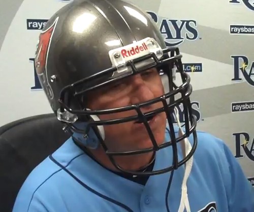
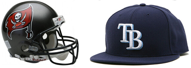
That’s right — Maddon wore a Bucs helmet for his post-game press conference, a rare feat of managerial cross-dressing that ranks as an instant classic.
So what’s the story behind this? The short version is that Maddon is tight with Bucs coach Raheem Morris (a slightly longer version, including a little video clip in which Maddon explains the whole thing, is available on Cork Gaines’s excellent Rays Index site). But leaving aside the whys and the wherefores, how many other MLB managers could pull off a stunt like this? Like, can you imagine Mike Quade showing up in a Bears helmet? No way. Bruce Bochy in a Niners helmet? Nuh-uh. Jim Leyland in a Lions helmet? Maaaaybe, except who’d be caught dead wearing a Lions helmet?
As a Mets fan, I have no particular gripes with Terry Collins, who seems to have done a decent job this year. But if I had my pick of any current MLB skipper to run the Mets, I’d take Maddon — and not just because it’d be great for Uni Watch. Although that part certainly wouldn’t hurt.
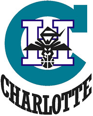
Charlotte shuffle: Last week I Ticker-linked to the old Hornets logo shown at right and mentioned that I had no memory of it. That prompted the following from reader Jeff Spry:
I interned with the Hornets’ Media Relations department back in the summer of 1988. This was the Hornets’ first year and I got to do a lot of work with the expansion draft, the first media guide, the new stadium, the new uniforms, and other work heading into that first season.
I remember that logo clearly and have some old T-shirts and I think even a pennant somewhere with that logo on it. It also appears in this photo, which ran in the July 1988 edition of The Bee Line, the official newsletter of the Hornets. I think the player in the white jersey is Ralph Lewis and the player in the dark jersey is Ennis Whatley.
The front page of that newsletter had a story about the unveiling of the team’s first uniform, which was designed by Alexander Julian. You’ll notice Julian refused payment but did accept a monthly shipment of North Carolina BBQ in exchange for his services. The model is Kelly Tripuka, whom we attained by trading Mike Brown (the seventh pick in the expansion draft) straight-up to Utah. Also notice that the newsletter feature the cartoon logo — the old one must not have lasted long.
Excellent stuff — thanks, Jeff.
Because man cannot live by uni alone: There’s a new post on the Permanent Record blog. And I think I may be able to give you the details on my new meat/butchery blog by tomorrow, whoop-whoop.
Stirrups Club reminder: Robert Marshall has a new set of stirrups for sale. For details, look here.
Uni Watch News Ticker: According to the Icethetics site, the Islanders’ new third jersey will look like this, which is so bad it actually veers into high comedy. Is this Wang’s revenge for losing the Coliseum referendum earlier this month? ”¦ New trophy for the Iowa/Iowa State game (from Cody Dannen). ”¦ Looks like Bill Olds was having some helmet decal issues. Bill Kellick spotted that in footage of a 1975 game. ”¦ Somebody somewhere processed the order for the Warren County (Tenn.) high school football team’s uniforms. Perhaps that someone should have said, “Uh, maybe you might wanna rethink that” (courtesy of Todd Herzog). ”¦ New football uniforms for the U. of Indianapolis (from Jacob Kubuske). ”¦ Good article about the SF Giants’ mascot (thanks, Brinke). ”¦ Also from Brinke: a bunch of scans from old NFL/Sears catalogs. ”¦ With the new Meadowlands stadium about to succumb to corporate douchebaggery, several people have been asking me if No Mas and I will produce a Naming Wrongs T-shirt for the occasion. We actually came out with that shirt a year ago, anticipating the inevitable. ”¦ The Astros became Los Astros on Saturday. ”¦ Maryland will unveil its new football uniforms today. ”¦ Gaelic football news from Denis Hurley, who writes: “Kerry and Mayo met on Sunday in the All-Ireland football semifinal. As both counties wear mainly green jerseys, they have been asked to wear alternative kits. Here’s how the Kerry/Mayo match-up has been handled in th epast. ”¦ New football uniforms for USF. ”¦ Blain Fowler reports that Under Armour has moved in a new direction: They’ve entered into their first sponsorship deal with a gymnast. ”¦ Lee Ziegler provided us with another look at that unusual stitching on Michael Vick’s shoulders. I sent the screen shot to Giants equipment director Joe Skiba, who said, “I believe it’s to eliminate stretch.” ”¦ Here’s a great gallery of photos from the Expos’ 1970 home opener (big thanks to Andrew Woolley). ”¦ Congrats to reader David Griffin, who finished third in the Toronto Star’s Blue Jays redesign contest. “Of course I still prefer it to the first- and second-place versions,” he says. ”¦ Really, really excellent piece about the role of the military uniform in contemporary American life. Recommended reading. ”¦ My friend Amy is currently taking culinary classes, and yesterday afternoon I attended a brunch that they held at the school. The seating was communal, so I started yakking with the guy sitting across the table from me, who was there because his wife is enrolled in the culinary program. One thing led to another, and it turned out that he’s longtime reader Matt Powers’s first cousin. Seriously, what are the odds? ”¦ Can’t figure out which NFL team to root for? Here’s a handy flowchart (from R. Scott Rogers). ”¦ New logo for Western Oregon University. ”¦ Noticed Johnny Damon wearing navy stirrups with navy sannies yesterday. Has he been doing this for a while? ”¦ New Iron Maiden-themed goalie mask for Chris Mason (from Kyle Allebach). … We all know college football teams often have multiple players with the same uni number, but I’d never seen it happen in the NFL before. Eric Stangel spotted that during last night’s Chargers/Cowboys game. ”¦ The AHL’s Springfield Falcons will be honoring all their past championship teams by wearing a Calder Cup jersey on Opening Night (from Nick LaRosa). ”¦ Check this out: Chargers vs. Chargers! That’s Evangel Christian and North River Christian, who faced off in Alabama last Friday (great find by Chuck Beech). ”¦ Dan Cichalski alerted me to a little mystery over on the Ballcap Blog: Can anyone identify this cap?
fuckreally?I don’t even watch hockey 98% of time, and I have only one thing to link
Well, someone has to make up for the Knicks and Mets using less black. I guess. It’s gonna look stupid as hell if they don’t get black pants to go with it.
So would the First Law of Unidynamics posit that there is a conservation of black among New York sports teams? So far, the data does seem to support the hypothesis.
I was thinking more along this line:
link
Well, I mean, if they were planning an outdoor game at Citi Field, maybe …
D’oh! Good Christ, what am I saying?! That thing blows. Worse than the brown pants the Leafs wore for a St. Patricks throwback game. Worse than the monochrome gold L.A. Kings. Worse than anything the Vancouver Canucks’ designers have puked up. It’ll make the Hartford Whalers in Cooperalls look like the Detroit Fucking Red Wings.
That black Isles jersey appeared on Yahoo last week and made its way here the same day, but I think it was the yahoo story that said that jersey was “leaked” to the public to try to get some feedback. I pray thats what it was and that mess won’t see the ice.
What did anyone expect from a stupid, no-class organization like the Islanders?
I hear Cleveland is lovely in winter. So are Kansas City, Quebec, Seattle, Houston and Moscow.
Buh-bye.
I’d like to say I disagree. Like to. Unfortunately, I can’t. One wonders if the team is actually going out of its way to alienate whatever remaining fans it has.
First the re-signing (alas, not the resigning) of Trevor Gillies, who has no talent that doesn’t require his fists. Now, a totally baseless and tasteless third jersey offering.
If the idea behind 3rd jerseys are to increase your souvenir sales, wouldn’t it be a good idea to offer fans a jersey somebody might actually WANT to wear?
Can’t they do anything right? If this jersey is supposed to be symbolic of the team, I guess we have our answer.
Memo to all professional sports teams marketing departments. Unless your team already has black as a team color – i.e., the Chicago White Sox, Oakland Raiders – please, I beg you, please do not use black for any jersey, jacket, cap, helmet, or sock. Black has “jumped the shark.” It’s time to bury it. Enough already.
Fish Sticks were worse, imho.
The Fisherman actually had colours. This black monstrosity is horri-awful. I want to make something clear: THERE IS NO NEED FOR A BLACK ALTERNATE WHEN THE ISLES JUST WENT BACK TO THEIR CLASSIC LOOK.
Can’t believe I agree with Teebz on the Fisherman uni. I didn’t like the design but understood the idea that they were going for.
This is just ridiculous. What about another orange jersey? I didn’t like the link but at least it’s one of their colors.
The only thing worse than it being black, is that it’s black with a whole lot of gray – a trim color from the “fishsticks” era, now magnified to put more gray on one jersey than was ever seen on the entire team in a single 1995-98 era game.
Oh, and it’s also the Ducks’ current third template. So the design’s not original, either.
I knew I’d convert you eventually, Shaftman. ;o)
Interesting, photos from the expos 1970s opener are all in black and white.
Looks like there was still some snow on the ground outside Jarry Park.
Maybe the B&W photos were taken for one of the papers? There was usually no need to shoot colour back then.
I couldn’t help but notice the Expo logo enclosed in a Carling-O’Keefe Breweries shield on the Welcome sign behind home plate.
The photo of former prime minister Pearson in an Expo hat is priceless. I don’t think I’ve ever seen a photo of him where he wasn’t sporting a bow tie.
“Maybe the B&W photos were taken for one of the papers? There was usually no need to shoot colour back then.”
Absolutely.
Shooting color, especially if likely no earthly use for it, was a waste of money.
They actually had a fairly state-of-the-art tableau indicateur for such a threadbare park.
One that can produce accented characters, to boot. (Look at the “a” in the first line.)
Another interesting quirk is on the clock: note the centered “1”. Rare to see something like that.
Amazing that all of the Blue Jays entries prominently featured stirrups (even the lumberjack one!) I realize that the provided template has stirrups, but I’m almost surprised that nobody pajamaed right over them. There’s no doubt that David Griffin’s entry should be #1, and not just because he’s a Uni Watcher. The old-school cap, the lighter blue, the gorgeous script, the subtle inclusion of the “T” mark and the maple leaf and, of course, the striped stirrups. It blows away the dark blue with the blah current Jays wordmark, and it definitely beats the red sleeved softball uni. I’d love to see them keep the lumberjack look as an alternative, maybe for Monty Python Day!
The only thing I dislike about Maddon is that ridiculous #70 that he wears. Why does he do that?
The least he could do would be to cover it up with that awesome powder-blue-plaid blazer that he has!
That’s another great thing about Maddon! He said he took 70 because no player would ever ask for it, so he’d never have to give it up. Guy is a real character. Count me as a fan.
Maddon is good for baseball…seems like a ‘down to earth’ guy who knows how to keep his team light.
from my hometown of Hazleton, PA
My wife rarely pays much attention to baseball, but whenever Maddon appears on screen or in the paper she wants to know what it’s about. She digs the glasses, the sense of humour, the offbeat sartorial choices. Must remind her of someone…
And I agree with Andrew M. — the kind of guy baseball needs more of.
Which is exactly the right, and really the only acceptable, approach for any manager to take when it comes to choosing a number. The only time it’s OK for a manager to have a low number is if he has already been inducted into Cooperstown as a player. Otherwise, no manager or coach should have a number below 40. Far as I’m concerned, this is not Maddon being a character, it’s Maddon having character.
one of my biggest pet peeves in sports: coaches and managers shouldn’t even wear friggin’ baseball uniforms… it’s 2011 (i think), let’s update a rule or 2…
If the rule is changed to wear suits and ties, I’d be all for it. If the rule is changed to encourage “team gear” (link), I’m against the idea entirely. I think it’s already begun heading that direction, though … especially besides the months of June, July, and August, I wonder how many managers wear a jersey on game day at all?
polos, khakis, and hats… no biggie at all
Cubs for years saved nos. 1-5 for manager and coaches. Jose Cardenal broke the string by taking 1.
OK Paul, if he chose it for that reason, I’ll give him credit for that.
Still, he could have done what a lot of Mets coaches have done (really, a *lot*; it must have been an unofficial team policy), which is to choose a number in the low 50s, so he’s outside the range of what looks good on a player, but not so bizarre that you do a double take when you see it.
I really think the Mets had the right idea there. And it freed up the low numbers so that you rarely saw a Met player wearing something ridiculous.
R.S., you should come see a game in the Japanese majors. Here, all managers and coaches have higher numbers than the players, and that includes players on the second (minor league) team. So you see people in the 70s, 80s, and 90s on the coaching lines all the time. “Developmental players”, bullpen catchers, BP pitchers, and other staffers are three digits!
Could still have conflicts — remember, Sid Fernandez and Benny Agbayani both wore 50, Santana wears 57, which is why Frankie Rodriguez wore 75 in Queens.
Unionjack, traditionally 50 was the last player number for the Mets. Sid had it, Agbayani had it. I probably should have said “51 and up”; starting with 51 you had coaches: Vern Hoscheit and Greg Pavlick were two from ’86. Off the top of my head, Charlie Hough had 54 despite wearing 46 when he pitched; Jerry Manuel was 53; HoJo came back with 52 after being 20 as a player; Mookie was 51.
If you have “Mets by the Numbers” you can see a lot more.
The Mets need to get more credit for doing this — it keeps players’ numbers looking reasonable while not making the coaches look ridiculous.
I Toronto, the coaches’ numbers run the gamut, although for many of them it appears they wear numbers they sported as players (John Farrell 52, Dwayne Murphy 21, Bruce Walton 53, Pat Hentgen 41). But Torey Lovullo’s wearing 7, which, if Baseball-Reference is accurate, is one of the few numbers he didn’t wear as a player (4, 6, 9, 10, 12, 13, 23, 27 and 43)!
The B-movie fan in me wishes Brian Butterfield (#55) would switch to number 8.
There are currently TWO NE PAtriots wearing #75: Vince Wilfork, who owns the number and a guard named Mark Wetterer
link
Don’t dual numbers happen all the time during the preseason? I’m not surprised.
That and the Raiders have a receiver wearing #6
Is it me or does the new Western Oregon logo have a striking resemblance to the New Mexico Lobos logo?
Here’s the St. Pete Times article on Maddon wearing the Bucs helmet. Good pic of him using the lineup card to cover his mouth as if he was calling a play.
link
And here’s the video:
link
Maddon reminds me of Ricky Williams when he left his helmet on post-game for an interview when he was on the Saints. haha
Except Williams suffers from social anxiety disorder and has admitted and clinical mental health issues.
Williams may have his issues and challenges, and if you don’t get why teams keep signing him when his best ballcarrying years are behind him…watch him pick up the blitz sometime. Guys like Williams and Robert Smith do/did it so well. Fans almost always overlook that talent. Coaches never do.
He is perhaps the greatest combination of talent and enigma I’ve seen in I don’t know how long.
My original point is that mental health issues aren’t funny, though.
Understood, KT. And I agree completely.
I was harmonizing (I hope), pointing out the guy is incredibly football smart, and that people are far too quick to dismiss him because they’re labeled him.
Oh, man, that’s not right, either.
They guy is incredibly smart, period.
Not just football smart.
Sears Catalog scans, specifically the 1971 NHL page – the Pittsburgh Penguins selection makes no sense. They were offering a black & gold shirt and the baby blue hat. The team colors were blue and white from 1967-1980, so why the black & gold shirt?
No wonder that 4 decades later, it is still undecided what the color scheme is for this team.
That, and the gold emblem on the St. Louis shirt. Geez, ya think the team’s nickname might’ve provided a clue?
Well if the Browns can be orange, why can’t the Blues be yellow?
like a blue/white maple leaf, or an orange drop of oil?
ehhh… maybe not the same anyway. haha
This is another case of the team not being named for a color. They aren’t the Blues as in the hue blue. They are the Blues as in music genre. The Browns aren’t named for a color either, but for their first coach. The Blackhawks also fit the bill too. No one seems to mind that they wear red.
White Sox, Red Sox, Reds, Blue Devils, etc., all named for a color, so the uniform color choice should indeed match.
Sure, technically they’re named after the music…but let’s be real here. If you’re the “Blues”, wearing red or green is pretty damn silly, isn’t it?
As I tried to reason with the Winnipeg Goldeyes- The St. Louis Blues would seem pretty clueless if they had no blue in their uniform.
Craig – the Blackhawks aren’t Black Hawks – they’re named after a Native American chief: link
Hence the crest on the sweater
@Craig D: “This is another case of the team not being named for a color. They aren’t the Blues as in the hue blue.”
Yeah, I get that, though I think they were named for W.C. Handy’s song. But the blue note on the team sweater has always been predominantly… well, blue. To render it in yellow as that Sears item did… there’s just something a little bit off about it. Like a Detroit sweater with a blue wing. There may be a reason, though.
@J-Dub: The army division that original Blackhawks owner Frederic McLaughlin is said to have served in, the 86th, were known as the Black Hawks, and their unit’s insignia featured a black hawk.
link
Be that as it may, the unit was in fact named for the Sauk chief.
What month did Sears catalogs get released? The images listed as 1975 look like they could actually be 1974 instead. They’ve got the green Eagles helmet for ’74, but not the funky NY that the Giants used in ’75.
Those are probably from the Big Book, which got released in the fall in time for the holiday shopping season. So they probably used the previous season’s designs.
link
That Western Oregon logo sure seems like it’s in the same ballpark as this:
link
Sure, in that it’s red lettering and a wolf. One’s a front view, one’s a side profile view. Lettering above one, below the other.
I really don’t think they’re close enough to call it copyright infringement and actually win.
That’s the definition of “ballpark,” right?
Congrats to David Griffin as well. Twas my brother-in-law who finished first.
Haha good NFL flowchart although it looks like you fizzled out in the end. Wish I could say that Boston prefers football over baseball but ah, the Red Sox will always rule the roost.
The flowchart comes from the authors of link, which is mostly dedicated to interpretive design (you know, like design for museums and national parks and whatnot), but which veers over into sports design a lot because the authors are both designers and huge sports fans. One of whom is a childhood friend of mine, and a teammate on the first baseball team I ever played on, the Radnor-Wayne Little League Mets.
Thanks for the link! Looks like a good website. How funny is that the main contributor is also named Paul?
1) ‘Bruce Bochy in a Niners helmet? Nuh-uh.’ Do they make helmets that big to fit his head??
2) Blue Jays jersey: Dave Griffin should have won. Heck, the Lumberjack is better than the First (what’s up with the Purple, or did the color not transfer correctly?) and Second (looks like a Mets uni) place entries. More of a reflection on the judges than the entries themselves.
The colour didn’t transfer correctly. It’s supposed to be blue.
I do like the lumberjack/hipster deal.
But in high school in the ’80s, a red plaid lumberjack shirt was de rigueur. Equally important fashion-wise: leaving your Cougar brand work boots untied.
“i root for a baseball team that wears lumberjack jerseys… you’ve probably never heard of them…”
hee hee :-)
Those ARE stirrups, too.
Too bad he didn’t wear white sanis.
Would have been fun to see.
Sides different very common to Puma soccer shoes.
And their streetwear models.
Based on the comments from the contest, it appears there will be a riot in Toronto if the Blue Jays do anything other than change the uniform, logo & colors back to the pre-1997 look. I might join them if that’s the case.
link
CONFUSED
besides being non-traditional and open to debate about their asthetic value (I’m not a fan, but I’m 43, not 15) am I missing something on the “rethink that” comment for these uniforms?
They are much more pleasing to the eye than the garbage worn by Oregon…
Oh, good … I’m not the only one that couldn’t figure it out. Does that belong in the top 95% of uniforms out there? I doubt it. However, is it bad enough to be ticker-worthy? Not in my opinion. In reviewing the photos, I actually had to question “P-I-O-N-E-E-R … yeah … it’s spelled right …”.
dan gilbert really loves the jerseys too. in fact, i heard he sent the team and fans a letter that reads:
“love the jerseys, especially the font! don’t let your teammates betray you!
-DG
cleveland cavs, 2012 NBA champs”
Gotta show the Pioneers some love. I’d never think of putting those suits on a pro or big college team, but as a high school uniform, they’re swell.
The font is good, although I’d prefer it if the 1 were just a straight line.
Love the colors.
My only beef is the striping. Fix that and they’re good to go.
“Dan Cichalski alerted me to a little mystery over on the Ballcap Blog: Can anyone identify this cap?”
Is that an old Long Island Ducks cap?
That was my first thought, but they wore link, as far as I can tell.
Madison Mallards?
Right color scheme, but according to the great Wikipedia “The 2010 season marks the Mallards’ 10th anniversary season.”
Another thing is that it could also be a jr. high or hs team. We wore New Era caps in the early 70’s in jr. high.
Sorry, but that Springfield Falcons uniform looks like a print-on-demand book cover. I am very aware of the city’s long and illustrious minor-league hockey history (Old-Time Hockey! Eddie Shore!), but that ain’t the way to celebrate it. Not even if they’d won the Calder Cup last year.
Another idea that no one must let the Toronto Maple Leafs know about.
The best picture of Joe Maddon arguing is the one where he’s leaning back with his arms up in an “excuuuuuuse me” pose.
link
Can’t find a pic, but his best moment might have been when he was ejected for arguing a balk call. He knew he wasn’t allowed to argue balks (like balls and strikes) so he came to the mound and started screaming at the pitcher (Matt Garza i believe). But he was really complaining about the balk call to the second base umpire who was close by. The entire infield was covering their faces because they were trying to hide their laughter. Classic Joe.
Maddon getting tossed for arguinf balk.
link
People will be lining up to wear a Lions helmet after this season.
Why would people be lining up to wear Lions helmets after a 6-10 season?
as team walk-ons?
I love those old Sears Catalog pages! The sweatshirt / pennant combo is great. A quick eBay search provided the following:
link
link
Re. the original Hornets logo – as I wrote last week, it was the primary logo from the team’s inception until around the 1988 draft. The Hugo logo was originally a secondary mark, but was apparently so popular it was promoted to primary by the time the Hornets’ first season started. The original logo remained on the warm-ups and waistbands until 1991, when it was replaced with Hugo and finally retired…
I give the Charlotte Hornets (but not the New Orleans variety) credit for cleverest use of color. The green, maroon and cyan stripes on the jersey accented the team colors without continuing to the shorts. Oddly subtle for a basketball uniform. Mr. Julian earned his barbecue!
“one of my biggest pet peeves in sports: coaches and managers shouldn’t even wear friggin’ baseball uniforms… it’s 2011 (i think), let’s update a rule or 2…”
Not sure what the year has to do with it, or why it needs updating, since as far as I know the reason they wear unis is the same as it always was, i.e., that baseball managers and coaches are routinely on the field doing baseball activities, like hitting infield, pitching batting practice, etc. And base coaches are on the field during games, unlike other sports. What would you have them wear? Team blazers?
almost certain… wait, no… i did say “khakis, polos, hats” didn’t i?
oh, but definitely assign a number to a guy thats gonna time a base runner and give signs. makes perfect sense…
How does it make sense to have baseball coaches wear polo shirts?
We are aware that polo is an actual sport, right? If we’re going to have coaches in one sport dress like players in a different sport, I vote for link.
With or without the bike shorts underneath?
How does it make sense to have baseball coaches wear polo shirts?
We are aware that polo is an actual sport, right?
You’ve gotta be kidding me with this.
The way I’ve felt about a lot of comments lately!
I’m with RyCo on this one. I don’t think the world will stop turning if we let the base coaches wear something other than the traditional team uniform. I’m pretty sure it’s fully possible to pitch batting practice w/o being in full team uniform!
Love the stirrups, like the jersey, hate the link
Those caught my eye as well, odd that they have different logos on the inside/outside of the shoe. I don’t think I’ve ever noticed anyone else in MLB wearing Puma, Damon’s got to be their most hi profile player.
This was supposed to be here…
Those ARE stirrups, too.
Too bad he didn’t wear white sanis.
Would have been fun to see.
Sides different very common to Puma soccer shoes.
And their streetwear models.
Barry Zito was the second to last guy to wear Pumas:
link
It is kind of disappointing. I think Puma has the most beautiful trademark on its shoes. The formstripe just flows nicely along the vamp and creates a sense of motion. Just like Adidas’ trefoil, the pouncing cat is a good logo to put on the tongue, but its place is not on the instep of an athletic shoe.
Or on link of a jersey!
That uni is a veritable menagerie. Counting the Premiership lions on the sleeves and numbers, that had 12! visible animals on it. Just silly.
Great look at a piece of soccer history:
link
From a testimonial match (Rodney Marsh was, to my knowledge, the second player to get one on these shores, but they’re common in Europe) on September 14, 1979. The nice touch is that they took the team’s unique wordmark and made it into a “patch” for the game.
This might also be a fairly early example of an addition to a jersey for a specific game (Super Bowl patches didn’t show up until 25, right?). Now it’s common.
ManU gets $66M for training kit sponsor:
link
By the way…..I couldn’t even gather the words to explain my disappointment over the weekend and UGA’s decision to “help NIKE out” by wearing the red long-johns for the Boise State game. Those tix were going for upwards of $500-$600 bucks a pair here locally…..I freakin’ GAVE mine away after seeing those monstrosities. Long live the link.
re: the Sears Catalog scans. The best one has to be the NFL kids robes. The largest print is for the description “Flame Resistant”. You know…for that 11 yr old that smokes in bed.
Didn’t have the robe, but I had the PJs. The tradeoff for flame resistance was that you had some vicious static electricity. On winter evenings you could hear it crackling if you ran your hand across your sleeve.
link
check it out. revel in the awesomeness of the Sears Christmas Wish Book.
Love it. I’d still go through it page by page if they were still published.
I was partial to the JC Penney catalog, but they were both top notch. Wish I still had an old one here.
I forgot they sold a field to go with these figures:
link
Funny you should mention Joe Maddon “cross-dressing” by wearing football stuff. I remember in Summer 2010, the Rays had a road trip to Toronto while the Blackhawks and Flyers were playing for the Stanley Cup. Maddon’s way of getting in on the fun? The team dress code for the trip was a hockey jersey. Maddon wore a #11 John Madden Blackhawks jersey, and Evan Longoria had a customized Lightning jersey with his own #3 for dropping the first puck.
Bingo!
link
Forgot that Balfour wore a Belfour jersey. Awesome.
how cool is olds 38? how can i not have a recollection of him? i get fail points today for sure.
as someone who loves ncaa trophy games as one of the subtle highlights to the season(phil & JTH can attest i feel this way), may i just say that the new cy-hawk trophy is a total fail. i can’t wait to see a shot posted of the players hauling that around. off the top of my head, how bout a big ass bronze corncob gently breaking it’s husks inside a bassinet with a blanket. it could be creepy and kind’a off beat cool, it would metaphorically talk about iowa being the “cradle” of the country with it’s corn, etc. i don’t know man, i may not have a perfect idea since i put 5 seconds of thought into it, but it is already better then what they turned out.
Looks like something out of Kim Jon-Il’s marketing department.
i can attest
wait…what?
sorry phil…
that i love all the stupid trophy games like paul bunyan’s axe and the bronze pig.
even the platypus trophy?
i am going to say there is no such game, but if there was one, i would be into it.
i thought you said the civil war was unwatchable…
well wrap me in bacon and call me a chestnut, that is awesome! i only new “civil war” because that was a non game until recently. but yeah, that is totally great. as far as unwatchable, nike does kind of kill that game, but i still watch it, and even before nike-gon, i rooted beaver.
you can beat yourself, but you can’t beat the beaver.
wait, did i do that to my name? i didn’t do that did i? good one phil.
I had family up from Arkansas this past week and one of them who served in Iraq and Afghanistan is now attending the University of Central Arkansas.
He thought that I might be interested in the color of the school’s newly redone football field:
link
When the afternoon sun hits that gray turf, the glare is going to be terrible.
I’m envisioning some kind of lowgrade strobing effect, too. On punts and kickoffs, especially.
Guess we’ll just have to wait and see. Literally.
Further evidence that the actual games are trying harder and harder to become like the video games. Sad.
I don’t hate the purple and gray “that” much, but the two gray sections together in the middle really sorta screw up the whole effect.
Well, if they wanted the same color adjacent to both endzones (probably a good idea), they didn’t have a helluva lot of choice, did they.
Right, but wanting to achieve that goal is in and of itself a mistake. But credit to Central Arkansas – if you’re going to go ugly, go ugly. Alternating field stripes all the way down the field is only mostly ugly. Alternating field stripes starting at the endzones and meeting in a double-wide stripe of gray (which isn’t even the school’s main color!) is all-the-way ugly. You basically can’t get uglier than that. (Well, you could, if you made the field markings black or lime green, but I don’t think the NCAA would allow it.)
gah…
the endzones are BLACK…wtf?
yep…black
and when they add UCA wordmarks and such, it will still be black
this is only a slightly worse idea than eastern washington and the original camo field
My point was that there is a mathetmatical imperative when you alternate colors, starting from each end.
Aw, hell, you know what I mean. To avoid a double color at the center you have to have an uneven number of spaces.
A local high school is playing on its new artificial turf this Friday. Blue turf with yellow endzones.
link
I’d like to see a all-white field with green markings.
Re: the stitching on Vick’s shoulders — I don’t recall if it was regarding the Eagles, but I’m fairly certain this stitching was discussed last season. I know this isn’t the first time I’ve seen it on the field.
It’s always a great day at UW when Parc Jarry is involved!
If only it was in color
link
RIP, Expos.
It wouldn’t surprise me to see Jim Leyland in a football helmet at some point – maybe not necessarily a Lions helmet – considering all the irritation that flies around regarding his lineup decisions. (Although, now that the lineups do seem to be working more in his favor of late, maybe we won’t after all…)
Poor Old Navy has apostrophe troubles!
link
At least they got the right apostrophe at the beginning of ‘Cuse, instead of assuming it’s supposed to be an open single quote at the beginning of an abbreviated word.
Will NoMaas be reprinting more of those tshirts? I don’t remember them from the beginning but I’d like one now and they seem to be pretty sold out of everything.
kevin’s brother?
Interesting photo posted by Maryland on their facebook page.
link
the first Maryland Football uniforms in 1892
Odd that the photo’s black and white.
Another Ocho facemask/helmet combo:
link
Nothing’s changed with his move to the Pats. How do equipment guys deal?
Not the first time Ocho Combo has worn an Ion 4D:
link
Nice job, David P!
Since I didn’t notice this in a quick scan of the comments, with 90 players on NFL rosters at the moment, every team has some duplicate numbers.
Off to the doubleheader.
“As a Mets fan, I have no particular gripes with Terry Collins, who seems to have done a decent job this year. But if I had my pick of any current MLB skipper to run the Mets, I’d take Maddon – and not just because it’d be great for Uni Watch. Although that part certainly wouldn’t hurt.”
Funny, I thought the same thing.
Team USA jerseys announced for this December’s Roller Derby World Cup in December:
link
The Evangel Christian mascot is actually the Lightning not Chargers.
link
I have a few problems with Maddon.
I may be mistaken, but I’m pretty sure he required his players to wear Ed Hardy gear on a road trip. Yikes!
I know he’s a little older… But Cold Play? Not a fan.
I wonder if MetLife Stadium will give away the same windbreakers that James Spader’s character lent to George Costanza.
Step nine!!!
I feel like one of Pavlov’s dogs every time I see those old Sears catlogs. The drool of my youth.
Why are the NY Giants wearing their away pants at the Meadowlands?
The Hiroshima Carp have announced that they will wear throwbacks this week while on the road.
Wayne Hagin just said most pitchers hurt themselves swinging the bat, not from throwing a ball.
Right. Because no pitcher has ever hurt his arm by throwing.
Can’t make it up, can’t make it up, can’t make it up….
Because Jason Berken, Jake Arrieta, Bobby Jenks, Clay Buchholz, Rich Hill, Daisuke Matsuzaka, Phil Humber, Tony Peña, Carlos Carrasco, Alex White, Al Alburquerque, Brad Thomas, Joel Zumaya, Garrett Richards, Frankie Rodriguez, Nick Blackburn, Scott Baker, Freddy Garcia, Sergio Mitre, Jeff Marquez, Joba Chamberlain, Damaso Marte, Pedro Feliciano, Trystan Magnuson, Michael Wuertz, Brett Anderson, Dallas Braden, David Aardsma, Alex Cobb, Mason Tobin, Omar Beltre, Brandon Webb, John Rauch, Carlos Villanueva, Jesse Carlson, and Dustin McGowan all got hurt swinging the bat in the American League, right?
Feel free to use that list on Fire Wayne Hagin. It’s current as of tonight at 7:35 EDT.
Interesting side note: Of the seven or eight players in the majors that I went to college with, two are AL pitchers currently on the DL. Weird.
hope a better picture circulates but here are marylands new digs. They look exactly like they do in NCAA 12, but there appears to be 2 new helmets; a white one with a different facemask and stripe and a black one, neither of which have a decal. I don’t understand the lack of decals though
link
scratch the no decals thing, they apparently have a turtle shell print on the white helmet.
currently the best look one can get at the unis is through the unveiling video from the school.
the uniforms don’t show up until about 10:30 into the video.
link
All the hype surrounding UMD’s new unis and this is what we get. Terrible design and no helmet logo.
A college football unveiling being overhyped????
I know, right? LOL… what a stupid concept. *snooty laughter* Like anyone would be astir over some fancy-shmancy spaceman uniform for a college team, especially in this day and age. *insanely obnoxious snooty laughter*
A couple of observations about the Parc Jarry photos:
1) Check out Richie Allen playing 3rd base for St. Louis wearing his trademark batting helmet in the field.
2) the Cardinal logo shown in the program is old. By 1970, the Cards were using script “Cardinals” for Birds on Bat, not the print font shown on the program
3) Nice usherette uniforms for the Expos
ON THE NEW MARYLAND UNIFORMS:
The new Terps head coach said that Kevin Plank got these uniforms “Done, done, done”
.
.
.
That’s a very accurate analogy, if you use the right link…
When did Ricky Williams wear #42?
link
I broke the link
That’s the other Ricky Williams, right? The “Ricky Williams who also played with the Colts” when he played with the Saints, not the “Ricky Williams who also played with the Dolphins” when he played with the Saints.