
By John Ekdahl
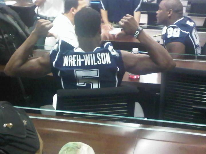
The Buffalo Bills wore their new uniforms for the first time last night in a preseason game versus the Chicago Bears, in what was just a brilliantly played four quarters of football. In all seriousness, what an tremendous improvement. The full gallery is available here.
Last names have made a return to UConn’s football uniforms. Head Coach Randy Edsall had them removed in 2004 and after making the jump to Maryland this year, he has removed player names from Maryland’s uniforms this year. We sense a pattern.

Zack Greinke was asked to pitch-hit last night and strolled up to the batter’s box wearing the wrong jersey. Instead of the standard alternate top, Greinke wore today’s “Bierbrauer” jersey which is a special jersey worn to celebrate German heritage in Wisconsin. Brewers Manager Ron Roenicke said he was not aware Greinke was wearing the wrong jersey because he was wearing a windbreaker in the dugout. “I had no idea,” Roenicke said. “It was blue, and that’s all it looked like to me. I didn’t know until one of the guys said something. He didn’t know [either].” Full story and video available here.

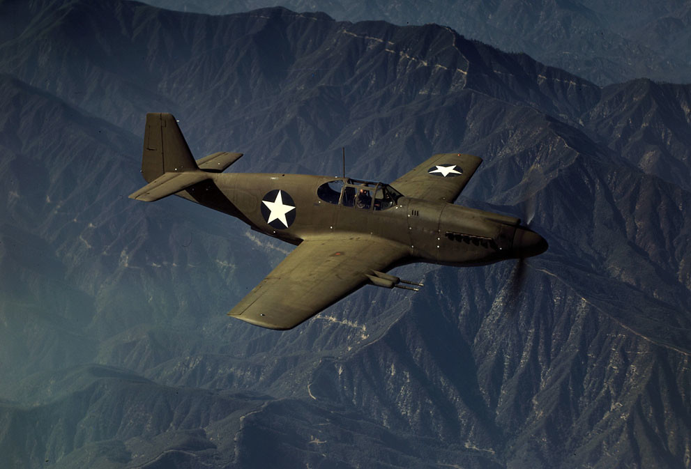
Shortly after the United States entered World War II, President Roosevelt created the Office of War Information (OWI), whose purpose was releasing war news and promoting patriotism to America’s news outlets through films and photos. Of these thousands of photos that were taken between 1939 and 1944 of the American War effort on the home front, nearly 1,600 were taken in full color and they are fantastic. Check them out here.

Benchies
by Rick Pearson
And they had better looking cuticles, too…

And here’s the full-size version.
God I hate the Bills gray facemasks. Why couldn’t they use blue or white? Why?!?
Now that I’ve seen it in action, I’m not really liking the tapered helmet stripe either… they should have either kept it normal or tapered the pants stripes to match.
Yes, I wish the Bills would have brought back the blue facemasks.
Any word about the Bills using blue pants with this new uniform?
Despite the Madden leak showing blue pants, I think the team said that they weren’t going to wear them this year.
Who knows though, if they start out 0-4 or something, the blue pants could come out as a slump buster.
“..if [the Bills] start out 0-4 or something..”
There’s a punch line there, somewhere.
White-over-white w/ black cleats & grey facemask. Tears of joy here. Game marred only by Bears’ lack of grey facemasks.
Now to hide the Bears’ navy pants…
I don’t think I like you…
Big improvement overall for the Bills, but I’m not a fan of the white-on-white look for a football uni. The blue pants are a must.
I admit it. I liked the red helmets so not that big on the return to white. I would’ve liked it a lot better if they did the blue facemask though. Unless you have gray in your team colors you shouldn’t have a gray facemask. It just makes everything look off. The gray facemask is becoming the black alternate or the 90’s teal. Everybody has to have it.
Count me in as one that hopes the blue pants make an appearance too but only on the road. Other than the Dolphins at home no team should wear all white & yes I’m including the Browns & Colts in that statement. I also get bugged when the arm/shoulder… UUuummmm… “armder?” stripes don’t match the pants stripes but this isn’t too big of a deal as long as the blue pants come back I’ll let this slide.
Overall though. Minor issues with these as compared to what they used to wear. These are a bajillion times better and I say this as a modernist that hates this retro/throwback/fauxback fad. I still like them a lot better than what they had been wearing. Now I just hope my Falcons decide to let the Swoosh get rid of the clown suits they’re wearing. Or at least talk them into going back to wearing their proper color, BLACK.
Players look so SLOW with black cleats.
Amen to that. I believe that leaves KC as the only team to sport white facemasks. Really like the white helmet/white facemask look (see TX, UT and Miami). Wish it would make a comeback. I was a fan of the red helmet as well. Think keeping that with a blue/white/blue center stripe would have really looked sharp.
John, thanks for the link to those marvelous OWI color photos. Terrific resource.
They are fantastic.
The Bills unis are definitely a vast improvement over their previous set. Not perfect, maybe, but definitely much better.
People should not be wearing super-stretchies without pads. The shoulder “pockets” sticking up like that make them look horrible. Granted, I’d rather see actual sleeves….
I think they (Bills) should consider wearing their blue socks. There is too much white going on.
The helmet stripe is mega wack.
Since Harvey Dahl joined the Rams, a team that already has Craig Dahl, I thought initials would come into play. They did not.
I think the NFL stopped requiring initials 2 or 3 seasons ago.
They NEVER required initials.
On the Rams preseason roster, shared numbers include either a “B” or a “W”. What is this? Please tell me it’s not a black/white thing. Surely they stand for (B)lue and (W)hite.
Has anyone seen this before?
Woopsie daisy
link
Nevermind. I just googled some images. Some of the black players have W’s.
Jumped guns.
That’s odd. Even in preseason I didn’t think NFL rosters were big enough to have/need shared numbers.
Not sure why they’d need to use a black or white distinction for players of different positions though. I can see black or white being a fairly obvious way to distinguish players if you’ve got 2 guys at the same position with the same number, but when one 36 is a safety and the other is a fullback it seems kinda unnecessary.
*edit*
so if it’s not black or white WTF does the B or W stand for?
First, the rams wear either white or blue jerseys at training camp, so one 36 wears a ‘W’hite jerseys and another wears 36 on a ‘B’lue jersey.
Next, while mot teams start out at around 80 players in camp, the reason for duplicate numbers is a combo of retired number not being used and the NFL’s rules about what positions wear what numbers.
I think it’s silly that teams enforce both of those rules even in the preseason but they do, hence duplicates.
Yeah, they mentioned during the Eagles-Ravens game that two players on the Eagles were wearing the same number, one on offense and one on defense.
Things stop making sense.
I guessing that the B or W stands for the jersey color (blue or white) and probably just for the practice jerseys.
That was my other thought. I stated it in my initial comment.
Rams D must wear blue practice jerseys and the O white. Then for preaseaon games thoes numbers just get doubbled up with the game jerseys.
I notice on the Saints’ roster, there’s one guy with number 72o, while another has 63d. Seems like a similar pattern.
pushbutton said:
shared tears here
the gray facemask is a ting of beauty, eh?
Feeling’s mutual.
Ugh… gray facemasks. Dumb.
Lee
Depends if a team considers facemasks equipment or part of the uniform.
That call is their option, and there is no wrong choice. Or dumb choice.
Because the choice IS theirs.
Besides, hating gray facemasks most often means someone’s football watching experience doeesn’t go back as far as the earliest Super Bowls. At that’s not wrong, either, but it does often mean they can’t conceive there could be another perpsective than theirs.
Facemasks haven’t been “just equipment” since the mid 70’s.
The Bills had a gray mask for 16 years. They then had a color coordinated mask for 35. Bringing gray back now on a *new* uniform is just… well, stupid. This isn’t a 1974 throwback with a gray mask for accuracy. It’s a new uniform with a tapered helmet stripe and navy trim. The gray mask is wrong.
NOt for the era the Bills are sort of “harking back” to.
As to not being equipment there apparently still are a few teams who see it that way. There’s a “rule” we missed?
Or are you mistakening style or a current trend for an absolute?
Not long ago it appeared we were heading toward the only teams to wear black cleats in MLB would be those who wore black or navy on their unis. But it didn’t turn out that way. Many of the teams who wore colored spikes reverted to black. Rangers, Angels, Blue Jays, Reds, Padres, Brewers, Mets and others…it’s quite a long list, actually.
Why in the hell are the Bills wearing black shoes? Why the hell do the Browns, Colts, etc wear black shoes? Its not “throwback” or “old school” its BFBS and it ruins an almost perfect look in all 3 of these cases. The same w/ the gray facemasks. F-ing stupid
To you, maybe, but to me, it’s a good look (both the black shoes and the grey facemasks). Although there are some teams that don’t fit the bill of a “black-shoe” team at all, like the link, and then there are teams that should be wearing black shoes, like the link and link.
Of course, in order to get the proper black shoe effect, you need to have a black shoe with as much black as possible (that means no white outsoles) and white laces, as shown in my example link.
Once again, if that matches only your recollections of pro football, that’s the way you’ll see it.
But yours isn’t the only accurate or valid one.
Well put. To each his own.
link
Noticed this on a RT on Icethetics’ Twitter feed. Helsinki Jokerit (Finland) has new hockey jerseys, as seen above. Basically a waist stripe away from being dead-ringers for the hockey Rockies. Epic two thumbs up, especially since they recently had the Florida Panthers’ navy template. I’d wear this…but only this one. God knows that anything “more ‘authentic'” means a shitload of ad patches.
It’s similar, I’ll grant you that, but the Rockies never had that stupid-ass shoelace at the collar.
I hate that f***ing shoestring. F*** the f***ing Rangers for bringing that f***ing thing back.
The Toronto Star is in the uni-tweaking business. Asking readers to come up with new Blue Jay unis.
link
I’m seeing way too much red for my taste. Gotta give the Star’s graphic artist credit, though, for drawing a template that featured stirrups.
Bruce A. Genther gets link.
That’s not bad… a lot of those designs, though…
link Really?
I know, eh. Maybe they have a cottage (summer home) in Tay Township.
link
Agreed. Nice mix of old and new.
The Buffalo Bills went from an F grade to a C grade IMO. The lines on the sleeves don’t match the lines on the socks. The helmet stripes match only the pants striping. And on such a minimalist team uniform those inconsistencies are magnified. Just like the Scott Norwood Super Bowl miss… wide right.
“The helmet stripes match only the pants striping.”
And how is that unusual?
Packers, 49ers, Cowboys, BYU in the Steve Young era and before…I could go on. Decades, literally, of that being common.
Mike-
Bingo on your comments. It’s simply a classic beautiful hockey outfit.
Noticed this on a RT on Icethetics’ Twitter feed. Helsinki Jokerit (Finland) has new hockey jerseys, as seen above. Basically a waist stripe away from being dead-ringers for the hockey Rockies. Epic two thumbs up, especially since they recently had the Florida Panthers’ navy template. I’d wear this…but only this one. God knows that anything “more ‘authentic’” means a shitload of ad patches.
Cincinnati Bearcats helmet (from yesterday) looks like the University of Cincinnati Annual Report cover, and not an on field symbol of their team. Somehow the UC print designer got to design the equipment. It’s not going to be legible on TV folks. A glaring example where form gets in the way of function. If you have a logo (and a decent one in Cincy), make it clearly visible to your audience\viewer.Makes NO sense.
The Toronto Blue Jays uni explorations provides evidence that it’s okay for professional design firms to be involved in the upfront process of brand positioning and market research before simply submitting artwork to the Toronto Star. Not sure what the criteria is for the project? What needs to be included? Is there a new primary mark included? What is the driving reason behind the change?
Is it just me or is the Bills’ stripe thicken towards the back??
White cleats 4 life. :)
You’re not seeing things, that’s for sure. The stripe does thicken in the back because it’s supposed to mimic the red speed stripe thingy on the charging buffalo logo (*SIDE NOTE* I’m surprised [and thankful] that they didn’t make the helmet stripe all-red while they were at it).
As far as the shoes go, This particular uniform (along with the Chiefs) fits the bill of both a white and a black shoe team, so I’m happy either way. Of course, I would love to see black shoe teams wear link.
I NEED HELP: What’s the name of the brand of wristband that Tyler Thigpen is wearing in link? I know it has an ‘N’ on it (can’t see it because it’s blacked out). Also, I heard that this brand was banned in the NFL? I could be wrong on this, but if it is banned, then why so?
Neumann
Thank you! =)
Woah, I just noticed the Cardinals are wearing BLACK hats tonight! With a bird/bat logo and not the “StL” that we’re so used to. Worse yet, they’re at home! Is this a brand new thing? If not, when/why did they start doing this? I’m so confused. My world is starting to come apart at the seams…
The hats are navy blue, not black.
This is their Sunday home hat; they’ve been wearing it a few years now.
Sure looks black to me.
Now that you mention it, I do seem to remember that being brought up at one point. Guess I just never get to watch the Cardinals at home on Sundays.
Gray facemask doesn’t bother me. I think it allows it to fade to the background much better than a colored one. Which is what I want a facemask to do.
The tapored helmet stripe, however, is dreadful. I’ve hated every attempt at a non straight stripe pattern out there. The Titans, Broncos, Panthers, Mich St, Louisville, they all look rediculous. I’m sure they’ll keep trying but they’ve failed thus far to make one work. Bills look a thousand times better overall though.
Ricko, I know how Mick feels. We got hammered by Amy Jo’s Photos earlier this year. Not fun.
Great improvement. Not crazy about the running buffalo as the logo (but then I’m a big AFL fan from back, so bring back the standing red bull). Blue socks would help break up the all white thing, but keep the white socks when using the blue pants and you have restored a nice balance. By the way, the Bears’ navy blue pants with white jerseys is a terrific look that goes back seventy years.