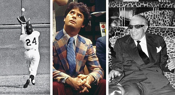
As you may have heard, the defending World Series champs visited the White House a few weeks ago. Most accounts of the event focused on Brian Wilson’s mohawk or Tim Lincecum’s long hair, but longtime Uni Watch pal Tyler Kepner noticed something else: “It looks like Willie Mays forgot the last loop on his tie. I guess when you’re Willie Mays, you can dress however you want, even when you meet the President.”
As I told Tyler, Willie’s neckwear immediately reminded me of Herb Tarlek from WKRP in Cincinnati, who frequently went with a similar style (although he sometimes wore a conventional knot).
When Willie Mays and Herb Tarlek have something in common, I figure that’s news. So I consulted my friend Jon Hammer (rhythm guitarist in the mighty Susquehanna Industrial Tool + Die Co., don’tcha know), who knows a thing or two about neckwear, to see if he could shed some more light on this situation. Here’s his response:
I have seen this knot before, and you have to be damn slick to pull it off. Someone needs to tell Willie, “Say, hey, tighten that tie, man.” It’s basically the same knot that you should tie for a proper ascot, except you are using a conventional necktie. Kind of a half-Windsor where you flop the big end over the knot, rather than through it.
I’ve seen it referred to in several places as an Onassis knot. Aristotle Onassis seems to have started wearing this style in the late ’50s, although not consistently.
Faaaaaascinating. The Onassis knot seems like one of those things that’s all well and groovy if you happen to be the world’s richest man or the greatest ballplayer who ever lived. But anyone else should probably heed the words of the guy in this message board thread who wrote, “You could tie a perfect Onassis, and 95% of people will just think you’re a dumbfuck who can’t tie a tie.”
Still: Aristotle Onassis, Willie Mays, and Herb Tarlek — the world’s most unlikely troika, joined at the neck.
(One postscript: Shortly after I finished writing this piece, I discovered that a small style blog was way ahead of me.)

Picking your brains: I’m kicking around a few ideas for fun, list-based ESPN columns and would welcome your input. Here are two that I’m pondering at the moment:
• Uniform mythbusters: This idea was inspired by the ongoing misconception that the MLB logo is based on Harmon Killebrew, which it is not. Other myths: The Mets took blue from the Dodgers, orange from the Giants, and pinstripes from the Yankees (the first two of those statements are true, but the Mets’ pins never had anything to do with the Yanks); the White Sox wore shorts for a whole season (they only wore them for a handful of games); and ”¦ what else?
This category could also include legendary stories that are true, such as the NBA logo being based on Jerry West. So I could present a commonly believed uni-related statement and then proclaim it to be True or False (ideally with a big-ass rubber stamp).
• Underrated uniforms: We’ve all seen lists of the best uniforms, the worst uniforms, the most outlandish, the classiest — but what about good ones that have largely flown under the radar without getting the positive response they deserve? Topping my list would be this Jags design and this Rays design. Others? What about the most underrated design currently in use?
If you have good ideas for either of these, feel free to post them in the comments, and/or contact me directly.
Uni Watch News Ticker: The Patriots are adding a memorial patch for Myra Kraft. ”¦ Bit of a kefuffle in New Zealand, where Adidas is being accused of price-gouging on the new All Blacks rugby jersey. Details here, here, here, and here (with thanks to Doug Mulliken). ”¦ Speaking of rugby, Eric Bangeman reports that England debuted their solid-black kits over the weekend. “Very strange to see them wearing this,” he says. “Also an odd font.” ”¦ New football uniforms for Marshall (with thanks to Christopher McComas). ”¦ In other Marshall news, Andrew Brown reports that the basketball court has been changed from dark green to kelly green. ”¦ Derrick Mason of the Jets will supposedly be wearing pink cleats all season long in honor of his mother, although I suspect the NFL may have something to say about that. ”¦ Jack Krabbe sent along a good shot of Wyoming’s three helmets. ”¦ “I found an old Marvel comic of mine from 1970,” writes Ronnie Poore. “Inside was an ad for an NFL mini-helmet set.” ”¦ Speaking of comic book ads, check out this totally boss O.J. Simpson ad for Spot-bilt shoes (major thanks to Erik Powers). ”¦ Paul Watson has a friend whose sixth grade son will be wearing this unusual helmet design this season. “It seems to depict steel plates nailed together, almost like Frankenstein,” he says. ”¦ Back in late June, I Ticker-linked to a photo of a Brewers logo made out of coral in Hawaii. Rick Thiel, who’s from Wisconsin, says he and his sons created that logo on Father’s Day — and he has the time-lapse video to prove it. “It took about two hours to complete the logo,” he says. “We have friends that live near Kona and they said that the logo was still there as of last Friday.” ”¦ Ricky Williams will be wearing No. 38 for the Ravens. ”¦ Also, Tyrod Taylor has apparently changed his number from 6 to 2 (with thanks to Andrew Cosentino). ”¦ Why was Raiders coach Hue Jackson wearing DayGlo sneakers the other day? According to this piece, “Jackson lost a bet with running back Michael Bennett at some point. The payment came in the form of Jackson wearing neon-green tennis shoes for practice” (big thanks to Mako Mameli). ”¦ Fans attending the Aug. 18 Brooklyn Cyclones game will get to choose from a free Jets-themed jersey or a free Giants-themed jersey (as noted by Ed Westfield Jr.). ”¦ Lots of speculation about a new Blue Jays uni for next season (with thanks to Andreas Papadopoulos). ”¦ It was Grateful Dead Night in San Francisco last night, so Phil Lesh and Bob Weir sang the national anthem, along with third base coach Tim Flannery, who wore a special sleeve patch for the occasion (thanks, Brinke). ”¦ Ryan Albright notes that several Penn State players have been wearing white shoelaces. “Paterno has used white laces in his standards shoes forever, but I’ve never seen players sport the white laces,” says Ryan. “Is this new, or have i just missed something?” Anyone care to enlighten us? ”¦ New logos for Manhattan College (courtesy of Michael Gleba). ”¦ Here’s what Nike’s golfers will be wearing for the PGA Championships. “It’s interesting to see how the same shirts will be worn during the tournament with different golfers,” notes Wade Harder. ”¦ Speaking of Nike, here’s a hamburger I have no desire to eat (from Justin Verrier).
From the linked Ricky Williams article:
“It might be the lone session in which he wears No. 38, because he struck a deal with running back Jalen Parmele to get back the number he’s worn throughout his entire career.”
Parmele tweeted yesterday that he and Ricky reached a deal… Parmele is moving to 33 so Ricky can have 34. No word on what was involved with the deal.
When the San Antonio Spurs went to the Rainbow Fiesta colors in 1990 I thought it was a tragic loss of the traditional Silver and Black motif. I’m so glad they returned to it in 2002. It’s one of those simple & elegant uniforms, and the spur “U” is innovative and unobtrusive. The curve of the logo is also supposed to be indicative of the Alamo facade, another nod to San Antonio. We certainly love our Spurs!
True, but the Spurs never changed their actual uniforms – only the warmups and logo.
The Spurs uni is very underrated, though. It’s not BFBS, so I actually like it a lot.
Dig the tie-dyed GIANTS font on those unis. Now that’s my nation, they can sing the anthem anytime.
interesting timing on GD night
august 9, 1995 was a tremendously sad day for deadheads…hard to believe it was 16 years ago
~~~
nice bit on the onassis knot! i always thought that was just sloth, not an actual style…and i used to be pretty up on men’s dress fashion
the more you know, as they say
Eh, to me it doesn’t look right, unless you’re wearing an ascot.
I’m going with, “just sloth, passing itself off as an actual style.” Either an actual ascot, or open-collar with a jacket, would be about 1000 times more stylish, than that. And Willie’s shirt has the perfect collar for going open-collar with a suit.
On the other hand, points to Willie for wearing the tie at a decent length. Last couple of years, I’m seeing way too many men wearing their ties absurdly long. A tie is a decoration for your shirt, not extra protection for your fly.
Hadn’t thought of it quite that way before, Scott. Nice distinction.
I had no idea that the death of Jerry Garcia came exactly eight years after the lights came on for the first time ever for the last time ever. Fitting, I suppose.
im not sure how you can equate the first official night game at wrigley with the death of jerry, but ok
interestingly, though, jerry’s last show was july 9, 1995 at…soldier field
so there is that chicago tie-in
Re: Onassis Knot
My great uncle suffered a stroke late in his life. He lost the use of the right side of his body but still made due with what he had. When he would show up at family parties in his wheel chair he’d be wearing a shirt and tie with the tie tied just like that Onassis Knot. I assumed that’s how you have to tie a tie if you only have the use of one hand.
Is it true that one should wear a button down collar with a sport coat and a non button collar with a suit?
Potential ideas for uni-watch columns (although admittedly my ideas have a chromatic bias)
1. The history of the much maligned color Brown in uniforms.
2. The most unusual color combinations in North American sports.
3. Uniform mysteries – Tampa Bay Bucaneers original colors were light green and orange, the Denver Broncos helmet colour, etc
I am on board for each of those suggestions. Excellent!
Me, too.
Most unusual uniform color combination (at least, as a regular color combo): Virginia Tech, hands down. When I did a tour when I was looking at schools, they said they specifically picked that color combination because nobody else in the nation had it. And there’s a damn good reason nobody picked it before they did.
Although they’re not as high-profile (or as garish) as VT’s I don’t think anyone else has the same color combo as Tulane.
And why no one else has that color scheme is beyond me.
I’d heard the very first draft of Tampa Bay’s uniform was solid green, with a skull and crossbones on the helmet. Weird.
You can find the original mockup somewhere in the NFL Network’s Top 10 show. I can’t remember which show, though. The jerseys were really gaudy but I do not remember green.
The bucs wanted to wear orange, red, and green, but it was the same shade of the ‘Phin’s green, so they took it out.
Great ideas and I like both of Paul’s ideas. I know he mentioned it’s been done, but what about a new twist on the best uniforms list. Like the best uniform in the 4 major’s from each decade. That way we can see how uniforms progressed through the years as well as see the best ones in each era.
I’ve long said that the most underrated NBA jerseys were the late 80’s-eary 90’s Milwaukee Bucks set.
link
There’s just something pleasing about the green-on-green and that simple, bold wordmark. Yet I’ve never seen Milwaukee wear them as throwbacks nor have I seen M&N produce a recreation. I’m not a big throwback jersey guy, but I would get one of these in a second:
link
Except that italics don’t belong on a sports uniform!
“Except that italics don’t belong on a sports uniform!”
The New York Jets logo is confused by this statement.
Well that’s a blanket statement, and a bad one at that.
I agree with Sean.
Note the Rainbow Guts treatment on the side panels.
All the more reason to love them!
Good choice, Sean.
RE: the mini helmets from the comic book ad….
1. The Giants helmet has 2 red stripes??
2. If you look at the display at the bottom you can make out the team helmets, but most of the colors are wrong.
Yeah I don’t know what they were doing with that Giants helmet. I also found it a bit funny that the text calls them “exact duplicates”. Oh how standards have changed.
For anyone who wasn’t reading comic books in the 1970s and 1980s, all the colors were wrong, everywhere. The colors in that NFL ad are actually pretty good, by the standards of the medium at that time.
I owned this set. As I recall the helmet colors were pretty accurate but the stick-on logos were a bit off.
The worst part of the set was the goalpost that held them. I tried to keep the helmets in standings order and the hanger clips eventually broke off.
I had one of those mini-helmet sets back in the day also. The helmets looked pretty good, much better than the ad in the comic.
Also, as an interesting sidebar, I note this was before the merger was officially completed– there were only 16 teams.
Perhaps Mays’ hands are arthritic so that he cannot tie a traditional tie knot?
It’s about time that Marshall got back to its roots with Kelly Green! That is the color that we grew up with! Great job by Athletic Director, Mike Hamrick, for bringing the true Marshall green back!
But what’s up with that “Thundering Herd” or “The Herd” font? It’s ugly.
Another example of a team going back to tradition in unis. I love the color and the “standard issue” look of the uni. Much like what Purdue and NC State did this year. I hope this is the new trend for Nike.
I’ll be in Kona in September. I’ll try to bring back a photo of the Brewers logo, if it’s still visible!
1. England looks ridiculous in an all black rugby kit. Attention Nike, England and New Zealand are different countries (although they have the same head of state.)
B. The Marshall uni looks very similar to the one Nike churned out for the University of N. Texas. Is stitching the nichname on the jersey Nike’s new innovation? “Mean Green” and “The Herd”. Wonder if they’re also lighter, faster and make a mean cappuccino.
They reminded me of the new North Texas State uniforms too.
Aren’t those England kits technically “anthracite” or some crap like that.
No, anthracite was their new “away” strip last year. They only wore it once, against Australia at home. link
The new unis are jet black with a hideous font. Still it better than the purple strip they tried two years ago. link
For N. Texas, they are the “Mean Green”, so it makes sense to have that on the front of the uni. For Marshall, I’m not sure why they didn’t go with “Thundering Herd”, but I love the fact that both sets are “normal” looking, and on the other end of the spectrum from Oregon.
Hi Paul,
Just a heads-up that the link to the Rays uniform image may be broken (not working for me at least).
Thanks. Worked fine for me, but I’ve swapped in a substitute, just in case.
Thanks, Paul. And sorry if it was a false alarm. For what it’s worth, here’s the message I was getting:
Access to the webpage was denied
You are not authorized to access the webpage at link. You may need to sign in.
I was a big fan of that green Rays uni… major upgrade from the prior set.
With the Jays redesigning things, I wonder if they’ll go back to the link of the early 00s – one of the better trends in MLB during that period.
I was a big fan of that green Rays uni… major upgrade from the prior set.
Agreed. And the bright blue in that set contained the seeds of a potentially great, unique-to-MLB color scheme. The green Rays unis were good, but had the blue been treated more as a true secondary color, as opposed to a tertiary-at-best accent color, they could have been great.
As someone who wears ties regualrly for work, the half Windsor has been my go-to knot for years. For variety’s sake, and thanks to Paul’s article, I went with the Onassis today. It’s not an everyday look, to be sure, but it does add some nice variety, especially with a textured tie.
Also, that England kit is an abomination. It’s like they all bought replica All Blacks kits to go as a group Halloween costume.
Not at all questioning the validity of the Onassis knot, but I’d be curious to hear how many people stop to let you know “you missed something”.
Yeah, I can think of at least 5 people that would say “were you drunk this morning” if I wore that…and the saddest part, is that they all work for me.
My thoughts on handsome uniforms that have flown under the radar:
1. Dolphins orange alternate jerseys (my eyes have trouble processing turquoise)
2. San Francisco Giants uniforms from the mid ’80s. I like the “GiantS” script, and the sleek numeral font.
3. Black+grey L.A. Kings uniforms: the Gretzky era.
4. 1976 Atlanta Hawks. Nice colors, I like the fancy block font they used.
5. 1977 Portland Trailblazers. The Championship Year.
6. 1st year of the San Diego Clippers. Pastel blue before it became overused in b-ball, I love the way “Clippers” was spelled in nautical flags down the shorts.
7. Spurs’ jerseys from the ’70s, when “San Antonio” was black on a black background.
I don’t know if it rises to the level of myths, but how about a list of the most glaringly inaccurate “throwback” logos used in merchandising today? Things like the Cooperstown Collection versions of the expansion Senators’ curly W, which seems to be a hand-drawn recreation of a mimeograph of a newspaper photo taken at a bad angle, whereas surviving artifacts show clearly that the old curly W looked almost exactly like the 2005 curly W, or the Boston/Bakersfield/Brooklyn B issue, and so forth. Might educate a few consumers and thereby help make demand drive more accuracy from suppliers.
Possible myth/true story: The burgundy Phillies unis had to drop the little curly line inside the P on the jersey because it looked deceptively like an actual baseball. That’s the story “everybody knew” back in the day, or at least the story every kid knew to be true in Delaware County circa 1980-84. Then again, maybe it was just too hard to sew that detail with tackle-twill? (Obviously, that curly line was meant to look like a baseball, but the story was that on the jersey, the size and colors made it look like a real actual baseball, whereas on the cap an opposing batter was never going to confuse it for an actual ball.)
A couple more “myths” which I think we’ve busted here already:
– Yankees were the first team with uniform numbers
– Stirrups/sanis to prevent infections story.
Add the Michigan winged helmet in there as well.
How about, “The H on the Canadiens’ sweater stands for Habitants?”
You’ll find that myth one drawer over from the one about the G on the Packers’ helmets.
Everyone knows that in Montreal, the Packers’ G stands for “Grandeur.”
If you had said you’re friends with JAN Hammer, that would have been impressive. :)
Don’t forget the myth about the plain silver 1976 Seahawks helmet.
It’s hard to think of an underrated football team. Every uniform seems to fall into one of these categories: 1) Glorious. 2) Hideous. Probably because each team has its fervent defenders and some detractors.
For *us* yeah… for the average non-uni-watcher? Not so much. Maybe “overrated” is the wrong term, but “overlooked” is fitting.
Sure, you’ve got a few obviously bad uniforms.. Bengals, Vikings, last year’s Bills…
The love-it-or-hate-its – Broncos, Seahawks, Bucs…
And the classics… Packers, Colts, Raiders…
But then there’s teams like the Chiefs or Saints who never usually get mentioned.
Yeah, my bad, I confused the two terms.
Chiefs. Best NFL uni, hands down.
I don’t care for the Chiefs unis that much either.
Some of the classics are hateworthy in my opinion. Like I hate the Raiders unis. I also hate that Dallas can’t match their silver and blues. Now lots of people love those unis, but to me in the Raiders case they are too plain and the Cowboys case they are schizophrenic.
Kudos to those Manhattan type treatments. Refreshingly clean. Somewhat vintage. Take a peek if you haven’t already.
Yeah, that’s a great bit of academic identity design. And it’s simple enough in conception and execution that there’s no reason that any high school or college in the nation that uses either ripoff pro logos or overdesigned “aggressive” logos with lots of beveling and multiple outlines and whatnot couldn’t produce a logo set of similar quality with in-house talent.
Another “myth” (really an untruth) — that Germany’s soccer team adopted green and white as their change kit to honor Ireland for being the first team to play them after the war (the first team to play West Germany was Switzerland, and green features in the German federation’s logo).
Yeah, but they did keep it for the longest time. Now they vascillate from black to anthracite to red.
I liked the green, myself.
They are going back to the green for the Euro 2012 cycle.
I’d actually never heard the Ireland thing. I’d always hear they used green and white because it was the color of the pitch.
So what happens if one of the Nike golfers misses the cut? Does Tiger wear his Saturday and Sunday outfits while he is catching up on his shopping at the local mall? More importantly, what kind of marketing message is that: “Buy this shirt/outfit that Paul Casey didn’t get to wear becaue he stunk it up on Thursday and Friday” or “Buy this shirt/outfit in which he played so badly on Friday that he missed the cut; it will save you the need to play on the weekend.” Golfers tend to be superstitious – some of them have to believe that is bad luck or at least tempting the golf gods to hit them with an 80 on Thursday.
BLACK. Mike says that “England looks ridiculous in all-black rugby kit,” and he’s right, of course. On one level, the new kit disrespects the New Zealanders’ claim to automatic distinctiveness, a prerogative they’ve earned over decades as the All-Blacks, the most successful franchise in rugger history. The new kit also has no precedent in English colors and looks like shyte in the bargain. [Ditto the US women’s soccer World Cup evil-nurse uni.] Last night the Mexican U20 men’s soccer team wore black (and won), just as their elders did for the big game against the US last month. In so doing, they abandoned what has always one of my favorite all-time kits, the very Mexican green shirt, white pants, [red socks. ¡Carajo, son los Tri!] Anyway. Like many other people around here, I don’t much like the proliferation of black. But — also like many others around here have noticed — it does seem as if blackness is popular, especially among fans born, say, after 1975. Certainly young Mets fans eat up the black product lines. But (at last) here’s a question: Has black ever been as popular a color for sports unis as it is today? All I can think of are some of John McGraw’s clubs plus the German SS of the Second World War.
BLUE. That Blue Jays new uni item recommended by Andreas Papadopoulos (Greek names rock!) offers a cool contest template for readers who want to pitch in with their own ideas. Get cracking, O’Brien.
GREEN. Good for Marshall. Yeah, double-green Bucks! And God’s blessings upon you, Manhattan College, for holding on to Jasper Green. I was moved by your explanation of the Jasper word-mark:
“…Like the new College logo, the ‘Jaspers’ word mark displays the Lasallian Star of Faith (“Signum Fidei”) to symbolize the five core principles (faith in the presence of God, respect for all people, commitment to quality education, an inclusive community, and concern for the poor and social justice) that guided the Christian Brothers in founding Manhattan College…”
There’s no horseshit like Irish horseshit.
There’s no horseshit like Irish horseshit.
And just to bring it full circle, link.
The people around me at work are looking at me because i laughed too loudly at this picture. Thanks, needed the pick-me-up.
A top contender for most underrated NHL uniform currently in use (well, for the 2010-2011 season at least): the Colorado Avalanche blue alternate.
In the NHL, it’s generally accepted that the only team that can get away with wearing a wordmark jersey is the Rangers, and even then only because they’ve been doing it for nigh on to forever. There’s some leeway granted to the Minnesota Wild green third and Buffalo Sabres royal blue third, because they look so much like college hockey jerseys. But outside of those two, there’s simply no love for the wordmark.
The Avalanche third, though, is a perfect example of a wordmark that works. It’s clean, the white pops against the blue, and the design elements all work nicely together: the burgundy shoulder yoke and burgundy/white/black shoulder and sock stripes mesh well with the blue, the drawstring adds to the design (as opposed to, say, the Flames jerseys, where it just looks tacked on), and the team’s primary logo looks even better on the shoulder yoke than it does on the standard home uniform. (Then again, I hate the style they chose when the league re-did their uniforms, and look forward to the day I’m commissioner, and can mandate the abolition of any uniform that includes vertical striping/piping or contrasting-color plackets as a design element.)
Overall, the Avalanche thirds stand as a solid argument that wordmarks in hockey shouldn’t be verboten; they simply need to be treated with respect and an eye to proper design.
I actually liked the link that the Avs wore. That one had the link too.
Here’s the rub against the Avalanche in my book: their team colors are link. But they wear so much black equipment (helmet, breezers, gloves) that would normally be color-coordinated, it’s as if the Avs are trying to make black a team color that they just forgot to put on the uniform.
The old maroons? Nice. Really ties in the black. The current blues, with the maroon shoulders? Just too jarring for me on the ice, no thank you. But it would look nice as a fan jersey.
Yep. The maroon with diagonal lettering was a great sweater.
I’m just going to go ahead and fully disagree with everything you just said, dilbert. As a hockey fan, the Avs’ alternate is horrendous.
I’m with Teebz on this one. The Maroon from a few years back was great…the current blue one? Not so much. Something about the combination of maroon and royal blue just doesn’t work for me. I appreciate the nod to the Nordiques’ colors, but I think it’s a miss.
I agree but remember Teebz doesn’t always have the greatest taste in what makes a wonderful jersey. :)
link
I wear it proudly, and there are a lot of hockey fans who would love to see those jerseys come back, Shaftman. ;o)
Besides, the Fisherman is way better than that black alternate “concept” the Isles are considering.
don’t even go there teebz
The district I teach for has a first day convocation of all personnel at which each school’s employees wear matching shirts*. My school has had the same colors (royal and yellow) for over 50 years. This year the faculty decided on BLACK shirts with gold lettering. I refuse to participate and may be unemployed come Tuesday. ;-(
*=being treated like a child is a daily reminder of having chosen education as a profession.
My high school is Green and White and every sports uniform now has black somewhere in it (however, the football team only has black as two pants stripe lines and number outlines).
Some of their shirts are now black. Personally, I like black (it’s a slimming shirt), but our colors are Green and White people.
My school’s colors were green and white too. Then in the late 70’s a coach who had went to the U of Oregon added yellow to the color scheme. So for years the school had yellow and then in the early 90’s a different coach took out the yellow and added black. So they decided to take it to a vote. The students preferred the black and they took it the school board who voted to make black the official accent color of the green and white. They generally only use the black in an accent color, I haven’t seen it abused that much.
Ryan Albright notes that several Penn State players have been wearing white shoelaces. “Paterno has used white laces in his standards shoes forever, but I’ve never seen players sport the white laces,” says Ryan. “Is this new, or have i just missed something?” Anyone care to enlighten us?
Depends on when your “forever” and “never” begin and end. It’s only the past 15 years or so (not pinning down a year; might be longer) that they’ve been wearing black. In the most of the TV era (from the mid 50s to the late 90s, I imagine) the Nittany Lions used white laces.
I read on a message board that PSU is supposed to wear the white laces this season.
Just as God intended.
FYI there is now a larger range of Giants/GD merch- that entire jersey is Dead-themed, if you notice the colors in the jersey font. Me, I just have one Dead/SFG T-shirt, and I’m happy we scored a run last night.
When did championship teams’ appearances at the White House begin happening so long after their victories? It seems like 20 or 25 years ago, a World Series-winning team would meet the president in November. Now, it’s April/August for the World Series and August for the Super Bowl…
It’s probably because Obama is never home to greet them.
Manchester United visited a few weeks ago on their pre-season tour and didn’t get to meet with Obama. IIRC, Rio Ferdinand was pretty bummed about it.
Don’t the White House visits usually coincide with the team’s regularly-scheduled visit to the DC area?
I know that’s how the link.
Not necessarily. The Giants visited on July 25th, an off day for them. They were travelling from Milwaukee to Philly that day.
I like to think that Willie Mays started getting dressed in the morning, then about halfway through the tie said to his reflection, “I’m Willie Mays, fools. President or no, I can wear my tie however I damn well please.”
Incidentally, Willie Mays sounds a lot like Mr. T in my head.
Would’ve enjoyed a mention for bring up Mason’s pink cleats in the comments yesterday but anyway…
…From a reliable source, a teammate, Mason plans on only wearing them throughout camp and (if allowed) preseason. He never planned on every game, only the ones during the usual NFL pink-fest
Would’ve enjoyed a mention for bring up Mason’s pink cleats in the comments yesterday but anyway…
About elventeen people brought that to my attention yesterday. But anyway…
God, I’m glad you’re back!
You’re a real peach Paul, nice guy.
read the FAQ johnj
I sent you a tip, and you wrote about it, but you didn’t give me credit – how come?
First of all, don’t be so sure that I didn’t notice it on my own. In general, though, if one or two people let me know about something, I’m happy to credit them by name. If more than two people tell me about the same thing, I’ll just say that “several readers” mentioned it, because it gets cumbersome to list so many names.
ProHockeyTalk.com is running “Best and Worst Sweaters of all time for each NHL team. Here is the link to Phoenix.
link
There they go again, dissing one of the greatest, most daring, interesting and well-executed logos of all time. Yes, the sleeve and hem pattern is beyond ridiculous, but that logo is magnificent……
link
True. I also think, if given a chance, the V could have been one of hockey’s enduring signature looks for the Canucks. Imagine it in blue and green and if it was the only design element (no sleeve and shoulder garbage).
You’re right!
Can somebody with photoshop skills realize Andy’s proposition?
I think hockey uniforms lend themselves to better looking designs in general. Combine that with hockey being the least popular of the 4 major sports and you get some underrated gems.
Carolina Hurricanes
link
I’m guessing people don’t think twice about these because the team used to be the Whalers, they’re a hockey team in the South, and they’re relatively new and traditionless.
But when you look at it just aesthetically, the colors work beautifully together and they make sense for what they are representing. Even the one gimmicky aspect, the checkerboard stripe across the waist, is the real hurriance warning flag, so it’s not just a pointless element dreamed up by some bored marketing exec. This is one that if you just see hanging on a rack in a sporting goods store, makes you do a double take.
The other is the St. Louis Blues alternate.
link
I think most people only know this one as the stolen design jersey, but I would actually put it in the running for single best looking uniform in all of professional sports.
I love how they took a modern design but made it look like a classic uniform with no unnecessary striping and the shoelace neckline, and I’m a sucker for incorporating elements of the city the way they do with the arch.
I’d throw a little love the New Jersey Devils’ way. Though watching the actual team is often as boring as watching paint dry, their jerseys and logo are among the best.
Agreed, the “Deviled J” is fantastic.
To me, this Jets uniform link is superior to what they wear now. Clean, sharp, wildly underrated.
I totally agree!! The futuristic Jets was awesome!! I hope they are bringing it back (I do see it used on SNY ads so I am hopeful!) It also looks better on apparel too!
link
**Paul: are you doing an NFL uni article this year? And if so, aren’t the Jets done with the Titans and are they bringing back the Futuristic Jet logo as their throwback?
I really hope you’re right. The Jets wearing those Titans uniforms is just wrong on a couple levels. They’re ugly as hell… no one actually cared about the team when they were the Titans so there’s no real nostalgia factor… and of course there’s another team called the Titans now. The 80’s or 90’s uniforms would be a much better alt/throwback for them.
I think the Saints home jersey with gold pants is underrated, since they go with the link all the time.
Also, link.
I have always loved that Cardinals jersey, the way it was a tad more complex than the red one.
Kinda sorta uni-related, and kinda-sorta Mets related: You can buy iPad sleeves made from Bernie Madoff’s old clothes.
link
I always thought Pete Rose was the MLB logo?
Chase Utley
No, it’s like the sword in the stone. One day, a ballplayer will come along whose batting stance precisely fits the MLB logo. Until that day comes, Bud Selig will remain commissioner.
Underrated:
Michigan Panthers –
Plum and
Champagne
Colors, not so much, but that helmet was awesome.
Colors, too.
Anyone know why the Dodgers were wearing Brooklyn hats last night?
holy shit…they were
nice spot…
anyone, anyone?
ah-ha
source
thought it was “bankruptcy” night
^^^ Post of the day/week/fortnight.
How far could we take this alphabet? G for Greatness, H for Habitants, B for Bankruptcy …
The Blue Jays are changing unis again? They already have the best ones in MLB.
That’s a real knee-slapper.
You had me goin’ there for a second.
Im serious. Love the logo. Love the alternate cap with the T.
There’s one in every crowd; remember, I’m the guy who wants to keep the black in the Mets’ uniform:)
Yeah, now THATS crazy talk.
You know, if the Jays used two shades of blue plus black as an accent only, and used the toothpaste-script “Toronto” that matched the “T” alt cap, and got themselves non-italic numbers, they’d have one of my favorite uniform sets in modern baseball. Much like The Phantom Menace, the current Blue Jays unis have the elements necessary to have been great, but the designers zigged where they should have zagged. It’s like they spun the wheel and went that one click past $5000 and landed on Bankrupt instead.
The toothpaste “T” is gorgeous.
I believe everything on this little comment thread.
And if *you* link
Seriously, guys…this is the first time I’ve heard anyone say they liked the Blue Jays’ current unis. Blow those things up and start over…or just go back to the originals.
here! here! i had to laugh when i saw in the story that they want something more canadian than ever. their original logo was perfect: a blue jay, a maple leaf and a baseball.
they’ve been wandering in the wilderness ever since they abandoned their original, clean, crisp and unique look. %$#@&* marketers.
I have no idea what the hell that just was. I will concede that they could cut the black and go with blue and graphite.
Virginia Tech is not the only school to wear orange and maroon. Check at the Susquehanna University Crusaders of Selinsgrove, Pennsylvania.
link
Susquehanna Crusaders wear orange and maroon. VT is not alone.
link
On one level, the new kit disrespects the New Zealanders’ claim to automatic distinctiveness, a prerogative they’ve earned over decades as the All-Blacks, the most successful franchise in rugger history.
Calling a national team a “franchise” is wrong.
Definition:
an authorization granted by a government or company to an individual or group enabling them to carry out specified commercial activities (like playing rugby and selling rugby merchandise).
Potential uni myth (or fact that has already been disproven among us): the flying V’s of the Vancouver Canucks did not stand for “Vancouver,” but “victory.”
On the same level, the H in the Canadiens’ logo does not stand for “Habs,” but “hockey.” (The parallel: the CA throwback stood for Athlétique Canadien.)
Oops. Beat me to it. That’s what I get for not reading this far down.
greatness
link
My underrated:
link
Yes!
Tyrod Taylor wore #5 at VT, not 6. link
Did someone say he wore #6 at VT?
He was link before he switched to #2.
Obviously, link.
Obviously no one cares about the Ravens. Being a dick isn’t necessary.
Any column with a Herb Tarlek sighting is worth reading.
all due respect…. did mays really have to wear a baseball cap in the white house?
More importantly, did he have to wear an ugly-ass Hitting Rehearsal cap in the White House?
I can answer that. Willie only wears that one Giants cap because it’s a generic G, without a reference to New York (the beginning and end of his career, with the Joan Whitney Payson connection to boot) or to San Francisco.
To me, this Cards set is the quintessential underappreciated uniform…
link
Beautifully simple. It’s an absolute shame they didn’t get to wear these in their Super Bowl appearance.
A shame they don’t wear them all the time.
Cardinals are a prime example of a team falling prey to the “More is Better Especially Briccabrack and DooDads” trend.
We don’t really know what the f— we’re doing, but we’re told it’s all the rage right now, and have you seen how cool I looked in my powder blue tux at my senior prom?
Yep, replaced them with the current trainwrecks undoubtedly because someone convinced them that’s how football uniforms are supposed to look now.
then went BFBS… icing on the cake
Also, they went from an old-school city (relatively speaking) to a new-school city. The traditional look was never gonna be a hit in Arizona.
Interesting how the PGA Championship Nike clothing documents look like they came from Nike, and Nike does not even know the name of the course that is hosing the tournament. It is ATLANTA Athletic Club not ATLANTIC Athletic Club.
Some more overlooked beauties:
1. Washington Federals- USFL
2. Jacksonville Bulls- USFL
3. San Antonio Riders- Europe League
4. Memphis Showboats- USFL
5. NY Giants- The Pisarcik Years
6. Saskatchewan Roughriders- 1980
The more entries I read, the more I remember.
Definitely agree on Roughriders.
Also these, especially the royal version…
link
You mean the Blue Bombers, right?
Whoops, you’re right, you’re right.. a little too hasty on the draw;)
Some of my overlooked beauties in no particular order:
* Sacramento Gold Miners, CFL
* New York/New Jersey Knights, WLAF
* Southern California Sun, WFL
* Los Angeles Kings(purple and gold version), NHL
* Pittsburgh Pirates(gold pinstripes-1977 to 79), MLB
* Washington Bullets, NBA
* Atlanta Falcons(William Andrews era), NFL
* Bears and Steelers 1994 Throwbacks
I think several of these are not overlooked. That’s a relative term, obviously, and we can disagree over what it means, but the Pirates’ gold pins, e.g., are part of the bumblebee set, which is not exactly an overlooked chapter in uni history.
no, but he needed a pittsburgh team in there somewhere
Got another (actually, I got zillions but Mom warned me about boring people to death) for you: The red Pistons’ uniforms from the mid ’70s, that had the big blue triangle on the shorts.
How about the Pistons uniform with the lightning bolts on the side?
Heard from a equipment guy at a Texans fan event that the practice jersey deals are with “teams” and not the “league”, hence no more NFL logo on practice jerseys. If a company is both a league and team sponsor, the logo can stay.
New soccer uniforms for Arizona State, part of the rolling rebrand:
link
speaking of rock logos, i just got back from study abroad in edinburgh and a group of us students made an asu logo out of rocks on top of arthurs seat: link
link
its probably gone, we made another one the week before and it had morphed into usc via fsu
Since I’m feeling all flush, I might as well see how many brown teams I can rattle off: 1) Bowling Green U. 2) Brown U. 3) U. of Wyoming 4) U. of Western Michigan 5) 1960-61 Denver Broncos 6) San Diego Padres 7) Cleveland Browns 8) St. Louis Browns 9) San Antonio Riders 10) Memphis Southmen 11) Tottenham Hotspur FC 12) Coventry City FC
Boston Bruins for their first decade or so, plus last year’s Winter Classic uni.
Absolutely right. I think the Hershey Bears are brown, too.
Long Beach State used to be brown, before they switched to black for some foolish reason.
The Hawaiians, WFL.
these bums:
hockey:
link
baseball:
link
San Antonio Riders, WLAF
Lehigh, Valparaiso, Southwest Minnesota State (D2), Rowan (D3), Baldwin-Wallace (D3), Nebraska Wesleyan (NAIA), and Quincy (NAIA) all use brown in their uniforms.
Teams to put on the “Underrated Uniform” list:
-Baltimore Ravens link.
-Houston Texans link.
–ALL of the TB Buccaneers unis since 1997. Even as a Saints fan, Tampa Bay’s uniforms are so CRIMINALLY underrated!
Yup, whatever it’s supposed to represent—a cannonball, a cutlass blade, a tankard of ale or all of the above—the use of pewter was/is a masterstroke in unconventional uni design…without having to resort to just adding more crap (or more black) and calling the uni new and better.
Dodgers are wearing their er-satins today, but the Phils are just wearing their normal road grays. Boooooo!
Most of the Dodgers are wearing their pants down to their shoetops….
Well, it was fun while it lasted.
Refresh my memory. What’s up with “er-satin” is it a play on “ersatz?”
Subtract one point for the run-on sentence.
Agreeed, Paul, om the Phils not wearing throwbacks. Maybe because of the Dodgers financial problems, or late ordering (such as not arriving in time,) that is an EPIC FAIL for someone.
I was checking out the photos to see how good the Phillies would look in turn-back-the-clock uniforms, so was disappointed to see them in their regular roads.
Here are the new duds for Louisiana-Lafayette. Added black pants but stayed with the red helmets which many people thought were going to switch to black. They also added a fleur de lis pattern in the pant stripes and shoulders.
link
link
link
Red/Black
link
link
link
I normally can’t stand sublimated shoulder/jersey treatments, but I think it works well with this set (mostly because it’s fitting, and the rest of the uni is toned down).
Other than the stripe/thingy on the pants, and the word mark on the front (just seems really smushed in there), I think these are pretty good.
Underrated Uniform: The San Antonio Spurs. The silver and black is almost always a good look (read, Raiders) with a few minor exceptions (read, Rockies). Also, the Minnesota Wild have tremendous uniforms, especially with such a great logo that is actually two logos in one.
New football uniforms for UNT (link) and Texas Tech (link).
Uniform Myths:
Spurs definitely have an underrated uni.
That Brown on Brown Wyoming helmet was interesting. If they go brown jerseys and pants won’t that blend in with the ball. Sort of the Boise State effect but a much more important factor than the field. I mentioned a while back in the comments a former HS football coach who lost a state championship game to a team who had all brown unis and ran a version of the wing t with a lot of misdirection.
Current underrated unis:
NBA – Grizzlies
MLB – Orioles
NFL – Chiefs (it’s also the best uni in the league)
MLS – FC Dallas (and anyone other team without a shirt sponsor)
Vilk’s right: red-and-yellow is a fine combo, underused. Spain’s national teams can look really sharp.
US National Team will go old-school for its game tonight against Mexico:
link
Apparently Klinsmann is going to do this every game, which is interesting and old school but doesn’t have eff-all to do with beating Mexico or anybody else.
-as someone who loves brown as a uniform colour, i have to say the matte wyoming helmet is brutal, especially with the shiny bucking bronco. i know some people like this matte trend, but i do not. not that every team needs to add the glitter either, but the matte is not good.
-not so sure about this whole underrated list, other then here for discussion. it seems difficult to narrow down what it all means. while none of these are really my favourite in any sport… the link had a good look that at the time was never touted as a great uni. the baseball cardinals get a ton of love, which makes link underrated,since purple is automatically underrated here the half painted facemask era for link, link last rose bowl, raglan era padres in brown or link, and the original link and blue.
-love the myth column idea, and i was going to throw out the german fubol team and green, but i think i saw that as i scanned on my way to the bottom of the page. but then again, i imagine we are keeping this to american sports teams.
-i would love if psu went back to white laces, a great idea.
I’ll spare you the obvious analogy, but I agree with you about that matte brown helmet. It’s turrible.
I know there were quite a few here who wished the Packers had gone matte brown for their link last year. You guys still think that would have been a good look?
Yup. Not gonna be a good look all the time in every setting, but would have worked for the Pack.
Plus, I dispute the implicit matte brown/turd association. I’ve got two dogs, so I see plenty of poo up close and personal, and I’m here to tell you, shit is shiny. Or anyway, it’s as liable to be shiny as it is matte. Meat-eaters seem to have shiny stool, grass-eaters, matte. If I’m going to have to be reminded of somebody’s solid refuse, I’d rather be reminded of a cow’s or a horse’s than a dog’s or a man’s. As a general rule, unshiny turd smells better than the reflective kind.
Where’s the “eyeroll” emoticon?
Anyway, the Packers could have gone matte with the helmets, but that would not have been true to the look of a link.
I think people today tend to picture leather helmets as head-shaped baseball gloves.
Showoff.
And shame on me for not using the proper terminology. I should have referred to it by its proper name — the eyeroll roundel.
That’s stinkin’ awesome B)
this would probably be more apropos than the eye roll
mad i missed all that exchange. maaaaaaybe for the pack throwback, but that is one timer at best. at best. perhaps the pack should have gone with something that emulated a leather somehow someway that wasn’t just a shine-met or a matte-met. but like i said, the matte look stinks as a look, and on top of it every time i pixture two helmets coming together i get a nails on chalkboard effect. not good.
I watched WKRP religiously in my youth and I don’t remember Herb tying his tie like that.
I wonder what Frank Bonner is up to.
Me too, and honestly, I don’t remember much past Lonnie Anderson’s boobs.
Bailey Quarters was way cuter.
I still have a major crush on Jan Smithers (Bailey). Hot stuff.
pl~
…and your second grade teacher? i hear all guys have crushes on them too. bailey, pfffft, talk about overrated. sure she was purdy and smort, but she was also a needy lamb, keep her. sort of one of those potential gals that always disappoints as you get to know them. and let’s throw in mary ann, and betty into to the mix, those are the obvious ones that are similar. beter then lonnie, ginger, and wilma? sure, but i’ll take the anne margrock. talk about underrated? so let it be written.
t
link
What’s wrong with needy?
Jan > Loni
That knot just doesn’t work for me with such a wide tie. Maybe if the tie were skinnier I’d love it, but with that tie it just doesn’t look good.
Paul,
With college football just around the corner, maybe a list of teams that HAVEN’T given in to the crazy uniform trend:
Alabama
Michigan
Oklahoma
USC
…to name a few.
And for the mythbusters list, don’t forget the “NAYV” kicker’s jersey…although, as you pointed out, it is real.
AND
What about teams that wore black looooong before BFBS was “in” (i.e. San Diego State).
late comment, might not get seen by many, but it’s a reasonable time for me, being on the west coast. anyway, thought I’d comment here, since you wrote about USC being a team not changing. this album is from the ‘SC scrimmage, and they’re wearing white pants w/ cardinal stripes that were apparently made up as an alternate before kiffin or somebody decided they weren’t gonna go forward with it.
link
Mays wearing a hat and an ugly one at that inside is far more offensive then Wilson’s beard or Lincecum’s hair.
Ron Santo’s got bright blue stirrups on.
link
link
link
And what’s under Ronnie’s arm (in the armpit)? link
isn’t that a cool-base jersey?
So what exactly is the purpose of championship teams visiting the White House? Do these teams feel like they need to be validated by the sitting president? And what happens if a player is no longer with the team, does he still get to go? I think it’s a silly tradition really.
I too liked the Tampa Bay Rays 2nd generation uni. We defintely need more green in baseball. The only part I despise though is wearing a sleevless (not a vest!) top and then wearing a t-shirt underneath. Ranks right up there with wearing socks with sandals.
Yeah, and why do we stand between the top and bottom of the seventh inning? I can stand and stretch my legs any time I want. And why do people throw out the first pitch? Nobody hits it. They only get it to the plate half the time. That’s silly. Why would a road team ever wear gray? Such a drab color. And why play the National Anthem before a sporting event? How random is that? Why would the Flyers play a tape of Kate Smith singing “God Bless America?” She’s dead and it’s not our anthem. Why have Old-Timers Day? Those guys can’t play…because THEY’RE OLD!
I have never understood “price gouging” complaints. If the market dictates a high price, why is it wrong for a company to offer that price? Conversely, if customers have a cheaper option than the high price (as in the All Blacks case), what’s the problem? Just go with the cheaper option. No need to turn this into a big deal.
So much to love about today’s topics! It was a slow day at work and I began to feel like I was monopolizing the site. If I had to stick to today’s uniforms, the best of the overlooked are the Saints (except for the black pants- yuck), the Cincinnati Reds, the Toronto Maple Leafs, and the San Antonio Spurs. I also like Real Salt Lake’s kits, but not as much as the old MetroStars’ uniform. Whew!
Why does the US mens soccer team wear Red and Blue but a red a blue that’s nowhere NEAR the flag’s red and blue? They should just replace white with ‘vintage white’ and completely ruin the color scheme.
You’re lucky they weren’t wearing the charcoal tonight.
And the answer to all questions regarding the uniforms worn by US Soccer teams is a four-letter word rhyming with “spiky.”
Columbus Blue Jackets and L.A. Clippers get my votes for underrated unis. Maybe I just like red, white and blue, but I think both those teams look good.
I’m sorry I checked in so late today. Cool topic.
Here’s one of my bookmarked sites on ties:
link
I’ve never tried the Onassis or the Atlantic, but I just might do that tomorrow.
Why didn’t Klinsman have any type of US logo on his shirt tonight?
he had the only logo that matters
Not sure why he didn’t have it. I noticed that as well. I was hoping he would go for the classier look he had when he was the German coach. All the US coaches end up wearing athletic polos and it just doesn’t look as cool or professional as this…
link
The NFL officials’ uniforms that came out in 1982 with the first letter of the position and number on the back were underrated IMHO (these were the ones where the numbers were more rounded than what they would evolve into). Speaking of officials, the white chest protectors that some MLB umpires wore under their dark blazers provided an interesting contrast versus the darker chest protectors that are now common. From what I understand, longtime NL ump Lee Weyer wore the same white chest protector inside his suit for his entire tenure as an arbiter. The AL’s Steve Palermo also wore a white chest protector behind the plate at the onset of his career, but I read where the AL president thought it was too much of a distraction, so he aquired a darker one starting with the 1983 World Series.
relatively refreshing. Nevertheless, I appologize, but I can not give credence to your whole strategy, all be it exhilarating none the less. It looks to us that your remarks are generally not completely justified and in reality you are generally yourself not really entirely convinced of the assertion. In any event I did appreciate examining it.
Interesting post about these guys. I wonder if they all had the same link? Weird!