By John Ekdahl
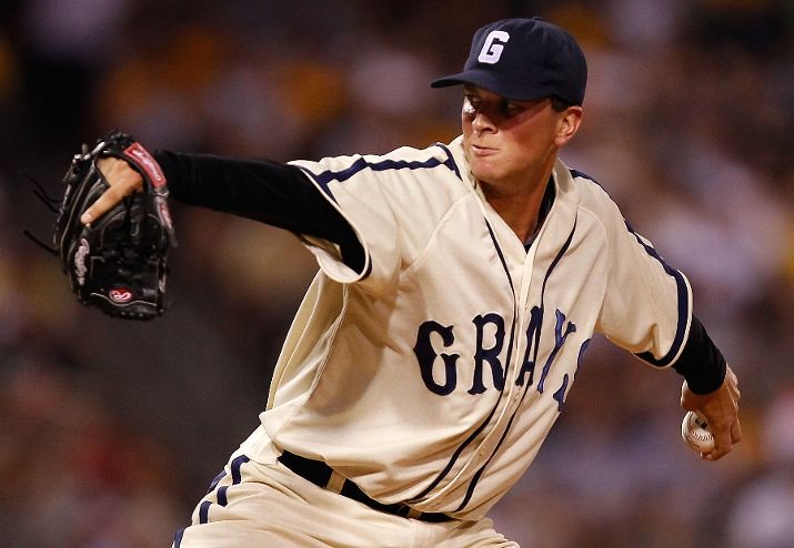
The Pittsburgh Pirates and St. Louis Cardinals wore Negro League uniforms last night for Heritage Week. The Cardinals were outfitted in the uniforms of the St. Louis Stars, while the Pirates wore uniforms belonging to the Homestead Grays. Both teams looked sharp, except of course for the Pirates mismatched helmets (although I love the colored black pocket flaps in that picture).
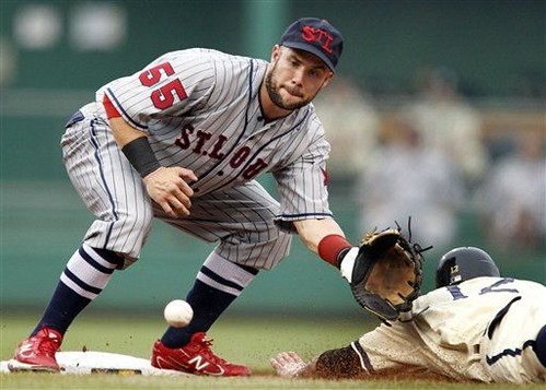
The Cardinals wore their standard batting helmets as well, but they matched the uniforms fairly well. Reader Brian Finch was able to dig up a great picture of a 1931 St. Louis Stars team photo. The ESPN game photo gallery is available here.
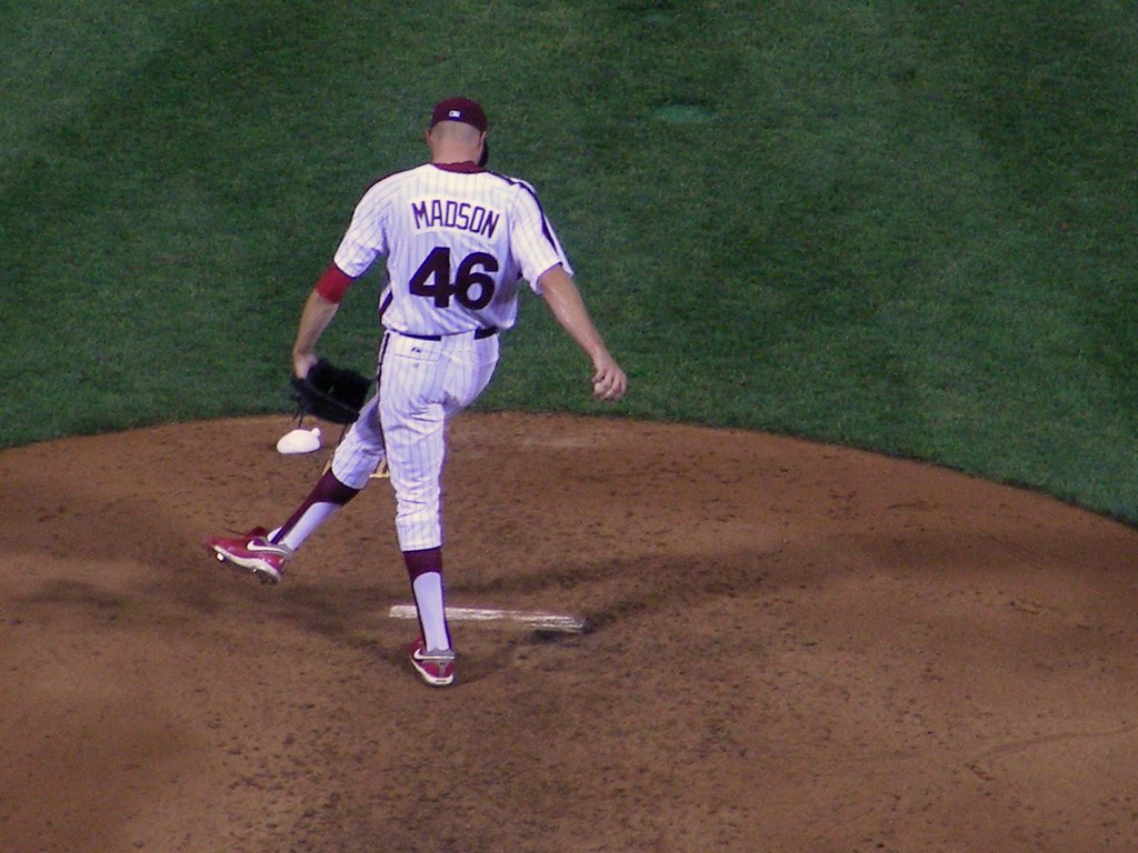
More from Friday’s Throwback Night in Philadelphia, as Ryan Madson did his best to impress Paul (but alas, he plays for the Phillies).
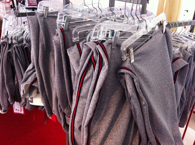
Dan from OMGReds.com stumbled upon game-used pants for sale in the Reds team shop from their July 9th Negro League game. The uniforms were made to look flannel, but of course were not. Dan explains:
“We confirmed that the uniforms were indeed synthetic, modern materials, not flannel. The material was designed to look like flannel from a distance. AIS Custom Uniform Company handled the manufacturing, as they have for other throwback games, movies and more.”
Head on over to his post to see some close-ups of the faux-flannel material.
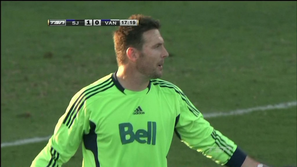
The Vancouver Whitecaps had a bit of an equipment problem when they arrived in San Jose to play the Earthquakes on Wednesday night, as a number of the players’ jerseys were missing. The team was forced to ask random Vancouver fans who happened to be wearing jerseys to the game if they would be willing to give them up. There was only one problem: no fan was wearing Joe Cannons’ goalkeeper jersey. As a result, they had to find a generic one and draw the team’s sponsor on with a marker.
Announcement: Paul will be interviewed on Sirius XM today, during the 1pm (eastern) hour. He’ll be appearing on Andrew Bogusch’s show, “The Weekend Playbook,” which is part of Mad Dog Radio. He was told that they will be discussing a wide range of topics, including the new Jets logos.
Update: Both parts of the interview are now available below.
[mp3j track=”https://staging.uni-watch.com/media/07-24-11 Paul Lukas Interview Part 1.mp3″]
[mp3j track=”https://staging.uni-watch.com/media/07-24-11 Paul Lukas Interview Part 2.mp3″]

Benchies
by Rick Pearson
“Hot enough for ya?”…

And, as always, the full-size version.
Pittsburgh, with an H. Just thought I would point that out.
Or maybe the game was played in link?
That’s what you get for writing at 1AM. Thanks.
We’re within a week of the centennial of link.
Those Homestead Grays unis are so f-n classic. IF only there was a way to change some MLB team into the HG w/that uniform to truly honor the Negro Leagues.
BTW sure the throwbacks are a synth material. But what are those caps made out of? …damn that Grays uniform looks good!
Is it just me, or does the guy in the front right of the St. Louis team photo appear to have a completely different jersey than the other players? The font on the name looks different, and it looks like he has neither the number nor the star on his sleeves. Also, his socks look different.
It definitely looks different and no number, but I think there is a star, it’s just a little faint.
Anyone know what channel that Sirius XM show is on?
And FYI, if you want to listen online, you can get a free trial by link.
I’d recommend signing up as soon as possible rather than doing it just before the Paul comes on, because it could take a little while for them to send you the login info.
It’s 86 on both Sirius and XM.
Thanks. I think there are exactly two channel numbers I have committed to memory. The rest are just preset #2, preset #3, etc. to me.
I think I got the wrong channel.
I just got John McEnroe saying “you cannot be sirius”.
Sorry :(
The Bucs wore the same fauxback Grays unis that the Nats wore back in 2007. The Grays script on the front is aligned differently than the Grays ever actually wore, but in a way that significantly improves readability of the A. The beautiful cream color is way too yellow for throwback purposes; it’s just shy of the old Padres sand roads. And the numbers on the back use the White Sox’ disco-era font, which looks great with the Grays script but bears no resemblance whatsoever to anything the Grays ever wore.
All in all, that Grays fauxback is my favorite sports uniform of all time, and I’m glad the Bucs brought it back. Just perfectly beautiful. But by the standards of authenticity that UniWatch usually holds throwbacks to, it’s an absolute failure. Aside from the piping and the contrast patches on the pants, it’s wrong in every detail.
BTW, the identical fauxbacks the Nats wore in 2007 were made by Nike.
sure wish some team would wear the “grays” look … some MLB team…
but who? and what would it look like?
maybe the nats…
sure wish someone would come up with a concept like that
I know what James Evans Jr. would say about those.
And I agree.
link
sure wish some MLB team would go with the faux flannel for their road greys, like a Red Sox, Yanks, Reds, Pirates. Home whites and road greys aren’t much different shades.
Red Sox and Pirates for sure, but the Yankees and Reds would probably need to tweak their existing look first. I think the white borders would need to be removed to make it work. (The Reds for sure — that wordmark would be way too busy.)
Another team that comes to mind that would look great if their existing look was transferred to that faux flannel is the Dodgers.
…and the Cardinals, Royals, White Sox, Rays, Giants and every other team that wears drab boring gray on the road. They all need to switch to the ash or heather or whatever it’s called. Yeah, maybe with a tweak here or there.
“…and every other team that wears drab boring gray on the road.”
Let’s see. That would be…
All of them.
I dunno, though. Maybe not everybody needs to wear the faux gray flannel. Royals in powder blue? Works for me.
If some teams stuck with the plain gray it wouldn’t be such a bad look. But as it is now, with 29 teams using exactly the same background for their logos (Rockies have pins), it is pretty dull.
I guess I should qualify by saying, when a team wears gray as a field color I would prefer it to be the ash. Now, like you say JTH, the Yankees current design doesn’t fit this profile and you’re probably right. Royals in powder, yes. Padres in sand, I say yes. But 90% of the grays worn would look better in the ash. IMO of course.
I’m with JTH. Gray is so dull (especially with colored socks not generally being visible these days) and I can’t understand why people like it so much. The very least they could do is make some effort to go to heathered gray, which has a little more character than boring gray polyester.
I still think that the explosion in color in 1970s uniforms was more due to teams suddenly seeing, after having switched to polyester uniforms around ’72, just how boring that background color is.
Then they livened things up with color, but in the ’80s color started giving way to dull gray. Which led to the current fad of solid-color alternate jerseys.
Boring block-gray needs to disappear. Colored uniforms; colored tops; heathered gray; whatever. Just do something.
I wanna see the A’s in powder green again.
“the uniforms were indeed synthetic, modern materials, not flannel. The material was designed to look like flannel from a distance. AIS Custom Uniform Company handled the manufacturing”
~~~~
you mean majestic couldn’t do that?
of course not…they actually looked good
and who is (or was) behind AIS?
you guessed it
look — let majestic *keep* the regular MLB contract until it runs out — but for the love of all that is holy…let AIS (or Bobcat) do ALL throwbacks, not just the *way* backs and negro leagues … ALL OF THEM
If you go to MLSsoccer.com and watch the highlights of the Whitecaps vs. ‘Quakes game you will see that Joe Cannon has an accurate NOB and his #1 in the correct officvail MLS font along with the MLS logo in white at the bottom, something that couldn’t be done with a marker. I suspect that the Whitecaps went to the Earthquakes’ and borrowed some of their letters and numbers, which are in the same font for all MLS teams.
link of the new Jets iconography, along with some unis of course.
I agree that they don’t need the leaf… but I don’t like the red jet. I think I’d make them a primarily gray team with blue trim. Maybe even use light gray and dark gray jerseys and avoid a white jersey entirely, if NHL rules would allow that.
I agree about the leaf in the roundel, though it’s also the leaf that defines it as the roundel. But the red jet makes the thing simpler and bolder, so that’s an improvement. But on the secondary logo with the wings, the jet doesn’t work. The leaf does. Symbolically, the wings represent flight and, most literally, a pilot’s wings. The leaf adds a new layer of meaning and locates the icon as Canadian. The jet adds no meaning, just a layer of visual redundancy. This is a case of taking a good general idea and pushing its application past the point of specific practicality.
But I really love what you’ve done for the home & away unis. We can only hope they look as good as you’ve done ’em.
Thanks R.S.
While I agree the jet is a bit redundant, i think putting a leaf on there when there is no (in this hypothetical situation) leaf on the main logo would be bizarre.
but glad you like the rest of the stuff!
“The team was forced to ask random Vancouver fans who happened to be wearing jerseys to the game if they would be willing to give them up.”
That’s a great story. And a reason to buy those $200 polyester jerseys…you may *actually* be helping your team by doing so…
I’ll stick to shirseys, but I find it a cool story nonetheless.
First, I browse the post. Then I go back and read what looks the most fascinating to me. Then, time permitting, I read everything else. That’s my daily UW ritual. Today, the fist thing I clicked on was the Whitecaps article, and everything in it. Yes Jimvilk, cool story. Similar to the Prince Fielder sunglasses a coupla weeks ago. Fan interaction like that creates lifetime memories for those of us with the passion but not necessairly the skills.
Or for the goalie they could’ve found a way to get the team name or crest on there and left the sponsor off. We all know that would never happen and as we see which one of those was the only one to make it on there (at least in the posted picture). But it would be nice to hope to see a trend to get all the ads off the sports uniforms and focus on the TEAMS. And that will happen about the same time I’m holding a winning Power Ball ticket, but we can dream.
Yeah, that sponsor thing put a damper on what was otherwise a great and fun story.
Seriously, no team name on the jersey, but they get someone to hand-letter the name of a sponsor?
Gives new meaning to that old saying about “playing for the name on the front”.
I’m guessing link weren’t the order of the day when the actual St. Louis Stars played, but I don’t care – they look faaaaantastic with those unis.
The
BucsGrays looked great, too.Red shoes need to go, period. But that guy in particular looks like he raided Bozo’s locker.
Great Benchies today!
I have to laugh at the White Sox today, it is hot and muggy and they are wearing BLACK! I just do not get it!
Of course they are. The last time they wore gray link. Clearly, the only rational thing to do was switch to the black jerseys.
Next time NBA basketball is played (hopefully on schedule), one team will call the Chesapeake Energy Arena their home.
The Wizards, right? Nope, the Thunder.
link
The Jets missed the runway. OMG, when you have a great visual history like the Winnipeg Jets franchise had, you can’t screw the identity up and they went and DID. How bland and boring…
It’s like Nike did it. Less is less. What an epic fail.
And Canadian neighbours (look I even spelled neighbors wrong just for you)… but enough with that maple leaf. Feel free to just use it on Canada Day or Boxing Day but enough already.
We get it you’re from Canada.
And my new Winnipeg Jets team identity solution? Simple.
link
haha, not a bad idea, that’s where I went with my idea – link
Tim–
You do great work and I am sure you don’t just slap things together.
My only critique is that the helmet and visor that you use on your template is way distracting and IMO, takes away from the overall template and alas, the concept. Because all I see is that visor and helmet.
Like I said, “just sayin’…” On man’s opinion.
that image is the old visor, perhaps this is better? – link
Yep, that is better.
UPDATE: I’ve added the audio of Paul’s interview this afternoon on SiriusXM to today’s post.
I’m not getting any audio on it…I push play and watch the playhead advance, but that’s it. And yes, my speakers are on.
Looks like there might be some compatibility issues with certain browsers. Gimme a sec…
Give it a try now.
Good stuff. I wasn’t sure what to expect. Was there going to be any of that “real sports fans don’t care about fashion” macho bullshit?
But I got the impression that the host would have talked to Paul all afternoon if he’d been allowed to.
Ah, Mario Marois.
Nice audio from PL. Man, that’s a good voice. There’s money there, Paul.
Good point Paul, about Reebok being spelled out on jerseys now instead of the logo. This sucks big time!
As a member of the Timbers Army I find the Vancouver story hilarious. When talking to the Timbers equipment manager I can totally see how that can happen because they don’t have several people doing things with the gear like in other leagues. It’s just one guy so if you accidentally forget a bag there is no one to double check for you. Still really funny and further proves our view in the northwest that they’re the red headed stepchild compared the Portland and Seattle.
LA Galaxy wearing their hideous third jerseys for a nationally televised game. Oy vey. Does anybody else find the discolored American flag offensive?
All I see is the Herbalifes playing Ethiad Airways.
Rob, I hate the idea of sponsors on jerseys, but in the case of soccer I’m ok with it as it is par for the course with what has been going on in Europe for decades. IMO the more MLS can do to be a legitimate football league (which includes the money that comes from jersey sponsors) the better.
It’s like what Paul said in that interview today. Jersey sponsorship is the European way. MLS is trying to be more European, so there you go.
Jersey sponsorships have only been the “European way” for the last 20-25 years.
It’s like saying around 1990 or so that playing baseball on Astroturf is the “American way” or that black alternate uniforms are an “American tradition” based on recent uniform trends.
Just because an odious practice has been allowed to continue for a few decades doesn’t make it desirable or defensible.