A few days ago I received a note from reader Zach Smith. He sent along a PDF of what he said was an internal NFL memorandum that had been shown to him by a friend who works for the league. I’ve done a bit of checking and have confirmed to my satisfaction that the memorandum is legit.
Zach has asked that I not show the memo itself but says it’s fine to describe and discuss its contents. His own description is a good place to start:
[The memo is about proposed] changes to the NFL’s alternate uniform rules. As I’m fairly certain has been covered before, the rules currently allow teams to wear their alternate uniform twice in the regular season and once in the preseason, but the NFL is looking to tighten those restrictions.
Here’s what they’re proposing:• Alternate uniforms would be limited to two uses in the regular season (eliminating the preseason option).
• Alternate uniforms would only be used in Sunday-afternoon games (not prime-time or nationally televised games).
• Alternate uniforms would only be worn prior to the start of the “flexible scheduling” portion of the schedule, which begins in Week 10.
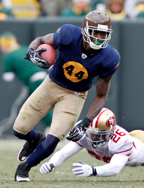
The rationale appears to be an attempt to “protect” the team’s brands [specifically, the memo says that the increasing use of alternate uniforms could “potentially compromise a club’s national brand equity” ”” PL], although given most of these third jerseys’ popularity with teams and their fans, I tend to think the real reason is that the NFL doesn’t want a casual fan to turn on a Sunday/Monday night game and find the Jets wearing navy and gold and have no idea who’s playing. An unfortunate change, in my opinion.
One small detail in the memorandum that Zach didn’t mention: The proposal would also limit alternate uniforms to games played in the United States.
Personally, I don’t really care if throwbacks and alts are worn in the preseason, or in December, or on Monday nights, or for games in London. All of that strikes me as typical NFL micromanaging.
The real news here, it seems to me, is that the league’s shift from Reebok to Nike isn’t going to bring any drastic changes. Even though this memo is just a proposal (Zach’s source at the league isn’t sure whether it’s been voted on or approved yet), its wording makes it pretty obvious that the NFL is way too conservative, way too committed to its core brand identities, to allow major tinkering by the swooshkateers. An NCAA-style parade of alt designs? Not gonna happen.
Which, incidentally, is exactly what I’ve been saying all along. People can make all the crazy-ass mock-ups they want, but the NFL is still gonna look like the NFL in 2012. Bank on it.
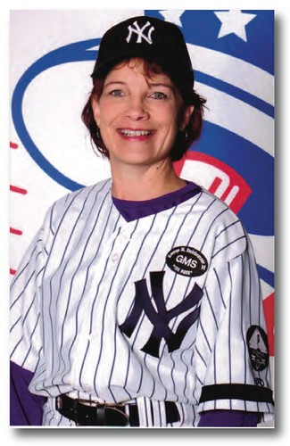
A uni story lurking within a non-uni story: I have a new ESPN column today about a woman named Patti White, who’s carved out an unusual niche: Her company provides the closed captioning for hearing-impaired fans on the scoreboards at four MLB ballparks.
While I was working on the story, Patti mentioned that she had attended the Yankees’ first-ever fantasy camp for women. She sent me a photo of herself in her Yankees gear, shown at right, and I immediately thought — just as I bet many of you are thinking — “Hmmm, that undershirt color doesn’t look right” (it’s more apparent if you see the photo at its full size). Patti then sent me an article that she wrote about her fantasy camp experience, and it turns out that the camp’s kangaroo court actually fined her for wearing the wrong-colored undershirt. Good to know we’re not the only ones paying attention to this stuff.

Collector’s Corner, by Brinke Guthrie
Even though Uni Watch was closed yesterday, Collector’s Corner was hard at work, putting the finishing touches on another great batch of eBay items:
• Look at the size of those numbers on Bradshaw’s helmet.
• Dig the low-slung facemask action on this 1965 NFL Hall of Fame program.
• Several Cincinnati items from reader Doug Smith: Here’s Johnny Bench groovin’ to Jesus Christ Superstar at his Mt. Adams bachelor pad; a Cedar Rapids Reds jersey; a 1963 Reds photo pennant; and an old-school shot of Joe Bell of the Cincinnati Mohawks hockey team.
• Cool 1980s Nike Frisbee. I always liked the wordmark/swoosh combo better than just the swoosh.
• Is this a neat 1971 ABA Squires program cover or what?
• Great logos on this 1970 ABA serving tray.
• Completely forgot I owned and played this 1970 NFL Sports Illustrated game. I was good, too.
Seen something on eBay that you think would make good Collector’s Corner fodder? Send your submissions here.
Uni Watch News Ticker: NFL teams may soon start covering their empty seats with a tarp. ”¦ Hmmm, are these the new Maryland football uniforms? ”¦ Some guy in Ohio has carved an OSU logo out of a tree stump (with thanks to Jason Hillyer). ”¦ Holy Toledo! That’s apparently what the Mud Hens were wearing in 1979. And I’ll let you in on a little secret: I really like it (great find, Ricko). ”¦ I hear this T-shirt is mighty popular in Cleveland these days (or at least in Scott Cummings’s house). ”¦ Andrew Tucker was driving around L.A. and spotted a company that’s drawing some, uh, inspiration from the Lakers logo. ”¦ Here’s something I hadn’t seen before: The NCAA baseball logo design shows a player wearing a dark-colored jersey. ”¦ Here’s an odd one: Wright State baseball is wearing small black sleeve marks. At first I thought maybe they were very understated memorial gestures, but a bit of Photoshoppery reveals that it’s actually a cover-up of the Wilson logo — weird. Same thing for the logo on their pants. Meanwhile, what’s that other sleeve logo they’re wearing? (Good spot by Chris Smith.) ”¦ Those last two Ticker items use photos from a page that is loaded with photos of beeYOOteeful Texas A&M stirrups. ”¦One odd thing about the bumblebee-era Pirates is that they used much larger NOB lettering for players with short surnames, like Lee Lacy. But even that example is nothing compared to Ed Ott’s NOB (big thanks to Ken Stephon). ”¦ Whoa, check out the amazing stirrups that come with this old uniform. ”¦ A high school pitcher in Utah is wearing a really unique facemask (with thanks to Ed Bauza). ”¦ You’d think the Army and the Marines would be on the same side, but they’ve gotten in a spat over who gets to use a certain camouflage pattern (with thanks to Kyle Kalkwarf). ”¦ Bosox pitcher Alfredo Aceves is risking a fine now that he’s drawn a cross on his cap logo (as noted by David Greene). ”¦ A whole buncha shit is gonna go down on 11/11/11, including this: That’s the day the Marlins will unveil the team’s new logo and uniforms (thanks, Phil). ”¦ This is pretty great: a baseball cap inspired by the BP oil spill. ”¦ The map for the Metro — that’s Washington DC’s subway — is being redesigned (with thanks to Bryan Stabbe). ”¦ Kirsten just alerted me to a really excellent rephotography project called Dear Photograph, the most recent entry on which happens to be uni-related. Click on the annoying faint “Home” button at right to see the full site, which has the makings of something very special. ”¦ Bruce Menard likes to go through old auction listings in search of cool stuff we’ve all overlooked, and he just found four beauties from a 2006 sales at Legendary Auctions: (1) You probably knew the AFL used orange and white zebra stripes, but did you know they also used orange and black penalty flags? Never seen a ref’s jersey with a crotch strap, either. (2) Major find here: At one point Al Davis was apparently pondering going with a gray alternate jersey for the Raiders, and here’s a prototype of that look. (3) I didn’t know Jackie Robinson had his own haberdashery and clothing line. Click on the first thumbnail for a closer look at the excellent tag design. (4) Best. Baseball. Jacket. Ever. ”¦ Bryan Justman’s latest DIY project is a late-’80s Astros BP jersey. “I used a T-shirt with grosgrain ribbon for the racing stripes and a rubber-sheeting fabric for the lettering,” he says. “My dad had asked me to make him one for a while, so this will be his Father’s Day gift.” ”¦ In case you missed Sunday’s “Colorize This!” photos, Chris Powers colorized the bowling/baseball shot of Duke Snider and George Altman from Friday’s entry. ”¦ Ay yi yi (blame Matt Benedict). ”¦ Jason Greening notes that the Giants’ coaches’ helmets have very dark “SF” logos compared to those of the players. “I don’t have a shot of the 3B coach, but it’s the same for him,” he says. ”¦ “During Sunday’s New Hampshire girls lacrosse state semifinal involving Kearsarge High School, one of the Cougars’ shoes began to shed its bottom in the late going,” writes Tris Wykes. “So the trainer improvised, which wasn’t pretty but got the job done.” ”¦ Andy Roddick has designed his own signature line of Lacoste clothing (thanks, Brinke). ”¦ Further evidence that Adidas doesn’t own the concept of three stripes as a design element: UConn baseball wears Nike uniforms, but check out their awesome triple-striped stirrups. Like I’ve been saying all along, sometimes three stripes are just three stripes (big thanks to Dan Cichalski). ”¦ Also from Dan: Eyeballs must have been bleeding after the UVA/ECU game, which featured a brutal color-on-color match-up. ”¦ Rays skipper Joe Maddon had the team dress in beach attire for a road trip the other day. ”¦ Buried within this story about Jason Bay is the revelation that Willie Harris “wore hot-hitting Justin Turner’s socks for Sunday’s [Mets/Braves] game, hoping it would start a hot streak.” ”¦ Here’s a good article on ballplayers and their gloves (Brinke again). ”¦ Jason Lord notes a strong resemblance between the new ASU logo and the logo for Sottomarino Watches. ”¦ In a related item, the Mountain West Conference New logo unveiled a new logo yesterday, and Bryan Stevens notes that it looks a lot like the Dr. Who logo. ”¦ Meanwhile, here’s more background on the development of the new MWC mark (big thanks to Matthew Robins). ”¦ Quinlan Kasal reports that Devin Hester has started a poll on his Facebook page, asking his fans which is Bears uniform is the best. ”¦ The Florida Panthers will officially unveil their new red jersey at the NHL draft later this month (with thanks to Mike McLaughlin). ”¦ Speaking of unveilings, here’s a thought: When the Bills unveil their new uni set on June 24, who’s going to model the uniforms? If the lockout is still going on, they won’t be able to have players wearing the new threads. ”¦ Back when the Padres were a minor league team in the Pacific Coast League, they wore uni numbers on their pant legs (another gem from the vaults of photo archivist Dave Esekenazi). ”¦ Ted Lilly wore a white undershirt with his road grays yesterday, which doesn’t sound all that odd, but it looks a bit off (as noted by Casey Gross). ”¦ Check out Willie Mays in this awesome ad for socks (big thanks to Eric Davis). ”¦ The Iranian women’s soccer team recently had to forfeit an Olympic qualifying match because they showed up wearing hijabs. “I’m sad to see FIFA take this position,” says Morris Levin. “The Olympics are an opportunity for inclusion. One of the challenging questions in many Middle Eastern societies is the changing role of women in the context of traditional societies. Here’s an opportunity to enable both to coexist.” ”¦ Ever heard of StarCraft? It’s a video game that’s apparently so popular in South Korea that it has the status of a major-level sport, complete with sponsorships, televised tournaments, and, of course, uniforms (with thanks to Mike Ortman). … “I took my daughters to the Museum of Flight in Seattle over the weekend,” writes Markus Kamp. “One unexpected exhibit there is a collection of old flight attendant uniforms.” ”¦ Uniform rankings are generally pretty lame, but soccer fans don’t often have a chance to experience that for themselves, so here you go. ”¦ Javier Baez better make it to the bigs fast, because he’s gonna take a lot of flak in the minors over his tattoo (with thanks to Tom Van de Kieft). ”¦ Darren Rovell has written one of his patented “Hey, if it’s good for business then it’s good, period!” pieces, this time about Nike’s 2009 makeover of Rafael Nadal. Of course, the question of how Nadal himself felt about switching from clamdiggers to shorts isn’t addressed anywhere in the piece, presumably because Nadal is just a Nike delivery device. Lovely (that Brinke fella again). ”¦ Gordon Blau notes that Bill Simmons’s Twitter profile photo shows Larry Bird playing baseball. ”¦ Just in case Anthony Weiner is reading this: I don’t care about your bare chest or your underwear, but pics featuring striped socks are always welcome.
My thanks to all who expressed concern about my family yesterday. We’re fine, no crisis, no emergency. Just had some family business to attend to. Okay? Okay.
Heh. I got fined for wearing a pair of link when I was at the Cubs’ fantasy camp. Fergie Jenkins actually BOUGHT a guy on my team a pair of blue spikes so he’d stop wearing his red ones. But nobody said anything about wrong-color undershirts.
Here I am link.
It didn’t stop me from link, of course.
Your bottom button is unbuttoned! Instead of the Pedro Porthole, we’ll call it Jimbo Gulch!!
Take another look. I assure you every button was buttoned (and my fly was zipped).
Mea culpa.
two words:
awe some
“It didn’t stop me from wearing them again, of course.”
Right on, brother. That’s all I can say.
Great ESPN article today. Mention of closed captioning always reminds me of Bill Clinton’s first inaugural. I was a college freshman in DC, watching from the edge of the Capitol’s west grounds that morning. When Maya Angelou got up to read the poem she’d written for the occasion, “link,” it became apparent that whoever was doing the closed captioning on the big screens set up around the Mall hadn’t been provided with written text. The poem began, “A rock, a river, a tree / Hosts to species long since departed …” but the words on the screen read, “Iraq. A river. A tree …”
I remember reading about a great flub a few years ago, at the Oscars.
It was during a speech for Saving Private Ryan or one of the other WWII films, and the captioner didn’t quite hear correctly: “the greatest generation” came through as “the great estrogen nation”.
I remember seeing…
“Some say mouse’s cum was an agreer and informer.”
What the speaker SAID was…
“Some say Mao Tse Tung was an agrarian reformer.”
And I NEVER thought that would be relevant to a UW discussion.
My reaction to the “Iraq, a river, a tree …” thing was that it would have made for a better poem. Angelou’s text was pretty crappy; it had all the political posturing but none of the linguistic vigor or personal engagement of a Nikki Giovanni poem. And “The Great Estrogen Nation” sounds like it could be a Nikki Giovanni title.
That statue wearing the Bruins jersey is George Washington, not Paul Revere. The Washington statue is in the Public Garden, and the Revere statue is in pretty much a dark alleyway behind the Old North Church.
Was he warning the British?
Nice.
He is warning British Columbia.
Well there certainly were a lot of those shots and link last night, that’s for sure.
Dane, excellent work.
Everyone else: GODDAMN I HATE THE NUCKS. (B-Hawks fan and an AMERICAN). Watching Boston pound those fuckin’ foreigners into the ice and taunt them for being the cheap-shotting assholes that they are was so great.
Fantastic game four.
“Watching Boston pound those fuckin’ foreigners…”
~~~
so…boston’s canadians & europeans beat the crap out of vancouver’s canadians & europeans?
wait…what?
“so…boston’s canadians & europeans beat the crap out of vancouver’s canadians & europeans?
Easily the IN-RQOTD (Ironic Nationality-Related Quote O’ the Day)
USA! USA!! USA!!!
That’s right! Eat it, link!
The other logo on Wright State’s uniforms is the Horizon League logo which is the conference they play in.
I wish MLB would adopt some stricter guidelines related to its teams using alternate uniforms…
Very surprised they haven’t. I’ve often thought that MLB was the most conservative of this country’s professional sports. However, they do allow some pretty crappy unis (See Phil’s article about almost all the all star game jerseys…not to mention the entire TATC unis).
Ted Lilly also wore the white undershirt with the Cubs
link
With the Dodgers he seems to have added the mark which shall not be named
link
The last thing the NFL needs to worry about is stupid limitations and regulations on alternate uniforms.
Either don’t allow them at all, or let the teams wear them whenever the hell they want. No one who actually gives a shit about football is going to be confused by the use of alternate uniforms. And no one’s “brand identity” is harmed, if anything those identities are expanded to include more looks. A team isn’t identified by just its current uniform, but by every uniform it’s worn in the past as well. Pepsi is still Pepsi despite having 27 different logos in their history. The same applies for anything else that level of popularity & recognition – and yes, NFL teams are at that level.
Sure, the Jets may look stupid wearing those ugly ass Titans uniforms, especially with another team in the league being called the Titans… but they should have the ability to make their own decision about it.
Gotta disagree about the effects on brand identity. Sure, Pepsi has had a lot of logos over the years. But (A) It only uses one logo at a time; if Pepsi used all 27 logos on cans of its cola interchangeably, its trademarks would cease to have any use or value; and (B) The proliferation of different logos over the years very much has cheapened Pepsi’s brand identity. Everyone knows exactly what a Coke looks like. Pepsi? Not so much. It’s like the old saying that a man who has one clock always knows what time it is; a man who has two clocks, never does.
But to the extent that dilution of brand identity is a problem, it’s a problem for individual teams, not for the league. Having the league issue rules aimed at requiring every team to take certain actions to protect their individual brand identities would seem to skirt dangerously close to the edge of antitrust violation. There are things that individual teams cannot do, and so a league must, and deciding how individual teams protect or don’t protect their IP portfolios would seem clearly not to be one of the things teams need a cartel to do for them.
Actually, Pepsi does link on occasion.
R.S., you’re right–brand identity is KEY in the proliferation of your product. When you see a Target commercial, you KNOW it’s Target–you don’t even need the word “Target” to come onscreen. When you see a Coke ad, you KNOW it’s Coke. They’ve been consistent in their branding for decades and it shows on the bottom line.
I understand what the NFL is doing and why. If you’ve been to an NFL game recently, you’ll generally see more regular jerseys than throwbacks and alternates. The NFL knows they’re selling more standard home and away jerseys, and they’re probably requiring the teams to outfit themselves accordingly.
Finally, I really, really don’t think they’re concerned with a casual fan not knowing who’s playing. During a 3-hour broadcast, there’s probably only about 10 minutes or so when there’s no information telling you who’s on the field (think score graphics, stat graphics, “keys to the game,” etc.). It’s a moneymaking idea, just like everything else they do.
Hey, the NFL is a business. We may wish to hold them to a higher aesthetic standard, but if it sells, it stays.
I wonder if the NFL hasn’t looked at its recent highlight packages, retrospectives and things such as the NFL Network’s current “Top 100 Players” and thought maybe they’re starting to look like a bit of mish mash.
“What teams were that we just saw on that great punt return?”
Not saying they’re right. Just saying that I’ve sort of noticed it, too…and maybe that’s the kind of thing they’re talking about in terms of “consistent branding”.
It gooes beyond just “this week’s games live,” that is.
While I agree that the basis for anything the NFL does is to “make money”, I honestly wonder how this would help. Let’s assume that every fan that buys a standard home or away jersey would buy that regardless of an existing alternate. I think that’s a safe assumption. Wouldn’t a “cool alternate”, that appeals to Joe Six-pack when the standard two jerseys don’t, actually make it more likely he’ll buy that jersey? Heck, maybe he’s a fan of another team but just so happens to like your alternate jersey. To me, limiting his exposure to your alternate jersey just makes it less likely that he sees it and decides to buy it. Unless I’m missing something, to me the NFL should be happy with alternates as long as merchandise sales don’t actually decrease. I hate the argument that “brands” (teams) might lose their identity. I know Americans get stupider every day, but I honestly fail to see how more than 0.1% of the NFL’s viewing public will see an alternate jersey and completely fail to figure out what team is wearing it.
But hey, overall I’m fine with this decision. I don’t mind alternates as long as they are tasteful, use an actual team color, and are worn sparingly. At least the NFL is trying to ensure us of #3. I wish somebody else would take that kind of stance… I’m looking at you, MLB.
I think the NFL’s predictable, solid collection of uniforms is an asset and I’m glad they’re looking to keep control on alternate uniforms.
The key word here is “alternate;” NFL teams are intended to have primary uniforms with the occasional, special-event change. The problem is that your average team only plays 8 regular season home games a year. Many teams take the option to wear their white uniform early in the season for heat management purposes. Others will vary the pants that they use.
The net result is that it can be difficult to establish what a team’s “base uniform” is. We know what the Cowboys look like, but not every team is so easy to discern. This will improve the situation in places like Miami, where they traditionally wear white at home unless playing in prime time, but have often used their unfortunate orange jersey instead of their primary colored jersey in those situations.
I like teams to have a basic, known set of uniforms. Home and away. Alternate uniforms are fine, but I want them to be visibly “alternate.” That both makes them more interesting when they are worn and it strengthens the uniform identity of the team.
I like the proposed changes for the NFL, although I think Paul is dead on when he says the NFL is doing what it does best, micro managing.
I like throwback uniforms as much as the next guy, but I’ve always disliked the inconsistency in which they are used. There’s nothing worse than watching a game in which one team is in throwbacks, while the other isn’t.
I really enjoyed the AFC’s throwback to the AFL. It was a uniform (not the kind you wear) project that showed consistency and reasoning.
While the reasoning isn’t clear, I’m sure somewhere, someone discovered that the carousel of throwbacks was hurting the bottom line. After all, the NFL is in it to make money.
Also note Patti’s jersey has an exposed manufacturer logo, and it’s Rawlings. It’s very common to not use the the current MLB approved jerseys at fantasy camps….must be cheaper.
I guess Christy Mathewson’s off season gig was hotel bellhop. . ..
re: Sottomarino Watches logo…I’m not sure you can really say anything about the logo vs. the Sun Devils; there are lots of similar trident logos, for example:
link
ed
I hope that kid didn’t pay too much for that tattoo. The (not Harmon Killebrew) batter has no brim on his helmet.
You beat me to it, Craig. I don’t mind that the kid got an MLB tattoo, I mind that it looks like sh!t. Don’t get me wrong, I truly enjoy seeing horrible tattoos on people (lots of websites/bolgs dedicated just such things).
So, the model for that MLB logo was Brooks Robinson. Who knew?
Who will model the Bills’ new uniforms?
You guessed it: Frank Stallone.
Seriiously, though…best uni-unveiling ever was a minor-league hockey team known for its offbeat promotions that had celebrity lookalikes model thei new duds years ago. Marilyn Monroe (or Monfaux, if you will) was one I remember.
” It may be difficult for fans to imagine Reyes wearing any uniform other than orange, blue and black…”
even the beat writers think it’s a team color
Of course the beat writers think it’s a team color – because it is.
We all know you hate it, but they’ve been using it for over a decade. Maybe it was a stupid addition, I won’t argue against that. But it is part of their color scheme now.
If it was any other team would you be so resistant to calling it a team color? Is the powder blue used by the San Diego Chargers also not a team color? They went from wearing navy, yellow & white to wearing navy, yellow, white & powder blue. Does that not count either? What’s the difference?
Powder blue is part of the Chargers’ history; black wasn’t part of the Mets’…
Well, black is part of the Mets’ history now, for better or for worse. (And we know on which side of that fence Paul and Phil sit…)
Eh, powder blue didn’t really become part of the Chargers history until 1994 and the 75th season throwbacks. The uniforms they wore in the 60’s were most definitely not as light as the modern version.
Nonetheless, the point is that black is a Mets color, and has been for over a decade. The silly trend following origin of it doesn’t change that.
That’s true. They first wore royal, then Air Force blue, with the while helmets and pants.
First true powder blue didn’t show up until later, with the cheddar pants and white helmets. The era when players like Johnny Unitas, Deacon Jones and Tim Rossovich were brought in late in their careers. ’72 or so.
link
Paul Lowe in ’63 (the All-America city decal helmet decal was in ’63)
link
Don Norton in ’61 (same blue as Colts)….
link
I can provide visual confirmation for as late as 1966. On successive Saturday nights that year, I saw UCLA play at the Coliseum and the Chargers play at Balboa Stadium.
UCLA definitely in powder blue. Chargers definitely not. They wore a much bluer blue, not even remotely close to as light as powder blue.
The Chargers have always worn some shade of blue, be it navy, royal, “collegiate” (as the team calls it), or powder with gold and white. Imagine that, blue can be more than one shade.
link
Whoa, a whole lot of omissions and, well, errors in that Charger uni summary. Unless, of course, it’s meant to be a summary, rather than a precise cataloging for uni geeks.
The Pirats uniforms were made in those days by Descente, a Japanese manufacturer that still makes quality stuff today. (Such as my amateur team’s unforms, the numbers on which aren’t sewn-on-twill; they’re entirely embroidered, plus thousands of embroidered stiches to make the border!)
Many Japanese teams with NOBs like to have one default letter width for players with names of around five to eight letters, plus a thinner one for the longer names, and then a third, link.
Some teams that don’t vary the width like to link (Vague memory: somehow I recall Milwaukee Brewers pitcher Scott Karl, #42, having a jersey like this in the mid-1990s. Anybody remember this? I can’t find a photo.)
This spacing thing is very popular in the Japanese language too; watch some movie credits, for example, and you’ll often see that the first and last letter of every person is in the same position, whereas the spacing between the intervening letters is adjusted so that they all start and end on the same lines. Left- and right-justification for lines of three to six characters!
I think the super-wide font variation looks ridiculous, but most people don’t seem to mind. link
The thing with Ed Ott and Lee Lacy is that their NOBs appear to be taller. I don’t know of any Japanese teams making the letters taller, though; just wider.
Descente made the Pirates’ blacks and white pins. Rawlings made the yellow/golds. I then think Rawlings made the plain whites in 1980 and onward.
So is there any weird spacing and fat lettering on the Rawlings jerseys? If not, I’m guessing it’s a Descente thing.
I’d still like to know who was the first team to wear the gold pins, it seems unlikely the Pirates were the first.
Since Descente is a Japanese company, I must assume there was a team in Japan with gold pins sometime before 1977.
Nah. The Rawlings yellows were rather normal with the letter spacing.
If you get ahold of the 1979 WS DVD, you can see the difference right off.
Typo alert: “coering their empty seats”?
Another one: “Jason Greening that the Giants’ coaches’ helmets have very dark “SF” logos compared to those of the players.”
This sentence no verb. ^^;
Also, the title of this page in the URL is “propsed-changes…” instead of “proposed-changes…”.
The URL is no big deal, but Jason Greening probably wants people to know that he “noticed” or “spotted” or “pointed out” the thing about the Giants’ coaches.
Guess who was really tired while compiling the Ticker last night?
Fixing now…
Way to go Marines. It is clearly much more important to protect your unique look than to have the Army use the most effective camouflage.
What’s a dead soldier or two if it means a Marine might get mistaken for one of the other services.
An unfortunate effect of the inter-service rivalries…
It is clearly much more important to protect your unique look than to have the Army use the most effective camouflage.
I’ve thought this ever since the USMC brought out the new digital pattern earlier this decade. While I understand the desire to be able to differentiate among the military’s various branches, to do so at the expense of troop safety seems to fall somewhere between ridiculous & abhorrent.
It seems like the ultimate no-brainer that whichever uniform is deemed to be the best is the one that every troop gets — especially those who are going in harm’s way.
Agreed!
We’re not talking about what color beret a soldier is wearing (think back a few years, or longer, when the Army was switching beret colors, and the Green Berets took issue with it).
If it’s a matter of safety, everyone should get the best option available.
But is there any evidence that one camo pattern offers a statistically significant tactical advantage over any other? Or even over plain old khaki?
The American soldier’s combat superiority has mainly to do with technology (esp. night-vision) and combined arms (esp. the ability to call in artillery and airpower) and the training to use them that we have and the enemy typically does not. The Taliban and other irregular forces don’t lose fights because they’re wearing plain brown clothes instead of camo; they lose fights because they’re facing an opponent with night-vision goggles and the U.S. Air Force on speed-dial and a war budget of half a trillion dollars a year.
For the most part, the camo thing is probably just like Nike or UnderArmour’s claims about “performance” fabrics: At least 80% bullshit.
To get the disclaimer out of the way, I’m a Marine, and I think only Marines should be wearing MARPAT.
That said, there are other patterns available to the US Army which are likely as effective as MARPAT, specifically MultiCam, a 7-color pattern designed for multiple environments. In fact, this pattern is already in use with Special Operations Command and individual units of the US Army, including the 173rd Airborne.
While people are quick to criticize the Marines for not being team players, please bear in mind the US Army implemented an Army-wide uniform change to the Army Combat Uniform using the Uniform Camouflage Pattern only a few years ago. Adopting and implementing an inferior pattern for the entire Army, Army Reserve, and National Guard seems at best wasteful, and at worst a sign of institutional incompetence.
Furthermore, Marines typically wear solid coyote brown interceptor vests (body armor) and other load-bearing gear while operating in tactical environments, regardless of whether they are wearing woodland or desert pattern cammies. These vests break up the camouflage in the area of the body – the chest – that presents the best target to the enemy. As such, the enemy has a solid block of brown at which he can aim.
This actually gets back to a main point of MARPAT; the pattern was designed by the Marine Corps to be distinctive and allow both friendly and enemy elements to be aware that US Marines were present on the battlefield. MARPAT is as much about brand identity (if you will) as it is about concealment.
The Army has issued a camouflage pattern which compromises the safety of its soldiers and is looking for a quick fix, and yet the Marine Corps seems to be the focus of outrage. As other patterns exist which offer the concealment level of MARPAT but protect the Marine Corps’ brand identity, I suggest people withhold their criticism of the Marines. Perhaps we could even ask why the Army specifically wants to use MARPAT instead of those other patterns.
With regards to the ASU logo and the logo for Sottomarino watches, if sometimes three stripes are just three stripes, then aren’t tridents sometimes just tridents?
That just points out the problem with Arizona State’s decision to go with a trident. The Devil traditionally uses a pitch fork. Not a trident. A pitchfork doesn’t have barbs or flare out like that. That impliment is for spearing fish. Pitch forks are for scooping and tossing hay, as well as poking sinners in eternal hellfire.
They should have changed their name to the Poseidens and color scheme to blue and green. Then the trident would work. Silly for a school in the desert though.
Nike isn’t worried about the “details”. That just gets in the way.
Over the course of ASU’s history, the mascot has wielded a variety of pronged and prong-less weapons.
Those can’t be the Maryland new unis as the entire athletic department has sworn to get rid of “Terps” as a logo. Maryland under UA is trying to unify the brand so the helmet should get rid of Script Terps. Sucks.
that’s what I thought. i saw those in a comment a couple days ago and those can’t be 100% right
That photo is from the EA Sports NCAA Football 2012 video game. That game goes on shelves in early July. So, I’m sure they went with whatever information they had at the time. Wouldn’t surprise me at all if those uniforms were completely off.
Regarding the Larry Bird photo: If anybody can scare up a photo of a c.1980 Indiana State baseball uniform, the back numbers are ginormous.
I had a hard time figuring out UConn baseball is sponsored by Nike. I mean, there’s only 6 swooshes (or swooshi?) visible.
Doctor Who*
The character is not a Dr. – Doctor is his name
Usually he’s been addressed as “The Doctor”
Usually he’s been addressed as “The Doctor”
_____
That doesn’t mean it’s not his name. ;)
So no more throwbacks on Thanksgiving?
Also regarding who should model the Bills’ new unis, well, it may sometimes be hard to locate former players…hmmm, maybe they can get O.J. Simpson, I’m pretty sure they know where he’s at….
So no more throwbacks on Thanksgiving?
Excellent point — hadn’t thought about that.
Good. It has always annoyed me when both teams are wearing dark-colored jerseys on Thanksgiving.
+1 on the good. That’s one of two ultimate “Sunday Best” occasions in football. Whatever uniform a team wears to the Thanksgiving game had darn well better be its best uniform, and whatever a team regards as its best uniform should be its actual uniform, not an alternate. If a throwback uni is so nice that you want to wear it on Thanksgiving, then that should be your regular uni, not an alt, and if it’s not, then tough. Make it so, and then you can wear it on the teevee.
That’s one of two ultimate “Sunday Best” occasions in football.
_____
Bull.
If Thanksgiving day involved different teams every year, maybe. With it always being the Lions in one game and the Cowboys in the other… pfft.
I like the idea of using Thanksgiving to emphasize tradition and throwbacks on principle. I don’t mind the color-vs-color concept.
However, as a Lions fan, I’ve never been a big fan of the throwback uniforms. They are just… boring. And this comes from someone who saw Barry Sanders play live in those things. The Lions uniform is, in my opinion, highly underrated, and the only time people ever see them is on Thanksgiving.
And really, the Cowboys throwbacks might be nice, but if their standard uniform (however we may feel about it’s interesting colors) isn’t an iconic uniform in the NFL, I don’t know what is. Why are they changing it on their most visible day of the year?
Plus, the Cowboys’ throwback is a joke, from an accuracy standpoint.
Pattern for the shoulder yoke is entirely wrong, not even close to the unique look of the real thing.
And the blue is navy instead of royal.
A totally fictional uni, historically speaking.
No Cowboy in the 1960s ever wore that uni.
On the page showing the different bumble-bee era Pirate uniforms, it seems that only the Stargell jersey has a reasonable spacing between the name and the number — in the other examples, the name is too close to the number. Agree?
-Jet
Jet, I would agree with you on the Stargell jersey. Bill Robinson’s name was closer together, while Phil Garner’s was more spread out.
Back then, the talk was centered on the overall style of those multicolored jerseys, and the different NOB spacing was barely mentioned. No doubt the Ed Ott jersey was the most noticeable, one can only wonder how big the lettering would have been if the Bucs had a player with only two letters in the last name.
On the Mountain West logo: It will only be a matter of time before someone makes a 3-D version of it, complete with spinning motion and a light on top. And MWC execs call it “the Rock”?! I’m already calling it “the TARDIS.”
Damn, I must hit “Refresh” before I post…lol
That’s alright… I’m sure that great minds not only think alike, but do so at the same time.
The new Mountain West logo link has TARDIS written all over it link
Checkout Peters Township’s baseball uniforms.
link
I read that as “Pete Townshend’s” so I was a bit confused when I clicked that link.
Here’s a certain UW reader link of the Northern Virginia Tour de Cure Sunday in Visalia Rawhide stirrups. Thanks, Comrade Moose!
I’ve never seen a Steelers’ helmet with that number font. When did they use it?
link
They didn’t. It’s just magazine cover art.
So may I inject an uncharacteristic note in praise of the here and now? The unis involved in this year’s Stanley Cup Finals are really pretty good, at least as they looked last night. And what a relief — no red or anything close to red.
Go Broons, btw.
Last year’s final looked better.
“When Willie Mays was swinging for the fences, his Pro-Socks were a swinging blue and orange”.
Did the Giants change color at some point that none of us were aware of?
Otherwise, I wouldn’t call a diplomatic stint in New York for his final Major League season “swinging for the fences”.
I’m not sure Willie ever went skiing either… But whatever — that’s just ad copy.
The bears have been wearing the same uniforms in the same city for decades and decades, how does this link – a night game – compromise brand identity?
I mean, I get that you don’t want Seattle to become Oregon but this seems to be legislating to the lowest common denominator.
I even understand the two game limit – that’s more %wise than the NBA allows alts (although, barely) but the whole night game thing bugs me.
(though the no alts in London/Mexico city, etc makes sense but it should make so much sense it doesn’t even need to be said.)
No Fun League strikes again
Yeah it seems like more of a bullshit control freak thing than anything else.
We have 24/7 sports coverage on ESPN… and then there’s the internet. A great play is going to be seen by everyone whether it takes place on a Sunday afternoon or a Monday night. If there really is any “brand weakening” in the Bucs wearing creamsicle orange instead of pewter for a game, I doubt that the time of the game is going to make much of a difference.
It’s in the viewer-ship. NFL night games are “nationally televised” (Sunday Night Football, Monday Night Football and the occasional Thursday Night Football). I get that the total viewers for night games are higher than, say a regionally televised KC/Denver game, but I still think it has something to do with merchandise sales.
But fans of established teams already have jerseys. The Bears wore those throwbacks twice and already every other guy wearing a jersey at those games had one.
And as far as, ‘fans won’t know who’s playing’ for an argument, it’s the most popular league in the world. This isn’t the MLS or even the NHL where third jerseys might confuse a casual fan flipping channels.
This is the NFL.
Everyone has a team, everyone watches and no one would stop on a primetime game and not A) know who’s playing, OR B) stay long enough to see the ever-present scoreboard pop up.
Stoopid rule I hope doesn’t pass.
The NFL should concentrate on more important micro-managing details: Outlawing the Chris Hovan look. Talk about brand destroying.
Ah, yes, good ol’ Chris “Get ‘er done” Hovan.
If you need someone to steal a chicken, he’s your guy…
link
Wow, I’d forgotten that ol’ Chris gave us a preview of the Colts’ curretn “teeshirt jersey” look while he was with the Vikings…
link
“(The) combination of tradition and the old-school admonition to ‘play for the name on the front of the jersey, not the one on the back’ (is) much easier to do if you don’t put a name on that back to begin with”
of course, the writer is talking about the natinals
Michigan Football has been posting some great old photos on their Facebook, and plan to continue to do so for the rest of this week, apparently. Some really nice shots in there already: link
It’s not closed-captioning if it’s on a stadium scoreboard or video screen — i.e., a place where everyone can see it without having to do something special. That makes it OPEN captioning.
But thank you for not writing “close” captioning.
I know — Patti explained the difference to me. But even she uses “closed captioning” as a vernacular term, because people are familiar with it, and she and I agreed that it was best for me to do so in the article. Would’ve taken too long to explain the differences.
Today’s ESPN column is up:
link
Great read today Paul! She is a gifted person. I have no idea how she does it.
The alternate uniform change would directly impact the Ravens. They typically only wore their black jerseys for prime time games.
Ravens need to adopt full time the purple jersey/black pants look for home games, and ditch the black jersey. The road white uniform is fine, but the helmet needs more purple.
Nobody else having a middle-school laugh at UNC wearing “pink socks”?
pretty much just you, jason
note the Rawlings logo on Patti’s uniform…
Three things about that Mountain West logo unveiling:
1) If you’re going to press release your new logo, you BETTER have it ready to show up on your “redesigned website”.
2) CBS is hosting the Mountain West Conference’s website? Really? Conflict of Interest?
3) Can we DROP the www already? Please?
Wright State logo = Horizon League Logo
Interesting that this isn’t exactly stimulating a ton of NFL Talk.
So, maybe we’ll just get a song stuck in our heads for the rest of the day instead…
link
btw, I still that was one of the truly great team names ever.
Houston Oilers was an amazing name. But this was a much better song:
link
Whoa, whoa, how are we forgetting one of the worst rap songs ever?
link
YES!!!! I am so happy that the NFL is protecting these brand identities. Too many uniforms are being used in sports today. I appreciate the NFL being the only league with the guts to try to protect each team’s core image. This is a welcome change to me, and am thrilled to hear the news. The NFL rocks.
Indeed. The NBA, in particular, has become ridiculous in the past few seasons. And the NHL isn’t far behind.
Motherfucking THIS.
I think the Broncos helmet decal was blue. Looking at the Green Bay helmet, the blue would’ve been hard to see on TV.
Yes I know I have no real logic behind this and that they are two completely different organizations with uniforms probably in different eras.
Disturbing news out of Cleveland. Shin Soo Choo is trying out a single-flap batting helmet during today’s BP.
Indians.com beat writer Jordan Bastian has been following the story on twitter…
link
The degree of coverage he’s providing there is heroic! Nicely done.
Great article today on ESPN, Paul. And I’m really glad you’ve been attaching video to relevant pieces here and on ESPN.
Was the article your idea?
Was the article your idea?
I was having lunch a few months ago with my friend Todd Radom, who’s a uniform designer. He knows Patti (and designed her company’s logo, in fact) and was telling me about her. I immediately thought, “What a great story that would make!”
Glad you liked.
I liked it too. Thanks for sharing that.
So what does everyone else do when Uniwatch takes a day off? I bet a lot of work got done around offices yesterday! Personally, I went to bed early. And by that, I mean I fell asleep on the recliner.
It’s Uni Watch. TWO WORDS.
I wanna know what’s in Johnny Bench’s 8-track player.
Came home, turned on the Twins game, was going through my mail, glanced up and thought, for a split second, that I was getting a Nationals game.
Don’t know why, but Francisco Liriano is wearing red sleeves pitching tonight in Cleveland. Might be the first time a Twin has even worn red sleeves.
See? Red sleeves…
link
Sorry if this is a double-post. I’m trying to identify the team that wore a hockey jersey that I recently picked up on ebay. A photo can be found on my webshots page: link
It was made by Spanjian and distributed by Athletic Supply in Seattle. My hunch is it’s from the short-lived Seattle Ironmen, but I can’t find any photos of them in their white jerseys.
I’d appreciate any help from fellow Uniwatchers!
Wayne
I’m getting:
You don’t have permission to access //cdn.uni-watch.com/172/2/0/47/2852200470103282221ZrCKDr_ph.jpg on this server.
Strange – I got that once too, but reloaded and it appeared fine. The Ebay listing is here:
link
Wayne
(also in the Burgh)
Some “action” shots of the ’79 Mud Hens:
link
link
There may be better stuff as you go along, but the Toledo Blade isn’t packed with photos.
“Imagine that, blue can be more than one shade.”
Really Geeman? Yeah, no shit there’s multiple shades of blue. That had nothing to do with that discussion. The Chargers went from using one shade of blue, to using 2 separate shades at the same time.
“The Chargers have always used some shade of blue” gives you a really good impression of their color scheme, doesn’t it? Thank you for that. Yes and the Brewers have “always worn blue & gold”. Again… really good accurate depiction of their color scheme…right? Yeah, not really. There’s a reason we say navy or royal instead of just calling it blue all the time.
somebody woke up on the wrong side of the bed
No, someone was trolling and I went ahead and bit on it anyway.
I think the 1967 Chargers may have used three shades of blue at the same time, at least two.
The jersey appeared to be be navy, but could have been a dark royal ala Dodger blue.
The lightning bolt on the pants looked like it was royal.
The stirrup socks (under the white crews) were powder.
link
2-2!
nice win,
cmavsTribe win, Heat lose… a banner day for Cleveland sports.
While, yes, I am rooting for the Mavs, I would not wear the shirt featured in the ticker:
link
Give me a Jason Terry or Dirk Nowitzki shirt instead. Life is too short to hate.
Now, I would wear the jersey that Paul surprisingly likes:
link
Off topic but any idea as to what the new wizards floor is going to look like?
“Personally, I don’t really care if throwbacks and alts are worn in the preseason, or in December, or on Monday nights, or for games in London.”
/fixed
NFL teams are gonna need some really big tarps when all of their seats are empty this fall…
No, that wasn’t fixed…let’s try that again…
“Personally, I don’t really care
if throwbacks and alts are worn in the preseason, or in December, or on Monday nights, or for games in London.”/really fixed
Man the new NFL would hate to have dealt with the Sydney City Roosters in the NRL (a comp in Australia) last year… they had 7 different shirt designs. they had a home shirt, away shirt, throwback shirt(called a heritage shirt), Hall of Fame game shirt, ANZAC day shirt, Women of League pink shaded shirt and an Indigenous round shirt, they played a team called the ST George Dragons 3 times last year including the Grand Final and once did they wear one of their standard shirts (ANZAC, HOF and Heritage). This year they are already at 5 shirt designs
That’s the future of all sports – no more regular uniforms. Every game will feature a different uniform for a different cause. It’s coming. Ads on jerseys might not happen if people stand their ground, but I don’t think anything can stop the “cause du juor” craze.