We’ll have a double-dose of spring training coverage today. Over on Page 2, I have an ESPN column on uni-notable developments around MLB training camps. Meanwhile, here on the blog, I want to spend some time going over some observations from the first weekend of Grapefruit and Cactus League action, beginning with an update on one of my favorite players.
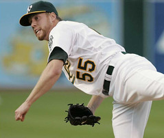
As longtime readers will recall, one of the most pleasant developments of the 2009 MLB season was the emergence of A’s pitcher Josh Outman, who brought tears of joy to the eyes of a certain uniform columnist by wearing picture-perfect stirrups. Unfortunately, his season was cut short by an elbow injury, which not only ended his 2009 campaign but also caused him to miss all of 2010.
The good news is that Outman is on the mend and competing for a spot in the A’s rotation. The bad news is — well, see for yourself.
Woof! This is one of those very rare cases when I’d strongly advocate for the pants being cuffed significantly lower.
Those images ran in a Yahoo Sports piece that appeared on Friday night. At first I thought Outman had abandoned stirrups for the accursed two-in-ones, but then I read the article, which said he’d been reduced to wearing the two-in-ones because “the A’s clubhouse guy forgot to have [stirrups] ready” for him.
The A’s clubhouse guy, of course, is Steve Vucinich, who happens to be a Uni Watch confidant. Had he really been caught with his stirrups down? I found that hard to believe, so I gave him a call on Sunday morning.
“Josh just told that to that reporter as a joke,” Steve told me. “I had some with the four-inch opening, but he likes the longer kind — the seven-inch — and I’d run out of those. I ordered a bunch more, but he’s pitching today, and he’ll wear the two-in-ones for that game. Then we’ll have his regular stirrups after that.”
Sure enough, Outman went with the softball sox yesterday. Turns out he’s done this before, while rehabbing in the Instructional League last September, but it’s good to know that’ll be just a one-game thing for spring traiing. Perhaps Outman (or Vucinich) should have called reader John Sheehan, who showed how it’s done for Stirrup Friday a few days ago.
One other note about Outman: His old uni number, 55, now belongs to Godzilla, so Outman has switched to No. 88. Why 88? I don’t know for sure, but a clue may lie in the number he wore as a minor leaguer in 2006.
Meanwhile, here are some other notes from the first weekend of spring training games:
• Disappointing to see Ubaldo Jimenez wearing solid socks instead of his usual stirrups on Saturday.
• The logo for the Rockies’ new spring training facility kinda looks like a stock market tracker, no?
• The Rays honored the St. Petersburg Police Department, which recently had three officers slain in the line of duty, by wearing St. Pete police caps for Saturday’s Grapefruit League opener against the Pirates. The only downer: The caps were adjusta-straps. (That last photo also indicates that Pirates third baseman Pedro Alvarez has changed his number from 17 to 24, by the way.)
• As we’ve previously noted, the Indians plain-Jane Bob Feller memorial patch has red numerals. Rather odd, then, to see that they’ve painted a “19” on their spring training field with white numerals. Different kerning, too. Wouldn’t they want to match the patch? This seems like another signal that they’ll eventually ditch this patch and go with the silhouette patch design once they sort out the copyright issues. (If you don’t know what I’m referring to, look here.)
• On Friday I mentioned that the Twins’ new Japanese import, Tsuyoshi Nishioka, was going double-flapped in batting practice, but I wasn’t sure if that was just as because he couldn’t find a single-flapped helmet that fit or whatever. Looks like it’s his preferred m.o.
• In a related item, it’s good to see that Willie Harris, now with the Mets, is maintaining his double-flapped ways. (Harris, of course, is a more unusual case than Nishioka, because Nishioka is a switch-hitter, while Harris only hits left-handed, and it’s extremely rare to find a double-flapper who isn’t also a switch.)
Finally, it’s worth noting that at least one baseball luminary is already in midseason form. That would be the inimitable Wayne Hagin, who kicked off Saturday’s broadcast by saying the Mets have had — I swear I’m not making this up — “a tremendous off-season.” Oh, Wayner, how I’ve missed you. Just like I’ve missed saying this: Fire Wayne Hagin already!
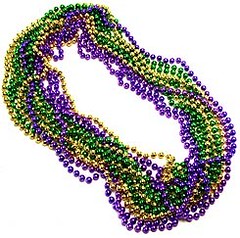
Show us your tits Smiths: The Hornets wore their Mardi Gras uniforms last night. Only problem is that one player’s NOB was misspelled.
I know what you’re thinking. You are thinking, “Well, it’s understandable that they’d misspell Didier Ilunga-Mbenga’s name, or maybe Emeka Okafor’s, or maybe even Quincy Pondexter’s.” What you are probably not thinking is that the player in question would be this one.
That’s Jason Smith. Fortunately, someone on the New Orleans bench spotted the typo at the end of the first quarter; even more fortunately, they apparently had a back-up jersey for him to change into.
This isn’t the first time America’s most common surname has been botched on a major-level uniform, incidentally. That’s Jason Smith of the 2006 Colorado Rockies. I can’t help but notice that both of the Smith typos were on jerseys that contained purple, further evidence that that this most putrid of hues leads to diminished mental acuity.
(Special thanks to Matt Beahan, Richard Thiberville, and Lisa Martin for the screen shots.)
Stirrup and bobble reminders: Remember, Robert Marshall is currently offering a new batch of stirrups and discounted bobbleheads. Please send him all of your money. Thanks.
Wait, save some money for this: You know how I’ve been selling T-shirts featuring a design based on a certain team and a certain foodstuff? Well, a certain legal team from a certain league has suggested that I should stop selling them, so that’s the end of that. I have a handful of shirts left, though, and I’d like to move those, so this is your last chance to obtain one of them. If you want in, it’s now or never.
Uni Watch News Ticker: As you may have seen in Phil’s Saturday post, the voters have spoken and the Dodgers are going with the satin-esque powder blues (which R. Scott Rogers has brilliantly dubbed the “ersatins”) for their six throwback games. Here are much larger versions of the front and back. Personally, I voted for the 1911 design, which came in a close second. ”¦ The Lake Erie Monsters will be wearing Browns-themed jerseys tonight. “Not entirely awful,” says John Muir. ”¦ Jim Lenahan recently bought these pajamas for his six-year-old boy and noticed something interesting about them: “I was testing his knowledge by pointing to a helmet on the pajamas and having him identify the team. As we were doing this, it occurred to me that we hadn’t seen the Cowboys yet. We noted that all the other 31 teams are on the pajamas, but not the Cowboys. What’s the deal?” ”¦ Mitchell & Ness is producing some groovy cardigans, but they’d be sooooo much better without that annoying M&N logo creep on the right cuff (with thanks to Jon Cannella). ”¦ While looking for something else, I came across a shot of Pirates infielder Steve Pearce, who appears to have stirrup loops on his pant cuffs. ”¦ Here’s a weird one: Batman wearing red (good find by Joe DeAngelis). ”¦ Check out the inner-arm padding worn by these old goalies. Interesting (big thanks to Mike Hersh). ”¦ Here’s something you won’t often see: the Detroit Tigers playing volleyball. That’s from a big slideshow of Tigers spring training photos that Andy Windsor brought to my attention. ”¦ Here’s a good piece about St. John’s skyline shorts from the mid-1990s. ”¦ I was poking around on eBay and found an usher’s shirt from the 2005 MLB All-Star Game. ”¦ It’s hard to care about the World Championship of American Football, but they do have a pretty nice logo for the 2011 championship (with thanks to Jeremy Brahm). ”¦ A Troy softball player is wearing a mask in the field, “I think because of a broken nose,” says Jonathan Sellers. ”¦ As if the poor folks in Madison don’t have enough to deal with, the Madison Mallards have unveiled a fairly hideous new identity set (with thanks to Rich Fronheiser). ”¦ New logo for the Melbourne Football Club (Jeremy Brahm again). ”¦ Also from Jeremy: The mascots for the 2014 Winter Olympics have been chosen. ”¦ UCLA hoops marked last game at the Pavilion before its renovation by wearing throwbacks on Saturday. ”¦ A quick check of the Chris Creamer board reveals a few items of interest: The Predators will have a new jersey next season; MLB has a new Opening Day logo; and when the NFL unveiled their new postseason and Super Bowl logo set, here are some alternate proposals that didn’t make the cut. ”¦ Many of you have probably seen the uniform that the Padres would have worn if they’d followed through on their plans to move to Washington in 1974. But here it is again, just in case. ”¦ Nebraska-Omaha hockey wore gray uniforms on Saturday, to promote brain cancer awareness (with thanks to Jim Polacek). ”¦ Here’s an article about Oregon’s new basketball arena, another one about the arena’s logo, and one that compares Oregon’s athletic funding to Cal’s (all this from Brinke). ”¦ Here’s an interesting little item about the sport-specific necktie designs that used to be worn at Harvard (with thanks to Ilana Hardesty). ”¦ Super rugby news from Adam Ingle, who writes: “Super 15 teams Chiefs and Highlanders, as well as the Stormers and Lions, wore red and black tape armbands this weekend, to show support for the earthquake victims in Christchurch. Red and black are the colors of the Christchurch-based Crusaders team.” ”¦ One of the prospects wearing that electronics-laden Under Armour shirt at the NFL Combine had a wardrobe malfunction yesterday. “Looks like Iron Man lost his arc reactor,” says Jason Kerzer). ”¦ Greg Riffenburgh recently spotted this Cal Poly – San Luis Obispo baseball jersey at a friend’s house. “If there ever was a ’70s jersey, this is the one!” he says. ”¦ “I ran across this Purdue football uniform and at first I thought it was just a mockup,” says Adam Wyss. “But then I saw that a friend of a friend, who’s a kicker for Purdue, had posted the image on his Facebook wall, labeling it as next year’s uniform. I don’t know if it’ll be full time, or just a one-time alternate, but an actual player posting it leads me to believe it’s probably legitimate.” ”¦ New baseball uniforms — including stirrups! — for UNC (with thanks to John Freeman). ”¦ If you’re gonna have a baseball team named after a football team, it makes sense that your jersey would have UCLA stripes (nice one by Dan Cichalski). ”¦ Intriguing find by Matt Harris, who found an old shot of Thurman Thomas wearing what appears to be a Houston Rockets championship cap on the sidelines. ”¦ Ken Davidoff Twittered yesterday afternoon that the Dodgers had already posted a “Duke 4” sign in their clubhouse for the Duke of Flatbush. I expect we’ll see a sleeve patch very soon. ”¦ Joe Hredzak found a bunch of old Pittsburgh sports photos. Uni-wise, I’m especially intrigued by this one (talk about fraternization!) and, especially, this one (never seen jerseys with diaper attachments paired with civvies for a promo shot, plus dig the very young Len Dawson).
Regarding the Cowboys helmet….the ‘Boys retain the rights to the logo and prefer to not use it in compilations like kids pj’s. They would rather you buy something from them direct…..
Jerry Jones is lame…
“Jerry Jones is lame…”
In other news, the Pope is Catholic, and a bear shits in the woods. LOL
I thought “Could you please give me one more reason to hate the Cowboys?” was a rhetorical question.
Sometimes, you just need to point out the obvious.
Sounds like the perfect NFL item if the Cowboys aren’t on it….
That polar bear in the 2012 mascots looks a LOT like link
In this article, it states that the creator of Misha is accusing the 2014 mascot designers of theft
link
Lovable lil Misha of the Boycott Games! The Sovs flooded Europe with free stuffed Mishas, and they were indeed kinda cute. These Sochi mascots are total losers in comparison, although maybe that adorable rabbit (hare, whatever) has some potential.
Great digging by Jeremy Brahm, of course. Another cool Jeremy contribution was that logo for the World Championship of American Football, to be held in Austria this summer. Paul likes the logo but couldn’t care less about the event. I don’t know, sitting midfield at some stadium in Salzburg, brew in hand, Alps looming, Netherlands vs Italy, say… Definitely better than some NFL experiences I’ve had.
a LOT?!?!
they’re both bears i’ll give you that… but am i missing something?
Ry Co 40 said:
“am i missing something?”
~~~
is a bear catholic?
Love the Tigers Spring training shots, especially the downward-sloping “TIGERS” in shots 3-5! FYI, their spring training home from 1934-1965 (except during WWII) Henley Field still stands in pretty much the same state.
Google Street View: link,,0,-2.55
Wikipedia: link
The Rays copcap tribute shows two important things:
1. A much better way to honor cops, firefighters, soldiers, etc. than sticking flags all over your uni or playing make-believe soldier dress-up with camo unis; and
2. The Rays shoulda stayed with blue and green. Man, those green caps look good with the blue jerseys, even if the combo is too low-contrast. Lighten either the blue or the green even just a little, and they’d have one of the best color schemes in all of sports.
There was a comment on the adjusta-straps on the caps, but those caps are the ones that the SPPD officers wear on the street and as part of their uniforms.
I would imaging that they could have had New Era do fitted caps, but if they were only going to wear them a game or two, the adjusta-straps were fine.
I thought it was a fine gesture by the Rays to wear the SPPD caps.
the rockies new spring training facility is shared with the d-bax (and it’s actually on native american land)
so that “logo” on the bag is actually a snake/mountain range, mimicking the two teams’ logos
I actually like that concept. Good call.
Other observations on a particularly rich ticker:
The Mallards logo & unis would not be the worst in MLB, if the Mallards were an MLB team, so I don’t accept “fairly hideous” as valid criticism. On the other hand, will I be calling the Mallards today to see if I can haggle them down on the price of one of their now-retired jerseys? Yes, I will. Will I be asking about the price of merchandise with their new identity? No, I will not. But the new logo & wordmarks are fairly anodyne, while the new color scheme is a vast improvement over the old, so surely this doesn’t deserve the implicit “stupid” rating. It’s an upgrade, even if it’s not the awesomest thing ever. Going from a C-minus to a C-plus is progress.
Love the new Opening Day typography. Straight outta 1977, which as much as the 1970s really did suck, especially for baseball design not involving the Phillies, the mid- to late-70s were really the last gasp of a certain kind of whimsy in American typography. Reminds me of a KFAT Radio t-shirt my uncle in San Jose sent me circa 1977 or 1978.
Which, a moment of Googling reveals, you can link with rebroadcasts of classic 1975-1983 KFAT programming. Holeee sheee-it, that right there justifies the existence of the internet.
I remember watching NASL San Jose Earthquakes games on WTBS in the early 80’s, where the KFAT banner was prominently displayed in the background. Of course they joked that it was Skip Caray’s favorite station.
“… the mid- to late-70s were really the last gasp of a certain kind of whimsy in American typography…”
____
Nice.
Got that right.
Now with “beveling” and all, everyone wants to be…
substantial, monolithic, aggressive, dramatic…
And wear black.
—Ricko
Good call on the Mallards – the new set’s not great, but it’s better than the old ones.
Then again, I still pine for the link. And the link. Now those were baseball teams.
And while we’re on the subject, I bet Paul would have loved link (if not necessarily all their outfielders).
Absolutely.
And, being an old cuss,I think of the Northern League version, the Mandan Mallards.
And the Aberdeen Pheasants. And Winnipeg Gold Eyes (thank godness that name got brought back). And St. Cloud Rox (saw Lou Brock play for them). And others, of course.
—Ricko
I’m glad they got rid of the red. When I think of a Mallard duck, green is the first color that comes to mind, not red, even though Mallards have red eyes.
if you color that beak green & put a headband on, it reminds me of the TMNT cartoons as a kid.
mallards: mark me down in the “fairly hideous” camp
angry duck (AFAS? (angry for angry’s sake)) + WAY too many shadows + no “charm” whatsoever = “fairly hideous” to me. also, can’t figure out why his head has that planetarium shape to it.
as for the opening day logo— are you sure? i thought the typography was awfully minimalist for something as exciting as opening day.
The 1957 Steelers photo states that the person on the far right (#18) is Ted Marchibroda, but it sure looks like Jack Kemp to me. Kemp did play for the Steelers in 1957.
It’s Kemp.
The MLB Opening Day logo has “April 2011” over the banner. With some of the teams opening on March 31, will there be a different version of the logo for those teams?
first thing i thought of—Giants start March 31.
PS thoe NFL SB logos that weren’t used are terrific IMO. especially the first one.
I don’t think I’ve ever heard, but was there a nickname chosen for the team when the Padres almost moved to Washington?
Can’t document this, but to my knowledge the folk wisdom in DC has always been that they were going to be the Washington Stars.
Of course, folk wisdom being what it is, that’s probably just an assumption based on the prominence of the shooting star in the couple of photos people remember from the time.
Seems to me “Nationals” got a fair amount of mention, too.
At the time, anyway.
Don’t know for sure how history’s been revised on it (not aimed at you, Scott; just couldn’t resist a jab at revisonist history, which seems to be so “in” this days).
—Ricko
I was trying to think of the number of teams that migrated east rather than west. It’s a relatively short list. Any others?
MLB
Browns from St. Louis to Baltimore
Braves from Milwaukee to Atlanta
Pilots from Seattle to Milwaukee
NFL
Titans from Houston to Memphis to Nashville
Browns from Cleveland to Baltimore
Rams from Los Angeles to St. Louis
NBA
Hawks from St. Louis to Atlanta
Grizzlies from Vancouver to Memphis
Sonics from Seattle to Oklahoma City
Well, in the grand scheme of things, they Rams still moved west, since they started in Cleveland.
MLS
San Jose to Houston
And, as always, don’t name your team the Browns, unless you plan on moving to Baltimore someday!
MLS
San Jose to Houston
~~~
he means real sports, jim
More…
NBA:
The Hawks had an earlier eastward move. They started life as the Tri-Cities (Moline, Illinois) Blackhawks and moved to Milwaukee.
Chicago Zephyrs –> Baltimore Bullets.
Fort Wayne Pistons moved to Detroit.
NHL:
Colorado Rockies –> NJ Devils
California Golden Seals –> Cleveland Barons
NFL/AFL:
Decatur Staleys –> Chicago Bears
Dallas Texans –> KC Chiefs
(Does Dallas Texans –> Baltimore Colts count)?
Forgot one…
MLB:
Baltimore Orioles –> New York Yankees
“(Does Dallas Texans —> Baltimore Colts count)?”
Yep. Besides the Baltimore Stallions,
link
has that city ever had an original team?
Duh, that reminds me:
CFL
Baltimore Stallions -> the new Montreal Alouettes
MISL
Houston Summit -> Baltimore Blast
/pipe down, Phil…
The Nets are going from Newark to Brooklyn. It’s 14 miles, but it’s 14 miles east.
I didn’t move to DC until 1992, so it’s entirely possible that (A) what I’ve heard about the near-move of the Padres is just wrong or (B) represents a collective misremembering or (C) both. I’d have sworn that I’d seen some kind of documentation once, a baseball card mockup or a WaPo story or a team letterhead or something, that used the Washington Stars name, but since I can’t even remember the context, much less the source, that’s worse than useless.
Anyway, it’s worth remembering that DC’s baseball folk wisdom is kept alive by a couple hundred thousand people who all attended every expansion Senators game ever played, including the last one, and they were each one of the guys who unfurled the “Short Sucks” banner. There’s a lot of I-was-at-Woodstock when it comes to DC baseball memories is what I’m saying.
The Nets are going from Newark to Brooklyn. It’s 14 miles, but it’s 14 miles east.
~~~
seems like they did that in the ABA too
NBA- Rockets went from San Diego to Houston
There a few people out there, who think a bunch of NHL teams that are in the South – should move East – real far East – all the way to Europe, and form a 6 team division.
Otherwise I suspect at least three of those teams will move North – above the 49th parallel. (Canada will always feel a certain amount of gratitude to Atlanta – for not providing 1, but soon 2 NHL teams)
can someone call teebz and make sure he didn’t pass out cold after reading that comment… thanks!
WHA had at least one…
Los Angeles Sharks (I think) became the Michigan Stags and Baltimore Blades, not necessarily in that order.
ABA…
Minnesota Muskies to Miami to become the Floridians.
Los Angeles Stars became Utah Stars.
Where’d Oakland Oaks go? To Washington Caps, then Virginia Squires? (btw, Virginia Squires is one of the really underppreciated names in sports history).
—Ricko
Do the Pipers moving back to Pittsburgh after their year in the Met Center count?
Can’t believe the Dodgers went with those throwbacks……we’ve seen ’em before!
That one was my last-ranked choice, particularly because they won’t actually be satin and will thus look like the Royals have moved to Brooklyn, but at least we get to see the spiffy McAuliffe font on a team other than the Red Sox. It looks so good.
I voted for that one since I’m a Giants fan and I wanted the Dodgers to look as bad as possible. Bwa ha ha haaa.
I voted for that one as well, in the hopes that we might actually get an authentic blue Dodger cap out of it.
The vote graphics indicated that we would, although the first publicity photos aren’t giving me much hope.
The Lake Erie monsters wore them on Saturday the 26th, they looked great on the ice, i went to the game. Lots of fans in Browns gear there. They were selling limited edition t-shirts in brown and orange as well, but they sold out before i could snag one. They auctioned off the players jerseys for charity after the game.
Here’s an action shot:
link
I’d almost wear that… if they didn’t have their Colorado Avalanche affiliation on their right sleeve!
You can always put a Browns patch on that spot.
I didn’t like that link font the first time link.
I’ve yet to encounter a Spartan fan or alum that actually likes that font.
Replace “a Spartan fan” with “anyone”
What I find interesting about the link is not the wardrobe malfunction, but that his height is given as 5′-8 7/8″. Eighths of an inch? They coudn’t just round the guy up to 5’9″?
They always measure guys in 7/8″ divisions at the combine. When you’re looking at two players who are essentially the same in terms of skillsets and performance measurements, the differences come down to seemingly insignificant details, like height, height-weight ratio, hand span, anything that might give one player an advantage over another.
RIP
link
link
That red Batman costume is the product of colorization. Not the strangest color the Bat has worn either: link
Terrific.
Pretty sure I still have that issue of Detective Comics. Bought in my kidhood, it was. For a dime. A memorable cover, to be sure, and I have a vague recollection of buying at the corner drug store a couple blocks from my grandmother’s apartment.
—Ricko
Wanna know the story behind it?
Dick Grayson broke his wrist or something at a charity event, so Bruce Wayne wore all those outfits to focus attention on Batman, hoping no one would notice that Robin had the same injury. It worked.
This was the era when Batman was a mainstream hero. Y’know, working PBS fund drives n’ such (just kidding, was before the “PBS” designation, but you get my drift).
—Ricko
Colorizations perhaps, but one wonders why a RED Batman in the other formats.
link
link
link
link
Yeah Bats never wore red in that 66 movie/series. How ridiculous.
1. Are the A’s going to bring back the solid green batting helmets on the road this year to match the caps? They got rid of those when they went to the black helmets.
2. Will they wear the green jerseys at home and the gold jerseys on the road, or is green strictly for the road and gold strictly for home?
Not sure about the helmets.
Regarding the alternate jerseys, both are simply designated as “alternate”; neither one is designated specifically for home or road.
I got a…
NEW “RULE”! NEW “RULE”! NEW “RULE”!
Every team goes to a black garment that’s BFBS, the players have to stand on the field/diamond/court/ice just prior to the national anthem and say in unison (in their really low voices)…
“Hello, we’re Johnny Cash.”
Bet that’d stop ’em.
—Ricko
Or make the players wear these:
link
That was the MISL’s Chicago Riot on Elvis Night. They not only honored the King, but Elvis Costello as well, featuring music by both Elvi.
I don’t know, Ricko, that’s just gonna annoy the fans. How about this: Any team that wears black when black isn’t one of the team’s two main colors, the only music allowed in the stadium is Johhny Cash songs. If recorded music, it must actually be Johnny Cash, and if played on the stadium organ or whatever, it must be from a pre-1977 Johnny Cash recording.
This includes player and at-bat intro music.
And for the Mets, a special rule: The only music allowed in Citi Field for any reason on days the Mets wear black is “link.”
“Here’s a good piece about St. John’s skyline shorts from the mid-1990s.”
Best line from that piece is the last one:
“The skyline design should only be left to the Denver Nuggets, who should really consider going back to that uniform now that they’ve lost Carmelo Anthony.”
YES. I’ve been thinking the same thing ever since the trade.
Likely wouldn’t be the same logo, though.
I mean, we can assume the Denver skyline has changed, right?
—Ricko
Not sure how accurate the old one was.
link
Always assumed it was a generic skyline. Or a Tetris game…
Here’s a real shot.
link
That wasnt Tetris on their uniforms?
Lots of great stuff to chew on today! As a signmaker, I’m lovin’ the old hand-painted signs from the Tigers picture gallery.
I sure hope that Batman pic is colorization because I lived and breathed that Batman series back then, including the movie, and I’m damn sure I would have noticed a red uni on the Batster.
First time I’ve seen that Washington “Stars” pic! I notice the player has a bat with no handle at the end of it.
That Pirates-Red “fraternization” photo with Clemente – the caption says it was a charity game, so I guess that explains the sitting in the opposing team’s dugout.
-Jet
Correcting myself: It’s Pirates vs. INDIANS in that charity game
-Jet
Indians. Not Reds.
Is the cutline wrong? Didn’t scan down far enough to read it.
—Ricko
No, I got the caption from one of the other pics – just a mental lapse, quick look at the pic and saw the wishbone “C”
-Jet
Where is that Washington Stars pic, I can’t seem to find it.
As a defender of Wayne Hagin over the past year, yesterday I even I wanted to smack him. From what I could gather when he talked about the passing of Duke Snyder yesterday, he mentioned how Duke would walk to the ballpark because he lived in Brooklyn. Ok.
Here’s the snag, I was listening to Richard Neer on the Fan after the game (on my new iphone) and he interviewed a reporter who said Duke did live in Brooklyn, but not near enough to walk. He had to drive.
Whoopps. Ok I was wrong. Fire the bastard.
I think link, linked in the St. John’s story as the view of Manhattan from the St. John’s campus, was actually taken at Queens College. Can anyone confirm?
I believe you’re right. St. John’s doesn’t have a see-thru clocktower like that; Queens College does. St. John’s does have one on St. Augustine Hall, their library, but no view of Manhattan from anywhere near their clocktower. Plus in front of St. John’s library is the Great Lawn, much bigger in comparison to that grassy area in that picture.
Pretty sure that is a pic of Queen’s College.
As a Pittsburgher, I am obviously very fond of the Brady Stewart collection of Pittsburgh area sports photos. Interesting that in link, number 57 is wearing a number 4 helmet for some reason.
But of all the images, link, and the story it tells, is definitely the most striking to me. Absolutely amazing.
Loved all of those photos. The color shot of Forbes Field was great. You could tell they stopped caring for the field since that was the year the Bucs moved into 3 Rivers.
It’s strange by today’s standards how Forbes Field was used until late June of the 1970 season and then the Pirates played at Three Rivers Stadium the rest of the way. Of course, the uniforms changed with the different stadium as well.
It would be interesting to see how often this has happened before, i.e., stadium transfer with uniform change during a season.
The Toronto Black…I mean Blue Jays moved into (I’m still calling it) Skydome in June 1989. I don’t think they changed their uni however. If someone can refudiate this, please do so.
On the old Pittsbugh Steeler photos….#18 is Jack Kemp, not Ted Marchibrodia.
Thurman Thomas is from Houston, so it makes sense he’s be giving a shout out to his hometown champs.
Ah, excellent point. Thanks!
I thought even Little League gave up on those stupid socks with the faux stirrup stripes on them…
Someone here should make a faux stirrup sock that looks like a proper stirrup.
It’s been done, but it doesn’t look good:
link
The problem is that you can’t knit curves — you can only do horizontal and vertical strokes that approximate the look of curves. Plus there’s a shift in the pattern where the leg portion of the sock meets the foot portion, so the “strap” of the faux stirrup doesn’t loop underneath the foot (this problem also afflicts ribbon-style two-in-ones).
Easy fix to that problem. WEAR STIRRUPS!!!!
Can’t see the link, but I’ll take your word for it.
Can the design be screen printed onto a white sock?
In the UNC photo, it looks like they have black stirrups. It looks like that to me, of course but I may be colorblind if it’s navy. I always mix up the two. Anyway, does anybody know if it’s black or navy?
Navy to match the caps.
The Cowboys’ helmet was going to be on the pajamas, but the company they hired to complete the inseams walked off the job and the new company hired at the last minute couldn’t get them done in time. So now your kid has a choice of brand new pajamas every year until he turns 13 or a lifetime supply of juice boxes.
But if he really complains about it, they’ll probably give him a million dollars.
+1
Not uni-related, but on “Portlandia” this week they had a skit where they’re auditioning players for a new Portland baseball team and a short clip of “Gathering Crowds” (aka the greatest sports theme music ever!) plays…
link
Made me want to go outside and practice home run-stealing catches on my backyard fence.
Paul –
Will those Brooklyn “throwbacks” be without the MLB neck collar logo and a Majestic sleeve logo? Didn’t see them in the pictures, but assumed for game play and retail sales, that they might be added.
Thanks!
Good question. Will try to find out.
don’t the NYYs pay to NOT have the Majestic logo on their uni’s?
Also can’t help but wonder if they’ll be sporting a patch honoring the Duke of Flatbush.
and on the 50s Steeler photo, dig the young Hon. Jack Kemp (MoC R-NY) and HHS Secretary during Bush 41.
on the 50s Steeler photo, dig the young Hon. Jack Kemp (MoC R-NY) and HHS Secretary during Bush 41 (that’s not Marchibroda). Also, note the really unusual thing about the Clemente photo – Pirates are playing the Cleveland Indians, which they did frequently in the 60s midseason in the “HYPO” charity exhibition game (it’s so ID’d on the photo). HYPO was an acronym for Help Young People Organize (if I remember correctly), and the proceeds went to youth sports programs. Quite the sight in the 60s to see an American League team at Forbes….Finally, one of those photos has Pirates coach Johnny Pesky (yes, that Pesky) in the foreground of the dugout.
This fall, I attended the Va. Tech homecoming game vs. Wake Forest. The alumni band had the sweetest uniform. They were a maroon cardigan sweeter, white shirt and Hokie-themed tie. It was a beautiful. I just thought of that when seeing the other cardigan in your column today.
Today’s ESPN column is up:
link
The California Golden Seals have been reborn! link
“…further evidence that that this most putrid of hues leads to diminished mental acuity.”
Please. Williams College, the best school in the country, has been sporting purple since 1869.
see?
no.
Ephraim, eh? Your moniker is the first name of your alma mater’s eponym? As in “The Ephs?’ Or “The Eph-men?”
And you see adorable little Williams, hard by the metropolis of North Adams, as “the best school in the country?” And you find it out perfectly acceptable than your arch-rival (better-in-every-way Amherst College) also sports purple, and that they had it first?
Well, if you can live with yourself….
Well I stand corrected on my own history here…
Williams has been wearing purple since 1865 (link), whereas Amherst has began using mauve as a school color in 1866, which at some point soon thereafter was changed to purple (link). So that’s that.
As for Amherst being better than Williams…
Williams is #1 and Amherst is #2 (link)
Williams has won 14 Director’s Cups, whereas Amherst has finished second once, third once, and fourth three times. (link)
Yet another reason to consider the 2012 London Summer Olympics logo total crap: link, because the figures vaguely resemble the word “Zion”.
What’s funny is that last night, I just watched a 2006 episode of Doctor Who, set in London in 2012, and they used the candidate logo to represent the Games, seeing as how the crap logo wasn’t introduced until 2007. Maybe in the Doctor Who universe, the 2006 Battle of London between the Daleks and the Cybermen took out the people who designed the crap logo?
Actually, I think they disappeared into the Cracks.
Stupid Iran. It clearly spells “Zoir.”
Absolutely disgusting for the Iranians to have made this political charge. Heinous. But the logo is particularly bad to begin with.
Just got an email pushing the Red Sox St Patty’s day jerseys. WOOF.
link
I feel as though to make authentic looking stirrups into two-and-ones should have already been done, and make it not look like someone eff’d up your sock striping.
The softball player’s fielding mask is going to be come a lot more common at the college level. Many youth teams / leagues (including the ones that I am the admin for) now require the mask to be worn by all fielding players. The most prominent manufacturer is Rip It: link
Outman’s faux’s are an abomination…
link
Solid colored socks are really the way to go if you don’t have proper stirrups on hand, and a pair of plain greens would have been perfectly fine in this case.
While looking around on Google, I found something I’d never seen before regarding the Dodgers’ satins. The Pittsburgh Press had link after seeing them in action at Forbes Field:
“The uniforms are dazzling, to say the least. Of satin, they are shimmery under the lights and made up of blue shirts and pants with white piping on the shoulders and white stripes down the legs. There are also white visors on the blue caps.”
Emphasis mine. White visors? Anybody hear this before?
regarding the number 88:
I was listening to British footy podcast and they were saying that in Europe, players who lean a certain way politicially often wear 88 because it is viewed as looking like a swastika. (use your imagination I guess)
I’m sure that would be a shock to Eric Lindros, Michael Irvin and any other American athlete that has worn the number.
Yep, but…it looks like a swastika? I think the 88 thing is right for a different reason.
Keeper Gianluigi Buffon infamously got talked out of #88 in Italy. Buffon always said #88 was an Italian sign of macho strength, because it is four balls (not just two). BUT, because H is the 8th letter, 88 is “clearly” code for HH, standing for “Hail a particular failed Austrian artist with a Charlie Chaplin mustache.” So Buffon took the traditional #1 instead.
“because H is the 8th letter, 88 is “clearly” code for HH”
That’s what I’ve heard about neo-skinheads. I think the footy podcast host had the big picture correct but was wrong on the “why”.
that makes sense too.
I don’t recall if Buffon was the person they were discussing, but possible. It was a show from a couple years ago.
He could have just said it was code for “Happy Holidays.”
People look into things too much. Still, this could be a way for Paul to sell more membership cards…”Got an 88 card? Show the world you love freedom and get a new card with a new number today!” ;)
I’m bummed that Al Alburquerque isn’t part of the Rockies’ organization any more. He had been with the Rox’ AA affiliate for a couple years. The last name alone is pretty sweet, but adding “Al” really makes it sing.
The nfl pj pants that dont have the Cowboys helmet on it, my son has those in boxers and sure enough, they dont have the Cowboys helmet on it either. Good for us seeing we are Redskins fans. In the words of my four year old “yucky cowboys”. Makes a dad proud.
We have those too and we noticed there are two teams not on them. Can’t remember the other one, I’ll check tonight.
If your kids makes a mess in his pants, that can substitute for the Cowboys…
Well, the Cowboys are the only ones missing on the NFL pajamas. But we ALSO have the MLB counterparts. And those have two teams missing. See? I knew I remembered something. The missing MLB teams? Reds and Rockies.
It’s interesting that people don’t seem to take too much offense to the SEC having half-pro rosters and laying claim to “the best football conference” in the country. I guess that’s how they roll in the “dirty” south. Yet, Phil Knight (love ’em or hate ’em) gives his money to the U of O legitimately and people have a problem with it. You can have your dirty programs SEC. I’ll take crazy uniforms and corporate jerkiness any day over cheating.
No more “Meats” shirts?
Guess the MLB got antsy when some enterprising soul did “Madoff” shirts in the same typeface as the Mets logo.
I proudly wear my Meats tshirt, and my “I’m Still Calling It Shea” tshirt too.
Muck the Fets. And Freddy Coupons, too.
pretty sure it’s just “I’M CALLING IT SHEA”
no “still”
So will the “Meats” logo be available to anyone who wants to make their own shirt?
Are there any Meats aprons left? I probably should have bought one for my friend, he’s a butcher.
Tweet from Hunter Pence: link
Just got opening day tickets to watch the Cubs/Pirates from the bleachers at Wrigley! Extremely excited, never been to Wrigley before.
Still a Jays fan, though. Hoping for a decent year from our young team in Toronto.
FTH GLG.
Allow me say: I actually kinda dig the St. John’s skyline shorts. Put them in the “so bad it’s good” category.
I LOVED those shorts. I also loved the old Kentucky shorts in like 1994-95 with the (I’m assuming) slashes like claws. Heck, I even liked the denim-look Kentucky unis, even if I almost guarantee I just lost all credibility.
So Nashville is geting new uniforms. Let us hope that they introduce a new crest as well…this thing is atrocious….
link
Can’t believe that you complained about the M&N logo on the sleeve cuff of the cardigans … my god it is barely visible.
Actress Jane Russell has died. She was 89.
I mention it because for a time she was married to Rams’ quarterback Bob Waterfield, probably the biggest name who played for the Rams both in Cleveland and in Los Angeles.
I’m guessing he didn’t meet her while the team was still in Cleveland (no offense to Clevelanders).
—Ricko
Is there a gallery somewhere that shows Nike’s sweatback designs in detail?
Great story on the original Nike waffle iron being found
link
I love that Utah Jazz floor more each time I see it. Gorgeous.
The Troy softball player is wearing that as protection from a grounder coming up and hitting her in the face. You see more girls wearing this in high school than in college. I saw a entire infield wear them during last season.
Watching the combine and the Colts went back to the old afc logo in their end zone. Little odd.