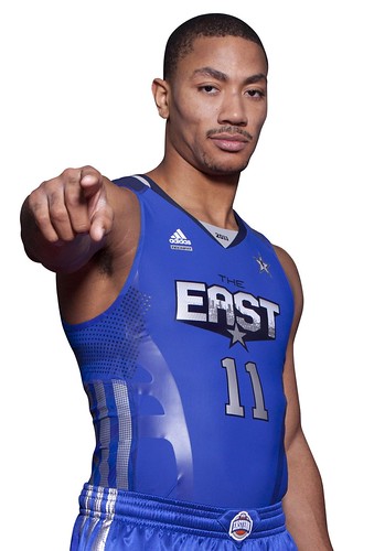
Most NBA players these days wear a compression tank top under their jersey. So why not just skip the jersey and wear the compression undergarment function as the uniform top?
That’s an idea that the NBA has decided to test-drive in the upcoming all-star game. The league will announce today that all players in that game will have the option of wearing skin-tight compression tanks instead of the standard Adidas jerseys.
It isn’t yet clear how many people will take the league up on this offer. But while we wait to find out, here are a few thoughts:
• Obviously, the Adidas “PowerWeb” bands are beyond ridiculous. Ruins any chance of this experiment succeeding on a visual level.
• But if you can remove the bands, or just ignore them, the idea of form-fitting basketball jerseys is intriguing. I generally prefer tight over baggy. Also, Nike’s System of Dress jerseys on the college level are fairly trim-fitting, and I think they generally look quite good (hope all of you who think I’m incapable of liking anything Nike-related are paying attention). If Adidas can come up with something similar on the NBA level — again, without the lame-o performance bands — I’m all for that.
• The risk here is that the skin-tight look could put too much emphasis on the players’ physiques and take things too far in the superhero direction.
• Then again, while the players have super-human bodies, most fans do not. If a team ever went to compression-style jerseys, would fans buy a merchandised version of that? I for one do not want to see Vinnie from Queens in a skin-tight Knicks jersey.
• When I first heard about this idea back in October, I mistakenly thought they’d be giving players the option of wearing compression shorts as well. I wish they’d gone that route — a full skin-tight uni, sort of like the Australian women’s hoops team (only two pieces, not a unitard) or the infamous NC State one-piece uni (which was basically a unitard, but it looked so awful that the players wore shorts with it anyway). As it stands now, they’ve got the potential for tight on top and baggy on the bottom, which is the same problem that afflicts the System of Dress. If you’re gonna go with the compression look, I say go all the way.
All in all: an interesting idea. Might not work, but I’ll be curious to see how it looks.
The NBA will be officially announcing all of this, plus a bunch of other all-star stuff, this morning. Meanwhile, if you want to see how the regular, non-compression jerseys look on several of the all-star players, look here.
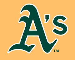
Golden boys: One of the worst-kept uni secrets of the past six months or so is that the A’s will be ditching their black alternate jersey this season and replacing it with a gold alternate. Broadcasters have mentioned it on the air, reporters have referenced it in print, and so on. But the team hadn’t officially acknowledged the new jersey until yesterday (further details here).
I say it’s a win-win. Getting rid of the black jersey is addition by subtraction, and the new jersey is my-t-fine. Well done.
Giveaway reminder: I’m raffling off an official Super Bowl XLV football. Details here.
Uni Watch News Ticker: Dwyane Wade has been having problems with migraines, so last night he planned to wear dark goggles to reduce the glare that can trigger his symptoms. But the NBA ruled that the goggles were too dark, so he had to go with amber glasses. And since Miami was playing the Knicks, who have Amare Stoudemire, the game was a real specs-fest. ”¦ Who? Hu, that’s who! ”¦ The Russell Athletic site has a pretty cool uni design interface (with thanks to Jay Jennings). ”¦ The Steelers have sued a local manufacturer for producing knockoff merch. ”¦ New sneakers for Kevin Garnett (with thanks to Carlos Jalife). ”¦ BJ Lanier reports that Michael Vick has been rigged with a helmet camera during Pro Bowl practices. ”¦ The Mariners have unveiled their Dave Niehaus memorial patch. ”¦ Remember the newfangled helmet that LaMichael James was wearing early in the BCS title game? Here’s an article about it (with thanks to Jef Green). ”¦ Jeff Scott recently acquired a bunch of game-used Cardinals stirrups. “There’s a pair from Dave Ricketts (#10 written at top) and three singles,” he says. “One has both #18 and #32, suggesting use by Mike Shannon and Steve Carlton; one has #6, suggesting it belonged to Stan Musial (as you know, he trained with the team long after his playing days); and one has #25 and is signed by Julian Javier. It’s interesting how different these stirrups are. The Ricketts pair, which likely is the oldest given his tenure with the team, is more of a coarse double-knit, while the three singles are more like Durene, tighter and silkier. Also two of the singles feature one-piece construction, but one has an extension on the bottom, and that extension is different than the extension on the Ricketts pair, both in width and type of material. I also acquired a Bob Gibson-worn undershirt, which is 90% wool!” ”¦ Nothing says hockey like a sand castle. ”¦ Lots of team-colored football fields — although by no means a comprehensive round-up of them — here and here. ”¦ DC United will unveil a third kit on Saturday. ”¦ Here’s a great slide show of the Packers’ jerseys being prepped for the Super Bowl. ”¦ Allison Ambrous found an old hockey trivia book that says Wayne Gretzky had a personalized version of the Olympic rings stamped into the butt end of his stick for Olympic play (not sure which year). … The Twins are retiring Bert Blyleven’s number.
Looking ahead: Busy week upcoming for me on ESPN. The story + video of my trip to the Wilson football factory in Ohio will run on Monday, plus I’ll have a Super Bowl installment of Uni Watch on Thursday, plus-plus I’ve written a piece about the Puppy Bowl, although I’m not sure which day that’s running. Haven’t decided yet how all this will affect things here on the blog — might take a day off, depending on how a few other things shake out.
Also: Tomorrow I’m taking a lamb-butchering course. Photos to follow next week.
I hope Hu never has a mis-spelled NOB. Uh?
. . or HO
My memory could be spotty, but I’m pretty sure I remember Hu playing first for the Dodgers. NY headline writers have to be salivating at that.
I can’t wait to hear the “Hu’s on second” routines on the broadcasts…
The 2-Tone blue field looks OK to me.
I’d love JMU to actually get the purple turf. JMU! JMU!
I’d go to Harrisonburg for that.
I like the two tone better than the all on color fields. Breaks it up some.
Love the gold A’s jerseys. This has been a good stretch for boldly colored color alternates in MLB what with this, the Giants’ orange one, the Royals’ and Rays’ powder blue ones, etc. Hope the trend continues. One question though, I assume this doesn’t mean the Athletics’ green jersey is done for? They had it at the same time they had the black one so I imagine they’ll still wear that one to.
if boldly colored alts are your thing, then yes, this is good — and i believe it’s replacing the black, so they’ll still have two softball tops from which to choose
don’t forget the mariners new teal top, to add to the bold softball line
Come on, Phil, take that lemon out of your mouth. ;)
It’s a nice update of a classic from the 1970s. It’s a great thing.
where did i ever say it’s not a good thing?
it’s still a softball top, but i’ve gone on record as saying the A’s should own the look — when EVERY TEAM has two alts, it ruins it for everyone, including the a’s
now, this is much better, and certainly better than their BFBS top…but the A’s are no longer unique or bold … they’re just another cog in the colored top wheel
Okay, fair enough.
Boldly colored alts aren’t my thing, but I’m still a big fan of the canary A’s jersey. For one thing, it’s an overall excellent balance of color and logo elements. It’s just better designed than most non-alt jerseys in the bigs right now. The tricky thing is that it really needs to be worn with the solid green cap, not the yellow-billed cap. For another thing, though, the piping is just outstanding on its own terms. That is how you do A-B-A piping. Big enough to distinguish each color individually, with a wider middle stripe to preserve the balance of colors. Basically every team other than the Giants and Brewers that uses triple-stripe piping needs to be whipped about the head with the new A’s alt until they replace their current piping with a similar pattern.
Great news! Love the gold jerseys!
g, you are on the money with dem aO’s orange, and i too like the gold. i mean c’mon, it replaces the black, and it is vibrant, a sharp look. so without a total a’s redesign, it’s a win. that being said, correct me if i am wrong, but the a’s don’t use the head-spoon pipping on their other jersey’s right? not saying that is a huge issue, but this one seems a bit out of synch. the head-spoon look is classic, and i like it in general, but toooo many teams use it, it looses the punch. you can look classic, and classy without a head-spoon. if it were up to me, i would redesign the a’s entire set to look more like their glory days, just take out the early 70’s goofy by making the shoulder/neck/pants stripes smaller. i am quite certain i am in the minority, but i am not a fan of the plain white of the cards and a’s. the cards just need a single red stripe down the pants(for me), but the a’s need some stripes. maybe i am the only one, but the bright bay area sun hitting the link is something that i vividly remember as a kid, so i want to see some link head-spoon pipping for the a’s. but again, i like the gold top.
Yes, that Bay Area sky (usually more clear on the Oakland side) really accentuates the A’s uniforms, and always has. Same with L.A. and UCLA and San Diego and the Chargers (when there’s no marine layer). I’ll defer to you on the trim; just glad to see the green and gold back, baby.
“…not a fan of the plain white of the cards and a’s.”
Me neither, that’s what’s bugged me about those unis for years. And with today’s roomy cuts the effect is that of wearing a big bag of undifferentiated white fabric for pants. Look at the Cards uni from the ’60s – they had striping back then & looked way better.
that’s why i prefaced. it’s a winner, i am happy to see it, just thought i would throw a couple centabos horchatas out there about what i would like to see with the a’s if it was my fantasy world.
after you mentioned the o’s i broke out my 1970:year of the birds LP to listen to as i alternate betwixt painting, and setting up some sock orders…”at months end the birds took to the air, destination, fantasy land, uh, perhaps i better say california. to anyone that doen’t live there, california seems a wild and wooly land where anything can happen, and usually does.”-chuck thompson. oh speaking of socks, i was charged tuesday/wednesday, which means i should be getting our latest order today for anyone interested.
giancarlo~
i don’t hate baggy. the 40’s, my favourite baseball era, was baggy, so on general principle i don’t bag baggy, but my brain-pan agrees with your analysis, just too much white fabric. maybe if they still showed sock it would break it up a little better. again though, i think we are in the minority on this one.
The Cards and A’s (and several other teams) would benefit GREATLY from some piping/striping. As much as I love the Cards’ birds on a bat, the uniform has a cheap visual quality overall because basically it’s just a whole lot of generic white that happens to have a cool wordmark. I said something similar yesterday regarding the Padres, and how they look like they got their uniforms from a generic white sale bin at the sporting goods store. In this era when no sock is shown to break up the baggy, white monotony, stripes would go a LONG way toward improving the aesthetic quality of non-pinstriped teams.
No, I think teams like the Cardinals and Dodgers home uniforms look terrific without unnecessary stripes and piping. Those uniforms practically glow during day games and the uniforms would be diminished, not improved, if there were stripes and other junk added to them.
p flava flav~
so let it be written, so let it be done sir. the cards have arguably the best wordmark in sport, so i am not suggesting they head-spoon some piping through that, and get all crazy, but how about a link on the leg. one line, huge improvement. that, and of all the major league teams, i don’t know why they don’t make showing some hose mandatory, they are hurt by current style trends more then anybody.
The Cardinals DID look terrific with no piping…back when they showed their red stirrups. Now that they wear baggy white pajamas, they could use some stripes. I’m not talking about anything garish, but maybe just some thin red piping on the pants and the sleeves.
rpm – yes, exactly!
scooter~
dodgers were not suggested next to the other white teams because they have been unchanged for a long time. i personally don’t love the dodger look without the dodger hose showing, but i also recognize it would be foolish to suggest a change to the iconic dodger way, so i didn’t. sometimes you deal with looks you don’t love because you know it can never, and should never change. the cards on the other hand have taken that stripe away, and the a’s likewise have a history of stripes, which is why i limited my comment to those teams.
Look at that!
link
Good God, the socks! Why would the Cardinals ever NOT want to look like that?
you and i both know this was the best cardinals look in like ever
which is why they’ll never go back to it
hard to believe a team that looked like that looked like this as well
if they could put thin piping back on the pants, it would return that uni to complete awesomeness
i do like that stan the man look, but i don’t think they need that radical of a change to return to excellence. i would love if somebody would use that look though because i love the shoulder pipe, and just the general bold and substancial nature of the pipping. the team i would love to see do this is the cubs, they had a similar look at one time, and don’t look all that sweet today(2 centabo horchata), but i iknow they will not do it because they are wed to those pins. so in order to get that design back into baseball, my favourite ever tweek, link would make me happy. but that is getting off topic, which is plain white uniforms.
nah…
the cubs need to get back to THIS…
and actually, scotty rogers nats “grays” redux (full uni here is better (no offense to chance) — as is this look
yes, that nats is as good as chance’s offering, that would be fabulous. and i do like that sox, but that was a fantasy thing for a jersey contest, the sox just need to replace silver with red and call it a winner. as for the cubs, you added an all white uni into a convo about getting rid of all white unis? um, no. i do prefer that cub logo, the sans white hat, and obviously the hose that we wouldn’t see on today’s player. so taking into account that last point, i dig why you like it, but no no no on the cub.
Aw, shucks. Glad you like my Brewer concept.
I love that piping pattern – nothing would make me happier than to see my Brew-has bring it back to the bigs.
Not every team needs stripes, especially on the jersey or pants. Sometimes I wonder if placket piping & pant stripes have been overdone. I wouldn’t clutter up the Cardinals clean look – their chain-stitch wordmark brings more than enough character to the set. As for the A’s, well… they know what they need to do:
link
Dang..I loved the black jereseys.
You’re nucking futs…
didn’t like the charcoal-sox terry? fair enough. oh wait, this guy is talking about the a’s black isn’t he? no way that is a serious comment.
The A’s new jersey and the M’s teal jerseys are really making me look forward to baseball season.
Love the piping on the A’s jersey, and I love that look in general, but I like the rest of the A’s jerseys the way they are. Same with the Cardinals.
Are those A’s “golden canary” jerseys going to be paired with pants of the same color? If so, that will be a nice look. If not, then it doesn’t get my approval.
White pants, and the usual green/gold cap.
Now if only the Orioles would bring back the orange jerseys.
It’s not great.
Whoops, disregard this. That was supposed to go down lower. Let me try again.
i agree. when they wore the orange bps last year in games, they looked great (except for the side panels, of course)
Thank the Creator. All yellow? Yuck.
I love the new Oakland jersey, I would give it all A’s!! :)
Yeah, those Lakers home jerseys that are all yellow suck. They should really pair the yellow tops with white shorts.
With the yellow (or other light colors) the white pants just don’t do it for me. Same deal with the powder blue tops with white pants, which I think both the Rays and the Royals did. It just comes out looking washed-out.
But what about the iconic A’s look of the 1970s?
link
Washed out, I think not.
Maybe not washed out, but I’m still not a fan of the combo.
Yeah, the Lakers basketball unis and a baseball uni are a apples to apples comparison.
The Lakers all purple road unis look great but by the same logic then I guess the Vikings all purple in football must be great too……………
Visually, I think the TechFit jerseys could be improved if the PowerWeb bands were applied to the inside of the garment instead of the outside. I mean, obviously they’re there because in this case, the jersey is acting as the compression tank, so removing the bands would make the garment much less functional. The bands don’t show through to the other side of the garment, though, so I think inside is a good option, unless you’re with adidas’ marketing department.
The A’s gold jersey is a great replacement for those hideous black alt jerseys. Love the argyle Packer sweater on the seamstress.
That sweater is epic.
You think that’s good, link!
Wool is actually a great choice for a baselayer. It acts like a synthetic fiber by pulling the moisture from the skin, but it doesn’t smell or harbor bacteria like synthetic fabrics do. It’s an awesome temperature regulator and it’s less abrasive on the skin as well. By the way, I’m talking wool blend garments here. Modern technical wool baselayers are usually 40%-70% wool and they range from very thin warm weather types to much thicker cold weather versions.
“Wool is actually a great base layer.” Unless you’re pitching in St. Louis in July or August.
Until the advent of synthetics, I thought the best material for base layers was silk? Didn’t medieval knights have literal under armor that was a doubleknit of wool over a silk base?
I believe so. And Geeman, a thin baselayer in a wool blend fabric will actually keep you cooler, drier and fresher than a similarly-weighted synthetic layer. Unfortunately, it costs much more, which is why we only see the smaller, boutique-esque sportwear companies (like Patagonia, for instance). Nike, adidas and Under Armour already sell their synthetic baselayers for $45-$60 per garment. I don’t know if they can make money trying to sell a wool blend version for $90-$120 per.
Perhaps in winter. I prefer wool to synthetics, don’t get me wrong, but would rather wear cotton in the summer.
“Here’s a great slide show of the Packers’ jerseys being prepped for the Super Bowl.”
So the patches are heat applied this year and not sewn? Can we get confirmation on that?
I’m checking on this.
joe —
couple of us had this discussion in the comments last night — paul is investigating
“Lukas, p.i.”
(patch investigator)
Probably not driving the Ferrari, though.
Too much snow in Brooklyn.
But a nice Hawaiian shirt might brighten the day.
link
—Ricko
I shall anxiously await a final determination on this, it seems some people commenting for the first time about it today have some of the same opinions we did last night. Good to know Paul PI is on the trail!
Phil/Paul, also some info on the #50 jersey.
A.J. Hawk wears the super-stretchies. The different layout includes that funky collar treatment. I was wondering last night how they fit the patch on those, since there’s less room between the TV numbers and the front numbers and it was a pretty tight fit on the regular jerseys.
i’m thinking they HAVE to be sewn, right? especially in such a contact sport. i think they set them there for the pic, heat pressed them down, and will sew them soon after. i’ll be amazed if otherwise!
You would think, but take a closer look at the picture of the stack of patches. If it was a sewn patch it wouldn’t have that clear plastic on the top of it…that is protective piece of plastic that is often found on heat transfers and on custom cut vinyl after the excess has be weeded off. That is never on embroidered patches…there is no need for it.
They look like the same material that the MLB Batting practice jerseys use for the numbers and letters.
I can’t believe how cheap those look. I mean, it’s bad enough that they took the fun out of super bowl patches with this awful, generic year after year look. But the patches aren’t even hand stitched. This is classless. I hate you, NFL. I hate you!
Well, on the plus side, at least they’re not using the JerryDome version of the logo.
These look like silkscreened patches. Like the same “faux stitched” numbers you would see on an EQT jersey.
I agree that the compression “Power-Web” bands look rediculous. It seemed that Adidas starting to offer the bands on several of the World Cup jerseys over the summer.
Spain jersey (on back)
link
The bands make Adidas jerseys look overdesigned and gaudy. It is no surprise that the French Football Federation ditched Adidas and went start to Nike. As you saw last week the Nike offering was very simple and clean. Adidas can definitely learn a thing or three from Nike in this regard.
FWIW, the Seattle Sounders recently introduced their TechFit kits for the upcoming season. They actually colored the straps silver on a shale background on one of the kits, so they really stand out. The general consensus is that they look like “bra straps” — and not in a good way. Maybe there’s science behind this for players, but I gotta think most of this is Adidas just trying to burn its brand into our consciousness.
link
link
Garnett getting special shoes that can only be worn in one game ever?
Oh.
I’m all for gamesmanship, but Bob Ryan was right. Those shoes should say 17-16, not 152-120. Who cares what the regular season record between them is? The edge in titles is more significant.
Does anyone remember the one-piece singlet uniforms that NC State wore back in ’89 with a pair of regular shorts. Or how about the skin-tight singlets worn by the players in an exhibition game for a proposed new women’s pro basketball league back in 1991? Do a Google search under “unitard basketball uniforms” for NC State pics.
Sure do. Coach V. said they wore modesty shorts above them because they were too revealing otherwise.
Right, I should include that in today’s text. Will add it now.
As you may recall, it was a one-piece uni, but the players wore shorts with it anyway:
link
link
Terry,
NC State wore them when Chris Corchiani and Chucky Brown were there:
link
You went full unitard. Never go full unitard.
I’m a lead-farmer, mother——!
Kirk Lazarus
ask sean penn
Excuse me while I diddle with the control panels on the the Russell design-it-yourself website. Serious timewaster, so thanks.
Interesting discussion, Paul, on basketball unis. If a stretch unitard looks good on an Australian female Olympic basketballer (as I think it does), why wouldn’t such a garment look good on an Olympic male? Is this a codpiece / external reproductive organ issue?
We can’t forget another problem — your Vinnie=from-Queens problem — wherein as elite athletes go skin-tight, less taut bodies inflict aesthetic catastrophes in pick-up games at the local Y.
Sorry, Proctor & Geeman, you were writing your notes as I was writing mine. Same basic thread.
Arrrrrgh, Powerbands. They ruined a lot of World Cup kits, too.
Hopefully, the NBA compression unis will someday become long-sleeved and contain hundreds of pressure sensors, so that fouls can be called automatically and perfectly,by the pressure sensors, rather than imperfectly (and possibly crookedly, if you believe Tim Donaghy) by the human refs.
I might start watching the NBA again if they went that route!
Good for Blyleven that he will have his # 28 retired by the Twins. Now if the Twins can also retire # 10 for Tom Kelly.
Works for my personal Hall of Fame, too (if I had one, that is).
#28 for the Twins in the years prior to Blyleven’s arrival was worn by Vic Power, the flashy fielding first baseman who was one of my all-time favorites and a joy to watch. Power had worn #10 with Indians before coming to the Twins in a trade, but catcher Earl Battey was #10 at the time.
link
I may actually have to pop for a Twins pins cream with #28 and NNOB. Cuz to me that #28 works for both guys.
—Ricko
hey RICKO
check you email from the past two days, please
thanks
Hey, Ricko, any Twins of note before Delmon Young wearing #21?
I’m probably overlooking someone obvious, but no one leaps to mind.
I have book at home called “By the Numbers”.
I’ll check it out later.
—Ricko
Oops, got title wrong. This is the book (which Paul has mentioned before)…
link
I found my copy at Half-Price Books.
—Ricko
Some Twins #21 of note (through 2005)…
P Ray Moore
2b Bernie Allen
2b Rod Carew (1967 only)
P Tom (The Blade) Hall
P Joe Decker
IF Lenny Faedo
P George Frazier (’87 WS team)
P Pat Mahomes
P Mike Trombley
P Eric Milton
OF Jason Tyner
2b Brett Boone
Matt Garza #17? That’ll look odd on the pitching mound.
link
More to the point on the Australian one-piece, is anyone else pervy enough to have noticed the prominent camel toe? As far as men wearing them…. those types of suits would be so tight we’d know what religions all the players were….
link
yeah…I really don’t think skin tight is an option we want the NBA to go with…
The A’s YELLOW jerseys look good.
I think we’d get universal agreement that there is gold in sunsets. And gold in Autumn leaves.
And neither has anything metallic about it.
In the visual universe there are, in fact, two basic golds, and have been for about as long as people have been painting images and dying fabric: A sort of (for lack of a better label) organic gold and a metallurgical gold. The latter is metallic, the former is not.
So will the A’s be changing their hat brims to the color of Michigan’s football pants to match those jerseys? If their new alts truly are yellow, that is.
Because, honestly, to say the A’s wear yellow is a bit like hearing someone describe his new “digital analog phone.” Relevant words, yes, but we know we pretty much can’t trust his knowledge of the subject matter.
—Ricko
Yeah, I know. I’m just feeling like complete crap today with nausea, a headache and cold flashes, so I thought I’d spread my misery around by kicking that horse again and annoying a few people.
Sorry.
Run that by us again.
How is this day different from any other day here?
;)
—Ricko
Hey, THE — what color is the sky on a clear day? Blue. How about part of the American flag? Blue. I’m sure that’s confusing for you.
Yeah, yeah, yeah. We also know quite well what the sky looks like and what the flag looks like.
Let’s say there’s an expansion team being announced, doesn’t matter what sport. If all the news we get prior to the unveiling is that the team colors will be “blue and gold” what do you think of? It could be sky blue and light yellow, it could be midnight blue and old gold, or anything in between. You have no idea until you see it.
Is it really that much to ask that we describe the color(s) in more specific terms on here?
When I hear blue and gold, I think United States Navy.
Actually, I guess “specific” isn’t the best word there. Replace that with “easily understandable” When you say yellow, people know what color you’re talking about. Yeah, it’s a little bit brighter than Athletic Gold, but people have a pretty good idea of what the color will be. Hell, if you say athletic gold, people know too. If you just say “gold”, it’s not so certain.
If you were looking for an answer to your question (you weren’t, but I think it might be interesting to see what people jump to), I jumped to the Pacers colors when you mentioned a team wearing blue & gold, which I suppose would be more of a navy blue and yellow.
Not arguing with you there. For a new team, of course. But if someone writes “the Gophers (or, say Georgie Tech) wore their golds last night” I have a pretty good idea what color the unis were.
I’m on the flip side of the issue, acutally, it terms of what grates on me.
When a spokesman for the A’s says they’re going to wear “Canary Yellow” jerseys, it makes me cringe.
A bit like the time Merle Harmon, broadcasting a WFL game that first season in ’74, informed us the Southern California Sun were wearing “Margenta and Orange.”
“Margenta”? That a brand name for Oleo?
So much for your knowledge on the subject, Merle.
(Or when someone says the Sun wore “purple” and orange. They did not. That’s what Clemson wears).
—Ricko
We’ve talked about this before – “gold” as a word for dark yellow goes back hundreds of years. If people are somehow just now being confused by that, blame them.
I don’t think most players will be wearing the form fitting jerseys in the NBA All Star Game. Yes, they all weare some form fitting jersey under their uniforms, but, that form fitting jersey usually have some sort of padding, which they will lose with the adidas tight jersey.
exactly…and with all the brutally hard defense being played at the game…
C’mon Phil, an elbow on the ribs is still an elbow on the ribs. That being said: I miss the 90s and those Knicks-Heat battles
I don’t. That rivalry, the Pistons bad boys and the early Ron Artest almost killed my love of the NBA. Give me the early 80s with Dr. J (who only took two steps to Jordan’s four) and his Sixers, the run & gun Nuggets, Lakers Showtime and Gervin’s Spurs to the 90s anyday.
And as far as Paul’s preference for tight unis over baggy ones…call me Goldilocks if you must, but whatever happened to “just right”?
You are a man of immense wisdom, V.
is this just right?
Close.
/you’re a man of immense smartassitude, H.
I didn’t say he was a man of immense sartorial splendor. He is or was clearly a tucker, but that was all the rage in the bumblebee era.
And Phil, that smartassitude is what keeps me coming back.
G., I’m only a semi-tucker now. And I’ve added an inch or two to my shorts.
dammit jim
that smartassitude is supposed to keep you away ;)
Gretzky only played in one Olympics… 1998 Nagano, Japan.
Still regarded as a sort of national hockey tragedy (in Canada) that he wasn’t selected to go in the OT shootout in the quarter final against Czech Republic, which Canada would lose, finishing in 8th place.
In related news, Mr. Red was suspended for link 2 fans at the Cincinnati Reds Caravan.
Mustaches rides, eh?
ZING!
Mr. Red exemplifies a pet peeve of mine: Mascots who wear caps that are not their teams’ actual caps. I don’t mind because the mascot’s cap doesn’t match the team’s cap. I mind because in every case, the mascot’s cap is always better than the team’s actual cap, but the team never sells the mascot’s version. If the Reds sold Mr. Red’s pillbox cap, that would be the official headwear of me. I’d have to buy like a box of ’em.
Persnickety much? ; )
No, see, persnickety would be objecting that the mascot should wear the team’s actual cap. I don’t mind that the caps don’t match. I just wish teams would let fans wear the mascot’s cap, since the mascot’s cap is usually cooler than the real deal!
From the NBA All-Star bulletin:
“The on court warm-ups are designed to mimic a three-piece suit often seen on the red carpet.”
If it’s well done, it’ll look like a joke. If it’s badly done, it’ll look like a bad joke.
That sounds like about a 1/2 step up from a tuxedo t-shirt.
No pics, but I found writing on the top of the back of the pants of the players at the Senior Bowl, and they, in fact, say “Senior Bowl” on them. Just like the “War Eagle” b.s.
Sweet, Puppy Bowl write-up!!!
To clarify: Another ESPN writer is working on a piece about the Puppy Bowl. My piece will be about the kitten halftime show, and will be a sidebar to the other writer’s article.
For a humorous look at the puppies, go here:
link
Were the designers purposely trying to echo a negative space map of Cape Cod/Boston shoreline on the KG face logo on the shoe’s tongue? If so brilliant!
link
If so, I approve. Been a Wellfleeter all of my life…349!
My mecca is White Crest Beach just a bit south of the Beachcomber!
Significant visual evidence that, as has been noted many times by many here, the two inside white stripes were significantly wider than the others…and that the current Cardinals socks (while looking great) are a bit off, historically speaking.
link
—Ricko
Those NBA jersey’s are horrible. One, they look rediculous, two, the colors do not match (shine vs matte), and the stripes do not line up. should have been shot down in production.
But that wouldn’t have given them a reason for a press release. You know what else is ridiculous? Spelling that word with an ‘e.’
easy, andy
Well, it’s stupid-ass Adidas, so what do you expect? On a related-note, while the compression look is a good idea (as long as you don’t pair it with matching compression shorts), I can only imagine all of the fat-jokes that the fans will be cracking on the players with less-than-cut physiques (sp?)
link
Don’t you all think that the Packers jersey are for media day? They seem small to me, I think those are the ones worn without pads. Maybe the patches for those are just heat pressed, not a lot of tackles on media day?
It would sure make media day more fun.
Good point.
It seems that last year during media day, the patches were sewn on.
link
… one other thing with the all star jersey’s, i guess this year it is officially “The East” vs “The West” ….they must be setting up a future game in mexico between “Los East” and “Los West”.
Yeah, but I wrote about that way back in June:
link
that NBA jersey looks like junk. what’s that shiny seilver blob on the left front? wait—I’m not an NBA fan. So I don’t care. Whew. That was close.
It’s thermoplastic urethane bonded to the garment to provide superior support to the body’s different muscle groups. It’s incorporated into adidas’ TechFit PowerWeb line of undergarments and recently, as an alternative to classic fitting soccer shirts, a player on a flagship adidas team can opt to wear a compression fit version of the jersey with these bands incorporated into it. It’s now making its debut in basketball in much the same manner.
still looks like shit, tho
Could be worst, it could ruin the stripes, like it did with Argentina’s kit during the World Cup
In case anyone was wondering, my 40th birthday is coming in September …
link
maybe your wife can send you to cubs fantasy camp
I keep expecting someone to say that logo is old-fashioned and stupid because it looks like a tropical fish funeral.
—Ricko
Damn. That is an astonishingly good-looking shirt. Go, Whales!
Lamb butchering – yum to crown roast of lamb, lamb chops, lamb shank, but not so much on lamb fries for me.
Like the “System of Dress” (ugh, it pains me to write that), these compression tops are all about macho bs/superhero/look-at-me marketing.
Performance enhancement? Right.
A conventional tank top jersey which allows enough room for movement served these gentlemen well…
link
I like the A’s new top, but, yeah, it does not seem as special as it should in the league wide sea of alternates.
ALL marketing-driven, and ALL ridiculous.
The NBA compression tops, that is.
It was good enough for those gentlemen, but those gentlemen didn’t play the same game we see now, and didn’t live in the same era, commercially. The performance benefits are backed up by science, so there’s no use in doubting them. Are they a big marketing tool? Sure they are. Do the athletes also reap performance benefits. You bet. I don’t understand why it has to be one or the other with you guys.
Are side airbags in cars a marketing tool? Yep. They get your car better crash ratings,make people feel better about buying your vehicle, make you look like an ‘innovator,’ etc. Do they also provide safety benefits to the vehicles occupants? Yes, they do.
Well, you are on a blog that’s all about aesthetics, so of course that’s what we care about.
That said, am I the only one more than a little dubious of the “science” behind these things?
“The performance benefits are backed up by science, so there’s no use in doubting them.”
I know it wasn’t meant to be, but this is really funny.
Man, Greg Oden has been around forever
I LOVE the new A’s gold jersey! HATED the black, so this is great!
Go A’s!
Nice to see a BFBS jersey get the kibosh.
The new Arizona Nike jerseys looked great in person last night, so much better than the bland ones we just had.
But Momo Jones was wearing one of those compression sleeves and had the same graphic on them as the jerseys.
link
Its hard to tell from that photo (much easier in person), but you can see the Cactus at the bottom and the Arizona flag at the top. First time I’ve seen the sleeves with graphics… has anyone else used these?
also looks like the black memorial band has been made a permanent addition (actually watched this game last night) — unis did look aight…just not a real fan of the sweatback look
I believe John Wall had a matching one for Kentucky last year. Those things are simply rIdiculous.
Arizona, UConn, and Syracuse are known for being sneaker rogues.
As is the case with Mr. Jones, he is wearing Lakers colored Kobe VI’s in the Black mamba colorway.
Nike rules. Kobe rules. That being said, Me. Jones’ footwear would’ve looked better if he had worn white socks. Just saying.
Mr.*
Wayne Gretzky only played in the 1998 Olympics, so he most likely had the logo imprinted on his stick for then.
link
Can you say “jersey foul”?
That’s something I’d expect to see on one of those knockoff jersey sites… but yeah, figures it’d be Walmart.
Could we eventually see a Battle of the Bay game of orange jerseys vs. yellow ones on fridays? Or will it be orange vs. green on friday nights?
Also: Tomorrow I’m taking a lamb-butchering course. Photos to follow next week.
Uh, considering I usually read this over breakfast…I’ll skip the post that day.
This is the hat the A’s need to pair with the yellow jersey
link
Also need some piping on the pants
The NBA jersey is hideous and will look even worse when only some of the players are wearing them so a team won’t match.
The question about green uniforms still there for the A’s
It’s
White = home primary
Yellow = home alt
Gray = road primary
Green = road alt
Green gets worn more than gray though since the starting pitcher decides which jersey to wear.
There also may be a few times a road alt is worn at home and vice versa. Like how NBA teams do with their roads to show home fans them and boost sales.
I like the A’s new jersey. I don’t love it.
It will look half-ass if they wear it with the current pants, because there isn’t stripes or piping to match the jersey.
All kinda relative, isn’t it.
Unless, of course, we label their BFBS jerseys and hats and “entire-assed,” in which case “half-assed” is a major improvement.
—Ricko
Interesting that they didn’t just make a gold version of the green jersey. None of their other jerseys says “A’s” on it and haven’t for years, since the early 1980s.
They should change the greens to match the new yellows. I like the A’s logo much better than the Athletics on the green.
Sorry if posted already: The Seattle Mariners will be wearing a patch {http://twitpic.com/3txax8} in honor of their late, great announcer, Dave Niehaus, who passed away this off-season. For those unfamiliar with the M’s, Dave was inducted into the broadcasters’ wing of the Baseball Hall of Fame. He had been the voice of the Mariners from day one in 1977. He will be missed by many in the Pacific Northwest.
I’m surprised I haven’t seen posted here yet about the Marlins/Mariners series moved from FL to WA because of a U2 schedule snafu. Marlins will be the “home” team and bat first. No word on the uniforms that will be worn by each team.
Niehaus patch is in today’s Ticker.
I’ve been wasting time on the Russell athletic site for months now. I also discovered that Nike, Adidas and Under Armour have uni configurators as well, but the Russell Athletic one is the easiest interface to deal with and looks the most realistic. Someone needs to create a website where us guys who don’t do the whole hours on a uni tweak thing can take pro unis and tweak them using the Russell Athletic uniform builder. It would save boatloads of time. The Nike site is niketeam.com, I can’t remember the others off the top of my head.
Closest thing we’ve gotten to a look at the full Pro Bowl uni:
link
It’s astounding how small they look without their pads on…
Well, that’s Wes Welker — he IS pretty small….
Dang. Never saw him without a helmet before. And here I thought one of the equipment people just decided to try it on for size.
The Mothervilker said: “It’s astounding how small they look without their pads on…”
Mr. Uni Watch said: “Well, that’s Wes Welker – he IS pretty small….”
I said: So an already puny football player looks even punier (sp?) without his “armor”? (Ya know… since athletes like to compare football to “Call of Duty: Black Ops”). It’s an interesting topic: what football players look like behind/under the pads. What athletes look basically the same, what athletes look totally different, and so on.
On a related note, I kinda noticed that players’ shoulder pads have shrunk in recent years. I remember reading a UW post on the subject. It was an interview? with the Bengals equipment manager? on linemen going for lighter shoes, Chad ???????? wearing baggy sleeves, etc. Can anyone link me to that post?
Why do the pants look so long? It looks like his knee pads would be down at his shins.
Even I think this colored football field concept is too much:
link
But the double blue? That I like.
link
Oh yeah.
After checking w/ the NFL, I can confirm that this year’s Super Bowl jersey patches will be heat-sealed, not sewn. Interesting.
link, people!
Or in this case, should it be “Keep your eyes peeled”?
I KNEW IT! Thanks for the research and quick answer Paul. I can rest easy tonight.
Visiting SI.com, i almost had to come and report that an OSU player at some college all-star game was wearing a red facemask, but it turns out the nations top recruit just goes to a school whose uniforms copies the football unis for “An Ohio State University” from the waist up.
link
Hard to see, but they also use a “pointy” version of THE’s pants, too. They’re also pirating the logo. A Defensive End with the No. 7? Weird… but I guess you can have an abnormal number when you’re the No. 1 overall prospect in the nation…
link
I got a dollar that says he isn’t pondering grad school.
Or graduating, for that matter.
—Ricko
News from the Arena Football League
1) The Milwaukee Iron are now going back to the name of the original AFL franchise in Milwaukee. The Mustangs.
2) Here is a shot of the end zone for the new Kansas City Command (horrible nickname)
link
Old name, new colors and logo. Awfully Broncos-ish, white horse with orange mane, although I like the hint of a football shape in it.
You mean they’re not going with the old purple and teal? Dang it.
link
The colors are the colors the Iron used since their inception. They just changed the name and the logo.
Surprised they didn’t include link on this list?
link
The design your own uniform site does not picture any socks. Why is a currant (bad) ballplayer prefered style being institutionalized by such companies? Today’s players didn’t invent the game or the uniform and their terrible ‘hip hop’ taste will someday be laughed at. Then I will watch baseball again. Today’s players have rendered a lifelong passion unbearable to watch.
Hey Paul, on the thought of *ahem* large fans wearing skin tight adidas gear…..
I think the MLS is a good example of how theyll avoid this. The players for teams like Chicago or DC wear skin tight power banded jerseys but these arent sold to fans… a much looser, less revealing version is sold.
I could see this being done in the case of the NBA.
… Ans im happy to see you enjoy the sweatbacks, i will make a mental note of your lack of nike hatred so i refrain from whining like usual. I agree that the fit looks better, my only issue is with team like duke where the back design takes away from the unis a bit (in my opionion)
*Ahhh long winded post from me, is it the weekend already?*
Wait a second!
I knew i recognized the midfield logo at “Bill Pate Stadium, Hidalgo, TX” (the dark blue field)
That’s the logo from the New York/ New Jersey Hitmen from the XFL:
link
Does it still count as logo-theft if its from a defunct team??
I think I speak for us all. No one piece Uni-Tards in the NBA. No one wants to see Lebron James’ Cameltoe.
aaaaaaaaaaaaaaaaaaaaaaaaaaaaaaaaaagh
I’m interested to see if those compression jersey will ride up on the players. I know they have that rubber band gizmo around the wasteline of the shorts, but I remain dubious.
If there is skin tight jerseys… Do you really want to see the bigger NBA players such as Shaq wearing them?
Seeing the NHL jerseys on TV. One word comes to mind BLECK!
If they didn’t have that front number, it would be better. I’m surprised one team isn’t in full red, like host Carolina.
Those stripes on the sleeves are horrible.
While the System of Dress aren’t that bad, these skintight NBA jerseys are awful. It reminds me of track runners. There’s no need to have a jersey that tight in basketball (or football), so I hope this never hits the court.
So they have each players jerseys in both colors?
Answer was yes. When the rookies came out the were holding a black and a white jersey.
link
Wilpon looking to sell minority share in Mets
–and this is how the Mets change their uni set; PL makes the purchase.
There is a junior hockey team named the Bonneyville Pontiacs
link
That Russel Athletic site is pretty neat.
link
Of course, I’d make it light blue around the whole sleeve, but they won’t let me do that.
Now, is there anything else I can do to improve that?
link
Yeah…now we’re talkin’…
On to the Padres.
link
This would be worn with the taco hat,
link
but change the *gold* to sand. And obviously the SD on the jersey would be interlocking, but they won’t let me do that.
Mr. Greenfield, you say there’s no way to show stirrups on here?
link
You can draw in your own.
One more…gotta go with my Buccos.
link
To be worn with hats like this:
link
mothersunbowlker
step away from the monitor…
Just for that, your Mets are next…
…ya
still waiting
Are we ever going to get an update on NCAA unis? I thought teams had to have the NCAA’s blue patch on their tops in order to have the manufacturer’s logo on there too??