Conspiracy theories don’t usually amount to much, but they’re more fun than eating vegetables, going to a wine bar, or listening to Wayne Hagin. And reader Ben Ross has come up with a really good one regarding all the Day-Glo trim on the new Nikegon uniform. I’ll let him explain:
Start by going to the home page of Nike.com. Look at the initial banner photo of the Nike Football Media Summit, and then look at the thumbnail photos for NikeStore, Nike6.0, and NikeFootball. One color seems to be a theme throughout all of these: neon yellow-green.
Meanwhile, they’re releasing Kobe’s new signature shoe, the Kobe VI, on Dec. 25 (when the Lakers play the Heat). Instead of sporting the Lakers’ usual purple and gold, the new shoe will feature a certain Grinch-ish hue.
And look at most of Europe’s top Nike-sponsored soccer players. Most of them have these on their feet.
And guess which color keeps on popping up in Nike’s Sparq collection. [Indeed, look what happens if you move your cursor over the “English” tab on this page, then move your cursor over “USA” or “England,” and then see what you get when you click on one of them. — PL]
It seems as everything Nike these days is touched with a tinge of this neon yellow-green, leading me to believe that the Oregon uniform is just another way for them to plug unity among their different shoe/clothing lines.
Persuasive, no? Kinda makes you wonder why they didn’t go with this look for the national championship game. (Whatever the merits of that design, it’s a great concept and an even better execution — my compliments to the chef.)
A few thoughts here:
• One of my biggest gripes about Nike, going back to the early 2000s, is that the team brand inevitably becomes subordinate to the corporate brand. In other words, Nike-outfitted teams tend to have their visual identities subsumed, Borg-like, into the larger identity of Team Nike. That’s what the orange sleeves were all about in 2005, it’s what the System of Dress was about in 2007, it’s what Amateur Armistice is about now, and it appears to be what the Day-Glo thing is about too. So those poor saps at Oregon are getting played: They don’t even get to look uniquely stupid — instead they’re just one small part of a giant stupid agenda. The whole thing reflects a nauseating degree of corporate hubris.
• If the Day-Glo program is still unfolding by the fall of 2012, it seems safe to say that the folks in Beaverton are gonna have a fucking field day with the Seahawks.
• This could create the biggest synergy between football and office products since Terrell Owens pulled out that Sharpie in 2002.
Meanwhile, if you don’t recognize today’s headline, the source can be found below (for the uninitiated, here are the lyrics, since you probably won’t be able to make out the nuances of Poly Styrene’s caterwauling):
I’ll go on record with this right now: If Nike uses X-Ray Spex in a commercial, all is forgiven.
(Special thanks to Phil for the Day-Glo swoosh.)
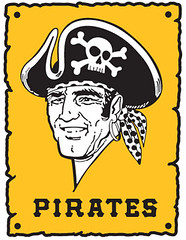
Bucco Beauties: Did you catch Game 7 of the 1960 World Series on MLB Network last night? Pretty cool stuff, right? Even cooler, Nathan Long just sent along shots of some spectacular old Robert Riger illustrations from the ’60 Series. “I originally came across them when cleaning out the attic of a bar that my mother purchased a couple of years ago,” says Nathan. “In addition to the art pieces, there were numerous original newspaper clippings from the Pirates and Steelers, including some interesting caricatures.”
And while we’re at it, this is a good time to take another look at all the great 1960 Pirates color screen shots that Larry Bodnovich has cobbled together. Magnificent.
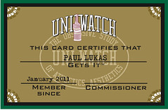
Now closing in on 2000: We got a huge response yesterday morning after I mentioned that we were on the verge of getting our 1000th enrollee in the Uni Watch Membership Program. Over two dozen of you signed up in the space of four hours. That group included Brooks Baker, who turned out to be the 1000th member. He’ll be getting a special membership card that may look like the one you see at right (or it may not — Scott and I are still working on finalizing the design).
We probably would’ve gotten even more sign-ups, but my Amazon Payments account started getting wonky around noontime. Several people told me that they tried to e-pay their membership fee but got an error message: “This account cannot receive payments at this time,” or something like that. I spent a ridiculous amount of time on the phone yesterday with Amazon but couldn’t get a definitive answer or solution. (And in case you’re wondering, Brooks had already become the 1000th member about 20 minutes before the Amazon trouble started, so nobody got cheated on that front.)
I know the Amazon account is now working for at least some people, because I’ve had a few folks send me test payments, and they’ve gone through okay, so I’m hoping the problem may have fixed itself. If you get an error message when try to sign up for a membership (or when buying a Meats T-shirt, which is another project where I depend on Amazon Payments), please do two things: (1) Send me an e-mail to let me know that you’re having a problem, and (2) if you know how to make a screen shot (command-shift-3 on a Mac), please make a shot of the error message and send it to me. Thanks.
Uni Watch News Ticker: In yesterday’s ESPN column, I quoted Auburn assistant A.D. Tim Jackson saying that the Tigers once wore an orange jersey against Georgia, got creamed, and that was the end of Auburn ever wearing an alternate uniform. I didn’t have a photo of that game, but I do now, thanks to Scott Hughes. “Keep in mind that James Brooks, the running back in that photo, is wearing a tearaway jersey, so it didn’t include the godawful navy and white sleeve stripes that everyone else was wearing,” he says. If anyone has more pics that show the full sleeve-striped effect, I’d love to see. ”¦ Update: Gordon Harvey just sent me this. Well done! … I neglected to mention yesterday that the Magic wore their black alt for the first time on Tuesday night. ”¦ Oh wow, these old posters are magnificent. They’re from Mike Hersh‘s latest rundown of old sports posters. ”¦ ”¦ You all know how I love meat. So you can imagine how stunned I was when I saw this video clip about a robotic butcher (thanks, Kirsten). ”¦ Russell Martin’s unusual NOB appears to be DOA, because he’s reportedly joining Team NNOB. ”¦ Question: Are the Nets slated to become the Brooklyn New Yorkers? Answer: No. I have been told by an NBA source what the Nets will be called when they move a few stinking blocks from my house to Brooklyn, and while I’m not at liberty to disclose what the team name will be, I can affirm that it is definitely not the New Yorkers. Trust me on this one. ”¦ Quick, what’s wrong with this logo? Answer: The hypocycloid colors are wrong (good catch by Jeff Flynn Jr.). ”¦ The Columbus Astros, a minor league team in Columbus, Georgia, appear to have worn a completely differently version of Houston’s shooting star design (cool find by Paul Wiederecht). ”¦ I think most of the “ice girl” outfits around the NHL are embarrassingly tacky. Actually, the whole concept of “ice girls” is rather tacky. But these new Oilers cheerleading outfits — those aren’t tacky at all. They’re pretty awesome, in fact. ”¦ A contestant on The Price Is Right yesterday was wearing a DIY Seattle Sounders jersey, made with glitter and sewn-on stripes. “As I’m sure you’re aware, Price Is Right host Drew Carey is a part owner of the Sounders,” says Scott Davis. ”¦ Reebok is working with MIT to produce electronics-enhanced fabric (with thanks to Tom Mulgrew). ”¦ Here’s a great article about the old New York Americans — the first team to play hockey at Madison Square Garden — complete with an awesome photo (with thanks to Alan Kreit). ”¦ Here’s a dubious record: a billboard with 1233 different logos on it (interesting find by Stu Taylor). ”¦ Dozens of members of the Russian military have ended up sick or hospitalized because their new uniforms can’t hold up to the winter cold. ”¦ Wow, that’s one miserable basketball uniform. The team in white is Caltech, but Greg Plefka, who sent me the photo, doesn’t know who’s wearing the orange, and neither do I. Anyone..? ”¦ “Interesting rugby memorial idea in New Zealand,” writes Caleb Borchers. “The Crusaders will play their first home game of the Super 15 wearing the jersey of the club most closely connected to the miners who died in NZ.” … Sad news about Bob Feller, who was still wearing picture-perfect pants and stirrups as recently as 2008. RIP (big thanks to Mike Edgerley).
Ho ho ho: I don’t know about you, but after three straight days of writing about Nikegon, I could use a bath. We’ll turn to more pleasurable pursuits tomorrow, as I’ll have the annual reader-appreciation raffle. See you then.
Re: the Reebok ‘enhanced fabric’
The CEo of MC10 is David Icke and I was worried it would be this David Icke: link
He used to be goalkeeper for Coventry City in England’s Division One (pre-Premier League days) and just adores sports leisurewear. Oh, and he thinks reptiles secretly control the world.
The team Caltech is playing is Hope International, a Christian college from Fullerton, California. They beat the Caltech Beavers 86-53. HIU is an NAIA school.
You sure about that, Terry? Look at Hope International’s uniforms here:
link
Player names match, but I have no idea on the uniform difference.
Upon further review I found that Caltech’s athletic department posted pictures of those Orange-clad opponents on more than one game recap. I should have noticed that earlier. Mea culpa. And I still can’t figure out who the opponent was. It could be a team from Canada. The number 7 jersey leads to that conclusion. I’m like Paul on this one, I just can’t tell.
I think that it United States Merchant Marine Academy, but those are the only photos that I can find.
I thought that too. But USMMA’s primary color is Blue.
Todd Cramer is a Freshman who is in the shot. So it has to be this year.
Here’s another shot of what looks to be the same game:
link
Amusing that Cal Tech and MIT, best engineering schools in the US, both are nicknamed the Beavers. CCNY, established by a municipality with beavers on its coat-of-arms, are also Beavers. Anyone know another non-engineering school that calls their athletes Beavers? No genitalia jokes, please.
/s/ Catcher, Hory Chevrolet Beavers, 1957
How about Oregon State?
link
How about Mayfield?
Bemidji State in Ricko’s part of the woods.
While we’re at it, check out Bemidji’s familar football unis:
link
Oregon State and Bemidji State both have engineering programs.
You betcha by golly fersue dontcha know.
4.5 hours drive north, actually past the timberline.
Twin Cities technically are in the prairie.
Bemidji is a great town (with an acutal downtown area of more than one main intersection) right on the shores of the Lake Bemidji. Campus is, too. Unique that way. Most Northern Minnesota towns of any size are not right on the lakeshore. Surrounded by lakes, maybe. Near a lake, maybe.
—Ricko
OSU’s best program is its engineering program, but I think that’s really a coincidence, given that the beaver is the Oregon state animal, and is on the reverse of the state flag.
Yeah, I really have no idea whether the nickname has anything at all to do with the engineering school but the question pertained to non-engineering schools.
So…
The question remains: are there any schools that DON’T have engineering programs that have “Beavers” for a nickname/mascot?
Purdue comes to mind.
Bluffton University
bluffton? the bluffton beavers?? go blu-vers?
Ha! Not too often my Bemidji State gets a mention on Uniwatch – even if just in the comments! Yes, the football unis are complete Jets rip-offs, but the school lives on hockey (D-I in hockey and D-II in everything else). BSU tends towards the traditional on the hockey… You can check out their entire uni photo gallery here:
link
Another Beaver school is my Mother’s alma mater – D-III Blackburn College in Carlonville, IL.
link
My 3 year-old daughter wants to know if Kobe’s new sneakers are “green snake shoes.”
he is the “Black Mamba”… that was my first thought when I saw them as well.
Three year old uni-watchers are sweet! Ricardo you are doing it right.
The shoes are supposed to look like snake skin. I love Kobe and all that is the LA Lakers but those shoes look like sh#$.
link
For your reading pleasure?!
Thanks! I want her to “get it!”
“Keep in mind that James Brooks, the running back in that photo, is wearing a tearaway jersey, so it didn’t include the godawful navy and white sleeve stripes that everyone else was wearing,”
I think these guys: link are wondering what’s so bad about blue & white stripes on an orange jersey.
What’s old is new. It’s been roughly 20-25 years since fluorescent ___ was popular. Nike’s just retreading.
Shoes, Shoelaces, Socks
Pretty soon it’ll be sunglasses, T-shirts (remember the “faded” beach shirts in fluorescent pink, yellow, orange, green?), and then some updated form of Zubaz pants.
Bringing a little beach back into their wares. It’s a cycle and we were due for it to return (just like bell-bottoms, skinny jeans, flannel, that kind of thing). Maybe MTV will make a reappearance, too.
Seriously, though, the Oregon links to Nike corporat-i-zation are damning. It would’ve been nice if they’d come up with something that marries “memorable” with their traditional colors. That shit’s gonna glow on gameday, though. Like the Orlando Thunder of old!
Hate to break it to you, but Zubaz are already back: link
Please be quiet The Jeff. The Arena league might hear you.
(fixed ;))
Told ya.
The lynchpin of that new Oregon uni is the neon shoes.
Some here talk about how it’s to stimulate jersey sales.
Nonsensem that’s thinking WAY too small. A fart in a windstorm, just extra gravy.
The real issue is the look of the new shoe line.
That’s where the sales are—the real money—in a worldwide sense.
We do remember all the “orange-ish” Nikes in the World Cup, right?
This time around, it greenish-yellow-neon (ref: Kobe’s new shoe).
It ain’t the jerseys, folks.
It’s the shoes.
—Ricko
Yep, damn shame.
Nike soccer boots/shoes/cleats change color about every month. The green was from august/september. I am sure some still wear that colorway, but at the world cup it was orange/purple. Pink has been popular lately.
Pretty much. Right before the world cup, the Vapors were orange and purple. The WC boots (Vapor, T90, CTR360 and Tiempo) were orange and what was supposedly “metallic blue”, but was definitely silver. Then the bright green Vapors, and now the “voltage” pink ones.
I hated that Nike did the exact same colorway for every boot during the Cup. The designs for their different boots are pretty cool, but you couldn’t tell who was wearing what.
(Personally, Nike’s a little too much flash for me. I wear Adidas for soccer boots)
So was Adidas trying to beat Nike to the punch by throwing these on the field this last May? link
I think adidas was trying to beat Nike to the punch back in ’07 when Chelsea started sporting this look…
link
There are neon shoes in either of those photos?
With link this time:
The Pirate logo in the body of the post didn’t come into use until about 1970. The one on link was more like the 1960 logo.
Point well taken, Jerry. Shame on me for using an era-inappropriate icon.
Hey BurghFan-What kind of car is that bumper sticker on? Is it possibly a “Hash?” The “Hash” was basically a Nash with a Hudson badge on it after the merger of Hudson and Nash into American Motors.
go easy on the hash, terry
Corned beef or roast beef?
moroccan
hahahahahahahahahaahahahahahahaha
link would have been awesome, and I’d be the Ducks’ strongest defender hereabouts if that had been their uni of choice for the big losing-the-champeenship bowl game.
I’ve never really liked any Houston uniform from the period between the end of the Colts and the introduction of their current unis, which I love, but if the parent club had worn the Columbus version of the shooting-star script, that would be my favorite Houston jersey of all time. The type on that jersey is just so much better suited to the Astros identity and the shooting-star treatment. Make an H in the style of that A, slap it on the cap (with or without star; it’d work either way) and that would be my ideal Astros uni. Even in blue and orange, which are ridiculous colors for a team with an outer-space theme.
The Columbus Astros retained that design through the early Rainbow Guts era, according to some of the images on the AstroLand.net photo and card site. Some of them looked like BP jerseys — blue and a red/orange.
that russian army article sounds like a proper load of BS, but interesting none the less. yes, that is all the russian army ever wears, full dress uniforms with no jackets.
An Auburn orange jersey from the early 1980s
link
Excellent work, Gordon — I’ll add that to the Ticker right now.
This picture link by Gordon shows that the Auburn assistant A.D. Tim Jackson is wrong about the dumping of the alt uni after one showing. If you look at the two orange jersey images, it is clear that they are from different years. In the image that Paul links, the running back has a grey facemask. In the one linked by Gordon, the guy has an orange facemask. I wonder how Jackson makes a statement like that if he truly does not know his uni history. Maybe that is why he is the assistant A.D. and not the A.D.
“I forget exactly when it was, because it was before I got here,” he says. “But we came out wearing orange jerseys and got beat by Georgia. I think that was the game that really locked Auburn people in regarding the uniforms. Don’t mess with our uniforms.”
He didn’t say that it was the only time they’d worn them.
Re: electronics-enhanced fabric. The first thing that came to my mind was advertising. Imagine your favorite soccer (or WNBA!) team with a chest sponsor that changes every 10 minutes. I’m going to go sulk and think about the good old days.
the sad thing is the seahawks can only go up from where they are now, color-wise
Scared to see a challenge like that put on the table.
What’s odd is that I am completely against color on color monochrome in football, but I absolutely LOVE the Seahawks current set. The pacific blue of whatever they call it fits that team so perfectly. And the white one white is very sharp also. It irritated me to no end the game or two that they wore the navy pants insteas with their blue top.
I call it suicide blue, because it’s so depressing. I’d rather see gray or even carbon. And of course, there was nothing wrong with the silver…
I just want some friggin’ silver/gray! Now that Nike’s gone and silver grayed the Ducks, maybe they can do the same for the Hawks in 2012?
No joke – with the plain silver helmet again too!
Down, boy.
I believe those Robert Riger 1960 Pirates illustrations were circulated by a paper company to introduce a new stock.
One of the guys in the neighborhood had the entire set. His dad had brought them home from work (he was a big wheel at one of the larger printing companies in town).
—Ricko
I distinctly remember a Riger drawing of Tony Kubek (NYY SS) catching a ball on his Adam’s-apple. Some would say turning-point of the game. Hit by Dick Groat? Anyone run across the Riger drawing?
The bad hop ground ball which injured Koubek was a key play, but I wouldn’t go as far to say it was a turning point. This game had so many key plays for each side, it was just a case of the Pirates taking advantage of batting last in this classic game.
One could say the turning point of the 1960 World Series occurred when Casey Stengal made the decision to only pitch Whitey Ford in Games 3 and 6. Stengal may have been overconfident heading into this Series by not scheduling his best pitcher to start game one, which the Pirates won.
It’s in SI. Can find it in the SI Vault. In the weeks following the ’60 W-S, of course.
I sent the link to Phil a long, long time ago.
—Ricko
here ya go
attaboy.
Groat in the Throat
You guys are the greatest. Check’s in the mail.
Riger shot his own photos, and worked from them, btw.
In THE PROS by Tex Maule, both his photos and illustrations are included. And some of his photos from GGEP in that book clearly were used as the basis for illustrations earlier in SI immediately following GGEP.
Most of the upper echelon sports artists worked that way. Met Bernie Fuchs at the U.S. Open at Hazeltine in 1970. Was standing about 10 feet from him when he took the photo that resulted in this cover (tough not to remember Jacklin’s ensemble that day)…
link
—Ricko
THE PROS is one of the all-time great sports books. Published before I was born, but there was a copy of it floating around our house when I grew up, and it had a huge effect on me.
Highly recommended, and available for cheap:
link
Make sure you buy a copy of THE PROS in the slip case with the additional prints. A lot of copies are sold without the prints.
I can’t WAIT for the Andre Agassi pink shoes to come back!
link
Oh wait, nevermind.
I’ll raise you one with the color of the day:
link
I believe that’s Joe Cribbs, not James Brooks. Here’s a Youtube video of Cribbs in action against Georgia in the orange jersey. The video from that game starts around the 1:08 mark. The picture in today’s ticker is also shown at the 0:20 mark.
link
Re: the two Auburn orange jerseys
Apparently Auburn wore orange more than once, because those two photos are from different games. James Brooks has a gray facemask in the first shot, and #94 has an orange facemask in the second.
Yeah, I have a B&W photo of Brooks in the orange tearaway–and white shoes–somewhere in my files. The Tigers were in white shoes by the time they wore orange jerseys again.
—Ricko
Brooks’ tearaway is sans stripes, too, btw.
RIP Bob Feller…love the Pony Cleats…
link
Another Baseball Legend gone…
Stan
I mentioned last night that one write called Feller
“The Ace of the Greatest Generation.”
He was.
And they were.
—Ricko
“… Oh wow, these old posters are magnificent. They’re from Mike Hersh‘s latest rundown of old sports posters. …”
Thanks, Paul. Thanks, MIke. Wonderful.
More posters in todays post
link
That X Ray Spex song is pure joy.
I think that the Cal Tech pic is probably an exhibition against some sort of foreign team, because the player most prominent in the picture is wearing #7, which cannot be worn in college basketball. Also, the fading orange look seems like something that some European owner who doesn’t know how basketball jerseys are supposed to work would do.
There appears to be an Australian flag on the jersey.
I watched the rebroadcast of Game 7 of the 1960 World Series last night. Even after fifty years I’m happy to report that, “Theeeeeeeeeeeeeeeeeeeeeeeeeeeeeeeeeeeee Yankeeeeeeeees LOSE.” Aw, poor John Sterling, ain’t that a shame!
That telecast was so awesome in so many ways. The game really was a thriller.
The Pirates had a PA guy who was great in his own right. You could hear him in the background in the early part of the game. Art McKennan.
Umps in coats and ties. Miss that look.
So cool to see Bob Prince interview nearly everybody in sight in the Pirate clubhouse after the win. “We had ’em allllllllllll the way!!!!”
Didn’t show any Gillette ads though. Bummer.
One could only imagine what would have happened had Prince called the Maz shot instead of Mel Allen.
Art McKennan…Loved hearing him and organist Vince Lascheid at Three Rivers!
Didn’t see the game, but hoping to get the DVD for Dad and me.
Prince did a reenactment of that game on audio cassette(I got Dad a copy of that), and for Maz’s homer he did his “You can kiss it goodbye!”
Yeah thats Cribbs #20. AU orange jerseys: Once in ’78 against Ga (tie), once in 79 against South Miss (for homecoming, win) and lastly in 80 against Ga again (loss).
LSU PURPLE HELMET MYSTERY (FROM YESTERDAY)
LSU did not wear Purple hemets in 1968, or in ANY other game after the late 1940s. The photos showing LSU in the “Purple Helmets” are bad exposures or transfers of the Black & White photos that make the Athletic Gold/Yellow helmets and striping appear darker than the Purple on the same uniform.
The dead giveaway to the “photo exposure” theory is that the White LSU jerseys appear to have a “Yellow/Purple/Yellow” UCLA striping sequence – which LSU has NEVER WORN since adopting UCLA stripng in the 1950s. LSU has ALWAYS worn “PURPLE/Yellow/Purple” UCLA stripng on their White jerseys.
Therefore, your eyes are not wrong, your history is not wrong, but the photo exposure is wrong. Mystery solved.
Speaking of LSU purple helmets, in he 1947 season LSU abandoned their Old Gold leather helmets for new Purple plastic shell helmets with a single Gold stripe. After 3-4 games, the team went back to the Old Gold leather helmets – I see this in the 1947-1948 LSU yearbook, but it offers no explanation why.
Maybe somebody from that can explain why a team like LSU would go to plastic helmets, then back to leather ….
Thank you for the further corroboration.
B&W print from color neg.
Result: Color value distortion.
Said that all day. :)
—Ricko
Here ya go.
You’d think the Eagles was playin’ the Brian Sipe era Browns.
link
There, that should end the debate.
—Ricko
That was odd ho dark the yellow helmets looked. As for leather plastic leather helmets. I have always wondered why Notre Dame did that and stuck with leather possibly longer than everybody. The Irish wore plastic helmets for a bit in the 40’s and went back to leather until around 1957
Screen shot on a PC: Alt+Print Screen (that gets a grab of the active window — Print Screen by itself gets you everything visible on your screen).
Then you need to create a new file in Paint (or another image editor), paste the image and save it.
Everything Oregon does with their uniforms screams out WASTE OF MONEY!!!
It does however match state politics to a tee.
well, look at this…
link
Also kinda shows the unis changed from old gold to athletic gold when the shoulder loops were added. That means, as I’ve said all along, that the Jets’ Titans throwbacks aren’t accurate.
Not the same issue as Packers/LSU color skewing, either. Can pratically guarantee that early AFL stuff was originally shot in B&W, not color. Oh, like anyone cared enough to spend that kind of money on that new league.
—Ricko
Speaking of Orlando (and not the Thunder…I have a Thunder #12 jersey in my closet, not giving it up), its new pro soccer team announced its logo this morning:
link
Not the Thunder, but Thunder…Thunder…Thundercats! HO!
(That’s going to be a difficult logo to render in a lot of formats, especially embroidery, isn’t it?)
Orlando City. Pfft.
I really hate soccer team names like this.
I am with you.
No worse than the Heat, Thunder, Magic, Avalanche, Wild Lightning, and Jazz (yeah, that name sucks too).
Good for the Marlin for adding the “s”.
Oopsies!
Wild, Lightning,
Wild Lightning sounds like a horse. Or whiskey.
…something tells me you didn’t actually click the link
Wild Lightning…drink a fifth of that for 5.99 and you’ll feel as if you were struck twelve times!
From the linked press release: “The three-sided equilateral shield is considered the most efficient of all shapes”. Someone got paid to write THAT? Someone paid for that? I could come up with something that incoherent for less than they paid!
Something about the Bob Feller picture intrigues me. You don’t often see candid photos of baseball players in non-baseball environments, and it makes it all more human.
link
Ray Bentley (Underrated Linebacker and Eye-Blacker)
link
link
link
link
link
Pretty cool as well for many reasons:
link
Attica? If you’re not from NY, you might not know the significance.
I am just waiting for cry-black to return.
You mean this? link
I think that’s pretty well known. There’s also an Attica in my neck of the woods, but they wear Red & White and are the Red Ramblers. It’s never really been explained to me exactly what a Rambler is supposed to be, other than a rip-off of the old-style Purdue Pete with a megaphone instead of a sledgehammer.
A rambler (at least by one definition) is someone who wanders about aimlessly.
The mascot is a fairly generic wolf character now, but Loyola University Chicago used to have a hobo mascot called “Bo Rambler”.
That’s about as good a definition as I ever got, though it’s not so definite as to picture what one is. You tell me “Eagles” or “Trojans,” or even “Irish,” and I can get at least an okay picture of what you’re referring to. Rambler? Not so much.
“Rambler”, as it was used to refer to Notre Dame back in the day, was a reference to their willingness to travel anywhere in the country to play (Rockne’s Ramblers).
Loyola University of Chicago currently uses a wolf as their mascot, taken from the University logo. The wolves are from the heraldic crest carved in the lintel of the home of St. Ignatius, in Loyola, Spain:
link
This is why love this site. Erudition, baby.
Ricko is absolutely right about the shoes.
And 25 years ago, Jaqson and the Scorchers were right when they warned that there are people out there who are turing everything into “something that’s easy to sell…and even your heroes are learning it every day…”
The whole thing is nauseating.
Mars Blackmon (Spike Lee) got the sneaker snowball rolling in the original Air Jordan commercials sting:
“It’s gotta be the Shoes”!
link
link
sting=stating
That just might be what I was referencing, yes. ;)
Interesting note on the Nets. I look forward to their new name. Hopefully the name/logo isn’t as pathetic as the alleged “New Yorkers” moniker and rendering were.
Thing is, the Nets would have to apply to the NBA for a name change just to switch from ‘new jersey Nets’ to ‘Brooklyn Nets’. So the question is will they be the Brooklyn Nets or something else. Paul, any idea when they’ll announce the new name?
New York Brooklynites.
Or Brooklyn Knights
And whether or not any of our speculation is right I think it’s a sign of all that Paul has accomplished with UniWatch that he is given that kind of secret information two years in advance. Kudos Paul
1960 World Series Game 7… some say the big play was in the bottom of the 8th when P Jim Coates didn’t cover 1st on a ball down the line that would have ending the inning. The next batter hit a 3 Run HR to give the Bucs a 9-7 lead.
anyway… the Yankees get to the WS four more times before the Pirates get back..
And therein lies the explanation of why beating them was (and still is, I suppose) a big deal.
you are correct Ricko…the New York Yankees have the record for losing the most WS.
The other major significance of 1960 was the fact that Pittsburgh had not been in a World Series in 33 years, and while the rest of the 60s did not produce any more titles, the 70s more than made up for that. Overall, it was a reminder about the storied tradition of the Pirates franchise, and baseball fans everywhere benefited from this event. Thank you, Bing Crosby.
No doubt this broadcast verified how exciting this game was, and why it’s regarded as one of the best in the history of the game. The quality of the game was surprisingly good, and it was refreshing not to be bombarded with needless statistics. Also, it was nice not to be inundated with promos about sitcoms during the game, and having multiple announcers talking about subjects unrelated to the contest.
Also impressive was Bob Costas and the theater presentation of the game. Bobby Richardson of the Yankees is a class act for appearing at this event, he could have easily declined. Richardson understood how significant this discovery was, and what this means in the big picture in the history of the game.
If anyone missed this presentation, check the MLB network schedule for future airings.
On again at 2:30 pm EST today.
Also, prior to the “Bing and Baseball” show that kicks it off, there was spot selling the dvd of Game 7, 1960.
Or, look here for who to get your copy…
link
—Ricko
Auburn orange regards: I sent a few color shots of the stripes way back in June of ’08 and actually made the end of the Ticker here:
link
All of these came from old Glomeratas:
link
link
link
(Yes, that is a SEQUINED AU logo on the towel.)
link
I’ve stated many a’ time I would hope these particular designs never-ever saw daylight again. But if for whatever reason they felt it absolutely necessary to wear orange again, a while back I whipped up my own rendition to make it at least somewhat tolerable (the second two are for shits).
link
Note: this summer’s World Cup Nike shoe — florescent orange — was another subsume job…
link
If this has been mentioned already, my apologies!
I know the Brooklyn New Yorkers won’t happen … but link
The more I see the logo the more I see a resemblance to Paul!
Any chance the Nets will go the European route and be called Brooklyn City? Or Brooklyn BC?
If it weren’t for the Warriors going back to their bridge design, I’d say call them the Brooklyn Bridges.
As for today’s conspiracy theory, I’d buy that. Here’s why: Phil showed me the yellow/green gradient uni before I read today’s piece, and after looking at it for a while I told him, “I’d…not entirely rule out wearing that. But I would wear those shoes.” And that’s how they get you – they sneak the shoes in with a gaudy uni, and you have a higher opinion of the shoes than if you saw them on someone wearing a plain dark jersey and pants.
Has there been any discussion in the New York area about a new nickanme for the old Nets franchise? Some teams hold a fan contest on nicknames, I’m in favor of changing the nickname when a franchise is moved, hopefully, we’ll see a good replacement name with the uniform.
The Oklahoma City Thunder had a decent nickname, but the uniform is a bit of a letdown. Is it true the Sonics nickname and history has been reserved for the city of Seattle?
Brooklyn Accents. Brooklyn Bridges. Brooklyn Shivs. Brooklyn Navy Yards. Brooklyn Brooklyns.
How about Brooklyn Nets?
Gusto, I heard Seattle kept the Sonics name and history.
As for the Thunder, I kinda like the unis, but since they were mentioned earlier, they should have used the colors of the Orlando Thunder…
Conspiracy Theories always have a slight edge of truth and a whole lot of crap. By the way neon has been back for at least a year, I work with teenagers and let me tell you nothing says trendy like a middle schooler trying to be popular. It’s like the 80’s and early 90’s fashion trends are overlapping each other right now. Frankly it’s scary to think I dressed like that as a kid. As far as the Nike “branding” across the board. You’re probably right to an extent, but if you look at other companies it’s just as bad. The three stripes from Adidas are everywhere. Oh yeah and the “Rave Green” that’s supposedly unique to Seattle Sounders gear can be found on their shoe designs everywhere. As for the soccer boot theory portion of that argument, those particular models weren’t even that popular amongst pros when they came out. I think the highest profile player I saw wearing them was Nani from Man United. Like I said there is always a little truth connected to conspiracy theories, so here it is, every company does it! It’s not just a Nike thing. Adidas does it. They all do it. Nike isn’t the only one. So if you’re going to call them on it, then you need to call the rest on it too.
Hope you didn’t mean me. I wasn’t calling Nike on anything regarding use of a particular color, not sure there’s anything TO call them on. No conspiracy or thievery. Don’t know that a color can be anyone’s “idea.” You see what’s hot, what can work for you, what the public will buy (swallow, in some cases)…and implement it.
Only was saying that neon-lime-yellow (given the Ducks’ new unis and Kobe’s new shoes) appears what they’ve chosen as the centerpoint “look” of their current marketing push.
And they’re using Oregon’s unis as a way to promote it…from the bottom up, so to speak, because they’re still primarily a peddler of shoes…not a designer of unis for the sake of good-looking unis.
—Ricko
Kobe’s new shoes are supposed to reference “The Grinch,” if you mean the ones he’ll wear on the 25th.
Pat Forde’s “Dash” through the college football bowl season includes who he gives the “mascot edge” and “uniform edge” to for each matchup.
link
Finally, someone with some sense regarding the Champs Sports Bowl (cough cough, Phil, cough), even if he’s not aware WVU’s rockin’ the Pro Combats. ;)
Apparently Pat likes terrible uniforms.
indeed…i didn’t read thru the whole thing, but i think he may have picked the direct opposite of every single of my bowl picks
He picked the opposite on most of mine. I’m pretty sure his uniform knowledge depth is somewhere along the lines of “Washington wears purple and Nebraska is red – I like purple better”.
i think you’re giving him far too much credit
did you base your picks on “better uni”?
Wow, someone even less qualified than the Mothervilker to do a 5&1 list. And I’m only about halfway through his article.
At least he appreciates the coolness of option football.
He thinks Mizzou looks better than Iowa?
Marshall, you gonna take that? He just dissed a B1G TEN team in favor of one of the worst-looking teams, just because the Hawkeyes look like the Stillers. Now THAT’s a biased pick.
At least he likes orange unis.
From Army vs. SMU:
“Uniform Edge: If the Cadets wear their camo, they win in a walkover.”
That’s pretty ridiculous.
Again, wow.
To recap, he favors UTEP’s unis over BYU, BOISE over Utah, Hawaii over…well, Tulsa isn’t great, but he ruins it by saying “Hawaii’s uniforms are cool enough to win most matchups”, Maryland over ECU, Okla. St. over Arizona, Army over SMU (especially if they wear camo?), Washington over Nebraska, Miami over ND, Sparty over Alabama (and he calls out ‘Bama’s classic helmet numbers as the reason), TCU in ANY incarnation over Wisconsin, UConn over Oklahoma (???), and he thinks VA Tech should wear the black Toy Combat unis.
There were other questionable picks, but these are just the egregious ones.
Yeah, I pick the occasional head-scratcher, but wow, that’s a murderer’s row of sucky uniform picks.
Even his Dashette is wearing an egregious outfit…
Hey Paul, get a load of this, from Pat Forde’s latest .com article, a bowl season preview:
Discover Orange Bowl (34)
Stanford vs. Virginia Tech, Jan. 3, Miami
Uniform Edge: Virginia Tech has found some creative looks to overcome its naturally repulsive maroon-and-orange color scheme. The Dash recommends a return to the all-black unis and helmets from the opener against Boise State.
Whoops, didn’t see Bernard’s comment
Paul, Why is it that you have such a problem with Nike but you never call out adidas? Sure, Nike incorporates their corporate identity in their uniforms, but look at adidas…they put their three stripes (I.E. LOGO) on EVERYTHING.
NBA warmups, referee jerseys, NBDL uniforms, NBA All Star game, World cup jerseys…EVERYTHING that Adidas makes includes their three stripes as part of the basic design of the garments.
So why do they get a free pass from you?
I know Adidas has been called about for the three stripe thing here before. Nike definitely takes the brunt of the criticism, but other manufacturers (esp. Adidas and Reebok) don’t exactly get a free pass.
adidas definitely doesn’t get a free pass from paul…and i think you know where i stand on the trefoil
nothing is more evil than the three stripes, not even UA, in my book
OK, maybe free pass wasn’t the right term to use, but the Nike hate gets out of hand here IMO, while there is rarely the level of backlash against adidas that Nike is subjected to.
don’t want to speak for paul, but i think his beef with nike goes way beyond uniform design…but since that’s primarily what’s discussed here, that’s what receives the lion’s share of attention
Love the trefoil, reminds me of the days in the 70s when adidas soccer was cool with the likes of Franz Beckenbauer, (I wore #6 my senior year of varsity soccer in honor of Der Kaiser. Tho I wore black with yellow trim cleats, the Gerd Müller Goal.)
So of course when my dad went overseas he always brought back cool adidas stuff from Germany or wherever.
Could you buy it in the states? No.
Were the guys in HS jealous? Most definately.
Who’s House?
One of the fictitious narratives that some people on this site like to cling to is that I give a free pass to non-Nike manufacturers.
It simply isn’t true. I call corporate douchebaggery wherever I see it — Adidas, Reebok, Nike, Puma, wherever.
But Nike is the most frequent offender, so they get called on it the most often.
Off to show-and-tell,
Paul
Off topic; Did Uni Watch ever have a type of poll on which Ducks uni they like best? I vaguely remember uni polls in the past…
I agree – if WVU and VT were playing each other, each wearing their pro combats, WVU would look better. And I contend that WVU will look better, in their pro combats, than NC State when they play.
when wvu officially declares “soot” a school color, then i’ll agree with you
What if they went soot helmets & pants with their regular yellow jersey? I think that could work
Very sad story about the Lion King Broadway actress dying of leukemia …
link
My heart goes out to her family.
That stated, I ask: Is it at least a LITTLE strange that she would be wearing a Madagascar t-shirt in what appears to be a publicity junket?
Remember when you thought the Virginia Tech Pro Combat jerseys were bad…
Let me just give you a quick preview of what to expect in the Orange Bowl in January…
link
*sigh*
orange lid…orange bowl
orange is a school color…
what are your togs? regular white/white?
that won’t look too bad, actually
better than this, this or this, that’s for sure
From what I understand, it will be the Orange helmets with the white on white.
I would rather not look like the Cleveland Browns, though…
kinda quick & dirty…but i don’t think anyone will mistake you for the cleveland browns
close? yes…but distictly different? absolutely
Love the orange lids.
bfs
The thing about the Pirates broadcast last night that made me wonder. They said the game was broadcast in color but Bing had a guy do the kinescope off a b&w tv. Sheesh. Come on Bing it should have been done in color.
I know you’re kidding, LarryB, but a lot of people who can’t conceive of a world without color TV should check this out…
link
As late as 1964, only 3.1% of American households had a color TV. And you can bet they were high middle income households at least (at time of the 1960 W-S, on my block of 44 single family homes of strictly middle income people, there was, as best I can recall, one color TV, and the picture was “iffy” most of the time).
I did some checking. The cost of a 21″ color set in 1960 was $500. Average annual income in U.S. was about $5,000.
That of course equates to, today, buying a $5,000 TV (with after tax dollars) if you’re making 50K.
—Ricko
Bing Crosby made the arrangements to record Game 7 because he was superstitious, and left the country. Crosby’s widow said they were in France when they heard the result of the game.
If less than 3 percent of the country had color TV in 1960, and some of those sets delivered an “iffy” picture, it’s possible whoever did the recording wanted to make sure Crosby had a clear picture, so the kinescope was done on a black and white TV. That’s just speculation on my part, we may not know the real answer.
The 1960 World Series film was shot in color, but with only one camera, I believe.
Oh I know nobody had color TV back then or hardly anybody did. My family did not get one until the early 70’s. So I watched the 71 series in b&w too.
Not sure how many cameras were used. But I though Costas said they had done the series in color a couple years already.
It sure would have been great to have it done off one of the few color TVs
oh shit check these shirts out
link
nice philly one
Paul, I find it odd that you call Oregon’s link a “great concept”, but a similarly designed basketball link “miserable”.
Oh, please. I realize that simply pointing a finger and saying, “Gotcha!” passes as analysis in some corners of the web, but I’d kinda hope for a higher standard here.
As I hope most people realized, I called the Oregon fade design a “great concept” in the context of Oregon’s long history of uni stupidity. It isn’t a good uniform; it’s just clever, like The Onion is clever.
The orange hoops uni is neither good-looking nor clever (at least not that I can tell). It’s just lame.
Well, Dave might have been going from this recent quote of yours:
“I’ve always liked the current winged-shoulder set, and Oregon’s design trend these days seems to be more toward ‘good’ than ‘stupid'”
I’m not pointing a finger, just saying that there is cause for confusion here.
plus…that nikegon kool aid is mighty tasty
Every photo you see of Bob Feller, he’s sporting the striped stirrups. It would probably never happen, but how great would it be to see the Tribe trot them out as an Opening Day tribute
link
link
link
I’m not a hosiery guy, but that would be an outstanding memorial tribute done by the team.
good thing that Canturbury clothing company doesn’t make the Super rugby shirts otherwise it will just be “stylised yo be west coast” which means a few different colours but still the same template AND THAT STUPID NECK SWIRL!!!!
As much as UniWatch hates the Nike/Oregon thing, you guys should be sending them gift baskets for giving you all this great material to write about.
Probably won’t get answered since it’s 3:45 in the morning on the East Coast, but Paul if you could describe to me how Nike is guilty of more “corporate douchebaggery” than others I’d really like to hear it. I’m not saying that in any sort of an accusatory tone, I’m just curious as to your reasoning why they are worse.
“Borg-like.” Nice!