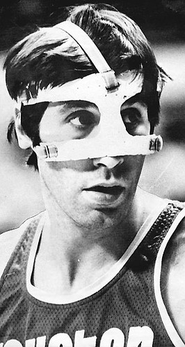
There’s been a fascinating development over at IPFW — that’s Indiana-Purdue at Fort Wayne, whose teams are called the Mastodons (love that). They have a player named John Peckinpaugh, who’s had trouble with concussions. So lately he’s been wearing boxing headgear, which among other things probably marks the first time the Everlast logo has appeared on a basketball court (although maybe Rudy Tomjanovich, pictured at right after his friendly chat with Kermit Washington, should’ve worn it).
Looks like they cut off the cheekbone padding from Peckinpaugh’s headpiece, presumably so as not to restrict field of vision, and then taped over the areas where the padding had been cut away. But even with the modification, this is the first time I can think of boxing gear being worn outside the realm of boxing, wrestling, MMA, and the like. It’s gotten me thinking about the larger issue of equipment from one sport showing up in another sport. Here are some past examples that came to mind:
• There have been several instances of baseball players wearing football facemasks.
• We’ve also seen hockey players wearing football facemasks.
• Conversely, there’s also been at least one case of a baseball player wearing a hockey mask. (Full details on Dave Parker’s mask odyssey can be found here.)
• I know of at least one baseball player who’s worn NFL gloves.
• Early baseball batting gloves were actually golf gloves.
• Early football gloves were scuba gloves (although I’m not sure if scuba qualifies as a sport).
• And of course there are many, many examples of sport-specific footwear being repurposed for other sports. That seems like a whole separate topic, so let’s save that for another day.
I’m sure there are loads of other examples I’m overlooking. If you know of some, post them in the comments and/or send them my way.
(My thanks to Jason Martynowski and Matthew Dowell for bringing Peckinpaugh’s boxing headgear to my attention.)

Gift sourcing reminder: I’m working on my annual holiday gift guide column for Page 2. If you know of good uni-related gift ideas — or if you’re offering some product or service yourself that you think might be appropriate — please let me know. Thanks.
Uni Watch News Ticker: Major snafu last night in college hoops, as Seattle wore red at home while hosting Oregon State, which created a ruddy mess on the court. Seriously, what were they thinking? ”¦ Follow-up regarding that Nike armored truck that was parked at an Ohio high school earlier this week: I’m told that it’s part of a contest in which high schools currently outfitted by Nike can propose a new uniform design to the company and reasons why they should get the new set donated for free. The players are responsible for coming up with the design and pitching it to company reps. All of which is fine — more than fine, in fact — but why is it necessary to promote this initiative with war-mongering imagery at a high school? Inexcusable. ”¦ New gold alts for Baylor (with thanks to Josh Lassiter). ”¦ Eric Nuhfer points out that Arizona State appears to be wearing a jersey swoosh but no NCAA logo (the other patch is their conference logo), which runs counter to the way I thought the new NCAA authentication program was supposed to work this season. I’ve asked the NCAA for a clarification — stay tuned. ”¦ One of the vintage jackets I featured yesterday was an FFA jacket. Now Ward Black has provided some good background info on that jacket style. ”¦ Notre Dame will be wearing green jerseys for that game at Yankee Stadium. ”¦ Here’s a great find: an original Navy jersey with SLOB (that’s slogan on back). Details here (with thanks to Eric Stangel). ”¦ Susan Freeman now reports that Texas Tech wore red pants all the way back in 1964 (and in 1958 too, although she doesn’t have a photo for that). ”¦ Also from Susan: some 1963 screen shots showing Texas A&M with inconsistent helmet striping. It’s hard to be sure without seeing more images, but it kinda looks like eligible receivers wore a stripe and linemen did not. ”¦ I understand why the Giants left Barry Zito off their postseason roster, but it sure would’ve been nice to see more of these. ”¦ “I just finished editing a great pic of the 1917 Washington Senators on Opening Day,” says BSmile. “Looks like they’re doing a mock-military formation to show support for the war. They’re wearing the rare jersey with the American flag crest, which appears to have been a patch that was open on the bottom. Also notice the multiple variations of sleeve lengths — they’re all over the place! In fact, the player all the way on the right looks like he has detachable sleeves, which makes them full-length.” ”¦ Peter Macaluso has raised an ugly possibility: As it becomes more and more likely that Oregon could end up in the BCS title game, will Nike come up with a special uniform for the occasion? The mind boggles. ”¦ Love the uniforms worn by Texas Western — that’s UTEP’s original name — in this old defensive training film (great find by Ken Fabela). ”¦ As you may know, Ohio State football wore jerseys with totally boss shoulder yokes back in the 1950s. Now Larry Bodnovich has discovered that this same design was also worn by OSU’s lacrosse team. ”¦ Lots of cool cycling trading cards here (with thanks to Sean Clancy). ”¦ Latest team to put advertising on their practice jerseys: the Red Wings. ”¦ Check out this shot of the Rolling Stones rolling stones. I’m not sure which is worse — the foot fouls, the poor lane courtesy (you should always wait until the guy in the adjacent lane has tossed his ball), or Keith’s missing cigarette (with thanks to Steve Mandich). ”¦ New hoops uniforms for St. Mary’s (with thanks to Mark Chiarucci). ”¦ Here’s a fascinating little bit about an early three-point line from 1945. Click on the photo for a larger view, which will allow you to read the rather entertaining caption (with thanks to Mike Kingery who also says there are rumors about Boise State wearing orange jerseys and/or a white helmet on Friday, but you know how rumors are). ”¦ Remember those studies a while back indicating that red or black uniforms led to more aggression? A new study says otherwise. ”¦ Did you know Wilt Chamberlain once had a volleyball team called the Big Dippers? (Nice find by Jeremy Brahm.) ”¦ Rajai Davis, who’d been wearing those A’s logo stirrups in recent years, was traded to the Blue Jays yesterday. Remains to be seen how this will affect his hosiery stylings. ”¦ The Rangers wore their retro alts for the first time last night, and there were several nice details that we hadn’t previously been privy to: (1) The dark blue helmet with the “New York” insignia that matches the jersey lettering. (2) Gloves with off-white trim, to match the off-white jersey trim. (3) Dark-red shells worn over the usual bright-red pants, to match the red in the jersey. As you may recall, the pants had been a particular concern of Joe DeAngelis, but he’s much happier now. ”¦ For the second day in a row, we have a photo of the Winnipeg Jets’ first-year sweater — only this photo’s much better. Looks like the lettering on the front was actually chain-stitched! (Big thanks to Paul Jones.) ”¦ Next person who sends me the link to those Nike NFL concepts and breathlessly asks, “Are they real? Do you think they’re real? I mean they’re probably not real but they might be real so do you think they’re real?” is asking for some serious knuckle sandwichitude. … Remember the shot of Billy Martin wearing angel wings? Here’s a much better photo, complete with caption. Now we just need to find out more about the Yankee Follies of 1953 (big thanks to Bruce Menard).
Are you sure those Nike concepts aren’t real?
/ducks
…as for that orange vs red basketball game – while I agree that those colors are too close for the viewer to want to deal with… I doubt the players had any problem with it. Surely we’ve all played basketball without uniforms before… high school gym class for example, where you simply know who your teammates are because you know them, regardless of the fact that you’re all wearing random colors. It’s a watchability issue, not a playability one.
…and that white Boise helmet sucks. It’s just an inverted version of the pro combat helmet, and it’d be far better if they used an orange shell with the blue detailed white horse.
>It’s a watchability issue, not a playability one.
And I never suggested otherwise. But watchability is a perfectly legitimate issue when you playing for paying customers, not in gym class.
Same reason that, although I like the concept of blue and red turf, you shouldn’t wear blue and red monochrome, respectively, on it. The opposing players can see them fine, but it’s difficult for viewers (i.e., paying customers). And I don’t like green monochrome on grass, either.
Say what you want about Nike, but how could anyone think they would actually put out crap like those NFL concepts. The only one of those concepts that’s somewhat decent is the Browns. Love the sleeve stripes! link
They like me! They really like me! Sometimes…
I think my favorite part is that whoever came up with them put a Schutt logo on a Nike helmet.
Those are Schutt helmets – most of the close-ups are Schutt ION-4Ds; the Browns one looked more like a DNA.
Of course Riddell is the official helmet of the NFL right now, but their contract is up at the end of the season and it has not been renewed.
Also, Riddell sued Schutt for patent infringement and won a large settlement – Riddell claimed that the ION-4D and DNA shell designs (which do come part way down the jaw line) were too similar to their patents for the Revolution helmet (which comes further down the jaw line). Riddell over-reached and included the Air XP in the lawsuit, but that one was ruled to not infringe on Riddell patents since it has a more normal size and shape shell.
Schutt has appealed and has also filed Chapter 11 to protect themselves in case the monetary award stands.
Doesn’t look like a big crowd on hand in Washigton for 1918 opening day. Funny how somethings don’t change…
Yeah, lots of seats down the left field line. Fabulous picture, BSmile, wonderful composition. Not to be (overly) pedantic, Jack, but it was 1917, not 1918. The US had just entered the war and there were lots and lots of conspicuously patriotic goings-on, many of them — like this one — both poignant and hokey from our vantage. By 1918, things has calmed down.
First, that 1917 event was not just patriotic hokum. Baseball was desperately trying to avoid being shut down by the war, and one idea they came up with was to have all players take part in regular military drill, led by actual military officers, while continuing to play.
And it’s not at all true that things had “calmed down” by 1918. By the spring of that year the government had issued a “work or fight” order, and baseball was *not* considered an essential industry. This meant all players were subject to the draft. Ban Johnson initially announced the AL would shut down on July 21, but then reconsidered. Ultimately the decision was made to end the 1918 season on Sept. 1, and the game was essentially shut down for the duration of the war at that point. Had the war not ended in November there would have been no 1919 season.
By “calm down” I meant only the fever of conspicuous, and yes, sometimes hokey, big patriotic-themed events. But you obviously know what you’re talking about, and I am duly educated.
Do we know for certain when the photo was taken? It may well have been long before first pitch. Opening Day was typically one of the few that would sell out in Washington, Presidents throwing out the first ball and all.
There’s an often-reproduced photo of FDR as Assistant Secretary of the Navy drilling with the Nats but I don’t have the time to search for it at the moment. Anyone?
It very well could have been many hours before the game. It’s definately 1917 because of the uni…but if it’s really Opening Day, that’s hard to say for sure. I’m convinced it is because 1) The Library Of Congress says it was (although they’ve been wrong before) and 2) Those uni’s look really clean and neat…probably the only day of the season that would happen.
Also,
You can see American flag-themed bunting in the upper-deck…usually reserved for Opening Day (and the World Series)
I’m actually making fun of today’s crowd standards based on the empty seats down the LF line. Here is the link to attendance from that decade link.
1917 WAS the lowest attended year in Washington– 90,000 that year.
’17 Nats finished fifth, mediocre but not exactly awful. Guess they had other things on their mind in Washington that year.
link
Whatever, those Nike unis for the NFL are turrible Charles. Except slap a red helmet on the Falcons concept, and BOOM perfect!
Texas Western’s basketball uniforms in the film were made by Sand-Knit. The movie “Glory Road” accurately reproduced those uniforms. Probably the best movie retro unis ever.
As to The Ohio State University’s lacrosse jerseys. I’ll bet that they were actually the football team’s jerseys that were used by the lax team. Remember, this was back in the day when schools actually paid for their uniforms. And I’m sure that even at OSU the lacrosse budget was so small that it wasn’t even enough to keep the football program in jock straps. Many college teams often shared uniforms in the old days.
I figured that too about those awesome jerseys.
it’s not like they haven’t been wearing a different combo every game for the past several years, so why would this be so bad? and im pretty sure the last time they broke out a new uniform element for bowl game (LV bowl), it didn’t so go well
ifwhen they play in the BCS bowl, my guess is they’ll wear a new combination of stuff they’ve worn the past two years … possibly the carbon helmet with either the white or black jersey (assuming they don’t wear that combo for one of their remaining games)chip kelly knows when something aint broke, you don’t fix it…and they’ve been doing quite well so far sticking with the 2009-10 uni sets
The white helmet-green jersey-white pants combo they used for the Rose Bowl was actually one of my favorites. I guess it depends on whether or not they are wearing a white or a colored jersey in the game–their ability to produce truly unique color combinations with the white jersey is limited, since they’ve already brought out most of the helmets and pants. My best guess is that they will wear carbon helmets and pants for their next road game with those silver shoes, but that’s just a guess.
i was thinking they may (if “tradition” holds) bust out something new for the arizona game
in 2008, that’s when they premiered the ’09-’10 line)
their final game (pre-bowl) is the civil war, and this year it’s in corvallis, so that would give them a chance to go carbon/white/carbon (a combo they’ve yet to wear this year)…
of course, OSU will be wearing their pro combat uni, so leave it to the ducks not to be upstaged by the beavs…especially if an undefeated season and trip to the BCS game is on the line…
Peter Macaluso has raised an ugly possibility: As it becomes more and more likely that Oregon could end up in the BCS title game, will Nike come up with a special uniform for the occasion?
Hasn’t Nike had Oregon on a two-year uniform cycle? If they follow their pattern over the past decade, Oregon would be in line to break out a new design at the Civil War in Corvallis in a few weeks. Or has Nike come up with so many combinations for Oregon this time around that Phil will give the Ducks another few years to exhaust all the possibilities?
Aren’t those Rolling Stones rolling stones commiting foot fouls?
“Has the whole world gone crazy? Am I the only one around here who gives a (crap) about the rules? Mark it zero!”
link
You expect the Rolling Stones – even Bill Wyman – to follow rules??
Is it me, is it the angle, or does number 18 seem to have a different “thicker” Yankee font? Number 6 appears “normal”….
link
link
Yankees minor leaguer, Dan Brewer. I am a former teammate of his and he refuses to wear normal batting gloves. Those are handball gloves.
link?
apparently so…
see #29
i really like the uni he’s wearing…the lack of dropshadow is so refreshing
on the brightside if boise wears orange unis at least we will be able to see them on the field for a change
A few of the Nike NFL sets aren’t horrible, the first Colts set was good, and that second Bengals pic almost looks like it could be the missing Bears set. – They better not be messing with the Bears. I’ve had enough of this change for change’s sake. Most of them though are atrocious eg the Steelers.
Nike needs to do link what they need to do link.
The Bears just need to move the TV numbers to the shoulders, or get rid of them. They seemed to do ok getting 3 sleeve stripes on those throwback uniforms.
Uh, no.
And the league named the AFC trophy after Lamar Hunt. Should the Chiefs take the patch that honors him off their jerseys?
It’s not as though either team routinely wins its founder’s namesake trophy. And besides, nobody cares about those trophies anyway.
Now if we were talking about the Browns with their “AL” on the sleeves, I’d be in complete agreement.
Yes, yes they should.
Unless of course you think it’d be a good idea for every team to use some kind of patch or lettering to honor their owner?
Where in my previous comment do I say anything remotely close to something that gives you the impression that I think every team should do it?
But when teams like the Chiefs and Browns do it, what’s to stop others?
I give the Bears a pass, much as I hate them, because they did it first. But now, it’s just masterbatory nonsense, owners patting themselves on the back by making their own last initials a permanent part of the uniform.
I give the Chiefs a pass as well. There may never have been an AFL without Lamar Hunt. I’m sure KC would have eventually gotten an NFL team, but how long would it have taken?
And where does you see me including the Browns on the list of teams that I think should do it? They absolutely should not.
“Where does you see me…”
Nice.
>>There may never have been an AFL without Lamar Hunt. I’m sure KC would have eventually gotten an NFL team, but how long would it have taken?
Yes, which is why the league has already honored him with the trophy.
Why does his team need to add an additional patch? Is he any more important TO HIS TEAM than any other owner? Why shouldn’t the Steelers have an Art Rooney patch, or the Packers for Curly Lambeau? Either every team should be able to forever honor their owner/founder, or no one should. A memorial patch when they die? Sure, that’s certainly appropriate. A permanent addition to the uniform? NO.
The league had already been established when Rooney and Lambeau brought their teams into it.
Besides, the Packers do have a link. I suppose you have a problem with that, too.
Nope, no problem at all with naming the stadium after him.
That’s far better than having a corporate name for the stadium, and it doesn’t add clutter to the jersey. I think something like Lamar Hunt Stadium at Arrowhead Park would be much, much better than the stupid patch.
That’s an OK option for Arrowhead, but for Soldier Field? Not acceptable.
Leave your 1960’s radicalism OFF the Bears!
Wait… so, “Football = War” via Nike is bad
but
The Bears playing at SOLDIER FIELD is good?
Right…
(disregard this if you happen to disagree with Paul’s stance on the Nike combat issue)
The Bears just need to get rid of the GSH.
That too. The league named the NFC Championship trophy after him, he’s been honored enough. The GSH in the stripes just looks bad.
Crap. My last comment should have gone here.
all three teams need to ditch the initials
Regardless, they seem to be prototypes, nothing wrong with fooling around with some, although if the Chiefs get a head dress on their helmets, I will be shocked….especially since it wouldnt be PC. But just love the idea of Reebok not being involved!!!!!!!!
I hope Nike uses this opportunity to return the Seahawks to their original silver helmets with no logo.
they’re not prototypes, they’re photoshops
and no, nothing wrong with creating them — it’s what all the tweakers do…but just don’t be expecting anything like that when nike takes over
in fact, it would seem that most teams will probably stick with what they currently have for at least the first season, although it would be nice if nike could fix the vestigial sleeves and the loop truncations
we know they can do loops…but will they
Those loops are no better than the ones on the standard Reebok Jerseys, though. The whole thing needs to be blown up and started over to include the possibility of putting full loops into a jersey.
The thing that IS wrong, is that its a pretty weak Photoshop job. I’m not saying I’m very good at it myself, but at I do have eyes. And my eyes tell me that the perspective on some of those numbers is just laughable:
link
link
link
You get the idea…
Yeah, it’s rather obvious they just typed the numbers on with a small bit of transparency or layer blending. They aren’t exactly being properly distorted by the jersey wrinkles
Th Navy Drive for Five jerseys were a nice looking jersey.
Nice job Susan with the old Texas Tech grabs and info
Here’s the new set of kits for recently rebranded Sporting KC (formerly Kansas City Wizards) of Major League Soccer. They haven’t had a shirt sponsor before, so it’s likely that this will be it:
link
Liking them.
In his annual “State of the League” press conference before the MLS Cup Final, Commissioner Don Garber indicated that within a year, all 18 MLS teams would have jersey sponsors. Something will be added to that new Sporting jersey.
During their unveiling, they mentioned that they could do “something beautiful” with a third jersey. Perhaps indigo and “Sporting Blue” hoops?
I hope there’s something added. It looks awful as it is. Not too different from Colorado.
RE: Nike prototypes:
If you’re gonna photoshop, at least don’t halfass it. The Colts one is horrid looking.
What happened to the retired numbers along the hem of the Rangers alt jerseys? It looks better without, from press photos, but I was surprised to see their absence in-game.
I think those retired numbers are on the inside of the jersey. At least that’s how I understood it, but I could be wrong of course.
Correct. Inner hem, just like the slogan on the inner collar.
They are on the inside of the hem.
What is the point of having design elements that will rarely be seen?
“You do Fosse, Fosse, Fosse! You do Martha Graham, Martha Graham, Martha Graham! Or Twyla, Twyla, Twyla! Or Michael Kidd, Michael Kidd, Michael Kidd, Michael Kidd! Or Madonna, Madonna, Madonna!… but you keep it all inside.”
The retired numbers only appear on jerseys for the fans that purchased the jersey at either the MSG store or the NHL store. The players do not wear them.
It was only for the fans.
Am I the only one who is annoyed by the fact that Indiana University — Purdue University Indianapolis is abbreviated IUPUI but Indiana University — Purdue University Fort Wayne is simply IPFW?
Probably.
~~~~~~~~~~~~~~~~~~~
The “credit where credit’s due” addendum:
I agree that Mastodons is a kickass nickname. And kudos for going with royal blue & white for school colors rather than just link.
Not to be confused with IUP, Indiana University in Pennsylvania.
I thought it was just for the fun of calling them “Oooey Pooey”.
Dave Parker and the hockey mask is something I do not recall off the top of my head and I was a big Pirate fan at that time.
Larry, if you read my ESPN column, you’ll see that he only wore it for one at-bat:
link
ah Thanks Paul I missed that
Speaking of the Pirates, one of the greatest games in baseball history has been released to the public on dvd.Game 7 from the 1960 World Series will also be seen in highlights as part of a MLB Network special on December 15th.
Gusto,
Are you sure it’s out already? I thought the DVD wasn’t supposed to be released until either just before or just after the MLB Network telecast.
I would hope they keep the Gillette ads between innings intact…
Can’t wait.
timmy b,
Yes it’s out, check mlb.com, all 223 minutes worth,it’s my understanding the MLB Network documentary will be released later.
The wait is over.
Why would anyone pay to have advertising on NHL practice jerseys when (as far as I know) practice is closed to the public and most of the times I see interviews after practice with the players they are out of their uniforms already. Seems like a waste of money to me.
You can still get the endorsement goodwill by saying you’re the official jersey sponsor of the team.
Pictures. The Sabres have pictures from practice in the newspaper almost daily.
Not to mention player interviews during the practice sessions. Prime real estate for a pre-game show.
Calvin Murphy in a hockey helmet: link
Anyone able to shed some light on this?
Paul, during their game at Baylor during the marathon Tuesday, I noticed La Salle is also wearing an Under Armour logo on their jersey without the NCAA authentication tag: link
I like how most the Washington players from 1918 have their beltbuckles turned so the players don’t get hurt when sliding….makes for a very smooth look.
That Senators picture is really awesome, thank you to whoever found it. Walter Johnson is second from the left.
I saw Alex Ovechkin wearing a red NFL perfomance gear shirt after a recent post-game interview. I am not sure if this is a regular occurance or not, but I am sure there are either pictures or video of the interview out there.
and here is the video: link!
Hard to see, but if you stick with it you can see it.
good shot at 1:28, you can see the logo over top of the Reebok logo. Later, John Carlson seems to have the same shirt on, but the Reebok logo is not covered, but it does look like a patch, or something….
I forgot about that one. He’s been wearing it for a while. This shot is from back in April:
link
That shot is from the “shirts off our backs” promotion on the last home game of the year when they hand over their sweaters (jerseys) to fans. So, is that an NFL shirt with Reebok over it, or a Reebok shirt with the NFL logo over it. Looks like a lot of guys have the same type of shirt, but the NFL logo is not busting out. Mike Knuble’s shirt (dark shirt, to the right) looks like it has pads built into the forearms.
My dad (a big volleyball guy) took me to see Wilt and the Big Dippers play the local Y team at Meadville (PA) High School in the early 70s. His team was mostly comprised of recent college stars — many from UCLA. I gained a whole new respect for the sport, which I’m sure was part of my father’s goal.
Whereabouts are you from? I grew up in Sharpsville, PA.
Oil City — we used to play Sharpsville in football.
I once spent a memorable Christmas with in Townville, PA.
I vaguely remember playing Oil City.
We used to with regularity get our asses handed to us from larger schools. Now, they’ve wised up and are playing teams more their size, and voila – they’re at least a top 10 team in the state almost annually.
Hey EMD I am across the line from Sharpsville in Masury, Ohio
I am eternally grateful that players are not allowed to design their link
Holy heck are those hideous.
Why the crap is Jimmy Rollins’ personalized Phillies uniform in Oakland A’s colors?
Yeah…that IS pretty odd!
WTF?
It could be because of where he’s from – if I’m not mistaken, he’s from the Bay Area and I know Rickey Henderson is an idol of his.
On a related note, true story involving those ugly custom jerseys – I was at a Phillies game sitting in the section directly underneath the Scoreboard, and a fan in the first row had just purchased the Shane Victorino-designed shirt. During warmups between innings, this gentleman got to yelling and eventually got Shane’s attention by waving that jersey at him. Shane started laughing and threw a ball to him – not a small feat considering the accuracy and arm strength needed. It’s funny, but that throw impressed me just as much (if not slightly more) than some of his throws during games.
Yes, Rollins is an Oakland guy. I’ve always figured he’ll end his career there.
By the way, the cut on Victorino’s throwing accuracy is ridiculous. The guy’s got a tremendous and usually accurate arm.
I’m surprised the Rangers’ NOBs didn’t get mentioned. It appears they’re slightly radially arched.
The off-white still drives me batty, especially seeing the regular pant and its pure white stripes peeking out from underneath the shell with the off-white stripes. Off-white should stay with the occasional baseball team; we don’t need hockey jerseys looking like they’ve been rotting in a nasty closet for 50 years. And yes, I say “jerseys” – the Reebok Edge jerseys will never be considered “sweaters” in my opinion.
The Iowa Energy (Des Monines NBA D-League team) has added a sponsors logo to their game jersey.
link
Forgive my brain-lock here, but is this the first D-League team to have a jersey sponsorship? Several WNBA teams have done it, but I can’t remember about the D-League.
Actually, I can’t remember *anything* about the D-League….
apparently not
that was from a ticker item when you were on vay-cay…
and i didn’t remember it either
Oh my…. the link are endless!
“Susan Freeman now reports that Texas Tech wore red pants all the way back in 1964 (and in 1958 too, although she doesn’t have a photo for that). … Also from Susan: some 1963 screen shots showing Texas A&M with inconsistent helmet striping. It’s hard to be sure without seeing more images, but it kinda looks like eligible receivers wore a stripe and linemen did not”.
Oh sorry – I can get a picture… that reference is from the book “Raiding The SWC”. I also have all the SWC Legends episodes shown in the last two years on my DVR – so I can watch that snipit again and see, for example if it shows the defense.
By the way…. the odd helmet stripes were not in every game. For example, seems there are no stripes in Thanksgiving Day game against Texas (as you can see in this link narrated by Kern Tips)! From my notes of various books and video sources, there were many discrepencies with the helmets that year – including one game I have a photo of that shows multiple sleeve designs.
Just thought it intersting that some of the guys in the Arkansas game did have the stripes, perhaps some kind of system. Need to talk to one of those Aggie players, I guess and see if they remember…
I’m an old fart, but I don’t recall seeing ref uniforms as depicted in that video!
Other interesting things in the clip:
* Funny that Tex Schramm introduced us to the Dallas Cowboy cheerleaders just seven years after this clip.
– Drainage issues on the field. Lot of splashing.
– Well-heeled fans certainly got close-up views.
Not to mention the streamers on the goalposts. I miss those – always did that at homecoming in high school. Imagine a Packers game with green ribbons around the yellow posts…
Oregon in the title game is bad enough, uni-wise, but imagine if Auburn loses and TCU ascends to number 2. That would set the stage for a Ducks-Frogs matchup that could be the uni-pocalypse. Ditto if Boise State manages to jump TCU.
In the BCS era, we’ve been pretty lucky so far with title games, at least aesthetically.
i think you guys (not you, specifically, patrick) are being a bit harsh on oregon…since the 2009-10 unis were introduced, they’re actually pretty good
now…boise and texas christian…that’s an entirely different matter
oregon’s *problem* isn’t bad unis, but the fact that they choose not to wear school colors about 80% of the time…but the unis themselves (as actual uniforms) are pretty good
I could take Oregon if they did two things:
1) get rid of that awful number font, and
2) lose the black and silver
In fact, other than those two gripes I think the Ducks look just fine. I don’t even mind the mixing and matching as long as it’s all green and gold.
belotti bold is awful, but it *is* oregon
it’s too bad the black and steel (carbon? gray? silver?) aren’t school colors, because they do them up better than most teams who actually can use them
that being said…their muted matte green is pretty sweet (although their 1995 rose bowl combo of kelly & gold was probably the apex of classic awesomeness)
once they began adding black in 2000 they never looked back
i actually liked the highlighter yellow, but that was a one-shot deal…they’ve never really approached that “brightness” quotient since
I don’t believe they’ve changed the color. It’s been Thunder Green and Lightning Yellow since they made the switch in 2000 I think.
link
Apex indeed. Hard to imagine that being topped.
Phil, the dark color of the uniform you referenced is actually a dark, ugly color of green rather than black. They actually incorporated black with the iteration of uniforms prior to the current one, the first group of unis where they really plugged the “hundreds of combinations” issue.
i could be wrong, but im pretty sure this is black
that’s from the 2000 holiday bowl and im 99.9% positive that was their first use of black
they may have reverted back to a dark green before going to the diamondplate series in ’06 (notice the 08 preview of the shoulder feather uni); but from 06 to the present they’ve made black much more prominent
perhaps someone more familiar with the ducks (jeremy? princip? kenny ocker?) could confirm all of this)
ok…i did some more research, and it would appear that the color was indeed dark green
people who were AT the game said it was green (very, very dark) but that in any photo and on tv it appeared black
so, i believe i stand corrected — my eyes weren’t deceiving me, but merely the reproduction in photos and on the interwebs…:P
which is interesting…because i know people who swear this is dark green, and yet it’s black…
thanks for the clarification stephen king
Oregon wore the double-green uniforms all year in 2000, and again in 01 and 02. At the time they had the referenced dark green and regular green uniform at home and one white uniform on the road. link
Remember the Joey Harrington for Heisman posters? That was that uniform.
Oregon seems to go on a regular 3-year cycle, and if memory serves Phil is correct that they debut the new uniform in a preceding season. That would mean that this cycle will conclude next season, and a home game again Oregon State or someone will debut the next set of duds.
Since it’s just Oregon doing this, I find it entertaining. Makes for great conversation. Maybe next year Phil can host a “predict the Oregon uniform” contest?
Hey, I’m on record as liking Oregon’s current set — I said as much when they were unveiled.
It’s not Oregon’s ideas that I’m worried about. It’s Nike’s.
link…
Yes, I’m hoping Auburn either loses at Alabama, or gets in trouble with the NCAA, so Boise State can play for the national title.
Although the Nike “concepts” are completely bogus (not only are the designs crap, but the execution is far below anything a company like Nike would put-out, some of the Photoshoping work is dreadful), the Titans’ helmet concept is interesting (if not the execution of said concept)…
link
Funny you mentioned that. The Titans and probably the Bills were the two mock concepts I really liked. Those two teams uniforms are such a “blocky” mess they need to be more streamlined.
I didn’t mind the mock of the Eagles either… I wouldn’t be surprised to see Nike come up with “Rivalry” concepts though for some matchups (Packers/Vikings), (Cowboys/Redskins), (Jets/Pats).
For your info, UTEP first name was Texas College of Mines (that is where Miners come from), Texas Western College was the Name in the from about the 40’s until 1967
>Texas College of Mines
That is SO great.
Thanks for the info!
There is still a Colorado School of Mines in Golden, CO.
UTEP wore
Texas Western throwbacks for their season opener.
New coach Tim Floyd began his coaching career under legendary coach Don Haskins. This is the 45th anniversary of their 1966 championship as Texas Western.
Also, UTEP has new Adidas uniforms. Coach Floyd also removed NOBs as he has done with all his former teams. Here are the
HOME and
AWAY.
Sad to see the nice UTEP with the T as pick logotype go by the way side, but those home unis (from Nike) were awful.
There’s still too much space between UTEP and the numbers, however.
pflava | November 18, 2010 at 1:18 pm |
“I could take Oregon if they did two things:
1) get rid of that awful number font, and
2) lose the black and silver
In fact, other than those two gripes I think the Ducks look just fine. I don’t even mind the mixing and matching as long as it’s all green and gold.”
Amen!
But I still like this better:
link
This too:
link
Just finished watching NFL Films Presents, A segment near the end of the show ” Evolution of the uniform”. Interview with Paul, who made some great points, little uni history and some joking around about armpits showing. Looks like we have a gridiron game turning into basketball on grass (see last MNF ) and the matching tank-top uni-tard getups with the colorful looking fairy slippers to boot.
Leatherhead
Leatherhead, Paul, whoeever:
Maybe I missed it but can someone tell me when this will be on next… channel, time, all that? I’d love to tape it. I did a search for “evolution of the uniform” and nothing came up.
It’s actually two separate programs, which were filmed about six months apart but are now airing at the same time — just an odd coincidence.
Not positive, but I *think* the “Top 10 Uniforms” program, which aired on NFL Network, has cycled thru all its showings.
The other program, in which I talk about sleeves (and the lack thereof), is apparently airing on ESPN2, or at least that’s where some readers tell me they’ve seen it. But I don’t have a schedule for when it’s airing. Waiting for the producers to return me email.
Gotta run to the City Reliquary to host tonight’s show-and-tell event. Talk to everyone tomorrow.
— P.
Via DirecTV, I have three showings:
Saturday, Nov. 20th, 12:00pm ET
Ssturday, Nov. 20th, 10:30pm ET
Sunday, Nov. 21st, 2:30am ET
Where’s Ricko? Inquring minds want to know.
Didn’t know Ellis Valentine wore the half facemask before…the only one I remembered was Gary Roenicke:
link
If I’m not mistaken, didn’t Knuckles Sandwichitude play some left field for the St. Louis Brown during the WWII era?
Too bad the unis were all NNOB back then.
fairy slippers?
Phil,
Did you see the NFL fines for the colored football cleats recently?
Leatherhead
oh…i’m not disagreeing — im totally *not* a sneakerhead so all these fancy schmancy new shoes they’ve come up with in the past 20 years do NOTHING for me — in fact, i firmly believe they’d led to the demise of the stirrup (especially hightops, even if they’re solid colors) and it wouldn’t surprise me if they have led to more teams in football going leotard too…
i just don’t know if i’d have used that term
link
I can understand why John Peckinpaugh needs to wear protection, but wouldn’t a helmet like the one worn by Chelsea’s Petr Cech be more practical?
link
I think the one he currently uses offers more protection in a position where it is much more likely he gets hard knocks to the head (elbows, charges, etc), where as cech needs a wider field of vision and is also less likely to get hit. obviously he has before, but that was more of a freak accident than an every game incident.
ESPN, they move it around from day and time,
Midweek and midday CST usually, Check the tv listings on the net for the most updated, Also on NFL Network, I don’t have that, TW is still in a pissing match with the NFL (Both greedy pricks).
Leatherhead
AAAH!! The dumb Nike Concepts…They burn!!!!!
Brain Kelly does not Get It®, and he never will.
Green jerseys when the squad is 5-5 and you’re playing Army? Announcing it beforehand? What the hell is wrong with this guy?
*Brian. Pardon my spelling.
UGGGGHHHH i dont wanna be this guy, i swear i dont… and i know its gonna start a useless argument about evil nike and i know im gonna get a snarky comment from paul BUT…
For WEEKS we hear how horrible pro combat is how horrible it is to equate sports with war even if its honoring and that its vulgar to even think of suggesting that there is any similarity.
Then we see a picture of baseball players in military formation holding their bats like they’re guns and not a peep? Nothing?! ughhhhhhhhh gag me
I’m at the Reliquary, so no orange box… Anyway: The problem with Pro Combat is it’s a MARKETING PLAN. It’s using militaristic imagery and nomenclature to sell lifestyle products (and, in the case of the armored truck in Ohio, to market militaristic imagery to children).
The WWI photo today isn’t trying to sell anything. The team was showing support for America’s recent entry into what was, at the time, the largest armed conflict in world history. It’s not equating baseball with war, and it’s certainly not trying to SELL baseball AS war.
Big difference.
point taken
“…baseball with war” reminds me of George Carlin’s classic routine comparing football and baseball: link
The fact that anyone would believe those Nike NFL ‘concepts’ for 2012 to be legitimate is laughable. The sloppiness and lack of creativity with which they are executed screams of an amateur designer. Nike may be an evil company, but they would not let work of that low caliber leave a meeting room
Not trying to say that Nike is perfect, but if you want to talk about evil…
link
Hey Adidas, if you’re listening, here are my thoughts to you:
link
ucla vs washington everybody no!!!!!!! bfbs vs crappy stretchy you wear this and the las vegas bowl dont even want either of you
Agreed. The UW unis are particularly offensive with the gold helmets.
Actually, given how awful I expected this to be, it’s not as bad as I thought. It only gives me the dry heaves, rather than actively triggering a fit.
I’m not as big of a critic of BFBS as some people. Some teams ID’d as BFBS aren’t even correct identifications–the Miami Heat, for example, have always worn black as their primary road uniform, with red being only an alternate. I have even always liked Duke’s road blacks.
This is where I detest BFBS.
link
The principle: If you have two perfectly good non-white colors, you have no reason whatsoever to be using black. I make a grudging exception for Oregon, but even then I don’t like their black uniforms much. However, Washington, Miami, Florida, Florida State, West Virginia, and other such teams have no business using black uniforms. You have a third color, use that.
Dichromatic teams like Michigan State or Duke using black or silver as an accent doesn’t bother me as much.
“i think you guys (not you, specifically, patrick) are being a bit harsh on oregon…since the 2009-10 unis were introduced, they’re actually pretty good
now…boise and texas christian…that’s an entirely different matter”
TCU’s the best of the bunch, even when they go all lizard-skin on us.
link
Actually, those are somewhat cool – better than when they wear mostly black.
link
Bleah.
The only thing seriously wrong with these is the tramp stamp:
link
Even with the black trim, I’d wear these.
These are just plain nice:
link
Not perfect, but just plain nice.
Any of these versions is better than anything Boise or Oregon have.
I just caught this The Gem:
Wow. How unbelievably shocking it is to me that you have completely missed the point on that one.
I am sure you are already aware of this, but I wanted to throw it out there just in case. Ohio State will be wearing Nike-designed “throwbacks” this year for the game against that team up north. They are supposed to be based on a 1942 design.
link
Maybe I’m missing the reference to it (arrived late to the party) but wouldn’t the goalie-style catcher’s mask (and now, ump’s mask) qualify as cross-sport dressing? It’s become so commonplace it’s probably fairly easy to overlook, but until 1996 when Charlie O’Brien got the idea at a hockey game during his Blue Jays tenure, it would have been unimaginable.
link
It is all over the news now in Boston