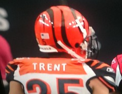
We all know there’s no consistency regarding the striping and side panels on the Bengals’ jerseys. But even by Cincy standards, Morgan Trent was wearing something very odd-looking yesterday. Never seen the orange panel look truncated like that. I’m assuming this is another side “benefit” of Reebok’s super-stretchies. Progress, it’s a beautiful thing, no?
In other weekend gridiron observations:
• It looks like the two numerals on the front of Charles Tillman’s jersey weren’t the same size. But here’s the weird thing: The same problem seems to have afflicted his road jersey and even his throwback jersey. As you can see in that last shot, this looks more like a case of how his jersey is taped down to his pads, creating the illusion of a smaller numeral. Here’s a shot from the preseason — looks like he had a little slit cut in the jersey for some sort of tie-down. Interesting.
• Was Rex Grossman listening to an iPod on the sidelines?
• Rashied Davis has the Bears’ logo shaved and dyed into his haircut.
• Looks like Steelers defensive coordinator Dick LeBeau was wearing assistant head coach John Mitchell’s headset.
• At Brad Childress’s post-game press conference, one of the mic covers had the old NFL logo.
• Further evidence that sleeve standards of some sort need to be implemented: Check out the jersey modification on Nebraksa defensive lineman Jared Crick.
• Kansas wore solid blue.
• Remember when autumn colors were maroon, mustard, and other foliage tones? Not anymore.
• Iowa tight end Brad Herman tore his pants in an unfortunate spot.
• Appalachian State and Western Carolina went color-vs.-color.
• At the Air Force/TCU game, the official handling the down marker kept a log of the down, distance, and ball position on the back of the stick. Is this standard practice?
(My thanks to everyone who contributed observations, photos, and screen shots, including Alex Higley, Jesse White, Nate Neumann, Chris Stoppel, George Carusone, Jason Greening, David Merrill, Joe Lombardo, and Aaron Maisel.)
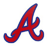
“A” team: On Friday’s Ticker I linked to a photo of an Alabama high school that’s using the Braves’ cap logo on their football helmets. Someone in the comments suggested that this might actually be the U. of Alabama’s “A” logo, but Phil quickly pointed out that those two marks are similar but not the same.
I thought that was the end of it, but then I got the following note from reader Austin Gillis:
I thought the photo of the high school team was interesting, because I had always been told that the Braves stole their “A” from the University of Alabama. I looked for proof of that in old Alabama pics, but the closest I came was this pic of Bear Bryant in a baseball cap instructing a young Broadway Joe. It’s not exactly the Atlanta “A,” but it’s not the current Alabama “A” either.
While looking for other pics, I found this rendering, where the Alabama “A” looks much more like the Braves logo.
That Alabama logo, by the way, came from a law blog entry about a logo lawsuit between the Oakland A’s and the University of Alabama. I don’t remember seeing anything about that before.
All very interesting. I’d never heard anything about the Braves poaching their logo from the Crimson Tide, although the visual similarities are obvious. Anyone know more about this?
Membership update: Is that the Ducks’ latest football uniform? Nope, it’s a membership card based on Steve Prefontaine’s old track outfit, a very interesting membership request we recently got from Neil Brown. That design is part of a new batch that’s recently been added to the membership card gallery.
For those of you who’ve been waiting for your cards, they should mail out today. And if you’ve been meaning to sign up (you wouldn’t believe how many people tell me, “I’m gonna do it at some point but I can’t decide which team to base the design on”), there’s no time like the present.
Too good for the Ticker: Gabe Butler recently scored a major prize at a flea market: a 1950 Tudor Tru-Action Electric Football game (manufactured right here in Brooklyn, don’tcha know). “The manual is beat up, but all of the players are there,” he says. “It came with a bunch of play cards and defensive strategies as well.” Gabe took a bunch of great photos of the game, which you can see below:
Uni Watch News Ticker: Some swoosh-emblazoned trail signs have appeared on Chicago’s Lakefront path. Judging from the many e-mails I’ve gotten, most of you think this is going to make my head explode, but if you read the story you’ll see that this seems more like a case of coordinated sponsorship for the civic good, much like a “This stretch of highway cleanup courtesy of”¦” sign. Not ideal, but not a clear-cut case of corporate vandalism like the last time Nike took an interest in the Lakefront. ”¦ Cool video about a guy who’s painted some fire hydrants in a Michigan football motif (with thanks to Tom Mulgrew). ”¦ Check out the little chain-stitched uni number at the bottom of Teddy Ballgame’s stirrup. Here’s a close-up (as noted by Paul Wiederecht). ”¦ Lots of old Clemson football program covers on display here (with thanks to Benji Boyter). ”¦ While watching the Giants/Phils game on Saturday night, I noticed something slightly amiss with Edgar Renteria’s helmet logo decal. Before I could get a screen shot, James Chipman had already provided one. ”¦ If you go to the Maple Leafs’ home page and look at the far-right sidebar, you’ll see Dion Phaneuf wearing the captain’s C. “But that’s last year’s jersey, and he didn’t start wearing the C until this year, when the Leafs got a new jersey design,” notes Ryan Mandel. ”¦ “I saw this numbered undersleeve on a replay this morning,” writes Susan Freeman. “He seems to be the only one it shows on. Not sure why the number is different.” ”¦ UCLA women’s volleyball libero Lainey Gera is wearing the blue jersey in both of these photos. As you can see, the one on the left matches the uni design being worn by her teammates, but more recently she’s switched to the one on the right, which is from several years ago (with thanks to Erkki Corpuz). ”¦ Last week I mentioned that Giants closer Brian Wilson was wearing Andre Torres’s batting helmet in the dugout when it looked like he might have to hit. He didn’t actually come up to bat in that game, but he did hit on Saturday night. This time, though, he had his own helmet (with thanks to Shane Martin). ”¦ I just won this cool jersey. More photos once it arrives in the mail. ”¦ Here are the uniforms being worn by Austrialia (on the left) and Ireland for the International Rules challenge matches between the Australian and Gaelic football associations (with thanks to Jeremy Brahm). ”¦ Also from Jeremy: The Italian Serie A Volleyball League has a new ball design. ”¦ You’ve probably seen plenty of TV reports on how baseballs are manufactured, but one more can’t hurt (with thanks to Tom Griffith). ”¦ Chris Biderman spotted this mannequin in the window of the NBA Store in Manhattan. The thing is, that logo on the shorts doesn ‘t appear on Golden State’s uniforms. For a second I thought maybe they put the shorts on the mannequin backwards, but the logo isn’t on the back either. ”¦ Here’s a helmet concept you probably haven’t seen before. That’s the design for the Northern Kentucky River Monsters, a team in the new Ultimate Indoor Football League (with thanks to Chad Hensley). ”¦ New hoops uniforms for Oregon State (with thanks to Eric Fisk). ”¦ Bill Jones has made a bunch of new additions to his gumball helmet collection, including the Australian Baseball League, MLB’s 2010 stars/stripes headwear (NL and AL), and the Israeli Football League. ”¦ Skip ahead to the 19th photo in this slideshow to see the cutest replica Yankees uniform — or at least the cutest kid wearing it — ever (with thanks to Dan Kaempff). ”¦ Another new college hoops uni, this time for Tulsa. “The pattern on the side of the shorts is a nod to the Nolan Richardson-era uniforms,” notes Matt Spencer. ”¦ Mark Prusinski was cleaning out an office at the middle school where he teaches and found some great Pepsi letterhead and a groovy x-country jersey. ”¦ Not my favorite color combo, but this is still one my-t-sweet old football jersey. ”¦ Tasty-looking set of hockey socks available here. ”¦ I don’t know what kind of jersey this is — rugby? — but it sure is cool. ”¦ My whole life I’ve been waiting for tequila sunrise in my favorite color scheme and didn’t even know it. ”¦ Jim Lonetti scored this cool NFL sleeping bag while thrifting. ”¦ The photos aren’t great, but you can see Louisville’s new hoops uniforms, along with their new arena, in this album (with thanks to David Merrill).
Wow. That LSU jersey is gorgeous. It’s probably similar to the jersey my grandfather wore when he played there in the late 30s/early 40s. He’s got some great old stories from those days!
I’d have to date that LSU jersey to the post-war ’40s at the earliest but more likely to the early 1950s. You can tell by the look that the jersey is made from Nylon/Durene, has tackle twill numbers sewn with a zig-zag stitch, and is washable. Were it from the 1930s to the wartime ’40s it more than likely would have been made from a wool blend fabric, had felt numbers sewn with a straight stitch, and would have been “Dry Clean Only.”
Terry,
What about that orange, collared, lace-front long sleeve jersey? I maintain that’s a soccer jersey as it looks like a precursor of some of the drek I had to wear in the late 70’s- early 80’s before adidas became more commonplace on campus.
You’re right, it is a soccer shirt. See my post below.
I always question an ebay item claiming to be a certain teams jersey.
Cincy’s jerseys have been like that for awhile. Not quite as bad as the Morgan Trent jersey, but a lot of them, you can see the bottom corners of the nameplate below the Orange… I guess “yoke” for lack of a better term.
You can see the two different “A” logos on Cris Creamer’s site.
link
Here’s a pic where both logos are seen on the baseball jersey (thicker A on the jersey, thinner A on the hat)
link
Now they just go with the thinner A logo for everything:
link
And you can see in their media guide that they wore hats with the A identical to the Braves during the 90s. Look at Dax Norris, 1996:
link
Not that this has anything to do with the two As, but the current Alabama A appears to be drawn by a righty and the Braves’ and old Alabama A appear to be drawn by a lefty. The key is the cross stroke.
In the current Alabama A, the stroke moves downward from left to right, as a right-handed person would draw it to avoid smudging the existing lines by moving his hand over them.
In the old Alabama and Braves A, the stroke moves downward from right to left, like a lefty drawing the pen in his fingers toward his hand, again to avoid smudging the existing lines.
Is that why I like the Braves and the old Bama logos better?
Not only was the WCU-App State game color-on-color, but App was wearing Pro Combat jerseys as well.
App’s normal road jerseys: link
I didn’t know the Pro Combats were used in D1-AA also (refuse to call it FCS).
Parrothead
After seeing enough taped back, stretched, laced and down right butchered jerseys in the NFL over the last few years. I think they need to rethink the term “Uniform”. There is nothing uniform about what an NFL team does with it’s jersey, pants, shoes and hosery. The only thing uniform on an NFL player is the NFL and Reebok logos are plastered over everything.
The NFL needs a template like NASCAR has. Before and after everygame you need to match the template. If you don’t you get docked points.
Jack, I had a comment ready to post that was exactly what you just typed….down to the NASCAR reference.
I was thinking any player caught with unapproved modifications would be penalized 15 yds. Is taping, tying down, cutting off of uniform parts any different than stickum, or cooking spray, or taping coins to your hands for those extra bell ringing head slaps? Outlaw that crap, give every player the same uniform and lets see who wins.
I would, however, allow an exception for Josh Cribbs to wear his striped sock arm warmers…those are just cool.
-Craig
In HS ball, any uniform or equipment infraction is a five yard penalty.
Let’s take even more fun out of the No Fun League.
I don’t see how making the players wear a uniform that doesn’t look stupid is taking fun out of the league… but if it is, how about we compromise by allowing touchdown dances? Bring back the Ickey Shuffle…or something. I guess.
It’s not about fun. it just looks shoddy when a multi-billion dollar organization dress worse than a pee-wee football team.
They are dressed like a bunch of monkey humping a football.
As far as the chain crew documenting down and distance: The crew might have done it in case they have to drop the sticks when a play is headed their way.
Usually, the Head Linesman will bring out a chain clip which one of the members of the crew will attach at the nearest 5 yardage line. There is a dial on the clip whcih you will use to indicate which line it is placed on, lest the sticks get knocked out of position.
chain clip:
link
On lower level games, where the chain crews are usually inexperienced students, the use of a clip is a pain because the HL often has to instruct the crew on evert aspect of the job, continuosly. Adding the responsibility of working the clip is too much. And very often, the HL will forget to retrieve it once the game is done. 19.99 adds up quickly!
The down is always kept on an officials hand using an indicator like the ones below:
link
link
Some high school refs are in trouble for using pink whistles without permission
link
That is RIDICULOUS! One very well-respected Varsity coach in my area gave every member of one of our crews pink whistles before a game last week.
And to respond to the last section of the article stating that the loss of playoff games would result in lost paychecks…Obviously an official works in order to make money, however, we are a very proud bunch who value playoff assignments as a huge honor. To lose one or multiple assignments due to any reason would be a huge blow!
The Haifa Underdogs!!! Talk about setting the right tone for your teams success!!!
i gotta tell ya, it’s takes a real man to hit the field wearing what the Bengals wear every Sunday afternoon. lol. i mean, i’ve seen bad uniforms in my day but… wow. you couldn’t pay me to wear one of those jerseys.
i just can’t believe the fans continue to endorse those “uniforms”. so embarrassing. glad i don’t have that problem (NYG fan).
Even if the Giants DID wear awful uniforms, we would NOT be able to see them anyway!
For those of you outside of the NY metro area, Cablevision, our cable provider has stopped carrying Fox, so the well-clad Giants cannot be seen!
they play on espn tonight, matt
And you guys do realize that you don’t actually need cable/satellite to pick up the Fox Broadcasting Company on your televisions, right?
WooHoo!
The new Giants stretchy uniforms are just as bad. Unwatchable.
as much as I hate to say it…hopefully Nike will be our knight in shining armor and fix the Bengals…Really, you can’t get much worse, and I really do feel that the Bengals have potential to have great uniforms. I absolutely love their color scheme and their helmets are extremely unique. Also, looking into their history, they have had respectable uniforms so let’s hope for the best!
Great uniforms for the Bengals? There’s no doubt in my mind that Nike can improve the look, but will it be something truly good or will it just be less bad?
Sadly, I’m thinking it’ll end up being the latter.
Looking back at the two decades, by my count, only three teams who’ve had uni overhauls ended up with an improvement over what they had been wearing. And all three of them (49ers, Giants and Jets) just rolled out modern twists on their classic looks. They didn’t come up with anything original.
ya, you’re probably right…
a classic Bengals look would be nice, but something original would be nice and refreshing as well!
I’d call the Bucs move to pewter an improvement.
The Lions current uniforms are also better than their first attempt at black trim.
Well, YMMV, of course.
I actually prefer the Bucs’ current logos but I’m not a fan of the pewter, so I consider their current vs. previous look to be a push.
I also call the Lions’ latest update a push because the overall design is an improvement but the number font is stupid.
Bring back the Akili Smith units lol
IMO:
Rams – Way upgraded
Bucs – Possibly biggest upgrade in sports history
49ers – Honestly, I’d rather have the most recent BTFBS than what they currently put on the field; The current uni is drab – historic, yes, but drab
Lions – Is the new look great? No. Heck of an improvement? Yep!
Cardinals – this may get me banned, but if I’m a 22-year-old rookie given the choice, I’m taking the football Cardinals’ new threads over what they had. Good news: I don’t plan on signing an NFL contract any time soon.
Not a fan of the Buccaneers pewter or their collection of generic logos. IMO their 2nd generation of the original look was the best. Captain Morgan helmet & a unique color scheme – instantly recognizable. The current looks like a bad 49ers-Raiders hybrid.
Regardless of whether or not Nike does an overall swell job when their administration comes into town, I think, as a group who loves everything uniforms, we should be excited. Obviously there will be disappointment, but I’m sure there will be some that we’ll all look at and say, ‘wow, nike did very well.’
Next topic:
Green bay should be the oregon of the NFL…LIGHTNING YELLOW and cheese holes on the shoulders!
obviously kidding but I love The O.
That KUA shirt is definitely a soccer jersey from the 1950s or early 1960s. That was “the” style until the very late ’60s when the short-sleeve V-neck styles came into fashion.
On the Green, White & Gold “Tequila Sunrise” jersey. I’d say that it was a basketball shooting shirt for these reasons- It only has a NOB, has a full collar, and has notched sides. Yes, I know the White Sox had collars, but theirs were only had the front flap.
And Paul, I will not make any more remarks about the eBay posters. Caveat Emptor!
Notre Dame basketball had a similiar warmup shirt in the 1970s, with blue added to the mix and a shamrock. I always wanted one as a kid.
I had link and also, for some reason, I had a Dolphins pillowcase.
not this one?
No, but thanks for reminding me about something….
Looking at that sleeping bag….does anyone ever recall seeing linkbefore?
What is better than the illustration on the Tru-Action box?
That’s right. Nothing.
Great stuff, indeed. Although the game itself was a little substandard. Understandable, seeing as how that was a first attempt at it.
Along with today’s bigger models, they make a battery-powered version that’s about the same size as the Tru-Action one, with lines only every 10 yards.
link
It’s ideally sized for arena football, but way too small for regular football. You can’t even line up your defense properly in a goal-line situation.
I got ans still have an electric football game from 1960-61 Tudor. I later bought another set like it on ebay.
Mine had the plastic red and yellow figures. As kid I painted them red and silver for one team and green and black for the others. 10 or so years ago I tried to remove the paint to restore the pieces to original colors. Some worked and came off nicely.
Anyhow that is why I later bought the same set.
I had seen the little blue and silver or whatever color guys that were more metal like for sale at antique places.
The plays and other items Gabe Butler got were very cool. Good for you Gabe. Cool item. And thanks for sharing.
Paul used this ad I sent to him in ticker long ago.
New York Titan player and 2 kids with Tudor Electric football game.
link
That was style my game was.
Does anyone know if the new, stretchy Reebok NFL jerseys are manufactured by Ripon like the regular Reebok NFL jerseys are, or if they are actually manufactured by Reebok? That could allow us to pinpoint the blame to a certain degree. Manufacturing capabilities probably factor in to a lot of the limitations were seeing on football jerseys.
The Giants were the first team to wear the super-stretchies, and I know their jerseys — or at least the first batch of them — were made in Israel. Not sure if that’s still the case, and/or if other teams’ stretchies have been made there as well.
Either way, though, I don’t think the production facility is to blame. They’re just making things to Reebok’s specs. That’s where the blame lies — with Reebok, not with the factory.
I don’t think it’s that simple. I think the manufacturing capabilities are at least partly to blame.
But let’s just get this out there. It’s not really the fault of the visual design team that these jerseys are destroying teams’ looks. The root of it is the product design team and the tough hand they’ve dealt the visual design team with the way the jersey is constructed. Who knows, the manufacturer may have had a hand in the way the jersey is constructed as well. It’s be really interesting the get the lowdown on the project from concept to completion so we can debunk all these myths and assumptions.
That would make a great UW interview.
do you work for reebok andy?
You hadn’t figured that out yet Phil? He’s even sockpuppeted at least once, when we were debating the relative merits of the upcoming Nike changeover.
I don’t mind and would even encourage the manufacturers to comment on their designs, since it adds a perspective most of us can’t have into the process.
I do however, have a problem with trying to pass as just another reader. Andy does not make disparaging comments toward the brands or designers, so he shouldn’t worry about retribution for identifying himself as an employee the way that Eagles ticket taker did.
I’m trying to provide a neutral, realistic viewpoint. I defend the designers because not everyone understands what it’s like to be one. Every company is going to hit some home runs, and every company is going to strike out every now and then. When I see a uniform or product that I’m not very hot on, I think about why the design might have been done that way and I think about the possible benefits of the design before commenting about it. My overall reaction could still be negative, but I always point out the positives I see to go along with it.
Working for a company as large as these sportswear conglomerates, it’s simply not realistic to expect to take a design from concept to completion by oneself, and it’s generally in that journey from design to production that things go awry, decisions are made (rarely by the designers) and a once-competent design is taken down a level or two. It happens everywhere: at adidas, at Reebok, at Nike, at Under Armour, you name it.
I think it’s a mistake to pass judgment when so little is known about the process of how whatever it is got from concept to completion. On the outside looking in, it’s really easy to say, “These Pro Combat jerseys suck. How can anyone think that looks good? The designer should be fired.” However, having a better perspective on the process would really make a lot of people think twice about what they’re saying and how they’re saying it. Spending even one day in the design offices at Nike or adidas, or following just one project from design to production would really open a lot of eyes. I’m not saying the designers are victims or anything, but I don’t think it’s wise to be so judgmental without the proper perspective.
In the end, opinions are what they are and everyone will have one, but there’s a world of difference in presenting an educated opinion in a tactful way vs. spouting off with an instant reaction. Too often people are doing the latter.
The soapbox is free now :-)
It takes one to know one. Swish.
so…
do you work for reebok, andy?
A division of the same parent company for sure.
thank you
UGH! link
Read the indictment…I mean, story link
Both schools did some logo swiping (FSU and Southern Miss).
Maybe down in Athens, GA they call that an link
;-)
Color me confused: the article is re a school in Athens, AL. Neither school appears to have used Georgia’s colors or logos. Is this a comment on the Georgia/Green Bay “oval G” origins?
I think he mean “homage” by breaking out black jerseys like UGA did in ’07, but yeah. That is Athens, Alabama not Georgia and the other team (East Limestone County) are their big inner-county rivals. Athens is about 15-20 minute drive from me and they have been pilfering USMs logo for a few years now. In a related note, Phillip Rivers’ brother is Athens High’s QB now, after link at the end of last season.
Fulham debuted their GFGS kits this weekend.
link
Speaking of unwatchable, have any of our astute readers ever seen this: link
The mind reels….
Did you see the logo design by anonymous in the third section. That guy invented the slug. The Sabres owe that guy some money.
A few thoughts:
The super stretchy, super modified jerseys are reminiscent of the awful looking tearaway era of the 70’s/80’s. Something really is going to need to be done, before linemen are only wearing a number stuck to the front of their pads.
There was no bigger uni-turd than the Bengals-Falcons game yesterday. Utterly unwatchable. Ravens-Bills was a pretty close second.
That Tru Action Football Game is amazing.
Giants-Rangers will be a pretty good Series, uni wise. The Rangers look good when they stick with white or gray (they’d look great if they cleaned up some of the busy-ness), and the Giants quietly have maybe the nicest home uni’s in the majors.
If the Phillies had won the NLCS, you would have had a game where the home team wore the geographic indicator and the road team wore the team name.
Would there have been any games in that series where that wouldn’t have been the case?
Argh! Caught myself in a semantical error in trying to catch you in the same. You get the idea, though, right?
I get what you’re saying.
how long until Oregon comes out with this?
link
Isn’t that basically just a HANS device for fighter pilots?
ya but a bad@$$ one
why did that link? hm…
i saw that david carr wasnt wearing all 3 stripes on his jersey, he only had one. look here: link
This is either the best or worst DIY jersey of the year. I can’t decide. link
What’s the back left????
link?
link
I can’t believe he used to wear the Dickerson mask.
Never mind all the pointless hours wasted working on that silly jersey…. this guy’s still a Favre fan. That’s lamentable. :)
actually, If you look at his left sleeve, you can see a little bit of yellow/white/yellow connecting to the Jets jersey…So I’m guessing the back is all packers.
Probably. But I like J-Dub’s hypothesis better.
I couldn’t help noticing, during the Sunday night game, that the Packers seem to be doing pretty well in retaining the sleeves on many of their jerseys (stripes too). The other thing I couldn’t help but notice is that their TV numbers are enormous! The contrast with the Vikings’ TV numbers was striking. I wonder if the Packers’ TV numbers are the biggest in the league. Has UW already covered this? Probably so but I don’t recall it.
The size of the Vikings’ TV numbers was driving me nuts as well. Now that you mention the Packers’ maybe the difference in size was really messing with my OCD. And I feel the need to say it – those Vikings’ kits are a mess.
I had that same NFL sleeping bag when I was growing up!!!
Tom Brady looked like he was wearing leg warmers against San Diego.
I like that River Monsters helmet design. Someone thinking out of the box there.
New logo for the Major Indoor Soccer League:
[url=http://desmond.yfrog.com/Himg207/scaled.php?tn=0&server=207&filename=id0q.jpg&xsize=640&ysize=640]logo[/url]
Ah, hell with it.
link
Coincidence that the player’s body is positions so it kind of looks like MISSL? Ad an “E” to the end, and you have a kick@$$ league acronym!
If link was their old logo: Whoa, huge downgrade. The old logo had a unique look, the new one is just another Dior-template copycat. Sad.
This is what happens when I don’t hit F5 before posting my comment below…
Are they still playing NFL football? It’s almost time for the Major Indoor Soccer League to begin!
New logo for the MISL, just unveiled today.
link
Trying to look like most other major sports, they went with this design over this logo:
link
Which was an improvement over this logo:
link
Which was a lateral move from when the original MISL became the MSL:
link
link
Of course, the best is still the original:
link
teenchy | October 25, 2010 at 12:35 pm |
Color me confused: the article is re a school in Athens, AL. Neither school appears to have used Georgia’s colors or logos. Is this a comment on the Georgia/Green Bay “oval G” origins?
Kris McInnis | October 25, 2010 at 1:08 pm |
I think he mean “homage” by breaking out black jerseys like UGA did in ’07, but yeah. That is Athens, Alabama not Georgia and the other team (East Limestone County) are their big inner-county rivals. Athens is about 15-20 minute drive from me and they have been pilfering USMs logo for a few years now. In a related note, Phillip Rivers’ brother is Athens High’s QB now, after spurning my high school alma mater at the end of last season.
**********************************************************
My bad, gents….had I read the whole article I would have known that the Athens in question was in AL and not in GA, which now renders my “homage” snarkiness link
No worries. An Alabama school doing a “blackout” as a nod to UGa could’ve done so in jest; it had the desired results against Auburn but against ‘Bama, not so much.
Edgar Renteria’s helmet logo problem link was first spotted by my 9 year old. We now have a second generation of Uniwatchers in my house.
“Another new college hoops uni, this time for Tulsa. “The pattern on the side of the shorts is a nod to the Nolan Richardson-era uniforms,” notes Matt Spencer.”
The only problem is, the pattern is lost in a sea of minimalist white.
I’m not so much a Nike hater, but I’m not a fan because they seem to go to too many extremes. They do outlandish stuff like Oregon football and pro combat at one end, then with the SoD unis they go too far in the other direction. Of course, the tight tops and the baggy bottoms are a case of extremes within an extreme.
The swooshkateers should just stay on their medication and design stuff to look just right. They’ve done it before, they sometimes do it now, and they can do it in the future.
The Rangers color identity crisis continues. Our NBC station is calling it’s World Series coverage “Red Fever”.
link
Kind of odd for a team clad in blue for nearly the entire ALCS.
Those KU blue unis looked pretty good.
link
Couldn’t get a decent pic of them Saturday night, or else they might have contended for the Top 5. Definitely in the Top 10 for this past weekend.
Speaking of pretty good, I’d wear those Aussie unis:
link
shhh…don’t tell marshall
Those aren’t UCLA stripes!
link
They should incorporate the UCLA stripes in all their sports (including football, dontcha know…), kind of how Michigan uses the winged helmet design in some of their other sports.
Numero 6!!!! Hubba hubba!
“All very interesting. I’d never heard anything about the Braves poaching their logo from the Crimson Tide, although the visual similarities are obvious. Anyone know more about this?”
I’ve done a bit of poking around in the USPTO database and it seems to me that the issue isn’t with the “A” itself, its with that PARTICULAR logo – a stylized “A” within the concentric circles with the team name written around the circumference.
In other words, its not the “A” that’s the problem, its the logo as a whole. Which makes more sense to me than a fight over a single letter.
Oakland filed their opposition in 2005 and its been stuck in process ever since. The trial is set to resume in January, 2011 and be wrapped up by the end of October, 2011.
As the weeks pass and football jerseys continue to morph, I’ve been thinking about two things.
1. Has the time for mandated TV numbers past?
2. What is the ‘end game’ with these stretching uniforms. I completely agree with the earlier post comparing this era to the tearaway jersey crazy. Those looked like crap, male belly shirts really, and now we’re close to replicating Aussie Rules jerseys in the NFL. Clearly the old uniforms are no longer functional. But what is a real, functional solution that doesn’t look like a third grade sewing project?
Would love to hear your thoughts.
“Clearly, the old uniforms are no longer functional.”
You see, that’s the problem. They–the “old uniforms”– are perfectly functional. This whole mess started when some genius thought of a way to make lot of money under the guise of revolutionizing the game. Where’s the evidence that these wonderful new shirts have done anything but make the game uglier?
I say you CAN go back to sleeves. And–eventually–the NFL will.
link
I noticed that the Indian head the other day on Duncan Kieth’s Uni looked messed up in the mouth/nose/face region and I couldn’t tell if it was the jersey or a weird fold or angle. I’m leaning toward the jersey.
The MISL’s Milwaukee Wave premiered their line of charity jerseys for the upcoming season:
link
I wouldn’t wear any of those (mostly because Time Warner is plastered on all of them), but even without that logo I’d only wear the Make A Wish one and the Special Olympics one. Nice idea, but there has to be a better way to raise money for charity.
Yeah, yeah…I’ll fix the link later…
here…lemme fix that for ya, jim
well…that is if one has a facebook account, which i don’t
It’s an open site, so you don’t need FB to see the jerseys. I’m not logged onto it right now and your link worked.
If Nike want’s to “fix” the Bengals, they should just put the stiped helmet on top of Oregon State’s Riflery uni
link
Nah… the Bengals have had tiger stripes on their uniforms for far too long to go back to something that simple.
They need to fix things a bit… lose the white side panels… a couple other tweaks perhaps… but the tiger stripes should stay in some form. A Bengals uniform with no tiger striping is like a Chargers uniform with no lightning bolts… it just ain’t right.
Just go back to the Collinsworth-era unis. Nothing wrong with those.
Yeah, that’d work.
I’d kinda like a bit of a hybrid really. Use the old style striping patterns, but keep the current number font and mix-n-match options.
it’s an easy fix
done and done
I don’t like the traditional pants stripe with all of that tiger print.
Jim Vilk is right. The original tiger uni was flawless. Maybe throw in some black pants for an alternate, but make damn sure that the socks are orange.
nobody cares what you think
although i do agree with you that black pants are fine
they could even be the “ducks” of the nfl … let them wear white, black and even orange pants…so long as they don’t go monochrome
…except of course this occasionally
if they could return to the boomer sooner look, and not the shit they have now…
i’d say that’s ok for the pants then
He said “Jim Vilk is right,” so hear the man out…
Y’all know I love traditional stripes, but not on these guys. Just go back to Boomer.
And if your Ducks can go mono, why can’t the Bengals?
Although if you insist on traditional stripes, how about a black and orange version of LSU?
if the man says “jim vilk is right” you know he’s lost all credibility
and they can’t go monochrome because they can’t be trusted not to pull this shit
and you know they’d wear orange socks with orange pants too (for that extra special orange popsickle look)
no…all orange, despite what robert marshall thinks, is NOT a good look
i have no problem if they want to wear white/white, white/black, white/orange; orange/black, orange/white; and black/white, black/orange
that’s 7 different combos…they don’t need nine
Yeah, but you’re looking at it through Reebok-colored glasses.
Colorize these pants black
link
and you’ll say, “Wow, I’d wear that.”
Didn’t they do that once? I’d swear they went with a solid black uniform at least once prior to the switch to the current uniform.
no
there’s only one team in the NFL that should own the all black look and that’s the ballmer
thugsravenssaints: NO
falcons: NO
bengals: NO
unless…and i still don’t like it…the wear orange socks (but i don’t trust them to do that)…rip CH, btw
bit of you wanna look like a thugly high school team (and for the love of corn, lose the white shoes and spats, please)…
the ravens are your club
btw…that “no” was to vilk, not THE jeff
i also distinctly recall the bengals doing the monochrome black at least once (might have even been their last home game of the season) with their old unis — i think it was actually done in preparation for the new unis
I dunno Phil, I think the mono-black could work for the Bengals if it was combined with orange socks and if that colored side panel on their jersey was orange instead of white.
Mono-orange would make a lot more sense though, based on what actual tigers look like.
The Ravens should be using my black-to-purple gradient concept. :)
looking for photo evidence, but they definitely wore the old uni in monochrome in 2003 (last ever game at cynergy?)
wait…what?
and im surprised you didn’t come up with this bad boy
I’ve brought this up before, but…
This is what they should be wearing during games (and how much more superior is that number font!)…
link
Or maybe they can do this:
link
and that IS the Ricko-sleeve, BTW ;)
Hmm, I wonder if that fire hydrant painter had the blessing from the fire chief? Hydrants are usually “color-coded” according to the water pressure available. Several years ago, a neighbor painted the yellow hydrant on his front lawn to a patriotic theme and the fire department made him repaint it back to yellow.
Grossman wouldn’t have been listening to an iPod – he would have been listening to the plays which were being called, they’ve just showed Romo doing the same thing in Giants v Cowboys
Can anyone get a screen shot of Chris Snee’s laced-up armhole? They showed a good view of it just after Manningham’s TD.
Never mind, got it!
oh…forgot
HOW BOUT DEM COWBOYS?
Re: down and distance marker in the airforce-tcu game…I’m not sure how widespread it is, but I’ve seen it on the sidelines at USC before.