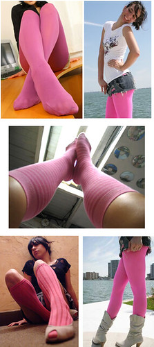
It’s not clear whether Buccaneers cornerback Aqib Talib has any of the images shown at right hanging in his locker (or his bedroom). What became abundantly clear during yesterday’s Bucs/Bengals game, however, is that Talib has a thing for pink hosiery — and that he has officially pushed the NFL’s breast cancer promotion way past the “Enough already!” breaking point.
It’ll be interesting to see if he’s fined for this. Personally, I don’t think he should be, because the league has essentially encouraged these types of shenanigans. If Goodell and his people don’t like what Talib was doing, they have nobody to blame but themselves, because Talib was simply taking the pink program to its logical extreme. Meanwhile, can you believe we have to put up with this crap for three more weeks? (Phil wonders if we might soon be seeing this, and let’s hope nobody at the networks is reading this and runs with that idea.)
Talib’s legwear notwithstanding, yesterday’s NFL action was remarkably uni-uneventful. There were several noteworthy developments in Saturday’s college games, however:
• Florida surprised everyone (or at least me) by wearing orange jerseys, which I thought looked pretty good. (There’s precedent for it, too.)
• Can’t say I was a fan of Minnesota’s white helmets, however.
• Even worse: white helmets for Baylor.
• But I thought Virginia Tech’s white helmets looked fine.
• Latest NCAA team with pink accessories: BYU.
• Indiana State went BFBS — eww.
Flour City or Flower City? Discuss: If there’s one thing Terry Proctor loves more than more than sporting goods, it’s the sports history of western New York State. Those two topics are found in a pair of old Rochester Amerks jersey photos he sent me the other day. “This one was worn by goaltender Serge Aubry in 1970-71,” says Terry. “It’s made out of ProBrite nylon tricot mesh, and all the stripes, stars, graphics, and numbers were screen-printed. The jersey was made by Champion Products of Rochester at their Geneseo, New York, plant. Note that the back numbers are full block while the TV numbers are plain block.”
Then there’s this one, which Terry describes as “without a doubt the most reviled jersey in the team’s 55-year history.” He goes on: “This 1971-72 jersey bore the infamous circular logo that was patterned after then-parent Vancouver’s ‘stick-in-a-rink’ logo. The fans hated it. The players hated it. And the lowly Amerks were laughed at everywhere they played that season. The first thing that the new Rochester-based owners did in the summer of 1972 was to restore the Americans’ proud shield to its rightful place as the team logo and put it back on the jerseys.”
ESPN reminder: In case you missed it on Friday, here’s my ESPN column on this year’s NHL goalie gear. (One thing I missed in that column: new mask for Jimmy Howard.)
More Wayne Hagin voodoo dolls than you’ve ever seen in one place: All you NYCers should come on down to the Knitting Factory this evening for Collectors’ Night, sponsored by the City Reliquary. I’ll have a table with several of my collections on display, and lots of other folks will be exhibiting their collections. I’m not joking when I say that the first Collectors’ Night, which I attended as an audience member in 2005, changed my life. That’s not to say tonight’s proceedings will necessarily change your life, but you never know. Besides, it’s a sure bet that the Brett & Randy Show will be completely insufferable tonight, so skip that and come do something fun instead.
Is it too soon to say “And it makes a great stocking stuffer”?: The Meats tee got a little more media attention over the past few days, this time from CNN’s Eatocracy site and Can’t Stop the Bleeding, whoop-whoop. I’m also happy announce that the venerable Fleisher’s butcher shop in the Hudson Valley is the latest retail outlet to carry the shirts. Not quite as good as having my own line of sausages, but having butcher shops sell something of mine, even a shirt, still feels like the achievement of a long-cherished goal. Oink!
If you don’t live near Fleisher’s, or near any of the other shops that are carrying the shirt, you can order yours here.
Uni Watch News Ticker: Interesting to see that Wilson was putting nylon into its flannels as early as 1955. ”¦ Peter Nash is single-handedly laying waste to the Baseball Hall of Fame’s reputation. ”¦ University of Minnesota goaltender Alex Kangas is a rarity: a goalie who wears the alternate’s “A” (with thanks to Chris Hodge). ”¦ New logo for the Japanese basketball all-star game (with thanks to Jeremy Brahm). ”¦ Luke Parks spotted a Georgia high school officiating crew using pink penalty flags on Friday. Breast cancer promotion, or just a shout-out to one of history’s greatest LPs? ”¦ Eric Trout is the latest reader to use that boxing poster tutorial for college football purposes. ”¦ Here’s a fairly comprehensive assessment of the Australian Baseball League’s new cap designs (with thanks to Tyler Maun). ”¦ The Lakers played an exhibition game in Spain the other day against the FC Barcelona basketball team, whose uniform is based on the FC Barcelona soccer kit (as noted by Britt Jackson). ”¦ Donovan Moore‘s latest team-color analysis takes a detailed look at the Cowboys. ”¦ Very late-breaking FBS uni adjustment: JP Bertram notes that Oregon State’s nose bumper graphic has changed from “Beavs” to the school’s “OS” logo. ”¦ Syracuse’s lacrosse team played a game against their alumni the other day. Look at those Loudmoth-style shorts that the alumni wore — yeesh (with thanks to Tony DiRubbo). ”¦ The Sabres’ new retro alt saw its first game action on Saturday night, and I think it looked great. The game also provided our first look at the Rangers’ 85th-anniversary patch on the road jersey. ”¦ The Blackhawks raised their championship banner on Saturday night. ”¦ I thought the Kings were going with the gold throwback this season, but instead they opened the season wearing purple throwbacks. Bonus points to goalie Jonathan Quick, who went with old-school gear. More info on that here. ”¦ The Canucks wore their 40th-anniversary throwbacks in that same game, creating an NHL rarity: NNOB vs. NNOB! ”¦ New 25th-season logo for the National Lacrosse League. ”¦ New hockey uniforms for the University of Denver. ”¦ So much to like in this old 7-Up ad. My favorite detail: the argyle socks and dress shoes on the kid. ”¦ Someone out there should buy this awesome softball patch and put it on the back of a jacket. ”¦ Speaking of softball, check out these tremendous 1939 programs. ”¦ New basketball uniforms for Georgia Tech and Arkansas (with thanks to Britton Thomas and Paul Watson, respectively). ”¦ Check out the awesome cover on this old Aussie rules football book. ”¦ Ebbets Field Flannels is running a sale on Latino heritage items this month. ”¦ “While, for personal reasons, watching the opening of Miami Vice, I noticed that the jai alai player has a 6 on the front of his jersey but what appears to be 43 on the back. Is that how jai alai numbers work?” I have no idea, but the “personal reasons” disclaimer is the funniest thing anyone’s written to me in quite a while. ”¦ More new college hoops uniforms: Texas A+M. Here’s the rear view. ”¦ The Rays’ plaid fetish has now extended to a rendition of the MLB logo. Unfortunately, they didn’t include that version of the lgoo on the plaid-billed caps they’ve been wearing lately. ”¦ Purdue will be wearing 2001 Rose Bowl throwbacks this Saturday. ”¦ Very nice set of felt patches from Pottstown (Pa.) Junior High here. ”¦ Went flea-marketing yesterday and came away with the most beautiful box of wooden forks ever. ”¦ According to a quick quip during yesterday’s Rays/Rangers game, Tampa closer Rafael Soriano often looks inside his cap in between batters because he has “inspirational things written in there.” ”¦ The Braves wore their alternate tomahawk caps yesterday — mostly. ”¦ What’s that patch the Hornets are wearing? The answer can be found here. ”¦ Here’s a color-on-color game from the world of women’s college hockey. That’s North Dakota in black (they were the home team) and Minnesota-Duluth in maroon. Note the pink stick tape for you know what (with thanks to Brandon Boemann). ”¦ The morphing of athletes into super-heroes, which I’ve been writing about since this blog’s very first entry, continues (as reported by David Browning). ”¦ Matt Bellner stumbled upon a real prize: a 1975 Western Women’s Professional Bowlers program. Look at that logo on the cover — amazing! ”¦ I mentioned this in the yesterday’s comments, but it bears repeating: Last night’s episode of The Simpsons showed Bart’s Little League team going high-cuffed with stirrups. It’s amazing how many cartoonists, graphics artists, illustrations, and the like continue to depict baseball players this way — further evidence people instinctively think of stirrups as “the way a ballplayer is supposed to look” (with thanks to Dan Cichalski for the screen shot). ”¦ Mario Morgado found some video footage of Frank Sinatra making his way to the stage at Madison Square Garden, accompanied by an entourage that included two guys wearing hockey-style “ABC TV” jerseys. … RIP, King Solomon.
Research Query: I was chatting with some editors the other day about maybe putting together a gallery of “tools of the trade” for officials — an umpire’s whisk broom, a football ref’s penalty flag, a soccer ref’s yellow card, maybe one of those stick-curvature measuring thingies they use in the NHL, etc. One thing that stumped us: What do basketball refs use, aside from a whistle — anything? If you have a good answer to that question, and/or if you have other ideas covering officials in other sports, let me know.
Nice Wire shout out Paul, too bad the number “154” doesn’t make its way into Uni Watch.
More than a few people here in Minnesota (where the best college football program is UM-Duluth) have referred to the UM-TC Golden Gopher white helmet uni set as “Brewster’s White Surrender Flag” (or something similar)
It’s been awhile since RI has had jai alai, but if I remember correctly, a jai alai match has 8 singles (or pairs) competing against one another. So, this guy must have been on the 6th “team” for that particular match. The numbers on the back don’t change. Those are the players’ own personal numbers. This begs the question, “Does each player need to have eight different jerseys?”
Yes, thats exactly how it works. His personal number is on the back. Years ago, I once saw a pic of a jai-alai locker room, and each player had jerseys of different colors, with all different numbers.
Thanks for the info, Alan. When I went to URI in the late 80’s, we would make the trip over the Newport Bridge and take in a few matches at Newport Jai Alai. It was a blast. Sadly, the fronton has been turned into a mini-casino.
Yes, each player has at least 8 jerseys to wear. The front number is their post position, and the color always matches that. So the #1 player always wears red, #6 gold, and so on. Unique system, but not too complex.
There is still a fronton near me, and I went once this summer. I have a few dark pictures showing it, and can submit to Paul.
I forgot about the color coordination thing. Thanks for the info.
FC Barcelona also owns the basketball team.
A lot of European teams have cross-sport ties. The Cracovia soccer team in Krakow, Poland also has a hockey team.
link
link
A fair number of European football clubs are actually part of a “sports club” where members can participate in everything from Badminton to wrestling to chess. You’ll also see hockey teams with the same name For example, there’s AC Sparta Prague (soccer) RC Sparta Prague (Rugby) and HC Sparta Prague (Hockey). I can’t confirm that thery’re all part of the same family now, but back in the day they were.
I’ve never been a fan of Florida’s orange jerseys. Even when they used to wear it as their main jersey. I’m not exactly sure why, especially since I do like Clemson’s similar look. But something about it is not right. Just seems like a “JV” look.
This J.V. would wear that!
Nah, I know you meant Junior Varsity, but hey, to each his own…
I keep seeing the little blue NCAA patch on the new college basketball uniforms, did we know this was coming??
link
I’ve known about it but haven’t written about it yet. Soon.
Just what uniforms need — more clutter. When are the ads for O’Reilly’s Auto Parts coming?
That Arkansas uni needs more clutter. Pretty boring.
“That Arkansas uni needs more clutter. Pretty boring.”
***
Don’t worry, the football team makes up for it.
Loved the Canucks unis. Loved the Kings unis (even though they were purple – just don’t over-use them).
Yeah, they were both great — love the big numbers and NNOB!
Haha I was thinking about you and your blog when I saw Talib’s socks yesterday. Nice blog btw – overload of neat observations.
“overload of neat observations”
That is basically the EXACT reaction I’ve been waiting for over all these years.
Uni Watch is now canceled, I am now retired, everyone enjoy the rest of your lives.
Without Uni Watch? I don’t know if that’s possible.
With the Pink getting more and more noticeable, how soon before something like this : link makes its way out of the Women’s section and onto the field? With Talib’s socks, Pink Jerseys(Uniforms?) are the next logical step.
Then the only question is whether they would count as an Alternate, or get the special “doesn’t count” status that the AFL unis got. (The latter being most likely, I think)
“Then the only question is whether they would count as an Alternate, or get the special “doesn’t count” status that the AFL unis got. (The latter being most likely, I think)”
help me understand the difference?
a hideous uniform is a hideous uniform regardless of how it counts
The difference is that if they were granted the exemption, they could be worn more often.
The difference being, if they count as an Alternate, they could only be worn twice by current NFL rules. If they are exempt of that rule (like the AFL throwbacks were) then all the teams could pink in up all October.
Man I hate all of this pink. I am reminded of Ricko’s (and others’) train of thought with the MLB stars and stripes hats which is when will this horrible fad ever end? In 5 years from now, when we are seeing pink on pink games? When one player doesn’t wear pink does that mean he doesn’t support breast cancer research? Just make a huge donation for breast cancer awareness and be done with it.
Sorry, I meant to only say “Man I hate all of this pink” and be done with it, but then I started thinking too much.
Maybe they’re trying to inspire all those doctors to finally cure cancer, so we don’t have to see the shitty pink ever again.
Wishful thinking I know, but like the etc’s, no logical exit plan strategy at all. I guess we’re stuck with until the leagues end or we’re all dead.
Did anyone watch the Bruins/Coyotes game on sunday? Tim Thomas was wearing a white mask and have yet to find a picture of it.
link
The now white mask looks like the graphics he had last year with the bear on one side and the claw on the other with the difference being front and center is a replica of a coin he wears around his neck and has replaced the spoked B – I’m not much of a fan of the whiteout though
Read an article yesterday about Florida. When Spurrier came to Florida in 1990, he immediately ditched the orange jerseys (which they had worn back since the last game of the 1979 season and all through the 1980s until the last game of the 1989 season) and ditched the artificial turf (good move). He hated both.
Orange is a school color and the uniforms most certainly are better than the storm trooper uniforms worn last year.
Spurrier’s line for getting rid of the orange jerseys:
“We look like Clemson.”
To make this thread go full circle, 1979 was the late Charley Pell’s first year as FL head coach, he came from…. you guessed it… Clemson.
And promptly went 0-11! Danny Ford took over Clemson for the bowl game that year, and Woddy Hayes punched the Clemson nose guard in the face at the end of the game.
The Florida-Florida State game in 1979 was the first time I ever saw a high-five.
Clarify that Pell left Clemson before the bowl game in ’78.
The late Dodger outfielder Glenn Burke is sometimes given credit for inventing the high five earlier that year. I saw it for the first time in an American Legion game in August, 1979.
Spurrier’s list of contract points joining UF had serveral uniform points:
1. Blue jerseys, which he got.
2. Black shoes, which he got initially.
3. F on the helmet — which he got, but then the AD rescinded after claims on alumni pressure (lots of items in the State of Florida have the script “Gators”, which I find terrible, but now so laced with tradition that they can’t get rid of it.
4. Grass field, which he got.
5. Miami back on the schedule annually, which he got initially, but then were dropped when SEC went to 8 games.
Florida wore blue jerseys (with orange pants — think Syracuse) in the last home game of 1989 season (pre-Spurrier). The orange jerseys are definitely tied to the Pell-Hall era, although Spurrier’s teams (and the current team) often play in orange pants (as well as blue and white) on the road. After a bad loss, Spurrier would “punish” the set of losing pants and the Gators might so several years without playing in that combination again. Spurrier often referenced what color “britches” the team was wearing in his coach’s show highight package. I think no coach paid more attention to uniforms than Spurrier did at Florida, probably because he was a former player.
Very interesting stuff.
And being from Tennessee but playing at Florida, Spurrier likely didn’t want to look like the rival orange-clad Vols either. I love the blue shirts, but thought these orange were a decent nod to the past. I don’t want them to be seen too much though, especially since they didn’t bring a win.
I suspect the Orange jerseys will be “punished” after a loss like that, although Meyer seems to be less uniform aware and will have them wear whatever brings in the revenue. Switching to the Nike combat uniforms and helmets in Tebow’s final few games was not well-received by the fans, but they did it anyway.
Florida has worn white at home (despite the extreme heat) only once in 1998 — in a Spurrier tweak of LSU’s “white preference”. LSU responded by wearing gold jerseys and breaking the collarbone of the UF Quarterback (ESPN’s Jesse Palmer).
But with the superduper high tech 2000% drier and 345oz lighter Nike uniforms, it doesn’t matter what color they wear in the heat!! Or that’s what the press releases tell us!
As a Gator fan, I don’t like the all-white set, nor blue over orange pants. All blue is great, and blue over white is good too. White over orange is ok, but not as good as white over blue.
I’m interested to see how the new Nike pro combat unis look on the field. I hope they are better than previous specials.
If you look closely at Quicks throwback mask you’ll see the ears on the side as it is painted to represent Rogie Vachon’s old mask.
link
Kind of like Steve Shields Gerry Cheevers Mask from a few years back.
link
Paul-
I don’t understand why you are so against the pink? It’s all for a good cause! Some/most of that equipment will be auctioned off and proceeds will go towards fighting breast cancer. If you (or anyone else complaining about the pink) knew someone battling the disease you would be sitting on your couch on sundays with a pink shirt, hat, and stirrups if you knew it would help the cause.
Have a heart!
Cancer has decimated my family: My brother and both sisters-in-law died from it, and my father had it (although that’s not what ended up killing him). So yeah, I know a little bit about that disease.
But pink on the gridiron looks like shit. Is it a worthy cause? Sure. But there are lots of worthy causes, and lots of ways of supporting them. Are you dressed head-to-toe in pink today? No? Why not? Because it would look like shit, perhaps?
There is a sad tendency in sports — and, by extension, in much of American life — to take good ideas waaaay past the point of rationality. “Sure, me too!” morphs into “I can top that!” until the whole thing becomes a self-parody at best, counter-productively annoying at worst. Exhibit A is currently on display in the NFL.
One weekend should be enough. Spreading it over a month, to me, defeats the purpose. The first weekend we notice it, but by the fourth we’re either used to it or bored with it. I would think neither of those attitudes is the desired effect.
I submit MLB’s ill-advised attempt at two All-Star Games as proof that many things are best done once, with maximum impact.
Ricko
My reaction to yesterday’s comics, after I figured out that it wasn’t a printing malfunction, was “Enough Already.” The campaign has gone beyond making me aware to becoming as annoying as political advertising.
The main problem I have with the pink is the fact that the league makes it such a big deal, but does nothing like this for any other type of cancer. Why not have a month of light blue accessories, socks, and ribbons for prostate cancer, which effects many more men(eg players and fans) than breast cancer?
I think that part of the reason that pink gets so much play is that no team has pink as a team color (aside from Italian soccer club Palermo). So you’re never going to wear your rivals’ color if you wear pink. Take your example- are the Chargers’, Titans’ North Carolina’s, UCLA’s, etc. opponents going to wear light blue accessories? Pink will never be confused with another team’s color, so it’s more neutral/palatable for all teams. Just my ramblings- may or may not be at all a factor.
Why breast cancer. Because we’re men, and we’re likely to get involved with anything that is even marginally associated with…
…breasts.
wait there’s at least one other team out there that wears pink…
link
(French rugby club Stade Francais)
My orienteering club (Orienteer Kansas) sports pink checks. It keeps hunters from confusing us with deer. Or other hunters.
link
Because it looks like shit, for one.
For another, why don’t they just donate the money? They go so far out of their way to make sure we all know that they’re doing it, and it’s shallow as hell. Look at us. Look how much we care about breast cancer. We’re wearing pink gloves, check it out! It’s stupid. Yeah, they’re going to auction off the pink stuff and donate some of those proceeds – why can’t they just do that with normal equipment? Which do you think the average Bears fan (as a random team example) would rather have – a game worn autographed helmet… or a game worn pink shoe?
It’s not just the NFL either. They have pink EVERYTHING. They sell freakin cat food in bags with pink graphics on them… how much wasted money is that to design and print up entirely new graphics each year for that? Wouldn’t that have been better spent just going straight to research? Oh, right, then we wouldn’t know that Purina cares about cancer.
To be fair, if they just donated the money silently, that wouldn’t do anything to raise awareness, which is a stated goal of the program.
And I think raising awareness is a worthy aim — sort of analogous to giving a man a fish vs. teaching him to fish. But there’s a difference between raising awareness and taking things way too far.
If every player on the field wore one pink wristband, wouldn’t that achieve the same goals without making the game look like a total fucking train wreck?
I disagree here … This situation is one of those times where how the uniform looks takes a backseat to the overall cause. If NFL players wearing pink raises awareness and makes money towards research, thats fine by me. The fact that we are discussing the pink uniforms (even if we are discussing how awful they look) proves it is working. By just wearing one pink wristband this would not be a discussion.
How much more aware can we be though, Paul?
There’s a point at which we become so over-saturated with pink that it becomes a negative and people start actively trying to avoid it. I don’t know if we’re there yet, but we’ve got to be getting damn close.
I think we can both agree that painting a ribbon on the field and using some pink TV graphics would be much more acceptable method of getting the message out.
It’s a special interest groups issue. What makes their disease more important than others, and why should they get preferential treatment? Do we have to have causes and charities shoved down our throats in everything we do? It just reeks of special interest lobbying. Like the motivation behind the NBA changing to a synthetic ball was purely based on someone with ties of animal rights & nepotism.
my mother has cancer…my aunt and grandmother died of cancer.
the pink accessories look like shit on the football field.
As far as “raising awareness”, Buccaneers cornerback Aqib Talib is a perfect example of how college and pro footballers never do anything in moderation.
From the visored motorcycle helmets…
To the hanging dreadlocks…
To the disappearing sleeves of the jerseys…
To the bicep “showing off my guns” bands…
To the unbuckled belts…
To the pants cut above the knees…
To the leotards or sewn in socks…
To the low socks….
To the black “spats” on shoes….
….and on and on…
It just looks like shit.
Here, here.
And it’s almost all played on artificial turf. Give me Alabama-South Carolina any day over the NFL.
CYNIC’S ALERT: The NFL is so hyped up for Breast cancer not to raise awareness, but to promote itself as “female friendly” It’s a massive demographic they’d love to tap (no pun intended). Not only are you ingratiating yourself to half the population, you’re at least building building a sense of understanding why hubby sits on the couch all day Sunday.
SB
Like the Japanese basketball, BJ league, all star logo’s resevior tip.
Colorado Buffaloes Hockey Uniforms: link Big fan of the helmet!
I can’t say that I agree. A silver helmet? That might be a tremendous look but I really don’t like it when NCAA hockey (or baseball, softball, etc.) programs co-opt the football program’s look.
Helmet sure looks gold to me, not silver.
Yes. Yes, it is gold. And that’s exactly why I said that a silver helmet MIGHT be a tremendous look, but I’m NOT a fan of this gold-helmeted uniform that essentially link.
For the record, the University of Colorado doesn’t play NCAA ice hockey. Rather, they compete in the ACHA, a national association of club teams with three divisions.
Ah, yeah, I was going with the catch-all “college sports = NCAA” when I shouldn’t have.
Plus, with University of Denver and Colorado College being powerhouses, I guess I just assumed that CU had an NCAA program .
Like that look especially with the gold football matching helmet – Michigan also has the same matching look going with the yellow striping on blue…my bad…maize on blue
I don’t think basketball refs use much more than a whistle, but one overdone contraption is the possession arrow. Do they really need a separate electrical light up box with red dot arrows and a big POSS. on the front? link
The black Poss Box. It has no flair whatsoever, and really, what do you need to point in one direction or the other? I bet RPM could come up with something much much better.
What exactly is the purpose of the possession arrow box anyway? Do referees tend to forget who is supposed to get the ball after time-outs? If I see a team passing the ball off to one another, should I check the light to make sure they really have possession of the ball? Admittedly, I haven’t watched a whole lot of basketball since Jordan “retired” from the Bulls, but I’ve got to say, I was never really unsure of who was supposed to have the ball in their hands.
The possession arrow is for dead-ball possessions; the only “tip-off” is at the start of the game (and the start of any overtime periods). If Team A wins the opening tip, Team B gets the next dead-ball possession after either a “held ball” call or the start of the next quarter, if there’s no “held ball” during the game. Possession alternates throughout the game. In my example (and assuming no tie-ups), Team B has the ball to start the second quarter, Team A has the ball to start the third quarter, and Team B has the ball to start the fourth quarter.
Explanation much appreciated! I was hoping there was a good reason!
Little-known fact: POSS stands for Piece Of Shit Sign.
I’m having serious flashbacks from that Kings-Canucks game – wow!! Note that the purple throwbacks they’re wearing are not the purple version of the gold ones you linked to — the purple ones are their early design, while the gold are the late 70’s version where they added the full shoulder/arm contrasting stripe. I prefer the original design, and had no idea they were using that one as a throwback also!
The goalie gear looked sweet too. Oh man, that’s how hockey should look every day, not just a few times per year!!
-Jet
They threw us the curveball at the draft with the gold jersey – I thought this was an INCREDIBLE looking game! The purple was awesome!!! I’m hoping to see that used a bunch this year…then turn it into the home for next year
How about that waffle board blocker…sweet touch!
So each NFL teams will play 4 or 5 games with the pink accouterments.
The NFL regular season being at 16 games and MLB at 162 means that, roughly speaking, each NFL game equates to 10 MLB games.
Let’s just hope MLB doesn’t decide to one-up the NFL on this one.
Me fail English? That’s unpossible.
Do you know what the #1 killer of American women is? Heart disease. Yet we are bombarded by all the pink. Now I’m not saying breast cancer is any less devastating, but let’s not kid ourselves. The NFL just wants an excuse to pimp their pink jerseys and caps.
Brilliantly stated.
Yes.
The NFL has been courting women fans for years. The cynical side of me believes this is just to get more females into the fold. I dont know what color represents heart disease, but I imagine it isnt as appealing to younger women as much as the pink. They know what they are doing.
Red is for heart disease.
link
Men get that disease too, don’t they?? You wouldn’t know, from that site. Then again, our local news always features a women’s health section but snubs the guys.
I’m not suggesting that back in the day the Rochester Americans should have dumped their iconic shield logo, but when I clicked and saw this …
link
…I was astonished. That’s a great logo, and some team or other should have adopted it if the Americans didn’t want it. (How about today’s Colorado Avalanche? You’ve got your mountain and your A.)
That Sabres/Rangers game photo confused me at first: the Sabres, home team, in dark, with ‘Buffalo’ on the jersey… New York, the visitors, in white, with ‘Rangers’ on the jersey…….
And, yeah, the ’75 Western Women’s Pro Bowlers program takes the grand prize.
This seems like the most appropriate team …
link
interlockingtc- If you lived through the hell of the four years that Vancouver owned the Amerks like I did and knew how totally inept the Canyucks running of the team was then you’d understand why that circular logo is so hated in Rochester.
First, they transferred the bulk of the 1968 Calder Cup champion Amerks players to Vancouver’s Western Pro League Canucks where that club won back-to-back WPHL Patrick Cup championships in 1968-69 and 1969-70.
All they left in Rochester was a motley crew of over-the-hill, never-was and never-would-be players who finished with the worst record in the American Hockey League for four consecutive seasons. The 1969-70 Amerks won only 18 games, an all-time low. The fact that the teams were 3,000 miles apart didn’t help either.
When Vancouver entered the NHL in 1970-71 the Canyucks had the Amerks do such things as break in new skates for Vancouver and they forbid things like beer in the clubhouse and required the players to all wear short haircuts. This really went over big in the early 1970s.
But the biggest slap to the once-proud franchise was the change of logos for the 1971-72 season. That circular emblem became a symbol of hate for Rochester Americans fans and to us was graphic proof as to just how bad things were.
After the 1971-72 season Vancouver finally had had enough and was ready to sell the franchise to anyone that wanted it. Thankfully a group of eight Rochester businessmen bought the franchise which included only two players, goaltender Lynn Zimmerman and some guy named Don Cherry. The owners met with Cherry and offered him the job of Coach/General Manager. The second thing they did was return the Americans shield to its rightful place as team logo.
Don Cherry ran the Amerks for the next two seasons without an NHL working agreement and right in the formative years of the WHA. Using all of his hockey contacts Grapes begged and borrowed players from everywhere. His 1972-73 club finished in third place and made the playoffs for the first time since 1968. His 1973-74 team of cast-offs had the best record in the AHL and earned Cherry his shot as Bruins coach in 1974-75. The Bruins also became the Amerks’ parent team that season.
So now you understand why that circular logo and the Vancouver Canyucks are forever despised among old-time Rochester Amerk fans like me.
Terry,
Did the Amerks come into the league with the original Pittsburgh Hornets franchise that shut down in the ’50s? (A new franchise started up in Pittsburgh when the Civic Arena opened in 1961.)
No, when the city fathers of the ‘Burgh razed the Duquesne Gardens in the summer of 1956 forcing the Hornets to fold John H. Harris (Ice Capades) held his franchise and team records in limbo until the Igloo opened in 1961. The new arena was supposed to be ready by 1958, but see what happens when the government gets involved. Rochester was granted a completely new franchise to begin play that fall. The Americans, who were named after the old New York Americans, were the joint farm team of the Toronto Maple Leafs and the Montreal Canadiens. Only two members of the ’55-’56 Hornets played for Rochester that first year. The bulk of the Toronto-owned players came from the ’55-’56 Western Pro League champion Winnipeg Warriors.
Almost every site out there says the original Hornets moved to Rochester. I’ve written to those that you can contact but haven’t received any response or corrrctions. But hey, who am I? I only live here, have followed the Amerks intimately since 1958, and worked for the team’s uniform supplier. But I guess all that means is that I don’t know anything about the team or it’s history. Whatever.
Thanks for the history, Terry. I can totally understand your disdain for anything Canucks and for that circular logo. We have strong emotional attachments to our teams, of course, their uniforms and logos. Sports franchise owners don’t really seem to care most of the time.
I would’ve felt that contempt, too.
But…because am not old enough nor from that region, all I saw, as a kid, was a logo from far off Vancouver that I thought was the coolest thing ever. And that Americans circular logo is in the same spirit…minimal and bold. I do like it.
interlocking- You can HAVE IT! No, by 1970s graphic standards it was a “cool” interpretation. But given Vancouver’s inept running of the Amerks franchise we lifelong Rochester fans looked upon that logo as a conquering enemy’s symbol that they had enslaved us. That logo became a “hammer and sickle” to us, forever to be hated.
Frankly I think the NFL needs to pick one week and have the teams put the pink on and that is it. It really is over done. I could see the pink ribbon stickers on the helmets for a month, but this is way to much pink. Limit it to pink wrist bands and the sticker and that is all.
THE jeff said:
They sell freakin cat food in bags with pink graphics on them… how much wasted money is that to design and print up entirely new graphics each year for that? Wouldn’t that have been better spent just going straight to research? Oh, right, then we wouldn’t know that Purina cares about cancer.
alright…what have you done with the real THE jeff?
the past few days, i’ve agreed with more of your comments than in the entire time you’ve been posting ;)
to borrow a phrase from david byrne, “stop making sense”
i knew there was a disturbance in the force this past week…and then there was that mirror mirror effect a couple of weeks ago…
wait…do you like or dislike this facemask? your answer will determine whether you’ve gone over to the dark side
(btw…did you notice the niners didn’t use the pink captaincy patch last night?)
I like this old way of posting comments that you are using, Phil. Much easier to follow.
I should say yes just to make your head explode, but that wouldn’t be very nice to whoever has to clean up the mess.
…and I’ll have you know I’m already on the dark side. You’re the one who’s being slowly converted. ;)
It is one hellaciously eclectic guy who has pink chick toes, Oz ball caps & an RIP for Solomon Burke.
BTW while I agree the Simpson staff probably thinks that IS how baseball unis should look, I also bet none of them have seen a game in 20 years either…[jk]
Paul:
Know anything more about these new Adidas Jerseys being unveiled this weekend at Notre Dame, Michigan, Tennessee, Cincinnati, UCLA, Texas A&M?
link
link
Also, I saw a video of ND’s and UCLA’s and it doesn’t look like ND’s (in the video at least) have the interlocking ND on the sleeve and UCLA doesn’t have stripes.
The ND on the sleeve is there. Take another look. You can see it a bit both when the actor (that ain’t a black Dayne Crist) is holding the jersey and in the close up of the padded player wearing the jersey.
One more thing, it will be interesting to see how the ND QBs will wear the jersey. Will they have the near sleeveless look they’ve sported to date? Perhaps the QBs won’t switch to the TECHFIT.
Also, the UCLA jersey does have stripes. You probably didn’t watch the entire UCLA video. They are clearly there is the padded jersey shot. However, they are more like eppaulettes (sp?) and look like absolute shit.
I’ve also been wondering about the adidas basketball programs. Are their unis going with the same newfangled style that the NBA has gone with?
Clarification: I meant ALL of the adidas schools, since it seems pretty clear that link is using them.
Just got the press release:
link
Lighter, drier, tighter, blah-blah-blah. In other words: Dog bites man.
I agree that it is the SOS (same old …) but I do wonder about something there. Unlike the SOD uni’s in basketball where tighter is purely style (and its hard to convince me otherwise) I can imagine a tight sleep fabric could be a big benefit to schools. Granted I dont know how much compared to what they have or what Nike has done, But it does seem at least plausible to help people miss a tackle.
direct from that article:
“‘The new TECHFIT jersey design will make old jerseys obsolete,’ said Mark Daniels, director of football and team sports for adidas. ‘adidas is changing the game with this revolutionary jersey construction and compression fit because we know the right gear can make a difference during a split second play. Less material and a tighter fit means the jersey is harder to grab and you can’t tackle what you can’t grab. College football is more competitive than ever before and teams need every advantage they can get on the field.'”
i don’t have time right now, but can someone find swooshie’s writeup on their pro combat jerseys? that sounds like it was ripped straight from the nike presser last year
I’ve been blasted for an anti-pink rant, but also supported (interestingly enough, by a cancer patient who’s feeling that the pink overload is too much, considering her type of cancer isn’t getting nearly as much attention).
Have your commentators talk up the cause during breaks in play. Show ads in every other TV time-out. Wear a simple commemorative patch or helmet sticker. This is how most special causes get promoted… so what makes one so much more important than others, that gets this kind of special treatment, and has to do it in the gaudiest, tackiest manner?
I dunno… I grew up with a mother and sister who would never cared for pink, and would never choose to wear it on their own. Maybe that affects my own opinion on the matter. But, at least they’re not infusing it into the NHL… yet.
Rob S said “I dunno… I grew up with a mother and sister who would never cared for pink, and would never choose to wear it on their own. Maybe that affects my own opinion on the matter. But, at least they’re not infusing it into the NHL… yet.”
Not pink but purple…..
link
And with Sid The Squid pushing it, I ain’t buying…
Isn’t that the name of the octopus on Jimmy Howard’s new mask?
They’ve done pink for the HFC ties in the past. The purple is a nice change, and it’s actually a fairly nice looking tie this year.
before i forget…
huge thanks again to terry proctor for the fantastic history lesson
whether we agree or disagree with terry or ricko, no one can deny that their cumulative knowledge of sports uniform history is second to none, and why we’re all so lucky to have both of their tremendous contributions to the board
thanks again gentlemen…there isn’t a day goes by when you guys don’t teach all of us something…and that in and of itself is more than enough reason to read UW on a daily basis
And you gotta love that photo of Terry Proctor.
While I agree that the pink looks like shit,It is pure marketing genius on the behalf of Susan G. Komen people. I work for one of the largest cancer research not-for-profits, and we could only hope to get a piece of the exposure the NFL is currently giving to breast cancer. The male 28-65 age bracket is the most underutilized fundraising resource for many charities. What better way to reach this group than to make the entire NFL pink each Sunday for a month.
Sure, its marketing genius by the Komen people, but if the peeps over at Frito Lay talked the NFL into wearing Ruffles branded jerseys for a month you’d be singing a different tune.
anyone else surprised that the braves player wearing the wrong cap was not the infamous brooks conrad?
Best part of the Braves implosion was that it took place within seconds of Romo throwing the final interception to effectively end the cowchips game.
So both (not my) America’s teams went down in flames simultaneously.
ironically, the giants pitcher who vultured the win was named romo…niiice.
I noticed in the slideshow of Syracuse lacrosse, the player in link picture 6 appears to have a tattoo on his leg of his uniform number and a Nike Swoosh.
looks like it’s his number (1) and a swoosh
fuckin ekin
agreed on the LP!
Williams at Dartmouth in JV football. A colorful matchup of purple (!) and green: link
Here is the video for the new Tennessee TECHFIT jersey.
link
I’m starting to have the sinking suspicion that the pink is not about gaining awareness for breast cancer, but rather an attempt to attract female fans.
I believe you are correct, sir.
Paul’s New Heroes: link
Great 7up ad. I liked the helmets and the #11 uniform.
I wondered if The Simpsons would get a mention today. It is one of my favorite shows.
hey, the niners didnt wear any pink last night…why didnt they??
did anybody even notice???? i cant find a link but u can check out the pics on yahoo…its one of the top headlines
they did the week before, but clearly, the 49ers don’t care about breast cancer anymore
this is just awful…think of all the breastseses that won’t get checked now, all due to the crass insensitivity of this heartless team
/49er merch boycott ON NOW
Taylor Mays would like to let us know link he’s planning to wear that shit.
Niners already have Crabs and VD, they don’t need breast cancer.
well maybe if the NFL just made all the teams go with a pink patch on their jersey…haha i was one of the first to notice in the room when the niners werent wearing pink i wonder why…and i also noticed the braves player without the stupid tomahawk that needs to really stop on the a haha
Oh la la, tabernac-câlisse, the Montreal Alouettes are breaking out the BFBS tops against the Calgary Stampeders. Not a good look at all. I would not wear that.
oh…mon dieu
a happy thanksgiving to all our canadian friends
Where white meat is for suckers, eh, Paulie?
I thought the traditional CFL Thanksgiving Day Game was Edmonton at Calgary.
Or did that go the way of the Packers in Detroit every Thanksgiving stateside?
—Ricko
The traditional games you’re thinking of (Edmonton at Calgary, Toronto at Hamilton, Winnipeg at Regina) are the Labour Day games.
Speaking of the 49ers, am I alone in thinking that they really need to switch back to white shoes?
I know this will upset the “all teams should wear black shoes” contingent here but some teams really just look better in white. The Niners are one such team.
Was thinking again last night, too. I’d say the same of the Redskins and the Dolphins. ‘Skins unis were originally designed with white shoes in mind, and Dolphins, well, come on, it’s MIAMI and you are wearing “aqua” and “coral”.
—Ricko
I think there’s another issue at work here: Today’s taping/spatting styles tend to extend beyond the shoe and up the shin a bit, which creates the effect of the black shoe looking more like a club-footed boot. The near-disappearance of the socks’ white component just accentuates the effect. So the black-shod teams look like they have hooves or something like that.
The white-shod teams use white tape spats, which doesn’t look as bad.
man…
imagine if tom dempsey spatted?
Or if Roberto Alomar hadn’t spatted …
Hooves? Padded legs? Oh, no! Cue the “haunting Torgo theme!”
Dolphins are definitely at the top of my list of teams that need to switch to white.
Raiders and Steelers top my list of teams that need to go the other direction.
Local article on the ISU BFBS:
“TERRE HAUTE – Indiana State’s football players thought the surprise they received before their Homecoming game against Illinois State was permission from ISU coach Trent Miles to wear black socks.
They had another surprise coming.
Just after pre-game warm-ups, the coaching staff unveiled black jerseys to the team in the locker room. None of the players was privvy to the fact that they existed, much less that they’d be playing in them against the Redbirds.
“It was a pretty big surprise to see those in the locker room. When we saw the jerseys, we thought to ourselves, we have to do this. We have to show everyone who supports us that we need to give them a reason to support,” Sycamore running back Shakir Bell said.”
link
Notre Dame will wear new jerseys’ against Western Michigan, and beyond.
link
Thank you for stating what was already stated a few hours ago. And also for apparently promoting your own website.
Paul, given your positive post a few weeks back about the Skins’ gold pants, you missed NFL uni-related note: The Redskins, for some reason, reverted back to white pants at home yesterday. The first two home games they wore the new gold pants, but for some reason went back to white yesterday. Wondering if it had to do with the fact that the Pack wears yellow pants and the Skins didn’t want to match? I had thought that the Skins would be in gold pants for all home games – and had hoped that the whites would be ditched entirely (even for road games where the Skins are in their burgundy jerseys) but that apparently is not the case. I don’t know if it’s the players who wanted to wear the white pants yesterday – they beat the Eagles in the white pants, and lost to the Texans in the gold – or if it is the coach’s or management’s decision. Either way, I hate the white pants now that they have the gold ones. Bummer. Hope to see a return to the gold against Indy on Sunday night.
Surprised by the Minnesota goalie wearing the A. I thought a goalie could only wear the C, since he is on the ice all the time.
Back to the Gimp tutorial from the other day. I am glad that Phil did that. I am going to use it to fix some of my colorized pictures that I had a hard time getting the colors just right.
A lot of steps to Gimp but if it works it is worth it.
By the way how would I find the column about the filters used back in the old b&w picture days. The one talking about red and blue and so on. I was thinking about that and would like to read that column again.
this one?
Yep thanks for finding it. I have to save that one for future reference.
new adidas college jersey equals that crappy stretchy crap weebok puts on the nfl guys cant wait to see this crap….
ready set terrible….
Unfortunately I think you might be right.
Lots of pink michigan products have just gone on sale. im glad they are raising money but it looks awful.
link
As a soccer referee, the amount of things we carry to a match is mind-boggling.
This is what is currently in my bag:
5 different jerseys (primary yellow, plus red, black, blue and green alternates) The referee is not supposed to wear the same color as either team or either goalie.
Yellow/Red cards
If not using write-on cards, scoresheets and a card wallet.
Flipping coin
Whistles (preferably at least two different types/tones so you can be different from neighboring fields)
Stopwatch (since referees keep the official time)
Pen/pencil
Flags for your ARs/linesmen
Pump and air pressure gauge
Patches of various organizations you ref for (USSF, high school, NISOA/NCAA, etc.)
For basketball, you need a whistle (with a lanyard) and maybe an air pressure gauge. Most basketball officials don’t even check the pressure, they just bounce it a couple of times to make sure it bounces back to the right height.
“Matt Bellner stumbled upon a real prize: a 1975 Western Women’s Professional Bowlers program. Look at that logo on the cover – amazing!”
link
Meh. Never liked when people try to make an angled letter into a rounded letter.
I like this logo better:
link
I’m assuming that stands for Wisconsin Women’s Bowlers Association. Got that from a bowler who was staying at the same hotel as the Akron hoops team when I covered them.
Will this be the logical conclusion of the techfit/pro combat lighter, drier, faster, blah blah?
Getting the pads underneath could be a bit of a problem with this solution though. link
Maybe before Curt Flood, that could have been an option…
1) Very smart to make sure the pattern was made as such that he didn’t need to have his nipples tattooed. I can only assume that would be less than pleasant.
2) If you’re going to go that far with it, you couldn’t get the collar right???
And when is he going to get the white of the jersey filled in?
Note to the Susan G. Komen Foundation:
You’ve reached the point that when I see pink, I start to think of all the other causes that don’t get any attention, and I’m more inclined to give to them, because you’ve gotta be raking in the donations. I know it’s a terrible disease, (and yes, I knew people who had it) but it’s not the only one.
Why don’t you buy an NFL team? The league could allow another Green Bay-type ownership in your case. Make that team’s unis pink, and any revenues you get would be channeled into research and treatment. Just a thought.
right.
because you’d wear that
Nah. Not my style. They should have gone with neon green instead…
Is Palermo for sale? link
Mention of the Hornets patch but no mention of the Magic’s patch for the new arena, court design for the new arena, or commentary on the leaked black jersey for the Magic?
Apparently, the center-ice line at Scottrade Center in St. Louis is made up of Blues logos. They were discussing this in detail during the third period of today’s game with Anaheim while penalties were being sorted out.
Not sure if this was mentioned before or not, but saw 2 interesting items yesterday from the NFL
1 – Colts end zone still has last year’s AFC logo
2 – Can’t find a picture, but it looks like Mike Singletary’s hat has the Reebok word mark sewn onto his hat on his left side, could it be sewn over the vector logo?
couldn’t find many good pictures, but Rochester Amerks & Hershey Bears wore throwbacks last night- AHL teams to wear throwbacks this season as part of 75th anniversiry of league. link
Question for all: Outside of the fictional North Dallas Bulls(from the film North Dallas Forty), has there been a pro or college football team in all silver/gray uniforms, including the helmet?
Watching the Oakland Raiders highlights yesterday made me think that team could pull it off. What about a silver jersey with black numbers? Maybe after Al Davis expires, someone could try this idea.
New England Patriots could pull it off in Madden. :-P
All kidding aside, standard silver helmet, standard silver pants, old silver alternate that has given way to the red Pat throwbacks…I think the navy pants normally went with those jerseys, but the all-silver could have happened!
man…over a year ago i was screwing around with alt looks for teams, and i did that one…
im not so sure it would look as good as you think
also see da raiders in mono black in that set of mocks
As long as the silver jersey matched the pants, I think we have a winner. I like the monochrome black, as long as there is a silver stripe on the pants. Also, whenever the Raiders wear their white jerseys, they need to return to the silver numbers. With a wide enough black border on those silver numbers, of course.
All gray is one of the few schemes Oregon hasn’t worn yet. Just give them time. :-(
Big NFL News:
“Numerous industry sources said that NFL owners are close to approving a five-year deal that would see Nike acquire uniform and sideline apparel rights for the league’s 32 teams, while New Era, the longtime MLB on-field rights holder would, for the first time, gets NFL sideline rights for caps. ”
From this article: bit.ly/8fQtp
Can’t wait to see that Bills Pro Combat uni!
16 different ensambles per team per season…er…18. One of them is bound to look good.
Word from Madison is the student section will be bringing pieces of blank white paper to Camp Randall, and then, hoist them in the air every time James White runs the ball Saturday vs. Ohio St.
Don’t know how I feel about a “temporary white out” in Sconnie… but I will have to see it first.
Even if they did not intend to give a shout out to “Pink Flag”, that album was the first thing that came to mind. My dog, Gordon, howls to a particular part during Surgeon’s Girl. I should probably try to Youtube that.
Green over white tonight. Yea, baby.
how did i know you were gonna check in with that ;)
/good seein’ ya saturday
Quick shot of Brett Favre in street clothes, including a Minnesota Twins cap. Dang, it’s as if those years in Green Bay never happened, or something.
Did Favre ever wear a Brewers cap during his time in Green Bay?
Not sure this was mentioned after Saturday’s college games. Washington State uniforms looked to me like they were more red than I had seen before.
Also the one Cougar defensive player has the biggest or most hair I have ever seen. I only saw highlights of that game.
I bet you think people should model their parenting skills on Homer Simpson too, huh?
Heyoh!
Has there ever been an NFL or college official wearing a rain jacket?
My friend just posted this on her Facebook page:
“the NFL needs to take away the Hot Pink accessories from the players…..it’s really not their color at all!!!”
Jim likes this.
ya know…
the pink actually looks good with the vikes purple…maybe they should consider replacing their gold with pink
/im actually being totally serious…those two colors work well together
I love breast. They are in my top 3 favorite things along with beer and college football. But this pink crap on the NFL unis has got to stop. Put a little bow patch on the shoulder and be done with it. The pink socks are over the top and look miserable.
I’m thinking we could see this as one of Phil’s reader quotes on the weekend.
Got a little color-on-color here from the world of junior college football:
link
Last Saturday, Fort Scott Community College broke out BFBS uniforms (the home unis usually have the maroon and black swapped but black is not a school color) while Air Force Prep went monochrome gray. What sucks is that when the photo posted to our website, it washed out and makes the AFP uniforms look white anyway. (Also, the scoreboard is *not* pink; it’s supposed to be red but it faces the sun and has faded badly).
the crew at Hockey Night In Canada Radio were raving on the LA Kings throwback jerseys on todays broadcast.
Well deserved raving!
So Lukas thinks that the NFL’s on field show of support for breat cancer research is “crap” and must be stopped immediately and should never have taken place at all.
As a recent survivor of breast cancer I have three words for you:
Fuck.
You.
Lukas.
You are a vile misogynist who quite obviously wants tens of thousands of women to suffer agonzing pain and an extremely shortened lifespans simply because you loathe the color pink and how it mess up all of the pwetty ittle sports uniforms.
I hope you get testiticular cancer and that it spreads to your tiny dick and both of them have to be cut off.
Seriously? that’s what you took away from that? You realize the sheer existence of the color pink does not magically cure breast cancer right? And there’s no correlation between how much it is used and cure rates right?
It’s an awareness thing and, believe me, we’re all aware of this dreaded disease. The over-use by the NFL (and other leagues) is becoming a distraction to the actual events which will lead to apathy and anger over having it rammed down our throats.
A patch or ribbon on the jersey or helmet and even a logo on the field would be more than enough. But the pink shoes, towels, gloves, hats, etc are getting quite out of hand.
Yet another of Lukas vile misogynistic buddies oozes his way in to try and defend his vile misogynistic woman hating buddy.
If as, you claim, “we are all aware of this dreaded disease,” then there shouldn’t be any need to raise awareness of it, right?
Obviously, you are a liar. In fact you are LYING SCUM, who loathes women even more then Lukas does.
You believe, and therefore it must be the law of the land, that even a mere patch or ribbon on jersey’s helmets or the field is more than enough, which means that it is going way too far, that in fact there should be nothing done to raise awareness of this horrid disease, because YOU LOATHE WOMEN AND WANT ALL OF US TO DIE PAINFUL, AGONIZING DEATHS OF breast cancer.
FUCK.
YOU.
You are filth.
You are scum.
In a scene where Bart removes his uniform i protest Bart seems to actually be wearing two in ones.(if i used this term correctly)