Hi there. Remember me?
First things first: By the time most of you read this, I’ll be on my way to Manhattan to cover this morning’s Nike Pro Combat unveiling (which you can apparently watch live via streaming video). Then I’ll be whipping up an ESPN piece about same Not sure yet if it’ll run later today or first thing tomorrow, but I’ll post an update here either way which has now been posted.
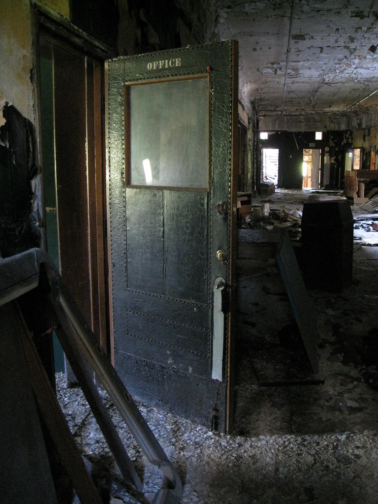
Now then, about that photo up there: No, Phil didn’t torch the Uni Watch offices on his way out. If you follow me on Facebook, you may be aware that two friends and I spent the past 10 days or so road-tripping through the Rust Belt and staying several days in Detroit, where we devoted a fair amount of our time to exploring abandoned buildings and industrial facilities. I took that photo on Saturday in an abandoned school that had later been turned into a bar and then suffered a bad fire.
It was a great trip. Here are some highlights:
• US-6 in Pennsylvania: It’s possible to get from NYC to Detroit in one long-haul day if you take the Interstates, but that’s not a road trip — that’s just driving. We stuck to two-lane blacktops as much as possible, and US-6 through northern Pennsylvania, a route I’d never taken before, was a major revelation. Spectacular countryside, lots of nice little towns, and a very 1950s-ish vibe. We especially liked all the cool stuff in the town of Wellsboro; Kinzua Bridge State Park (where the titular bridge collapsed during a tornado a few years ago); the very hypnotic Kinzua Dam; the completely adorable Lindy Motel and Cabins just outside Coudersport, where we spent our first night on the road; and this amazing Victorian ghost house in Coudersport:
We were also happy to find several superior watering holes, including the Table Rock Hotel in Laceyville (that’s Jennifer, our barmaid); the Arlington Hotel in Kane (yes, they served us pie along with our beers, and check out those great little dancing-girl silhouettes in the back-bar lights); and the Towers Tavern in Albion (where the bartender was a dead ringer for Linda Manz, but I didn’t get a photo of her).
• Here’s Buck in Your Eye: Ah, Ohio — the state that puts the “heart” in “heartland,” or maybe just in “heartburn.” Most of our stops in the Buckeye State were food-related, including our visits to the White Turkey Drive-In in Conneaut (probably the only roadside eatery in America that specializes in turkey sandwiches); the New Sandusky Fish Co. in Sandusky (where we had a wonderful fried perch sandwich picnic and also got a kick out of the adjoining bait shop’s live crayfish); the amazing Twistee Treat ice cream stand in Clyde; Gyro George just outside of Cleveland (where we had a very solid breakfast, but I mainly liked it because they had history’s most pathos-laden grits sign in the window); Schmucker’s in Toledo (those three pies, in sequence, are blackberry, rhubarb, and apple-walnut-caramel); and Central Hot Dog, also in Toledo (so much better than the overrated Tony Packo’s, which has become an insipid TGIDouchebag sports bar nightmare).
On the non-food front, we stayed at the wonderful Old Orchard Motel in Fremont and also had a somewhat life-altering experience at a serious white-trash bar in Mitiwanga called the Patio Tavern, where we apparently made such an impression that two of the regulars “treated” us a little NSFW performance as we pulled out of the parking lot. Still haven’t fully recovered from that one.
• Don’t forget the Motor City: For all the crap you hear about Detroit, it has two of the most beautiful skyscrapers I’ve ever seen: the incredible Guardian Building, which is right downtown, and the only slightly less impressive Fisher Building. Both were absolutely magnificent (Guardian first, then Fisher):
The elegant skyscrapers made a nice counterpoint to all the decay and abandoned sites we explored. I wasn’t able to photograph the interiors as well as I would have liked, because the light was generally poor and I often had one of my hands occupied with a flashlight, but I got a fair number of decent shots at the amazing Fisher Body plant and also got a few decent images inside the Ft. Wayne Hotel. Unfortunately, I don’t have any good shots from Cass Tech, an abandoned high school that was absolutely magnificent — the chem lab was full of beakers and other glassware, the auditorium was nearly as grand as a Broadway theater, and I found some old report cards from the 1950s. All very poignant.
Unfortunately, we weren’t able to get inside the cathedral-like Michigan Central Station train depot (where I got all the way to the roof back in 1998!), because they were filming a movie in there. But it still made for some right purty exterior pictures:
I didn’t bother photographing most of our meals, but I made an exception for our incredible lunch spread at Lafayette Coney Island (that thing in the center is a “looseburger”), the great church fish fry that we stumbled upon right after our Fisher Body expedition, and the cool street BBQ scene outside the Eastern Market. I also really liked El Rincon, a Mexican seafood joint with great ceviche and the saddest flashing arrow sign ever:
And there was lots more: a late-night boat ride out on the Rouge River, where we saw all sorts of industrial activity taking place; finally getting to meet Julia Solis, an absolute god(dess) of industrial exploration; a visit to the always inspiring Heidelberg Project; dinner at a Russian monastery that serves Eastern European food to the public on Thursday nights; and an utterly surreal visit to the lair of one Jay Thunderbolt that easily qualifies as the most Lynch-ian experience of my life (if you have to ask, don’t ask).
I know, I know — “Less talk, more rock uniforms.” We’ll get back to regular uni-driven content tomorrow. And like I said up top, I’ll have Nike unveiling coverage on ESPN either later today or early tomorrow.
Finally, let’s hear it for Phil, who presided over a very, very good month of content. Some backup QBs play it safe and just avoid tossing interceptions; others take charge and move the ball down the field. I think it’s pretty obvious which category Phil falls into. Great job, buddy. Thanks for running the show, and congrats on all the great material. Now sit back take a nice long rest — you’ve earned it, and then some.
The undershirt I can’t get enough of: Remember how I got completely obsessed with those 1956 Portland Beavers striped undersleeves last fall? Dave Eskenazi, who brought those stripes to my attention in the first place, has now come up with the best view yet of those amazing sleeves. Even better, the photo caption explains that the stripes were controversial but ultimately allowed by the league president.
Some of you are probably wondering what happened to those plans we had to order some reproductions of that design. Bob Halfacre, who was going to be in charge of that, showed me some fabric samples a few months back, but I wasn’t very happy with them and asked if he could come up with something better, which he said he’d try to do. I hadn’t heard back from him in a while, so yesterday I sent him a note. Here’s his response:
The biggest issue is that the fabric of choice back then was cotton durene. I know of only one machine left in the U.S. that knits durene, and the tread is equally scarce. I did a project years ago with them and it was very expensive — as much as $25 just for the sleeve parts. I’m trying to find an import company that makes a similar product that’s more economical. The actual manufacturing of the garment is nothing — obtaining the raw goods is the challenge. I’ll keep looking.
So there we are. I’ll keep you posted, natch. Meanwhile, major thanks to Dave Eskenazi for continuing to send these great Beavers photos my way.
A couple of friendly reminders: My thanks to the many of you who’ve ordered “Meats” T-shirts over the past few weeks. They’ve available in gray and white, sizes M thru XXL. Price: a mere $13 + $3 shipping for the first shirt and $1.50 shipping for each additional shirt. To order, send the appropriate amount via Amazon Payments to plukas64 at gmail dot com (after paying, send me a separate e-mail with your size, color, and shipping info), or send a check to Paul Lukas, 671 DeGraw St., Brooklyn, NY 11217. Rush shipping available if you want the shirts delivered in time for your Labor Day barbecue. Special rates available for for vegans and Wayne Hagin.
Also, don’t forget that the Uni Watch Membership Program is still going strong. If you’ve been meaning to join, there’s no time like the present.
Uni Watch News Ticker: Q: What do you get when you combine BFBS and the Seahawks? A: Rafael Nadal last night. … New court design for the Jazz (with thanks to Jefferson Boswell). ”¦ Here’s a video clip about UCLA’s new road uni (with thanks to Erkki Corpuz). ”¦ Remember my articles earlier this summer about Hinchliffe Stadium, the old Negro Leagues ballpark in Paterson, N.J.? Some cool events will be taking place there this weekend. ”¦ Seriously disturbing apostrophe catastrophe on the cover of Temple’s football media guide. ”¦ Here’s yet another example of the Reds experimenting with “air-conditioned” caps in the 1950s. According to the caption, “The air-conditioning of the cap consists of a water-coooled band made of aluminum foil and sponges with a perforated vinyl cover, all inserted inside the plastic cap.” Yikes (with thanks to Todd Radom). ”¦ Craig Deno reports that St. Xavier High in Cincy has “AMDG” on their nose bumpers. “That stands for Ad Majorem Dei Glorium (For the Greater Glory of God), which is the motto of the Jesuit Order,” he explains. ”¦ Yesterday’s Wall Street Journal, of all places, had a hilarious article about college football players posing for beefcake pics. ”¦ Stephen Wong sent along this list of the world’s best-selling soccer jerseys, plus he also reports that Adidas has re-upped its MLS sponsorship. ”¦ Here’s a little item about why Brandon Marshall wears that tape on his arms (with thanks to Kurtiss Dilley). ”¦ Vols coach Derek Dooley’s sun hat is apparently making quite a fashion statement down in Tennessee. ”¦ With Alabama taking part in today’s Nike unveiling, someone at the school’s web site put together a sensational Crimson Tide uni timeline (big thanks to Paul Crook). ”¦ Our own Terry Proctor has written a history of the Rochester Amerks’ uniforms. ”¦ Robbie Cano: Still wearing the pink MLB logo (as noted by Mike Mattison). ”¦ What do you do with a ceramic meerkat? You give it a Nebraska football paint job, natch. “Please note the squared collar, the new Adidas logo positioning, the Husker tradition emblem, and the new TV number positioning,” says Jon Gates, the proud artist.
Welcome back.
indeed…welcome back, buddy
long isle phillip~
let me just say once again that you did a fabulous job. we are a cantankerous bunch, don’t take out crap to seriously. or better yet, don’t take out crap.
paul~
perhaps the flashers were warning you to get the hell out of ohio before nike unveiled their football is real war craptacular nonsense. perhaps the sagging breasts were a metaphor for, um, for, hm, oh! they were a metaphor for your, or our, lost innocence. yeah, that’s the ticket. they represent our seemingly antiquated notion that football is a sport, and not war. the very idea of making sport war is an affront to decency, but i better stop here before i go off. at one time those ohio hags were wide eyed sprites, and now, after years of nike, blamo, not. they were a real life manifestation of what you, or i have lost in sport.
Good to have you back, Paul. Thanks for the great slideshows!
Welcome back! and Thanks to Phil.
Ditto.
Paul, here’s a website of the “ruins” of Detroit, that you might want to check out.
I think you will really like it.
link
Also, did you hit Louie’s Bar in Sandusky?? It near Cedar Point, kind of hidden behind all the glitz and glamour of Cedar Point. The workers from CP go to hang out there after the bar.
Still shuddering from the White Trash pics!
I meant to say the workers from CP go to hang out there after work.
Louie’s is hard to find if you don’t know where it is. And on summer nights its absolutely packed because its near the workers housing. In winter its almost abandoned, except for the year round workers that live in housing.
All I remember is that you have to walk across the highway, and through a field to get to Louie’s.
That really hasn’t changed, except there’s a walk bridge over the road now
This post may not be “uni-driven”, but it does display a few things:
1.) Shows the detail, ornament, and quirkiness in the world around us. I think most outside the friendly confines of UniWatch would have missed many of the details that make these places unique.
2.) Shows us what the world was like before “franchise architecture” (i.e. McDonalds, Walgreens, et cetera). As a city planner, nothing makes me more excited than to see the 4th nearly identical Walgreens come into town. (#sarcasm)
3.) Like the classic unis and throwbacks, your readers get to see “authentic” Americana through your trip before it’s replaced by the fauxstalgia that you’ll find in your average Friday’s or Crapplebees.
Welcome back. The helm was well-manned in your absence, but your presence will always be missed.
Beautifully put, Eric. I couldn’t agree more.
Welcome back, Paul. All this industrial goodness on the morning I have to return to work, and become a slave to the clock, after summer break. Ah, well…later.
Welcome back Mr. Lukas. Enjoyed the Detroit skyscraper slides, and I have to put that Pennsylvania dam on a travel itinerary.
No scratch off Phil, he did a terrific job while you were away; look forward to his posts this weekend. Too bad it’ll include an item ’bout UCLA giving up the baby blue road unis.
No scratch off Phil, he did a terrific job while you were away; look forward to his posts this weekend.
thanks flip (and everyone for all your kind words)
im actually taking ‘vacation’ this weekend (i’ll be back 9/11-12)…although it looks like earl may come knockin’…
Ahh yeah the White Turkey! Glad to see you stopped by there, that place is great. And Albion, dang, you guys almost drove right past my town! Good stuff. :-)
You drove through my town (right by my house even) and didn’t stop and say hi? That upsets me Paul :( j/k.
I walked across the Kinzua Bridge many times in my life. And when I heard it fell, it was heartbreaking. And when I went there to see it, I couldn’t help but get choked up. It’s just yet another reminder that we need to appreciate the present as much as we can, because the older we get…I think you know the rest.
Excellent roady. Good for you. Well, I aborted soon as I got a gander – but not before I noticed the guy* in the pic better do some spread arm pushups, smokes don’t help the allure either… ;-)
* had to fight back somehow
Not a fan…
link
link
link
link
Paul – you did not mention going over to see the sacred ground at Michigan & Trumbull. Considering you were right by the station I am sure you went.
Not sure if you were aware but there is a grassroots organization that is trying to clean and maintain the field – The Spirit of Tiger Stadium. They have a Facebook group if anyone is interested link
Great post, Paul. Wondering if you ‘planned’ the stops on your trip, or just winged it for the most part?
Particularly, was it serendipity with those motel stays, or did you plan them out ahead of time?
Yeah, that’s what I was wondering too.
The whole trip was a mix of planned and spontaneous. Lindy Motel and Cabins was a lucky discovery; the Old Orchard Motel was on our list beforehand. Much of the food was pre-researched to some degree; almost all of the bars were “Hey, that looks cool, let’s stop there.”
I’ve spent plenty of time in abandon buildings/schools around St.Louis. Nothing like breathing that moldy musty air. But man, those things just get me depressed when I see some of the junk that is being built now vs. the detail and charm of those pre-war buildings.
Back to the rifelry, sorry, this just looks awful. The tightness of the shirt makes those numbers look rediculous, and where did the color go? Mizzou has gold as a team color…..I thought. Quit it. Just quit it, nike. link
I think it is really nice of Nike to give some people a chance to design football costumes who have never seen a football game.
Nice unis if you’ve filming “HIGH SCHOOL MUSICAL Part 4” (or whatever the hell sequel they’re up to now)…or an Elton John music video.
—Ricko
You ever make it to the Chesterfield Manor before it burned last month?
As a sign painter/maker myself, I appreciate your focus on signage when you travel.
Are we going to get the details of that Patio Tavern tit-a-tit?
-Jet
No real details to share. We stayed for a few drinks, chatted a little, and were just getting into our car to leave when they said, “Hey, over here!” and “treated” us to the show. We laughed, hooted, snapped some pics, and drove off, shaken to the core.
Watching the Pro Combat Unveiling. The cameramen are obviously pretty bored. They’re filming every good looking female journalist in the room while Chris Fowler and the Nike reps blabber on.
No!!! Fadeaway stripes on Bama’s pants. American flag on sleeve as well.
Muted houndstooth pattern on helmet stripes and numbers, too.
Okay, stripes aren’t fadeaway but are truncated. The script A appears on the left hip. Program “values” are printed on four finges of the gloves. Houndstooth pattern from BCS National Championship Game remains on gloves.
i thought andy told us it’s not houndstooth but gingham plaid
here’s what he said yesterday:
“I hope when they say ‘houndstooth’ they really mean gingham plaid, because the Bear’s famous hat was (as far as I know) gingham plaid. In fact, I can’t find a picture of him in a houndstooth hat anywhere. They are all gingham plaids.”
just want to make sure
houndstooth pattern
gingham plaid pattern
bear’s hat
Correct me if I’m wrong, but gingham is a light cotton fabric, not a pattern. Could be striped, could be houndstooth, paisley, etc.
Yeah, that was supposed to be below Long Island Philip’s last post.
yeah…um
i donno…maybe andy can clarify that
It is, but whatever. The point is that link looks like houndstooth at first glance, but it’s plaid.
And that’s not the link that he wore. You can do an image search and Bear in a variety of different *plaid* hats will come up.
Heh. The iconic houndstooth hat ain’t even houndstooth.
Well he at least sometimes wore a [url=http://media.photobucket.com/image/bear%20bryant%20hat/LakeLady10351/ROLL%20TIDE/BearBryant-1.jpg]houndstooth[/url] hat
this is correct, but the check plaid pattern has become strongly associated with the gingham fabric over time. And yes, that thick hat in your first link, JTH, made me do a double take, but it is indeed a check plaid (the ‘gingham’ pattern I was referring to). How hard is it to get that right? It’s pretty clear that the Bear did not wear a houndstooth hat. And it only took a ten-second Google image search to confirm it.
Adam. That’s not houndstooth. That’s the same check/plaid pattern we’re taking about. Truth be told, that specific hat is the only one I’ve seen (same one that JTH posted earlier) that even looks remotely enough like houndstooth that it could be mistaken for houndstooth. All the other are clearly the ‘picnic tablecloth’ gingham/check/plaid.
All right, I guess that one could be considered houndstooth, because houndstooth really could be seen as just a coarse check plaid, depending on how you look at it. Determining whether or not it is in fact houndstooth depends on how it’s woven. But, lets just say the Bear’s hat was not houndstooth the majority of the time, just so Nike can be wrong.
Welcome back, Paul! UW was left in very capable hands. It wasn’t as wrist-slittingly bad that you were gone for the month.
Love the pictures of the rundown buildings. I suspect that you might already know about link and link
Can’t wait to see how bad the Nike uniforms are! Reading the descriptions yesterday only made me want to see how they actually look…
The gloves make the team logo when you put them together in a completely awkward way that you will never do for more than a half second during a game, and then only if a football is headed straight for your palms! Righteous.
Nice of Chris Fowler to abandon all pretense of journalism and host the event, though. Well done there.
Oregon State has stripes on their compression shirts- did they learn from Ricko?
Here’s a pic link
Why don’t they just keep the jersey sleeves super tight, but down to the elbow? Putting the armhole so close to the shoulder pads creates a grabbing point, no?
Gentlemen, on August 28 it was I who suggested putting the sleeve stripes onto the compression shirt, thank you.
I know someone here brought up the idea of wearing compression shirts with stripes for under football jerseys to make up for the lack of sleeves. It looks like Oregon State stole that idea for their Pro Combat Unis.
link (and maybe some others) did that last year.
And saying that Oregon State stole the idea is giving them way too much credit.
Interesting that while the overall concept is certainly there, that uniform top actually has sleeves!
JTH – I think we all know that these concepts were done way before Ricko had that great idea. simply coincidince and shows what a great idea Ricko had.
As far as a the uniform for the Beavs….. Friekin Awesome! As a true and proud Beaver Believer, I say this is a total win. Hard to believe that it came from the swoosh. They did such a nice job with combining the new technology with the classic look of yesteryear. Wish they would switch to this full time.
As an aside- This weekend marks the final games the Portland Beavers will play in Portland. Thanks to the idiot Portland citizens, they were not able to acquire aa new location for a stadium and historic Civic (PGE) Stadium will no longer be suitable for baseball…. thanks to the MLS. Why is it that it takes something being gone before some people will pull their head out and realize what a gift they had? Farewell Civic! Farewell Beavers! Thanks for all the memories.
Right. My point was:
A) this isn’t a new feature for the 2010 pro combat unis.
B) saying that *Oregon State* ripped off the idea is way off the mark since all of these designs are so clearly Nike-driven.
And really, did Nike have this in the works before Ricko proposed it? Is it simple coincidence? Probably, but maybe not.
And I’ll never lay claim to the idea, either. A particular adaptation, maybe, but not the notion.
I was simply remembering the spider webs, etc., on US skiers a while back and figured if the technology existed to create spider webs they certainly could put traditional striping on the biceps of compression shirt sleeves.
—Ricko
Welcome back Paul!
I love the Wellsboro/Coudersport area. Have family from there and do some business in the area several times a year. Wellsboro is famous for its “Grand Canyon of the east.” Also, in Coudersport, they have the huge, newly built former-Adelphia cable headquarters that former Sabres owner John Rigas built. A temple to himself before the downfall…..
Glad you are back! Thanks Phil for all your hard work!
Dave
The locals call it “Coudy”. I know the high school has COUDY across the front of their basketball jerseys (or so they did last season).
After all, it is “God’s Country!!”
Paul,
Glad you’re back.
But man, thanks for the plug for the US 6 journey thru the Keystone State. US 6 is one of the best pure road trips one can take in PA. Wellsboro is truly a gem. We got married there we enjoyed it so much. Might even retire in Wellsboro. Gotta love those gas street lights! Best time to do a route 6 road trip is definitely in early October. PA Grand Canyon is breathtaking in the fall.
Highly recommended!!!
I’ve been wanting to get my kicks on Route 6 for years. Along with the scenery, I want to go to as many of the old-fashioned diners as I can.
Like this one in Smethport, home of the Hubber Burger:
link
I’ve been on the far western part, at Pymatuning State Park, where you can feed the carp and ducks:
link
Timmy’s right. You have to do this drive again in the fall.
Welcome back.
Somewhere near Smethport is a bar where a woman crushes empty beer cans with HER ‘cans’.
Yeeesh.
Feeding the carp and ducks was something I had done long ago as a kid and later on too
Nice to see Paul made his way though my area.
My sister just had a wedding at Geneva on the Lake. We drove though Conneaut on the way home. NE Ohio and NW Pa are nice.
my early rankings of the new pro combat unis-
Oregon State – love the stripes
Ohio State – number font looks Kansasish
Miami – much better from the front than back
Alabama – not enough different
Florida – see Alabama
Boise State -meh
TCU – the frog skin pattern is unique- give em that
West Virginia – Bob Huggins hasn’t changed clothes since Duke game
Pitt – meh- wish they could have used mustard or script Pitt
Va Tech – if you didn’t know they were playing, you’d never guess it was them based on this uni
link
Ohio State Pro Combat
Uni numbers are clearly a throwback to the Les Horvath era, 1942.
Sometimes there’s a great price to pay for indepednence…
link
I’m just going to officially say that I really don’t like the US flag on the sleeves of any football jersey.
Sure, Army & Navy could do it, but it looks stupid as hell on anyone else.
If American Football becomes an Olympic sport, then they can stick a flag on the jersey during those games. Otherwise… ugh.
bless you the jeff.
Whether anyone likes it or not, the link, the universally recognized guide to proper display of and respect for the flag, specifically forbids display of the flag anywhere on any athletic uniform. The relevant sections of the Flag Code are:
(d) The flag should never be used as wearing apparel.
(e) The flag should never be fastened, displayed, used, or stored in such a manner as to permit it to be easily torn, soiled, or damaged in any way.
(j) No part of the flag should ever be used as a costume or athletic uniform.
In case part J isn’t clear enough for athletic directors, league officials, and team execs, parts E and E also apply. Is there a good chance that any of your uniforms will be soiled, torn, or damaged during the game? That is to say, might any of your players get dirty or muddy or have a grass stain or rip their unis or have part of the uni stretched under their padding? If so, then you’re setting the flag up to be soiled, torn, or damaged, and that is the definition of flag desecration. Might as well go get a brand new flag and pee on it or burn it.
I don’t understand why this is so hard for sports teams, especially football and baseball teams, to understand. Dragging the flag in the dirt literally for sport is the opposite of respect for the flag.
You’ve decided that “Patch that looks like a Flag” = “Flag”.
And groups ranging from the Cub Scouts to your local police force to the United States Army would disagree with that interpretation.
(That said, I think wearing the flag on athletic uniforms is tacky. I also think singing the national anthem before every single game in every single sport is overkill, and diminishes the meaning of the song. But that’s just me.)
The Michigan Central Terminal is a lovely building; I believe that it was designed by Warren and Wetmore, the same people who designed Grand Central Terminal. There’s an unused tunnel behind it that comes in from Windsor; you used to be able to take the train directly to Canada. Now if you want to go to Toronto, you have to drive across the river to the station.
I have a friend who was involved in trying to save Cass Tech (he’s an alum). He was successful in that they were able to prevent the building from being demolished (so far), while the new suburban-style high school campus was being built across the street.
Oh, Detroit…
Alabama’s Pro Combat uniforms…
link
Wish ‘Bama would’ve used full pants stripes like Oregon State, but other than that, I like the design. Roll Tide!
Timely article in today’s NYT about Detroit:
link
Great photos, Paul… I refer to rural Pennsylvania as “The South of the North” and your chance encounter in Mitiwanga proves that. :D
Hey now, that was in Ohio…
…home of Akron, also known as the capital of West Virginia.
Mitiwanga is more of its own seperate country
nike pro combat website – fyi:
link
Not really uni related (unless you count some of the great shots of WWII armed forces uniforms) but a great set of photos from the US campaign in the Pacific.
link
– Love everything about that Oregon State look. Outstanding.
– The Boise State helmet reminds me of the old Michigan Panthers. It’s a keeper. The rest of the uniform: Yikes!
– As far as the others, meh works for me, too.
Boise State’s helmet would be better if they’d gone the full Michigan Panther style and made the helmet a contrasting color. It’s a giant blue logo on a blue shell. Kinda doesn’t work as well.
With the exception of West Virginia, I do think these are better than last year’s, not that that’s saying much.
till paul’s article is ready…
shots of the unveil
To sum up the Nike Pro Combat uniforms. THEY ALL SUCK! And they’re not very original. The helmet logo placement on Boise State harkens back to the Michigan Panthers of the late, great USFL. And what’s with the two different-colored sleeve trims on Boise? What happened, Mr. Swooshy? Did you run short on one color of material?
I love Ricko’s assessment of the designs. Spot on!
Welcome back Paul. To those few who criticized the vacation crew I ask you, “Do YOU want the job next year? Could you have done a better job? What’s that, I can’t hear you?” End of subject.
yes on all fronts mr.proctor, you are wise beyond your years.
Looking forward to reading Paul’s writeup on this latest Pro Combat set(welcome back).
I may have my opinion as to what I like and don’t like(hate), however I will say I love the fact that I geek out over them. For this reason, they’re all awesome. Just love the notion of the Pro Combat uniform alternative. For a uniform geek like me, you couldn’t ask for anything better. I only wish the NFL would do something similar, however, only for a game or two.
i was really hoping they would go back to the PITT script but they went the complete opposite direction…
link
West Virginia in white and black = stupid.
You would think there would be more money to be made in merchandizing by creating attractive uniforms in the actual school colors. You know, things people might actually want to buy and wear to a game.
How many extra jerseys do they sell by creating shit designs in goofball color schemes??
Am I the only one that thought of Florida A&M when I saw the Miami Pro-Combat unis?
no you are not.
Have they announced which dates each uniform will be worn? I think I read that Bama’s will be worn the weekend after Veteran’s Day…so I’m assuming November 13 against UTEP.
Nevermind, I just found it on this PDF: link
Here’s the text:
The participating schools all rank in the preseason top 25. The teams plan to
wear the uniquely designed uniforms for the games listed below and any other
games they may determine at a later date: the University of Alabama (Nov. 13),
Boise State University (Sept. 6), University of Florida (Oct. 30), University of
Miami (Nov. 20), The Ohio State University (Nov. 27), Oregon State University
(Dec. 4), University of Pittsburgh (Nov. 26), TCU (Sept. 4), Virginia Tech (Sept.
6) and West Virginia University (Nov. 26).
So here are the games for the unis:
Alabama (Nov 13) vs UTEP
Boise St. (Sept 6) vs Virginia Tech
Florida (Oct 30) vs Georgia
Miami (Nov 20) vs Virginia Tech
Ohio St. (Nov 27) vs Michigan
Oregon St. (Dec 4) vs Oregon
Pittsburgh (Nov 26) vs West Virginia
TCU (Sept 4) vs Oregon St.
Virginia Tech (Sept 6) vs Boise St.
West Virginia (Nov 26) @ Pittsburgh
Paul, you should have called when you went to the White Turkey – about 20 minutes from my house. Would have taken you on a tour of all the Covered Bridges in Ashtabula County (and well, frankly plenty of abandoned factories too).
OSU Pro Combat uniforms honor 1942 National Championship team. Camo print pattern on the compression sleeves a nod to Buckeyes that would be soon link
Whether you like the uni or not, this is one of the better reasons (I suppose) to create one like this.
it does not HONOUR anything, that is all a bunch of crap, wake the f**k up. there are tasteful ways to honour the soldiers that fought in WWII, and it ain’t compression sleeves. i think i am going to be sick.
Seriously lame rationale on Nike’s part.
Because—and I’m pretty sure about this—guys from the other 47 states were going off to WWII in 1942, too. Even if they weren’t on a national championship football team.
And in 1943.
And in 1944.
And in 1945.
It was pretty much a national thing, as I understand it.
—Ricko
Indeed it was. I was going to argue this point, but I see it is useless.
seriously, it assumes we are all a bunch of idiots. rick, i honestly am sick to my stomache over this. hm, if we say it is about the troops, then everybody has to be on board, right? it is a dang football team, not a military unit, do not DIShonour servicemen(and women) by making it seem so. i don’t think i have ever said this, because i know that things are what they are, but nike is evil man.
Did you even read the story at the link?
cancel that e on stomach. i need this finger to stop having torn this and that.
Well, I read the story at the link, and it’s still nonsense.
I was just going to say that perhaps the rationale has nothing to do with Nike.
Interesting story on Nike’s new CEO link
This had me cracking up:
“Now then, about that photo up there: No, Phil didn’t torch the Uni Watch offices on his way out.”
Haha! Phil finally snaps…
Also, West Virginia’s Pro Combat uni looks like the Ducks.
The Pro Combat Superhero Costumes are about what I expected. They range from mildly silly to tragically awful, with the exception of OSU – which is actually an upgrade over what they currently wear.
Yup.
And it’s getting pretty pathetic to watch how everyone—ESPN especially—just keeps guzzling the Nike Kool-Aid.
—Ricko
link what is your addy? because i am going to hop in the automobile, find you, and drop you.
Calm down killer, he probably meant the OSU on the west coast.
The Jeff is the voice of reason here.
Am I in the bearded Spock universe?
Yeah, sorry Marshall. I definitely did NOT mean your OSU, but rather the Beavers. Should have specified…
Bottom line is that pro combat uni’s are video game clown suits.
And for the record, the Buckeyes version is just a shameless excuse to dress up and play army man.
yeah marshall
when referencing the school who plays in the shoe…
we’ll all reference them as THE osu to avoid confusion
There are other state schools in Ohio, so I call them An Ohio State University.
sorry pflava, i won’t relive my grizzly bear attack with you. and YES, it is a reason to dress up and play army man, it is embarrassing.
um, AN? says anyone who didn’t go to THE.
thanks jeff, i was putting petrol in the jalopy until i saw the morris code come in on my dash board ticker. dude, you saved plava’s life! all hail bearded spok.
Not to poke a wounded grizzly, but here you go, Robert:
link
About the only positive to this is they broke up that rivalry that wasn’t a rivalry, the end-of-season yawner between PSU and MSU. Not that anyone else besides OSU makes a decent rival, and they’re taken.
Am I the only one who…after, wow, 20 years?…still sees Penn State as the square peg in a conference full of round holes? JTH is right – we’re in the bearded Spock universe. Mr. Sulu, whip us around the sun and take us back to the time when Pitt and WVU didn’t wear crappy one-time cartoon unis…and they both played Penn State every year.
i saw that whole proposal a while back jim, so sad. i think the subject that has me all in a tizzy today, and the war uni’s just piled on. and don’t be offended by the double directional mothervilkers of the poor line, if anything it is a compliment to your undying loyalty to those slippery vilker state ewes. you know i love you jim, that is why i tease you so. by the way, i put the last coat of SHELLAC on your wiffle~vilker, as soon as i take a pixture, it is in the mail.
while i am at it, screw Tosu, i know that craptacular worthles institution is what it is, don’t think i am one of those people who thinks the sun rises and sets in THE’s arse, it doesn’t. if we were all that and a bag of chips we would have more then one rival. look at the scUM or notre lame, they both have multiple schools that hate them(i know EVEYBODY hates the now, but you know). THE is the spartans sans the loosing.
hey denvergreg, one of kate’s first recruiting trips for KCAI is to denver, any must see stuff you can recomend?
ricko’s prayers have been answered!
photographic proof of the blue bronco
*ducks*
There’s blue ducks, too?
—Ricko
link
Indeed.
Actually, that’s a good looking helmet…except the logo might be about 15% too large.
Nike, of course, is not known for knowing what’s a little too much.
—Ricko
I kind of prefer that Boise helmet to their current style, wish the Broncos would enlarge “Boise State” on the front of whatever jersey they utilize. There has been a disappointing trend in recent years of schools reducing the size of their names on the front of the jersey. Obviously, this doesn’t apply to everyone, I’m referring to schools like Michigan State and Texas Tech, who had their school names in bigger size until recently. Texas is one example of a D1 school with the proper size lettering.
Wasn’t advocating a change in helmets. Just that that ain’t a bad lookin’ helmet.
—Ricko
England’s new home kit is a big step back for me:
link
It seems like they’re shooting away from the traditional look they just had, for a clash of tradition and artsy fartsy blues and hues, a la the random colored St. George’s crosses:
link
In fact, I think it’ll be like having St. George crosses as dandruff, or wearing a shirt that has had part of a tea towel sewn to it. It’s all gone downhill from the World Cup for the team and kit. In fact, it’s not all that far off from an Umbro ‘tonal range’ blue that was done during the Cup. There’s just something about the blue that kills it to begin with for me, even blue numbers:
link
Just organizationally that collar even makes the number, Umbro logo, and crest seem out of balance.
Needless to say, with the cash grabs that are in the sport with year by year, competition by competition new kit launches, I say MEH.
I’m torn on it. I still love the look. The simplicity, the subtlety, and the quirkiness of it. But, as you said, the World Cup kit was so good, that this is at best a sideways change. They should have done this one first, then ‘perfected it’ by releasing the version they wore in the World Cup. Blue on England is a little strange, but on aesthetics alone, I really like this new kit.
w.wbir.com/news/local/story.aspx?storyid=132311&catid=8
Great hat if your name is “Indiana Feldman, Retired CPA, now living in Port St. Lucie…and get off my lawn!”.
ref: Vince Dooley’s hat in Ticker.
“Beaver Nation?” Really?
I think I’ll refrain from seeing if they wrapped up “beavernation.com” while I’m at work…
And in the same state as “Duck U”, yet.
Paul–I saw this over the summer at the Akron Art Museum–it ties right into your field trip through Detroit. Some pretty spectacular shots on display.
link
We wanted to stop there, but the museum is closed on Mondays and Tuesdays, which is when we were passing thru that region. Very frustrating, because we really wanted to check it out.
as long as you had a galley boy at swensen’s and made a trip to the civic theatre, your bases are covered.
Nike didn’t kill anybody. Nike didn’t cheat on a loved one. Nike didn’t run down little Timmy’s dog in the middle of the street. Nike took input from athletic departments, combined them with designs from their own stable of graphic designers, and made one-off uniforms. It’s fun, there’s a reason they aren’t advocating for these schools to change to these uniforms all the time. Of course these uniforms don’t look that good when compared to their historic counteparts. They weren’t created to be considered in the aesthetic timeline of each school, so I don’t think comparing them to traditinal uniforms is fair. And maybe most importantly, the players like them and the recruits like them and their football programs are going to wear them. Isn’t that what’s most important?
Yes, because whatever else, we simply must pander to 17-year-old recruits.
Ned are you new here?
After all this is a site where a lot of times new=bad, old=good.
With the new uniforms, its not that they’re just ugly, its the lame ass reasoning that Nike comes up with for what they’re trying to do. If they just said: “Hey we’re gonna make a select number of schools special jerseys to wear during their rivalry game” not many people would have a problem with it. Its the fact that they have to have a pageant unveiling and kiss their own ass that bugs me. And yes if any other manufacturer did it I’d feel the same way.
well put dan. if i may scud missile for a moment…
“Nike didn’t cheat on a loved one” -yes it did, my “girlsfriends” don’t have red “hair”
“nike took input from athletic departments” -or coerced them
“It’s fun” -when you play double directional mothervilkers of the poor maybe to give me a reason to watch a 85-2 game. not the michigan game. and it isn’t fun to pretend football is war, or pretend we honour troops when all we are doing is trying to sell nike. you can create any back story you want, a spade is still a spade.
“Of course these uniforms don’t look that good when compared to their historic counteparts” -and that’s okay?
“They weren’t created to be considered in the aesthetic timeline of each school” – that would be what we call a problem here at uniwatch.
“I don’t think comparing them to traditinal uniforms is fair” -fair? what are you 3? i’ll send you a participant cookie. it might take me a minute to continue, i can’t stop laughing. fair, haaaaaaaaaaaaaaaa. i will be as fair to nike as they are to their labour.
“the players like them and the recruits like them” -i’ll be talking to you after the joy of wearing them translates into a giant flop against the scUM at the shoe…which i now hope happens.
“and their football programs are going to wear them. Isn’t that what’s most important?” – oh snap! you mean they are going to wear them? then i better put on my happy face and take that sausage.
“And maybe most importantly, the players like them and the recruits like them and their football programs are going to wear them. Isn’t that what’s most important?”
No, it isn’t.
“Nike didn’t run down little Timmy’s dog in the middle of the street.”
just got an email from mr. brulia…some mothervilker just pulled a hit & run on his basset
Grrrrrrrrrr. Now I’m stuck with three cats. Purrrrrrrrrrr.
JTH | September 1, 2010 at 1:58 pm |
The Jeff is the voice of reason here.
Am I in the bearded Spock universe?
Next time Phil has a weekend column, this needs to be the quote at the end.
Paul,
I see that Weston is on the stirrup bandwagon…
link
i wonder how that happened?
welcome back.
the store was in great hands while you were out.
I’m originally from that area of Northwest PA, a bit south of Route 6 on 219.
While, I too have been a uni watcher for most of my life. My first real interest in that way has always been roads and highways (especially signs). Like we can talk NOBs and BFBS, I’m also fully fluent in Super-2’s, Button Copy, and Multiplexes. Here’s a link or three that may be of some interest to you.
link
link
link
Michael,
Whereabouts on 219? Johnsonburg, Wilcox, Ridgway? 219’s a very nice ride, too, from DuBois up to Bradford.
I’m a road sign geek myself. Have been since I was 3. There’s still a yellow stop sign in use in Tionesta.
DuBois… and it is a great ride, especially when we get all the autumn leaves coming in. 219’s a nice ride up that way. Also heading west on 322 at that point south of their is incredible. You go through towns with all sorts of historic buildings like in Brookville and or the college town of Clarion.
It’s days like this that I’m glad Wisconsin signed with Adidas.
Couldn’t agree more. If they wore something like these I’d have to watch the game with my eyes closed.
A blogger for yahoo has a nice little piece about the new unis:
link
comrade marshall will enjoy this — from that yahoo article:
link. okay, does the fact that his shirt is scarlet and gray make it even better?
Can’t believe you were in Cleveland and didn’t go to Melt!! Check it out and stop there the next time you are out this way!!
link
He would have to have added an extra day to his trip, because that’s how long you have to wait until being seated.
Melt: featured on the episode of “Man v Food” (the one where Adam wears the “I still call it the Jake” shirt).
oops. Left out a detail: the episode that’s on RIGHT NOW.
I’m shocked, shocked that there’s gambling….er, ah, I mean, I’m shocked that people hate these uniforms!!
Paul, welcome back, been following your flickr photos, sounds like you had a great road trip. My brother and I need to take you on a central/western PA tour sometime, we’d have a blast.
My piece on today’s unveiling is up:
link
I’ll say this man, although I don’t agree with everything you wrote, props to you on your first day back getting that out so soon! Great job with the photo slide shows embedded.
Hey, I hit the ground running, baby!
Glad you like the embedded slideshows — I really like them too. Gonna be using more of those.
holy FCK
you were too kind in your rankings, paul
seriously, WTF? did they just invent a brand new font for PITT or did that exist somewhere before now?
and the neon orange for miama? makes those ballmer aOs throwbacks look downright plain
sadly, the best looking one of the bunch is tOSU…but how they came up with it is the lamest of reasons…
jesus…i kinda liked some of last years entries…these are just…awful
I’ve never seen that font used by Pitt until today, so yeah, it’s a custom job for this one-off uniform.
Ohio State’s unis are a Georgia – Kansas lovechild
Definitely last years lot was better.
Now, “Putting the sleeve stripes on the undersleeves, instead of on the actual jersey, is probably the future of football striping. …”
Didn’t our very own Ricko come up with this idea, followed by a nice writeup on the concept?
well…yeah
Well, he did the visual mockups, but I believe that the idea has been thrown around by many people before. No offense to Ricko, but it’s not that revolutionary an idea to attribute it to one person, sort of like Tenacious D’s ‘One Note Song.’
“…No offense to Ricko, but it’s not that revolutionary an idea to attribute it to one person,….”
Well, yea I guess I should’ve phrased the question a little better on that one. ;o) Thanks for posting the link Phil.
I repeat. Never said it was a revolutionary idea. Been thinking about it for years (as sleeves have been getting shorter), figuring if they could put spider webs all over Olympic skiers more than a decade ago they could put stripes around the sleeves of a compression shirt.
Just finally did some mockups to see how it would look.
—Ricko
this is from the Virginia Tech athletics web site
“This will not be the only time a Tech team wears a special uniform. Two other of Tech’s teams — the men’s basketball team and the baseball team – will wear a special uniform at some point during the course of their respective seasons as well.”
As a Buckeye uniform historian, I am more pleased with the Buckeyes combat uniforms than I thought I would be. This years are fairly close to the actual 1942 National Champions.
Last years were no where near close to the actual 1954 Champions uniforms. So this is as close to a throwback as Ohio State has done. They did honor the 1968 national Champions in 1993 by wearing black numbers all year.
I like these way better than last years
I agree Larry. I dig’em.
I agree with a lot of things Paul said, some of the sets I liked some I didn’t. Some of the concepts were obvious and some seemed like they tried to hard to make it work. With that said the American flags on the Alabama and Ohio State jersey seem so out of place to me, especially on Alabama. I get the connection with the Ohio State concept but the choice of flag with the thick yellow border seems clunky and against the streamlined, superheroesque over concept of the Pro Combat series.
The Ricko style sleeve stripes on the Oregon State jersey are amazing I hope this is the start of a trend.
Maybe I missed this in the article or discussion here, but will the “Nike Pro Combat” definitely be on the compression sleeve of the undershirt as they are in the mockups? Was that just an element for the press conference, or will that be seen on field?
rpm | September 1, 2010 at 3:47 pm |
“i saw that whole proposal a while back jim, so sad. i think the subject that has me all in a tizzy today, and the war uni’s just piled on. and don’t be offended by the double directional mothervilkers of the poor line, if anything it is a compliment to your undying loyalty to those slippery vilker state ewes. you know i love you jim, that is why i tease you so.”
No problems. Took me a while to figure out what you were talking about, though. Blast this newfangled comment format…
and i am unintelligible half the time, let’s not forget that.
larry & mike~
if you guys want to like them that is fine by me, but i will never be convinced. that horrible belt alone on that nike set should be enough for us all to gag.
Paul said:
“If you think football is kind of like a video game played by superheroes, these designs are for you”
Thing is, we’re living in the “Smallville” years, where that analogy isn’t as accurate:
link
Not exactly the superhero look we grew up with, eh?
If the show’s version of Clark ever puts on the old suit, kids today will probably say, “Oh, he’s trying to look like a football player, now.”
Anyway, loved the Oregon State look. ‘Bama and that school from Columbus have palatable unis. The rest can just go away.
Oregon State’s looked great. I’d downgrade the current champs and that northeastern team with the flag to “tolerable”. The others are bad jokes at best, although thug u’s is fitting in that many inmates do wear orange jumpsuits.
Paul really hit the ground running. As usual, I loved his customary stinging one-liners.
Count me as one who’s not totally on the bandwagon with the slideshow format though….I’m probably the minority here.
In the minority? Probably. But you’re not alone.
My home internet connection is out, so I’m at the local “gourmet” grocery store sipping on a cup of coffee that I paid over $7 for (after being guilted into donating to the “salad bars for public schools” ponzi scheme) while logged into what I think might be a 9600 baud connection.
Needless to say, those slideshows ain’t loading up too smoothly (or *at all* in most cases) for me.
consider it a blessing. The uniforms are heinous and by the time you read one caption you have to tell it to re-load every slideshow
pro combat – fail
slideshow format – fail
I suppose I qualify as a grumpy middle-aged alumni after reading that piece. I love the line where he says they are all stupid. Priceless.
Wow, the Guardian building is truly incredible. Simply fantastic Native American/Art Deco fusion. I had no idea such a fantastic building existed in Detroit.
just wanted to point out that in the ticker item about the beefcake photos: the one in the article with the purdue linemen from 2000? the guy second from the right in the picture is one of my football coaches at garfield heights high school in ohio. we have that picture in our lockeroom with him circled! haha it cracks us up
Ya know, I remember my first pair of Nike’s. Nike All-Courts. White canvas, powder blue swoosh. I was the first person in my HS to wear them. People would go, ‘what are those? Nikes? (Like Mikes.)
And now look where we are.
PS- I recall Vitas Gerulaitis wearing Nike promo socks around 78 or so- I wrote Nike and asked them where to get them. “We have no plans to market sportswear at this time.”
They did, however, send me three pair of tube socks with just a blue stripe, a green stripe, and an all-white pair- sold in a Nike bag.
And now look where we are.
i was an early sipper of the kool ade…had the same pair (canvas) also the leather version — the leather ones that mac wore…wore the leather on hardcourts and the canvas on har-tru…and kept right on buying nike kicks up until a few years ago…
now i buy shoes that actually fit my foot, provide good arch support and come in wide widths…none of the qualities (then or now) of nikes…and yes, i too pronounced them as a single syllable…rhymes with mike
as brinke said…now look where we are
i’ll give swooshie this — they hooked a young and impressionable 12-13 year old and held his loyalty, despite the shoes basically sucking…for almost 20 years
Well said, =bg=. I remember first seeing a pair of Nikes on a guy a few years older than me–a guy I looked up to–and thought they were pretty cool. Now, all these years later, with their labor practices, over-aggressive marketing and design, etc., I refuse to wear or even touch anything with the swoosh.
Gee Paul, thanks for the heads-up. Come to Detroit and don’t bother telling any of us uni-watchers here! Seriously, thanks for the press. There are few good things left in the D and you highlighted pretty much most of them. I also enjoyed the highlights of your trip westward. All the fantastic roadsigns, hotels, bars and other timewarp ephemera are a great reminder of what this country once was before the homogenization of it all. It’s my dream to one day drive the Lincoln Highway from coast-to-coast and sleep only in non-chain motels (or even motor courts) and eat only in local joints.
Read somewhere the current population of Detroit has fallen to 1910 levels. Tough times in Michigan, I think the state is number one nationally for unemployment.
Welcome back Paul. Phil housesat well, but this will always be your castle.
Adam Richman is wearing an “I Still Call It The Jake” shirt on Man vs. Food in Cleveland on tonight’s episode.
The Guardian building is truly incredible. Simply fantastic Native American/Art Deco fusion. I had no idea such a fantastic building existed in Detroit.
The El Rincon Taraxco arrow breathes its last desperate breaths…Sublime.
The well preserved Patio Tavern sign is extracted from my ’60’s childhood…the female regulars, fortunately, are not.
I don’t know what goes on in the mind of one Jay Thunderbolt and I’m not sure I want to find out, yet I cannot look away….
All glorious images, yes, but the road trip begins and ends right here…..
link
buh bye mr. brooklyn decker