I was looking at the MLB schedule yesterday morning and saw that the Rays were slated for a noon game at the Trop. “A weekday afternoon game in a dome is so weird,” I thought. “It’s like having a date with a really pretty girl and then taking her out to your dentist’s office.”
Ah, but what if the pretty girl was wearing hose like these? It might just render the rest of the equation moot.
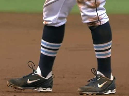
That was certainly the case yesterday in Tampa, where several of the Rays wore striped stirrups that even the dreary Trop couldn’t diminish. Rays broadcaster Todd Kalas provided the backstory early in the game:
The Rays have lost nine of their last 12 and are looking to turn things around, so Joe Maddon is sporting a new look today, along with a few of the players. [Equipment manager] Chris Westmoreland and some of the guys were watching the Cardinals play the other day, and they said, “Hey, that’s kind of a cool look with the old-style stirrups.” So Evan Longoria, B.J. Upton, Sean Rodriguez, amongst the guys who are in the lineup today going with the old-style stirrups. Chris Westmoreland ordered them specially, and they came in today after he designed them.
At the risk of belaboring the obvious: The striped legwear looked awesome and a half. It quickly became apparent that the stripes looked equally magnificent in every imaginable setting — at the plate, on the bases (irony alert: That’s George Hendrick coaching first base), in the dugout, in the bullpen, at a conference on the mound, you name it. And as Joe Maddon showed in the 7th inning, if you’re gonna get the thumb for arguing a balk call, you may as well look smokin’ hot while doing it. (Additional photos, plus a breakdown of how the stirrups-clad players performed relative to their pajama-pantsed teammates, can be found here.)
But there’s something really sad — even disturbing — about all this. Let me explain: The striped hose, as snappy as they are, are not part of the Rays’ uniform package. Yet it’s apparently fine for a bunch of players to wear them. Nobody will be fined, Bob Watson will not be calling. It’s like when A’s equipment manager Steve Vucinich got those logo-emblazoned stirrups for Rajai Davis — those aren’t part of Oakland’s official wardrobe either, yet nobody uttered a peep. So this is what it’s come to: Hosiery is no longer considered a uniform component. Instead it’s treated more like an accessory or a piece of equipment, not much different than a Phiten necklace or a shinguard. Just make sure it’s rendered in your team’s colors and you’re fine.
You could say this all started with Frank Robinson and other players adding extra fabric to their stirrup loops so they could pull them higher. But players have always modified their gear, so there was nothing really new about that. I place the larger blame on two factors. First, the introduction of ribbon stirrups and, especially, two-in-ones, which were never part of any team’s official uni specs and should never have been allowed on the field. And second, MLB’s abysmal failure to provide or enforce any standards regarding cuff height, which gave the implicit message that sock exposure — and hence socks themselves — didn’t matter. And it’s too late to establish such guidelines now, because it would constitute a change of the rules and would therefore have to be collectively bargained with the players’ union, which would never approve a high-cuff standard.
So that’s the irony of yesterday’s game in Tampa. While showing how beautiful baseball socks can be, it also showed how irrelevant they’ve become.

Uni Watch 2.0 Update: Yesterday’s implementation of the new site design was surprisingly painless. We still have a few small issues to iron out, mostly regarding the format of the comments, but for the most part everything’s working the way it’s supposed to (or to put it another way, I am very, very grateful to John Ekdahl). Hope you like, and definitely let me know if you spot anything that needs attention. Thanks.
Uni Watch News Ticker: Mmmm, purty. That’s not actual fabric — it’s a digital patern that John Ekdahl created while working on the site upgrade. We haven’t found a good use for it yet on the site, but I’m using it as the desktop background on my monitor. ”¦ Major news brewing in Dallas, where the Cowboys are contemplating a revision to their greenish home pants. They ought to do it, natch, although having two different sets of silver pants has always been one of the few endearing quirks about an otherwise loathsome team. ”¦ Oooh, dig this absolutely awesome track and field-themed letterhead (thanks, Kirsten). ”¦ Want the NHL to go back to white at home? There’s a Facebook group just for you. ”¦ In the great tradition of lids for Yids, we now have a combination baseball cap and yarmulke (with thanks to Jeff Cohen). ”¦ Here’s a lesson for everyone: Before you suit up, be sure to check your uni number (great old find by Larry Bodnovich). ”¦ While making all those screen grabs from yesterday’s Rays game, I saw something I hadn’t noticed before: Even the umps are wearing those goddamn swooshified undershirts. ”¦ Wisconsin hockey goalie Scott Gudmandson is inviting fans to design his mask (with thanks to Jerry Harrison). ”¦ Had we seen the new U. of Washington football jerseys before? Well, we have now. God, I hate that template (with thanks to Tyler Keefe). ”¦ Here’s what the Warriors’ new court will look like. ”¦ Why does Brazil wear yellow soccer shirts? The answer is here (thanks, Brinke). ”¦ The Saskatchewan Roughriders are switching from black facemasks to white (with thanks to Kevin Clark). ”¦ In case you hadn’t heard, Paul Henderson’s 1972 Team Canada jersey ended up selling at auction for a record price. ”¦ Season-opening throwback game supposedly on tap for the Canucks and Kings. ”¦ Reprinted from yesterday’s comments: This old magazine cover shows Ralph Kiner’s wife wearing No. 4 earrings — his uni number. … At long last, a shot of Francisco Cervelli caught in the act of trading in his S100 for a regular helmet after reaching base (with thanks to Brooks Simpson). ”¦ Scroll down to the “Great in Grey” section of this page to learn how the Twins tried a bit of uni-based gamesmanship on Ubaldo Jimenez (with thanks to George Scordo). ”¦ The Germany/Ghana World Cup match found the Germans wearing their black away shirts with their black home shorts — a problem, since the trim didn’t match. I’m sure the soccer fans out there will tell us why they wore this unusual combo, yes? ”¦ Meanwhile, John Pantsil of Ghana has been playing with one sleeve and a misspelled NOB. Further info here (with thanks to Jeremy Richardson). ”¦ Also from Jeremy: “Standard Liege, a Belgian club, just released their 2010-11 kits. They couldn’t find a good deal with a kit maker, so they just developed their own brand and made their own. That got me thinking — could you ever see a U.S. league or college team/conference ditching their uniform suppliers and starting their own operation, similar to how they’ve created their own TV networks?” Never thought of that, but it’s an interesting question. … About Freakin’ Time Dept.: Last year Mariano Rivera didn’t have his own batting helmet and got stuck wearing Alfredo Aceves’s and Cody Ransom’s. Judging by his at-bat two nights ago, someone apparently decided over the off-season that a first-ballot Hall of Famer deserves his own helmet.
The Cowboys are the 2nd (well, technically 5th) team I know of to “wear” one color, because it shows up as another on TV. The other teams? Pat Patrick Racing (Now Chip Ganassi Racing), Team Penske, and F1’s McLaren and Ferrari. All of them used Day-Glo Red, because it showed up on TV as Marlboro Red.
I think it’d be interesting to see an article/entry on all the cases in sports where they used one color because it showed up on TV as another.
The explanation for the German’s with their missmatched shorts is that, as the designated home team, Ghana got to pick their home whites (including the shorts). Soccer is very strict about both teams having completely different coloured uniforms, even the shorts and socks must differ. Therefore Germany were forced to wear black shorts so they didn’t clash with Ghana’s but obviously hadn’t accounted for such a possibility and so had to go with the shorts designed to go with their home jersey.
England, on the other hand, did account for needing alternate shorts when they played Slovenia (who wore white shorts and white tops). This meant England wore all red for the first time since something like 1962 (I’m not entirely sure). Still, they looked pretty snazzy.
It happens all the time by chance. Brazil wore white shorts against Japan in 2006. Japan was wearing blue tops with white shorts normally, but had to go all blue. In essence, this would be the “Third” or “Fourth” uniform.
link
this is one of FIFA’s ridiculous uniform rules. Nobody would suffer if both teams were wearing similar shorts/socks. Just as silly is the rule that the shirt number be on a solid back-ground, which completely ruins the look of a striped/hooped shirt (ie. Argentina, Celtic)
No idea if this is FIFA’s thinking or not (and if I’m right with my guess about the reason, it’s not ridiculous), but I’ve always assumed there was a rule about different color shorts and socks so that a referee would have the best chance to make the correct call about who last touched the ball in-bounds. Strikes me as the same rationale for goalkeepers wearing different colors, so that it’s clear who can use his or her hands, and who can’t.
FIFA don’t have a rule saying the number on a striped shirt must be on a solid background (just look at Argentina — their black numbers are on a striped background). The rule is simply that the number must be sufficiently contrasting.
UEFA used to have that rule, but they relaxed/eliminated it very recently (look at Inter in this year’s Champions League Final).
“Nobody would suffer if both teams were wearing similar shorts/socks.”
Except the match officials, who’d be giving throw-ins, corners and goal kicks the wrong way quite a bit more. At the top level the game can get seriously fast at times, so it’s VITAL to be able to be sure who touched the ball last quickly. Hence the stricter colour rules at the World Cup.
IFA don’t have a rule saying the number on a striped shirt must be on a solid background.I think same
link
“They ought to do it, natch, although having two different sets of silver pants has always been one of the few endearing quirks about an otherwise loathsome team”
Actually, I’ve always considered it another annoying quirk about that loathsome team.
Hilarious comment either way.
Padday – England most recently wore all red (although it was a very dark red, almost maroon) when they played Brazil at Wembley in 1995. Not a great look, but better that than the red/navy/red combo we were against the USA a couple of years previously
link
The English FA consider the 1995 strip to be maroon & not red – link
What teams do you believe would make “their own brand”?
The loathsome Cowboys would be the first, naturally.
yankees, though you wouldn’t know since the don’t wear and brand logos.
Didn’t Germany once have green jerseys as their “color” kit? I always liked those.
Yes, they played in the 1986 Final in green.
Germany wore green as a change for years, even decades. Grey has been used sparingly, and recently it’s been red and black as a change.
The Ken Harris uniform problem (Before you suit up, be sure to check your uni number) reminds me of the old Bob Nelson football routine:
link
The skit starts at 2:00, the reference is at 3:15.
The other bad part of yesterday’s Padres-Rays matinee was the fact that the Rays wore their dark blue alternate jersey at home. I have simply never been a fan of colored alternates at home with white pants, although as a Padres fan it did require San Diego to wear its sand road jerseys which I prefer instead of the blue alternate with sand pants look. Those socks with the all-white Rays home uniform would have looked a lot better.
When I saw the Rays new stirrups, first thing I thought of was Cardinals stirrups: link
It’s the same stripe-pattern.
Also, Happy Stirrup Friday! link
Might be tough for a North American professional or collegiate team to create it’s own brand. Sports marketing is obviously a HUGE business and the Nike, Adidas, Under Armors of the world invest millions to stay in the game.
Even though you can get a team owned network anywhere in the country ( YES, SNY etc ) it is still a “regional” business. Getting distribution set up is rather easy.
I think if you created your own brand, you would have to compete with the big boys for shelf space in sports stores that are in bed with the Axis of Evil ( Nike, Reebok, Adidas ).
Not to mention the fact that most merchandising deals are done at League Level, so not even sure if a team could pull it off…..
All that being said, the Yankees, Cowboys or Lakers could probably make it work….
im lovin’ the rups, of course…but (and jimbo mentioned this yesterday)…they might have been better served with a better pattern
the “cardinals” striping doesn’t work well because the carolina blue and the white are fairly close together on the spectrum, especially when viewed from a distance (particularly noticeable in highlights)
it almost appears there are two “medium width” (the white-columbia-white) bands (as opposed to six distinct, smaller bands) separated by one thin navy band
whereas this pattern, when worn by the cardinals, looks like seven distinct, equi-distant bands
im NOT criticizing this look by any means, just that they might have considered using a different pattern (JTH suggested red sox)…i’d tend to agree with that one, or perhaps “triple” (pattern B)
How would these look? Still the too-close color spectrum problem? link
Maybe Wilmington could donate them to Tampa Bay since they’re not being used any more.
I think that works better because with columbia blue as the main color, it picks up the middle stripe a bit better. But I’m not sure how those would look with the navy caps & sleeves. Maybe if they went with columbia for their undershirts as well…
When I had Rob Ullman do a Rays illo, I had him create ‘rups similar to the Red Sox style. I thought they turned out great.
link
Historical Kits has a page with the uniform matchups for all of the World Cup matches. link
There were rumblings going around last fall that the Canucks were going to dispense with the Orca, and go back to the stick-in-rink as the primary logo. That ever go anywhere?
That article on the Cowboys says they have the most classic uniform in sports? Please. It’s up there, but the Yankees probably win that title (and I’m a Red Sox fan).
I don’t think it’s clear that the Cowboys are even the most classic uniform in football. You got the Colts, the Raiders,the Packers….and when it comes to all of sports, Cowboys don’t approach the level of the Yankees or Canadiens.
To me the Cowboys always failed at their unis. They seem to have a clusterfuck of shades of blue and gray, and it’s ridiculous to have completely different color schemes for home & road.
I guess maybe they look better when they’re displayed with five SB trophies.
They play in St. Pete, not Tampa. go rays.
I was waiting for that one.
And, perhaps ironically, the Lightning play in the St. Pete Times Forum, which is in Tampa.
The thing I like most about the Rays stirrups is the way they distinguish the Rays even more from the Yankees. The current Rays look in its original form was too close in a general “look and feel” sense to the Yanks for my taste, and so I’ve been a fan of the several uni steps they’ve taken since then that point away from Bronx styling. Striped stirrups would really help cement the un-Yankeeization of the Rays unis.
yankees?
um…they look more like the mariners (thanks ricko) or detroit than the yankees
something about the pinstripes
I hear ya, but given how popular the Yankees are in that part of Florida, the choice of dark navy blue caps with simple white double letters, relatively plain jerseys, and thin block letters was too close for comfort with the Yanks for me. Especially since they play in the same division; teams looking like division rivals is a pet peeve of mine. (See also Nats & Phils, and these days Twins & Tribe.) Pinstripes aren’t everything; I don’t mean that if you showed me photos of the two teams, I couldn’t tell which was which. Just that there was a general similarity of color and design choices that was too close for me.
As the Rays have let their beautiful light blue creep more prominently into their uniforms, they’ve progressively de-Yankeed their unis, at least as I see it. Adopting those stirrups for real would be a big step further down that road to me.
“… thin block NUMBERS …” that should have read. Sorry!
All the better reason to go with the Red Sox pattern for the stirrups, eh?
All the better reason for them to have gone with the style of those great-looking burgundy and athletic gold St. Pete Pelicans Senior League unis—with the pins and all—and not look like ANYBODY.
Ah, well, woulda been taken as favoring Fla.St., i suppose, and that whole Gator-Seminole thing is HUGE among Florida sports fans.
—Ricko
Could the Reason that you (Mr Blog writer)dont like the new Nike Swoosh undershirts be, because they wouldnt send you one FREE of charge? ie the Ump Pic above?
Clearly someone who is new to Paul’s Uni-verse . . .
LOL. True that!
Did anybody else notice in the video explaining Brazil’s yellow shirts, Pele’s yellow shirt he was wearing was not a Brazil jersey, but a New York Cosmos shirt.
The Big Ego said:
Could the Reason that you (Mr Blog writer)dont like the new Nike Swoosh undershirts be, because they wouldnt send you one FREE of charge? ie the Ump Pic above?
Haven’t been reading this blog for long, have you.
That reply seems to be missing something …
– Jim
The Washington Wizards’ new ad campaign for John Wall has a pretty neat uni-related touch:
link
Interestingly enough (or probably not), that’s not the only “NHL white at home” on Facebook.
There’s also link. I’m guessing there are others.
Unusual sight in Philly this weekend: The Phils will be wearing their road grays while playing at Citizens Bank Park, while the “home team” Toronto Blue Jays will wear their home gear.
will the Phils have to use the visiting dugout too?
So the Jays will wear their road throwbacks then?
They’ve been up-front that they were going to use the DH and Toronto would bat last as home team, but I hadn’t heard they were going to wear those uniforms. Thanks.
Here’s an interesting bit of trivia – this will be the first time Toronto has ever (34 seasons) played a home game on grass. They’re the only team to have never done so until now.
When did Tampa Bay?
2007 against Texas, 2008 against Toronto
link
link
I only remember this because I watched the Toronto series on TV and the Toronto announcers didn’t mention they were playing in Orlando, I spent most of the game confused about the venue
link
“It will be very interesting,” Philadelphia’s Shane Victorino said. “It’ll be a little unusual.”
Almost as unusual as seeing the Phillies wearing their road uniforms at Citizens Bank Park is Halladay’s current losing skid.
That is because the Jays were forced out due to the G4/G20 Summits that will eb going on for the next few weeks or whatever.
So many other questions … who’s PA announcer gets used? Who’s scoreboard graphics? If each team hits a home run, which one gets fireworks?
If I’m part of the Blue Jays organization, I’d demand the home clubhouse and dugout. If this is a road game for you, it should feel like one in every reasonable way possible.
If you’re part of the Blue Jays organization, you’re just happy that you’ll get to keep the home share of the near-sellout gate receipts, instead of the piddly gate you’d have gotten in Toronto. That’s why the team agreed to do this so readily in the first place — it’s a financial windfall for them.
maybe it had something to do with the jays not being allowed extradition on halladay?
Geeze, I can feel the Dallas Cowboy love around here.
The Cowboys have something unique with their weird ambiguously-colored pants, which have always looked greenish in certain photos/lighting situations. The pants they should switch are the common-looking silver ones that they pair with the blue jerseys.
How about a set of pants that’s the same color as the helmet?
Great looking Rays stirrups… NHL teams wearing white jerseys at home…
two things that make you go, “Well, DUH!” It’s how the universe SHOULD be.
-Jet
In another obvious failure to do any kind of fact and image checking on the internet by a major “news” outlet…
At the 1:12 mark of the video of the reasons why Brazil wheres the iconic yellow kit the narrator states “the new shirt has played its part in changing soccer history with Pele helping the team to three World Cup triumphs and building a dynasty”
The image, Pele in a yellow NY Cosmos jersey.
It’s like these companies do a Google search for Pele and yellow jersey and don’t bother to research further than that
re: rays rups
i think this set is fine, but like i said above, the columbia gets kind of washed out…
solutions?
maybe none of the following is any good, but something to consider:
a sort of red sox-esque pattern
a three columbia stripe pattern
a three navy stripe pattern
none of these is great (and i definitely think they should use the columbia blue on there)…
thoughts?
Maybe just three equal columbia blue stripes on navy?
Less is more, most of the time.
—Ricko
How about three gold stripes on navy? Gold is supposed to be one of their colors, after all.
I dunno. They use less of it than the Cardinals do yellow (and then only because it’s a Sun graphic) , and I’d sure think yellow stripes on the Cardinals’ socks would be a reach. So they’d really be a stretch for the Rays.
(I forget. What’s greater, a stretch or a reach?)
—Ricko
I just watched the game highlight video. I say they should be left as they are. One of the things I like about baseball uniforms are the little things that aren’t obvious from a distance, but give distinction when inspected close-up.
1. Tigers varying Ds
2. Yankees varying NYs
3. The A’s elephant (took me years to figure out what it was)
The stirrups look fine from a distance, but when viewed close up, it’s a “hey – very nice!” moment.
Agreed. They’d look better with no white.
Agreed with Ricko, that is.
Nah, the pattern the Rays picked was the only choice.
In May 2008, the Rays were in St. Louis on “Stan Musial Day,” when Musial’s statue was unveiled outside Busch Stadium. That game, the Rays wore their batting practice tops. The Rays’ adoption of the Cardinals’ stirrup pattern is their official act of repentance towards the uni gods.
I don’t think any of these three samples work as well as the stirrups they actually wore. I would like to see Ricko’s light blue on navy idea though. Using gold or just white wouldn’t be an improvement because the two blues are the teams main colors.
And I agree that these really set the team apart from the Yankees, and are an improvement. Good job.
What about using the columbia blue at the ankle and using navy on the calf? It seems that with the Red Sox style, the lighter color is at the ankle, e.g. Red Sox & Orioles.
Ho ’bout switching the navy and columbia stripes (still with a navy base color)? From a distance, maybe the columbia gets lost, but you’re left with a great northwestern stripe.
uhhh… “HOW” ’bout…
So this is what it’s come to: Hosiery is no longer considered a uniform component. Instead it’s treated more like an accessory or a piece of equipment, not much different than a Phiten necklace or a shinguard. Just make sure it’s rendered in your team’s colors and you’re fine.
-just realized how crazy this could get- some Cardinals could wear their traditional stirrups, some the Red Sox style, some plain red, some plain navy, some the old Indians style, the old Senators, etc.
Shoot, it already happens in San Francisco, where Matt Cain still has yet to receive the memo that the Giants’ black socks come with orange stripes now.
Indeed. Think of them as wristbands.
Just stay in the team colors.
Riiiiiight.
—Ricko
I’m probably alone in this, but I’d like to see the Cowboys standardize all their shades of silver (pants, helmet and trim on the blue jerseys) to the greenish tint used on their home pants. I’d also like to see them standardize all their shades of blue to the one used on their home jerseys.
FYI the updoodled site doesn’t show up in the Bloglines RSS feed.
You might have to re-enter your feed location as we are running our feed through feedburner exclusively.
link
Thanks, Mr. E. All cleared up.
You are not alone. It’s not such a crazy idea – isn’t this more or less how they looked for 20 years?
ok…
rays rups a la ricko
and a la paul
/i think i like the 3 columbia strips best (the giants got it right)
Gold stripes remind me too much of the Brewers.
I just talked to the folks at Adidas … they like all your mockups.
And what about those ’40s and ’50s Cubs? Talk about lazy. Stealing that look for their stirrup socks. : )
—Ricko
Or adapt the pattern of the ’50s KC A’s.
Thicker columbia blue stripes with a narrow white edge (solves problem that white, because it reflects so much light, overpowers the columbia blue, which reflects so little).
link
—Ricko
aaaaaaand we have a winner. In my book anyway. I like all the ideas people have posted, but I love what the Rays actually did. There’s an understated classiness to the tonal balances that I actually prefer to the Cardinals stirrups. Widening the columbia blue stripes, and narrowing the white, however, would improve on the virtues and reduce the vices.
correction
rays rups a la paul ;)
Now we’re talkin’!
Actually, I like what they wore. I was only tossing out the gold-stripe idea to see how it would look.
The real test will come tonight. Think they’ll wear them again?
i know right? we’re already trying to *fix* (ok, IM trying to fix) the rays rups when we should all be ecstatic they wore ANY kind of hosiery, much less striped stirrups
i hope they go on a 40 game winning streak and the whole team sports them
link?
interesting — better to be columbia gold columbia…or gold-columbia-gold?
The link
So our position now is that yellow could–or should–be incorporated into the Cardinals’ stirrups stripes simply because the bird bill and the bat are that color?
Cuz other than the sunburst, where is the yellow on the Rays unis?
I mean, I don’t care if they list, for technical reasons, the PMS for the yellow among their colors. That just means it’s there in the logo, not that it’s necessarily primary, or even secondary, to the uni’s design theme.
Twins have a yellow border around the state on the shoulder patch. That mean yellow hats for them would fit right in with their uni look?
—Ricko
Wear both patterns at the same time- like the old Sabres home jerseys!
link
so…like this then?
That works. But I think I agree with you that the link work best.
The Twins starter in that Rockies game – Liriano – always wears the dark tops, so I don’t know that it’s much of a conspiracy.
Fat lot of good it did him though.
Probably the minority, but I like that MLB does not have a firm stance on sock design. If the Rays had a plain navy blue sock as their official color, we wouldn’t have gotten to see the wonderful display last night.
Keep them uniform in any one game, but let the team decide what style to wear, even if it changes throughout the season
Nuh-uh. That just sends the message that socks aren’t an important component of a team’s visual presentation. You don’t go changing pants or caps willy-nilly (well, unless you have a bunch of alternate caps), and you shouldn’t be changing socks either.
Interesting concept…
What if teams had a home sock, road sock, and alternate sock? Do you think that would put hosiery on more of a legit level in the eyes of major leaguers?
Two teams that jump out would be the Red Sox and Tigers.
I’m still surprised “official socks” aren’t sold. If the Denver Broncos can sell striped uniform socks, so can anybody else. And once the socks are sold in gift shops, you know it will be a “best interest” for the players to showcase a piece of official on-field merchandise.
I’ve seen official socks sold by Euro soccer teams too.
Ricko said:
So our position now is that yellow could—or should—be incorporated into the Cardinals’ stirrups stripes simply because the bird bill and the bat are that color?
Cuz other than the sunburst, where is the yellow on the Rays unis?
I mean, I don’t care if they list, for technical reasons, the PMS for the yellow among their colors. That just means it’s there in the logo, not that it’s necessarily primary, or even secondary, to the uni’s design theme.
Twins have a yellow border around the state on the shoulder patch. That mean yellow hats for them would fit right in with their uni look?
i don’t think anyone’s trying to *justify* the use of gold other than to see how it would look…admittedly, it’s just a very small component of the logo, and not used on the uni at all (other than in the sunburst)
i wouldn’t consider it a “uniform” color either; however, the gold does look good when combined with navy or even in conjunction with the columbia as well
should they use it? no
could they? absolutely
in this instance, i just don’t think it’s a
stretchreach — not like it would be to use green or gold on the blackhawks uni or silver, red & blue on a stillers unithere’s a guy I work with who occasionally wears his yellow Hawks practice jersey to the office. It looks horrible.
But the green sweaters actually look pretty *ahem* link.
Actually, although the gold isn’t in the uniforms very much, the team actually does play up the yellow a lot around the stadium as a team color.
My new suggestion for quick review of the comment section:
For the first ___ a post is live on the blog:
10: Purple border with a black drop shadow, plus green dot after “reply”
30: Purple border with a black drop shadow
60: Purple border
After 60 minutes, the border reverts back to the standard as seen around this post right now.
(If I show up missing in the next 24 hours, please suggest the authorities check Paul and Ek’s trunks)
I’m sure Paul won’t have any trouble finding an April Fool’s gag.
Um, yeah, and a gold “C” after one hundred minutes!
i have a feeling mlb teams have their own accounts with tck. so no, not from me, BUT if raji is with the team, and i don’t know either way, i will be sending him something special when the latest batch comes in. as paul stated, there is a sad state of affairs for mlb hosiery, and since you can wear anything, i might send some stuff to a few players to see what happens.
speaking of hose, i wore my dem aO’s hose for my 16″ game last night, and an awful week for me got worse(i should never have tempted the corn mother’s fate with aO’s hose this week). having never played 16 before, and playing with people i don’t really know, i was shocked three weeks ago when “coach” put the guy who is 12 years senior to everyone on the team at cleanup and short, but i showed i was up to the task as i played very well in the first to games. but last night, not so much, my first oh-fer since i stopped playing hardball many moons ago, and a broken digit on a screaming-meemee in the second has my left index throbbing, purple and tight as a drum. i can’t catch a break this week.
on the bright side i did start a little project yesterday on a friend’s lathe. hint? okay. mothervilker & wonder boy. hm. wondervilkers? motherboys? i can almost smell the tar. oh wait, that is a can of tar~o~pine i smell.
can you send the pÄ…czki rups to ubaldo????
Maybe send some Ranger-striped (black body, small silver stripes, big purple stripe) to U-ball? Would Mr. Lukas start spinning due to the incompatability of a purple stripe on a sweet stirrup?
I like the sound of that…
Actually, although the gold isn’t in the uniforms very much, the team actually does play up the yellow a lot around the stadium as a team color.
Disregard that… somehow it replied to the wrong post.
DJ, thanks for setting me straight. I must not be paying very close attention
Whoa. Like the new look of the site and the threading. Well done.
Hey, Cookie:
How about custom rups for Juan Pierre — 59 word series style with silver in place of the red?
Actually the Rays would look good in a simple Ranger stripe with Columbia blue and white on the navy stirrup.
link
Good post on the stirrups, Paul. It seems absurd that major league baseball cannot have a uniform standard without having to bargain it for with the millionaire players. Couldn’t the commish, in the interest of baseball, decree that players will show some sort of socks? I’m not stirrup-crazy like some, and I don’t care if they wear them high or low, or if they wear plain socks instead of stirrups, or stirrups/socks with stripes, but the long pajama pants just look riddiculous. It’s especially annoying for this Red Sox fan. Yo, your nickname is the RED SOX!
Yeah, but 50+ years of having no policy regarding stirrups and style of pants blousing, etc., IS having a policy.
And that policy is, No Policy.
So it isn’t so much abut getting it right or wrong, it’s about changing an environment that’s existed for more than half a century. About taking something has been in the realm of the individual player and saying, “Sorry, that’s not your decision anymore.”
Kinda like the PGA declaring that all golfers in PGA tournaments must now wear Plus Fours, knee high socks and wear neckties. The reason? They like that look better and they should have made that rule 70+ years ago when Bobby Jones was playing and they…forgot, I guess.
—Ricko
They do it in the minors without a problem. That rule didn’t just come out of nowhere. It’s really a rule by custom and practice in the majors, if not in writing (and I don’t know if it’s writing or not).
And the fact that for 50 years or more, practically every player who makes it to the majors is released from some of the strict restrictions applied to minor leaguers is, what, irrelevant? (Hot tip: MLB teams have people around to tailor unis to the players’ individual preferences; that tell us anything about MLB’s opinion of who can have such tailoring?).
What about that traditionally MLB has left such things as stirrups and stirrup height up to the individual teams?
Now you want the Commissioner to make an arbitrary ruling regarding on how thirty businesses should tell their employees to dress? Yeah, they’re franchises, but this isn’t IHOP we’re talking about.
Shouldn’t reality, preacticality and honest evaluation of the history of the issue enter this discussion somewhere along the line?
Otherwise, why shouldn’t David Stern issue an edict that all NBA shorts should stop 2″ above the knee? Probably a lot of nuns and priests out there with parochial school skirt-measuring experience who could be hired part-time.
—Ricko
Phil, I just e-mailed you my tweak for the Rays’ ‘rups.
Re: the Brazil unis…
I also caught the fact that Pele was wearing a Cosmos jersey. Sloppy work.
To me, however, what REALLY makes Brasil have such a cool, iconic uni is not just the yellow jersey with green trim, it’s the use of BLUE shorts and socks. By doing so, it not only brings in all the major colors of the Brazilian flag, but it provides a colorful combo that really “pops” without being gaudy or overbearing.
is the left stirrup in the picture paul used to start the post (left when looking at it, on his right foot though) on backward? looks like the wider opening is in the front, with a bit smaller one in the back.
kind of surprised that paul led with that photo of them not really being worn correctly, even though it looks great. could be that he liked the overall composition of the photo though, and chose to overlook wrong ‘rup.
Good catch. I, too, think it’s on backward.
Finally. Been waiting all day for someone to notice that.
—Ricko
The Reds will be wearing green hats tonight vs. the Tribe, as they celebrate Irish Heritage Night. They’ll also be selling green beer at select concession locations.
Okay, well those Rays stirrups are fantastic, as is. What a pleasant surprise.
And earlier this year we are treated to the Giants striped beauties. This, after years and years of nothing on the stirrup front?
I tell you, it’s happening. One team at a time.
Patience, my friends, patience. Eventually, they’ll all come around. Just sit back and enjoy the re-emergence as it slowly unfolds.
Meanwhile….if the Canucks are going to engage in a contest with the Kings wearing their original sweaters, the logo better look like this, or else…
link
Track and Field stationery. It is an interesting double non-sequitir: (1) Princeton Knitting Mills of Pennsylvania, showing a picture of (2) Harvard stadium.
Ken Harris’ reversed uni numbers reminded me of a jersey my dad has. He went on an official visit to Arizona State in the late 70s and the equipment manager had made up a jersey for him with his number (62) to give to him as part of the process. problem was, he messed up like Harris’ number, and it was 62 on the back and 26 on the front I believe. Pretty sure he still has the jersey, I’ll try to find it and take a picture if I can next time I’m there.
I like the drop down menu for the archives at the right
just read the comments today…
i actually like what the rays wore, but if i had to pick any of the suggested ones, phil’s first one was the best, the red soxie one with the columbia on top, navy on the bottom with a white band that separates them. that was real sharp phil, i feel inspired. off yo throw in some laundry, and get a wood burning tool, i can’t find mine. what an exciting life.
Admit it. You’re just slinking off to drown your sorrows as my Sox put a hurtin’ on your Cubs.
I love hearing (the real) “Cookie” share his wisdom during Marlins games. He does the Spanish TV for home games, and the English feed features him before an inning. Cookie always has great stories and I enjoyed this little nod to him here.
I’m watching the TCU game right now and me and my buddy are trying to figure out what the line logo TCU has on the back of their hats. Anybody know the significance of this logo and what it means? Sorry no screen grab.
Brewers/Mariners is a throwback game to commemorate 1982. The Mariners I think look fantastic. The Brewers always look good.
Met’s looking resplendent in their pinsripes tonight!
Just going through Yahoo I came across this article
link
Kind of funny that we’re talking about socks in MLB being neglected when, in the World Cup, someone’s being made to colour their socks
Is essential in soccer. Players constantly identify teammates and opponents by the color socks because they’re watching legs out of the corner of their eye. Same goes for the referees.
Very similar to hockey that way.
In baseball, the colored socks are purely decorative, and their origin goes to wearing short pants to play a kids game…because kids wore knickers. Pants dragging along the ground got filty, and a hundred years ago or more it took a load of work off Mom if she didn’t have to deal with that kind of cleaning.
Seriously. Look at historic photos and think about it. Wool pants? Keeping those suckers clean? No washing machines? Much easier to put kids in short trousers and minimize the problem.
Things weren’t always as they are today (he said for the umpteenth time).
—Ricko
Here’s the Rays stirrups in a true link And here’s a more elaborate one link
If I could do anything with the Cowboys unis..
Take the stars on the sleeves of the road uni..and put em on the white one.
Road silver pants—match to the home pants.
One color navy- one color silver.
I’ve been a DC fan forever, and I never really thought about the greenish tint until recently. Jerry shoulda done this update before JerryWorld opened.
Watching the NHL draft… lots of teams have NOBs pre-made for their draft picks. And then when highly-ranked Cam Fowler falls to 12th, he’s forced to go NNOB. Dunno what sucks more for him tonight… that or the fact that his name is “Fowler” and he’s going to the Ducks.
…and the LA Kings just drafted Derek Forbort. The Staples fans were already cheering, but they ERUPTED when they gave him an old-school purple and gold sweater.
***** No-hitter alert *****
Edwin Jackson (D-Backs) going to the 9th against the Rays at the Trop. Summer of the pitcher, yes?
Summer of the Juice finally getting flushed out of everyone’s system.
—Ricko
See, this is what happens when you tease the baseball gods. Return of the jammy pants? No hits for you.
So now is this the third time the Rays have been no-hit in the last 12 months or is it more than that? (Buehrle & Braden also threw their perfectos against them.)
cookie rojas said:
“i did start a little project yesterday on a friend’s lathe. hint? okay. mothervilker & wonder boy. hm. wondervilkers? motherboys?”
Hmm, should I be concerned about this? ;)
Anyway, scored a major find on my day-cation today at the flea market: three USFL pennants (Maulers, Stallions and Showboats – anyone want the Showboats?), a teal Marlins wiffleball helmet (I should paint the brim black to match my old hat) and a bunch of old Sports Illustrateds for a quarter a piece. Some of the SIs will be donated to the UW library.
If anyone has back issues of SI from ’83-’85, talk to me. I’m looking for some specific ones and I’m willing to trade memorabilia.
Don’t you dare paint that brim black. Keep it teal the way the good Lord intended it.
Might offset the scuffs that are on the helmet.
I’m guessing you wouldn’t like my teal Charleston RiverDogs hat with the purple brim, either…
Like link?
Dunno. Maybe. link and it might be even better.
The Sharks just made their first-round pick, and they gave him a black sweater… looks like the front-corner jersey number is staying.
James,
The RiverDogs hat is from the mid-90s, so the color scheme is like this:
link
And I wouldn’t wear that reversed purple over teal. That’s just not right.
Methinks I really like this uni:
link
Bright trim looks great on both the dark blue and the white.
Yunno Paul, I get the obsession with the stirrups.
But give it a rest. huh?
Don’t post much here, do ya.
link, I guess.
If I didn’t already have so damn many black t-shirts, I’d consider link it.
I go to that site too, I just wonder if people/security would get pissed if you actually wore this to the ballpark.
Well, it isn’t nearly as classy link, so maybe.
Is that at todays (Friday 6-25) game? I wore my 59 Sox stirrups, and didn’t feel like a geek hardly at all.
It was April 18 of last year. Here’s the link of that shirt.
Check out the sweet 50s crew cuts on these UW guys.
link
Horrifying minor league promotion going on tonight in Fresno:
link
Argentina is squashing their adversaries in the world cup. Argentina is likely going to take it all, I sympathize with whoever they’re playing next!