I’ve never run a “Letters to the Editor” or “Mailbag” section, in part because the comments section sort of serves that function already. But we know from our site analytics that most of you don’t read the comments (which is fine), so you probably didn’t see this post from reader Parish Glover on Monday:
Has Uni Watch lost its focus? This is one of the few blogs I check on a daily basis, but it seems like lately (past few months) the content has become intensely focused on a small handful of obscure fetishes while ignoring actual happenings in the world of sports uniforms. I realize that there are going to be slow days so it helps to have some fallback items, but it’s turning into navel-gazing.
Our lead story today is a bunch of 60-year-old photos [“There’s No Service Like Wire Service, Vol. 14”], while buried in the Ticker are new logos for teams in the NBA and MLS. Where are the priorities? The Timbers logo is worthy of some real discussion, particularly since it’s a revision of an existing logo. Why isn’t Uni Watch asking “Is it good or is it stupid?”
There’s a throwaway comment about the listing of opponents and dates on World Cup jerseys, which goes wholly uninvestigated. This should be the sort of thing that UW goes crazy over. First, it’s not a new phenomenon, so why not take a look at its history in both international competition and important club matches? Some countries puts flags on the shirts, some embroider the name of the opponent, some do nothing. Why aren’t we taking a look at who does what? Are there trends among manufacturers or regions?
Instead we get (essentially)”¦ new logo for the Timbers ”¦ Nate Robinson wore a bracelet ”¦ fascinating development at the World Cup ”¦ here’s a picture of Raquel Welch from the ’70s
All of those are presented with an equal sense of importance. None of them have been given as much space as I would get if I sent in a poorly drawn sketch of a red Dallas Cowboys jersey idea I had when I was drunk. I feel like the amount of thought going into the posts is steadily decreasing. Am I alone in this? I’m interested in the topics the site purports to cover, but the disconnect between what I’m looking for and what I’m getting is getting to the point that I’m wondering if I should stop caring.
My first reaction to this is that it’s hilarious for a Uni Watch reader to complain about the site being overrun by “obscure fetishes.” This is like a fish complaining about water being wet, no?
My second reaction is that this critique, like much of the reader feedback I receive from time to time, essentially boils down to “Your version of Uni Watch doesn’t match up with what I want Uni Watch to be.” Some people love the historical content, others hate it; some people love the DIY stuff, others hate it; some people like it when I geek out over something like Stephen Strasburg’s perfectly bloused pants, others roll their eyes. So when Parish suggests that I’m ignoring “the topics the site purports to cover,” he’s really just trying to substitute his editorial priorities for mine, since the site has never purported to cover anything but athletics aesthetics — a very broad subject area that includes 60-year-old photos every bit as much as it includes brand-new logo revisions.
But I also think his larger point has plenty of merit and is good food for thought. In fact, a few months ago I was chatting with longtime reader Giancarlo, and I mentioned to him that I was worried that the Ticker had grown so big that I was basically listing information without providing any analysis of that information. And although I haven’t told this to anyone, lately I’ve been looking at some of Phil’s weekend entries and thinking to myself, “Damn, he put a lot of work into that one. I need to raise my game to keep up.”
So, yes: I plead guilty. There are times when breaking news ends up being reduced to a sentence or two in the Ticker, and there are also times when seemingly arcane historical details end up being fussed over endlessly. Some of this is a reflection of my tastes and priorities (which, again, may not always match Parish’s, or yours), but some of it is also the simple reality of there being only so many hours in a day. Parish is right — the bit about the opponents and dates on World Cup jerseys would be a great Uni Watch topic, except that I haven’t had time to investigate it fully, plus I don’t really care that much about soccer, plus-plus I really love running those old wire service photos, blah-blah-blah. Is that laziness? Maybe. Navel-gazing? I’ll let you be the judge.
Looking back, I think there’s no question that the Ticker used to have more of a “voice” and a point of view, whereas now it’s more of a list. Part of that is because my overall point of view is already well-established and I don’t feel the need to re-state it so often. Part of it is also that I trust you folks to pick and choose what’s important to you and come to your own conclusions. Part of it is that I’m busy with some non-Uni Watch projects that have cut into my time. And part of it is that I’m now flooded with so much uni-related information every day that I’m often treading water just to keep up with all of it and have no time for commentary or analysis. It’s tricky, because I’ve created a bit of a monster here ”” the more info I give you people, the more you give back. I love that, but it becomes an endless feedback loop. So I try to strike a quantity/quality balance and hope for the best.
There’s another issue at work here, which I was mentioning to Phil the other night: I feel like our standards of uni-newsworthiness have shifted a bit. Three years ago, something like the new Maple Leafs sweater would’ve been surefire lead-entry material. Now I feel like it’s not such a big deal, in part because so many other media sources now provide coverage of uni unveilings (hell, the Icethetics blog has better contacts in the hockey world that I do and is clearly the go-to source for something like a Maple Leafs unveiling). It used to be necessary for Uni Watch to provide that sort of coverage; now I feel like it’s less necessary. The whole world now talks about a new design when it’s unveiled, so there’s less need for me to talk about it. Of course, unveilings are still important, and I don’t mean to suggest that I’m never going to cover them again (indeed, I covered the new Jazz and Magic logos just the other day), but they’re no longer the Obvious Big Thing to Write About, at least to me. So I try to focus on things that are more unique, things that nobody else is doing. Maybe that means I’m delving into “obscure fetishes” after all.
I don’t agree with everything Parish wrote, but I do think he’s raised a lot of good issues, and I bet lots of you out there have similarly thoughtful feedback that’s worth hearing. So let’s do this: If you have thoughts about the general state of Uni Watch, positive or negative, please send them here (not in today’s comments, please). I’d prefer that you sign your real name, but anonymous or pseudonymous notes are alright. I’ll compile the most interesting submissions into a future entry.
Mind you, I won’t necessarily act on every suggestion you folks make. But I’m interested in hearing what you have to say, and I think it will be good for everyone to hear what other readers are thinking as well.
Okay, so this entry definitely qualifies as navel-gazing. But hopefully that’s just a one-time thing.
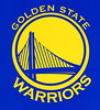
In case you missed it yesterday: The Warriors unveiled their new logo, which had already been leaked ages ago, yesterday afternoon. I covered it over on ESPN. (Also, if you go to the team’s home page, scroll down to the little video player, and click on “History of the Warriors’ Logo,” you’ll get a really nice video clip — recommended.)
Giveaway Results: The winner of the Africa Unity jersey is Adam Hancock. Thanks to all who entered — more giveaways coming soon.

Stirrup Club Reminder: Robert Marshall is now taking orders for the next round of Uni Watch Stirrup Club designs. Details here.
Brad Mielke’s World Cup Report
The USA’s victory — whoops, I mean draw — against England has led to a more visible American presence here in South Africa. Americans are wearing their jerseys and flags around Cape Town (poncho, too — it’s been a bit rainy out here) and congratulating each other on the streets. Meanwhile, English fans are pouring into Cape Town for Friday’s match against Algeria, and their presence is just a wee bit subdued.
Here are some of the highlights in the recent days of American and English fans:
• The return of the American sombrero.
• Dudes that insist on painting other dudes’ faces.
• Obama gear. (As an aside, Africans are really into Obama as well. “Yes We Can” chants started echoing around Cape Town right around halftime.)
• The oldest tradition of them all: patriotic head-shaving.
• Pants. Oh, the pants. Napoleon Dynamite fans should be proud.

• This guy. We saw him later in his much more terrifying full-body ensemble.
Brinke Guthrie’s Collector’s Corner
Photo is from Christmas ’68, I think. Those are football PJs, of course.
Our latest eBay finds:
• A complete set of NFL drink coasters from the ’60s, and still in the box.
• Remember the NFL book series from the 1960s? Here’s a nice set of them.
• Great vintage Dolphins poster.
• Those colors and typography sure date this program cover to the early ’70s, don’t they?
• Why get an inflatable doll of a naked girl when you can get this L.A. Angels inflatable doll?
• I’d forgotten that the Houston Rockets were once in San Diego.
• And today’s Mets item for Lukas is ”¦: a Mets kite. Did the Mets seriously have Kite Day? [Never seen that before. Interesting how it inverts the usual “Lets Go Mets!” chant, too. I’ll see what I can find out about it. — PL]
Uni Watch News Ticker: The Yomiuri Giants had been holding a contest to let kids design the team’s uniform for a game. Jeremy Brahm reports that hey’ve now announced the winner. Whatever you think of the results, the idea of letting fans design a uni for just one game isn’t a bad promotion — I’m surprised it doesn’t happen more often over here. ”¦ Speaking of which, the Grand Rapids Griffins are holding a jersey design contest for their New Year’s Eve game. ”¦ Reprinted from yesterday’s comments: Blue Jays pitcher Ricky Romero was missing the logo on his batting helmet on Wednesday. ”¦ Here’s a good page devoted to Colorado State football uniform history, with a corresponding page for basketball (good finds by Michael Thomas). ”¦ The West Michigan White Caps wore Led Zeppelin jerseys. No photos from the game yet (with thanks to Jacob Kubuske). ”¦ Jimbo Huening was at the Blackhawks Store in Chicago the other day and spotted a cap that was missing the team’s logo. “I might have bought it if it was marked down, but it wasn’t,” he says. ”¦ I haven’t found Mr. Met’s designer yet, but Brian Werling sent me a really sensational video clip about the guy who designed the Albuquerque Dukes’ logo and uniforms. Priceless stuff — don’t miss. ”¦ We all know NFL sleeves are disappearing anyway, so why not go all the way? (With thanks to Ryan Connelly.) ”¦ Mike Korczynski notes that Pedro Alvarez is wearing his cap over his ears. I remember John Maine doing this a year or two ago but can’t recall anyone else doing it. ”¦ Rare sight last night in Cleveland, as Jose Reyes went high-cuffed. ”¦ I don’t even know how to describe this next item — here, just go to this page and scroll down (and then blame MJ Kurs-Lasky). … Arkansas football fanatic Paul Watson notes that the Razorbacks had a lot of seriously scratched and scuffed helmets last season. “I’ve never noticed this much scratching on players’ helmets in previous years,” he says. Hmmmmm.
link brought to you by SEPTA.
Can we have T-Shirts made saying “I’m still calling it Pattison Avenue Station”, please?
I’m one of those who rarely reads the comments. For what it’s worth, I love the historical stuff. I don’t get the obsession with stirrups, and am not a huge baseball fan, so the baseball stuff I tend to skip over. I do like the off topic stuff like the trip to Scotland and food, stuff like that. It adds to the personality of the column. Same reason I like Peter King’s Monday Morning QB column over at si.com. You feel like you know the guy a little from the personal tidbits sprinkled in. I guess I wouldn’t change a thing. If you don’t like a particular topic, don’t read it. There’s more than enough for everyone here, I think.
The normally PJed Shin-Soo Choo went high cuffed as well. His slump-busting move turned into a 3-for-5 night with 2 runs scored.
link
BTW, I don’t watch a lot of the Mets, so you all probably know this already, but Jose Reyes is really, really good.
My 2cents…
Mainly because I’ve been reading Uni Watch since it was in the Village Voice, I’ve seen it evolve and understand the priority that items receive and the format. This is a BLOG for heaven’s sake, even though Paul can do whatever the F*** he wants he always takes feedback and contributions, and I for one am always thrilled when one of my items is in the ticker. The only slight nit-pick I have is that the “redesigns” on the weekend are a bit much (the drunken “Cowboys” drawings) but I usually scroll over those anyway.
The Caps will unveil their NHL Winter Classic uni (most likely the 1974-75 white uniform they wore) at link in DC.
Re: NFL Sleeves
The Bucs are WAY ahead of their time!
link
Here’s an interesting look at MLB parks and how they compare with each other…
link
Will they be selling bandwidth caps at the entrances?
On topic: I too have followed this blog from the Voice days. I come here not so much for people’s aesthetic opinions but to learn more about the history and evolution of sports uniforms and equipment.
I read the comments because you never know when an infrequent poster may whip out an obscure item or factoid.
I wish I was able to provide more meaningful commentary. My very narrow area of expertise is Washington AL v1.0 and 2.0 unis, which few people cared about until, say, late 2004. I worked with Mark Okkonen and Peter Capolino @ M&N in the early ’90s identifying Nats uni photos and details by season from old photos and film footage, including some from George Case III whose video you featured a few days ago.
At any rate, please keep up the good work. Focusing on your “obscure fetishes” makes for entertaining reading and viewing, and often sheds light on how unis got to be the way they are today. Thanks!
Almost offensively invalid dismissals of criticism:
“[H]e’s really just trying to substitute his editorial priorities for mine”
“This is a BLOG for heaven’s sake, even though Paul can do whatever the F*** he wants”
If we take seriously either of those statements, or the sentiments behind them, then we necessarily invalidate all criticism of anything ever. Of course it’s a blog! Of course it’s Paul’s blog! Of course any opinion about this blog by anyone other than Paul amounts to substituting one’s own editorial judgment for Paul’s. Likewise, when Paul criticizes a new logo, all he’s really doing is substituting his judgment for the judgment of the designers and executives who adopted the logo.
I don’t mean to pick on Paul – he’s awesome, and a great guy, and despite some occasional apparent prickliness, actually quite respectful of criticism. We commenters are much more likely than Paul to invoke the ridiculous “Paul can do whatever he wants” attack on criticism. Of course Paul can do whatever he wants! That’s why we come here. But by that score, the Utah Jazz can do whatever they want too, so we should all shut up and accept their new logos already.
Truth be told, I agree with the general slant of Parish’s criticism, but I also don’t. I love Paul’s regular entries, and often the less newsworthy they are the more I get out of them. But I also miss the depth of coverage and analysis we used to get on news like new logos and unis. When I hear about a new logo for team X, my first instinct will never be to watch the next episode of Sports Center; instead, I come to UniWatch. Which increasingly takes little more note of new logos than Sports Center.
The above is a criticism, not a complaint, however. If the trend of the last year or so continues, eventually I’ll be habituated to looking elsewhere for news and analysis of sports uni and logo events. And if the more historical or scholarly or, yes, sometimes obscurantist material Paul now more heavily features continues to interest me, I’ll continue to look forward to reading UniWatch every morning anyway.
In the end, the one thing that is valid about the otherwise objectionable objections I quote above is that whatever interests a writer most passionately, he will write about best. Better for all of us if Paul follows his passions and interests, even if they lead away from our own. Not that such an extreme dichotomy is likely, but I’d rather UniWatch be a great blog that I don’t feel compelled to read anymore than a lesser blog that I do.
Awesome response, every word of it.
I guess the Magic didn’t make such a splash with their new logo.
It leaves me hunry for more (foul territory? Wall heights? (hey … that’s almost my last name!) So many directions that can go.
… and some people didn’t even call Shea Shea when Shea WAS Shea!
More “offensively invalid dismissals of criticism”.
To be honest, I’m just glad Paul gives his time (and LI Phil on the weekend) to update this blog and give us fresh information. I have been a fan of so many blogs that have just been flat out abandoned due to the lack of author’s interest, and that will never happen here. Since my expectations are quite low, and just being happy that this blog exists is not an option, I will gracefully bow out of this conversation, apologies if I offended anyone.
(indeed, I covered the new Jazz and Heat logos just the other day)
Should be Jazz and Magic
We’ve had some kids’ designs for items before. The Charlotte Checkers had a kid design a hockey jersey, the occasional NASCAR, IndyCar, and NHRA helmet has been designed by a Make A Wish, Victory Junction or Ronald McDonald House kid, and there’s a current commercial promising that the Joe Gibbs Racing team would allow a kid to design the Kurt Busch car.
About the Netherlands fan shirts with the print on the inside: that idea has been done, and even invaded the pitch, before.
link
My Avast Antivirus is indicating a Trojan Horse when I come to this site again
-Jet
I really enjoy reading Uni-Watch. It’s one of three tabs I open in my browser the moment I sit down at work (the others being Yahoo for email and slacker for music). I love the uni-centric content, but I also love stuff like the Scotland trip, the assorted meat platters and the pencil sharpener collection.
I can see where Parish is coming from when he says the priorities can get lost. My only beef with his comment is that I see the wire service photos being just as relevant to “the obsessive study of athletics aesthetics” as a revision to the Utah Jazz logo. Perhaps there just needs to be a minor tweak to the assemblage of daily posts: Major uni-related content/news at the top, Ticker in the middle and personal topics at the bottom. Or it could be two sections: Uni then Personal with a Ticker for each.
We keep scanning the site with multiple diagnostic tools and it keeps coming up clean.
Seems to me the “Focus” thing is more about decisions made in some sort of Editorial Board Meeting that goes on in Paul’s head.
Many times editors later think, “Hmmm, maybe THAT should have been our lead story.” It’s just the way it is in that business.
Bottom line, I don’t read every story in Sports Illustrated every week, and don’t think some things are worthy of being on its cover. Same for Uni Watch. Neither of those issues stop me from reading the magazine, nor do they compel me to fire off a Letter to the Editor.
Yeah, Uni Watch has meandered away from News a bit to lead with more Feature-style material…but there’s still always something fresh, relevant and worth reading every day. That in itself is an hellacious accomplishment.
And, if some particular item is of no interest to me, I don’t read it. Pretty simple, that.
—Ricko
To Paul & those others who “man the ship” so to speak, I don’t always have the time/interest in every item on the site, but the fact that I have the option to read or not makes me thankful.
I appreciate the time and effort you all put into this little corner of the world (which we CHOOSE to be a part of) that I thought for so long i was was alone in.
so as I’ve said before – thank you.
I don’t like contant attacks against colors such as purple and black simply for existing on a uniform. I don’t like hearing about other people’s vacations. I don’t like question/answer formats for interviews. I don’t like swearing for no other reason than being to lazy to find a real adjective.
There are also things about my wife and kids that don’t always thrill me (put your shoes by the front door, put your dishes in the sink, and close the fridge when you’re not actively looking for something). Do I expect them to change? No. Do I really even want them to change? Not really.
They’ve done experiments where lab rats got everything in life they ever wanted. They died of boredom.
Don’t change a thing. I don’t always like you the way you are, and I’m good with that.
And, as long as I’m shooting off cliches … You take the good, you take the bad, you take them both and there you have the obsessive study of athletic aesthetics.
I think I’m done now.
I’m with Ricko on this. If a topic or Ticker item doesn’t interest me, I just keep scrolling. I don’t throw out an entire newspaper because I don’t care about the lead story on Page 1.
“here’s a picture of Raquel Welch from the ’70s”
Whoa! I missed that?
Seconded.
The Warriors’ new unis (although we haven’t actually seen the unis, have we) should be a nice melding of past and present.
Being honest, I liked their current set,in the sense that Navy, Orange and Athletic Gold was an unique combination, and they put it together nicely. Not talking logos or typography now, just the overall look of the uni.
So, if the Warriors also return to athletic gold at home and royal on the road, how long before some brilliant knothead says, “Oh, they’re just trying to copy the Lakers”?
Then we clear our throats and say, “Ahem, when those teams first moved to the West Coast, the Lakers wore white at home and the San Francisco Warriors wore gold, as they had from time to time in Philadelphia. Was more of an Old Gold, of course, but still…”
—Ricko
JimWa said…
“close the fridge when you’re not actively looking for something”
Wish I had a dollar for every time I said, “They’re not showing a movie in there.”
—Ricko
link
Now I’m wondering where she was when the photo was taken. I know she did some Westerns in the 1960s – anybody familiar with them, recognize the “____nnickel Saloon”?
in uni news, the US is playing (apparently) the Charlie Browns in World Cup today…
and I just can’t abide the orange shoes. horrible. we are not ORANGE.
Chance Michaels wrote:
“If’n I ‘member krecktly,” the Old Coot mused, “it was on the set of HANNIE CAULDER.”
link
—Ricko
All I could think of watching the high-cuffed Jose Reyes was “Those shoes he’s wearing look really bad” and “How does he get away with those shoes?” Without his pants covering them you can finally see his whole shoes, and they are essentially white shoes with little bits of black on them. When he slides you can see that even the soles are white. I remember reading in the past that players’ shoes are supposed to be at least 51% black (or whatever the team’s official shoe color is). Is this true? And if so, is anyone enforcing this? There was the story a few weeks ago about CC Sabathia being made to change his shoes, but I believe on that occasion he was wearing shoes that were just plain gray, with no black at all. Every day this year I watch games and see at least one player on each team pushing the limits more and more in terms of having what appear (on TV anyway) to be mostly white shoes, and to my (admittedly old-fashioned) eye it looks really bush-league (although nowhere near as bad as the deplorable footwear situation in soccer, where even players wearing their national colors insist on wearing shoes of the ugliest and most “different” color their shoe company can come up with). On the Mets the main offenders are Reyes and Wright. But nobody ever says anything about it. Paul, what gives? I think you need to use your connections and resources to investigate this important issue. Maybe with the world cup in full swing you can explain that situation first for us non-soccer people, but then I think an investigation of the MLB shoe standards is in order.
@ Ricko:
My 5 year old is just starting to do that. Sheesh, what the hell is that boy looking for that wasn’t there 10 minutes ago?
Is it just me or was the “Reply | Quote” thing not there 15 minutes ago?
@ Chance Michaels:
Chance Michaels wrote:
“If’n I ‘member krecktly,” the Old Coot mused, “it was on the set of HANNIE CAULDER.”
link…
–Ricko
(okay, now I see how it works)
@ Paul Lukas:
My antivirus blocked one yesterday, but it’s fine today. Do the banners rotate to different sites?Maybe one of the external banner images is culprit?
Answering my own question now: link? That was a British film, shot in Spain, as opposed to the other Westerns I see on her resume, which all appear to have been shot in the United States.
Anybody know that one?
Paul Lukas wrote:
Usually, I’m a fan of longer shorts. In this case, not so much.
My favorite parts of the blog are the historical research on topics like the evolution of the protective ear flaps on the batting helmets, the Orioles’ monochrome orange uniforms and the mysterious “S” that appeared in place of the numbers on the Dodgers’ uniforms in spring training.
Chris in Nashville wrote:
Funny how none of ’em are truly diamond-shaped. Close but no cigar.
marc wrote:
Hmmm, Johnny Ek appears to be testing a new quote functionality. Let’s see how it looks.
paul’s actually not required to write anything at all. UW is a gift, just enjoy it…
GOOOOOOOOOOOOOOAAAAAAAAAAAALLLLLLLLLLLL!
come on USA!!!!!!
marc wrote:
“Baseball Diamond” is drawn from the shape of the infield. Pretty sure the phrase was coined before there ever even WERE outfield fences.
—Ricko
Ry Co 40 wrote:
lets be careful here … no one offering constructive criticism is saying UW is not a gift, or that Paul owes us anything etc.
BUT PAUL ASKED FOR IDEAS, SUGGESTIONS, CRITICISMS… since Paul asked why is it wrong to give some suggestions?
Ricko wrote:
how much did they charge you for those games, rick?
(just testing the quote feature)
JimWa wrote:
x10000000000000000000
Evan wrote:
We’ve scrubbed the offending code that was injected early this week and installed more than one scanning and monitoring program. What most of you are experiencing when you get those alerts is your system warning you that the site you are visiting was infected. Meaning, when your virus program scanned the site it was infected (probably Sunday or Monday) and it has yet to rescan the site since it has been cleaned.
Email me if you have any problems and I’ll double-check.
webmaster[at]uniwatchblog.com
Chance Michaels wrote:
You gotta have some appreciation for the spaghetti westerns. If you do, then you’ll say (as I do) that it actually is one of Welch’s better films. Now, you also might say that’s not saying much, so I’ll amend it to, “It’s a pretty good film on it’s own. She also happens to do well—and look just great—in it.”
—Ricko
Beef: Warriors new Partial Logo. Basketball outlines only on the top half of the logo, yet full basketball outlines on Secondary B logo? What kind of logic or wizardry would allow the space underneath the bride to remain solid blue?? That’s my only complaint about the new look – the fact that they’re putting the whole logo & the uniform number in the open sky space balances out the logo. Kudos on not using any black, either! Have to say, this is one of my favorite new designs to come along in a long, long time.
link
LI Phil wrote:
And while we’re testing the quote feature, why do they call them “diamonds” when they’re clearly square-shaped? Hmmmmmm?
Speaking of things I usually skip over in weekend UW entries, I had this crazy dream last night involving one of the cooks from Top Chef Masters and Stephen Strasburg, in which the Nats had completely new uniforms, all red and yellow, almost like the old Mariners or Brewers schemes, but in a sort of turn-ahead-the-clock or minor-league-hockey kind of way. And with red instead of blue, natch.
I’ll save readers like me the annoyance of actually posting a sketch, but it has me thinking that red and yellow is (A) a gap in MLB’s color combos, so a chance for the Nats to distinguish themselves, and (B) probably a good baseball equivalent of burgundy and gold, and also maybe a good option for a Wizards rebranding to create a sort of pan-Washington color scheme.
@ concealed78:
I agree with the non-black sentiment. Also, even though I haven’t been a NBA fan since “the finger roll” I do think that this is the best design in a loooooooong time.
That being said I think I would like it even better if they took the same logo and only showed the “Warriors” wordmark on top of the sphere on their home uni’s and only showed “Golden State” below the sphere on the roads. It would be a little asymmetrical when the uni’s are side by side but would be a great chance to differentiate home vs road (other than color).
Phil, any chance you could mock that up?
Another regular reader and sporadic at best commenter chiming in here.
Much of what I would say has been posted and expressed better by others. What I would add is that I also think at times sports design news gets shorted at times. It seems to me this blog has a (possibly the) central role for covering and discussing what’s new in sports design. That may not be a role that has been sought or even be desired, but it seems to me that it is real. So that shorting can seem almost negligent. The defense that this is Paul’s blog has some validity, but I think it is also a bit of a punt. Ultimately the banner and title say Uni Watch: the Obsessive Study of Athletics Aesthetics, which to me hold the blog out as being something at least a bit more than just the author’s interests at the moment.
I think of this like how Nate Silver lately is indulging his interest in the World Cup at FiveThirtyEight but he is still doing his usual quality political content as well- the core of that blog. The feature type content is often very good, but it isn’t unreasonable for readers to expect attention to what’s new.
Maybe it’s time for this blog to evolve a bit- whether it is slowly becoming more a group blog, taking on multiple writers, spinning off another blog, or even re-branding to “abdicate the thrown” as a hub for what’s new, I don’t know.
There are any number of options, just wanted to throw my two cents in. Hope the comment section regulars forgive the interruption.
concealed78 wrote:
Beef: Warriors new Partial Logo. Basketball outlines only on the top half of the logo, yet full basketball outlines on Secondary B logo? What kind of logic or wizardry would allow the space underneath the bride to remain solid blue?? That’s my only complaint about the new look — the fact that they’re putting the whole logo & the uniform number in the open sky space balances out the logo. Kudos on not using any black, either! Have to say, this is one of my favorite new designs to come along in a long, long time.
link…
I agree with the non-black sentiment. Also, even though I haven’t been a NBA fan since “the finger roll” I do think that this is the best design in a loooooooong time.
That being said I think I would like it even better if they took the same logo and only showed the “Warriors” wordmark on top of the sphere on their home uni’s and only showed “Golden State” below the sphere on the roads. It would be a little asymmetrical when the uni’s are side by side but would be a great chance to differentiate home vs road (other than color).
Phil, any chance you could mock that up?concealed78 wrote:
JTH wrote:
are not all squares also diamonds (geometry was never my strong suit, even 30 years ago)…
i know it’s one of those things where “not all diamonds are squares” or something
but yeah…they’re definitely technically squares
ok…now back to the world cup
Throne, not thrown. It looked wrong, it felt wrong, but I was having a block on that word.
concealed78 wrote:
As far as basketball uni sets go, I would have to agree.
JAson wrote:
Just testing this function again.
ahhhh….I’m just screwing this up now. I was trying to reply to concealed78. Hope everyone was able to follow.
BuckeyeMark wrote:
I hate to break this to you, but “fucking” and “shitty” ARE real adjectives. Would I want to use them in every single sentence? Nope. But do they have a place? You betcha. The cliché that such terms are “lazy” is a fiction promulgated by people who want to keep the world clean and sanitized. There’s not a single great writer who’s never used those words (and no, I’m comparing myself to the world’s great writers, but why shouldn’t I avail myself to the same set of words they have access to?). They’re part of a writer’s toolkit, no more or less lazy than, say, “awesome” or “awful,” and I’ll keep using them when I think they’re appropriate.
I try to write in a way that reflects how I talk. And when I talk, I sometimes say “fuck” and “shit.” Not all the time, but sometimes.
Serbia looked fantastic in their red monochromes today. Loved the socks! 1-0 over Germany not too shabby either.
@ Alex Rachmiel:
I would love to lead that committee.
gggggoooooooooooooooooooooooooaaaaaaaaalllllllllll
Ricko wrote:
Oh I know, I just found it funny that so many of ’em get soooo close without actually looking like yer stereotypical diamond shape. I guess link and their ilk didn’t wanna get too literal. :-)
Your second sentence reminds me of something a friend once mused about in that baseball’s playing field stretches on infinitely. Just like in “link,” a hit could travel six miles out of the ballpark, but if the fielder was able to get a cab, then a bus then shoot up the elevator of the “Umpire State” building, hoist himself up the flagpole and toss the glove in the air to catch the ball on the fly, it’d still be an out (whether the ump claws his way up the side of the building is pure speculation). Now there’s a beautiful game!
teenchy wrote:
Ladies and gentlemen, we have a winner for POST OF THE DAY! No more calls, please.
On the ESPN home page right now …
“Landon Donovan’s goal cut Slovenia’s lead in half, but can the U.S. win a tie?”
I think the short answer is …
uh, NO
(not that they can’t tie the game, but they can’t WIN a tie)
… cause, obviously, they’re capable of tying the game …
;^)
marc wrote:
Whoops! Can’t throw the glove at it. Still, if he’d left the glove on and caught it on the fly, it’d be an out. Done and done.
LI Phil wrote:
Well, I’m sure you know that I was just being a smartass. It’s certainly not unreasonable to look at a square that’s oriented “point-down” and call it a diamond, but a “true” diamond shape, or lozenge, is a (non-equiangular) rhombus.
~~~~~~~~~~~~~~~~~~~~~~
And dang it, ESPN3.com froze up on me just after the yellow card was issued.
BuckeyeMark wrote:
let’s be careful here?!?! what are you, my AA sponsor all of the sudden?!?! LOL
first off, he asked for “ideas, suggestions, criticisms” in the form of an e-mail.. second, the “criticism” is essentially the reason for today’s post, right?
i’m just stating a simple fact. there’s certainly posts that i like less than others (not many at all, BTW), but i’m not complaining. and i’m sure many people feel the same way. lighten up… lol
Shaftman wrote:
very quick and dirty…but are you asking for this:
home and road?
@ LI Phil:
Perfect!!!!
….and I love the look.
LI Phil wrote:
Perfect!!!!
….and I love the look.
Shaftman wrote:
thanks — btw…do we even know what color the roads will be? i just assumed gold, but i spose they could be sorta-powderish blue (gotta run out, so can’t do that mock, but you get the idea)
Roads…
link
Thereby forcing the Lakers do wear their whites on days they don’t wanna?
Not too sure that would fly.
Honestly, I don’t recall, did they show a white jersey? Guess they did. Maybe they’ll have three: White, Gold and Royal, with option of wearing the gold on the road OR at home?
—Ricko
re: Arkansas scratched-up helmets.
When I was in high school, as a bench-warming sophomore, we used to scratch our helmets up by any means necessary. Metal brads, rocks, banging them on cement. A scratched-up helmet meant you were playing. Playing hard and strong and tough. I’m guessing there’s a little self-inflicted scratching going on there in Razorback country.
Well, the anti-offsides people should be chirping today. I really hope those extra two points the U.S. should have don’t prevent it from moving on in the tournament when group play ends. That ball had nearly hit the ground inside the penalty area before Edu moved past the defenders and put it in the back of the net, not to mention the two Solvenian defenders who had full bear hugs on the American players inside the box. It’s too bad a team of three officials viewing the action at three different angles couldn’t make one accurate call in this situation, or the better part of the second half.
Paul is a gifted writer with an irrational dislike for purple. So what? I take the former and tolerate the later.
While, I enjoy Phil’s weekend posts, less is more during the week, though. I sneak a peak when I can at work, but do most of my gazing at night when I’m home. Phil-like daily posts would be overwhelming.
Phil’s posts are a weekend treat, much like curling up with the Sunday Times. I can do it on Sundays, not so much the rest of the week.
I enjoy the comments and take them for what they are: Comments. Uniform aesthetics are a matter of taste. I may not agree with the taste of some posters, but they may not like mine. I live with it. Teams have their own tastes, and they force theirs on us, commenters don’t force anything on us.
Constructive criticism is fine. Suggestions are fine. But I’m pretty certain I get my money’s worth from this blog. I’ve been following it for a long time, and I’m appreciative of both its contents and its remarkable ability to stay more or less on topic and, for the most part, remain pretty damned civil. Thank you, Mr. Lukas, the team and all the bench players.
@ LI Phil:
If they wear gold on the road, will they only be allowed to play the Lakers on Sundays?
James Craven wrote:
Well, shucks, thank you. I write that as a disgruntled AT&T customer, just waiting for the right moment to jump ship to Verizon.
@ Paul Lukas:
nope. sorry – they may be acceptable to some but continue to be amazed at folks who don’t want to believe that such talk is offensive and unacceptable in many, many places (which is why your ESPN columns don’t have them). they are viewed as classless by many. they make the blog nsfw for many. often they are lazy, since as an adjective they are often ambivalent and unclear. many times they don’t even make sense, when transcribed to a literal meaning.
as for “those who want to make the world clean” – that’s a pretty unfair shot but I’m not sure why anybody is for dirtying things up …. why not set the bar a little higher? isn’t that what we want in the uni world?
I know this is an argument I can’t win but it continues to be the most disappointing aspect of UniWatch.
well, my quote didn’t even work… was referencing Paul’s rebuttal to my agreement with a post that is anti-swearing.
[quote comment=”394931″]
That’s a great shot. Here’s a better one.
it was a Fantastic Voyage, indeed.
link
link
well, that link didnt work, and now it whacked out the margin. Paul can you fix?
“Three years ago, something like the new Maple Leafs sweater would’ve been surefire lead-entry material. Now I feel like it’s not such a big deal…”
I wonder how much of that is due to fatigue.
Go back a few years, when this was all new to a lot of us, every little change was EXCITING. A few years on, in a world where every little tweak to a uniform requires the team to hold a press conference, maybe its just harder to get excited about a couple of stripes.
There’s another shot of Raquel Welch in the Chelsea kit where she’s wearing link. I thought it might be either 100 Rifles or Bandolero, but it does match up best with Hannie Caulder.
The number she’s wearing is Peter Osgood’s. She made one appearance on the sidelines of Stamford Bridge and cheered for Osgood. There’s also a story about her wearing a T-shirt that said something like, “I scored with Peter Osgood” but I can’t find a photo of it.
Since he asked….
I’m a Ticker contributor from time to time and I also am thrilled to see what I have sent in in it.
But since you can’t please everybody, I’ll throw in my two cents.
I don’t like the food entries. I don’t post about what I had for dinner or which establishment I ate at last night. But should I? I’m not a New Yorker and probably will never go, so why should I care about some obscure food related items in a uniform and logo site?
I don’t care for the DIYers and the childhood conceptual drawings. I also could care less about all the “kits” talk.
But apparently, those of my dislikes are a big deal to somebody here, and they have as much a right to be read as anybody elses. I am sure some things I would like, somebody would poo-poo them also.
All is all, Uniwatch is the 1st thing I read every morning. I skip over the parts I don’t like.
The only thing that REALLY bugs me is the food entries. That space could be used in a more constructive, uni, way.
Been cleaning out my room and uncovering lots of nostalgia. Thought this was worth sharing: a sheet of MLB tattoos from Frosted Flakes. Each team has a logo or wordmark along with a little illustration.
link
Sorry, I linked the wrong one. Here is the reversed image so the words read left to right:
link
(Also, you may need to hit refresh or enter on the address bar because the site I posted to doesn’t allow remote linking).
Last time with correct link and I’ll go away:
link
[quote comment=”394984″]@ Paul Lukas:
nope. sorry – they may be acceptable to some but continue to be amazed at folks who don’t want to believe that such talk is offensive and unacceptable in many, many places (which is why your ESPN columns don’t have them). they are viewed as classless by many. they make the blog nsfw for many. often they are lazy, since as an adjective they are often ambivalent and unclear. many times they don’t even make sense, when transcribed to a literal meaning.
as for “those who want to make the world clean” – that’s a pretty unfair shot but I’m not sure why anybody is for dirtying things up …. why not set the bar a little higher? isn’t that what we want in the uni world?
I know this is an argument I can’t win but it continues to be the most disappointing aspect of UniWatch.[/quote]
You know what I find offensive, unacceptable and classless? Refusal to honor simple requests…
…especially from those who belabor the issue.
Well, it looks like the generic blockquote tag isn’t working quite right.
One more thing:
I always thought that the Ticker was for the display of all the “news” and the comments section was for the discussion. The main article was for specific topics and the author’s views.
Is this not correct?
I can totally see both sides of this argument. To be honest, I’ve lost a lot of interest in Uni Watch over the past few months and rarely read the blog anymore. I used to read it daily. Why? I’m just not interested in the recent content. I can agree with Parish that there has been some sort of shift in focus recently that has not exactly been to my liking (but others may love it, I don’t know). I’d say certainly there has been a change. Whether it’s good change or bad change is subjective, to each his own. Personally, I have not enjoyed it and am in the same boat as Parish on my opinion of it.
But I have a lot of sympathy for Paul. He’s a guy who created a tremendous blog and column that has totally taken on a life of its own. As he said, it has become a monster. People are constantly looking to him for everything uni-related. Inundating him with with links, content, opinions, comments, etc. He’s expressed his opinions on uniforms for years, so it must get extremely boring to keep re-hashing much of the same material. In addition to feeling redundant, it is extremely time consuming and Paul has other work/interests to keep up with. If I was Paul, I probably would have mailed it in or gone on a sabbatical a long time ago. What begins as a passion can quickly become and all-consuming annoyance, so I can’t blame Paul for feeling a certain level of frustration, apathy, or boredom with the blog lately (if that is the case).
So those are my thoughts on this issue. Paul,it would be great if you keep us updated on the state of Uni Watch. Thanks very much for all of your hard work. I appreciate it immensely.
[quote comment=”394977″]Shaftman wrote:
thanks — btw…do we even know what color the roads will be? i just assumed gold, but i spose they could be sorta-powderish blue (gotta run out, so can’t do that mock, but you get the idea)[/quote]
I would assume blue like on the website.
Nager Morgan often wears the hat with the ear flaps, and a couple of other players too
[quote comment=”394981″]While, I enjoy Phil’s weekend posts, less is more during the week, though. I sneak a peak when I can at work, but do most of my gazing at night when I’m home. Phil-like daily posts would be overwhelming.
Phil’s posts are a weekend treat, much like curling up with the Sunday Times. I can do it on Sundays, not so much the rest of the week.
[/quote]
couple things — i generally spend (far too much) time during the week either writing or thinking about the weekend posts — paul certainly doesn’t have the luxury of time that i do; when i did the week paul was in scotland (which, if you combine it with the weekend before and long weekend after, was 10 straight days), and it was exhausting — so i doubt the weekday posts (which i tried to keep shorter) would ever approach the cornucopia that sometimes makes up the weekend;
however, in the main when paul said “although I haven’t told this to anyone, lately I’ve been looking at some of Phil’s weekend entries and thinking to myself, “Damn, he put a lot of work into that one. I need to raise my game to keep up.” … i don’t think he was implying the weekday posts would ever trend towards the 10 course buffet i lay out — i think he was referring specifically to a couple of the main articles i did on the historical perspective for many of the throwbacks we’ve recently seen
i was a history major, and research is what i do, so i had plenty of time to really delve back into that aspect of it — many of those (specifically the packers, eagles and bears, plus some of the baseball teams) i knew were coming and i had plenty of time to really really research stuff — plus, i love doing it — if that were a chore and not a pleasure, i doubt i’d have been able to do it…it’s not everyone’s forte, but i love that sort of thing, and hopefully my efforts were reflected in those posts
i don’t want to speak for paul, but i believe that’s what he was referring to, and not that the weekend posts with all the fixin’s were something the weekday posts would be
i’ve said it before and i’ll say it again — i think we all owe an incredible debt of gratitude to paul for this wonderful site, and honestly, i don’t know what i’d do without it; there is no question paul is the captain of the ship and we readers are just along for a wonderful ride
UW will still ALWAYS be the go-to site for uni news; if it’s not the lede, it will surely be in the ticker
like everyone has said, if there is a portion of the blog you don’t like, skip it — the ONLY thing i’m not a fan of is the “culinary corner” but that’s just because im NOT a fan of food
the other thing, and the point of today’s entry, is if there are things you guys would like to see more (or less) of…tell paul — im sure he’ll make every effort to be accommodating if at all possible
[quote comment=”395000″]
like everyone has said, if there is a portion of the blog you don’t like, skip it — the ONLY thing i’m not a fan of is the “culinary corner” but that’s just because im NOT a fan of food
the other thing, and the point of today’s entry, is if there are things you guys would like to see more (or less) of…tell paul — im sure he’ll make every effort to be accommodating if at all possible[/quote]
I’m actually a big fan of Culinary Corner. I like to cook, look at food, talk about food, watch PBS cooking shows (wonder if Paul likes BBQ University), and figure out stuff like Taco Bell’s lava sauce or how to make good battered french fries. What do I not like? Cereal and soccer.
[quote comment=”394981″]
im NOT a fan of food
[/quote]
I just shed a tear for you, my friend.
Oh boy!
Newim NOT a fan of food
I just shed a tear for you, my friend.
Not sure if Brinkie has shown this little gem, currently on ebay, from his corner? Yet, I’ve never seen a Detroit Lions alt. logo like this before.
Sorry, Paul, for those of us that we didn’t comply for your request for e-mailed thoughts/ideas/suggestions. Maybe you were planning to weed through them for a future post, but quite honestly, I’m enjoying reading all the commments as they are made!
link
[quote comment=”394999″]Nager Morgan often wears the hat with the ear flaps, and a couple of other players too[/quote]
You can go as far back as a guy named Lou Johnson, who first came up with the Cubs in about ’59. Went on to have his best years with the Dodgers. Then maybe played in Japan for a while. Not sure.
—Ricko
[quote comment=”395007″][quote comment=”394999″]Nager Morgan often wears the hat with the ear flaps, and a couple of other players too[/quote]
You can go as far back as a guy named Lou Johnson, who first came up with the Cubs in about ’59. Went on to have his best years with the Dodgers. Then maybe played in Japan for a while. Not sure.
—Ricko[/quote]
I meant Johnson wore his hat over his ears.
[quote comment=”395005″]Sorry, Paul, for those of us that we didn’t comply for your request for e-mailed thoughts/ideas/suggestions. Maybe you were planning to weed through them for a future post, but quite honestly, I’m enjoying reading all the comments as they are made![/quote]
I’m of the same persuasion. Rarely do we delve into what others think of the blog as a whole, except for when people explode in the comments. The people who think out their criticisms often are not the ones who are disposed to posting them in the comments.
doesn’t d-train wear his cap over his ears?
[quote comment=”395010″]doesn’t d-train wear his cap over his ears?[/quote]
You mean D-Railed?
Crap. Been doing some digging.
Wasn’t Lou Johnson.
Well, now I gotta figure out who the heck I’m thinking of.
It isn’t that I’m old, it’s that there are some many years to sort through.
That’s my rationale, and I’m stickin’ to it.
—Ricko
[quote comment=”395001″][quote comment=”395000″]
like everyone has said, if there is a portion of the blog you don’t like, skip it — the ONLY thing i’m not a fan of is the “culinary corner” but that’s just because im NOT a fan of food
the other thing, and the point of today’s entry, is if there are things you guys would like to see more (or less) of…tell paul — im sure he’ll make every effort to be accommodating if at all possible[/quote]
I’m actually a big fan of Culinary Corner. I like to cook, look at food, talk about food, watch PBS cooking shows (wonder if Paul likes BBQ University), and figure out stuff like Taco Bell’s lava sauce or how to make good battered french fries. What do I not like? Cereal and soccer.[/quote]
Funny, I was thinking of munching on some Oatmeal Squares cereal while I watched today’s World Cup game…
I love BBQ University and Culinary Corner!
I’m not a Warriors fan, or an NBA fan for that matter, so all I can say about the new logo is that it’s nice to see some bright colors return.
Royal blue and golden yellow are a refreshing change from the darkening trend of the last 10-15 years. Here’s hoping some other teams who, for whatever reason, went to navy/hunter/etc. will see the “light” and make a triumphant return to royal/kelly/etc.
It looks just as “tough” to me.
Been out of town this week. Went to visit a cousin in Davenport Iowa and then my brother and I went to see a Twins game the other night. Twins beat Rockies 8-3. In Minneapolis we walked around the gorgeous new Gopher stadium and toured the Metrodome. Went to the Nagurski complex and saw old uniforms and pictures.
Then on way back stopped at Ames Iowa to see the Cyclone stadium. Saw some old uniforms and pictures there too.
I mentioned I should have contacted Ricko for the Minneapolis part. I forget where Ricko is from up there.
ANyhow I have to look over the past few days on UW that I missed.
Even though I had not been commenting much recently I always check UW and enjoy it.
[quote comment=”395014″]I’m not a Warriors fan, or an NBA fan for that matter, so all I can say about the new logo is that it’s nice to see some bright colors return.
Royal blue and golden yellow are a refreshing change from the darkening trend of the last 10-15 years. Here’s hoping some other teams who, for whatever reason, went to navy/hunter/etc. will see the “light” and make a triumphant return to royal/kelly/etc.
It looks just as “tough” to me.[/quote]
Going lighter doesn’t always look “tough”, though …
link
For whatever it’s worth, I absolutely love the foodie items with UniWatch. Two of my favorite passions in one place!
[quote comment=”395016″][quote comment=”395014″]I’m not a Warriors fan, or an NBA fan for that matter, so all I can say about the new logo is that it’s nice to see some bright colors return.
Royal blue and golden yellow are a refreshing change from the darkening trend of the last 10-15 years. Here’s hoping some other teams who, for whatever reason, went to navy/hunter/etc. will see the “light” and make a triumphant return to royal/kelly/etc.
It looks just as “tough” to me.[/quote]
Going lighter doesn’t always look “tough”, though …
link[/quote]
Looks okay to me.
Going darker doesn’t look tough…just trendy.
Oh, and as a historian, I also love all the historical content as well.
[quote comment=”394999″]Nager Morgan often wears the hat with the ear flaps, and a couple of other players too[/quote]
nyjer is ears-out. flat brimmed though
“Oh, and as a historian, I also love all the historical content as well.”
I certainly do love historical content as well.
Wow, two days in a row, a jersey I wouldn’t wear.
I’ll pass on those Whitecaps Zeppelin jerseys.
Ok..I haven’t posted previously, but am a daily reader. I just had to drop a note to say that I really enjoy reading the blog even the things I don’t initially find interesting. At first I didn’t enjoy the talk of old uniforms and the wire service photos, but thru reading the blog I have found a new appreciation of the traditional as well as the new or “funky” designs of some teams. I just wanted to thank Paul and all the others for putting in so much effort into the blog to bring me some personal enjoyment daily. Keep up the good work.
The England/Algeria game is awfully bright.
The only contrast is Algeria’s goalie, who is doing the light purple over dark purple. England’s goalie’s in all bright yellow, the rest of the team is in all white, and the rest of Algeria’s in all lime. They have stripes, but they’re little and you hardly see them.
I like bright, but a little more contrast would have helped.
That video interview with Dick Moots is amazing. I miss the Albuquerque Dukes.
I get that “Isotopes” is a clever tie-in to the Simpsons, and that they sell a lot of stuff, but it’s a shame that a classic identity lies unused.
[quote comment=”395025″]That video interview with Dick Moots is amazing. I miss the Albuquerque Dukes.
I get that “Isotopes” is a clever tie-in to the Simpsons, and that they sell a lot of stuff, but it’s a shame that a classic identity lies unused.[/quote]
Well, Isotopes is topical to New Mexico as well. The first nuclear weapon was detonated there, and the Los Alamos National Laboratory is in the state as well. But I really do like cities reusing the names of bygone sports teams, like Portland has done with the Timbers and Beavers.
[quote comment=”395025″]That video interview with Dick Moots is amazing. I miss the Albuquerque Dukes.
I get that “Isotopes” is a clever tie-in to the Simpsons, and that they sell a lot of stuff, but it’s a shame that a classic identity lies unused.[/quote]
And I miss the Calgary Cannons…
[quote comment=”394998″][quote comment=”394977″]Shaftman wrote:
thanks — btw…do we even know what color the roads will be? i just assumed gold, but i spose they could be sorta-powderish blue (gotta run out, so can’t do that mock, but you get the idea)[/quote]
I would assume blue like on the website.[/quote]
where on the website did you see that? i looked and couldn’t find anything…
anyway, here’s a blue road mock (pretty crappy, but just for an idea)
wow, just wow…. link
Warriors will have white home blue road and a yellow road alt from what I have heard.
Supposedly yellow home aren’t allowed anymore and lakers have been given an exception from what I’ve read.
The historical content is my favorite part, actually. And as someone who loves great food and different food, I enjoy the culinary digressions, too.
And, toward Paul’s point about the use of profanity, I quote Dick Vermeil (seriously): “There’s a world of difference between calling a guy an idiot and calling him a fucking idiot.”
I love the Warriors’ new logo. That’s the way you step out with distinction and style.
I wish they’d gone all the way back, to the one that said, simply, “The City.” Gotta love a uniform with built-in swagger.
[quote comment=”395029″]wow, just wow…. link
in relate news, link
[quote comment=”395028″][quote comment=”394998″][quote comment=”394977″]Shaftman wrote:
thanks — btw…do we even know what color the roads will be? i just assumed gold, but i spose they could be sorta-powderish blue (gotta run out, so can’t do that mock, but you get the idea)[/quote]
I would assume blue like on the website.[/quote]
where on the website did you see that? i looked and couldn’t find anything…
anyway, here’s a link mock (pretty crappy, but just for an idea)[/quote]
The background image on the Warrior’s home page, actually is what I was referring to:
link
[quote comment=”395029″]wow, just wow…. link
Greenman’s gone patriotic.
[quote comment=”395032″][quote comment=”395029″]wow, just wow…. link
in relate news, link
Not that there’s anything wrong with that.
[quote comment=”394924″]To Paul & those others who “man the ship” so to speak, I don’t always have the time/interest in every item on the site, but the fact that I have the option to read or not makes me thankful.
I appreciate the time and effort you all put into this little corner of the world (which we CHOOSE to be a part of) that I thought for so long i was was alone in.
so as I’ve said before – thank you.[/quote]
Although I haven’t been here as long as some, I have been reading, commenting and contributing since this site was a couple of months old. I feel as Dwight does. I read every morning and enjoy what Paul, Phil, Brian, Ek, Teebz and others add to my day. I don’t care for every topic, I prefer the more modern material myself, but I do find something that I like everyday.
The Golden State Warriors new logo and uniforms are hideous. The word suck is a nice a word for that train wreck. Hideous.
And, toward Paul’s point about the use of profanity, I quote Dick Vermeil (seriously): “There’s a world of difference between calling a guy an idiot and calling him a fucking idiot.”
I love the Warriors’ new logo. That’s the way you step out with distinction and style.
Nothing says Illustrator beginner class more than the use of poorly arched Copperplate over a stock image of a bridge? Not sure what bridge?
Figures Lucas would like this crap. Bad through and through.
I am trying to type a post to the new Golden St. Warriors logo and unis but I am trembling too much from “logoparalysis” to keep going. This blog should be lit up with Watchers ripping this GOlden St. Warriors mess– but alas… awful taste runs the show here. Hilarious how shitty that thing is and how few understand.
[quote comment=”395039″]I am trying to type a post to the new Golden St. Warriors logo and unis but I am trembling too much from “logoparalysis” to keep going. This blog should be lit up with Watchers ripping this GOlden St. Warriors mess– but alas… awful taste runs the show here. Hilarious how shitty that thing is and how few understand.[/quote]
That logoparalysis must be a selective thing. It prevents you from helping us poor fools understand, but it doesn’t stop you from making derisive comments. What a shame. I was so hoping you’d be able to show us the error of our ways.
The Warriors’ new unis (although we haven’t actually seen the unis, have we) should be a nice melding of past and present.
Being honest, I liked their current set,in the sense that Navy, Orange and Athletic Gold was an unique combination, and they put it together nicely. Not talking logos or typography now, just the overall look of the uni.
So, if the Warriors also return to athletic gold at home and royal on the road, how long before some brilliant knothead says, “Oh, they’re just trying to copy the Lakers”?
Then we clear our throats and say, “Ahem, when those teams first moved to the West Coast, the Lakers wore white at home and the San Francisco Warriors wore gold, as they had from time to time in Philadelphia. Was more of an Old Gold, of course, but still…”
–Ricko
Huh? Take a look at that thing…
This is another NBA regurgitated “throwback (or should I say throw-up) like the 76ers, the Jazz and now the Warriors. WTF?
Is there a moratorium on creativity in the NBA? Ummm, we have no ideas so let’s shit out some bad knockoff’s of what were bad logos to begin with. OMG!!!
Shame on Stern and the NBA Creative Services group. Awful.
What happened to respect for the American flag? Wearing it as a cape tied around your neck is completely disrespectful. Patriotism it’s NOT. Dress in red, white and blue, and cheer for the USA, but don’t “wear” the flag.
[quote comment=”395041″]Is there a moratorium on creativity in the NBA? Ummm, we have no ideas so let’s shit out some bad knockoff’s of what were bad logos to begin with. OMG!!![/quote]
Let’s hope that’s the case…until I get a knockoff of the Nuggets’ 80s unis.
After that, we can get back to being original.
[quote comment=”395038″]
Nothing says Illustrator beginner class more than the use of poorly arched Copperplate over a stock image of a bridge? Not sure what bridge?
Figures Lucas would like this crap. Bad through and through.[/quote]
probably not even worth replying to a comment like this, but that is anything but a stock image of a bridge
of course, your intent wasn’t to display your ignorance, it just came out naturally
you don’t have to like the logo, but at least understand what you’re criticizing
samuel clemens was right
I’m glad someone mentioned the collection of historical photos and the ridiculous amount of space devoted to freaking socks (for what it’s worth, I like striped hosery too, but it’s such a small portion of the uniform and the obsession is maddening). I usually skim down to the ticker, and just live in that area.
It’s got to the point that I see “There’s no service like…” and I press the “back” button on my browser as quickly as possible. Seems like a “cop out” article for whenever there isn’t enough REAL uni-related news.
Everyone is entitled to their opinion and Paul, especially so, because it is his site. I’m just glad SOMEONE said all this, because I’m on that side of the fence and am glad I’m not just taking crazy pills.
Paul – the site is sweet. I seriously, love it. Do whatever the heck you want to do with it. I’m glad you don’t take the criticism personally, because it really is nit-picking in the grand scheme of things. If I were THAT ticked off, I wouldn’t read every day.
Are we even doing Uni-tracking this season? For some reason I remember there being more updates last year, its getting close to the All-Star break and still nothing
I don’t recall seeing link before of the president wearing a White Sox BP cap, complete with ridiculous ear piping:
Love the new Warriors logo. I thought they changed bridges. I owe myself a beer for catching that.
oooo, new tabs.
i love the wire service, i love the culinary stuff, i skip every jeremy brahm link because too many of them have come close to destroying my computer with the malicious computer demons, we all have our likes, dislikes, etc. i don’t know, i have zero complaints, not that it happens too often, but if there is something i don’t like i skip it, or quickly brush over it. i like that we have a variety, and would be bored to tears, and probably stop reading if the only thing we did was analyze every little change to south dakota state’s basketball uni’s, and said everything else is irrelevant to the blog. obviously that kind of stuff is a big part of the site, but to say that is all we should be about is crazy, but that’s just my useless opinion about what i read everyday.
(long time reader, first time commenter)
“And, if some particular item is of no interest to me, I don’t read it. Pretty simple, that.” – Ricko (no idea how to quote)
I think the reason behind today’s post is to try and gather what the audience wants to read. If every thursday was “Pictures of Paul’s cats in stirrups”, you would probably skip it by week two and go straight to the ticker. “It doesn’t interest me so I don’t read it” If everyone feels that way and every day of the week starts to become cat picture articles, then the audience goes away (to be replaced with creepy cat stalker people perhaps)
Paul needs to write what he wants to write, otherwise he wont enjoy it. But if he equally enjoys articles on uniforms and cat pictures, but finds out nobody gives a rip about cat pictures. Perhaps he would want to focus his writings in the direction the audience cares more about.
What drew me to the ESPN articles and the blog was the detailed look at uniforms/logos in sports. Interesting things that I don’t have the eye to see. What didn’t draw me is was vintage photos and childhood drawings. That’s just me.
Gotta join the chorus here of nay-bobs, Paul. I used to read this blog quite religiously (checking it up now was more because I was quite bored at work — quite coincidental, really), but when the site started heading down the path of hosiery and ignoring a lot of important uni-related elements, I pretty much quit. I understand you what to write what you’re interested, and looking at uniforms is already a fairly obsessive hobbey, but the whole socks/stirrups/old pictures specificity just wasn’t up my alley. I actually came here to search if there was any commentary on the WNBA Tulsa Shock logos/uniforms, and sadly the most I could find was typically in the comments section.
Saying that major uniform stories are being covered elsewhere doesn’t really cut it, either. Mainly, because I trust your knowledge base, but not the knowledge base of some sports reporter in, say, the Miami-Dade area.
In the end, I have no problem with you running this blog any way you want, Paul. Just voicing my two-cents on the matter.
This comes late, but it’s been a long day, and this was my first chance to check the site.
The glory of the Internet is its egalitarianism: you want to start a site about burlesque tassels, you start one. And if one of your readers thinks he can do a better job of reporting on burlesque tassels, he’s free to fire up his own site. The fact is that Paul and his minions have selflessly created something (and painstakingly maintained something) pretty darn wonderful. It’s Paul’s blog, and he can take it wherever he wants to. I like watching where Paul’s interests take him. If you want to spend some of the precious moments of mortality you have remaining to analyze the striping patterns on new Portland Timbers logo relative to the former Portland Timbers logo, then mazel tov. Start your own blog, and just go crazy. Personally, I like looking at the old timey photos…
[quote comment=”395042″]
What happened to respect for the American flag? Wearing it as a cape tied around your neck is completely disrespectful. Patriotism it’s NOT. Dress in red, white and blue, and cheer for the USA, but don’t “wear” the flag.[/quote]
That’s an issue that seems to be rather selectively applied, I’m afraid. I remember back in about 1968, during the height of the anit-war movement, someone on TV was ranting about how horrible it was that Abbey Hoffman had worn jeans with an American Flag patch on the one his back pockets.
Ten minutes later on some variety show, Roy Rogers and Dale Evans came out in cowboy flag outfits and everyone loved it.
More often that not it apparently comes down to what the viewer’s perceptions of the other person’s politics are.
Just sayin’.
—Ricko
[quote comment=”395046″]Are we even doing Uni-tracking this season? For some reason I remember there being more updates last year, its getting close to the All-Star break and still nothing[/quote]
funny you should mention that…check back tomorrow
This just in from Harry Doyle on today’s USA action in the World Cup…
“I think we got hosed on that call.”
ChiSox@Nats, alt v. alt. Paul, please keep kicking posterior. (my apologies for not using more/less colorful language)and please get down to DC for a Uniwatch party, it’s way overdue. Thank you, Jesse.
“I actually came here to search if there was any commentary on the WNBA Tulsa Shock logos/uniforms,”
el santo on june today of this year
you have got to be kidding me. “wnba” & much needed “commentary” do not belong in the same sentence. and i find it hard to believe you have stopped reading and just happened by the site today. in the word’s of pineapple, i call bullsh*t.
i don’t get it, i like the fact that we get glimpses into paul’s interests outside of uniforms, it draws me closer to the author, and makes me want to read more, i become invested beyond the fetish or the site. maybe i am an atypical sports fan, i know i am, but knowing paul has interests other then sports is something i love about the site. if i were paul i would have smashed my brain~pan against the wall long ago, i don’t know how he puts up with what he puts up with.
Couple things.
One, Toy Story 3 is terrific. Go see it.
Two, Paul’s site can be anything he deems it to be. Food references? Fine. A story about those..um..forget the name..some kinda building..errrr….Paul, you know what I mean. Fine. UniWatch is about athletic aesthetics, but aesthetics can exist in a variety of places depending on your interest.
I have a blog that is primarily about technology;
but I put pop culture on there, if I want.
um, and that link is;
link
Tried to add thru that link button, no workie.
Feel free to visit, comment, tell your friends.
Well, I tried twice to include the blog link, and it won’t work. I surrender.
And the probably with wanting a little commentary on the WNBA is what? If that’s El Centro’s preference than so be it. I guess that makes two of us who enjoy it :)
[quote comment=”395061″]And the probably with wanting a little commentary on the WNBA is what? If that’s El Centro’s preference than so be it. I guess that makes two of us who enjoy it :)[/quote]
Eh. I meant problem. Boo on me
oh, and one more thing, and this is to the enough about stirrups/hosiery crowd…
perhaps you are sick of the topic, but i can attest that there are a, excuse me mark, shit~ton of people who go bonkers for them. i would not be able to put together orders every month if paul was only speaking to 5 people on the subject. sure i have my regulars, but there are different people every month who decide to snatch some up. so if we needed concrete proof that stirrups are important to uni watchers in a general way, i can verify that they are.
[quote comment=”395062″][quote comment=”395061″]And the probably with wanting a little commentary on the WNBA is what? If that’s El Centro’s preference than so be it. I guess that makes two of us who enjoy it :)[/quote]
Eh. I meant problem. Boo on me[/quote]
No, you meant “probability.” Which would be next to zero.
you can want the commentary miles, i am just saying that it is about as relevant as high school lacrosse uniforms to most people. sure he could include it with a ticker mention, but to provide extensive “commentary” seems a bit excessive on a subject that would surely close web browsers for 99.999% of the readers. obviously i am making assumptions, but i would be willing to bet my left one on that.
is the wnba still in existence?
serious question
Perhaps “commentary” is the wrong word here, but I do understand what he is getting at. And in no way am I laying the blame at Paul’s doorstep. I would say though that, in general, this collective as a whole seems to dismiss certain sports altogether. More has been said to criticize certain sports (WNBA and WPSL are just two examples), then to actually comment on developments in those sports.
My random thoughts…
I usually read the comments first, to be honest. I’m usually interested in what Ricko has to say, followed by rpm- his posts usually crack me up.
I like the Culinary Corner.
I like the DIY stuff.
I almost always skip the tweaks unless I see a team I follow regularly.
I don’t get the fascination with stirrups- but long baseball pants are annoying so socks with stripes are more to my liking.
Random other interests Paul presents are fine by me- I even went to see the display on the Candela structures when I was in NYC last year. That’s not something I would have ever found without this blog.
There’s something that’s just not right about those new Warrior unifoms and I just can’t put my finger on it. I want to like them. I like the idea of the bridge logo. I love the return of blue and yellow.
What is it? It seems there’s… too much going on, I think. It needs to be reduced, simplified somehow.
The wordmark (bad choice, Copperplate) seems too small and redundant (Golden State and Warriors?). What if there was no wordmark? Just the bridge logo. And no blue background on the logo. Maybe the circle needs to be larger so that the number doesn’t look crammed in there.
Hmmm. What is it?
See, there’s a lot going on in this one…but it all seems to fit.
link
And this one, also, looks okay. All those interesting elements are big, bold. It all fits, I think.
link
Love hosiery. Baseball needs more link, lamented the day the NFL stopped link them, basketball needs to shorten the shorts and return to link this look.
Sorry, LOGOCreep and PCapalino, those Warrior threads are elegant. Loved Barry in link. I hope the Warriors look like the earlier depictions and not link.
For those of you that like the culinary stuff:
I went to my local Jack-In-The-Box for dinner tonight.
I started out with a side salad with a balsamic vinaigrette dressing.
For my main course, I had a Jumbo Jack w/Cheese and curly fries.
For my choice of beverages, I had a Coca-Cola with just the right amount of ice and it was chilled properly. For desert, I had a Chocolate Overload Cake.
My wife had the beef tacos, a Coca-Cola and a piece of Key Lime pie.
My son had chicken strips, french fries and a Barq’s Root Beer.
I saw a player with his shoe untied, and he then tied it back, during his at-bat in the 7th inning of the Rockies game last night.
I will be posting my pics of my DIY jersey that I made of the Normal CornBelters of the Frontier League.
Boy, those Valencia kits for 2011 are the best ever!
This is what Uniwatch has spiraled down into.
There’s always a uni gem to be found here every day. In the headline, in the ticker, or in the comments. That’s why I come here.
For those of you that like the culinary stuff:
I went to my local Jack-In-The-Box for dinner tonight.
I started out with a side salad with a balsamic vinaigrette dressing.
For my main course, I had a Jumbo Jack w/Cheese and curly fries.
For my choice of beverages, I had a Coca-Cola with just the right amount of ice and it was chilled properly. For desert, I had a Chocolate Overload Cake.
My wife had the beef tacos, a Coca-Cola and a piece of Key Lime pie.
My son had chicken strips, french fries and a Barq’s Root Beer.
I saw a player with his shoe untied, and he then tied it back, during his at-bat in the 7th inning of the Rockies game last night.
I will be posting my pics of my DIY jersey that I made of the Normal CornBelters of the Frontier League.
Boy, those Valencia kits for 2011 are the best ever!
This is what Uniwatch has spiraled down into.
[quote comment=”395072″]Love hosiery. Baseball needs more link, lamented the day the NFL stopped link them, basketball needs to shorten the shorts and return to link this look.
Sorry, LOGOCreep and PCapalino, those Warrior threads are elegant. Loved Barry in link. I hope the Warriors look like the earlier depictions and not link.[/quote]
Meant to include this link:
And seriously, this is link. Especially when link was dangled before us.
Meant to include this link:
And seriously, this is link. Especially when link was dangled before us.
[quote comment=”395067″]Perhaps “commentary” is the wrong word here, but I do understand what he is getting at. And in no way am I laying the blame at Paul’s doorstep. I would say though that, in general, this collective as a whole seems to dismiss certain sports altogether. More has been said to criticize certain sports (WNBA and WPSL are just two examples), then to actually comment on developments in those sports.[/quote]
fair enough my friend. it for sure merits ticker, i will grant you that without doubt.
happy to get the last word. love the site. have checked in almost daily for 2 yrs or so. even gladly paid for the membership…thanks. my favorite uni – gotta go with some female pole vaulters.
[quote comment=”395073″]For those of you that like the culinary stuff:
I went to my local Jack-In-The-Box for dinner tonight.
I started out with a side salad with a balsamic vinaigrette dressing.
For my main course, I had a Jumbo Jack w/Cheese and curly fries.
For my choice of beverages, I had a Coca-Cola with just the right amount of ice and it was chilled properly. For desert, I had a Chocolate Overload Cake.
My wife had the beef tacos, a Coca-Cola and a piece of Key Lime pie.
My son had chicken strips, french fries and a Barq’s Root Beer.
I saw a player with his shoe untied, and he then tied it back, during his at-bat in the 7th inning of the Rockies game last night.
I will be posting my pics of my DIY jersey that I made of the Normal CornBelters of the Frontier League.
Boy, those Valencia kits for 2011 are the best ever!
This is what Uniwatch has spiraled down into.[/quote]
That’s actually kinda funny.
Now, if Paul talked about food every single day, I might join you in your satire. I have parents who do that and I can only take so much (went to Florida once on a week’s vacation and when I got back they spent more time telling me what they ate over the weekend than I did talking about my trip).
The occasional Culinary Corners, on the other hand, are a treat. Maybe they could be more geared toward tailgating or sports-themed foods, but I’m fine with how they’re done now.
I like the friends I’ve made because of this place, the research I’ve always wondered about that Paul and Phil have done for me, and all the stuff I never new was out there. Except food. But I just quickly jump over that. My wife thinks I’m a little nuts but graciously shrugs it off and saying it could be a much worse hobby. Anyway, Thanks Paul.
[quote comment=”395075″]For those of you that like the culinary stuff:
I went to my local Jack-In-The-Box for dinner tonight.
I started out with a side salad with a balsamic vinaigrette dressing.
For my main course, I had a Jumbo Jack w/Cheese and curly fries.
For my choice of beverages, I had a Coca-Cola with just the right amount of ice and it was chilled properly. For desert, I had a Chocolate Overload Cake.
My wife had the beef tacos, a Coca-Cola and a piece of Key Lime pie.
My son had chicken strips, french fries and a Barq’s Root Beer.
I saw a player with his shoe untied, and he then tied it back, during his at-bat in the 7th inning of the Rockies game last night.
I will be posting my pics of my DIY jersey that I made of the Normal CornBelters of the Frontier League.
Boy, those Valencia kits for 2011 are the best ever!
This is what Uniwatch has spiraled down into.[/quote]
see the difference is nobody knows or cares about you. we don’t read what you have to say every day. i don’t care about your tacos, or should i say your taco? paul however is someone i want to know better, and a snippet or two every now and again allows me that glimpse. i want to know what makes that guy tick because i read his opinion every day. see the difference yet? probably not, but that’s why you eat at jack in the box. i has me a strange feeling that comments like your will only serve to reinforce that he should do what he wants, rather then legit constructive comments about how he could improve things, so for that i thank you max, because i loooooves me my uni watch as is, maple fritters and all.
[quote comment=”394967″]Ricko wrote:
Oh I know, I just found it funny that so many of ’em get soooo close without actually looking like yer stereotypical diamond shape. I guess link and their ilk didn’t wanna get too literal. :-)
Your second sentence reminds me of something a friend once mused about in that baseball’s playing field stretches on infinitely. Just like in “link,” a hit could travel six miles out of the ballpark, but if the fielder was able to get a cab, then a bus then shoot up the elevator of the “Umpire State” building, hoist himself up the flagpole and toss the glove in the air to catch the ball on the fly, it’d still be an out (whether the ump claws his way up the side of the building is pure speculation). Now there’s a beautiful game![/quote]
Actually, it’s against the rules to throw your glove to stop or catch a ball. I believe it results in an automatic double for the batter.
[quote comment=”395077″]Meant to include this link:
And seriously, this is link. Especially when link was dangled before us.[/quote]
The one you say is awful is a fake from two years ago. It’s what a warrior fan website came up with, when the new bridge was rumored to be in a remake of the city jerseys.
I love Culinary Corner!
[quote comment=”395060″]Well, I tried twice to include the blog link, and it won’t work. I surrender.[/quote]
You need to highlight some text before you click the link button.
Or you can just put it in the “URI” text box and your name becomes a link automatically.
And you’re right about Toy Story 3 (although my daughter thought it was a bit scary).
[quote comment=”395083″][quote comment=”394967″]Ricko wrote:
Oh I know, I just found it funny that so many of ’em get soooo close without actually looking like yer stereotypical diamond shape. I guess link and their ilk didn’t wanna get too literal. :-)
Your second sentence reminds me of something a friend once mused about in that baseball’s playing field stretches on infinitely. Just like in “link,” a hit could travel six miles out of the ballpark, but if the fielder was able to get a cab, then a bus then shoot up the elevator of the “Umpire State” building, hoist himself up the flagpole and toss the glove in the air to catch the ball on the fly, it’d still be an out (whether the ump claws his way up the side of the building is pure speculation). Now there’s a beautiful game![/quote]
Actually, it’s against the rules to throw your glove to stop or catch a ball. I believe it results in an automatic double for the batter.[/quote]
throwing the mit at the ball is a double, hitting the ball triple(if memory serves the rule book), but it is also up to the discrepancy of the umpire to some extent to punish further. for instance if a player throws his mit at a homer and hits it, it’s a homer.
[quote comment=”395071″]And this one, also, looks okay. All those interesting elements are big, bold. It all fits, I think.
link
There’s too much bridge in the new logo. That’s what gets me, at least.
I’ll finally give my two cents here:
I like reading talented writers, regardless of their subject matter. I’ve read stories about sports I don’t care about or scenarios that seem wholly benign, but because of the writer who composed them, they became interesting. Paul is one of those writers for me. I’ve read damn near every post since I discovered this blog, and I can say I’ve enjoyed nearly all of them. The historical pieces, the food pieces, the interviews, the do-it-yourself articles all captivate me.
As an aspiring writer, I know how much easier it is to write about things you care about on a day-to-day basis, and I also know it is difficult to create a literary voice. Paul is a great example of the former leading to the latter.
Do I agree with everything he says? No. (For instance, I accept purple as a part of the color spectrum.) But do I enjoy reading his work every day? Yes, because it’s his.
And Phil, on the other hand, I li — BZZZZZZZZZZZZZ BZZZZZZZZZZZZZZZZZZZ BZZZZZZZZZZZZZZZZZZZZZZ BZZZZZZZZZZ BZZZZZZZZZZZZ BZZZZZZZ.
It’s an invuvuzelasion!
And now, if you don’t mind, I have to reset my name so I don’t forget to do it next time.
[quote comment=”395082″]see the difference is nobody knows or cares about you. [/quote]
That maybe so, but a spiteful person I am not.
If you can not recognize what satire [look it up in a dictionary, if you have one] is, then this life’s journey of yours will be a dark and dreary one.
Oh, btw…That key that is labled “Shift” is there for a purpose.
[quote comment=”395091″][quote comment=”395082″]see the difference is nobody knows or cares about you. [/quote]
That maybe so, but a spiteful person I am not.
If you can not recognize what satire [look it up in a dictionary, if you have one] is, then this life’s journey of yours will be a dark and dreary one.
Oh, btw…That key that is labled “Shift” is there for a purpose.[/quote]
satire or spite? if your satire drips of malice it isn’t just satire, it bleeds into something else. but you know that, right? after all you have a dictionary.
[quote comment=”395091″][quote comment=”395082″]see the difference is nobody knows or cares about you. [/quote]
That maybe so, but a spiteful person I am not.
If you can not recognize what satire [look it up in a dictionary, if you have one] is, then this life’s journey of yours will be a dark and dreary one.
Oh, btw…That key that is labled “Shift” is there for a purpose.[/quote]
RPM and Phil both can’t take a shift. They’re commentstipated.
[quote comment=”395093″][quote comment=”395091″][quote comment=”395082″]see the difference is nobody knows or cares about you. [/quote]
That maybe so, but a spiteful person I am not.
If you can not recognize what satire [look it up in a dictionary, if you have one] is, then this life’s journey of yours will be a dark and dreary one.
Oh, btw…That key that is labled “Shift” is there for a purpose.[/quote]
RPM and Phil both can’t take a shift. They’re commentstipated.[/quote]
ba~dum~bing~bum. seriously though, there are soooo many things that someone can rip me for, but the shift key? straw grasping. what’s up green goblin? sunday is our opening day for bags, maybe we can have a late night goblin-p’apple-moose ramblin’ convo after.
There’s not too much going on in my world. Just passing the time before I move into where I’m living next year. I went to a Eugene Emeralds game tonight. (It’s opening day for short-season a-ball, and the Ems are the Padres’ affiliate.) The Ems make everyone wear high socks or stirrups, but the only two people I saw ‘rupped up were the center fielder and the third base coach. The Vancouver Canadians looked like garbage with a BFBS softball top, whereas the Ems have some nice pinstripes and a decent, if generic, logo.
And Sunday sounds fantastic. I’ll be defrosting from work, because I’m the only copy editor this summer. Everything goes through me for production (we publish weekly when school’s not in session).
And what do you mean “for bags,” Roberto?
[quote comment=”395095″]There’s not too much going on in my world. Just passing the time before I move into where I’m living next year. I went to a Eugene Emeralds game tonight. (It’s opening day for short-season a-ball, and the Ems are the Padres’ affiliate.) The Ems make everyone wear high socks or stirrups, but the only two people I saw ‘rupped up were the center fielder and the third base coach. The Vancouver Canadians looked like garbage with a BFBS softball top, whereas the Ems have some nice pinstripes and a decent, if generic, logo.
And Sunday sounds fantastic. I’ll be defrosting from work, because I’m the only copy editor this summer. Everything goes through me for production (we publish weekly when school’s not in session).
And what do you mean “for bags,” Roberto?[/quote]
corn hole