
I was recently interviewed by the folks at NFL Films, who were shooting a feature about football uniforms. At one point I asked the producer who else they were interviewing, and he rattled off a few names. Then he said, “Oh, and we’re trying to get the guy who designed the Bengals’ helmet, Bruce Claypool, but we haven’t been able to nail him down yet.”
I’d never heard of Claypool (or anyone else) being credited with the Bengals’ striped helmet design, but I was intrigued, so I wrote down his name and googled it later. Sure enough, there was a Bruce Claypool listed as an instructor at the Art Center College of Design in Pasadena, where his faculty bio listed “Cincinnati Bengals Helmet Design, NFL Properties, Inc.” among his accomplishments. I contacted him and asked if we could chat, and he readily agreed.
This is the second time in a month that a largely anonymous uni designer from the early 1980s has come across my field of vision (the first was Joe Petruccio). It’s a good reminder that although we often ascribe designs to institutions — “The Bengals went with a striped concept” or “Nike came up with a really stupid design” or whatever — the reality is that uniforms are the result of specific people making specific design decisions. But those people are almost never named (in part because the psychology of branding is based on companies wanting us to ascribe things to institutions), so it’s been a rare treat to encounter two uni designers in such a short span.
Bruce Claypool turned out to be an interesting interview. Here’s how it went:
Uni Watch: Tell me a bit about your background and how you got into art direction and design.
Bruce Claypool: I originally graduated from the Art Center, where I teach now. Right out of school, I went to work for some graphic design companies full-time, doing annual reports, logo design, all that good graphic design kind of stuff.
UW: So that was in the 1970s?
BC: The late ’70s, yes. At the same time, I was doing freelance work, and I got hold of Dave Boss, who was the creative director at NFL Properties. He liked my stuff, so he gave me some work. And he liked what I did, so he gave me more work. And around that time, the Bengals’ helmet design came up, and I thought, “Wow, it would be an honor to work on that, a great opportunity.”
UW: Were you already a football fan at that point?
BC: Indirectly. I wasn’t a huge football fan, but I couldn’t help but be around it, through my family and all. But I wouldn’t sit down and watch a weekend game unless it was a really important game.
UW: Do you think that affected the work you did for the NFL — either positively, because you had an outsider’s perspective, or negatively, because you didn’t eat, sleep, breathe the game?
BC: I don’t think either way. I don’t think you have to be a football fan to do good design. But I don’t think it hurts, either. I think it’s two separate things, being a fan and coming up with a good graphic solution.
UW: When you say the Bengals assignment “came up,” how did that happen? Like, did the team want it done, or the NFL wanted it done, or what?
BC: The way Properties worked at that time, the team came to Properties. Maybe it’s still that way, I don’t know. So Dave Boss came to me and asked if I’d like to work this, and I said, “Great!”
UW: Were you still freelancing for them at this time, or were you on staff?
BC: I think I was still freelancing then. I was doing several projects at the same time, so I’m not positive about that. Eventually I became a full-time art director for them.
UW: The original Bengals helmet was obviously quite plain. What did you think of that?
BC: I basically thought it was an opportunity, because a new design could be a real positive advantage for them. And that new design took them all the way to the Super Bowl.
UW: I know! We’ll get to that in a minute.
BC: Newsweek and Sports Illustrated had set up interviews with me, in the event that they won that Super Bowl. I was pretty disappointed when they didn’t win that game. Maybe I would’ve become a bit more famous. But that’s okay.
UW: The solution you arrived at, with the tiger stripes, is much different than a standard football helmet design with a logo on each side. Was that your intention all along?
BC: I was strongly influenced at that time by the Rams. I thought they had the strongest helmet, and I really liked the way the horns wrapped the helmet and worked with the shape of the helmet, and I wanted to do the same thing with the stripes. The stripes were an obvious motif, I thought, because of their strong association with bengal tigers.
UW: Tell me about the process, how you got from here to there.
BC: I prefer to work in three dimensions, instead of 2-D, because something totally different happens. So I asked Dave Boss to get me a plain orange helmet, and then I took marking pens and I would be working on it — front to back, side to side, take a design off, put a new one on — until I got to a point where I felt it was working really well.
UW: Were there several iterations of the concept before you arrived at the one that was eventually approved?
BC: I think we did three or four iterations on it. But they basically loved it, and they took it from there. I was a little disappointed in the uniform design that went with the helmet, but that was out of my hands.
UW: You only did the helmet?
BC: Yes.
UW: When you were marking the stripe patterns on that orange helmet, how did you develop the specific stripe patterns that you used? Like, did you look at photographs of tigers and things like that?
BC: Yeah, exactly, that was part of the research. I was trying to come up with a stripe that everyone would recognize, the most common denominator form of a stripe itself, with all the subtleties and nuances. And then simplifying that so it becomes graphic and strong, a symbol.
UW: How long did the whole process take?
BC: I think it was about a six-month job. Different stages went through different approvals, and that sometimes took awhile to get back to me.
UW: Do you have any of your original sketches or other original materials?
BC: No. I was looking through my records, trying to find even a little piece of evidence that I designed the helmet, in case I was ever challenged on it and had to prove that I was the designer. And it turns out I don’t have anything except my own word. Dave Boss knows I did it, but I don’t even know if he’s still alive — I haven’t been in touch with him in about 20 years. [Boss died in 1999. — PL]
UW: There’s an early photo of Paul Brown reviewing an assortment of helmet prototypes that were presented to him around the time of the franchise’s founding, and one of those early prototypes looks like a simpler version of the striped concept that you came up with. Were you aware of that photo, and did it help inspire your design?
BC: No, I’m not aware of that. Maybe he was looking at one of my early prototypes.
UW: No, it’s definitely from the ’60s. [For the record, the AP caption for the photo read, “Paul Brown, President of the New Cincinnati Bengals of the American Football League, is trying to select the design, helmets, Jan. 3, 1968 in Cincinnati, to be worn by his team when it starts play in the A.F.L. next fall. Brown hasn’t made up his mind yet which helmet it will be.” — PL] Let me e-mail the photo to you right now.
[Slight pause while photo is in transit.]
BC [upon seeing the photo]: Oh! Interesting. I’ve never seen — I don’t recall seeing this photo.
UW: The one he’s holding looks like a more primitive version of your design.
BC: You know, I may have seen this photo, and it might have influenced me, but I don’t recall it. It’s very interesting, though. I wonder why they didn’t go with that one originally.
UW: Speaking of Paul Brown, there’s a longstanding rumor, or maybe an urban legend, that he decided to switch to a striped helmet so he could tell the difference between the Browns and Bengals from the owner’s box. Or on a more general level, there was just widespread feeling that the Bengals’ and Browns’ helmets were too similar. Did you ever hear anything like that?
BC: Yes. When the redesign was presented to me, I distinctly remember that one of the main problems with the old helmet was that it was too hard to distinguish from the plain Browns helmet. I remember that this was an issue with Paul Brown and the redesign project was a high priority for him.
UW: Did he provide any input or direction for your design?
BC: Not directly. It was always through the chain of command of NFL Properties.
UW: Since the design was so unconventional, was there any pushback from the league, or the team, or from anywhere else?
BC: Not that I’m aware of. I knew it was unconventional, and it took them awhile to approve it, but the feedback I got was pretty positive, and I was told that the Bengals’ officials liked it.
UW: So the team starts wearing your helmet design in 1981 and boom, they go straight to the Super Bowl. I assume you took full credit for that, right?
BC: I would have loved to take credit for it. But I don’t think so, no.
UW: Is there any small flaw in the design that bugs you, or something you’d do differently if you could go back and do it over?
BC: That wouldn’t be out of the question, but it never occurred to me to go back and change anything. At the time, I think I was very happy with it. We did plenty of refinements to it during the design process, so I was very satisfied with how it turned out. Dave Boss was such a great guy — he always said, “Whatever you think, Bruce. If you like it, I’ll submit it.” He trusted me 100%.
UW: The striped helmet is now one of the longest-lasting helmet designs in the league. Are you surprised by how durable it’s turned out to be?
BC: Probably so. That is pretty surprising. What about the Rams?
UW: Well, they still have the horns, but their color scheme has changed a bit, whereas the Bengals’ helmet is pretty much exactly the same as what you designed.
BC: Yeah. You know, one of my students showed me some poll in which it was voted the number one helmet design in the NFL. And my name was never mentioned, I should point out.
UW: Actually, it seems to be a very polarizing design. I’ve seen it show up on lists of the best helmets in the league and also lists of the worst helmets. How do you feel about those polarized responses?
BC: Well, critics are going to say whatever they say, and we can’t let ourselves be too affected by that. But it’s great to get positive response, obviously.
UW: You mentioned earlier that you didn’t design the jersey and pants that went with the helmet. Do you know who did design them?
BC: I think it was done by the team. It didn’t go through Properties.
UW: Which came first, the helmet or the rest of the uniform?
BC: The helmet. I remember that when I saw the uniform, I was pretty disappointed. It looked like they kind of bastardized the stripes [from the helmet] and just slapped them on the shoulder pads somehow. But I kinda shrugged my shoulders and said, “Well, I don’t have any control over that.” And of course they’ve changed the uniform since then.
UW: Yeah, but they’ve kept the helmet. Do you feel it still works as well today with their current uniform?
BC: I think it does, yeah. And whenever I tell someone that I was the designer, they’re usually pretty impressed. It’s sort of my main claim to fame.
UW: You know, that brings up a point: I write about uniforms for a living, but I’d never heard your name until very recently, which sort of fits the pattern of designers in the sports realm rarely receiving public credit for their designs. Does it bother you that your connection to the Bengals’ helmet isn’t more widely known?
BC: Not really, no. If I was an egomaniac, it would bother me. I mean, it’s nice to get the recognition, and it’s nice that you located me after all these years. But it’s not a big issue.
UW: Do you have any contact or communication with the Bengals?
BC: No I don’t. They probably don’t even know who I am. At one point a few years ago I was considering e-mailing them. I would love to just have a physical helmet.
UW [incredulous]: You don’t even have one?
BC: No.
UW: Oh, wow. That does seem like something that should be addressed.
BC: But how would I approach them? They don’t know who I am, and I don’t have any proof. I could just be a fan who wants a free helmet.
UW: After all these years, are they sort of your sentimental favorite team?
BC: They are. And I’m always disappointed that they haven’t, you know, done better.
UW: Yeah, they’ve had some rough stretches. Was that painful for you, to see your helmet as the iconic symbol of a team that had essentially become a laughingstock?
BC: It was disappointing, but I was okay with it, since the helmet had already gone straight to the Super Bowl in its first year.
UW: I’ve seen prototypes of a reverse-field version of your design. Have you seen that?:
BC: No. But that could work.
UW: How long did you end up working for NFL Properties, and what other projects did you work on for them?
BC: I think it was a couple of years. There was no dissatisfaction on either side — I was just ready to move on. I think it was probably the best corporate environment I ever worked in. But I had this urge to teach, so I went in that direction.
UW: Did you ever design any other helmet or uniform elements for any of the other NFL teams?
BC: Dave Boss had me work on some Italian team helmets. I don’t think any of them were ever actually used — there were various problems with the teams or something like that. Nothing ever came of it. And I was working on some USC stuff for him — a couple of books. Nothing regarding their uniforms, though. Most of what I did for NFL Properties was editorial graphic design.
UW: For publications?
BC: Yes.
UW: Do you still follow football?
BC: I’d follow it more if the Bengals started doing really well. You know, I’m here in L.A. and we don’t even have a team. As a kid, I used to be a huge Rams fan. And I played in several junior leagues, although I don’t think I was cut out to be a football player — I almost got killed several times. But I had the uniforms that I loved wearing.
UW: So were you one of these kids who were sketching logos in the margins of your notebooks and stuff like that?
BC: Not really, no. But I was really into car design. In fact, that’s what I wanted to do initially — I actually won a scholarship from General Motors, which put me through school.
UW: And bankrupted them.
BC [laughing]: No, that came later. This was back when GM was throwing a lot of money into Art Center. I think they still do a little. Back then they were putting a lot of designers through school, because they wanted those designers to come work for them.
UW: Have you followed the current state of helmet design enough to offer any opinions on it?
BC: Probably not. I’d have to do some research.
UW: What about the updating of the NFL logo, the overhaul of the Super Bowl logo, and stuff like that?
BC: Those seem to change pretty regularly. Again, I’d have to do some research to get up-to-date on that.
UW: Do you think there’s any difference between sports designs created by designers like yourself, who were trained in the analog era, and ones created by designers who work exclusively on computers?
BC: That’s a good question. It depends on the product. For a two-dimensional design, the computer expedites things so well — you couldn’t live without it. But for a three-dimensional design, like a helmet, working in three dimensions is still the way to go.
Major thanks to Bruce for sharing his time and expertise. And if anyone connected to the Bengals is reading this, send the guy a helmet already.
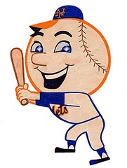
Would this little guy’s father please stand up?: Speaking of designers who’ve never gotten their due, the vintage Mr. Met decal featured in Brinke Guthrie’s most recent installment of Collector’s Corner got me wondering: Who designed Mr. Met? The live mascot began appearing at Shea Stadium in 1964, but the cartoon character made his debut a year earlier, on the cover of the 1963 yearbook. Who drew him? I’ve asked quite a few people lately, including Mets scholar Matt Silverman and illustrator Joe Petruccio, but nobody seems to know.
Sadly but somewhat predictably, that includes the folks at Wilponics Inc. A Mets PR guy who I spoke with yesterday said that the team has no records of Mr. Met’s creator. The person who probably would have known was the team’s first promotions director, Julius Ochs Adler, who died in 2003. I thought maybe I’d find the answer inside the 1976 yearbook, whose cover design appears to have been drawn by the original Mr. Met artist, but the credits for that yearbook are maddeningly incomplete, with no mention of the illustrator.
Whoever the designer was, he was clever. Look closely and you’ll see that Mr. Met’s pupils were originally depicted as miniature baseball diamonds. And as I’ve been pointing out lately here on the site, Mr. Met always — always — wore a cap with an orange brim. Yes, that’s uni-inaccurate, but it speaks to an impressively programmatic approach to creating a telltale visual calling card (much like how Mr. Redlegs is always shown with one upturned collar point).
Mr. Met deserves better than to be an orphan. Nearly 50 years after his birth, he remains an integral part of the team’s branding, and it is nothing short of a travesty that we don’t know who created him. So now I’m officially obsessed: We must determine who designed Mr. Met. If you have any info or leads, you know what to do.
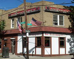
Uni Watch Lunch Report: Hopped in the car yesterday afternoon with NYC’s finest soul DJ, Mr. Finewine, and headed out to Queens. Our destination was Von Westernhagen’s, a neighborhood German joint that’s been slinging the spaetzle since 1964. It turned out to be the best lunch I’ve had in ages — excellent turnip soup, amazing house-made bratwurst with German potato salad (I liked the brat so much that I took a half-dozen links to go), very solid square hamburgers (that’s just half of one, because Finewine and I were splitting it), plenty of German beer on tap, and an owner named Connie who’s the bee’s lederhosen. I’m telling ya, it was like being in Wisconsin.
That’s the good news. The bad news is that Von Westernhagen’s is closing its doors for good “at the end of this week” (which among other things means they have served their last Tuesday luncheon special). We couldn’t get them to say whether that means the final day will be Friday, Saturday, or Sunday, but whatever — it’s soon. So you NYCers should cancel whatever plans you had for the next 48ish hours and haul your keisters straight to 71-28 Cooper Ave. in Glendale. You can thank me later. (Need more convincing? There’s a really sweet Von Westernhagen’s video clip here.)
Giveaway Reminder: Today’s the last day to enter the giveaway for the Africa Unity jersey. Full details here.
Stirrup Club Reminder: Robert Marshall is now taking orders for the next round of Uni Watch Stirrup Club designs. Details here.
Uni Watch News Ticker: Boy, this almost makes Chief Wahoo look politically correct by comparison. ”¦ Chicago isn’t the only city that can spell things out on buildings. That’s a building in Tokyo, spelling out “Banzai Nippon” (“Congratulations Japan”) after Japan’s World Cup win on Monday (with thanks to Jeremy Brahm). ”¦ I hear through the grapevine that next year’s MLB BP jerseys will be full button-fronts but will also have “almost Edge-like stripping up the sides and under arms.” ”¦ Hard not to like the name of this page (thanks, Phil). ”¦ Got a spare million burning a hole in your pocket? You could do a lot worse than spending it on this super-cool eatery (big thanks to longtime Uni Watch pal Tim Adams). ”¦ More news about that upcoming A’s throwback game: Joe Rudi will throw out the first pitch with an orange baseball (a Charlie Finley idea that never caught on) — a nice touch. Meanwhile, A’s equipment manager and Uni Watch reader Steve Vucinich appears in the video clip embedded on this page (with thanks to Mike Rowinski). ”¦ Dan Cichalski has come up with something really special: If you go to this page, you’ll find the audio that was broadcast on a Washington radio station on September 21, 1939. If you scroll down to track #11, you’ll get most of the play-by-play of the Indians/Senators game that was played that day. It picks up in the 4th inning and continues through the end of the game. An amazing time capsule. ”¦ Also from Dan: As many of you know, the Pittsfield Colonials are wearing super-old-timey uniforms this season. There’s some really good coverage of them, including lots of photos, here. ”¦ New throwbacks for the Saskatchewan Roughriders, and they’re already a source of controversy (with thanks to Doug Brei). ”¦ Mike Lafferty isn’t fond of the orange/gray Nike cleats being worn by many World Cup players, and I’d have to agree with him there. ”¦ In case you haven’t seen it already, Wally Backman’s fully mic’d tantrum makes for very entertaining viewing. ”¦ The Warriors will be unveiling their new look, which has already been leaked all over the place, at their draft party next Thursday. ”¦ Giants closer Brian Wilson got a rare at-bat yesterday. Apparently he doesn’t have his own helmet, because he wore Matt Downs’s lid (good spot by Christopher Rogers). ”¦ See the gap toward the bottom of this kid’s jersey? That’s Jeremy Schneden of Burlington High in Iowa. “He has a button missing, but he thinks it’s good luck, so he’s not replacing it,” says his coach, Scott Mason. ”¦ Here’s something new, at least to me: a baseball-themed corset (big thanks to Rob Harrigan). ”¦ Cash Collins has founded a charitable group to provide equipment for Little Leaguers in South Carolina and the Dominican Republic. How does he intend to do this? Through the power of stirrups, of course. ”¦ The Bucs will wear their creamsicle throwbacks on December 5th. ”¦ You definitely shouldn’t go see the Brooklyn Cyclones on Monday, unless you wanna subject yourself to this (Dan Cichalski yet again). ”¦ Very nice blousing last night by Jimmy Rollins, who was on a minor league rehab assignment. Looks like he was going double-flapped, too (photos by Jim Taggart, and forwarded my way by Adam Brodsky). ”¦ You know what product category is often blessed with spectacular package design? Crayons (thanks, Kirsten). ”¦ Here’s a ranking of all the Detroit area’s uniforms (with thanks to Patrick Coletta). ”¦ A theater company in Cambridge, Mass., is currently performing a show called Johnny Baseball, in which Red Sox history is set to music, complete with uniforms.
Your High-Socks FTW link has some stirrup porn that’s borderline NSFW.
/sarcasm (if it’s not too early for that tag)
—
Also, Paul, you did a great job with this interview. It’s really interesting how little credit the individual designers get for their work, in general. It’s weird that he never even got a helmet from the team. I’d want one, but then again, I’m the person who keeps every newspaper his stories appear in.
Weird that the Pittsfield Colonials are wearing the blue tops during road games. They are supposed to have gray tops to pair with the gray pants, but maybe they aren’t doing that? Also, was it normal for 19th century teams to wear jerseys that didn’t match the color of the pants? I think the Colonials would look even better if they’d break out navy blue pants…
POSSIBLY THE BEST NOB EVER:
link
POSSIBLY THE BEST NOB EVER:
Daniel Te’o-Nesheim
June 16, 2010 | Last Updated: 6/16/10 5:38 PM ET | Comments (0)
With Daniel Te’o-Nesheim officially joining the Eagles roster, the 10th of 13 draft picks to do so, the question now is what kind of impact the third-round pick can have as a rookie for defensive coordinator Sean McDermott.
Te’o-Nesheim is part of the overhaul on the defensive line and is certainly expected to make an impact getting after the opposing quarterback. But let’s not forget that the Te’o-Nesheim selection, 86th overall, was pegged as a “reach” by many draft analysts who didn’t expect the University of Washington product to go so high. And while the rookie certainly hasn’t even come close to proving anything yet, it’s obvious that the Eagles expect the soft-spoken lineman to make an immediate impact.
Yay creamsicles!
great interview paul
btw…obama has weighed in on the vuvus
Listening to the Blue Jays-Padres game last night and apparently Ricky Romero had a decal-less batting helmet. Any photos?
Actually, I think the Brooklyn Cyclones special jerseys are perfect; that’s usually what the front of my shirt looks like after I ride a roller coaster.
Here:
link
Count me as a fan of the Bengals’ helmet. Kudos to you, Bruce Claypool.
I chose the Bengals as my favorite team back when I was 12 or so based on the striking simplicity of that original helmet. I thought it stood out among all the others, bravely and defiantly plain.
Now, I’m one who hates tweaks–mostly. (See Vancouver Canucks stick-in-rink). I say, if you’re going to change it, CHANGE it. Blow it up and start from scratch.
I didn’t see the Bengals change coming but when I did I wasn’t sad or mad, because it was bold and decisive and, thanks to Bruce Claypool’s design, brilliant.
Great to hear from the creator.
Paul, You absolutely MUST check out link re: “The Gobbler” aka “The Grooviest Motel in Wisconsin” by James Lileks. Take link… you won’t be sorry.
Excellent interview with Bruce Claypool. Everything I ever wanted to know about the Bengals’ helmet (and then some) was covered! Too bad they didn’t give him a crack at the rest of the uniform.
I forgot to add… there’s a lot of purple. A lot.
Paul- In Brazil’s World Cup match the other day their starting lineup wore jerseys 1-11. I don’t have photos of it but it’s pretty amazing.
Me, too.
Here you go.
link
(Brazil v. North Korea, page 6 of ESPN’s photo gallery.)
The pose of the starting 11 seems to be a tradition. 6 up, 5 kneeling, goalie and captain on the far side in the back row.
J-Roll can go hi-cuff in the majors, too. link
Got a spare million burning a hole in your pocket? You could do a lot worse than spending it on this super-cool eatery
Oh, my god – link!
I used to drive past that place going between Milwaukee and Madison. For a while I was making that commute every day, and used to slow down just a bit to marvel at that building.
Are you being sarcastic? I can’t tell because here’s what I got when I clicked on the hyperlink:
Request Blocked by Real-Time Classifier
Your request to URL “http://highsocksftw.tumblr.com/” has been blocked by the Webwasher Real-Time Classifier. The page was classified as sexual, erotic or adult content (70% probability overall) which is not allowed by your administrator at this time.
Oh man – those Riders’ retros look great but the non-green issue will be huge in Riderville. It is true that this province bleeds green. They have the absolute best fans in the CFL. Although sometimes they get a tad carried away:
link
Nice to see the ‘every link opening in a new tab/window’ thing fixed – that was driving me nuts!
No word verification??
I recently read a bio of Paul Brown and would like to share two points pertinant to recent discussions.
According to the book, Brown chose the original uniform design, and he deliberately chose a quite plain design because he didn’t want to bring undue attention to the team at a point when he expected they would struggle. He reportedly was angry at the deal the team got to stock players from college and the rest of the AFL/NFL.
You also ran a photo of him recently with a hat adorned with “CB”. Yes, that’s from the Bengals. There’s a picture of him wearing the same hat in the book.
link
I seem to recall that he wore a nearly-identical hat with the Browns, but can’t find the photo I’m thinking of.
We’re trying a different kind of spam-blocker. If it works — and so far it is — we won’t need security verifications for comments.
Yes, I realize there are other small issues with the site at the moment. We’ve been hit by a lot of software attacks in the past week and have been scrambling to respond. Hand in there — we’re working on it.
Best. (Hotel-Focused) Website. Ever.
I missed the conversation yesterday, but am loving those new stirrups. I’m going to order a pair of the Milwaukee Braves’ version – not because I’m nostalgic for them (although I am), but because they were also worn by the old link (even before they were owned by the Braves).
Hats off to Mr. Claypool. When I was a kid following football in the pre-1981 era it always seemed there was this annoying imbalance in the NFL’s graphics spectrum… some kind of unfinished business – and that was the Bengals’ helmet. When the Claypool design came out it seemed like everything was now right in the league. (Actually, the Browns’ orange pants were another mistake that needed to be corrected, and eventually was).
It’s interesting that Paul Brown suddenly wanted to differentiate the Bengals from the Browns. Wasn’t the whole idea behind the Bengals’ uniform to look as much as possible like the Browns as a sort of professional nose-thumbing?
confused. how can bruce claypool take credit for a design that was designed 12 years or so before his?
the helmut stripes in the paul brown pic from the “sixties” are, umm, like, you know, a little similar to mr claypool’s. apology in advance if i’m missing something. duotasking watching greece – nigeria.
Corn Flakes are cereal. Fruity Pebbles are cereal. The folks at Kellogg’s should not take credit for Post’s cereal’s deliciousness.
East Central University in Oklahoma a D II school in the Lone Star Conference is using the Bengals reverse field version:
link
link
Dennis
Just for the heck (or is it the “Ek”) of it (sorry), I think John Ekdahl needs a major shout out for all the work he does behind the scenes.
He doesn’t post/comment much anymore so we can’t thank him publically . . .but we ought to!
Sorry that should be WAS.
Sad to hear that a joint like VonWesternhagen’s is closing. That looks like just the kind of place I like to find when visiting NYC. I’m actually heading out there in about a week for a wedding, too bad it’s not this weekend.
Being an avid stirrup-club member, I enjoyed the link to the Stirrup Project. Better yet, I bought a t-shirt, so I can feel good about providing baseball gear to underprivileged kids. Now I can wear my stirrups for a good cause!
Claypool’s design is his and his alone, despite the fact that somebody else (unbeknownst to him) previously had a similar idea.
It’s not the idea that’s important, it’s the execution of that idea. Hence several months of drawing different striping patterns on blank orange helmets.
I recall Brown being pissed about that.
I also remember thinking, “What, because he’s Paul Brown his expansion team should get stocked differently than the way all the other expansion teams had been stocked?”
—Ricko
Thanks! I’m always here behind the scenes.
These attacks seem to come in waves. It was pretty smooth for a while until this weekend. We’ve made some major improvements and changes. A lot of the visible changes you see are due to certain addons and plugins no longer being updated (these are the most vulnerable to attacks), so they had to be jettisoned.
I’m hoping this new spam catcher works so everyone won’t have to do the captcha/math stuff anymore.
If anyone has any comments, questions or problems of a techical variety, you’re free to contact me at webmaster[at]uniwatchblog.com
I don’t know about that. Although he might have enjoyed whatever agita it caused in Cleveland, he always denied deliberately trying to make any connection in the minds of fans.
I always chalked up the similarities to his own personal aesthetic. Brown was quoted as saying “nothing is worse than a bad team with a crazy-looking uniform”. If only his son had remembered those words.
Seems more like Brown respected the fans, but tried to get under Art Modell’s skin.
so, since i (hopefully) will have the rest of my friday’s off this summer…
i’m celebrating pÄ…czki day today
mmmmm…
jellypowidÅ‚a donutsMatt from L.A.: Paul- In Brazil’s World Cup match the other day their starting lineup wore jerseys 1-11. I don’t have photos of it but it’s pretty amazing.
Here you go.
link…
(Brazil v. North Korea, page 6 of ESPN’s photo gallery.)
The pose of the starting 11 seems to be a tradition. 6 up, 5 kneeling, goalie and captain on the far side in the back row.
It’s also tradition for Brazil to give #s 1-11 to their starting lineup.
Fridays off?
Must be a government job. ;)
—Ricko
Let’s call ’em “Rocking Chair” unis.
Y’know, as in, crazy-unis on a bad team give the illusion of excitement, and a rocking chair gives the illusion movement without making any real progress.
(Think it was JFK who said something like that about rockers).
—Ricko
Ha, my brother’s wedding reception was at the Gobbler. A Jefferson County reference on UniWatch! I hope there are more coming…
A tradition they can’t always follow.
link
link
To be fair, I believe Brazil gives its regular starters 1-11, but I don’t believe you can do that on a game-by-game basis. I believe once a player has a number for a particular FIFA tournament, they can’t change during the tournament (I believe you can only be numbered 1-23 as well). So you couldn’t have someone start in your place one day and take your number.
Though I did know of a college team whose coach used to do that on a game-by-game basis. The eleven starters were 1-11, meaning you might wear #9 one day and #8 the next game. That’s very old school. It’s also why #18 is a traditional backup goalkeeper number, because the backup keeper was usually the very last guy on the roster (#18).
Yes!
Yay to Bruce Claypool as well! Great interview.
Boo to the Brooklyn Cyclones.
link
I would not wear that when at bat, I would not wear that with a hat. I would not wear that, and that is that.
it’s no worse than (and better than) a lot of the crap you would wear…
just out of curiosity — is it because it’s tie dye? something about tie dye you don’t like? or perhaps those who are given to wearing such a garment?
ironically playing a rams knockoff…
It’s the tie-dye look itself.
Never liked it, even as a kid, before I knew of its origins. Always hated those colroful blacklight posters from the same era.
World of difference between these:
link
link
and this:
link
JTH, the stirrup site is blocked most likely because it uses a lot of swear words.
The Mexico/France soccer match is color-on-color. Does one of the teams not have a white version of their uni?
France and Mexico kicking off now.
Les Bleus in all blue with the red and white gills on the jerseys. Gracias to Mexico for not wearing the BFBS unis. Looking much better in the green over white.
Oooo, two minutes in someone from Mexico hit the post. Both sides are bringing it early on.
Has anyone listened to the Indians-Senators radio broadcast that Dan Chichalski found? Absolutely fascinating!
link
The style of the announcer is really bland and (relative to the style of announcing today) sounds very amateurish; just balls and strikes with little embellishment. (In fact, the first announcer you hear is Washington pitching great Walter Johnson- the second announcer is a bit better.)
I’ve heard many minor league radio broadcasts that sound more polished. Plus they are picking up a major league game and only beginning the broadcast in the fourth inning.
Does anyone know of any websites that have similar broadcasts of past major league games available?
Well worth a listen…
France’s white unis are tres magnifique:
link
Those World Cup cleats aren’t orange and grey. It’s a purple color. So they are even worse!
$400 of ugly
link
Maybe it’s the same shade of “lavender” the link & link coaches were wearing a couple seasons ago?
i wasn’t in the comments late, but did everyone see the saints championship rings?
link
wow! didn’t realize this was going on either:
link
Nice, Jim. (And I’m not talking about the uni.)
Those are nice… but I’m curious why its color on color? Does Mexico not have a white jersey?
Well, they’re BOUND to find Jimmy Hoffa now!
Nope, they have an all-black uni. Therefore, this looks so much better.
link
I’m learning…
Oh, and thanks. ;)
Fantastic interview with the man who helped design the current Bengals helmet, and worked so closely with David Boss'(s) NFL design team back in the day. Love the fact that he’s an industrial designer at heart; “…working in three dimensions is still the way to go.” Regarding helmet designs, and car designs.
Could be. Or it’s just because random shit gets blocked here quite often.
They appear to have fixed this one, but it used to be that any URL with the word “adult” in it would get blocked. Like, say there’s a ticker item about a jersey on eBay and the URL has something like “…jersey-adult-large…” in it.
Oh, here’s a good one. I tried to do some online shopping for my kids and link is blocked: “The URL is listed under categories (Provocative Attire, Search Engines), which are not allowed by your administrator at this time.”
Regarding the Brazil 1-11…
I can remember when Argentina distributed shirt numbers in A-B-C order. In fact, Ossie Ardiles actually wore #1 in – I think – the 1982 World Cup in Spain. Has to be the only time I ever saw a position player in soccer wearing #1.
Color on color link in soccer. Soccer doesn’t have the “one team must wear white” rule that American sports do.
They also don’t technically have “road” uniforms. Instead they have “clash” or “change” uniforms, their second choice.
If one team is in white, then it’s because they chose to wear white. Like England and the United States, who wear white shirts unless they’re forced to change because of a clash.
Ahhhhhhh! Thanks. So that’s why they call them “change” uniforms. Never knew why.
And worth pointing out that because of the prevalence of striped shirts in club soccer, UEFA insist that each team competing in European competition has three registered uniforms to avoid any potential clash with the home team’s kit should it be made up of two major colours. Celtic, Internazionale, AC Milan etc.
For the World Cup Finals, FIFA stipulate what uniforms should be worn on a game by game basis.
gotcha
so you like wild and crazy colors
just so long as they’re not stoner wild and crazy colors
awesome post today!
in from tck today:
the browns are FINALLY right! amerks are in, and in plenty of time before the fourth, and they look fantastic.
i am not a fuge booster of team rooster, but they got jobbed in this match. and some of you should be happy, the mexicali ole’s are drowning out the horns.
Univision must have its crowd mics strategically placed. All I can hear on the espn3.com feed is the buzzing.
holy crap does that look great! that is one sharp stirrvp look my friend.
gracias…the pÄ…czki rocks with the
purpledeep reddish/blue saniDoes anyone have a picture of the navy uniforms the Tigers wore for one game around 1994? I remember seeing it in the comments here a while back but I sure as heck can’t find it now, and it was a pretty low quality picture if I remember correctly.
The Bengals uni’s start and end here.
Period.
Great article, btw.
link
link
Holy hell that is terrible.
No reason Claypool’s helmet couldn’t be wore with that uni. Tiger stripes don’t have to be everywhere. Sometimes a graphic can be designed just for the helmet. Eagles and Rams, for example.
—Ricko
wow…did they really use copperplate gothic for that font face?
link
From Paul’s link.
This keeps me thinking that perhaps Copperplate Gothic Bold is simply a placeholder.
link
Warriors logo and home uniform officially unveiled:
link
Not a bitch, just an observation:
I’m noticing that links in the comments are opening in the same window/tab. This is happening for everyone, right?
Happening to me, too, and because of it I’ve accidentally closed down UW a few times.
yes…we (and by we, i mean ek) are working on it
Don’t get your hopes up.
So the cruddy looking digitized images … accidental/incidental, or intentional so they can’t be reused for unauthorized marketing?
The first paragraph of ESPN’s Recap of today’s Rockies/Twins game.
“MINNEAPOLIS — With his old-school stirrups pulled high and a 100-mph fastball in his holster, Ubaldo Jimenez is taking pitching back to a bygone era where gunslingers like Bob Gibson and Sandy Koufax dominated the landscape.”
Man, I love Ubaldo. (helps being a Rockies fan)
From what I’m reading in the comments, I guess I consider myself to be in the minority, but I love the new logo! Being born in 1991, this is not only the first time I get to see a “The City” motif logo, but also the first time I get to see the hockey-style crest on the new unis in my lifetime. I consider the uni traditionalists that came long before me to be lucky that they got to see the Warriors’ unis in their young days. Sure, the font is clearly something out of MS Word, but I say appreciate the good points of the rebranding, instead of focusing on the one negative. This, B.T.W., is coming from a Lakers fan.
On it:
link
Saints Super Bowl ring:
link
Anyone else here like the mini-baseball helmet sundaes they serve at ballparks? Now you can get one at your local Baskin-Robbins! link
I’m off to BR right now!
Aside from the use of Copperplate, the new Warriors uni is amazing. But even that’s forgivable– it’s just too nice. Great work.
Has there ever been a Uni Watch column/blog post about teams that establish “modern” new identities, only to ditch them for their old identities later? Just curious, because it’s really becoming a trend in the NBA now.
Teams that I’ve seen do it:
MLB
Chicago White Sox (interlocking S-O-X logo, to 70s batter logo, back to interlocking S-O-X)
Atlanta Braves (lowercase A and crazy pullovers back to traditional uniform and capital A)
Philadelphia Phillies (red to maroon back to red)
LA Angels, sorta, when they ditched their Disneyfied uniforms for the halo-A again
NFL
San Francisco 49ers (now again wearing their Montana-era colors)
New York Jets (return of the Namath-era logo/unis)
New York Giants (from ny to GIANTS back to ny)
San Diego Chargers, sorta (return of the white helmet full time, although modernized)
NBA
Philadelphia 76ers (return to old logo/red white and blue)
Utah Jazz (use of old logo as secondary, return of green and gold)
Golden State Warriors (return of old colors, bridge motif)
Cleveland Cavaliers, not really, but they did restore wine and gold as colors and are using CAVALIERS and not CAVS
NHL
Vancouver Canucks (return to blue and green, increased use of stick-in-rink)
New York Islanders (the rise and fall of the Gorton’s Fisherman)
Pittsburgh Penguin (skating penguin, to pigeon, to skating penguin)
Buffalo Sabres, probably (assuming they ditch the Buffaslug as indicated)
Washington Capitals (from red/white/blue to Wizards colors to red/white/blue)
go check out the Stirrup Project!!!
AB, you can add the Seattle SuperSonics to your list of NBA teams (god rest its soul). They went to that dark green and red business for a few years before going retro for their final years.
of course the
goddamyankees may have been the first to do it, first sporting this in 1912, only to abandon it, bringing it back for good in 1936 (of course, with a different cap & ‘rups)…/that’s kind of a stretch tho ;)
The Detroit Pistons, with the teal abomination breaking up the red/white/blue.
The Calgary Flames, as their fire-breathing horse failed to supplant the classic C.
The New York Rangers, if you want to count the short-lived John Ferguson “Jets” uniforms as a departure.
The St. Louis Blues, as the red came and went.
The Indianapolis Colts, when the color silver didn’t stick.
That’s all I can add for the moment…
Even more delightful — today Uball decided to wear the normal uni, rather than the stupid black sleeveless jersey.
You know, I really like that. I might need to become a Warriors fan.
Kinda like the one this former MLB owner is wearing? But not as good looking? That one?
(I am obligated to link to this photo whenever the Rockies’ black or the Pirates’ red vests are mentioned. It’s traditional. Like blowing a vuvuzela at a soccer match until your lips look like Meg Ryan after botox.)
—Ricko
The link! The link!!!
link
Will there be a cable car on the back? Or will the new jerseys feature “plain” numbers and names?
Evidently the Bay Bridge is now the prime visual to suggest San Francisco, replacing the Golden Gate?
Just kidding, it DOES make sense. The Warriors don’t play in Marin County, and that new bridge does connect both sides of the bay.
Seriously, it’s good to see the look come back. Always did like those Golden Gate and Cable Car unis with “The City.” Wouldn’t work these days, of course.
Though most visiting teams do still stay at hotels in The City.
—Ricko
Just a guess, but I’d think not. The Warriors play in Oakland. No cable cars in Oakland. Maybe a BART train?
—Ricko
BART train…
link
No Ricko, THIS is a BART train. (On a rail to boot!)
link
thx for the input Hemo/Phil/Mike. Forgot about the Sonics as well as the Pistons. I thought about adding the Rangers and Blues but it was really more of a uni change than an overall identity change for them.
You could also probably throw the Flyers into that mix, since they’ve pretty much shelved the EDGEy black home sweater in favor of the retro-inspired orange top.
link
How hard would have been to do something like this?
His dad’s such a homer.
called the local B-R.
first attempt—-no answer.
second———–fax machine tone
third————‘uh, we don’t have those.’
To be fair, I believe Brazil gives its regular starters 1-11, but I don’t believe you can do that on a game-by-game basis. I believe once a player has a number for a particular FIFA tournament, they can’t change during the tournament (I believe you can only be numbered 1-23 as well). So you couldn’t have someone start in your place one day and take your number
Correct. The 1-11 go to the starters in the first match. Injuries, tactical reasons, poor form, disciplinary suspensions, etc., can and do lead to changes.
Did anyone mention the Bucks? Went from green & red to multiple shades of green to green & purple and finally back to green & red.
Do the Leafs count? Not exactly a major overhaul, but next seasons unis definitely bring back a more classic look.
link
Also, one of the three goalies each team must have on their roster is required to wear 1. So no Ossie Ardiles wearing 1 anymore…
Late to the party today. Trying to play catchup while watching the C’s and Lakers.
Terrific interview with Bruce Claypool. The Bengals’ helmet may be polarizing, but it’s been tops with me ever since I saw the photo of Forrest Gregg introducing it and explaining the players better live with. I’m disappointed, Claypool was disappointed with the rest of the uniform. That kit remains one of my favorites.
Paul, you ought to follow up in a couple weeks to see if the Bengals send that man a helmet!
I’m anxious to see the rest of the Warriors’ uniform. So far, so good. I can even live with that goofy collar. (BTW I’m a Copperplate fan. It’s a classic. I’d pict another typeface to go with the bridge logo, but really, you can’t go wrong with Copperplate.
OK, back to the game. Get with it, Celtics.
Outstanding interview with Les Claypool. Once again, a guy with my dream job.
I liked the uniforms that went with his helmet design. All the craziness of animal patterns confined in solid stripe patterns. UCLA stripes to boot.
I have to laugh at this because I found myself thinking the same thing every time I saw “Claypool”.
OK, since the seal has been broken, I can finally post link, which has been in my head all damn day.
I was always partial to this.
link
Man. I sure did love them in 90 & 91. I haven’t since. Since the Warriors unveiled shit today, it’s kind of appropriate. I was also into two other Bay Area bands at that time. The Victim’s Family and Plaid Retina. You may as well throw in those Canadians, No Means No. At that time, I thought only three pieces could deliver.
congrats lakers
imagine how much better the finals would have been with this?
It’s hard to beat these lyrics:
They call me Mr. Knowitall.
I am so eloquent.
Perfection is my middle name.
…and whatever rhymes with eloquent.
~~~~~~~~~~~
So does Phil (not the Long Island variety) get the XI hat tonight?
The Yankeescowboyslakers win again.
Fuck!
Went to my local BR and was offered Cubs, ChiSox and Cardinals. Odd that they didn’t have Tigers considering I’m in the Detroit market but that’s OK, I already have the Tigers one. I chose Cubbies but was disappointed that the C wasn’t a raised one like the real helmet. I’m planning on gaining 50 pounds this summer now.
Come to St. Louis. Ted Drewes has almost every team. Unicolor only, however. Thank God for alternates, eh Brave’s fans?
Is the C disproportionately huge? The ones they have at Wrigley are. Check link out.
~~~~~~~~~~~~~~~~~~~`
More from link.
That just reminded me of when I went to the Mets game and they had black and orange. Looking back on it, I should’ve gone with orange. That was back when I was living in the dark ages.
Beats the Yankeescowboysceltics.
Go Lakers!
Fixed. So happy Boston lost. :-)
More from Mr. Claypool.
I was a little late to the party on these boys, but they killed Mr. Claypool for me.
link
Beats the Yankeescowboysceltics.
Go Lakers!
Yikes! I always go with the lesser of two evils.
At least Shaq won’t be rappin, “Hey Kobe… you couldn’t do it without me…”
Yeah, I know that Kobe has won one since that killer freestyle.
I would give anything to match wits with Shaq. Shit, I would straight up battle him.
Honestly. I love the vuvuzelas. But I’d be willing to give them up if everyone would just quit their bitching and moaning about them.
link
Hey! Where did my spam word go?
best idea yet…that would make EVERYONE happy
and i sent that hitler video to paul last night…guess he didn’t think it would make for a good ticker add
ben…check your email
let’s not overreact for corn’s sake. who wasn’t afraid of thundersticks, and they were one and done more or less. and let’s not forget that the international sports scene is much much different than the u.s.. look at out of country baseball, they have all sorts of fun that our puritanical asses won’t have. but thousand decibel ac/dc or hawks song is aaaaaaaaaaaaaaaall fine as long as we sit on our fat fat asses mostly. there are all sorts of thing i like and don’t about going to a game and crowd “participation”, and the horn is/would be so much less annoying then drunken fratboy. let the stadium canned music and “clap here” signs go away, bring the noise back to the crowd. nertz to the horn backlash and the nuck=futz who hate fun.
Fun haters. Worthless friggin fun haters. Goes back to more and more regulations. Bigger government. Less freedom.
I will always say KEEP the indian names, LOSE instant replay everywhere, KEEP the vuvus, LOSE interference in hockey (sorry teebz), KEEP the DH, LOSE offsides in soccer, KEEP the NCAA tournament at 64 teams, and LOSE the BCS.
Paul, Thanks for the tip on Von Westernhagen’s. I had a buddy of mine in town and we were trying to think of a different place to have dinner and I remembered that you said this place was closing for good, so we went. Great food and beer! We also had a special treat in that someone was celebrating their retirement there last night and they had a belly dancer there to entertain, which was kind of weird, and kind of fascinating. Thanks again for the tip. Keep them coming.