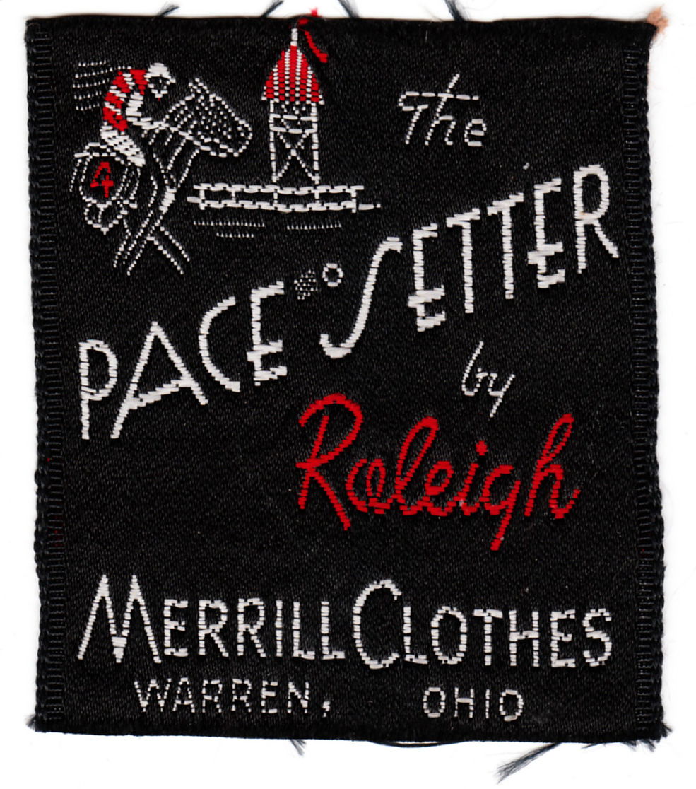
Is that a magnificent clothing label or what? The typography, the little horse racing vignette, the composition. It’s all the more impressive when you take a closer look and see that all the lines and strokes are comprised of horizontal dashes, and still more impressive when you realize that the whole thing is just a few square inches. It’s a mini-masterpiece of design.
That’s one of 122 labels that I recently won on eBay. Unfortunately, almost none of them are from uniforms or other sportswear, although a couple of them have sports-related content, like the thoroughbred scene shown above. In any case, they’re worth examining in closer detail, so let’s take a look:
• Love the little tennis and golf crest in the corner of this Brunswick tag. Actually, I love the whole design.
• Not sure which I like better — the hunting scene (complete with pipe!) or the brand name “Mid-Zip.”
• Here’s an unusual iteration of our friend Brownie the elf. Note that he’s knitting!
• I’d never heard of zephyr fabric until I saw these labels. If you google the term, you come up with several different definitions, and I’m unsure which of them, if any, would apply to clothing. Anyone know more about this?
• I love the little American Gothic-esque scene here.
• This one puzzled me. How could a T-shirt be patented? So I looked up the patent number and sure enough — a patented T-shirt! If you read through the patent text, you’ll see it’s for a one-piece design that promises greater comfort, sizing flexibility, and manufacturing yield. Since I’ve never seen a one-piece T-shirt, I guess that concept didn’t catch on.
• I love this slogan: “Loomed to be Heirloomed.”
• There’s something really perfect about a guy named Sol the Clothier.
• There are several labels from manufacturers in Florida, and they all feature that all-purpose Sunshine State signifier, the palm tree. I’m figuring this was probably a Florida operation too.
• Interesting that they went to the expense of a second thread color for such a subtle gray effect.
• Another example of a two-color design in which the second color was barely used.
• Here are two variations on the same basic design. I love the little asterisk and the trademark notation.
• Some brand names are just inherently amusing, like Nubbies or DaintyTogs or Duckee Duds.
• Oh man, this one is so beautiful. I particularly love the red accents in the green lettering.
• At first I was confused by this one, because I thought “Cravenette” was a take-off on the term cravate, which is a neckwear term, but the label seemed to big and wide for a tie. Turns out “Cravenette” actually refers to a waterproofing process.
• Unfortunate ethnic stereotyping or no, this is one impressive design. The white portions against the off-white background are particularly nice.
• And as long as we’re talking about ethnic stereotyping: Here’s your gratuitous Native American reference (juxtaposed with the term “Army Cloth”!), and with Orlon and wool you get egg roll.
• I’m not sure what to make of this. Like, does the clothing grow with you? Or are you supposed to buy a new one each year? Whatever — great design.
• I’m assuming “Gab-O-Sheen” referred to gabardine fabric.
• Look at this: the same design executed in two different colors. I’m sure you can guess which one I prefer.
• I don’t have much to say about this one except that it cracked me up.
• When I saw these two labels, the first thing I thought of was Charms candy.
• Wanna see something awesome? Take a look at those last two labels from the reverse side — look here and here. (The black splotches on the edges are from where the labels were originally pasted into an album with black pages.)
• In fact, lots of the labels are at least as interesting from the back as they are from the front. Many of the rear views are nicely abstract, and they also give a sense of how the thread patterns were woven into the label. There are two that particularly intrigued me: (1) It’s fun that this label shows a fence, but shouldn’t it be white? It is white on the back. (2) It’s very odd to see white thread on a white background, but it’s super-beautiful from behind.
Want to see more? The whole set is here.
Everybody’s (just) doing it: Major development last night in Arizona, as Cy Lincecum was breathing Ethier thanks to his E-section (screen shots courtesy of Laren Richardson and Joe Plate). Since Andre Ethier hails from Phoenix and had been placed on the DL the day before, the question has to be asked: Was this Lincecum’s way of sending a “Get well soon” shout-out to 2010’s best offensive player in his hometown? Seems like a crazy notion, but remember, this is Lincecum we’re talking about here. Intriguing.
ESPN Reminder: Paul here. In case you missed it yesterday, my latest ESPN column is here.
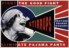
Uni Watch Stirrup Club Update
By Comrade Robert Marshall
Comrades, it has come to the attention of the Revolution that pajamists have unleashed an insidious plot on the proper aesthetic. They clearly fear our seductive hosiery, and have draped Uncle Sam in pajamas in an effort to discredit us. In a brazen move, they had the audacity to try to sneak this into the local VSW Hall in a poor attempt to appeal to people’s sense of modesty. But the veterans of stirrup wars know the proud hosiery history of this country. Revolutionaries remember the 1776 behosing of the original Baltimore Oriole mascot that started an uprising, and they know where Betsy Ross got the idea for the American flag design. The memory of these and other seminal events in the Revolution’s history give me cause for reflection, and so for this 4th of July I am offering a stirrup that screams America. It is as of yet undetermined exactly how many stripes I can get onto the top of the stirrup (13 may be too many to hope for, but we’ll see).
I know I normally wait until the newest orders have been sent out before I introduce anything new. But in order to assure that our patriotic offering is in your hands by the Fourth, I will need to order immediately, and want to give people the opportunity to get in at the “new” price, and not just send them immediately to à la carte. For full ordering details, look here.
— Robert Marshall, comrade 91200
Collector’s Corner
By Brinke “Sky Chief” Guthrie
Growing up in Louisville in the ’60s, I wasn’t aware of the NFL until 1970 or so. The first NFL uniforms to catch my eye belonged to the Chiefs and Vikings, who faced off in Super Bowl IV. I ended up buying this pennant at the first NFL game I attended, on October 18th, 1970, at the then-new Riverfront Stadium. I clearly remember buying it because I liked the Chiefs helmet logo.
In other eBay action:
• Always loved the Braves’ lowercase “a” logo. Went to a game at Wrigley once and bought a Braves helmet as a result.
• Interesting old look for the NY Giants.
• I recall this NFL cap design. Is that the worst ever?
• Nice deisgn on this old Bears pennant.
• This sticker features all the American League team logos from the early 1970s.
• Not sure which patch is more unusual here — the Dayton Triangles or the NFL Huddles.
• How about a sealed bag of mini-pennants?
• I’d buy this “NFL on Fox” T-shirt, but I haven’t been an “L” since, oh, middle school.
• Always thought the Seals had one of the more interesting logos.
• Weird to see the color scheme on these Rams pins, since I don’t recall the team ever having worn red.
That’ll do it for this week. Now back to Paul with today’s Ticker.
Uni Watch News Ticker: New uniforms for the Brazilian men’s and women’s volleyball teams, both of which will have striped liberos (with thanks thanks to Jeremy Brahm). ”¦ Also from Jeremy: FC Copenhagen in the Danish Superliga wore a special “Champions” jersey in their final game of the season. ”¦ The Oilers’ new AHL affiliate in Oklahoma City have unveiled their team name, colors, uniforms, and all the rest (with thanks to Brian Porter). ”¦ Have I mentioned lately that buttons on a baseball jersey don’t make sense? That’s Tommy Hanson from yesterday (with thanks to Shaun Tunick). ”¦ Over two years ago we talked about how the Dodgers had their coaches wear pinstripes in spring training. But now it turns out that the insignia on those jerseys, along with the caps, were red (major find by Dan Cichalski). ”¦ Also from Dan: Small glimmer of positive news at Minute Maid Park, where the Astros have brought back a live organist. ”¦ The Fukuoka Softbank Hawks have released their jersey and cap for the 2010 Hawks Festival in July (Jeremy Brahm again). ”¦ You’ve heard of HTML5? Google’s engineering director David Glazer decided it would look good on a Sharks jersey at the Google I/O developers conference in San Francisco yesterday (big thanks to Terence Kearns). ”¦ “My fourth graders had their biography presentations today,” says Marty Hick. “It’s always a pretty big occasion that wraps up the school year, so for the past few years I’ve been wearing a suit (with Chucks).
But this time I decided to step it up a notch by wearing stirrups. These were the stirrups my Little League team wore back in 1984 and ’85 — not literally the exact pair I wore (those had to be turned in) but from the official allotment (my friend’s dad was our coach and he found a few in storage at his parents’ house). Now, don’t tell Phil, but I’m not a ‘Stirrup Friday’ kind of guy — wearing two layers of hosiery on my calves all day is not entirely comfortable, plus, I try to avoid even the subtlest of mass movements — but wearing these felt pretty good.” ”¦ Hey, ump, your cap is backwards! That photo is from a really wonderful audio slideshow about the connections between baseball and cricket. Recommended (big thanks to Chris Bisbee). ”¦ “I was going through my collection of MISL programs and came across a pair of ads depicting the league’s uniform suppliers,” writes Matt Newbury. “The Admiral ad is from the second season the MISL played, 1979-80. The teams depicted are the Philadelphia Fever and Buffalo Stallions. The Shez ad is from 1981-82 and depicts a player from the Baltimore Blast.” … Bit of design change for Jupiter, which has lost one of its stripes.
And I’ve already packed me bagpipes: Tomorrow I head off to bonny Scotland, where I’ll be spending the next week enjoying a wee vacation. Phil will be minding the store while I’m gone and has promised to wear a kilt for the entire week (which should be interesting when Stirrup Friday rolls around). I’ll be back home by Memorial Day and will reclaim the reins on June 1st.
Ticker contributions can still be sent to the usual address, which will be forwarded to Phil. For non-Ticker communiqués (questions, research projects, etc.), please wait until I get back to terra uni. Thanks.
Oh, and I fully expect Jerry Manuel to be fired while I’m gone. Glad I’ll miss that circus.
I remember wooden football cards, they came in my woodburner set I received one X-mas. I seem to remember they were made of cabinet grade luaun. Probably 1975-76.
don’t tell Phil, but I’m not a ‘Stirrup Friday’ kind of guy
the revolution has ways of finding these things out
I like how the OKC Barons didn’t even bother to photoshop out the NHL logo from their “new” jersey.
link
link
I can help on Brinke’s wooden card.
It comes from a craft set of plaques that came with a plug-in heat wand. You would trace over the borders and it would burn, baby, burn. There may have been paints with it to finish the work of art. I never painted mine, though I burned away, It was cool to have, and the smoke would billow from the gridiron great’s head.
Merry Jerry won’t get axed this weekend – way the NYY are playing the Mets will no doubt sweep. Thus prolonging the agony, for both teams. Not to mention extending Beltran’s mystery rehab. . ..
Barons is a great name and there’s the makings of a decent logo, but they really dropped the ball on that design.
Six colors, really? Anybody ever talk to a screenprinter before? Why are people still making the wordmark the largest section of the shield? Isn’t the shield supposed to be a graphic representation of the team? And what’s with the beveling? Is it still 2005?
FAIL
[quote comment=”391112″]Barons is a great name and there’s the makings of a decent logo, but they really dropped the ball on that design.
Six colors, really? Anybody ever talk to a screenprinter before? Why are people still making the wordmark the largest section of the shield? Isn’t the shield supposed to be a graphic representation of the team? And what’s with the beveling? Is it still 2005?
FAIL[/quote]
Well, gee, everyone knows more is always better, right?
And darker is universally an improvement, too.
(eyeroll)
Hey, PAUL, we gonna get a haggis report regularly?
Y’know things could be worse. Scotsmen could be wearing ankle length kilts. Man, we’d really miss out on some great socks then.
And we would still call them kilts, despite them resembling those long “hostess skirts” of a few years back. After all, basketball shorts are still shorts…even though they’re more like, I dunno, clamdiggers or something.
Have a great and memorable trip, Fearless Leader.
—Ricko
[quote comment=”391112″]Barons is a great name and there’s the makings of a decent logo, but they really dropped the ball on that design.
Six colors, really? Anybody ever talk to a screenprinter before? Why are people still making the wordmark the largest section of the shield? Isn’t the shield supposed to be a graphic representation of the team? And what’s with the beveling? Is it still 2005?
FAIL[/quote]
The name “Barons” already has a long history in the AHL. Cleveland has used it on several occasions. Personally, the Oilers’ choice of “Barons” for their AHL franchise shows a complete lack of creativity and some serious disregard for the history of the AHL.
link?
Sounds like Sol’s a legitimate businessman for sure.
Finally watched the new Nike advert for the World Cup. It’s interesting that Rooney is wearing England’s World Cup kit while the other non-Nike uniforms are simply mock-ups of colors (i.e. Drogba’s Ivory Coast is supplied by Puma).
link
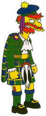
In the picture of Groundskeeper Willie above, it appears that he’s wearing an inverted Star Wars Rebel symbol on the front of his kilt:
link
I have to think this is intentional, right?
Now if you’ll excuse me, I’m going to go puke out my frightening nerd-ness.
[quote comment=”391114″][quote comment=”391112″]Barons is a great name and there’s the makings of a decent logo, but they really dropped the ball on that design.
Six colors, really? Anybody ever talk to a screenprinter before? Why are people still making the wordmark the largest section of the shield? Isn’t the shield supposed to be a graphic representation of the team? And what’s with the beveling? Is it still 2005?
FAIL[/quote]
The name “Barons” already has a long history in the AHL. Cleveland has used it on several occasions. Personally, the Oilers’ choice of “Barons” for their AHL franchise shows a complete lack of creativity and some serious disregard for the history of the AHL.[/quote]
It doesn’t seem to me that the Oilers have ever put much thought into nicknames so why start now?
Those labels are design perfection. Man. So much to like. The melding of art and efficiency and information on a tiny piece of cloth. Really, really great acquisition.
[quote comment=”391115″]link?
Sounds like Sol’s a legitimate businessman for sure.[/quote]
link
[quote comment=”391120″][quote comment=”391115″]link?
Sounds like Sol’s a legitimate businessman for sure.[/quote]
link[/quote]
Remember, no Lawrence TAILor jokes, either.
[quote comment=”391120″][quote comment=”391115″]link?
Sounds like Sol’s a legitimate businessman for sure.[/quote]
link[/quote]
“I never tell the truth because I don’t believe there is such a thing. That is why I prefer the simple straight line simplicity of cutting cloth.”
youppi friday
[quote comment=”391116″]Finally watched the new Nike advert for the World Cup. It’s interesting that Rooney is wearing England’s World Cup kit while the other non-Nike uniforms are simply mock-ups of colors (i.e. Drogba’s Ivory Coast is supplied by Puma).
link
Umbro is a Nike sub-brand now. I’ve seen England kits in NikeTown.
Hey rpm, any chance of getting a single star on the blue field of the American stirrups? Wouldn’t that just be the ultimate in patriotism?
[quote comment=”391117″]In the picture of Groundskeeper Willie above, it appears that he’s wearing an inverted Star Wars Rebel symbol on the front of his kilt:
link
I have to think this is intentional, right?
Now if you’ll excuse me, I’m going to go puke out my frightening nerd-ness.[/quote]
not sure there’s enough time in the day, or toilet to puke in, b-money… lol
[quote comment=”391126″][quote comment=”391117″]In the picture of Groundskeeper Willie above, it appears that he’s wearing an inverted Star Wars Rebel symbol on the front of his kilt:
link
I have to think this is intentional, right?
Now if you’ll excuse me, I’m going to go puke out my frightening nerd-ness.[/quote]
not sure there’s enough time in the day, or toilet to puke in, b-money… lol[/quote]
Why you little…
On the contrary, I’m pretty sure I could get it all into your 5950.
link
Love that Mid-Zip tag, but it’s not a hunting scene. That four-pocket serge coat, that Montana peak Stetson hat … that’s a Mountie on a manhunt with a tracking dog. Because the RCMP Always Get Their Man.
Well, that or a park ranger from Mark Trail, because in the Lost Forest, American park rangers dress exactly like Canadian Mounties.
[quote comment=”391127″][quote comment=”391126″][quote comment=”391117″]In the picture of Groundskeeper Willie above, it appears that he’s wearing an inverted Star Wars Rebel symbol on the front of his kilt:
link
I have to think this is intentional, right?
Now if you’ll excuse me, I’m going to go puke out my frightening nerd-ness.[/quote]
not sure there’s enough time in the day, or toilet to puke in, b-money… lol[/quote]
Why you little…
On the contrary, I’m pretty sure I could get it all into your 5950.
link
done… you win
Since you are going across the pond, you should try a tour called the “Whisky Experience”. Best 22 dollars..I mean euros…..I mean pounds…whatever. You basically drink whisky straight from barrels in old castles and distilleries. Then you can have haggis, neeps and tatties!!
I’ve posted some pics of these link I especially love the 1960 cover with the Ram clenching that vintage RK lid. Does anyone recognize the artist? Looks like it could be the same artist for all three covers, however, the sig. looks the same for 1960-61.
[quote comment=”391112″]Barons is a great name and there’s the makings of a decent logo, but they really dropped the ball on that design.
Six colors, really? Anybody ever talk to a screenprinter before? Why are people still making the wordmark the largest section of the shield? Isn’t the shield supposed to be a graphic representation of the team? And what’s with the beveling? Is it still 2005?
FAIL[/quote]
Totally agree.
I bet they wanted to incorporate brown and tan to tie in with the land in Oklahoma. I think that’s a cool idea, but then they didn’t have the stones to make brown the primary team color. So what’ll we add to the earthy tones? Why red, white and blue of course! USA! USA! USA!
The Lincecum logo chop is nothing more than the fact that he is sponsored by Reebok. The only thing “anti-Nike” about it is that Reebok is paying the bills, not Nike. Timmy, or Eithier for that matter, probably had nothing to do with it, as Mike Murphy (Giants equipment manager) was likely instructed by Reebok to make the alteration. No need to over-think this.
[quote comment=”391133″]The Lincecum logo chop is nothing more than the fact that he is sponsored by Reebok. The only thing “anti-Nike” about it is that Reebok is paying the bills, not Nike. Timmy, or Eithier for that matter, probably had nothing to do with it, as Mike Murphy (Giants equipment manager) was likely instructed by Reebok to make the alteration. No need to over-think this.[/quote]
Speaking of Reebok and “anti-Nike”, you can pick up a stick signed by every member of the Gold medal winning Team Canada on ebay…. with the exception of Sidney Crosby, because you know, there’s a big swish on the stick and he’s a Reebok guy.
link
“Bit of design change for Jupiter, which has lost one of its stripes.”
Did they happen to find a black monolith as well?
‘Cause, after all, it is that time:
link
[quote comment=”391133″]The Lincecum logo chop is nothing more than the fact that he is sponsored by Reebok. The only thing “anti-Nike” about it is that Reebok is paying the bills, not Nike. Timmy, or Eithier for that matter, probably had nothing to do with it, as Mike Murphy (Giants equipment manager) was likely instructed by Reebok to make the alteration. No need to over-think this.[/quote]
not that im saying i *agree* or *disagree* with these non-nike athletes (or the equip mgr) performing the swoosh-ectomy…but im just wondering how “kosher” that move is…
question: do the players themselves get any sort of ‘payment’ from majestic or new era? maybe those brands aren’t in direct competition with nike/reebok/adidas/etc., but im pretty sure if a player decided to surgically remove the new era logo or the majestic mark, they would be subject to a fine
true, an undershirt is *not* a uniform, per se, but it is an OFFICIAL garment, yes? i know guys like johnny franco and david wright wore orange undershirts, but are the players now required to wear nike undershirts?
so, isn’t this somewhat similar to MJ putting masking tape over the adidas mountain or covering the reebok logo with the american flag?
MJ was probably rightly pulling *corporate douchebaggery* then, but i fail to see how the nikectomy isn’t somewhat similar
im not saying i WANT to see the swoosh (or any logo) on the undershirt, but if it’s an official garment, im wondering if the commish isn’t thinking about official reprimands
just wondering…
The Duckee Duds label would be a nice design for a script baseball jersey:
link
Just keep telling yourself, “It’s supposed to be an arm…”
link
Paul, change the logo to a stirrup and the name to Uni Watch and you have the official flag of this blog:
link
Have a great trip as well. Forget the haggis and go for the meat pies!
link
[quote comment=”391123″]link[/quote]
don’t wear that for sofball, ever. if i may quote a label from today, your bat will be repel~o~tized
[quote comment=”391125″]Hey rpm, any chance of getting a single star on the blue field of the American stirrups? Wouldn’t that just be the ultimate in patriotism?[/quote]
that one little star would double the price, and i like to keep things inexpensive. but i can sew one on personally if you really want the star.
um..everyone needs to click now. home video of white sox in shorts. great find by sbb!
link
[quote comment=”391123″]link[/quote]
I don’t see Youppie there – I see Aston Villa.
Please stop blaming the button jerseys for today’s player’s inability to operate them properly, or wear fitted unis. These player are idiots, they look like shet with their baggy bell bottoms. The Mets pics yesterday looked like softball jerseys. We need enforcement of uni rules, including stirrups, or socks. Remember how the stretched the stirrups ’till they were just a stripe down the side? Nothing can be left up to the dumb jock players.
[quote comment=”391108″] don’t tell Phil, but I’m not a ‘Stirrup Friday’ kind of guy
the revolution has ways of finding these things out[/quote]
i think the stirrups “suit” him well. ba dum dum.
dang, that was a bad joke.
[quote comment=”391141″][quote comment=”391123″]link[/quote]
I don’t see Youppie there – I see Aston Villa.[/quote]
not west ham?
link
nice.
Ok … my last post isn’t showing up … maybe it was so short it was assumed to be spam, so I’ll just add some unnecessary words here …
Nice.
link
[quote comment=”391144″][quote comment=”391141″][quote comment=”391123″]link[/quote]
I don’t see Youppie there – I see Aston Villa.[/quote]
not west ham?[/quote]
don’t forget Burnley and Scunthorpe
Where has this jersey been all my life?
link
Excuse me while I go sell some blood to get the cash for this one-of-a-kind.
[quote comment=”391144″][quote comment=”391141″][quote comment=”391123″]link[/quote]
I don’t see Youppie there – I see Aston Villa.[/quote]
not west ham?[/quote]
How ’bout Burnley?
link
what a way to enjoy your weekend……
Chicago White Sox and their shorts in FULL GLORY !!!!!!!!
link
[quote comment=”391148″]Where has this jersey been all my life?
link
Excuse me while I go sell some blood to get the cash for this one-of-a-kind.[/quote]
I’m going to go out on a limb and guess most of your life, the jersey was still in the “to be assembled” stage.
[quote comment=”391147″][quote comment=”391144″][quote comment=”391141″][quote comment=”391123″]link[/quote]
I don’t see Youppie there – I see Aston Villa.[/quote]
not west ham?[/quote]
don’t forget Burnley and Scunthorpe[/quote]
And also Colorado Rapids…
I know there are a bunch of teams that wear claret and blue – Aston Villa is just first on my mental list.
Paul – Have fun, be safe and enjoy every minute.
Phil – I look forward to it. You always bring a great effort.
[quote comment=”391149″][quote comment=”391144″][quote comment=”391141″][quote comment=”391123″]link[/quote]
I don’t see Youppie there – I see Aston Villa.[/quote]
not west ham?[/quote]
How ’bout Burnley?
link
Or Colorado?
link
Or Michigan?
link
[quote comment=”391154″][quote comment=”391149″][quote comment=”391144″][quote comment=”391141″][quote comment=”391123″]link[/quote]
I don’t see Youppie there – I see Aston Villa.[/quote]
not west ham?[/quote]
How ’bout Burnley?
link
Or Colorado?
link
Or Michigan?
link
Or Turkish club Trabzonspor? link
[quote comment=”391150″]what a way to enjoy your weekend……
Chicago White Sox and their shorts in FULL GLORY !!!!!!!!
link
Even as a Cub fan I enjoyed that … but to me, the unis were secondary to the park oddities I saw:
1. Bullpen dugouts. At first I thought I was seeing the dugout, and realized it was WAY too small. Looks like both bullpens were down the foul lines (ala Wrigley), but Commisky had sunken bullpen dugouts in the same style and fashion as the rest of the team further down the way. Anyone know if those were still used up to the last days of the park?
2. A crowd shower just inches away from the outfield fence. A) White Sox fans could use that. Probably the only bathing they get all year. B) A little creativity, and I bet that shower could have made things really interesting for some deep fly balls to that side of the park.
3. Were those kids on the field stacking beer boxes between innings at the end? Very PC! :)
[quote comment=”391155″][quote comment=”391154″][quote comment=”391149″][quote comment=”391144″][quote comment=”391141″][quote comment=”391123″]link[/quote]
I don’t see Youppie there – I see Aston Villa.[/quote]
not west ham?[/quote]
How ’bout Burnley?
link
Or Colorado?
link
Or Michigan?
link
Or Turkish club Trabzonspor? link
Or Weymouth?
link
Whenever this subject is discussed on this list, I, as a soccer fan, feel that a longer and more important history is being ignored.
Johan Cruyff, at the peak of his star powers, famously refused to wear three stripes on his Netherlands jersey for the World Cup in 1974. At the time some people projected an anti-corporate attitude onto Cruyff but he was simply doing his part to support Puma money against Adidas money.
I have no idea if this practice predated him put it was a HUGE deal in 1974 when the most famous at the world cup (this jersey still sells well and a “Cruyff turn” (well just look it up on You Tube)
There are people who take principled stands against logos but they tend not to be big name athletes.
That home video footage of the White Sox in shorts was priceless. Thanks!
[quote comment=”391157″][quote comment=”391155″][quote comment=”391154″][quote comment=”391149″][quote comment=”391144″][quote comment=”391141″][quote comment=”391123″]link[/quote]
I don’t see Youppie there – I see Aston Villa.[/quote]
not west ham?[/quote]
How ’bout Burnley?
link
Or Colorado?
link
Or Michigan?
link
Or Turkish club Trabzonspor? link
Or Weymouth?
link
Or the Yankees???
link
[quote comment=”391156″][quote comment=”391150″]what a way to enjoy your weekend……
Chicago White Sox and their shorts in FULL GLORY !!!!!!!!
link
Even as a Cub fan I enjoyed that … but to me, the unis were secondary to the park oddities I saw:
1. Bullpen dugouts. At first I thought I was seeing the dugout, and realized it was WAY too small. Looks like both bullpens were down the foul lines (ala Wrigley), but Commisky had sunken bullpen dugouts in the same style and fashion as the rest of the team further down the way. Anyone know if those were still used up to the last days of the park?
2. A crowd shower just inches away from the outfield fence. A) White Sox fans could use that. Probably the only bathing they get all year. B) A little creativity, and I bet that shower could have made things really interesting for some deep fly balls to that side of the park.
3. Were those kids on the field stacking beer boxes between innings at the end? Very PC! :)[/quote]
The ending soundtrack, great. Beethoven’s Sixth. The Pastoral Symphony.
[quote comment=”391158″]
Whenever this subject is discussed on this list, I, as a soccer fan, feel that a longer and more important history is being ignored.
Johan Cruyff, at the peak of his star powers, famously refused to wear three stripes on his Netherlands jersey for the World Cup in 1974. At the time some people projected an anti-corporate attitude onto Cruyff but he was simply doing his part to support Puma money against Adidas money.
I have no idea if this practice predated him put it was a HUGE deal in 1974 when the most famous at the world cup (this jersey still sells well and a “Cruyff turn” (well just look it up on You Tube)
There are people who take principled stands against logos but they tend not to be big name athletes.[/quote]
He did have stripes on his Dutch shirt. Just 2 instead of 3.
Good claret and blue knowledge today, guys.
[quote comment=”391156″] Anyone know if those were still used up to the last days of the park?[/quote]I believe the bullpens were originally in center field and then they were moved to foul territory at some point.
The bullpens were moved back out to center field around 1981. You can see where they were link and link.
As a kid, I always wondered why the bullpens weren’t behind a fence in the outfield. I understood why it was that way at Wrigley, but at Comiskey, they seemed to have plenty of room for them so it made perfect sense to me when they did make the move.
[quote comment=”391160″][quote comment=”391157″][quote comment=”391155″][quote comment=”391154″][quote comment=”391149″][quote comment=”391144″][quote comment=”391141″][quote comment=”391123″]link[/quote]
I don’t see Youppie there – I see Aston Villa.[/quote]
not west ham?[/quote]
How ’bout Burnley?
link
Or Colorado?
link
Or Michigan?
link
Or Turkish club Trabzonspor? link
Or Weymouth?
link
Or the Yankees???
link
Or first Carolina Cougars of ABA.
Used garnet(?) from NC State, powder from NC.
link
–Ricko
While on the subject of the World Cup…just dropped by the local Barnes & Noble and was impressed by the numerous World Cup books and magazines available.
Back in say, 1982, one would have been very very hard pressed to find anything at all on the World Cup in a newsstand or bookstore. One would have been hard pressed to find ANYONE who even knew about the World Cup.
That is certainly one change for the better.
Speaking of the 1974 World Cup, I have heard rumors that the West German shirts for that WC (which they hosted) were actually made by…Wilson???? Is that true? You’ll note no kit supplier tag anywhere on either their white or green shirts for that WC. I know Erima supplied the 78 W. German kit and since 1982, it’s been Adidas, of course.
[quote comment=”391136″][quote comment=”391133″]The Lincecum logo chop is nothing more than the fact that he is sponsored by Reebok. The only thing “anti-Nike” about it is that Reebok is paying the bills, not Nike. Timmy, or Eithier for that matter, probably had nothing to do with it, as Mike Murphy (Giants equipment manager) was likely instructed by Reebok to make the alteration. No need to over-think this.[/quote]
not that im saying i *agree* or *disagree* with these non-nike athletes (or the equip mgr) performing the swoosh-ectomy…but im just wondering how “kosher” that move is…
question: do the players themselves get any sort of ‘payment’ from majestic or new era? maybe those brands aren’t in direct competition with nike/reebok/adidas/etc., but im pretty sure if a player decided to surgically remove the new era logo or the majestic mark, they would be subject to a fine
true, an undershirt is *not* a uniform, per se, but it is an OFFICIAL garment, yes? i know guys like johnny franco and david wright wore orange undershirts, but are the players now required to wear nike undershirts?
so, isn’t this somewhat similar to MJ putting masking tape over the adidas mountain or covering the reebok logo with the american flag?
MJ was probably rightly pulling *corporate douchebaggery* then, but i fail to see how the nikectomy isn’t somewhat similar
im not saying i WANT to see the swoosh (or any logo) on the undershirt, but if it’s an official garment, im wondering if the commish isn’t thinking about official reprimands
just wondering…[/quote]
Majestic has been designated by MLB as the official uniform and New Era, the official cap, which is required to be worn on-field according to MLB Rules. Because of this agreement, Majestic’s licensing rights and New Era’s licensing rights do wind up contributing to the Player’s Union for the use of player names and/or team logos. So, in a sense, the players do get money back from these agreements (keep in mind, all the money is pooled and distributed evenly – so Derek Jeter gets the same money back as James Russell for jersey sales).
Players have the option of wearing MLB approved shoes (that’s basically all of the shoe companies) and since that endorsement goes directly to their pocket, it behooves them to stay in good graces with the shoe companies.
Since undergarments are not required to be worn on-field (unlike a jersey or cap) players do have the option of wearing whatever brand they choose. However, Nike, as the “official” undergarment is the only one whose logo can be visible.
In Lincecum’s case, it probably wasn’t Reebok contacting Mike Murphy directly but rather Reebok contacting Lincecum’s agent who passed along word to Lincecum to either cut the Nike logo or have Murphy do it.
[quote comment=”391144″][quote comment=”391141″][quote comment=”391123″]link[/quote]
I don’t see Youppie there – I see Aston Villa.[/quote]
not west ham?[/quote]
[quote comment=\”391144\”][quote comment=\”391141\”][quote comment=\”391123\”]link[/quote]
I don\’t see Youppie there – I see Aston Villa.[/quote]
the “youppi” stirrup is from my gawd awful artist coed softball team from last year whose name was technically the unemployed youppi. our uniform was that stirrup matched with a burgundy sani, as phil sports it today. jth and shaggy each filled in a couple times, they can confirm how miserable(in play) of a team it was. but we could drink any other team under the table, even with a dry shag.
[quote comment=”391168″][quote comment=”391144″][quote comment=”391141″][quote comment=”391123″]link[/quote]
I don’t see Youppie there – I see Aston Villa.[/quote]
not west ham?[/quote]
[quote comment=\”391144\”][quote comment=\”391141\”][quote comment=\”391123\”]link[/quote]
I don\’t see Youppie there – I see Aston Villa.[/quote]
the “youppi” stirrup is from my gawd awful artist coed softball team from last year whose name was technically the unemployed youppi. our uniform was that stirrup matched with a burgundy sani, as phil sports it today. jth and shaggy each filled in a couple times, they can confirm how miserable(in play) of a team it was. but we could drink any other team under the table, even with a dry shag.[/quote]
I have to commend you, Dr. Marshall, for the pro- and anti- stirrup revolutionary propaganda. The posters, paintings, etc… top notch.
I mean, Uncle Sam has elastic running under the arches of his shoes, for crissakes. Friggin brilliant.
link
[quote comment=\”391150\”]what a way to enjoy your weekend……
Chicago White Sox and their shorts in FULL GLORY !!!!!!!!
link
i don’t even know where to begin on what i loved about this. this needs to be in the next ticker so everyone can see it. the music, the visuals,the beer stacking, the kid in the bravo hat, reggie’s dong, ken singleton, the shorts, the cut off jeans, the hazy city, and the original shower is so much better then the current placement too, AMAZING!
What the holy hell happened to that quoting? Sheesh.
[quote comment=”391169″][quote comment=”391168″][quote comment=”391144″][quote comment=”391141″][quote comment=”391123″]link[/quote]
I don’t see Youppie there – I see Aston Villa.[/quote]
not west ham?[/quote]
[quote comment=\”391144\”][quote comment=\”391141\”][quote comment=\”391123\”]link[/quote]
I don\’t see Youppie there – I see Aston Villa.[/quote]
the “youppi” stirrup is from my gawd awful artist coed softball team from last year whose name was technically the unemployed youppi. our uniform was that stirrup matched with a burgundy sani, as phil sports it today. jth and shaggy each filled in a couple times, they can confirm how miserable(in play) of a team it was. but we could drink any other team under the table, even with a dry shag.[/quote]
I have to commend you, Dr. Marshall, for the pro- and anti- stirrup revolutionary propaganda. The posters, paintings, etc… top notch.
I mean, Uncle Sam has elastic running under the arches of his shoes, for crissakes. Friggin brilliant.
link
i am not going to lie, while it takes some time to get those images together, i like that part so much more then stuffing and taping envelopes. and while link is not a perfectly constructed image, i laugh every time i look at the behosing of the bird.
New Jersey Nyets?
link
[quote comment=”391173″]New Jersey Nyets?
link
I didn’t realize Prokhorov made his fortune selling stone-washed jeans. Maybe the Nets will go back to this look link
[quote comment=”391169″]
I mean, Uncle Sam has elastic running under the arches of his shoes, for crissakes. Friggin brilliant.
link
does this remind anyone of this?
[quote comment=”391174″][quote comment=”391173″]New Jersey Nyets?
link
I didn’t realize Prokhorov made his fortune selling stone-washed jeans. Maybe the Nets will go back to this look link
And we complain about MLB uniforms looking like pajamas!!!!
[quote comment=”391175″][quote comment=”391169″]
I mean, Uncle Sam has elastic running under the arches of his shoes, for crissakes. Friggin brilliant.
link
does link remind anyone of link?[/quote]
Hmmm… I thought you were going somewhere else with that.
Anyway, back to that NJ Nyets thing…
New Jersey Stonewashed Jeans: Not only does it reference Prokhorov’s first success, it also shouts out the state’s pants of choice.
I thought link was de rigueur in the Garden State.
[quote comment=”391165″][quote comment=”391160″][quote comment=”391157″][quote comment=”391155″][quote comment=”391154″][quote comment=”391149″][quote comment=”391144″][quote comment=”391141″][quote comment=”391123″]link[/quote]
I don’t see Youppie there – I see Aston Villa.[/quote]
not west ham?[/quote]
How ’bout Burnley?
link
Or Colorado?
link
Or Michigan?
link
Or Turkish club Trabzonspor? link
Or Weymouth?
link
Or the Yankees???
link
Or first Carolina Cougars of ABA.
Used garnet(?) from NC State, powder from NC.
link
–Ricko[/quote]
That’s a great uni – reminds me of Loyola Marymount:
link
For those who haven’t seen this…
link
—Ricko
[quote comment=”391175″][quote comment=”391169″]
I mean, Uncle Sam has elastic running under the arches of his shoes, for crissakes. Friggin brilliant.
link
does link remind anyone of link?[/quote]
Hey, if it’s good enough for Uncle Sam, Rhett Butler and Hopalong Cassidy…
—Ricko
[quote comment=”391180″][quote comment=”391175″][quote comment=”391169″]
I mean, Uncle Sam has elastic running under the arches of his shoes, for crissakes. Friggin brilliant.
link
does link remind anyone of link?[/quote]
Hey, if it’s good enough for Uncle Sam, Rhett Butler and Hopalong Cassidy…
—Ricko[/quote]
link.
[quote comment=”391181″][quote comment=”391180″][quote comment=”391175″][quote comment=”391169″]
I mean, Uncle Sam has elastic running under the arches of his shoes, for crissakes. Friggin brilliant.
link
does link remind anyone of link?[/quote]
Hey, if it’s good enough for Uncle Sam, Rhett Butler and Hopalong Cassidy…
—Ricko[/quote]
link.[/quote]
Is that Pam Dawber on the right?
[quote comment=”391177″][quote comment=”391175″][quote comment=”391169″]
I mean, Uncle Sam has elastic running under the arches of his shoes, for crissakes. Friggin brilliant.
link
does link remind anyone of link?[/quote]
Hmmm… I thought you were going somewhere else with that.
.[/quote]
here?
too easy
Think I broke the claret and blue string, so I’ll condense it.
[quote comment=”391165″]Or first Carolina Cougars of ABA.
Used garnet(?) from NC State, powder from NC.
link
–Ricko[/quote]
Very cool. Reminds me of classic Loyola Marymount:
link
From this SI article: link
Many in the room applauded when an audience member asked if Leonsis would consider changing the Wizards’ name back to the Bullets and reinstate the Bullets’ red, white and blue color scheme. Leonsis said that issue wasn’t exactly at the top of his list, but he didn’t rule it out. Pollin had changed the name because of the violent connotation of the word “bullets.”
“I probably will like red colors more than the teal-blue that they have,” Leonsis said. “I intend to listen to people, but I also think Mr. Pollin made a personal decision and I want to understand it, and I want to pay the appropriate respect that a decision like that would deserve.”
[quote comment=”391181″][quote comment=”391180″][quote comment=”391175″][quote comment=”391169″]
I mean, Uncle Sam has elastic running under the arches of his shoes, for crissakes. Friggin brilliant.
link
does link remind anyone of link?[/quote]
Hey, if it’s good enough for Uncle Sam, Rhett Butler and Hopalong Cassidy…
—Ricko[/quote]
link.[/quote]
or this…
link
[quote comment=”391181″][quote comment=”391180″][quote comment=”391175″][quote comment=”391169″]
I mean, Uncle Sam has elastic running under the arches of his shoes, for crissakes. Friggin brilliant.
link
does link remind anyone of link?[/quote]
Hey, if it’s good enough for Uncle Sam, Rhett Butler and Hopalong Cassidy…
—Ricko[/quote]
link.[/quote]
What an interesting afternoon you’ve had, James.
link
link
I’m trying to envision these people on stage together, and wondering just exactly what their act would be.
link
link
—Ricko
[quote comment=”391187″][quote comment=”391181″][quote comment=”391180″][quote comment=”391175″][quote comment=”391169″]
I mean, Uncle Sam has elastic running under the arches of his shoes, for crissakes. Friggin brilliant.
link
does link remind anyone of link?[/quote]
Hey, if it’s good enough for Uncle Sam, Rhett Butler and Hopalong Cassidy…
—Ricko[/quote]
link.[/quote]
or this…
link
Actually the original photo reminded me of this:
link
Couple notes on Collector’s corner:
That Rams hat is NOT the worst design ever. Looks terrible yes… like NASCAR… but compared to some ’90’s sideline hats with jagged color… things…., and some current sideline hats with color fading and random airbrush color work and paintball splats… nah. I’d call it restrained by comparison.
And the Seals DID have a truly unique logo, along with the Nordiques. When I recently saw their proposed new logo for the next season, had they not moved to Denver, (a generic Minnesota Timberwolves wolf), I decided Quebec deserved to lose them.
[quote comment=”391188″][quote comment=”391181″][quote comment=”391180″][quote comment=”391175″][quote comment=”391169″]
I mean, Uncle Sam has elastic running under the arches of his shoes, for crissakes. Friggin brilliant.
link
does link remind anyone of link?[/quote]
Hey, if it’s good enough for Uncle Sam, Rhett Butler and Hopalong Cassidy…
—Ricko[/quote]
link.[/quote]
What an interesting afternoon you’ve had, James.
link
link
Well, Bernard, he is the same man who brought us this:
link
[quote comment=”391189″]I’m trying to envision these people on stage together, and wondering just exactly what their act would be.
link
link
—Ricko[/quote]
They’re the backup singers, waiting for this guy link to come out and perform his kazoo solo.
Curious about that new Golden State Warriors logo? You can go logo hunting:
link
One more post.
Those of you who can’t join me to see the Harrisburg Senators take on the Akron Aeros (weather permitting) can watch Kurt Warner begin his new career tonight:
link
See ya.
link
:( 1:04
[quote comment=”391193″][quote comment=”391189″]I’m trying to envision these people on stage together, and wondering just exactly what their act would be.
link
link
—Ricko[/quote]
They’re the backup singers, waiting for this guy link to come out and perform his kazoo solo.[/quote]
OMG!!! Put those together and we’ve actually uncovered photos of that legendary group that wandered from place-to-place playing their Eastern European stringed instruments…
The Hither & Thither Zither Band!
—Ricko
Crap. Should have saved that line for “Benchies”.
Watching Twins and Brewers.
You think Fielder’s pants look stupid?
Check out his beard.
—Ricko
Yellow vs. Orange on espn2.
Auburn at Oregon. Softball.
Both teams in white pants.
—Ricko
link
Hey that is my neck of the woods here in NE Ohio. About 15 miles away
[quote comment=”391200″]Yellow vs. Orange on espn2.
Auburn at Oregon. Softball.
Both teams in white pants.
—Ricko[/quote]
Not 2, just espn.
Sorry.
[quote comment=”391170″][quote comment=\”391150\”]what a way to enjoy your weekend……
Chicago White Sox and their shorts in FULL GLORY !!!!!!!!
link
i don’t even know where to begin on what i loved about this. this needs to be in the next ticker so everyone can see it. the music, the visuals,the beer stacking, the kid in the bravo hat, reggie’s dong, ken singleton, the shorts, the cut off jeans, the hazy city, and the original shower is so much better then the current placement too, AMAZING![/quote]
Reggie’s dong?! Guess that’s not a family friendly video clip!
Friday Musings –
– That Chisox shorts footage made my day. Hell, it made my week.
– Anyone else love those baby Brinke photos?
– This link will soon be framed and hanging in my basement bar.
– Got a big hankering for Hinchliffe and other such places. Here’s one I need to make a pilgrimage to… link Anyone? rpm? JTH? Ricko? RyCo? Teebz? Mothervilker? KCPhil..er..LIPhil? We’ll call it Game 2 in the battle of the Field of Dreams.
– Don’t much like the idea of fake buttons on baseball jerseys.
– This link
was just plain sign em up good, Michael Hass.
– I gotta get Frosty to make me one of those 1978 White Sox jerseys.
– Floyd Landis is a sleeze. However, has there ever been a doping allegation that has ever turned up false?
– No matter the colors, this clown suit rocks! link
– Nice friday hosery Phil!
– Happy late 4th birthday Uniwatch and Happy traveling Paul. (Go see a Scottish golf course!)
[quote comment=”391204″]- Anyone else love those baby Brinke photos?
– Got a big hankering for Hinchliffe and other such places. Here’s one I need to make a pilgrimage to… link Anyone? rpm? JTH? Ricko? RyCo? Teebz? Mothervilker? KCPhil..er..LIPhil? We’ll call it Game 2 in the battle of the Field of Dreams.[/quote]
I like ’em too. Keep ’em coming, Brinke.
Hannibal, MO? A bit far for me, but it might be worth the trip.
[quote comment=”391203″][quote comment=”391170″][quote comment=\”391150\”]what a way to enjoy your weekend……
Chicago White Sox and their shorts in FULL GLORY !!!!!!!!
link
dong, dinger, wilma, salomi. but yeah, i see your point.
i don’t even know where to begin on what i loved about this. this needs to be in the next ticker so everyone can see it. the music, the visuals,the beer stacking, the kid in the bravo hat, reggie’s dong, ken singleton, the shorts, the cut off jeans, the hazy city, and the original shower is so much better then the current placement too, AMAZING![/quote]
Reggie’s dong?! Guess that’s not a family friendly video clip![/quote]
[quote comment=”391197″][quote comment=”391193″][quote comment=”391189″]I’m trying to envision these people on stage together, and wondering just exactly what their act would be.
link
link
—Ricko[/quote]
They’re the backup singers, waiting for this guy link to come out and perform his kazoo solo.[/quote]
OMG!!! Put those together and we’ve actually uncovered photos of that legendary group that wandered from place-to-place playing their Eastern European stringed instruments…
The Hither & Thither Zither Band!
—Ricko[/quote]
Say that five times fast…
i swear i didn’t put that in the middle, grrrr. and what’s a salomi? did i mean salami? i should just get off this thing, it has been a weird day.
oh, and trax, sure game 2 can be there, but we need to secure game one first:)
[quote comment=”391195″]Those of you who can’t join me to see the Harrisburg Senators take on the Akron Aeros (weather permitting) can watch Kurt Warner begin his new career tonight:
link
Shoulda stayed home…
Stand back, I’m in full get-off-my-lawn mode now.
I know it’s good PR and all, but the minor and major leagues need to reconsider tossing all those foul balls to the kids in the stands. The little punks get a sense of entitlement and think they can stand in front of our seats all game long waiting for one. Plus they think any fair ball caught for an out is theirs, too. No ushers out in left field, so I had to take matters into my own hands (well, my own feet – propped them up on the wall to keep anyone from getting past us). Would have been nice if the parents did something, but I’m a realist.
The sad part is, a lot of those kids don’t even care about the actual game. They just want that stupid ball. When I was their age I wouldn’t have cared – I wanted to sit in the outfield so I could catch a home run, not a foul ball.
I’ll spare you the rest of my rant. That’ll be directed at Aeros management…and possibly put into my future book “Attention Deficit Hyperactive Disorder and the American Sports Fan.”
[quote comment=”391209″][quote comment=”391195″]Those of you who can’t join me to see the Harrisburg Senators take on the Akron Aeros (weather permitting) can watch Kurt Warner begin his new career tonight:
link
Shoulda stayed home…
Stand back, I’m in full get-off-my-lawn mode now.
I know it’s good PR and all, but the minor and major leagues need to reconsider tossing all those foul balls to the kids in the stands. The little punks get a sense of entitlement and think they can stand in front of our seats all game long waiting for one. Plus they think any fair ball caught for an out is theirs, too. No ushers out in left field, so I had to take matters into my own hands (well, my own feet – propped them up on the wall to keep anyone from getting past us). Would have been nice if the parents did something, but I’m a realist.
The sad part is, a lot of those kids don’t even care about the actual game. They just want that stupid ball. When I was their age I wouldn’t have cared – I wanted to sit in the outfield so I could catch a home run, not a foul ball.
I’ll spare you the rest of my rant. That’ll be directed at Aeros management…and possibly put into my future book “Attention Deficit Hyperactive Disorder and the American Sports Fan.”[/quote]
post o the day. i enjoyed that rant.
[quote comment=”391210″][quote comment=”391209″][quote comment=”391195″]Those of you who can’t join me to see the Harrisburg Senators take on the Akron Aeros (weather permitting) can watch Kurt Warner begin his new career tonight:
link
Shoulda stayed home…
Stand back, I’m in full get-off-my-lawn mode now.
I know it’s good PR and all, but the minor and major leagues need to reconsider tossing all those foul balls to the kids in the stands. The little punks get a sense of entitlement and think they can stand in front of our seats all game long waiting for one. Plus they think any fair ball caught for an out is theirs, too. No ushers out in left field, so I had to take matters into my own hands (well, my own feet – propped them up on the wall to keep anyone from getting past us). Would have been nice if the parents did something, but I’m a realist.
The sad part is, a lot of those kids don’t even care about the actual game. They just want that stupid ball. When I was their age I wouldn’t have cared – I wanted to sit in the outfield so I could catch a home run, not a foul ball.
I’ll spare you the rest of my rant. That’ll be directed at Aeros management…and possibly put into my future book “Attention Deficit Hyperactive Disorder and the American Sports Fan.”[/quote]
post o the day. i enjoyed that rant.[/quote]
Thanks, I needed to get that off my chest.
By the way, I never had that problem when I went to see a game in Bowie, MD. Prince Georges County Stadium is a great place to see a AA game. Well, it was whenever I was there.
[quote comment=”391209″][quote comment=”391195″]Those of you who can’t join me to see the Harrisburg Senators take on the Akron Aeros (weather permitting) can watch Kurt Warner begin his new career tonight:
link
Shoulda stayed home…
Stand back, I’m in full get-off-my-lawn mode now.
I know it’s good PR and all, but the minor and major leagues need to reconsider tossing all those foul balls to the kids in the stands. The little punks get a sense of entitlement and think they can stand in front of our seats all game long waiting for one. Plus they think any fair ball caught for an out is theirs, too. No ushers out in left field, so I had to take matters into my own hands (well, my own feet – propped them up on the wall to keep anyone from getting past us). Would have been nice if the parents did something, but I’m a realist.
The sad part is, a lot of those kids don’t even care about the actual game. They just want that stupid ball. When I was their age I wouldn’t have cared – I wanted to sit in the outfield so I could catch a home run, not a foul ball.
I’ll spare you the rest of my rant. That’ll be directed at Aeros management…and possibly put into my future book “Attention Deficit Hyperactive Disorder and the American Sports Fan.”[/quote]
[quote comment=”391210″][quote comment=”391209″][quote comment=”391195”]Those of you who can’t join me to see the Harrisburg Senators take on the Akron Aeros (weather permitting) can watch Kurt Warner begin his new career tonight:
link
Shoulda stayed home…
Stand back, I’m in full get-off-my-lawn mode now.
I know it’s good PR and all, but the minor and major leagues need to reconsider tossing all those foul balls to the kids in the stands. The little punks get a sense of entitlement and think they can stand in front of our seats all game long waiting for one. Plus they think any fair ball caught for an out is theirs, too. No ushers out in left field, so I had to take matters into my own hands (well, my own feet – propped them up on the wall to keep anyone from getting past us). Would have been nice if the parents did something, but I’m a realist.
The sad part is, a lot of those kids don’t even care about the actual game. They just want that stupid ball. When I was their age I wouldn’t have cared – I wanted to sit in the outfield so I could catch a home run, not a foul ball.
I’ll spare you the rest of my rant. That’ll be directed at Aeros management…and possibly put into my future book “Attention Deficit Hyperactive Disorder and the American Sports Fan.”[/quote]
post o the day. i enjoyed that rant.[/quote]
[quote comment=”391208”]i swear i didn’t put that in the middle, grrrr. and what’s a salomi? did i mean salami? i should just get off this thing, it has been a weird day.
oh, and trax, sure game 2 can be there, but we need to secure game one first:)[/quote]
I’m free in the morning for game 1. Not too early though.
This looks like an rpm sign.
link
Geez. I don’t know how I did that. Impressive.
link
Stay out of JimV’s box…
How did I forget to post this until now?
““I was going through my collection of MISL programs and came across a pair of ads depicting the league’s uniform suppliers,” writes Matt Newbury.”
You were going through them to see which ones you wanted to give to me, right Matt?
[quote comment=”391213″]Geez. I don’t know how I did that. Impressive.
link
Stay out of JimV’s box…[/quote]
Wow, he called it cheap-looking and feeling? I thought of it as more no frills. It is minor league ball, after all. Give me a plain stadium with plenty of attentive ushers and I’m happy.
I simply have to own one of these by the end of the summer. Just look at that 7!
link
nice rant mothervilker!
you definitely win this one today
Gotta say, this guy’s take on Canal Park link is almost spot-on. I don’t like the angled seats along the baselines…that’s why we sit way out in section 122. Even there you can’t see into deep left field. Just not as impressed as some other Akronites are.
[quote comment=”391217″]nice rant mothervilker!
you definitely win link today[/quote]
Watch out, Ricko…I’m giving you some competition.
[quote comment=”391218″]Gotta say, this guy’s take on Canal Park link is almost spot-on. I don’t like the angled seats along the baselines…that’s why we sit way out in section 122. Even there you can’t see into deep left field. Just not as impressed as some other Akronites are.[/quote]
Here is a new one that looks to buck the overdone red brick trend. Something kind of plastic, synthetic, movie set about it but I think I like it.
[quote comment=”391220″][quote comment=”391218″]Gotta say, this guy’s take on Canal Park link is almost spot-on. I don’t like the angled seats along the baselines…that’s why we sit way out in section 122. Even there you can’t see into deep left field. Just not as impressed as some other Akronites are.[/quote]
Here is a new one that looks to buck the overdone red brick trend. Something kind of plastic, synthetic, movie set about it but I think I like it.[/quote]
and the link….link
link
Can I fruck anything else up tonight…er…this morning? Don’t answer that.
[quote comment=”391222″]http://ballparkreviews.com/frisco/frisco.htm#
Can I fruck anything else up tonight…er…this morning? Don’t answer that.[/quote]
A wee bit of a Churchill Downs feel to it, no? I kind of like its difference-ness.
Wouldn’t want a whole mess of parks like that, but it definitely has its place.