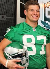
The Eagles made it official yesterday: They’ll be wearing kelly green 1960 throwbacks for their season opener against the Packers. Not much to dislike here — the helmet looks good, they’re going with striped socks, and even the Reebok logo looks better when rendered in kelly green. Well done.
A few notes:
• If you look at that last link, you’ll see that they also unveiled a mark to commemorate the 50th anniversary of the 1960 championship season (which, like so many new logotypes these days, features unnecessary beveling). It’s not clear to me if they’ll be wearing that as a patch on the throwback jersey and/or on their regular jerseys this fall. Will advise. (As an aside, it’s interesting how that design shows the old and new Eagles logos facing in different directions, which raises a question readers sometimes ask me: Why do the Eagles have their logo facing left when almost all the other NFL team logos face right? I’ve never heard a good answer for this.)
• Team owner Jeff Lurie wore that anniversary logo as a lapel pin for yesterday’s press conference. That’s Chuck Bednarik standing behind Lurie and wearing an Iggles bolo tie.
• Nice to know that the cheerleaders and mascot will also be throwback-attired (although I’m fairly certain mascots in 1960 didn’t wear jersey patches promoting local supermarket chains).
There’s video of the unveiling here. If you skip ahead about two-thirds of the way through the clip, you’ll see some cool footage from the team’s 1960 season — good stuff.
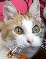
And now for something completely different kinda similar, but in a new format: Meet Brinke Guthrie’s cat, Punkin. Many of you probably know Brinke’s name from his frequent Ticker contributions, many of which are links to assorted eBay collectibles. Instead of scattering these randomly through the Ticker, we’ve decided to inaugurate a new feature, “Punkin’s Corner,” which will serve as a way for Brinke to share his eBay finds. This will be a semi-regular column, appearing a coupla times a week, or as often as the eBay listings merit.
We’re calling it “Punkin’s Corner” cuz “Brinke’s Corner” or “Collector’s Corner” sounded too boring, and we’re including a photo of Punkin because she’s a lot cuter than Brinke (plus she has her own blog). Okay? Okay.
With that, here’s Brinke with the first installment — enjoy.
By Brinke Guthrie, with Assistance from Punkin
Welcome to Punkin’s Corner, which will feature some cool things I find on that Big Auction Site. You know the one.
I wouldn’t say I am an obsessive collector, but there are some sports-related goodies I like (along with some non-sports goodies), and there are a few things I recall from the ’70s that really hit the hot button. Special memories, like these Kentucky Colonels thermal mugs, from Marathon Oil (1970). The Dallas Cowboys Flip Charts from Texaco (1971). The classic NFL stamp albums from Sunoco (1972). Great NFL posters. The NFL Playbook by American Express (1973). And my Holy Grail, the amazingly priced NFL Chiquita stickers.
So that’s where my tastes lie. With that in mind, here are some recent finds, in no paraticular order:
• Little NFL mini-records: I had these and have no idea how you played them. I guess with a mini-record player.
• Issue of Pro! for the 1972 NFC Championship Game: I was at this game, sat in the end zone, and a guy from NFL Films wanted me to hold up the cover for the weekly TV highlights show. Don’t think I made the cut.
• Tudor NFL electric football games: They featured “Total Team Control,” which somehow did not prevent all the players from piling up in one corner.
• Fridge magnets: I had all the NFL and MLB ones.
• NFL logo pennant: Not sure I’ve ever seen a pennant with just the NFL logo instead of a team affiliation.
• AFC East patch: Never seen that before either.
• NFL helmet plaque: Remember these? I had a Bengals one. Or a Cowboys one.
• NFL Films music LPs:. Yeah. “The Ramblin’ Man from Gramblin.'” You can find these songs on iTunes, y’know.
• Expos logo patches: Betcha can’t eat just one!
But there are some things you won’t find on eBay: Paul here, with news of a very special offer from Cleveland-based reader Jim Vilk. As some of you may recall, Jim wrote an extensive ode to Richfield Coliseum for the site last year. That entry included a mention and some photos of a scale model of Quicken Loans Arena, a prized possession of Jim’s brother. “But even a pack rat like my brother gets the cleaning bug sometimes,” says Jim, “and now he’s looking to clean out his basement. That means he wants to get rid of that scale model. For anyone in Northeast Ohio who’s willing to come pick it up, it’s yours for the asking. For anyone else, if you really want to pay for shipping (it’s big and heavy), you can have it as well. And as for you Yinzers, I have plans to see the Pirates on Sunday, May 23rd (it’s Wind-Up Pierogi day, so bring the kids!), so we could work something out around that.”
Pretty damn generous, no? If you want to claim this very special piece of Rust Belt memorabilia, contact Jim pronto. Hold your fire — it’s now spoken for.
Uni Watch News Ticker: While looking for something else, I came across this unusual logo. Details here. ”¦ The Washington Huskies, a longtime Nike school, were wearing Russell pants for their spring scrimmage. Probably just old/leftover pants, but still interesting (good spot by Kyle Hanks). ”¦ Brandon Schwartz notes that ESPN has already Photoshopped Lebron’s new uni number, although they got the font wrong. ”¦ Yesterday I ran these shots of Centerville High’s unusual football helmet. Now Steve Johnston informs me that the yellow stripes are actually Centerville’s version of merit decals, as you can see by comparing the stripe-free helmets from the team’s first game of the season. ”¦ New uniforms for the Japanese table tennis team (with thanks to Jeremy Brahm). ”¦ Minnesota gubernatorial candidate Tom Emmer is using a hockey jersey as part of his campaign. “They want a $200 contribution to his campaign for one of them,” says Lance Smith. ”¦ Tokyo’s taxi toppers are a lot cooler than the ones we have here (with thanks to Matt Shevin). ”¦ The Wisconsin softball team’s batting helmets look like Wisconsin football helmets — “complete with the Big Ten logo where the nose bumper would be!” says Jacob Kubuske). ”¦ Don’t think I’ve ever seen a Met wearing orange-trimmed shoes before. That Luis Castillo from last night (thanks, Phil). … Fingers Furniture in Houston sits on the site of the old Buff Stadium, where the minor league Houston Buffaloes played. So the furniture store includes a little sports museum, which you can see in this video clip (big thanks to Troy Griggsby). ”¦ Larry Brunt stumbled upon a Portland kickball league. “The uniforms were just T-shirts with a happy ball logo, but the teams got fancy with their socks,” he says. ”¦ Some good Life photos from Paul Wiederecht. First, this has to be the coolest car windshield decal ever. And then there’s this, which was apparently some sort of ticket promotion that the Phillies held in 1949. Look what the band was wearing! ”¦ Reprinted from yesterday’s comments: Phillies bench coach Pete Mackanin, who writes out the lineups posted on the dugout wall, is a calligraphy buff. ”¦ Ricko isn’t the only one whose pants look like shit who does that thing with the elastic strap. Check out University Delaware infielder D.J. Long (with thanks to Jason Levine). ”¦ The Blue Jays are giving away a blue cap on May 16th — imagine that! Could this mean that a return to blue might be in the offing? ”¦ America’s latest gift to world culture: Camo jerseys have spread, like a virus, to Australia (with thanks to Drew H. Douglas, who also reports that an Aussie logo dispute has landed in the Victorian Supreme Court). ”¦ Thanks to the puritanical moron who currently occupies the Virginia Attorney General’s office, the State Seal of Virginia now has a new uniform, of sorts. ”¦ Very odd mesh-looking pillbox cap shown in this Topps card (with thanks to Mike Colvin). ”¦ You know how Princeton football jerseys used to have those awesome sleeve stripes? The baseball team used to have corresponding stirrup stripes! That shot is from 1939 (big thanks to David Barndollar). ”¦ Hideki Okajima, like a lot of Japanese ballplayers, wears those crazy toe socks. And here, supposedly, is a game-used pair of them (with thanks to Grant Goldman). ”¦ Count Oscar Salazar among those wearing the XProtex batting gloves (with thanks to Alex Higley). ”¦ “I was watching some clips from the 1980s PBS show Square One,” writes Matt Cunningham. “There was a bit they had called ‘Mathman,’ in which a Pac Man-like character would do math problems. Whoever created him must have been a Michigan fan.” … Two days ago I fired up the smoker for the first time this season. Smoked some duck breasts stuffed with rosemary, garlic, fennel seeds, and pistachios, along with a few ears of corn. Not a bad way to kick off the cookout season.
They should have brought back the white helmets with green wings, but I never realized how amazing the silver winged ones are.
[quote] Fridge magnets: I had all the NFL and MLB ones.[/quote]
How are the Mighty Ducks from the 70’s?
Fridge magnets: I had all the NFL and MLB ones.
I had ’em all. I wish someone still made them. :-(
They should have brought back the white helmets with green wings
Then it wouldn’t have been a 1960 throwback. I also liked the thought of having the photo shoot at Penn’s Franklin Field, site of that 1960 Championship Game.
Just a note, but your cheerleaders link has an html error, we’re seeing the whole addy, not just the intended linked “cheerleaders”
Uni side note, both da Bears and Iggles have really done nice jobs on the throwbacks this year.
It’s good to see Finger Furniture reopened and kept the display on Houston sports. Quite a lot of nice uniforms to look at in the display cases, especially the variety of old Astros jerseys.
[quote comment=”388855″]both da Bears and Iggles have really done nice jobs on the throwbacks this year.[/quote]
indeed…”A” for both
good call on the iggs choosing the pack for their opponent too…gonna be a great looking game
not quite like this, but could be close
wonder if they’ll retrofy the game program for that day
[quote comment=”388853″][quote] Fridge magnets: I had all the NFL and MLB ones.[/quote]
How are the Mighty Ducks from the 70’s?[/quote]
I’m more concerned with the Coyotoes, Senators and Penguins mini football helmets.
I do, however, like the one with Magnum P.I.’s dogs.
link
[quote comment=”388857″][quote comment=”388855″]both da Bears and Iggles have really done nice jobs on the throwbacks this year.[/quote]
indeed…”A” for both
good call on the iggs choosing the pack for their opponent too…gonna be a great looking game
not link, but could be close
wonder if they’ll link the game program for that day[/quote]
Maybe we could petition the Packers to bring back the unis they wore in 2003 for a Thanksgiving game:
link
link
link
I know it won’t happen – but it would be cool if the Eagles played at least a pre-season game at Franklin Field as part of the “’60/50th”.
That NFL pennant was part of a set of all the NFL teams’ pennants. It also included AFC and NFC pennants.
Nice Eagles unis, but isn’t it kinda sad/pathetic that there has to be a “throwback” scenario in order to have uniforms that LOOK THE WAY THEY’RE SUPPOSED TO LOOK?!?!?!
-Jet
[quote comment=”388862″]Nice Eagles unis, but isn’t it kinda sad/pathetic that there has to be a “throwback” scenario in order to have uniforms that LOOK THE WAY THEY’RE SUPPOSED TO LOOK?!?!?!
-Jet[/quote]
So true. So true.
I actually had the player for the NFL mini-records – there were actually mini-records for all sports. The player came with 4 disks – I’m hazy though on the exact subject of the ones I had but I’m pretty sure there was one each for football, baseball, basketball and maybe soccer or boxing (BTW – I was like 5 or 6 years old when I got the thing, apparently “age appropriate” and “breakablity” weren’t considerations for my mom). The basic format was a sort of newsreel-sounding voice-over reviewing the athlete’s career highlights etc.
I had to listen to the 1960 Championship game on the radio, because, at that time, the telecast was blacked out locally.
[quote comment=”388862″]Nice Eagles unis, but isn’t it kinda sad/pathetic that there has to be a “throwback” scenario in order to have uniforms that LOOK THE WAY THEY’RE SUPPOSED TO LOOK?!?!?!
-Jet[/quote]
Who knows, maybe they’ll see how much the fans have missed kelly green and go back to basics permanently ala the sixers. I really hate how the late 90’s/early 2000’s made every other pro sports team go for dark/metallic versions of their original color schemes…or in the case of the sixers change the entire palette entirely.
[quote comment=”388864″]I actually had the player for the NFL mini-records – there were actually mini-records for all sports. The player came with 4 disks – I’m hazy though on the exact subject of the ones I had but I’m pretty sure there was one each for football, baseball, basketball and maybe soccer or boxing (BTW – I was like 5 or 6 years old when I got the thing, apparently “age appropriate” and “breakablity” weren’t considerations for my mom). The basic format was a sort of newsreel-sounding voice-over reviewing the athlete’s career highlights etc.[/quote]
Would this be similar to the record player that came with Mattel’s Monday Night Football game? Good luck finding one that works, as the rubber belts that drove the thing have long since crumbled away.
If they’re going to go with kelly green, I’d much rather see the Eagles wear their 1980s threads with the crazy sleeve stripes, or the 1990s threads with the full bird on the sleeve.
Both of those were classics. The unis they have now are not bad in their own right, but pale when compared to the past.
Billy Hatcher, first base coach for the Reds, was wearing a Larry Bowa style helmet last night. Still searching for a picture.
The mini-records were used in something called “Instant Replay”. I had it. It was a generic announcer describing a highlight of a certain player. They were only about a minute long.
Blah to another throwback uniform.
The 60’s uniform always looked mismatched to me. Silver wings on the helmet and no silver anywhere else. White pants & numbers, no white on the helmet. The 1985 uniform is far superior in my eyes.
/sorry, I had to make some kind of comment today, back to lurking I go…
Why do the Eagles have their logo facing left when almost all the other NFL team logos face right? I’ve never heard a good answer for this.
[quote comment=”388872″]Perhaps NFL Properties created a left facing logo to differentiate it from the other three bird head logos (Ravens, Seahawks, Cardinals). I’m sure they didn’t want everything to look the same.[/quote]
That kinda flies in the face of the actual design that NFL Properties has been doing for the past decade-plus, with the increased navy, general darkening of color schemes, piping and wavy stripes everywhere, etc.
Brinke Guth–…er…Punkin, you have all of the memorabilia which decorated my bedroom and supplied countless hours of glorious obsession in the days of my youth. Now give it back!
ps.–Eagles: The “throwback” helmet IS your helmet. Just wear the damn thing already.
the ealges tried to play the game at franklin field, but they did not because there are no bath rooms in the upper level of the stadium
Smoked duck breasts stuffed with rosemary, garlic, fennel seeds, and pistachios? Wow. When’s the next cookout and can I come over?
[quote comment=”388873″][quote comment=”388872″]Perhaps NFL Properties created a left facing logo to differentiate it from the other three bird head logos (Ravens, Seahawks, Cardinals). I’m sure they didn’t want everything to look the same.[/quote]
That kinda flies in the face of the actual design that NFL Properties has been doing for the past decade-plus, with the increased navy, general darkening of color schemes, piping and wavy stripes everywhere, etc.[/quote]
I doubt there’s any real reason behind it. They aren’t even consistent with it, really. The eagle under the wordmark faces right. By itself, it typically faces left, but not always. The Cardinals are the same way. I’m not going to go searching, but I seem to recall a picture getting posted on here with a coach wearing a jacket with it facing one way and a hat facing the other. It’s a mirror-able logo and they use it in whatever direction they want.
[quote comment=”388875″]the ealges tried to play the game at franklin field, but they did not because there are no bath rooms in the upper level of the stadium[/quote]
link won’t work for ONE game?
They had ’em for years at Soldier Field until the spaceship landed.
they even come in link.
[quote comment=”388875″]the ealges tried to play the game at franklin field, but they did not because there are no bath rooms in the upper level of the stadium[/quote]
why is that a problem?
[quote comment=”388878″][quote comment=”388875″]the ealges tried to play the game at franklin field, but they did not because there are no bath rooms in the upper level of the stadium[/quote]
link won’t work for ONE game?
They had ’em for years at Soldier Field until the spaceship landed.
they even come in link.[/quote]
One game? at the old soldier field that was all there was in the north endzone seats.
Paul,
When I grill corn, I usually do it with the stalk on, but how did you get such a golden brown hue to it? It looks more appetizing than when I grill corn!
Frank
[quote comment=”388880″][quote comment=”388878″][quote comment=”388875″]the ealges tried to play the game at franklin field, but they did not because there are no bath rooms in the upper level of the stadium[/quote]
link won’t work for ONE game?
They had ’em for years at Soldier Field until the spaceship landed.
they even come in link.[/quote]
One game? at the old soldier field that was all there was in the north endzone seats.[/quote]
Did you read past the first sentence of what I wrote?
[quote comment=”388877″][quote comment=”388873″][quote comment=”388872″]Perhaps NFL Properties created a left facing logo to differentiate it from the other three bird head logos (Ravens, Seahawks, Cardinals). I’m sure they didn’t want everything to look the same.[/quote]
That kinda flies in the face of the actual design that NFL Properties has been doing for the past decade-plus, with the increased navy, general darkening of color schemes, piping and wavy stripes everywhere, etc.[/quote]
I doubt there’s any real reason behind it. They aren’t even consistent with it, really. The eagle under the wordmark faces right. By itself, it typically faces left, but not always. The Cardinals are the same way. I’m not going to go searching, but I seem to recall a picture getting posted on here with a coach wearing a jacket with it facing one way and a hat facing the other. It’s a mirror-able logo and they use it in whatever direction they want.[/quote]
How many “mirrorable” logos are there that ALWAYS face one direction?
The only one I can think of is the link but I guess it’s debatable as to whether it’s truly mirrorable. I mean, is the paint the same on the right side of his face? Is there a scar? Would you only see the orange and maybe part of the yellow feather? Is there another set of completely different feathers on the right side?
“I was watching some clips from the 1980s PBS show Square One,” writes Matt Cunningham. “There was a bit they had called ‘Mathman,’ in which a Pac Man-like character would do math problems. Whoever created him must have been a Michigan fan.”
Mathman’s helmet was but one of many University of Michigan references on Square One TV. The executive producer and head writer of Square One were both Michigan alumni, and consequently, Michigan references were a running joke in the show.
link
[quote comment=”388881″]Paul,
When I grill corn, I usually do it with the stalk on, but how did you get such a golden brown hue to it? It looks more appetizing than when I grill corn!
Frank[/quote]
That’s the smoker for ya. The smoke imparts an amazing bronzed hue (and, of course, a delicious smokiness). I tried this on a whim a few yrs ago and was surprised by how nicely it turned out. Now it’s my preferred method of outdoor corn cookery.
That duck looks AWESOME. What temperature did you cook it to?
Well, looks like they have figured out a way to control the Phillies fans
link
[quote comment=”388877″][quote comment=”388873″][quote comment=”388872″]Perhaps NFL Properties created a left facing logo to differentiate it from the other three bird head logos (Ravens, Seahawks, Cardinals). I’m sure they didn’t want everything to look the same.[/quote]
That kinda flies in the face of the actual design that NFL Properties has been doing for the past decade-plus, with the increased navy, general darkening of color schemes, piping and wavy stripes everywhere, etc.[/quote]
I doubt there’s any real reason behind it. They aren’t even consistent with it, really. The eagle under the wordmark faces right. By itself, it typically faces left, but not always. The Cardinals are the same way. I’m not going to go searching, but I seem to recall a picture getting posted on here with a coach wearing a jacket with it facing one way and a hat facing the other. It’s a mirror-able logo and they use it in whatever direction they want.[/quote]
There are certain logos (the Cardinals’ being one of them, I believe the Vikings’ is another) that must never be placed in such a way that the logo ‘sniffs’ the crotch or armpit of the wearer. That is the only reason the Cardinals’ logo faces left on a coach’s polo; since it is embroidered on the left chest, it would be sniffing the armpit if it were facing right. Otherwise, the Cardinals’ and Vikings’ logos always face right.
[quote comment=”388887″]That duck looks AWESOME. What temperature did you cook it to?[/quote]
125ish. Medium rare.
[quote comment=”388872″]Why do the Eagles have their logo facing left when almost all the other NFL team logos face right? I’ve never heard a good answer for this.
From last night…
[quote comment=”388892″][quote comment=”388851″][quote comment=”388846″][quote comment=”388843″]I really don’t think royal blue works as a uni color. Black, navy, powder, beige, sand, yellow/gold… OK.
Forest green… maybe.
Red, orange, royal, purple, kelly green… probably not.[/quote]
You’d only play with a box of eight crayons when Crayola makes a box of 64? Not saying I’d use every one, but I wouldn’t restrict myself to what you said.
It was one thing when there were only 16 teams in the majors and most of them looked similar. It’s another when there are 30 teams. You want to cut down on the amount of goofy designs teams use to stand out? Expand the color palette a bit.[/quote]
So you think, for example, having the Orioles make another attempt at the link or the Indians going back to the link would help to cut down on the amount of goofy designs teams use to stand out?
Not me. Tribe in solid navy or the O’s in solid black? Maybe.[/quote]
I think it would work with some minor tweaks. In both examples, the striping looks too big. Fix the Orioles’ sleeves and the Tribe’s belt and it would look better.[/quote]
[quote comment=”388888″]Well, looks like they have figured out a way to control the Phillies fans
link
they cannot stop them…they can only hope to contain them
By the way, I got a taker for the Quicken Loans Arena model. Thanks, Paul.
Wish I had the time and the space to do something with it, but it’s going to a good home.
Now if it was a Coliseum model, I would have made space for it…
Brinke’s Corner sounded too boring? I love cats and all, yet I don’t know too many people named Brinke. Actually like the name and I’m curious as to the derivation? I do know a Punkin who’s now a cocktail waitress ex stripper.
Anyway, I totally dig the new Uniwatchblog feature. Brinke and I no doubt have a similar eye.
I love those NFL fridge magnets. Something about the texture, malleability, and colors/paint that really make them stand out.
Here’s my ebay find of the day. How about a link You might know him from Hill Street Blues fame. Few people know that he actually played for the Seahawks in 1977. However, only played in two games. Also wore #49 with the Hawks.
[quote comment=”388894″][quote comment=”388888″]Well, looks like they have figured out a way to control the Phillies fans
link
they cannot stop them…they can only hope to contain them[/quote]
But will it work on the Eagles fans?
Until very recently, Mathman was my Twitter avatar because of the Michigan helmet.
Quick question for anyone who might know: Is there a name for the type of hat being worn by the Michigan logo on link? Also, I have found retro logos for California, Baylor, North Carolina, Michigan, and Texas which all feature that same style of hat. Does anyone know of any other major schools which used a logo wearing that style of hat on a cartoonish version of the mascot?
Thanks so much!
Those mini-NFL records link did indeed need a special player – the kind found in this game I used to have:
link
I also had that NFL pennant. I believe it was part of a set that included conference and team pennants, but I just had the league one.
[quote comment=”388899″]Those mini-NFL records link did indeed need a special player – the kind found in this game I used to have:
link
I also had that NFL pennant. I believe it was part of a set that included conference and team pennants, but I just had the league one.[/quote]
Never saw those mini NFL records before. Great find there. The illustrations look very similar to the lunch boxes back in the day.
what year did the redskins helmet have no logo?
it’s like the first season seahawks
I was at the Northwestern Women’s lacrosse home season finale this past Sunday at Lakeside Field in beautiful Evanston, Illinois… Of course the 5-time (all in a row) and defending NCAA Champion purple-clad ‘Cats dominated Florida link
The interest though to perhaps 1 or two readers besides myself are a few uniform quirks..
For starters, Northwestern prints player names under the numbers: link
Also, check out the difference in socks. Florida goes with, well… And some of the ‘Cats wear ones with a lacrosse player silhouette: link
One last thing, how cool do these goalie socks look with the sunlight from the goal netting reflected upon them: link
[quote comment=”388901″]what year did the link?
it’s like the first season seahawks[/quote]
Doesn’t that game come with a shot glass and ashtray?
Really got a kick out of that Purdue logo:
link
She’d better kick soccer-style with those shoes, though. There’d be no room for error whatsoever if she kicked straight-on.
link
[quote comment=”388901″]what year did the link?
it’s like the first season seahawks[/quote]
Obviously that’s a pre-season shot. The real question is why the 49ers still had silver helmets floating around.
[quote comment=”388901″]what year did the link?
it’s like the first season seahawks[/quote]
Good one.
That’s one of those deals where they could only use the MNF name, not the league’s. In fact, there was only a Mattel logo at midfield (which I covered up with a USFL sticker).
interesting stuff from Umbro- alternate classic crests/kits for the 7 nations who have won the World Cup
link
[quote comment=”388902″]I was at the Northwestern Women’s lacrosse home season finale this past Sunday at Lakeside Field in beautiful Evanston, Illinois… Of course the 5-time (all in a row) and defending NCAA Champion purple-clad ‘Cats dominated Florida link
The interest though to perhaps 1 or two readers besides myself are a few uniform quirks..
For starters, Northwestern prints player names under the numbers: link
Also, check out the difference in socks. Florida goes with, well… And some of the ‘Cats wear ones with a lacrosse player silhouette: link
One last thing, how cool do these goalie socks look with the sunlight from the goal netting reflected upon them: link
That is a cool shot there.
Gotta say, even with the bumper sticker on the side, I kinda like that NW uni. Nice fonts. I’d like it even more if the little sleeve number was on both sleeves. Florida’s pretty good, too. Don’t mind the shoulder piping, but the side piping’s a bit too much. Mrs. V could use an orange skirt like that…but not with black socks.
From link:
“1960 JERSEY ON FIELD”
Whuck? All your base are belong to us?
[quote comment=”388898″]Until very recently, Mathman was my Twitter avatar because of the Michigan helmet.
Quick question for anyone who might know: Is there a name for the type of hat being worn by the Michigan logo on link? Also, I have found retro logos for California, Baylor, North Carolina, Michigan, and Texas which all feature that same style of hat. Does anyone know of any other major schools which used a logo wearing that style of hat on a cartoonish version of the mascot?
Thanks so much![/quote]
The Sailor’s cap was used by numerous schools, and discussed on uniwatch way back in 2006 – link
[quote]Don’t think I’ve ever seen a Met wearing orange-trimmed shoes before. That Luis Castillo from last night (thanks, Phil).[/quote]
Willie Mays as a Met with orange trimmed shoes.
link
[quote]Very odd mesh-looking pillbox cap shown in this Topps card (with thanks to Mike Colvin). [/quote]
Rick Reuschel is wearing a Spring Training mesh pillbox hat on that Topps card.
I don’t know of a town named for Brinke, but there is one that Punkin can link.
[quote comment=\”388911\”]The Sailor\’s cap was used by numerous schools, and discussed on uniwatch way back in 2006 – link
Many thanks to you good sir!
i remember when our high school was ordering new baseball unis, there was a pant option called “clemson cut”, which was a pair of pajama-style pants with elastic straps…
link
I had that Instant Replay player with the mini discs also. I remember having Lew Alcindor and Donny Anderson, a baseball guy (Willie McCovey?), and a drag-racing guy (probably a Mattel tie-in to Hot Wheels), as well as (I’m pretty sure)the football set shown.
Paul,
Is there a specific wood that you use in your smoker?
[quote comment=\”388909\”][quote comment=\”388902\”]I was at the Northwestern Women\’s lacrosse home season finale this past Sunday at Lakeside Field in beautiful Evanston, Illinois… Of course the 5-time (all in a row) and defending NCAA Champion purple-clad \’Cats dominated Florida link
The interest though to perhaps 1 or two readers besides myself are a few uniform quirks..
For starters, Northwestern prints player names under the numbers: link
Also, check out the difference in socks. Florida goes with, well… And some of the \’Cats wear ones with a lacrosse player silhouette: link
One last thing, how cool do these goalie socks look with the sunlight from the goal netting reflected upon them: link
That is a cool shot there.
Gotta say, even with the bumper sticker on the side, I kinda like that NW uni. Nice fonts. I\’d like it even more if the little sleeve number was on both sleeves. Florida\’s pretty good, too. Don\’t mind the shoulder piping, but the side piping\’s a bit too much. Mrs. V could use an orange skirt like that…but not with black socks.[/quote]
Back around 2004, Northwestern wore tennis dresses and looked like alien beekeepers.
[quote comment=”388912″][quote]Don’t think I’ve ever seen a Met wearing orange-trimmed shoes before. That Luis Castillo from last night (thanks, Phil).[/quote]
Willie Mays as a Met with orange trimmed shoes.
link
[quote]Very odd mesh-looking pillbox cap shown in this Topps card (with thanks to Mike Colvin). [/quote]
Rick Reuschel is wearing a Spring Training mesh pillbox hat on that Topps card.[/quote]
There was a season or two where virtually al the Mets wore royal shoes with orange trim, no matter the brand: Puma, adidas, whatever…usually with white laces. Around the time Steve Henderson was the “future star” of the club. Mid-to-late ’70s.
Broncos wore them that way, too, around that time.
And Red Sox wore red cleats with royal trim and white laces.
MIght be some other teams, too. Need to think on it.
—Ricko
[quote comment=”388898″]Until very recently, Mathman was my Twitter avatar because of the Michigan helmet.
Quick question for anyone who might know: Is there a name for the type of hat being worn by the Michigan logo on link? Also, I have found retro logos for California, Baylor, North Carolina, Michigan, and Texas which all feature that same style of hat. Does anyone know of any other major schools which used a logo wearing that style of hat on a cartoonish version of the mascot?
Thanks so much![/quote]
I’ve always loved link. Should be on the OSU helmets, if you ask me.
And I think it’s just a sailor hat. Google ‘sailor hat’ and at least half the images that pop up are hats of that style.
[quote comment=”388919″][quote comment=”388912″][quote]Don’t think I’ve ever seen a Met wearing orange-trimmed shoes before. That Luis Castillo from last night (thanks, Phil).[/quote]
Willie Mays as a Met with orange trimmed shoes.
link
[quote]Very odd mesh-looking pillbox cap shown in this Topps card (with thanks to Mike Colvin). [/quote]
Rick Reuschel is wearing a Spring Training mesh pillbox hat on that Topps card.[/quote]
There was a season or two where virtually al the Mets wore royal shoes with orange trim, no matter the brand: Puma, adidas, whatever…usually with white laces. Around the time Steve Henderson was the “future star” of the club. Mid-to-late ’70s.
Broncos wore them that way, too, around that time.
And Red Sox wore red cleats with royal trim and white laces.
MIght be some other teams, too. Need to think on it.
—Ricko[/quote]
I just saw that Mays pic this morning and then poof! a question about it shows up in the Ticker today.
Remember the Reds had a Bob Howsam-policy that they wore shoes with the adidas stripes/Puma stripe/other contrasting stripes blacked out?
That changed when Pete Rose returned to the Reds as manager in 1984 when the Reds still wore black shoes, but the Mizuno/adidas/Nike etc., stripe was colored red. They changed to red shoes shortly there after.
A lot of the people who did Square One, as I recall, were Michigan alums. There were TONS of Michigan references throughout the show’s history, and at least one segment where they discussed how to do the math to figure out how many of a given object would fit in Michigan Stadium. The one that sticks out the most in my mind was the segment on filling the Stadium with cheeseburgers. I’m pretty sure there were others. It even featured game footage from the 1988 season.
I also remember a MathNet weekly serial where they took a shot at Michigan State, along with a George Steinbrenner-esque character to serve as the villain.
[quote comment=”388915″]i remember when our high school was ordering new baseball unis, there was a pant option called “clemson cut”, which was a pair of pajama-style pants with elastic straps…
link
Clemson cut pants actually taper down to the ankle. I played for a team that had the Clemson cut and hated them.
[quote comment=”388919″][quote comment=”388912″][quote]Don’t think I’ve ever seen a Met wearing orange-trimmed shoes before. That Luis Castillo from last night (thanks, Phil).[/quote]
Willie Mays as a Met with orange trimmed shoes.
link
[quote]Very odd mesh-looking pillbox cap shown in this Topps card (with thanks to Mike Colvin). [/quote]
Rick Reuschel is wearing a Spring Training mesh pillbox hat on that Topps card.[/quote]
There was a season or two where virtually al the Mets wore royal shoes with orange trim, no matter the brand: Puma, adidas, whatever…usually with white laces. Around the time Steve Henderson was the “future star” of the club. Mid-to-late ’70s.
Broncos wore them that way, too, around that time.
And Red Sox wore red cleats with royal trim and white laces.
MIght be some other teams, too. Need to think on it.
—Ricko[/quote]
link did that in the mid-1970s as well.
[quote comment=”388922″][quote comment=”388919″][quote comment=”388912″][quote]Don’t think I’ve ever seen a Met wearing orange-trimmed shoes before. That Luis Castillo from last night (thanks, Phil).[/quote]
Willie Mays as a Met with orange trimmed shoes.
link
[quote]Very odd mesh-looking pillbox cap shown in this Topps card (with thanks to Mike Colvin). [/quote]
Rick Reuschel is wearing a Spring Training mesh pillbox hat on that Topps card.[/quote]
There was a season or two where virtually al the Mets wore royal shoes with orange trim, no matter the brand: Puma, adidas, whatever…usually with white laces. Around the time Steve Henderson was the “future star” of the club. Mid-to-late ’70s.
Broncos wore them that way, too, around that time.
And Red Sox wore red cleats with royal trim and white laces.
MIght be some other teams, too. Need to think on it.
—Ricko[/quote]
I just saw that Mays pic this morning and then poof! a question about it shows up in the Ticker today.
Remember the Reds had a Bob Howsam-policy that they wore shoes with the adidas stripes/Puma stripe/other contrasting stripes blacked out?
That changed when Pete Rose returned to the Reds as manager in 1984 when the Reds still wore black shoes, but the Mizuno/adidas/Nike etc., stripe was colored red. They changed to red shoes shortly there after.[/quote]
Red Sox did the black shoes/red trim thing, too.
Think it was the season before they went to red with royal trim.
And, thanks, Chance for adding Braves to the list.
Orioles and Giants, of course, had orange trim….Orioles also used orange laces.
And the Pirates, in the mustard hat period, had old gold/mustard trim…at least on the adidas they wore.
[quote comment=”388925″]
link did that in the mid-1970s as well.[/quote]
that uni kicked ass
Braves?
Brewers.
Sorry.
—Ricko
[quote comment=”388927″][quote comment=”388925″]
link did that in the mid-1970s as well.[/quote]
that uni kicked ass[/quote]
Ah, yes, with big George Scott and his necklace of small white shells or some such, which he used to say were “second basemen’s teeth.”
—Ricko
[quote comment=”388926″][quote comment=”388922″][quote comment=”388919″][quote comment=”388912″][quote]Don’t think I’ve ever seen a Met wearing orange-trimmed shoes before. That Luis Castillo from last night (thanks, Phil).[/quote]
Willie Mays as a Met with orange trimmed shoes.
link
[quote]Very odd mesh-looking pillbox cap shown in this Topps card (with thanks to Mike Colvin). [/quote]
Rick Reuschel is wearing a Spring Training mesh pillbox hat on that Topps card.[/quote]
There was a season or two where virtually al the Mets wore royal shoes with orange trim, no matter the brand: Puma, adidas, whatever…usually with white laces. Around the time Steve Henderson was the “future star” of the club. Mid-to-late ’70s.
Broncos wore them that way, too, around that time.
And Red Sox wore red cleats with royal trim and white laces.
MIght be some other teams, too. Need to think on it.
—Ricko[/quote]
I just saw that Mays pic this morning and then poof! a question about it shows up in the Ticker today.
Remember the Reds had a Bob Howsam-policy that they wore shoes with the adidas stripes/Puma stripe/other contrasting stripes blacked out?
That changed when Pete Rose returned to the Reds as manager in 1984 when the Reds still wore black shoes, but the Mizuno/adidas/Nike etc., stripe was colored red. They changed to red shoes shortly there after.[/quote]
Red Sox did the black shoes/red trim thing, too.
Think it was the season before they went to red with royal trim.
And, thanks, Chance for adding Braves to the list.
Orioles and Giants, of course, had orange trim….Orioles also used orange laces.
And the Pirates, in the mustard hat period, had old gold/mustard trim…at least on the adidas they wore.[/quote]
I remember as a kid going to Rochester Red Wings games and noticing that all the players had the black/orange shoes that matched the Orioles uniforms, but not the Red Wings.
Paul, despite your cooking/grilling acumen and love for meat, you lose significant man points for introducing a feature named after a cat with an over-obsessive owner. Don’t get me wrong, I like cute things as much as the next secure man, but I can’t say “Punkin” with a straight face.
[quote comment=”388929″][quote comment=”388927″][quote comment=”388925″]
link did that in the mid-1970s as well.[/quote]
that uni kicked ass[/quote]
Ah, yes, with big George Scott and his necklace of small white shells or some such, which he used to say were “second basemen’s teeth.”
—Ricko[/quote]
link
Nice job on the duck, looks like it turned out fabulously.
[quote comment=”388911″][quote comment=”388898″]Until very recently, Mathman was my Twitter avatar because of the Michigan helmet.
Quick question for anyone who might know: Is there a name for the type of hat being worn by the Michigan logo on link? Also, I have found retro logos for California, Baylor, North Carolina, Michigan, and Texas which all feature that same style of hat. Does anyone know of any other major schools which used a logo wearing that style of hat on a cartoonish version of the mascot?
Thanks so much![/quote]
The Sailor’s cap was used by numerous schools, and discussed on uniwatch way back in 2006 – link
Auburn has used that logo, too:
link
Sports venues are not immune to flooding in Nashville. At one point, LP Field had six feet of standing water on the playing surface. Bridgestone Arena, home of the Predators, had two to four inches of water where the ice surface would be during the season. Plus area colleges, high schools, and rec leagues have seen major damage.
link
Add this schools to the sailor-cap crowd:
NC State
link
And did UNC ever use the interlocking NC from this logo, or was it only seen on the cartoon Ram?
link
[quote comment=”388917″]Paul,
Is there a specific wood that you use in your smoker?[/quote]
I try to get hickory. Honestly, though, I suspect I couldn’t tell the diff. between hickory, oak, maple, apple, or cherry, all of which I’ve used and enjoyed at various times.
My only rule: No mesquite. Don’t care for it.
[quote comment=”388931″]Paul, despite your cooking/grilling acumen and love for meat, you lose significant man points for introducing a feature named after a cat with an over-obsessive owner. Don’t get me wrong, I like cute things as much as the next secure man, but I can’t say “Punkin” with a straight face.[/quote]
I’m sure everyone here can understand just how devastated I am to have lost “man points” with Charles….
Let’s head this one off at the pass… The Suns are going to wear their “Los Suns” jerseys for Cinco de Mayo, and as a protest against Arizona’s new immigration law:
link
You are free to weigh in on whether “Los Suns” is a stupid thing to put on a jersey (although we’ve already been thru that countless times). You are also free to discuss whether it’s approprriate for a team to wear an alternate jersey in the playoffs, or whether it makes sense for the Suns to wear orange at home, or whether the Spurs should wear their usual black road uniforms or their home whites.
You can even discuss the larger issue of whether it’s appropriate for a team to use its uniforms as a form of political protest.
That’s all fine.
Here’s what’s NOT fine: coming out for or against the Arizona law. Let’s leave that for other sites, shall we? Thanks.
I’ll hit this opportunity to say that I am bucking the trend of cold weather-long pants to debut the ’67 Sens stirrups in the season opener!
I hope to have images of the glorious stirrups on the diamond, but it will all depend on camera people being available. Apparently not too many wives, girlfriends, and significant others are enthusiastic about sitting out in 48-50F weather watching grown men living out a dying dream.
Also, rain is in the forecast, so if the opener is delayed, stirrups will be worn at the following game.
[quote comment=”388936″]
And did UNC ever use the interlocking NC from this logo, or was it only seen on the cartoon Ram?
link
in the 50’s up until the mid 60s
the uni that this season’s retro was based on.
link
[quote comment=”388898″]Until very recently, Mathman was my Twitter avatar because of the Michigan helmet.
Quick question for anyone who might know: Is there a name for the type of hat being worn by the Michigan logo on link? Also, I have found retro logos for California, Baylor, North Carolina, Michigan, and Texas which all feature that same style of hat. Does anyone know of any other major schools which used a logo wearing that style of hat on a cartoonish version of the mascot?
Thanks so much![/quote]
link… I think tons of schools used them in the 50s/60s. It’s a sailor cap. There are more SWC ones that I have not found a good graphic for yet.
Not sure what happened to the link
[quote comment=”388936″]Add this schools to the sailor-cap crowd:
NC State
link
And did UNC ever use the interlocking NC from this logo, or was it only seen on the cartoon Ram?
link
Not a sailor’s cap. Is a cartooned up version of a freshman beanie, sans propeller, of course. THAT’s why it appeared so often in a college context.
Two models generally. One with straight standard brim as seen on campus, the other a “notched” version, which I think went into production after kids of the day cut notches into the manufactured model.
Most widely seen on Jughead.
And Goober.
link
—Ricko
[quote comment=”388943″]Not sure what happened to the link[/quote]
And I am pretty sure the sailor cap logos are not as old as the 2006 blog post mentioned. Let me pull up my source for my images and see what kind of date I have. I really think it was more 50s with some still using the logos into the 60s.
[quote comment=”388945″][quote comment=”388943″]Not sure what happened to the link[/quote]
And I am pretty sure the sailor cap logos are not as old as the 2006 blog post mentioned. Let me pull up my source for my images and see what kind of date I have. I really think it was more 50s with some still using the logos into the 60s.[/quote]
Those really AREN’T sailor hats.
Here’s an antique Wisconsin freshman beanie. Took all of 30 seconds to find it searching “freshman beanie” at google images.
link
Not being combative, honest. Just that I’ve known since I was a kid that those hats on college mascots were one of the kinds of freshman beanies.
Now, the hat on the Miami pelican, that might be a sailor hat. That would make sense. But the overwhelming majority of the rest are freshman beanies.
When in doubt, at least START with the old guy. See if he knows anything.
—Ricko
[quote comment=”388945″][quote comment=”388943″]Not sure what happened to the link[/quote]
And I am pretty sure the sailor cap logos are not as old as the 2006 blog post mentioned. Let me pull up my source for my images and see what kind of date I have. I really think it was more 50s with some still using the logos into the 60s.[/quote]
Okay, as far as the SWC goes…. sailor caps in late 40s into 50s on link. I also have some similar (yet different) logos that Dad cut out of some kind of a plastic bag for Arkansas and Baylor – not sure on the date for those. Baylor and Rice continued to use the sailor-capped logo on the gas station giveaway link (I have yet to verify the school seal version of those glasses were Humble and not Mobil). Baylor also used the sailor-capped bear on the link and a game program from 1983. Of course, there is the much older Baylor logo (cited in the 2006 blog – which may have been actually pulled from my site) that I have yet to verify any date.
[quote comment=”388944″][quote comment=”388936″]Add this schools to the sailor-cap crowd:
NC State
link
And did UNC ever use the interlocking NC from this logo, or was it only seen on the cartoon Ram?
link
Not a sailor’s cap. Is a cartooned up version of a freshman beanie, sans propeller, of course. THAT’s why it appeared so often in a college context.
Two models generally. One with straight standard brim as seen on campus, the other a “notched” version, which I think went into production after kids of the day cut notches into the manufactured model.
Most widely seen on Jughead.
And Goober.
link
—Ricko[/quote]
Is there confirmed documentation of this? Or is it just a theory? While I see the resemblance to some college beanies, nearly all of the caps these mascots are wearing bear more than a passing resemblance to a sailor’s cap.
[quote comment=”388946″][quote comment=”388945″][quote comment=”388943″]Not sure what happened to the link[/quote]
And I am pretty sure the sailor cap logos are not as old as the 2006 blog post mentioned. Let me pull up my source for my images and see what kind of date I have. I really think it was more 50s with some still using the logos into the 60s.[/quote]
Those really AREN’T sailor hats.
Here’s an antique Wisconsin freshman beanie. Took all of 30 seconds to find it searching “freshman beanie” at google images.
link
Not being combative, honest. Just that I’ve known since I was a kid that those hats on college mascots were one of the kinds of freshman beanies.
Now, the hat on the Miami pelican, that might be a sailor hat. That would make sense. But the overwhelming majority of the rest are freshman beanies.
When in doubt, at least START with the old guy. See if he knows anything.
—Ricko[/quote]
I have several freshman beanies and NOT ONE of mine has a brim like the one you linked. That would make sense with the broad date range of sailor-capped logos – freshman beanies were popular in the 40s but have carried through (I think my TCU one is from the 70s).
[quote comment=”388946″][quote comment=”388945″][quote comment=”388943″]Not sure what happened to the link[/quote]
And I am pretty sure the sailor cap logos are not as old as the 2006 blog post mentioned. Let me pull up my source for my images and see what kind of date I have. I really think it was more 50s with some still using the logos into the 60s.[/quote]
Those really AREN’T sailor hats.
Here’s an antique Wisconsin freshman beanie. Took all of 30 seconds to find it searching “freshman beanie” at google images.
link
Not being combative, honest. Just that I’ve known since I was a kid that those hats on college mascots were one of the kinds of freshman beanies.
Now, the hat on the Miami pelican, that might be a sailor hat. That would make sense. But the overwhelming majority of the rest are freshman beanies.
When in doubt, at least START with the old guy. See if he knows anything.
—Ricko[/quote]
It really ISN’T a pelican.
Here’s link.
Took me all of 30 seconds to find it searching “Miami Ibis” at Google images.
Not being combative, honest. Just uh… yeah, y’know.
[quote comment=”388928″]Braves?
Brewers.
Sorry.
—Ricko[/quote]
Oh, sure. Rub salt in that particular wound. ;)
[quote comment=”388939″]Let’s head this one off at the pass… The Suns are going to wear their “Los Suns” jerseys for Cinco de Mayo, and as a protest against Arizona’s new immigration law:
link
Personally, I think if a team has an alternate uniform/jersey/whatever, they should be able to wear it a limited number of times in the postseason. Some proposed rules: Alternate uniforms can only be worn at home games, twice overall in the offseason, and only once per series. This wouldn’t apply to the NFL, due to the limited amount of postseason games.
Alternate uniforms are common enough that it seems to make sense to let teams wear them when they get more exposure, like postseason games. Let them try make their money selling replicas with the bigger spotlight, I don’t have to buy them.
Naturally, some alternates are better than others, but everyone here already knows that.
[quote comment=”388949″][quote comment=”388946″][quote comment=”388945″][quote comment=”388943″]Not sure what happened to the link[/quote]
And I am pretty sure the sailor cap logos are not as old as the 2006 blog post mentioned. Let me pull up my source for my images and see what kind of date I have. I really think it was more 50s with some still using the logos into the 60s.[/quote]
Those really AREN’T sailor hats.
Here’s an antique Wisconsin freshman beanie. Took all of 30 seconds to find it searching “freshman beanie” at google images.
link
Not being combative, honest. Just that I’ve known since I was a kid that those hats on college mascots were one of the kinds of freshman beanies.
Now, the hat on the Miami pelican, that might be a sailor hat. That would make sense. But the overwhelming majority of the rest are freshman beanies.
When in doubt, at least START with the old guy. See if he knows anything.
—Ricko[/quote]
I have several freshman beanies and NOT ONE of mine has a brim like the one you linked. That would make sense with the broad date range of sailor-capped logos – freshman beanies were popular in the 40s but have carried through (I think my TCU one is from the 70s).[/quote]
Sailor Hat: link
Freshman Beanie: link
[quote comment=”388949″][quote comment=”388946″][quote comment=”388945″][quote comment=”388943″]Not sure what happened to the link[/quote]
And I am pretty sure the sailor cap logos are not as old as the 2006 blog post mentioned. Let me pull up my source for my images and see what kind of date I have. I really think it was more 50s with some still using the logos into the 60s.[/quote]
Those really AREN’T sailor hats.
Here’s an antique Wisconsin freshman beanie. Took all of 30 seconds to find it searching “freshman beanie” at google images.
link
Not being combative, honest. Just that I’ve known since I was a kid that those hats on college mascots were one of the kinds of freshman beanies.
Now, the hat on the Miami pelican, that might be a sailor hat. That would make sense. But the overwhelming majority of the rest are freshman beanies.
When in doubt, at least START with the old guy. See if he knows anything.
—Ricko[/quote]
I have several freshman beanies and NOT ONE of mine has a brim like the one you linked. That would make sense with the broad date range of sailor-capped logos – freshman beanies were popular in the 40s but have carried through (I think my TCU one is from the 70s).[/quote]
It’s Division III, but their sports director also calls it a sailor’s cap link about another vintage logo…
Linfield has been wearing this “sailor-capped” (for search purposes) logo for link!!! That’s pretty damn cool!
The Baltimore Colts poster (Photo 44 in Brinke’s gallery) is a portrait of Mike Curtis, who once met a fan he didn’t like. And he didn’t have to use a Taser!
Link to video here
Ok, here it is again:
Link to Mike Curtis video link
Sailor Cap vs. Freshman Beanie… looks like it could be both! From Washington University link:
An intriguing question is why the W.U. logo should be depicted as wearing a sailor cap — a design which makes sense for the Coast Guard Academy, but not for a land-locked institution such as Washington University. The look of the bear’s cap also resembles the freshman beanies that used to be a tradition on many college campuses, but the origins of the Bear’s hat, like the origins of the Bear himself, remain a mystery.
[quote comment=”388953″][quote comment=”388949″][quote comment=”388946″][quote comment=”388945″][quote comment=”388943″]Not sure what happened to the link[/quote]
And I am pretty sure the sailor cap logos are not as old as the 2006 blog post mentioned. Let me pull up my source for my images and see what kind of date I have. I really think it was more 50s with some still using the logos into the 60s.[/quote]
Those really AREN’T sailor hats.
Here’s an antique Wisconsin freshman beanie. Took all of 30 seconds to find it searching “freshman beanie” at google images.
link
Not being combative, honest. Just that I’ve known since I was a kid that those hats on college mascots were one of the kinds of freshman beanies.
Now, the hat on the Miami pelican, that might be a sailor hat. That would make sense. But the overwhelming majority of the rest are freshman beanies.
When in doubt, at least START with the old guy. See if he knows anything.
—Ricko[/quote]
I have several freshman beanies and NOT ONE of mine has a brim like the one you linked. That would make sense with the broad date range of sailor-capped logos – freshman beanies were popular in the 40s but have carried through (I think my TCU one is from the 70s).[/quote]
Sailor Hat: link
Freshman Beanie: link
link
Another garbled link…??? link!
[quote comment=”388947″][quote comment=”388945″][quote comment=”388943″]Not sure what happened to the link[/quote]
And I am pretty sure the sailor cap logos are not as old as the 2006 blog post mentioned. Let me pull up my source for my images and see what kind of date I have. I really think it was more 50s with some still using the logos into the 60s.[/quote]
Okay, as far as the SWC goes…. sailor caps in late 40s into 50s on link. I also have some similar (yet different) logos that Dad cut out of some kind of a plastic bag for Arkansas and Baylor – not sure on the date for those. Baylor and Rice continued to use the sailor-capped logo on the gas station giveaway link (I have yet to verify the school seal version of those glasses were Humble and not Mobil). Baylor also used the sailor-capped bear on the link and a game program from 1983. Of course, there is the much older Baylor logo (cited in the 2006 blog – which may have been actually pulled from my site) that I have yet to verify any date.[/quote]
and Baylor is STILL using link… good to know, I hate the newer Bear logos!
[quote comment=”388949″][quote comment=”388946″][quote comment=”388945″][quote comment=”388943″]Not sure what happened to the link[/quote]
And I am pretty sure the sailor cap logos are not as old as the 2006 blog post mentioned. Let me pull up my source for my images and see what kind of date I have. I really think it was more 50s with some still using the logos into the 60s.[/quote]
Those really AREN’T sailor hats.
Here’s an antique Wisconsin freshman beanie. Took all of 30 seconds to find it searching “freshman beanie” at google images.
link
Not being combative, honest. Just that I’ve known since I was a kid that those hats on college mascots were one of the kinds of freshman beanies.
Now, the hat on the Miami pelican, that might be a sailor hat. That would make sense. But the overwhelming majority of the rest are freshman beanies.
When in doubt, at least START with the old guy. See if he knows anything.
—Ricko[/quote]
I have several freshman beanies and NOT ONE of mine has a brim like the one you linked. That would make sense with the broad date range of sailor-capped logos – freshman beanies were popular in the 40s but have carried through (I think my TCU one is from the 70s).[/quote]
I just know they’re cartooned up (not realistic) versions of a style hat that was popular back then for young boys and very often used as a freshman beanie.
Watch a few “college” or “kids” movies from the ’30s and ’40s. You see them quite commonly.
Obviously, it has become stylized in the years since, probably by artists who THOUGHT it was a sailor hat, so it has evolved to that truly is neither anymore….although it sure does LOOK more like a sailor hat in recent versions. I was just giving the origin of it.
Or, let’s ask these questions.
If it weren’t something suggesting “collegiate”, why does it appear with such great frequently on college mascots and only occasionally, if at all, on any other non-nautical sports logos? Why, out of nowhere, would an artists stick a sailor hat on a college logo and think, “There, that’ll say ‘college’ “?
All I know is that in the ’50s it was pretty much accepted that those jaunty hats on mascots represented (if not necessarily replicated) freshman beanies. That’s what they signified: Joe College. Not the navy.
I’m really am not being combative. Just trying to provide an answer from someone who lived in that era with a father who was a commercial artist/art director and such things were commonly discussed in my home. If you want to discount it, feel free.
—Ricko
the kelly green was the best color or shade for the Eagles. And the silver wings are a great look.
[quote comment=”388940″]I’ll hit this opportunity to say that I am bucking the trend of cold weather-long pants to debut the ’67 Sens stirrups in the season opener!
I hope to have images of the glorious stirrups on the diamond, but it will all depend on camera people being available. Apparently not too many wives, girlfriends, and significant others are enthusiastic about sitting out in 48-50F weather watching grown men living out a dying dream.
Also, rain is in the forecast, so if the opener is delayed, stirrups will be worn at the following game.[/quote]
And the game has been cancelled as the rain is now falling steadily.
Crap!
I love hearing the news that the Suns will be wearing Los Suns jerseys as a way of “honoring” their latino fans in the wake of the new immigration law. There is no better way to honor a culture than by spanglishing their language.
[quote comment=”388962″][quote comment=”388949″][quote comment=”388946″][quote comment=”388945″][quote comment=”388943″]Not sure what happened to the link[/quote]
And I am pretty sure the sailor cap logos are not as old as the 2006 blog post mentioned. Let me pull up my source for my images and see what kind of date I have. I really think it was more 50s with some still using the logos into the 60s.[/quote]
Those really AREN’T sailor hats.
Here’s an antique Wisconsin freshman beanie. Took all of 30 seconds to find it searching “freshman beanie” at google images.
link
Not being combative, honest. Just that I’ve known since I was a kid that those hats on college mascots were one of the kinds of freshman beanies.
Now, the hat on the Miami pelican, that might be a sailor hat. That would make sense. But the overwhelming majority of the rest are freshman beanies.
When in doubt, at least START with the old guy. See if he knows anything.
—Ricko[/quote]
I have several freshman beanies and NOT ONE of mine has a brim like the one you linked. That would make sense with the broad date range of sailor-capped logos – freshman beanies were popular in the 40s but have carried through (I think my TCU one is from the 70s).[/quote]
I just know they’re cartooned up (not realistic) versions of a style hat that was popular back then for young boys and very often used as a freshman beanie.
Watch a few “college” or “kids” movies from the ’30s and ’40s. You see them quite commonly.
Obviously, it has become stylized in the years since, probably by artists who THOUGHT it was a sailor hat, so it has evolved to that truly is neither anymore….although it sure does LOOK more like a sailor hat in recent versions. I was just giving the origin of it.
Or, let’s ask these questions.
If it weren’t something suggesting “collegiate”, why does it appear with such great frequently on college mascots and only occasionally, if at all, on any other non-nautical sports logos? Why, out of nowhere, would an artists stick a sailor hat on a college logo and think, “There, that’ll say ‘college’ “?
All I know is that in the ’50s it was pretty much accepted that those jaunty hats on mascots represented (if not necessarily replicated) freshman beanies. That’s what they signified: Joe College. Not the navy.
I’m really am not being combative. Just trying to provide an answer from someone who lived in that era with a father who was a commercial artist/art director and such things were commonly discussed in my home. If you want to discount it, feel free.
—Ricko[/quote]
Totally makes sense…. just only seen that ONE beanie with a lip! Of course, I did not live through it though. And I agree, mascot with cap = sports logo.
But just for fun, let me throw this one out there. The cap is often pushed forward for battle… Yes, sports is the battle – but that is a bit more like a sailor than a freshman!
Awesome debate – not discounting your household discussions at all!
[quote comment=”388955″]Linfield has been wearing this “sailor-capped” (for search purposes) logo for link!!! That’s pretty damn cool![/quote]
That would be 1970.
I’m talking the ’30s, ’40s and ’50s.
And that’s most likely the problem.
I won’t bother you again with background info.
So you get to be right. They’re all based on a sailor hat, the universal and historical symbol for a college man.
I won’t schmutz up your reality any further with details or history or origins of things.
—Ricko
[quote comment=”388898″]Until very recently, Mathman was my Twitter avatar because of the Michigan helmet.
Quick question for anyone who might know: Is there a name for the type of hat being worn by the Michigan logo on link? Also, I have found retro logos for California, Baylor, North Carolina, Michigan, and Texas which all feature that same style of hat. Does anyone know of any other major schools which used a logo wearing that style of hat on a cartoonish version of the mascot?
Thanks so much![/quote]
Another link of the Michigan logo.
[quote comment=”388965″]I love hearing the news that the Suns will be wearing Los Suns jerseys as a way of “honoring” their latino fans in the wake of the new immigration law. There is no better way to honor a culture than by spanglishing their language.[/quote]
Having lived in Spain, a country that follows basketball closely, this is not ‘spanglishing’ Spanish. That is literally how they refer to the teams. Pau Gasol plays for Los Lakers and Rudy Fernadez plays for Los Blazers. While it might seem silly that the name isn’t translated directly, there is no point in translating something that is not translated in the first place. I’m positive that the Latino community does not take offense to the Suns using “Los Suns” jerseys, and will be honored that they are taking a stance against the controversial law.
Okay – I think link are just making this up…!
“In the 1960s and early 1970s, the Red Fox was pictured wearing a sailor’s hat. This was due to the fact that the sailing team won the ECAC championship during the 1960s and was the dominant Marist sports team at the time.”
[quote comment=”388965″]I love hearing the news that the Suns will be wearing Los Suns jerseys as a way of “honoring” their latino fans in the wake of the new immigration law. There is no better way to honor a culture than by spanglishing their language.[/quote]
According to the NBA, their market research shows that Hispanic fans really do say “Los Suns” and “Los Bulls” (as opposed to “Los Sols” and “Los Toros”). So that’s the route they take for the Noche Latina jerseys. I have no idea whether that’s true; just saying it’s what the NBA claims.
[quote comment=”388964″][quote comment=”388940″]I’ll hit this opportunity to say that I am bucking the trend of cold weather-long pants to debut the ’67 Sens stirrups in the season opener!
I hope to have images of the glorious stirrups on the diamond, but it will all depend on camera people being available. Apparently not too many wives, girlfriends, and significant others are enthusiastic about sitting out in 48-50F weather watching grown men living out a dying dream.
Also, rain is in the forecast, so if the opener is delayed, stirrups will be worn at the following game.[/quote]
And the game has been cancelled as the rain is now falling steadily.
Crap![/quote]
Oh well, here I was going to suggest wearing your long pants, then putting on some two-sided tape, then putting the stirrups over that. Coulda been a way to kill two birds with one stone…
The numeral 7 on the sleeve doesn’t match the one on the front. Faux pas!
[quote comment=”388967″][quote comment=”388955″]Linfield has been wearing this “sailor-capped” (for search purposes) logo for link!!! That’s pretty damn cool![/quote]
That would be 1970.
I’m talking the ’30s, ’40s and ’50s.
And that’s most likely the problem.
I won’t bother you again with background info.
So you get to be right. They’re all based on a sailor hat, the universal and historical symbol for a college man.
I won’t schmutz up your reality any further with details or history or origins of things.
—Ricko[/quote]
No need for attitude, I am not being combative – nor do I need to be right. I am not even disagreeing with you necessarily. I am simply exploring the possibilities. No offense, but unless your dad was the first guy to draw a college sports logo with a freshman beanie like that, we don’t reeeeeaaallly know, do we? Some schools with any kind of maritime link may have chosen to use a sailor cap. And then it became muddled…. as far back as the 30s! (Have not seen many college sports logos at all from the 30s…)
[quote comment=”388972″][quote comment=”388965″]I love hearing the news that the Suns will be wearing Los Suns jerseys as a way of “honoring” their latino fans in the wake of the new immigration law. There is no better way to honor a culture than by spanglishing their language.[/quote]
According to the NBA, their market research shows that Hispanic fans really do say “Los Suns” and “Los Bulls” (as opposed to “Los Sols” and “Los Toros”). So that’s the route they take for the Noche Latina jerseys. I have no idea whether that’s true; just saying it’s what the NBA claims.[/quote]
Agreed. ‘Los Mets’ y ‘Los Yankees’ is how I’ve always heard the teams referred. Makes sense, we in the states don’t call the Madrid soccer teams the Madrid Athletics or Royal Madrid, do we?
[quote comment=”388939″]
You can even discuss the larger issue of whether it’s appropriate for a team to use its uniforms as a form of political protest.
That’s all fine.
[/quote]
Okay, here goes: I think the uniform is a GREAT way to make this kind of statement and, since the players were all for it, it’s certainly within their rights to do so. I wish baseball would sack up and do something similar.
[quote comment=”388939″]Let’s head this one off at the pass… The Suns are going to wear their “Los Suns” jerseys for Cinco de Mayo, and as a protest against Arizona’s new immigration law:
link
You are free to weigh in on whether “Los Suns” is a stupid thing to put on a jersey (although we’ve already been thru that countless times). You are also free to discuss whether it’s approprriate for a team to wear an alternate jersey in the playoffs, or whether it makes sense for the Suns to wear orange at home, or whether the Spurs should wear their usual black road uniforms or their home whites.
You can even discuss the larger issue of whether it’s appropriate for a team to use its uniforms as a form of political protest.
That’s all fine.
Here’s what’s NOT fine: coming out for or against the Arizona law. Let’s leave that for other sites, shall we? Thanks.[/quote]
Thank YOU.
Alts in the playoffs are OK with me. In the NCAA tourney Notre Dame usually wears green unis if the first round falls on or near St. Patrick’s Day. Never had a problem with that.
Since los jerseis de Los Suns have numeros blanco, I say the Spurs should wear los jerseis blanco con los numeros negro.
As for whether they should use their jerseys as a sign of protest: as long as it’s unanimous between players and management, why not. This is America…which means they should also be allowed to protest the league’s officiating while they’re at it…
Best thing about the Eagles from 1960 isn’t their uniforms. It’s link, number 60.
[quote comment=”388981″]Best thing about the Eagles from 1960 isn’t their uniforms. It’s link, number 60.[/quote]
bednarik was the shit
two of my all time favorite photos are him defiantly standing over giff after knocking him out of the game for a year and a half and the second is him smoking a butt, drinking a brew AND smoking a victory ceegar after the 1960 champeenship
course, this is a great pic too
[quote comment=”388947″][quote comment=”388945″][quote comment=”388943″]Not sure what happened to the link[/quote]
And I am pretty sure the sailor cap logos are not as old as the 2006 blog post mentioned. Let me pull up my source for my images and see what kind of date I have. I really think it was more 50s with some still using the logos into the 60s.[/quote]
Okay, as far as the SWC goes…. sailor caps in late 40s into 50s on link. I also have some similar (yet different) logos that Dad cut out of some kind of a plastic bag for Arkansas and Baylor – not sure on the date for those. Baylor and Rice continued to use the sailor-capped logo on the gas station giveaway link (I have yet to verify the school seal version of those glasses were Humble and not Mobil). Baylor also used the sailor-capped bear on the link and a game program from 1983. Of course, there is the much older Baylor logo (cited in the 2006 blog – which may have been actually pulled from my site) that I have yet to verify any date.[/quote]
Additional examples of Arkansas, TCU, and Texas with sailor caps (1950 and 1951 Humble Schedule Decals) on link – overlooked those earlier. There is something so right about a Horned Frog wearing a sailor cap!
So far so good with the uni forecasts…the Colts and Gaints (though this may be their 2011 look) should be next. I was slightly wrong with the Packers and Patriots and first..haha.
link
Gotta love classic throwbacks.
[quote comment=”388984″]So far so good with the uni forecasts…the Colts and Gaints (though this may be their 2011 look) should be next. I was slightly wrong with the Packers and Patriots and first..haha.
link
Gotta love classic throwbacks.[/quote]
Love the winged Giants helmet, but have hated the link since they first showed up.
I suppose I’d give them a pass if they went link style or link it.
So long, Ernie:
link
[quote comment=”388986″]So long, Ernie:
link
Will the Tigers be wearing any memorials for him? It seems the Tigers have been among the stingiest teams when it comes to honoring their late greats with uniform patches, but if anyone deserves it, Ernie does.
I’m glad he was such a gentlemen even when Jeanne Zelasko and the powers that be at Fox rudely cut off him during the 2005 All-Star pre=game show.
[quote comment=”388983″][quote comment=”388947″][quote comment=”388945″][quote comment=”388943″]Not sure what happened to the link[/quote]
And I am pretty sure the sailor cap logos are not as old as the 2006 blog post mentioned. Let me pull up my source for my images and see what kind of date I have. I really think it was more 50s with some still using the logos into the 60s.[/quote]
Okay, as far as the SWC goes…. sailor caps in late 40s into 50s on link. I also have some similar (yet different) logos that Dad cut out of some kind of a plastic bag for Arkansas and Baylor – not sure on the date for those. Baylor and Rice continued to use the sailor-capped logo on the gas station giveaway link (I have yet to verify the school seal version of those glasses were Humble and not Mobil). Baylor also used the sailor-capped bear on the link and a game program from 1983. Of course, there is the much older Baylor logo (cited in the 2006 blog – which may have been actually pulled from my site) that I have yet to verify any date.[/quote]
Additional examples of Arkansas, TCU, and Texas with sailor caps (1950 and 1951 Humble Schedule Decals) on link – overlooked those earlier. There is something so right about a Horned Frog wearing a sailor cap![/quote]
Fantastic stuff Susan.
[quote comment=”388899″]Those mini-NFL records link did indeed need a special player – the kind found in this game I used to have:
link
I also had that NFL pennant. I believe it was part of a set that included conference and team pennants, but I just had the league one.[/quote]
OH MAN! TALKING MONDAY NIGHT FOOTBALL! That’s the game I had too. I loved that game. My oldest friend and I still laugh about playing that game as little kids. If memory serves, depending on the down, your play call, and whatever other variables you’d pop a certain record in and randomly hear the results of your play. The best was something along the lines of “Tight end goes left, defense goes right, 16 yards!”
[quote comment=”388894″][quote comment=”388888″]Well, looks like they have figured out a way to control the Phillies fans
link
they cannot stop them…they can only hope to contain them[/quote]
A taser? Was it really that necessary? I mean the guy already is a Philly fan…
I’d be shocked if the Tigers didn’t have an armband or a patch for Ernie, especially given how things went back in ’91. I’m not a Michigander, but I’m thinking the club would be hearing about it from the fans pretty darn quick if they didn’t do something.
And, just as I write that, I see this tweet from SI’s Richard Deitsch:
RT @richarddeitsch: All Tigers in uniform will wear patch on right sleeve with Ernie Harwell’s initials for remainder of season (via @Seth_Everett & @MLB).
[quote comment=”388990″][quote comment=”388894″][quote comment=”388888″]Well, looks like they have figured out a way to control the Phillies fans
link
they cannot stop them…they can only hope to contain them[/quote]
A taser? Was it really that necessary? I mean the guy already is a Philly fan…[/quote]
think they needed something stronger?
[quote comment=”388993″][quote comment=”388990″][quote comment=”388894″][quote comment=”388888″]Well, looks like they have figured out a way to control the Phillies fans
link
they cannot stop them…they can only hope to contain them[/quote]
A taser? Was it really that necessary? I mean the guy already is a Philly fan…[/quote]
think they needed something stronger?[/quote]
Apparently, yes:
link
The Eagles stadium no longer has a judge enacting swift justice during games – perhaps they should bring him to the Phillies’ park.
[quote comment=”388980″]
Alts in the playoffs are OK with me. In the NCAA tourney Notre Dame usually wears green unis if the first round falls on or near St. Patrick’s Day. Never had a problem with that.
[/quote]
I wasn’t aware/don’t remember them doing it in the past three years. The women, however, have worn green-trimmed uniforms (instead of gold-trimmed) in the postseason for as long as I’ve been here.
Some of the Steelers played a basketball game for charity in Wheeling, West Virginia. Only one not so great picture in the article unfortunately
link