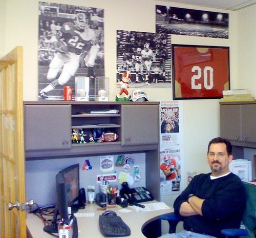
[Editor’s Note: Greg Allred, shown above, is the guy behind this site, which is devoted to the Birmingham Americans and Birgmingham Vulcans, both of the old WFL. He’s also accumulated some interesting memorabilia, much of which he’s made himself or had made to his specifications. Today he’ll be telling us about his collection. — PL]
By Greg Allred
I’ve been a DIYer for quite a while — I just didn’t really know it, or think there were others like me. I have several items that I have done over the years, dating back to the late ’80s or so.
I’ve always known what I wanted for my office decor and never found what I liked, so I made my own…sort of. Basically, I took photos of my favorite players and teams (Joe Namath, Johnny Musso, Fenway Park, Birmingham Americans, etc.), had oversize prints made and dry-mounted, and put them on the walls of my office and of my study at home. It’s fun, and I keep things fresh by rotating them from time to time.
What started it all was a life-size mural of Johnny Musso that I saw at a Papa Johns.com Bowl reception a few years ago. I was in attendance because I had contributed some WFL footage for the program, as Johnny Musso was the honoree (he formerly played for the Birmingham Vulcans). I asked for the mural after the event and was initially told I could have it, only to be told a few minutes later that Johnny’s sister had requested it. I was disappointed, but I certainly understood. A couple of weeks later, a smaller version of the same mural was delivered to me via FedEx. I still don’t know who sent it, but that sort of started the idea of these pictures for my office.
Here’s a nameplate — one of several that I had made. My original plan was to use each one with the respective player’s photo in a grouping or something, but I was never happy with the results, so I just framed them and put them on the wall of my study. The only one I incorporated into something larger is this one, which I paired with some Joe Namath sketches from an old book.
Here we have a Birmingham Americans collage I created and had printed, dry-mounted, and later framed. Then there’s a helmet I made for the 30th-anniversary reunion of the Birmingham Americans & Vulcans, which I hosted at the Alabama Sports Hall of Fame back in 2004. I had it signed by several players, coaches, team staffers, etc. I actually had the facemask painted on one side, to correspond with their change to blue masks.
The old WFL never had any trading cards, so back in 1999 I made some for the league’s 25th anniversary of the WFL. Here’s another uncut sheet, as well as a Johnny Musso card I made for a later event.
I also made a Birmingham Americans sweatshirt and mini-helmet — again, because I could not find what I liked back in 1997. So I bought a blank mini-helmet, and had the decals made, and so on.
I’ve also included photo of a Red Sox jersey I had made back in the early ’90s. I was pretty happy with it, except that the NOB was stitched directly to the jersey (even though I had requested a nameplate). The seamstress actually used a coach’s whistle lanyard for the sleeve trim — I was impressed with her patience.
Uni Watch News Ticker: Paul here. Nice story about the guy who designed the NBA logo. ”¦ Those leaked Man U kits have now been confirmed (with thanks to Patrick Runge). ”¦ If you haven’t checked in with A Collection a Day recently, it’s always worth a look (thanks for the reminder, Amy Fritch). ”¦ Also from Amy: a good art project from a photographer who takes shots of discarded baseballs. I especially like this one. ”¦ Here’s why Eric Berry will be wearing No. 29 (with thanks to Ethan Lowrence). ”¦ Camo jerseys upcoming this weekend for Penn State baseball (with thanks to Chris Flinn). ”¦ Also from Chris: Some interesting news regarding Joe Paterno’s sneakers.
although i like the logo change when the americans became the vulcans in 1975…
i still think they missed a great opportunity to simply flip the old logo (even tho the star would have been “upside down”)…woulda been cool
Immense downgrade for Manchester United. The chevron kit was excellent… and unique.
[quote comment=”388056″]Immense downgrade for Manchester United. The chevron kit was excellent… and unique.[/quote]
True, but that’s one of the beautiful things about English soccer. The kits are always changing, within the basic parameters.
If you like the kits, enjoy them while they last. If you don’t, a new one will come along soon. Sort of like Doctor Who. ;)
As downgrades go, this isn’t bad. Well, home at least. Change shirts are a mess.
Does anyone know where I can find a good picture of the French Connection (Perreault, Robert, Martin)? I need it for a Stealing Signs request.
Have any pics of the new Notre Dame football unis been found?
[quote comment=”388058″]Does anyone know where I can find a good picture of the French Connection (Perreault, Robert, Martin)? I need it for a Stealing Signs request.[/quote]
how’s this?
edit: or this litho
(how great were those early sabes unis btw?)
[quote comment=”388060″](how great were those early sabes unis btw?)[/quote]
As good as (if not better than) any of the O6 is how great they were.
And I wish I could decorate my
officecubicle like that.link!
And not an action photo, but I like link.
[quote comment=”388059″]Have any pics of the new Notre Dame football unis been found?[/quote]
I’m told they’re on the way. Patience.
[quote comment=”388068″][quote comment=”388059″]Have any pics of the new Notre Dame football unis been found?[/quote]
I’m told they’re on the way. Patience.[/quote]
Wish ND would stick with what they have, like Alabama has stuck with its unis all these years. No need to tinker with a classic. The current jerseys have been worn since the last year of the Willingham era (2004) and were “cleaned up” of the tacky billboarding of logos (and side stripes on the road jerseys) that had accumulated in the previous few years.
So what’s everyone’s preferred look for Notre Dame? My faves are:
1. Ron Powlus-era 94-97 (gold neckline, no sleeve trim, ND shoulder logo, Golden Dome neck logo, by Champion)
link
(navy neckline for road uni)
link
2. Joe Montana-era road uniform 75-78 (green neckline and sleeve trim, TV numbers)
link
I don’t like the green home uniforms from that era.
link
Notre Dame’s home uni should always be navy:
link
3. Rick Mirer-era 90-92 (gold neckline and gold sleeve trim, ND shoulder logo, by Champion)
link
(navy neckline and sleeve trim for road uni)
link
Least favorites are:
Arnaz Battle version (early 2000s) wit the gold torso stripe – terrible – by Adidas.
link
Jarious Jackson version (98-99) with ND logo and mutli-striped neckline/sleeves by Champion. Too busy.
link
[quote comment=”388057″][quote comment=”388056″]Immense downgrade for Manchester United. The chevron kit was excellent… and unique.[/quote]
True, but that’s one of the beautiful things about English soccer. The kits are always changing, within the basic parameters.
If you like the kits, enjoy them while they last. If you don’t, a new one will come along soon. Sort of like Doctor Who. ;)
As downgrades go, this isn’t bad. Well, home at least. Change shirts are a mess.[/quote]
Consider that the kits suffer from the poor picture quality. At least the home kit, the away is ‘hard done by’ as the Brits would say.
[quote comment=”388066″]link!
And not an action photo, but I like link.[/quote]
Rangers (w/ JD in goal) wearing their 1977-78 Fat John Ferguson inspired logo’d nightmares!
Here are a bunch of old school Pitt football Pictures for your enjoyment.
link
not sure if this made the ticker…but bleacher report gives a UW shout in talking about the new ND unis…
darker pants this year??? (more like old gold than vegas…maybe)
[quote comment=”388071″][quote comment=”388057″][quote comment=”388056″]Immense downgrade for Manchester United. The chevron kit was excellent… and unique.[/quote]
True, but that’s one of the beautiful things about English soccer. The kits are always changing, within the basic parameters.
If you like the kits, enjoy them while they last. If you don’t, a new one will come along soon. Sort of like Doctor Who. ;)
As downgrades go, this isn’t bad. Well, home at least. Change shirts are a mess.[/quote]
Consider that the kits suffer from the poor picture quality. At least the home kit, the away is ‘hard done by’ as the Brits would say.[/quote]
I don’t think the picture quality has much to do with it – we’ve had link already.
[quote comment=”388074″]not sure if this made the ticker…but link in talking about the new ND unis…
darker pants this year??? (more like old gold than vegas…maybe)[/quote]
That would be a good change, and not just for ND.
[quote comment=”388077″][quote comment=”388074″]not sure if this made the ticker…but link in talking about the new ND unis…
darker pants this year??? (more like old gold than vegas…maybe)[/quote]
Reasonable bet that “new pants” might only mean these…
link
…because they’re recognizable more as adidas new PowerWeb pants than as new Notre Dame pants. If addias weren’t interesting in promoting it the pants would have been a solid color.
—Ricko
That would be a good change, and not just for ND.[/quote]
[quote comment=”388077″][quote comment=”388074″]not sure if this made the ticker…but link in talking about the new ND unis…
darker pants this year??? (more like old gold than vegas…maybe)[/quote]
That would be a good change, and not just for ND.[/quote]
Ooops, let’s get it in the right place…
Reasonable bet that “new pants” might only mean these…
link….
…because they’re recognizable more as adidas new PowerWeb pants than as new Notre Dame pants. If addias weren’t interesting in promoting it the pants would have been a solid color.
–Ricko
Just click on the PowerWeb link in the ND story.
[quote comment=”388073″]Here are a bunch of old school Pitt football Pictures for your enjoyment.
link
Great Stuff! Loved most all of it, especially the old Pitt logo with the crawling panther! Why oh why did they tear down Pitt Stadium? Also looking forward to the day when the Dorsett-Marino unis are brought pack permanently!
Speaking of old photos, check out the PR gimmick shots on thumbnail p. 47…
link
—Ricko
[quote comment=”388080″][quote comment=”388077″][quote comment=”388074″]not sure if this made the ticker…but link in talking about the new ND unis…
darker pants this year??? (more like old gold than vegas…maybe)[/quote]
That would be a good change, and not just for ND.[/quote]
Ooops, let’s get it in the right place…
Reasonable bet that “new pants” might only mean these…
link….
…because they’re recognizable more as adidas new PowerWeb pants than as new Notre Dame pants. If addias weren’t interesting in promoting it the pants would have been a solid color.
–Ricko[/quote]
The reason the PowerWeb appears to be a different color is because it’s a different material. It’s similar to a TPU-esque rubbery plastic as opposed to the stretch fabric of the rest of the pant, which is why it is distinguishable on solid color pants.
[quote comment=”388084″][quote comment=”388080″][quote comment=”388077″][quote comment=”388074″]not sure if this made the ticker…but link in talking about the new ND unis…
darker pants this year??? (more like old gold than vegas…maybe)[/quote]
That would be a good change, and not just for ND.[/quote]
Ooops, let’s get it in the right place…
Reasonable bet that “new pants” might only mean these…
link….
…because they’re recognizable more as adidas new PowerWeb pants than as new Notre Dame pants. If addias weren’t interesting in promoting it the pants would have been a solid color.
–Ricko[/quote]
The reason the PowerWeb appears to be a different color is because it’s a different material. It’s similar to a TPU-esque rubbery plastic as opposed to the stretch fabric of the rest of the pant, which is why it is distinguishable on solid color pants.[/quote]
And, how convenient, also makes the pants recognizable as being adidas.
Just sayin’, if adidas WANTED less difference in the shades of gold, there’d BE less difference. They are smart enough to figure that out.
I’m not finding fault. It’s what they should be doing, in their minds, anyway.
–Ricko
[quote comment=”388060″][quote comment=”388058″]Does anyone know where I can find a good picture of the French Connection (Perreault, Robert, Martin)? I need it for a Stealing Signs request.[/quote]
link?
edit: link
(how great were those early sabes unis btw?)[/quote]
Love those unis. I’m a sucker for blue & gold, and that original logo is outstanding.
french connection. great hockey line. sweet nickname. for the youngsters among us, movie of same name also. boston bruins in 70’s had similar nickname crossover. movie: bob, carol, ted, and alice. bruins: bob, carol, ted, and dallas. clever, huh?
“I’ve always known what I wanted for my office decor and never found what I liked, so I made my own…sort of.”
Ah, a like-minded individual. Great stuff, Mr. Allred!
Love the blown-up photos. That’s what I’d like to do, but I usually just take full-page magazine photos and Fun-Tak them up on my basement walls.
The homemade football cards are great as well. Gives me an idea for some small photos I have.
What, no Stallions memorabilia?
Why oh why did they tear down Pitt Stadium?
So they could build the Petersen Athletic Center (the new home of Pitt hoops) on the site.
[quote comment=”388084″][quote comment=”388080″][quote comment=”388077″][quote comment=”388074″]not sure if this made the ticker…but link in talking about the new ND unis…
darker pants this year??? (more like old gold than vegas…maybe)[/quote]
That would be a good change, and not just for ND.[/quote]
Ooops, let’s get it in the right place…
Reasonable bet that “new pants” might only mean these…
link….
…because they’re recognizable more as adidas new PowerWeb pants than as new Notre Dame pants. If addias weren’t interesting in promoting it the pants would have been a solid color.
–Ricko[/quote]
The reason the PowerWeb appears to be a different color is because it’s a different material. It’s similar to a TPU-esque rubbery plastic as opposed to the stretch fabric of the rest of the pant, which is why it is distinguishable on solid color pants.[/quote]
And this helps the players how? Makes them 100 percent lighter, right? Offers more breathability? Prevents hamstring pulls? Yada, yada, yada.
Just looks ugly.
[quote comment=”388088″]
What, no Stallions memorabilia?[/quote]
why would he have usfl memorabilia? granted, this was a great uni and all, but not all “third” pro leagues (speaking of nfl & afl as 2 distinct leagues here) were created equal …
Some of the commenters are claiming fake on those Man U kits…
Others are saying they look too “American” whatever that means.
Did anyone else catch the discussion regarding DJ Carrasco’s stirrups last night during the Pirates-Brewers game on FSN Pittsburgh?
Although Ollie was the only one wearing them last night, the Mets cream faux-backs look great with link
…
the Mets…the first place Mets
fixed
[quote comment=”388075″][quote comment=”388071″][quote comment=”388057″][quote comment=”388056″]Immense downgrade for Manchester United. The chevron kit was excellent… and unique.[/quote]
True, but that’s one of the beautiful things about English soccer. The kits are always changing, within the basic parameters.
If you like the kits, enjoy them while they last. If you don’t, a new one will come along soon. Sort of like Doctor Who. ;)
As downgrades go, this isn’t bad. Well, home at least. Change shirts are a mess.[/quote]
Consider that the kits suffer from the poor picture quality. At least the home kit, the away is ‘hard done by’ as the Brits would say.[/quote]
I don’t think the picture quality has much to do with it – we’ve had link already.[/quote]
I just don’t see anything wrong w/ the home set. That collar shouts ‘footy shirt’and I can life w/ the sponsor as it’s only 3 letter (thou I wish they’d make it w/ a smaller font— but that ain’t ever happening!)
From a limited prospective, the away kit is also simplicity personified– the collar shouts footy kit– I just wish the sleeves had a more toned down treatment.
I find it humorous that the Brits regard the away kit as a ‘american’ design…. I wonder what they refer to all that crappy football shirts designed in the 90’s?? Were those also ‘american’???
[quote comment=”388094″]Although Ollie was the only one wearing them last night, the Mets cream faux-backs look great with link[/quote]
I agree Ben.. great look— too bad Ollie only wore this ensemble for 3 + innings link
I’m surprised no one has commented on the stirrups in this picture:
link
In light of the “slow day” here at Uniwatch, I present my biggest complaints about unis:
1) pinstripes on road grays (Rockies)
2) drop shadows (Mets, Dolphins)
3) light over dark in football (red top/black pants etc)
4) pajama pants
5) white cleats (baseball)
agree? disagree?
[quote comment=”388098″]I’m surprised no one has commented on the stirrups in this picture:
[/quote]
Sorry. Don’t know what happened to the link:
link
[quote comment=”388099″]In light of the “slow day” here at Uniwatch, I present my biggest complaints about unis:
1) pinstripes on road grays (Rockies)
2) drop shadows (Mets, Dolphins)
3) light over dark in football (red top/black pants etc)
4) pajama pants
5) white cleats (baseball)
agree? disagree?[/quote]
I dunno, link work sometimes.
Steve Levy at ESPN gets it TM
link
Any Vida Blue fans out there? Here’s something you might like:
link
[quote comment=”388101″][quote comment=”388099″]In light of the “slow day” here at Uniwatch, I present my biggest complaints about unis:
1) pinstripes on road grays (Rockies)
2) drop shadows (Mets, Dolphins)
3) light over dark in football (red top/black pants etc)
4) pajama pants
5) white cleats (baseball)
agree? disagree?[/quote]
I dunno, link work sometimes.[/quote]
I wore white cleats when i played t-ball for Lacross Lumber in fulton, MO, but just b/c it’s old doesn’t make it right! still say no to white cleats.
[quote comment=”388102″]Steve Levy at ESPN gets it TM
link
Oh man does he ever. The Phoenix whiteout is an atrocity in every sense of the word.
I was in Winnipeg for several of the whiteouts and it was fantastic. We all showed up wearing white (there were no white tshirts waiting for us on the seats). Why they continue to do this when the VISITING team is the one wearing white is beyond me. It is simply wrong!
[quote comment=”388104″][quote comment=”388101″][quote comment=”388099″]In light of the “slow day” here at Uniwatch, I present my biggest complaints about unis:
1) pinstripes on road grays (Rockies)
2) drop shadows (Mets, Dolphins)
3) light over dark in football (red top/black pants etc)
4) pajama pants
5) white cleats (baseball)
agree? disagree?[/quote]
I dunno, link work sometimes.[/quote]
I wore white cleats when i played t-ball for Lacross Lumber in fulton, MO, but just b/c it’s old doesn’t make it right! still say no to white cleats.[/quote]
my first cleats for eastman party store were white too, and i likewise dislike the white baseball spike, just does not look right. the a’s on the road look ridiculous, and since there is zero stripe at home, their pajamas look like footies. thumbs down in any era.
[quote comment=”388106″][quote comment=”388104″][quote comment=”388101″][quote comment=”388099″]In light of the “slow day” here at Uniwatch, I present my biggest complaints about unis:
1) pinstripes on road grays (Rockies)
2) drop shadows (Mets, Dolphins)
3) light over dark in football (red top/black pants etc)
4) pajama pants
5) white cleats (baseball)
agree? disagree?[/quote]
I dunno, link work sometimes.[/quote]
I wore white cleats when i played t-ball for Lacross Lumber in fulton, MO, but just b/c it’s old doesn’t make it right! still say no to white cleats.[/quote]
my first cleats for eastman party store were white too, and i likewise dislike the white baseball spike, just does not look right. the a’s on the road look ridiculous, and since there is zero stripe at home, their pajamas look like footies. thumbs down in any era.[/quote]
Sure does make it easy to spot the A’s in a highlight package, though. In this of era of homogenization of baseball unis (especially so many dark Alts), that’s almost a relief. Can focus on the highlight instead of thinking , “Which two frickin’ teams are playing?”
Oh, something was gonna mention.
Kudos to Mets for going royal hats and royal sleeves for both ends of doubleheader yesterday.
That being said, they did it against the Dodgers.
Now, seriously, if you (good or bad not the issue here) have hats, sleeves, even unis, that use black, wouldn’t the place to use them have been against the Dodgers. For, y’know, contrast?
Same kind of thinking (or lack thereof) that gets us navy vs. black, etc., I guess
—Ricko
[quote comment=”388086″][quote comment=”388060″][quote comment=”388058″]Does anyone know where I can find a good picture of the French Connection (Perreault, Robert, Martin)? I need it for a Stealing Signs request.[/quote]
link?
edit: link
(how great were those early sabes unis btw?)[/quote]
Love those unis. I’m a sucker for blue & gold, and that original logo is outstanding.[/quote]
I think we’ve seen the last of the slug on the ice. Will be interesting to see how they manage to screw things up next year.
[quote comment=”388106″]thumbs down in any era.[/quote]
so this trumps this?
since (at least now, and for a long time) a’s are ONLY team with white cleats, i give them a pass, because they are (were) unique
once other teams started farting around with white shoes…
it looked incredibly stupid
of course, as ricko is quick to point out white shoes with dark socks tends to look like this
[quote comment=”388101″][quote comment=”388099″]In light of the “slow day” here at Uniwatch, I present my biggest complaints about unis:
1) pinstripes on road grays (Rockies)
2) drop shadows (Mets, Dolphins)
3) light over dark in football (red top/black pants etc)
4) pajama pants
5) white cleats (baseball)
agree? disagree?[/quote]
I dunno, link work sometimes.[/quote]
I’m ok with white cleats, provided the WHOLE team wears them. I don’t like the situations like D-Wright’s virtually white shoes when the rest of team wears predominantly black shoes, or Alfonso Soriano’s white shoes with the Cubs.
The white shoes are as identifiable with the A’s as any piece of a uniform can be associated with a particular team. Odds are, if someone mentions the A’s uniform, white shoes is what immediately comes to mind.
I’m surprised no other MLB team has adopted the practice as a team-wide rule. IF you were to nominate a team that should go with white cleats full-time, who would it be?
I don’t think it can be any team that wears pins (Yanks, ChiSox, Twins, Astros, Rox). I don’t think it can be one of the teams that already wears a designated color shoe other than black (Cards, Royals). I don’t think it works with teams that wear darker colors, either.
My nominee – Cincy.
My nominee for teams that should wear them with certain alt unis: Houston non-pins uni with the orange hat (provided they go with orange socks, too)
link
i think the white shoes goes best with a clean white uni devoid of lots of frills
link
i even think it work with their road uniform. these shoes are grey, but it’s closer to white than black.
link
[quote comment=”388110″][quote comment=”388101″][quote comment=”388099″]In light of the “slow day” here at Uniwatch, I present my biggest complaints about unis:
1) pinstripes on road grays (Rockies)
2) drop shadows (Mets, Dolphins)
3) light over dark in football (red top/black pants etc)
4) pajama pants
5) white cleats (baseball)
agree? disagree?[/quote]
I dunno, link work sometimes.[/quote]
I’m ok with white cleats, provided the WHOLE team wears them. I don’t like the situations like D-Wright’s virtually white shoes when the rest of team wears predominantly black shoes, or Alfonso Soriano’s white shoes with the Cubs.
The white shoes are as identifiable with the A’s as any piece of a uniform can be associated with a particular team. Odds are, if someone mentions the A’s uniform, white shoes is what immediately comes to mind.
I’m surprised no other MLB team has adopted the practice as a team-wide rule. IF you were to nominate a team that should go with white cleats full-time, who would it be?
I don’t think it can be any team that wears pins (Yanks, ChiSox, Twins, Astros, Rox). I don’t think it can be one of the teams that already wears a designated color shoe other than black (Cards, Royals). I don’t think it works with teams that wear darker colors, either.
My nominee – Cincy.
My nominee for teams that should wear them with certain alt unis: Houston non-pins uni with the orange hat (provided they go with orange socks, too)
link
Those A’s uniforms are some of the best all-time, in my mind, including with white shoes. But I think if they had come along when I was in my 30s or 40s, I wouldn’t have liked them. Kind of like youngsters today like all the horns and Oregon-type unis and we older guys don’t.
A lot of college teams wear white shoes for some reason, but you can hardly find white shoes for baseball and football on youth teams anymore, or in the sporting goods stores. The whole trend went from black to white to black over the last 30 years.
[quote comment=”388099″]In light of the “slow day” here at Uniwatch, I present my biggest complaints about unis:
3) light over dark in football (red top/black pants etc)
agree? disagree?[/quote]
I tend to agree, although I do like this:
link
White baseball cleats seem to work when they’re related to the overall design, and are intro’d pretty much simultaneously with the new look.
ATHLETICS’ first used them with an existing uni, but added gold sanis and stripes to socks at same time to reflect the footwear change.
ASTROS went to whites in second year of Tequila Sunrise and actually looked better than the black cleats had. The whole uni was so “out there”, so “’70’s,” that they seemed right.
PADRES’ change to white cleats accompanied a revamping that involved going to the all lower-case “padres”, also very ’70s…and that wordmark was still there through the Taco unis.
All the rest (Phillies, final Senators, Angels) simply switching to white with their existing unis was just too…”Look how hip we are.” And therefore fell (and continue to fall) flat.
War Damn Eagle makes a great point. Today, in this era of anything but “avant-garde” unis, whites would look best with an uncluttered set of duds. Maybe that’s why they still work for the A’s. Not much “bumper sticker” thinking on the A’s unis (yeah, black alts, but that’s not really about “clutter”).
Also why Albert Pujols’ “virtually white” home cleats don’t look all that awful, either.
—Ricko
[quote comment=”388099″]In light of the “slow day” here at Uniwatch, I present my biggest complaints about unis:
1) pinstripes on road grays (Rockies)
2) drop shadows (Mets, Dolphins)
3) light over dark in football (red top/black pants etc)
4) pajama pants
5) white cleats (baseball)
agree? disagree?[/quote]
Agree. And add the following:
1. Road uniforms at home in basketball (unless it’s a gold or silver alternate).
2. Black uniforms when black is not your school color and you already have two or more colors.
3. Monochrome unis in the NFL.
4. Horns and stripes and shadows.
5. Baseball players without any socks or stirrups showing.
6. Knee-high white socks in football or basketball.
7. Anything Oregon.
Those Man U home kits are based on their link. Does this fall into “faux-back” territory?
Thankfully I doubt they’ll be wearing those shorts.
Can’t seem to find anything those away kits are based.
[quote comment=”388115″]
7. Anything Oregon.[/quote]
link
[quote comment=”388117″][quote comment=”388115″]
7. Anything Oregon.[/quote]
link[/quote]
You’re right. Too broad a statement. Those throwbacks are beautiful.
I also don’t like a baseball team having more than one white uniform at home. Pick pins, pick snow-whites, but don’t take both. You only have one grey uni on the road, so why two white home unis?
[quote comment=”388109″][quote comment=”388106″]thumbs down in any era.[/quote]
so link trumps this?
since (at least now, and for a long time) a’s are ONLY team with white cleats, i give them a pass, because they are (were) unique
once link teams link farting link with link…
it looked incredibly stupid
of course, as ricko is quick to point out link tends to look like link[/quote]
i dig what you and others are saying about the a’s, but i don’t like it. green spikes would be what i would choose, especially on the road. and while i am at it, in my opinion the a’s need a total uniform overhaul. i used to love watching a weekend day game when it featured the a’s as a kid, now, blah. maybe i will finally breakdown and do a tweak.
and of course apologies to shaggy if he is reading any of this, because he always wears solid white spikes for softball, and looks sharp. i of course wear solid black spikes. i finally found a new pair to replace the ones i wore for 22 years before i blew them out early last summer. i am also going to get some natural leather to put on the tongue, to replicate link look.
[quote comment=”388107″][quote comment=”388106″][quote comment=”388104″][quote comment=”388101″][quote comment=”388099″]In light of the “slow day” here at Uniwatch, I present my biggest complaints about unis:
1) pinstripes on road grays (Rockies)
2) drop shadows (Mets, Dolphins)
3) light over dark in football (red top/black pants etc)
4) pajama pants
5) white cleats (baseball)
agree? disagree?[/quote]
I dunno, link work sometimes.[/quote]
I wore white cleats when i played t-ball for Lacross Lumber in fulton, MO, but just b/c it’s old doesn’t make it right! still say no to white cleats.[/quote]
my first cleats for eastman party store were white too, and i likewise dislike the white baseball spike, just does not look right. the a’s on the road look ridiculous, and since there is zero stripe at home, their pajamas look like footies. thumbs down in any era.[/quote]
Sure does make it easy to spot the A’s in a highlight package, though. In this of era of homogenization of baseball unis (especially so many dark Alts), that’s almost a relief. Can focus on the highlight instead of thinking , “Which two frickin’ teams are playing?”
Oh, something was gonna mention.
Kudos to Mets for going royal hats and royal sleeves for both ends of doubleheader yesterday.
That being said, they did it against the Dodgers.
Now, seriously, if you (good or bad not the issue here) have hats, sleeves, even unis, that use black, wouldn’t the place to use them have been against the Dodgers. For, y’know, contrast?
Same kind of thinking (or lack thereof) that gets us navy vs. black, etc., I guess
—Ricko[/quote]
Yer nitpicking, Sr. Ricardo.
I’m just happy the Coupons actually held an old fashioned doubleheader yesterday. Good kharma was rewarded with a another sweep. Do I hear 9-1 homestand???
BTW: Bobby Valentine called the 9-1 homestand 12 days ago on Baseball Tonight. Good boy, bobby, come home any time. (with or w/o the black electrical tape under the nose) :)
[quote comment=”388120″][quote comment=”388109″][quote comment=”388106″]thumbs down in any era.[/quote]
so link trumps this?
since (at least now, and for a long time) a’s are ONLY team with white cleats, i give them a pass, because they are (were) unique
once link teams link farting link with link…
it looked incredibly stupid
of course, as ricko is quick to point out link tends to look like link[/quote]
i dig what you and others are saying about the a’s, but i don’t like it. green spikes would be what i would choose, especially on the road. and while i am at it, in my opinion the a’s need a total uniform overhaul. i used to love watching a weekend day game when it featured the a’s as a kid, now, blah. maybe i will finally breakdown and do a tweak.
and of course apologies to shaggy if he is reading any of this, because he always wears solid white spikes for softball, and looks sharp. i of course wear solid black spikes. i finally found a new pair to replace the ones i wore for 22 years before i blew them out early last summer. i am also going to get some natural leather to put on the tongue, to replicate link look.[/quote]
I’m not a fan of white shoes in baseball or football, but the A’s get a pass here. And I like the simplicity of their uniforms, though I wouldn’t dislike it if they added green or gold piping. I would prefer a gold jersey to a black jersey, though, as homage to the past.
quiz for you all- my 10 year old son has 2 replica jerseys (actually one’s just a t-shirt) and both players went to the same high school. Who are the players and what high school did they both attend? I’ll give you more clues if you need them.
They play different sports in the same city
[quote comment=”388120″][quote comment=”388109″][quote comment=”388106″]thumbs down in any era.[/quote]
so link trumps this?
since (at least now, and for a long time) a’s are ONLY team with white cleats, i give them a pass, because they are (were) unique
once link teams link farting link with link…
it looked incredibly stupid
of course, as ricko is quick to point out link tends to look like link[/quote]
i dig what you and others are saying about the a’s, but i don’t like it. green spikes would be what i would choose, especially on the road. and while i am at it, in my opinion the a’s need a total uniform overhaul. i used to love watching a weekend day game when it featured the a’s as a kid, now, blah. maybe i will finally breakdown and do a tweak.
and of course apologies to shaggy if he is reading any of this, because he always wears solid white spikes for softball, and looks sharp. i of course wear solid black spikes. i finally found a new pair to replace the ones i wore for 22 years before i blew them out early last summer. i am also going to get some natural leather to put on the tongue, to replicate link look.[/quote]
Of course I am reading this!!!!!!!!!!!!! Can’t wait to see you tonight, Blue! link
I do agree though that the A’s are the only team that should do this, it’s unique and part of their history. Lots of colorful tops and bottoms, and usually white shoes. Like the Cowboys wearing white tops at home or the Lakers wearing gold/yellow, it’s a tradition that I would think most enjoy and understand.
[quote comment=\”388123\”]quiz for you all- my 10 year old son has 2 replica jerseys (actually one\’s just a t-shirt) and both players went to the same high school. Who are the players and what high school did they both attend? I\’ll give you more clues if you need them.[/quote]
Just saw your 2nd post, but I would have guessed Channing Frye and Jerryd Bayless (both played basketball and Saint Mary\’s High school in Phoenix then later when on to star at the UofA)
[quote comment=”388121″][quote comment=”388107″][quote comment=”388106″][quote comment=”388104″][quote comment=”388101″][quote comment=”388099″]In light of the “slow day” here at Uniwatch, I present my biggest complaints about unis:
1) pinstripes on road grays (Rockies)
2) drop shadows (Mets, Dolphins)
3) light over dark in football (red top/black pants etc)
4) pajama pants
5) white cleats (baseball)
agree? disagree?[/quote]
I dunno, link work sometimes.[/quote]
I wore white cleats when i played t-ball for Lacross Lumber in fulton, MO, but just b/c it’s old doesn’t make it right! still say no to white cleats.[/quote]
my first cleats for eastman party store were white too, and i likewise dislike the white baseball spike, just does not look right. the a’s on the road look ridiculous, and since there is zero stripe at home, their pajamas look like footies. thumbs down in any era.[/quote]
Sure does make it easy to spot the A’s in a highlight package, though. In this of era of homogenization of baseball unis (especially so many dark Alts), that’s almost a relief. Can focus on the highlight instead of thinking , “Which two frickin’ teams are playing?”
Oh, something was gonna mention.
Kudos to Mets for going royal hats and royal sleeves for both ends of doubleheader yesterday.
That being said, they did it against the Dodgers.
Now, seriously, if you (good or bad not the issue here) have hats, sleeves, even unis, that use black, wouldn’t the place to use them have been against the Dodgers. For, y’know, contrast?
Same kind of thinking (or lack thereof) that gets us navy vs. black, etc., I guess
—Ricko[/quote]
Yer nitpicking, Sr. Ricardo.
I’m just happy the Coupons actually held an old fashioned doubleheader yesterday. Good kharma was rewarded with a another sweep. Do I hear 9-1 homestand???
BTW: Bobby Valentine called the 9-1 homestand 12 days ago on Baseball Tonight. Good boy, bobby, come home any time. (with or w/o the black electrical tape under the nose) :)[/quote]
Was more about using yesterday’s doubleheader as an example of how no one seems to take time to think about how the field’s gonna look today. The WHOLE field, not just their team.
Very few do, evidently. We get football games with both teams in navy pants, for example, when at least one them also has, say, athletic gold pants they could have opted to wear.
That’s all, just that you’d think the more visual differentiation you could accomplish the better. Not to mention a better looking “show” going home on TV for the rod and cones and all. Different colors on the competing teams are just flat-out more interesting/entertaining to the human eye. To the senses. To the mind. Not talking consciously, now, rather the involuntary processing of data.
—Ricko
[quote comment=”388128″][quote comment=”388121″][quote comment=”388107″][quote comment=”388106″][quote comment=”388104″][quote comment=”388101″][quote comment=”388099″]In light of the “slow day” here at Uniwatch, I present my biggest complaints about unis:
1) pinstripes on road grays (Rockies)
2) drop shadows (Mets, Dolphins)
3) light over dark in football (red top/black pants etc)
4) pajama pants
5) white cleats (baseball)
agree? disagree?[/quote]
I dunno, link work sometimes.[/quote]
I wore white cleats when i played t-ball for Lacross Lumber in fulton, MO, but just b/c it’s old doesn’t make it right! still say no to white cleats.[/quote]
my first cleats for eastman party store were white too, and i likewise dislike the white baseball spike, just does not look right. the a’s on the road look ridiculous, and since there is zero stripe at home, their pajamas look like footies. thumbs down in any era.[/quote]
Sure does make it easy to spot the A’s in a highlight package, though. In this of era of homogenization of baseball unis (especially so many dark Alts), that’s almost a relief. Can focus on the highlight instead of thinking , “Which two frickin’ teams are playing?”
Oh, something was gonna mention.
Kudos to Mets for going royal hats and royal sleeves for both ends of doubleheader yesterday.
That being said, they did it against the Dodgers.
Now, seriously, if you (good or bad not the issue here) have hats, sleeves, even unis, that use black, wouldn’t the place to use them have been against the Dodgers. For, y’know, contrast?
Same kind of thinking (or lack thereof) that gets us navy vs. black, etc., I guess
—Ricko[/quote]
Yer nitpicking, Sr. Ricardo.
I’m just happy the Coupons actually held an old fashioned doubleheader yesterday. Good kharma was rewarded with a another sweep. Do I hear 9-1 homestand???
BTW: Bobby Valentine called the 9-1 homestand 12 days ago on Baseball Tonight. Good boy, bobby, come home any time. (with or w/o the black electrical tape under the nose) :)[/quote]
Was more about using yesterday’s doubleheader as an example of how no one seems to take time to think about how the field’s gonna look today. The WHOLE field, not just their team.
Very few do, evidently. We get football games with both teams in navy pants, for example, when at least one them also has, say, athletic gold pants they could have opted to wear.
That’s all, just that you’d think the more visual differentiation you could accomplish the better. Not to mention a better looking “show” going home on TV for the rod and cones and all. Different colors on the competing teams are just flat-out more interesting/entertaining to the human eye. To the senses. To the mind. Not talking consciously, now, rather the involuntary processing of data.
—Ricko[/quote]
Here’s a great example, Ricko. I was watching this game online last night link It looked like a Maryland (or Watford) intrasquad game- both clubs even have the same shirt sponsor.
[quote comment=”388128″][quote comment=”388121″][quote comment=”388107″][quote comment=”388106″][quote comment=”388104″][quote comment=”388101″][quote comment=”388099″]In light of the “slow day” here at Uniwatch, I present my biggest complaints about unis:
1) pinstripes on road grays (Rockies)
2) drop shadows (Mets, Dolphins)
3) light over dark in football (red top/black pants etc)
4) pajama pants
5) white cleats (baseball)
agree? disagree?[/quote]
I dunno, link work sometimes.[/quote]
I wore white cleats when i played t-ball for Lacross Lumber in fulton, MO, but just b/c it’s old doesn’t make it right! still say no to white cleats.[/quote]
my first cleats for eastman party store were white too, and i likewise dislike the white baseball spike, just does not look right. the a’s on the road look ridiculous, and since there is zero stripe at home, their pajamas look like footies. thumbs down in any era.[/quote]
Sure does make it easy to spot the A’s in a highlight package, though. In this of era of homogenization of baseball unis (especially so many dark Alts), that’s almost a relief. Can focus on the highlight instead of thinking , “Which two frickin’ teams are playing?”
Oh, something was gonna mention.
Kudos to Mets for going royal hats and royal sleeves for both ends of doubleheader yesterday.
That being said, they did it against the Dodgers.
Now, seriously, if you (good or bad not the issue here) have hats, sleeves, even unis, that use black, wouldn’t the place to use them have been against the Dodgers. For, y’know, contrast?
Same kind of thinking (or lack thereof) that gets us navy vs. black, etc., I guess
—Ricko[/quote]
Yer nitpicking, Sr. Ricardo.
I’m just happy the Coupons actually held an old fashioned doubleheader yesterday. Good kharma was rewarded with a another sweep. Do I hear 9-1 homestand???
BTW: Bobby Valentine called the 9-1 homestand 12 days ago on Baseball Tonight. Good boy, bobby, come home any time. (with or w/o the black electrical tape under the nose) :)[/quote]
Was more about using yesterday’s doubleheader as an example of how no one seems to take time to think about how the field’s gonna look today. The WHOLE field, not just their team.
Very few do, evidently. We get football games with both teams in navy pants, for example, when at least one them also has, say, athletic gold pants they could have opted to wear.
That’s all, just that you’d think the more visual differentiation you could accomplish the better. Not to mention a better looking “show” going home on TV for the rod and cones and all. Different colors on the competing teams are just flat-out more interesting/entertaining to the human eye. To the senses. To the mind. Not talking consciously, now, rather the involuntary processing of data.
—Ricko[/quote]
Ricko, how does this work?
link
[quote comment=”388132″][quote comment=”388128″][quote comment=”388121″][quote comment=”388107″][quote comment=”388106″][quote comment=”388104″][quote comment=”388101″][quote comment=”388099″]In light of the “slow day” here at Uniwatch, I present my biggest complaints about unis:
1) pinstripes on road grays (Rockies)
2) drop shadows (Mets, Dolphins)
3) light over dark in football (red top/black pants etc)
4) pajama pants
5) white cleats (baseball)
agree? disagree?[/quote]
I dunno, link work sometimes.[/quote]
I wore white cleats when i played t-ball for Lacross Lumber in fulton, MO, but just b/c it’s old doesn’t make it right! still say no to white cleats.[/quote]
my first cleats for eastman party store were white too, and i likewise dislike the white baseball spike, just does not look right. the a’s on the road look ridiculous, and since there is zero stripe at home, their pajamas look like footies. thumbs down in any era.[/quote]
Sure does make it easy to spot the A’s in a highlight package, though. In this of era of homogenization of baseball unis (especially so many dark Alts), that’s almost a relief. Can focus on the highlight instead of thinking , “Which two frickin’ teams are playing?”
Oh, something was gonna mention.
Kudos to Mets for going royal hats and royal sleeves for both ends of doubleheader yesterday.
That being said, they did it against the Dodgers.
Now, seriously, if you (good or bad not the issue here) have hats, sleeves, even unis, that use black, wouldn’t the place to use them have been against the Dodgers. For, y’know, contrast?
Same kind of thinking (or lack thereof) that gets us navy vs. black, etc., I guess
—Ricko[/quote]
Yer nitpicking, Sr. Ricardo.
I’m just happy the Coupons actually held an old fashioned doubleheader yesterday. Good kharma was rewarded with a another sweep. Do I hear 9-1 homestand???
BTW: Bobby Valentine called the 9-1 homestand 12 days ago on Baseball Tonight. Good boy, bobby, come home any time. (with or w/o the black electrical tape under the nose) :)[/quote]
Was more about using yesterday’s doubleheader as an example of how no one seems to take time to think about how the field’s gonna look today. The WHOLE field, not just their team.
Very few do, evidently. We get football games with both teams in navy pants, for example, when at least one them also has, say, athletic gold pants they could have opted to wear.
That’s all, just that you’d think the more visual differentiation you could accomplish the better. Not to mention a better looking “show” going home on TV for the rod and cones and all. Different colors on the competing teams are just flat-out more interesting/entertaining to the human eye. To the senses. To the mind. Not talking consciously, now, rather the involuntary processing of data.
—Ricko[/quote]
Ricko, how does this work?
link
Well, if that’s the only choices the teams have, then that’s what you get. Sometimes it is what is is. But, if Georgia Tech HAD had a set of dark jerseys as a option, that might have been a good time to wear them.
—Ricko
[quote comment=”388122″][quote comment=”388120″][quote comment=”388109″][quote comment=”388106″]thumbs down in any era.[/quote]
so link trumps this?
since (at least now, and for a long time) a’s are ONLY team with white cleats, i give them a pass, because they are (were) unique
once link teams link farting link with link…
it looked incredibly stupid
of course, as ricko is quick to point out link tends to look like link[/quote]
i dig what you and others are saying about the a’s, but i don’t like it. green spikes would be what i would choose, especially on the road. and while i am at it, in my opinion the a’s need a total uniform overhaul. i used to love watching a weekend day game when it featured the a’s as a kid, now, blah. maybe i will finally breakdown and do a tweak.
and of course apologies to shaggy if he is reading any of this, because he always wears solid white spikes for softball, and looks sharp. i of course wear solid black spikes. i finally found a new pair to replace the ones i wore for 22 years before i blew them out early last summer. i am also going to get some natural leather to put on the tongue, to replicate link look.[/quote]
I’m not a fan of white shoes in baseball or football, but the A’s get a pass here. And I like the simplicity of their uniforms, though I wouldn’t dislike it if they added green or gold piping. I would prefer a gold jersey to a black jersey, though, as homage to the past.[/quote]
I don’t mind white or black shoes in any sport. What I really hate is colored shoes. I don’t like the Cardinals, Phillies, Nats wearing red shoes. Mets wearing blue shoes. It looks cheap, plastic and dumb (IMHO). Either the white or black needs to be worn and I don’t mind either one. Also, every player needs to wear the same shoe. Too much mix and match in basketball especially.
[quote comment=”388074″]not sure if this made the ticker…but link in talking about the new ND unis…
darker pants this year??? (more like old gold than vegas…maybe)[/quote]
Where is the story on Uni Watch about that??
[quote comment=”388134″][quote comment=”388122″][quote comment=”388120″][quote comment=”388109″][quote comment=”388106″]thumbs down in any era.[/quote]
so link trumps this?
since (at least now, and for a long time) a’s are ONLY team with white cleats, i give them a pass, because they are (were) unique
once link teams link farting link with link…
it looked incredibly stupid
of course, as ricko is quick to point out link tends to look like link[/quote]
i dig what you and others are saying about the a’s, but i don’t like it. green spikes would be what i would choose, especially on the road. and while i am at it, in my opinion the a’s need a total uniform overhaul. i used to love watching a weekend day game when it featured the a’s as a kid, now, blah. maybe i will finally breakdown and do a tweak.
and of course apologies to shaggy if he is reading any of this, because he always wears solid white spikes for softball, and looks sharp. i of course wear solid black spikes. i finally found a new pair to replace the ones i wore for 22 years before i blew them out early last summer. i am also going to get some natural leather to put on the tongue, to replicate link look.[/quote]
I’m not a fan of white shoes in baseball or football, but the A’s get a pass here. And I like the simplicity of their uniforms, though I wouldn’t dislike it if they added green or gold piping. I would prefer a gold jersey to a black jersey, though, as homage to the past.[/quote]
I don’t mind white or black shoes in any sport. What I really hate is colored shoes. I don’t like the Cardinals, Phillies, Nats wearing red shoes. Mets wearing blue shoes. It looks cheap, plastic and dumb (IMHO). Either the white or black needs to be worn and I don’t mind either one. Also, every player needs to wear the same shoe. Too much mix and match in basketball especially.[/quote]
trax trax trax, you were making a reasonable point until you tried to standardize the shoe. that being said, it would be nice if everyone had to follow the limitations more accurately. but personally, i think the white’s look cheap.
as for the colours, let’s look at the teams you mentioned, stricktly in my opinion…
phillies~no black in the uni, i think red works here.
nats~black would be better, but a navy shoe would be nice too, it’s blackish, or at least dark, and works with their colour scheme.
mets~for sure their current colour scheme supports black. and even if they ditch black all together, it would look better in black, but i don’t mind blue here either.
cards~ see mets. i suppose black would be nice, but i think the red works fine here.
After all the blue the Mets have been wearing recently, it was kind of jarring to see the black hats and undershirts (and hideous two-toned helmets) back today. It was like reopening a wound.
[quote comment=”388137″]After all the blue the Mets have been wearing recently, it was kind of jarring to see the black hats and undershirts (and hideous two-toned helmets) back today. It was like reopening a wound.[/quote]
Agreed…. worst of the bunch: David Wright’s black faux stirrups, black long sleeve under shirt and black & blue trimmed cap. Barf!
link
[quote comment=”388088″]”I’ve always known what I wanted for my office decor and never found what I liked, so I made my own…sort of.”
Ah, a like-minded individual. Great stuff, Mr. Allred!
Love the blown-up photos. That’s what I’d like to do, but I usually just take full-page magazine photos and Fun-Tak them up on my basement walls.
The homemade football cards are great as well. Gives me an idea for some small photos I have.
What, no Stallions memorabilia?[/quote]
I have some Stallions stuff (jerseys, programs, photos, etc.) I’m just afflicted with the WFL bug I guess. Most of my memorabilia is, of course, not DIY, so it wouldn’t be apppropiate for this segment. Thanks for the compliments!
[quote comment=”388117″][quote comment=”388115″]
7. Anything Oregon.[/quote]
link[/quote]
Unnecessary white alert! Though it looks nice. Maybe a thin piece of white trim down the side of the pants would justify it being there.
[quote comment=”388090″][quote comment=”388084″][quote comment=”388080″][quote comment=”388077″][quote comment=”388074″]not sure if this made the ticker…but link in talking about the new ND unis…
darker pants this year??? (more like old gold than vegas…maybe)[/quote]
That would be a good change, and not just for ND.[/quote]
Ooops, let’s get it in the right place…
Reasonable bet that “new pants” might only mean these…
link….
…because they’re recognizable more as adidas new PowerWeb pants than as new Notre Dame pants. If addias weren’t interesting in promoting it the pants would have been a solid color.
–Ricko[/quote]
The reason the PowerWeb appears to be a different color is because it’s a different material. It’s similar to a TPU-esque rubbery plastic as opposed to the stretch fabric of the rest of the pant, which is why it is distinguishable on solid color pants.[/quote]
And this helps the players how? Makes them 100 percent lighter, right? Offers more breathability? Prevents hamstring pulls? Yada, yada, yada.
Just looks ugly.[/quote]
Chill. I’m just informing you. It’s physically impossible to make TPU with the exact same color and reflective properties as stretch polyester, and that’s why you can see the PowerWeb design on solid colored pants. It’s about as subdued as it can be. If they wanted it to stand out, they would have made it a contrasting color.
link
never seen this jersey before.
[quote comment=”388141″][quote comment=”388090″][quote comment=”388084″][quote comment=”388080″][quote comment=”388077″][quote comment=”388074″]not sure if this made the ticker…but link in talking about the new ND unis…
darker pants this year??? (more like old gold than vegas…maybe)[/quote]
That would be a good change, and not just for ND.[/quote]
Ooops, let’s get it in the right place…
Reasonable bet that “new pants” might only mean these…
link….
…because they’re recognizable more as adidas new PowerWeb pants than as new Notre Dame pants. If addias weren’t interesting in promoting it the pants would have been a solid color.
–Ricko[/quote]
The reason the PowerWeb appears to be a different color is because it’s a different material. It’s similar to a TPU-esque rubbery plastic as opposed to the stretch fabric of the rest of the pant, which is why it is distinguishable on solid color pants.[/quote]
And this helps the players how? Makes them 100 percent lighter, right? Offers more breathability? Prevents hamstring pulls? Yada, yada, yada.
Just looks ugly.[/quote]
Chill. I’m just informing you. It’s physically impossible to make TPU with the exact same color and reflective properties as stretch polyester, and that’s why you can see the PowerWeb design on solid colored pants. It’s about as subdued as it can be. If they wanted it to stand out, they would have made it a contrasting color.[/quote]
If they wanted it to stand out? Shit, they would put three stripes on there if they could. This stands out plenty and as Ricko says, is totally a “signature” element, like Nike’s horns or UnderArmour’s — whatever their crap is.
Nice! Skip Schumaker of the Cardinals has gone high-cuffed for today’s game, probably to break out of a hitting slump. He’s batting only .203, but got himself a lead off hit today! Hopefully it leads to him staying high-cuffed. I can’t tell if he’s wearing stirrups or just socks though.
Looks like Skip is wearing stirrups! Dan McLaughlin and Al Hrabosky just talked about Skip’s new look in the bottom of the 3rd inning. Al asked Dan if he liked Skip’s new look, and Dan said he always likes that look. Al then said he prefers the pants to be a bit lower than at the knee, and explained how in the past Cardinals players had to show three stripes when blousing their pants. Nice little banter about pants and the Cardinals’ socks.
[quote comment=”388091″][quote comment=”388088″]
What, no Stallions memorabilia?[/quote]
why would he have usfl memorabilia? granted, link and all, but not all “third” pro leagues (speaking of nfl & afl as 2 distinct leagues here) were created equal …[/quote]
Why wouldn’t he? And as comment 75 shows, he does. Wasn’t saying he should, I was just wondering.
Cleats should go with the hat.
If a team has a solid colored hat, the cleats should match.
If a team has a dark crown and a lighter bill, the cleats should match the crown.
If a team has a lighter crown and a darker bill (rarely seen these days), the cleats should match the bill.
Having said all of that, white cleats should never appear in baseball.
[quote comment=”388136″][quote comment=”388134″][quote comment=”388122″][quote comment=”388120″][quote comment=”388109″][quote comment=”388106″]thumbs down in any era.[/quote]
so link trumps this?
since (at least now, and for a long time) a’s are ONLY team with white cleats, i give them a pass, because they are (were) unique
once link teams link farting link with link…
it looked incredibly stupid
of course, as ricko is quick to point out link tends to look like link[/quote]
i dig what you and others are saying about the a’s, but i don’t like it. green spikes would be what i would choose, especially on the road. and while i am at it, in my opinion the a’s need a total uniform overhaul. i used to love watching a weekend day game when it featured the a’s as a kid, now, blah. maybe i will finally breakdown and do a tweak.
and of course apologies to shaggy if he is reading any of this, because he always wears solid white spikes for softball, and looks sharp. i of course wear solid black spikes. i finally found a new pair to replace the ones i wore for 22 years before i blew them out early last summer. i am also going to get some natural leather to put on the tongue, to replicate link look.[/quote]
I’m not a fan of white shoes in baseball or football, but the A’s get a pass here. And I like the simplicity of their uniforms, though I wouldn’t dislike it if they added green or gold piping. I would prefer a gold jersey to a black jersey, though, as homage to the past.[/quote]
I don’t mind white or black shoes in any sport. What I really hate is colored shoes. I don’t like the Cardinals, Phillies, Nats wearing red shoes. Mets wearing blue shoes. It looks cheap, plastic and dumb (IMHO). Either the white or black needs to be worn and I don’t mind either one. Also, every player needs to wear the same shoe. Too much mix and match in basketball especially.[/quote]
trax trax trax, you were making a reasonable point until you tried to standardize the shoe. that being said, it would be nice if everyone had to follow the limitations more accurately. but personally, i think the white’s look cheap.
as for the colours, let’s look at the teams you mentioned, stricktly in my opinion…
phillies~no black in the uni, i think red works here.
nats~black would be better, but a navy shoe would be nice too, it’s blackish, or at least dark, and works with their colour scheme.
mets~for sure their current colour scheme supports black. and even if they ditch black all together, it would look better in black, but i don’t mind blue here either.
cards~ see mets. i suppose black would be nice, but i think the red works fine here.[/quote]
Welp, I guess I can see how one might think white looks a touch cheap, but I can accept that. I like the A’s wearing white especially since they put white shoes on their logo. Always thought that was a cool touch.
link
I really don’t mind it on other teams though, preferably with home whites but not with dark non-stirruped socks as Ricko mentioned before (and Phil reinforced with a great example). But colored shoes goes too far. Never liked ’em. Don’t see any red cows out there and it just seemed odd to see red shoes. I would have accepted the Browns wearing brown leather shoes. That would have been cool!
[quote comment=”388139″]I have some Stallions stuff (jerseys, programs, photos, etc.) I’m just afflicted with the WFL bug I guess. Most of my memorabilia is, of course, not DIY, so it wouldn’t be apppropiate for this segment. Thanks for the compliments![/quote]
You have any Scott Norwood jerseys or photos? If so, let’s talk.
[quote comment=”388150″]
You have any Scott Norwood jerseys or photos? If so, let’s talk.[/quote]
i have this print
/awesome
I don’t know about baseball, but some football teams should definitely wear white shoes.
Cowboys, Dolphins, Chargers, Titans… 49ers need to switch back to white shoes. Maybe the Jets, too.
link was definitely one of my fondest sports memories, but the Bears really can’t pull off the white shoe look.
I’d like to see the A’s go with green shoes.
Anyone check Teebz pool rankings lately?
Yep. Uh huh.
[quote comment=”388153″]Anyone check Teebz pool rankings lately?
Yep. Uh huh.[/quote]
what’d i say last night?
Okay, so I have no class. Still fun to pull one of these once in a while… link
[quote comment=”388151″][quote comment=”388150″]
You have any Scott Norwood jerseys or photos? If so, let’s talk.[/quote]
i have link
/awesome[/quote]
Gratuitious cheapshot, Phil. I love it~
Right# / Wrong #:
link
link
finally done with stats league softball stats for tonight. may i evoke a little used word? do they make a miracle salve that makes html coding after midnight go away/grown men that don’t need stats with the morning cup’o joe go away? buh.
[quote comment=”388150″][quote comment=”388139″]I have some Stallions stuff (jerseys, programs, photos, etc.) I’m just afflicted with the WFL bug I guess. Most of my memorabilia is, of course, not DIY, so it wouldn’t be apppropiate for this segment. Thanks for the compliments![/quote]
You have any Scott Norwood jerseys or photos? If so, let’s talk.[/quote]
No Norwood stuff, if I did I’d give you a heads up. Just a #32 Talton jersey and a #11 NNOB jersey. some other misc stuff, but that’s all the game used stuff I have