Classic Auctions is different than the other auction houses whose wares I’ve recently covered. They’re based in Delson, Quebec, so most of what they offer is either hockey- or Canada-related. They’ve had some absolutely spectacular items up for bid lately. Here’s a sampling (in each case, click on the thumbnails for much larger photos):
• This 1930s hockey jersey features something I’d never seen before: a curved northwestern stripe!
• There’s something extremely endearing about the simplicity of this fish crest. Oddly, the team was called the Fishermen, so shouldn’t the fish be hooked on a line, or hauled up in a net, or something along those lines?
• Love this photo of the Bruins’ tallest and shortest players. If you click on the thumbnail, you’ll see that the short guy’s kneepads are freakishly bulge-y.
• If only program covers still looked something like this. Or like this, this, this, or this. (As an aside, this program cover isn’t particularly remarkable, but I love the milk ad at the middle of the center-spread.)
• It’s not often that you see old minor league all-star sweaters — very nice.
• Here’s a much more spectacular minor league all-star design. I love everything about this jersey — the stripes, the stars, the off-center crest, the cuffs, the felt numerals in the odd font. Magnifique!
• Totally digging this 1960s NHL calendar artwork.
• These sports-themed beer ads are soooo up my alley, especially the football one.
• I’d never seen anything like these adjustable cardboard rings. Were these common in Canada?
• Getting tired of all the hockey material? Then dig this amazing Hamilton Tiger-Cats jersey.
• Oooh, how sweet is this old New York Americans jacket? Looks like it would be too big for me, but I’d happily gain weight and have arm-lengthening surgery for a chance to wear that baby out in public.
• I’ve seen throwback reproductions of the old Quebec Aces design, but I think this is the first time I’ve seen an authentic vintage example.
• Something really nice about the simplicity of this pennant.
• This Canadiens jacket and this Bruins cardigan are both a little generic-feeling for my tastes, but I love how the swash under each team name script has “N.H.L.” — like, just in case you weren’t sure.
• I would’ve bought a lot more hockey cards as a kid if they’d come in this wrapper.
• Be sure to click on the thumbnail so you can see how the bear’s tongue is shaped like a hockey stick.
• Totally loving these NHL All-Star posters of Gordie Howe and Bob Pulford.
• Best. Hockey. Crest. Ever. (And here’s one that isn’t far behind.)
• Turns out the 1970 Des Moines Oak Leafs had an unbeatable uni combo: a spectacular jersey crest and CNOB!
• Attention skedders: this one’s for you.
• Not sure why this baseball photo was part of the auction — no discernable connection to hockey or Canada — but take a closer look at Gabby Hartnett’s late-1920s Cubs logo. So damn cool.
(Special thanks to Paul Wiederecht, who first tipped me wise to Classic Auctions.)
Uni Watch News Ticker: Birthday boy Jack Krabbe recently found himself on an airplane sitting next to a kid with an Orioles logo tattoo. It’s tough to be sure, but it looks like it includes the team’s upside-down apostrophe. ”¦ Color-on-color alert! “That’s Here’s the Victoria Salmon Kings of the ECHL in their red Canadian Olympic-themed ‘home’ uniforms, taking on the Alaska Aces in Victoria, BC, on Sunday, Dec. 27,” says Mark Snider. “Normally, the home team wears white during the first half of the ECHL season, then they shift to the dark uniforms at home after the league’s all-star game. But the Salmon Kings introduced their red alternate duds in honor of the upcoming Olympics.” ”¦ Several of the Vikings’ NOBs were riding seriously low last night (as noted by Jackson Bungart). ”¦ The Pennsylvania Dept. of Transportation is using a new, more legible font for their highway signage (with thanks to Todd Bingman). ”¦ Terry Proctor is gonna flip when he sees what I just won on eBay. … According to a sentence in the middle of this page, Miami will be wearing their riflery uniforms for their bowl game tonight (with thanks to Sam Miret).
I think you ran an article about the PennDOT font change last summer…not that it doesn’t need repeating, I agree that the signs are pretty cool.
Very cool post today, I can’t help but be sucked in to that vintage hockey stuff. It makes me wonder if middle-agers in 2030 will be longing for things like the FOX Robot
Anyone have photos of Viking CB Griffin last night as examples of his first half black socks and his switch (to change up their luck as they trailed at half?) to traditional purple/white mix for the second half?
[quote comment=”369094″]I think you ran an article about the PennDOT font change last summer…not that it doesn’t need repeating, I agree that the signs are pretty cool.
Very cool post today, I can’t help but be sucked in to that vintage hockey stuff. It makes me wonder if middle-agers in 2030 will be longing for things like the FOX Robot[/quote]
I long for the old turkey trophy from the early 2000’s. sort of.
Hey Paul.
Well done with the coverage of this auction. If I hadn’t just got married, I think I would have spent a few bucks there.
In regards to the cards with rings, check out this site
link
Sorry for driving the price of the Champion catalog up a bit. I was going for a dupe.
Re: PA road signage
“The font is said to reduce a phenomenon called halation, which causes blurring when bright headlights strike a highly reflective surface.”
Can also be brought on by another phenomenon called inhalation.
That minor league hockey jersey was indeed magnifique. I love it when a fourth color is combined with the primary colors. It’s almost always green. Especially in the board game world (Sorry, Uno, Phase 10, etc). I can’t really think of an instance when the fourth color wasn’t green. Someone once told me that orange looks too much like red, and that purple is too close to blue. Green stands more independent of yellow or blue. I’m buying it.
[quote comment=”369094″] . . . It makes me wonder if middle-agers in 2030 will be longing for things like the FOX Robot[/quote]
Why can’t that abomination go the way of Fox’s ‘glowing puck’?
Too bad that Tiger Cats jersey is pink? I guess you could get that bleached out?
as a college football fan, thank goodness Reebok doesn’t have any school ties (outside of BC which i believe is switching to UA this spring?)…the attention to detail on NFL uniforms are horrible!
Oh man, what a way to start the day. I’m misty-eyed looking at these hockey auction items.
No one has made a “we want Fish Sticks!” comment about that Selkirk Fisherman sweater yet??
What’s great about that 71-72 Bruins yearbook is that on the three sample pages shown, they include color pictures of WESTERN conference opponents. It was always a big deal to see pics of the colorful North Stars, Penguins and Kings unis (the three shown) or any expansion team for that matter back then because the Original Six teams tended to regard the Original Expansion teams on a par with the American Hockey League for many years when it came to promotional photos, etc.
I had those Wheaties posters. Western Conference, of course. Still got some pics of me as a teen with them hanging on the wall of my room.
Well done. Today’s edition is a keeper…
Ok, major update for the UW Deep Freeze.
The Ramada’s salesperson has called me and we have agreed on a price of $69/night for the Friday and Saturday (but he seemed to be pretty lax about the days as long as we stay there). That’s their best price that they can offer, so if you want a hotel room, please link. I hope that code came out right.
If you want to call them and book directly, please phone 1-800-551-ROOM (7666). The name you want to book under is “Deep Freeze”. Only call this if YOU WANT YOUR OWN ROOM. Otherwise, email me and I’ll get bookings set up through the Ramada.
Renovated hotel, large indoor pool, new exercise facility, wireless and data ports in each room… I’m hoping it is as good as they claim to be.
Sound good? Alrighty then.
[quote comment=”369100″][quote comment=”369094″] . . . It makes me wonder if middle-agers in 2030 will be longing for things like the FOX Robot[/quote]
Why can’t that abomination go the way of Fox’s ‘glowing puck’?[/quote]
link.
Too bad we’ll probably never see them do that again, since the show was canceled.
* The Des Moines Oak Leaf little guy
* The Swiss SC Bern bear
* The Quebec Aces playing cards
* The Selkirk fish (!)
Yeah, this milk is good!
[quote comment=”369104″]Ok, major update for the UW Deep Freeze.
The Ramada’s salesperson has called me and we have agreed on a price of $69/night for the Friday and Saturday (but he seemed to be pretty lax about the days as long as we stay there). That’s their best price that they can offer, so if you want a hotel room, please link. I hope that code came out right.
If you want to call them and book directly, please phone 1-800-551-ROOM (7666). The name you want to book under is “Deep Freeze”. Only call this if YOU WANT YOUR OWN ROOM. Otherwise, email me and I’ll get bookings set up through the Ramada.
Renovated hotel, large indoor pool, new exercise facility, wireless and data ports in each room… I’m hoping it is as good as they claim to be.
Sound good? Alrighty then.[/quote]
There are several okay places to eat within walking distance, too, as well as a shopping area with Sports Authority, Barnes&Noble and Best Buy, among others. Kitty corner across the freeway, is a big box store of Hockey Giant (hockeygiant.com). Also REI and, bit farther away, Dick’s Sporting Goods. Hotel has shuttle to Mall of America and airport. Hopefully, enough local UWers will be involved so that we can get out-of-towners the six miles or so to Pond Hockey at Lake Nokomis via a carpool.
Light Rail runs from Mall of America to Airport and on to downtown, ending a block from Target Center, for those who might want to attend the Wolves game Friday night. Can be done without a car, I mean.
Want to figure where the Ramada is? It’s at intersection of Lyndale Avenue South and Interstate 494. Can enter 7800 Lyndale Ave. So at MapQuest and will come close enough for searching where things are relative to it.
—Ricko
[quote comment=”369104″]Ok, major update for the UW Deep Freeze.
The Ramada’s salesperson has called me and we have agreed on a price of $69/night for the Friday and Saturday (but he seemed to be pretty lax about the days as long as we stay there). That’s their best price that they can offer, so if you want a hotel room, please link. I hope that code came out right.
If you want to call them and book directly, please phone 1-800-551-ROOM (7666). The name you want to book under is “Deep Freeze”. Only call this if YOU WANT YOUR OWN ROOM. Otherwise, email me and I’ll get bookings set up through the Ramada.
Renovated hotel, large indoor pool, new exercise facility, wireless and data ports in each room… I’m hoping it is as good as they claim to be.
Sound good? Alrighty then.[/quote]
Good hotel, good location. Used to be the Thunderbird Hotel, right next to the site of the old Met Center (if you are at the Ramada I think you are at). Next to Mall of America, IKEA and airport too. Short hop to the pond hockey on Lake Nokomis, 25-30 minutes to hockey on Lake Minnetonka. I think they have a free shuttle to/from airport as well.
I live in TC and plan to attend at least the gathering and hope to make some of the other events. Looking forward to putting names with faces.
[quote comment=”369108″][quote comment=”369104″]Ok, major update for the UW Deep Freeze.
The Ramada’s salesperson has called me and we have agreed on a price of $69/night for the Friday and Saturday (but he seemed to be pretty lax about the days as long as we stay there). That’s their best price that they can offer, so if you want a hotel room, please link. I hope that code came out right.
If you want to call them and book directly, please phone 1-800-551-ROOM (7666). The name you want to book under is “Deep Freeze”. Only call this if YOU WANT YOUR OWN ROOM. Otherwise, email me and I’ll get bookings set up through the Ramada.
Renovated hotel, large indoor pool, new exercise facility, wireless and data ports in each room… I’m hoping it is as good as they claim to be.
Sound good? Alrighty then.[/quote]
Good hotel, good location. Used to be the Thunderbird Hotel, right next to the site of the old Met Center (if you are at the Ramada I think you are at). Next to Mall of America, IKEA and airport too. Short hop to the pond hockey on Lake Nokomis, 25-30 minutes to hockey on Lake Minnetonka. I think they have a free shuttle to/from airport as well.
I live in TC and plan to attend at least the gathering and hope to make some of the other events. Looking forward to putting names with faces.[/quote]
Ricko beat me to it and it is a different Ramada (though only about 5 minutes from the one I mentioned). I stand corrected.
Funny thing about the Montreal Maroons pennant.
Every time I hear that teams name, I think of Bugs Bunny saying, “what a maroon!” like “what a dummy”…
“World Champion Maroons” kinda takes on a whole new meaning, dunnit
[quote comment=”369110″]Funny thing about the Montreal Maroons pennant.
Every time I hear that teams name, I think of Bugs Bunny saying, “what a maroon!” like “what a dummy”…
“World Champion Maroons” kinda takes on a whole new meaning, dunnit[/quote]
Is this where we give Powers shit by noting that “being marooned” then would mean getting a degree from, I dunno, Wagner?
—Ricko
Question: (Ricko will know this I’m sure.)
When did MLB teams switch from felt numbers and letters to tackle twill numbers and letters on flannel jerseys?
That hornet needs less teeth.
Paul Lukas said:
“Here’s a much more spectacular minor league all-star design. I love everything about this jersey – the stripes, the stars, the off-center crest, the cuffs, the felt numerals in the odd font. Magnifique!”
link
Someone needs to pick that sweater design for his or her membership card. I’d wear that.
Penn State preapres for their upcoming bowl game…wearing their light blue jerseys and green jerseys…
link
[quote comment=”369112″]Question: (Ricko will know this I’m sure.)
When did MLB teams switch from felt numbers and letters to tackle twill numbers and letters on flannel jerseys?[/quote]
I’d think/guess the early 1950s, but would have to do some photo comparing to be certain. Might even have been before that.
I started following baseball around that time, and I know the felt always looked “old-tiimey” when I saw it in photos.
Could be wrong; that’s just a first-thought reaction, remembering old baseball cards and photos (without actually taking a look at them).
—Ricko
[quote comment=”369116″][quote comment=”369112″]Question: (Ricko will know this I’m sure.)
When did MLB teams switch from felt numbers and letters to tackle twill numbers and letters on flannel jerseys?[/quote]
I’d think/guess the early 1950s, but would have to do some photo comparing to be certain. Might even have been before that.
I started following baseball around that time, and I know the felt always looked “old-tiimey” when I saw it in photos.
Could be wrong; that’s just a first-thought reaction, remembering old baseball cards and photos (without actually taking a look at them).
—Ricko[/quote]
For ex., I have a 1951 Minneapolis Millers jersey from Ebbets Field Flannels. The letters/numbers are tackle twill…and Ebbets is pretty manic about accuracy.
—Ricko
Gotta love the end of the description for that awesome Ti-Cats jersey:
“Nice wear here with unrepaired holes and burns on the shoulders. Sensational black and yellow stripes on the sleeves, with a spot of dried blood on the right sleeve delivering that taste of smashmouth football.”
[quote comment=”369117″][quote comment=”369116″][quote comment=”369112″]Question: (Ricko will know this I’m sure.)
When did MLB teams switch from felt numbers and letters to tackle twill numbers and letters on flannel jerseys?[/quote]
I’d think/guess the early 1950s, but would have to do some photo comparing to be certain. Might even have been before that.
I started following baseball around that time, and I know the felt always looked “old-tiimey” when I saw it in photos.
Could be wrong; that’s just a first-thought reaction, remembering old baseball cards and photos (without actually taking a look at them).
—Ricko[/quote]
For ex., I have a 1951 Minneapolis Millers jersey from Ebbets Field Flannels. The letters/numbers are tackle twill…and Ebbets is pretty manic about accuracy.
—Ricko[/quote]
I have an early 1960s Los Angeles Angels jersey that has the felt numbers and letters and a 1970 Reds with tackle twill.
I am wondering if different manufacturers did it at different times.
[quote comment=”369119″][quote comment=”369117″][quote comment=”369116″][quote comment=”369112″]Question: (Ricko will know this I’m sure.)
When did MLB teams switch from felt numbers and letters to tackle twill numbers and letters on flannel jerseys?[/quote]
I’d think/guess the early 1950s, but would have to do some photo comparing to be certain. Might even have been before that.
I started following baseball around that time, and I know the felt always looked “old-tiimey” when I saw it in photos.
Could be wrong; that’s just a first-thought reaction, remembering old baseball cards and photos (without actually taking a look at them).
—Ricko[/quote]
For ex., I have a 1951 Minneapolis Millers jersey from Ebbets Field Flannels. The letters/numbers are tackle twill…and Ebbets is pretty manic about accuracy.
—Ricko[/quote]
I have an early 1960s Los Angeles Angels jersey that has the felt numbers and letters and a 1970 Reds with tackle twill.
I am wondering if different manufacturers did it at different times.[/quote]
Could be. Cuz, come to think of it, the last Los Angeles Angels PCL team (’57) had felt….
link
—Ricko
’61 Angels (last series ’61 card, shot in spring training; note no hat halo on Ken Hunt in bkgd).
Felt or twill? Hard to tell without holding actual card…
link
–Ricko
Kent Hunt, btw, is the father of Butch Patrick (“Eddie Munster”).
—Ricko
forgive for I have been away for a while, but why are the “rivalry” uniforms continually referred to as “riflery” uniforms
[quote comment=”369115″]Penn State preapres for their upcoming bowl game…wearing their light blue jerseys and green jerseys…
link
So does that mean LSU is practicing in their black and red jerseys? ;)
Hmm, green jerseys…in the future could we see a change from the Nittany Lions to the Neon Lions?
[quote comment=”369125″]forgive for I have been away for a while, but why are the “rivalry” uniforms continually referred to as “riflery” uniforms[/quote]
Skewering Nike’s “prepare for combat” nonsense relative to the promotion.
[quote comment=”369110″]Funny thing about the Montreal Maroons pennant.
Every time I hear that teams name, I think of Bugs Bunny saying, “what a maroon!” like “what a dummy”…
“World Champion Maroons” kinda takes on a whole new meaning, dunnit[/quote]
I’ve seen too many cartoons, so I think the same thing as well.
By the way, Paul, if you liked the Maroons pennant, you might like these from my basement:
link
link
link
Have some others, but those are my oldest and simplest ones.
[quote comment=”369126″][quote comment=”369115″]Penn State preapres for their upcoming bowl game…wearing their light blue jerseys and green jerseys…
link
So does that mean LSU is practicing in their black and red jerseys? ;)
Hmm, green jerseys…in the future could we see a change from the Nittany Lions to the Neon Lions?[/quote]
They’re just adding colors cuz they feel like it.
They ARE a Nike school, after all.
Like Oregon.
Can you imagine Joe Paterno….? LOL
“Hey, Coach, should we wear navy, powder or green on Saturday?”
“Get the fuck out of here. And what’s ‘Twitter’ mean?”
—Ricko
[quote comment=”369129″][quote comment=”369126″][quote comment=”369115″]Penn State preapres for their upcoming bowl game…wearing their light blue jerseys and green jerseys…
link
So does that mean LSU is practicing in their black and red jerseys? ;)
Hmm, green jerseys…in the future could we see a change from the Nittany Lions to the Neon Lions?[/quote]
They’re just adding colors cuz they feel like it.
They ARE a Nike school, after all.
Like Oregon.
Can you imagine Joe Paterno….? LOL
“Hey, Coach, should we wear navy, powder or green on Saturday?”
“Get the fuck out of here. And what’s ‘Twitter’ mean?”
—Ricko[/quote]
Literally laughing out loud (LLOL?)
[quote comment=”369128″][quote comment=”369110″]Funny thing about the Montreal Maroons pennant.
Every time I hear that teams name, I think of Bugs Bunny saying, “what a maroon!” like “what a dummy”…
“World Champion Maroons” kinda takes on a whole new meaning, dunnit[/quote]
I’ve seen too many cartoons, so I think the same thing as well.
By the way, Paul, if you liked the Maroons pennant, you might like these from my basement:
link
link
link
Have some others, but those are my oldest and simplest ones.[/quote]
Wow, great stuff, Jim! I love that the Steelers pennant is exactly the same as the Giants pennant, except in Black n Gold and with a steel mill behind the guy!
However, I do NOT care for the Chicago Cardinals pennant. Look at all the extraneous piping on that uniform… ;)
That color-on-color game is a good contrast in logos. The Salmon Kings link have a nice simple logo, almost hearkening back to the stuff we’ve seen in today’s article. The Aces, on the other hand, link are an example of why I don’t like most modern logos – too many jagged edges, a way-too-mean mascot and it’s just too busy. A few tweaks and this could be a really cool logo.
I know why a lot of teams have logos like this: 1) because their designers can do it and 2) because your average DIYer can’t. Even if I wasn’t a cheapskate, though, I’d still prefer a simpler logo.
[quote comment=”369131″][quote comment=”369128″][quote comment=”369110″]Funny thing about the Montreal Maroons pennant.
Every time I hear that teams name, I think of Bugs Bunny saying, “what a maroon!” like “what a dummy”…
“World Champion Maroons” kinda takes on a whole new meaning, dunnit[/quote]
I’ve seen too many cartoons, so I think the same thing as well.
By the way, Paul, if you liked the Maroons pennant, you might like these from my basement:
link
link
link
Have some others, but those are my oldest and simplest ones.[/quote]
Wow, great stuff, Jim! I love that the Steelers pennant is exactly the same as the Giants pennant, except in Black n Gold and with a steel mill behind the guy!
However, I do NOT care for the Chicago Cardinals pennant. Look at all the extraneous piping on that uniform… ;)[/quote]
That was an early Nike prototype, when they were thinking of a squiggle logo instead of a swoosh logo…
[quote comment=”369133″][quote comment=”369131″][quote comment=”369128″][quote comment=”369110″]Funny thing about the Montreal Maroons pennant.
Every time I hear that teams name, I think of Bugs Bunny saying, “what a maroon!” like “what a dummy”…
“World Champion Maroons” kinda takes on a whole new meaning, dunnit[/quote]
I’ve seen too many cartoons, so I think the same thing as well.
By the way, Paul, if you liked the Maroons pennant, you might like these from my basement:
link
link
link
Have some others, but those are my oldest and simplest ones.[/quote]
Wow, great stuff, Jim! I love that the Steelers pennant is exactly the same as the Giants pennant, except in Black n Gold and with a steel mill behind the guy!
However, I do NOT care for the Chicago Cardinals pennant. Look at all the extraneous piping on that uniform… ;)[/quote]
That was an early Nike prototype, when they were thinking of a squiggle logo instead of a swoosh logo…[/quote]
Thank God that monochrome/unitard look never caught on.
Oh, wait…
[quote comment=”369132″]That color-on-color game is a good contrast in logos. The Salmon Kings link have a nice simple logo, almost hearkening back to the stuff we’ve seen in today’s article. The Aces, on the other hand, link are an example of why I don’t like most modern logos – too many jagged edges, a way-too-mean mascot and it’s just too busy. A few tweaks and this could be a really cool logo.
I know why a lot of teams have logos like this: 1) because their designers can do it and 2) because your average DIYer can’t. Even if I wasn’t a cheapskate, though, I’d still prefer a simpler logo.[/quote]
I think that Aces logo is horrible for more reasons than just being too jagged and/or busy. It’s polar bear. WTF do polar bears have to do with Aces?
At least it’s a hockey logo without any hockey equipment on it, so it’s got that going for it.
The font change on highway signs is pretty neat, but we’ve had the new font in Texas for probably about 5 years or so now.
[quote comment=”369132″]That color-on-color game is a good contrast in logos. The Salmon Kings link have a nice simple logo, almost hearkening back to the stuff we’ve seen in today’s article. The Aces, on the other hand, link are an example of why I don’t like most modern logos – too many jagged edges, a way-too-mean mascot and it’s just too busy. A few tweaks and this could be a really cool logo.
I know why a lot of teams have logos like this: 1) because their designers can do it and 2) because your average DIYer can’t. Even if I wasn’t a cheapskate, though, I’d still prefer a simpler logo.[/quote]
3) computers allow designers to create precise arcs, angles details and typography that, with a brush, are time consuming and a pain in the ass (which, I guess, goes to your DIY point)…not to mention embracing the “more is better” philosophy.
The Whalers logo today likely would be considered “too PlaySkool, looks like some second grader drew it with markers.”
—Ricko
[quote comment=”369137″][quote comment=”369132″]That color-on-color game is a good contrast in logos. The Salmon Kings link have a nice simple logo, almost hearkening back to the stuff we’ve seen in today’s article. The Aces, on the other hand, link are an example of why I don’t like most modern logos – too many jagged edges, a way-too-mean mascot and it’s just too busy. A few tweaks and this could be a really cool logo.
I know why a lot of teams have logos like this: 1) because their designers can do it and 2) because your average DIYer can’t. Even if I wasn’t a cheapskate, though, I’d still prefer a simpler logo.[/quote]
3) computers allow designers to create precise arcs, angles details and typography that, with a brush, are time consuming and a pain in the ass (which, I guess, goes to your DIY point)…not to mention embracing the “more is better” philosophy.
The Whalers logo today likely would be considered “too PlaySkool, looks like some second grader drew it with markers.”
—Ricko[/quote]
That’s what I meant by “their designers can do it.” That logo just makes me think of the saying, “Just because you CAN do it, doesn’t always mean you should.”
[quote comment=”369135″][quote comment=”369132″]That color-on-color game is a good contrast in logos. The Salmon Kings link have a nice simple logo, almost hearkening back to the stuff we’ve seen in today’s article. The Aces, on the other hand, link are an example of why I don’t like most modern logos – too many jagged edges, a way-too-mean mascot and it’s just too busy. A few tweaks and this could be a really cool logo.
I know why a lot of teams have logos like this: 1) because their designers can do it and 2) because your average DIYer can’t. Even if I wasn’t a cheapskate, though, I’d still prefer a simpler logo.[/quote]
I think that Aces logo is horrible for more reasons than just being too jagged and/or busy. It’s polar bear. WTF do polar bears have to do with Aces?
At least it’s a hockey logo without any hockey equipment on it, so it’s got that going for it.[/quote]
Well, they couldn’t very well use a playing card with ice and snow all over it, cuz that would have sent the message, “Come to Alaska and freeze your ace off.”
Just a guess: The bear is for Alaska. Not all logos are about the nickname. Some are about the place. Now, if they were the Albany Aces or something…
—Ricko
So long, Dave Diles, and thanks for the memories.
link
[quote comment=”369139″][quote comment=”369135″][quote comment=”369132″]That color-on-color game is a good contrast in logos. The Salmon Kings link have a nice simple logo, almost hearkening back to the stuff we’ve seen in today’s article. The Aces, on the other hand, link are an example of why I don’t like most modern logos – too many jagged edges, a way-too-mean mascot and it’s just too busy. A few tweaks and this could be a really cool logo.
I know why a lot of teams have logos like this: 1) because their designers can do it and 2) because your average DIYer can’t. Even if I wasn’t a cheapskate, though, I’d still prefer a simpler logo.[/quote]
I think that Aces logo is horrible for more reasons than just being too jagged and/or busy. It’s polar bear. WTF do polar bears have to do with Aces?
At least it’s a hockey logo without any hockey equipment on it, so it’s got that going for it.[/quote]
Well, they couldn’t very well use a playing card with ice and snow all over it, cuz that would have sent the message, “Come to Alaska and freeze your ace off.”
Just a guess: The bear is for Alaska. Not all logos are about the nickname. Some are about the place. Now, if they were the Albany Aces or something…
—Ricko[/quote]
The original team was called the link when they played in the West Coast Hockey League (WCHL). The following year, the Aces changed their logo to link as they used a polar bear for a mascot.
In 2003-04 after being sold on eBay, the new “Alaska Aces” joined the expanding ECHL as the “E” looked west. The Aces decided to link. They won the ECHL’s Kelly Cup in 2006. However, the Aces looked to incorporate more of a regional identity once again in 2008, and link, their mascot, back into the logo.
Speaking of “Boomer”, was gonna mention the headline atop the StarTribune sports page today is…
FUMBLIN’, STUMBLIN’
—Ricko
Phil’s boss is in the office today, btw.
Don’t you hate it when they show up and, on top of having to spend eight hours a day there, they expect you to WORK, too.
—Ricko
[quote comment=”369140″]So long, Dave Diles, and thanks for the memories.
link
My memories are fuzzy, but didn’t Diles do the Prudential Halftime show with Warner Wolf?
[quote comment=”369143″]Phil’s boss is in the office today, btw.
Don’t you hate it when they show up and, on top of having to spend eight hours a day there, they expect you to WORK, too.
—Ricko[/quote]
Yet another example of The Man keeping us down…
[quote comment=”369144″][quote comment=”369140″]So long, Dave Diles, and thanks for the memories.
link
My memories are fuzzy, but didn’t Diles do the Prudential Halftime show with Warner Wolf?[/quote]
FWIW
My memories are fuzzy as well but I believe Warner co-hosted some college football scoreboard show, perhaps the Prudential one (were there any others?). I think it was only for one year (1975?) and it wasn’t a good fit for his talents as I recall.
Or not.
Would
Chance Michaels
Paul Radetsky
Andrew Greenwood
Zach Davis
and
Steve Prestegard
Please, please email me? I write for a Brewers website and I’d like to do a piece on the logo/uni reworks that were done and I didn’t find any way to contact you.
I’d like to use all the “redos” so everyone who did one should look for an email from me soon. I think this would make a great off-season discussion starter and I can’t wait to share your great work with a wider Brewers audience. Paul’s already okayed the hijacking of the topic.
Please get in contact with me at nicole(dot)haase(at)gmail(dot)com
Thanks!
[quote comment=”369129″]
“Get the fuck out of here. And what’s ‘Twitter’ mean?”[/quote]
–following the vikes loss to da bears
[quote comment=”369148″][quote comment=”369129″]
“Get the fuck out of here. And what’s ‘Twitter’ mean?”[/quote]
–following the vikes loss to da bears[/quote]
Meh. They lost. They aren’t as much fun to watch now.
After the Panther game I said they were playing like a “one-and-done” playoff team. Still are.
They miss E.J. Henderson more than people realize (sorta same thing happened last year when he got hurt).
And now any football coach with an IQ above 85 knows how to beat them.
The Favre-Chilly thing has nuthin’ to do with it. Just do NOT attack the big guys in the O-line straight on. Come at them from one side or the other, force them to get their feet moving, and they can be had.
Toooaaaaasssssst.
—Ricko
Holy smokes! Fitz, meet Chicago Cardinal, your long lost brother.
link
link
Red monochromes to the tee.
[quote comment=”369146″][quote comment=”369144″][quote comment=”369140″]So long, Dave Diles, and thanks for the memories.
link
My memories are fuzzy, but didn’t Diles do the Prudential Halftime show with Warner Wolf?[/quote]
FWIW
My memories are fuzzy as well but I believe Warner co-hosted some college football scoreboard show, perhaps the Prudential one (were there any others?). I think it was only for one year (1975?) and it wasn’t a good fit for his talents as I recall.
Or not.[/quote]
I’ll tune into W Wolfs’ 1050AM gig on Saturday morning –perhaps he’ll address his association w/ D. Dile. just out of curiosity, mind you.
[quote comment=”369150″]Holy smokes! Fitz, meet Chicago Cardinal, your long lost brother.
link
link
Red monochromes to the tee.[/quote]
nice catch
[quote comment=”369140″]So long, Dave Diles, and thanks for the memories.
link
hey…didn’t i just hear that george michael just passed on as well?
man…i used to watch the sports machine sunday nights before cable arrived in my neighborhood…
[quote comment=”369153″][quote comment=”369140″]So long, Dave Diles, and thanks for the memories.
link
hey…didn’t i just hear that george michael just passed on as well?
man…i used to watch the sports machine sunday nights before cable arrived in my neighborhood…[/quote]
Yeah. On Christmas Eve.
That show was great. I loved that he would cover pro wresting alongside everything else. And I also liked the way he would “run the tape” himself on the big Machine.
link.
[quote comment=”369140″]So long, Dave Diles, and thanks for the memories.
link
Very sad, I grew up watching Dave Diles do sports here in Detroit, will him and Al Ackerman.
Yeah, used to watch the GM Sports Machine too. My wife was a little shocked when I told her George Michael died…and then relieved and voiced some displeasure with me.
[quote comment=”369156″]Yeah, used to watch the GM Sports Machine too. My wife was a little shocked when I told her George Michael died…and then relieved and voiced some displeasure with me.[/quote]
im guessing she didn’t have faith
[quote comment=”369156″]Yeah, used to watch the GM Sports Machine too. My wife was a little shocked when I told her George Michael died…and then relieved and voiced some displeasure with me.[/quote]
Yeah, my sisters were shocked, thinking it was the guy from Wham, then I explained who he was.
I love all this old hockey stuff! Those cardboard rings have to be from at least 1970 since the Canucks are there but the Penguins is the one they only used for the 1967-68 season. Plus, the Seals logo is the one used for the first few months before they changed the name to the Oakland Seals in December 1967.
RFK taken out of mothballs for Temple/Ucla. Too bad it’s not coloroncolor.
[quote comment=”369154″][quote comment=”369153″][quote comment=”369140″]So long, Dave Diles, and thanks for the memories.
link
hey…didn’t i just hear that george michael just passed on as well?
man…i used to watch the sports machine sunday nights before cable arrived in my neighborhood…[/quote]
Yeah. On Christmas Eve.
That show was great. I loved that he would cover pro wresting alongside everything else. And I also liked the way he would “run the tape” himself on the big Machine.
link.[/quote]
Good show. I used to enjoy watching that.
Tough week for sportscasters, eh?
Awesome auction items today! I especially loved the Red Wings one (duh) just for the ads alone. Makes me wonder whatever happened to those places of business. Also, here’s a good link showing the new fonts for the route markers. I’m also a maps/roads freak so this was right up my…alley. (yeah, i said it)
link
[quote comment=”369160″]RFK taken out of mothballs for Temple/Ucla. Too bad it’s not coloroncolor.[/quote]
Love Temple’s pants. And, of course, all the better because no other major college program or pro team wears that “titled” look. Ottawa Rough Riders did a long time ago, but no one else these days.
—Ricko
[quote comment=”369163″][quote comment=”369160″]RFK taken out of mothballs for Temple/Ucla. Too bad it’s not coloroncolor.[/quote]
Love Temple’s pants. And, of course, all the better because no other major college program or pro team wears that “titled” look. Ottawa Rough Riders did a long time ago, but no one else these days.
—Ricko[/quote]
TILED…not titled ;)
[quote comment=”369164″][quote comment=”369163″][quote comment=”369160″]RFK taken out of mothballs for Temple/Ucla. Too bad it’s not coloroncolor.[/quote]
Love Temple’s pants. And, of course, all the better because no other major college program or pro team wears that “titled” look. Ottawa Rough Riders did a long time ago, but no one else these days.
—Ricko[/quote]
link…not titled ;)[/quote]
Relax. We’re all en-TITLED to the occasional typo.
I’ll fuck off now.
A story about George Michael as a big-time disk jockey before his television career. complete with a link to some on-air sound:
link
Speaking of Temple’s tiling pattern, did UNC have a checkerboard thing going on with those throw-backs last night against Rutgers? I haven’t seen any close-up pictures today. Pretty sweet, through.
I like the half-time conversation between Lou Holtz and Mark May about Texas Tech’s suspension of Mike Leach. After May made his points, Holz accused him of looking at the situation from the players’ perspective. “How about looking at it from a coach’s perspective,” he asked.
What a jerk. I thought the game WAS played for the players’ benefit. Since when did was it played for the benefit of the coach?
Things are stacked too high in their favor as it is. The players get jack. Hope Tech has the stones to follow this through.
[quote comment=”369168″]I like the half-time conversation between Lou Holtz and Mark May about Texas Tech’s suspension of Mike Leach. After May made his points, Holz accused him of looking at the situation from the players’ perspective. “How about looking at it from a coach’s perspective,” he asked.
What a jerk. I thought the game WAS played for the players’ benefit. Since when
did was it played for the benefit of the coach?Things are stacked too high in their favor as it is. The players get jack. Hope Tech has the stones to follow this through.[/quote]
Fixed. Need an edit button.
[quote comment=”369169″][quote comment=”369168″]I like the half-time conversation between Lou Holtz and Mark May about Texas Tech’s suspension of Mike Leach. After May made his points, Holz accused him of looking at the situation from the players’ perspective. “How about looking at it from a coach’s perspective,” he asked.
What a jerk. I thought the game WAS played for the players’ benefit. Since when
did was it played for the benefit of the coach?Things are stacked too high in their favor as it is. The players get jack. Hope Tech has the stones to follow this through.[/quote]
Fixed. Need an edit button.[/quote]
couldn’t get the closed tag to work, sorry.
UCLA-Temple.
Both teams in white shoes. Most players in white high socks. Kind of an ’80s flashback goin’ on here.
—Ricko
[quote comment=”369128″][quote comment=”369110″]Funny thing about the Montreal Maroons pennant.
Every time I hear that teams name, I think of Bugs Bunny saying, “what a maroon!” like “what a dummy”…
“World Champion Maroons” kinda takes on a whole new meaning, dunnit[/quote]
I’ve seen too many cartoons, so I think the same thing as well.
By the way, Paul, if you liked the Maroons pennant, you might like these from my basement:
link
link
link
Have some others, but those are my oldest and simplest ones.[/quote]
Wow, I love the old pennants like those. I bought a lot of felt in hoping to make some of my own mini pennants. Never got around to it though.
Also I had forgot about the descending size of letters as the letters head towards the narrow part.
DOH
[quote comment=”369172″]UCLA-Temple.
Both teams in white shoes. Most players in white high socks. Kind of an ’80s flashback goin’ on here.
—Ricko[/quote]
just got home…
where’s this game being played? i see the players’ breath!
i thought bowl games were played in like, warm sunny locales…guessing UCLA was glad they made the trip from so cal for this…boosters too
[quote comment=”369174″][quote comment=”369172″]UCLA-Temple.
Both teams in white shoes. Most players in white high socks. Kind of an ’80s flashback goin’ on here.
—Ricko[/quote]
just got home…
where’s this game being played? i see the players’ breath!
i thought bowl games were played in like, warm sunny locales…guessing UCLA was glad they made the trip from so cal for this…boosters too[/quote]
RFK.
They quoted Rick N. as saying the bowl invite was a great thing for a program that’s rebuilding…for what that’s worth.
Need help with the Temple merit decals. Thought they were Valentine’s hearts. Close up makes it appear they are actually diamonds. Someone got the story behind this?
Do know which Brewer fans are on Ebbets Field Flannels’ mailing list, but this baby is on sale…
link
—Ricko
Brian Griese doing the color for the Eaglebank Bowl. So far, no inappropriate taco references.
from “Star” as in “Stargell” by a Mr. Lukas:
“The Temple Owls are an instructive case study: Instead of taking the obvious and boring approach of using an owl-based design, their stickers instead depict a diamond–a brilliantly obscure reference to university founder Russell Conwell, who was known for his inspirational “Acres of Diamonds” oratory.”
BTW, Temple colors referred to as Cherry and White.
[quote comment=”369174″][quote comment=”369172″]UCLA-Temple.
Both teams in white shoes. Most players in white high socks. Kind of an ’80s flashback goin’ on here.
—Ricko[/quote]
just got home…
where’s this game being played? i see the players’ breath!
i thought bowl games were played in like, warm sunny locales…guessing UCLA was glad they made the trip from so cal for this…boosters too[/quote]
Weather can be a little capricious at some sites, even those where we might not expect it to be. As I recall Joe Montana had hypothermia issues in the Cotton Bowl. In Dallas.
From ESPN website’s “Montana Was Comeback King”…
“The most dramatic of them was his last collegiate game, at the 1979 Cotton Bowl, when he fought hypothermia in the ice and wind in Dallas. After being fed bouillon during the second half to get his temperature back near normal, he led Notre Dame from a 34-12 deficit to a 35-34 victory in the final 7:37, throwing a perfect pass to Kris Haines for a touchdown with no time remaining.”
—Ricko
[quote comment=”369179″]Temple colors referred to as Cherry and White.[/quote]
they were apparently a bit redder last time temple was in a bowl game
too bad ucla is now just putting on ayres
[quote comment=”369181″][quote comment=”369179″]Temple colors referred to as Cherry and White.[/quote]
they were apparently a bit link last time temple was in a bowl game
too bad ucla is now just putting on ayres[/quote]
Owls’ cleats were really ahead of their time, too, huh.
[quote comment=”369159″]I love all this old hockey stuff! Those cardboard rings have to be from at least 1970 since the Canucks are there but the Penguins is the one they only used for the 1967-68 season. Plus, the Seals logo is the one used for the first few months before they changed the name to the Oakland Seals in December 1967.[/quote]
That Seals logo is never a good one to use as a barometer for dating things. That subtle change of the outside ring of the logo from a “C” to an “O” is not the kind of thing that many people noticed in the early days of expansion. Heck, many people didn’t even realize that outer ring represented either a “C” or an “O” to begin with, in the same way they didn’t see the “C” in the original Canucks logo.
So when it was time for some company to make a souvenir item, the odds of there being a uni geek on hand to say, “hey, don’t forget to use the right Seals logo!” was rather slim…
[quote comment=”369172″]UCLA-Temple.
Both teams in white shoes. Most players in white high socks. Kind of an ’80s flashback goin’ on here.
—Ricko[/quote]
No wonder I love it!
Normally I would ignore a bowl like this because it includes a 6-6 team, but there our so many other things in its favor:
– The uni-matchup is freaking sweet.
– I like RFK Stadium.
– The name, although a corporate one, rolls off the tongue.
– It’s on during the day.
Gee, guess I’m not letting the cat out of the bag by saying this will make the next-to-last Top 5 list. Just wish I could have seen it on something larger than my computer screen.
[quote comment=”369168″]I like the half-time conversation between Lou Holtz and Mark May about Texas Tech’s suspension of Mike Leach. After May made his points, Holz accused him of looking at the situation from the players’ perspective. “How about looking at it from a coach’s perspective,” he asked.
What a jerk. I thought the game WAS played for the players’ benefit. Since when did was it played for the benefit of the coach?
Things are stacked too high in their favor as it is. The players get jack. Hope Tech has the stones to follow this through.[/quote]
does anyone else besides me feel lou holtz is thisclose to having an al campanis/don imus moment at any given second?
[quote comment=”369114″]Paul Lukas said:
“Here’s a much more spectacular minor league all-star design. I love everything about this jersey – the stripes, the stars, the off-center crest, the cuffs, the felt numerals in the odd font. Magnifique!”
link
Someone needs to pick that sweater design for his or her membership card. I’d wear that.[/quote]
Funny how link
Reminds me of link
canes lookin good in their storm troopers
/hate to say it, but this is one riflery uni i like better than their regular uni
Rivalry unis for Miami in the Champs Sports Bowl.
No thoughts on the EagleBank Bowl, but they most certainly did not take RFK “out of mothballs.”
It is still used 20+ times a year for soccer, both DC United and international games.
Granted, the city agency that “maintains” it hasn’t spent a dime on anything other than expense account lunches since the Natinals left but it is used regularly.
[quote comment=”369178″]Brian Griese doing the color for the Eaglebank Bowl. So far, no inappropriate taco references.[/quote]
BOB Griese.
[quote comment=”369185″][quote comment=”369168″]I like the half-time conversation between Lou Holtz and Mark May about Texas Tech’s suspension of Mike Leach. After May made his points, Holz accused him of looking at the situation from the players’ perspective. “How about looking at it from a coach’s perspective,” he asked.
What a jerk. I thought the game WAS played for the players’ benefit. Since when did was it played for the benefit of the coach?
Things are stacked too high in their favor as it is. The players get jack. Hope Tech has the stones to follow this through.[/quote]
does anyone else besides me feel lou holtz is thisclose to having an al campanis/don imus moment at any given second?[/quote]
It’s worth mentioning that Adam James is exaggerating the facts a lot, and just generally being a spoiled little bitch about the situation. After he got the concussion, he showed up to the next practice in sunglasses, so Leach sent him to an equipment room that players use to get out of the sun. Naturally, being a spoiled little bitch, he cried about it to his daddy, who was already calling Leach every week to complain about his kid’s PT.
Bottom line is that it’s a power play by the Jameses because their lazy-ass kid isn’t getting enough playing time and won’t let him transfer to SMU.
[quote comment=”369180″][quote comment=”369174″][quote comment=”369172″]UCLA-Temple.
Both teams in white shoes. Most players in white high socks. Kind of an ’80s flashback goin’ on here.
—Ricko[/quote]
just got home…
where’s this game being played? i see the players’ breath!
i thought bowl games were played in like, warm sunny locales…guessing UCLA was glad they made the trip from so cal for this…boosters too[/quote]
Weather can be a little capricious at some sites, even those where we might not expect it to be. As I recall Joe Montana had hypothermia issues in the Cotton Bowl. In Dallas.
From ESPN website’s “Montana Was Comeback King”…
“The most dramatic of them was his last collegiate game, at the 1979 Cotton Bowl, when he fought hypothermia in the ice and wind in Dallas. After being fed bouillon during the second half to get his temperature back near normal, he led Notre Dame from a 34-12 deficit to a 35-34 victory in the final 7:37, throwing a perfect pass to Kris Haines for a touchdown with no time remaining.”
—Ricko[/quote]
I have that game on tape (from when I had ESPN Classic). ND in the white with green #s, Houston running the veer option, Lindsay Nelson calling the whole beautiful thing…it’s a real classic.
Weather’s also a factor in my favorite lesser bowl, the Sun Bowl.
link
Dig the fog in the ’74 game:
link
link
Haven’t found a picture yet, but Pitt and Texas A&M played in the snow there in ’89, when it was the John Hancock Bowl.
Sorry about the rant, but Leach put my school on the map, and I’m preparing for armed revolution and open revolt against the chancellor if he tries to fire him.
[quote comment=”369190″][quote comment=”369178″]Brian Griese doing the color for the Eaglebank Bowl. So far, no inappropriate taco references.[/quote]
BOB Griese.[/quote]
No, the original comment was correct. Brian did the Eaglebank Bowl.
[quote comment=”369194″][quote comment=”369190″][quote comment=”369178″]Brian Griese doing the color for the Eaglebank Bowl. So far, no inappropriate taco references.[/quote]
BOB Griese.[/quote]
No, the original comment was correct. Brian did the Eaglebank Bowl.[/quote]
My point was that Bob, not Brian, made the taco reference.
I haven’t been around in a few days so i am late in complimenting Phil and Ricko on Sunday’s quiz.
That was ALOT of fun…It also gives me a great list of things to do over winter break.
[quote comment=”369195″][quote comment=”369194″][quote comment=”369190″][quote comment=”369178″]Brian Griese doing the color for the Eaglebank Bowl. So far, no inappropriate taco references.[/quote]
BOB Griese.[/quote]
No, the original comment was correct. Brian did the Eaglebank Bowl.[/quote]
My point was that Bob, not Brian, made the taco reference.[/quote]
Ah. Maybe leon was making an “apple not falling far from the tree” reference.
[quote comment=”369189″]No thoughts on the EagleBank Bowl, but they most certainly did not take RFK “out of mothballs.”
It is still used 20+ times a year for soccer, both DC United and international games.
Granted, the city agency that “maintains” it hasn’t spent a dime on anything other than expense account lunches since the Natinals left but it is used regularly.[/quote]
I meant for football (the American kind).
Probably too subtle an analogy.
No caps, but the Slovakian goalie in the IIHF tourney is wearing the number 2. Just a curious observation that it’s not 1 or 29-39.
[quote comment=”369164″][quote comment=”369163″][quote comment=”369160″]RFK taken out of mothballs for Temple/Ucla. Too bad it’s not coloroncolor.[/quote]
Love Temple’s pants. And, of course, all the better because no other major college program or pro team wears that “titled” look. Ottawa Rough Riders did a long time ago, but no one else these days.
—Ricko[/quote]
link…not titled ;)[/quote]
Speaking of tiled unis, Marquette’s wearing one of my favorite unis, the light blue ones with the blue and yellow tiles. link I guess West Virginia had to go with the home whites instead of yellow. Great matchup.
I don’t have many hard and fast rules about uniforms but one is that uniform number should be one solid color. They can be outlined in another color but the number itself should be one color. Just my opinion.
[quote comment=”369199″]No caps, but the Slovakian goalie in the IIHF tourney is wearing the number 2. Just a curious observation that it’s not 1 or 29-39.[/quote]
The other rostered Slovak goaltender is #1 leading me to believe they’re going old school european style with the backup wearing #2.
[quote comment=”369196″]I haven’t been around in a few days so i am late in complimenting Phil and Ricko on Sunday’s quiz.
That was ALOT of fun…It also gives me a great list of things to do over winter break.[/quote]
thank you matthew…at least ONE person liked it
how did you do, if i may ask?
[quote comment=”369203″][quote comment=”369196″]I haven’t been around in a few days so i am late in complimenting Phil and Ricko on Sunday’s quiz.
That was ALOT of fun…It also gives me a great list of things to do over winter break.[/quote]
thank you matthew…at least ONE person liked it
how did you do, if i may ask?[/quote]
Phil, I liked it as well I got all but two.
Thought I\’d look up all the NHL goalie numbers just to see how traditional the old standards were:
1 – 8
20 – 1 (Nabokov – San Jose)
29 – 5
30 – 13
31 – 6
32 – 3
33 – 2 (Leclair – Ottawa, Boucher – Philly)
34 – 2 (Legace – Carolina, Kiprusoff – Calgary)
35 – 7
37 – 1 (Harding – Minnesota)
38 – 1 (Deslauriers – Edmonton)
39 – 3
40 – 4
41 – 3
43 – 1 (Biron – NYI)
49 – 1 (Leighton – Philadelphia)
50 – 2 (Mason – Columbus, Gustavsson – Toronto)
60 – 1 (Theodore – Washington)
Was really surprised to see only two #33s.
[quote comment=”369205″]Thought I\’d look up all the NHL goalie numbers just to see how traditional the old standards were:
[/quote]
The first goalies I can remember breaking the mold of the 1-30-31 default numbering system, off the top of my head… Tony Esposito – 35… Gilles Meloche – 27… I believe Don “Smokey” McLeod wore 29 with the Flyers…
What’s with some of Wisconsin players’ pants? Some of them have shiny strips up and down the back of the pants. Is this some new compression system or something?
[quote comment=”369206″][quote comment=”369205″]Thought I\’d look up all the NHL goalie numbers just to see how traditional the old standards were:
[/quote]
The first goalies I can remember breaking the mold of the 1-30-31 default numbering system, off the top of my head… Tony Esposito – 35… Gilles Meloche – 27… I believe Don “Smokey” McLeod wore 29 with the Flyers…[/quote]
The one I remember most from my youth (I’m only 27) was Ed Balfour wearing 20. I know people said Roy’s 33 was abnormal for the time but it always looked right to me.
ok, just found a pic of Smokey McLeod – he wore #24 with the Flyers in 71-72
others from the early 70’s – Chris Worthy wore #25 for the Seals in 70-71 after wearing 30 the previous year (with the original style jerseys). Bob Champoux wore 28 for the Seals in 73-74.
I was a huge Seals fan, hence the obsession …
[quote comment=”369162″]Awesome auction items today! I especially loved the Red Wings one (duh) just for the ads alone. Makes me wonder whatever happened to those places of business. Also, here’s a good link showing the new fonts for the route markers. I’m also a maps/roads freak so this was right up my…alley. (yeah, i said it)
link
Patrick, please contact me off list at pdeaver(at>juno[dot}com. Thanks.
[quote comment=”369187″]canes lookin good in their storm troopers
/hate to say it, but this is one riflery uni i like better than their regular uni[/quote]
What qualifies as ‘storm trooper?’ Just a white helmet, white jersey and white pants? IMHO, there’s too much orange and green to be a ‘storm trooper’ look.
[quote comment=”369211″][quote comment=”369162″]Awesome auction items today! I especially loved the Red Wings one (duh) just for the ads alone. Makes me wonder whatever happened to those places of business. Also, here’s a good link showing the new fonts for the route markers. I’m also a maps/roads freak so this was right up my…alley. (yeah, i said it)
link
Patrick, please contact me off list at pdeaver(at>juno[dot}com. Thanks.[/quote]
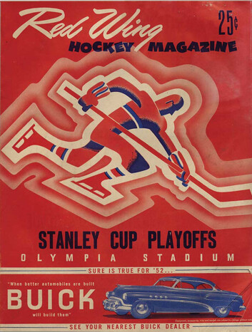
I love the Red Wing one too. I have a program from the 1936 Stanley Cup playoffs my granddad left me when he passed on. I have it sealed in plastic.
A couple of things about that Red Wings program. Notice that the roster only had one goalie listed on the roster. That was commonplace back in those days. Usually someone on staff was the emergency goalie.
Also, Terry Sawchuck carried sides of meat in the off-season for my other granddad.
[quote comment=”369208″][quote comment=”369206″][quote comment=”369205″]Thought I\’d look up all the NHL goalie numbers just to see how traditional the old standards were:
[/quote]
The first goalies I can remember breaking the mold of the 1-30-31 default numbering system, off the top of my head… Tony Esposito – 35… Gilles Meloche – 27… I believe Don “Smokey” McLeod wore 29 with the Flyers…[/quote]
The one I remember most from my youth (I’m only 27) was Ed Balfour wearing 20. I know people said Roy’s 33 was abnormal for the time but it always looked right to me.[/quote]
Ahem… Terry Sawchuk was the first player to opt for a number other than #1. link, and how they were originally assigned #1 and #2.
Other fun random goalie numbers:
Darren Puppa – 93 with Tampa Bay
Kevin Weekes – 80 with Carolina and NYR
Cristobal Huet – 53 short time with Chicago
John Grahame – 47 with Tampa/Boston/others
Ron Hextall – 72 (pretty sure about this)
Yay. I started an interesting discussion where I learned something as a result. Thanks for droppin’ the knowledge, Thomas Clark, JET, and Teebz.
I will have to look through my boxes of programs and pictures but I am almost 100 percent positive that Ed Belfour wore #30 when he played for the Saginaw Hawks of the old IHL.
[quote comment=”369212″][quote comment=”369187″]canes lookin good in their storm troopers
/hate to say it, but this is one riflery uni i like better than their regular uni[/quote]
What qualifies as ‘storm trooper?’ Just a white helmet, white jersey and white pants? IMHO, there’s too much orange and green to be a ‘storm trooper’ look.[/quote]
well, other than the ridiculous ass stripes, there’s pretty much no color on that uni (other than the helmet stripe/logo and uni numbers)…and oh yeah, the orange spirograph on the shoulder…and the bowl patch…and the big orange swoosh
also, every cane (except the kicker) seems to be wearing one white cleat with orange and one white with green on them
still…that’s about as storm trooper of a uni as you can get
[quote comment=”369218″]I will have to look through my boxes of programs and pictures but I am almost 100 percent positive that Ed Belfour wore #30 when he played for the Saginaw Hawks of the old IHL.[/quote]
He wore 31 in his second season, but I can’t find anything about his first season.
Belfour wore 30 his first season with the Blackhawks as well:
link
here’s a better shot
check out all the guys on the sidelines
you could make a case for it
[quote comment=”369220″][quote comment=”369218″]I will have to look through my boxes of programs and pictures but I am almost 100 percent positive that Ed Belfour wore #30 when he played for the Saginaw Hawks of the old IHL.[/quote]
He wore 31 in his second season, but I can’t find anything about his first season.[/quote]
I have tons of old Saginaw Hawks programs around here someplace, it is just finding the box they are in. If he wore 31 his second season, he more than likely wore it his first as well.
HockeyDB doesn’t have #’s for the 87-88 season for the Hawks but shows 31 for Belfour in 88-89…The Hawks are a bit before my time to have any photos or anything, plus I’m from Flint…Saginaw stole our team!
here’s a look at the orange right/green left look by the U
[quote comment=”369218″]I will have to look through my boxes of programs and pictures but I am almost 100 percent positive that Ed Belfour wore #30 when he played for the Saginaw Hawks of the old IHL.[/quote]
Belfour wore 30 his first couple of seasons with Chicago. It wasn’t until he was traded to San Jose at the tail end of a season, then to Dallas, that he switched to #20. Why – I don’t know…
[quote comment=”369224″]HockeyDB doesn’t have #’s for the 87-88 season for the Hawks but shows 31 for Belfour in 88-89…The Hawks are a bit before my time to have any photos or anything, plus I’m from Flint…Saginaw stole our team![/quote]
I live in Clarkston but I went to school at Saginaw Valley State and went to many Saginaw Generals/Hawks games.
[quote comment=”369226″]
Belfour wore 30 his first couple of seasons with Chicago. [/quote]
Correcting myself, he wore 30 and 31 before switching to 20 with San Jose, then Dallas
[quote comment=”369226″][quote comment=”369218″]I will have to look through my boxes of programs and pictures but I am almost 100 percent positive that Ed Belfour wore #30 when he played for the Saginaw Hawks of the old IHL.[/quote]
Belfour wore 30 his first couple of seasons with Chicago. It wasn’t until he was traded to San Jose at the tail end of a season, then to Dallas, that he switched to #20. Why – I don’t know…[/quote]
In honour of Tretiak, his goaltending coach.
[quote comment=”369229″]
In honour of Tretiak, his goaltending coach.[/quote]
Super, thanks Teebz!
[quote comment=\”369227\”][quote comment=\”369224\”]HockeyDB doesn\’t have #\’s for the 87-88 season for the Hawks but shows 31 for Belfour in 88-89…The Hawks are a bit before my time to have any photos or anything, plus I\’m from Flint…Saginaw stole our team![/quote]
I live in Clarkston but I went to school at Saginaw Valley State and went to many Saginaw Generals/Hawks games.[/quote]
Bah…SVSU!?! I went to Northwood just down the road.
[quote comment=”369230″][quote comment=”369229″]
In honour of Tretiak, his goaltending coach.[/quote]
Super, thanks Teebz![/quote]
It’s all in the article I linked. ;)
But you’re welcome!
[quote comment=”369231″][quote comment=\”369227\”][quote comment=\”369224\”]HockeyDB doesn\’t have #\’s for the 87-88 season for the Hawks but shows 31 for Belfour in 88-89…The Hawks are a bit before my time to have any photos or anything, plus I\’m from Flint…Saginaw stole our team![/quote]
I live in Clarkston but I went to school at Saginaw Valley State and went to many Saginaw Generals/Hawks games.[/quote]
Bah…SVSU!?! I went to Northwood just down the road.[/quote]
Got to love the Axe Bowl.
[quote comment=”369216″]Other fun random goalie numbers:
Darren Puppa – 93 with Tampa Bay
Kevin Weekes – 80 with Carolina and NYR
Cristobal Huet – 53 short time with Chicago
John Grahame – 47 with Tampa/Boston/others
Ron Hextall – 72 (pretty sure about this)[/quote]
Actually, it was Nikolai Khabibulin who wore 53 as a Blackhawk before he switched to 39. Huet wore 38 last year and went to 39 before this season.
[quote comment=”369221″]Belfour wore 30 his first season with the Blackhawks as well:
link
Hate to contradict you again, Thomas, but 90-91 wasn’t Belfour’s first NHL season. It was his third.
In link, he link (as mentioned by Teebz in the HBIC post that he linked above).
[quote comment=”369234″][quote comment=”369216″]Other fun random goalie numbers:
Darren Puppa – 93 with Tampa Bay
Kevin Weekes – 80 with Carolina and NYR
Cristobal Huet – 53 short time with Chicago
John Grahame – 47 with Tampa/Boston/others
Ron Hextall – 72 (pretty sure about this)[/quote]
Actually, it was Nikolai Khabibulin who wore 53 as a Blackhawk before he switched to 39. Huet wore 38 last year and went to 39 before this season.[/quote]
relax…so he blhuet
i’ll fuck off now
[quote comment=”369235″][quote comment=”369221″]Belfour wore 30 his first season with the Blackhawks as well:
link
Hate to contradict you again, Thomas, but 90-91 wasn’t Belfour’s first NHL season. It was his third.
In link, he link (as mentioned by Teebz in the HBIC post that he linked above).[/quote]
Ha, no worries man, better to be corrected than continue thinking the wrong answers!
[quote comment=”369236″]relax…so he blhuet[/quote]
Oh, wow.
Just… wow.
[quote comment=”369164″][quote comment=”369163″][quote comment=”369160″]RFK taken out of mothballs for Temple/Ucla. Too bad it’s not coloroncolor.[/quote]
Love Temple’s pants. And, of course, all the better because no other major college program or pro team wears that “titled” look. Ottawa Rough Riders did a long time ago, but no one else these days.
—Ricko[/quote]
link…not titled ;)[/quote]
wish ucla went back to the old school unis from the late 90’s
[quote comment=”369203″][quote comment=”369196″]I haven’t been around in a few days so i am late in complimenting Phil and Ricko on Sunday’s quiz.
That was ALOT of fun…It also gives me a great list of things to do over winter break.[/quote]
thank you matthew…at least ONE person liked it
how did you do, if i may ask?[/quote]
I liked it, but only got one. Apparently I just watch sports but not a lot of sports movies.
[quote comment=”369212″][quote comment=”369187″]canes lookin good in their storm troopers
/hate to say it, but this is one riflery uni i like better than their regular uni[/quote]
What qualifies as ‘storm trooper?’ Just a white helmet, white jersey and white pants? IMHO, there’s too much orange and green to be a ‘storm trooper’ look.[/quote]
“Clone Trooper” might be a more accurate description:
link
link
Go ahead, proclaim a geek alert…
You outbid me on that 60s Champion catalog! Please scan it and post it as i was planning on doing.
[quote comment=”369229″]
In honour of Tretiak, his goaltending coach.[/quote]
Many Russian born goalies wear #20 for the same reason.
(I know Teebz knows this, I’m just reinforcing).
[quote comment=”369181″][quote comment=”369179″]Temple colors referred to as Cherry and White.[/quote]
they were apparently a bit link last time temple was in a bowl game
too bad ucla is now just putting on ayres[/quote]
looks like ‘Cos is sporting a clown nose for this picture
[quote comment=”369200″][quote comment=”369164″][quote comment=”369163″][quote comment=”369160″]RFK taken out of mothballs for Temple/Ucla. Too bad it’s not coloroncolor.[/quote]
Love Temple’s pants. And, of course, all the better because no other major college program or pro team wears that “titled” look. Ottawa Rough Riders did a long time ago, but no one else these days.
—Ricko[/quote]
link…not titled ;)[/quote]
Speaking of tiled unis, Marquette’s wearing one of my favorite unis, the light blue ones with the blue and yellow tiles. link I guess West Virginia had to go with the home whites instead of yellow. Great matchup.[/quote]
I think DePaul’s tiled unis worn by the ‘Aguirre led bunch of 1981 make for the best version of that look. IMO.
[quote comment=”369214″]A couple of things about that Red Wings program. Notice that the roster only had one goalie listed on the roster. That was commonplace back in those days. Usually someone on staff was the emergency goalie.
Also, Terry Sawchuck carried sides of meat in the off-season for my other granddad.[/quote]
Or the coach as in the case of Les Patrick’s Rangers!