Thanks to Phil’s recent “Worst Uni Ever” poll, you’ve seen plenty of Colorado Caribous photos lately. But most of you probably haven’t seen this one.
That shot, along with a bunch more (click on the thumbnails for larger versions), come from this site devoted to NASL jerseys, which reader Rob Bryant just brought to my attention.
In a nutshell: The site is so awesome that I might just have to become a soccer fan after all. A very small selection of the highlights (click on little pics to see big pics):
• Totally digging the chest logo used by the Montreal Olympique.
• Stripe-o-rama! That’s the Rochester Lancers, 1971. Interesting to see that they used a different font for the rear uni number.
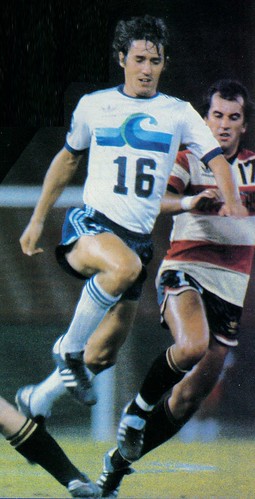
• Love how the San Francisco Quakes used the cross stroke on the Q to form a fault line — or, better yet, to fracture a soccer ball. (As an aside, did you know there was an indoor soccer team called the San Francisco Fog? How awesome is that jersey?!)
• Sort of quaint how Minnesota teams are always named after the state, not after a particular city, as in the Minnesota Strikers. Not such a bad thing when it results in the state outline being depicted on the jersey, though.
• Check out the silver chain-stitching on this Las Vegas Quicksilvers jersey (which also has one of history’s clunkiest, most awkward NOBs).
• Uni typography doesn’t get much more quintessentially ’70s than this Edmonton Drillers design. Only problem is that the jersey is actually from 1982. Interestingly, the 1970s-esque design replaced something that was much more ’80s-ish.
• Very odd insignia for the 1980 Houston Hurricane. Don’t think I’ve ever seen a team intentionally obscure part of the type like that. But it’s probably better than this.
• The Adidas logo really ruined the elemental simplicity of this 1979 California Surf design. Looks better in this overexposed photo, since you almost can’t see the logo creep. (And speaking of the Surf, check out this shot from a game played at Vets Stadium, complete with all the MLB logos in the background. Ah, the indignities of being a minor sports league.)
• My vote for best NASL sleeves goes to the Tampa Bay Rowdies, for obvious reasons. Mmmm, tasty.
• Then again, the Toronto Blizzard had some pretty cool sleeves too.
• What happens you’re your team uses really huge-ass NOB lettering (and, as an aside a sews the apotrophe on backwards)? You run the risk of ending up with a DDNHOB (double-decker hyphenated NOB, duh)! Those jerseys are from the Hartford Bicentennials (now there’s a team name with a short shelf life), who had a very cool chest logo.
• Do you get the feeling that maybe the Detroit Cougars didn’t originally plan on using NOBs?
• On the other hand, the New York Cosmos left plenty of NOB room but didn’t know how to use it.
• So much to like in this photo of the Chicago Sting vs. the Dallas Tornado.
• Now that’s a weird number font. If you scroll through this page, you’ll see that the Clippers used all sorts of weird number treatments in their brief two-season existence.
• Starred socks! As worn by the Houston Stars, natch.
• Okay, I don’t mean to harp on the NOBs, but come on. Joe Hilseberg, where were you when this league needed you?
• I hate logo creep but love ticking stripes. So what do I make of this? Hmmm, that’s a tricky one. The team in question, by the way, is the 1980 Memphis Rogues, although they weren’t the only team using that design element.
• Interesting to see that the Philly Fury used a contrasting placket. Looked pretty good!
• Does this 1967 St. Looie Stars jersey totally look like a thrift store special or what? Yes, I’ll buy it for $6, sold!
And look, the site even has a page devoted to NASL cheerleaders. Would you believe the KC Spurs called their cheering corps the InSPURettes? And the Tampa Bay Rowdies called theirs — wait for it — the Wowdies.
And just to bring everything full circle, reader Raifie Bass has a real prize in his collection: a Colorado Caribous satin jacket!
That settles it, from now on Uni Watch will cover soccer exclusively, the end.
Research Query: Two years ago I wrote an ESPN column in which surveyed the Cowboys’ assorted uniform quirks, past and present. The following summer, I wrote similar columns about the Cubs and White Sox.
Those columns were really fun to write, and popular besides. I’d like to do more of them, but I’ve had a hard time identifying other teams that would benefit from the same treatment. Maybe the St. Looey Cardinals..?
Can you think of other teams that would fit the bill here? Remember, the operative concept here is NOT “Let’s look at this team’s entire uni history”; the idea is to find teams that have had interesting uni histories, replete with quirks and underappreciated nuances. If you go back and read those three previous columns, you’ll see that the Cowboys, Cubs, and Chisox fit this description exceedingly well. If you think any other teams qualify, don’t be shy about telling me. Oh, and please don’t bother suggesting Oregon’s football team, thanks.
Uni Watch News Ticker: New Aussie football kit for Port Adelaide (designed by a seven-year-old girl — no, really, read the sixth graf) and West Coast (with thanks to Jeremy Brahm). ”¦ Also from Jeremy: Check out this bizarre baseball jersey patch. That’s the Rojos del Aguila de Veracruz, circa 1940s. ”¦ Phil found some interesting shots of Teddy Ballgame wearing cut-off windbreaker sleeves and an undershirt. Here’s another. ”¦ Apparently Kareem didn’t get the memo about which shoes and socks to wear to the photo shoot (with thanks to Jeremy Richardson). ”¦ Danny Millan has started a new Brooklyn-centric clothing line. I appreciate the sentiments, although I hope the Brooklyn Nets never actually come to pass. ”¦ Remember these football gloves? Here’s the next evolutionary step (with thanks to Jonathan Mayer). ”¦ Ever wonder why David Vyborny used to use solid-black sticks? Right, me neither, but Columbus Dispatch beat writer Aaron Portzline had this to say during a recent online chat: “David Vyborny was so peeved that he didn’t get a stick deal that he used to spray paint his sticks black to keep from advertising the manufacturer. Vyborny was an interesting dude” (with thanks to Kellen Dargle). ”¦ Scandalous news out of New Jersey, where a little birdie informs me that the Devils’ throwbacks, slated to be worn on March 17th, will be lame-o fauxbacks. According to my source, they’re just using the current jersey template with green replacing the black. Also, they’re using the modern red and a darker green. Pfeh. ”¦ What team is this? Details here. ”¦ Troy Polamalu’s little embroidered cross is suddenly everywhere. Word I hear from league sources is that they’re okay with it because it’s covered by his hair, sort of like if he had a message on a T-shirt under his jersey — out of sight, out of mind — but I suspect the real story is that they don’t want to wade into the thorny thicket of religious expression. ”¦ Lots of Mets fans sent me this item about the new cream-base pinstripes, which will be officially introduced in a few weeks. The item implies that the cream pins won’t have the black drop shadow — I hope that’s true, but it does not jibe with the information I have. ”¦ Yesterday’s Portland Beavers entry inspired Craig Rockhold to send over a bunch of pics from that PCL exhibit at the San Francisco airport. ”¦ In a move that’s waaaaay overboard for a high school, Under Armour is sponsoring River Hill High in Maryland and has provided them with a different uniform for every game this season (with thanks to Jonathan Blake). ”¦ Pete Woychick recently rediscovered these two high school hoops warm-up tops in his parents’ attic. Super-offensive logo icon on one of them, but nice pieces nonetheless. Odd to see St. Joe’s abbreviated as “St. Jo’s,” no? ”¦ Throwbacks will be in the mix this season for Loyola Marymount. No images yet, but the game dates are listed in the middle of this page. ”¦ 1957 A.L. Red Book, in what looks to be tip-top condition, available here (thanks, Teebz). … Back to Uni Watch’s new favorite sport: Coachie Ballgames has done an analysis of World Cup uniforms and concluded that it’s all about the collars.
And speaking of the Surf, looks like they played at Candlestick, complete with all the MLB logos in the background.
No, the Surf’s home field was Anaheim Stadium. In the picture you link to, the Surf was playing the Philadelphia Fury. At Veterans Stadium. In Philadelphia.
“(And speaking of the Surf, looks like they played at Candlestick, complete with all the MLB logos in the background. Ah, the indignities of being a minor sports league.)”
That game must have been played at the Vet in Philly. Looks like the Vet’s outfield wall and there is astro-turf. My bet is the Vet not Candlestick.
[quote comment=”361510″]”(And speaking of the Surf, looks like they played at Candlestick, complete with all the MLB logos in the background. Ah, the indignities of being a minor sports league.)”
That game must have been played at the Vet in Philly. Looks like the Vet’s outfield wall and there is astro-turf. My bet is the Vet not Candlestick.[/quote]
My thanks to our first two commenters for setting me straight. I’ll adjust the text accordingly.
Apparently Kareem was wearing the wrong shoes and sock to distract you from noticing the two guys wearing #32 across from him. That would be Magic Johnson, and the guy who isn’t Magic Johnson (who also seems to have lost his yellow sock stripe on the way to the photo shoot)
River Hill has been a UA school for a few years now, and its my guess they order new sets each year. RH are the defending state champs, i believe, but they are not a perennial national powerhouse, so my guess is UA didn’t send them a half dozen different uniform sets for free and plan an Oregon uni situation there.
My favorite NASL jersey, without question, is this one for the Washington Diplomats:
link
How can you go wrong with shoulder stripes and numbers like this?
link
^^ FYI, that’s Jamaal “Silk” Wilkes … he was #52, I believe, back in the Lake Show days. Not sure where his yellow stripes went, though ;)
On a different note, leave it to a Brooklynite to launch the “North Cacalaca” line of clothes.
The FAR more common use of the slang is: North “Cackalacky.” Just sayin’ … do your homework.
[quote comment=”361515″]^^ FYI, that’s Jamaal “Silk” Wilkes … he was #52, I believe, back in the Lake Show days. Not sure where his yellow stripes went, though ;)
On a different note, leave it to a Brooklynite to launch the “North Cacalaca” line of clothes.
The FAR more common use of the slang is: North “Cackalacky.” Just sayin’ … do your homework.[/quote]
Thanks for the correction, but you have to admit, it looks like “32”
It does look like the yellow stripe may be folded under, as if the socks were to long. Maybe they were Kareems socks?
Not funny that River Hill High in Maryland is the Oregon of high school football … but has no problem at all ripping its logo from the University of Iowa.
So very classy.
Of course the Mets’ cream pinstripes are going to have a black drop-shadow. They wouldn’t be the Mets if they got something 100% completely right.
The Oakland Oaks close-ups in the PCL exhibit illustrate one of my biggest complaints about modern baseball uniforms: The terrible three-color piping. Seems like half of MLB uses it, and the number is growing every year (Twins just added it to their road jerseys), but only Milwaukee gets it right. Three equally narrow stripes of colors A, B, and A just wind up looking like whatever color you get when you mix colors A and B. In most cases, as with the Nationals, that’s purple. Sometimes it’s brown.
But just look at that three-stripe Oaks piping. A wide stripe of green with a narrow stripe of red on both sides. In proportion and effect, it matches the way jersey scripts are usually outlined. That is how you make three-stripe piping.
Oh, and love the link to the Crimson Rims. Baseball was huge in towns on the Western frontier, but useful written records are scarce and quality photographs even scarcer.
I really hope that little birdie was misinformed about those NJ Devils throwbacks. That would be a huge letdown…
[quote comment=”361512″]Apparently Kareem was wearing the wrong shoes and sock to distract you from noticing the two guys wearing #32 across from him. That would be Magic Johnson, and the guy who isn’t Magic Johnson (who also seems to have lost his yellow sock stripe on the way to the photo shoot)[/quote]
I saw that too, but I think it’s Mychal Thompson, who wore #52.
BTW, those Brooklyn Tees are really cool. I saw them in person and will probably be ordering the Jesus Shuttlesworth Nets.
And does anyone foresee legal problems for Under Armour High school? Iowa is gonna come callin.
My guess is that one of the founders of UA, a former UM fullback, probably attended that HS thus the preferential treatment similar to Empereor Knight with the U of O and King James with SVSM.
[quote comment=”361515″]^^ FYI, that’s Jamaal “Silk” Wilkes … he was #52, I believe, back in the Lake Show days. Not sure where his yellow stripes went, though ;)
On a different note, leave it to a Brooklynite to launch the “North Cacalaca” line of clothes.
The FAR more common use of the slang is: North “Cackalacky.” Just sayin’ … do your homework.[/quote]
The North Cacalaca reference is from one of rap’s most famous tunes, Scenario by the Leaders of the New School, which included none other than Busta Rhymes and the duo from Tribe.
1:39 of the video
link
BTW, they added an AWESOME touch to that tee. On the left sleeve is a graphic play on the Tar Heel logo…its a timberland boot with presumably blacktop on the heel!
It’s hard to find a bigger Mets fan than me around so I’ve put up with a bunch of nonsense. In the grand scheme of things, their uni isn’t high. They can wear leotards if they end up winning the World Series.
But how an organization can be so deaf to its fanbase is almost unfathomable. To keep this on topic, if they go old-school with these unis (which have the opportunity to be real, real classy looking) and they do so with black in it…they really are beyond stupid.
[quote comment=”361523″][quote comment=”361515″]^^ FYI, that’s Jamaal “Silk” Wilkes … he was #52, I believe, back in the Lake Show days. Not sure where his yellow stripes went, though ;)
On a different note, leave it to a Brooklynite to launch the “North Cacalaca” line of clothes.
The FAR more common use of the slang is: North “Cackalacky.” Just sayin’ … do your homework.[/quote]
The North Cacalaca reference is from one of rap’s most famous tunes, Scenario by the Leaders of the New School, which included none other than Busta Rhymes and the duo from Tribe.
1:39 of the video
link
BTW, they added an AWESOME touch to that tee. On the left sleeve is a graphic play on the Tar Heel logo…its a timberland boot with presumably blacktop on the heel![/quote]
Fixed
Nike has a new logo for its soccer training gear. Hypercube: link
emperor knight?
really?
[quote comment=”361515″]^^ FYI, that’s Jamaal “Silk” Wilkes … he was #52, I believe, back in the Lake Show days. Not sure where his yellow stripes went, though ;)
On a different note, leave it to a Brooklynite to launch the “North Cacalaca” line of clothes.
The FAR more common use of the slang is: North “Cackalacky.” Just sayin’ … do your homework.[/quote]
Scotty M. You’re right about the fella being Wilkes. I thought it was Mychal Thompson, which was erroneous!
link
[quote comment=”361525″][quote comment=”361523″][quote comment=”361515″]^^ FYI, that’s Jamaal “Silk” Wilkes … he was #52, I believe, back in the Lake Show days. Not sure where his yellow stripes went, though ;)
On a different note, leave it to a Brooklynite to launch the “North Cacalaca” line of clothes.
The FAR more common use of the slang is: North “Cackalacky.” Just sayin’ … do your homework.[/quote]
The North Cacalaca reference is from one of rap’s most famous tunes, Scenario by the Leaders of the New School, which included none other than Busta Rhymes and the duo from Tribe.
1:39 of the video
link
BTW, they added an AWESOME touch to that tee. On the left sleeve is a graphic play on the Tar Heel logo…its a timberland boot with presumably blacktop on the heel![/quote]
Fixed[/quote]
every day powers?!?! lol
really though, great heads up on the song reference!
[quote comment=”361525″][quote comment=”361523″][quote comment=”361515″]^^ FYI, that’s Jamaal “Silk” Wilkes … he was #52, I believe, back in the Lake Show days. Not sure where his yellow stripes went, though ;)
On a different note, leave it to a Brooklynite to launch the “North Cacalaca” line of clothes.
The FAR more common use of the slang is: North “Cackalacky.” Just sayin’ … do your homework.[/quote]
The North Cacalaca reference is from one of rap’s most famous tunes, Scenario by the Leaders of the New School, which included none other than Busta Rhymes and the duo from Tribe.
1:39 of the video
link
BTW, they added an AWESOME touch to that tee. On the left sleeve is a graphic play on the Tar Heel logo…its a timberland boot with presumably blacktop on the heel![/quote]
Fixed[/quote]
Here we go yo … what a video
It might be interesting to delve into the Pittsburgh Steelers’ uniforms. The V/diamond uni’s were interesting, and the fact that they were once combined with the Eagles should make for interesting discussion. This says nothing of the iconic status of their current uniforms or having the distinction of being the only NFL team to have a logo on one side of the helmets. I know most people may know why they do that, but the public at large probably doesn’t.
Didn’t Maybelline use “Crimson Rims” in one of it’s ad campaigns?
I assume that the Houston Hurricanes were going for a “Hey, we play in the Astrodome” look with that logo.
“its a timberland boot with presumably blacktop on the heel!”
There are several theories surrounding the origin of the term “Tarheels”. None of them involves “blacktop”.
Just sayin….
[quote comment=”361530″][quote comment=”361525″][quote comment=”361523″][quote comment=”361515″]^^ FYI, that’s Jamaal “Silk” Wilkes … he was #52, I believe, back in the Lake Show days. Not sure where his yellow stripes went, though ;)
On a different note, leave it to a Brooklynite to launch the “North Cacalaca” line of clothes.
The FAR more common use of the slang is: North “Cackalacky.” Just sayin’ … do your homework.[/quote]
The North Cacalaca reference is from one of rap’s most famous tunes, Scenario by the Leaders of the New School, which included none other than Busta Rhymes and the duo from Tribe.
1:39 of the video
link
BTW, they added an AWESOME touch to that tee. On the left sleeve is a graphic play on the Tar Heel logo…its a timberland boot with presumably blacktop on the heel![/quote]
Fixed[/quote]
Here we go yo … what a video[/quote]
Interesting note, the rapper who uses the North Cacalaca phrase, (Charlie Brown), can be seen wearing a similar cap this to this during the video:
link.jpg
Ah, the NASL…. Back when I was in high school in the early-mid 90’s there was an advert every month in the back of Loaded magazine (kind of like a proto-Maxim) for repro NASL jerseys. There were about a dozen teams offered, and I’d obsess over the designs. A few friends and I ended up buying some, as they were pretty cheap (about £10). I ended up with California Surf & Tampa Bay Rowdies jerseys. They weren’t the best quality, but they were cool enough, especially when we all wore them on the same day. The Surf jersey disintegrated years ago, but I’m pretty sure I’ve still got the Rowdies one. Even though I’m not a fan of football those were some of my favourite designs of all-time.
[quote comment=”361535″][quote comment=”361530″][quote comment=”361525″][quote comment=”361523″][quote comment=”361515″]^^ FYI, that’s Jamaal “Silk” Wilkes … he was #52, I believe, back in the Lake Show days. Not sure where his yellow stripes went, though ;)
On a different note, leave it to a Brooklynite to launch the “North Cacalaca” line of clothes.
The FAR more common use of the slang is: North “Cackalacky.” Just sayin’ … do your homework.[/quote]
The North Cacalaca reference is from one of rap’s most famous tunes, Scenario by the Leaders of the New School, which included none other than Busta Rhymes and the duo from Tribe.
1:39 of the video
link
BTW, they added an AWESOME touch to that tee. On the left sleeve is a graphic play on the Tar Heel logo…its a timberland boot with presumably blacktop on the heel![/quote]
Fixed[/quote]
Here we go yo … what a video[/quote]
Interesting note, the rapper who uses the North Cacalaca phrase, (Charlie Brown), can be seen wearing a similar cap this to this during the video:
link.jpg
[/quote]
I quit, again.
[quote comment=”361534″]”its a timberland boot with presumably blacktop on the heel!”
There are several theories surrounding the origin of the term “Tarheels”. None of them involves “blacktop”.
Just sayin….[/quote]
Give me SOME credit, Leon! I often forget how to link pics, but Tar on the heel, c’mon.
I was referring to the Timberland, Brooklyn, City feel to the the whole concept.
Where’s Haratford?
[quote comment=”361538″][quote comment=”361534″]”its a timberland boot with presumably blacktop on the heel!”
There are several theories surrounding the origin of the term “Tarheels”. None of them involves “blacktop”.
Just sayin….[/quote]
Give me SOME credit, Leon! I often forget how to link pics, but Tar on the heel, c’mon.
I was referring to the Timberland, Brooklyn, City feel to the the whole concept.[/quote]
Then you should have said “Timbaland”, boyee!
[quote comment=”361538″][quote comment=”361534″]”its a timberland boot with presumably blacktop on the heel!”
There are several theories surrounding the origin of the term “Tarheels”. None of them involves “blacktop”.
Just sayin….[/quote]
Give me SOME credit, Leon! I often forget how to link pics, but Tar on the heel, c’mon.
I was referring to the Timberland, Brooklyn, City feel to the the whole concept.[/quote]
Thought it had to done with some opposing general (or someone) during the Civil War who credited the North Carolinians with holding their position. Something like, “They stood their ground like they had tar on their heels.”
—Ricko
My sister-in-law sent me this link.
It is a history of the rivalry between Ohio State and Michigan, but what i loved was the first two pictures of the 1897 teams from both schools. Look at the awesome striping by Ohio State,
Not to mention the socks of the third gentleman on the bottom row.
WOW!
Ugliest Uniform Slideshow over on NBCSports. To be honest, I really like about half the uniforms on the list.
link
In the link about River Hill did anyone notice that in the first gallery, they used the Southern Miss eagle head on a banner as well as the Iowa hawkeye on the helmet.
Plus in same gallery, one of the pics, 2nd row,a coach appears to be wearing a Nike hat and jacket. A mom is also wearing a Nike jersey
[quote comment=”361512″]Apparently Kareem was wearing the wrong shoes and sock to distract you from noticing the two guys wearing #32 across from him. That would be Magic Johnson, and the guy who isn’t Magic Johnson (who also seems to have lost his yellow sock stripe on the way to the photo shoot)[/quote]
Or he wore the different socks & shoes so you wouldn’t notice his shorts are so short his underwear is showing…
link
link
link
[quote comment=”361543″]Ugliest Uniform Slideshow over on NBCSports. To be honest, I really like about half the uniforms on the list.
link
Nice to see they told their intern, “Okay, for all the headlines, just come up with an alliteration for each one.”
Not only did the Rowdies have the best unis, they had the best slogan ever: The Rowdies are a kick in the grass!
[quote comment=”361543″]Ugliest Uniform Slideshow over on NBCSports. To be honest, I really like about half the uniforms on the list.
link
that’s a joke, right?
That Oaks “stars & stripes” acorn logo is incredibly awesome.
[quote comment=”361549″][quote comment=”361543″]Ugliest Uniform Slideshow over on NBCSports. To be honest, I really like about half the uniforms on the list.
link
that’s a joke, right?[/quote]
Out of 28, I ike 25 uniforms…Rams Horns don’t belong on a helmet…This guy doesnt’t Get It!
[quote comment=”361531″]It might be interesting to delve into the Pittsburgh Steelers’ uniforms. quote]
i too was thinking the steelers. in addition to what was stated earlier, they have the ribbed socks, and the idea that the front uni numbers are absent during the preseason and only appear once the season starts. throw in the fact that their base uni hasn’t really changed over the past 40 yrs, even witht he shrinking unis.
[quote comment=”361551″][quote comment=”361549″][quote comment=”361543″]Ugliest Uniform Slideshow over on NBCSports. To be honest, I really like about half the uniforms on the list.
link
that’s a joke, right?[/quote]
link
Apparently they were the Yellow Bay Packers when this uniform was worn.
HA HA HA HA HA HA HA ha…
Ummmmm… wait. There’s less yellow on that uni than they have on their link.
Out of 28, I ike 25 uniforms…Rams Horns don’t belong on a helmet…This guy doesnt’t Get It![/quote]
Crap. Screwed that up…
[quote comment=”361553″][quote comment=”361551″][quote comment=”361549″][quote comment=”361543″]Ugliest Uniform Slideshow over on NBCSports. To be honest, I really like about half the uniforms on the list.
link
that’s a joke, right?[/quote]
link
Apparently they were the Yellow Bay Packers when this uniform was worn.
HA HA HA HA HA HA HA ha…
Ummmmm… wait. There’s less yellow on that uni than they have on their link.
Out of 28, I ike 25 uniforms…Rams Horns don’t belong on a helmet…This guy doesnt’t Get It![/quote][/quote]
link
Apparently they were the Yellow Bay Packers when this uniform was worn.
HA HA HA HA HA HA HA ha…
Ummmmm… wait. there’s less yellow on that uni than they have on their link.
[quote comment=”361543″]Ugliest Uniform Slideshow over on NBCSports. To be honest, I really like about half the uniforms on the list.
link
This is by far the worst “word uniforms” compilation I have ever seen. For both the choices of uniforms and the horrible headlines and captions.
as far as that ugliest uni link, it has to be a joke. it loses all credibility with the inclusion of the Rams, one of the best unis of all time.
The Rowdies… my fave team. Only NASL game I ever saw was the night before Easter, 1980 at the “big sombrero”.. we were visiting relatives in Tampa who were HUGE fans and had season tickets… Loved that home jersey: the green and gold perfectly accenting the crisp white, the striped sleeves, the open polo shirt-type collar in contrasting green, and the beautifully arching wordmark with “turn-of-the century” font. My high school had the same color scheme, and when our soccer team was formed in 1981 I tried to get us to have similar jerseys, but it was a no go– we wound up with a much more basic set.
[quote comment=”361526″]Nike has a new logo for its soccer training gear. Hypercube: link
Interesting. In link, I see a striking resemblence to link.
it looks like the Houston Stars are actually wearing starred stirrups, not socks. does it look that way to anyone else?
link
Those are actually Cutter’s Gloves and Cutter’s arm sleeves. I know this because I’m the Cutter’s rep for my province….which means nothing more than I bring in best receiver gloves for a bunch of Touch Football people and cold weather ultimate frisbee people.
My guess is that the high school that uses the Iowa Tiger Hawk logo has permission from the U of I because they understand that nationwide marketing of something like a logo is GOOD…unlike those puds from Wisconsin who feel the need to sue and go after every high school who uses a ‘W’ that is slanted in the slightest.
GO HAWKS!
Hey Paul what are your general feelings on Fauxbacks? What separates the Devils using green from the Blackhawks new alts? Are there criteria for determining if a fauxback is good or not and are those criteria different from normal uniforms?
From the credit where credit’s due department, I wish I’d found link before we ran the worst uni poll.
So they did manage to get something right in that crappy slideshow.
[quote comment=”361556″]as far as that ugliest uni link, it has to be a joke. it loses all credibility with the inclusion of the Rams, one of the best unis of all time.[/quote]
It may be a joke but it reminded me that the Lions will likely wear those awful unis next Thursday.
I’m sure the high school that uses the University of Iowa Tiger Hawk logo received permission from the U of I because their marketing department understands the importance of national marketing. They’re not like Wisconsin’s marketing department that goes after any school that has a ‘W’ that is slanted in the slightest.
GO HAWKS!
[quote comment=”361551″][quote comment=”361549″][quote comment=”361543″]Ugliest Uniform Slideshow over on NBCSports. To be honest, I really like about half the uniforms on the list.
link
that’s a joke, right?[/quote]
Out of 28, I ike 25 uniforms…Rams Horns don’t belong on a helmet…This guy doesnt’t Get It![/quote]
Clearly. Anyone who doesn’t like the Rams (and the old Rams at that) is nuts.
My vote for best NASL sleeves goes to the Tampa Bay Rowdies, for obvious reasons. Mmmm, tasty.
Paul, this is a uniform…it’s not meat.
[quote comment=”361564″]
It may be a joke but it reminded me that the Lions will likely wear those awful unis next Thursday.[/quote]
why, exactly, are they ‘awful’?
Jacoby Ellsbury changing his number from 46 to 2. SHould sell a shitload more t-shirts to all the Pink Hatters
link
[quote comment=”361559″]it looks like the Houston Stars are actually wearing starred stirrups, not socks. does it look that way to anyone else?[/quote]
I thought the same thing
[quote comment=”361568″][quote comment=”361564″]
It may be a joke but it reminded me that the Lions will likely wear those awful unis next Thursday.[/quote]
why, exactly, are they ‘awful’?[/quote]
I have to echo that sentiment. I have NEVER liked the Lions throwbacks. They are WAY too plain for me.
No helmet logo, no sock stripe…way too stark for me.
If they made the slightest change, my opnion might be changed:
link
[quote comment=”361570″][quote comment=”361559″]it looks like the Houston Stars are actually wearing starred stirrups, not socks. does it look that way to anyone else?[/quote]
I thought the same thing[/quote]
they sure do, i didn’t notice that at first, but that first shot sure makes them appear like stirrups
As for interesting soccer jerseys, I have always considered this one to be my guilty pleasure:
link
[quote comment=”361572″][quote comment=”361568″][quote comment=”361564″]
It may be a joke but it reminded me that the Lions will likely wear those awful unis next Thursday.[/quote]
why, exactly, are they ‘awful’?[/quote]
I have to echo that sentiment. I have NEVER liked the Lions throwbacks. They are WAY too plain for me.
No helmet logo, no sock stripe…way too stark for me.
If they made the slightest change, my opnion might be changed:
link
yeah…um…that would kind of defeat the purpose of the throwback
and if they’re going to make any change to that uni, adding the new logo to the helmet is not exactly improving anything
[quote comment=”361560″]http://static.cdn.mrx.ca/cfl/league/images/en/newser/2009/11/Dave_Stala_2009_23942.jpg
Those are actually Cutter’s Gloves and Cutter’s arm sleeves. I know this because I’m the Cutter’s rep for my province….which means nothing more than I bring in best receiver gloves for a bunch of Touch Football people and cold weather ultimate frisbee people.[/quote]
link
Interesting that in link the Philadelphia player is wearing indoor/turf shoes (and ankle socks) while the California player appears to be wearing standard outdoor cleats.
[quote comment=”361565″]I’m sure the high school that uses the University of Iowa Tiger Hawk logo received permission from the U of I because their marketing department understands the importance of national marketing. They’re not like Wisconsin’s marketing department that goes after any school that has a ‘W’ that is slanted in the slightest.
GO HAWKS![/quote]
Yup, I guess I’ll have to ‘splain it again.
First off, as long as I can remember (and that goes back to the 1950s) high schools and small colleges often have appropriated and adapted logos and uniform looks from higher echelon programs. Those whose material got used took as a positive sign that they were respected, admired and worth emulating. And, it wasn’t bad to have your logo/look out there, even if modified a bit.
Things have changed over the years and the sale of merchandise (and revenue therefrom) has become an issue. Some teams still look the other way, some restrict usage to unis only, prohibiting use on merchandise for sale and, others, like Wisconsin, get real pissy about it.
Secondly (and this is NOT aimed at you, Mase), those who think they have uncovered a great crime—somebody “ripped off” somebody—need to take a step back. You have not ferreted out a evildoer. What you ARE doing is looking naive. Better simply to say you noticed a school that’s using the Iowa hawk head. That way you’ll sound older than 12. No need to call the Hotline for Copyright Infringement. It’s not news.
Now, if some high school get SUED over logo usage, that’s news.
—Ricko
[quote comment=”361568″][quote comment=”361564″]
It may be a joke but it reminded me that the Lions will likely wear those awful unis next Thursday.[/quote]
why, exactly, are they ‘awful’?[/quote]
Because they’re boring as hell. They’re too plain. No logo, no striping, no number outlines, nothing. It’s a practice uniform. It’s a low budget high school team. It’s not a good look. Not to mention that since it’s worn with a stripped version of the current helmet, you get a black facemask on an otherwise completely blue & silver uniform, and it looks even worse.
If the Lions want to throwback on Thanksgiving, they’ve got plenty of better looking options. The mid 90’s Barry Sanders uniforms, the early 80’s with the silver numbers, the 60’s with the double striping and no white outlines… but going back to the 30’s and a big blank uniform is not good.
[quote comment=”361573″][quote comment=”361570″][quote comment=”361559″]it looks like the Houston Stars are actually wearing starred stirrups, not socks. does it look that way to anyone else?[/quote]
I thought the same thing[/quote]
they sure do, i didn’t notice that at first, but that first shot sure makes them appear like stirrups[/quote]
Quite common back then.
What’s next?
[quote comment=”361570″][quote comment=”361559″]it looks like the Houston Stars are actually wearing starred stirrups, not socks. does it look that way to anyone else?[/quote]
I thought the same thing[/quote]
I’ll third that notion.
[quote comment=”361575″][quote comment=”361572″][quote comment=”361568″][quote comment=”361564″]
It may be a joke but it reminded me that the Lions will likely wear those awful unis next Thursday.[/quote]
why, exactly, are they ‘awful’?[/quote]
I have to echo that sentiment. I have NEVER liked the Lions throwbacks. They are WAY too plain for me.
No helmet logo, no sock stripe…way too stark for me.
If they made the slightest change, my opnion might be changed:
link
yeah…um…that would kind of defeat the purpose of the throwback
and if they’re going to make any change to that uni, adding the new logo to the helmet is not exactly improving anything[/quote]
the best way to improve that uniform is to get rid of the black facemasks and go with gray.
YES, I realize that they didn’t have facemasks when they originally wore those unis, but the only place black belongs with those uniforms is on the shoes.
[quote comment=”361582″][quote comment=”361575″][quote comment=”361572″][quote comment=”361568″][quote comment=”361564″]
It may be a joke but it reminded me that the Lions will likely wear those awful unis next Thursday.[/quote]
why, exactly, are they ‘awful’?[/quote]
I have to echo that sentiment. I have NEVER liked the Lions throwbacks. They are WAY too plain for me.
No helmet logo, no sock stripe…way too stark for me.
If they made the slightest change, my opnion might be changed:
link
yeah…um…that would kind of defeat the purpose of the throwback
and if they’re going to make any change to that uni, adding the new logo to the helmet is not exactly improving anything[/quote]
the best way to improve that uniform is to get rid of the black facemasks and go with gray.
YES, I realize that they didn’t have facemasks when they originally wore those unis, but the only place black belongs with those uniforms is on the shoes.[/quote]
I agree with both of you that adding “bubbles” would defeat the purpose of a throwback.
However, throwing back to say the 1965-74 unis would add simple changes that might liven them up a bit:
link
[quote comment=”361579″][quote comment=”361568″][quote comment=”361564″]
It may be a joke but it reminded me that the Lions will likely wear those awful unis next Thursday.[/quote]
why, exactly, are they ‘awful’?[/quote]
Because they’re boring as hell. They’re too plain. No logo, no striping, no number outlines, nothing. It’s a practice uniform. It’s a low budget high school team. It’s not a good look. Not to mention that since it’s worn with a stripped version of the current helmet, you get a black facemask on an otherwise completely blue & silver uniform, and it looks even worse.
If the Lions want to throwback on Thanksgiving, they’ve got plenty of better looking options. The mid 90’s Barry Sanders uniforms, the early 80’s with the silver numbers, the 60’s with the double striping and no white outlines… but going back to the 30’s and a big blank uniform is not good.[/quote]
Actually, they wore that uni until the very late ’50s.
But when they wear low (or no) crew socks and high tops (or tape that looks like high tops) it sure does resemble the older version, though.
For what it’s worth, Lions’ only NFL titles in the TV era came in those unis (’53 and ’57). Might be one of the criteria they applied.
—Ricko
An interesting study of uniforms would be of teams that have changed their hue of gold over the years. There has been a decided shift from bright yellow-gold to metalic gold. Examples: Wake Forest (which wore almost-yellow colors in the 1980s and whose school colors include old gold); Missouri; Notre Dame (yes, the basketball team wore brighter gold in Digger’s days); UCLA (note how the color on the home football jerseys evolved, for example); South Florida, Alabama-Birmignham, and Jacksonville (all of which wore Laker gold in their Sun Belt Conference heyday of the 1980s); Western Carolina (gone back and forth between Laker gold and old gold over the years); and so on. Even VMI, whose colors are “red, yellow, and white,” now wears old gold instead of yellow-gold.
Regarding the Devils red and greens:
Say it ain’t faux, Paul, say it ain’t faux!
And then there’s the St. Louis Rams, too.
SkullCandy just unveiled NBA Player-themed Headphones, complete with jersey-type design elements:
link
[quote comment=”361584″][quote comment=”361579″][quote comment=”361568″][quote comment=”361564″]
It may be a joke but it reminded me that the Lions will likely wear those awful unis next Thursday.[/quote]
why, exactly, are they ‘awful’?[/quote]
Because they’re boring as hell. They’re too plain. No logo, no striping, no number outlines, nothing. It’s a practice uniform. It’s a low budget high school team. It’s not a good look. Not to mention that since it’s worn with a stripped version of the current helmet, you get a black facemask on an otherwise completely blue & silver uniform, and it looks even worse.
If the Lions want to throwback on Thanksgiving, they’ve got plenty of better looking options. The mid 90’s Barry Sanders uniforms, the early 80’s with the silver numbers, the 60’s with the double striping and no white outlines… but going back to the 30’s and a big blank uniform is not good.[/quote]
Actually, they wore that uni until the very late ’50s.
But when they wear low (or no) crew socks and high tops (or tape that looks like high tops) it sure does resemble the older version, though.
For what it’s worth, Lions’ only NFL titles in the TV era came in those unis (’53 and ’57). Might be one of the criteria they applied.
—Ricko[/quote]
Also, they’re throwing back to the era when they first started playing on Thanksgiving.
[quote comment=”361577″]Interesting that in link the Philadelphia player is wearing indoor/turf shoes (and ankle socks) while the California player appears to be wearing standard outdoor cleats.[/quote]
Many NFL players wore different types of soles on turf as well, ranging from actual basketball shoes, to the nubby turf shoes, similar to the adidas in the pic to molded rubber and or detachable cleats.
Favre in Air Force Max B hoops shoes:
link
Brett Favre inspired Nike Zoom Turfs:
link
[quote comment=”361549″][quote comment=”361543″]Ugliest Uniform Slideshow over on NBCSports. To be honest, I really like about half the uniforms on the list.
link
that’s a joke, right?[/quote]
Ok, I can maybe understand why a lot of people would not like what Oregon wore against Utah(week 3), in my opinion, the best uniform combination all season. Yet, to say this about their week 4 throwbacks, against Cal, is simply troll type writing; “While the Green Bay Packers can pull off the yellow and green look, this retro uniform doesn’t quite work for Oregon.”
[quote comment=”361568″][quote comment=”361564″]
It may be a joke but it reminded me that the Lions will likely wear those awful unis next Thursday.[/quote]
why, exactly, are they ‘awful’?[/quote]
I have always liked Detroit’s uniforms but when there is no helmet decal and the jerseys have no stripes they look like practice uniforms, not game-day uniforms (especially on Thanksgiving).
THE jeff…do you also post as “bill”?
’57 NFL title game…
link\
link
Not exactly the same atmosphere as the meeting between them coming up, huh.
—Ricko
[quote comment=”361590″][quote comment=”361577″]Interesting that in link the Philadelphia player is wearing indoor/turf shoes (and ankle socks) while the California player appears to be wearing standard outdoor cleats.[/quote]
Many NFL players wore different types of soles on turf as well, ranging from actual basketball shoes, to the nubby turf shoes, similar to the adidas in the pic to molded rubber and or detachable cleats.
Favre in Air Force Max B hoops shoes:
link
Brett Favre inspired Nike Zoom Turfs:
link
Yeah. Those make sense. They don’t have grass-type cleats. It just seemed kinda weird to me that the one guy wasnt’ wearing turf shoes on a carpet.
[quote comment=”361592″][quote comment=”361568″][quote comment=”361564″]
It may be a joke but it reminded me that the Lions will likely wear those awful unis next Thursday.[/quote]
why, exactly, are they ‘awful’?[/quote]
I have always liked Detroit’s uniforms but when there is no helmet decal and the jerseys have no stripes they look like practice uniforms, not game-day uniforms (especially on Thanksgiving).[/quote]
I will say it doesn’t look -quite- as bad when the other team also throws back to the same era. The game in 2001 or 2002… can’t remember off hand… vs the Packers where Green Bay also went to a blank helmet, it sorta worked. But, against anyone wearing a normal uniform with stripes and logos, it’s just really really bad.
[quote comment=”361589″][quote comment=”361584″][quote comment=”361579″][quote comment=”361568″][quote comment=”361564″]
It may be a joke but it reminded me that the Lions will likely wear those awful unis next Thursday.[/quote]
why, exactly, are they ‘awful’?[/quote]
Because they’re boring as hell. They’re too plain. No logo, no striping, no number outlines, nothing. It’s a practice uniform. It’s a low budget high school team. It’s not a good look. Not to mention that since it’s worn with a stripped version of the current helmet, you get a black facemask on an otherwise completely blue & silver uniform, and it looks even worse.
If the Lions want to throwback on Thanksgiving, they’ve got plenty of better looking options. The mid 90’s Barry Sanders uniforms, the early 80’s with the silver numbers, the 60’s with the double striping and no white outlines… but going back to the 30’s and a big blank uniform is not good.[/quote]
Actually, they wore that uni until the very late ’50s.
But when they wear low (or no) crew socks and high tops (or tape that looks like high tops) it sure does resemble the older version, though.
For what it’s worth, Lions’ only NFL titles in the TV era came in those unis (’53 and ’57). Might be one of the criteria they applied.
—Ricko[/quote]
Also, they’re throwing back to the era when they first started playing on Thanksgiving.[/quote]
Thank you. Was going to mention that and flat-out forgot.
—Ricko
The only reason the Devils kept the Christmas colors as long as they did was that John McMullen’s wife Jackie had chosen the colors and helped out on the jersey design.
I recently won a Tampa Bay Rowdies shirt on eBay. Those sleeve stripes are beautiful to wear, and get a bunch of looks every time I do.
[quote comment=”361593″]THE jeff…do you also post as “bill”?[/quote]
No, I’m only myself. I just knew what bill was thinking and decided to answer it for him.
Was that wrong of me? Should I not do that? I really haven’t read all of the rulebook yet, so if that’s a bad thing I’ll try not to do it again
[quote comment=”361596″][quote comment=”361592″][quote comment=”361568″][quote comment=”361564″]
It may be a joke but it reminded me that the Lions will likely wear those awful unis next Thursday.[/quote]
why, exactly, are they ‘awful’?[/quote]
I have always liked Detroit’s uniforms but when there is no helmet decal and the jerseys have no stripes they look like practice uniforms, not game-day uniforms (especially on Thanksgiving).[/quote]
I will say it doesn’t look -quite- as bad when the other team also throws back to the same era. The game in 2001 or 2002… can’t remember off hand… vs the Packers where Green Bay also went to a blank helmet, it sorta worked. But, against anyone wearing a normal uniform with stripes and logos, it’s just really really bad.[/quote]
He means he doesn’t like it much.
“Good” and “bad” are little more ethereal. Individual results may vary.
(Standard “The Jeff” disclaimer)
Hey, I write for car dealers. I know the need for a disclaimer when I see it.
;)
—Ricko
[quote comment=”361596″][quote comment=”361592″][quote comment=”361568″][quote comment=”361564″]
It may be a joke but it reminded me that the Lions will likely wear those awful unis next Thursday.[/quote]
why, exactly, are they ‘awful’?[/quote]
I have always liked Detroit’s uniforms but when there is no helmet decal and the jerseys have no stripes they look like practice uniforms, not game-day uniforms (especially on Thanksgiving).[/quote]
I will say it doesn’t look -quite- as bad when the other team also throws back to the same era. The game in 2001 or 2002… can’t remember off hand… vs the Packers where Green Bay also went to a blank helmet, it sorta worked. But, against anyone wearing a normal uniform with stripes and logos, it’s just really really bad.[/quote]
OK, I’ll give you that. It would be nice if both teams were playing along.
By the way, if Detroit keeps the Thanksgiving game (and I hope they do), I’d like to see them play the Bears & Packers every three years with someone else thrown in for variety.
So it’d be like this:
This year – Packers
next year – Bears
following year – non-divisional opponent
Repeat that pattern ad infinitum.
Everyone wears throwbacks. Packers in Lambeau-era yoked jerseys, Bears in their 30s orange jerseys (color-on-color!), etc.
[quote comment=”361565″]I’m sure the high school that uses the University of Iowa Tiger Hawk logo received permission from the U of I because their marketing department understands the importance of national marketing. They’re not like Wisconsin’s marketing department that goes after any school that has a ‘W’ that is slanted in the slightest.
GO HAWKS![/quote]
Plus, the U of I knows a thing or two about the power of “paying homage” to another organization.
link
link
Ad infinitum? Or possibly ad nauseam?
Paul, there’s no quaintness about the “Minnesota” versus the name of the city, its practicality.
The rivalry between Minneapolis and Saint Paul has died down over the years some, but the emnity between the two cities is legendary. Until about 20 years ago, they tried to entice the others’ businesses to come to the their town. Before Target Field was built, Saint Paul tried to lure the Twins, Minneapolis tried to lure the Wild. When one city got something, the other was determined to get something bigger or better. They even sued each other over “fraudulent” census returns in the late 1800s.
Metropolitan Stadium was built in the middle of a Bloomington cornfield in the mid 60’s just to avoid the ire of a scorned city. The Met Center followed suit across the street. (Now, there’s just a gigantic mall there siphoning businesses from both cities…talk about ironic.)
Minneapolis, to Saint Paulites, is trendy, with delusions of cosmopolitanism. Saint Paul, to Minneapolitans, is a dowdy, boring town where the streets are rolled up at night. Neither characterization is entirely true or false.
Oh, and by the way, there were a few exceptions… Minneapolis Lakers, St. Paul Fighting Saints (WHL) are two that come to mind. I’m sure that there are others (Ricko?) who can probably name a dozen off the top of their heads because their memories are sharper than mine.
Did it bother anyone else to see “Groton’s Fisherman”? It’s GORTON’S! Is it really that hard? That’s what she said. But seriously, come on.
I guess when you don’t have many choices of photos, you sometimes need to use odd photos to show the cheerleader uni.
the Port Adelaide Guernseys (jerseys) may have been designed by a child, but she did an awesome job! Check out the horrible ones they wore before this redesign. At least now they look like an actual Footie team, and not a 1990’s nightmare.
link
Sorry if this is already known. Royals will add a powder blue cap next year to pair with the powder blue home alternates.
link
[quote comment=”361562″]Hey Paul what are your general feelings on Fauxbacks? What separates the Devils using green from the Blackhawks new alts? Are there criteria for determining if a fauxback is good or not and are those criteria different from normal uniforms?[/quote]
One big difference between those two examples is that many fans (myself included) are old enough to remember the Devils design. So if they’re going to honor it, they should do it right. But very, very few of us ever saw the original Blackhawks design. Yes, it would be nice if they copied it properly, but taking some artistic license seems less egregious in that case (esp. since the Blackhawks never claimed that they were doing a straight throwback — they said all along that they were cherrypicking elements from different years).
[quote comment=”361599″]I recently won a Tampa Bay Rowdies shirt on eBay. Those sleeve stripes are beautiful to wear, and get a bunch of looks every time I do.[/quote]
Have you been speaking with my wife? I constantly have to remind her – you DON’T WIN things on eBay. What you “win” is the right to pay for the item listed.
I agree that the Lions’ throwbacks are duds. They should just breakout the classic uniforms
link
Although, living in the Detroit TV market, I doubt I will get to watch the game…and Ford can suck it if he thinks I am going to pay to see that garbage
[quote comment=”361605″]Paul, there’s no quaintness about the “Minnesota” versus the name of the city, its practicality.
The rivalry between Minneapolis and Saint Paul has died down over the years some, but the emnity between the two cities is legendary. Until about 20 years ago, they tried to entice the others’ businesses to come to the their town. Before Target Field was built, Saint Paul tried to lure the Twins, Minneapolis tried to lure the Wild. When one city got something, the other was determined to get something bigger or better. They even sued each other over “fraudulent” census returns in the late 1800s.
Metropolitan Stadium was built in the middle of a Bloomington cornfield in the mid 60’s just to avoid the ire of a scorned city. The Met Center followed suit across the street. (Now, there’s just a gigantic mall there siphoning businesses from both cities…talk about ironic.)
Minneapolis, to Saint Paulites, is trendy, with delusions of cosmopolitanism. Saint Paul, to Minneapolitans, is a dowdy, boring town where the streets are rolled up at night. Neither characterization is entirely true or false.
Oh, and by the way, there were a few exceptions… Minneapolis Lakers, St. Paul Fighting Saints (WHL) are two that come to mind. I’m sure that there are others (Ricko?) who can probably name a dozen off the top of their heads because their memories are sharper than mine.[/quote]
You pretty much nailed the history, not to mention the marketing practicality that there probably will only be one major league team in any of the big sports in Minnesota.
The WHA Fighting Saints, both versions, did use “Minnesota,” though.
Once the Twins went with the state name, it stuck.
Only ones I can think of that didn’t use it post-Twins arrival were the “Twin Cities Skippers” of the short-lived National Bowling League (’61-’62), “St. Paul Vulcans” junior hockey, Mike Veeck’s independent baseball “St. Paul Saints” and two other recent minor league baseball attempts, “Minneapolis Loons” and “Minneapolis Millers”.
Everyone else–Muskies & Pipers (ABA), Fillies (women’s pro basketball), Monarchs (women’s pro volleyball), Moose (minor league hockey), Norseman & Goofy’s (men’s pro softball), Kicks & Strikers (soccer), Vixen (women’s pro football) and Swarm (lacrosse) are the lesser-knowns that come quickly to mind—has gone with “Minnesota”.
—Ricko
[quote comment=”361613″]the short-lived National Bowling League (’61-’62)[/quote]
imagine that
Another little element of the Minneapolis-St. Paul rivalry.
IIRC during the first Twins season writers agreed to dateline their Twins stories “Minneapolis” for the first half of the season and “St. Paul” for the second half. Or something like that.
By the ’62, I believe they just went to ‘BLOOMINGTON, Minn.–”
—Ricko
[quote comment=”361614″][quote comment=”361613″]the short-lived National Bowling League (’61-’62)[/quote]
imagine that[/quote]
Okay, without going on the Interweb or to any other research source, how many teams from that league can we name?
Obviously, Twin Cities Skippers.
I’ll start…
Fresno Bombers (honest)
—Ricko
[quote comment=”361611″][quote comment=”361599″]I recently won a Tampa Bay Rowdies shirt on eBay. Those sleeve stripes are beautiful to wear, and get a bunch of looks every time I do.[/quote]
Have you been speaking with my wife? I constantly have to remind her – you DON’T WIN things on eBay. What you “win” is the right to pay for the item listed.[/quote]
What would be the correct verb then?
Doesn’t change the fact that every eBay purchase of an old soccer jersey feels like a victory!
[quote comment=”361603″][quote comment=”361565″]I’m sure the high school that uses the University of Iowa Tiger Hawk logo received permission from the U of I because their marketing department understands the importance of national marketing. They’re not like Wisconsin’s marketing department that goes after any school that has a ‘W’ that is slanted in the slightest.
GO HAWKS![/quote]
Plus, the U of I knows a thing or two about the power of “paying homage” to another organization.
link
link
You could do the same thing with Iowa and Steelers photos from the early and mid-50s.
And Minnesota wore exactly the same thing in the 50s, too, but in maroon and gold.
As did Oklahoma, in red and white.
And Penn State, in blue and white.
And Texas A&M, in maroon and white.
MY GOD, ALL THAT RIPPING OFF. CRIMINALS EVERYWHERE BACK THEN!
;)
As I’ve said before. Doesn’t happen much today. But when Hayden Fry went to those unis for the Hawks, such things were still not that unusual. What’s made it linger, of course, is that it was one of the last instances…and neither has changed in almost 30 years.
So it just hangs on. A visual reminder of how things sometimes used to be.
—Ricko
[quote comment=”361609″]Sorry if this is already known. Royals will add a powder blue cap next year to pair with the powder blue home alternates.
link[/quote]
They really don’t want to keep Greinke, do they?
[quote comment=”361614″][quote comment=”361613″]the short-lived National Bowling League (’61-’62)[/quote]
imagine that[/quote]
For some reason, this string made me recall my days on the school newspaper at Harper College in Palatine, IL. One year while I was there, the PBA set up a temorary bowling alley in the gym for an event that was televised nationally (I remember it being called the “Super Bowl of Bowling … but I’m not a bowling guy, so it didn’t mean much at the time). I don’t know if this is a common occurance, and I can’t imagine they created mobile bowling alleys just for this event, so I’m curious if anyone else knows of the frequency of similar events.
Looking back, I’m sure I passed up an opportunity for a really interesting photo series as the lanes were assembled and disassembled!
[quote comment=”361617″][quote comment=”361611″][quote comment=”361599″]I recently won a Tampa Bay Rowdies shirt on eBay. Those sleeve stripes are beautiful to wear, and get a bunch of looks every time I do.[/quote]
Have you been speaking with my wife? I constantly have to remind her – you DON’T WIN things on eBay. What you “win” is the right to pay for the item listed.[/quote]
What would be the correct verb then?
Doesn’t change the fact that every eBay purchase of an old soccer jersey feels like a victory![/quote]
I’ll certainly give you that the purchase felt like a victory. No argument there … But you answered your own question. You PURCHASED the item through eBay.
[quote comment=”361613″]
Mike Veeck’s independent baseball “St. Paul Saints” ….
—Ricko[/quote]
Blatant hijack – if you’re ever looking for an interesting book about the business of baseball in the deep, deep minors, Neal Karlen’s Slouching Towards Fargo is just an excellent read.
link
[quote comment=”361610″][quote comment=”361562″]Hey Paul what are your general feelings on Fauxbacks? What separates the Devils using green from the Blackhawks new alts? Are there criteria for determining if a fauxback is good or not and are those criteria different from normal uniforms?[/quote]
One big difference between those two examples is that many fans (myself included) are old enough to remember the Devils design. So if they’re going to honor it, they should do it right. But very, very few of us ever saw the original Blackhawks design. Yes, it would be nice if they copied it properly, but taking some artistic license seems less egregious in that case (esp. since the Blackhawks never claimed that they were doing a straight throwback — they said all along that they were cherrypicking elements from different years).[/quote]
I’ve always felt the Devils would have a much sharper uniform if they replaced the green with red instead of black — perhaps adding some yellow trim to distinguish it from the Red Wings’ look.
[quote comment=”361621″][quote comment=”361617″][quote comment=”361611″][quote comment=”361599″]I recently won a Tampa Bay Rowdies shirt on eBay. Those sleeve stripes are beautiful to wear, and get a bunch of looks every time I do.[/quote]
Have you been speaking with my wife? I constantly have to remind her – you DON’T WIN things on eBay. What you “win” is the right to pay for the item listed.[/quote]
What would be the correct verb then?
Doesn’t change the fact that every eBay purchase of an old soccer jersey feels like a victory![/quote]
I’ll certainly give you that the purchase felt like a victory. No argument there … But you answered your own question. You PURCHASED the item through eBay.[/quote]
So did you major in nitpicking at the University of South Palatine? ;)
Discussion about the Lions’ throwbacks brings up a pet peeve of mine. That is that somehow plain = ugly/awful. Yes, Detroit’s throwbacks are plain–they’re throwbacks! Yes, Penn State’s uniforms are plain, but that doesn’t mean they’re ugly.
If you’ve seen enough of Detroit’s throwbacks and want something else, that’s fine. I personally love the silver numbers from the 70s and wouldn’t mind seeing them, but that doesn’t mean the 30s stuff is ugly or awful. Plain yes, worn out maybe, but not ugly.
[quote comment=”361601″][quote comment=”361596″][quote comment=”361592″][quote comment=”361568″][quote comment=”361564″]
It may be a joke but it reminded me that the Lions will likely wear those awful unis next Thursday.[/quote]
why, exactly, are they ‘awful’?[/quote]
I have always liked Detroit’s uniforms but when there is no helmet decal and the jerseys have no stripes they look like practice uniforms, not game-day uniforms (especially on Thanksgiving).[/quote]
I will say it doesn’t look -quite- as bad when the other team also throws back to the same era. The game in 2001 or 2002… can’t remember off hand… vs the Packers where Green Bay also went to a blank helmet, it sorta worked. But, against anyone wearing a normal uniform with stripes and logos, it’s just really really bad.[/quote]
He means he doesn’t like it much.
“Good” and “bad” are little more ethereal. Individual results may vary.
(Standard “The Jeff” disclaimer)
Hey, I write for car dealers. I know the need for a disclaimer when I see it.
;)
—Ricko[/quote]
When compared with the current state of design and over-reliance on frills and gimmicks, the Lions’ throwbacks are quite refreshing and can almost be called innovative in a minimalistic sort of way.
[quote comment=”361584″][quote comment=”361579″][quote comment=”361568″][quote comment=”361564″]
It may be a joke but it reminded me that the Lions will likely wear those awful unis next Thursday.[/quote]
why, exactly, are they ‘awful’?[/quote]
Because they’re boring as hell. They’re too plain. No logo, no striping, no number outlines, nothing. It’s a practice uniform. It’s a low budget high school team. It’s not a good look. Not to mention that since it’s worn with a stripped version of the current helmet, you get a black facemask on an otherwise completely blue & silver uniform, and it looks even worse.
If the Lions want to throwback on Thanksgiving, they’ve got plenty of better looking options. The mid 90’s Barry Sanders uniforms, the early 80’s with the silver numbers, the 60’s with the double striping and no white outlines… but going back to the 30’s and a big blank uniform is not good.[/quote]
Actually, they wore that uni until the very late ’50s.
But when they wear low (or no) crew socks and high tops (or tape that looks like high tops) it sure does resemble the older version, though.
For what it’s worth, Lions’ only NFL titles in the TV era came in those unis (’53 and ’57). Might be one of the criteria they applied.
—Ricko[/quote]
Except for those red/black/white wack Bo McMillin jobs of 1948 and the lingering aftermath with red leftovers in 1949 and 1950, yeah the Lions were almost unchanged from 1934-1960.
[quote comment=”361625″]Discussion about the Lions’ throwbacks brings up a pet peeve of mine. That is that somehow plain = ugly/awful. Yes, Detroit’s throwbacks are plain–they’re throwbacks! Yes, Penn State’s uniforms are plain, but that doesn’t mean they’re ugly.
If you’ve seen enough of Detroit’s throwbacks and want something else, that’s fine. I personally love the silver numbers from the 70s and wouldn’t mind seeing them, but that doesn’t mean the 30s stuff is ugly or awful. Plain yes, worn out maybe, but not ugly.[/quote]
thank you
that was actually the response i was trying to elicit…
you can criticize the lions throwback as plain, boring, etc. etc…but to call it awful?
ok…if it was awful when it was introduced (which i’d disagree with) then it’s still awful, but because it is lacking in bumperstickers it’s not, by definition, “awful”
i just hate the knee-jerk response to an (albeit not quite historically correct) throwback which by today’s standards looks “plain” as being awful
it’s refreshing and enjoyable to see this uni once a year…plain, boring…maybe
awful? no way
Edinburgh’s new rugby kits for the 1872 Cup are “memorable” according to one of their players.
link
[quote comment=”361625″]Discussion about the Lions’ throwbacks brings up a pet peeve of mine. That is that somehow plain = ugly/awful. Yes, Detroit’s throwbacks are plain–they’re throwbacks! Yes, Penn State’s uniforms are plain, but that doesn’t mean they’re ugly.
If you’ve seen enough of Detroit’s throwbacks and want something else, that’s fine. I personally love the silver numbers from the 70s and wouldn’t mind seeing them, but that doesn’t mean the 30s stuff is ugly or awful. Plain yes, worn out maybe, but not ugly.[/quote]
I live in the Detroit area and I definitely hate them. They look lazy. it doesn’t help that the helmet is just the current helmet with the decals and stripes taken off. The leaping lion has been on the Lions helmet for 50 years! I doubt that any Lions fan relates to the uniform that was worn in 1957.
I like classic “boring” uniforms (Browns, Penn St., Alabama) but the Lions miss with their throwback. Give me the 1984-2002 uniforms all day.
[quote comment=”361593″]THE jeff…do you also post as “bill”?[/quote]
LI Phil…I began my response to your post (#59) but had to minimize Uni Watch when a co-worker invaded my cube. When I finally finished and posted my response it was #82.
Not trying to agitate you, just bad timing on my part.
[quote comment=”361628″][quote comment=”361625″]Discussion about the Lions’ throwbacks brings up a pet peeve of mine. That is that somehow plain = ugly/awful. Yes, Detroit’s throwbacks are plain–they’re throwbacks! Yes, Penn State’s uniforms are plain, but that doesn’t mean they’re ugly.
If you’ve seen enough of Detroit’s throwbacks and want something else, that’s fine. I personally love the silver numbers from the 70s and wouldn’t mind seeing them, but that doesn’t mean the 30s stuff is ugly or awful. Plain yes, worn out maybe, but not ugly.[/quote]
thank you
that was actually the response i was trying to elicit…
you can criticize the lions throwback as plain, boring, etc. etc…but to call it awful?
ok…if it was awful when it was introduced (which i’d disagree with) then it’s still awful, but because it is lacking in bumperstickers it’s not, by definition, “awful”
i just hate the knee-jerk response to an (albeit not quite historically correct) throwback which by today’s standards looks “plain” as being awful
it’s refreshing and enjoyable to see this uni once a year…plain, boring…maybe
awful? no way[/quote]
I think it’s OK to call it awful (which is just a variatio on “bad”). If you think plain=bad, then Penn State is bad.
But you can’t call it ugly. It just isn’t. Plain, yes. And if you plain=bad, then okay, bad, yes. But not ugly.
It was the San Jose Earthquakes not the SF Quakes. In some of the other pictures you can clearly see San Jose on the jerseys. They also used to use 1st name on the back of the jerseys.
[quote comment=”361547″][quote comment=”361543″]Ugliest Uniform Slideshow over on NBCSports. To be honest, I really like about half the uniforms on the list.
link
Nice to see they told their intern, “Okay, for all the headlines, just come up with an alliteration for each one.”[/quote]
Arrrgh…abundant alliteration’s annoying…
As for the unis, there are only six of those I didn’t like. I think this is the first time I saw someone put down the Rams’ horns. C’mon, seriously? Whoever compiled this list just de-valued the list-making profession.
[quote comment=”361630″][quote comment=”361625″]Discussion about the Lions’ throwbacks brings up a pet peeve of mine. That is that somehow plain = ugly/awful. Yes, Detroit’s throwbacks are plain–they’re throwbacks! Yes, Penn State’s uniforms are plain, but that doesn’t mean they’re ugly.
If you’ve seen enough of Detroit’s throwbacks and want something else, that’s fine. I personally love the silver numbers from the 70s and wouldn’t mind seeing them, but that doesn’t mean the 30s stuff is ugly or awful. Plain yes, worn out maybe, but not ugly.[/quote]
I live in the Detroit area and I definitely hate them. They look lazy. it doesn’t help that the helmet is just the current helmet with the decals and stripes taken off. The leaping lion has been on the Lions helmet for 50 years! I doubt that any Lions fan relates to the uniform that was worn in 1957.
I like classic “boring” uniforms (Browns, Penn St., Alabama) but the Lions miss with their throwback. Give me the 1984-2002 uniforms all day.[/quote]
There seem to be three points of view for teams choosing throwbacks.
1. Go to a prescribed specific year, warts and all (Broncos Legacy unis this year).
2. Go to a year when we won something (Bills Legacy unis this year)
3. Go to the best looking uni from a prescribed time period, during which we, unfortunately, sucked (Jets Legacy unis for ’61 & ’62 instead of dowdier ’60 set).
Given that no time period is prescribed for the Lions, they quite obviously have selected #2.
That haven’t chosen to pick an era when “We sucked, but damn we looked good” (that doesn’t appear to be a common #4, btw).
So live with it. It’s their call.
Or watch the parade.
–Ricko
[quote comment=”361594″]’57 NFL title game…
link\
link
Not exactly the same atmosphere as the meeting between them coming up, huh.
—Ricko[/quote]
This confirms my recollection of 2 teams benches on the same sideline. It was Briggs, Ricko. Not able to watch the whole thing yet, but some great names mentioned, besides bobby layne and jim brown. Had many of their cards and many went on to coach in the NFL or were even around for “paper lion”. John Gordie, Ray Renfro, Tobin Rote (remmber him from the AFL), and Steve Junker i remember playing for the skins in the early 60’s, just to name a few. Some pretty grim field conditions, btw. oh and chris schenkel doing the p-b-p. good stuff.
Just got more information on RHHS: Iowa did in fact come after them already and they had to update the logo. No one from Under Armour is from the High School, they are just in the Baltimore area where UA is based.
[quote comment=”361635″][quote comment=”361630″][quote comment=”361625″]Discussion about the Lions’ throwbacks brings up a pet peeve of mine. That is that somehow plain = ugly/awful. Yes, Detroit’s throwbacks are plain–they’re throwbacks! Yes, Penn State’s uniforms are plain, but that doesn’t mean they’re ugly.
If you’ve seen enough of Detroit’s throwbacks and want something else, that’s fine. I personally love the silver numbers from the 70s and wouldn’t mind seeing them, but that doesn’t mean the 30s stuff is ugly or awful. Plain yes, worn out maybe, but not ugly.[/quote]
I live in the Detroit area and I definitely hate them. They look lazy. it doesn’t help that the helmet is just the current helmet with the decals and stripes taken off. The leaping lion has been on the Lions helmet for 50 years! I doubt that any Lions fan relates to the uniform that was worn in 1957.
I like classic “boring” uniforms (Browns, Penn St., Alabama) but the Lions miss with their throwback. Give me the 1984-2002 uniforms all day.[/quote]
There seem to be three points of view for teams choosing throwbacks.
1. Go to a prescribed specific year, warts and all (Broncos Legacy unis this year).
2. Go to a year when we won something (Bills Legacy unis this year)
3. Go to the best looking uni from a prescribed time period, during which we, unfortunately, sucked (Jets Legacy unis for ’61 & ’62 instead of dowdier ’60 set).
Given that no time period is prescribed for the Lions, they quite obviously have selected #2.
That haven’t chosen to pick an era when “We sucked, but damn we looked good” (that doesn’t appear to be a common #4, btw).
So live with it. It’s their call.
Or watch the parade.
–Ricko[/quote]
I would think that a team would do better to pick a uniform that creates the best connection for a fan base to the past. Taking the Broncos, for example, I would guess that the fans would much rather prefer the orange and blue Elway uniforms over the AFL throwbacks. Why? because there is probably more of a connection to them with the average fan.
Looking at the Lions, using 1957 as an inspiration makes no sense. They won a couple of NFL championships in that time. Big whoop. The large majority of the fans today weren’t old enough to remember those uniforms (I think the leaping lion was added in ’60). As much as people dog on the lions for being pathetic, they actually had some good years during the 90’s. 80,000 people used to pack the Silverdome to watch Sanders, Moore and Spielman play. It was insanely loud and a great atmosphere. THAT is time that they should try to connect to. Not the 50’s lions playing at Tiger Stadium (I bet the majority of fans today didn’t even see the Lions play there.)
The 1984-2002 uniforms were retired in 2002. Now that they have gone to a different font and updated the logo, I think it is time that Detroit brought back the Sanders era uniforms for Thanksgiving. It would at least create a connection for the current fan who remembers having FUN at a lions game
Ah, thanks MPowers, forgot about Tribe Called Quest. Not sure if learning this makes it better or worse.
Cacalaca
Cackalaca
Cackalacky
What-eva.
[quote comment=”361546″]http://www.library.osu.edu/sites/archives/OSUvsMichigan/osuvsmichigan.htm
link
link
Tim, That is a great site and I see they have updated it from the last time I checked it. They added some good pictures from the 1969 and 1970 Ohio State Michigan game.
I have been spending a lot of time this week looking for old Ohio State Michigan pictures.
[quote comment=”361638″][quote comment=”361635″][quote comment=”361630″][quote comment=”361625″]Discussion about the Lions’ throwbacks brings up a pet peeve of mine. That is that somehow plain = ugly/awful. Yes, Detroit’s throwbacks are plain–they’re throwbacks! Yes, Penn State’s uniforms are plain, but that doesn’t mean they’re ugly.
If you’ve seen enough of Detroit’s throwbacks and want something else, that’s fine. I personally love the silver numbers from the 70s and wouldn’t mind seeing them, but that doesn’t mean the 30s stuff is ugly or awful. Plain yes, worn out maybe, but not ugly.[/quote]
I live in the Detroit area and I definitely hate them. They look lazy. it doesn’t help that the helmet is just the current helmet with the decals and stripes taken off. The leaping lion has been on the Lions helmet for 50 years! I doubt that any Lions fan relates to the uniform that was worn in 1957.
I like classic “boring” uniforms (Browns, Penn St., Alabama) but the Lions miss with their throwback. Give me the 1984-2002 uniforms all day.[/quote]
There seem to be three points of view for teams choosing throwbacks.
1. Go to a prescribed specific year, warts and all (Broncos Legacy unis this year).
2. Go to a year when we won something (Bills Legacy unis this year)
3. Go to the best looking uni from a prescribed time period, during which we, unfortunately, sucked (Jets Legacy unis for ’61 & ’62 instead of dowdier ’60 set).
Given that no time period is prescribed for the Lions, they quite obviously have selected #2.
That haven’t chosen to pick an era when “We sucked, but damn we looked good” (that doesn’t appear to be a common #4, btw).
So live with it. It’s their call.
Or watch the parade.
–Ricko[/quote]
I would think that a team would do better to pick a uniform that creates the best connection for a fan base to the past. Taking the Broncos, for example, I would guess that the fans would much rather prefer the orange and blue Elway uniforms over the AFL throwbacks. Why? because there is probably more of a connection to them with the average fan.
Looking at the Lions, using 1957 as an inspiration makes no sense. They won a couple of NFL championships in that time. Big whoop. The large majority of the fans today weren’t old enough to remember those uniforms (I think the leaping lion was added in ’60). As much as people dog on the lions for being pathetic, they actually had some good years during the 90’s. 80,000 people used to pack the Silverdome to watch Sanders, Moore and Spielman play. It was insanely loud and a great atmosphere. THAT is time that they should try to connect to. Not the 50’s lions playing at Tiger Stadium (I bet the majority of fans today didn’t even see the Lions play there.)
The 1984-2002 uniforms were retired in 2002. Now that they have gone to a different font and updated the logo, I think it is time that Detroit brought back the Sanders era uniforms for Thanksgiving. It would at least create a connection for the current fan who remembers having FUN at a lions game[/quote]
If those unis were so great (and I liked them too), then they shouldn’t have changed them. They should still be wearing the 84-02 unis regularly, and throwing back to the 30s-50s unis for Thanksgiving. As someone else said, they’re throwing back to when they started the whole Thanksgiving tradition. That, and the Lions long-ago championships, should be embraced, not forgotten.
Oh, and “Big whoop” for winning a title in 1957? As I tell Cleveland fans when they don’t count the Cleveland Crunch NPSL titles, Take what you can get.
[quote comment=”361638″][quote comment=”361635″][quote comment=”361630″][quote comment=”361625″]Discussion about the Lions’ throwbacks brings up a pet peeve of mine. That is that somehow plain = ugly/awful. Yes, Detroit’s throwbacks are plain–they’re throwbacks! Yes, Penn State’s uniforms are plain, but that doesn’t mean they’re ugly.
If you’ve seen enough of Detroit’s throwbacks and want something else, that’s fine. I personally love the silver numbers from the 70s and wouldn’t mind seeing them, but that doesn’t mean the 30s stuff is ugly or awful. Plain yes, worn out maybe, but not ugly.[/quote]
I live in the Detroit area and I definitely hate them. They look lazy. it doesn’t help that the helmet is just the current helmet with the decals and stripes taken off. The leaping lion has been on the Lions helmet for 50 years! I doubt that any Lions fan relates to the uniform that was worn in 1957.
I like classic “boring” uniforms (Browns, Penn St., Alabama) but the Lions miss with their throwback. Give me the 1984-2002 uniforms all day.[/quote]
There seem to be three points of view for teams choosing throwbacks.
1. Go to a prescribed specific year, warts and all (Broncos Legacy unis this year).
2. Go to a year when we won something (Bills Legacy unis this year)
3. Go to the best looking uni from a prescribed time period, during which we, unfortunately, sucked (Jets Legacy unis for ’61 & ’62 instead of dowdier ’60 set).
Given that no time period is prescribed for the Lions, they quite obviously have selected #2.
That haven’t chosen to pick an era when “We sucked, but damn we looked good” (that doesn’t appear to be a common #4, btw).
So live with it. It’s their call.
Or watch the parade.
–Ricko[/quote]
I would think that a team would do better to pick a uniform that creates the best connection for a fan base to the past. Taking the Broncos, for example, I would guess that the fans would much rather prefer the orange and blue Elway uniforms over the AFL throwbacks. Why? because there is probably more of a connection to them with the average fan.
Looking at the Lions, using 1957 as an inspiration makes no sense. They won a couple of NFL championships in that time. Big whoop. The large majority of the fans today weren’t old enough to remember those uniforms (I think the leaping lion was added in ’60). As much as people dog on the lions for being pathetic, they actually had some good years during the 90’s. 80,000 people used to pack the Silverdome to watch Sanders, Moore and Spielman play. It was insanely loud and a great atmosphere. THAT is time that they should try to connect to. Not the 50’s lions playing at Tiger Stadium (I bet the majority of fans today didn’t even see the Lions play there.)
The 1984-2002 uniforms were retired in 2002. Now that they have gone to a different font and updated the logo, I think it is time that Detroit brought back the Sanders era uniforms for Thanksgiving. It would at least create a connection for the current fan who remembers having FUN at a lions game[/quote]
The Broncos’ Legacy unis this year were dictated by, supposedly, recalling 1960. The Broncos, to their credit, were one of the few that took it seriously and did a good job of it.
Was it their best-looking uni? Duh, of course not. That wasn’t the point (see first paragraph). Complaining about them is like complaining about a team from Missouri with the state of Texas on its helmet. Hello, what core element of this concept is the complainer missing?
Lions fans don’t remember those 1950s unis or the team’s last two titles? Well, heaven forbid they should learn something about a team they supposedly care about. Or discover that something significant may actually have have happened outside their life experience.
Gonna say it again. Part of the appeal of some throwbacks IS that they aren’t particularly good-looking by current standards. And that’s what we get to see, a glimpse of the past.
You think Montreal wears those barber poles because they’re pondering wearing them all the time on account of them being so damn attractive?
—Ricko
[quote comment=”361625″]Discussion about the Lions’ throwbacks brings up a pet peeve of mine. That is that somehow plain = ugly/awful. Yes, Detroit’s throwbacks are plain–they’re throwbacks! Yes, Penn State’s uniforms are plain, but that doesn’t mean they’re ugly.
If you’ve seen enough of Detroit’s throwbacks and want something else, that’s fine. I personally love the silver numbers from the 70s and wouldn’t mind seeing them, but that doesn’t mean the 30s stuff is ugly or awful. Plain yes, worn out maybe, but not ugly.[/quote]
I have always used that same argument to call PSU’s all white unis ugly. I can deal with the Lions throwbacks. And seeing the old Lions uniforms in color, I think the silver and blue is a good looking combo.
And I too liked 90% of those uniforms in that NBC slide show for what they called ugly
[quote comment=”361641″][quote comment=”361638″][quote comment=”361635″][quote comment=”361630″][quote comment=”361625″]Discussion about the [/quote]
If those unis were so great (and I liked them too), then they shouldn’t have changed them. They should still be wearing the 84-02 unis regularly, and throwing back to the 30s-50s unis for Thanksgiving. As someone else said, they’re throwing back to when they started the whole Thanksgiving tradition. That, and the Lions long-ago championships, should be embraced, not forgotten.
Oh, and “Big whoop” for winning a title in 1957? As I tell Cleveland fans when they don’t count the Cleveland Crunch NPSL titles, Take what you can get.[/quote]
They were great. I can’t believe Matt Millen deemed them not manly enough and added stupid black accents to the uniforms. What a jackass.
As far as the titles, even the Lions have pretty much forgotten them. IIRC, they don’t have any championship banners at Ford Field. Most people just view the Lions as a team who has never won a Super Bowl.
[quote comment=”361620″][quote comment=”361614″][quote comment=”361613″]the short-lived National Bowling League (’61-’62)[/quote]
imagine that[/quote]
For some reason, this string made me recall my days on the school newspaper at Harper College in Palatine, IL. One year while I was there, the PBA set up a temorary bowling alley in the gym for an event that was televised nationally (I remember it being called the “Super Bowl of Bowling … but I’m not a bowling guy, so it didn’t mean much at the time). I don’t know if this is a common occurance, and I can’t imagine they created mobile bowling alleys just for this event, so I’m curious if anyone else knows of the frequency of similar events.
Looking back, I’m sure I passed up an opportunity for a really interesting photo series as the lanes were assembled and disassembled![/quote]
don’t know aobut back then, but I’ve seen in the last year things the PBA has done at Several six flags parks with temp lanes on the ESPN channels. So temporary and outdoor.
Ricko, how could you forget the illustrious Minnesota Fighting Pike (AFL2?) and Minnesota Arctic Blast (Roller Hockey International)? Though I never saw a game, I bought an Arctic Blast based on the “snarling polar bear” logo.
And you write for car dealers? Denny Hecker could have used you, until his empire collapsed, of course.
[quote comment=”361621″][quote comment=”361617″][quote comment=”361611″][quote comment=”361599″]I recently won a Tampa Bay Rowdies shirt on eBay. Those sleeve stripes are beautiful to wear, and get a bunch of looks every time I do.[/quote]
Have you been speaking with my wife? I constantly have to remind her – you DON’T WIN things on eBay. What you “win” is the right to pay for the item listed.[/quote]
What would be the correct verb then?
Doesn’t change the fact that every eBay purchase of an old soccer jersey feels like a victory![/quote]
I’ll certainly give you that the purchase felt like a victory. No argument there … But you answered your own question. You PURCHASED the item through eBay.[/quote]
he didn’t win the item, but he clearly won the auction.
Also:John Henry Johnson, Hopalong Cassidy, Milt Plum, Lou Groza, Joe Schmidt, the Carpenter Bros. and the Miller High Life Endzone Camera. A uni-related note from vol.3: Yale Lary of the Lions changed to a helmet with a facemask when he returned punts. Ok, no more waxing nostalgic.
[quote comment=”361633″]It was the San Jose Earthquakes not the SF Quakes. In some of the other pictures you can clearly see San Jose on the jerseys. They also used to use 1st name on the back of the jerseys.[/quote]
Correct! It was always San Jose Earthquakes.
Also, the Minnesota Strikers weren’t born in Minnesota. They were the Fort Lauderdale Strikers from 1977-1983, and brought the nickname with them.
The NASL was an interesting league to follow for more than the game of soccer itself. Teams moved around as frequently as Felix Unger did when Oscar had that hangover and threw him out for running the vaccuum cleaner. For instance, pointing to two of the jerseys featured today, the Hartford Bicentennials- two incarnations later- would become the Edmonton Drillers.
The Royals should not mess with their game hat. Ever. They don’t need an alternate hat. Ever. That royal blue hat is one of the best things they have going for them. They tried adding gray to the hat. Nope. They tried adding black to the hat. Twice. Nope and nope. Leave well-enough alone. The powder blue hat looks like a New Era goofy-color fashion cap.
For those who would prefer they add more powder blue to the pants, rather than the hat, I remind myself of this: you can’t sell pants to the fans at the team store.
You know what would be a fun project… Coming up with a list of the best possible uniform for each team in the NFL. Use any uniform in their past and choose the best one. now, of course, you’d have teams like Carolina where you have the default, but that would be a fun project, don’t you think?
[quote comment=”361645″][quote comment=”361641″][quote comment=”361638″][quote comment=”361635″][quote comment=”361630″][quote comment=”361625″]Discussion about the [/quote]
If those unis were so great (and I liked them too), then they shouldn’t have changed them. They should still be wearing the 84-02 unis regularly, and throwing back to the 30s-50s unis for Thanksgiving. As someone else said, they’re throwing back to when they started the whole Thanksgiving tradition. That, and the Lions long-ago championships, should be embraced, not forgotten.
Oh, and “Big whoop” for winning a title in 1957? As I tell Cleveland fans when they don’t count the Cleveland Crunch NPSL titles, Take what you can get.[/quote]
They were great. I can’t believe Matt Millen deemed them not manly enough and added stupid black accents to the uniforms. What a jackass.
As far as the titles, even the Lions have pretty much forgotten them. IIRC, they don’t have any championship banners at Ford Field. Most people just view the Lions as a team who has never won a Super Bowl.[/quote]
Damn. I always forget that pro football didn’t exist before the Super Bowl.
Obviously then, none of my points hold water for those folks. Cuz, y’know, if the world’s always had a Super Bowl, then there’s no world before the Super Bowl. That was just, like, pretend world. Right?
Man, you think I’d understand something so basic.
Sorry about that.
—Ricko
tonight, unless we win twice, the softball season mercifully comes to an link for the unofficial official team of unemployed youppis, uniwatch readers, artists, link, monster truck rally lovers, and 3 nippled hookers. so, if you are one of the 8 or so people out there that have this stirrup, and are not already wearing it to work/play/church/brothel as you should every gameday, put it on when you get home.
we are 1-18(? 19?) this summer, and i just figured out our average margin of loss, 23. that’s right, twenty fucking three, got a problem with that?!. but we play mr. clean and the gang from morgan’s pub. now i am not saying mr. clean is covering up the fact that he is gay with his body building, shaved head, baseball pant wearing, girl plowing over ways, but then again, maybe i am. our only other win was a first 1/2 playoff revenge win against the girl heckling drunken bats, so who knows, there might be a miracle tonight.
so if you are in the chicago area, and are a big fan of link, free beer, and satin lace, come on out to sheridan park in littly. yeah, yeah, despite yesterdays setback i will be bringing lots of cheep beer to the game, come drink it. pineapple gets in town for the holiday right around gametime too, so i may change into my super hero costume link
Good to see some love for the NASL on this site.
As good as the Sockers, Strikers and Sting look, they looked even better when they switched to playing in the Major Indoor Soccer League:
Sockers – link
link
Strikers – link
link
Sting – link
link
By the way, the Earthquakes were also known as the Golden Bay Earthquakes, both in the NASL and the MISL: link
[quote comment=”361647″]Ricko, how could you forget the illustrious Minnesota Fighting Pike (AFL2?) and Minnesota Arctic Blast (Roller Hockey International)? Though I never saw a game, I bought an Arctic Blast based on the “snarling polar bear” logo.
And you write for car dealers? Denny Hecker could have used you, until his empire collapsed, of course.[/quote]
(smacks forehead) Forget the Fighting Pike? That’s embarrassing.
Never worked for Denny. But he liked being a big wheel.
(That crashing sound you hear is his world coming down around him. No more court side seats for the Wolves, Denny).
—Ricko
oh, and after all that…7pm
[quote comment=”361652″]You know what would be a fun project… Coming up with a list of the best possible uniform for each team in the NFL. Use any uniform in their past and choose the best one. now, of course, you’d have teams like Carolina where you have the default, but that would be a fun project, don’t you think?[/quote]
yes! sounds like jth and lipS should be getting on this survey style. that should only take 5 minutes to put together right?
[quote comment=”361649″]Also:John Henry Johnson, Hopalong Cassidy, Milt Plum, Lou Groza, Joe Schmidt, the Carpenter Bros. and the Miller High Life Endzone Camera. A uni-related note from vol.3: Yale Lary of the Lions changed to a helmet with a facemask when he returned punts. Ok, no more waxing nostalgic.[/quote]
Gene Gedman, Dr. Dave Middleton, Terry Barr, Jim Doran, Dan Lewis, Lou Creekmur…
And, a few years later, the “All-L” defensive backfield: Lane, LeBeau, Lary and Lowe.
(How’m I doin’?)
—Ricko
Royals hat is for sale already…
link
JUst curious, but did anyone else think of a darker version of the Flying V’s when they saw the Port Adelaide kit?
[quote comment=”361645″][quote comment=”361641″][quote comment=”361638″][quote comment=”361635″][quote comment=”361630″][quote comment=”361625″]Discussion about the [/quote]
If those unis were so great (and I liked them too), then they shouldn’t have changed them. They should still be wearing the 84-02 unis regularly, and throwing back to the 30s-50s unis for Thanksgiving. As someone else said, they’re throwing back to when they started the whole Thanksgiving tradition. That, and the Lions long-ago championships, should be embraced, not forgotten.
Oh, and “Big whoop” for winning a title in 1957? As I tell Cleveland fans when they don’t count the Cleveland Crunch NPSL titles, Take what you can get.[/quote]
They were great. I can’t believe Matt Millen deemed them not manly enough and added stupid black accents to the uniforms. What a jackass.
As far as the titles, even the Lions have pretty much forgotten them. IIRC, they don’t have any championship banners at Ford Field. Most people just view the Lions as a team who has never won a Super Bowl.[/quote]
Clearly, Matt Millen’s days as a Raider undid him, because I can’t believe a Penn State product could be capable of destroying a team as much as he did…
Did the Lions even celebrate the 50th anniversary of their ’57 title when they had the chance? I can’t believe they don’t have a banner. Y’all should petition Mr. Ford to put something up in the rafters.
I think the worst uni ever contest was done too soon. Have you see the new New Orleans Hornets jerseys?
Yikes
link
Another from the National Bowling League….
Detroit Thunderbirds
—Ricko
[quote comment=”361663″]Y’all should petition Mr. Ford to put something up in the rafters.[/quote]
matt millen?
[quote comment=”361656″]Good to see some love for the NASL on this site.
As good as the Sockers, Strikers and Sting look, they looked even better when they switched to playing in the Major Indoor Soccer League:
Sockers – link
link
Strikers – link
link
Sting – link
link
By the way, the Earthquakes were also known as the Golden Bay Earthquakes, both in the NASL and the MISL: link
Although I gotta say I love this NASL Sockers jersey: link
And here’s another Chicago Sting MISL uni: link
“And, a few years later, the “All-L” defensive backfield: Lane, LeBeau, Lary and Lowe.”
Dick “Night Train” Lane, married to who was it, Dinah Washington? Dick LeBeau, still coaching somewhere in the NFL, the aforementioned Yale Lary, but I don’t know the Lowe.
You’ve still got some brain cells left. (And right, judging by your art).
[quote comment=”361666″][quote comment=”361663″]Y’all should petition Mr. Ford to put something up in the rafters.[/quote]
matt millen?[/quote]
wearing a Bobby Layne jersey?
[quote comment=”361612″]I agree that the Lions’ throwbacks are duds. They should just breakout the classic uniforms
link
Although, living in the Detroit TV market, I doubt I will get to watch the game…and Ford can suck it if he thinks I am going to pay to see that garbage[/quote]
They should just go back to these full time and ditch the black. The Sims-Sanders era Lions unis were one of the leagues best!
looks like the Twins have a new hat and a new patch to go with it…
link
[quote comment=”361669″][quote comment=”361666″][quote comment=”361663″]Y’all should petition Mr. Ford to put something up in the rafters.[/quote]
matt millen?[/quote]
wearing a Bobby Layne jersey?[/quote]
or barry sanders??? lol
[quote comment=”361672″][quote comment=”361669″][quote comment=”361666″][quote comment=”361663″]Y’all should petition Mr. Ford to put something up in the rafters.[/quote]
matt millen?[/quote]
wearing a Bobby Layne jersey?[/quote]
or barry sanders??? lol[/quote]
sorry:
“or a barry sanders jersey”
[quote comment=”361652″]You know what would be a fun project… Coming up with a list of the best possible uniform for each team in the NFL. Use any uniform in their past and choose the best one. now, of course, you’d have teams like Carolina where you have the default, but that would be a fun project, don’t you think?[/quote]
That would, actually, be pretty fun. And actually you’re example of Carolina, I would actually like to see their alt in Carolina Blue be the home uni and the black the alt, so even that works!
[quote comment=”361658″]oh, and after all that…7pm[/quote]
after all what???
kidding! lol
good luck tonight… all i can do is hope it’s less than 23!
…maybe 11
link
[quote comment=”361671″]looks like the Twins have a new hat and a new patch to go with it…
link
Mark L., I apologize in advance,
and the vikings new quarterback has a strange dot on the back of his helmet.
[quote comment=”361649″]Also:John Henry Johnson, Hopalong Cassidy, Milt Plum, Lou Groza, Joe Schmidt, the Carpenter Bros. and the Miller High Life Endzone Camera. A uni-related note from vol.3: Yale Lary of the Lions changed to a helmet with a facemask when he returned punts. Ok, no more waxing nostalgic.[/quote]
Ahhh Those are names of my youth that brought back images of thir football cards I had as a kid.
Funny that a chunk of those guys were Buckeyes, Lions and Pitt Panthers.
Asa kid because my dad was a Steeler fan I was too. I had to tell a younger cousin of mine who John Henry Johnson was.
Now I hate the Steelers. They are darn good though
[quote comment=”361675″][quote comment=”361658″]oh, and after all that…7pm[/quote]
after all what???
kidding! lol
good luck tonight… all i can do is hope it’s less than 23!
…maybe 11
link
it is a marshall amp.
other then the one win, we were within 10 twice. i think i have two uw readers playing tonight, so we should lose by 40:)
[quote comment=”361668″]”And, a few years later, the “All-L” defensive backfield: Lane, LeBeau, Lary and Lowe.”
Dick “Night Train” Lane, married to who was it, Dinah Washington? Dick LeBeau, still coaching somewhere in the NFL, the aforementioned Yale Lary, but I don’t know the Lowe.
You’ve still got some brain cells left. (And right, judging by your art).[/quote]
Yes, Dinah Washington.
Gary Lowe.
—Ricko
[quote comment=”361678″][quote comment=”361675″][quote comment=”361658″]oh, and after all that…7pm[/quote]
after all what???
kidding! lol
good luck tonight… all i can do is hope it’s less than 23!
…maybe 11
link
it is a marshall amp.
other then the one win, we were within 10 twice. i think i have two uw readers playing tonight, so we should lose by 40:)[/quote]
Good to know. I’ll call my bookie.
[quote comment=”361674″][quote comment=”361652″]You know what would be a fun project… Coming up with a list of the best possible uniform for each team in the NFL. Use any uniform in their past and choose the best one. now, of course, you’d have teams like Carolina where you have the default, but that would be a fun project, don’t you think?[/quote]
That would, actually, be pretty fun. And actually you’re example of Carolina, I would actually like to see their alt in Carolina Blue be the home uni and the black the alt, so even that works![/quote]
Poor Panthers. Wear black, mindful of the Raiders. Wear that blue, mindful of Lions.
Damn, no wonder Delhomme can’t hit a tractor with a handful of dirt.
—Ricko
[quote comment=\”361680\”][quote comment=\”361678\”][quote comment=\”361675\”][quote comment=\”361658\”]oh, and after all that…7pm[/quote]
after all what???
kidding! lol
good luck tonight… all i can do is hope it\’s less than 23!
…maybe 11
link
it is a marshall amp.
other then the one win, we were within 10 twice. i think i have two uw readers playing tonight, so we should lose by 40:)[/quote]
Good to know. I’ll call my bookie.[/quote]
hammer morgans’s as long as the spread is less then 31. i think the money line is -30,000.
A friend recently gave me a game-worn 1978 San Jose Earthquakes home jersey. It’s really just an adidas t-shirt with NOB and logo on the front. As a piece of history, it’s great, though.
The NASL was not immune from the era of bad clothing, by any means. To me, the Rowdies’ kit is a thing of beauty – partially because it’s unique and well thought-out, and, yes, partially because I grew up there and it’s the team I loved as a kid.
The “new” Rowdies have already screwed up the logo/badge, so I hold out no hope that their modern imagining of the classic kit will be good-looking. I don’t expect them to replicate the 1975-84 look, but an homage would be nice.
Chipping away at the National Bowling League…
NEW YORK GLADIATORS
(who actually played in New Jersey; how’s that for being ahead of their time?)
—Ricko
link
Has it been mentioned that #3 in the Colorado Caribous team photo from a few days back is former NFL kicker Matt Bahr?
[quote comment=”361681″][quote comment=”361674″][quote comment=”361652″]You know what would be a fun project… Coming up with a list of the best possible uniform for each team in the NFL. Use any uniform in their past and choose the best one. now, of course, you’d have teams like Carolina where you have the default, but that would be a fun project, don’t you think?[/quote]
That would, actually, be pretty fun. And actually you’re example of Carolina, I would actually like to see their alt in Carolina Blue be the home uni and the black the alt, so even that works![/quote]
Poor Panthers. Wear black, mindful of the Raiders. Wear that blue, mindful of Lions.
Damn, no wonder Delhomme can’t hit a tractor with a handful of dirt.
—Ricko[/quote]
That’s true. Plus, their white on white breaks my “no baseball uni rule. ;)
At least the blue is a bit different than the Lions blue. Black is black.
Maybe if the Lions, Panthers, Titans, Chargers, Dolphins, and Jags all wore their blueish unis, we could have the whole Honolulu-Teal spectrum covered. :)
i think the lions go with the plain throwbacks so they can try to pass themselves off as a different team. if theres no logo it might work- at least until they start playing.
[quote comment=”361609″]Sorry if this is already known. Royals will add a powder blue cap next year to pair with the powder blue home alternates.
link[/quote]
Jiminy Frick! $38 for that cap! The design is okay, but it doesn’t match the uniform script at all. White script with royal trim is what they should have done in the first place.
Here is the link on the Royals site about the hats.
If you go to the Royals main page there is a different image from the one posted in a previous message.
link
[quote comment=”361652″]You know what would be a fun project… Coming up with a list of the best possible uniform for each team in the NFL. Use any uniform in their past and choose the best one. now, of course, you’d have teams like Carolina where you have the default, but that would be a fun project, don’t you think?[/quote]
Here’s my choice…
[URL=”https://www.bestsportsphotos.com/image.php?productid=24421″]https://www.bestsportsphotos.com/image.php?productid=24421[/URL]
My choice…
link
[quote comment=”361693″]My choice…
link[/quote]
that is a great uni, love the shade of gold on the numbers and pantaloons soooooo much more then what they use now.
[quote comment=”361689″][quote comment=”361609″]Sorry if this is already known. Royals will add a powder blue cap next year to pair with the powder blue home alternates.
link[/quote]
Jiminy Frick! $38 for that cap! The design is okay, but it doesn’t match the uniform script at all. White script with royal trim is what they should have done in the first place.[/quote]
I went to Lids and for 5 dollars, I bought a Lids Club card. It entitles me to 25% off of every purchase. After one purchase of a New Era, it has paid for itself.
There, the caps cost 33.99 and with a disount of 25%, they ceom out to 25.50 before tax, whcih isn’t bad.
[quote comment=”361678″][quote comment=”361675″][quote comment=”361658″]oh, and after all that…7pm[/quote]
after all what???
kidding! lol
good luck tonight… all i can do is hope it’s less than 23!
…maybe 11
link
it is a marshall amp.
other then the one win, we were within 10 twice. i think i have two uw readers playing tonight, so we should lose by 40:)[/quote]
As long as you drive faster than your losing margin, all id well!
link for sure. ditches black and superfluous white.
[quote comment=”361671″]looks like the Twins have a new hat and a new patch to go with it…
link
New Era has had that cap on their site for about three weeks. It is in conjuction with their new uniforms, which were unveiled a few days ago:
link
[quote comment=”361696″][quote comment=”361689″][quote comment=”361609″]Sorry if this is already known. Royals will add a powder blue cap next year to pair with the powder blue home alternates.
link[/quote]
Jiminy Frick! $38 for that cap! The design is okay, but it doesn’t match the uniform script at all. White script with royal trim is what they should have done in the first place.[/quote]
I went to Lids and for 5 dollars, I bought a Lids Club card. It entitles me to 25% off of every purchase. After one purchase of a New Era, it has paid for itself.
There, the caps cost 33.99 and with a disount of 25%, they ceom out to 25.50 before tax, whcih isn’t bad.[/quote]
The money saved will allow me to purchase “KEYBOARDING FOR IDIOTS”.
[quote comment=”361652″]You know what would be a fun project… Coming up with a list of the best possible uniform for each team in the NFL. Use any uniform in their past and choose the best one. now, of course, you’d have teams like Carolina where you have the default, but that would be a fun project, don’t you think?[/quote]
I like that!
Okay, exhale.
I know you’ve been holding your breath for another member of the National Bowling League…
FORT WORTH PANTHERS
(They wore monochome black on the road. Big, ornate, embroidered panther on their backs. Tough. Coulda rolled their Lucky Strikes—no bowling pun intended—in their sleeves with a look like that.)
—Ricko
Nike Hoops Sock shenanigans:
link
Seriously, don’t these guys get blisters?
And some nice Kobe IV ID’s on Isiah Thomas of UW.
[quote comment=”361683″]A friend recently gave me a game-worn 1978 San Jose Earthquakes home jersey. It’s really just an adidas t-shirt with NOB and logo on the front. As a piece of history, it’s great, though.
The NASL was not immune from the era of bad clothing, by any means. To me, the Rowdies’ kit is a thing of beauty – partially because it’s unique and well thought-out, and, yes, partially because I grew up there and it’s the team I loved as a kid.
The “new” Rowdies have already screwed up the logo/badge, so I hold out no hope that their modern imagining of the classic kit will be good-looking. I don’t expect them to replicate the 1975-84 look, but an homage would be nice.[/quote]
If they bring back link, then all can be forgiven.
The Rowdies run here
The Rowdies run there
They kick the ball around
The Rowdies run here
The Rowdies run there
Then they fall on the ground
Oh, the Rowdies
The Rowdies
The Rowdies AaaaaAaaaaaAre
A kick in the grass!
[quote comment=”361618″]
As I’ve said before. Doesn’t happen much today. But when Hayden Fry went to those unis for the Hawks, such things were still not that unusual. What’s made it linger, of course, is that it was one of the last instances…and neither has changed in almost 30 years.
So it just hangs on. A visual reminder of how things sometimes used to be.
—Ricko[/quote]
You sure about that?
link
link
I posted a mock-up of what David Wright would look like in cream pinstripes as well as in cream no-pinstripes. I still don’t think it makes any sense unless the fabric changes. Plus, it’s not a true throwback since the Mets have always used stark white, not cream, at home.
link
[quote comment=”361705″][quote comment=”361618″]
As I’ve said before. Doesn’t happen much today. But when Hayden Fry went to those unis for the Hawks, such things were still not that unusual. What’s made it linger, of course, is that it was one of the last instances…and neither has changed in almost 30 years.
So it just hangs on. A visual reminder of how things sometimes used to be.
—Ricko[/quote]
You sure about that?
link
link
Oh, yeah, Iowa’s wandered about a bit….but now the teams are back to virtually the same again (please note I said “virtually”)
I forget how anal and nitpicking this place can be. It’s impossible to say anything without disclaimers and footnotes and a list of every possible exception.
Sometimes really feels like it’s more trouble than it’s worth.
Seriously.
—Ricko
For all of you Pittsburghers, Eastbay has the new Pitt hoops shorts:
link
Does anyone know what year the Oakland Oaks stars and stripes logo jersey is from?
UFL tonight on Versus.
Florida and California. The matchup we’ve feared. The two teams whose unis feature the most lime and blue.
Be afraid. Be very afraid.
—Ricko
[quote comment=”361707″][quote comment=”361705″][quote comment=”361618″]
As I’ve said before. Doesn’t happen much today. But when Hayden Fry went to those unis for the Hawks, such things were still not that unusual. What’s made it linger, of course, is that it was one of the last instances…and neither has changed in almost 30 years.
So it just hangs on. A visual reminder of how things sometimes used to be.
—Ricko[/quote]
You sure about that?
link
link
Oh, yeah, Iowa’s wandered about a bit….but now the teams are back to virtually the same again (please note I said “virtually”)
I forget how anal and nitpicking this place can be. It’s impossible to say anything without disclaimers and footnotes and a list of every possible exception.
Sometimes really feels like it’s more trouble than it’s worth.
Seriously.
—Ricko[/quote]
Who’s always messin’ up Ricko’s plans?
TheJeff!TheJeff![quote comment=”361707″]
Oh, yeah, Iowa’s wandered about a bit….but now the teams are back to virtually the same again (please note I said “virtually”)
I forget how anal and nitpicking this place can be. It’s impossible to say anything without disclaimers and footnotes and a list of every possible exception.
Sometimes really feels like it’s more trouble than it’s worth.
Seriously.
—Ricko[/quote]
Sorry to nitpick, but as an Iowa State fan, I can never resist the opportunity to point out the ridiculous Hawkeye jerseys from 94-96 with those stupid wings on the shoulders. I hate that they never seem to make anyone’s Ugliest Uniforms lists.
[quote comment=”361708″]For all of you Pittsburghers, Eastbay has the new Pitt hoops shorts:
link
What’s up with the Converse-ish star on the Marquette shorts? Old picture?
[quote comment=”361713″][quote comment=”361708″]For all of you Pittsburghers, Eastbay has the new Pitt hoops shorts:
link
What’s up with the Converse-ish star on the Marquette shorts? Old picture?[/quote]
um…converse — they were d-wade’s school & converse was his brand (well, converse/nike)
now they’re nike jumpman or something
great history/pics
I just noticed in the first Tampa Bay Rowdies picture that it was from back in the day when shin guards were optional. It looks kind of slopy with the soccer socks hanging around the ankles instead of pulled up.
damn…somehow missed this in the ticker:
“Scandalous news out of New Jersey, where a little birdie informs me that the Devils’ throwbacks, slated to be worn on March 17th, will be lame-o fauxbacks. According to my source, they’re just using the current jersey template with green replacing the black. Also, they’re using the modern red and a darker green. Pfeh”
damn…always much preferred the original devils colorscheme (i don’t necessarily consider their switch to black to be BFBS, but it still sucked)
obviously they’re a fairly consistent/traditional team when in comes to unis (never had a third, for example), but i’d love to see a return to the red/green
like so…first two would be almost direct throwbacks, while the second set would be dumping the black but not necessarily replacing it with green, but rather switching up the colors a bit (second road uni looks a bit like wings or canes, tho), so i’d prefer they just returned to the first two (and if they were to have an alt, the third uni in that set could work)
[quote comment=”361710″]UFL tonight on Versus.
Florida and California. The matchup we’ve feared. The two teams whose unis feature the most lime and blue.
Be afraid. Be very afraid.
—Ricko[/quote]
My son worked in the box office for the last California game. He said they had a total of 70 walkup tickets sold in the 4 hours he worked. lol
[quote comment=”361710″]UFL tonight on Versus.
Florida and California. The matchup we’ve feared. The two teams whose unis feature the most lime and blue.
Be afraid. Be very afraid.
—Ricko[/quote]
Somebody please post images later? Those of us on DirecTV are sans-Versus these days.
[quote comment=”361698″]link for sure. ditches black and superfluous white.[/quote]
Thumbs up. That’s Steve Owens, correct?
i know the buckeyes have obnoxious fans, hell i want to knock out most of them out. i know we have not held up the banner for the big ten very well in big games lately. and i know everybody including myself is going to vomit this weekend when we see those horrible uniforms they are trotting out. but it’s about time to get it on, and link still brings tears to my eyes. best band uni ever. leaving for LA friday morning, so i won’t be able to chatter about the game this weekend, so let me say now…michigan sucks eggs
playoffs tonight are canceled, anybody who wants beer and whiskey need to stop by the studio. we play the week after thanks giving. that’s right softball in december. got a benchies for that ricko?
[quote comment=\”361719\”][quote comment=\”361698\”]link for sure. ditches black and superfluous white.[/quote]
Thumbs up. That\’s Steve Owens, correct?[/quote]
good call, i think you’re right. was going to use a lem barney
rams
sorry…
link
[quote comment=”361720″]i know the buckeyes have obnoxious fans, hell i want to knock out most of them out. i know we have not held up the banner for the big ten very well in big games lately. and i know everybody including myself is going to vomit this weekend when we see those horrible uniforms they are trotting out. but it’s about time to get it on, and link still brings tears to my eyes. best band uni ever. leaving for LA friday morning, so i won’t be able to chatter about the game this weekend, so let me say now…michigan sucks eggs
playoffs tonight are canceled, anybody who wants beer and whiskey need to stop by the studio. we play the week after thanks giving. that’s right softball in december. got a benchies for that ricko?[/quote]
Marshall, that video is GREAT! I just got more amped watching that than the actual team entrances.
So with all the talk of the Twins gettin’ new threads for the upcoming yeah, I thought I would contact my favorite team (the Brew Crew) and see if they would have any plans for uni changes for the 2010 season. You would think someone in the design department would be a fan of Uni Watch and would have seen all the uni tweaks we did with the Crew not too long ago.
Anyways, I contacted Jill Aronoff Sr. Director – Merchandise Branding Milwaukee Brewers Baseball Club. My e-mail was as follows:
______________________
Jill,
I was just wondering if the Milwaukee Brewers were planning any uniform changes for the 2010 baseball season? I know you might not be able to divulge details at this time, but was wondering if you could at least let me know if there were going to be any updates in general? Also, this upcoming season marks the 10th anniversary of the Brewers playing at Miller Park. Is there going to be a commemorative patch on the uniform or a logo in general? Any information would be very helpful and appreciated. Thank you very much for your time.
Prince for MVP,
John O.
____________
her response:
Hi John,
Thanks for your email and your enthusiasm for the Brewers uniforms. You are correct that I cannot reveal any information about our uniforms for 2010. I can tell you that not only will our Brewers on Deck event be a spectacular experience this year, there will be some exciting announcements made as well. The event is on January 31st at the Midwest Airlines Center. For more information please visit: link
I hope to see you there!
Thanks, and Go BREWERS!!
________________
So does this mean we might be seeing some tweaks? Or is she just promoting Brewers on Deck? (Which is a great time anyways). Hmmmm gotta wait I suppose to find out.
[quote comment=”361714″][quote comment=”361713″][quote comment=”361708″]For all of you Pittsburghers, Eastbay has the new Pitt hoops shorts:
link
What’s up with the Converse-ish star on the Marquette shorts? Old picture?[/quote]
um…converse — they were d-wade’s school & converse was his brand (well, converse/nike)
now they’re nike jumpman or something
link[/quote]
When D-Wade entered the league, he signed to the One Star. Marquette followed suit and has worn converse made unis ever since.
If you notice, they are still marketed with Nike gear, because about 3 years ago, Nike bought out converse to the point that their uniforms are even made in the SOD style.
Marquette players have been seen wearing Nike headbands and wristbands on-court during this time.
Now that D-Wade has signed with Jordan Brand, Marquette has jumped on board as well.
link
JB has even gone so far to produce D-Wade PE’s:
link
link
Damn, sorry people. Seriously.
Here are the JB Wade specials:
link
Oklahoma State blackout? What the fuuuuuuuuuuuck?!
[quote comment=”361719″][quote comment=”361698″]link for sure. ditches black and superfluous white.[/quote]
Thumbs up. That’s Steve Owens, correct?[/quote]
And QB is Greg Landry. I remember he wore those hightop SpotBilts one season.
—Ricko
when did the royals have gray caps? what did they look like?
[quote comment=”361725″][quote comment=”361714″][quote comment=”361713″][quote comment=”361708″]For all of you Pittsburghers, Eastbay has the new Pitt hoops shorts:
link
What’s up with the Converse-ish star on the Marquette shorts? Old picture?[/quote]
um…converse — they were d-wade’s school & converse was his brand (well, converse/nike)
now they’re nike jumpman or something
link[/quote]
When D-Wade entered the league, he signed to the One Star. Marquette followed suit and has worn converse made unis ever since.
If you notice, they are still marketed with Nike gear, because about 3 years ago, Nike bought out converse to the point that their uniforms are even made in the SOD style.
Marquette players have been seen wearing Nike headbands and wristbands on-court during this time.
Now that D-Wade has signed with Jordan Brand, Marquette has jumped on board as well.
link
JB has even gone so far to produce D-Wade PE’s:
link
link
I knew that Marquette switched from Converse to Jordan. That’s why I was confused – why would they STILL have a Converse star on them, if they’re now Jumpman, being sold alongside other Nike gear?
[quote comment=”361723″][quote comment=”361720″]i know the buckeyes have obnoxious fans, hell i want to knock out most of them out. i know we have not held up the banner for the big ten very well in big games lately. and i know everybody including myself is going to vomit this weekend when we see those horrible uniforms they are trotting out. but it’s about time to get it on, and link still brings tears to my eyes. best band uni ever. leaving for LA friday morning, so i won’t be able to chatter about the game this weekend, so let me say now…michigan sucks eggs
playoffs tonight are canceled, anybody who wants beer and whiskey need to stop by the studio. we play the week after thanks giving. that’s right softball in december. got a benchies for that ricko?[/quote]
Marshall, that video is GREAT! I just got more amped watching that than the actual team entrances.[/quote]
i know, i love how they are getting pumped up. when i was in school i would to go yell at the band when they marched between the skull sessionan and the shoe before the scUM game, tell ’em how imortant they were in colourful language. you could really see the nerves even in the band.
of course there is the always classy band link, i love the crowd surfer. there is some funny stuff by them on you tube.
[quote comment=”361729″]when did the royals have gray caps? what did they look like?[/quote]
Mid-90s — about the same time the O’s and Pirates did.
They looked… gray.
With blue brims.
cowboys in all black with white lids? wtf…
there was just an interview with mike gundy — he looks young, anyone know his age?
The National Bowling League Roll Call continues…
OMAHA PACKERS
kansas vs central arkansas basketball game is color vs color as KU is in red at home and UCA is in their purple roads.
A college hoops color-on-color alert:
Kansas is wearing their red uniforms against Central Arkansas tonight. UCA is in purple.
Bill Self is reported to not like the reds, so usually they get drug out for a home cupcake, the annual game in Kansas City, and maybe a conference road game. (Supposedly, the adidas contract requires that they be worn three times each year.)
This is on ESPN Full Court, in glorious local-TV-production low-def, if you want to see the carnage for yourself.
[quote comment=”361524″]It’s hard to find a bigger Mets fan than me around so I’ve put up with a bunch of nonsense. In the grand scheme of things, their uni isn’t high. They can wear leotards if they end up winning the World Series.
But how an organization can be so deaf to its fanbase is almost unfathomable. To keep this on topic, if they go old-school with these unis (which have the opportunity to be real, real classy looking) and they do so with black in it…they really are beyond stupid.[/quote]
If the new “home” jersey is (1) sans black drop-shadow, (2) worn exclusively with the blue cap, and (3) worn regularly in home games, I might consider thinking about possibly taking into consideration the chance that I could perhaps someday contemplate maybe watching the Mets again.
[quote comment=”361732″][quote comment=”361729″]when did the royals have gray caps? what did they look like?[/quote]
Mid-90s — about the same time the O’s and Pirates did.
They looked… gray.
With blue brims.[/quote]
link
link
I need to type faster. Or not explain why KU only wears the reds in crummy games.
Panthers (in the blue alts) vs. Dolphins… incredibly ugly football game.
[quote comment=”361716″]damn…somehow missed this in the ticker:
“Scandalous news out of New Jersey, where a little birdie informs me that the Devils’ throwbacks, link, will be lame-o fauxbacks. According to my source, they’re just using the current jersey template with green replacing the black. Also, they’re using the modern red and a darker green. Pfeh”
damn…always much preferred the original devils colorscheme (i don’t necessarily consider their switch to black to be BFBS, but it still sucked)
obviously they’re a fairly consistent/traditional team when in comes to unis (never had a third, for example), but i’d love to see a return to the red/green
link…first two would be almost direct throwbacks, while the second set would be dumping the black but not necessarily replacing it with green, but rather switching up the colors a bit (second road uni looks a bit like wings or canes, tho), so i’d prefer they just returned to the first two (and if they were to have an alt, the third uni in that set could work)[/quote]
My guess is that mock-up #1 is pretty much on the nose. I’d bet that Lamoriello is trying to placate the people clambering for a return to red and green while screwing it up JUST enough to be able to say “we tried… no one liked it… so leave us alone.”
It’s strange. Oklahoma State’s colors are orange and black, but they just look strange with black jerseys black pants and a white helmet. Just too much black I guess to top it off with a white helmet.
when did Colorado go with those horrible urine gold colored helmets?
[quote comment=”361733″]cowboys in all black with white lids? wtf…
there was just an interview with mike gundy — he looks young, anyone know his age?[/quote]
I do not believe he’s ever mentioned it. I think it’s a very closely guarded secret.
[quote comment=”361743″]when did Colorado go with those horrible urine gold colored helmets?[/quote]
I am not near a t.v. right now, but unless these are different Colorado always wears gold helmets.
The updated helmets piece has been picked up by the Boston Globe link
[quote comment=”361728″][quote comment=”361719″][quote comment=”361698″]link for sure. ditches black and superfluous white.[/quote]
Thumbs up. That’s Steve Owens, correct?[/quote]
And QB is Greg Landry. I remember he wore those hightop SpotBilts one season.
—Ricko[/quote]
Then became a Pony man in the USFL: link
UFL on tonight – Florida and North Carolina….
Oops – that’s the Fish and the Panthers in their pastels. Actually a nice uni matchup, but the Carolina Blue and the Aqua are a bit soft. Panthers black jerseys would look better tonight.
[quote comment=”361743″]when did Colorado go with those horrible urine gold colored helmets?[/quote]
Ummm haven’t watched college football in years?
[quote comment=”361727″]Oklahoma State blackout? What the fuuuuuuuuuuuck?![/quote]
Not a fan of the blackout in general – but as mentioned earlier the white hats are really out of place on top of that get-up. Who put this look together and liked it – and who thought it was a good idea against a conference rival that wears black pants?
[quote comment=”361747″][quote comment=”361728″][quote comment=”361719″][quote comment=”361698″]link for sure. ditches black and superfluous white.[/quote]
Thumbs up. That’s Steve Owens, correct?[/quote]
And QB is Greg Landry. I remember he wore those hightop SpotBilts one season.
—Ricko[/quote]
Then became a Pony man in the USFL: link
In USFL’s first season EVERYONE was a Pony man.
League had a contract with Pony. Check the officials’ socks. Say…
P
O
N
Y
on the stripes.
—Ricko
[quote comment=”361751″][quote comment=”361747″][quote comment=”361728″][quote comment=”361719″][quote comment=”361698″]link for sure. ditches black and superfluous white.[/quote]
Thumbs up. That’s Steve Owens, correct?[/quote]
And QB is Greg Landry. I remember he wore those hightop SpotBilts one season.
—Ricko[/quote]
Then became a Pony man in the USFL: link
In USFL’s first season EVERYONE was a Pony man.
League had a contract with Pony. Check the officials’ socks. Say…
P
O
N
Y
on the stripes.
—Ricko[/quote]
I used to like those socks.
John Reaves of the Bandits, though, was a swoosh man: link
[quote comment=”361752″][quote comment=”361751″][quote comment=”361747″][quote comment=”361728″][quote comment=”361719″][quote comment=”361698″]link for sure. ditches black and superfluous white.[/quote]
Thumbs up. That’s Steve Owens, correct?[/quote]
And QB is Greg Landry. I remember he wore those hightop SpotBilts one season.
—Ricko[/quote]
Then became a Pony man in the USFL: link
In USFL’s first season EVERYONE was a Pony man.
League had a contract with Pony. Check the officials’ socks. Say…
P
O
N
Y
on the stripes.
—Ricko[/quote]
I used to like those socks.
John Reaves of the Bandits, though, was a swoosh man: link
Whoops, you said FIRST season. That pic was from ’85.
This one’s from ’83, but you can’t see the swoosh or the Pony slant on this one: link
Is it possible that the handful of curious Uniwatchers tuning in to see the UFL trainwreck might make up the bulk of the audience for Versus tonight? up against the NFL and the NCAA? …and The Office and CSI and what-not on CBS??
Florida’s blue-black-blue look is an “instant classic worst.uni.ever.”
[quote comment=”361753″][quote comment=”361752″][quote comment=”361751″][quote comment=”361747″][quote comment=”361728″][quote comment=”361719″][quote comment=”361698″]link for sure. ditches black and superfluous white.[/quote]
Thumbs up. That’s Steve Owens, correct?[/quote]
And QB is Greg Landry. I remember he wore those hightop SpotBilts one season.
—Ricko[/quote]
Then became a Pony man in the USFL: link
In USFL’s first season EVERYONE was a Pony man.
League had a contract with Pony. Check the officials’ socks. Say…
P
O
N
Y
on the stripes.
—Ricko[/quote]
I used to like those socks.
John Reaves of the Bandits, though, was a swoosh man: link
Whoops, you said FIRST season. That pic was from ’85.
This one’s from ’83, but you can’t see the swoosh or the Pony slant on this one: link
Some lineman for the ’83 Feds, though, has some three stripes on: link
Did just the star players get the Pony deal?
Let’s put it this way: 3/4 of the teams I’m watching right now have good unis, and the leafs have a bland and inoffensive uni that’s neither good nor bad.
I don’t get Versus up here, but I would not tune in anyway. I have an NFL game and an NHL game, why would I want to watch the UFL even if the uniforms were decent?
A little color vs. color action going on between Syracuse and Cal.
link
[quote comment=”361756″]Let’s put it this way: 3/4 of the teams I’m watching right now have good unis, and the leafs have a bland and inoffensive uni that’s neither good nor bad.
I don’t get Versus up here, but I would not tune in anyway. I have an NFL game and an NHL game, why would I want to watch the UFL even if the uniforms were decent?[/quote]
By “tuning in” I meant checking in for one moment and quickly switching back…
Ricko,
Two questions: first, why is Minnesota playing Utah Valley? Second: who does the radio for the hoops team? When Akron played there in ’91 the announcer was calling his 1,000th game. Just wondered if he’s still there or not.
[quote comment=”361676″][quote comment=”361671″]looks like the Twins have a new hat and a new patch to go with it…
link
[/quote]
Mark L., I apologize in advance,
and the vikings new quarterback has a strange dot on the back of his helmet.[/quote]
you should become a comedian because you’re so hilarious
I would have preferred Miami’s all-whites, but this is a nice matchup:
link
[quote comment=”361733″]cowboys in all black with white lids? wtf…
there was just an interview with mike gundy — he looks young, anyone know his age?[/quote]
I know he’s more than 40…
Another blech-out matchup: link
[quote comment=”361761″]I would have preferred Miami’s all-whites, but this is a nice matchup:
link
I like that combo on Miami. I prefer that over the all whites.
As for the panthers, that really really should be their home.
[quote comment=”361753″][quote comment=”361752″][quote comment=”361751″][quote comment=”361747″][quote comment=”361728″][quote comment=”361719″][quote comment=”361698″]link for sure. ditches black and superfluous white.[/quote]
Thumbs up. That’s Steve Owens, correct?[/quote]
And QB is Greg Landry. I remember he wore those hightop SpotBilts one season.
—Ricko[/quote]
Then became a Pony man in the USFL: link
In USFL’s first season EVERYONE was a Pony man.
League had a contract with Pony. Check the officials’ socks. Say…
P
O
N
Y
on the stripes.
—Ricko[/quote]
I used to like those socks.
John Reaves of the Bandits, though, was a swoosh man: link
Whoops, you said FIRST season. That pic was from ’85.
This one’s from ’83, but you can’t see the swoosh or the Pony slant on this one: link
Was only first year. Reaves shot is against Ariz. Outlaws, which is year three. Feds, though, is year one. As that first season wore on, guys went back to what they were comfortable wearing. But I remember early on, Pony was pretty universal. I checked on it. LOL
—Ricko
[quote comment=”361759″]Ricko,
Two questions: first, why is Minnesota playing Utah Valley? Second: who does the radio for the hoops team? When Akron played there in ’91 the announcer was calling his 1,000th game. Just wondered if he’s still there or not.[/quote]
Cuz they needed a game that didnt’ count? They’ve been know to play the FCA team.
Radio usually is Dave Lee and former Gopher Kevin Lynch.
—Ricko
[quote comment=”361764″][quote comment=”361753″][quote comment=”361752″][quote comment=”361751″][quote comment=”361747″][quote comment=”361728″][quote comment=”361719″][quote comment=”361698″]link for sure. ditches black and superfluous white.[/quote]
Thumbs up. That’s Steve Owens, correct?[/quote]
And QB is Greg Landry. I remember he wore those hightop SpotBilts one season.
—Ricko[/quote]
Then became a Pony man in the USFL: link
In USFL’s first season EVERYONE was a Pony man.
League had a contract with Pony. Check the officials’ socks. Say…
P
O
N
Y
on the stripes.
—Ricko[/quote]
I used to like those socks.
John Reaves of the Bandits, though, was a swoosh man: link
Whoops, you said FIRST season. That pic was from ’85.
This one’s from ’83, but you can’t see the swoosh or the Pony slant on this one: link
Was only first year. Reaves shot is against Ariz. Outlaws, which is year three. Feds, though, is year one. As that first season wore on, guys went back to what they were comfortable wearing. But I remember early on, Pony was pretty universal. I checked on it. LOL
—Ricko[/quote]
I believed you, just wondered if guys tried to sneak back into their favorite shoes.
[quote comment=”361765″][quote comment=”361759″]Ricko,
Two questions: first, why is Minnesota playing Utah Valley? Second: who does the radio for the hoops team? When Akron played there in ’91 the announcer was calling his 1,000th game. Just wondered if he’s still there or not.[/quote]
Cuz they needed a game that didnt’ count? They’ve been know to play the FCA team.
Radio usually is Dave Lee and former Gopher Kevin Lynch.
—Ricko[/quote]
Guy doing 1,000th game was Ray Christensen. Did Gopher football, too, and I remember him from St. Paul Saints American Association baseball, too. Didn’t know it at time but he was doing the “recreation” bit using wire service feeds on road games. Kinda figured it out cuz the same vendor kept coming by.
He’s retired now. Still alive. Did a bit of play-by-play during first game at TCT Bank Stadium. Wrote an interesting book about growing up in the Twin Cities, and his sports expereinces. Just found my copy the other day while going through some stuff.
—Rick
Haven’t been keeping up to date on posta, so I’m sure this has been mentioned , but just want to check. Saw in the magazine rack today – what looks to be a very well done special issue of the Hockey News dedicated to hockey uniforms – lots of great pictures – it just might go on my Christmas list.
Separate note, but what the NFL does better – way better – is diversity of color combo’s in team uniforms – tonight’s game is a classic example.
scrolling through the LIFE archives, found this link from opening day in Washington. funny how little has changed attendance wise for the natinals
[quote comment=”361767″][quote comment=”361765″][quote comment=”361759″]Ricko,
Two questions: first, why is Minnesota playing Utah Valley? Second: who does the radio for the hoops team? When Akron played there in ’91 the announcer was calling his 1,000th game. Just wondered if he’s still there or not.[/quote]
Cuz they needed a game that didnt’ count? They’ve been know to play the FCA team.
Radio usually is Dave Lee and former Gopher Kevin Lynch.
—Ricko[/quote]
Guy doing 1,000th game was Ray Christensen. Did Gopher football, too, and I remember him from St. Paul Saints American Association baseball, too. Didn’t know it at time but he was doing the “recreation” bit using wire service feeds on road games. Kinda figured it out cuz the same vendor kept coming by.
He’s retired now. Still alive. Did a bit of play-by-play during first game at TCT Bank Stadium. Wrote an interesting book about growing up in the Twin Cities, and his sports expereinces. Just found my copy the other day while going through some stuff.
—Rick[/quote]
That’s the name! It was driving me nuts. I remember they gave him a jersey with the number 1000 on it.
[quote comment=”361749″][quote comment=”361743″]when did Colorado go with those horrible urine gold colored helmets?[/quote]
Ummm haven’t watched college football in years?[/quote]
Colorado has used that putrid hue the last couple years at least. On my high-fashioned console it looks pretty bad. The photos don’t capture the nastiness.
Sorry for the delay. Another long awaited NBL team…
LOS ANGELES TOROS
–Ricko
New logo and uniforms for the Mobile Bay Bears:
link
I like the new script and the bear patch on the shoulder is a nice touch.
[quote comment=”361772″]Sorry for the delay. Another long awaited NBL team…
LOS ANGELES TOROS
–Ricko[/quote]
I think it’s time for an NBL reunion…and throw in a National Curling League for good measure.
[quote comment=”361773″]New logo and uniforms for the Mobile Bay Bears:
link
I like the new script and the bear patch on the shoulder is a nice touch.[/quote]
I’m sorry but what the hell is a bay bear?
[quote comment=”361772″]Sorry for the delay. Another long awaited NBL team…
LOS ANGELES TOROS
–Ricko[/quote]
Disappointed that none of the NBL teams had bowling lingo in their nicknames – Strikes, Splits, Kegglers, Pinbusters…
[quote comment=”361760″][quote comment=”361676″][quote comment=”361671″]looks like the Twins have a new hat and a new patch to go with it…
link
[/quote]
Mark L., I apologize in advance,
and the vikings new quarterback has a strange dot on the back of his helmet.[/quote]
you should become a comedian because you’re so hilarious[/quote]
in all fairness, I apologized in advance…Nonetheless, check out post #186 i replied for real, sorry to ruffle your feathers!
[quote comment=”361776″][quote comment=”361772″]Sorry for the delay. Another long awaited NBL team…
LOS ANGELES TOROS
–Ricko[/quote]
Disappointed that none of the NBL teams had bowling lingo in their nicknames – Strikes, Splits, Kegglers, Pinbusters…[/quote]
[quote comment=”361776″][quote comment=”361772″]Sorry for the delay. Another long awaited NBL team…
LOS ANGELES TOROS
–Ricko[/quote]
Disappointed that none of the NBL teams had bowling lingo in their nicknames – Strikes, Splits, Kegglers, Pinbusters…[/quote]
Honestly, one of the things that bugged me about my time with World Team Tennis was the proliferaton of “tennis” nicknames. I’d keep asking owners if hockey teams had names like PowerPlays, or Pucks, or SlapShots? Or why footbal teams weren’t Gridders, or Blockers, or Tacklers?
Just sayin’. If you’re trying to make a typically individual sport viable as a “team” sport, wonder if such nicknames actually steer you away from the “feel” of team sports rather than toward it? Don’t have answer, just posed the question.
—Ricko
[quote comment=”361775″][quote comment=”361773″]New logo and uniforms for the Mobile Bay Bears:
link
I like the new script and the bear patch on the shoulder is a nice touch.[/quote]
I’m sorry but what the hell is a bay bear?[/quote]
A member of the sound tiger family?
Okay, okay, I know you’re waiting for another NBL team.
DALLAS BRONCOS
—Rico
[quote comment=”361777″][quote comment=”361760″][quote comment=”361676″][quote comment=”361671″]looks like the Twins have a new hat and a new patch to go with it…
link
[/quote]
Mark L., I apologize in advance,
and the vikings new quarterback has a strange dot on the back of his helmet.[/quote]
you should become a comedian because you’re so hilarious[/quote]
in all fairness, I apologized in advance…Nonetheless, check out post #186 i replied for real, sorry to ruffle your feathers![/quote]
You’re too nice to him, Matt.
C’mon. Lower the boom. Threaten not to sleep on his couch at some point in the future.
[quote comment=”361775″][quote comment=”361773″]New logo and uniforms for the Mobile Bay Bears:
link
I like the new script and the bear patch on the shoulder is a nice touch.[/quote]
I’m sorry but what the hell is a bay bear?[/quote]
Don’t ask the Bowie Baysox. They’re trying to figure out what they are…
[quote comment=”361541″][quote comment=”361538″][quote comment=”361534″]”its a timberland boot with presumably blacktop on the heel!”
There are several theories surrounding the origin of the term “Tarheels”. None of them involves “blacktop”.
Just sayin….[/quote]
Give me SOME credit, Leon! I often forget how to link pics, but Tar on the heel, c’mon.
I was referring to the Timberland, Brooklyn, City feel to the the whole concept.[/quote]
Thought it had to done with some opposing general (or someone) during the Civil War who credited the North Carolinians with holding their position. Something like, “They stood their ground like they had tar on their heels.”
—Ricko[/quote]
nice try ricko… but I believe the nickname tarheel was already in use before the war and not coined during it. And I’m way too tired to check wiki.
[quote comment=”361783″][quote comment=”361541″][quote comment=”361538″][quote comment=”361534″]”its a timberland boot with presumably blacktop on the heel!”
There are several theories surrounding the origin of the term “Tarheels”. None of them involves “blacktop”.
Just sayin….[/quote]
Give me SOME credit, Leon! I often forget how to link pics, but Tar on the heel, c’mon.
I was referring to the Timberland, Brooklyn, City feel to the the whole concept.[/quote]
Thought it had to done with some opposing general (or someone) during the Civil War who credited the North Carolinians with holding their position. Something like, “They stood their ground like they had tar on their heels.”
—Ricko[/quote]
nice try ricko… but I believe the nickname tarheel was already in use before the war and not coined during it. And I’m way too tired to check wiki.[/quote]
Was just saying that’s the one I heard a long, long time ago. Wasn’t lobbying for it.
—Ricko
[quote comment=”361781″]
You’re too nice to him, Matt.
C’mon. Lower the boom. Threaten not to sleep on his couch at some point in the future.[/quote]
better yet…threaten never to post a link on here again
[quote comment=”361778″][quote comment=”361776″][quote comment=”361772″]Sorry for the delay. Another long awaited NBL team…
LOS ANGELES TOROS
–Ricko[/quote]
Disappointed that none of the NBL teams had bowling lingo in their nicknames – Strikes, Splits, Kegglers, Pinbusters…[/quote]
[quote comment=”361776″][quote comment=”361772″]Sorry for the delay. Another long awaited NBL team…
LOS ANGELES TOROS
–Ricko[/quote]
Disappointed that none of the NBL teams had bowling lingo in their nicknames – Strikes, Splits, Kegglers, Pinbusters…[/quote]
Honestly, one of the things that bugged me about my time with World Team Tennis was the proliferaton of “tennis” nicknames. I’d keep asking owners if hockey teams had names like PowerPlays, or Pucks, or SlapShots? Or why footbal teams weren’t Gridders, or Blockers, or Tacklers?
Just sayin’. If you’re trying to make a typically individual sport viable as a “team” sport, wonder if such nicknames actually steer you away from the “feel” of team sports rather than toward it? Don’t have answer, just posed the question.
—Ricko[/quote]
It would just be very bowling-like to have a team named the Kingpins. In a corny, kitschy kind of way.
Also pondering the scope of Powers’ knowledge-base on rented multi-colored shoes??
This from the Outer Banks Chamber of Commerce website…
In Colonial days, North Carolina was a big producer of tar, pitch and turpentine.
During one of the fiercest conflicts of the Civil War, North Carolina troops felt they had been let down by a regiment carrying the colors of another state, and thus carried chips on their shoulders when they pulled back from the front after the battle.
“Any more tar down in the Old North State, boys?” members of the other regiments taunted the battle-weary North Carolinians.
“Not a bit. Jeff Davis bought it all up,” retorted the Carolinians.
“How’s that, what’s he going to do with it?”
“He’s gonna put it on your heels to make you stick better in the next fight,” answered the soldiers from the land of tar, pitch and turpentine.
Gerneral Lee, hearing of the incident, remarked: “God Bless the Tar Heel Boys.”
The nickname stuck.
Source … Creecy’s “Grandfather Tales of North Carolina”
Numerous other websites make reference to similar tarheel stories. But, like Matt, too tired right now to read through them all.
—Ricko
[quote comment=”361786″]It would just be very bowling-like to have a team named the Kingpins.[/quote]
always thought pin pals was kinda great
[quote comment=”361577″]Interesting that in link the Philadelphia player is wearing indoor/turf shoes (and ankle socks) while the California player appears to be wearing standard outdoor cleats.[/quote]
And white boots at that…. unheard of in the late 70’s. I don’t think it’s that unusual to see someone wearing molded cleats and having someone else using rubber turf shoes… I still see that today on the new, safer astroturf pitches. It’s all depending on personal tastes-I still prefer to use molded boots on the turf as you’re less apt to ‘lock’ into the pitch and stress your knee or ankles.
Lost count of how many NBL teams posted.
Anyway, here’s another….
SAN ANTONIO CAVALIERS
(They never got a home “arena” built and were a permanent road team. They also were, I believe, the first team to fold. About two months into the season. Whoa, big surprise there.)
Three NBL teams in Texas? Yup. Who knew Texas was such a hotbed of bowling around 1960. Or maybe the league figured Texas was hungry for anything claiming “big league” status. Cowboys and Texans were only in their second season. Colt .45s were yet to come.
—Ricko
[quote comment=”361602″][quote comment=”361596″][quote comment=”361592″][quote comment=”361568″][quote comment=”361564″]
It may be a joke but it reminded me that the Lions will likely wear those awful unis next Thursday.[/quote]
why, exactly, are they ‘awful’?[/quote]
I have always liked Detroit’s uniforms but when there is no helmet decal and the jerseys have no stripes they look like practice uniforms, not game-day uniforms (especially on Thanksgiving).[/quote]
I will say it doesn’t look -quite- as bad when the other team also throws back to the same era. The game in 2001 or 2002… can’t remember off hand… vs the Packers where Green Bay also went to a blank helmet, it sorta worked. But, against anyone wearing a normal uniform with stripes and logos, it’s just really really bad.[/quote]
OK, I’ll give you that. It would be nice if both teams were playing along.
By the way, if Detroit keeps the Thanksgiving game (and I hope they do), I’d like to see them play the Bears & Packers every three years with someone else thrown in for variety.
So it’d be like this:
This year – Packers
next year – Bears
following year – non-divisional opponent
Repeat that pattern ad infinitum.
Everyone wears throwbacks. Packers in Lambeau-era yoked jerseys, Bears in their 30s orange jerseys (color-on-color!), etc.[/quote]
Sounds good to me.
How about this for an NFL league=wide uniform policy.
All teams wear White jerseys at home, except for Division games, where the home teams wear their dark jerseys. This way, all home fans experience the visiting team’s dark jersey color variety, and also get to see their home team wear dark jerseys against the more familiar Divisional rivals.
If teams like Dallas or any others want to always wear White at home, that’s OK.
What do you (all) think?
[quote comment=”361660″][quote comment=”361649″]Also:John Henry Johnson, Hopalong Cassidy, Milt Plum, Lou Groza, Joe Schmidt, the Carpenter Bros. and the Miller High Life Endzone Camera. A uni-related note from vol.3: Yale Lary of the Lions changed to a helmet with a facemask when he returned punts. Ok, no more waxing nostalgic.[/quote]
Gene Gedman, Dr. Dave Middleton, Terry Barr, Jim Doran, Dan Lewis, Lou Creekmur…
And, a few years later, the “All-L” defensive backfield: Lane, LeBeau, Lary and Lowe.
(How’m I doin’?)
—Ricko[/quote]
What? No Charlie Sanders?? Gr
[quote comment=”361660″][quote comment=”361649″]Also:John Henry Johnson, Hopalong Cassidy, Milt Plum, Lou Groza, Joe Schmidt, the Carpenter Bros. and the Miller High Life Endzone Camera. A uni-related note from vol.3: Yale Lary of the Lions changed to a helmet with a facemask when he returned punts. Ok, no more waxing nostalgic.[/quote]
Gene Gedman, Dr. Dave Middleton, Terry Barr, Jim Doran, Dan Lewis, Lou Creekmur…
And, a few years later, the “All-L” defensive backfield: Lane, LeBeau, Lary and Lowe.
(How’m I doin’?)
—Ricko[/quote]
What? No Charlie Sanders?? Greg Landry or Gary Danielson?? BTW: does Gary Danielson have a son that is a ‘professional’ wrestler?
[quote comment=”361693″]My choice…
link[/quote]
Oh, what a thing of BEAUTY.
Memories of this uni only get me more and more nauseaous when I have to see my beloved Saints in their Black leotards.
YUK
[quote comment=”361794″][quote comment=”361660″][quote comment=”361649″]Also:John Henry Johnson, Hopalong Cassidy, Milt Plum, Lou Groza, Joe Schmidt, the Carpenter Bros. and the Miller High Life Endzone Camera. A uni-related note from vol.3: Yale Lary of the Lions changed to a helmet with a facemask when he returned punts. Ok, no more waxing nostalgic.[/quote]
Gene Gedman, Dr. Dave Middleton, Terry Barr, Jim Doran, Dan Lewis, Lou Creekmur…
And, a few years later, the “All-L” defensive backfield: Lane, LeBeau, Lary and Lowe.
(How’m I doin’?)
—Ricko[/quote]
What? No Charlie Sanders?? Greg Landry or Gary Danielson?? BTW: does Gary Danielson have a son that is a ‘professional’ wrestler?[/quote]
Those guys came a bit later than the players in the YouTube film from 1957, which is where this all started. We were talking about players who were pre-sleeve-stripe Lions (at home, I mean, so don’t someone go posting the roads with NW striping on white jersey and high white socks, LOL).
—Ricko
[quote comment=”361702″]Okay, exhale.
I know you’ve been holding your breath for another member of the National Bowling League…
FORT WORTH PANTHERS
(They wore monochome black on the road. Big, ornate, embroidered panther on their backs. Tough. Coulda rolled their Lucky Strikes—no bowling pun intended—in their sleeves with a look like that.)
—Ricko[/quote]
IIRC, Ernie McCracken was thei big ‘ace’, right?
Probably shouldn’t say this, but the UFL game has turned out to be pretty entertaining.
The colors make it look like a petri dish that’s actually starting to MOVE, but the game’s been kinda fun.
—Ricko
[quote comment=”361797″][quote comment=”361702″]Okay, exhale.
I know you’ve been holding your breath for another member of the National Bowling League…
FORT WORTH PANTHERS
(They wore monochome black on the road. Big, ornate, embroidered panther on their backs. Tough. Coulda rolled their Lucky Strikes—no bowling pun intended—in their sleeves with a look like that.)
—Ricko[/quote]
IIRC, Ernie McCracken was thei big ‘ace’, right?[/quote]
I think Fort Worth had Carmen Salvino. Or maybe he was with San Antonio.
Twin Cities Skippers had Bob Stampe and Earl Anthony, I know. I was at their opening match in October of ’61…against Fort Worth. That’s why Salvino comes to mind, and why I know the Panthers wore all black on the road.
—Ricko
[quote comment=”361715″]I just noticed in the first Tampa Bay Rowdies picture that it was from back in the day when shin guards were optional. It looks kind of slopy with the soccer socks hanging around the ankles instead of pulled up.[/quote]
SLOPPY?!?!?!?! SLOPPY?!?!?!?! Are you kidding? Check the final of the 74 world cup…. i dare you to call that uni match up ‘sloppy’!!
You are a heathen! :)
Well, there were 10 teams in the NBL.
And I think there’s only one I’ve left to mention.
KANSAS CITY STARS
—Ricko
(and to all a good night)
oops….
Bob STRAMPE.
Think Skippers also had Bill Golembieski.
—Ricko
[quote comment=”361716″]damn…somehow missed this in the ticker:
“Scandalous news out of New Jersey, where a little birdie informs me that the Devils’ throwbacks, link, will be lame-o fauxbacks. According to my source, they’re just using the current jersey template with green replacing the black. Also, they’re using the modern red and a darker green. Pfeh”
damn…always much preferred the original devils colorscheme (i don’t necessarily consider their switch to black to be BFBS, but it still sucked)
obviously they’re a fairly consistent/traditional team when in comes to unis (never had a third, for example), but i’d love to see a return to the red/green
link…first two would be almost direct throwbacks, while the second set would be dumping the black but not necessarily replacing it with green, but rather switching up the colors a bit (second road uni looks a bit like wings or canes, tho), so i’d prefer they just returned to the first two (and if they were to have an alt, the third uni in that set could work)[/quote]
I can’t criticize the Devil’s Red/Green unis until I see them.
That said, any movement toward Red/Green and AWAY from Red/Black is considered an improvement by me. As I understand it, Red/Green has a bit of tradition for NJ hockey – including various teas in various leaggues – as I once read a very long and well-written Village Voice Sports Section (!) article on that NJ hockey history in the late 1980’s-early 1990’s.
I always liked the Devils, and felt bad that they moved to Red/Black just in time to win the Stanley Cup. I like it better when teams stay somewhat true to their heritage, particularly in colors and unis. This creates a linear connection to those teams, particularly those weaker teams that fans so laboriously rooted for in past years, when that championship finally arrives.
Mess with the colors and the uni, you mess with the lineage, you mess with the value of the final payoff.
That’s my take on it, feel free to disagree …..w
[quote comment=”361788″]Numerous other websites make reference to similar tarheel stories. But, like Matt, too tired right now to read through them all.
—Ricko[/quote]
well done, then ricko. I had my hands full just trying to wade thru the 260+ comments this evening!
paul, i’m not sure if you’re is yet aware of these, but if somehow they’ve escaped you thus far, please enjoy now…
link
F* River Hill. I come from the same county as them and they are nothing but trust fund silver spoon babies. They recruit and kill the fun for the rest of the schools in the county.