It doesn’t take much to make my day — just genius, transcendence, perfection. Serve me up a tall glass of those and I’m an easy fella to please, ask anyone.
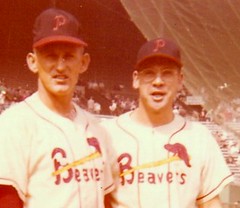
Case in point: Show me a 1956 Portland Beavers jesey and I’ll walk around with a big, goofy smile on my face for the rest of the day. The fun Cardinals-knockoff design (which is odd, because they weren’t affiliated with the Cards at that time), the gorgeous chain-stitching (that’s a modern reproduction, but still”¦), it’s a masterpiece. What could be better?
Oh, maybe this.
Holy shit holy shit holy shit, look at those sleeve stripes mimicking the stirrup stripes! It’s like a perfect call-and-response mating dance. It’s like that beautiful dream that you can’t quite remember when you wake up. It’s like heaven on a stick, only without the stick.
But was it just an isolated thing worn by that one guy? A mere tease to torture us with visions of what might have been? No!
Just imagine it: an entire team decked out in the game’s greatest stripe pattern, high and low. The mind reels, the body trembles. This, brothers and sisters, is what the political and corporate puppet masters don’t want the people to know about. This is the vision that could awaken the masses from their narcotic stupor and upend the establishment. This is How Life Is Supposed to Be.
I know of only one other baseball team that had matching sleeve and sock stripes: the early-1940s Cubs (see photos here, here, and here). I thought they were an isolated example, but the Beavers pics suggest otherwise. This changes everything.
Allow me to suggest a few immediate and urgent items for the agenda:
• There must be other photos of the 1956 Beavers out there. It is imperative that we find them.
• Now that we know the Cubs weren’t the only team with matching sleeve/stirrup stripes, we need to start scouring the old newspaper files for additional examples. I’m confident that they’re out there.
• We must — MUST — find one of these old Beavers undershirts. There has to be one stowed away in someone’s house, tattered and moth-nibbled. It is essential that we find out who manufactured it. (Jeremy Brahm, you live in Portland, so please start snooping around in people’s closets and attics, thanks.)
• Meanwhile, it is just as essential for someone, or perhaps several someones, to begin making reproductions of the undershirt. Jerry Cohen, Peter Capolino, whoever’s running the show over at Stall & Dean this week — I’m talking to you. Get crackin’. (Update: Cohen just told me, “Love to, but it can’t be done. No one will make a garment with knit-in stripes in low quantities. The machinery doesn’t exist anymore in the U.S.” Then he added, “If someone wants 10,000, maybe…” Okay, I’m in for the first thou. Who’s with me?)
• Finally, I hope all you Photoshop tweakers are already busily creating images to show us how other teams might have looked if their sleeves had matched their hose. Imagine a sleeve stripes based on this pattern, for example. Or this. Or, dare I even think it, this.
Okay, brothers and sisters, our mission is clear. But before we adjourn, let’s give a word of thanks — nay, a standing ovation! — to Pacific Northwest baseball historian Dave Eskenazi, who discovered these amazing photos and sent them my way a few days ago. I’ve been in a state of bliss ever since.
Like I said, I’m an easy fella to please.
Update: About an hour after this entry was posted, reader Roger Faso came up with this team portrait. Looks like five of the players are wearing the sleeve stripes in that shot.
Bigger Update: Dave Eskenazi has just come up with seven additional photos showing the sleeve stripes. I’ve put them all here.

Mardi Gras in November: The Hornets will unveil their new Mardi Gras alternates this afternoon. I’m not allowed to talk about them until the unveiling begins at 4pm eastern. So at that precise moment, I will post a short new entry here on the blog (probably just a photo and a few sentences) and will also have a new column going live on ESPN. Trust me — love ’em or hate ’em, you sure won’t be able to ignore them.
Uni Watch News Ticker: You’d think the NFL could use its current logo when turning people down for Super Bowl tickets (that’s the letter Bo Baize got). ”¦ Big Ohio State riflery photo gallery here, and a Miami riflery gallery here. ”¦ A little birdie — okay, a little birdie named Moe Khan — tells me the CFL will switch to having the home team wear white next season. ”¦ Kevin Marks got an excellent shot of Lendale White wearing what appears to be three pairs of socks (or two pairs plus a calf sleeve, whatever, same diff). ”¦ CJ Giannuzzi spotted this guy at last Sunday’s Steelers/Bengals game. ”¦ Wanna buy 200 really cool vintage sports T-shirts? I have just the link for you. ”¦ Jonathan Cain wonders why Benny the Bull’s uniform doesn’t match what the team wears. ”¦ You can really see the difference between the Packers’ seamless and standard jerseys here and here (with thanks to Jacob Shell). ”¦ This photo is full of Very Famous People but I’m not gonna tell you who they are because it’s such a great photo — why ruin it with celebrity baggage? (But Jen Muller knows who they are.) ”¦ Hey look, a big sportswear company has decided to treat its sweatshop workers like human beings after all. What a concept. ”¦ Memphis had one player going NNOB last night. Not sure of the story behind that (as spotted by Chris Salove). ”¦ Extremely garish new uniform for the Brisbane Lions (with thanks to Heather Hamilton). … Someone has started a petition demanding that the MLB Network air the Dock Ellis no-hitter. Not a bad cause, but it would be even cooler if they’d air the No Mas-produced Dock Ellis no-hitter animation.
The mystery photo is of Archie, Peyton and Eli Manning. Easy…
Is that supposed to be a white hurricane cloud on a very light gray background on the undershirt sleeves of the new Miami Nike jersey?
Will try to look for the Beavers sleeve stripes.
They mentioned on the broadcast that the Memphis player had ripped his jersey in the first half and had to go with the NNOB. Doesn’t seem like it would be too hard to bring 2 jerseys for each player on the road, especially since you have room to pack jerseys for players that don’t exist.
The famous mystery people will udoubtedly like the Mardi Gras Hornets unis.
link.jpg
BTW, I don’t imagine it would be too difficult to DIY those Portland undershirts.
[quote comment=”361206″]The famous mystery people will udoubtedly like the Mardi Gras Hornets unis.
link.jpg
BTW, I don’t imagine it would be too difficult to DIY those Portland undershirts.[/quote]
Oops,
link
And seriously, WTF is wrong with players like White?
link
Personally, I HATE the white section of those types of football socks, but there are other ways to decrease the visible white as opposed to looking like a homeless person.
The NFL needs to hire ME to become a uniform cop.
quick and dirty:
57 reds
’60’s vest-era bucs
cards
i know these suck, but i love that cardinals one
[quote comment=”361203″]Is that supposed to be a white hurricane cloud on a very light gray background on the undershirt sleeves of the new Miami Nike jersey?[/quote]
I think it is, but if you look at photo 5, it looks like a smiley face. Intentional or not?
I have to say I am surprised. I didn’t think the baseball vest had been around that long.
[quote comment=”361210″][quote comment=”361203″]Is that supposed to be a white hurricane cloud on a very light gray background on the undershirt sleeves of the new Miami Nike jersey?[/quote]
I think it is, but if you look at photo 5, it looks like a smiley face. Intentional or not?[/quote]
Haha yeah I see where you could make out a smiley face. Still, seems pointless to me. White happy hurricane on a light gray background? No way anybody’s going to see that in anything but close up pics.
[quote comment=”361209″]quick and dirty:
link
link
link
i know these suck, but i love that cardinals one[/quote]
great work, but i think the stripes look better on the forearm area closer to the wrist…
[quote comment=”361202″]The mystery photo is of Archie, Peyton and Eli Manning. Easy…[/quote]
Are we sure that’s Peyton and not Cooper?
How much were they paid to wear Puma?
Nike’s always looking for something to put on the performance undershirts that MLB players wear.
link
So what better way to make them stand out then to use the stripes? That Cards mock-up is great, Phil. It would stand out even more than this did:
link
[quote comment=”361208″]And seriously, WTF is wrong with players like White?
link
Personally, I HATE the white section of those types of football socks, but there are other ways to decrease the visible white as opposed to looking like a homeless person.
The NFL needs to hire ME to become a uniform cop.[/quote]
yeah i can see it now:
“guys, look at this pic! this is what an nfl uniform should look like… wait.. oops… fixed, now look!”
haha
Nice!
Can’t be true that nobody in the U.S. will knit those shirts. There are 10-15 idle textile plants in North Carolina alone!
also, don’t forget ricko’s comp sleeve (modified) idea — doesn’t mimic socks… or does it?
obviously not quite same as portland beav’s/chicago cubs, but the look is similar
In my search for Beaver pics, I found this awesome sight. Great pics and vids …
link
[quote comment=”361219″]In my search for Beaver pics, I found this awesome sight. Great pics and vids …
link
I just re-read my post. It’s totally safe, folks.
[quote comment=”361215″]Nike’s always looking for something to put on the performance undershirts that MLB players wear.
link
So what better way to make them stand out then to use the stripes? That Cards mock-up is great, Phil. It would stand out even more than this did:
link
I can’t see Nike agreeing to design anything that would resemble the identifying stripes of Adidas.
If any company were to spearhead this, it would have to be Majestic.
As for Ryan, I hope you enjoyed that “chili”.
Oops, I meant dog food. Fixed! :(
Might be a good place to start:
link
[quote comment=”361218″]also, don’t forget link (modified) idea — doesn’t mimic socks… or link?
obviously not quite same as portland beav’s/chicago cubs, but the look is similar[/quote]
I think Ricko’s idea is a GREAT one, however Nike is at least making an attempt with the Combat undershirts.
Front row … striped sleeve beaver.
link
BTW, some good pics of OU’s Combat gear:
link
link
link
[quote comment=”361221″][quote comment=”361215″]Nike’s always looking for something to put on the performance undershirts that MLB players wear.
link
So what better way to make them stand out then to use the stripes? That Cards mock-up is great, Phil. It would stand out even more than this did:
link
I can’t see Nike agreeing to design anything that would resemble the identifying stripes of Adidas.
If any company were to spearhead this, it would have to be Majestic.
As for Ryan, I hope you enjoyed that “chili”.
Oops, I meant dog food. Fixed! :([/quote]
you had like 4 bowls of that “chilli”… besides, cheese makes anything good… haha
i have to say, dog food or not, that chilli was awesome!
link
Great Ideas for Throwbacks!!
[quote comment=”361224″]Front row … striped sleeve beaver.
link
Middle row on the right, too. Nice work, Roger!
[quote comment=”361226″][quote comment=”361221″][quote comment=”361215″]Nike’s always looking for something to put on the performance undershirts that MLB players wear.
link
So what better way to make them stand out then to use the stripes? That Cards mock-up is great, Phil. It would stand out even more than this did:
link
I can’t see Nike agreeing to design anything that would resemble the identifying stripes of Adidas.
If any company were to spearhead this, it would have to be Majestic.
As for Ryan, I hope you enjoyed that “chili”.
Oops, I meant dog food. Fixed! :([/quote]
you had like 4 bowls of that “chilli”… besides, cheese makes anything good… haha
i have to say, dog food or not, that chilli was awesome![/quote]
I don’t know if any of the innocent bystanders who became your victims will agree on “awesome”.
[quote comment=”361228″][quote comment=”361224″]Front row … striped sleeve beaver.
link
Middle row on the right, too. Nice work, Roger![/quote]
Roger, those look great!
[quote comment=”361224″]Front row … striped sleeve beaver.
link
Look at the fourth and fifth from the right in the back row and the second row as well.
[quote comment=”361219″]In my search for Beaver pics, I found this awesome sight.[/quote]
the interwebs are a wonderful thing
[quote comment=”361229″][quote comment=”361226″][quote comment=”361221″][quote comment=”361215″]Nike’s always looking for something to put on the performance undershirts that MLB players wear.
link
So what better way to make them stand out then to use the stripes? That Cards mock-up is great, Phil. It would stand out even more than this did:
link
I can’t see Nike agreeing to design anything that would resemble the identifying stripes of Adidas.
If any company were to spearhead this, it would have to be Majestic.
As for Ryan, I hope you enjoyed that “chili”.
Oops, I meant dog food. Fixed! :([/quote]
you had like 4 bowls of that “chilli”… besides, cheese makes anything good… haha
i have to say, dog food or not, that chilli was awesome![/quote]
I don’t know if any of the innocent bystanders who became your victims will agree on “awesome”.[/quote]
that poor bastard… he was all happy, had a jump in his step, just finished up a good run… then he ran right into it… like a punch in the face.
[quote comment=”361224″]Front row … striped sleeve beaver.
link
Also center rear row, and the guy to the right. Plus first & second in uniform from right on second row
“- Finally, I hope all you Photoshop tweakers are already busily creating images to show us how other teams might have looked if their sleeves had matched their hose. Imagine a sleeve stripes based on this pattern, for example. Or this. Or, dare I even think it, this.”
Can we get comeone to colorize those Cubs sleeve stripes pics? I’d love to see those done up!!
Terence
Is Michigan wearing a throwback against OSU? Or is it current jersey vs throwback in the Big House?
[quote comment=”361210″][quote comment=”361203″]Is that supposed to be a white hurricane cloud on a very light gray background on the undershirt sleeves of the new Miami Nike jersey?[/quote]
I think it is, but if you look at photo 5, it looks like a smiley face. Intentional or not?[/quote]
I thought the same thing … it really does look like a smiley face.
[quote comment=”361235″]
Can we get comeone to colorize those Cubs sleeve stripes pics? I’d love to see those done up!!
[/quote]
im pretty sure larry bodnovich has already done a bunch of screen grabs from when it was a game, which show those (or similar era) sleeves in color
if not, he is the guy who can probably colorize them too
check out his work in this old post
I was at the KU – Memphis game last night and they actually made an announcement at the beginning of the second half that due to uniform problems, that player would now be wearing number 4. I thought it was odd that they cited “uniform problems”.
It did provide a great opportunity to drop some uni knowledge about blood jerseys, etc on my buddies.
Like the sleeve stripes on my Cardinals, but I’d settle for everyone going high cuffed.
Sooner hoops are wearing a patch…I can’t see it very well but there is a #23 so I assume it’s Wayman Tisdale’s signature (passed away earlier in 2009 for those who didn’t know). I like it.
link;
[quote comment=”361205″]They mentioned on the broadcast that the Memphis player had ripped his jersey in the first half and had to go with the NNOB. Doesn’t seem like it would be too hard to bring 2 jerseys for each player on the road, especially since you have room to pack jerseys for players that don’t exist.[/quote]
It’s a lot easier for a team to pack one extra blood jersey than fifteen extra backup jerseys. Fifteen large shirts takes up more space than you might think.
Interesting sockage from a late post yesterday: it’s photo 6 in the gallery.
link
I watched about 16 hours of the ESPN 24 Hours of Basketball yesterday.
Its official, basketball uniforms are in the Great Depression! The ultimate low!
They are so bad that it makes the game hard to watch. It turns great athletic plays into eyesores.
This tight on top and dress on bottom is a honestly a traveshamockery.
Georgetown’s unis were a disgrace. Same with Michigan State.
[quote comment=”361241″][quote comment=”361205″]They mentioned on the broadcast that the Memphis player had ripped his jersey in the first half and had to go with the NNOB. Doesn’t seem like it would be too hard to bring 2 jerseys for each player on the road, especially since you have room to pack jerseys for players that don’t exist.[/quote]
It’s a lot easier for a team to pack one extra blood jersey than fifteen extra backup jerseys. Fifteen large shirts takes up more space than you might think.[/quote]
A lot easier? Really? What, one extra box is going to kill them? Sure, it is easier, but so much so that it would actually be a real issue to bring more? Seems like it’s more of a “we shouldn’t have to, so we don’t” issue than an actual “we can’t”.
[quote comment=”361240″]Sooner hoops are wearing a patch…I can’t see it very well but there is a #23 so I assume it’s Wayman Tisdale’s signature (passed away earlier in 2009 for those who didn’t know). I like it.
link
Correct:
link
Compare these:
link
To these:
link
[quote comment=”361244″]I watched about 16 hours of the ESPN 24 Hours of Basketball yesterday.
Its official, basketball uniforms are in the Great Depression! The ultimate low!
They are so bad that it makes the game hard to watch. It turns great athletic plays into eyesores.
This tight on top and dress on bottom is a honestly a traveshamockery.
Georgetown’s unis were a disgrace. Same with Michigan State.[/quote]
Michigan state would look a lot better with green at the collar and armholes.
Never posted anything on Flickr before, but here’s some Indians fauxback stripes…
link
[quote comment=”361248″][quote comment=”361244″]I watched about 16 hours of the ESPN 24 Hours of Basketball yesterday.
Its official, basketball uniforms are in the Great Depression! The ultimate low!
They are so bad that it makes the game hard to watch. It turns great athletic plays into eyesores.
This tight on top and dress on bottom is a honestly a traveshamockery.
Georgetown’s unis were a disgrace. Same with Michigan State.[/quote]
Michigan state would look a lot better with green at the collar and armholes.[/quote]
Check comment 45. MSU used to have nice unis.
[quote comment=”361221″][quote comment=”361215″]Nike’s always looking for something to put on the performance undershirts that MLB players wear.
link
So what better way to make them stand out then to use the stripes? That Cards mock-up is great, Phil. It would stand out even more than this did:
link
I can’t see Nike agreeing to design anything that would resemble the identifying stripes of Adidas.
If any company were to spearhead this, it would have to be Majestic.
As for Ryan, I hope you enjoyed that “chili”.
Oops, I meant dog food. Fixed! :([/quote]
If Nike can make these, then they can do it for shirt sleeves on MLB undershirts. Three stripes don’t always mean “Adidas.” Because Nike will simply put a swoosh near the stripes, thus negating any identification with their corporate rival.
link
link
link
link
[quote comment=”361248″][quote comment=”361244″]I watched about 16 hours of the ESPN 24 Hours of Basketball yesterday.
Its official, basketball uniforms are in the Great Depression! The ultimate low!
They are so bad that it makes the game hard to watch. It turns great athletic plays into eyesores.
This tight on top and dress on bottom is a honestly a traveshamockery.
Georgetown’s unis were a disgrace. Same with Michigan State.[/quote]
Michigan state would look a lot better with green at the collar and armholes.[/quote]
And normal shorts instead of the shants the flagship SoD programs are wearing.
[quote comment=”361249″]Never posted anything on Flickr before, but here’s some Indians fauxback stripes…
link
Now if only we could put those stripes on a good pitcher, we’d be in business.
[quote comment=”361247″]Compare these:
link
To these:
link
I think the new ones would look a lot better than the old ones if they accented the collar and armholes and wore real shorts. Those green jerseys were too busy.
I just found this by accident and yowza.
link
[quote comment=”361224″]Front row … striped sleeve beaver.
link
i think next year, my fantasy football team name will be “Striped Sleeve Beaver.”
[quote comment=”361255″]I just found this by accident and yowza.
link
Hey! It’s Striped Sleeve Beavers!
(note: the guy’s last name is in the link)
[quote comment=”361253″][quote comment=”361249″]Never posted anything on Flickr before, but here’s some Indians fauxback stripes…
link
Now if only we could put those stripes on a good pitcher, we’d be in business.[/quote]
they could put ’em on cliff le… oh wait… no they can’t.
[quote comment=”361254″][quote comment=”361247″]Compare these:
link
To these:
link
I think the new ones would look a lot better than the old ones if they accented the collar and armholes and wore real shorts. Those green jerseys were too busy.[/quote]
Since I’m sure I’ll take some heat for that, let me clarify: Michigan State uses a very heavy font for their wordmark and it’s a five letter word that extends all the way across the chest. That tends to make the jersey look very narrow, so adding a double accent on the collars and armholes, then an unbalanced double stripe on the side just crowds it in more.
The new SoD jersey has the same font, but it changes the stripe to a dashed line and moves it further back so it doesn’t infringe on the space for the wordmark. Having no accent on the collar or armholes does make it look like the wordmark is at seas on the front of the jersey, so adding that little bit of color would anchor the eye to the players’ chests.
They also need to wear shorts above the knee.
[quote comment=”361258″][quote comment=”361253″][quote comment=”361249″]Never posted anything on Flickr before, but here’s some Indians fauxback stripes…
link
Now if only we could put those stripes on a good pitcher, we’d be in business.[/quote]
they could put ’em on cliff le… oh wait… no they can’t.[/quote]
They could put ’em on CC… no…
Wouldn’t those stripes look good on Vic Mart… hmm…
Pronk?
[quote comment=”361260″]They could put ’em on CC… no…
Wouldn’t those stripes look good on Vic Mart… hmm…
Pronk?[/quote]
here’s one we can get behind… SANDY ALOMAR, JR.!!!
[quote comment=”361261″]here’s one we can get behind… SANDY ALOMAR, JR.!!![/quote]
it’s sad when the fan favorite is the 1st base coach. happy to see sandy in a tribe uni again, tho.
[quote comment=”361261″][quote comment=”361260″]They could put ’em on CC… no…
Wouldn’t those stripes look good on Vic Mart… hmm…
Pronk?[/quote]
here’s one we can get behind… SANDY ALOMAR, JR.!!![/quote]
Omar Vizquel said he wants to play in Cleveland for his last year. Maybe he should just be the bench coach instead.
[quote comment=”361263″]Omar Vizquel said he wants to play in Cleveland for his last year. Maybe he should just be the bench coach instead.[/quote]
omar is still my favorite tribe player of all time. i’d dig it if he came back to be an usher.
then there was that rumor a month or so ago (before he re-signed w/ the dodgers) that manny was talking to jim thome about coming back to cleveland with him to finish out their careers. manny being manny…
[quote comment=”361263″]Maybe he should just be the bench coach instead.[/quote]
bench coaches rule
What in the world is link
Never seen that before. Its Bobby Abreu when he played for Houston. Was that a prototype jersey he was wearing or was that something I just completely missed?
[quote comment=”361257″][quote comment=”361255″]I just found this by accident and yowza.
link
Hey! It’s Striped Sleeve Beavers!
(note: the guy’s last name is in the link)[/quote]
I wonder if those stars represent championships…
:)
[quote comment=”361258″][quote comment=”361253″][quote comment=”361249″]Never posted anything on Flickr before, but here’s some Indians fauxback stripes…
link
Now if only we could put those stripes on a good pitcher, we’d be in business.[/quote]
they could put ’em on cliff le… oh wait… no they can’t.[/quote]
Nah, but Cliff Lee could get a pretty sweet Liberty Bell on his sleeve
Appears that the Cardinals logo isn’t the only borrowed item on the Beavers’ unis. Now where did I see that “P” before? Oh, yeah link
Still, those unis are still wonderful.
[quote comment=”361271″]Nah, but Cliff Lee could get a pretty sweet Liberty Bell on his sleeve[/quote]
on that note (and this is a stretch), has there ever been a womens team (any sport) in philly named the “liberty belles?” i’d be shocked if there hasn’t.
[quote comment=”361268″]What in the world is link
Never seen that before. Its Bobby Abreu when he played for Houston. Was that a prototype jersey he was wearing or was that something I just completely missed?[/quote]
I believe that might actually be a Tucson Toros uni with the logo removed from the jersey and an A superimposed on the cap.
Or it’s possibly some other 90s Astros affiliate that had an A on the cap.
[quote comment=”361274″][quote comment=”361268″]What in the world is link
Never seen that before. Its Bobby Abreu when he played for Houston. Was that a prototype jersey he was wearing or was that something I just completely missed?[/quote]
I believe that might actually be a Tucson Toros uni with the logo removed from the jersey and an A superimposed on the cap.
Or it’s possibly some other 90s Astros affiliate that had an A on the cap.[/quote]
I was on the right track. It’s an link.
[quote comment=”361275″][quote comment=”361274″][quote comment=”361268″]What in the world is link
Never seen that before. Its Bobby Abreu when he played for Houston. Was that a prototype jersey he was wearing or was that something I just completely missed?[/quote]
I believe that might actually be a Tucson Toros uni with the logo removed from the jersey and an A superimposed on the cap.
Or it’s possibly some other 90s Astros affiliate that had an A on the cap.[/quote]
I was on the right track. It’s an link.[/quote]
That’s strange. The Tourists were only affiliated with the Astros until 1993, so either the date of the card is wrong on the site or they used a two year old picture.
[quote comment=”361209″]quick and dirty:
link
link
link
i know these suck, but i love that cardinals one[/quote]
Restraint is an admirable quality in both design and dress.
If one pocket silk matching your necktie is marginally good, adding another plus matching cufflinks isn’t necessarilly better.
(I know, I know, who wears pocket silks or cufflinks anymore. It’s an analogy) LOL
Did they allow the pitchers to wear those striped sleeves back then, I wonder? Seems like there’d be a lot going on for a hitter’s eyes to sort out. Similar reasoning to why pitchers aren’t allowed to wear a batting glove or wristbands. Or why the sleeveless green-gold A’s pitchers (back with A’s had white TV numbers on undersleeves…around ’63-’64) had to go without the numbers. Position players wore ’em; pitchers were forbidden.
—Ricko
Benny the Bull prob has some really pissy people in the office that he has to put up with. I’m the mascot at D2 Valdosta State and only one of the uni’s I have is up to date and at that is the old football one from last year with holes and stuff in it. Not even the right freaking number. Our Guy’s basketball team took the floor monday night with Sarcuse’s style SOD. I hate how the stripes are only on the pants. lol I thought that in the mascot world it was only D2 and down that you didn’t get the right uni, but i guess CHi-town hates mascots too.
Not shilling for Ebbets, put if you want a close look at some recreated BEAVER stuff…
link
(If link doesn’t work, just go to ebbets.com and search “portland”)
—Ricko
The Memphis player had NNOB jersey because his original jersey was torn in the first half and he switched to the backup jersey at half time.
[quote comment=”361257″][quote comment=”361255″]I just found this by accident and yowza.
link
Hey! It’s Striped Sleeve Beavers!
(note: the guy’s last name is in the link)[/quote]
[quote comment=”361243″]Interesting sockage from a late post yesterday: it’s photo 6 in the gallery.
link
It’s either the maroon players wearing multiple adidas socks(Foolish) or the Wazzou players wearing the Nike Elite basketball socks with the vertical stripe in the back.
He probably practice Rex-Kwan-do:
link
[quote comment=”361277″](I know, I know, who wears pocket silks or cufflinks anymore. It’s an analogy) LOL
—Ricko[/quote]
Haven’t you seen the ‘Key Matchups’ commercial on the Mother Ship? You gotta have the pocket square and tie match the fuchsia socks or your yellow suit with orange shirt just doesn’t look right.
[quote comment=”361278″]Benny the Bull prob has some really pissy people in the office that he has to put up with. I’m the mascot at D2 Valdosta State and only one of the uni’s I have is up to date and at that is the old football one from last year with holes and stuff in it. Not even the right freaking number. Our Guy’s basketball team took the floor monday night with Sarcuse’s style SOD. I hate how the stripes are only on the pants. lol I thought that in the mascot world it was only D2 and down that you didn’t get the right uni, but i guess CHi-town hates mascots too.[/quote]
1) The Bulls have never worn uniforms that look like what Benny wears, so it’s not a case of not being up-to-date.
2) Are you sure it’s Benny who has to put up with management, or link?
[quote comment=”361203″]Is that supposed to be a white hurricane cloud on a very light gray background on the undershirt sleeves of the new Miami Nike jersey?[/quote]
It looks to me like it is supposed to be camo.
Re-printed from very late last night…
The Wisconsin Badgers have released a wallpaper that shows the set up at Camp Randall Stadium for the “Culver’s Camp Randall Hockey Classic”. Yes, they added a sponsor to the name and the logo. It sucks, and doesn’t fit, but in the end, at least it is Culvers. (For those of you who don’t know, Culver’s is a fast food chain known for their butter burgers)
link
[quote comment=”361281″][quote comment=”361257″][quote comment=”361255″]I just found this by accident and yowza.
link
Hey! It’s Striped Sleeve Beavers!
(note: the guy’s last name is in the link)[/quote]
[quote comment=”361243″]Interesting sockage from a late post yesterday: it’s photo 6 in the gallery.
link
It’s either the maroon players wearing multiple adidas socks(Foolish) or the Wazzou players wearing the Nike Elite basketball socks with the vertical stripe in the back.
He probably practices Rex-Kwan-do:
link
I quit..
Nike Elite Basketball socks:
link
I know the Steelers and Eagles merged for a season (hoping to get to my copy of Matthew Algeo’s “Last Team Standing” soon, btw), but that Steagles jersey link just ain’t right. It’s like combining Yankees and Mets jerseys.
And yet, if someone did a Pitt/WVU or a Pitt/Penn State version, I’d wear that. Go figure.
[quote comment=”361284″][quote comment=”361203″]Is that supposed to be a white hurricane cloud on a very light gray background on the undershirt sleeves of the new Miami Nike jersey?[/quote]
It looks to me like it is supposed to be camo.[/quote]
no…the image is graphically of a hurricane…
and while i actually admire the nike designers for coming up with a reasonable facsimile, im pretty sure it fails the “is it good or is it stupid” test
[quote comment=”361244″]I watched about 16 hours of the ESPN 24 Hours of Basketball yesterday.
Its official, basketball uniforms are in the Great Depression! The ultimate low!
They are so bad that it makes the game hard to watch. It turns great athletic plays into eyesores.
This tight on top and dress on bottom is a honestly a traveshamockery.
Georgetown’s unis were a disgrace. Same with Michigan State.[/quote]
You are correct. In recent years whether my dwindling interest in hoops (which was once about my favorite sport) has been tied to the declining quality of play, which I think is tied to the declining quality of uniforms. Pretty soon you are going to see players running up and down the court dribbling with one hand and holding their pants up with the other. I miss the days of Magic, Dr. J., and Larry (though they all could have used longer shorts).
[quote comment=”361285″]Re-printed from very late last night…
The Wisconsin Badgers have released a wallpaper that shows the set up at Camp Randall Stadium for the “Culver’s Camp Randall Hockey Classic”. Yes, they added a sponsor to the name and the logo. It sucks, and doesn’t fit, but in the end, at least it is Culvers. (For those of you who don’t know, Culver’s is a fast food chain known for their butter burgers)
link
Mmm, butter burgers…
Steven Raichlen has a recipe for those (and for inside-out cheeseburgers as well) on this site: link
[quote comment=”361288″][quote comment=”361284″][quote comment=”361203″]Is that supposed to be a white hurricane cloud on a very light gray background on the undershirt sleeves of the new Miami Nike jersey?[/quote]
It looks to me like it is supposed to be camo.[/quote]
no…the image is graphically link…
and while i actually admire the nike designers for coming up with a reasonable facsimile, im pretty sure it fails the “is it good or is it stupid” test[/quote]
It’d look f’in great on a yellow jersey though.
:)
Steagles jersey,
Like this:
link
or this
link
[quote comment=”361289″][quote comment=”361244″]I watched about 16 hours of the ESPN 24 Hours of Basketball yesterday.
Its official, basketball uniforms are in the Great Depression! The ultimate low!
They are so bad that it makes the game hard to watch. It turns great athletic plays into eyesores.
This tight on top and dress on bottom is a honestly a traveshamockery.
Georgetown’s unis were a disgrace. Same with Michigan State.[/quote]
You are correct. In recent years whether my dwindling interest in hoops (which was once about my favorite sport) has been tied to the declining quality of play, which I think is tied to the declining quality of uniforms. Pretty soon you are going to see players running up and down the court dribbling with one hand and holding their pants up with the other. I miss the days of Magic, Dr. J., and Larry (though they all could have used longer shorts).[/quote]
Yeah, they need to either go back to shorts that are actually shorts… or just start wearing actual pants, like the warm-up uniforms.
I don’t know why anyone would want to play in shorts so baggy you can trip on them.
[quote comment=”361289″][quote comment=”361244″]I watched about 16 hours of the ESPN 24 Hours of Basketball yesterday.
Its official, basketball uniforms are in the Great Depression! The ultimate low!
They are so bad that it makes the game hard to watch. It turns great athletic plays into eyesores.
This tight on top and dress on bottom is a honestly a traveshamockery.
Georgetown’s unis were a disgrace. Same with Michigan State.[/quote]
You are correct. In recent years whether my dwindling interest in hoops (which was once about my favorite sport) has been tied to the declining quality of play, which I think is tied to the declining quality of uniforms. Pretty soon you are going to see players running up and down the court dribbling with one hand and holding their pants up with the other. I miss the days of Magic, Dr. J., and Larry (though they all could have used longer shorts).[/quote]
I agree with everything except what you said at the end in parentheses. Doc, Magic and Larry had it right. They’re called “shorts” after all.
As long as they have room to move and nothing sticks out, there’s nothing wrong with this look at all: link
[quote comment=”361292″]Steagles jersey,
Like this:
link
or this
link
That second one needs a D. Dodgels sounds a lot better than Dogels.
[quote comment=”361292″]Steagles jersey,
Like this:
link
or this
link
Actually, here’s a site with a virtual plethora of them:
link
[quote comment=”361292″]Steagles jersey,
Like this:
link
or this
link
At least the Dodgers/Angels one matched up the numbers. The Steagles and the ND/OSU (“Irisheyes”?) jerseys didn’t.
[quote comment=”361296″][quote comment=”361292″]Steagles jersey,
Like this:
link
or this
link
Actually, here’s a site with a virtual plethora of them:
link
On the right side of the page, there are links to other categories of torn jerseys, some of which are pretty cool:
link
[quote comment=”361298″][quote comment=”361296″][quote comment=”361292″]Steagles jersey,
Like this:
link
or this
link
Actually, here’s a site with a virtual plethora of them:
link
On the right side of the page, there are links to other categories of torn jerseys, some of which are pretty cool:
link
The effect on this one is really well done:
link
[quote comment=”361282″][quote comment=”361277″](I know, I know, who wears pocket silks or cufflinks anymore. It’s an analogy) LOL
—Ricko[/quote]
Haven’t you seen the ‘Key Matchups’ commercial on the Mother Ship? You gotta have the pocket square and tie match the fuchsia socks or your yellow suit with orange shirt just doesn’t look right.[/quote]
Indeed, thought about referencing that promo.
However, if one eschews the pocket silk altogether it eliminates the dilemma that develops when one pushes a basic, simple ensemble into an area where such embellishments now become relevant. And one doesn’t always want to do that, does one.
Leaving a classic look as a classic look will work. When one begins adding accoutrements and other appointments the issue becomes…where to stop. What’s too little and what’s too much?
Ah, yes, is uncharted fashion territory from which extracation is difficult.
As Mom used to say,
“You can’t take the peas out of your mouth once they’re in there.”
(lol)
—Ricko
[quote comment=”361299″][quote comment=”361298″][quote comment=”361296″][quote comment=”361292″]Steagles jersey,
Like this:
link
or this
link
Actually, here’s a site with a virtual plethora of them:
link
On the right side of the page, there are links to other categories of torn jerseys, some of which are pretty cool:
link
The effect on this one is really well done:
link
Now that’s the way to do it!
[quote comment=”361296″][quote comment=”361292″]Steagles jersey,
Like this:
link
or this
link
Actually, here’s a site with a virtual plethora of them:
link
Exactly when has Notre Dame ever been a real rival for the Buckeyes? If you’re going to mix a Buckeyes jersey with a blue jersey, it had damn well better have maize numbers on it. (of course, actually wearing it anywhere near either campus would probably get you shot, but that’s beside the point)
[quote comment=”361301″][quote comment=”361299″][quote comment=”361298″][quote comment=”361296″][quote comment=”361292″]Steagles jersey,
Like this:
link
or this
link
Actually, here’s a site with a virtual plethora of them:
link
On the right side of the page, there are links to other categories of torn jerseys, some of which are pretty cool:
link
The effect on this one is really well done:
link
Now that’s the way to do it![/quote]
Yeah, except that Nike completely butchered the stripe pattern on the Bulls half of the jersey. And shouldn’t there be half a basketball above the hand on the Bullets half?
Speaking of butchered striping patterns, how can something that’s link look so right?
“I don’t know why anyone would want to play in shorts so baggy you can trip on them.”
Hey, guys rob banks and convenience stores wearing pants so big, and wearing them so far below their butts, that they trip and fall over them…resulting in their apprehension.
That’s what it is, actually. The “I’m On My Way to Knock Over a Liquor Store” look is the in thing in basketball right now, that’s all.
So let’s just relax, watch, enjoy, and think of those great helicopter police chase videos of morons running down alleys and climbing fences, holding their jeans up with one hand, while we wonder at what point knowledge of their own stupidity finally kicked in for them.
It’ll make the season a lot more fun.
—Ricko
[quote comment=”361230″][quote comment=”361228″][quote comment=”361224″]Front row … striped sleeve beaver.
link
Middle row on the right, too. Nice work, Roger![/quote]
Roger, those look great![/quote]
Top Row Center as well
[quote comment=”361302″][quote comment=”361296″][quote comment=”361292″]Steagles jersey,
Like this:
link
or this
link
Actually, here’s a site with a virtual plethora of them:
link
Exactly when has Notre Dame ever been a real rival for the Buckeyes? If you’re going to mix a Buckeyes jersey with a blue jersey, it had damn well better have maize numbers on it. (of course, actually wearing it anywhere near either campus would probably get you shot, but that’s beside the point)[/quote]
That was from the Fiesta Bowl a few years ago. That’s Brady Quinn’s sister. She was dating AJ Hawk, thus the split loyalty for the game.
[quote comment=”361299″][quote comment=”361298″][quote comment=”361296″][quote comment=”361292″]Steagles jersey,
Like this:
link
or this
link
Actually, here’s a site with a virtual plethora of them:
link
On the right side of the page, there are links to other categories of torn jerseys, some of which are pretty cool:
link
The effect on this one is really well done:
link
To me, this one sucks on so many levels: I miss the Bullets and their lifeguard jerseys and to pair it with the Jordan is just a reminder of how poorly he performed in Washington, both as an over-the-hill player and talent evaluator. It’s sad, really. But more importantly, the Bullets logo contained a ball leaving the “hands” of the double “L”, so the jersey should have depicted at least a portion of a ball.
one more Q&D…kinda messed up the sleeve stripes on his right arm, but you get the idea
splendid
[quote comment=”361302″][quote comment=”361296″][quote comment=”361292″]Steagles jersey,
Like this:
link
or this
link
Actually, here’s a site with a virtual plethora of them:
link
Exactly when has Notre Dame ever been a real rival for the Buckeyes? If you’re going to mix a Buckeyes jersey with a blue jersey, it had damn well better have maize numbers on it. (of course, actually wearing it anywhere near either campus would probably get you shot, but that’s beside the point)[/quote]
That’s Laura Quinn, Brady’s sister. She married AJ Hawk and then wore that shirt to the 2006 Fiesta Bowl.
Some more great wire photos from this guy on ebay:
link.
link.
link.
link.
link?
link!
[quote comment=”361302″][quote comment=”361296″][quote comment=”361292″]Steagles jersey,
Exactly when has Notre Dame ever been a real rival for the Buckeyes? If you’re going to mix a Buckeyes jersey with a blue jersey, it had damn well better have maize numbers on it. (of course, actually wearing it anywhere near either campus would probably get you shot, but that’s beside the point)[/quote]
It was worn by Brady Quinn’s sister during the Bowl Game. She is now married to AJ Hawk, a player on OSU
[quote comment=”361302″](of course, actually wearing it anywhere near either campus would probably get you shot, but that’s beside the point)[/quote]
That’s probably why there’s no Longsooners jersey in there.
[quote comment=”361308″]one more Q&D…kinda messed up the sleeve stripes on his right arm, but you get the idea
link[/quote]
Belongs on the Mt. Rushmore of sleeve stripes!
From what I have seen, the numbers on the Ohio State riflery jersey look pink. And now we have a glimpse of the silly gloves and shoes. Nike is ruining the word “tribute” for everyone. OSU definitely has the talent to beat Michigan, but can they overcome their distracting uniforms they have had thrust upon them? (See Notre Dame vs. USC 2007)
Moving on to the U. of Miami uniform, is it just me, or do the half-and-half jersey numbers make it seem like the player is a half-full vessel of kerosene?
That 200-piece retro ebay auction is mostly stuff that either midgets or anorexic girls sized 0 or 2 could wear; especially since shirts were cut smaller decades ago. Some really cool designs, tho.
[quote comment=”361313″][quote comment=”361308″]one more Q&D…kinda messed up the sleeve stripes on his right arm, but you get the idea
link[/quote]
Belongs on the Mt. Rushmore of sleeve stripes![/quote]
Okay, Phil…
I dare you to find a Twins, Cubs or White Sox player from last year, at home, in the dark alt jersey…and make the sleeves white with appropriate navy, royal or black pins. Vertical, of course.
Come on, let’s see what ya got.
I Triple Double Dog Dare you.
(and don’t say you can’t cuz you’ll shoot your eye out).
lol.
–Ricko
hey… nice ebay finds.
Pepitone looks like Carbone from ‘Good Fellas’ –just missing the icepick sticking our of the nape of his neck. and is that last picture ‘big dit’ clapper???? :)
Well… the shirt still sucks on our rivalry uni.
But I like the pants.
[quote comment=”361316″][quote comment=”361313″][quote comment=”361308″]one more Q&D…kinda messed up the sleeve stripes on his right arm, but you get the idea
link[/quote]
Belongs on the Mt. Rushmore of sleeve stripes![/quote]
Okay, Phil…
I dare you to find a Twins, Cubs or White Sox player from last year, at home, in the dark alt jersey…and make the sleeves white with appropriate navy, royal or black pins. Vertical, of course.
Come on, let’s see what ya got.
I Triple Double Dog Dare you.
(and don’t say you can’t cuz you’ll shoot your eye out).
lol.
–Ricko[/quote]
im not really sure what you’re asking…
something like this or this?
[quote comment=”361319″][quote comment=”361316″][quote comment=”361313″][quote comment=”361308″]one more Q&D…kinda messed up the sleeve stripes on his right arm, but you get the idea
link[/quote]
Belongs on the Mt. Rushmore of sleeve stripes![/quote]
Okay, Phil…
I dare you to find a Twins, Cubs or White Sox player from last year, at home, in the dark alt jersey…and make the sleeves white with appropriate navy, royal or black pins. Vertical, of course.
Come on, let’s see what ya got.
I Triple Double Dog Dare you.
(and don’t say you can’t cuz you’ll shoot your eye out).
lol.
–Ricko[/quote]
im not really sure what you’re asking…
something like link or link?[/quote]
First one. Second does match anything else on the uni.
or this (made undersleeves a bit lighter)
[quote comment=”361320″][quote comment=”361319″][quote comment=”361316″][quote comment=”361313″][quote comment=”361308″]one more Q&D…kinda messed up the sleeve stripes on his right arm, but you get the idea
link[/quote]
Belongs on the Mt. Rushmore of sleeve stripes![/quote]
Okay, Phil…
I dare you to find a Twins, Cubs or White Sox player from last year, at home, in the dark alt jersey…and make the sleeves white with appropriate navy, royal or black pins. Vertical, of course.
Come on, let’s see what ya got.
I Triple Double Dog Dare you.
(and don’t say you can’t cuz you’ll shoot your eye out).
lol.
–Ricko[/quote]
im not really sure what you’re asking…
something like link or link?[/quote]
First one. Second does match anything else on the uni.[/quote]
And thank you. That first one is some serious uniform coordinology, in the elementeral matchification sense of the word, that is.
Well done.
—Ricko
[quote comment=”361321″]or link (made undersleeves a bit lighter)[/quote]
Well, yes, they should match the pants.
[quote comment=”361322″][quote comment=”361320″][quote comment=”361319″][quote comment=”361316″][quote comment=”361313″][quote comment=”361308″]one more Q&D…kinda messed up the sleeve stripes on his right arm, but you get the idea
link[/quote]
Belongs on the Mt. Rushmore of sleeve stripes![/quote]
Okay, Phil…
I dare you to find a Twins, Cubs or White Sox player from last year, at home, in the dark alt jersey…and make the sleeves white with appropriate navy, royal or black pins. Vertical, of course.
Come on, let’s see what ya got.
I Triple Double Dog Dare you.
(and don’t say you can’t cuz you’ll shoot your eye out).
lol.
–Ricko[/quote]
im not really sure what you’re asking…
something like link or link?[/quote]
First one. Second does match anything else on the uni.[/quote]
And thank you. That first one is some serious uniform coordinology, in the elementeral matchification sense of the word, that is.
Well done.
—Ricko[/quote]
Or, using real words – “It makes the colored jersey on top of the pinstriped pants look better.” :D
[quote comment=”361324″][quote comment=”361322″][quote comment=”361320″][quote comment=”361319″][quote comment=”361316″][quote comment=”361313″][quote comment=”361308″]one more Q&D…kinda messed up the sleeve stripes on his right arm, but you get the idea
link[/quote]
Belongs on the Mt. Rushmore of sleeve stripes![/quote]
Okay, Phil…
I dare you to find a Twins, Cubs or White Sox player from last year, at home, in the dark alt jersey…and make the sleeves white with appropriate navy, royal or black pins. Vertical, of course.
Come on, let’s see what ya got.
I Triple Double Dog Dare you.
(and don’t say you can’t cuz you’ll shoot your eye out).
lol.
–Ricko[/quote]
im not really sure what you’re asking…
something like link or link?[/quote]
First one. Second does match anything else on the uni.[/quote]
And thank you. That first one is some serious uniform coordinology, in the elementeral matchification sense of the word, that is.
Well done.
—Ricko[/quote]
Or, using real words – “It makes the colored jersey on top of the pinstriped pants look better.”
:D[/quote]
No. There’s really nothing that can be done make that jersey look better.
Oh, wait. There is something that can be done. Don’t wear it during games.
[quote comment=”361324″][quote comment=”361322″][quote comment=”361320″][quote comment=”361319″][quote comment=”361316″][quote comment=”361313″][quote comment=”361308″]one more Q&D…kinda messed up the sleeve stripes on his right arm, but you get the idea
link[/quote]
Belongs on the Mt. Rushmore of sleeve stripes![/quote]
Okay, Phil…
I dare you to find a Twins, Cubs or White Sox player from last year, at home, in the dark alt jersey…and make the sleeves white with appropriate navy, royal or black pins. Vertical, of course.
Come on, let’s see what ya got.
I Triple Double Dog Dare you.
(and don’t say you can’t cuz you’ll shoot your eye out).
lol.
–Ricko[/quote]
im not really sure what you’re asking…
something like link or link?[/quote]
First one. Second does match anything else on the uni.[/quote]
And thank you. That first one is some serious uniform coordinology, in the elementeral matchification sense of the word, that is.
Well done.
—Ricko[/quote]
Or, using real words – “It makes the colored jersey on top of the pinstriped pants look better.”
:D[/quote]
It embiggens the jersey. Makes it appear more cromulent.
[quote comment=”361325″]No. There’s really nothing that can be done make that jersey look better.[/quote]
here: made it look better
For all you Nike haters, the 10th Anniversary Edition of Naomi Klein’s “No Logo” is now on sale.
link
I’m gonna bet there ISN’T any video of Dock Ellis’s no-hitter to air. This was a Padres home game in 1970 (I know, I was there with my dad), and the Padres didn’t televise games at that time, and I’ll bet the Pirates didn’t televise West Coast night games.
Let’s hope I didn’t screw up the quote tag…
[quote comment=”361325″]
No. There’s really nothing that can be done make that jersey look better.
Oh, wait. There is something that can be done. Don’t wear it during games.[/quote]
Why? What is so bad about wearing colored jerseys in baseball? Give me a reason besides “tradition”. Heck, if a pitcher wearing white gloves is a visual distraction for the batter and illegal, how the hell is a guy dressed in white from head to toe even considered acceptable? By the logic of banning white gloves, I’d think colored uniforms should be the standard.
[quote comment=”361328″][quote comment=”361325″]No. There’s really nothing that can be done make that jersey look better.[/quote]
here: link[/quote]
Ooh, can you make the undershirt plaid now? :P
[quote comment=”361268″]What in the world is link
Never seen that before. Its Bobby Abreu when he played for Houston. Was that a prototype jersey he was wearing or was that something I just completely missed?[/quote]
More like Very Bad Airbrush Job meant to evoke the 1960s or 70s.
[quote comment=”361331″]Let’s hope I didn’t screw up the quote tag…
[quote comment=”361325″]
No. There’s really nothing that can be done make that jersey look better.
Oh, wait. There is something that can be done. Don’t wear it during games.[/quote]
Why? What is so bad about wearing colored jerseys in baseball? Give me a reason besides “tradition”. Heck, if a pitcher wearing white gloves is a visual distraction for the batter and illegal, how the hell is a guy dressed in white from head to toe even considered acceptable? By the logic of banning white gloves, I’d think colored uniforms should be the standard.[/quote]
It’s a personal preference thing. I like a lot of the colored tops, but I think this specific version is a problem because solid color over pins looks messy. If they had plain white pants it would look ten times better.
[quote comment=”361332″][quote comment=”361328″][quote comment=”361325″]No. There’s really nothing that can be done make that jersey look better.[/quote]
here: link[/quote]
Ooh, can you make the undershirt plaid now? :P[/quote]
But only if the uni includes plaid pants. Or plaid stirrups.
So maybe that’s a look for golf.
Or curling.
—Ricko
[quote comment=”361276″][quote comment=”361275″][quote comment=”361274″][quote comment=”361268″]What in the world is link
Never seen that before. Its Bobby Abreu when he played for Houston. Was that a prototype jersey he was wearing or was that something I just completely missed?[/quote]
I believe that might actually be a Tucson Toros uni with the logo removed from the jersey and an A superimposed on the cap.
Or it’s possibly some other 90s Astros affiliate that had an A on the cap.[/quote]
I was on the right track. It’s an link.[/quote]
That’s strange. The Tourists were only affiliated with the Astros until 1993, so either the date of the card is wrong on the site or they used a two year old picture.[/quote]
Yep. Really Bad Airbrushing.
[quote comment=”361331″]
Why? What is so bad about wearing colored jerseys in baseball? Give me a reason besides “tradition”. Heck, if a pitcher wearing white gloves is a visual distraction for the batter and illegal, how the hell is a guy dressed in white from head to toe even considered acceptable? By the logic of banning white gloves, I’d think colored uniforms should be the standard.[/quote]
other than personal preference and tradition, no THE jeff, there is not
it’s all a matter of opinion
you have yours
we have ours
and never the twain shall meet
[quote comment=”361334″][quote comment=”361331″]Let’s hope I didn’t screw up the quote tag…
[quote comment=”361325″]
No. There’s really nothing that can be done make that jersey look better.
Oh, wait. There is something that can be done. Don’t wear it during games.[/quote]
Why? What is so bad about wearing colored jerseys in baseball? Give me a reason besides “tradition”. Heck, if a pitcher wearing white gloves is a visual distraction for the batter and illegal, how the hell is a guy dressed in white from head to toe even considered acceptable? By the logic of banning white gloves, I’d think colored uniforms should be the standard.[/quote]
It’s a personal preference thing. I like a lot of the colored tops, but I think this specific version is a problem because solid color over pins looks messy. If they had plain white pants it would look ten times better.[/quote]
Solid white pants would help, but link.
The walking cub logo is OK, I guess. but why is the NL logo on it as a sleeve patch? It’s like they decided at the last minute that they NEEDED a sleeve patch but they were already using the primary jersey’s sleeve patch as the chest insignia so they just grabbed a design that was lying around.
Hmmm… what else?
The red numbers/letters on the back look like garbage.
Oh, and the fact that the cap always comes off as a darker color doesn’t help it look any better.
Did anyone notice all the sponsor’s logos on the court at the Scottrade Center during the Hall of Fame Showcase?
Come on. Do we really need Reese’s in the lane, Bud Light on the timelines, PNY underneath the coaches, Mutual of Omaha on the scorer’s table, and O’Reilly Auto Parts on the mat to dry off your shoes? (Not to mention the other ones on the baseline.)
It is embarrassing.
LI Phil has never said he’s against all colored jerseys. He just thinks they should be used sparingly.
It’s probably a good idea, too, to have only one team wear them in a game, though it seems to be okay in basketball (gold vs. blue, for example) it works in at least one football game (UCLA v. USC). Not sure it worked in the 1979 World Series, but I was a kid then and I loved it. I would not like it today, however.
There’s a “leaked” mockup floating around the web of what the Mardi Gras unis will look like. If it’s accurate…I LIKE! it is
LOUD but I definitely LIKE. I await what the final product will look like. I just hope they don’t use the über-annoying dazzle material…but I’m expecting it.
[quote comment=”361330″]I’m gonna bet there ISN’T any video of Dock Ellis’s no-hitter to air. This was a Padres home game in 1970 (I know, I was there with my dad), and the Padres didn’t televise games at that time, and I’ll bet the Pirates didn’t televise West Coast night games.[/quote]
I doubt there is video of the game as well. i have to point out that Doc’s no hitter was thrown the first game of a doubleheader at 2:13 local time
[quote comment=”361342″][quote comment=”361330″]I’m gonna bet there ISN’T any video of Dock Ellis’s no-hitter to air. This was a Padres home game in 1970 (I know, I was there with my dad), and the Padres didn’t televise games at that time, and I’ll bet the Pirates didn’t televise West Coast night games.[/quote]
I doubt there is video of the game as well. i have to point out that Doc’s no hitter was thrown the first game of a doubleheader at 2:13 local time[/quote]
Yeah…scratch that. I was totally looking at the wrong time. It was a 6:00 game
[quote comment=”361341″]There’s a “leaked” mockup floating around the web of what the Mardi Gras unis will look like. If it’s accurate…I LIKE! it is
LOUD but I definitely LIKE. I await what the final product will look like. I just hope they don’t use the über-annoying dazzle material…but I’m expecting it.[/quote]
Got a link?
…and nice inclusion of the umlaut on “über.”
I like that on the lead picture, an assumed fabric fold makes me think that this team could have been owned by Jerry Mathers.
[quote comment=”361341″]There’s a “leaked” mockup floating around the web of what the Mardi Gras unis will look like. If it’s accurate…I LIKE! it is
LOUD but I definitely LIKE. I await what the final product will look like. I just hope they don’t use the über-annoying dazzle material…but I’m expecting it.[/quote]
Well, for Mardi Gras “loud” would be appropriate. Such things are relevant when judging a design, y’know.
—Ricko
Here’s what the leaked Hornets Mardi Gras uniform looks like:
link
[quote comment=”361345″]I like that on the lead picture, an assumed fabric fold makes me think that this team could have been owned by Jerry Mathers.[/quote]
Yes, the correct use of the apostrophe to indicate the singular possessive.
[quote comment=”361347″]Here’s what the leaked Hornets Mardi Gras uniform looks like:
link[/quote]
And, like, “beads”. Cool.
Cultural question: What happens if we throw that jersey to a girl with big, um…eyes?
—Ricko
[quote comment=”361348″][quote comment=”361345″]I like that on the lead picture, an assumed fabric fold makes me think that this team could have been owned by Jerry Mathers.[/quote]
Yes, the correct use of the apostrophe to indicate the singular possessive.[/quote]
If ever there was a team that should be managed by a guy named “Wally”…
[quote comment=”361324″][quote comment=”361322″][quote comment=”361320″][quote comment=”361319″][quote comment=”361316″][quote comment=”361313″][quote comment=”361308″]one more Q&D…kinda messed up the sleeve stripes on his right arm, but you get the idea
link[/quote]
Belongs on the Mt. Rushmore of sleeve stripes![/quote]
Okay, Phil…
I dare you to find a Twins, Cubs or White Sox player from last year, at home, in the dark alt jersey…and make the sleeves white with appropriate navy, royal or black pins. Vertical, of course.
Come on, let’s see what ya got.
I Triple Double Dog Dare you.
(and don’t say you can’t cuz you’ll shoot your eye out).
lol.
–Ricko[/quote]
im not really sure what you’re asking…
something like link or link?[/quote]
First one. Second does match anything else on the uni.[/quote]
And thank you. That first one is some serious uniform coordinology, in the elementeral matchification sense of the word, that is.
Well done.
—Ricko[/quote]
Or, using real words – “It makes the colored jersey on top of the pinstriped pants look better.”
:D[/quote]
Damn. Nuthin’ get by you, does it. ;)
—Ricko
[quote comment=”361350″][quote comment=”361348″][quote comment=”361345″]I like that on the lead picture, an assumed fabric fold makes me think that this team could have been owned by Jerry Mathers.[/quote]
Yes, the correct use of the apostrophe to indicate the singular possessive.[/quote]
If ever there was a team that should be managed by a guy named “Wally”…[/quote]
did Bucky Dent play for them?
Brad van Pelt?
[quote comment=”361337″][quote comment=”361331″]
Why? What is so bad about wearing colored jerseys in baseball? Give me a reason besides “tradition”. Heck, if a pitcher wearing white gloves is a visual distraction for the batter and illegal, how the hell is a guy dressed in white from head to toe even considered acceptable? By the logic of banning white gloves, I’d think colored uniforms should be the standard.[/quote]
other than personal preference and tradition, no THE jeff, there is not
it’s all a matter of opinion
you have yours
we have ours
and never the twain shall meet[/quote]
Trying to remember…Did the pitcher with the white glove eventually get ordered to stop using it?
—Ricko
[quote comment=”361347″]Here’s what the leaked Hornets Mardi Gras uniform looks like:
link[/quote]
I like it. There’s a lot going on, but unlike the green Michigan State jersey above, the wraparound purple keeps the side stripe from crowding the wordmark or opening accents.
I just found those Hornets Mardi Gras jerseys too, since Paul wouldn’t peep I had to do my own Google search!
That said- I need to see them beyond the drawing to say if I like it.
Also, the EU version of NBA 2K10 is apparently a good source for Jersey leaks.
[quote comment=”361273″][quote comment=”361271″]Nah, but Cliff Lee could get a pretty sweet Liberty Bell on his sleeve[/quote]
on that note (and this is a stretch), has there ever been a womens team (any sport) in philly named the “liberty belles?” i’d be shocked if there hasn’t.[/quote]
The AAU girls’ basektball team the link are pretty well-known in their circle.
[quote comment=”361357″][quote comment=”361273″][quote comment=”361271″]Nah, but Cliff Lee could get a pretty sweet Liberty Bell on his sleeve[/quote]
on that note (and this is a stretch), has there ever been a womens team (any sport) in philly named the “liberty belles?” i’d be shocked if there hasn’t.[/quote]
The AAU girls’ basektball team the link are pretty well-known in their circle.[/quote]
How can we forget Philadelphia’s own women’s professional tackle football team? link
re: COUNTING BEAVERS
Evidently by 1956 there was only one Beaver on the bat.
Well, I suppose in those years during and right after WWII the Beavers WERE friendlier and…
Oh, never mind.
—Ricko
[quote comment=”361214″][quote comment=”361202″]The mystery photo is of Archie, Peyton and Eli Manning. Easy…[/quote]
Are we sure that’s Peyton and not Cooper?
How much were they paid to wear Puma?[/quote]
Yeah, I remember seeing that picture years ago– that’s Cooper shooting the ball and Peyton with the Yankees gear on… Eli was not born yet when this picture was taken.
I’m pretty sure Archie and Olivia still live in that house, too….
Let’s change the subject.
To Pheasants…
link
or Flamingos…
link
[quote comment=”361361″]Let’s change the subject.
To Pheasants…
link
or Flamingos…
link
And may I say…I LOVE that Aberdeen jersey.
Seriously high on my “someday” list.
—Ricko
[quote comment=”361358″][quote comment=”361357″][quote comment=”361273″][quote comment=”361271″]Nah, but Cliff Lee could get a pretty sweet Liberty Bell on his sleeve[/quote]
on that note (and this is a stretch), has there ever been a womens team (any sport) in philly named the “liberty belles?” i’d be shocked if there hasn’t.[/quote]
The AAU girls’ basektball team the link are pretty well-known in their circle.[/quote]
How can we forget Philadelphia’s own women’s professional tackle football team? link
There is also a roller derby team named the Liberty Belles:
link
for the 3 who care…
woke up at 5am, put on my tie and cardigan, pulled up my white stirrups with the red and blue “ranger” stripes over a red sani, put a couple rubber bands in my hair, and drove 2.5hrs to bloomington-normal for traffic court. you were right james, not the most progressive town. think i might have heard some deliverance dueling banjos as i got off the highway, and i went over like a lead(pb) zepplin. got one of my tickets tossed, but the other two stuck, and will gouge me over a nickel. oh well, life goes on, but i got out of there as quickly as possible before some hillbilly tried to make me and my pigtails squeal. on the way home i couldn’t help but blame my father for my dire straits. after all, had i had a cool name like major applewhite, or colt, or some other nonsense word, my life would be predestined. rather then poverty, i would be wrapping up my nfl career, and you all would be talking about my single bar face mask. yeah, i can’t help but wonder how the life of stone cooper, tucker lambshanks, trip picklebus, moose sparrow, or grip longfellow might have taken a different path.
Comic books, too, including this archive…
link
[quote comment=”361364″]for the 3 who care…
woke up at 5am, put on my tie and cardigan, pulled up my white stirrups with the red and blue “ranger” stripes over a red sani, put a couple rubber bands in my hair, and drove 2.5hrs to bloomington-normal for traffic court. you were right james, not the most progressive town. think i might have heard some deliverance dueling banjos as i got off the highway, and i went over like a lead(pb) zepplin. got one of my tickets tossed, but the other two stuck, and will gouge me over a nickel. oh well, life goes on, but i got out of there as quickly as possible before some hillbilly tried to make me and my pigtails squeal. on the way home i couldn’t help but blame my father for my dire straits. after all, had i had a cool name like major applewhite, or colt, or some other nonsense word, my life would be predestined. rather then poverty, i would be wrapping up my nfl career, and you all would be talking about my single bar face mask. yeah, i can’t help but wonder how the life of stone cooper, tucker lambshanks, trip picklebus, moose sparrow, or grip longfellow might have taken a different path.[/quote]
Or maybe just if your first name were Dillon.
Woulda got everybody all excited when the bailiff called you.
Last name first, of course.
—Ricko
[quote comment=”361364″]for the 3 who care…[/quote]
awww…there’s gotta be at least 4 of us
/with your hindsight being 20/20, do you think your appearance had any bearing on the proceedings?
//pics? did pineapple snap any (or you)
[quote comment=”361367″][quote comment=”361364″]for the 3 who care…[/quote]
awww…there’s gotta be at least 4 of us
/with your hindsight being 20/20, do you think your appearance had any bearing on the proceedings?
//pics? did pineapple snap any (or you)[/quote]
Come to think on it, though…What’re a couple moving violations compared to having to go through life named “Buford”?
Think a “WHERE’S WAPNER?” teeshirt would have helped?
—Ricko
My brain won’t refer to them as ‘dark alternate jerseys’… instead my brain prefers ‘batting practice jerseys’.
[quote comment=”361344″][quote comment=”361341″]There’s a “leaked” mockup floating around the web of what the Mardi Gras unis will look like. If it’s accurate…I LIKE! it is
LOUD but I definitely LIKE. I await what the final product will look like. I just hope they don’t use the über-annoying dazzle material…but I’m expecting it.[/quote]
Got a link?
…and nice inclusion of the umlaut on “über.”[/quote]
All kidding aside, how would you type an umlaut?
[quote comment=”361367″][quote comment=”361364″]for the 3 who care…[/quote]
awww…there’s gotta be at least 4 of us
/with your hindsight being 20/20, do you think your appearance had any bearing on the proceedings?
//pics? did pineapple snap any (or you)[/quote]
yes, yes it did make things more difficult, and bare on the proceedings.
bloomington-normal is 1/2 way to st louis, so pineapple wasn’t there. was going to have some random snap one, but after the state bent me over i just wanted to hit the road.
good one on the rico. when i checked in with my last name first, it would have sounded better, mashall, dillon. but better that i didn’t get that name, because in classic gunsmoke fashion, it would have gone like this… after saving a baby from a burning building set by scoundrels on the way to b-n, i beat the tickets, and get pleasured by the bailiff who draws a striking resemblance to miss kitty. then after a cup of joe and a hand rolled smoke, i thwart a stage coach robbery on the way home, but i am tragically killed by an anvil that officer young pushes off the roof of my studio when i get home. end scene with officer young laughing at my mangled corpse. yeah, best my first name is not dillon.
[quote comment=”361370″]
All kidding aside, how would you type an umlaut?[/quote]
you need a german keyboard, matt
otherwise you’re fücked
It’s 4pm . . .
[quote comment=”361373″]It’s 4pm . . .[/quote]
it’ll be over on page 2, not here
[quote comment=”361374″][quote comment=”361373″]It’s 4pm . . .[/quote]
it’ll be over on page 2, not here[/quote]
” I will post a short new entry here on the blog (probably just a photo and a few sentences) and will also have a new column going live on ESPN.”
But it’s neither
[quote comment=”361374″][quote comment=”361373″]It’s 4pm . . .[/quote]
it’ll be over on page 2, not here[/quote]
Both, actually: A new blog entry was just posted here (you have to go to the home page to see it), and here’s the ESPN piece:
link
There it is
This matching sleeve-to-sock striping pattern has been quite common in football, though.
[quote comment=”361386″]This matching sleeve-to-sock striping pattern has been quite common in football, though.[/quote]
And hockey.
[quote comment=”361377″][quote comment=”361374″][quote comment=”361373″]It’s 4pm . . .[/quote]
it’ll be over on page 2, not here[/quote]
Both, actually: A new blog entry was just posted here (you have to go to the home page to see it), and here’s the ESPN piece:
link
If you actually like that one, does it mean it’s eligible for Uni Watch membership card treatment?
(I feel like hell is freezing over this very moment.)
[quote comment=”361372″][quote comment=”361370″]
All kidding aside, how would you type an umlaut?[/quote]
you need a german keyboard, matt
otherwise you’re fücked[/quote]
ßtüpid pöwerß ußing xenöphöbic keyboärdß.
…off german, on canadian…
nola is okay, i just don’t like the front and back being different colours, it confrazes me when i watch.
Like this:
link
link
link
[quote comment=”361403″][quote comment=”361372″][quote comment=”361370″]
All kidding aside, how would you type an umlaut?[/quote]
you need a german keyboard, matt
otherwise you’re fücked[/quote]
ßtüpid pöwerß ußing xenöphöbic keyboärdß.
…off german, on canadian…
nola is okay, i just don’t like the front and back being different colours, it confrazes me when i watch.[/quote]
Can we safely say, color on color will NOT work here?
Yes.
[quote comment=”361338″][quote comment=”361334″][quote comment=”361331″]Let’s hope I didn’t screw up the quote tag…
[quote comment=”361325″]
No. There’s really nothing that can be done make that jersey look better.
Oh, wait. There is something that can be done. Don’t wear it during games.[/quote]
Why? What is so bad about wearing colored jerseys in baseball? Give me a reason besides “tradition”. Heck, if a pitcher wearing white gloves is a visual distraction for the batter and illegal, how the hell is a guy dressed in white from head to toe even considered acceptable? By the logic of banning white gloves, I’d think colored uniforms should be the standard.[/quote]
It’s a personal preference thing. I like a lot of the colored tops, but I think this specific version is a problem because solid color over pins looks messy. If they had plain white pants it would look ten times better.[/quote]
Solid white pants would help, but link.
The walking cub logo is OK, I guess. but why is the NL logo on it as a sleeve patch? It’s like they decided at the last minute that they NEEDED a sleeve patch but they were already using the primary jersey’s sleeve patch as the chest insignia so they just grabbed a design that was lying around.
Hmmm… what else?
The red numbers/letters on the back look like garbage.
Oh, and the fact that the cap always comes off as a darker color doesn’t help it look any better.[/quote]
I agree that if the cap looks darker it doesn’t work, and the numbers could be white trimmed in blue instead of vice versa…
…but I like the NL patch. To me it’s what saves the jersey. I’d like to see some other teams use that (not all teams, mind you).
I guess I’ll agree on using plain white pants as well…unless they use Ricko’s pinstriped sleeves.
[quote comment=”361370″][quote comment=”361344″][quote comment=”361341″]There’s a “leaked” mockup floating around the web of what the Mardi Gras unis will look like. If it’s accurate…I LIKE! it is
LOUD but I definitely LIKE. I await what the final product will look like. I just hope they don’t use the über-annoying dazzle material…but I’m expecting it.[/quote]
Got a link?
…and nice inclusion of the umlaut on “über.”[/quote]
All kidding aside, how would you type an umlaut?[/quote]
on a Mac it’s option uu
[quote comment=”361407″]
I guess I’ll agree on using plain white pants as well…unless they use Ricko’s pinstriped sleeves.[/quote]
aww…hell nah
no solid jerseys of any color, over pins
no way…no how
those mocks i did for rick were meant to show how SHITTY the whole thing looks, not how good…
[quote comment=”361412″][quote comment=”361407″]
I guess I’ll agree on using plain white pants as well…unless they use Ricko’s pinstriped sleeves.[/quote]
aww…hell nah
no solid jerseys of any color, over pins
no way…no how
those mocks i did for rick were meant to show how SHITTY the whole thing looks, not how good…[/quote]
Not saying it’s my first choice – just thought made a slight improvement.
I had peeped the mockup from my iphone and was having an issue copy and pasting the link.
I have an international keyboard on this doohickey so Im able to do this ÇÅÑÜÅØĮ.
[quote comment=”361415″]
I have an international keyboard on this doohickey so Im able to do this ÇÅÑÜÅØĮ.[/quote]
Oh yeah? Well ÇÅÑÜÅØĮ you, too!
[quote comment=”361415″]I had peeped the mockup from my iphone and was having an issue copy and pasting the link.
I have an international keyboard on this doohickey so Im able to do this ÇÅÑÜÅØĮ.[/quote]
¡ ∫üçßin’ Ã… right!
[quote comment=”361406″][quote comment=”361403″][quote comment=”361372″][quote comment=”361370″]
All kidding aside, how would you type an umlaut?[/quote]
you need a german keyboard, matt
otherwise you’re fücked[/quote]
ßtüpid pöwerß ußing xenöphöbic keyboärdß.
…off german, on canadian…
nola is okay, i just don’t like the front and back being different colours, it confrazes me when i watch.[/quote]
Can we safely say, color on color will NOT work here?
Yes.[/quote]
colour on colour is fine as long as the other team wasn’t in purple, green, gold, or teal. so, um, red. but if i was playing i would turn the ball over a ton. pass to the purple, wait, he’s green, wait, am i green? i’m confrazed. the rest of the look is fine.
i want one of pbp’s russo bohemian spanglish keyboards with the little tijuana twisties at the bottom of the type.
Oh…. I thought the link and link meant the NBA had taken on link (like the WNBA)! link are link!
I’m watching the France-Ireland world cup qualifier right now and I must say, France’s Kit has to be one of the worst ones I’ve seen in a while. Usually they keep it clean, but not today. I’ll try to post a pic later when the game goes final
Not a bad cause, but it would be even cooler if they’d air the No Mas-produced Dock Ellis no-hitter animation.
Not until they redo it to put the Pirates in the vests and black caps they’d have been wearing in June of 1970.
[quote comment=\”361416\”][quote comment=\”361415\”]
I have an international keyboard on this doohickey so Im able to do this ÇÅÑÜÅØĮ.[/quote]
Oh yeah? Well ÇÅÑÜÅØĮ you, too![/quote]
¿ÇÅÑÜÅØĮ me? ¡ÆY! ¡ÇÅÑÜÅØĮ You!…I\’m liking this keyboard more and more lol!
On another note, anybody can use their keyboard as an international keyboard. go into control panel and set the keyboard settings.
link
i forgot to mention earlier. i am very displeased with the inclusion of the tosu’s riflery uni’s in today’s post, it depresses me, and i am sick of getting depressed about this. if they were playing any other big ten team i really do think i would root against them. you know what really grinds me? that they actually include the 54 uni in there so we can see just how much they are messing it up.
[quote comment=”361438″]i forgot to mention earlier. i am very displeased with the inclusion of the tosu’s riflery uni’s in today’s post, it depresses me, and i am sick of getting depressed about this. if they were playing any other big ten team i really do think i would root against them. you know what really grinds me? that they actually include the 54 uni in there so we can see just how much they are messing it up.[/quote]
Yeah, how to take the notion of “vintage inspired,” screw it up, and then try to justify it. And make everyone think you did something innovative and good.
Why doesn’t anyone see this for what it really is? It has absolutely NOTHING to do with college football tradition. It is a Nike promotion/boondoggle, pure and simple. Period.
—Ricko
[quote comment=\”361436\”]On another note, anybody can use their keyboard as an international keyboard. go into control panel and set the keyboard settings.
link[/quote]
Can’t do it…I’m uber-frustrated….
and Phil, you can take that German keyboard and
shove it up your @$%.
BTW…I LOVE the colors of the NOLA kit, however all together it doesn’t work for me.
[quote comment=”361412″][quote comment=”361407″]
I guess I’ll agree on using plain white pants as well…unless they use Ricko’s pinstriped sleeves.[/quote]
aww…hell nah
no solid jerseys of any color, over pins
no way…no how
those mocks i did for rick were meant to show how SHITTY the whole thing looks, not how good…[/quote]
Miller Huggins has some sleves like that.
link
Wow, baseball history meets dark alts. Damn, life is good sometimes, huh. (eyeroll)
—Ricko
Just an update: Mike Miller is wearing his LeBrons against the Cavs again, and his teammates are apparently still mad about it. JVG is making fun of the Wizards for making a big deal out of it.
[quote comment=”361454″][quote comment=”361412″][quote comment=”361407″]
I guess I’ll agree on using plain white pants as well…unless they use Ricko’s pinstriped sleeves.[/quote]
aww…hell nah
no solid jerseys of any color, over pins
no way…no how
those mocks i did for rick were meant to show how SHITTY the whole thing looks, not how good…[/quote]
Miller Huggins has some sleves like that.
link
Wow, baseball history meets dark alts. Damn, life is good sometimes, huh. (eyeroll)
—Ricko[/quote]
wow…interestingly enough the sleeves are attached to an actual jersey
NOT some undergarment you want to use to “justify” a shitty solid alt over pinstripes
you wanna bring back full length sleeves on a baseball uniform, you’ll get no argument from me…but if you wanna say ‘well, see, solid alts can look good over pinstriped pants if we just, ya know, wear pinstriped comp sleeves/undersleeves’
nope…you wanna wear that on a softball diamond fine
keep that shit outta the bigs, thanks
;)
Guess what I just found on the back of Troy Polamalu’s jersey? The all elusive Red Cross.
link
[quote comment=”361456″][quote comment=”361454″][quote comment=”361412″][quote comment=”361407″]
I guess I’ll agree on using plain white pants as well…unless they use Ricko’s pinstriped sleeves.[/quote]
aww…hell nah
no solid jerseys of any color, over pins
no way…no how
those mocks i did for rick were meant to show how SHITTY the whole thing looks, not how good…[/quote]
Miller Huggins has some sleves like that.
link
Wow, baseball history meets dark alts. Damn, life is good sometimes, huh. (eyeroll)
—Ricko[/quote]
wow…interestingly enough the sleeves are attached to an actual jersey
NOT some undergarment you want to use to “justify” a shitty solid alt over pinstripes
you wanna bring back full length sleeves on a baseball uniform, you’ll get no argument from me…but if you wanna say ‘well, see, solid alts can look good over pinstriped pants if we just, ya know, wear pinstriped comp sleeves/undersleeves’
nope…you wanna wear that on a softball diamond fine
keep that shit outta the bigs, thanks
;)[/quote]
Yes, but isn’t it nice to know that if you dig long enough you can probably justify anything?
The “Nudity in the Olympics” Group lives in that world, I think.
Or at least longs for the good old days of the (ahem) Caribous of Colorado. Y’know, if the Caribous wore white cowboy hats they’d look a lot like the dancer in the famous “I’m your worst nightmare” scene in 48 HOURS, wouldn’t they.
—Ricko
[quote comment=”361458″][quote comment=”361456″][quote comment=”361454″][quote comment=”361412″][quote comment=”361407″]
I guess I’ll agree on using plain white pants as well…unless they use Ricko’s pinstriped sleeves.[/quote]
aww…hell nah
no solid jerseys of any color, over pins
no way…no how
those mocks i did for rick were meant to show how SHITTY the whole thing looks, not how good…[/quote]
Miller Huggins has some sleves like that.
link
Wow, baseball history meets dark alts. Damn, life is good sometimes, huh. (eyeroll)
—Ricko[/quote]
wow…interestingly enough the sleeves are attached to an actual jersey
NOT some undergarment you want to use to “justify” a shitty solid alt over pinstripes
you wanna bring back full length sleeves on a baseball uniform, you’ll get no argument from me…but if you wanna say ‘well, see, solid alts can look good over pinstriped pants if we just, ya know, wear pinstriped comp sleeves/undersleeves’
nope…you wanna wear that on a softball diamond fine
keep that shit outta the bigs, thanks
;)[/quote]
Yes, but isn’t it nice to know that if you dig long enough you can probably justify anything?
The “Nudity in the Olympics” Group lives in that world, I think.
Or at least longs for the good old days of the (ahem) Caribous of Colorado. Y’know, if the Caribous wore white cowboy hats they’d look a lot like the dancer in the famous “I’m your worst nightmare” scene in 48 HOURS, wouldn’t they.
—Ricko[/quote]
C’mon, you know you want to see that in certain events. And it would certainly solve the whole swimsuit controversy.
[quote comment=”361458″]the famous “I’m your worst nightmare” scene in 48 HOURS[/quote]
i’m not familiar with that…what’s my worst nightmare?
[quote comment=”361217″]Nice!
Can’t be true that nobody in the U.S. will knit those shirts. There are 10-15 idle textile plants in North Carolina alone![/quote]
Most have moved to China, so Wal-Mart can save 16 cents. Wal-Mart sucks.
[quote comment=”361464″][quote comment=”361412″]the famous “I’m your worst nightmare” scene in 48 HOURS[/quote]
i’m not familiar with that…what’s my worst nightmare?[/quote]
“an Ethnic with a badge”
—Ricko
[quote comment=”361463″][quote comment=”361458″][quote comment=”361456″][quote comment=”361454″][quote comment=”361412″][quote comment=”361407″]
I guess I’ll agree on using plain white pants as well…unless they use Ricko’s pinstriped sleeves.[/quote]
aww…hell nah
no solid jerseys of any color, over pins
no way…no how
those mocks i did for rick were meant to show how SHITTY the whole thing looks, not how good…[/quote]
Miller Huggins has some sleves like that.
link
Wow, baseball history meets dark alts. Damn, life is good sometimes, huh. (eyeroll)
—Ricko[/quote]
wow…interestingly enough the sleeves are attached to an actual jersey
NOT some undergarment you want to use to “justify” a shitty solid alt over pinstripes
you wanna bring back full length sleeves on a baseball uniform, you’ll get no argument from me…but if you wanna say ‘well, see, solid alts can look good over pinstriped pants if we just, ya know, wear pinstriped comp sleeves/undersleeves’
nope…you wanna wear that on a softball diamond fine
keep that shit outta the bigs, thanks
;)[/quote]
Yes, but isn’t it nice to know that if you dig long enough you can probably justify anything?
The “Nudity in the Olympics” Group lives in that world, I think.
Or at least longs for the good old days of the (ahem) Caribous of Colorado. Y’know, if the Caribous wore white cowboy hats they’d look a lot like the dancer in the famous “I’m your worst nightmare” scene in 48 HOURS, wouldn’t they.
—Ricko[/quote]
C’mon, you know you want to see that in certain events. And it would certainly solve the whole swimsuit controversy.[/quote]
Oh, great, and then someone will complain that someone saw a plastic surgeon to minimize…um, rudder drag.
“This has go to stop! Those damn surgically altered ‘short keelers’ are winning everything!!!”
So, what WOULD someone do to win eight Golds?
—Ricko
[quote comment=”361467″]
So, what WOULD someone do to win eight Golds?
[/quote]
i think we all know the answer to that
[quote comment=”361470″][quote comment=”361467″]
So, what WOULD someone do to win eight Golds?
[/quote]
i think we all know link[/quote]
Ummm…I wasn’t talking about the size of someone’s “bong”.
—Ricko
[quote comment=”361454″][quote comment=”361412″][quote comment=”361407″]
I guess I’ll agree on using plain white pants as well…unless they use Ricko’s pinstriped sleeves.[/quote]
aww…hell nah
no solid jerseys of any color, over pins
no way…no how
those mocks i did for rick were meant to show how SHITTY the whole thing looks, not how good…[/quote]
Miller Huggins has some sleves like that.
link
Wow, baseball history meets dark alts. Damn, life is good sometimes, huh. (eyeroll)
—Ricko[/quote]
what’s with the db product placement:) i couldn’t resist.
[quote comment=”361473″][quote comment=”361454″][quote comment=”361412″][quote comment=”361407″]
I guess I’ll agree on using plain white pants as well…unless they use Ricko’s pinstriped sleeves.[/quote]
aww…hell nah
no solid jerseys of any color, over pins
no way…no how
those mocks i did for rick were meant to show how SHITTY the whole thing looks, not how good…[/quote]
Miller Huggins has some sleves like that.
link
Wow, baseball history meets dark alts. Damn, life is good sometimes, huh. (eyeroll)
—Ricko[/quote]
what’s with the db product placement:) i couldn’t resist.[/quote]
That Huggins photo is one of those that’s pirnted backwards from original.
Flipped so can read everything.
Logo creep? I don’t see any logo creep.
link
—Ricko
Actually, long-forgotten experiment by Yankees with striped shoes, too.
Cavs tracker update:
Now 2-2 in the red unis. Thanks to the blowout they also have a negative scoring margin in the reds as well.
Honestly, I did that just to show how vastly different it looked when adidas started showing up in MLB in ’71. Was quite a departure from what had gone before.
link
—Ricko
[quote comment=”361475″][quote comment=”361473″][quote comment=”361454″][quote comment=”361412″][quote comment=”361407″]
I guess I’ll agree on using plain white pants as well…unless they use Ricko’s pinstriped sleeves.[/quote]
aww…hell nah
no solid jerseys of any color, over pins
no way…no how
those mocks i did for rick were meant to show how SHITTY the whole thing looks, not how good…[/quote]
Miller Huggins has some sleves like that.
link
Wow, baseball history meets dark alts. Damn, life is good sometimes, huh. (eyeroll)
—Ricko[/quote]
what’s with the db product placement:) i couldn’t resist.[/quote]
That Huggins photo is one of those that’s pirnted backwards from original.
Flipped so can read everything.
Logo creep? I don’t see any logo creep.
link
—Ricko[/quote]
there was no logo creep, or anything underhanded, i was joking because he was sitting on a coca cola box.
[quote comment=”361484″][quote comment=”361475″][quote comment=”361473″][quote comment=”361454″][quote comment=”361412″][quote comment=”361407″]
I guess I’ll agree on using plain white pants as well…unless they use Ricko’s pinstriped sleeves.[/quote]
aww…hell nah
no solid jerseys of any color, over pins
no way…no how
those mocks i did for rick were meant to show how SHITTY the whole thing looks, not how good…[/quote]
Miller Huggins has some sleves like that.
link
Wow, baseball history meets dark alts. Damn, life is good sometimes, huh. (eyeroll)
—Ricko[/quote]
what’s with the db product placement:) i couldn’t resist.[/quote]
That Huggins photo is one of those that’s pirnted backwards from original.
Flipped so can read everything.
Logo creep? I don’t see any logo creep.
link
—Ricko[/quote]
there was no logo creep, or anything underhanded, i was joking because he was sitting on a coca cola box.[/quote]
Oh, I knew what you meant, just couldn’t resist altering history. It’s SO the “in” thing to do thesedays (see: Ohio State, white helmets, Nike, etc.).
—Ricko
[quote comment=”361464″][quote comment=”361458″]the famous “I’m your worst nightmare” scene in 48 HOURS[/quote]
i’m not familiar with that…what’s my worst nightmare?[/quote]
Me designing your favorite teams’ unis…
[quote comment=”361486″][quote comment=”361484″][quote comment=”361475″][quote comment=”361473″][quote comment=”361454″][quote comment=”361412″][quote comment=”361407″]
I guess I’ll agree on using plain white pants as well…unless they use Ricko’s pinstriped sleeves.[/quote]
aww…hell nah
no solid jerseys of any color, over pins
no way…no how
those mocks i did for rick were meant to show how SHITTY the whole thing looks, not how good…[/quote]
Miller Huggins has some sleves like that.
link
Wow, baseball history meets dark alts. Damn, life is good sometimes, huh. (eyeroll)
—Ricko[/quote]
what’s with the db product placement:) i couldn’t resist.[/quote]
That Huggins photo is one of those that’s pirnted backwards from original.
Flipped so can read everything.
Logo creep? I don’t see any logo creep.
link
—Ricko[/quote]
there was no logo creep, or anything underhanded, i was joking because he was sitting on a coca cola box.[/quote]
Oh, I knew what you meant, just couldn’t resist altering history. It’s SO the “in” thing to do thesedays (see: Ohio State, white helmets, Nike, etc.).
—Ricko[/quote]
Stripèd shoes with pinstripèd unis just seems so right. Even in 1920.
While we’re at it, I’d like to see the Yanks bring back the link.
[quote comment=”361472″][quote comment=”361470″][quote comment=”361467″]
So, what WOULD someone do to win eight Golds?
[/quote]
i think we all know link[/quote]
Ummm…I wasn’t talking about the size of someone’s “bong”.
—Ricko[/quote]
Rhymes with bong…
[quote comment=”361486″][quote comment=”361484″][quote comment=”361475″][quote comment=”361473″][quote comment=”361454″][quote comment=”361412″][quote comment=”361407″]
I guess I’ll agree on using plain white pants as well…unless they use Ricko’s pinstriped sleeves.[/quote]
aww…hell nah
no solid jerseys of any color, over pins
no way…no how
those mocks i did for rick were meant to show how SHITTY the whole thing looks, not how good…[/quote]
Miller Huggins has some sleves like that.
link
Wow, baseball history meets dark alts. Damn, life is good sometimes, huh. (eyeroll)
—Ricko[/quote]
what’s with the db product placement:) i couldn’t resist.[/quote]
That Huggins photo is one of those that’s pirnted backwards from original.
Flipped so can read everything.
Logo creep? I don’t see any logo creep.
link
—Ricko[/quote]
there was no logo creep, or anything underhanded, i was joking because he was sitting on a coca cola box.[/quote]
Oh, I knew what you meant, just couldn’t resist altering history. It’s SO the “in” thing to do thesedays (see: Ohio State, white helmets, Nike, etc.).
—Ricko[/quote]
that was a low blow my friend…
dark football pants.
[quote comment=”361490″][quote comment=”361472″][quote comment=”361470″][quote comment=”361467″]
So, what WOULD someone do to win eight Golds?
[/quote]
i think we all know link[/quote]
Ummm…I wasn’t talking about the size of someone’s “bong”.
—Ricko[/quote]
Rhymes with bong…[/quote]
Is it long?
[quote comment=”361492″][quote comment=”361490″][quote comment=”361472″][quote comment=”361470″][quote comment=”361467″]
So, what WOULD someone do to win eight Golds?
[/quote]
i think we all know link[/quote]
Ummm…I wasn’t talking about the size of someone’s “bong”.
—Ricko[/quote]
Rhymes with bong…[/quote]
Is it long?[/quote]
Not if you want to win Gold in Olympic nude swimming…which is where this nonsense discussion started.
[quote comment=”361495″][quote comment=”361492″][quote comment=”361490″][quote comment=”361472″][quote comment=”361470″][quote comment=”361467″]
So, what WOULD someone do to win eight Golds?
[/quote]
i think we all know link[/quote]
Ummm…I wasn’t talking about the size of someone’s “bong”.
—Ricko[/quote]
Rhymes with bong…[/quote]
Is it long?[/quote]
Not if you want to win Gold in Olympic nude swimming…which is where this nonsense discussion started.[/quote]
Strong?
[quote comment=”361489″][quote comment=”361486″][quote comment=”361484″][quote comment=”361475″][quote comment=”361473″][quote comment=”361454″][quote comment=”361412″][quote comment=”361407″]
I guess I’ll agree on using plain white pants as well…unless they use Ricko’s pinstriped sleeves.[/quote]
aww…hell nah
no solid jerseys of any color, over pins
no way…no how
those mocks i did for rick were meant to show how SHITTY the whole thing looks, not how good…[/quote]
Miller Huggins has some sleves like that.
link
Wow, baseball history meets dark alts. Damn, life is good sometimes, huh. (eyeroll)
—Ricko[/quote]
what’s with the db product placement:) i couldn’t resist.[/quote]
That Huggins photo is one of those that’s pirnted backwards from original.
Flipped so can read everything.
Logo creep? I don’t see any logo creep.
link
—Ricko[/quote]
there was no logo creep, or anything underhanded, i was joking because he was sitting on a coca cola box.[/quote]
Oh, I knew what you meant, just couldn’t resist altering history. It’s SO the “in” thing to do thesedays (see: Ohio State, white helmets, Nike, etc.).
—Ricko[/quote]
Stripèd shoes with pinstripèd unis just seems so right. Even in 1920.
While we’re at it, I’d like to see the Yanks bring back the link.[/quote]
Oh, sure, next I suppose you’ll try to tell us that teams like the Yankees, White Sox and Senators once actually had pins on their gray road uniforms.
Sheesh.
—Ricko
[quote comment=”361498″][quote comment=”361489″][quote comment=”361486″][quote comment=”361484″][quote comment=”361475″][quote comment=”361473″][quote comment=”361454″][quote comment=”361412″][quote comment=”361407″]Oh, sure, next I suppose you’ll try to tell us that teams like the Yankees, White Sox and Senators once actually had pins on their gray road uniforms.
Sheesh.
—Ricko[/quote]
And softball tops…although they at least had matching pants
link
link
link
Now those are nice.
[quote comment=”361232″][quote comment=”361219″]In my search for Beaver pics, I found this awesome sight.[/quote]
the interwebs are a wonderful thing[/quote]
yes, but that could easily led you to NSFW ville.
I have an old Portland Lucky Beavers t-shirt, I think from Ebbets Field Flannels. Thumbs up.
[quote comment=”361502″]I have an old Portland Lucky Beavers t-shirt.[/quote]
i assume you rub it for luck
This pains me as well. But imagine what might have been…my Grandfather (Tommy Heath) used to manage the Beavers. He died in 1966, the year I was born, and later in that year my Grandmother went on a television show in LA and she took all of his uniforms from all the teams he was affiliated with through the years to show the audience. Columbus Redbirds, St. Louis Browns, Milwuakie Brewers, Portland Beavers, Hawaii Islanders, Sacramento Solons, San Francisco Seals and the Angels. Now, guess what happened…yes, all of it, stolen and never recovered. Not only do I onlyhave a few photo’s of him, but I have nothing really tangible to hold onto. It hurts every day, honestly. So, that has served you no purpose, apologies. I’ll look through the photo’s and see if I can find some obscure stuff. Oh, also, when we moved from NH back to Oregon, my wife GAVE AWAY the barbecue that the Beavers team bought my Grandfather for Father’s Day. It had a Beavers metal plate on it dedicating it to him and it had personalized tools with mini baseball bat handles. The only thing that needs to happen now is to have all my photo’s burn in a house fire. Most are in a safe deposit bos, no worries. Great site, I hope I can help out.