Many of you may know Stall & Dean as a throwback apparel operation. But back in the day, it was an active sporting goods company that made uniforms and accessories for lots of top-level pro teams in several sports. The company’s archives have been decimated over the years as the Stall & Dean name has been sold and licensed, but a small cache of old S&D materials remains. It currently resides in an industrial park in New Jersey, and our own Scott M.X. Turner was recently hired to index and document it. Two Fridays ago I tagged along with him to take a look.
It turned out to be a spectacular day. Here’s a small sampling of what I saw (and, in some cases, tried on):
• As soon as we walked in, I saw a big pile of hockey jerseys and immediately fixated on this one because of its green/gold design. Interesting to see the front uni number on a jersey of this era.
• More green and gold here. This one had a front uni number and some odd front initials — not sure what that was about. Also, note the rounded uni number font, which Scott says was common for S&D jerseys.
• I was ready wear this baby home, especially when I saw the back design, but Scott politely told me that wouldn’t be possible. He made sure to get a shot of the sleeve number, though.
• Scott says this is his favorite piece in the entire archive. Neither of us had ever seen anything like the pleat at the bottom of the placket — odd. Love that crest.
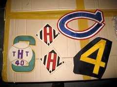
• There was a whole box full of old labels. Some were manufactured in big spools (I regret not getting a photo of that), others in small boxes (ditto). I especially like that Puckmaster design at upper-right.
• Speaking of tags, I was fascinated when I saw this box, which contained assorted size tags and some sort of gadget to apply them, or make them, or something. This was one of many things I meant to go back and investigate more fully, but I kept getting distracted by other things and then the day slipped away from me. So after I got home, I looked on eBay and found this, which indicates that the gadget was actually for applying paper price labels, not cloth tags. Hmmmmm.
• This jersey struck me as unremarkable — until I saw the amazing sleeve patch.
• This was my favorite baseball jersey of the day. Something so simple and nice about that script (which, if you look closely, was rendered in felt over tackle twill — unusual format).
• I didn’t actually like this design all that much, but it was interesting to wear a satin jersey.
• Not sure about the story here, but Scott thinks those are Hebrew letters on the chest patch.
• It was amazing to see this box of hand-drawn, hand-cut lettering templates, some of which were accompanied by a finished sample. Here’s another example, with lots of handwritten annotations on the template.
• There were some very interesting basketball shorts. This set had built-in hip pads; this set was made from a flecked wool fabric (sort of like a Donegal tweed) and an unusual back closure; and this one had an unusually thick belt.
• I hadn’t realized that S&D also made gloves.
• It’s not clear if this was a company team or a S&D-sponsored team. Either way, very cool.
• Highlight of the day: I spent more than an hour poring over hundreds of typed index cards, some of them dating back to the 1920s. Each one described the design, construction, and materials for a specific S&D product, sometimes with accompanying sketches (I especially like the little sketches for these zippered football and basketball carrying cases). This one was so detailed that it continued onto a second card. I photographed over 30 of these, all of which can be viewed in this slideshow.
• There was a big pad of order sheets. Here’s a closer look.
And just to bring things full circle, there was one other green/gold item I lusted after: this vintage loveseat in the lobby. They better have it nailed down next time I’m there!
Late-breaking research request: I’m putting together a Uni Watch glossary. The terms I’ve included so far are here. If you have suggestions for other terms that should be included, please contact me asap. Thanks.
Raffle Reminder: I’m currently raffling off a cashmere soccer scarf. For details, look here.
Uni Watch News Ticker: Yesterday I linked to this shot of Rogers Hornsby’s son. That prompted Todd Radom to send me a shot of the same kid, eight years earlier. ”¦ Good rundown of ugly basketball jerseys here (with thanks to long-lost Kenn Tomasch). ”¦ The Cavs awarded framed jerseys to ESPN’s Tom Jackson and members of the O’Jays on Sunday night (with thanks to Corey Buck). ”¦ “I watched nearly every second of the Cavs/Pistons game on Sunday night, waiting for the moment where Wally Z. had to guard Rip Hamilton mask-to-mask,” says Kenny Crookston. “Has this ever happened before?” ”¦ Our latest DIYer is Brad Spence, who created a Ravens onesie for his infant son, Palmer. “Yes, as a true Baltimore fan, I was able to talk my wife into allowing me to name my first-born after Jim Palmer,” he says. “I used a plain white onesie, some iron-on transfer paper for our printer, and got the logos off of the internet.” ”¦ Alex Minnehan noticed some very odd shoulder seams on this Bills jersey. ”¦ Speaking of the Bills, I can’t say I’m in love with the Bills’ 50th-anniversary patch. Where did they get that “5”? Woof. ”¦ This is a really bad idea. But the real question, of course, is whether the apostrophe is properly oriented (with thanks to Joe Hilseberg). ”¦ Greg Scholand was going through a box of his old childhood stuff and came across this book, which has a page devoted to each team. Not only does the Browns page feature the phantom CB logo, but there are several illos of Lou the Toe, all of which show him wearing the logo that never was. ”¦ New powder blue alt jersey for UNC baseball (with thanks to Chris Warfford). ”¦ Speaking of college baseball, several new uni designs for Mississippi State, too. And as long as we’re talking about the Bulldogs, the football team is going back to a maroon helmet (with thanks to Demi Brown). ”¦ Yesterday’s note about MLB players pulling their pant cuffs down over over their heels prompted this note from Tod Tompkins: “I’m a uniform manufacturer, so it’s my job to pay attention to fads and designs. At a middle school game last year, I noticed almost the entire team pulling their pants down over their heels. I had to inspect it closer, so after the game I asked one of the kids to show me his cleat. The kids all pulled the pant bottoms down over the last heel spike, and poked it through the pants. It made a hole in the pant, but at least it stayed. I asked him why he did it and he said, ‘Cuz it looks tight!’ Since then, we have developed several different versions for coaches, so the kids don’t rip their pants. The obvious one is the Clemson cut with outer stirrup. We actually make the stirrup the same color as the shoe to cover it up better. Then we offer an inside stirrup that goes around the foot like a traditional sock that you can’t see from the outside.” I’m sure I don’t have to tell everyone how appalling I find all of this. Tod, you’re what’s known in the trade as an enabler. ”¦ With the auto biz in the crapper, Buick has ended its sponsorship deal with Tiger Woods. This means, of course, that Woods might end up on skid row, but fortunately another company was willing to step into the breach. Phew. ”¦ In a move that strikes me as a rather unusual marketing partnership, the new Pottery Barn Kids catalog features a bunch of MLB-licensed bedding (additional pics here, here, and here). I suppose you could say that this is just the spiritual heir of the old Sears catalog stuff, except that Sears was for working-class families and Pottery Barn is for yuppies, all of which probably says more about the current state of sports marketing than anything I could come up with on my own (with thanks to James Huening). ”¦ Cool vintage 7-Up baseball uni available here. ”¦ Reprinted from last night’s comments: Really fun time-lapse video of the Tigers’ Photo Day photo sessions here. ”¦ Two weeks ago, I wrote, “I don’t much care for the new Tropicana OJ package graphics, but I admit I’m a total sucker for the new navel orange-shaped plastic cap.” Now, sure enough, they’re bringing back the old packaging. And here’s a small note, buried deep in the article: “One aspect of the new Tropicana packaging is being salvaged: plastic caps for the cartons ”¦ that are shaped and colored like oranges.” I’m happy to take full credit for this corporate turnabout. ”¦ Here’s something that really drives home the point about players not wearing their regular jerseys for Photo Day shoot: Several of the Giants posed in a Russell jersey (good spot by Michael Korczynski). ”¦ Jesus Christ, Jerry, tuck in your jersey. ”¦ Here’s an excellent view of both of the Twins’ sleeve patches for this season (neither of which is appearing on their BP jersey, by the way). ”¦ New road uniforms for the Orix Buffaloes (thanks, Jeremy). ”¦ ”¦ Lookie what I just won! ”¦ Five MLB teams have somehow neglected to wring every last cent out of St. Paddy’s Day (with thanks to Brinke Guthrie). … Terry Proctor sent along some amazing pics of the Livonia (NY) High School basketball team, circa 1973: “The team is wearing Russell Athletic uniforms in the Atlanta Hawks style,” he writes. “How do you like the stirrups? Stirrups were still very popular with basketball players until the early 1980s. That’s about the time when Patrick Ewing started with the goddamn T-shirt-under-the-jersey look and basketball has been going downhill ever since.” For the record, I don’t much care for stirrups on the basketball court. Looks too much like a rip-off of baseball, plus it doesn’t make any sense: Nobody’s gonna get spiked playing basketball, so why do you need a stirrup over a sani? Why not just wear colored tube socks?
Phantom Browns logo…
Is it possible that the logo is just something that the authors of the book threw on the helmet so it wouldn’t be blank.
I remember back in the day it was not uncommon for the TV graphics people to put a lion logo on Penn State’s helemet for what I presume to be asthetic reasons, authenticity be damned.
Maybe this is kind of the same thing.
I’d be willing to bet that the two characters inside the ten-pointed star (a.k.a. a “decagram”) are Chinese or Japanese instead of Hebrew.
The pant-under-the-cleat abomination is frightening. As the head varsity coach of a HS baseball program I appreciate now more than ever the ‘power’ I have to mandate that ALL pants are cuffed at the knee. We are the only program to do so in the state of Delaware and the only to wear stirrups and sanitaries as well. This applies to every athlete, 9th grade to 12th, as well as my entire coaching staff.
did this remind anyone else of this?
…not even a little bit? ;)
JC (on S&D hockey jersey) = Junior College?
The Rhode Island sweater with the strange initials (JC) is probably an old Community College of RI (CCRI) sweater, formerly known as the Rhode Island Junior College (RIJC)
[quote comment=”316130″]The pant-under-the-cleat abomination is frightening. As the head varsity coach of a HS baseball program I appreciate now more than ever the ‘power’ I have to mandate that ALL pants are cuffed at the knee. We are the only program to do so in the state of Delaware and the only to wear stirrups and sanitaries as well. This applies to every athlete, 9th grade to 12th, as well as my entire coaching staff.[/quote]
There may be hope yet, I salute you!
No way are those Hebrew letters.
[quote comment=”316135″][quote comment=”316130″]The pant-under-the-cleat abomination is frightening. As the head varsity coach of a HS baseball program I appreciate now more than ever the ‘power’ I have to mandate that ALL pants are cuffed at the knee. We are the only program to do so in the state of Delaware and the only to wear stirrups and sanitaries as well. This applies to every athlete, 9th grade to 12th, as well as my entire coaching staff.[/quote]
There may be hope yet, I salute you![/quote]
i second that! keep up the GREAT work!!!
Paul, I liked seeing all the items from Stall & Dean, but why didn’t you try on the basketball shorts like you did the jerseys? LOL.
Great entry today.
[quote comment=”316131″]did link remind anyone else of link?
…not even a little bit? ;)[/quote]
What was that jacket? I used to live in Bethel Park, PA (I assume there is more than one) but their colors are traditionally black and orange.
Considering it dates back to when LITHIUM was an ingredient in 7-Up, “7-Uppers” seems very appropriate on that jersey.
I’m guessing Korean on the jersey writing.
My wife and I are totally not yuppies, but we do occasionally shop at Pottery Barn for Kids as our daughter loves some of the crap they sell. Last year, they had some friggin’ sweet Batman, Superman, Spiderman, and Star Wars bed room theme items. The MLB theme stuff will be bought and placed in storage till my daughter is old enough to respect baseball…or we have boys.
Question about the St Patty’s MLB stuff: Is there a list of the teams that will be wearing green this year? I see the listing of teams on that MLB shop page, but which teams are actually wearing green during a game this year?
No green Nationals Jerseys? Finally, a reason to be proud of my team! I blame it on the anti-Notre Dame sentiment held by the local Navy Fans. Or maybe just incompetant marketing. Either way.
We Nats fans reserve our “wearin’ of the green” for our eco-friendly ballpark event last year that went over like a fart in church.
Hello,
The letters on the patch are Japanese, and they mean “White River”.
There is currently a “White River High School” near Seattle in the White River Valley. That would make sense in terms of areas with a Japanese population in the mid 1900s. (According to the White River Valley Museum, Japanese influence began being seen in the area in the early 20th century.)
I don’t know how old that jersey is, or whether Stall & Dean worked with teams as far away from Massachsetts as Seattle, but you could be looking at something from around the internment era, which would certainly be fascinating.
[quote comment=”316131″]did link remind anyone else of link?
…not even a little bit? ;)[/quote]
I actually first thought of link
link? The name’s changed, and the colors are slightly different now, but I think it’s possible…
[quote comment=”316147″][quote comment=”316131″]did link remind anyone else of link?
…not even a little bit? ;)[/quote]
I actually first thought of link[/quote]
I don’t know about what exactly it looks like. But to me, it seems like it’s more appropriate for this link.
Oops!
Not the internment era…the Japanese were not even able to speak Japanese in the camps, let alone wear a uniform with Japanese on it. It could be from the so-called “Golden Age” of Japanese baseball in the US…the 1920s and 30s. There were entire leagues of Japanese-American teams set up during that era.
There were some beautiful uniforms, and you’ll be happy to know that they always wore their socks high ; )
I’ll try to actually remember all the facts before I post in the future. : )
Here are two pictures of the uniform from the 1930
link
link
I am still amazed at what you can find on the internet.
Admittedly, I didn’t page through the comments yesterday, so if this has been mentioned, I apologie. But…speaking of the Russell jerseys, does anyone else realize the Phillies and the Giants were sporting the old 59/50s with the gray underbill in their team photos?
[quote comment=”316151″]
I’ll try to actually remember all the facts before I post in the future. : )[/quote]
You do remember that you’re posting on the Internet, right? ;)
[quote]I am still amazed at what you can find on the internet.[/quote]
heh
Not that I really want to extend the commentary from yesterday about the replica/authentic deal. But I thought of something last night I didn’t What about the college teams who use duplicate numbers? Essentially they made the team, deserve their own number. If, like someone said yesterday, Joe Schmoe doesn’t make the big leagues, he didn’t earn anything but an invite. If a QB gets invited to try out for a NFL team and he gets cut, they take his stuff out of his locker when he’s getting cut.
Clearly, link are not yet behind us.
[quote comment=”316131″]did link remind anyone else of link?
…not even a little bit? ;)[/quote]
The latter only reminds me of link
In the pic of Edgar Renteria, he has a gray underbill and is holding Ivan Ochoa’s bat.
link
I know this was discussed yesterday but I would think they would give the players a plain bat or just a bat that says Pro Model.
While I agree that stirrups have no place in basketball, I think the idea that their use in baseball had anything to do with players being spiked is a bit misguided.
I’m putting together a Uni Watch glossary. The terms I’ve included so far are link. If you have suggestions for other terms that should be included, please link asap. Thanks.
[quote comment=”316160″]
While I agree that stirrups have no place in basketball, I think the idea that their use in baseball had anything to do with players being spiked is a bit misguided.[/quote]
Nope, that’s the reason. way back when, the dyes weren’t colorfast and would come out of the sock, and were poisonous. If you got spiked and had the sock right next to your skin, the dye got into your blood, which could make you rather sick. So they wore plain white socks underneath. But then you’re wearing two socks and your foot is sliding around, so you cut off the foot of the colored sock.
That’s how stirrups developed. To give the illusion of a colored sock when it wasn’t quite safe to just wear one.
And on a completely different note, are we going to lynch link because he’s not wearing the correct jersey? It doesn’t even have a NOB!
[quote comment=”316160″]
While I agree that stirrups have no place in basketball, I think the idea that their use in baseball had anything to do with players being spiked is a bit misguided.[/quote]
Oh, but they did! Quoting link:
Q.E.D.!
Not sure if this has been previously been posted, but Paul has been quoted on the Wiki site for the new Met’s “patch.”
link
[quote comment=”316162″]
And on a completely different note, are we going to lynch link because he’s not wearing the correct jersey? It doesn’t even have a NOB![/quote]
The Giants are going with NOBs on their home jerseys this year?
[quote comment=”316164″]Not sure if this has been previously been posted, but Paul has been quoted on the Wiki site for the new Met’s “patch.”
link
And why not? The man’s an authority. :D
in regard to paul’s call for glossary items, he and i thought it’d actually be a good idea to post them RIGHT IN THE COMMENTS
here’s what paul is looking for:
I want terms that we’ve actually used in discussions, along with terms used in the industry. “Retro” is definitely too mainstream to include, but “throwback” will be included. Frocks for Jocks might be too slang-ish — I never use it anymore myself…. I think the list I linked to is a pretty good start. But I’m sure I overlooked a few terms……
The glossary will be included as a section in my next ESPN column, which I think is running tomorrow, so I’m way late in asking for contributions on this one. My hope is that I’ll just keep updating the glossary even after it’s published (and/or republish it on the blog), so it’ll be a “living document” and all that…..
so any glossary suggestions, post ’em here
I was never sure why they were called sanitaries until reading the above, so why not put that in the glossary?
Paul, thanks for the look into their archives. I have to say that I’m not really that impressed with their offerings now. It’s all old-ish logos and words plastered on to very contemporary templates.
Not to mention that they almost ruined Ebbets Field Flannels during their brief ownership.
[quote comment=”316165″][quote comment=”316162″]
And on a completely different note, are we going to lynch link because he’s not wearing the correct jersey? It doesn’t even have a NOB![/quote]
The Giants are going with NOBs on their home jerseys this year?[/quote]
Thank goodness you don’t work for the golf channel…link
[quote comment=”316168″]I was never sure why they were called sanitaries until reading the above, so why not put that in the glossary?[/quote]
Amen, I actually looked on Paul’s list to see if they were already on there because I never hear anyone else refer to them as sanitaries.
Paul, you should probably put “breezers” in that list.
Anyone know how to get in touch with Rob Ullman? I couldn’t find it after (admittedly quickly) searching his site and Uni Watch.
Thanks!
Is system of dress a Nike term or a uniwatch term?
[quote comment=”316173″]Anyone know how to get in touch with Rob Ullman? I couldn’t find it after (admittedly quickly) searching his site and Uni Watch.
Thanks![/quote]
Try this:
rob at robullman dot com
[quote comment=”316175″][quote comment=”316173″]Anyone know how to get in touch with Rob Ullman? I couldn’t find it after (admittedly quickly) searching his site and Uni Watch.
Thanks![/quote]
Try this:
rob at robullman dot com[/quote]
Nope — this:
link
Paul – congrats on your E-bay win – I have a similar set (I think its from the 73-74 season – there’s no Scouts or Caps on it)- bedspread and curtains!
Interesting that your set doesn’t appear to have a Capitals logo – but just says “Washington”
[quote comment=”316177″]Paul – congrats on your E-bay win – I have a similar set (I think its from the 73-74 season – there’s no Scouts or Caps on it)- bedspread and curtains!
Interesting that your set doesn’t appear to have a Capitals logo – but just says “Washington”[/quote]
Looks like you’re not “beerframeguy” on eBay anymore. Because that winner’s eBay alias starts with M and ends in R…
[quote comment=”316178″][quote comment=”316177″]Paul – congrats on your E-bay win – I have a similar set (I think its from the 73-74 season – there’s no Scouts or Caps on it)- bedspread and curtains!
Interesting that your set doesn’t appear to have a Capitals logo – but just says “Washington”[/quote]
Looks like you’re not “beerframeguy” on eBay anymore. Because that winner’s eBay alias starts with M and ends in R…[/quote]
I think the names are masked until payment is finalized (or something like that).
I guess I should have just googled “system of dress.” I will now light myself on fire.
did anyone notice in the “worst basketball jerseys ever” post in the ticker, it looks like the #3 1984 denver nuggets jersey is misspelled? maybe its just me.
In regards to the “5” on the Buffalo patch, I believe that it is based on the “5” font that was used on the buffalo nickels…compare the five in the date here to the one on the logo:
link
[quote comment=”316163″][quote comment=”316160″]
While I agree that stirrups have no place in basketball, I think the idea that their use in baseball had anything to do with players being spiked is a bit misguided.[/quote]
Oh, but they did! Quoting link:
Q.E.D.![/quote]
Spiking and blisters. Yessir, those were the reasons for sanitaries. Blisters the main issue in basketball, of course.
And was easier to wash and dry sanitaries than the heavy wool stirrups of early baseball, which took forever to line dry. If they were a little dirty and dusty–or even muddy—often could just let them dry and shake them out. The part that got stinky was where the santiaries were.
—Ricko
Terry Proctor’s quote about the t-shirts under the jerseys made me laugh, because I’ve always hated that look. But one good thing that’s come from the SoD uniforms is the trend of tighter, form-fitting undershirts that aren’t all baggy and awkward. It’s not just Nike, a lot of the adidas schools are wearing them, too. You still see the regular t-shirts, but they’re far less common I think.
link
[quote comment=”316131″]did link remind anyone else of link?
…not even a little bit? ;)[/quote]
More like these:
link
BTW, MSU’s new head coach was one of my coaches in college:
link
1)i have 5 new favourite baseball teams
2)todd tompkins, listen carefully, no. no, no, no.
3)now i observe stirrup friday, and wear a pair every week, so i obviously like the stirrup. but the truth is, stirrups are no longer needed, and miserably uncomfortable, ask me every friday. as we all know, the reason they were worn, toxic dye, hence the “sanitary” underneath, and therefore, now useless. why bring it up? for the above reason, they are no more or less stupid in basketball. but paul knows this, and is always just waxing nostalgic for their reappearance in baseball, and i dig that, i really do, ask me on a friday. but if teams just wore a right proper stripey sock, i would be ecstatic. one last point on the stirrup, if tom is somewhat, shall i say, evil for pandering to the chaps who want to cleat their pantaloons, then frank robinson is also evil for splitting his stirrup, and elongating it for fashion, and and george hendrick is just plain satin for taking stirrups to new heights. i have never said this on the comments before, even though i have always wanted to, but a right proper stirrup shows very little sanitary anyway, like the reds & yanks of the 70’s. god i hate those teams, but they wore a nifty hose.
The front jersey number on a hockey jersey is not some new revelation that the Sabres invented with the introduction of the BuffaSlug jersey. Even in Buffalo in the 70’s the Buffalo Norseman had a front jersey number.
link
Just like the shoulder logo of the B with the sword through it the Sabres poached the idea from some other team and claimed it as there own.
[quote comment=”316161″]I’m putting together a Uni Watch glossary. The terms I’ve included so far are link. If you have suggestions for other terms that should be included, please link asap. Thanks.[/quote]
douchebag!
btw, i know satan, typing faster then i was thinking. i am obviously not that bright, so my comment should be ignored.
[quote comment=”316187″]The front jersey number on a hockey jersey is not some new revelation that the Sabres invented with the introduction of the BuffaSlug jersey. Even in Buffalo in the 70’s the Buffalo Norseman had a front jersey number.
link
Just like the shoulder logo of the B with the sword through it the Sabres poached the idea from some other team and claimed it as there own.[/quote]
And as clearly shown at the Stall & Dean attic, front jersey numbers existed at least sporadically, many years ago. Doesn’t mean it’s a good aesthetic choice. I still hate the idea because it clutters the jersey front, and will be problematic when certain teams reach the Stanley Cup Finals.
As an introductory Uni Watch article once stated, Uni Watch isn’t for a return to old designs. Just for the advancement of good designs, which sometimes are inexplicably left behind. Houston Astros’ tequila sunrises vs San Diego Chargers’ old powder blue tops. One is a beautiful looking design, while the other is just a throwback that arguably should never be new again. Which one is which?
[quote] front jersey numbers existed at least sporadically, many years ago. Doesn’t mean it’s a good aesthetic choice. I still hate the idea because it clutters the jersey front, and will be problematic when certain teams reach the Stanley Cup Finals.[/quote]
it won’t be problematic here
[quote comment=”316188″][quote comment=”316161″]I’m putting together a Uni Watch glossary. The terms I’ve included so far are link. If you have suggestions for other terms that should be included, please link asap. Thanks.[/quote]
douchebag![/quote]
Now that I read that back, I wasn’t calling you a douchebag, I meant that should be added to the glossary
[quote comment=”316191″][quote] front jersey numbers existed at least sporadically, many years ago. Doesn’t mean it’s a good aesthetic choice. I still hate the idea because it clutters the jersey front, and will be problematic when certain teams reach the Stanley Cup Finals.[/quote]
it won’t be link[/quote]
Hey, I sort of recognize that guy…didn’t we have a goalie that looked like that at some point? Crazy guy, never stayed in the crease. Whatever happened to him?
(joey mac, go away)
[quote comment=”316191″][quote] front jersey numbers existed at least sporadically, many years ago. Doesn’t mean it’s a good aesthetic choice. I still hate the idea because it clutters the jersey front, and will be problematic when certain teams reach the Stanley Cup Finals.[/quote]
it won’t be link[/quote]
It may have been if you guys had kept Okinen and Luongo…Mark Parrish and Oleg Kvasha…..yeah….classic Islanders self destruct
Ah, the Vikings apparently have a deal made for Sage (a.k.a., the ball-spewing human helicopter) Rosenfels, changing his uni from Battle Red to Purple.
May I just say this about every aspect of the previous paragraph: Oh, be still my heart.
However, the depth chart could be interesting if it were to read: Rosenfels Jackson Booty (yeah, HAS anybody seen LaToya lately?)
—Ricko
Are the Twins kidding? Wouldn’t it be more appropriate to have the “Carl” patch over the dome in a more “heavenly” position? It just seem wrong to memorialize a person and then have the patch located under a building in a more “hellish” location.
Try to picture the patches reversed with the “Carl” blimp floating peacefully over the Metrodome and see if that just doesn’t feel more “right” and appropriate.
OK, insert “That old miser is probably in hell and they did it on purpose” comments here, but I still think it would be more appropriate and just plain look better if the patches were reversed. It had to be a conscious on the Twins part to do it that way, because I would have expected that the jerseys would have been done up with the Metrodome patch already on them in the lower position in advance of the season prior to Pohlad’s passing.
Paul, was the question ever asked as to why Stall & Dean changed their marketing? They used to sell some nice stuff.
[quote comment=”316196″]Are the Twins kidding? Wouldn’t it be more appropriate to have the “Carl” patch over the dome in a more “heavenly” position? It just seem wrong to memorialize a person and then have the patch located under a building in a more “hellish” location.[/quote]
holy crap, that’s an excellent point jeff
[quote comment=”316198″][quote comment=”316196″]Are the Twins kidding? Wouldn’t it be more appropriate to have the “Carl” patch over the dome in a more “heavenly” position? It just seem wrong to memorialize a person and then have the patch located under a building in a more “hellish” location.[/quote]
holy crap, that’s an excellent point jeff[/quote]
Why not put one patch on each sleeve? Check that, they have the Twin Cities patch on the other sleeve. Guess they’ll just have to live with the patch clutter! Any other team play with 3 patches before?
Good thing I grabbed link from a while back, because it just may become relevant again.
Stephon Marbury…putting the “creep” in “logo creep,” and now finding himself with an out-of-date branding. Way to go, dude.
Hey!
Being a former equipment manager, a uniform expert, a football guy and an artist.
Just wanted people to see what McFarlane is putting out
now they got Walter Payton’s mask wrong-but they gave Archie Manning a mask that was not even invented yet-the reverse strap!
I look at his stuff with a fine tooth comb-but this is a tad ridiculous!
-Stoops
link
MLB licensed bedding has been available from PBTeen for while now. I guess they have just made the designs more kid oriented now.
another untucked jersey: U. of Iowa, 1987.
glossary contributions:
batwing shoulders
pillbox hat
edge
alternate
wordmark
The index cards slide show broke my heart.
What a find.
Who was this man, this portly, unassuming fellow in his late thirties, with slicked back, thinning hair and a slight limp in his gait, married to a fine woman, the father of a ten year old boy who didn’t much like sports, who came in every day and carefully slid those index cards into that tempermental typewriter and recorded the essentials behind the merchandise? Diligently, one key at a time.
the Cleveland Browns history essay in that Punt Pass and Kick book has a big time error. The Browns did not start out as the Cleveland Rams. The Browns have always been the Browns, the Rams are a separate franchise that started in Cleveland then moved to Los Angeles and St. Louis.
The Houston Dynamo are wearing a grey right sleeve band tonight in honor of Stuart Holden’s father, who passed away.
I’m not sure if I have ever seen a non-black memorial arm band before…the gray matches the squad’s orange/gray/white color scheme.
[quote comment=”316187″]The front jersey number on a hockey jersey is not some new revelation that the Sabres invented with the introduction of the BuffaSlug jersey. Even in Buffalo in the 70’s the Buffalo Norseman had a front jersey number.
link
Just like the shoulder logo of the B with the sword through it the Sabres poached the idea from some other team and claimed it as there own.[/quote]
after seeing that, do you know where they put the captain’s “C”. On the non-traditional right side? (players right)
Term for glossary: fight strap
Don’t know if anyone saw this but SI.com had a photo essay on the NHL goalie masks. 61 different masks.
link
[quote comment=”316176″][quote comment=”316175″][quote comment=”316173″]Anyone know how to get in touch with Rob Ullman? I couldn’t find it after (admittedly quickly) searching his site and Uni Watch.
Thanks![/quote]
Try this:
rob at robullman dot com[/quote]
Nope — this:
link
Paul and Mike:
Thanks to both of you!
Hey all, I’m a student at the University of Arizona, and a self-professed Uni Watch geek. The college baseball season’s coming up, and I’m pretty excited about it. I’d really like to get my hands on an Arizona Wildcats baseball jersey. Unfortunately, the only place it seems I can get one is from eBay (which never seems to have my size, and they always look like cheap knock-offs). Anyone know a legit place to get collegiate baseball jerseys, current or throwback?
I know a DIY version wouldn’t look bad, but to be honest, I’m not really into it. Sorry, fellas.
Glossary: Pedro Porthole
Speaking of Mississippi State – has anyone heard if they are going to re-design their football uniforms to go along with the helmet?
[quote comment=”316199″]Why not put one patch on each sleeve? Check that, they have the Twin Cities patch on the other sleeve. Guess they’ll just have to live with the patch clutter! Any other team play with 3 patches before?[/quote]
Yea, the Twins!
link
In 2000 when Calvin Griffith passed away, the Twins had their 40th anniversary patch on the right sleeve and put the “CRG” initials over the team logo on the left, similar to the Cubs, who memorialized Jack Brickhouse with the “Hey Hey” patch over the team logo while the Harry Caray patch was on the other.
link
don’t mean to beat a dead horse, but that’s definitely not Hebrew. The letter on the right could be construed as a Tav (T) but its the one on the left that gives it away. It could be a similar semitic language though.
[quote comment=”316291″]don’t mean to beat a dead horse, but that’s definitely not Hebrew. The letter on the right could be construed as a Tav (T) but its the one on the left that gives it away. It could be a similar semitic language though.[/quote]
I instantly thought it was Japanese or Chinese. In Japanese, it reads “Shiro kawa” right to left — White river.
the only two teams that should be allowed to sell st. patricks day gear is the White Sox and the Red Sox… The Chicago Southside Irish are a huge part of the white sox fanbase and Boston is a very Irish dominant town. They both also wear Green jerseys or green pinstripe jerseys… i dont know the specifics of Boston’s green jerseys and when they wear them but i know they do and the White Sox have been doing the halfway to st. patricks day since . and even though Paul doesn’t like it, the fans here love it and it is one of the best games to go to, and it sells out almost every year. I know i’m biased having been born and raised on the Southside of Chicago, but name me another town that celebrates St. Patty’s day like Chicago or Boston. (i know Rolla Missouri does St. Patys day up too) we have the Southside Irish Parade and Gaelic Fest plus the big day which is always raucous on the southside. i don’t know but it always gets me riled up when i see a Cardinals green hat or an astros or any team but those two.
sorry i didnt mean the since after halfway to st patricks day