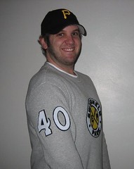
Another day, another DIY project, this time from longtime contributor Ryan Connelly. Here’s his story:
I grew up in Swisshelm Park, within the Pittsburgh city limits, and the bus that ran through my neighborhood was called the “68G Swisshelm Park Express.” So whenever I need a team name for a fantasy league, I call it the Swisshelm Express. I recently got inspired to create my own DIY Swisshelm Express jersey.
I started by creating a quick, simple logo for an old-school-looking hockey jersey. I had to keep it simple because I’d be cutting it out of felt.
Once I had the basic design, I cut it out, glued it together and had it cross-stitched.
Next, I had to design numbers. I always liked UCLA’s old number font, so I traced out my favorite number in AutoCAD. I printed out the tracings on 8.5 x 11 paper, cut them out as templates, traced them backwards onto felt (I did it backwards so any ink from the outline would be facing down instead of up), and then them cut out from there. I used in two layers of felt and made smaller versions for the sleeves. I was going to add a layer of yellow but decided not to. I thought this had an old-school throwback look. Nice and simple, almost like looking at a black-and-white photo.
For the jersey itself, I went with a $15 Gap thermal because it had a “hockey sweater” kind of feel and look. I haven’t sewn on the logo or numbers yet (I’m going to use a straight stitch for the numbers), but here’s how they look positioned on the jersey — front, back, and a close-up of the crest. I could use some advice regarding striping, so if anyone wants to offer suggestions, please send them my way.
I’m also working on a home/dark jersey, which I know you’ll love (I found a thermal at the Gap with lots of stripes!), but I haven’t started it yet. I’m still designing the logo and a shoulder patch.
I’ve gotta say, this increasing tide of DIY projects is one of the more surprising and enjoyable developments in the 10 years I’ve been writing Uni Watch. Who knew all you rough, tough sports fans would be so adept with a needle and thread? Very cool.

Start drafting those stirrup-fetishist personal ads: Yesterday’s inquiry about the possibility of a Uni Watch Classifieds section on the site, primarily as a vehicle for posting job listings, generated a lot of positive response, so we’ll probably go ahead and do it in the near future.
In the interests of fairness, however, I should probably mention that there’s already a sports-oriented jobs web site out there, which I didn’t know about until a few readers mentioned it to me yesterday. I’m no expert on these things, but it’s entirely possible that a dedicated career site read by all sorts of people in the industry might be more useful to you than a fine-print page on a blog (although it’s also possible that the world is big enough for both).
And the subway goes right to their door: Today is Thursday, which means tonight is Thursday night, which means Uni Watch design director Scott M.X. Turner will be hosting his weekly Thursday-night Pub Quiz event at Rocky Sullivan’s in Red Hook. You know what to do.
Uni Watch News Ticker: Get this: Spirit Airlines flight attendants are complaining about logo creep! (Big thanks to Darren Rusakiewicz). ”¦ Soccer note from Josh Williams, who writes: “Tuesday night Albion played away at Leicester City, and the referee thought that Albion’s away shirt (yellow and dark blue stripes) was too similar in colour to Leicester’s shirt (all blue), so Albion was forced to use Leicester’s away shirt (yellow). Most of the numbers were correct, but there were no NOBs. Albion matched the shirts with their own shorts and socks.” Further details here, and photos here. ”¦ Ryan McDevitt notes that Italian goalkeeper Gianluigi Buffon recently wore “a particularly heinous blue raincoat” under his jersey. ”¦ Reprinted from yesterday’s comments: Chicks with guns are always cool. That’s the 1925 Drexel Institute girls’ rifle team. ”¦ Before he became America’s most entertaining political train-wreck, Rod Blagojevich fought in the Golden Gloves (nice find by James Huening). ”¦ Wayne Koehler sent along some old pics from the Florida Southern College archives, including shots of the 1957 and 1973 soccer teams, the 1924 football team, and the 1929 women’s hoops team (I love those sashes). ”¦ In a radio interview yesterday, Jonathan Ogden said he wore the same pair of shorts under his uniform pants for his entire 12-year career. “I washed them, of course,” he quickly added. ”¦ Here’s another shot of the Packers basketball team. “James Jones apparently hasn’t gotten the memo that Kobe’s tights are now both passe and verboten,” says the Rev. Nørb. ”¦ Chris Speakman, the man behind Sports Propaganda (one of our advertisers, don’tcha know), is the subject of a small profile here. Also: Speakman’s work is screen-printed, which is a process that could come in handy for you DIY types. There’s a good tutorial here. ”¦ The NC State hoops team added a Kay Yow memorial patch the other night. ”¦ Gee, what company do you think makes the Maldives men’s volleyball uniforms? (Thanks, Jeremy.) ”¦ Nice to see that some unemployed folks are making good use of their new free time. ”¦ Hey, these are even better than Huddles (with thanks to Stephen Krajewski). ”¦ A few days ago I linked to a story about a Steelers-themed bar mitzvah. Now Matt Hiett has topped that by sending along some shots of a Steelers-themed funeral (additional pics here and here). ”¦ Tremendous assortment of game-worn minor league hockey jerseys on display here. ”¦ Coupla great pieces from Mike Hersh‘s collection: First, here’s an old newsletter from NFL Enterprises, one of the league’s early licensing ventures. And did you know that there used to be a Dallas Texans hockey team? Love the footwear. … Uniform change, of sorts, at the White House. … In case you missed it yesterday afternoon, here‘s my latest ESPN column. I’ll have another one tomorrow.
I came across this photo yesterday, and found it jarring. I had somehow forgotten that the Chargers foregone the lightning bolts on their pants for a while. They just don’t look right without them.
link
For as much as we dog Nike (rightfully so, oftentimes), I wanted to share something cool they did. They ran a full page ad in the Raleigh News & Observer as a tribute to Kay Yow (NCSU women’s coach).
Basically, it’s entitled S.K.Y. with a drawing of her. Then for 3 paragraphs it eloquently lists her accomplishments in reaching the “sky” … her initials, BTW.
There’s a pink ribbon and a very, very small Nike swoosh at the bottom. Very tasteful and well done.
Perfect, Ryan, absolutely perfect. Creative, original, enterprising, nostalgic (recognizing a great pairing of words from childhood and keeping it alive) and real (using it for rec or intramual competition purposes).
Nice to know all these years when I’ve been painting baseball and football pants stripes, altering stirrups, changing shoe colors and creating my own hats and jerseys I wasn’t alone.
Seriously, congrats to all the DIYers who’ve demonstrated their work here. You’re showing it’s possible to combine inventiveness and imagination with being a jock. It’s good for everyone to be reminded that being a fan and/or a lifelong player is supposed to be fun…and that “fun” can be defined differently for each of us.
When I first started doing my DIY stuff and having my own “throwback” days I think the guys I played with (and against) thought I was weird. Now they say things like, “This would really be boring without you” or “St. Louis Browns, right?”
We’re learning the same thing here. Generally, guys don’t think about stuff like that…until they’ve been exposed to it. Once they have been, though, sooner or later the charm, history and quintessential kidhood of it comes through and they “get it”.
—Ricko
props to ryan on a spectacular project…looking forward to seeing the finished product
gotta agree with paul in that this is a fascinating trend (and one which im no longer reticent to try, tho fearful of the results)
and after seeing first-hand powers’ DIY job, i realize that if he can do it, well…anyone can (granted, the results may not be the same)
great work!
Having worked at the White House for two years, I can say I am not a fan of the no coats and more casual dress code in the WW.
I would guess Adidas?
I also LOVE how the Dallas Texans are wearing shoes with their uniforms outside the bus.
Great article on the long pants basketball teams. I knew about girls teams wearing skirst sometimes but knew nothing about the boys teams doing something similar.
The Steelers-themed Bar Mitzvah and funeral remind me of the Colts-themed wedding from the movie “Diner”, which contains IMO the greatest uni-driven dialogue in any movie. Does anyone know of other movies with this knid of uni-chatter?
[quote comment=”312402″]The Steelers-themed Bar Mitzvah and funeral remind me of the Colts-themed wedding from the movie “Diner”, which contains IMO the greatest uni-driven dialogue in any movie. Does anyone know of other movies with this knid of uni-chatter?[/quote]
“The Fish That Saved Pittsburgh”
Someone who’s smaller than I am should snap this up, pronto:
link
I have to say, this is my favorite DIY shirt/jersey posted so far. I’d pay money for a shirt like that.
Kudos to all who have posted their DIY projects. Very impressive stuff!
There was also a Fort Worth Texans hockey team in the 70s — the Central Hockey League, if I remember correctly.
thanks for the positive feedback on the DIY Swisshelm Express jersey so far! i’ll be sure and send a “finished product” pic in the near future… just have to go pick up some type of ribbon. thanks again, glad you like!!!
Thinking back to the discussion of the Reds’ mascots from a few days ago, check out this alternate version of Mr. Red. The Reds apparently used it a bit in the ’70s to celebrate their lengthy period of success.
link
It shows Mr. Red’s no. 27 at its most visible.
And here is a published version of Rosie Red in earlier lifetime.
link
[quote comment=”312409″]And here is a published version of Rosie Red in earlier lifetime.
link
And note that Mr. Redlegs was then known as “Cincy Red.” Odd.
[quote comment=”312402″]The Steelers-themed Bar Mitzvah and funeral remind me of the Colts-themed wedding from the movie “Diner”, which contains IMO the greatest uni-driven dialogue in any movie. Does anyone know of other movies with this knid of uni-chatter?[/quote]
Pivotal Question o your Prospective Wife …
Prior to the current Baltimore Colts, The City of Baltimore had an original Colts Franchise and lost it …. What where the team colors of the original Baltimore Colts franchise?
(What a Ball-Buster !!!)
HOORAY, the 2009 MLS schedule has been released today. In MLS Uni-news the San Jose Earthquakes have a new shirt sponsor. link
link
Green and White?
Green and gray/silver.
What an excellent DIY project. Love it.
If this awesome trend of DIY-ers continues, I could see a new section or even an entire subset of Uni-Watch dedicated to it.
No screen grab or pics that I could find, but when ESPN did a story on Kay Yow the day after she passed away, they had a pic of her coaching at Elon, and their girls basketball team wore sleeves back then!
i believe Y.A. Tittle was on that version of the Colts.
Elyse got that question right.
You guys have me on the DIY streak. I’m buying an early ’70s Bruins sweater from the link Paul posted the other day and making a link sweater.
Thankfully I’ve got the ’06 Bruins third/throwback to use as a template for the crest and the numbers.
(also working on rebuilding a destroyed Stratocaster, but that’s not really uni-releated)
link
Department of Hockey:
Olie Kolzig is out for the season for the Lightning, and Rick Tocchet says that he’s considering retirement. If so, then his stint with the Lightning, in my mind, qualifies as a uni cameo, because of his long tenure with the Washington Capitals. He’s an interesting subject for this site, since he’s the only player to wear the original Caps red/white/blue, then play with them through the whole blue/black/gold era, and then rock the new red/white/blue last year. We’ll have to stay tuned to see if he hangs up the skates.
Personally, though, I really like “Godzilla” and simply hope that whatever decision he makes is the one that’s best for him and his family. He has long been associated with the charity “Athletes Against Autism” and is a true class act.
The story with the Steeler fan and his funeral is going on four years old – link
[quote comment=”312410″][quote comment=”312409″]And here is a published version of Rosie Red in earlier lifetime.
link
And note that Mr. Redlegs was then known as “Cincy Red.” Odd.[/quote]
I have another version of that pennant,with World Champions on it rather than the “Reds Hot” saying. I believe it is at my parents’ house, I will check this weekend and see if I can get a picture of it.
[quote comment=”312418″]Elyse got that question right.[/quote]
we all know most marriages depend on a firm grasp of football trivia
[quote comment=”312415″]
If this awesome trend of DIY-ers continues, I could see a new section or even an entire subset of Uni-Watch dedicated to it.[/quote]
Yeah, definitely. All of these DIY project posts are filed under GENERAL. It’s gotten to the point that there really needs to be a DIY category.
I didn’t know about the Dallas Texans hockey team. I also didn’t know about a New York Raiders hockey team …
link
[quote comment=”312423″][quote comment=”312418″]Elyse got that question right.[/quote]
we all know most marriages depend on a firm grasp of football trivia[/quote]
Well, the good ones, anyway.
[quote comment=”312425″]I didn’t know about the Dallas Texans hockey team. I also didn’t know about a New York Raiders hockey team …
link
yup…WHA team, played in the garden; in fact, they’re most likely the reason the islanders were awarded a franchise by the NHL
…im sure our WHA historian, sir rick, could tell you all about them
[quote comment=”312425″]I didn’t know about the Dallas Texans hockey team. I also didn’t know about a New York Raiders hockey team …
link
A one-year wonder. Picked royal and orange to follow lead of Knicks and Mets, they did. For second WHA season they became the New York Golden Blades, switching to purple and yellow-gold. You’ll occasionally see things out there mistakenly showing them in royal blue…but it was purple.
How the New York Golden Blades never became the revered historical hockey team on “Will & Grace” is still beyond me.
—Ricko
Want a Golden Blades mousepad?
(I guarantee you it isn’t from 1973)
link
In regards to yesterday’s column, with the all-white long pants/jersey combo…I think there’s something to be said for that, in terms of continuity of the aesthetic athletic form. These unis actually look pretty sleek. Basketball link in tank-style jerseys and shorts, but I personally have played plenty of outdoor games in long pants and it never bothered me.
But maybe I’m just the lone representative of the Uni Watch Skinny-Chicken-Leg, uh, Wing.
Of course, the best thing about the NY Golden Blades (who later became the New Jersey Knights and then the San Diego Mariners) was that they actually wore golden blades: link
interesting take on the texas rangers new lids
[quote comment=”312398″]Having worked at the White House for two years, I can say I am not a fan of the no coats and more casual dress code in the WW.[/quote]
Because, to paraphrase Billy Crystal, “it’s better to look good, than to govern good.”
The Anaheim Ducks identity is horrific.
Interesting DIY snack take
link
Saw it on the SI site
BACON WALLS!!!
[quote comment=”312398″]Having worked at the White House for two years, I can say I am not a fan of the no coats and more casual dress code in the WW.[/quote]
Care to elaborate? I’d be interested in hearing why.
With that Blago picture, his hair still hasn’t changed! *rimshot!*
[quote comment=”312432″]interesting take on the link[/quote]
From the article:
1. The Rangers had to make a special appeal to Major League Baseball to request wearing BLACK shoes. MLB dictates / requires that a team’s shoe color be their dominant uniform color. Also, MLB defines the dominant uniform color as that which applies to 75% of their uniform. Therefore, MLB requires one of their teams colors to be 75% of their uniform from head to toe.
Is this true? If so there are a lot of teams that got special permission to wear black shoes cause the only team I know of that wears spikes that fit that guideline is the A’s.
[quote comment=”312432″]interesting take on the link[/quote]
Oh, joy, now MLB helmets can be as nifty as those flashy speckled bowling balls. Or have some FLAMES, maybe. Ooo, cool. Henry Aaron would have looked SO much better hitting #715 in a helmet painted all over with that feather logo from the jersey sleeves.
Finally, some batting helmets with a little class apparently are just up the road. Can’t wait. At least as cool as the paintings on black velvet that guy sells out of his van at the corner of 38th & Xerxes.
[quote comment=”312438″][quote comment=”312432″]interesting take on the link[/quote]
From the article:
1. The Rangers had to make a special appeal to Major League Baseball to request wearing BLACK shoes. MLB dictates / requires that a team’s shoe color be their dominant uniform color. Also, MLB defines the dominant uniform color as that which applies to 75% of their uniform. Therefore, MLB requires one of their teams colors to be 75% of their uniform from head to toe.
Is this true? If so there are a lot of teams that got special permission to wear black shoes cause the only team I know of that wears spikes that fit that guideline is the A’s.[/quote]
And last time I checked, the Yankees have no black at all in their uniform, save their shoes and the occasional memorial sleeve stripe. That claim cannot be correct.
[quote comment=”312438″][quote comment=”312432″]interesting take on the link[/quote]
From the article:
1. The Rangers had to make a special appeal to Major League Baseball to request wearing BLACK shoes. MLB dictates / requires that a team’s shoe color be their dominant uniform color. Also, MLB defines the dominant uniform color as that which applies to 75% of their uniform. Therefore, MLB requires one of their teams colors to be 75% of their uniform from head to toe.
Is this true? If so there are a lot of teams that got special permission to wear black shoes cause the only team I know of that wears spikes that fit that guideline is the A’s.[/quote]
I imagine they mean other than the basic white or gray jersey and pants. Although it certainly doesn’t make that quite clear.
Paul,
I thought your ESPN article yesterday was great, I certainly had no idea teams wear long pants.
I’m all about Free Exercise, but I found it a little odd that the person you interviewed couldn’t reference the Scripture that supposedly says men must dress “modestly.” What’s more, the girls basketball team wears short skirts, so I found his rationale for the long pants a little silly.
Do you have any sort of stats on the teams that play in long pants records? Or their win/loss record against teams who wear shorts?
Regardless, great piece.
[quote comment=”312436″][quote comment=”312398″]Having worked at the White House for two years, I can say I am not a fan of the no coats and more casual dress code in the WW.[/quote]
Care to elaborate? I’d be interested in hearing why.[/quote]
In my personal opinion, wearing a jacket in the WW and a coat and tie in the Oval Office is a matter of respect to the office of the Presidency. If you want to take your coat off and work, then go into the office next door (Clintons BJ Room) where there are is more privacy. I love the fact President obama roams the WW more than the last President and has a more laid back style. My opinion is not based on this being a Bush thing, but again, a matter of respect for the history of the Presidency.
[quote comment=”312386″][quote]Anyone else notice that for the Bears/Vikings game this year in the HumpDome the Vikes wore semi-throwback uni’s?[/quote]
wait…what?[/quote]Search for a picture of Bernard Berrian scoring on a 99 yard pass play against the Bears in 2008: you’ll see that he’s wearing a uniform that Tarkenton or Foreman would have worn in the Bud Grant era. Today’s Vikes wear a Rollerball-style uniform with curved stripes and contrasting panels on the side of the jersey. (IMO, today’s uniforms look goofy-and the Bears game just confirmed it for me.)
[quote comment=”312389″][quote comment=”312381″][quote comment=”312377″]I hate italicized run-on sentences.
Italics fixed?[/quote]I hate them too- but I’m a HTML idiot.[/quote]
I hope you realize that I was referring to a run-on that I wrote and that I wasn’t criticizing your writing.[/quote]No offense taken friend. :-) I guarantee nobody was more embarrassed than I was when I posted without closing the tag. I was frantically searching for an “edit” button last night.
That picture of Rod Blagovich was one of two published that day. The photographer made a point of saying that Rod was the ONLY fighter there that nigh who made a point to come up to him to request that he take his picture. The other picture from the Tribune that day showed him in the corner, almost posing/smiling/winking at the cameraman.
On the subject of the Sabres uniforms: one more vote for the classics they came into the league with back in about 1970. And should the Super Bowl patches do a much better job of reflecting the host city/franchise? A resounding Yes.
I have an idea, if you like it then you can take it if not you can send it right back, instead of a job site why not ad a DIY section where people can share their creations with the rest of us
[quote comment=”312442″]Paul,
I thought your ESPN article yesterday was great, I certainly had no idea teams wear long pants.
I’m all about Free Exercise, but I found it a little odd that the person you interviewed couldn’t reference the Scripture that supposedly says men must dress “modestly.” What’s more, the girls basketball team wears short skirts, so I found his rationale for the long pants a little silly.
Do you have any sort of stats on the teams that play in long pants records? Or their win/loss record against teams who wear shorts?
Regardless, great piece.[/quote]
I agree, great stuff, but the puzzling part for me was how come you did not do the voice over on the video piece?
[quote comment=”312440″][quote comment=”312438″][quote comment=”312432″]interesting take on the link[/quote]
From the article:
1. The Rangers had to make a special appeal to Major League Baseball to request wearing BLACK shoes. MLB dictates / requires that a team’s shoe color be their dominant uniform color. Also, MLB defines the dominant uniform color as that which applies to 75% of their uniform. Therefore, MLB requires one of their teams colors to be 75% of their uniform from head to toe.
Is this true? If so there are a lot of teams that got special permission to wear black shoes cause the only team I know of that wears spikes that fit that guideline is the A’s.[/quote]
And last time I checked, the Yankees have no black at all in their uniform, save their shoes and the occasional memorial sleeve stripe. That claim cannot be correct.[/quote]
That is exactly my point. The only teams with black as a primary color are the Rockies,the Giants and if you want to count them the Mets, but only the A’s wear white spikes.
[quote comment=”312439″][quote comment=”312432″]interesting take on the link[/quote]
Oh, joy, now MLB helmets can be as nifty as those flashy speckled bowling balls. Or have some FLAMES, maybe. Ooo, cool. Henry Aaron would have looked SO much better hitting #715 in a helmet painted all over with that feather logo from the jersey sleeves.
Finally, some batting helmets with a little class apparently are just up the road. Can’t wait. At least as cool as the paintings on black velvet that guy sells out of his van at the corner of 38th & Xerxes.[/quote]Why does MLB insist on trying to make the majors look like the minors?
[quote comment=”312447″][quote comment=”312440″][quote comment=”312438″][quote comment=”312432″]interesting take on the link[/quote]
From the article:
1. The Rangers had to make a special appeal to Major League Baseball to request wearing BLACK shoes. MLB dictates / requires that a team’s shoe color be their dominant uniform color. Also, MLB defines the dominant uniform color as that which applies to 75% of their uniform. Therefore, MLB requires one of their teams colors to be 75% of their uniform from head to toe.
Is this true? If so there are a lot of teams that got special permission to wear black shoes cause the only team I know of that wears spikes that fit that guideline is the A’s.[/quote]
And last time I checked, the Yankees have no black at all in their uniform, save their shoes and the occasional memorial sleeve stripe. That claim cannot be correct.[/quote]
That is exactly my point. The only teams with black as a primary color are the Rockies,the Giants and if you want to count them the Mets, but only the A’s wear white spikes.[/quote]The White Sox use black as a primary color. (Technically silver is the contrast-very, very little is actually used and I wish it was less.)
[quote comment=”312449″][quote comment=”312447″][quote comment=”312440″][quote comment=”312438″][quote comment=”312432″]interesting take on the link[/quote]
From the article:
1. The Rangers had to make a special appeal to Major League Baseball to request wearing BLACK shoes. MLB dictates / requires that a team’s shoe color be their dominant uniform color. Also, MLB defines the dominant uniform color as that which applies to 75% of their uniform. Therefore, MLB requires one of their teams colors to be 75% of their uniform from head to toe.
Is this true? If so there are a lot of teams that got special permission to wear black shoes cause the only team I know of that wears spikes that fit that guideline is the A’s.[/quote]
And last time I checked, the Yankees have no black at all in their uniform, save their shoes and the occasional memorial sleeve stripe. That claim cannot be correct.[/quote]
That is exactly my point. The only teams with black as a primary color are the Rockies,the Giants and if you want to count them the Mets, but only the A’s wear white spikes.[/quote]The White Sox use black as a primary color. (Technically silver is the contrast-very, very little is actually used and I wish it was less.)[/quote]
Pirates? Certainly with that new alt jersey….
Hopefully we will Tennessee-Alabama color on color soon.
link
[quote comment=”312450″][quote comment=”312449″][quote comment=”312447″][quote comment=”312440″][quote comment=”312438″][quote comment=”312432″]interesting take on the link[/quote]
From the article:
1. The Rangers had to make a special appeal to Major League Baseball to request wearing BLACK shoes. MLB dictates / requires that a team’s shoe color be their dominant uniform color. Also, MLB defines the dominant uniform color as that which applies to 75% of their uniform. Therefore, MLB requires one of their teams colors to be 75% of their uniform from head to toe.
Is this true? If so there are a lot of teams that got special permission to wear black shoes cause the only team I know of that wears spikes that fit that guideline is the A’s.[/quote]
And last time I checked, the Yankees have no black at all in their uniform, save their shoes and the occasional memorial sleeve stripe. That claim cannot be correct.[/quote]
That is exactly my point. The only teams with black as a primary color are the Rockies,the Giants and if you want to count them the Mets, but only the A’s wear white spikes.[/quote]The White Sox use black as a primary color. (Technically silver is the contrast-very, very little is actually used and I wish it was less.)[/quote]
Pirates? Certainly with that new alt jersey….[/quote]
Damnit I knew I was forgetting a few. Blue Jays too with their alt jersey.
[quote comment=”312452″][quote comment=”312450″][quote comment=”312449″][quote comment=”312447″][quote comment=”312440″][quote comment=”312438″][quote comment=”312432″]interesting take on the link[/quote]
From the article:
1. The Rangers had to make a special appeal to Major League Baseball to request wearing BLACK shoes. MLB dictates / requires that a team’s shoe color be their dominant uniform color. Also, MLB defines the dominant uniform color as that which applies to 75% of their uniform. Therefore, MLB requires one of their teams colors to be 75% of their uniform from head to toe.
Is this true? If so there are a lot of teams that got special permission to wear black shoes cause the only team I know of that wears spikes that fit that guideline is the A’s.[/quote]
And last time I checked, the Yankees have no black at all in their uniform, save their shoes and the occasional memorial sleeve stripe. That claim cannot be correct.[/quote]
That is exactly my point. The only teams with black as a primary color are the Rockies,the Giants and if you want to count them the Mets, but only the A’s wear white spikes.[/quote]The White Sox use black as a primary color. (Technically silver is the contrast-very, very little is actually used and I wish it was less.)[/quote]
Pirates? Certainly with that new alt jersey….[/quote]
Damnit I knew I was forgetting a few. Blue Jays too with their alt jersey.[/quote]
Orioles…..
[quote comment=”312446″]the puzzling part for me was how come you did not do the voice over on the video piece?[/quote]
I was already working on the article when I got a call from someone in the High School Sports dept. of ESPN.com. He was working on a little video report about the history of h.s. basketball shorts and wanted to pick my brain about some historical points. I mentioned to him that I was working on a story about a high school with long basketball pants, and we (and our respective editors) agreed it would be good to coordinate our efforts. So he ended up hiring a video crew to film the Gate City kids (he didn’t actually travel down there to see them, and neither did I — we just got raw footage), and then he added that footage to his video report and did the voiceover. Then we embedded his video report in my column.
My column was originally slated to run next week (since I already had two other columns scheduled for this week), but we moved it up to yesterday because that’s when his video report was set to be posted.
The principal of the school got everyone all pumped up for the ESPN moment, as you can see in this story:
link
And this photo gallery:
link
I have to believe the rule, if it is such, really pertains to a color of cleats other than basic black or white. Otherwise it makes no sense.
Although I don’t know why they’d worry that the Phillies were going to opt for kelly green cleats or something. But I guess ya gotta have a rule for every contingency.
I think the metallic flakes in helmet paint make them look dumb. Like a fishing boat.
OK, I admit it: I’m a fan.
Last night’s Top Chef episode was Super Bowl-themed. The current contestants cooked-off versus an All-Star team from past seasons, with the chefs wearing jersey-ified chef coats. Current cast each had their first name and the number “5” (for season 5) on the back of their white coats, while the ex contestants had black coats (don’t remember if they ever showed the backs…) with NFL logo patches on the right sleeve.
The cook-offs were team/city themed, with each competitor wearing a button of the team/city that was meant to inspire their dish. They also displayed the team helmets during the cook-offs.
The audience all wore cheap-o replica jerseys, while the show’s hostess Padma Lakshmi, wore a pretty fetching ref uni…
Here’s a gallery…
link
The Washington Huskies Women’s hoops team is wearing their pink uniforms for the first time ever tonight… before their scheduled debut for their “Think Pink” weekend. The coaches wanted to honor the late NC State women’s coach Kay Yow as they will not be able to attend memorial services due to the Pac-10 schedule.
[quote comment=”312443″][quote comment=”312436″][quote comment=”312398″]Having worked at the White House for two years, I can say I am not a fan of the no coats and more casual dress code in the WW.[/quote]
Care to elaborate? I’d be interested in hearing why.[/quote]
In my personal opinion, wearing a jacket in the WW and a coat and tie in the Oval Office is a matter of respect to the office of the Presidency. If you want to take your coat off and work, then go into the office next door (Clintons BJ Room) where there are is more privacy. I love the fact President obama roams the WW more than the last President and has a more laid back style. My opinion is not based on this being a Bush thing, but again, a matter of respect for the history of the Presidency.[/quote]
Or to put it another way:
link
I think Ryan’s Swisshelm Park logo is one of the nicest creations I’ve seen in a long while. So simple and striking.
Ryan, is the logo based on the actual Pittsburgh city bus signage or just from your imagiantion? In any case, it looks just great.
Pitt and Villanova played at The Spectrum last night, but the floor was from the Wachovia Center… does anyone have a screen grab? My phone pics didnt really come out.
I’ve always been fascinated by your hatred of nike, Paul, when adidas is like a million times worse. i used to like adidas because they were kinda the little brother of nike (in that they were less popular, it seemed) but this shit they pull nowadays is disgusting.
They put their stupid three stripe piping down EVERYTHING as if it’s cool or something. The only thing it actually might be cool on are like vintage adidas track suit with that old three pointed logo. nobody wants to see an NBA team warm up and be reminded that the warm up shirts are made by adidas. nobody cares that you make the mother effing all-star jerseys–they look like shit.
yea, nike puts their swoosh all over everything, but they never make it part of the actual uniforms–its not like there’s big swoosh piping down the side of oregon’s pants. Even on the decent football jerseys adidas makes (UCLA, Wisconsin) they stick the goddamn adidas logo RIGHT above the front jersey number so its the first thing people see when they look at a player. I really disgusts me and I would like to hear more about how adidas sucks a pair of sweaty balls (not that nike doesn’t suck an equally sweaty pair of balls). Thanks, Paul.
/gets off soapbox
a.) AWESOME sweater, making my own teams jersey has crossed my mind (the New York Fighting Polacks thats my fantasy team name).
b.) Really interesting story about the H.S. team. Playing in long pants sucks. That kid was too kind it’s hot as blazes I played indoor soccer in long pants once yeah no burn on the knees but I had to take them off during half time.
[quote comment=”312454″][quote comment=”312446″]the puzzling part for me was how come you did not do the voice over on the video piece?[/quote]
I was already working on the article when I got a call from someone in the High School Sports dept. of ESPN.com. He was working on a little video report about the history of h.s. basketball shorts and wanted to pick my brain about some historical points. I mentioned to him that I was working on a story about a high school with long basketball pants, and we (and our respective editors) agreed it would be good to coordinate our efforts. So he ended up hiring a video crew to film the Gate City kids (he didn’t actually travel down there to see them, and neither did I — we just got raw footage), and then he added that footage to his video report and did the voiceover. Then we embedded his video report in my column.
My column was originally slated to run next week (since I already had two other columns scheduled for this week), but we moved it up to yesterday because that’s when his video report was set to be posted.
The principal of the school got everyone all pumped up for the ESPN moment, as you can see in this story:
link
And this photo gallery:
link
How awesome is this:
link
[quote comment=”312462″]I’ve always been fascinated by your hatred of nike, Paul, when adidas is like a million times worse. i used to like adidas because they were kinda the little brother of nike (in that they were less popular, it seemed) but this shit they pull nowadays is disgusting.
They put their stupid three stripe piping down EVERYTHING as if it’s cool or something. The only thing it actually might be cool on are like vintage adidas track suit with that old three pointed logo. nobody wants to see an NBA team warm up and be reminded that the warm up shirts are made by adidas. nobody cares that you make the mother effing all-star jerseys–they look like shit.
yea, nike puts their swoosh all over everything, but they never make it part of the actual uniforms–its not like there’s big swoosh piping down the side of oregon’s pants. Even on the decent football jerseys adidas makes (UCLA, Wisconsin) they stick the goddamn adidas logo RIGHT above the front jersey number so its the first thing people see when they look at a player. I really disgusts me and I would like to hear more about how adidas sucks a pair of sweaty balls (not that nike doesn’t suck an equally sweaty pair of balls). Thanks, Paul.
/gets off soapbox[/quote]
I am starting to feel the same way in my 22 years of life I’ve had one pair of Nikes (half boots for the winter that I got from my ex’s brother) and about 10 pairs of Adidas Sambas so my view is a bit askew.
Adidas vintage stuff really cool, new stuff is horrid seriously the football jerseys, the soccer jerseys, the b-ball unis are shit. Nike does make some horrid stuff anything Oregon is junk but at least it’s a little swoosh can you imagine if Adidas did those jerseys 3 lines up and down.
Adidas still has my heart but I am finding some Nike stuff really good looking (new Steve Nash’s NICE… any new Adidas sneakers crap).
[quote comment=”312438″][quote comment=”312432″]interesting take on the link[/quote]
From the article:
1. The Rangers had to make a special appeal to Major League Baseball to request wearing BLACK shoes. MLB dictates / requires that a team’s shoe color be their dominant uniform color. Also, MLB defines the dominant uniform color as that which applies to 75% of their uniform. Therefore, MLB requires one of their teams colors to be 75% of their uniform from head to toe.
Is this true? If so there are a lot of teams that got special permission to wear black shoes cause the only team I know of that wears spikes that fit that guideline is the A’s.[/quote]
so all the teams that wear predominantly navy had to get special permission to wear black shoes? that sounds retarded? (braves, twins, tigers, yankees, mariners)
[quote comment=”312447″][quote comment=”312440″][quote comment=”312438″][quote comment=”312432″]interesting take on the link[/quote]
From the article:
1. The Rangers had to make a special appeal to Major League Baseball to request wearing BLACK shoes. MLB dictates / requires that a team’s shoe color be their dominant uniform color. Also, MLB defines the dominant uniform color as that which applies to 75% of their uniform. Therefore, MLB requires one of their teams colors to be 75% of their uniform from head to toe.
Is this true? If so there are a lot of teams that got special permission to wear black shoes cause the only team I know of that wears spikes that fit that guideline is the A’s.[/quote]
And last time I checked, the Yankees have no black at all in their uniform, save their shoes and the occasional memorial sleeve stripe. That claim cannot be correct.[/quote]
That is exactly my point. The only teams with black as a primary color are the Rockies,the Giants and if you want to count them the Mets, but only the A’s wear white spikes.[/quote]
throw the blue jays, marlins and orioles in there, too. although the o’s are putting more orange in there these days.
[quote comment=”312467″][quote comment=”312447″][quote comment=”312440″][quote comment=”312438″][quote comment=”312432″]interesting take on the link[/quote]
From the article:
1. The Rangers had to make a special appeal to Major League Baseball to request wearing BLACK shoes. MLB dictates / requires that a team’s shoe color be their dominant uniform color. Also, MLB defines the dominant uniform color as that which applies to 75% of their uniform. Therefore, MLB requires one of their teams colors to be 75% of their uniform from head to toe.
Is this true? If so there are a lot of teams that got special permission to wear black shoes cause the only team I know of that wears spikes that fit that guideline is the A’s.[/quote]
And last time I checked, the Yankees have no black at all in their uniform, save their shoes and the occasional memorial sleeve stripe. That claim cannot be correct.[/quote]
That is exactly my point. The only teams with black as a primary color are the Rockies,the Giants and if you want to count them the Mets, but only the A’s wear white spikes.[/quote]
throw the blue jays, marlins and orioles in there, too. although the o’s are putting more orange in there these days.[/quote]
Still think it largely pertains to teams wanting to wear something other than black or white shoes. Only reason there’d seem to be a need for it.
And why doesn’t Obama wear a powdered wig? If it was good enough for Washington…
OK. Back to non-politics. Here’s the link and here’s the link.
Maybe it’s lost in these images, but I don’t see how they’d clash.
Also I think those are the 2007-2008 LCFC away jerseys which are now the third jersey. They have a black shirt that they’re wearing this year.
[quote comment=”312457″]OK, I admit it: I’m a fan.
Last night’s Top Chef episode was Super Bowl-themed. The current contestants cooked-off versus an All-Star team from past seasons, with the chefs wearing jersey-ified chef coats. Current cast each had their first name and the number “5” (for season 5) on the back of their white coats, while the ex contestants had black coats (don’t remember if they ever showed the backs…) with NFL logo patches on the right sleeve.
The cook-offs were team/city themed, with each competitor wearing a button of the team/city that was meant to inspire their dish. They also displayed the team helmets during the cook-offs.
The audience all wore cheap-o replica jerseys, while the show’s hostess Padma Lakshmi, wore a pretty fetching ref uni…
Here’s a gallery…
link
I think it’s the 3rd to last picture shows one in black with their name on the back and the number 4 (season 4 maybe?)
It’s not like a huge number of teams wear shoes that aren’t black:
NL
Phillies (red)
Cardinals (red)
Cubs (royal)
Dodgers (royal)
AL
Athletics (white)
Royals (royal)
That’s it. Six teams.
[quote comment=”312443″][quote comment=”312436″][quote comment=”312398″]Having worked at the White House for two years, I can say I am not a fan of the no coats and more casual dress code in the WW.[/quote]
Care to elaborate? I’d be interested in hearing why.[/quote]
In my personal opinion, wearing a jacket in the WW and a coat and tie in the Oval Office is a matter of respect to the office of the Presidency. If you want to take your coat off and work, then go into the office next door (Clintons BJ Room) where there are is more privacy. I love the fact President obama roams the WW more than the last President and has a more laid back style. My opinion is not based on this being a Bush thing, but again, a matter of respect for the history of the Presidency.[/quote]
Fair enough. I wasn’t making an assumption either way, I was just curious. I tend to think if they are dressed more relaxed, productivity tends to increase because of increased morale. Now it would be one thing if they started showing up in jeans and button downs, but slacks and sweaters or sweater vests with a collared shirt is still formal enough. Just my two cents.
In those Leicester City pictures, it looks like Leicester gave Brighton & Hove Albion their reserve team or youth team kits. The number font on the back of the yellow kits is not the standard Coca-Coca League font.
[quote comment=”312471″]It’s not like a huge number of teams wear shoes that aren’t black:
NL
Phillies (red)
Cardinals (red)
Cubs (royal)
Dodgers (royal)
AL
Athletics (white)
Royals (royal)
That’s it. Six teams.[/quote]
Think maybe it designed to be certain that, say, if the Mets wanted to wear something other than black or white, royal would be their only choice. Orange wouldn’t be on an option. Not enough of it on the uniform.
Or the Brewers couldn’t wear old gold. Or the Phillies royal. The Mariners teal. Etc.
Who knew people here would have such a hard time compiling a comprehensive list of MLB teams that wear black. There have been like 97 comments posted on the subject today and nobody’s gotten it right yet.
AL:
Jays, O’s, Sox, A’s
NL:
Mets, Fish, Bucs, Stros, Reds, D-Backs, Giants, Rox
[quote comment=”312474″][quote comment=”312471″]It’s not like a huge number of teams wear shoes that aren’t black:
NL
Phillies (red)
Cardinals (red)
Cubs (royal)
Dodgers (royal)
AL
Athletics (white)
Royals (royal)
That’s it. Six teams.[/quote]
Think maybe it designed to be certain that, say, if the Mets wanted to wear something other than black or white, royal would be their only choice. Orange wouldn’t be on an option. Not enough of it on the uniform.
Or the Brewers couldn’t wear old gold. Or the Phillies royal. The Mariners teal. Etc.[/quote]
Somebody tell that to David Wright.
link
[quote comment=”312476″][quote comment=”312474″][quote comment=”312471″]It’s not like a huge number of teams wear shoes that aren’t black:
NL
Phillies (red)
Cardinals (red)
Cubs (royal)
Dodgers (royal)
AL
Athletics (white)
Royals (royal)
That’s it. Six teams.[/quote]
Think maybe it designed to be certain that, say, if the Mets wanted to wear something other than black or white, royal would be their only choice. Orange wouldn’t be on an option. Not enough of it on the uniform.
Or the Brewers couldn’t wear old gold. Or the Phillies royal. The Mariners teal. Etc.[/quote]
Somebody tell that to David Wright.
link
Ah, yes…”Are you a white shoe, or a black shoe?” Should have Glynda standing there.
And, of course, the gray, or mostly gray, shoes many players wear on the road are a gray area.
[quote comment=”312462″]I’ve always been fascinated by your hatred of nike, Paul, when adidas is like a million times worse. i used to like adidas because they were kinda the little brother of nike (in that they were less popular, it seemed) but this shit they pull nowadays is disgusting.
They put their stupid three stripe piping down EVERYTHING as if it’s cool or something. The only thing it actually might be cool on are like vintage adidas track suit with that old three pointed logo. nobody wants to see an NBA team warm up and be reminded that the warm up shirts are made by adidas. nobody cares that you make the mother effing all-star jerseys–they look like shit.
yea, nike puts their swoosh all over everything, but they never make it part of the actual uniforms–its not like there’s big swoosh piping down the side of oregon’s pants. Even on the decent football jerseys adidas makes (UCLA, Wisconsin) they stick the goddamn adidas logo RIGHT above the front jersey number so its the first thing people see when they look at a player. I really disgusts me and I would like to hear more about how adidas sucks a pair of sweaty balls (not that nike doesn’t suck an equally sweaty pair of balls). Thanks, Paul.
/gets off soapbox[/quote]
I also don’t necessarily LIKE all the branding, but isn’t it integral to the uni’s at this point? I think the adidas logo tends to work better with a lot of uni’s than the nike–and who pays for our little conceit of a comment room if these guys don’t put out the uni’s? Half the comments here are generated by dude finding a picture of branding. If they weren’t there, we would have to WORK!
Sorry to be devil’s advocate, but…let’s talk aesthetics. We all know what the Nike and Adidas logos look like. They’re not going anywhere and sometimes they are interestingly incorporated.
Ryan: Cool jersey! Did you intentionally design the original logo with the upside down lettering on the bottom? link If so, why did you abandon that in favor of the right side up lettering on the finished product? link
Paul’s article from yesterday is on the ESPN main page below The Sports Guy as the Editor’s Choice.
Uni Watch gets namechecked in this auction for an ugly/beautiful soccer jersey:
link
“Ryan, is the logo based on the actual Pittsburgh city bus signage or just from your imagiantion? In any case, it looks just great.”
interlockingtc, actually the yellow circle in the middle is supossed to look like the “RR” crossing sign:
link
and to tall paul, i was going to go with the upside down lettering, but i looked at the pen’s throwback logo, and the blackhawk’s throwback logo, and the wild’s logo and all the lettering is right side up.
thanks for the compliments!!!
“Finally, some batting helmets with a little class apparently are just up the road. Can’t wait. At least as cool as the paintings on black velvet that guy sells out of his van at the corner of 38th & Xerxes.”
Ricko, is there really a guy who sells velvet paintings there? Nice area…near the SW corner of Lake Calhoun, correct? Gawd, I miss Minneapolis!
On topic, these DIY projects are great! I wish I had done my own sewing on a hockey jersey botched by a local sports shop.
Uni related comic today here:
link
Looks like the ol’ “Bush Required Jackets and Ties AT ALL TIMES because he RESPECTED THE OFFICE” story might not have been as link as we were led to believe.
Jeez, if the guy could allow a lie about coats & ties permeate the media to this extent, it kinda makes you wonder if there’s anything else about the past 8 years that we might want to take a closer look at, no?
[quote comment=”312484″]Uni related comic today here:
link
Cute, but it ain’t no “Benchies.”
[quote comment=”312411″][quote comment=”312402″]The Steelers-themed Bar Mitzvah and funeral remind me of the Colts-themed wedding from the movie “Diner”, which contains IMO the greatest uni-driven dialogue in any movie. Does anyone know of other movies with this knid of uni-chatter?[/quote]
Pivotal Question o your Prospective Wife …
Prior to the current Baltimore Colts, The City of Baltimore had an original Colts Franchise and lost it …. What where the team colors of the original Baltimore Colts franchise?
(What a Ball-Buster !!!)[/quote]
Green and silver, I believe. Those were the colors of the Miami Seahawks of the old AAC whose franchise migrated up to Baltimore after one season. (Some also claim the original Colts wore green and gold.)
“I wish I had done my own sewing on a hockey jersey botched by a local sports shop”
or, if you want a job done up to team and league standards, send it to “joe h”… he does great work!!!
[quote comment=”312462″]
yea, nike puts their swoosh all over everything, but they never make it part of the actual uniforms–its not like there’s big swoosh piping down the side of oregon’s pants.
/gets off soapbox[/quote]
Oh great…. don’t give them any ideas!
Here’s my latest sports-related cake. It took a lot of food coloring to get it that dark and it turned all of our teeth green, but it was worth it.
link
we all know most marriages depend on a firm grasp of football trivia
Greatest moment of Guttenberg’s career: Emerging from the room where he’d been quizzing Elyse and declaring, with drama: “The wedding … is off.”
(Working from memory. Wording might not be verbatim.)
[quote comment=”312483″]”Finally, some batting helmets with a little class apparently are just up the road. Can’t wait. At least as cool as the paintings on black velvet that guy sells out of his van at the corner of 38th & Xerxes.”
Ricko, is there really a guy who sells velvet paintings there? Nice area…near the SW corner of Lake Calhoun, correct? Gawd, I miss Minneapolis!
On topic, these DIY projects are great! I wish I had done my own sewing on a hockey jersey botched by a local sports shop.[/quote]
Oh, there are plenty of “paintings on black velvet” sellers. In the summer, anyway. Probably not at 38th and Xerxes, though, cuz as you mentioned is a mighty nice neighborhood there south of Thomas Beach and a bit north of the Linden Hills area, which I love.
I just wanted to use a street name that sounded as odd as , say, “Kedzie” which Chicago people get use for such things. LOL
The “Bub’s Pub” on the Benchies unis was, in real life, The Uptown Bar & Grill, with which I am certain you are also familiar (don’t tell anyone that, though, that’s just between you and me).
—Ricko
Ricko, I do my fair share of drinking out of my numerous Uptown Bar pint glasses, actually. You probably know the ones; they have the very cool script logo, which would probably look great on a baseball jersey.
Hmmm…maybe a future DIY project?!?
Not a big Celtics fan (except for KG), but that cake posted by Dawn above was awesome!
[quote comment=”312476″][quote comment=”312474″][quote comment=”312471″]It’s not like a huge number of teams wear shoes that aren’t black:
NL
Phillies (red)
Cardinals (red)
Cubs (royal)
Dodgers (royal)
AL
Athletics (white)
Royals (royal)
That’s it. Six teams.[/quote]
Think maybe it designed to be certain that, say, if the Mets wanted to wear something other than black or white, royal would be their only choice. Orange wouldn’t be on an option. Not enough of it on the uniform.
Or the Brewers couldn’t wear old gold. Or the Phillies royal. The Mariners teal. Etc.[/quote]
Somebody tell that to David Wright.
link
I thought Kenny Chesney was a Red Sox fan, and wear’s that token choker?
At closer inspection, looks like the choker necklace is there.
Could that shirt that Paul linked to be a Roller Derby jersey (instead of bowling)?
link
Here’s some more fuel to the Lions’ logo rumors:
link
[quote comment=”312493″]Ricko, I do my fair share of drinking out of my numerous Uptown Bar pint glasses, actually. You probably know the ones; they have the very cool script logo, which would probably look great on a baseball jersey.
Hmmm…maybe a future DIY project?!?
Not a big Celtics fan (except for KG), but that cake posted by Dawn above was awesome![/quote]
Indeed. Know that logo well. Very cool. Very classic. Been around as long as I can remember, which, we have determined, is a fair amount of time.
Oh, nurse….
(And, if you scroll down and look on the right on this page, it will show you where to send stuff for the context: link )
[quote comment=”312407″]thanks for the positive feedback on the DIY Swisshelm Express jersey so far! i’ll be sure and send a “finished product” pic in the near future… just have to go pick up some type of ribbon. thanks again, glad you like!!![/quote]
Great Job, Ryan…you numbers and logo make it!
[quote comment=”312497″]Here’s some more fuel to the Lions’ logo rumors:
link
Would it help if the Lions also changed their name to the Michigan Lions; i.e. Carolina Panthers? I mean, if you’re going to re-brand the Lions, better not do it half ass.
Didn’t someone post a designer graphic company’s attempt at a new Detroit Logo sometime ago…I distinctly remember seeing a very “british” Lion with full facial features outlined in gold…
[quote comment=”312428″][quote comment=”312425″]I didn’t know about the Dallas Texans hockey team. I also didn’t know about a New York Raiders hockey team …
link
A one-year wonder. Picked royal and orange to follow lead of Knicks and Mets, they did. For second WHA season they became the New York Golden Blades, switching to purple and yellow-gold. You’ll occasionally see things out there mistakenly showing them in royal blue…but it was purple.
How the New York Golden Blades never became the revered historical hockey team on “Will & Grace” is still beyond me.
—Ricko[/quote]
NEWBY’S WHA MEMORY OF THE NY RAIDERS
I visited New York in 1972-1973 as a twelve-year-old and one of my first sports team identification memories, other than my hometown N.O. Saints and ABA Buccanners, were dozens of New York Raiders posters plastered gonzo-graffiti style in commercial areas all over my relatives’ Brooklyn neighborhood. They were about the size of movie posters, about 2 x 3 feet large.
The posters were of a Black and White (then) modern style and featured a pretty fierce hockey player’s shadow-type profile, I don’t remember them having a logo or number, and a really nice bold type font “New York Raiders”. They were placed like other free handbills all over the place, on boarded buildings and fences and other surfaces.
At the time I didn’t know the WHA from HR Puff’n’Stuff, but I always remembered the pretty cool NY Raiders posters, and particularly how the player’s profile and bold type-font stood out on a the two-color posters.
Anybody have one of those?
[quote comment=”312501″][quote comment=”312407″]thanks for the positive feedback on the DIY Swisshelm Express jersey so far! i’ll be sure and send a “finished product” pic in the near future… just have to go pick up some type of ribbon. thanks again, glad you like!!![/quote]
Great Job, Ryan…you numbers and logo make it![/quote]
Yep. Without those, it’s just a gray shirt from the Gap.
[quote comment=”312491″]we all know most marriages depend on a firm grasp of football trivia
Greatest moment of Guttenberg’s career: Emerging from the room where he’d been quizzing Elyse and declaring, with drama: “The wedding … is off.”
(Working from memory. Wording might not be verbatim.)[/quote]
Agreed.
He must have been related to the producers to have been given such a great, timeless line.
Is there a better scene in the history of Hollywood that captures or relates better to unicentricity?
[quote comment=”312484″]Uni related comic today here:
link
Wonder if the inspiration for this came from the high school goaltender who has pattened the goal netting graphics on his pads, blocker and catching glove?
[quote comment=”312496″]Could that shirt that Paul linked to be a Roller Derby jersey (instead of bowling)?
link
My guess would be it’s a Roller Derby or women’s athletic jersey of some kind because:
1.) It appears to be of a pretty durable knit or durene material that is more appropriate for a contact sport, and
2.) The hem at the bottom and width of the jersey seems to be again more appropriate for a contact sport, as a bowling shirt would be looser and probably cut square at the bottom hem.
That said, who could know ……
Pretty nice ESPN article. Still can’t get used to seeing kids wear pants on the court, but it was a good interview.
The guy seemed pretty reasonable about the whole thing.
[quote comment=”312508″][quote comment=”312496″]Could that shirt that Paul linked to be a Roller Derby jersey (instead of bowling)?
link
My guess would be it’s a Roller Derby or women’s athletic jersey of some kind because:
1.) It appears to be of a pretty durable knit or durene material that is more appropriate for a contact sport, and
2.) The hem at the bottom and width of the jersey seems to be again more appropriate for a contact sport, as a bowling shirt would be looser and probably cut square at the bottom hem.
That said, who could know ……[/quote]
***************************************
DUH TO ME … I amend my answer …
The fact that it is flannel, is made by Powers (contact sport uni-manufacterer), has soil stains (outdoor useage), and is a size 34 (very likely ladies’ size) points to it being a women’s softball/baseball jersey.
I don’t bowl, but has anybody ever seen a flannel bowling shirt?
[quote comment=”312505″][quote comment=”312501″][quote comment=”312407″]thanks for the positive feedback on the DIY Swisshelm Express jersey so far! i’ll be sure and send a “finished product” pic in the near future… just have to go pick up some type of ribbon. thanks again, glad you like!!![/quote]
Great Job, Ryan…you numbers and logo make it![/quote]
Yep. Without those, it’s just a gray shirt from the Gap.[/quote]
comment of the day
[quote comment=”312508″][quote comment=”312496″]Could that shirt that Paul linked to be a Roller Derby jersey (instead of bowling)?
link
My guess would be it’s a Roller Derby or women’s athletic jersey of some kind because:
1.) It appears to be of a pretty durable knit or durene material that is more appropriate for a contact sport, and
2.) The hem at the bottom and width of the jersey seems to be again more appropriate for a contact sport, as a bowling shirt would be looser and probably cut square at the bottom hem.
That said, who could know ……[/quote]
It certainly has the design elements of a roller derby jersey, but because it’s short sleeve, I have my doubts.
PFT is reporting that the Lions will change uniforms in 2010.
link
Hopefully this involves ditching the black. After all, it’s basically a visual reminder of the Millen era.
[quote comment=”312502″][quote comment=”312497″]Here’s some more fuel to the Lions’ logo rumors:
link
Would it help if the Lions also changed their name to the Michigan Lions; i.e. Carolina Panthers? I mean, if you’re going to re-brand the Lions, better not do it half ass.[/quote]
Eh, I don’t know about that…I don’t think that will ever happen, because I think that would rub the citizens of Detroit the wrong way. I mean, the city, not to mention the team, already has a bad image and this is the opportunity to change that image – but they’re going to take away the chance at redemption by taking away its identity with the city?
Ryan-
Did you try cutting out the center of the small 4 or didn’t that look any good?
[quote comment=”312492″]I just wanted to use a street name that sounded as odd as , say, “Kedzie” which Chicago people get use for such things. LOL [/quote]
Why would we use Kedzie when we can just as easily use Melvina, Paulina or Lunt?
:-)
[quote comment=”312514″][quote comment=”312502″][quote comment=”312497″]Here’s some more fuel to the Lions’ logo rumors:
link
Would it help if the Lions also changed their name to the Michigan Lions; i.e. Carolina Panthers? I mean, if you’re going to re-brand the Lions, better not do it half ass.[/quote]
Eh, I don’t know about that…I don’t think that will ever happen, because I think that would rub the citizens of Detroit the wrong way. I mean, the city, not to mention the team, already has a bad image and this is the opportunity to change that image – but they’re going to take away the chance at redemption by taking away its identity with the city?[/quote]
SAVE US FROM THE TREND-SEEKING, WEAK-MINDED IDIOTS THAT WOULD ADD BLACK TO THE YANKEES UNI IF THEY THOUGHT IT WOULD MAKE THEM LOOK COOL
Nothing in the world was wrong with the 1960s-1990s Lions unis, then they -like so many others guided by traditionless idiots – added the Black to the uni and it all went to crap. Adding the Black was SINFUL, and truly a metaphor of looking how you play for the Millen-era
Go back to the Blue & Silver traditional unis, do something perhaps to accomodate the fact that sleeves are shorter and the striping may need to be changed, and they will look great.
The one good thing about Thanksgiving football used to be that no matter what kind of team the Lions had, the unis looked sharp and good.
At least the 49ers adding the black was connected to an actual era (1950s). Their first mistake was the updated unis are way too busy when you add the black and the extra trim and striping required to accomodate all the colors.
They would do much better simply going back to the 1970s-1997s unis. Their adding the Black was in BAD TASTE, not SINFUL.
[quote comment=”312473″]In those Leicester City pictures, it looks like Leicester gave Brighton & Hove Albion their reserve team or youth team kits. The number font on the back of the yellow kits is not the standard Coca-Coca League font.[/quote]
There are no patches either, reminds of a time late in the last century when Man City came to Fratton Park and had to borrow our yellow away kit.
[quote comment=”312478″][quote comment=”312462″]I’ve always been fascinated by your hatred of nike, Paul, when adidas is like a million times worse. i used to like adidas because they were kinda the little brother of nike (in that they were less popular, it seemed) but this shit they pull nowadays is disgusting.
They put their stupid three stripe piping down EVERYTHING as if it’s cool or something. The only thing it actually might be cool on are like vintage adidas track suit with that old three pointed logo. nobody wants to see an NBA team warm up and be reminded that the warm up shirts are made by adidas. nobody cares that you make the mother effing all-star jerseys–they look like shit.
yea, nike puts their swoosh all over everything, but they never make it part of the actual uniforms–its not like there’s big swoosh piping down the side of oregon’s pants. Even on the decent football jerseys adidas makes (UCLA, Wisconsin) they stick the goddamn adidas logo RIGHT above the front jersey number so its the first thing people see when they look at a player. I really disgusts me and I would like to hear more about how adidas sucks a pair of sweaty balls (not that nike doesn’t suck an equally sweaty pair of balls). Thanks, Paul.
/gets off soapbox[/quote]
I also don’t necessarily LIKE all the branding, but isn’t it integral to the uni’s at this point? I think the adidas logo tends to work better with a lot of uni’s than the nike–and who pays for our little conceit of a comment room if these guys don’t put out the uni’s? Half the comments here are generated by dude finding a picture of branding. If they weren’t there, we would have to WORK!
Sorry to be devil’s advocate, but…let’s talk aesthetics. We all know what the Nike and Adidas logos look like. They’re not going anywhere and sometimes they are interestingly incorporated.[/quote]
amen brotha
[quote comment=”312516″]
Why would we use Kedzie when we can just as easily use Melvina, Paulina or Lunt?
:-)[/quote]
…but only if you’re pronouncing them “Melv-EYE-na” and “Paul-EYE-na” the way God intended them to be pronounced. Drives me nuts to hear the XM traffic reporters refer to the “Ashland/Paul-EE-na” exit.
(BTW, my wife’s grandmother’s house is on Melvina Ave.)
[quote comment=”312504″][quote comment=”312428″][quote comment=”312425″]I didn’t know about the Dallas Texans hockey team. I also didn’t know about a New York Raiders hockey team …
link
A one-year wonder. Picked royal and orange to follow lead of Knicks and Mets, they did. For second WHA season they became the New York Golden Blades, switching to purple and yellow-gold. You’ll occasionally see things out there mistakenly showing them in royal blue…but it was purple.
How the New York Golden Blades never became the revered historical hockey team on “Will & Grace” is still beyond me.
—Ricko[/quote]
NEWBY’S WHA MEMORY OF THE NY RAIDERS
I visited New York in 1972-1973 as a twelve-year-old and one of my first sports team identification memories, other than my hometown N.O. Saints and ABA Buccanners, were dozens of New York Raiders posters plastered gonzo-graffiti style in commercial areas all over my relatives’ Brooklyn neighborhood. They were about the size of movie posters, about 2 x 3 feet large.
The posters were of a Black and White (then) modern style and featured a pretty fierce hockey player’s shadow-type profile, I don’t remember them having a logo or number, and a really nice bold type font “New York Raiders”. They were placed like other free handbills all over the place, on boarded buildings and fences and other surfaces.
At the time I didn’t know the WHA from HR Puff’n’Stuff, but I always remembered the pretty cool NY Raiders posters, and particularly how the player’s profile and bold type-font stood out on a the two-color posters.
Anybody have one of those?[/quote]
Can’t find a poster but here’s a pic of the team logo: link
Nick @ 122 is right.
The Lions uniform prior to the stupid addition of black is lovely.
And that logo should remain untouched. Actually, get rid of the superfluous black outline.
I recently flew Spirit Airlines and the entire inside of the cabin was a giant billboard for Bahamas Tourism. Every overhead bind had an ad, as did each bulkhead.
Given that the Bahamas tourism logo looks like this: link
It was a pretty tacky display.
[quote comment=”312520″]…but only if you’re pronouncing them “Melv-EYE-na” and “Paul-EYE-na” the way God intended them to be pronounced. Drives me nuts to hear the XM traffic reporters refer to the “Ashland/Paul-EE-na” exit.
(BTW, my wife’s grandmother’s house is on Melvina Ave.)[/quote]You can always tell a newbie: a few years ago we had a restaurant chain come to town and advertise that they had a store in “KNAP-er- ville”. I think the chain is out of business now.
And the traffic reporters are just HORRIBLE-they really should make them listen for about a week or two before trying to say Beisterfield.
Second City had a skit about Soldier Field, Comiskey and a few other regularly butchered names: lifelong Chicagoans laughed, others just didn’t get it.
“Ryan-
Did you try cutting out the center of the small 4 or didn’t that look any good?”
i tried, it just didnt look good. looked cleaner as it is. and for the “p” “a” & “r” i actually cut through the letter to cut out the middle part. i just glued it up real nice! haha
I also don’t necessarily LIKE all the branding, but isn’t it integral to the uni’s at this point?
NO. Would you enjoy the Super Bowl any less if there were no Reebok (or anybody else’s) logos on the uniforms? I’d enjoy it a bit more.
We all know what the Nike and Adidas logos look like. They’re not going anywhere…
You’re right that they’re not going anywhere, but they don’t add anything to uniforms.
[quote]The fact that it is flannel, is made by Powers (contact sport uni-manufacterer), has soil stains (outdoor useage), and is a size 34 (very likely ladies’ size) points to it being a women’s softball/baseball jersey.[/quote]
sounds like matt’s next DIY
as a man who has never sewn a button on a shirt, i am impressed by all the DIY crowd… i really want to give it a whirl.
[quote comment=”312484″]Uni related comic today here:
link
Funny thing about that comic. I was reading a book last night. It said Carlisle painted a football on all its jerseys to confuse the defense in a game vs Harvard. Carlisle also used the hidden ball trick.
[quote comment=”312526″]I also don’t necessarily LIKE all the branding, but isn’t it integral to the uni’s at this point?
NO. Would you enjoy the Super Bowl any less if there were no Reebok (or anybody else’s) logos on the uniforms? I’d enjoy it a bit more.
We all know what the Nike and Adidas logos look like. They’re not going anywhere…
You’re right that they’re not going anywhere, but they don’t add anything to uniforms.[/quote]
Actually, they add their logos, which the teams put there to get breaks on the uni’s and pay big bucks to design.
I know that the(all) aesthetics are subjective, but look at the proliferation of other patches with branding as well. Stop watching sports if it bugs you that much. Unfortunately, these branding things are a totally legit aspect of the sports we watch.
Find something more interesting to reference here.
And, I would enjoy the super bowl far more if you doubled the branding on uniforms and eliminated the half time show!
[quote comment=”312529″][quote comment=”312484″]Uni related comic today here:
link
Funny thing about that comic. I was reading a book last night. It said Carlisle painted a football on all its jerseys to confuse the defense in a game vs Harvard. Carlisle also used the hidden ball trick.[/quote]
Man, I had been trying to remember that since the comic was posted. I read it in The Football Hall Of Shame but I’m at work and don’t have access to the book and couldn’t remember the specifics. I did find a reference to it online in The Anatomy Of A Game with a Google book search. Here’s the link (hope it works): link
[quote comment=”312531″][quote comment=”312529″][quote comment=”312484″]Uni related comic today here:
link
Funny thing about that comic. I was reading a book last night. It said Carlisle painted a football on all its jerseys to confuse the defense in a game vs Harvard. Carlisle also used the hidden ball trick.[/quote]
Man, I had been trying to remember that since the comic was posted. I read it in The Football Hall Of Shame but I’m at work and don’t have access to the book and couldn’t remember the specifics. I did find a reference to it online in The Anatomy Of A Game with a Google book search. Here’s the link (hope it works): link
Good find. I read it in a book called “Inside the Program” A history of college football. I chuckled when I read it and thought how odd to see the comic today after reading that last night.
As a basketball coach at a private Christian school I must interject on the long pants thing. There is nothing Biblical stating you shouldn’t wear shorts. The Bible says young women should be modest (1 Tim. 2: 9-10).
There is nothing specifically directed at men, but men are still to be modest (Phil 1: 9,10).
Now if the team was wearing a thong for basketball shorts that’d be one thing, but basketball shorts today are FAR from revealing link . You could even argue that those long pants are *tighter*, thus more revealing.
That being said many people interpret Scripture as many different things. I’m not dissing my Christian brothers, I’m just respectively disagreeing with them.
Is there a Biblical scholar or theologian who can back me up/correct me on this one?
[quote comment=”312465″][quote comment=”312462″]I’ve always been fascinated by your hatred of nike, Paul, when adidas is like a million times worse. i used to like adidas because they were kinda the little brother of nike (in that they were less popular, it seemed) but this shit they pull nowadays is disgusting.
They put their stupid three stripe piping down EVERYTHING as if it’s cool or something. The only thing it actually might be cool on are like vintage adidas track suit with that old three pointed logo. nobody wants to see an NBA team warm up and be reminded that the warm up shirts are made by adidas. nobody cares that you make the mother effing all-star jerseys–they look like shit.
yea, nike puts their swoosh all over everything, but they never make it part of the actual uniforms–its not like there’s big swoosh piping down the side of oregon’s pants. Even on the decent football jerseys adidas makes (UCLA, Wisconsin) they stick the goddamn adidas logo RIGHT above the front jersey number so its the first thing people see when they look at a player. I really disgusts me and I would like to hear more about how adidas sucks a pair of sweaty balls (not that nike doesn’t suck an equally sweaty pair of balls). Thanks, Paul.
/gets off soapbox[/quote]
I am starting to feel the same way in my 22 years of life I’ve had one pair of Nikes (half boots for the winter that I got from my ex’s brother) and about 10 pairs of Adidas Sambas so my view is a bit askew.
Adidas vintage stuff really cool, new stuff is horrid seriously the football jerseys, the soccer jerseys, the b-ball unis are shit. Nike does make some horrid stuff anything Oregon is junk but at least it’s a little swoosh can you imagine if Adidas did those jerseys 3 lines up and down.
Adidas still has my heart but I am finding some Nike stuff really good looking (new Steve Nash’s NICE… any new Adidas sneakers crap).[/quote]
I gotta admit, I used to be a die hard adidas guy. I still say their running shoes are really good. But, I’ve switched over to Nike. Their basketball shoes not only look better but feel better. The adidas college bball unis, excluding Indiana, Arkansas and UCLA which they didn’t design, stink. Nebraska, Texas A&M, Notre Dame, just to name a few, are brutal. Nike doesn’t have any design (outside Oregon’s camoflage jerseys) that’s near as bad. Let’s give Nike a little love. Oh, and Under Armors college bball jerseys aren’t much better than adidas’.
Hey, there’s a Page 2 article on uniforms and not by Paul. It’s by “unofficial Page 2 contributor” Dave Dameshek and friend of Uniwatch writing about Pittsburgh’s uniforms.
Anyone else here collect gumball football helmets? You know, the 50-cent machine at the grocery store…My girlfriend recently got a Chargers one that is navy blue, not white as pictured here: link
We’re in the process of hunting down Steelers and Cardinals ones to go on the football cake for Sunday.
So in honor of the passing of Mrs. Yow
the NC State womans basketball team will be wearing pink uniforms for the rest of the season
for breat cancer awareness
Don’t know if this has been posted yet, so sorry it is has…
NFLshop.com has the Super Bowl Championship shirts and hats at their store for pre-sale.
Cards:
shirt:
link
hat:
link
towel:
link
Stillers:
shirt:
link
hat:
link
towel:
link
…I gotta say I actually really like this years stuff. I enjoyed last years hats, but not the shirts at all.
[quote comment=”312538″]Don’t know if this has been posted yet, so sorry it is has…
NFLshop.com has the Super Bowl Championship shirts and hats at their store for pre-sale.
Cards:
shirt:
link
hat:
link
towel:
link
Stillers:
shirt:
link
hat:
link
towel:
link
…I gotta say I actually really like this years stuff. I enjoyed last years hats, but not the shirts at all.[/quote]
*Should be…”sorry if it has been posted”
I missed this at my first glance…but what’s up with the the green stitching on the shoulders on the Championship shirts???
And notice the continuing trend of no vector reebok logo on the shits and hats.
And aside from three Super Bowl logos on the towels, there is no logo creep. Is that not made by reebok?
[quote comment=”312539″][quote comment=”312538″]Don’t know if this has been posted yet, so sorry it is has…
NFLshop.com has the Super Bowl Championship shirts and hats at their store for pre-sale.
Cards:
shirt:
link
hat:
link
towel:
link
Stillers:
shirt:
link
hat:
link
towel:
link
…I gotta say I actually really like this years stuff. I enjoyed last years hats, but not the shirts at all.[/quote]
*Should be…”sorry if it has been posted”
I missed this at my first glance…but what’s up with the the green stitching on the shoulders on the Championship shirts???
And notice the continuing trend of no vector reebok logo on the shits and hats.
And aside from three Super Bowl logos on the towels, there is no logo creep. Is that not made by reebok?[/quote]
Did Reebok ever put their vector logo on their shits? That really would be logo creep!
;-)
I know that the(all) aesthetics are subjective, but look at the proliferation of other patches with branding as well. Stop watching sports if it bugs you that much. Unfortunately, these branding things are a totally legit aspect of the sports we watch.
Is the NBA’s lack of manufacturers’ logos illegitimate? I only hope that the proliferation you mention stops before I’m moved to stop watching.
Find something more interesting to reference here.
Than your posts? OK. ;)
And, I would enjoy the super bowl far more if you doubled the branding on uniforms and eliminated the half time show!
Turn off the TV, do something else for a half-hour, and turn it back on.
[quote comment=”312538″]Don’t know if this has been posted yet, so sorry it is has…
NFLshop.com has the Super Bowl Championship shirts and hats at their store for pre-sale.
Cards:
shirt:
link
hat:
link
towel:
link
Stillers:
shirt:
link
hat:
link
towel:
link
…I gotta say I actually really like this years stuff. I enjoyed last years hats, but not the shirts at all.[/quote]
Shouldn’t the merch say “NFL League Champions”? :^J
And aside from three Super Bowl logos on the towels, there is no logo creep. Is that not made by reebok?
There’s a company called link that makes all the NFL’s towels. Of course, if the Steelers win, those towels that the NFL Shop is selling won’t be the big sellers.
[quote comment=”312533″]As a basketball coach at a private Christian school I must interject on the long pants thing. There is nothing Biblical stating you shouldn’t wear shorts. The Bible says young women should be modest (1 Tim. 2: 9-10).
There is nothing specifically directed at men, but men are still to be modest (Phil 1: 9,10).
Now if the team was wearing a thong for basketball shorts that’d be one thing, but basketball shorts today are FAR from revealing link . You could even argue that those long pants are *tighter*, thus more revealing.
That being said many people interpret Scripture as many different things. I’m not dissing my Christian brothers, I’m just respectively disagreeing with them.
Is there a Biblical scholar or theologian who can back me up/correct me on this one?[/quote]
Taylor, may I ask (and I’m not anti-Christian, far from it)…Is the fundamentalist (sort of) notion that we should be protected from ourselves actually scriptural? I mean, the whole idea of sex as “original sin” only dates to St. Thomas Aquinas, right? So it isn’t truly biblical, the “original sin” notion, that is. And, as I understand it, accepting Grace actually leads us to have an easier time with temptation, rather than more difficulty. So then, those attending such a school—assuming they have truly accepted Grace—should’t need more safeguarding than the generally accepted standards of the sports community in general, should they?
I realize that’s a pretty secular intreptation, but it seems a bit relevant.
(Now, my FLIP observation is that I hope they don’t have a sychronized swim team. Based on what their unis might look like, their routines would be limited to, say, recreating Titanic survivors treading water in the North Atlantic.)
—Ricko
[quote]no vector reebok logo on the shits and hats.[/quote]
freudian slip of the day ;)
Ryan, did you do the cross stitch by yourself? I have a couple DIY projects, but really need to learn how to do that to finish them…
[quote comment=”312527″][quote]The fact that it is flannel, is made by Powers (contact sport uni-manufacterer), has soil stains (outdoor useage), and is a size 34 (very likely ladies’ size) points to it being a women’s softball/baseball jersey.[/quote]
sounds like matt’s next DIY[/quote]
No…but here it is, just finished…except the stitching:
link
link
link
link
link
I know golf doesn’t get too interesting unitl The Masters in April (and rarely is it eccentric for us uniwatchers), BUT did anyone besides me see what Ryan Moore was sporting today at the FBR Open in Phoenix? sorry could find any photos…
“Ryan, did you do the cross stitch by yourself? I have a couple DIY projects, but really need to learn how to do that to finish them…”
nah, my friend shirley did the cross stitching. i guess its a setting on the machine. i will do it next time though… sorry
[quote comment=”312544″][quote comment=”312533″]As a basketball coach at a private Christian school I must interject on the long pants thing. There is nothing Biblical stating you shouldn’t wear shorts. The Bible says young women should be modest (1 Tim. 2: 9-10).
There is nothing specifically directed at men, but men are still to be modest (Phil 1: 9,10).
Now if the team was wearing a thong for basketball shorts that’d be one thing, but basketball shorts today are FAR from revealing link . You could even argue that those long pants are *tighter*, thus more revealing.
That being said many people interpret Scripture as many different things. I’m not dissing my Christian brothers, I’m just respectively disagreeing with them.
Is there a Biblical scholar or theologian who can back me up/correct me on this one?[/quote]
Taylor, may I ask (and I’m not anti-Christian, far from it)…Is the fundamentalist (sort of) notion that we should be protected from ourselves actually scriptural? I mean, the whole idea of sex as “original sin” only dates to St. Thomas Aquinas, right? So it isn’t truly biblical, the “original sin” notion, that is. And, as I understand it, accepting Grace actually leads us to have an easier time with temptation, rather than more difficulty. So then, those attending such a school—assuming they have truly accepted Grace—should’t need more safeguarding than the generally accepted standards of the sports community in general, should they?
I realize that’s a pretty secular intreptation, but it seems a bit relevant.
(Now, my FLIP observation is that I hope they don’t have a sychronized swim team. Based on what their unis might look like, their routines would be limited to, say, recreating Titanic survivors treading water in the North Atlantic.)
—Ricko[/quote]
I’m not going to try to play like I’m some Rick Warren/Billy Graham theologian or anything, but the way I understand it…
I don’t believe Scripture talks about “protecting ourselves from ourselves” or anything. I know we’re supposed to protect our heart from temptations (drugs, affairs, etc.)
As for the sex thing, sex is great, sex is wonderful. Shoot, GOD INVENTED SEX! That probably sounds sacreligous to some, but it’s true. Not to get scientific, but it’s how we procreate. God wants us to have passion and joy. Otherwise he’s just have us rub elbows with our wives to get them pregnant or something. But the catch is while you are single you’re supposed to hold off on the sex thing. Once you get married: GO FOR IT!!! Knock yourself out!
I’m just guessing on this, but maybe the school doesn’t want it’s students dealing with temptation. That’s sad to me, because these kids (and adults) are going to face temptation at some point, if they haven’t already. Would you rather them learn how to handle temptation in the safe confines of a Christian school or would you rather shelter them and let them face it when they are at a party in college alone, if that makes sense.
Sorry to ramble. To make this post somewhat uni-relevant, I’ll say that it’s wrong for basketball players to wear long pants. It’s like baseball players wearing pajamas (wait, they do that already, bad example).
[quote comment=”312547″][quote comment=”312527″][quote]The fact that it is flannel, is made by Powers (contact sport uni-manufacterer), has soil stains (outdoor useage), and is a size 34 (very likely ladies’ size) points to it being a women’s softball/baseball jersey.[/quote]
sounds like matt’s next DIY[/quote]
No…but here it is, just finished…except the stitching:
link
link
link
link
link
Wow. That’s pretty damn nice. I was actually going to do something really similar. I certainly wasn’t planning to honor Michael Stonebreaker, though.
[quote comment=”312551″][quote comment=”312547″][quote comment=”312527″][quote]The fact that it is flannel, is made by Powers (contact sport uni-manufacterer), has soil stains (outdoor useage), and is a size 34 (very likely ladies’ size) points to it being a women’s softball/baseball jersey.[/quote]
sounds like matt’s next DIY[/quote]
No…but here it is, just finished…except the stitching:
link
link
link
link
link
Wow. That’s pretty damn nice. I was actually going to do something really similar. I certainly wasn’t planning to honor Michael Stonebreaker, though.[/quote]
He was my favorite player as a kid and always wondered where he diappeared to.
One of my friends is originally from Atlanta, where he went to HS with Wes Pritchett, one of the other ND linebackers at the time.
Well, those two have reconnected via Facebook and today, my buddy was exchanging messages with Stonebreaker. My buddy actually told him about my project!!!
[quote comment=”312552″][quote comment=”312551″][quote comment=”312547″][quote comment=”312527″][quote]The fact that it is flannel, is made by Powers (contact sport uni-manufacterer), has soil stains (outdoor useage), and is a size 34 (very likely ladies’ size) points to it being a women’s softball/baseball jersey.[/quote]
sounds like matt’s next DIY[/quote]
No…but here it is, just finished…except the stitching:
link
link
link
link
link
Wow. That’s pretty damn nice. I was actually going to do something really similar. I certainly wasn’t planning to honor Michael Stonebreaker, though.[/quote]
He was my favorite player as a kid and always wondered where he diappeared to.
One of my friends is originally from Atlanta, where he went to HS with Wes Pritchett, one of the other ND linebackers at the time.
Well, those two have reconnected via Facebook and today, my buddy was exchanging messages with Stonebreaker. My buddy actually told him about my project!!![/quote]
Until I saw that last photo, I had completely forgotten that he was briefly a Bear. He and Chris Zorich were in the same draft class, right?
“I’ve got this thing and it’s fucking link, and, uh, uh, I’m just not giving it up for fuckin’ nothing. I’m not gonna do it. And, and I can always use it. I can parachute me there.”
I wonder if he lost that fight by link as well…
[quote]As for the sex thing, sex is great, sex is wonderful. Shoot, GOD INVENTED SEX![/quote]
may have to rethink that earlier ‘comment of the day’ nomination…
[quote comment=”312553″][quote comment=”312552″][quote comment=”312551″][quote comment=”312547″][quote comment=”312527″][quote]The fact that it is flannel, is made by Powers (contact sport uni-manufacterer), has soil stains (outdoor useage), and is a size 34 (very likely ladies’ size) points to it being a women’s softball/baseball jersey.[/quote]
sounds like matt’s next DIY[/quote]
No…but here it is, just finished…except the stitching:
link
link
link
link
link
Wow. That’s pretty damn nice. I was actually going to do something really similar. I certainly wasn’t planning to honor Michael Stonebreaker, though.[/quote]
He was my favorite player as a kid and always wondered where he diappeared to.
One of my friends is originally from Atlanta, where he went to HS with Wes Pritchett, one of the other ND linebackers at the time.
Well, those two have reconnected via Facebook and today, my buddy was exchanging messages with Stonebreaker. My buddy actually told him about my project!!![/quote]
Until I saw that last photo, I had completely forgotten that he was briefly a Bear. He and Chris Zorich were in the same draft class, right?[/quote]
yup…STonebreaker played for te Bears in 91
[quote comment=”312556″][quote comment=”312553″][quote comment=”312552″][quote comment=”312551″][quote comment=”312547″][quote comment=”312527″][quote]The fact that it is flannel, is made by Powers (contact sport uni-manufacterer), has soil stains (outdoor useage), and is a size 34 (very likely ladies’ size) points to it being a women’s softball/baseball jersey.[/quote]
sounds like matt’s next DIY[/quote]
No…but here it is, just finished…except the stitching:
link
link
link
link
link
Wow. That’s pretty damn nice. I was actually going to do something really similar. I certainly wasn’t planning to honor Michael Stonebreaker, though.[/quote]
He was my favorite player as a kid and always wondered where he diappeared to.
One of my friends is originally from Atlanta, where he went to HS with Wes Pritchett, one of the other ND linebackers at the time.
Well, those two have reconnected via Facebook and today, my buddy was exchanging messages with Stonebreaker. My buddy actually told him about my project!!![/quote]
Until I saw that last photo, I had completely forgotten that he was briefly a Bear. He and Chris Zorich were in the same draft class, right?[/quote]
yup…STonebreaker played for te Bears in 91[/quote]
From what I heard, he’s back in Louisiana doing something with this company:
link
[quote comment=”312555″][quote]As for the sex thing, sex is great, sex is wonderful. Shoot, GOD INVENTED SEX![/quote]
may have to rethink that earlier ‘comment of the day’ nomination…[/quote]
I vote for comment of the year…
[quote comment=”312555″][quote]As for the sex thing, sex is great, sex is wonderful. Shoot, GOD INVENTED SEX![/quote]
may have to rethink that earlier ‘comment of the day’ nomination…[/quote]
You cut me deep, Phil. You cut me real deep just now.
[quote comment=”312522″]Nick @ 122 is right.
The Lions uniform prior to the stupid addition of black is lovely.
And that logo should remain untouched. Actually, get rid of the superfluous black outline.[/quote]
I agree. Changing a logo ( a classic one to boot), because a team has a bad record is superstitious nonsense!
[quote comment=”312561″][quote comment=”312522″]Nick @ 122 is right.
The Lions uniform prior to the stupid addition of black is lovely.
And that logo should remain untouched. Actually, get rid of the superfluous black outline.[/quote]
I agree. Changing a logo ( a classic one to boot), because a team has a bad record is superstitious nonsense![/quote]
Yup. Go back to the Barry Sanders era look (adjusted for today’s tailoring differences) and go get better. If they were close to being good, maybe new unis would be a nice little “icing on the cake”, but something new now is just putting a tux on Gilbert Gottfried and hoping he’ll turn into Josh Brolin.
—Ricko
[quote comment=”312420″]http://sports.espn.go.com/nhl/news/story?id=3867259
Department of Hockey:
Olie Kolzig is out for the season for the Lightning, and Rick Tocchet says that he’s considering retirement. If so, then his stint with the Lightning, in my mind, qualifies as a uni cameo, because of his long tenure with the Washington Capitals. He’s an interesting subject for this site, since he’s the only player to wear the original Caps red/white/blue, then play with them through the whole blue/black/gold era, and then rock the new red/white/blue last year. We’ll have to stay tuned to see if he hangs up the skates.
Personally, though, I really like “Godzilla” and simply hope that whatever decision he makes is the one that’s best for him and his family. He has long been associated with the charity “Athletes Against Autism” and is a true class act.[/quote]
I love Olie Kolzig. As a Caps fan of over 20 years, there has been no better face for the franchise than Kolzig. Then again, Ovie is making a strong case for that now, so think of it like a passing of the torch. On a more uni-related note, the original style home white Capitals jersey is my all-time favorite pice of apparel, and is unique with 28 individually sewn elements (logo, stars) which made it one of the more expensive NHL jerseys to buy. Pair it with the blue pants with the red & white stars down the side and you’ll steal my heart
I also prefer do it yourself project because i get Improvement of stick skills by the DIY project.
What a great insight with DIY project new adition.