By Bryan Redemske
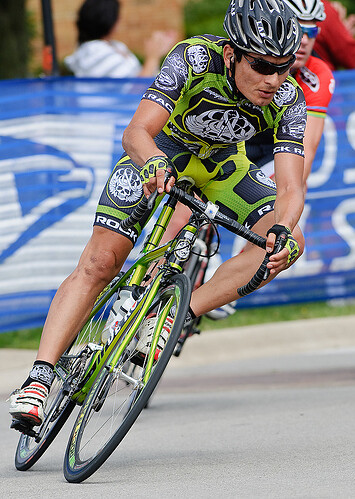
Cycling kits are typically not connected with adjectives like “classy” or “subtle.” Like other sports that depend heavily on sponsor subsidies, the goal in kit design is getting that sponsor name out there. You know, like this.
In that aspect, the Rock Racing team is not unique. Formed in 2007 by fashion designer Michael Ball of Rock & Republic, the boys in green fancy themselves as the rebels of the cycling world. Or, more specifically, they’ve created buzz by hiring ex–dopers who have served their suspensions and need a ride.
One of the longstanding traditions in cycling is creating a special kit for special events. Most grand tour leaders have been going all yellow, pink, or gold. The U.S. Postal/Discovery Channel teams wore special kits for Lance Armstrong’s last three tour wins in 2003, 2004, and 2005.
All of those situations imply a team needs a reason to wear a different kit. Not so for Rock Racing, which makes sure everything is extreme!!! Always. They don’t use a practical Saab for their team car. No, no, no. Escalade. As you saw above, this is the standard RR kit. That color is called “venom,” by the way, and it’s only the beginning. These guys change kits more often than the White Sox have changed team identities.
At the recent eight-stage Tour of Britain, the team wore three different kits — green, black, and blue (it’s called “London Rocks,” if you’re interested). And that’s not counting Tyler Hamilton’s new U.S. champion jersey, which also comes in white. At the same time, the rest of the team was at the Tour of Missouri. And yeah, they had a new kit, too.
The team wore two kits at the Tour of California earlier this year. Stage one was ridden with barbed wire (named “Crucifixion”), allegedly in protest of the commissaires’ decision to bar three Rock Racing riders (all ex-dopers) from starting. After that, it was back to venom.
At the Tour of Georgia a few weeks later, it was all venom until the last stage, when everything turned peachy.
Rock Racing also pulls out wardrobe switches for one day races: Harlem, Austin, Manhattan Beach, and the U.S. national championships, which shouldn’t be confused with Hamilton’s U.S. champion jersey. The official names for the Harlem, Austin, and Manhattan Beach jerseys are “Harlem Rocks,” “Austin Rocks,” and … yeah, you get the picture. The “Rocks” jerseys were worn in races sponsored by Rock Racing.
The Tour of Utah saw a new take on venom — road rash. The Tour of Qinghai Lake garb is here, and there are still four more kits yet to be seen. They’re all called “O.G.” Venom, road rash, black, and white.
That makes 17 different jerseys, not counting Hamilton’s championship jerseys. Kind of makes baseball teams with five jerseys seem perfectly reasonable, huh?
Note: I contacted a Rock Racing official with a few questions about the kits. Despite the best efforts of the team PR officer, an interview never took place. If that interview does happen, I’ll try to shed some light on the more interesting kits in the closet.
Uni Watch news ticker: The Nats look like a Walgreens kind of team when the W is isolated. … Utah State has its own NOB, and it’s not small. Thanks to Karl on the tip. … Here’s another Gene Upshaw sleeve, this time on Brian Dawkins of the Eagles. Bryan Duklewski with the quick camera phone work. … Matthew Lepke was at the Iowa-Indiana game on Saturday and sends this dispatch: “I attended the Iowa-Indiana football game this weekend and had a good laugh at some funny logo creeping my alma mater Iowa’s Tigerhawk has done. Just when you think the university has branded all it can, you’re surprised to learn that even a sherriff’s sidearm can show support for the Hawks. The man pictured has been the Iowa head football coach’s traveling police escort for many years, dating back to the Hayden Fy era. I’ve always found this interesting, since he is a Polk County (Des Moines) deputy and Iowa City is in Johnson County, but alas. I don’t even know what to say about the backup kicker’s shoes, seen behind the sherriff.” I don’t know either, but thanks for the report. … K.C. Kleiss says, “We may have beaten Michigan, but we still look like crap.” The “we” is Toledo, and K.C. is correct. … The Houston Aeros minor league hockey team has a 15th anniversary logo, seen here. Kinda cool, but could get busy if it’s too small or in the wrong spot. Thanks for the tip, T.J. … Jaymes Progar has a question, rugby fans: “I was watching a 6 Nations match between Ireland and Scotland from a while ago (it was an archived game on Setanta Broadband). I noticed that Ireland had something written just below the neckline in the middle of the jersey. It was low quality but on further inspection it appeared to be “Scotland 23-02-08″. Do you know, or do you know anyone that might know more about this? Maybe it was for an auction? Or is this something that is common in test rugby?” No idea. Somebody help the guy, huh? … Jason Hijuelos remembers reading an interview with New Orleans Hornets exec Chad Shinn, and there was a mention of an ABA New Orleans Buccanneers throwback. Could this be it? … Here’s another from K.C. — a fix for the WNBA? … Very cool eBay find here. Good catch by Prentice James. … I don’t know if I’ve seen this question before. Bill Krauss notices most NFL cheerleading squads wear the same white go-go boots. And he’s wondering if they all come from the same place. Someone should do some research or something. … It’s uni-related. I think. Thanks, Craig Justice. Thanks. … This looks cool, with thanks to Todd Bingman. … As mentioned in the comments … sometime in the past few days (or maybe I was imagining it, I don’t know), the Browns are headed back to 1957 for tonight’s game. It’s the last item here, and thank you, Laz Buda. … It’s cancer awareness month right now, if you didn’t know. (Personally, I’d prefer 12 months of cancer fighting instead of cancer awareness for one, but anyway …) As such, there are a lot of pink-tinged events going on. This is a shot of a high school game in Phoenix. The gloves were donated by Cutters, which also made a donation to the Susan G. Komen foundation. Thanks to Daniel Prokosch for the link.
Seeing these unis just makes me smile :)
link
Really wish they’d go back to these.
On the rugby jerseys: it’s been quite common for soccer (I mean, football) teams playing in big matches recently to put either the national flags of both teams on their jerseys (as in Euro 08) or the actual date and opponent (as in May’s Champion’s League final). I’d never noticed it before the last few years, which isn’t to say it hasn’t been done for a long time. Probably makes the jersey more valuable, since it’s more unique.
CAR debuets their third jerseys tonight against DET… ugh. Not looking forward to watching a full game with those things…
link
Most international rugby teams issue new jerseys for each game, and some, including Ireland put the date and name of the opponent on the jerseys.
You can see it in link of Andrew Trimble from the England game in last year’s 6 Nations.
[quote comment=”294589″]On the rugby jerseys: it’s been quite common for soccer (I mean, football) teams playing in big matches recently to put either the national flags of both teams on their jerseys (as in Euro 08) or the actual date and opponent (as in May’s Champion’s League final). I’d never noticed it before the last few years, which isn’t to say it hasn’t been done for a long time. Probably makes the jersey more valuable, since it’s more unique.[/quote]
Yes, it is same for rugby, see below for another Irish example
link
Looks a s Roloson & Garon have Vintage masks to go with their vintage unis. I love when goailes go the extra mile and get matching masks…
link
Thanks, Bryan for highlighting the
SchlockRock Racing squad ofdisgraced dopers who have no place in the pelotonglorious former champions. I especially enjoyed seeing pics of Tyler Hamilton whoblood doped and wants to us believe he had a “vanishing twin”persevered thanks to people who areamazingly gullibletrue believers who kept him going in his “Believe Tyler” campaign. I’m sure Tyler and his team willshamegrace the peloton in theirgod awful tackyinnovative kits for years to come!Switching back to the sport of the season:
I said this a few weeks ago, but after seeing the movie this weekend, I’ll say it again: Check out this for classic uniforms and other attire. link
Man, how much better and classier people dressed in 1958 than today. The uniforms are great too — except for Kansas’ all-Carolina blue outfits (where did that come from???).
Interesting note is how the coaches wore striped socks, pulled up over their khaki pants, on the sidelines.
On another note, Ernie D., at least as played by the actor in the movie, was not only a terrific athlete but a beautiful personality.
I swear, watching that soccer kit video reminded me so much of Mike Meyers on SNL: “Zis is ze time on Sprockets ven ve dance.”
I think I saw the Geico caveman wearing a Padres-looking kit about 1:40 into it as well.
link
here is a link to the Iowa Players soccer shoes
Carlos Santana designs the white cheerleader boots for the Raiders … (fourth story down.)
link
As far as I know a lot of national football/soccer teams wear the name of the opponent and the date for any match; even friendlies. It probably has little to do with the monetary value, since most players tend to exchange shirts with opponents and collect them as souvenirs. Some end up at charity auctions though.
I have a theory about the Rock Racing shirts:
There are/were some professional cyclists (among which Michael Rasmussen) who’d ride their individual practices in all-black gear. Their explanation was that it prevented them from being bothered by pushy fans while training. The more sinister theory is that they might be using it for messing with the drug-testers’ schedule, and for hiding their whereabouts. The Rock Racing team basically does the same thing: they give their riders so many kits, that the testers won’t know what to look for.
Garmin-Chipotle’s team car isn’t a Saab, but a link.
So I decided to watch part of the Lion/Viking game on Sunday. Tuned in just in time to see DET QB Orlovsky run out the back of the endzone for a safety like it was he was allowed to do that. I turned it to another game right after that. lol Gotta love the Lions…
Anyways in the 2.5 minutes of that game I watched, I noticed Orlovsky’s helmet a ‘raised’ white stripe in the middle, and picture hunting this morning found he wasn’t the only one.
link
link
Is this new this year or am I just noticing something that has been there for years? (which I wouldn’t doubt seeing it’s the NFL) :)
On the topic of breast cancer awareness, the NSU Riverhawks are taking a different approach this saturday:
link
Don’t know if NSU will be wearing pink, but when was the last time we had a “sea of pink” at a college football game?
[quote comment=”294601″]Garmin-Chipotle’s team car isn’t a Saab, but a link.[/quote]
Their European fleet is Skoda, but they drive Saab in the U.S. Bad illustration of that up top. Sorry. I’ll try to find another.
Is the term “kit” used only with regard to soccer and biking uniforms, or in other sports as well?
Houston Aeros 15 year anniversary? I always assumed the WHA Aeros were the same franchise as the IHL/AHL Aeros. Looks like the Aeros folded with the WHA in 1978.
Toledo may look like crap, but Michigan still looks like shit in those crappy adidas unis and sideline clothes!
does anyone else think the new deacs’ all black unis look tight as hell?
link
hopefully this works better
regarding the rugby kit – it is often in football (soccer for yanks) that for certain matches, i.e. world cup qualifiers, that clubs will wear information regarding the match on their kit. if you look at england’s kits from their match with kazakhstan over the week-end, you’ll see a similar phenomenon
Edmonton Oilers wore their beautiful new classic alt uni last night and I noticed a small interesting detail:
They are wearing white ear loops & chin straps on the blue helmet. link
Interesting because the other blue helmet teams, the habs link
and canucks wear black ear loops and chin straps link
but if you look back about 15 years, all teams wore the white straps on blue. link
including the habs link
I think this change over to black occurred when the Cooper helmets turned into Bauer helmets after the Nike buyout around 1997, and CCM soon followed suit.
It’s just a nice touch by the Oilers to make the classic look a little more authentic.
Found that Chad Shinn quote mentioned above re: Hornets wearing Bucs throwback. link Apparently there’s also a Mardi Gras-themed alt in the offing.
“There’s all kinds of things going on,” he said. “We got a Mardi Gras uniform we’re going to wear a couple of times this year and we got a Bucs jersey we’ll be wearing. In the next few years we’ll try and incorporate a third jersey.”
More pink cancer jerseys. These are from Lowell High School in MI earlier this year. They are usually the Red Arrows, but became the Pink Arrows for a game. Not sure how they paid for it all.
link
link
link of what I was talking about on Portis’s helmet logo during yesterday’s game. You can see it pretty clearly in the first pic of the gallery. Anyone know what’s up with that?
Walgreen’s seems to have been moving to put their W front-and-center with their own branding since this spring. I noticed in the newspaper circulars earlier in the year. I know they had the curly W first, but why a company would want its corporate identity to more closely resemble the Washington Nationals is beyond me.
And the custom Hawkeyes revolver grip: I’m not usually one to envy another man’s gun, but I needs me one of those. I wonder if the custom grips are available for a Colt single-action …
[quote comment=”294615″]link of what I was talking about on Portis’s helmet logo during yesterday’s game. You can see it pretty clearly in the first pic of the gallery. Anyone know what’s up with that?[/quote]
link, sorry
[quote comment=”294606″]Houston Aeros 15 year anniversary? I always assumed the WHA Aeros were the same franchise as the IHL/AHL Aeros. Looks like the Aeros folded with the WHA in 1978.[/quote]
Different ownership group, and they were named the Aeros as a way to honour the strong WHA roots in Hourston. They were an expansion team in the IHL in 1994. Five years later, they won the Turner Cup over the Orlando Solar Bears. Not bad, eh?
[quote comment=”294617″][quote comment=”294615″]link of what I was talking about on Portis’s helmet logo during yesterday’s game. You can see it pretty clearly in the first pic of the gallery. Anyone know what’s up with that?[/quote]
link, sorry[/quote]
what exactly are we supposed to be looking for?
[quote comment=”294618″][quote comment=”294606″]Houston Aeros 15 year anniversary? I always assumed the WHA Aeros were the same franchise as the IHL/AHL Aeros. Looks like the Aeros folded with the WHA in 1978.[/quote]
Different ownership group, and they were named the Aeros as a way to honour the strong WHA roots in Houston. They were an expansion team in the IHL in 1994. Five years later, they won the Turner Cup over the Orlando Solar Bears. Not bad, eh?[/quote]
Dammit, it’s a holiday in Canada thanks to Turkey Day. Why am I even awake at this hour? ;o)
I saw the ticker item on Australia’s womens basketball unis. Sometimes I scare myself, but I actually remember that a league of these uniforms HAS been tried, sort of. I remember seeing highlights on ESPN when I was in high school, over 15 years ago. It was called the Liberty Basketball Association. I couldn’t find any photographic evidence, but here’s a quick write up on this page. Scroll down to the “Liberty Basketball Association” entry.
link
[quote comment=”294619″][quote comment=”294617″][quote comment=”294615″]link of what I was talking about on Portis’s helmet logo during yesterday’s game. You can see it pretty clearly in the first pic of the gallery. Anyone know what’s up with that?[/quote]
link, sorry[/quote]
what exactly are we supposed to be looking for?[/quote]
There’s a silver streak painted over the eyes on the helmet logo
[quote comment=”294622″][quote comment=”294619″][quote comment=”294617″][quote comment=”294615″]link of what I was talking about on Portis’s helmet logo during yesterday’s game. You can see it pretty clearly in the first pic of the gallery. Anyone know what’s up with that?[/quote]
link, sorry[/quote]
what exactly are we supposed to be looking for?[/quote]
There’s a silver streak painted over the eyes on the helmet logo[/quote]
Maybe it’s War Paint?
[quote comment=”294622″][quote comment=”294619″][quote comment=”294617″][quote comment=”294615″]link of what I was talking about on Portis’s helmet logo during yesterday’s game. You can see it pretty clearly in the first pic of the gallery. Anyone know what’s up with that?[/quote]
link, sorry[/quote]
what exactly are we supposed to be looking for?[/quote]
There’s a silver streak painted over the eyes on the helmet logo[/quote]
well…i see what you’re talking about…are you sure it isn’t (1) glare, or (2) paint from an opponent’s helmet caused by a hit?
[quote comment=”294602″]
Anyways in the 2.5 minutes of that game I watched, I noticed Orlovsky’s helmet a ‘raised’ white stripe in the middle, and picture hunting this morning found he wasn’t the only one.
link
link
Is this new this year or am I just noticing something that has been there for years? (which I wouldn’t doubt seeing it’s the NFL) :)[/quote]
It’s just the helmet that has the raised part in the middle
link
[quote comment=”294623″][quote comment=”294622″][quote comment=”294619″][quote comment=”294617″][quote comment=”294615″]link of what I was talking about on Portis’s helmet logo during yesterday’s game. You can see it pretty clearly in the first pic of the gallery. Anyone know what’s up with that?[/quote]
link, sorry[/quote]
what exactly are we supposed to be looking for?[/quote]
There’s a silver streak painted over the eyes on the helmet logo[/quote]
Maybe it’s War Paint?[/quote]
I was going to say paint rub-off from the other team, but the Rams don’t have silver in their color scheme. Probably just the light.
I really wish I spoke German for that video on the Bundesliga. I recognize the 5 or 6 clubs that are on stands, but then the dancing. . .
wha. . .
I have no idea, other than they seem to be wearing stirrups.
[quote comment=”294624″][quote comment=”294622″][quote comment=”294619″][quote comment=”294617″][quote comment=”294615″]link of what I was talking about on Portis’s helmet logo during yesterday’s game. You can see it pretty clearly in the first pic of the gallery. Anyone know what’s up with that?[/quote]
link, sorry[/quote]
what exactly are we supposed to be looking for?[/quote]
There’s a silver streak painted over the eyes on the helmet logo[/quote]
well…i see what you’re talking about…are you sure it isn’t (1) glare, or (2) paint from an opponent’s helmet caused by a hit?[/quote]
Oh, my gosh. It’s a pair of shades! Looks like Clinton just wanted to have some fun to me. Maybe he was a link fan as a kid?
[quote comment=”294622″][quote comment=”294619″][quote comment=”294617″][quote comment=”294615″]link of what I was talking about on Portis’s helmet logo during yesterday’s game. You can see it pretty clearly in the first pic of the gallery. Anyone know what’s up with that?[/quote]
link, sorry[/quote]
what exactly are we supposed to be looking for?[/quote]
There’s a silver streak painted over the eyes on the helmet logo[/quote]
I wonder if that streak of silver was only part of the adornment and he was told to get the tube shaped item out of the indian’s mouth?
This is Clinton Portis after all.
SB
Re: Clinton Portis.
Check link. It’s a smear on the decal. Check the helmet of the Rams guy in the upper right. See how his helmet has a whitish-silver mark on it? Same thing on Mr. Portis.
[quote comment=”294628″][quote comment=”294624″][quote comment=”294622″][quote comment=”294619″][quote comment=”294617″][quote comment=”294615″]link of what I was talking about on Portis’s helmet logo during yesterday’s game. You can see it pretty clearly in the first pic of the gallery. Anyone know what’s up with that?[/quote]
link, sorry[/quote]
what exactly are we supposed to be looking for?[/quote]
There’s a silver streak painted over the eyes on the helmet logo[/quote]
well…i see what you’re talking about…are you sure it isn’t (1) glare, or (2) paint from an opponent’s helmet caused by a hit?[/quote]
Oh, my gosh. It’s a pair of shades! Looks like Clinton just wanted to have some fun to me. Maybe he was a link fan as a kid?[/quote]
Todd Marinovich did that when he was with the raiders. Shades and a goatee on the raider crest. Three cheers to the person who can find it.
SB
[quote comment=”294624″][quote comment=”294622″][quote comment=”294619″][quote comment=”294617″][quote comment=”294615″]link of what I was talking about on Portis’s helmet logo during yesterday’s game. You can see it pretty clearly in the first pic of the gallery. Anyone know what’s up with that?[/quote]
link, sorry[/quote]
what exactly are we supposed to be looking for?[/quote]
There’s a silver streak painted over the eyes on the helmet logo[/quote]
well…i see what you’re talking about…are you sure it isn’t (1) glare, or (2) paint from an opponent’s helmet caused by a hit?[/quote]
I’m pretty sure it wasn’t glare for a few reasons: a) it was clear in every shot throughout the game b) the fox camera guy kept it on screen for 20 seconds between one play, so I’m thinking they saw it there and thought it was of interest
looks like redemske nailed it
[quote comment=”294633″]looks like redemske nailed it[/quote]
Well, I have the responsibility of using my powers for good or evil. Today looks like a good day.
[quote comment=”294630″]Re: Clinton Portis.
Check link. It’s a smear on the decal. Check the helmet of the Rams guy in the upper right. See how his helmet has a whitish-silver mark on it? Same thing on Mr. Portis.[/quote]
Whatever it is it looks kinda cool
[quote comment=”294590″]CAR debuets their third jerseys tonight against DET… ugh. Not looking forward to watching a full game with those things…
link
I always liked the flag/stick logo better, even though the hurricane warning flag is TWO FLAGS, a tropical storm is one flag. And this jersey doesn’t have the annoying shoulder yoke striping the other jerseys have. But the all-black shoulder logo you can barely see and the hurricane flag stripe around the bottom that is black/silver instead of red/black are major point deductions.
Regarding the “fix” for the WNBA. I didn’t know Sepp Blatter, the idiot in charge of FIFA, had taken up blogging.
link
As is noted above, it doesn’t work. No one watches women’s indoor volleyball despite exactly those kinds of uniforms.
[quote comment=”294594″]Looks a s Roloson & Garon have Vintage masks to go with their vintage unis. I love when goailes go the extra mile and get matching masks…
link
I was hoping to see something along these lines:
link
link
link
Maybe not for in-game use, but maybe warmups/introductions or something.
Randomly throwing this out there:
The Oklahoma City Thunder know exactly what they’re doing with their horrible logo/jersey/gear.
They know everyone in OKC will buy it anyway, even though it sucks, just because the team is new.
Then, once sales taper off, they put forth an actual logo and color scheme which doesn’t completely suck, and everyone will rush to buy that.
That’s ugly, evil, genius. I hope they go 0-82 every year forever.
[quote comment=”294622″][quote comment=”294619″][quote comment=”294617″][quote comment=”294615″]link of what I was talking about on Portis’s helmet logo during yesterday’s game. You can see it pretty clearly in the first pic of the gallery. Anyone know what’s up with that?[/quote]
link, sorry[/quote]
what exactly are we supposed to be looking for?[/quote]
There’s a silver streak painted over the eyes on the helmet logo[/quote]
It looks like its just paint or plastic from the game. There is the same stuff below the Indian head as well.
[quote comment=”294594″]Looks a s Roloson & Garon have Vintage masks to go with their vintage unis. I love when goailes go the extra mile and get matching masks…
link
That oversized reebok logo just ruins it for me.
I live in Toledo and went to school at UT, and I love our Rockets, but I can’t argue with the comments about their unis. They are a little hard on the eyes. We seem to be the home of the ugly sports jerseys. Don’t believe me, do a search for the Storm hockey uniforms, if you’re not already familiar with them. That was one ugly-ass logo, but we loved our team. I can’t wait to see what they spring on us next year for our new hockey team (the Toledo Walleye), and our recently announced, yet to be named, arenafootball2 team. Both teams will inhabit our soon-to-be finished new downtown sports area. We will love them both as much as we love our Rockets and our Med Hens.
Oh but there is a Toledo Walleye Logo!!!
link
Looks like somebody’s true feelings about our brothers to the south came out at the US Soccer WC Qualifier on Saturday night:
link
link
Florida Southern College volleyball went with the pink jerseys last week. I wonder if when volleyball teams wear special jerseys if the libero (see below) feels left out?
link
same riddell helmet shell that has been around since…well…a damn long time. “raised stripe” interesting.
and yes that would either be glare or hit marks on portis’ headgear.
[quote comment=”294649″]same riddell helmet shell that has been around since…well…a damn long time. “raised stripe” interesting.
and yes that would either be glare or hit marks on portis’ headgear.[/quote]
Told you I didn’t know much about the NFL…
Guess I’ll go back into the ‘hockey wing’ of UW where I belong…
[quote comment=”294650″]
Guess I’ll go back into the ‘hockey wing’ of UW where I belong…[/quote]
Knock twice and ask for Teebz when you get there.
The link on their shirts yesterday against Columbus.
The patch is the same as the logo at the top left of link.
[quote comment=”294621″]I saw the ticker item on Australia’s womens basketball unis. Sometimes I scare myself, but I actually remember that a league of these uniforms HAS been tried, sort of. I remember seeing highlights on ESPN when I was in high school, over 15 years ago. It was called the Liberty Basketball Association. I couldn’t find any photographic evidence, but here’s a quick write up on this page. Scroll down to the “Liberty Basketball Association” entry.
link[/quote]
Yes, I recall that. I believe they only played the one game, an all-star game. Also, not everyone’s body (male or female) is best flattered by those things.
[quote]Guess I’ll go back into the ‘hockey wing’ of UW where I belong… [/quote]
or you could join the “lions fan” wing…
you can be the charter member ;)
Just flipping through the family of world wide leader channels and stopped for a second on ESPNU. Big 12 womens volleyball (Nebraska v Oklahoma) which is pretty uninteresting, but they were talking about how Joba Chamberlain goes to almost all the games, of course he wasn’t able to make it to this particular one but his dad was there, of course wearing his Yankees hat and I noticed his Joba jersey pin is complete with NOB…not sure if this has been discussed ever on the site, but it seems to me that at the very least the family of a player should be able to get it right that Yankees don’t have NOB, right?
link
link
same riddell helmet shell that has been around since…well…a damn long time. “raised stripe” interesting.
and yes that would either be glare or hit marks on portis’ headgear.
Told you I didn’t know much about the NFL…
Guess I’ll go back into the ‘hockey wing’ of UW where I belong…
do not sweat it…
i use my knowledge to help and educate
grew up on the sidelines
my father was a football coach
and i grew up an equipment manager
i fixed helmets and masks and other equipment from the early 80’s to early 2000.
even did helmet decals and ward stickers.
[quote comment=”294655″]Love the new throw backs for the NYJ has anybody checked them out. link to get free sports daily articles and picks[/quote]
Spamming bastard.
[quote comment=”294658″][quote comment=”294655″]Love the new throw backs for the NYJ has anybody checked them out. link to get free sports daily articles and picks[/quote]
Spamming bastard.[/quote]
Whoops, sorry. Asleep at the wheel.
As for the WNBA “fix,” the amount of actual time that a man will watch women’s sports because the competitors are (a) hot or (b) wearing short/tight/sexy uniforms is vastly overrated.
Else the Lingerie Bowl would have been more popular.
[quote comment=”294654″][quote]Guess I’ll go back into the ‘hockey wing’ of UW where I belong… [/quote]
or you could join the “lions fan” wing…
you can be the charter member ;)[/quote]
Wait a second LI Phil…I’m in the Lions Fan wing and I don’t appreci…. wha?… hello? Where is everyone?
C’mon Bryan. Who gives a shit about bike racing?
[quote comment=”294662″]C’mon Bryan. Who gives a shit about bike racing?[/quote]
I do. Come back tomorrow if it’s a problem.
[quote comment=”294663″][quote comment=”294662″]C’mon Bryan. Who gives a shit about bike racing?[/quote]
I do. Come back tomorrow if it’s a problem.[/quote]
yes…tomorrow is going to feature billy goat curses, black cats, bartmen and batting practice jerseys
or…maybe more biking stuff…tune in tomorrow
New center court design in Morgantown, WV. Check out:
link
[quote comment=”294663″][quote comment=”294662″]C’mon Bryan. Who gives a shit about bike racing?[/quote]
I do. Come back tomorrow if it’s a problem.[/quote]
Come on folks. I’m as bike apathetic a person as we have here on the blog, but this is some mildly interesting stuff. I think it’s kind of cool to see the bike team in all the different colors. It’s almost as if, “We have a really unique design feature, so we can take some liberties with colors.” Kind of like the UOregon diamond plate shoulders and knees. (Note that this is NOT an endorsement of the design. It’s still as ugly as sin, but you know what team it is instantly, and from a mile away.)
I really like Mr. Redemske as a palette cleanser every once in a while. Mr. Lukas (by his own admission) is a slave to his interests in the Mets, baseball, American football, and more Mets. Thanks, Mr. Redemske, for occasionally mentioning biking just to mix things up a bit. Besides, it sounds as if you really know what you’re talking about, so go right ahead and educate us Uni Watchers.
Those bike jerseys look like Ed Hardy rip-offs. I guess that’s what they give to dopers these days, LA’s lamest fashion trend.
From last week’s discussion about the 1984 Chicago Cubs wearing a division title patch that same post-season: I don’t know if anyone brought this up in one of the past days’ threads, but there as at least one other non-uniform example of a team displaying a reference to a title the same season it was won. Last night I was watching the DVD of Game 1 of the 1987 World Series, and noticed a banner above the garage in the right field corner of the Metrodome. It said something to the effect of “Welcome to The Metrodome, Home Of The American League Champion Twins”. Definitely a reference to the Twins having won that season’s A.L. pennant. Of course, the Twins went on to win that World Series, so obviously no jinx there. True, it wasn’t on their uniform, but the Twins did go through the process of officially displaying a mention of their A.L. title in their stadium for the Cardinals, and the media, to see.
If anyone cares…
Thirft store log:
Son Calvin and I went to our favorite thrift store this weekend with a $50 to spend. Here’s our haul:
link
Sweet Flutie and Spikes Bills jerseys, both looked like new (must be a disgruntled Buffalo fan in the Portland area). The Razorbacks warm-up is actually an authentic. And I love that NRL jersey, it’s heavyweight, very high quality. The Melo jersey is for Calvin to grow into, and Matt Powers, the suede 6.0 dunks are for you.
link
link
One last thing, the LA polo shirt. It was new with the MLB tags still attatched, but what attracted my eye is there was no manufacturer mentioned anywhere, just Genuine MLB merchandise in the neck. MLB in the clothing game?
link
Keep thriftin.
[quote comment=”294664″]
yes…tomorrow is going to feature billy goat curses, black cats, bartmen and batting practice jerseys
[/quote]
I’ll take, “Things I don’t believe in for $400, Alex.”
[quote comment=”294656″]Just flipping through the family of world wide leader channels and stopped for a second on ESPNU. Big 12 womens volleyball (Nebraska v Oklahoma) which is pretty uninteresting, but they were talking about how Joba Chamberlain goes to almost all the games, of course he wasn’t able to make it to this particular one but his dad was there, of course wearing his Yankees hat and I noticed his Joba jersey pin is complete with NOB…not sure if this has been discussed ever on the site, but it seems to me that at the very least the family of a player should be able to get it right that Yankees don’t have NOB, right?
link
link[/quote]
Nebraska folks are over the top when it comes to their womans v-ball program. The season sells out in minutes. Besides football its the only program that charges students for admission. I don’t get it myself but my son is up their and he’s caught up in it now.
[quote comment=”294671″][quote comment=”294656″]Just flipping through the family of world wide leader channels and stopped for a second on ESPNU. Big 12 womens volleyball (Nebraska v Oklahoma) which is pretty uninteresting, but they were talking about how Joba Chamberlain goes to almost all the games, of course he wasn’t able to make it to this particular one but his dad was there, of course wearing his Yankees hat and I noticed his Joba jersey pin is complete with NOB…not sure if this has been discussed ever on the site, but it seems to me that at the very least the family of a player should be able to get it right that Yankees don’t have NOB, right?
link
link[/quote]
Nebraska folks are over the top when it comes to their womans v-ball program. The season sells out in minutes. Besides football its the only program that charges students for admission. I don’t get it myself but my son is up their and he’s caught up in it now.[/quote]
The Huskers don’t charge the kids for basketball?
[quote comment=”294670″][quote comment=”294664″]
a cubs world series parade in my lifetime
[/quote]
I’ll take, “Things I don’t believe in for $400, Alex.”[/quote]
(fixed)
[quote comment=”294673″][quote comment=”294670″][quote comment=”294664″]
a cubs world series parade in my lifetime
[/quote]
I’ll take, “Things I don’t believe in for $400, Alex.”[/quote]
(fixed)[/quote]
Shit, I’ll hold a Cubs World Series parade right now if you want. You never said they had to win it.
Not that anyone cares but, the picture of the Utah State jerseys were last year’s version. They have new uniforms this year(which are mostly plain) seen here: link
I’m not surprised that these got overlooked for the season preview since the Aggies are perrenially one of the worst division 1 teams in the nation
[quote comment=”294672″][quote comment=”294671″][quote comment=”294656″]Just flipping through the family of world wide leader channels and stopped for a second on ESPNU. Big 12 womens volleyball (Nebraska v Oklahoma) which is pretty uninteresting, but they were talking about how Joba Chamberlain goes to almost all the games, of course he wasn’t able to make it to this particular one but his dad was there, of course wearing his Yankees hat and I noticed his Joba jersey pin is complete with NOB…not sure if this has been discussed ever on the site, but it seems to me that at the very least the family of a player should be able to get it right that Yankees don’t have NOB, right?
link
link[/quote]
Nebraska folks are over the top when it comes to their womans v-ball program. The season sells out in minutes. Besides football its the only program that charges students for admission. I don’t get it myself but my son is up their and he’s caught up in it now.[/quote]
The Huskers don’t charge the kids for basketball?[/quote]
No, I believe it’s either ID admission or get a ticket with your ID.
michigan. adidas logo. man oh man did i hate the cal bears’ swoosh till i saw that.
[quote comment=”294676″][quote comment=”294672″]The Huskers don’t charge the kids for basketball?[/quote]
No, I believe it’s either ID admission or get a ticket with your ID.[/quote]
It’s not much but they do charge for basketball. About $2 a game, $40 or so for the whole season. It’s a steal of a deal actually, but they do charge.
[quote comment=”294625″][quote comment=”294602″]
Anyways in the 2.5 minutes of that game I watched, I noticed Orlovsky’s helmet a ‘raised’ white stripe in the middle, and picture hunting this morning found he wasn’t the only one.
link
link
Is this new this year or am I just noticing something that has been there for years? (which I wouldn’t doubt seeing it’s the NFL) :)[/quote]
It’s just the helmet that has the raised part in the middle
link
You will notice that center raised section on all Riddell VSR-4 helmets.
[quote comment=”294669″]If anyone cares…
Thirft store log:
Son Calvin and I went to our favorite thrift store this weekend with a $50 to spend. Here’s our haul:
link
Sweet Flutie and Spikes Bills jerseys, both looked like new (must be a disgruntled Buffalo fan in the Portland area). The Razorbacks warm-up is actually an authentic. And I love that NRL jersey, it’s heavyweight, very high quality. The Melo jersey is for Calvin to grow into, and Matt Powers, the suede 6.0 dunks are for you.
link
link
One last thing, the LA polo shirt. It was new with the MLB tags still attatched, but what attracted my eye is there was no manufacturer mentioned anywhere, just Genuine MLB merchandise in the neck. MLB in the clothing game?
link
Keep thriftin.[/quote]
Dunks are quality…but when was Arkansas a Nike school???
[quote comment=”294634″][quote comment=”294633″]looks like redemske nailed it[/quote]
Well, I have the responsibility of using my powers for good or evil. Today looks like a good day.[/quote]
Now I am a resource to be wielded like a dog let off of it’s leash?
JK
[quote comment=”294681″][quote comment=”294634″][quote comment=”294633″]looks like redemske nailed it[/quote]
Well, I have the responsibility of using my powers for good or evil. Today looks like a good day.[/quote]
Now I am a resource to be wielded like a dog let off of it’s leash?
JK[/quote]
more like a gelding
[quote comment=”294651″][quote comment=”294650″]
Guess I’ll go back into the ‘hockey wing’ of UW where I belong…[/quote]
Knock twice and ask for Teebz when you get there.[/quote]
Jim’s got an office/broom closet right beside my office/broom closet. He doesn’t need to knock whatsoever. ;o)
[quote comment=”294680″][quote comment=”294669″]If anyone cares…
Thirft store log:
Son Calvin and I went to our favorite thrift store this weekend with a $50 to spend. Here’s our haul:
link
Sweet Flutie and Spikes Bills jerseys, both looked like new (must be a disgruntled Buffalo fan in the Portland area). The Razorbacks warm-up is actually an authentic. And I love that NRL jersey, it’s heavyweight, very high quality. The Melo jersey is for Calvin to grow into, and Matt Powers, the suede 6.0 dunks are for you.
link
link
One last thing, the LA polo shirt. It was new with the MLB tags still attatched, but what attracted my eye is there was no manufacturer mentioned anywhere, just Genuine MLB merchandise in the neck. MLB in the clothing game?
link
Keep thriftin.[/quote]
Dunks are quality…but when was Arkansas a Nike school???[/quote]
They were Nike between their Adidas (2004?) & Reebok…I believe it was for only three years.
[quote comment=”294646″]Oh but there is a Toledo Walleye Logo!!!
link
Yeah, I knew about the Walleye logo, obviously. Haven’t seen the unis yet. I’m almost sorry they didn’t used the Peckerheads nickname that was batted around briefly. We would have had great fun with that one.
i have my doubts as to whether that tour of missouri pic was actually taken in missouri. where was all the roadkill?
From the shots of the Browns warming up, it looks like most of them have striped socks on tonight — now only if that would be permanent.
Razorbacks basketball was Nike about ten years ago. I actually have a Sunday Adebayo Nike gamer.
Here’s an interesting Nike/Razorbacks tidbit. It entirely looks like Nike had Powers make the jerseys for them. All of my Razorbacks Nike stuff has this style tagging, check out these pics:
link
link
The care instructions are word for word. And the RN number is the same…
Anyone notice how ridiculous Aaron Ross of the Giants looks with his cleat tape the same color as the socks, so it looks like he’s wearing 80’s leg warmers under his pants?
From the ESPN College Football front page:
Paul’s worst nightmare?
link
The Brownies should keep the striped socks and the helmet numbers all the time. Giants have the white with grey….and alot of accent red (socks, undershirt sleeves, arm bands etc…
I won’t argue with success, but as I Giants fan I enjoy the emphasis on blue more than I do on red.
[quote comment=”294636″][quote comment=”294590″]CAR debuets their third jerseys tonight against DET… ugh. Not looking forward to watching a full game with those things…
link
I always liked the flag/stick logo better, even though the hurricane warning flag is TWO FLAGS, a tropical storm is one flag. And this jersey doesn’t have the annoying shoulder yoke striping the other jerseys have. But the all-black shoulder logo you can barely see and the hurricane flag stripe around the bottom that is black/silver instead of red/black are major point deductions.[/quote]
Watching the game, I can attest to the fact that without HD, I can barely see the uni numbers. Red on black, even with the white outline, is not enough contrast. White with a red outline would be much better. Overall, I think the look needs a little more white and red to contrast with the black.
[quote comment=”294685″][quote comment=”294646″]Oh but there is a Toledo Walleye Logo!!!
link
Yeah, I knew about the Walleye logo, obviously. Haven’t seen the unis yet. I’m almost sorry they didn’t used the Peckerheads nickname that was batted around briefly. We would have had great fun with that one.[/quote]
Walleye–awesome nickname, especially because it’s a tangible noun in the singular form. I love it.
“dating back to the Hayden Fy era”
Bryan, I’ve never heard of him…and I’m an Iowa fan.
[quote comment=”294687″]From the shots of the Browns warming up, it looks like most of them have striped socks on tonight — now only if that would be permanent.[/quote]
[quote comment=”294691″]The Brownies should keep the striped socks and the helmet numbers all the time.[/quote]
i agree this is a much better look…i was so afraid they were gonna come out in all turd color (before they announced the throwbacks earlier this week)
[quote]Giants have the white with grey….and alot of accent red (socks, undershirt sleeves, arm bands etc…
I won’t argue with success, but as I Giants fan I enjoy the emphasis on blue more than I do on red.[/quote]
well…
wethey are known as ‘big blue’…and i know the red is also a ‘throwback’ (tho a permanent one), but i liked the first incarnation (link) which had more blue…or even the photoshops paul did (link) for his mothership piece…granted, neither one of those is the true throwback, but the away uni needs more blue than the helmet and one pant stripe
[quote comment=”294694″][quote comment=”294687″]From the shots of the Browns warming up, it looks like most of them have striped socks on tonight — now only if that would be permanent.[/quote]
[quote comment=”294691″]The Brownies should keep the striped socks and the helmet numbers all the time.[/quote]
i agree this is a much better look…i was so afraid they were gonna come out in all turd color (before they announced the throwbacks earlier this week)
[quote]Giants have the white with grey….and alot of accent red (socks, undershirt sleeves, arm bands etc…
I won’t argue with success, but as I Giants fan I enjoy the emphasis on blue more than I do on red.[/quote]
well…
wethey are known as ‘big blue’…and i know the red is also a ‘throwback’ (tho a permanent one), but i liked the first incarnation (link) which had more blue…or even the photoshops paul did (link) for his mothership piece…granted, neither one of those is the true throwback, but the away uni needs more blue than the helmet and one pant stripe[/quote]
There was a time when the road pants with those red numbered jerseys and red socks were plain white. See the “sneaker game” of Gifford era(can’t find any photos in quick search online). But maybe this will do…
link
Yeah is a training camp shot, but shows the “look”.
Also one year when TV numbers extended down into a cut out space on the sleeves stripes.
—Ricko
Not sure if this has been linked yet, but here are Kentucky’s new basketball uniforms. Checkered pattern based on jockey silks, a black band and black “K” for Mr. Wildcat, Bill Keightley, and the waist band checkered area with the championship years…with one left blank for the next. I absolutely love these things.
link
Somewhere, there is a link in the works.
[quote comment=”294696″]Not sure if this has been linked yet, but here are Kentucky’s new basketball uniforms. Checkered pattern based on jockey silks, a black band and black “K” for Mr. Wildcat, Bill Keightley, and the waist band checkered area with the championship years…with one left blank for the next. I absolutely love these things.
link
And now I have yet another reason to hate UK basketball. Those are HIDEOUS
[quote comment=”294688″]Razorbacks basketball was Nike about ten years ago. I actually have a Sunday Adebayo Nike gamer.
Here’s an interesting Nike/Razorbacks tidbit. It entirely looks like Nike had Powers make the jerseys for them. All of my Razorbacks Nike stuff has this style tagging, check out these pics:
link
link
The care instructions are word for word. And the RN number is the same…[/quote]
There you have it…you’ve finally discovered the reason to my bizarre connection to the swoosh!
On another note,
Giants/Browns:
1. #91, Justin Tuck and #55, Clark on the Giants both wearing Revolution Speeds!
2. #66, The left tackle on the Giants O-Line is wearing Player Exclusive Black/Grey Air Jordan III cleats.
3. Kornheiser mentioned that every time that he looks at the Browns thorwback helmets, he thinks that someone has written the numbers on with a magic marker.
4. The Giants are getting their asses handed to them.
[quote comment=”294682″][quote comment=”294681″][quote comment=”294634″][quote comment=”294633″]looks like redemske nailed it[/quote]
Well, I have the responsibility of using my powers for good or evil. Today looks like a good day.[/quote]
Now I am a resource to be wielded like a dog let off of it’s leash?
JK[/quote]
more like a gelding[/quote]
Dammit Phil, that was a low blow, which makes your comment moot!
is plax gone git fined for his red kicks?
[quote comment=”294698″][quote comment=”294696″]Not sure if this has been linked yet, but here are Kentucky’s new basketball uniforms. Checkered pattern based on jockey silks, a black band and black “K” for Mr. Wildcat, Bill Keightley, and the waist band checkered area with the championship years…with one left blank for the next. I absolutely love these things.
link
And now I have yet another reason to hate UK basketball. Those are HIDEOUS[/quote]
Not so much hideous as just plain ridiculous. Jockey silks? More like clown suits.
[quote comment=”294696″]Not sure if this has been linked yet, but here are Kentucky’s new basketball uniforms. Checkered pattern based on jockey silks, a black band and black “K” for Mr. Wildcat, Bill Keightley, and the waist band checkered area with the championship years…with one left blank for the next. I absolutely love these things.
link
Just a couple of observations.
1. The checkers look strange on the jersey but good on the shorts.
2. Shorts that run below the knee not only look idiotic, they look as if they will inhibit the wearer.
3. The outlined “K” just makes me think of Coach K. (I’m not a Duke or Kentucky fan.)
4. Still nice to see that the swooshes have not made it to the jersey.
These are above average for what teams wear today.
At least it’s not these:
link
or these
link
[quote comment=”294703″][quote comment=”294696″]Not sure if this has been linked yet, but here are Kentucky’s new basketball uniforms. Checkered pattern based on jockey silks, a black band and black “K” for Mr. Wildcat, Bill Keightley, and the waist band checkered area with the championship years…with one left blank for the next. I absolutely love these things.
link
Just a couple of observations.
1. The checkers look strange on the jersey but good on the shorts.
2. Shorts that run below the knee not only look idiotic, they look as if they will inhibit the wearer.
3. The outlined “K” just makes me think of Coach K. (I’m not a Duke or Kentucky fan.)
4. Still nice to see that the swooshes have not made it to the jersey.
These are above average for what teams wear today.
At least it’s not these:
link
or these
link
I agree, the shorts below the knee looks terrible.
Im not 100% sure, but I also think UK got custom shoes from Nike, a school specific version of the Hyperdunk. From what I’ve heard Syracuse, Texas, Oregon and UK are the 4 schools Nike is making them for.
[quote comment=”294701″]is plax gone git fined for his red kicks?[/quote]
[quote comment=”294705″][quote comment=”294701″]is plax gone git fined for his red kicks?[/quote][/quote]
Why not, he doesn’t care: link
A few rules for NFL cleats:
1. Nike, Under Armour, and Reebok are the only liscensed companies, thus Randy Moss’s Pony’s had to be all white, with no visible branding.
link
2. Red is the Giants chosen accent color so cleats in that color are OK. Lasy year in the playoffs, Kavika Mitchell wore red Nike Apocalypse that were almost all red.
link
3. The Tongue color and laces MUST match, ala Michael Strahan lasy year.
link
And BTW, here are UK’s Hyperdunks:
Black:
link
Blue:
link
[quote comment=”294602″]So I decided to watch part of the Lion/Viking game on Sunday. Tuned in just in time to see DET QB Orlovsky run out the back of the endzone for a safety like it was he was allowed to do that. I turned it to another game right after that. lol Gotta love the Lions…
Anyways in the 2.5 minutes of that game I watched, I noticed Orlovsky’s helmet a ‘raised’ white stripe in the middle, and picture hunting this morning found he wasn’t the only one.
link
link
Is this new this year or am I just noticing something that has been there for years? (which I wouldn’t doubt seeing it’s the NFL) :)[/quote]
Its totally dependent on the type of helmet the player wears. Classic Riddel helmets have the raised center stripe while the Revolutions and Schutts do not.
Speaking of Schutt, I was in Modell’s today and came across these youth Shoulder pads, made by Schutt:
link
Look familiar:
link
Also check out these pads made by Schutt:
link
link
[quote comment=”294647″]Looks like somebody’s true feelings about our brothers to the south came out at the US Soccer WC Qualifier on Saturday night:
link
I can’t stand Americans thinking they’re awesome in soccer they play Mexico which is subpar itself and think they’re hot shit… you play Honduras and Guatamala to get World Cup. WOW!
[quote comment=”294698″][quote comment=”294696″]Not sure if this has been linked yet, but here are Kentucky’s new basketball uniforms. Checkered pattern based on jockey silks, a black band and black “K” for Mr. Wildcat, Bill Keightley, and the waist band checkered area with the championship years…with one left blank for the next. I absolutely love these things.
link
I LOVE those uniforms seriously LOVE them… I might even get one.
Ps why the missing k?
And now I have yet another reason to hate UK basketball. Those are HIDEOUS[/quote]