Thirteen years ago, The New York Times ran this obituary for an illustrator named Lon Keller, who among other things was credited with having designed the Yankees’ “top hat” logo in 1947.
I don’t recall if I read that obit; if I did, it obviously didn’t make much of an impression on me. And that’s a shame because it turns out that Lon Keller was a giant of American sports design, and not just because he created one of baseball’s most iconic logos. As the obit explains, “In 1938, Mr. Keller became chief illustrator for Spencer Marketing, a New York City company that designed programs for sporting events across the country. In more than three decades with Spencer, he created cover designs used for games at more than 300 colleges and universities.”
I didn’t know any of this until Mike Hersh (who I profiled last month) recently pointed me toward this site, where a ton of Keller’s work has been archived. And most of it is spectacular.
Keller illustrated just about everything: high school football, basketball (girls’ hoops, too), baseball; college football (including lots of work for the service academies) and, to a much lesser extent, basketball; pro football, baseball, boxing, and the ponies; and miscellaneous stuff like the Globetrotters, the Olympics, a teeny bit of hockey, and even roller derby.
Keller’s work has its limits. Due to the era he worked in (and, I suspect, Spencer Marketing’s client list), almost every single person depicted in his artwork — athletes, fans, cheerleaders, everyone — is white (here’s a rare exception from 1970, relatively late in his career). And this made me cringe on several different levels.
Graphically speaking, though, Keller was the total package. He could capture power and strength but also playfulness and whimsy. He could be a literalist and he could get more conceptual, and he had lots of clever ideas.
Much like Steve Dewing’s baseball photo site, the Keller archive is a huge time-sink that’s impossible to look at quickly or casually — once you start clicking, you’ve basically made a two-hour commitment, minimum. So my apologies in advance for everyone’s lowered productivity today.
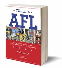
Raffle Reminder: Today’s the last day to enter the raffle for the copy of Remember the AFL. Details here. I’ll announce the winner on Monday.
Uni Watch News Ticker: Interesting branding brouhaha over in the F1 world (with thanks to Ken Ocker). ”¦ Jeremy Brahm sent along the best view yet of Charlie Manuel’s facemask. He also sent along a shot of Julio Zuleta’s mask. ”¦ Jimmy Griffin notes that Phil Hughes is now wearing glasses. ”¦ The Astros never wore a pillbox cap, but you can still buy one (with thanks to James Poisso). ”¦ Gabriel Ganot worked as a ball boy at the U.S. Open earlier this month. “This year’s uniforms were rather neat,” he says. “The rumor was that instead of the navy blue theme that Polo had been giving us for the last three years, they were going to give us a black uniform (after all, this is New York). In the end, though, we got these (see also heree and here), which were actually pretty nice. The shirts and shorts were a lot thinner and had a lot more breathable fabric, which made life a little nicer in the summer sun. I’m waiting for the day when we get the hats and sunglasses that the Australian Open ball persons get to wear. It gets hot on court!” ”¦ All Western Hockey League players and officials will wear an “EC” helmet decal this season, in memory of Ed Chynoweth (with thanks to Mark Snider). ”¦ Yesterday’s Ticker item about Nicky Hayden’s motoGP helmet led Al Stone to point me toward the sport’s most “creative” helmet, as worn by Valentino Rossi. ”¦ Tyler Kepner reports that Juan Miranda, who wore No. 66 for the Bronx Bombers last night, is the first Yankee to wear that number since Jim Deshaies in 1984 (only one other Yank has ever worn it: Steve Balboni, in 1981-83), and that Humberto Sanchez, who made his MLB debut last night, is the first 77 in team history.. ”¦ Illinois will go NNOB this fall (with thanks to Andrew Joseph). ”¦ Cool old Ohio State hoops jersey with a crotch extension (with thanks to Nina Jablonski). ”¦ Latest System of Dress school: Michigan State. ”¦ Chris Cooley of the Redskins has posted more photos of his cock some info on the Ridell Revolution Speed helmet he’s been wearing. Details here (click on the photos for much larger versions). ”¦ Ethan Rowley thinks the guy about to receive the snap in this 1902 photo looks like Darth Vader. ”¦ New hoops uniforms on the way for Oklahoma State. ”¦ T.J. Leibowitz reports that former University of Colorado football coach and athletic director Eddie Crowder, who died last week, is being memorialized on the football team’s field and nose bumpers. ”¦ Speaking of nose bumpers, look what the high school team in Stuarts Draft, Virginia, is wearing (with thanks to Steve Hicks). ”¦ The Blues’ third jersey is described in detail, but not shown, here (thanks to Adam Chkautovich).
I like that STL is going to a circular logo, but I just don’t see an Arch coming off well. A circular logo with city name and team with just the blue’s note would be fine, that arch I think is going to F it up.
[quote comment=”290347″]I like that STL is going to a circular logo, but I just don’t see an Arch coming off well. A circular logo with city name and team with just the blue’s note would be fine, that arch I think is going to F it up.[/quote]
Circular logos come off rather well I feel:
link
link
link
link
link
link
link
link
not that i was hoping for link again…but this morning’s ryder cup unis are link
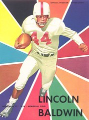
Could Lon Keller have been inspired by link in designing the “Lincoln-Baldwin” program at the top of the page?
I sent Paul the Astros Pillbox cap link in hopes someone on here knows anything about it. I hope to win the auction because it’s an interesting Astros cap, but I would like to know a little more about it if I can.
Funny line from Cooley’s comments:
Why can’t we seem to get away from the Helmet posts this week?
Also, when asked, the seller said there were no labels/tags inside the hat.
Very interesting…I mean, it sounds like a fashion hat, and not licensed at that, but why would anyone make a pillbox styled Astros orange cap with a plastic adjusting strap in the back.
Does anyone on here remember if there were any promotions in 1976 or around then where you could get a team cap in the pillbox style?
My brother had an Expos pillbox hat in the early 80s, and they never actually wore one on the field. I think it was just a fad back then.
Move over GU63…
link
[quote comment=”290355″]Move over GU63…
link
You’ve got to be freakin’ kidding me.
[quote comment=”290355″]Move over GU63…
link
If that’s true, I’m going to boycott everything that is the NFL.
[quote comment=”290357″][quote comment=”290355″]Move over GU63…
link
If that’s true, I’m going to boycott everything that is the NFL.[/quote]
Oh, come on guys! Do you really need to be told that’s a joke?
[quote comment=”290357″][quote comment=”290355″]Move over GU63…
link
If that’s true, I’m going to boycott everything that is the NFL.[/quote]
Seriously? Relax, it’s a joke people.
Here is a full set (jersey, pants, helmet) from the oft mentioned “Turn Ahead” games: link
[quote comment=”290359″][quote comment=”290357″][quote comment=”290355″]Move over GU63…
link
If that’s true, I’m going to boycott everything that is the NFL.[/quote]
Seriously? Relax, it’s a joke people.[/quote]
and a damn good one
Ha-ha. I missed the sarcasm. Whoops. I wouldn’t put it past the league to do some stupid shit like that, though.
[quote comment=”290356″][quote comment=”290355″]Move over GU63…
link
You’ve got to be freakin’ kidding me.[/quote]
Noun
gullibility (uncountable)
The quality of readily believing information, truthful or otherwise, usually to an absurd extent.
[quote comment=\”290354\”]My brother had an Expos pillbox hat in the early 80s, and they never actually wore one on the field. I think it was just a fad back then.[/quote]
that\’s just it, I don\’t think it was a fad thing. in 1976, the Expos wore a pillbox: link
[quote comment=”290363″]Noun
gullibility (uncountable)
The quality of readily believing information, truthful or otherwise, usually to an absurd extent.[/quote]
did you know gullibility isn’t in the dictionary?
link
Apparently, the University of Illinois athletic department decided to forego the use of nameplates on the men’s basketball uniforms after one member unexpicably recieved an alarmingly large number of negative electronic messages this week. One Illinois representative, who chose to remain nameless, mentioned that a large majority of e-mails were generated by members of one “fringe/fetish website”:
link
These cult-like figures took umbarge with this photograph and responded in quite a surly manner:
link
[quote comment=”290365″][quote comment=”290363″]Noun
gullibility (uncountable)
The quality of readily believing information, truthful or otherwise, usually to an absurd extent.[/quote]
did you know gullibility isn’t in the dictionary?[/quote]
“I bet that I’ll have you gambling by the end of the day!”
A friend of mine had an A’s pillbox cap.
I’m almost positive he bought it when we were at the ’83 All-Star Game at Comiskey Park. So that would place it at about the time Oakland was wearing something like 5 different jerseys, but I don’t recall them ever wearing a pillbox hat on the field.
This was one of the comments on the IlliniHQ website:
Now we can join Ohio State in having the ugliest uniforms in the league. I actually wouldn’t want my name on the back of those jerseys. They look like they shrunk in the dryer. But, I assume our deal with Nike includes letting them dictate our “athletic fashion.”
Would this person fall under the category of “getting it”?
i like the idea of state parks closing while athletes get new unis every year
Are we sure that’s really an old Ohio State jersey and not just an early example of one of these?
link
link
[quote comment=”290355″]Move over GU63…
link
That is pure genius. The fact that some people (idiots?) actually got all riled up and, you know, believed it made it even greater.
The Onion doesn’t have a monopoly on satire……
Hmmmm…
Not faulting the artist, not at all, but surprised MLB let this one get through. Indians wore the “C” with Chief Wahoo hat in ’54. And blue is a little light for navy, isn’t it?
link
Great work on Lon Keller. I’m shocked that his contribution to the Yankees’ lore isn’t more widely recognized.
Personally, I’ve been hoping that the Yankees would return to link of the link link when they move into the new park – I’ve always preferred them to the c. 1970s logo.
Point of trivia – link was reportedly the first instance of the top hat logo in print. Funny – we think of the Yankees as having the longest and most stable visual traditions, but the things we most associate with them – the “NY” logo on the chest, the top hat logo – weren’t around in Babe Ruth’s day.
[quote comment=”290373″]Hmmmm…
Not faulting the artist, not at all, but surprised MLB let this one get through. Indians wore the “C” with Chief Wahoo hat in ’54. And blue is a little light for navy, isn’t it?
link
link from the ’54 WS…(look at the guns on the say hey kid)…looks to me like they’re wearing a wahoo cap…
anyone know if this was what they wore all season or was it a ws special?
[quote comment=”290375″][quote comment=”290373″]Hmmmm…
Not faulting the artist, not at all, but surprised MLB let this one get through. Indians wore the “C” with Chief Wahoo hat in ’54. And blue is a little light for navy, isn’t it?
link
link from the ’54 WS…(look at the guns on the say hey kid)…looks to me like they’re wearing a wahoo cap…
anyone know if this was what they wore all season or was it a ws special?[/quote]
Wore it all year. Was their only hat from ’53 or ’54 through ’57. Went to red wishbone C edged in white in ’58.
World Series special few and far between in that era. Just wasn’t in vogue. From time I started following baseball, only World Series special I recall in all of the 50s, 60s and 70s (off top of my head, anyway) was the White Sox white stirrups in ’59.
[quote comment=”290376″][quote comment=”290375″][quote comment=”290373″]Hmmmm…
Not faulting the artist, not at all, but surprised MLB let this one get through. Indians wore the “C” with Chief Wahoo hat in ’54. And blue is a little light for navy, isn’t it?
link
link from the ’54 WS…(look at the guns on the say hey kid)…looks to me like they’re wearing a wahoo cap…
anyone know if this was what they wore all season or was it a ws special?[/quote]
Wore it all year. Was their only hat from ’53 or ’54 through ’57. Went to red wishbone C edged in white in ’58.
World Series special few and far between in that era. Just wasn’t in vogue. From time I started following baseball, only World Series special I recall in all of the 50s, 60s and 70s (off top of my head, anyway) was the White Sox white stirrups in ’59.[/quote]
according to link, they wore the cap depicted on the WS program in 1953 (or earlier — as you pointed out, mr. pearson)…so…
the WHOLE year of 1954 they had the wahoo cap but the artist used a pre-1954 cap for his cover art…
i’d say the fault is both MLB and the artist, though someone should have picked up on it
/good catch ricko
[quote comment=”290370″]i like the idea of state parks closing while athletes get new unis every year[/quote]
Athletic association budgets aren’t always state funded (even at public universities). At Florida, for example, University Athletic Association, Inc. is separate. There aren’t any funds that could pay for parks going to orange and blue Nike wear that I know of.
The general point about priorities is, of course, valid.
[quote comment=”290377″][quote comment=”290376″][quote comment=”290375″][quote comment=”290373″]Hmmmm…
Not faulting the artist, not at all, but surprised MLB let this one get through. Indians wore the “C” with Chief Wahoo hat in ’54. And blue is a little light for navy, isn’t it?
link
link from the ’54 WS…(look at the guns on the say hey kid)…looks to me like they’re wearing a wahoo cap…
anyone know if this was what they wore all season or was it a ws special?[/quote]
Wore it all year. Was their only hat from ’53 or ’54 through ’57. Went to red wishbone C edged in white in ’58.
World Series special few and far between in that era. Just wasn’t in vogue. From time I started following baseball, only World Series special I recall in all of the 50s, 60s and 70s (off top of my head, anyway) was the White Sox white stirrups in ’59.[/quote]
according to link, they wore the cap depicted on the WS program in 1953 (or earlier — as you pointed out, mr. pearson)…so…
the WHOLE year of 1954 they had the wahoo cap but the artist used a pre-1954 cap for his cover art…
i’d say the fault is both MLB and the artist, though someone should have picked up on it
/good catch ricko[/quote]
It might have been MLB’s fault. Keller was a commercial artist and he probably didn’t follow up on uniforms as much (or to the extent that some of us do). When MLB approached him he probably would have asked for a reference sample and it’s not beyond the realm of possibility that MLB sent him a photo or photos of the Indians from 1953. As Paul indicated, he worked on pro sports to a lesser extent than he did on other sports, so it’s entirely plausible that he didn’t know about the cap switch from one year to the next and merely went with what MLB provided him.
LI Phil was right, though; someone should have picked up on it.
[quote comment=”290374″]Great work on Lon Keller. I’m shocked that his contribution to the Yankees’ lore isn’t more widely recognized.[/quote]
And I’m shocked that you’re the only one so far who’s commented on today’s lead entry. Such great artwork! Is nobody else moved by it?
Honest, I’m really not trying be a wise guy here but these pillboxes are not game hats and really don’t warrant mention because they would be the first of what we now refer to as “fashion caps”.
Only the Pirates, who stayed with the style well after ’76, and the few NL clubs that wore the style can be considered game hats or replicas. Many NL clubs didn’t participate, including Houston and definitely no AL clubs wore them on the field.
Folks, it was a novelty, based on the popularity of the Pirates’ hat and that style, and the other teams capitalized on it to try and make a buck…
…funny, because a lot of you in here poo-poo the Lids.com style of hats that are out now and you blast MLB and New Era for making stuff just for money but when it’s a style you think is cool, it’s perfectly fine.
i dunno but the girls hoops pic looks like its two guys
[quote comment=”290382″]i dunno but the girls hoops pic looks like its two guys[/quote]
don’t they all?
[quote comment=”290380″][quote comment=”290374″]Great work on Lon Keller. I’m shocked that his contribution to the Yankees’ lore isn’t more widely recognized.[/quote]
And I’m shocked that you’re the only one so far who’s commented on today’s lead entry. Such great artwork! Is nobody else moved by it?[/quote]
ok lukas…i bit…i checked out the site, and most, if not all, of his work is, in a word, awesome
i must admit until this entry i knew very little, if not nothing, about mr. keller’s work (of course, everyone knows the yankee top hat)…but ’twas excellent to see his other works
i especially liked the link, and link was my favorite
not being any type or artist or having much talent, i cannot tell if he actually painted that on a fence, or if he worked the FENCE into his painting…either way, it was very neat
/link reminded me a bit of link…and im wondering if perhaps that’s were he (leroy) got some of his inspiration
//thanks for the lead story, paul
[quote comment=”290380″][quote comment=”290374″]Great work on Lon Keller. I’m shocked that his contribution to the Yankees’ lore isn’t more widely recognized.[/quote]
And I’m shocked that you’re the only one so far who’s commented on today’s lead entry. Such great artwork! Is nobody else moved by it?[/quote]
I think everybody else is still in the middle of their “two-hour commitment” to the gallery. :D
[quote comment=”290384″]link was my favorite
[/quote]
Yeah, that’s a great one.
Looks he was interested in link with his own Yankees logo.
Did anyone else notice that the description of Oklahoma State’s new basketball uniform is clearly system of dress?
[quote comment=”290372″][quote comment=”290355″]Move over GU63…
link
That is pure genius. The fact that some people (idiots?) actually got all riled up and, you know, believed it made it even greater.
The Onion doesn’t have a monopoly on satire……[/quote]
You know what? Some of us need to be certain when we read something. Ok…the 1st thing i did when reading it was try to find a source on it…GOD forbid people with brains arent critizied.
[quote comment=”290381″]…funny, because a lot of you in here poo-poo the Lids.com style of hats that are out now and you blast MLB and New Era for making stuff just for money but when it’s a style you think is cool, it’s perfectly fine.[/quote]
Who’s saying they think the style is cool? I thought I’d read all the comments so far, but I must have missed those.
Posting from yesterday on intentionalfoul.com criticizing a couple of Nike’s college football designs. Not entirely justified IMHO — there’s small but obvious differences.
link
[quote comment=”290389″][quote comment=”290381″]…funny, because a lot of you in here poo-poo the Lids.com style of hats that are out now and you blast MLB and New Era for making stuff just for money but when it’s a style you think is cool, it’s perfectly fine.[/quote]
Who’s saying they think the style is cool? I thought I’d read all the comments so far, but I must have missed those.[/quote]
not necessarily today, just in general in the past I’ve seen things like “pretty cool looking”, etc.
[quote comment=”290391″][quote comment=”290389″][quote comment=”290381″]…funny, because a lot of you in here poo-poo the Lids.com style of hats that are out now and you blast MLB and New Era for making stuff just for money but when it’s a style you think is cool, it’s perfectly fine.[/quote]
Who’s saying they think the style is cool? I thought I’d read all the comments so far, but I must have missed those.[/quote]
not necessarily today, just in general in the past I’ve seen things like “pretty cool looking”, etc.[/quote]
no douggie…the pillboxes were cool if *you* (and i) wore them…in the days of our youth, when the adults no doubt too the same umbrage we take today on the kids who wear the lidz
the BIG difference, tho, IMHO, is that those pillboxes didn’t DIS the uni, in that they at the very least were in the proper colors and attempted to reflect the proper style of the day…you’re not seeing a green yankee lid with a magenta “NY” in the pillbox
and, one thing i can guaranfuckingtee…NO ONE ever wore a pillbox link or link
[quote comment=”290388″][quote comment=”290372″][quote comment=”290355″]Move over GU63…
link
That is pure genius. The fact that some people (idiots?) actually got all riled up and, you know, believed it made it even greater.
The Onion doesn’t have a monopoly on satire……[/quote]
You know what? Some of us need to be certain when we read something. Ok…the 1st thing i did when reading it was try to find a source on it…GOD forbid people with brains arent critizied.[/quote]
You know what? I was actually referring to the people who posted on the blog, but hey, if the shoe fits…
And even granting you that it may not have been obvious at first, which it certainly was, (a) the Brett Favre quote, and (b) the fact that Brady’s “statement” said “All the right things– Tom Brady” should have been dead giveaways.
I’ll grant you, some satire is subtle, but this thing was just wielding the Sledgehammer of Obvious.
[quote comment=”290391″][quote comment=”290389″][quote comment=”290381″]…funny, because a lot of you in here poo-poo the Lids.com style of hats that are out now and you blast MLB and New Era for making stuff just for money but when it’s a style you think is cool, it’s perfectly fine.[/quote]
Who’s saying they think the style is cool? I thought I’d read all the comments so far, but I must have missed those.[/quote]
not necessarily today, just in general in the past I’ve seen things like “pretty cool looking”, etc.[/quote]
I think if you’re going to call the people here hypocrites, you should be able to point to specific examples, not some vague memories of prior conversations….
[quote comment=”290393″]
I’ll grant you, some satire is subtle, but this thing was just wielding the Sledgehammer of Obvious.[/quote]
esta gente es idiotas
[quote comment=”290394″][quote comment=”290391″][quote comment=”290389″][quote comment=”290381″]…funny, because a lot of you in here poo-poo the Lids.com style of hats that are out now and you blast MLB and New Era for making stuff just for money but when it’s a style you think is cool, it’s perfectly fine.[/quote]
Who’s saying they think the style is cool? I thought I’d read all the comments so far, but I must have missed those.[/quote]
not necessarily today, just in general in the past I’ve seen things like “pretty cool looking”, etc.[/quote]
I think if you’re going to call the people here hypocrites, you should be able to point to specific examples, not some vague memories of prior conversations….[/quote]
Well, the person that posted said they were bidding on the auction because they thought it was an interesting item. I guess that’s not enough…
But Chance, you’re right so from now on I’ll spend all day citing specific examples and I’ll hold you to the same standard.
LI Phil, I know you and I tend to agree to disagree on the fashion caps/jerseys but I respect your opinion and point is taken insofar as the style of the pillbox caps wasn’t crazy like a red Yankees hat, etc.
But my point remains the same: they made those caps to capitalize on a fad and make more money than if they just sold standard hats. When that happens NOW, even in a case where proceeds benefit a good cause, everyone wants to burn down the MLB and New Era corporate offices.
Now I know the name of the artist for all of the old Idaho State programs in the drawer behind me. Very cool stuff.
Frank
[quote comment=”290385″][quote comment=”290380″][quote comment=”290374″]Great work on Lon Keller. I’m shocked that his contribution to the Yankees’ lore isn’t more widely recognized.[/quote]
And I’m shocked that you’re the only one so far who’s commented on today’s lead entry. Such great artwork! Is nobody else moved by it?[/quote]
I think everybody else is still in the middle of their “two-hour commitment” to the gallery. :D[/quote]
That’s why I haven’t been much. Yet, anyway. Know I’ll get lost there. Love the hockey one…blue with gold stars.
[quote comment=”290396″]But Chance, you’re right so from now on I’ll spend all day citing specific examples and I’ll hold you to the same standard./quote]
That’s not a bad idea. So from now on, when ever someone slurps Paul and responds with “I’m not a lemming; I disagree with Paul on a lot of things”, we should see some specific examples to back it up.
[quote comment=”290399″][quote comment=”290396″]But Chance, you’re right so from now on I’ll spend all day citing specific examples and I’ll hold you to the same standard.[/quote]
That’s not a bad idea. So from now on, when ever someone slurps Paul and responds with “I’m not a lemming; I disagree with Paul on a lot of things”, we should see some specific examples to back it up.[/quote]
does that happen often?
[quote comment=”290400″][quote comment=”290399″][quote comment=”290396″]But Chance, you’re right so from now on I’ll spend all day citing specific examples and I’ll hold you to the same standard.[/quote]
That’s not a bad idea. So from now on, when ever someone slurps Paul and responds with “I’m not a lemming; I disagree with Paul on a lot of things”, we should see some specific examples to back it up.[/quote]
does that happen often?[/quote]
link
Something tells me that if this was published today, Fox News would rip it to shreds (figuratively and literally):
link
[quote comment=”290401″][quote comment=”290400″][quote comment=”290399″][quote comment=”290396″]But Chance, you’re right so from now on I’ll spend all day citing specific examples and I’ll hold you to the same standard.[/quote]
That’s not a bad idea. So from now on, when ever someone slurps Paul and responds with “I’m not a lemming; I disagree with Paul on a lot of things”, we should see some specific examples to back it up.[/quote]
does that happen often?[/quote]
link
But seriously folks, I’ll be here all week opening up for LI Phil, tell your friends….
I did in fact use the search function of the site and would point back to this entry: link
In the comments someone mentions that have a collection of the caps and another person refers to their Brewers’ (obviously fashion since they were an AL team at the time) version and how they like it.
Is that good or do I need to find a few more Chance? (Hope so, I have to get back to work!!!!)
Sorry, I think I’ve built up enough negative street cred (yeah, I don’t really know what that means, I just typed it and thought it sounded good) to have to do THAT. I’ll exempt myself from that process!!!
Aw, c’mon, guys. Let’s all get along. I was one of the ones who commented on the blog about that article. But, I’ll admit I only read the headline and honestly thought it was truthful until I realized there was no way they’d do that. Because, it would be retarded. So, ya know, call me whatever, because I deserve it. I bit on that.
People can like whatever they like (people can even hold contradictory opinions, believe it or not).
I can’t speak for anybody but myself, but I’m tired of the broad brush strokes. You know, things like “when ever someone slurps Paul”.
Don’t we have enough logos, designs, colors and uniforms to talk about without attacking each other?
Guess we can expect my Reds to be wearing one of those plain Civil Rights game uniforms against the White Sox this year: link
[quote comment=”290393″][quote comment=”290388″][quote comment=”290372″][quote comment=”290355″]Move over GU63…
link
That is pure genius. The fact that some people (idiots?) actually got all riled up and, you know, believed it made it even greater.
The Onion doesn’t have a monopoly on satire……[/quote]
You know what? Some of us need to be certain when we read something. Ok…the 1st thing i did when reading it was try to find a source on it…GOD forbid people with brains arent critizied.[/quote]
You know what? I was actually referring to the people who posted on the blog, but hey, if the shoe fits…
And even granting you that it may not have been obvious at first, which it certainly was, (a) the Brett Favre quote, and (b) the fact that Brady’s “statement” said “All the right things– Tom Brady” should have been dead giveaways.
I’ll grant you, some satire is subtle, but this thing was just wielding the Sledgehammer of Obvious.[/quote]
You know what? NO…you say obvious, i say NO…it sited NFL.com…credible source…and BTW i sent it to a boatload of people ane every one of them thought it was real too…
some satire is subtle, but this thing was just wielding the Sledgehammer of Obvious? NO…Brett Favre saying the trade? Ok…the retirement and where is his patch? Uh NO
Story in the Austin American Statesman today about college athletic programs cracking down on high schools’ use of logos. Here’s the link link
[quote comment=”290405″]People can like whatever they like (people can even hold contradictory opinions, believe it or not).
I can’t speak for anybody but myself, but I’m tired of the broad brush strokes. You know, things like “when ever someone slurps Paul”.
Don’t we have enough logos, designs, colors and uniforms to talk about without attacking each other?[/quote]
OK, the thing is, you choose to challenge me and put words in my mouth (“hypocrites”) when I said no such thing.
I think my underlying point was that there is a strong disdain for things that aren’t either authentic or replicas in the style of what is worn on the game.
I think it is contradictory to blast the corporate machine for newer hip hop styles as exploitive when in essence, these AL pillboxes were doing the same thing in that they were capitializing on a trend/fad/style that was popular and unique at the time.
I wasn’t attacking anyone, just stating an opinion and hoping for some good, honest debate, which I did get from some folks (hey, isn’t that what this is supposed to be about anyway?) It could be said that you, in fact attacked me by putting words in my mouth.
JTH thought he’d play “GOTCHA” with comment #41 and you jumped right in a few later and told me I was being too vague.
Sorry, thought this was a blog, not a term paper that I need to cite all my references. Come on, get real. With a blog with as much activity as this, I think you would give people a pass if they were to do a “didnt someone say recently” type post.
I give up. Why would this make you cringe?
Yes, the way the colonists treated the native americans makes me feel uncomfortable. But this cover is both clever and representative.
link
[quote comment=”290407″]You know what? NO…you say obvious, i say NO…it sited NFL.com…credible source…and BTW i sent it to a boatload of people ane every one of them thought it was real too…
some satire is subtle, but this thing was just wielding the Sledgehammer of Obvious? NO…Brett Favre saying the trade? Ok…the retirement and where is his patch? Uh NO[/quote]
So you sent it to a “boatload of people” and they all believed it? That truly is frightening. And the fact that you really believe Brett Favre would say something like that is even more frightening.
Hey, you fell for it. Joke’s on you, pal. The fact that someone said “I saw this over on NFL.com” and you fell for it hook, line and sinker makes it even funnier.
I think the author of the piece said it best: “I’m not sure who needs to get a life more–me for taking the time to write this, or the four of you who missed the satire and got pissed about it! I guess I’ll vote you, because at least I was funny… glad some of you enjoyed it.” I guess we can add you and your “boatload of people” to that list.
What was that, LI Phil? “Esta gente es idiotas”? Boy, you said it!
[quote comment=”290407″][quote comment=”290393″][quote comment=”290388″][quote comment=”290372″][quote comment=”290355″]Move over GU63…
link
That is pure genius. The fact that some people (idiots?) actually got all riled up and, you know, believed it made it even greater.
The Onion doesn’t have a monopoly on satire……[/quote]
You know what? Some of us need to be certain when we read something. Ok…the 1st thing i did when reading it was try to find a source on it…GOD forbid people with brains arent critizied.[/quote]
You know what? I was actually referring to the people who posted on the blog, but hey, if the shoe fits…
And even granting you that it may not have been obvious at first, which it certainly was, (a) the Brett Favre quote, and (b) the fact that Brady’s “statement” said “All the right things– Tom Brady” should have been dead giveaways.
I’ll grant you, some satire is subtle, but this thing was just wielding the Sledgehammer of Obvious.[/quote]
You know what? NO…you say obvious, i say NO…it sited NFL.com…credible source…and BTW i sent it to a boatload of people ane every one of them thought it was real too…
some satire is subtle, but this thing was just wielding the Sledgehammer of Obvious? NO…Brett Favre saying the trade? Ok…the retirement and where is his patch? Uh NO[/quote]
then you surround yourself with idiots
I’m intrigued by the Lon Keller artwork. Quite a variance in his styles — some “dreamy” which seems out of place in the 50s (perhaps a precursor to the psychadelic 60s) … while others are more cartoon-like. While I dispise the Yanks as a team, the ‘top hat’ logo is one of the finest ever. I drew that a thousand times as a kid.
Also, this image (link below) gets no mention, yet? One could argue that both the man and the woman are not caucasian. Or, perhaps the QB is, but the topless woman is likely not. Beautious work.
link
I’m fond of this one.
link
I love the use of colors. It has a sort of icy feel to it.
[quote]Also, this image (link below) gets no mention, yet?[/quote]
prolly cuz it’s NSFW
/but now that horse has left the barn…good thing my boss wasn’t looking over my shoulder when i opened it
For a split-second, I bought the “Brady Patch” thing…
Then I thought it was hysterical and well done.
And I also thought that unfortunately the NFL probably won’t get the message, being so above reproach and all.
[quote comment=”290409″]I wasn’t attacking anyone, just stating an opinion and hoping for some good, honest debate, which I did get from some folks (hey, isn’t that what this is supposed to be about anyway?) It could be said that you, in fact attacked me by putting words in my mouth.
[/quote]
If I misinterpreted your post, then I am sorry. We see too many silly “you guys march in lockstep” posts here, and perhaps that has made me too sensitive.
[quote comment=”290415″][quote]Also, this image (link below) gets no mention, yet?[/quote]
prolly cuz it’s NSFW
/but now that horse has left the barn…good thing my boss wasn’t looking over my shoulder when i opened it[/quote]
C’mon LI Phil, when he described the image as “the topless woman”, that didn’t set off any alarms? Did he really have to put NSFW on there as well? Remember what I said about “sledgehammer of obvious”? :-P
Looks like the Padres are wearing new unis…
link
And let the weekend bitch fest begin…now where the hell is my popcorn.
Hey Adam, I am with you. I once got from someone in Egypt. Apparently I had a long lost relative that died and left me 20 millions dollars. All I have do is send him my social security number, bank account number and $5K for shipping and he will send me my money. I can’t belive how lucky I am. He said he is from the Bank of Egypt so I know it is legit!
[quote comment=”290421″]Hey Adam, I am with you. I once got from someone in Egypt. Apparently I had a long lost relative that died and left me 20 millions dollars. All I have do is send him my social security number, bank account number and $5K for shipping and he will send me my money. I can’t belive how lucky I am. He said he is from the Bank of Egypt so I know it is legit![/quote]
OK now THAT was funny.
People on this board need to fucking cool out. We’re all here for the same reason, and we’re all allowed to have different views. Contradicting viewpoints should be used to learn, and to fuel discussion. Have an open mind. To the many people that check this board out for interesting links, cool ideas and more information on the stuff we love….you’re ignorant bantering is annoying and unnecessary. Honestly, is there a need for elementary school level insults on here?
[quote comment=”290421″]Hey Adam, I am with you. I once got from someone in Egypt. Apparently I had a long lost relative that died and left me 20 millions dollars. All I have do is send him my social security number, bank account number and $5K for shipping and he will send me my money. I can’t belive how lucky I am. He said he is from the Bank of Egypt so I know it is legit![/quote]
lol.
Will everyone just relax!!!!!!!!!
Everyone has an opinion and that is FINE!!!
Evolve and have a thicker skin!
We all come here as an escape, and because we have a very specific interest, some might say obsession, but that is debatable.
We’re all here for the same reason, act like it!
Of all people, I am imploring us to behave. You KNOW the Fit has hit the SHan, if I’m the justi one!
[quote comment=”290418″]C’mon LI Phil, when he described the image as “the topless woman”, that didn’t set off any alarms? [/quote]
quizás usted perdió mi sarcasmo obvio
/now back to our regularly scheduled unibitchfest
This book cover intrigues me – I know that the Mets dropped the “NY” from their logo nine years ago (have I really been reading UniWatch that long?), but I don’t think I’ve ever seen link of their primary logo before.
If you look closely you can see serifs – not quite like their cap logo, but not the stick-figure NY either.
[quote comment=”290407″][quote comment=”290393″][quote comment=”290388″][quote comment=”290372″][quote comment=”290355″]Move over GU63…
link
That is pure genius. The fact that some people (idiots?) actually got all riled up and, you know, believed it made it even greater.
The Onion doesn’t have a monopoly on satire……[/quote]
You know what? Some of us need to be certain when we read something. Ok…the 1st thing i did when reading it was try to find a source on it…GOD forbid people with brains arent critizied.[/quote]
You know what? I was actually referring to the people who posted on the blog, but hey, if the shoe fits…
And even granting you that it may not have been obvious at first, which it certainly was, (a) the Brett Favre quote, and (b) the fact that Brady’s “statement” said “All the right things– Tom Brady” should have been dead giveaways.
I’ll grant you, some satire is subtle, but this thing was just wielding the Sledgehammer of Obvious.[/quote]
You know what? NO…you say obvious, i say NO…it sited NFL.com…credible source…and BTW i sent it to a boatload of people ane every one of them thought it was real too…
some satire is subtle, but this thing was just wielding the Sledgehammer of Obvious? NO…Brett Favre saying the trade? Ok…the retirement and where is his patch? Uh NO[/quote]
Dude, seriously????
Buy a clue, buddy!
[quote comment=”290396″][quote comment=”290394″][quote comment=”290391″][quote comment=”290389″][quote comment=”290381″]…funny, because a lot of you in here poo-poo the Lids.com style of hats that are out now and you blast MLB and New Era for making stuff just for money but when it’s a style you think is cool, it’s perfectly fine.[/quote]
Who’s saying they think the style is cool? I thought I’d read all the comments so far, but I must have missed those.[/quote]
not necessarily today, just in general in the past I’ve seen things like “pretty cool looking”, etc.[/quote]
I think if you’re going to call the people here hypocrites, you should be able to point to specific examples, not some vague memories of prior conversations….[/quote]
Well, the person that posted said they were bidding on the auction because they thought it was an interesting item. I guess that’s not enough…
But Chance, you’re right so from now on I’ll spend all day citing specific examples and I’ll hold you to the same standard.
LI Phil, I know you and I tend to agree to disagree on the fashion caps/jerseys but I respect your opinion and point is taken insofar as the style of the pillbox caps wasn’t crazy like a red Yankees hat, etc.
But my point remains the same: they made those caps to capitalize on a fad and make more money than if they just sold standard hats. When that happens NOW, even in a case where proceeds benefit a good cause, everyone wants to burn down the MLB and New Era corporate offices.[/quote]
Actually, I am the guy who thought the acution was interesting–haven’t bid on anything–and it wasn’t because I think it is cool, but because it is odd because I know for a fact that the Astros never wore the pillbox style, and I was looking for information to see if this was an actually licensed cap or just a knock off.
Now to say that pillbox caps were made to capitolize on the popularity of the style back then is, in my opinion, unfounded as only the Bucs continued to wear the style past 1976. If the style was continued to be sold after 1976 for every team, then you could equate it with the fashion hats being sold today. Anything past a design that is worn on the field is crap in my opinion, but there is a market and, as such, will cause more of these fashion hats, and jerseys, to be produced till such time that it is no longer profitable to sell them.
[quote comment=”290426″][quote comment=”290418″]C’mon LI Phil, when he described the image as “the topless woman”, that didn’t set off any alarms? [/quote]
quizás usted perdió mi sarcasmo obvio
/now back to our regularly scheduled unibitchfest[/quote]
hahaha true. Joke is on me, my friend! :-)
[quote comment=”290417″][quote comment=”290409″]I wasn’t attacking anyone, just stating an opinion and hoping for some good, honest debate, which I did get from some folks (hey, isn’t that what this is supposed to be about anyway?) It could be said that you, in fact attacked me by putting words in my mouth.
[/quote]
If I misinterpreted your post, then I am sorry. We see too many silly “you guys march in lockstep” posts here, and perhaps that has made me too sensitive.[/quote]
No problem Chance, all good.
I think you’ve blended my fashion style caps with the comment about slurping Paul. I didn’t make that comment… but I have gotten in trouble in here in the past with accusing people of groupthink. Paul politely, or maybe not so politely I really don’t remember (and I’m not going to look it up!!!) told me to shut the f–k up on that note and I did.
But back to the original tone of my post, it was more of a curious “I’m wonder why some feel one way on one item but the differently on the other” not “you guys are a bunch of effin’ hypocrites?” Just wanted to spark some conversation on the topic.
According to this ad page at Yahoo, “purple is the IN color this season.”
link
[quote comment=”290427″]This book cover intrigues me – I know that the Mets dropped the “NY” from their logo nine years ago (have I really been reading UniWatch that long?), but I don’t think I’ve ever seen link of their primary logo before.
If you look closely you can see serifs – not quite like their cap logo, but not the stick-figure NY either.[/quote]
I wouldn’t be surprised if the original logo as painted did have the serifs, but when it was shrunk (to fit on patches, etc.) the serifs were lost in the translation, and from that point on they just went with the stick-figurish NY.
[quote comment=”290432″]According to this ad page at Yahoo, “purple is the IN color this season.”
link[/quote]
dude, that’s awesome…i can’t believe no one ever posted that before
[quote comment=”290430″][quote comment=”290426″][quote comment=”290418″]C’mon LI Phil, when he described the image as “the topless woman”, that didn’t set off any alarms? [/quote]
quizás usted perdió mi sarcasmo obvio
/now back to our regularly scheduled unibitchfest[/quote]
hahaha true. Joke is on me, my friend! :-)[/quote]
This topless woman’s uniform has no buttons.
link
[quote comment=”290434″][quote comment=”290432″]According to this ad page at Yahoo, “purple is the IN color this season.”
link[/quote]
dude, that’s awesome…i can’t believe no one ever posted that before[/quote]
you’re on a roll today, phil
I wonder if this jersey will be a hot commodity this season.
link
[quote comment=”290435″]This topless woman’s uniform has no buttons.
link
The painter got the “®” next to the Cubs logo right. Outstanding.
[quote comment=”290434″][quote comment=”290432″]According to this ad page at Yahoo, “purple is the IN color this season.”
link[/quote]
dude, that’s awesome…i can’t believe no one ever posted that before[/quote]
Someone did, this week!
[quote comment=”290439″][quote comment=”290434″][quote comment=”290432″]According to this ad page at Yahoo, “purple is the IN color this season.”
link[/quote]
dude, that’s awesome…i can’t believe no one ever posted that before[/quote]
Someone did, this week![/quote]
dammit, phil…gullible???
[quote comment=”290437″]I wonder if this jersey will be a hot commodity this season.
link
depends on your neighborhood
Interesting that the link to the August 18th post that Kek references above has some conversation about that exact A’s pillbox cap I was talking about in my first post.
I really wish I had more time to go back and check out all the posts I’ve missed over the last year or so.
[quote comment=”290439″][quote comment=”290434″][quote comment=”290432″]According to this ad page at Yahoo, “purple is the IN color this season.”
link[/quote]
dude, that’s awesome…i can’t believe no one ever posted that before[/quote]
Someone did, this week![/quote]
Do I even have to say it?
Re: Pillbox hats, was this a situation where every National League team was supposed to wear them for the 1976 year and some teams decided not to? Maybe Paul can shed some light on that? Because then it would makes sense that we would see hats like the Astros one where, even if they didn’t wear it that year, the hats were still made because MLB told all their suppliers and licensees that it was going to be a 1976 promotion for the entire NL. Now why there’s an A’s one floating around I have no idea, but what do you guys think?
Speaking of patches
link|39%3A1|66%3A2|65%3A12|240%3A1318&_trksid=p3286.c0.m14
Why can’t we all agree that Oregon’s uniforms suck, the St. Louis Blues alternate would have set us back 100 years, and I apologized for using a purple stamp to send in my registration for this illustrious site.
(also, I kick lots of ass because I got a link in today!)
[quote comment=”290441″][quote comment=”290437″]I wonder if this jersey will be a hot commodity this season.
link
depends on your neighborhood[/quote]
only if you’re singing the anthem
bad football uniforms link
Looking at espn.com’s Madden preview for the NFL week 3 they have a picture of the simulated game between the Packers and Cowboys with Tony Romo wearing a captians patch.
link
they can’t really have Romo going 22-23…
Man, I go out to check out a friend’s new kitten and you all turn into a bunch of eight-year-olds.
As usual, I don’t care who started it, I don’t care who was acting as the voice of reason vs. the voice of nastiness, and I don’t care whose point of view was misrepresented by whom. I just want it to stop. Now.
When these pissing matches break out and you’re about to lob the latest bomb, please ask yourself a simple question: “If I don’t get the last word, will the world keep on spinning?” I think you’ll find the answer quite illuminating.
Thanks.
[quote comment=”290449″]Looking at espn.com’s Madden preview for the NFL week 3 they have a picture of the simulated game between the Packers and Cowboys with Tony Romo wearing a captians patch.
link
Ain’t the only thing they got wrong. they also show Marty Booker catching a TD pass in the Bears-Bucs game.
link
[quote comment=”290451″]Man, I go out to check out a friend’s new kitten…[quote]
Any pics?
[quote comment=”290444″]Re: Pillbox hats, was this a situation where every National League team was supposed to wear them for the 1976 year and some teams decided not to? Maybe Paul can shed some light on that? Because then it would makes sense that we would see hats like the Astros one where, even if they didn’t wear it that year, the hats were still made because MLB told all their suppliers and licensees that it was going to be a 1976 promotion for the entire NL. Now why there’s an A’s one floating around I have no idea, but what do you guys think?[/quote]
The A’s hat and others like it had nothing to do with the 76 NL promotion. Nothing.
They were souvenier hats sold at almost every stadium. They were novelty hats that were never worn on the field of play.
I bet if you turned that Astros hat around, you’ll see that it’s adjustable.
Why doesn’t anyone remember these? They were frickin everywhere … like those awful painter hats.
I had a Red Sox one and an A’s one. I got them at the Oakland Coliseum in 1982.
Ugh. Sorry for forgetting to close that tag.
[quote comment=”290453″][quote comment=”290451″]Man, I go out to check out a friend’s new kitten…[/quote]
Any pics?[/quote]
is that a euphamism for some afternoon delight?
[quote comment=”290454″][quote comment=”290444″]Re: Pillbox hats, was this a situation where every National League team was supposed to wear them for the 1976 year and some teams decided not to? Maybe Paul can shed some light on that? Because then it would makes sense that we would see hats like the Astros one where, even if they didn’t wear it that year, the hats were still made because MLB told all their suppliers and licensees that it was going to be a 1976 promotion for the entire NL. Now why there’s an A’s one floating around I have no idea, but what do you guys think?[/quote]
The A’s hat and others like it had nothing to do with the 76 NL promotion. Nothing.
They were souvenier hats sold at almost every stadium. They were novelty hats that were never worn on the field of play.
I bet if you turned that Astros hat around, you’ll see that it’s adjustable.
Why doesn’t anyone remember these? They were frickin everywhere … like those awful painter hats.
I had a Red Sox one and an A’s one. I got them at the Oakland Coliseum in 1982.[/quote]
Thank you, Roger, for pointing that out. They were fan caps. No big overlooked uni mystery to be solved here. Yes, a couple teams actually wore them. Yes, the All-Star teams wore them that year for pre-game (or something). End of story.
Those covers remind me of some from my high school. I’m sure these were some stock covers from the printer.
link
[quote comment=”290456″][quote comment=”290453″][quote comment=”290451″]Man, I go out to check out a friend’s new kitten…[/quote]
Any pics?[/quote]
is that a euphamism for some afternoon delight?[/quote]
Kittens cetainly are delightful be it afternoon, morning, evening or night. Aside from that I have absolutely no idea what you could possibly be referring to.
[quote comment=”290459″][quote comment=”290456″][quote comment=”290453″][quote comment=”290451″]Man, I go out to check out a friend’s new kitten…[/quote]
Any pics?[/quote]
is that a euphamism for some afternoon delight?[/quote]
Kittens cetainly are delightful be it afternoon, morning, evening or night. Aside from that I have absolutely no idea what you could possibly be referring to.[/quote]
I think Phil is a fan of Anchorman: The Legend of Ron Burgandy. ;o)
link
[quote comment=”290454″][quote comment=”290444″]Re: Pillbox hats, was this a situation where every National League team was supposed to wear them for the 1976 year and some teams decided not to? Maybe Paul can shed some light on that? Because then it would makes sense that we would see hats like the Astros one where, even if they didn’t wear it that year, the hats were still made because MLB told all their suppliers and licensees that it was going to be a 1976 promotion for the entire NL. Now why there’s an A’s one floating around I have no idea, but what do you guys think?[/quote]
The A’s hat and others like it had nothing to do with the 76 NL promotion. Nothing.
They were souvenier hats sold at almost every stadium. They were novelty hats that were never worn on the field of play.
I bet if you turned that Astros hat around, you’ll see that it’s adjustable.
Why doesn’t anyone remember these? They were frickin everywhere … like those awful painter hats.
I had a Red Sox one and an A’s one. I got them at the Oakland Coliseum in 1982.[/quote]
I have said, and it is mentioned in the auction, that the cap is adjustable. No one ever said this was a game used cap, or anything else. Again, I only brought this to Paul’s attention because (a) I had never seen anything like it before and (b) wanted more information on it as it has been shown that UW readers are usually a vast wealth of useless knowledge and resources. If this was sold at the Dome back in 1976, I would have expected the seller to tell me there was a maunfacturing tag inside the cap, but there was nothing apparently. My thoughts are this is a game promoation, but if there are no other logos or any labels inside the cap, I just don’t know what it could be.
Question: Has ANYONE seen an Astros pillbox cap before this one?
Is my desk calendar missing an item? Been wading through all these posts, and I love this group, but is it National “Beat Insignificant and/or Non-Existant Subjects to Death” Day or something, and I’m just not aware of it?
Lighten up. What it IS, I do know, is POETS Day (Piss On Everything, Tomorrow’s Saturday).
And tonight we can check out Baylor’s unis, which, for the most part, have looked pretty good this year. Classic helmet, for example.
Plus, tomorrow morning the undefeated Gophers (wow, #1 in nation in Red Zone efficiency) play. I’m no big Gopher fan, just wanted to feel the absurdity of typing those facts. So far, they’ve stuck to maroon over gold at home. Wonder if winning will dictate they contine.
[quote comment=”290456″][quote comment=”290453″][quote comment=”290451″]Man, I go out to check out a friend’s new kitten…[/quote]
Any pics?[/quote]
is that a euphamism for some afternoon delight?[/quote]
Everyone loves a little daytime pussy, no question. Photos (completely safe for work) here:
link
[quote comment=”290393″][quote comment=”290388″][quote comment=”290372″][quote comment=”290355″]Move over GU63…
link
That is pure genius. The fact that some people (idiots?) actually got all riled up and, you know, believed it made it even greater.
The Onion doesn’t have a monopoly on satire……[/quote]
You know what? Some of us need to be certain when we read something. Ok…the 1st thing i did when reading it was try to find a source on it…GOD forbid people with brains arent critizied.[/quote]
You know what? I was actually referring to the people who posted on the blog, but hey, if the shoe fits…
And even granting you that it may not have been obvious at first, which it certainly was, (a) the Brett Favre quote, and (b) the fact that Brady’s “statement” said “All the right things– Tom Brady” should have been dead giveaways.
I’ll grant you, some satire is subtle, but this thing was just wielding the Sledgehammer of Obvious.[/quote]
I never thought I would have to defend myself on this site, but Justin and I were probably just blown away by the atrociousness of the article (and the fact that it was 9:42 am) to not comment about it.
Just because we didn’t respond with a -quote the comment, FAKE – response, doesn’t mean we believed the article. I for one was just saying IF it happened to be true, I would be boycottting everything that is the NFL.
so there.
Saskatchewan Roughriders will be wearing their Classic “Retro” Jerseys for Saturday’s game VS BC Lions in honour of “The Little General” Ron Lancaster who died this week.
link
[quote]UW readers are usually a vast wealth of useless knowledge [/quote]
well, it’s good to know we’re good for something
Johnny Vander Meer’s record is safe for the time being.
[quote comment=”290463″][quote comment=”290456″][quote comment=”290453″][quote comment=”290451″]Man, I go out to check out a friend’s new kitten…[/quote]
Any pics?[/quote]
is that a euphamism for some afternoon delight?[/quote]
Everyone loves a little daytime pussy, no question. Photos (completely safe for work) here:
link
Thank god, it’s Uni-conscious. Look at those meticulously cleaned sanitaries.
[quote comment=”290466″][quote]UW readers are usually a vast wealth of useless knowledge [/quote]
well, it’s good to know we’re good for something[/quote]
Matters on what you seems as useless…
I love knowing the fact that Joe Kocur is the ninth player’s name etched on the cup for the wings in 96-97. DOn’t ask who is #8 or #10, but #9 is Joe Kocur. Don’t know how or where I retained that info but it’s true…
Is that useless? I DON’T THINK SO!!! :)
[quote comment=”290469″][quote comment=”290463″][quote comment=”290456″][quote comment=”290453″][quote comment=”290451″]Man, I go out to check out a friend’s new kitten…[/quote]
Any pics?[/quote]
is that a euphamism for some afternoon delight?[/quote]
Everyone loves a little daytime pussy, no question. Photos (completely safe for work) here:
link
Thank god, it’s Uni-conscious. Look at those meticulously cleaned sanitaries.[/quote]
Always nice to show some white.
And for the record, we had more or less resolved our bickering on our own…. :D
[quote comment=”290443″][quote comment=”290439″][quote comment=”290434″][quote comment=”290432″]According to this ad page at Yahoo, “purple is the IN color this season.”
link[/quote]
dude, that’s awesome…i can’t believe no one ever posted that before[/quote]
Someone did, this week![/quote]
Do I even have to say it?[/quote]
Sure, go for it!
[quote comment=”290462″]Is my desk calendar missing an item? Been wading through all these posts, and I love this group, but is it National “Beat Insignificant and/or Non-Existant Subjects to Death” Day or something, and I’m just not aware of it?
Lighten up. What it IS, I do know, is POETS Day (Piss On Everything, Tomorrow’s Saturday).
And tonight we can check out Baylor’s unis, which, for the most part, have looked pretty good this year. Classic helmet, for example.
Plus, tomorrow morning the undefeated Gophers (wow, #1 in nation in Red Zone efficiency) play. I’m no big Gopher fan, just wanted to feel the absurdity of typing those facts. So far, they’ve stuck to maroon over gold at home. Wonder if winning will dictate they contine.[/quote]
Acctually it is a day of celebration.
link
[quote comment=”290473″][quote comment=”290462″]Is my desk calendar missing an item? Been wading through all these posts, and I love this group, but is it National “Beat Insignificant and/or Non-Existant Subjects to Death” Day or something, and I’m just not aware of it?
Lighten up. What it IS, I do know, is POETS Day (Piss On Everything, Tomorrow’s Saturday).
And tonight we can check out Baylor’s unis, which, for the most part, have looked pretty good this year. Classic helmet, for example.
Plus, tomorrow morning the undefeated Gophers (wow, #1 in nation in Red Zone efficiency) play. I’m no big Gopher fan, just wanted to feel the absurdity of typing those facts. So far, they’ve stuck to maroon over gold at home. Wonder if winning will dictate they contine.[/quote]
Acctually it is a day of celebration.
link
ARRRRRRRRRRRRRRRRRR!
[quote comment=”290474″][quote comment=”290473″][quote comment=”290462″]Is my desk calendar missing an item? Been wading through all these posts, and I love this group, but is it National “Beat Insignificant and/or Non-Existant Subjects to Death” Day or something, and I’m just not aware of it?
Lighten up. What it IS, I do know, is POETS Day (Piss On Everything, Tomorrow’s Saturday).
And tonight we can check out Baylor’s unis, which, for the most part, have looked pretty good this year. Classic helmet, for example.
Plus, tomorrow morning the undefeated Gophers (wow, #1 in nation in Red Zone efficiency) play. I’m no big Gopher fan, just wanted to feel the absurdity of typing those facts. So far, they’ve stuck to maroon over gold at home. Wonder if winning will dictate they contine.[/quote]
Acctually it is a day of celebration.
link
ARRRRRRRRRRRRRRRRRR![/quote]
iswydt
Ricko, you used to be involved in the WHA correct? (You lucky bastard) Did they have Draft logos like the NHL did? I’ve looked and can’t find any…
Sample NHL draft logo
link
[quote comment=”290470″][quote comment=”290466″][quote]UW readers are usually a vast wealth of useless knowledge [/quote]
well, it’s good to know we’re good for something[/quote]
Matters on what you seems as useless…
I love knowing the fact that Joe Kocur is the ninth player’s name etched on the cup for the wings in 96-97. DOn’t ask who is #8 or #10, but #9 is Joe Kocur. Don’t know how or where I retained that info but it’s true…
Is that useless? I DON’T THINK SO!!! :)[/quote]
hey, I never said useless knowledge was a bad thing…
I don’t see what’s wrong with link. The logo of William & Mary is respectfully done, as opposed to the Indians, even though I don’t have a problem with Chief Wahoo, and the logo for West Point is apart of of their coat of arms showing the helmet of Pallas over a sheathed Greek sword.
[quote comment=”290478″]I don’t see what’s wrong with link. The logo of William & Mary is respectfully done, as opposed to the Indians, even though I don’t have a problem with Chief Wahoo, and the logo for West Point is apart of of their coat of arms showing the helmet of Pallas over a sheathed Greek sword.[/quote]
I’m thinking it’s the atrocious writing and color schemes, along with just enough of the offensive stuff to bother a guy.
[quote comment=”290479″][quote comment=”290478″]I don’t see what’s wrong with link. The logo of William & Mary is respectfully done, as opposed to the Indians, even though I don’t have a problem with Chief Wahoo, and the logo for West Point is apart of of their coat of arms showing the helmet of Pallas over a sheathed Greek sword.[/quote]
I’m thinking it’s the atrocious writing and color schemes, along with just enough of the offensive stuff to bother a guy.[/quote]
Thats’s fair.
[quote comment=”290478″]I don’t see what’s wrong with link.[/quote]
link
[quote comment=”290481″][quote comment=”290478″]I don’t see what’s wrong with link.[/quote]
link[/quote]
This guy seems to hate it… deosn’t look happy
link
didnt see this posted but fox sports had this picture of manny with his name on a mouthguard that is in dodgers colors
link
[quote comment=”290381″]Honest, I’m really not trying be a wise guy here but these pillboxes are not game hats and really don’t warrant mention because they would be the first of what we now refer to as “fashion caps”.
Only the Pirates, who stayed with the style well after ’76, and the few NL clubs that wore the style can be considered game hats or replicas. Many NL clubs didn’t participate, including Houston and definitely no AL clubs wore them on the field.
Folks, it was a novelty, based on the popularity of the Pirates’ hat and that style, and the other teams capitalized on it to try and make a buck…
…funny, because a lot of you in here poo-poo the Lids.com style of hats that are out now and you blast MLB and New Era for making stuff just for money but when it’s a style you think is cool, it’s perfectly fine.[/quote]
Obviously this topic has been well covered, but I just read it and would like to comment.
KEK, it is impossible for me to know exactly what was “meant” by your comment but it did seem to me to be a somewhat common feeling of some here that the “old farts hate everything new, love everything old just because it is from their era”.
I can certainly understand that sentiment, I guess it’s been going on for generations.
In this case, however, I will defend my “old fart” position on pillbox hats. The idea of a “novelty” cap for your MLB team was just that, novel. Just getting the opportunity to get a different look was exciting. I remember not all that long ago, getting the alternate color caps was kind of exciting. You may or may not agree with me that the bombardment cap variation by manufacturers has made the concept less than special.
[quote comment=”290379″][quote comment=”290377″][quote comment=”290376″][quote comment=”290375″][quote comment=”290373″]Hmmmm…
Not faulting the artist, not at all, but surprised MLB let this one get through. Indians wore the “C” with Chief Wahoo hat in ’54. And blue is a little light for navy, isn’t it?
link
link from the ’54 WS…(look at the guns on the say hey kid)…looks to me like they’re wearing a wahoo cap…
anyone know if this was what they wore all season or was it a ws special?[/quote]
Wore it all year. Was their only hat from ’53 or ’54 through ’57. Went to red wishbone C edged in white in ’58.
World Series special few and far between in that era. Just wasn’t in vogue. From time I started following baseball, only World Series special I recall in all of the 50s, 60s and 70s (off top of my head, anyway) was the White Sox white stirrups in ’59.[/quote]
according to link, they wore the cap depicted on the WS program in 1953 (or earlier — as you pointed out, mr. pearson)…so…
the WHOLE year of 1954 they had the wahoo cap but the artist used a pre-1954 cap for his cover art…
i’d say the fault is both MLB and the artist, though someone should have picked up on it
/good catch ricko[/quote]
It might have been MLB’s fault. Keller was a commercial artist and he probably didn’t follow up on uniforms as much (or to the extent that some of us do). When MLB approached him he probably would have asked for a reference sample and it’s not beyond the realm of possibility that MLB sent him a photo or photos of the Indians from 1953. As Paul indicated, he worked on pro sports to a lesser extent than he did on other sports, so it’s entirely plausible that he didn’t know about the cap switch from one year to the next and merely went with what MLB provided him.
LI Phil was right, though; someone should have picked up on it.[/quote]
Let’s not overestimate “MLB’s” role in planning the World Series in those days. I put MLB in quotes because in those days what we know as MLB was simply referred to as “The Commissioner’s Office”. It in no way resembles what it is today, or even 30 years ago. As a matter of fact, until 1974, World Series programs were published by the clubs themselves and in most cases were just expanded versions of the club’s regular season program. Many covers didn’t even acknowledge the opponent so the lack of attention to detail is not all that surprising.
the Fort Worth Star Telegram has a”Uniform Showdown” where they pick a matchup from the NFL, NCAA, and local high schools and have people vote on the unis. Link:
link
[quote comment=”290476″]Ricko, you used to be involved in the WHA correct? (You lucky bastard) Did they have Draft logos like the NHL did? I’ve looked and can’t find any…
Sample NHL draft logo
link
Nope, but we had big ol’ sign from a guy at the corner poster shop. Drafts-as-Events weren’t around yet. But the sign did have grommets and everything for handy re-hanging.
I can’t find that photo again…of first WHA draft, sorry. Took place in a medium-sized conference room in a medium-sized hotel/motel in Anaheim.
—Ricko
Was I the only one who thought when Zambrano pitched his no-no that it was not necessarily a good thing for the Cubs? The guy misses a start with tendonitis and then throws a CG. No blaming Lou, or Zambrano, what can you do? But hard to believe that didn’t have something to do with this: link
[quote]not all that long ago, getting the alternate color caps was kind of exciting.[/quote]
you know i love you larry, and you (and the ricko) have prolly have forgotten more about unis than i’ll ever know…but dude
i cannot believe YOU would even postulate such lack of profundity concerning alternate color caps
srsly…you would have wanted/worn a “KC” cap in colors other than royal and white (or link)…(excepting of course link)…
maybe IM the old fart, but i NEVER wanted a mets cap in anything OTHER than what they wore on the field…(which unfortunately now includes link and link)
you’d really have worn link or link?
Looks like the Montreal Canadiens will wear the 100th Anniversary patch on their right shoulder and the All-Star Game patch on their left shoulder:
link
Touching on the alternate caps/tops thing, I’m curious about something. I know teams such as the Mets, Brewers, Astros, etc., like to wear their alternate tops other than their official “home” or “road” jerseys. I’m a Cubs fan, so I know that the alternate blues are worn generally when Zambrano and Marquis pitch. They’re worn exclusively when Zambrano pitches, Marquis wears them on occasion.
So, my question is, who gets to make the call for other teams? Is it the pitchers or a managerial decision?
As a side note, I don’t think I’ve seen the Astros in anything other than their reds this year, both on the road and at home. So, obviously they prefer that one over their pinstripes or road grays.
[quote comment=”290491″]Touching on the alternate caps/tops thing, I’m curious about something. I know teams such as the Mets, Brewers, Astros, etc., like to wear their alternate tops other than their official “home” or “road” jerseys. I’m a Cubs fan, so I know that the alternate blues are worn generally when Zambrano and Marquis pitch. They’re worn exclusively when Zambrano pitches, Marquis wears them on occasion.
So, my question is, who gets to make the call for other teams? Is it the pitchers or a managerial decision?
As a side note, I don’t think I’ve seen the Astros in anything other than their reds this year, both on the road and at home. So, obviously they prefer that one over their pinstripes or road grays.[/quote]
Their pinstripes are one of my personal favorites.
[quote comment=”290490″]Looks like the Montreal Canadiens will wear the 100th Anniversary patch on their right shoulder and the All-Star Game patch on their left shoulder:
link
Arrgh! The Patch Mentality continues rages on.
I’ve said it before: Same general design sense that never stops believing its car needs just ONE more bumper sticker to be PERFECT.
Georges Laraque- why do they hand him a uniform? They should hand him boxing trunks.
[quote comment=”290491″]Touching on the alternate caps/tops thing, I’m curious about something. I know teams such as the Mets, Brewers, Astros, etc., like to wear their alternate tops other than their official “home” or “road” jerseys. I’m a Cubs fan, so I know that the alternate blues are worn generally when Zambrano and Marquis pitch. They’re worn exclusively when Zambrano pitches, Marquis wears them on occasion.
So, my question is, who gets to make the call for other teams? Is it the pitchers or a managerial decision?
As a side note, I don’t think I’ve seen the Astros in anything other than their reds this year, both on the road and at home. So, obviously they prefer that one over their pinstripes or road grays.[/quote]
the answer is…it depends
when jr. was with the m’s, i think he called the shots (except for one or two senior pitchers)…i think PL had something on this like just in the past week…
with the stros, i think mclame loves the brick, so they wear it alot
with the mets…ugh…apparently charlie samuels (equip mgr) hates the color of the mets dugout jackets, so he’d prefer they wear black (or black & blue) themes…meaning they really only wear the true blue on the warmest of days (and once in a blue moon odom)
i had always believed the days starting pitcher dictated the laundry in most cases, but when teams are on a roll…(see rockies, colorado, circa 2007)…they’ll stick with whatever they’re winning in…whether it’s an alt or not
[quote comment=”290489″][quote]not all that long ago, getting the alternate color caps was kind of exciting.[/quote]
you know i love you larry, and you (and the ricko) have prolly have forgotten more about unis than i’ll ever know…but dude
i cannot believe YOU would even postulate such lack of profundity concerning alternate color caps
srsly…you would have wanted/worn a “KC” cap in colors other than royal and white (or link)…(excepting of course link)…
maybe IM the old fart, but i NEVER wanted a mets cap in anything OTHER than what they wore on the field…(which unfortunately now includes link and link)
you’d really have worn link or link?[/quote]
Probably more like these: link
I think I said that to say that change isn’t bad but like most fashion trends “these days” enough is rarely enough.
Phil, if you find yourself wandering from Mets-Braves and stumble on Rays-Twins, no cursing the official scorer!
[quote comment=”290374″]Great work on Lon Keller. I’m shocked that his contribution to the Yankees’ lore isn’t more widely recognized.
Personally, I’ve been hoping that the Yankees would return to link of the link link when they move into the new park – I’ve always preferred them to the c. 1970s logo.
Point of trivia – link was reportedly the first instance of the top hat logo in print. Funny – we think of the Yankees as having the longest and most stable visual traditions, but the things we most associate with them – the “NY” logo on the chest, the top hat logo – weren’t around in Babe Ruth’s day.[/quote]
_____
Though the NY logo on the chest was not there for the Babe, it is quite old, having 1st appeared in 1912.
[quote comment=”290495″][quote comment=”290491″]Touching on the alternate caps/tops thing, I’m curious about something. I know teams such as the Mets, Brewers, Astros, etc., like to wear their alternate tops other than their official “home” or “road” jerseys. I’m a Cubs fan, so I know that the alternate blues are worn generally when Zambrano and Marquis pitch. They’re worn exclusively when Zambrano pitches, Marquis wears them on occasion.
So, my question is, who gets to make the call for other teams? Is it the pitchers or a managerial decision?
As a side note, I don’t think I’ve seen the Astros in anything other than their reds this year, both on the road and at home. So, obviously they prefer that one over their pinstripes or road grays.[/quote]
the answer is…it depends
when jr. was with the m’s, i think he called the shots (except for one or two senior pitchers)…i think PL had something on this like just in the past week…
with the stros, i think mclame loves the brick, so they wear it alot
with the mets…ugh…apparently charlie samuels (equip mgr) hates the color of the mets dugout jackets, so he’d prefer they wear black (or black & blue) themes…meaning they really only wear the true blue on the warmest of days (and once in a blue moon odom)
i had always believed the days starting pitcher dictated the laundry in most cases, but when teams are on a roll…(see rockies, colorado, circa 2007)…they’ll stick with whatever they’re winning in…whether it’s an alt or not[/quote]
Yeah, I remember reading about Jr. this week. Kepner interview, maybe? Anyway, I just hate, hate, hate the Mets in black (see also Blue Jays, A’s) however, the Rockies black unis aren’t terrible. I prefer the Mets in the blue pinstripes with blue lids. I don’t think I’m alone there.
These are my favorite for the Mets:
link
[quote comment=”290497″][quote comment=”290374″] Funny – we think of the Yankees as having the longest and most stable visual traditions, but the things we most associate with them – the “NY” logo on the chest, the top hat logo – weren’t around in Babe Ruth’s day.[/quote]
_____
Though the NY logo on the chest was not there for the Babe, it is quite old, having 1st appeared in 1912.[/quote]
link
true…the link first appeared as a giants logo…
but, as seen above, the babe link in the link stages of his career
link
I thought the U.S. Open ballboys were wearing these unis…
link
[quote comment=”290488″]Was I the only one who thought when Zambrano pitched his no-no that it was not necessarily a good thing for the Cubs? The guy misses a start with tendonitis and then throws a CG. No blaming Lou, or Zambrano, what can you do? But hard to believe that didn’t have something to do with this: link
No, you’re not alone. It didn’t really occur to me until a couple days after the no-hitter, but the thought definitely crossed my mind.
ya know…im not sure WHERE or WHEN those pics of the babe with the NY on his chest are from…but…according to link…the yanks didn’t have them until 1936…TWO YEARS after the babe left the team…
is it possible those photos are either doctored or taken much later on, when he returned for ‘babe ruth day’ or something?
i KNEW i’d seen him with the NY on his chest…but it’s not jiving with him playing with it in his playing days
anyone?
The CFL has its “hall of Fame” Auction going right now on autographed jerseys
They have:
1) REPLICAS! (that start at $175) *puke*
2) 2008 jerseys for players from different eras.
THUS, not 1 bid on ANY jerseys! (Flutie, Moon, Pringle, Mosca, “Pinball”Clemons )
link
link
Did the Celtics trade Kendrick Perkins for him?!?!?!?
[quote comment=”290505″]http://www.nba.com/gallery/celticswh/080919_5.html
Did the Celtics trade Kendrick Perkins for him?!?!?!?[/quote]
They got a raw deal. Nothing says “balla” like a old white man in his late fifties. GWB=/= Minnie Minnoso
Question: Has ANYONE seen an Astros pillbox cap before this one?
I remember seeing one in a local department store in the early 80’s. While the Astros were one of my favourite teams at the time, I felt the same way about orange as Paul does about purple so I didn’t buy it.
Watching Tigers@Indians…In the background, I noticed the fan who changes hats every inning. I believe Paul had a blurb about him last year or something. Unfortunately, he’s not wearing a pillbox cap.
Watching the Twins at the Rays and I never really noticed before how bad the Twins nameplate looks on their grey pinstripes. It looks ok from afar but up close ist absolutely horrible. You would think they would sew the names directly on to make it look better.
[quote comment=”290472″][quote comment=”290443″][quote comment=”290439″][quote comment=”290434″][quote comment=”290432″]According to this ad page at Yahoo, “purple is the IN color this season.”
link[/quote]
dude, that’s awesome…i can’t believe no one ever posted that before[/quote]
Someone did, this week![/quote]
Do I even have to say it?[/quote]
Sure, go for it![/quote]
You’re a douche.
[quote comment=”290509″]Watching the Twins at the Rays and I never really noticed before how bad the Twins nameplate looks on their grey pinstripes. It looks ok from afar but up close ist absolutely horrible. You would think they would sew the names directly on to make it look better.[/quote]
I noticed that as well. It looks particularly bad on players with long names (like starter Nick Blackburn–link a pic in the home pins…couldn’t find a one in greys, but it definitely looks worse).
Of course if you try sewing the names directly on the jerseys, then you have letters intersecting stripes, and that could be even worse.
DAMNIT! I thought MSU was going to be their own team. Guess not.
Also, I just saw this bit of Wilco merchandise based on the Cardinals’ logo, it’s kind of interesting:
link
[quote comment=”290511″]Of course if you try sewing the names directly on the jerseys, then you have letters intersecting stripes, and that could be even worse.[/quote]
Don’t all of the other pinstriped teams sew the letters directly on the jerseys, including the Rockies’ road grays?
[quote comment=”290512″]Also, I just saw this bit of Wilco merchandise based on the Cardinals’ logo, it’s kind of interesting:
link
Wow. I love the Cards’ logo (hate the team) and I’m a Wilco fan, but that looks awful. Plus, Jeff Tweedy lives in Chicago, so it’s basically a “Chicago band” so it really doesn’t work. An Uncle Tupelo shirt like that might be cool, though.
[quote comment=”290503″]ya know…im not sure WHERE or WHEN those pics of the babe with the NY on his chest are from…but…according to link…the yanks didn’t have them until 1936…TWO YEARS after the babe left the team…
is it possible those photos are either doctored or taken much later on, when he returned for ‘babe ruth day’ or something?
i KNEW i’d seen him with the NY on his chest…but it’s not jiving with him playing with it in his playing days
anyone?[/quote]
Right the second time – whenever you see Babe Ruth with a “NY” on his chest, it’s an old-timers day or something like it. He never wore it during his playing career.
Of course, the logo existed in some form – he did wear it on his link.
Stadium Naming Logo Creep on the move. Network Associates…then McAfee….next?
link
I suggest “Oakland Mausoleum.”
(Stole it from Chris Berman, but it fits.)
[quote comment=”290495″][quote comment=”290491″]Touching on the alternate caps/tops thing, I’m curious about something. I know teams such as the Mets, Brewers, Astros, etc., like to wear their alternate tops other than their official “home” or “road” jerseys. I’m a Cubs fan, so I know that the alternate blues are worn generally when Zambrano and Marquis pitch. They’re worn exclusively when Zambrano pitches, Marquis wears them on occasion.
So, my question is, who gets to make the call for other teams? Is it the pitchers or a managerial decision?
As a side note, I don’t think I’ve seen the Astros in anything other than their reds this year, both on the road and at home. So, obviously they prefer that one over their pinstripes or road grays.[/quote]
the answer is…it depends
when jr. was with the m’s, i think he called the shots (except for one or two senior pitchers)…i think PL had something on this like just in the past week…
with the stros, i think mclame loves the brick, so they wear it alot
with the mets…ugh…apparently charlie samuels (equip mgr) hates the color of the mets dugout jackets, so he’d prefer they wear black (or black & blue) themes…meaning they really only wear the true blue on the warmest of days (and once in a blue moon odom)
i had always believed the days starting pitcher dictated the laundry in most cases, but when teams are on a roll…(see rockies, colorado, circa 2007)…they’ll stick with whatever they’re winning in…whether it’s an alt or not[/quote]
I believe it was more that, in previous seasons, the Mets only had one jacket, and it was black. And, as you note, the equipment manager hates how the black clashes with the blue caps (this, guys, would be why you shouldn’t have introduced black caps).
Last season the Mets introduced a blue version of their dugout jackets, and so it opened up the possibility of wearing blue on a chilly day as well.
[quote comment=”290487″][quote comment=”290476″]Ricko, you used to be involved in the WHA correct? (You lucky bastard) Did they have Draft logos like the NHL did? I’ve looked and can’t find any…
Sample NHL draft logo
link
Nope, but we had big ol’ sign from a guy at the corner poster shop. Drafts-as-Events weren’t around yet. But the sign did have grommets and everything for handy re-hanging.
I can’t find that photo again…of first WHA draft, sorry. Took place in a medium-sized conference room in a medium-sized hotel/motel in Anaheim.
—Ricko[/quote]
Ah, the WHA. LOVED those Cincinnati Stingers in the brown-yellow-orange themed Riverfront Coliseum interior. Felt like I was in “Sanford & Son.” Or head up the elevator to the private “Beehive” club.
[quote comment=”290514″][quote comment=”290503″]ya know…im not sure WHERE or WHEN those pics of the babe with the NY on his chest are from…but…according to link…the yanks didn’t have them until 1936…TWO YEARS after the babe left the team…
is it possible those photos are either doctored or taken much later on, when he returned for ‘babe ruth day’ or something?
i KNEW i’d seen him with the NY on his chest…but it’s not jiving with him playing with it in his playing days
anyone?[/quote]
Right the second time – whenever you see Babe Ruth with a “NY” on his chest, it’s an old-timers day or something like it. He never wore it during his playing career.
Of course, the logo existed in some form – he did wear it on his link.[/quote]
What that story left out – it mentions that there’s only three game worn Babe Ruth hats in existence, but it doesn’t mention that one of the other two is owned by David Wells, who wore it during a game in 1997 (until Joe Torre noticed and told him to cut it out)
#35 by Kek on 09.19.08 11:24 am | Quote
Honest, I’m really not trying be a wise guy here but these pillboxes are not game hats and really don’t warrant mention because they would be the first of what we now refer to as “fashion caps”.
Dear Kek — Perhaps you aren’t aware that the “Cap Anson” hats (yes “pillbox” for all you Jackie O fans)were a 1976 National League “way” to celebrate the league’s 100th anniversary by evoking the 19th Century.
Yes, the idea was laudable, but the on-field results came up way short (ever see the picture of Tom Seaver pitching while wearing one?) since 1976-era uniforms/shoes/patches/hairstyles just didn’t jibe with the hats (the Chi Sox retrro jammy unis might’ve worked with this hat…).
And the fan-available versions of the Cap Anson hat also came up way short. I still have my 1976 Mets version, but I couldn’t wear it for years…and it wasn’t because of it’s polyester cloth body, silk-screened orange NY logo and stripes or the cheap carboard brimg covered in that poly cloth.
No, I couldn’t wear it for years because the round top was made of foam rubber which began disintegrating lmost immediately after I bought it. Now, some 32 years later, all the foam rubber has fallen out – as has the label [[I have a photo montage of the hat but it won’t paste into this comments block]
Here’s a tag pic of my Angels pillbox:
link
[quote comment=”290399″][quote comment=”290396″]But Chance, you’re right so from now on I’ll spend all day citing specific examples and I’ll hold you to the same standard.[/quote]
That’s not a bad idea. So from now on, when ever someone slurps Paul and responds with “I’m not a lemming; I disagree with Paul on a lot of things”, we should see some specific examples to back it up.[/quote]
There are none.
Because if you disagree with Paul, he deletes your entry. And I have screenshots to prove it.