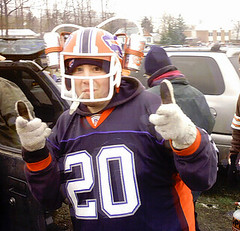
In this brave new economy of ours (you know, the one where they privatize the profits and socialize the debt), we’re all gonna have to fend for ourselves a bit more. That’s why I was so happy to get a note the other day from reader Chris Markham (that’s him at right), who informed me of an interesting do-it-yourself project he’d recently undertaken. I hereby surrender the podium to him:
One day back in 2004, I was randomly perusing through a Spencer’s store, when I saw this beer helmet for sale. It was nothing grand, just a simple blue and black helmet with some holders on the sides for a recommended beverage (oops!). After a couple of minutes pondering what I could really do with it, I decided to buy it and, since I’m a lifelong Bills fan, turn it into a Bills helmet. I was very happy with the results and bring it tailgating with me to every game I attend.
A couple of weeks ago, I happened to be in Spencer’s again and saw the same blank helmet. Now that the Bills have their oh-so-beautiful throwbacks, I decided to make another one and document the process.
First I used painter’s tape to tape up the pads on the inside, as well as the silver “snaps” on the outside. Then I bought white plastic spray paint and painted the entire helmet white. It took a couple coats to completely wash away the black and blue.
Next, I bought some acrylic black and white paint and mixed them to get the right shade of gray. Then I carefully painted the facemask (yes, on my dryer).
I was able to find Bills throwback decals on eBay and applied them to the helmet underneath the beverage holder. I was unable to find helmet stripes on eBay, though, so I ended up buying the stripes from this site. Happily, there was no minimum order.
After applying the stripes, I used some white striping to create a the blank neck bumper (one thing I love about the Bills throwback helmets, is that there’s no mumbo-jumbo on the back). Then quick poke through the top of the helmet for the straws and it’s ready for action!
I decided not to add a nose bumper decal for a two reasons: 1) I tried a blank one and it looks better without it, and 2) I couldn’t find one that said “Riddell” on it.
It was a pretty simple and fun process, costing only $40 or so create. When not in use, the throwback design looks great on display next to the regular helmet, and I can be assured of being the best-looking guy drinking out of a straw this Sunday. Go Bills!
Great stuff. I think I speak for everyone here when I say we have nothing to fear from the nation’s recent financial meltdown as long as home-grown ingenuity like this is on display. Show me a Malaysian who can turn out this kind of workmanship for 10 ¢ an hour and I’ll show you an NFL team that’s arranged to play some of its “home” games in a foreign country (oops). Let’s hope the Canadian customs officials don’t confiscate Chris’s specialized headwear when he goes to Toronto for the Bills/Dolphins game later this season.
Uni Watch News Ticker: Three good baseball card finds from Andy Chalifour: Charlie Hayes during his cleaer-facemask phase (I’ve run a shot of this mask before, but this photo is much better), Curt Flood with his name spelled out on the fingers of his glove, and a hilariously lazy attempt to make Oscar Gamble not look like a Phillie. ”¦ Ryder Cup observations from Chris Burris: Ben Curtis has the American flag on his shoes; all the Americans had mesh-ventilated caps, except for Phil Mickelson; the Americans’ bags look like this; and the Golf Channel’s Alex Miceli has some interesting ideas about how to dress. ”¦ Got a note from Matt Mitchell with “i blame you” in the subject line. Text read as follows: “Whenever I see something like this, my first thought is ‘Hey ”” TV numbers. I gotta clip this and ship it to Paul.’ Note the mesh backs. And who’s green and who’s blue?” ”¦ Yesterday’s post on helmet carts led Chad Cate to point out this site. ”¦ It also led Bill Gornall to show me this (details here). ”¦ And it led Helmet Hut honcho Curtis Worrell to let me know that he’s in the market for a vintage helmet cart, so if you see one driving around, please carjack it and send Curtis the keys. ”¦ The perfect marriage of athlete and sponsor (thanks, Scott). ”¦ The Daily News here in NYC had this on their web site yesterday (with thanks to John Muir). ”¦ Doug Mooney attended the MotoGP race in Indianapolis last weekend and noticed Nicky Hayden saluting the Colts with a special helmet design. ”¦ If you go to this page and scroll down a bit on the on-screen menu, you’ll find a nice little video clip of the University of Illinois equipment staffpreparing the throwbacks worn in the team’s home opener (with thanks to Andrew Joseph) ”¦ Several readers sent along this shot from the NHL’s rookie tournament in Traverse City. Note the “JHM” memorial patch for John H. McConnell on the Blue Jackets jersey. … James Wortham was poking around in his in-laws’ attic when he found a box of his father-in-law’s sports-related treasures — Little League photos, early shots of the Astrodome, scorecards, etc., mostly from the early ’60s. Priceless stuff, and he’s been nice enough to gather it all into a slideshow here. … The Magic’s new uniform is apparently shown in this NBA 2K9 screen shot (as forwarded by Anfernee Lam). … Big article here about NFL players wearing wristbands above their elbows.
Man. U. has a patch for winning Champions League
link
Better View here
link
Now, does the treasury dept. get a cut of the shirt sales?
I dont get it, AIG and Wagner?
Thanks for the spotlight today, Paul!
For those interested, I created a short slideshow here of the 2 helmets: link
link…but does he forget what to do to dial the last number called?
—-
aig & billy wagner = they’re both broken
[quote comment=”290215″]I dont get it, AIG and Wagner?[/quote]
AIG needs a bail out, much like Wagner’s career
Syracuse makes a historical mistake via the Nike swoosh
link
Never mind the Blue Jackets’ patch, check out the awesomeness of those pre-swift Blues jerseys.
Er, let me rephrase that…
Never mind the Blue Jackets’ patch, check out the awesomeness of those pre-Edge Blues jerseys.
this is a kid from my friends frat at michigan. its made of wood.
link
I salute that Oscar Gamble card.
As a kid, I would have derided (and obsesssed over) the white out of the Phillies mark, but, my god, just look at the interesting, highly unusual photograph for a card. His card, his identity to thousands of kids that year, is captured away from the action, in a cloud of dust, on the ground, helmetless (better able to showcase the great afro) looking back to see if his efforts at breaking up the DP had worked. Sometimes Topps could really surprise a kid. A special card.
Re: The New York Times article on wristbands.
“We don’t want our kids looking like walking billboards.”
Nothing else to say.
[quote comment=”290222″]this is a kid from my friends frat at michigan. its made of wood.
link
Natty light would not exist if not for college kids! But, that guy needs to know you don’t mix a basketball jersey with a football helmet.
High school players aren’t allowed to wear their wristbands above their elbows.
I had to tell two freshman kids in a game last night to put their wristbands back where they belonged.
[quote comment=”290226″]High school players aren’t allowed to wear their wristbands above their elbows.
I had to tell two freshman kids in a game last night to put their wristbands back where they belonged.[/quote]
Are they allowed to wear the bicep bands below the elbow or are they forced to wear actual sweatbands?
Nicky Hayden also has small Colts jersey decals on either side of his bike that say Hayden 69.
Chris Markham is my hero (next to Paul, of course). Awesome work, Chris! Your helmets make Homer’s link seem amateurish in comparison!
[quote comment=”290221″]Er, let me rephrase that…
Never mind the Blue Jackets’ patch, check out the awesomeness of those pre-Edge Blues jerseys.[/quote]
Here here! I loved those sweaters.
[quote comment=”290230″][quote comment=”290221″]Er, let me rephrase that…
Never mind the Blue Jackets’ patch, check out the awesomeness of those pre-Edge Blues jerseys.[/quote]
Here here! I loved those sweaters.[/quote]
Looking at it again, I just noticed that it’s the pre-EDGE sweaters and seemingly pre-EDGE socks, but with EDGE pant shells… whats up with that?
Great helmets, Chris!
“Not to be used with alcoholic beverages”? I take it the company doesn’t want to be liable for excessive drunkenness? :-)
Do all drink hats have that?
[quote comment=”290227″][quote comment=”290226″]High school players aren’t allowed to wear their wristbands above their elbows.
I had to tell two freshman kids in a game last night to put their wristbands back where they belonged.[/quote]
Are they allowed to wear the bicep bands below the elbow or are they forced to wear actual sweatbands?[/quote]
i don’t think they’re wearing bicep or wrist bands for their intended purpose, so does it really make a difference–they prolly just took them off
too bad kenn couldn’t tell the kids to put their ASSES back where they belonged…on the pine
Like the Flood photo: link
currently on ebay is this Topps neg of Roger Nelson: link
That’s his nickname “Spider” on the fingers
Yesterday at my son’s middle school football game, a player was told to remove the bicep (calf?) band he was wearing just below his knee.
A Nebraska blogger has posed the question of whether the Cornhuskers will ever don throwbacks, while throwing some jabs at Virginia Tech’s recent Nike efforts.
The writer even provides a nice summary of the school’s major uniform trends of the past.
link
We never had any rules about wristbands in my high school days. I wore two above my elbows and one on my left knee. Never had a problem.
[quote comment=”290222″]this is a kid from my friends frat at michigan.[/quote]
It’s not frat, it’s fraternity.
You don’t call your country a c###, do you?
;)
(Just flashing back to the mid-90s, that’s all…)
About the Hog Helmet car….
The original, link, had “S. Little” across the front of it in honor of All-American kicker link. This guy that’s redoing the helmet is refusing to put the name back on the front because Little was paralyzed from the neck down after driving drunk one night. He says that Little sets a bad example.
The hats that every member of the Ryder Cup team, except Phil, is made by Nike. It usually featrues a swoosh on the front, a “SQ” logo with a small swoosh on the right side, and a Nike One logo on the left side. For what it is worth, the back has an adjustable, velcro closure. I am guessing that the hat he is wearing is made by Callaway, but from the pic it is hard to tell.
[quote comment=”290237″]We never had any rules about wristbands in my high school days. I wore two above my elbows and one on my left knee. Never had a problem.[/quote]
Illustrated rules from the 2008 High School Football Rules Book:
link
link
link
link
…And let’s not forget the hilariously lazy attempt to make Oscar Gamble not look like an Indian:
link
[quote comment=”290239″]About the Hog Helmet car….
The original, link, had “S. Little” across the front of it in honor of All-American kicker link. This guy that’s redoing the helmet is refusing to put the name back on the front because Little was paralyzed from the neck down after driving drunk one night. He says that Little sets a bad example.[/quote]
Also, notice the emblem on the helmet. The razorback is red, when it is supposed to be white.
link
Biceps bands offer no competitive advantage, so why make kids take them off? A few years ago I wore them all the time in high school until my last football game, where after we were losing in the 4th quarter, the line judge finally asked me to take them off, as if he had just remembered the rule. It seems to me someone at the top of the high school athletics organization really just has it out for them, and everyone else doesn’t give a shit. I’m a big fan of traditional uniforms, but I think it’s a good look for whoever chooses to wear it.
Also from NHL prospects tour, DET is using their standard preseason lettering on their prospects as well.
link|1&axs=0|82856564%2c82856560%2c82856537%2c82856533%2c82856529%2c82856524%2c82849720%2c82849719%2c82849717%2c82849716%2c82849715%2c82849714%2c82849709%2c82849707%2c82849508%2c82849504%2c82842590%2c82842575%2c82842572%2c82842562%2c82842544%2c82842522%2c82842518%2c82842517%2c82842511%2c82842509%2c82842508%2c82842506%2c82842500%2c82842496%2c82842493%2c82842491%2c82842489%2c82842488%2c82842486%2c82842484%2c82842482%2c82842481%2c82842479%2c82842476%2c82842473%2c82842470%2c82842467%2c82842466%2c82842464%2c82842462%2c82842460%2c82842458%2c82842455%2c82842452%2c82842450%2c82842448%2c82842446%2c82842443%2c82842442%2c82842439%2c82822999%2c82822996%2c82822992%2c82740167|0&id=82856529
Watched ATL vs DET prospects game last night on NHL network. Pretty good game for a bunch of prospects…
[quote comment=”290221″] check out the awesomeness of those pre-Edge Blues jerseys.[/quote]
As someone who was weaned on the classic 60’s/70’s Blues sweater, these don’t do it for me. Too much black (there shouldn’t be ANY black) and the wide black stripe at the bottom of the sweater only blends into the black pants (WHY BLACK PANTS?) to make the sweater look too short. The shoulder bars give it that classic look, but again there shouldn’t be any black in there.
Hey, that Houston Colt 45’s slide show was awesome!!!
-Jet
[quote comment=”290242″]…And let’s not forget the hilariously lazy attempt to make Oscar Gamble not look like an Indian:
link
Love the cheesy headline. That card should come with its own rimshot.
[quote comment=”290246″][quote comment=”290221″] check out the awesomeness of those pre-Edge Blues jerseys.[/quote]
As someone who was weaned on the classic 60’s/70’s Blues sweater, these don’t do it for me. Too much black (there shouldn’t be ANY black) and the wide black stripe at the bottom of the sweater only blends into the black pants (WHY BLACK PANTS?) to make the sweater look too short. The shoulder bars give it that classic look, but again there shouldn’t be any black in there.
Hey, that Houston Colt 45’s slide show was awesome!!!
-Jet[/quote]
This is how STL should look….
link
[quote comment=”290214″]Man. U. has a patch for winning Champions League
[/quote]
And what be the worlds most link number font for European games. Though it might’ve been the 0-0 scoreline that had me yawning. =/
I think there are bigger things to worry about than bicep bands… like link (both the uniform design and the NOB).
[quote comment=”290248″][quote comment=”290246″][quote comment=”290221″] check out the awesomeness of those pre-Edge Blues jerseys.[/quote]
As someone who was weaned on the classic 60’s/70’s Blues sweater, these don’t do it for me. Too much black (there shouldn’t be ANY black) and the wide black stripe at the bottom of the sweater only blends into the black pants (WHY BLACK PANTS?) to make the sweater look too short. The shoulder bars give it that classic look, but again there shouldn’t be any black in there.
Hey, that Houston Colt 45’s slide show was awesome!!!
-Jet[/quote]
This is how STL should look….
link
I agree. It’s a travesty that they’ve gotten away from the original look.
[quote comment=”290246″][quote comment=”290221″] check out the awesomeness of those pre-Edge Blues jerseys.[/quote]
As someone who was weaned on the classic 60’s/70’s Blues sweater, these don’t do it for me. Too much black (there shouldn’t be ANY black) and the wide black stripe at the bottom of the sweater only blends into the black pants (WHY BLACK PANTS?) to make the sweater look too short. The shoulder bars give it that classic look, but again there shouldn’t be any black in there.
Hey, that Houston Colt 45’s slide show was awesome!!!
-Jet[/quote]
It’s not black… it’s Navy! The Blues’ pre-Edge sweaters (and the gawd-awful Edge jerseys, for that matter) combine royal blue and navy blue.
Admittedly, not as good as their link link, but better than link monstrosity…
Sadly, I fear the Blues will return to the “Bettman bib” when the regular season returns.
[quote comment=”290247″][quote comment=”290242″]…And let’s not forget the hilariously lazy attempt to make Oscar Gamble not look like an Indian:
link
Love the cheesy headline. That card should come with its own rimshot.[/quote]
Speaking of cheesy/groaner headlines…
In late 50’s, Taylor Phillips, a pitcher whose nickname was “T-Bone,” went to the Phillies in a trade, and this headline appeared…
T-Bone Becomes Philly Minion
(Honest. I’m not smart enough to make this stuff up)
—Ricko
The Chattanooga Lookouts (AA baseball, Southern League) are changing their affiliation from the Cincinnati Reds to the Los Angeles Dodgers; new uniforms could be introduced as early as next week.
link
link
[quote comment=”290252″][quote comment=”290246″][quote comment=”290221″] check out the awesomeness of those pre-Edge Blues jerseys.[/quote]
As someone who was weaned on the classic 60’s/70’s Blues sweater, these don’t do it for me. Too much black (there shouldn’t be ANY black) and the wide black stripe at the bottom of the sweater only blends into the black pants (WHY BLACK PANTS?) to make the sweater look too short. The shoulder bars give it that classic look, but again there shouldn’t be any black in there.
Hey, that Houston Colt 45’s slide show was awesome!!!
-Jet[/quote]
It’s not black… it’s Navy! The Blues’ pre-Edge sweaters (and the gawd-awful Edge jerseys, for that matter) combine royal blue and navy blue.
Admittedly, not as good as their link link, but better than link monstrosity…
Sadly, I fear the Blues will return to the “Bettman bib” when the regular season returns.[/quote]
or link
aboot the only thing keenan ever did right (nixing it, that is)
Liverpool went without shirt sponsor Carsburg’s logo on their jersey for their Champions League match at Marseille yesterday. Not because of anything to do with the financial crisis, but because France doesn’t allow alcohol ads!
link
[quote comment=”290254″]The Chattanooga Lookouts (AA baseball, Southern League) are changing their affiliation from the Cincinnati Reds to the Los Angeles Dodgers; new uniforms could be introduced as early as next week.
link
link
Dang, a 21-year affiliation is about to go down the drain. It’s a shame.
[quote comment=”290255″][quote comment=”290252″][quote comment=”290246″][quote comment=”290221″] check out the awesomeness of those pre-Edge Blues jerseys.[/quote]
As someone who was weaned on the classic 60’s/70’s Blues sweater, these don’t do it for me. Too much black (there shouldn’t be ANY black) and the wide black stripe at the bottom of the sweater only blends into the black pants (WHY BLACK PANTS?) to make the sweater look too short. The shoulder bars give it that classic look, but again there shouldn’t be any black in there.
Hey, that Houston Colt 45’s slide show was awesome!!!
-Jet[/quote]
It’s not black… it’s Navy! The Blues’ pre-Edge sweaters (and the gawd-awful Edge jerseys, for that matter) combine royal blue and navy blue.
Admittedly, not as good as their link link, but better than link monstrosity…
Sadly, I fear the Blues will return to the “Bettman bib” when the regular season returns.[/quote]
or link
aboot the only thing keenan ever did right (nixing it, that is)[/quote]
Maybe it’s just me, but with STL third jersey design being rumored as the note and the arch together, I am not seeing this coming out well. Predicting tragety….
[quote comment=”290255″][quote comment=”290252″][quote comment=”290246″][quote comment=”290221″] check out the awesomeness of those pre-Edge Blues jerseys.[/quote]
As someone who was weaned on the classic 60’s/70’s Blues sweater, these don’t do it for me. Too much black (there shouldn’t be ANY black) and the wide black stripe at the bottom of the sweater only blends into the black pants (WHY BLACK PANTS?) to make the sweater look too short. The shoulder bars give it that classic look, but again there shouldn’t be any black in there.
Hey, that Houston Colt 45’s slide show was awesome!!!
-Jet[/quote]
It’s not black… it’s Navy! The Blues’ pre-Edge sweaters (and the gawd-awful Edge jerseys, for that matter) combine royal blue and navy blue.
Admittedly, not as good as their link link, but better than link monstrosity…
Sadly, I fear the Blues will return to the “Bettman bib” when the regular season returns.[/quote]
or link
aboot the only thing keenan ever did right (nixing it, that is)[/quote]
There is a certain quality of those jerseys that I like. Not as sports jerseys, but it’d make an awesome backdrop for a St. Louis Blues poster with a whole bunch of players on it.
[quote comment=”290255″][quote comment=”290252″][quote comment=”290246″][quote comment=”290221″] check out the awesomeness of those pre-Edge Blues jerseys.[/quote]
As someone who was weaned on the classic 60’s/70’s Blues sweater, these don’t do it for me. Too much black (there shouldn’t be ANY black) and the wide black stripe at the bottom of the sweater only blends into the black pants (WHY BLACK PANTS?) to make the sweater look too short. The shoulder bars give it that classic look, but again there shouldn’t be any black in there.
Hey, that Houston Colt 45’s slide show was awesome!!!
-Jet[/quote]
It’s not black… it’s Navy! The Blues’ pre-Edge sweaters (and the gawd-awful Edge jerseys, for that matter) combine royal blue and navy blue.
Admittedly, not as good as their link link, but better than link monstrosity…
Sadly, I fear the Blues will return to the “Bettman bib” when the regular season returns.[/quote]
or link
aboot the only thing keenan ever did right (nixing it, that is)[/quote]
That and ending NYR Stanley Cup drought…
[quote comment=”290260″][quote comment=”290255″]or link
aboot the only thing keenan ever did right (nixing it, that is)[/quote]
That and ending NYR Stanley Cup drought…[/quote]
that’s a good thing?
[quote comment=”290261″][quote comment=”290260″][quote comment=”290255″]or link
aboot the only thing keenan ever did right (nixing it, that is)[/quote]
That and ending NYR Stanley Cup drought…[/quote]
that’s a good thing?[/quote]
Yeah, it was sad to see a histroical franchise going that long. Kinda like CHI now.
i was digging the KSU pants last night. blasphemy to love the purple, but alas, i did. sorry paul :(
I play alot of Rec basketball, some flag football and other sports where wristbands could apply. I used to wear them, on the forearm, just below the elbow. Part fashion, part function (I could wipe sweat off my forehead with them there).
I’m going to be a trendsetter today, and rock them old school, on my wrists, like they are supposed to be.
[quote comment=”290263″]i was digging the KSU pants last night. blasphemy to love the purple, but alas, i did. sorry paul :([/quote]
Here ya’ go:
link
link
And I’ll say it AGAIN! I strongly dislike when high-profile Nike teams are given obscurely colored uniforms without corresponding cleats!
Make some purple accented cleats for KSU, LSU, C’mon!
What are the normal K-State pantaloons?
trading floor jackets. mesh = air conditioning. trading pits can get a little hot.
While reviewing the Houston slideshow, I was interested to find that Colt Stadium, the predecessor to the Astrodome, was built solely to be the temporary home for the expansion Colts/Astros until the real stadium could be built. It appears as though the field was allowed to immediately go into a state of disrepair and the stadium was virtually unused between the time the Astrodome was built and Colt Stadium was dismantled in the 70’s to be reconstructed in the Mexican League.
I can’t think of another situation in the 20th century where a major league stadium in any sport was built with the knowledge that it would be discarded a few years later.
[quote comment=”290266″]What are the normal K-State pantaloons?[/quote]
Silver. Silver-Gray. Whatever you want to call it.
[quote comment=”290266″]What are the normal K-State pantaloons?[/quote]
link or link, depending on your determination of what that color is…same as the helmet tho
[quote comment=”290268″]While reviewing the Houston slideshow, I was interested to find that Colt Stadium, the predecessor to the Astrodome, was built solely to be the temporary home for the expansion Colts/Astros until the real stadium could be built. It appears as though the field was allowed to immediately go into a state of disrepair and the stadium was virtually unused between the time the Astrodome was built and Colt Stadium was dismantled in the 70’s to be reconstructed in the Mexican League.
I can’t think of another situation in the 20th century where a major league stadium in any sport was built with the knowledge that it would be discarded a few years later.[/quote]
Didn’t the 49ers and Raiders do that in the Bay Area?
Those pants are gray, ladies and gentlemen. Gray. There’s no metallicky undertone.
[quote comment=”290269″][quote comment=”290266″]What are the normal K-State pantaloons?[/quote]
Silver. Silver-Gray. Whatever you want to call it.[/quote]
exactly…
hey ricko…i asked you this last night, but didn’t know if you saw it…do you have a photographic memory?
sweet helmet…but does he forget what to do to dial the last number called?
Heh-heh. I like it, LI Phil.
Great slideshow, James Wortham! Thanks for sharing.
Wollen1, Colt Stadium also is legendary for the persistently awful mosquito situation it had. Methinks Houston baseball fans didn’t miss that when they went indoors.
Ah, Oscar Gamble. If there was a better Afro in MLB, I want to see pictures. Sweet ‘fro.
Help!
On July 19th the Mariner’s wore 1989 throwbacks. Paul linked a picture at cbssportline (link now dead) showing Ichiro reaching to grab a fly ball. In his sunglasses you could see reflections of his arms. Anyone still have that picture?
[quote comment=”290261″][quote comment=”290260″][quote comment=”290255″]or link
aboot the only thing keenan ever did right (nixing it, that is)[/quote]
That and ending NYR Stanley Cup drought…[/quote]
that’s a good thing?[/quote]
NYR + win = BAD
NYR + fail = GOOD
very simple math
San Diego Padres rookies trading uniforms for Hooters uniforms:
link
[quote comment=”290268″]I can’t think of another situation in the 20th century where a major league stadium in any sport was built with the knowledge that it would be discarded a few years later.[/quote]
Yeah, that’s a poser right there.
Turner Field was built to be temporary in its original configuration and then was reworked into a ballpark. Supposedly if Chicago gets the 2016 Olympics (God forbid), the stadium they’ll have to build (because, even at a half-billion bucks, Soldier Field just doesn’t cut it) will be temporary and then reworked into a much smaller deal.
But you’re right – I can’t think of one, either. There were stadiums that turned out to be temporary digs, but I can’t recall any that were actually planned to have short lifespans (that said, one of the absolute coolest things about our trip to the World Cup in ’06 was the link right outside the Reichstag in Berlin where they would show other games and stuff).
Lastly, I don’t know the rationale for the wristband things. The kids last night had the UnderArmour little bands. Technically, any of that stuff isn’t supposed to go more than three inches up from the wrist, but as long as it’s below the elbow, I’ll normally let it go at the freshman or jayvee level. Varsity they’re pretty strict. All I know is, they told us not to allow it and I have enough to worry about without questioning why.
And the pics that MPowers linked to (well done there) aren’t technically from the rules book but from Rules Simplified and Illustrated, or what we commonly refer to as the “comic book” or “funny book” (depending on the age of the speaker). Same publisher, same auspices, but just one of the many books we have (Rules Book, Case Book, Officials Manual, Rules by Topic, Bin Book, Simplified and Illustrated and Officials Handbook are all on my desk as I type this because I have a big game in the middle of nowhere tonight).
[quote comment=”290256″]Liverpool went without shirt sponsor Carsburg’s logo on their jersey for their Champions League match at Marseille yesterday. Not because of anything to do with the financial crisis, but because France doesn’t allow alcohol ads!
link
Ranger FC had the same issue in France last year. Instead of having “no ad” jerseys, link
Man, link truly was a work of art. (Hey, that kinda fits the theme of today’s post!)
I remember watching White Sox games as a kid wondering how his kept his hat on. I wondered the same thing about link, too.
should have said “… how HE kept his hat on…”
Here’s a little logo creep for you.
This is one of the annual corn mazes that occurs here in Northern California (along the coast, just south of SF).
Apparently, they have a sponsor this year, check it out and see if you can notice who it is.
link
[quote comment=”290282″]Here’s a little logo creep for you.
This is one of the annual corn mazes that occurs here in Northern California (along the coast, just south of SF).
Apparently, they have a sponsor this year, check it out and see if you can notice who it is.
link
Sponsered maze, or is Toyota in the Crop Circle business now…
[quote comment=”290245″]Also from NHL prospects tour, DET is using their standard preseason lettering on their prospects as well.
link|1&axs=0|82856564%2c82856560%2c82856537%2c82856533%2c82856529%2c82856524%2c82849720%2c82849719%2c82849717%2c82849716%2c82849715%2c82849714%2c82849709%2c82849707%2c82849508%2c82849504%2c82842590%2c82842575%2c82842572%2c82842562%2c82842544%2c82842522%2c82842518%2c82842517%2c82842511%2c82842509%2c82842508%2c82842506%2c82842500%2c82842496%2c82842493%2c82842491%2c82842489%2c82842488%2c82842486%2c82842484%2c82842482%2c82842481%2c82842479%2c82842476%2c82842473%2c82842470%2c82842467%2c82842466%2c82842464%2c82842462%2c82842460%2c82842458%2c82842455%2c82842452%2c82842450%2c82842448%2c82842446%2c82842443%2c82842442%2c82842439%2c82822999%2c82822996%2c82822992%2c82740167|0&id=82856529
Watched ATL vs DET prospects game last night on NHL network. Pretty good game for a bunch of prospects…[/quote]
Why do the Red Wings use a different font for names on the jerseys in the preseason? It drives me nuts. I love their normal font.
[quote comment=”290284″][quote comment=”290245″]Also from NHL prospects tour, DET is using their standard preseason lettering on their prospects as well.
link|1&axs=0|82856564%2c82856560%2c82856537%2c82856533%2c82856529%2c82856524%2c82849720%2c82849719%2c82849717%2c82849716%2c82849715%2c82849714%2c82849709%2c82849707%2c82849508%2c82849504%2c82842590%2c82842575%2c82842572%2c82842562%2c82842544%2c82842522%2c82842518%2c82842517%2c82842511%2c82842509%2c82842508%2c82842506%2c82842500%2c82842496%2c82842493%2c82842491%2c82842489%2c82842488%2c82842486%2c82842484%2c82842482%2c82842481%2c82842479%2c82842476%2c82842473%2c82842470%2c82842467%2c82842466%2c82842464%2c82842462%2c82842460%2c82842458%2c82842455%2c82842452%2c82842450%2c82842448%2c82842446%2c82842443%2c82842442%2c82842439%2c82822999%2c82822996%2c82822992%2c82740167|0&id=82856529
Watched ATL vs DET prospects game last night on NHL network. Pretty good game for a bunch of prospects…[/quote]
Why do the Red Wings use a different font for names on the jerseys in the preseason? It drives me nuts. I love their normal font.[/quote]
Yeah it drives me nuts too. They use it because it’s on a nameplate (which they normally don’t use) so it’s easier to put on names with all the players coming and going from training camp. Why not just put normal font on a nameplate who knows… maybe it’s a you have to make the team to wear that font thing.
Most other teams wear regular font jersyes in preseason, don’t know why not DET.
[quote comment=”290284″][quote comment=”290245″]Also from NHL prospects tour, DET is using their standard preseason lettering on their prospects as well.
link|1&axs=0|82856564%2c82856560%2c82856537%2c82856533%2c82856529%2c82856524%2c82849720%2c82849719%2c82849717%2c82849716%2c82849715%2c82849714%2c82849709%2c82849707%2c82849508%2c82849504%2c82842590%2c82842575%2c82842572%2c82842562%2c82842544%2c82842522%2c82842518%2c82842517%2c82842511%2c82842509%2c82842508%2c82842506%2c82842500%2c82842496%2c82842493%2c82842491%2c82842489%2c82842488%2c82842486%2c82842484%2c82842482%2c82842481%2c82842479%2c82842476%2c82842473%2c82842470%2c82842467%2c82842466%2c82842464%2c82842462%2c82842460%2c82842458%2c82842455%2c82842452%2c82842450%2c82842448%2c82842446%2c82842443%2c82842442%2c82842439%2c82822999%2c82822996%2c82822992%2c82740167|0&id=82856529
Watched ATL vs DET prospects game last night on NHL network. Pretty good game for a bunch of prospects…[/quote]
Why do the Red Wings use a different font for names on the jerseys in the preseason? It drives me nuts. I love their normal font.[/quote]
It’s part of the lore that is the Detroit Red Wings. Like making smart draft choices:
link
Or winning Stanley Cups:
link
Would you rather they have a simple jersey, make bad draft picks and not win Stanley Cups?
link
[quote comment=”290286″][quote comment=”290284″][quote comment=”290245″]Also from NHL prospects tour, DET is using their standard preseason lettering on their prospects as well.
link|1&axs=0|82856564%2c82856560%2c82856537%2c82856533%2c82856529%2c82856524%2c82849720%2c82849719%2c82849717%2c82849716%2c82849715%2c82849714%2c82849709%2c82849707%2c82849508%2c82849504%2c82842590%2c82842575%2c82842572%2c82842562%2c82842544%2c82842522%2c82842518%2c82842517%2c82842511%2c82842509%2c82842508%2c82842506%2c82842500%2c82842496%2c82842493%2c82842491%2c82842489%2c82842488%2c82842486%2c82842484%2c82842482%2c82842481%2c82842479%2c82842476%2c82842473%2c82842470%2c82842467%2c82842466%2c82842464%2c82842462%2c82842460%2c82842458%2c82842455%2c82842452%2c82842450%2c82842448%2c82842446%2c82842443%2c82842442%2c82842439%2c82822999%2c82822996%2c82822992%2c82740167|0&id=82856529
Watched ATL vs DET prospects game last night on NHL network. Pretty good game for a bunch of prospects…[/quote]
Why do the Red Wings use a different font for names on the jerseys in the preseason? It drives me nuts. I love their normal font.[/quote]
It’s part of the lore that is the Detroit Red Wings. Like making smart draft choices:
link
Or winning Stanley Cups:
link
Would you rather they have a simple jersey, make bad draft picks and not win Stanley Cups?
link
TOR uni is simple, but that’s why I like it.
Gulity as charged for bad draft picks and not winning Cups.
If CHI can finish turning the corner and TOR can even find a damn corner to turn, the league would be so much better. Imagine a world where all original 6 teams make the playoffs. I wish I live to see that. Plus a DET MON Final… I think I would die of happiness.
id just like the isles to win one more cup in my lifetime
but FTH
[quote comment=”290287″][quote comment=”290286″][quote comment=”290284″][quote comment=”290245″]Also from NHL prospects tour, DET is using their standard preseason lettering on their prospects as well.
link|1&axs=0|82856564%2c82856560%2c82856537%2c82856533%2c82856529%2c82856524%2c82849720%2c82849719%2c82849717%2c82849716%2c82849715%2c82849714%2c82849709%2c82849707%2c82849508%2c82849504%2c82842590%2c82842575%2c82842572%2c82842562%2c82842544%2c82842522%2c82842518%2c82842517%2c82842511%2c82842509%2c82842508%2c82842506%2c82842500%2c82842496%2c82842493%2c82842491%2c82842489%2c82842488%2c82842486%2c82842484%2c82842482%2c82842481%2c82842479%2c82842476%2c82842473%2c82842470%2c82842467%2c82842466%2c82842464%2c82842462%2c82842460%2c82842458%2c82842455%2c82842452%2c82842450%2c82842448%2c82842446%2c82842443%2c82842442%2c82842439%2c82822999%2c82822996%2c82822992%2c82740167|0&id=82856529
Watched ATL vs DET prospects game last night on NHL network. Pretty good game for a bunch of prospects…[/quote]
Why do the Red Wings use a different font for names on the jerseys in the preseason? It drives me nuts. I love their normal font.[/quote]
It’s part of the lore that is the Detroit Red Wings. Like making smart draft choices:
link
Or winning Stanley Cups:
link
Would you rather they have a simple jersey, make bad draft picks and not win Stanley Cups?
link
TOR uni is simple, but that’s why I like it.
Gulity as charged for bad draft picks and not winning Cups.
If CHI can finish turning the corner and TOR can even find a damn corner to turn, the league would be so much better. Imagine a world where all original 6 teams make the playoffs. I wish I live to see that. Plus a DET MON Final… I think I would die of happiness.[/quote]
but the rbk edge Toronto sweater is a sad development. Now waist stripe and bare shoulders make it look like a practice jersey (before practice jersey were overdesigned crap)
link
Trajan SUCKS!
[quote comment=”290268″]While reviewing the Houston slideshow, I was interested to find that Colt Stadium, the predecessor to the Astrodome, was built solely to be the temporary home for the expansion Colts/Astros until the real stadium could be built. It appears as though the field was allowed to immediately go into a state of disrepair and the stadium was virtually unused between the time the Astrodome was built and Colt Stadium was dismantled in the 70’s to be reconstructed in the Mexican League.
I can’t think of another situation in the 20th century where a major league stadium in any sport was built with the knowledge that it would be discarded a few years later.[/quote]
Found a good site about Cold Stadium — (sorry don’t know how to post pitcures from a website) but there were two great pictures – one showing the Astrodome under construction off the first base side and another showing Cold Stadium off in the distance in the parking lots of the Astrodome!
link
anyone check out those horrific solid purple pants of K-State last night? If only they would have stayed with their stripe and done a grey and white stripe down the side, it wouldn’t look like they forgot their pants in Manhattan and someone ran out to WalMart to get something that would just “work”.
I wasn’t totally opposed to them, but they needed their traditional stripe!
Oh and great Husker article, would love to see the NU helmet once again!!
[quote comment=”290287″][quote comment=”290286″][quote comment=”290284″][quote comment=”290245″]Also from NHL prospects tour, DET is using their standard preseason lettering on their prospects as well.
link|1&axs=0|82856564%2c82856560%2c82856537%2c82856533%2c82856529%2c82856524%2c82849720%2c82849719%2c82849717%2c82849716%2c82849715%2c82849714%2c82849709%2c82849707%2c82849508%2c82849504%2c82842590%2c82842575%2c82842572%2c82842562%2c82842544%2c82842522%2c82842518%2c82842517%2c82842511%2c82842509%2c82842508%2c82842506%2c82842500%2c82842496%2c82842493%2c82842491%2c82842489%2c82842488%2c82842486%2c82842484%2c82842482%2c82842481%2c82842479%2c82842476%2c82842473%2c82842470%2c82842467%2c82842466%2c82842464%2c82842462%2c82842460%2c82842458%2c82842455%2c82842452%2c82842450%2c82842448%2c82842446%2c82842443%2c82842442%2c82842439%2c82822999%2c82822996%2c82822992%2c82740167|0&id=82856529
Watched ATL vs DET prospects game last night on NHL network. Pretty good game for a bunch of prospects…[/quote]
Why do the Red Wings use a different font for names on the jerseys in the preseason? It drives me nuts. I love their normal font.[/quote]
It’s part of the lore that is the Detroit Red Wings. Like making smart draft choices:
link
Or winning Stanley Cups:
link
Would you rather they have a simple jersey, make bad draft picks and not win Stanley Cups?
link
TOR uni is simple, but that’s why I like it.
Gulity as charged for bad draft picks and not winning Cups.
If CHI can finish turning the corner and TOR can even find a damn corner to turn, the league would be so much better. Imagine a world where all original 6 teams make the playoffs. I wish I live to see that. Plus a DET MON Final… I think I would die of happiness.[/quote] I don’t know what percentage of that corner’s been turned, but the Hawks have made more good moves in the last 12 months than they had in the previous 15 years. It’s amazing what can happen after #3 on the list of link dies.
[quote comment=”290287″][quote comment=”290286″][quote comment=”290284″][quote comment=”290245″]Also from NHL prospects tour, DET is using their standard preseason lettering on their prospects as well.
link|1&axs=0|82856564%2c82856560%2c82856537%2c82856533%2c82856529%2c82856524%2c82849720%2c82849719%2c82849717%2c82849716%2c82849715%2c82849714%2c82849709%2c82849707%2c82849508%2c82849504%2c82842590%2c82842575%2c82842572%2c82842562%2c82842544%2c82842522%2c82842518%2c82842517%2c82842511%2c82842509%2c82842508%2c82842506%2c82842500%2c82842496%2c82842493%2c82842491%2c82842489%2c82842488%2c82842486%2c82842484%2c82842482%2c82842481%2c82842479%2c82842476%2c82842473%2c82842470%2c82842467%2c82842466%2c82842464%2c82842462%2c82842460%2c82842458%2c82842455%2c82842452%2c82842450%2c82842448%2c82842446%2c82842443%2c82842442%2c82842439%2c82822999%2c82822996%2c82822992%2c82740167|0&id=82856529
Watched ATL vs DET prospects game last night on NHL network. Pretty good game for a bunch of prospects…[/quote]
Why do the Red Wings use a different font for names on the jerseys in the preseason? It drives me nuts. I love their normal font.[/quote]
It’s part of the lore that is the Detroit Red Wings. Like making smart draft choices:
link
Or winning Stanley Cups:
link
Would you rather they have a simple jersey, make bad draft picks and not win Stanley Cups?
link
TOR uni is simple, but that’s why I like it.
Gulity as charged for bad draft picks and not winning Cups.
If CHI can finish turning the corner and TOR can even find a damn corner to turn, the league would be so much better. Imagine a world where all original 6 teams make the playoffs. I wish I live to see that. Plus a DET MON Final… I think I would die of happiness.[/quote]
A Detroit-Montreal final would be grand. I’d also take Boston or the above-posted Leafs. From a history/uniform stand point, it would certainly be a much better final that the delightful Detroit-Hartford Carolina final of a few years back.
Sad news: Ron Lancaster, CFL legend and one of those link has passed away at age 69 from lung cancer.
[quote comment=”290257″][quote comment=”290254″]The Chattanooga Lookouts (AA baseball, Southern League) are changing their affiliation from the Cincinnati Reds to the Los Angeles Dodgers; new uniforms could be introduced as early as next week.
link
link
Dang, a 21-year affiliation is about to go down the drain. It’s a shame.[/quote]
I agree. Always seems a little sad to me when things change for no apparant reason.
My old Lookouts cap is one of my favorites.
[quote comment=”290297″]I agree. Always seems a little sad to me when things change for no apparant reason.[/quote]
There’s always a reason, and it’s usually money or philosophical differences. Sad, maybe, but rarely without an apparent reason.
The relationship with the Reds “had become stagnant”…
(sorry, I’m not savvy enough to post a link since the tag buttons went away…)
link
Guess I am after all…
[quote comment=”290231″]
Looking at it again, I just noticed that it’s the pre-EDGE sweaters and seemingly pre-EDGE socks, but with EDGE pant shells… whats up with that?[/quote]
All the junior players and rookies wear their pants with the dark breezers over top. The breezers are made by Rbk Hockey and must be worn due to the NHL merchandising contract. Unless a player has a specific contract where he promotes another company, he must wear the Rbk breezers.
None of the rookies or junior players have a contract, so they’re forced to wear Rbk’s breezers.
[quote comment=”290300″]Guess I am after all…[/quote]
descartes?
Just wanted to say that I picked up that Saving Face book that was mentioned in the ticker the other day…
PHENOMENAL hockey resource. Spend the money, and give it to yourself for Christmas or something. It is not to be missed if you’re a hockey fan.
[quote comment=”290301″][quote comment=”290231″]
Looking at it again, I just noticed that it’s the pre-EDGE sweaters and seemingly pre-EDGE socks, but with EDGE pant shells… whats up with that?[/quote]
All the junior players and rookies wear their pants with the dark breezers over top. The breezers are made by Rbk Hockey and must be worn due to the NHL merchandising contract. Unless a player has a specific contract where he promotes another company, he must wear the Rbk breezers.
None of the rookies or junior players have a contract, so they’re forced to wear Rbk’s breezers.[/quote]
Is there ANY merit to the design of Reebok’s jerseys in ANY sport?
I have to comment on the whole “bicep band” thing. They’re dumb. Its an accessory made to help enhance your look on the field. More specifically, they’re for WR’s and DB’s who want to make their string bean arms look bigger. Here’s an idea…get in the damn weightroom. I especially hate when players cut them to make them even narrower, but leave the logo. It looks like a cotton charm bracelet.
[quote comment=”290305″]I have to comment on the whole “bicep band” thing. They’re dumb. Its an accessory made to help enhance your look on the field. More specifically, they’re for WR’s and DB’s who want to make their string bean arms look bigger. Here’s an idea…get in the damn weightroom. I especially hate when players cut them to make them even narrower, but leave the logo. It looks like a cotton charm bracelet.[/quote]
link
[quote comment=”290218″][quote comment=”290215″]I dont get it, AIG and Wagner?[/quote]
AIG needs a bail out, much like Wagner’s career[/quote]
More like, Billy Wagner is going to need (actually, had successful) Tommy John surgery and his bobblehead is sponsored by AIG, which, among other things, handles health insurance……
There’s a funny uni related story in today’s Onion: NFL Fines Pacman Jones For Not Tucking Gun Into Pants
link
[quote comment=”290290″][quote comment=”290287″][quote comment=”290286″][quote comment=”290284″][quote comment=”290245″]Also from NHL prospects tour, DET is using their standard preseason lettering on their prospects as well.
link|1&axs=0|82856564%2c82856560%2c82856537%2c82856533%2c82856529%2c82856524%2c82849720%2c82849719%2c82849717%2c82849716%2c82849715%2c82849714%2c82849709%2c82849707%2c82849508%2c82849504%2c82842590%2c82842575%2c82842572%2c82842562%2c82842544%2c82842522%2c82842518%2c82842517%2c82842511%2c82842509%2c82842508%2c82842506%2c82842500%2c82842496%2c82842493%2c82842491%2c82842489%2c82842488%2c82842486%2c82842484%2c82842482%2c82842481%2c82842479%2c82842476%2c82842473%2c82842470%2c82842467%2c82842466%2c82842464%2c82842462%2c82842460%2c82842458%2c82842455%2c82842452%2c82842450%2c82842448%2c82842446%2c82842443%2c82842442%2c82842439%2c82822999%2c82822996%2c82822992%2c82740167|0&id=82856529
Watched ATL vs DET prospects game last night on NHL network. Pretty good game for a bunch of prospects…[/quote]
Why do the Red Wings use a different font for names on the jerseys in the preseason? It drives me nuts. I love their normal font.[/quote]
It’s part of the lore that is the Detroit Red Wings. Like making smart draft choices:
link
Or winning Stanley Cups:
link
Would you rather they have a simple jersey, make bad draft picks and not win Stanley Cups?
link
TOR uni is simple, but that’s why I like it.
Gulity as charged for bad draft picks and not winning Cups.
If CHI can finish turning the corner and TOR can even find a damn corner to turn, the league would be so much better. Imagine a world where all original 6 teams make the playoffs. I wish I live to see that. Plus a DET MON Final… I think I would die of happiness.[/quote]
but the rbk edge Toronto sweater is a sad development. Now waist stripe and bare shoulders make it look like a practice jersey (before practice jersey were overdesigned crap)[/quote]
Maybe that;s why they do so bad… they always think it’s practice!!
(rimshot)
[quote comment=”290264″]I play alot of Rec basketball, some flag football and other sports where wristbands could apply. I used to wear them, on the forearm, just below the elbow. Part fashion, part function (I could wipe sweat off my forehead with them there).
I’m going to be a trendsetter today, and rock them old school, on my wrists, like they are supposed to be.[/quote]
you couldn’t wipe the sweat from your forehead with them on your wrists?
[quote comment=”290302″][quote comment=”290300″]Guess I am after all…[/quote]
descartes?[/quote]
Renee would say he has to think first..
Yahoo appears to have a new feature called link. Should we file this one under the “purple = death” category?
[quote comment=”290310″]you couldn’t wipe the sweat from your forehead with them on your wrists?[/quote]
I thought the supposed idea of wristbands was to keep sweat from your arms from sliding onto your hands, making it harder to do things with a ball. At least originally. And headbands were to keep sweat out of your eyes.
One of the longer, cooler-looking wristbands (the ones they eventually came out with that are basically the size of two stuck together) can easily be used to wipe sweat off your brow, sure (as can a single, but less easily).
Didn’t Slick Watts or some Globetrotters wear multiple wristbands for aesthetic reasons? And I thought Mark Clayton started wearing long wristbands (after guys like Fred Biletnikoff would tape their forearms from wrist to elbow) and it caught on.
Might be a research project for Paul, if he hasn’t done it already – the history of wristbands and other forearm accoutrements.
[quote comment=”290312″]Yahoo appears to have a new feature called link. Should we file this one under the “purple = death” category?[/quote]
Kenyon College is happy to oblige
link
As are the UCA Bears. Remind me of Kansas State.
link
It appears the Mets are making a hard charge towards the top of the leaderboard in “court dates served for current and former players” late in the season.
link – former Met reliever
link
[quote comment=”290297″][quote comment=”290257″][quote comment=”290254″]The Chattanooga Lookouts (AA baseball, Southern League) are changing their affiliation from the Cincinnati Reds to the Los Angeles Dodgers; new uniforms could be introduced as early as next week.
link
link
Dang, a 21-year affiliation is about to go down the drain. It’s a shame.[/quote]
I agree. Always seems a little sad to me when things change for no apparant reason.
My old Lookouts cap is one of my favorites.[/quote]
Think the “eyes” logo will change, too? The logo has been among the most popular in the minor leagues for a long time. My guess is that the red will be ditched in favor of blue, but otherwise the logo remains intact.
[quote comment=”290268″]While reviewing the Houston slideshow, I was interested to find that Colt Stadium, the predecessor to the Astrodome, was built solely to be the temporary home for the expansion Colts/Astros until the real stadium could be built. It appears as though the field was allowed to immediately go into a state of disrepair and the stadium was virtually unused between the time the Astrodome was built and Colt Stadium was dismantled in the 70’s to be reconstructed in the Mexican League.
I can’t think of another situation in the 20th century where a major league stadium in any sport was built with the knowledge that it would be discarded a few years later.[/quote]
Jarry Park in Montreal was supposed to be a temporary home for the Expos, and was built specifically to house the major league team.
[quote comment=”290318″][quote comment=”290268″]While reviewing the Houston slideshow, I was interested to find that Colt Stadium, the predecessor to the Astrodome, was built solely to be the temporary home for the expansion Colts/Astros until the real stadium could be built. It appears as though the field was allowed to immediately go into a state of disrepair and the stadium was virtually unused between the time the Astrodome was built and Colt Stadium was dismantled in the 70’s to be reconstructed in the Mexican League.
I can’t think of another situation in the 20th century where a major league stadium in any sport was built with the knowledge that it would be discarded a few years later.[/quote]
Jarry Park in Montreal was supposed to be a temporary home for the Expos, and was built specifically to house the major league team.[/quote]
true, but link already existed as a 3,000 seat stadium…the expos promised to reconstruct it into a link seat link by opening day (which they did)…and they stayed there for like 8 years until link opened
[quote comment=”290317″][quote comment=”290297″][quote comment=”290257″][quote comment=”290254″]The Chattanooga Lookouts (AA baseball, Southern League) are changing their affiliation from the Cincinnati Reds to the Los Angeles Dodgers; new uniforms could be introduced as early as next week.
link
link
Dang, a 21-year affiliation is about to go down the drain. It’s a shame.[/quote]
I agree. Always seems a little sad to me when things change for no apparant reason.
My old Lookouts cap is one of my favorites.[/quote]
Think the “eyes” logo will change, too? The logo has been among the most popular in the minor leagues for a long time. My guess is that the red will be ditched in favor of blue, but otherwise the logo remains intact.[/quote]
Or it might not. When the then Devil Rays took over the Catfish from the Dodgers they did not change the colors from Dodger Blue to the Green the Rays were using at the time.
[quote comment=”290318″][quote comment=”290268″]While reviewing the Houston slideshow, I was interested to find that Colt Stadium, the predecessor to the Astrodome, was built solely to be the temporary home for the expansion Colts/Astros until the real stadium could be built. It appears as though the field was allowed to immediately go into a state of disrepair and the stadium was virtually unused between the time the Astrodome was built and Colt Stadium was dismantled in the 70’s to be reconstructed in the Mexican League.
I can’t think of another situation in the 20th century where a major league stadium in any sport was built with the knowledge that it would be discarded a few years later.[/quote]
Jarry Park in Montreal was supposed to be a temporary home for the Expos, and was built specifically to house the major league team.[/quote]
I think I remember the Tampa Bay Lightning in ’93 renovating an old baseball stadium to play in while their future digs were still being set up.
[quote comment=”290321″][quote comment=”290318″][quote comment=”290268″]While reviewing the Houston slideshow, I was interested to find that Colt Stadium, the predecessor to the Astrodome, was built solely to be the temporary home for the expansion Colts/Astros until the real stadium could be built. It appears as though the field was allowed to immediately go into a state of disrepair and the stadium was virtually unused between the time the Astrodome was built and Colt Stadium was dismantled in the 70’s to be reconstructed in the Mexican League.
I can’t think of another situation in the 20th century where a major league stadium in any sport was built with the knowledge that it would be discarded a few years later.[/quote]
Jarry Park in Montreal was supposed to be a temporary home for the Expos, and was built specifically to house the major league team.[/quote]
I think I remember the Tampa Bay Lightning in ’93 renovating an old baseball stadium to play in while their future digs were still being set up.[/quote]
I don’t know if it was previously used for baseball, but the Lightning played in Expo Hall from 1992-1993 until they moved into what is now Tropicana Field (at the time, called ThunderDome). The Rays now play at the Trop and the Lightning play in the St. Pete Times Forum.
[quote comment=”290311″][quote comment=”290302″][quote comment=”290300″]Guess I am after all…[/quote]
descartes?[/quote]
Renee would say he has to think first..[/quote]
Was he related to Popeye??
[quote comment=”290321″]I think I remember the Tampa Bay Lightning in ’93 renovating an old baseball stadium to play in while their future digs were still being set up.[/quote]
No.
Expo Hall at the Florida State Fairgrounds was a building that had long been standing and while I’m sure the Bolts put money into some renovations and it WAS a temporary solution, that doesn’t fit the Colt Stadium motif, a stadium specifically constructed for temporary use by a particular team.
And their “future digs” weren’t still being set up in 1992, they were complete and operating, as the Florida Suncoast Dome. But the venue was seen, at first, as too big for an expansion NHL team. I think they also hoped to get an arena built in Tampa, which wouldn’t happen for another four years.
Expo Hall, in point of fact, was the site of my high school graduation ceremony. It was a barn that was never used for baseball to my knowledge.
(As an aside, I wanted to give my son the middle name Kontos in honor of Chris Kontos, who scored four goals in the Bolts’ first game at Expo Hall, five months before my son’s birth. His mom, despite being half-Greek, wasn’t interested.)
[quote comment=”290324″][quote comment=”290321″]I think I remember the Tampa Bay Lightning in ’93 renovating an old baseball stadium to play in while their future digs were still being set up.[/quote]
No.
Expo Hall at the Florida State Fairgrounds was a building that had long been standing and while I’m sure the Bolts put money into some renovations and it WAS a temporary solution, that doesn’t fit the Colt Stadium motif, a stadium specifically constructed for temporary use by a particular team.
And their “future digs” weren’t still being set up in 1992, they were complete and operating, as the Florida Suncoast Dome. But the venue was seen, at first, as too big for an expansion NHL team. I think they also hoped to get an arena built in Tampa, which wouldn’t happen for another four years.
Expo Hall, in point of fact, was the site of my high school graduation ceremony. It was a barn that was never used for baseball to my knowledge.
(As an aside, I wanted to give my son the middle name Kontos in honor of Chris Kontos, who scored four goals in the Bolts’ first game at Expo Hall, five months before my son’s birth. His mom, despite being half-Greek, wasn’t interested.)[/quote]
Yeah. Expo Hall was very small. I wanna say maximum capacity is something like 10,000.
[quote comment=”290325″][quote comment=”290324″][quote comment=”290321″]I think I remember the Tampa Bay Lightning in ’93 renovating an old baseball stadium to play in while their future digs were still being set up.[/quote]
No.
Expo Hall at the Florida State Fairgrounds was a building that had long been standing and while I’m sure the Bolts put money into some renovations and it WAS a temporary solution, that doesn’t fit the Colt Stadium motif, a stadium specifically constructed for temporary use by a particular team.
And their “future digs” weren’t still being set up in 1992, they were complete and operating, as the Florida Suncoast Dome. But the venue was seen, at first, as too big for an expansion NHL team. I think they also hoped to get an arena built in Tampa, which wouldn’t happen for another four years.
Expo Hall, in point of fact, was the site of my high school graduation ceremony. It was a barn that was never used for baseball to my knowledge.
(As an aside, I wanted to give my son the middle name Kontos in honor of Chris Kontos, who scored four goals in the Bolts’ first game at Expo Hall, five months before my son’s birth. His mom, despite being half-Greek, wasn’t interested.)[/quote]
Yeah. Expo Hall was very small. I wanna say maximum capacity is something like 10,000.[/quote]
Is… Expo Hall is very small.
Can someone point me in the right direction to find info on those new football helmets that were breifly talked about the other day. The ones that are being tested or introduced at UAB and another school. Can’t remember anything about the company to use google to find em.
[quote comment=”290327″]Can someone point me in the right direction to find info on those new football helmets that were breifly talked about the other day. The ones that are being tested or introduced at UAB and another school. Can’t remember anything about the company to use google to find em.[/quote]
Nevermind.. I got it.
Frank Youell Field was built as a temporary stadium for the Raiders.
[quote comment=”290329″]Frank Youell Field was built as a temporary stadium for the Raiders.[/quote]
What I thought…
anyone can get an american flag on their footjoys or something cool like a Jayhawk or something crappy like a donkey logo.
link
Show me an adult with a beer helmet and I’ll show you a loser!!!!!!
ya know…those link are kinda growing on me…lovin them shoulders for some reason…pants still are annoying…
and i’ll even go so far as to say that WVU’s unis aren’t terrible either (no offense, scotty)
here’s a link link pics from the game…
notice how much link link love the bicep bands
What exactly does Colorado have painted on the 25-yard lines at Folsom Field? They also appear to have it on the fronts of their helmets.
It appears to be “Eddie,” in memory of Eddie Crowder, CU’s former football coach and AD
link
[quote comment=”290338″]What exactly does Colorado have painted on the 25-yard lines at Folsom Field? They also appear to have it on the fronts of their helmets.[/quote]
link (for eddie crowder)
will try for a screen grab
link
(sorry for the quality)
[quote comment=”290271″][quote comment=”290268″]While reviewing the Houston slideshow, I was interested to find that Colt Stadium, the predecessor to the Astrodome, was built solely to be the temporary home for the expansion Colts/Astros until the real stadium could be built. It appears as though the field was allowed to immediately go into a state of disrepair and the stadium was virtually unused between the time the Astrodome was built and Colt Stadium was dismantled in the 70’s to be reconstructed in the Mexican League.
I can’t think of another situation in the 20th century where a major league stadium in any sport was built with the knowledge that it would be discarded a few years later.[/quote]
Didn’t the 49ers and Raiders do that in the Bay Area?[/quote]
They’re STILL doing it. Have YOU seen Candlestick lately?
[quote comment=”290342″][quote comment=”290271″][quote comment=”290268″]While reviewing the Houston slideshow, I was interested to find that Colt Stadium, the predecessor to the Astrodome, was built solely to be the temporary home for the expansion Colts/Astros until the real stadium could be built. It appears as though the field was allowed to immediately go into a state of disrepair and the stadium was virtually unused between the time the Astrodome was built and Colt Stadium was dismantled in the 70’s to be reconstructed in the Mexican League.
I can’t think of another situation in the 20th century where a major league stadium in any sport was built with the knowledge that it would be discarded a few years later.[/quote]
Didn’t the 49ers and Raiders do that in the Bay Area?[/quote]
They’re STILL doing it. Have YOU seen Candlestick lately?[/quote]
Sorry, I only watch good football.
[quote comment=”290329″]Frank Youell Field was built as a temporary stadium for the Raiders.[/quote]
Good call and here’s a good article or two about it:
link
[quote comment=”290327″]Can someone point me in the right direction to find info on those new football helmets that were breifly talked about the other day. The ones that are being tested or introduced at UAB and another school. Can’t remember anything about the company to use google to find em.[/quote]
Xenith helmets:
link
[quote comment=”290306″][quote comment=”290305″]I have to comment on the whole “bicep band” thing. They’re dumb. Its an accessory made to help enhance your look on the field. More specifically, they’re for WR’s and DB’s who want to make their string bean arms look bigger. Here’s an idea…get in the damn weightroom. I especially hate when players cut them to make them even narrower, but leave the logo. It looks like a cotton charm bracelet.[/quote]
link[/quote]
No, this guy:
link
[quote comment=”290336″]ya know…those link are kinda growing on me…lovin them shoulders for some reason…pants still are annoying…
and i’ll even go so far as to say that WVU’s unis aren’t terrible either (no offense, scotty)[/quote]
The Buff’s unis are terrible and so are the ‘Eers! Man, I’m not in the best mood after last night….grrrrrrr