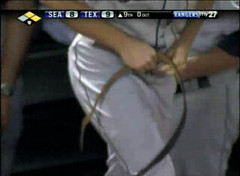
There was a uni-related sequence for the ages during last night’s Mariners/Rangers game in Arlington. With the Mariners trailing by a run in the top of the 9th, Kenji Johjima was hit by a pitch and had to leave the game. With the Seattle bench running a tad thin (Jeff Clement and Jose Vidro are both nicked up), skipper Jim Riggleman called on pitcher Jarrod Washburn to pinch-run — which turned out to be slightly problematic, because Washburn was out of uniform.
There was a slight delay as Washburn disappeared into the clubhouse to put on spikes and a jersey. He eventually re-emerged into the dugout while still tucking in his shirttails fore and aft. Just one problem: He’d forgotten to put on a belt. So Riggleman, displaying the kind of keen managerial acumen that only a man with a season-opening 14-game losing streak on his résumé can possess, took off his own belt and proceeded to give Washburn a whoopin’ handed it to Washburn, who then held the belt while doing a bit more tucking, zipping up his pants, and trotting to first base, where he finally put on the belt.
All this occasioned a fair degree of merriment in the Rangers’ broadcast booth, where Tom Grieve noted, among other things, that it was a good thing Lou Piniella no longer manages the Mariners, or else Washburn would’ve had to wrap the belt around his waist twice.
Footnote: Washburn eventually scored the go-ahead run. I have not yet been able to ascertain whether he then returned the belt to Riggleman, but it’s worth noting that Seattle ended up losing the game a half-inning later, which is the sort of thing that can happen when your manager is working without a crucial component of his uniform.
(Special thanks to Jerry Gardner for bringing this delicious fiasco to my attention.)
Soylent Green Dot: Monday’s coverage of the NFL’s new logo-emblazoned green dot prompted an interesting note from reader Mike Brodsky. Check it out:
My employer, Deloitte, has a green dot at the end of its logo. It’s been in place since 2003. While the green “dot” is effectively a period at the end of a one-word sentence, the purpose of the green dot is for “finality” or to “stop” — i.e., you need look no further for your professional service needs (audit, tax, financial advisory, consulting). ”¦
The green dot has taken on a life of its own at Deloitte. Our “greening” initiative is called “the greening of the green dot.” If you ask my kids where I work, my youngest will say “Daddy works at Deloitte greendot.” For the past three years, we’ve had an annual “Deloitte Film Festival” where Deloitte employees are invited to make short films about their “Deloitte experience,” and many of the movies focus on the ubiquitous green dot. In addition, we’ve all been given lapel pins with the “D” in the Deloitte logo followed by a green dot.
When the green dot started appearing on NFL helmets last year, someone at work mentioned it to me and thought maybe we’d struck a sponsorship deal with the NFL, but I have a buddy who works for the Pats and he told me what it was about. I admit it’s funny seeing green dots in random places since it’s such a part of our corporate identity. When I read that defensive players would be wearing the dot this season, I thought, “Wonderful branding idea — it could be the NFL Defensive Player sponsored by Deloitte.”
Man, you just know someone at NFL HQ is scurrying to explore that idea at this very moment (because as we all know, if there’s one thing the NFL needs, it’s more corporate sponsorships). Nice going, Mike.
Uni Watch News Ticker: I’d totally bid on this, except it’s too big. ”¦ “Do you know what this photo is all about?” asks Neil Paine. “It’s Peter Forsberg in 1995, the first year the Avalanche were in Denver, but the uniform is way off. The burgundy of the jersey is too bright/red, and he’s wearing a black helmet even though the Avs traditionally wear white helmets with their white jerseys.” Anyone know more about this? ”¦ Rick Friedel notes that Willis McGahee is now wearing a new LT-ish facemask. And Troy Smith has already worn at least two facemasks during camp, switching from this to this. ”¦ We’ve heard this before — let’s see if it really happens this time (with thanks to Eric Borer). ”¦ And so it has come to this: People need to be shown how to hike up their cuffs. ”¦ Note for Brett Favre watchers: The Jets waived punter Joe Smith yesterday. His uni number was 4. ”¦ Reprinted from yesterday’s comments: Rockies third baseman Ian Stewart appears to have an upside-down M, instead of a W, on his NOB. Check out Troy Tulowitzki for comparison. ”¦ “A friend sent me this picture of Cal Ripken, Jr. in his 1981 Rochester Red Wings uniform,” writes Terry Proctor. “The Wings wore those god-awful mesh-backed caps with a heat-sealed letter for most of the 1980s.” ”¦ Josh Rose notes that A’s prospect Jemile Weeks, currently playing with the Kane County Cougars, goes high-cuffed in the field but low-cuffed at the plate. Odd. ”¦ Check out the bizarre jersey worn by the host Argentinian team in the recent FIBA 18u Americas Tournament. Additional pics here and here (with thanks to Stanton Smith). ”¦ Interesting story of questionable veracity regarding Tampa Bay’s old Bucco Bruce logo, courtesy of Jeffrey Moulden: “I couldn’t find any merchandise with the old logo, so I asked the owner of Buc Heaven in Tampa. Supposedly, when the Culverhouse estate sold the team to the Glazers in ’97, they either told them they had to change the uniforms, or else the Glazers got a cheaper price if they didn’t take the logo rights (I’m not sure which is correct), so the Culverhouse estate still owns that logo and colors. Therefore, the team cannot market the old logo, and the Culverhouse estate hasn’t chosen to market it either. The only loophole is if a player who played on a team prior to the sale in ’97 puts his name on a product — for example, when I found a couple of shirts down there, they all had this Mike Alstott tag.” Not sure how accurate all that is, but I bet someone else can help us fill in some of the blanks, yes? ”¦ The Ft. Myers Miracle will be hosting a Negro Leagues tribute night this Friday (with thanks to Scott Johnson, who also sent along this article about clubbies). ”¦ Hmmm, is this a Boise State cap or a Florida cap? Both, as it turns out. Details here (with thanks to Mike Kingery). ”¦ Larry Wiederecht sent along this ad from the 1969 All-Star Game program. Can you spot the anomaly? Give yourself a gold star if you noticed that the Mets cap has an orange button, something that didn’t happen on the field until 1997. ”¦ The Astros wore right-sleeve patches last night in honor of the 50th anniversary of NASA. Details here, and there’s a partial close-up here. ”¦ Just when you thought logo creep couldn’t get any worse — oy vey (nice spot by Chris Ray). … David Lee has turned up two articles that mention how the Cardinals considered adding a Sportsman’s Park-esque mound ring to the Busch Stadium mound in 2006. For details, scroll down to the end of this piece and look at the third bullet point in the middle of this one. ”¦ Mike Piekarski was looking at some old video from the 2002 season and spotted Toronto’s Raul Mondesi with an “18” inscription on his helmet. “The only player I could find who wore 18 for the Blue Jays that year was Homer Bush, who had been released a month earlier,” writes Mike. “By the time of this game, Bush had already been signed by the Marlins, so I find it hard to believe Mondesi would still have an 18 inscribed in protest of the release.” Must have been a shout-out to some other 18 — anyone know more? ”¦ The Chicago Jacks, an American Legion team, look my-t-fine (with thanks to Mike Hlebasko).
Do you know what this photo is all about?” asks Neil Paine.
Link didn’t work for me….
I would LOVE to see this pic.
I haven’t seen it mentioned here (searched, but maybe I missed it): Robinson Cano of the Yankees has been wearing different color batting gloves on each hand lately – the same model it seems, but one is black and one is white-and-blue. what’s up with that?
WTF…..
link
[quote comment=”282469″]Do you know what this photo is all about?” asks Neil Paine.
Link didn’t work for me….
I would LOVE to see this pic.[/quote]
Try it now.
The Astros’ NASA patch is based off this logo. The picture that Paul had was pretty small.
link
They wore the patches yesterday because NASA was established on 7/29/1958 by the National Aeronautics and Space Act.
I do recall the Avs wearing black helmets at home their first year in Colorado-it may not have even lasted that entire first year before they switched to the traditional white helmet at home-an NHL mandate, perhaps?
Seems to me there are two other anomalies in the ’69 all-star program ad: the A’s and Pilots caps both look to be too light in color.
[quote comment=”282472″][quote comment=”282469″]Do you know what this photo is all about?” asks Neil Paine.
Link didn’t work for me….
I would LOVE to see this pic.[/quote]
Try it now.[/quote]
Thanks Paul, works now.
According to gettyimages, that pic was posted on 10/9/1995, a 6-6 tie with PIT. Third game of their first season in COL since moving from QUE. What I think happaned is that pic was taken in preseason and posted later when they were possibly trying out uni combos. Because everywhere I look does not have that combo as the offical helmet/jersey combo. Plus I found this pic:
link|1&axs=0|73851871%2c73851866%2c72476466%2c72462247%2c226823%2c81420038%2c231803%2c231793%2c231791%2c81354350%2c231530%2c81474401%2c81420875%2c81413605%2c81411352%2c221181%2c53124434%2c72441857%2c235156%2c72462723%2c72359977%2c72379105%2c72359079%2c72325089%2c72303797%2c72462957%2c298185%2c231268%2c226431%2c53132325%2c53124421%2c53134301%2c53133352%2c53124427%2c53124409%2c53121138%2c53121137|0&id=226431
Which was taken in 9/25/1995, which is defintley preseason. Looks like they were trying uni combos during preseason. So to me, either that pic was posted later, or they carried their uni combo experiments into early regular season, which seems unlikely.
As for the color, COL’s first year ‘red’ being different then a lot of people rememeber.
COL in 95-96
link|1&axs=0|51586101%2c237137%2c237100%2c237057%2c350636%2c306830%2c303232%2c246394%2c226834%2c1403773%2c303235%2c231793%2c72555426%2c231421%2c81474401%2c81420875%2c81413605%2c81411352%2c72544094%2c231885%2c329506%2c53132422%2c72342049%2c359466%2c53132426%2c53132424%2c53132017%2c53130101%2c53129146|0&id=237137
COL year after (96-97):
link|1&axs=0|253961%2c1403906%2c1389244%2c303552%2c303549%2c1389274%2c1389262%2c1389260%2c306863%2c306833%2c296602%2c278371%2c278278%2c306794%2c303555%2c306803%2c306785%2c306869%2c306857%2c306806%2c306866%2c306851%2c287765%2c287711%2c306845%2c306848%2c306797%2c306791%2c303546%2c306812%2c306809%2c306819%2c306800%2c346663%2c306842%2c306875%2c306872%2c279175%2c292392%2c287773%2c303536%2c279315%2c72475200%2c359423%2c346764%2c224575%2c223707%2c53132410%2c306879%2c306827%2c306788%2c306860%2c360620%2c348269%2c306854%2c306839%2c306835%2c223972%2c316323%2c303543|0&id=306833
The off ‘red’ could have been the lighting from arena and cameras too…
I thought the anomaly was the fact that there were 21 hats despite them saying 20 teams fly United. But the extra cap is a United cap. (Which is weird in the way it’s just kind of thrown in in an odd place. And adding it doesn’t help the array–were they desperate for that 4-5-4-5-3 row lineup? I would’ve just settled on the 20 caps, which are a lot easier to arrange symmetrically than 21. Or at least set up the 20 how you want them, then throw in your own cap right in the middle or something…)
Ok, maybe I am just too much of a stickler on uni correctness, but this just pisses me off.
I hate it when people get jerseys made that:
A) That player never wore that style of jersey
link
B) Player never wore NOB with that team
link|1&axs=0|253961%2c1403906%2c1389244%2c303552%2c303549%2c1389274%2c1389262%2c1389260%2c306863%2c306833%2c296602%2c278371%2c278278%2c306794%2c303555%2c306803%2c306785%2c306869%2c306857%2c306806%2c306866%2c306851%2c287765%2c287711%2c306845%2c306848%2c306797%2c306791%2c303546%2c306812%2c306809%2c306819%2c306800%2c346663%2c306842%2c306875%2c306872%2c279175%2c292392%2c287773%2c303536%2c279315%2c72475200%2c359423%2c346764%2c224575%2c223707%2c53132410%2c306879%2c306827%2c306788%2c306860%2c360620%2c348269%2c306854%2c306839%2c306835%2c223972%2c316323%2c303543|0&id=306833
And this qualifies for doing both…
link
Shame someone put that great of a player on that shitty of a jersey…
Is it just me??
[quote comment=”282478″]Ok, maybe I am just too much of a stickler on uni correctness, but this just pisses me off.
I hate it when people get jerseys made that:
A) That player never wore that style of jersey
link
B) Player never wore NOB with that team
link|1&axs=0|253961%2c1403906%2c1389244%2c303552%2c303549%2c1389274%2c1389262%2c1389260%2c306863%2c306833%2c296602%2c278371%2c278278%2c306794%2c303555%2c306803%2c306785%2c306869%2c306857%2c306806%2c306866%2c306851%2c287765%2c287711%2c306845%2c306848%2c306797%2c306791%2c303546%2c306812%2c306809%2c306819%2c306800%2c346663%2c306842%2c306875%2c306872%2c279175%2c292392%2c287773%2c303536%2c279315%2c72475200%2c359423%2c346764%2c224575%2c223707%2c53132410%2c306879%2c306827%2c306788%2c306860%2c360620%2c348269%2c306854%2c306839%2c306835%2c223972%2c316323%2c303543|0&id=306833
And this qualifies for doing both…
link
Shame someone put that great of a player on that shitty of a jersey…
Is it just me??[/quote]
Sorry, replace link for B) with this:
link
here’s something interesting…
link
(cards are 1970 topps)
[quote comment=”282475″]Seems to me there are two other anomalies in the ’69 all-star program ad: the A’s and Pilots caps both look to be too light in color.[/quote]
What often gets lost is that the A’s hats through the late 60’s were a lot more toward a “lime” green than the kelly they became when they ditched the gold pants and vests for ’72. In later years, I’ve seen several game worn hats from the 60’s and my thought every time has been, “Damn, I was right; that’s almost a flat-out lime green.”
One other thing, based on personal experience watching the A’s at the Met, they looked quite limey in direct sunlight, moreso than other times.
Pilots hat? Dunno. Apparently, there are several shades that often all get described as “Royal Blue” (which may explain the confusion about White Sox colors in ’69 and ’70; the latter may have just been a far darker shade of Royal than the previous year…a color somewhere between typical Royal and Navy).
Anyway, check some 1964 Topps cards (players like LaRussa and Tartabull come to mind) and look at the green on the A’s…it has a lot more yellow in it than say, the green of the Celtics or the A’s starting in ’72. It isn’t just a printing anomaly. They looked that way in person, too.
–Ricko
[quote comment=”282481″][quote comment=”282475″]Seems to me there are two other anomalies in the ’69 all-star program ad: the A’s and Pilots caps both look to be too light in color.[/quote]
What often gets lost is that the A’s hats through the late 60’s were a lot more toward a “lime” green than the kelly they became when they ditched the gold pants and vests for ’72. In later years, I’ve seen several game worn hats from the 60’s and my thought every time has been, “Damn, I was right; that’s almost a flat-out lime green.”
One other thing, based on personal experience watching the A’s at the Met, they looked quite limey in direct sunlight, moreso than other times.
Pilots hat? Dunno. Apparently, there are several shades that often all get described as “Royal Blue” (which may explain the confusion about White Sox colors in ’69 and ’70; the latter may have just been a far darker shade of Royal than the previous year…a color somewhere between typical Royal and Navy).
Anyway, check some 1964 Topps cards (players like LaRussa and Tartabull come to mind) and look at the green on the A’s…it has a lot more yellow in it than say, the green of the Celtics or the A’s starting in ’72. It isn’t just a printing anomaly. They looked that way in person, too.
–Ricko[/quote]
In fact, what color is the White Sox hat in than ad? Navy or Dark Royal. And they say that’s ’69. See, no wonder there’s confusion there. LOL
[quote comment=”282480″]here’s something interesting…
link
(cards are 1970 topps)[/quote]
if for some reason you’re getting a “this page cannot be displayed” error (i got that)…just copy and paste it into a new window…should work
[quote comment=”282479″][quote comment=”282478″]Ok, maybe I am just too much of a stickler on uni correctness, but this just pisses me off.
I hate it when people get jerseys made that:
A) That player never wore that style of jersey
link
B) Player never wore NOB with that team
link|1&axs=0|253961%2c1403906%2c1389244%2c303552%2c303549%2c1389274%2c1389262%2c1389260%2c306863%2c306833%2c296602%2c278371%2c278278%2c306794%2c303555%2c306803%2c306785%2c306869%2c306857%2c306806%2c306866%2c306851%2c287765%2c287711%2c306845%2c306848%2c306797%2c306791%2c303546%2c306812%2c306809%2c306819%2c306800%2c346663%2c306842%2c306875%2c306872%2c279175%2c292392%2c287773%2c303536%2c279315%2c72475200%2c359423%2c346764%2c224575%2c223707%2c53132410%2c306879%2c306827%2c306788%2c306860%2c360620%2c348269%2c306854%2c306839%2c306835%2c223972%2c316323%2c303543|0&id=306833
And this qualifies for doing both…
link
Shame someone put that great of a player on that shitty of a jersey…
Is it just me??[/quote]
Sorry, replace link for B) with this:
link
I agree with the examples you’ve given, but I think it’s a case-by-case thing.
For example, at Penguins’ games this past season, I saw a lot of yellow Crosby and Malkin jerseys in the model of this era: link
Granted they never wore them, but I thought they still looked alright. If I’m buying that jersey, I’m still getting a #66 but that’s just me.
That Orr jersey is HORRIBLE.
Peoria Chiefs (Cub’s minor league team) and Kane County Cougars (A’s) played the first ever minor league game at Wrigley last night, photos are linked to this article
interesting that the chiefs were wearing Cubs helmets
[quote comment=”282484″][quote comment=”282479″][quote comment=”282478″]Ok, maybe I am just too much of a stickler on uni correctness, but this just pisses me off.
I hate it when people get jerseys made that:
A) That player never wore that style of jersey
link
B) Player never wore NOB with that team
link|1&axs=0|253961%2c1403906%2c1389244%2c303552%2c303549%2c1389274%2c1389262%2c1389260%2c306863%2c306833%2c296602%2c278371%2c278278%2c306794%2c303555%2c306803%2c306785%2c306869%2c306857%2c306806%2c306866%2c306851%2c287765%2c287711%2c306845%2c306848%2c306797%2c306791%2c303546%2c306812%2c306809%2c306819%2c306800%2c346663%2c306842%2c306875%2c306872%2c279175%2c292392%2c287773%2c303536%2c279315%2c72475200%2c359423%2c346764%2c224575%2c223707%2c53132410%2c306879%2c306827%2c306788%2c306860%2c360620%2c348269%2c306854%2c306839%2c306835%2c223972%2c316323%2c303543|0&id=306833
And this qualifies for doing both…
link
Shame someone put that great of a player on that shitty of a jersey…
Is it just me??[/quote]
Sorry, replace link for B) with this:
link
I agree with the examples you’ve given, but I think it’s a case-by-case thing.
For example, at Penguins’ games this past season, I saw a lot of yellow Crosby and Malkin jerseys in the model of this era: link
Granted they never wore them, but I thought they still looked alright. If I’m buying that jersey, I’m still getting a #66 but that’s just me.
That Orr jersey is HORRIBLE.[/quote]
I LOVE those style of PIT jerseys, but the whole crosby / malkin names on them irks me for some reason. Plus you should have Lemiuex on them anyways…
can’t link for shit:
link
[quote comment=”282483″][quote comment=”282480″]here’s something interesting…
link
(cards are 1970 topps)[/quote]
if for some reason you’re getting a “this page cannot be displayed” error (i got that)…just copy and paste it into a new window…should work[/quote]
Looks to me as all their hats are slightly different to each other’s.
[quote comment=”282488″][quote comment=”282483″][quote comment=”282480″]here’s something interesting…
link
(cards are 1970 topps)[/quote]
if for some reason you’re getting a “this page cannot be displayed” error (i got that)…just copy and paste it into a new window…should work[/quote]
Looks to me as all their hats are slightly different to each other’s.[/quote]
here’s another hint…
link
remember the year also
Forget about the potential for Deloitte sponsorship, imagine if Walmart put its new logo on some team’s uniform. Asterisks for everyone!
[quote comment=”282474″]I do recall the Avs wearing black helmets at home their first year in Colorado-it may not have even lasted that entire first year before they switched to the traditional white helmet at home-an NHL mandate, perhaps?[/quote]
My first thought was that it was a Photoshop/airbrush job done in the Quebec/Colorado interregnum, but I found out differently.
According to the link of the Forsberg photo:
9 Oct 1995: Peter Forsberg of the Colorado Avalanche fires a slap shot during the Avalanche”s 6-6 tie with the Pittsburgh Penguins at the McNichols Sports Arena in Denver, Colorado.
This would have been the second or third home game of their inaugural season in Denver. Seems to jive with what cheechoo said.
Yes, I agree, while I think the crosby/malkin ones are OK, the Lemieux is the way to go.
Depending on what the third jersey looks like, the yellow #66 might be a purchase for the season next year.
I’d like to drop a few pounds though, so I don’t look like a school bus!!!!
[quote comment=”282483″][quote comment=”282480″]here’s something interesting…
link
(cards are 1970 topps)[/quote]
if for some reason you’re getting a “this page cannot be displayed” error (i got that)…just copy and paste it into a new window…should work[/quote]
Those were the Pilots unis in spring training…strictly “off the rack” stuff. The “S” looks a little orange in some of them, but that’s just photo/printing “badness.” The quality control on Topps that year really sucked.
Seem to remember a photo or two of the scrambled eggs hat with that uni…also from spring training…so they apparently broke out the game hats prior to reg. season.
Also have a photo somewhere of manager Joe Schultz in a scrambled eggs version with an “S” that almost looks almost like a backward sans serif “Z”. So there may be, technically, three different hats the Pilots wore during their brief existence.
—Ricko
Well, of course, by 1970 there were no Seattle Pilots.
Showing, once again, how close to the regular season that franchise relocation took place.
[quote comment=”282485″]Peoria Chiefs (Cub’s minor league team) and Kane County Cougars (A’s) played the first ever minor league game at Wrigley last night, photos are linked to this article
interesting that the chiefs were wearing Cubs helmets[/quote]
Unfortunately the photo of Birdzerk says he’s a Zooperstar. Birdzerk is his own entertainment.
Wow, the Jets released punter Joe Smith, who wore #4.
Just learned that from The Favre Channel, formerly known as ESPN.
(What would the Vikings do? They’ve already issued #4 to John David Booty.)
–Rick
Could the lettering on Mondesi’s helmet be 1B, as in first base?
[quote comment=”282494″][quote comment=”282483″][quote comment=”282480″]here’s something interesting…
link
(cards are 1970 topps)[/quote]
if for some reason you’re getting a “this page cannot be displayed” error (i got that)…just copy and paste it into a new window…should work[/quote]
Those were the Pilots unis in spring training…strictly “off the rack” stuff. The “S” looks a little orange in some of them, but that’s just photo/printing “badness.” The quality control on Topps that year really sucked.
Seem to remember a photo or two of the scrambled eggs hat with that uni…also from spring training…so they apparently broke out the game hats prior to reg. season.
Also have a photo somewhere of manager Joe Schultz in a scrambled eggs version with an “S” that almost looks almost like a backward sans serif “Z”. So there may be, technically, three different hats the Pilots wore during their brief existence.
—Ricko[/quote]
The two with scrambled eggs were our scenario of “hi-numbered” cards with photos taken in 1970. Both Baldwin and Bolin didn’t join the club until 1970. So each are pictured in uniforms they have no actually playing record for.
I’ve seen that Schultz photo you mentioned. I think it was from when he was named manager (earlier than spring training) so I guess the logo was still “under development”.
[quote comment=”282497″]Wow, the Jets released punter Joe Smith, who wore #4.
Just learned that from The Favre Channel, formerly known as ESPN.
(What would the Vikings do? They’ve already issued #4 to John David Booty.)
–Rick[/quote]
Someone didn’t read the ticket very carefully! ;-)
[quote comment=”282500″][quote comment=”282497″]Wow, the Jets released punter Joe Smith, who wore #4.
Just learned that from The Favre Channel, formerly known as ESPN.
(What would the Vikings do? They’ve already issued #4 to John David Booty.)
–Rick[/quote]
Someone didn’t read the ticket very carefully! ;-)[/quote]
Someone also does’t type very well, should have said ticker.
Yup. Tend to to scan the Ticker for items with links first. So I missed it.
Hangs head, trying to touch chin to chest, digs toe into carpet, signs off and goes (yuck) to work.
—Ricko
(Boy, you’d think being the only one here who has to read the Ticker wearing bifocals would get a guy a little slack).
With Hugh Culverhouse’s history, I would not be surprised at all regarding the Buccaneers logo story. However, I’m really surprised that the NFL didn’t/doesn’t have at least some residual rights and control over use of the logo, especially since they’ve centralized all design over the past few years. Also, if the Culverhouses do actually own full rights to the branding, what’s stopping them from licensing that brand out on their own?
But if you look around, you will find nothing, even on the internet, with Bucco Bruce on it. You may find a “throwback” jersey or two but they are clearly knockoffs.
In regards to the Tampa Bucco Bruce, RetroSports (Reebok owns them) has been using the Bucco logo on a series of throwback t shirts, sweatshirts, & hats. I am not sure how they are can use the logo unless Reebok’s NFL sponsorship weighs in.
Also, where can I get one of those Alstott/Bucco Bruce grey t shirts? I loved the McKay squads of the late 70’s with Leroy & Dewey Selmon, Ricky Bell and Doug Williams, etc.
[quote comment=”282503″]With Hugh Culverhouse’s history, I would not be surprised at all regarding the Buccaneers logo story. However, I’m really surprised that the NFL didn’t/doesn’t have at least some residual rights and control over use of the logo, especially since they’ve centralized all design over the past few years. Also, if the Culverhouses do actually own full rights to the branding, what’s stopping them from licensing that brand out on their own?
But if you look around, you will find nothing, even on the internet, with Bucco Bruce on it. You may find a “throwback” jersey or two but they are clearly knockoffs.[/quote]
If that were true how come you can buy T-Shirts with the old logo at Distant Replays
link
A better link of the number 18 on Mondesi’s helmet. I thought it was actually a 13 until i saw this.
Great stirrups on the Chicago Jacks, not too much white.
in regards to the Forsberg photo: The person putting the photo up on the website may have played with the colors a bit. I don’t know if other teams do this, but on the Flyers’ website, when a player is on the front page news thing, their jersey is always off color. It always looks like it’s red rather than orange.
[quote comment=”282502″]Yup. Tend to to scan the Ticker for items with links first. So I missed it.
Hangs head, trying to touch chin to chest, digs toe into carpet, signs off and goes (yuck) to work.
—Ricko
(Boy, you’d think being the only one here who has to read the Ticker wearing bifocals would get a guy a little slack).[/quote]
Just messin’ with ya, Ricko. I can’t tell you how many times items in the comments bring me back to re-read the ticker.
Just another note about those Pilots cards, there are a handful more in that 1970 Topps set that have a) Scrambled eggs caps and b) were taken in spring training. All players/manager involved were not on the 1969 roster.
I don’t ever remember seeing this combo until I stumbled on it the other day:
link
As for the color of the A’s cap, this one’s pretty light too.
link
Paul (and everyone else),
If you do find out hard information about that alleged weird clause in the old colors and logo of the Bucs, please let me know.
law at nyctrademarks dot com is the e-mail address!
[quote comment=”282505″][quote comment=”282503″]With Hugh Culverhouse’s history, I would not be surprised at all regarding the Buccaneers logo story. However, I’m really surprised that the NFL didn’t/doesn’t have at least some residual rights and control over use of the logo, especially since they’ve centralized all design over the past few years. Also, if the Culverhouses do actually own full rights to the branding, what’s stopping them from licensing that brand out on their own?
But if you look around, you will find nothing, even on the internet, with Bucco Bruce on it. You may find a “throwback” jersey or two but they are clearly knockoffs.[/quote]
If that were true how come you can buy T-Shirts with the old logo at Distant Replays
link
And why do they charge almost $10 more for a small than they do for a 2XL? Seems a little backwards…
[quote]why do they charge almost $10 more for a small than they do for a 2XL? Seems a little backwards…[/quote]
two words: females
This may be more urban legend than fact, but the story was that when the Glazers bought the team, they wanted to erase all traces of the old logo. A year before they moved into Raymond James Stadium, they finally changed the uni and made the playoffs. Only recently could you buy those Alstott or Lee Roy Selmon shirts. The good thing is that only the true fans love Bucco Bruce. The bandwagon jumpers have Chris Simms jerseys.
If you really wanna see some sports unis in another type of action, check out the YouTube pages and search “Takeshi’s Castle” (or its’ “American Cousin” as it were MXC on Spike TV). From what I’ve seen, there’s gobs of Japanese baseball unis along with some football and soccer kits as well. In addition, they made foam baseball and football uniforms for a few of the games.
Also, I sent out the winner’s DVDs today (7/30) from the July Raffle, and you should be getting them very soon.
[quote comment=”282505″][quote comment=”282503″]With Hugh Culverhouse’s history, I would not be surprised at all regarding the Buccaneers logo story. However, I’m really surprised that the NFL didn’t/doesn’t have at least some residual rights and control over use of the logo, especially since they’ve centralized all design over the past few years. Also, if the Culverhouses do actually own full rights to the branding, what’s stopping them from licensing that brand out on their own?
But if you look around, you will find nothing, even on the internet, with Bucco Bruce on it. You may find a “throwback” jersey or two but they are clearly knockoffs.[/quote]
If that were true how come you can buy T-Shirts with the old logo at Distant Replays
link
Yeah, that all seems fishy to me. Perhaps you don’t see it used much because people (at least in the bay area) don’t want to see it.
That logo represents what is perceived to be one of the worst run franchises in sports history. When it was changed, people when crazy.
As for the “Bucco Bruce” reference, this moniker devised by a local columnist who hated it and used it as the focal point of what was wrong with the organization (which was ridiculous). Since his status as big fish in the small pond gave it legs, the logo (and colors) were doomed. Funny how that shade of orange goes over just fine in eastern Tennessee.
Had that team won a couple of Super Bowls in that helmet, it would still be around today IMO.
[quote comment=”282512″]“Two words: females.”[/quote]
That’s one word, Lawn Guyland Philip.
Regarding Forsberg … and hockey guys like Teebz might be of assistance .. but I think the Avs had shiny sleeves for a time, meaning that lighter red may be a product of the lights, rather than the color of the fabric itself.
Paul and others,
what search logic do you use when finding some of these vintage type jerseys on eBay? I used “vintage baseball jersey” and I don’t get a lot of the type of things that are linked here a lot.
The Avalanche went through a handful of jersey manufacturers in their first few seasons, and each manufacturer used a different style of mesh as well as taking liberties with the red/burgundy – it’s trended more toward the darker end of the burgundy scale over the 13 years they’ve been in Colorado. Also, the road and home helmets were the same for that first season – I have the Sports Illustrated issue from when they won their first Cup, and they’re definitely wearing black helmets with their white jerseys throughout the season. Why that is I can’t say, but the name, logo, and uniforms were kind of a rush job when they moved from Quebec, so maybe that had something to do with it.
The picture at the top of this page shows the progression of the CountryMark (Co-op) logo throughout the years link
I just spoke to a partner at Deloitte who verifies that they spent more than $10 million dollars with the PR firm on the dot.
Can they sue for copyright infringement?
[quote comment=”282509″][quote comment=”282502″]Yup. Tend to to scan the Ticker for items with links first. So I missed it.
Hangs head, trying to touch chin to chest, digs toe into carpet, signs off and goes (yuck) to work.
—Ricko
(Boy, you’d think being the only one here who has to read the Ticker wearing bifocals would get a guy a little slack).[/quote]
Just messin’ with ya, Ricko. I can’t tell you how many times items in the comments bring me back to re-read the ticker.
Just another note about those Pilots cards, there are a handful more in that 1970 Topps set that have a) Scrambled eggs caps and b) were taken in spring training. All players/manager involved were not on the 1969 roster.
I don’t ever remember seeing this combo until I stumbled on it the other day:
link
As for the color of the A’s cap, this one’s pretty light too.
link
That’s what I meant…some regular season gear in combo with the generic early spring training stuff.
As far as spring training 1970, they went through it as the Seattle Pilots. Wasn’t til just as camp broke that the move to Milwaukee became official.
So there’s an odd point. Technically, the Milwaukee Brewers played 1970 without ever playing a spring training game…or having spring training.
Or better:
“Where did the 1970 Milwaukee Brewers hold spring training?”
“Nowhere.”
On the Peter Forsberg pic, I’d assume they just swapped helmet for the game and the red is wrong because the color in the pic is bad. look at the pizza hut logo, its the wrong red also.
[quote comment=”282492″][quote comment=”282474″]I do recall the Avs wearing black helmets at home their first year in Colorado-it may not have even lasted that entire first year before they switched to the traditional white helmet at home-an NHL mandate, perhaps?[/quote]
My first thought was that it was a Photoshop/airbrush job done in the Quebec/Colorado interregnum, but I found out differently.
According to the link of the Forsberg photo:
9 Oct 1995: Peter Forsberg of the Colorado Avalanche fires a slap shot during the Avalanche”s 6-6 tie with the Pittsburgh Penguins at the McNichols Sports Arena in Denver, Colorado.
This would have been the second or third home game of their inaugural season in Denver. Seems to jive with what cheechoo said.[/quote]
It still is one ugly sweater no matter what shade of red. The sad part is that the Nordiques had the best sweater in the NHL.
I don’t think you can copyright a polka dot. ;)
[quote comment=”282520″]The Avalanche went through a handful of jersey manufacturers in their first few seasons, and each manufacturer used a different style of mesh as well as taking liberties with the red/burgundy – it’s trended more toward the darker end of the burgundy scale over the 13 years they’ve been in Colorado. Also, the road and home helmets were the same for that first season – I have the Sports Illustrated issue from when they won their first Cup, and they’re definitely wearing black helmets with their white jerseys throughout the season. Why that is I can’t say, but the name, logo, and uniforms were kind of a rush job when they moved from Quebec, so maybe that had something to do with it.[/quote]
Not throughout the whole season, they were wearing white on white by November…
link|1&axs=0|1395697%2c287619%2c81409538%2c81354354%2c72544094%2c72527587%2c72527426%2c72457745%2c72443891%2c72443369%2c72376321%2c72374960%2c72361896%2c72317949%2c72305852%2c72284688%2c303570%2c231885%2c231852%2c221181%2c81475117%2c329506%2c72573949%2c72567728%2c72562509%2c72561497%2c72484617%2c72462723%2c72460947%2c72440347%2c72377387%2c72359977%2c72342049%2c72308335%2c72305231%2c231912%2c224526%2c72379105%2c72305855%2c72209149%2c298322%2c255443%2c239349%2c226357%2c221758%2c72562778%2c72547184%2c72359079%2c72325089%2c72303797%2c295032%2c230637%2c230622%2c230555%2c224527%2c72524424%2c287771%2c223963%2c223962%2c72560285|0&id=72379105
That’s why I feel they tried the black on white to start, and didn’t like it so they switched.
Re: Peter Forsberg pic
Early in the Avs’ 95-96 season, Colorado wore black helmets at home, before the NHL mandated (before the end of 1995, I think) that they had to wear white helmets with their home whites. Another clue about how early in the Avs’ history this picture is: the blue-lined dasher boards with partitioned glass behind Forsberg at McNichols Arena; this was before they switched to the seamless glass and red-lined dasher boards.
As for the jersey fabric, the Avs jerseys then were made by Starter, which seemed to use a lighter red in their jerseys than future jersey manufacturers (i.e. ProPlayer, CCM/Rbk, etc.).
[quote comment=”282526″]I don’t think you can copyright a polka dot. ;)[/quote]
They’d have to sue whoever makes those peel off stickers, too.
They can, I think, protect it for a specific use. As a corporate logo, say. But pretty tough to protect a generic shape, even if in a particular color.
Let’s see, if the green dot met H&R Block’s green square…under the red Traveller’s umbrella…after arriving in a brown UPS truck…
[quote comment=”282518″]Regarding Forsberg … and hockey guys like Teebz might be of assistance .. but I think the Avs had shiny sleeves for a time, meaning that lighter red may be a product of the lights, rather than the color of the fabric itself.[/quote]
As for the red, it was definitely different shade than it is now, and as for the shininess, I think it has to do with the lights.
Bright environment:
link|1&axs=0|53131756%2c237137%2c237100%2c237069%2c237057%2c237033%2c237016%2c81458083%2c72573527%2c72571753%2c72537037%2c72476466%2c72388511%2c72360292%2c72354333%2c56898017%2c56898015%2c56898010%2c350636%2c350278%2c306830%2c303567%2c303562%2c303333%2c303331%2c303324%2c303322%2c303318%2c303315%2c303309%2c303306%2c303303%2c303300%2c303295%2c303279%2c303276%2c303268%2c303265%2c303244%2c303241%2c303238%2c303232%2c246394%2c231754%2c231724%2c231680%2c81875324%2c81420575%2c81417384%2c81415740%2c81409255%2c81354353%2c72477037%2c72462247%2c303327%2c303312%2c303290%2c303287%2c226834%2c226827|0&id=350636
Dark environment: (same day)
link|1&axs=0|53131756%2c237137%2c237100%2c237069%2c237057%2c237033%2c237016%2c81458083%2c72573527%2c72571753%2c72537037%2c72476466%2c72388511%2c72360292%2c72354333%2c56898017%2c56898015%2c56898010%2c350636%2c350278%2c306830%2c303567%2c303562%2c303333%2c303331%2c303324%2c303322%2c303318%2c303315%2c303309%2c303306%2c303303%2c303300%2c303295%2c303279%2c303276%2c303268%2c303265%2c303244%2c303241%2c303238%2c303232%2c246394%2c231754%2c231724%2c231680%2c81875324%2c81420575%2c81417384%2c81415740%2c81409255%2c81354353%2c72477037%2c72462247%2c303327%2c303312%2c303290%2c303287%2c226834%2c226827|0&id=72360292
[quote comment=”282516″][quote comment=”282505″][quote comment=”282503″]With Hugh Culverhouse’s history, I would not be surprised at all regarding the Buccaneers logo story. However, I’m really surprised that the NFL didn’t/doesn’t have at least some residual rights and control over use of the logo, especially since they’ve centralized all design over the past few years. Also, if the Culverhouses do actually own full rights to the branding, what’s stopping them from licensing that brand out on their own?
But if you look around, you will find nothing, even on the internet, with Bucco Bruce on it. You may find a “throwback” jersey or two but they are clearly knockoffs.[/quote]
If that were true how come you can buy T-Shirts with the old logo at Distant Replays
link
Yeah, that all seems fishy to me. Perhaps you don’t see it used much because people (at least in the bay area) don’t want to see it.
That logo represents what is perceived to be one of the worst run franchises in sports history. When it was changed, people when crazy.
As for the “Bucco Bruce” reference, this moniker devised by a local columnist who hated it and used it as the focal point of what was wrong with the organization (which was ridiculous). Since his status as big fish in the small pond gave it legs, the logo (and colors) were doomed. Funny how that shade of orange goes over just fine in eastern Tennessee.
Had that team won a couple of Super Bowls in that helmet, it would still be around today IMO.[/quote]
I think that’s more to the point.
link has a link of link link link for link, only link of which is player-related.
It’s a good story, but I doubt that there’s much truth to it.
Had the Bucs not so badly blown their dealings with Doug Williams after he had taken the team to the playoffs…they’d still be in Tennessee Orange and no one would say a word.
Howcum the Culverhouses (and others recalling Buc history) always kinda conveniently overlook that little tidbit from their past? Probably his later performance with the Redskins is just too vivid a suggestion of what should have been–or at least COULD have been–for Tampa Bay.
The problem wasn’t the logo, or the colors…it was–hello–the ownership.
[quote comment=”282478″]Ok, maybe I am just too much of a stickler on uni correctness, but this just pisses me off.
I hate it when people get jerseys made that:
A) That player never wore that style of jersey
link
B) Player never wore NOB with that team
link|1&axs=0|253961%2c1403906%2c1389244%2c303552%2c303549%2c1389274%2c1389262%2c1389260%2c306863%2c306833%2c296602%2c278371%2c278278%2c306794%2c303555%2c306803%2c306785%2c306869%2c306857%2c306806%2c306866%2c306851%2c287765%2c287711%2c306845%2c306848%2c306797%2c306791%2c303546%2c306812%2c306809%2c306819%2c306800%2c346663%2c306842%2c306875%2c306872%2c279175%2c292392%2c287773%2c303536%2c279315%2c72475200%2c359423%2c346764%2c224575%2c223707%2c53132410%2c306879%2c306827%2c306788%2c306860%2c360620%2c348269%2c306854%2c306839%2c306835%2c223972%2c316323%2c303543|0&id=306833
And this qualifies for doing both…
link
Shame someone put that great of a player on that shitty of a jersey…
Is it just me??[/quote]
Some people just don’t care. If you ever make it to a Pirate games you should see the “fashion jersey” atrocities leveled against Willie Stargel and Roberto Clemente.
Personally I think that a jersey is such a questionable choice in public that it has to be a really has to be great to justify it. But like I said, some people just don’t care.
Basketball club or wrestling team?
link
And are half of them too damn cool to look into the camera??
The Colorado Avalanche (no matter the manufacturer) wore a lighter red for the first couple of years, I have a ’98 home (white) jersey made by CCM that has lighter red sleeves than the ’05 white jersey I own, which has a more burgundy colored sleeve (it was also made by CCM).
[quote comment=”282502″]Yup. Tend to to scan the Ticker for items with links first. So I missed it.
Hangs head, trying to touch chin to chest, digs toe into carpet, signs off and goes (yuck) to work.
—Ricko
(Boy, you’d think being the only one here who has to read the Ticker wearing bifocals would get a guy a little slack).[/quote]
Slack granted due to the hilarity of “The Favre Channel” reference. I feel like ESPN has turned into an Access Hollywood type network with SportsCenter leading off with “Day 8 of FAVRE WATCH” or some such.
[quote comment=”282533″][quote comment=”282478″]Ok, maybe I am just too much of a stickler on uni correctness, but this just pisses me off.
I hate it when people get jerseys made that:
A) That player never wore that style of jersey
link
B) Player never wore NOB with that team
link|1&axs=0|253961%2c1403906%2c1389244%2c303552%2c303549%2c1389274%2c1389262%2c1389260%2c306863%2c306833%2c296602%2c278371%2c278278%2c306794%2c303555%2c306803%2c306785%2c306869%2c306857%2c306806%2c306866%2c306851%2c287765%2c287711%2c306845%2c306848%2c306797%2c306791%2c303546%2c306812%2c306809%2c306819%2c306800%2c346663%2c306842%2c306875%2c306872%2c279175%2c292392%2c287773%2c303536%2c279315%2c72475200%2c359423%2c346764%2c224575%2c223707%2c53132410%2c306879%2c306827%2c306788%2c306860%2c360620%2c348269%2c306854%2c306839%2c306835%2c223972%2c316323%2c303543|0&id=306833
And this qualifies for doing both…
link
Shame someone put that great of a player on that shitty of a jersey…
Is it just me??[/quote]
Some people just don’t care. If you ever make it to a Pirate games you should see the “fashion jersey” atrocities leveled against Willie Stargel and Roberto Clemente.
Personally I think that a jersey is such a questionable choice in public that it has to be a really has to be great to justify it. But like I said, some people just don’t care.[/quote]
Agreed, I don’t wear jerseys in public unless it’s a game, or I have people over to watch a game, or my NHL fantasy draft. Never wear one around town like to run errands. But as I said before, I am a stickler for correctness, they all look good.
Funny that the Astros managed to screw up a NASA patch. All they needed was the original NASA logo and a number 50 in some kind of serif font. Would that have been so tough to execute? –link
[quote comment=”282518″]Regarding Forsberg … and hockey guys like Teebz might be of assistance .. but I think the Avs had shiny sleeves for a time, meaning that lighter red may be a product of the lights, rather than the color of the fabric itself.[/quote]
Originally, when Colorado began play as the Avalanche, they were using link as their jersey manufacturer. Starter created the jerseys to have a sheen to them. In the light, they would come off as more red than burgandy, while looking very burgandy in the dark.
The Avs jersey I own shows these properties – in the light link, but without using the flash on my camera it looks link and is certainly burgandy while hanging in my closet.
My guess is that these photographers that were taking the pictures got stuck seeing the sheen from the arena lights and the flashes. Case in point? The 1996 Stanley Cup Playoffs between Colorado and Florida. Check out link in Florida’s arena where (a) the lighting is normally poor for hockey, and (b) the photographer’s flash is too far away to pick up the sheen.
However, in link hoisting the Stanley Cup after the Avs defeated the Panthers, the photographers pick up the red much more. As you can see, the wet parts of his jersey are much darker because the sheen on the Starter jerseys lost some of its lustre when the jersey was wet.
Starter’s inability to match the burgandy to the rest of the uniform made the Avalanche look like a beer league team in the early days of the franchise. Check out link between Chris Simon’s jersey and his socks.
The St. Louis Blues also experienced this problem with the shiny material used in their jerseys when it came to matching the blue colours being used on their jerseys.
[quote comment=”282535″]The Colorado Avalanche (no matter the manufacturer) wore a lighter red for the first couple of years, I have a ’98 home (white) jersey made by CCM that has lighter red sleeves than the ’05 white jersey I own, which has a more burgundy colored sleeve (it was also made by CCM).[/quote]
This is also correct. CCM had them wearing a much more red jersey than burgandy after CCM received the contract to dress all 30 teams. I am still trying to pinpoint the exact time that CCM changed their colour scheme.
[quote comment=”282532″]Had the Bucs not so badly blown their dealings with Doug Williams after he had taken the team to the playoffs…they’d still be in Tennessee Orange and no one would say a word.
Howcum the Culverhouses (and others recalling Buc history) always kinda conveniently overlook that little tidbit from their past? Probably his later performance with the Redskins is just too vivid a suggestion of what should have been–or at least COULD have been–for Tampa Bay.
The problem wasn’t the logo, or the colors…it was–hello–the ownership.[/quote]
Speak for yourself. I thought “The Curse of Doug Williams” was real. And remember who first drafted Bo Jackson too.
[quote comment=”282537″][quote comment=”282533″][quote comment=”282478″]Ok, maybe I am just too much of a stickler on uni correctness, but this just pisses me off.
I hate it when people get jerseys made that:
A) That player never wore that style of jersey
link
B) Player never wore NOB with that team
link|1&axs=0|253961%2c1403906%2c1389244%2c303552%2c303549%2c1389274%2c1389262%2c1389260%2c306863%2c306833%2c296602%2c278371%2c278278%2c306794%2c303555%2c306803%2c306785%2c306869%2c306857%2c306806%2c306866%2c306851%2c287765%2c287711%2c306845%2c306848%2c306797%2c306791%2c303546%2c306812%2c306809%2c306819%2c306800%2c346663%2c306842%2c306875%2c306872%2c279175%2c292392%2c287773%2c303536%2c279315%2c72475200%2c359423%2c346764%2c224575%2c223707%2c53132410%2c306879%2c306827%2c306788%2c306860%2c360620%2c348269%2c306854%2c306839%2c306835%2c223972%2c316323%2c303543|0&id=306833
And this qualifies for doing both…
link
Shame someone put that great of a player on that shitty of a jersey…
Is it just me??[/quote]
Some people just don’t care. If you ever make it to a Pirate games you should see the “fashion jersey” atrocities leveled against Willie Stargel and Roberto Clemente.
Personally I think that a jersey is such a questionable choice in public that it has to be a really has to be great to justify it. But like I said, some people just don’t care.[/quote]
Agreed, I don’t wear jerseys in public unless it’s a game, or I have people over to watch a game, or my NHL fantasy draft. Never wear one around town like to run errands. But as I said before, I am a stickler for correctness, they all look good.[/quote]
I occasionally wear mine to my university classes, but mostly just because my car doesn’t have AC and it helps to hide the damp spots from the seat-belt and my back. I only have replicas, though, I wouldn’t wear a jersey worth more than $100 at just any occasion.
Not sure if this was posted yet, but its a video from ESPN showing how Manny Parra of the Brewers wears his socks….GO BREWERS GO!!!
link
Any similarities?
[url]http://farm4.static.flickr.com/3261/2707565083_29f548e7f0.jpg?v=0[/url]
[url]http://dadrants.files.wordpress.com/2007/05/mryuck.thumbnail.jpg[/url]
Although it was pretty obvious from the context clues on the web site, the Steelers just officially announced that they would be wearing the throwback unis again this year.
link
I think that they would look better with yellow pants.
The “18” inscription did not appear on Mondesi’s helmet until May 11th, three days after Bush’s release. Clearly, a shoutout to Homer.
[quote comment=”282543″]Not sure if this was posted yet, but its a video from ESPN showing how Manny Parra of the Brewers wears his socks….GO BREWERS GO!!!
link
from the ticker:
[quote] And so it has come to this: People need to be shown link[/quote]
hey paul…
maybe you need to put the ticker FIRST…ya know…before the lead story ;)
Personally I think that a jersey is such a questionable choice in public that it has to be a really has to be great to justify it. But like I said, some people just don’t care.
Agreed, I don’t wear jerseys in public unless it’s a game, or I have people over to watch a game, or my NHL fantasy draft. Never wear one around town like to run errands. But as I said before, I am a stickler for correctness, they all look good.
I occasionally wear mine to my university classes, but mostly just because my car doesn’t have AC and it helps to hide the damp spots from the seat-belt and my back. I only have replicas, though, I wouldn’t wear a jersey worth more than $100 at just any occasion.
The older you get the more discerning you have to be about when you wear a jersey.
To be honest, I only wear jerseys to games anymore if I have crappy seats. I still wear them at home and to tailgates though.
[quote comment=”282541″][quote comment=”282532″]Had the Bucs not so badly blown their dealings with Doug Williams after he had taken the team to the playoffs…they’d still be in Tennessee Orange and no one would say a word.
Howcum the Culverhouses (and others recalling Buc history) always kinda conveniently overlook that little tidbit from their past? Probably his later performance with the Redskins is just too vivid a suggestion of what should have been–or at least COULD have been–for Tampa Bay.
The problem wasn’t the logo, or the colors…it was–hello–the ownership.[/quote]
Speak for yourself. I thought “The Curse of Doug Williams” was real. And remember who first drafted Bo Jackson too.[/quote]
You do realize I AM agreeing with you?
Bucs had Steve Young, too, as I recall (of course they did; just reinforcing the argument).
The Bucs history sometimes seems to get so fixated on their unis and that logo as somehow the cause of their problems. No, ownership/management resolutely took dead aim at their foot and fired…again and again and again.
THAT was the problem.
I liked those old Buc unis. Well, not the orange pants, but the other combos.
By the way, here’s a general question I’ve been meaning to ask…
When did White become such an awful color for a football team to wear? It’s like teams don’t want to be caught dead wearing all white.
When did jade become a fugly color to wear as pants with the eagles? I remember the Monday Night dibacle a decade and a half ago when they chose to wear all-green and looked like a bunch of fucking pickles!
[quote comment=”282545″]Although it was pretty obvious from the context clues on the web site, the Steelers just officially announced that they would be wearing the throwback unis again this year.
link
I think that they would look better with yellow pants.[/quote]
Steelers did wear yellow pants with that jersey and helmet, up through ’57 or so. There were a few seasons there when Steelers and Packers looked virtually identical in b&w photos. Steelers had numbers on helmet and some differences in number font and TVs-or-no-TVs…but really looked quite a bit alike.
—Ricko
I can help with the Forsberg thing. The first year, the first few games the AVS wore black helmets with the white uniforms. They switched to white helmets early in the season. As for the red, the AVS wore a satin-esque material their first year, and the colors seem off from what they are now
[quote comment=”282550″]When did jade become a fugly color to wear as pants with the eagles? I remember the Monday Night dibacle a decade and a half ago when they chose to wear all-green and looked like a bunch of fucking pickles![/quote]
i happen to like the iggles shade of green…i hate the iggles, but i do find their particular shade of green appealing…unlike the other tenants of giant stadium…but that’s just mho
it’s funny…i kind of like the iggles in monotone whereas the jets look like shit when in the all green…don’t know why (guess it’s the shade)
i must say i did NOT like the link the eagles sported up until last season, especially when paired with the green pants (which i believe they only did once…could be wrong)
still…that alt is arguably better than link
speaking of alternate unis…is there anyone besides me who would LIKE to see this
link?
[quote comment=”282554″]speaking of alternate unis…is there anyone besides me who would LIKE to see this
link?[/quote]
I like it, I’d switch the number and shoulder patch locations though…
Plus the way Linemen wear no sleeve nowadays, their short little sleeves will be crowded with numbers and patches.
Still like the way it looks in the picture though.
[quote comment=”282551″][quote comment=”282545″]Although it was pretty obvious from the context clues on the web site, the Steelers just officially announced that they would be wearing the throwback unis again this year.
link
I think that they would look better with yellow pants.[/quote]
Steelers did wear yellow pants with that jersey and helmet, up through ’57 or so. There were a few seasons there when Steelers and Packers looked virtually identical in b&w photos. Steelers had numbers on helmet and some differences in number font and TVs-or-no-TVs…but really looked quite a bit alike.
—Ricko[/quote]
I think, but I don’t know, that your choices are third jersey or retro uniform. I believe that if you go with retro uniform, that the pants jersey and helmet must all be different than your normal uniform set. If you go with third jersey, only the jersey can be different.
If this is true, it is one explanation for white pants.
Does anyone know for sure?
[quote comment=”282520″]The Avalanche went through a handful of jersey manufacturers in their first few seasons, and each manufacturer used a different style of mesh as well as taking liberties with the red/burgundy – it’s trended more toward the darker end of the burgundy scale over the 13 years they’ve been in Colorado. Also, the road and home helmets were the same for that first season – I have the Sports Illustrated issue from when they won their first Cup, and they’re definitely wearing black helmets with their white jerseys throughout the season. Why that is I can’t say, but the name, logo, and uniforms were kind of a rush job when they moved from Quebec, so maybe that had something to do with it.[/quote]
I think you hit the nail on the head here.
[quote comment=”282556″][quote comment=”282551″][quote comment=”282545″]Although it was pretty obvious from the context clues on the web site, the Steelers just officially announced that they would be wearing the throwback unis again this year.
link
I think that they would look better with yellow pants.[/quote]
Steelers did wear yellow pants with that jersey and helmet, up through ’57 or so. There were a few seasons there when Steelers and Packers looked virtually identical in b&w photos. Steelers had numbers on helmet and some differences in number font and TVs-or-no-TVs…but really looked quite a bit alike.
—Ricko[/quote]
I think, but I don’t know, that your choices are third jersey or retro uniform. I believe that if you go with retro uniform, that the pants jersey and helmet must all be different than your normal uniform set. If you go with third jersey, only the jersey can be different.
If this is true, it is one explanation for white pants.
Does anyone know for sure?[/quote]
Could be. I was just noting that Steelers in the past had wore first gold pants and then white with that jersey-helmet combo.
re: Bucs alt. All pewter. Like it.
re: Eagles green. Darker than Jets, right. Once heard it described as “Midnight Green” or something.
re: Eagles gold and powder. Throwbacks should always be accurate, but also be either great-looking or unbelievably ugly. Otherwise they’re no fun at all…and there’s no point to it.
[quote comment=”282553″]
still…that alt is arguably better than link[/quote]
The one on the left seems fine. Must be the powder blue ummmm… pants.
[quote comment=”282498″]Could the lettering on Mondesi’s helmet be 1B, as in first base?[/quote]
I thought it look like a 13. But the person who asked it probably got a better view of it, but it just doesn’t come across as clear in a still shot, so I’ll give them benefit of the doubt.
[quote comment=”282545″]Although it was pretty obvious from the context clues on the web site, the Steelers just officially announced that they would be wearing the throwback unis again this year.
link
I think that they would look better with yellow pants.[/quote]
I have to disagree. The white pants gave it a fresh look. Aside from a foray in the early 70s with the road unis, Steeler fans have been subject to those same old yellow pants forever.
Normally, I’m not crazy about different colored helmets/jerseys/pants but this outfit, for some reason works with me.
[quote comment=\”282545\”]Steelers did wear yellow pants with that jersey and helmet, up through \’57 or so. There were a few seasons there when Steelers and Packers looked virtually identical in b&w photos. Steelers had numbers on helmet and some differences in number font and TVs-or-no-TVs…but really looked quite a bit alike.
—Ricko[/quote]
ricko,
didn’t the pack in 1957 and 1958 wear an all white
ensemble for road games, including helmet and nw striped socks? i caught a clip on \”lost treasures of the NFL\” on NFL Network a year or so ago and i believe it was the Packers at Forbes Field against the Steelers and the pack looked to be in all white. it danged near looked like a scrimmage game, the unis were so identical!
[quote comment=”282561″][quote comment=”282545″]Although it was pretty obvious from the context clues on the web site, the Steelers just officially announced that they would be wearing the throwback unis again this year.
link
I think that they would look better with yellow pants.[/quote]
I have to disagree. The white pants gave it a fresh look. Aside from a foray in the early 70s with the road unis, Steeler fans have been subject to those same old yellow pants forever.
Normally, I’m not crazy about different colored helmets/jerseys/pants but this outfit, for some reason works with me.[/quote]
Plus, the white pants sort of coincided with the arrival of Bobby Layne and, because of him (and later QBs Ed Brown and Rudy Bukich), the Steelers offense stopped sucking so bad and they got to be fun to watch…Buddy Dial, Tom Tracy, John Henry Johnson, et al.
[quote comment=”282494″][quote comment=”282483″][quote comment=”282480″]here’s something interesting…
link
(cards are 1970 topps)[/quote]
if for some reason you’re getting a “this page cannot be displayed” error (i got that)…just copy and paste it into a new window…should work[/quote]
Those were the Pilots unis in spring training…strictly “off the rack” stuff. The “S” looks a little orange in some of them, but that’s just photo/printing “badness.” The quality control on Topps that year really sucked.
Seem to remember a photo or two of the scrambled eggs hat with that uni…also from spring training…so they apparently broke out the game hats prior to reg. season.
Also have a photo somewhere of manager Joe Schultz in a scrambled eggs version with an “S” that almost looks almost like a backward sans serif “Z”. So there may be, technically, three different hats the Pilots wore during their brief existence.[/quote]
I have a picture link. It was a prototype that Scultz wore on his link, trying to drum up interest in the club in advance of its first season.
I like it – the cap logo and road wordmark matches the italicized link, rather than the block S and arched lower-case link the team eventually used.
So you’re right – there were three caps, used in succession. The unused prototype, the simple block “S” of Spring Training, and the block “S” with captain’s detailing that they wore during the regular season.
[quote comment=”282525″]
It still is one ugly sweater no matter what shade of red. The sad part is that the Nordiques had the best sweater in the NHL.[/quote]
But if they were back in Quebec the following season they were going to change sweaters to a darker blue with a wolf logo on it, or so was the rumour. You can find a picture of them on Chris Creamers site.
[quote comment=”282562″][quote comment=\”282545\”]Steelers did wear yellow pants with that jersey and helmet, up through \’57 or so. There were a few seasons there when Steelers and Packers looked virtually identical in b&w photos. Steelers had numbers on helmet and some differences in number font and TVs-or-no-TVs…but really looked quite a bit alike.
—Ricko[/quote]
ricko,
didn’t the pack in 1957 and 1958 wear an all white
ensemble for road games, including helmet and nw striped socks? i caught a clip on \”lost treasures of the NFL\” on NFL Network a year or so ago and i believe it was the Packers at Forbes Field against the Steelers and the pack looked to be in all white. it danged near looked like a scrimmage game, the unis were so identical![/quote]
Yup, think those Packer road pants were white for awhile, but always been a mystery if they actally had road helmets, too. I do know the “gold” back then was more toward today’s Michigan yellow, so could look pretty light in B&W photos.
[quote comment=”282562″][quote comment=\”282545\”]Steelers did wear yellow pants with that jersey and helmet, up through \’57 or so. There were a few seasons there when Steelers and Packers looked virtually identical in b&w photos. Steelers had numbers on helmet and some differences in number font and TVs-or-no-TVs…but really looked quite a bit alike.
—Ricko[/quote]
ricko,
didn’t the pack in 1957 and 1958 wear an all white
ensemble for road games, including helmet and nw striped socks? i caught a clip on \”lost treasures of the NFL\” on NFL Network a year or so ago and i believe it was the Packers at Forbes Field against the Steelers and the pack looked to be in all white. it danged near looked like a scrimmage game, the unis were so identical![/quote]
link, although I don’t know whether the alternate white helmets were strictly for the road, or if they also sometimes wore them at home.
If anybody can help clarify, I’d appreciate it.
[quote comment=”282565″][quote comment=”282525″]
It still is one ugly sweater no matter what shade of red. The sad part is that the Nordiques had the best sweater in the NHL.[/quote]
But if they were back in Quebec the following season they were going to change sweaters to a darker blue with a wolf logo on it, or so was the rumour. You can find a picture of them on Chris Creamers site.[/quote]
link
[quote comment=”282549″][quote comment=”282541″][quote comment=”282532″]Had the Bucs not so badly blown their dealings with Doug Williams after he had taken the team to the playoffs…they’d still be in Tennessee Orange and no one would say a word.
Howcum the Culverhouses (and others recalling Buc history) always kinda conveniently overlook that little tidbit from their past? Probably his later performance with the Redskins is just too vivid a suggestion of what should have been–or at least COULD have been–for Tampa Bay.
The problem wasn’t the logo, or the colors…it was–hello–the ownership.[/quote]
Speak for yourself. I thought “The Curse of Doug Williams” was real. And remember who first drafted Bo Jackson too.[/quote]
You do realize I AM agreeing with you?
Bucs had Steve Young, too, as I recall (of course they did; just reinforcing the argument).
The Bucs history sometimes seems to get so fixated on their unis and that logo as somehow the cause of their problems. No, ownership/management resolutely took dead aim at their foot and fired…again and again and again.
THAT was the problem.
I liked those old Buc unis. Well, not the orange pants, but the other combos.
By the way, here’s a general question I’ve been meaning to ask…
When did White become such an awful color for a football team to wear? It’s like teams don’t want to be caught dead wearing all white.[/quote]
Maybe that’s the appeal of the Cleveland Browns. They still go all white on the road and look good doing it. I miss the Kosar days when they wore white at home too.
Found this on an NBA blog…
“The Magic, Timberwolves and Kings rookies are all donning the new jerseys that their teams will be wearing for the first time next season. Now this is just my personal opinion, but I rank Orlando as the best, then Sacramento, then Minnesota. The Magic’s jerseys have a Penny/Shaq/3-D Scott feel, with a modern Dwight Howard/Spiderman touch. I’m digging them.”
[quote comment=”282568″][quote comment=”282565″][quote comment=”282525″]
It still is one ugly sweater no matter what shade of red. The sad part is that the Nordiques had the best sweater in the NHL.[/quote]
But if they were back in Quebec the following season they were going to change sweaters to a darker blue with a wolf logo on it, or so was the rumour. You can find a picture of them on Chris Creamers site.[/quote]
link[/quote]
That’s a very unknown fact about QUE too. That new uni would have been a HUGE step back from their other one. HUGE!!
[quote comment=”282569″][quote comment=”282549″][quote comment=”282541″][quote comment=”282532″]Had the Bucs not so badly blown their dealings with Doug Williams after he had taken the team to the playoffs…they’d still be in Tennessee Orange and no one would say a word.
Howcum the Culverhouses (and others recalling Buc history) always kinda conveniently overlook that little tidbit from their past? Probably his later performance with the Redskins is just too vivid a suggestion of what should have been–or at least COULD have been–for Tampa Bay.
The problem wasn’t the logo, or the colors…it was–hello–the ownership.[/quote]
Speak for yourself. I thought “The Curse of Doug Williams” was real. And remember who first drafted Bo Jackson too.[/quote]
You do realize I AM agreeing with you?
Bucs had Steve Young, too, as I recall (of course they did; just reinforcing the argument).
The Bucs history sometimes seems to get so fixated on their unis and that logo as somehow the cause of their problems. No, ownership/management resolutely took dead aim at their foot and fired…again and again and again.
THAT was the problem.
I liked those old Buc unis. Well, not the orange pants, but the other combos.
By the way, here’s a general question I’ve been meaning to ask…
When did White become such an awful color for a football team to wear? It’s like teams don’t want to be caught dead wearing all white.[/quote]
Maybe that’s the appeal of the Cleveland Browns. They still go all white on the road and look good doing it. I miss the Kosar days when they wore white at home too.[/quote]
[quote comment=\”282569\”][quote comment=\”282549\”][quote comment=\”282541\”][quote comment=\”282532\”]Had the Bucs not so badly blown their dealings with Doug Williams after he had taken the team to the playoffs…they\’d still be in Tennessee Orange and no one would say a word.
Howcum the Culverhouses (and others recalling Buc history) always kinda conveniently overlook that little tidbit from their past? Probably his later performance with the Redskins is just too vivid a suggestion of what should have been–or at least COULD have been–for Tampa Bay.
The problem wasn\’t the logo, or the colors…it was–hello–the ownership.[/quote]
Speak for yourself. I thought \”The Curse of Doug Williams\” was real. And remember who first drafted Bo Jackson too.[/quote]
You do realize I AM agreeing with you?
Bucs had Steve Young, too, as I recall (of course they did; just reinforcing the argument).
The Bucs history sometimes seems to get so fixated on their unis and that logo as somehow the cause of their problems. No, ownership/management resolutely took dead aim at their foot and fired…again and again and again.
THAT was the problem.
I liked those old Buc unis. Well, not the orange pants, but the other combos.
By the way, here\’s a general question I\’ve been meaning to ask…
When did White become such an awful color for a football team to wear? It\’s like teams don\’t want to be caught dead wearing all white.[/quote]
Maybe that\’s the appeal of the Cleveland Browns. They still go all white on the road and look good doing it. I miss the Kosar days when they wore white at home too.[/quote]
Amen. Actually they wore all white at home at least as far back as the mid-60s, when I started watching. They wore all white in the 1964 Championship Game, the last title for any Cleveland team. Back then I think the only time they ever wore dark jerseys was when they played at Dallas, and the brown jerseys really looked jarring when you weren\’t used to seeing them. They messed around with brown/orange at home in the 70s and early 80s, before returning to the all whites. All white is a great, distinctive look for them, especially with their terrific logo-free orange helmets.
The material used on the Avs jerseys the first couple of years were pretty much made of the same material used for football jerseys by Starter. When I worked at Jersey City – we had a couple of pro jerseys in stock and they definitely came off differently depending on the amount of light shining on it.
Plus the original letter font that was used by Starter was much rounder for the nameplates than what the Avs used on the ice from Day 1
A few weeks ago I asked if I should include the TM on the cake I was making of the Phillies logo. I took the advice and left it out. Here’s pics. Sorry, I don’t know how to make the links work.
link
link
Thanks for the help!
[quote comment=”282570″]Found this on an NBA blog…
“The Magic, Timberwolves and Kings rookies are all donning the new jerseys that their teams will be wearing for the first time next season. Now this is just my personal opinion, but I rank Orlando as the best, then Sacramento, then Minnesota. The Magic’s jerseys have a Penny/Shaq/3-D Scott feel, with a modern Dwight Howard/Spiderman touch. I’m digging them.”[/quote]
Anyone know where to get pics?
[quote comment=”282536″][quote comment=”282502″]Yup. Tend to to scan the Ticker for items with links first. So I missed it.
Hangs head, trying to touch chin to chest, digs toe into carpet, signs off and goes (yuck) to work.
—Ricko
(Boy, you’d think being the only one here who has to read the Ticker wearing bifocals would get a guy a little slack).[/quote]
Slack granted due to the hilarity of “The Favre Channel” reference. I feel like ESPN has turned into an Access Hollywood type network with SportsCenter leading off with “Day 8 of FAVRE WATCH” or some such.[/quote]
You think it’s bad on ESPN? You should try living here in Wisco!! It’s awful. Every story is live from the Lambeau Field Atrium. Or Brett Favre’s street. Or that one place he once at lunch.
I thought it was bad when he retired, this is just horrific.
Mark Teixeria is expected to wear #25 as he takes the field for the first time as an Angel. Other notables who have wore 25 for the Halos: Bobby Bonds, Don Baylor, Tommy John, Jim Abbot, Jim Edmonds and Troy Glaus.
of course, unlike the bucs all pewter mockup…there are some proposed alts that should never see the light of day
link
and its even uglier stepchild
link
although…such a uni might look appropriate on link fuckin guy
[quote comment=”282578″]of course, unlike the bucs all pewter mockup…there are some proposed alts that should never see the light of day
link
and its even uglier stepchild
link
although…such a uni might look appropriate on link fuckin guy[/quote]
Now that was just unnecessary.
[quote comment=”282567″][quote comment=”282562″][quote comment=\”282545\”]Steelers did wear yellow pants with that jersey and helmet, up through \’57 or so. There were a few seasons there when Steelers and Packers looked virtually identical in b&w photos. Steelers had numbers on helmet and some differences in number font and TVs-or-no-TVs…but really looked quite a bit alike.
—Ricko[/quote]
ricko,
didn’t the pack in 1957 and 1958 wear an all white
ensemble for road games, including helmet and nw striped socks? i caught a clip on \”lost treasures of the NFL\” on NFL Network a year or so ago and i believe it was the Packers at Forbes Field against the Steelers and the pack looked to be in all white. it danged near looked like a scrimmage game, the unis were so identical![/quote]
link, although I don’t know whether the alternate white helmets were strictly for the road, or if they also sometimes wore them at home.
If anybody can help clarify, I’d appreciate it.[/quote]
Thanks. Was one of the things about NFL unis I’d wondered about for a long time (is 50 years a long time?). The things looked SO blasted white in B&W photos and films, but I couldn’t figure how it fit into their overall color scheme. And I guess it didn’t. But nice to finally learn that what appeared to be, actually was.
–Ricko
[quote comment=”282574″]A few weeks ago I asked if I should include the TM on the cake I was making of the Phillies logo. I took the advice and left it out. Here’s pics. Sorry, I don’t know how to make the links work.
link
link
Thanks for the help![/quote]
I’m not a Phils phan, but that cake looks terrific. Nice work!
The Avs were forced by the NHL to change from the black helmets due to the clash with the home jerseys a few games into the innaugural season
IDK if it’s already known to you guys but I think Lorenzo Neal wore the LT facemask before LT actually did. (Or something similar to it.)
link
Has this jersey been discussed in the past few days?
If so, sorry.
If not, thoughts?
link
[quote comment=”282581″][quote comment=”282574″]A few weeks ago I asked if I should include the TM on the cake I was making of the Phillies logo. I took the advice and left it out. Here’s pics. Sorry, I don’t know how to make the links work.
link
link
Thanks for the help![/quote]
I’m not a Phils phan, but that cake looks terrific. Nice work![/quote]
I’m not a Phils fan either, but no fellow Yankee fans have requested sports cakes for their birthdays. If I do any more logos or anything of interest to Uni Watch I’ll post them.
Thanks for the compliment, it means a lot. I was nervous it would get in trouble with you guys for not getting all the details exactly right but frosting is tough to draw with!
The blue on that Phillies cake, my dear Dawn, should have been a bit darker.
as the owner of several Bucco Bruce-emblazoned items I can tell you that there is no way the story is true.
Also, many Bucs fans remember the Orange unis fondly and yearn for the day when the Bucs participate in a throwback game.
The problem is, the uniforms were fine back in the 70s and 80s when it was just orange and white with very little red.
link
By the beginning of the 90s the Orange was almost neon (creamsicle). The orange had a satin look like the old Starter jackets… and they were incorporating Red more and more. It was AW.ful.
link
link
and check out the difference between the orange on the pants and the helmet…just bad.
link
[quote comment=”282587″]The problem is, the uniforms were fine back in the 70s and 80s when it was just orange and white with very little red.
link[/quote]
i notice lee roy’s jersey has “L SELMON” as a NOB…was there another selmon on the team, or did just he have the FINOB? also, did any other bucs participate in this nomenclature if indeed he was the only selmon on the team?
thanks
actually, upon further inspection, it’s “L.” (L. SELMON)
[quote comment=”282582″]The Avs were forced by the NHL to change from the black helmets due to the clash with the home jerseys a few games into the innaugural season[/quote]
Can you find proof of the NHL’s enforcement? The Winnipeg Jets wore red helmets with their blue road jerseys for an entire season, and they clashed horrifically. The NHL never made them change their look.
Lee Roy’s brother Dewey also played for the Bucs for several years in the late 70s.
[quote comment=”282591″]Lee Roy’s brother Dewey also played for the Bucs for several years in the late 70s.[/quote]
thanks cork…
a. i suppose i could have looked it up
b. im actually busy at work and just in a break now
c. i do remember dewey…barely…so im guessing he had “D. SELMON” on his jersey then
Another uniform mishap from that Ranger / Mariner game last night, Ryan Roberts #29 for the Rangers, just called up from AAA Oklahoma, wore a #22 (Marlon Byrd) wrist band while pinch hitting for Milton Bradley in the bottom of the eighth inning.
[quote comment=\”282592\”][quote comment=\”282591\”]Lee Roy\’s brother Dewey also played for the Bucs for several years in the late 70s.[/quote]
thanks cork…
a. i suppose i could have looked it up
b. im actually busy at work and just in a break now
c. i do remember dewey…barely…so im guessing he had \”D. SELMON\” on his jersey then[/quote]
There was another brother that played for the Memphis Southmen of the World Football League, Lucious. They were three of nine Selmon boys.
[quote comment=”282586″]The blue on that Phillies cake, my dear Dawn, should have been a bit darker.[/quote]
I know! When I practiced it over Fourth of July it came out much darker. Oh well, it’s an art, not a science. If I ever do a Yankees cake I’ll need a vat of food coloring to get it that dark.
link
[quote comment=”282594″][quote comment=\”282592\”][quote comment=\”282591\”]Lee Roy\’s brother Dewey also played for the Bucs for several years in the late 70s.[/quote]
thanks cork…
a. i suppose i could have looked it up
b. im actually busy at work and just in a break now
c. i do remember dewey…barely…so im guessing he had \”D. SELMON\” on his jersey then[/quote]
There was another brother that played for the Memphis Southmen of the World Football League, Lucious. They were three of nine Selmon boys.[/quote]
link
btw…how you been rick?
Call this “equipment related.”
One of the things I remember about Doug Williams was the size of his hands.
Check it out. He looks like a regular person holding one of those junior balls for kid football.
link
[quote comment=”282596″][quote comment=”282594″][quote comment=\”282592\”][quote comment=\”282591\”]Lee Roy\’s brother Dewey also played for the Bucs for several years in the late 70s.[/quote]
thanks cork…
a. i suppose i could have looked it up
b. im actually busy at work and just in a break now
c. i do remember dewey…barely…so im guessing he had \”D. SELMON\” on his jersey then[/quote]
There was another brother that played for the Memphis Southmen of the World Football League, Lucious. They were three of nine Selmon boys.[/quote]
link
btw…how you been rick?[/quote]
I’m good. Just quiet in baseball season. Plus, this work thing is just taking up all of my time. Thanks for asking!
[quote comment=”282584″]Has this jersey been discussed in the past few days?
If so, sorry.
If not, thoughts?
link
Ridiculousness! And not only because it’s black and navy, uni original sin as far as I’m concerned!
One more look at D.Williams’ hands.
Yikes.
link
crap.
try here.
link
the hell with it.
lol
link
Should the folks at the University of Arkansas be concerned about this?
[quote comment=”282542″][quote comment=”282537″][quote comment=”282533″][quote comment=”282478″]Ok, maybe I am just too much of a stickler on uni correctness, but this just pisses me off.
I hate it when people get jerseys made that:
A) That player never wore that style of jersey
link
B) Player never wore NOB with that team
link|1&axs=0|253961%2c1403906%2c1389244%2c303552%2c303549%2c1389274%2c1389262%2c1389260%2c306863%2c306833%2c296602%2c278371%2c278278%2c306794%2c303555%2c306803%2c306785%2c306869%2c306857%2c306806%2c306866%2c306851%2c287765%2c287711%2c306845%2c306848%2c306797%2c306791%2c303546%2c306812%2c306809%2c306819%2c306800%2c346663%2c306842%2c306875%2c306872%2c279175%2c292392%2c287773%2c303536%2c279315%2c72475200%2c359423%2c346764%2c224575%2c223707%2c53132410%2c306879%2c306827%2c306788%2c306860%2c360620%2c348269%2c306854%2c306839%2c306835%2c223972%2c316323%2c303543|0&id=306833
And this qualifies for doing both…
link
Shame someone put that great of a player on that shitty of a jersey…
Is it just me??[/quote]
Some people just don’t care. If you ever make it to a Pirate games you should see the “fashion jersey” atrocities leveled against Willie Stargel and Roberto Clemente.
Personally I think that a jersey is such a questionable choice in public that it has to be a really has to be great to justify it. But like I said, some people just don’t care.[/quote]
Agreed, I don’t wear jerseys in public unless it’s a game, or I have people over to watch a game, or my NHL fantasy draft. Never wear one around town like to run errands. But as I said before, I am a stickler for correctness, they all look good.[/quote]
I occasionally wear mine to my university classes, but mostly just because my car doesn’t have AC and it helps to hide the damp spots from the seat-belt and my back. I only have replicas, though, I wouldn’t wear a jersey worth more than $100 at just any occasion.[/quote]
I wear jerseys somewhat often. I always wear one of my Yankee jerseys when I go to games, and I wear them sometimes when going out. During the football season mainly, and also during the rest of the year, I wear Patriots jerseys often. Most of the time I wear the screen print replicas, but on game days I wear either my Bruschi ERQ or my Lawyer Milloy authentic on-field jersey. Now that being said, I wear either a Yankee or Patriot cap every day.
link
Nike Steps Aside For Speedo At Olympics
The thing that makes me sad is the kid in the yarmulke probably thinks it’s cool to have a swoosh on his head… Is there no humanity?
The green dot identifies the helmet as one with the radio equipment allowing the coach and the quarterback to communicate before teh play begins.
Jemile Weeks actually did the whole pants up in the field and pants down at the plate when he played at Miami too.
Okay, this picture is totally fake:
link
Goddamn…Farnsworth…
Any idea what number Pudge will wear in the Bronx?
Also thanks to Ricko for so many insightful comments and great contributions to the site. Could Uniwatch award him a Silver Star?
[quote comment=”282562″]
didn’t the pack in 1957 and 1958 wear an all white
ensemble for road games, including helmet and nw striped socks? i caught a clip on \”lost treasures of the NFL\” on NFL Network a year or so ago and i believe it was the Packers at Forbes Field against the Steelers and the pack looked to be in all white. it danged near looked like a scrimmage game, the unis were so identical![/quote]
Strange. I thought by that point the league mandated that one team wear colored jerseys. Explanation?
[quote comment=”282609″]Okay, this picture is totally fake:
link
Goddamn…Farnsworth…[/quote]
Don’t show this to Joe Girardi, he might just get hysterical! Just saw him tearing up over losing Kyle. Seriously, can we please cut the weaping by adults over trades? I heard he did the same when they cut Hawkins, jeez!
[quote comment=”282610″]Any idea what number Pudge will wear in the Bronx?
Also thanks to Ricko for so many insightful comments and great contributions to the site. Could Uniwatch award him a Silver Star?[/quote]
Number 7 not available?
[quote comment=”282604″]I wear jerseys somewhat often. I always wear one of my Yankee jerseys when I go to games, and I wear them sometimes when going out. During the football season mainly, and also during the rest of the year, I wear Patriots jerseys often. Most of the time I wear the screen print replicas, but on game days I wear either my Bruschi ERQ or my Lawyer Milloy authentic on-field jersey. Now that being said, I wear either a Yankee or Patriot cap every day.[/quote]
you must be quite the ladies man
[quote comment=”282613″][quote comment=”282610″]Any idea what number Pudge will wear in the Bronx?[/quote]
Number 7 not available?[/quote]
thanks for the chuckle larry…i needed that
Sorry for not posting since those posts on Hammels’ brown belt and Hanley Ramirez’s teal glove.
That blurb about Cal JR. playing for the Rochester Red Wings reminds me of the throwback authentic Red Wings jersey my dad found in his closet that doesn’t fit him anymore. And guess who got it!!! I’ll post some pictures tonight or tommarow when I find my camera. My dad bought it in the 80s from Ebbet’s Field Flannels with the number 19 (his favorite). I find it rather brave of him to give his 14 year old son such an expensive and awesome jersey. I think it will be like the 36th in my collectioin. Unfortunately most of my collection are crappy nylon stuff they sell today.
I can’t link for crap, but if you search getty images, under editorial images, sport, you can find the new Magic jersey by searching Courtney Lee, the new T-Wolves jersey by searching Kevin Love, and the new Kings jersey if you search Jason Thompson. You just get a glimpse of the Magic jersey, but the neckline is absolutely stunning.
[quote comment=”282613″][quote comment=”282610″]Any idea what number Pudge will wear in the Bronx?
Also thanks to Ricko for so many insightful comments and great contributions to the site. Could Uniwatch award him a Silver Star?[/quote]
Number 7 not available?[/quote]
Good one.
That number seven in The Boogiedown hasn’t been available since, um, 1969 IIRC.
i dont know if it has been posted but here are kentucky’s new football unis (at least the home)…
link
Kings:
link
T-Wolves:(It looks like he is wearing the old under it)
link
Magic(sort of):
link
[quote comment=”282618″]That number seven in The Boogiedown hasn’t been available since, um, 1969 IIRC.[/quote]
June 8, 1969, to be exact!
[quote comment=”282511″][quote comment=”282505″][quote comment=”282503″]With Hugh Culverhouse’s history, I would not be surprised at all regarding the Buccaneers logo story. However, I’m really surprised that the NFL didn’t/doesn’t have at least some residual rights and control over use of the logo, especially since they’ve centralized all design over the past few years. Also, if the Culverhouses do actually own full rights to the branding, what’s stopping them from licensing that brand out on their own?
But if you look around, you will find nothing, even on the internet, with Bucco Bruce on it. You may find a “throwback” jersey or two but they are clearly knockoffs.[/quote]
If that were true how come you can buy T-Shirts with the old logo at Distant Replays
link
And why do they charge almost $10 more for a small than they do for a 2XL? Seems a little backwards…[/quote]
And why can’t you get anything larger than a 2XL, even here on Uniwatch?
I know some of you got your panties in a bunch about guys untucking their jerseys after a win but this one bugs me more: Can someone PLEASE tell Doug MEN-KAY-VICH (not even gonna attempt to spell that one) to button his jersey?!
He scores so high because he wears his pants high, but then the shirt makes him look like a slob.
re. the Av’s black helmets
IIRC, the issue wasn’t that they clashed with the Av’s uniforms but that they often clashed with the visitors’ helmets. If (say) the Black Hawks were in town, everyone would have black helmets and it made it just that more difficult to tell players apart.
I recall this because it also came up once when the Habs played the Rangers, I don’t remember where the game was but they got league permission to both wear their dark (road) jerseys, which meant blue helmets for both teams, and after a few minutes whichever team was the home team switched back to white helmets because of the confusion.
further to my last post, found a news report, the Rangers game was in Montreal on January 2, 2000.
link
[quote comment=”282621″][quote comment=”282618″]That number seven in The Boogiedown hasn’t been available since, um, 1969 IIRC.[/quote]
June 8, 1969, to be exact![/quote]
technically, i don’t think that number’s been “available” since late 1951…
/just sayin’
[quote comment=”282503″]With Hugh Culverhouse’s history, I would not be surprised at all regarding the Buccaneers logo story. However, I’m really surprised that the NFL didn’t/doesn’t have at least some residual rights and control over use of the logo, especially since they’ve centralized all design over the past few years. Also, if the Culverhouses do actually own full rights to the branding, what’s stopping them from licensing that brand out on their own?
But if you look around, you will find nothing, even on the internet, with Bucco Bruce on it. You may find a “throwback” jersey or two but they are clearly knockoffs.[/quote]
I’ve met the owner of Buccaneer Heaven a couple times and he’s a freaking douchebag. Nice enough, but a db all the same. He seems to think he’s got the inside scoop on all things buccaneer. I very much doubt this story.
[quote comment=”282611″][quote comment=”282562″]
didn’t the pack in 1957 and 1958 wear an all white
ensemble for road games, including helmet and nw striped socks? i caught a clip on \”lost treasures of the NFL\” on NFL Network a year or so ago and i believe it was the Packers at Forbes Field against the Steelers and the pack looked to be in all white. it danged near looked like a scrimmage game, the unis were so identical![/quote]
Strange. I thought by that point the league mandated that one team wear colored jerseys. Explanation?[/quote]
In 1957 the NFL made it a rule that the visiting team wear white jerseys and the home team wear dark. This edict lasted thru 1963. In 1964 the NFL allowed the home team to make the decision on white or dark, and the visiting team had to wear the opposite.
The Packers-Steelers game I referred to is that the designs of the two teams unis, similar helmet design, similar jersey design (the Packers in white, Steelers in black), similar pant designs (even the stripe had matching width!) and similar sock design (Packers dark blue NW stripes on white socks, Steelers yellow NW stripes on black socks).
[quote comment=”282607″]The green dot identifies the helmet as one with the radio equipment allowing the coach and the quarterback to communicate before teh play begins.[/quote]
thanks for that.
[quote comment=”282585″][quote comment=”282581″][quote comment=”282574″]A few weeks ago I asked if I should include the TM on the cake I was making of the Phillies logo. I took the advice and left it out. Here’s pics. Sorry, I don’t know how to make the links work.
link
wow that looks good. get me a pint of B&R chocolate chip, and I’ll dig right in. I’ll feel guilty for ruining your work…..but I’ll still dig in.
link
Thanks for the help![/quote]
I’m not a Phils phan, but that cake looks terrific. Nice work![/quote]
I’m not a Phils fan either, but no fellow Yankee fans have requested sports cakes for their birthdays. If I do any more logos or anything of interest to Uni Watch I’ll post them.
Thanks for the compliment, it means a lot. I was nervous it would get in trouble with you guys for not getting all the details exactly right but frosting is tough to draw with![/quote]
With Hugh Culverhouse’s history, I would not be surprised at all regarding the Buccaneers logo story. However, I’m really surprised that the NFL didn’t/doesn’t have at least some residual rights and control over use of the logo, especially since they’ve centralized all design over the past few years. Also, if the Culverhouses do actually own full rights to the branding, what’s stopping them from licensing that brand out on their own?
But if you look around, you will find nothing, even on the internet, with Bucco Bruce on it. You may find a “throwback” jersey or two but they are clearly knockoffs.
I’ve met the owner of Buccaneer Heaven a couple times and he’s a freaking douchebag. Nice enough, but a db all the same. He seems to think he’s got the inside scoop on all things buccaneer. I very much doubt this story.
I know where bucco bruce is….i work at hatland.com and we currently have both reebok and mitchell and ness hats with him on them. none of our throwback buccaneers hats have players names on them either. so not to sure about that story.
as far as the wal-mart boise st./florida mash up, i’ve seen the same types of mix ups happen a couple times with our zypher hats.
link
Icethetics supposedly has some of the jersey crests to be worn on some of the new NHL 3rd jerseys.
As a Lightning fan, I’ve always been a fan of diagonal lettering, but if this is right, I wish they used the word “Lightning” instead of “Bolts.”
I thought I’d seen some stupid fashion caps before, but these BY FAR take the cake as WORST EVER.
link
[quote comment=”282486″][quote comment=”282484″][quote comment=”282479″][quote comment=”282478″]Ok, maybe I am just too much of a stickler on uni correctness, but this just pisses me off.
I hate it when people get jerseys made that:
A) That player never wore that style of jersey
link
B) Player never wore NOB with that team
link|1&axs=0|253961%2c1403906%2c1389244%2c303552%2c303549%2c1389274%2c1389262%2c1389260%2c306863%2c306833%2c296602%2c278371%2c278278%2c306794%2c303555%2c306803%2c306785%2c306869%2c306857%2c306806%2c306866%2c306851%2c287765%2c287711%2c306845%2c306848%2c306797%2c306791%2c303546%2c306812%2c306809%2c306819%2c306800%2c346663%2c306842%2c306875%2c306872%2c279175%2c292392%2c287773%2c303536%2c279315%2c72475200%2c359423%2c346764%2c224575%2c223707%2c53132410%2c306879%2c306827%2c306788%2c306860%2c360620%2c348269%2c306854%2c306839%2c306835%2c223972%2c316323%2c303543|0&id=306833
And this qualifies for doing both…
link
Shame someone put that great of a player on that shitty of a jersey…
Is it just me??[/quote]
Sorry, replace link for B) with this:
link
I agree with the examples you’ve given, but I think it’s a case-by-case thing.
For example, at Penguins’ games this past season, I saw a lot of yellow Crosby and Malkin jerseys in the model of this era: link
Granted they never wore them, but I thought they still looked alright. If I’m buying that jersey, I’m still getting a #66 but that’s just me.
That Orr jersey is HORRIBLE.[/quote]
I LOVE those style of PIT jerseys, but the whole crosby / malkin names on them irks me for some reason. Plus you should have Lemiuex on them anyways…[/quote]
I am less bothered by seeing a current player in an old style. Granted, I’m 23 years old so I consider myself part of the alternate and throwback uniform generation. I absolutely HATE the idea of putting a classic name (let alone a legend) on a new school jersey. It almost seems disrespectful to the history of the player and franchise. Then again, I totally just contradicted myself. Oh well.
Can’t get a clean shot of it but Andruw Jones has an American flag decal on the back of his batting helmet in tonight’s game against the Giants.
The Minnesota Timberwolves jersey is completely awful. People got paid to create that?
Check out this link, link
click on the photo for Brock Graham. Go to the end of the slide show to see how awful the uniforms at my Alma Mater look