Fidel Castro resigned the Cuban presidency yesterday. In so doing, he also relinquished the coveted title of WMBOD, which of course is short for world’s most baseball-obsessed dictator — a lofty perch for which he had no serious competition.
Although Castro dabbled in a number of sports, including table tennis, basketball, golf, and boxing, his first love was always baseball. The oft-repeated story about him supposedly having gotten a tryout with the Washington Senators is total bunk, but it’s true that he long harbored a fantasy of playing for the Yankees (where El Duque and Jose Contreras would no doubt have greeted him by saying, “Dude, did you defect too?!”).
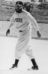
Baseball-related photos of Castro — and there are a lot of them — break down into three primary categories:
1. Castro in a baseball uniform. Most of these date back to the late 1950s through the mid-’60s. As you can see, his stirrup style left a bit to be desired, and I think we can safely say he wasn’t doing steroids, but dig those eyeglasses! And El Presidente had the whole facial hair thing going on long before before Rollie Fingers’s ’stache was a glimmer in Charlie Finley’s eye.
2. Castro in military fatigues. Loads of these pics floating around. Fidel loved to throw out the first pitch or take the ceremonial first swing (a quaint Cuban custom, not unlike slaughtering a chicken upon the birth of your neighbor’s first child). El Comandante also appears to have gotten some actual game action whilst attired in olive drab, as seen here, here, here and here. (Those last two shots, of course, are from Castro’s little-known beatnik phase, when he was prone to reciting painfully bad poetry and reading Jack Kerouac.)
3. Castro looking like your grandfather who belongs on the shuffleboard court, not the baseball diamond. More recent photos document El Jefe Maximo’s descent into baseball self-parody. Like a meddling team owner who can’t resist the urge to play dress-up, he’s donned all manner of embarrassing get-ups, sometimes while in the company of other world leaders. If only the Bay of Pigs plan had succeeded, we could have been spared this.
(It’s worth noting that Fidel also tried his hand at managing the Cuban national team in an exhibition game against Venezuela in 1999. But as reader Eric Trager points out, “Of course, among Latin American dictators, Castro barely holds a candle to Hugo Chavez, who pitched four semi-stirruped inings in that same game.” A rematch in 2000 was embarrassing for all concerned.)
Two best Castro pics I found: Fidel checking out a young prospect, and checking out a really young prospect. I believe he was telling the tyke, “No signing bonus for you, kid — that’s only for capitalists. And don’t even bother learning the words ‘free agency.’ ”
Smoke ’Em If You Got ’Em: Yesterday’s entry on smoking prompted a flood of good responses. The very first one came from Todd Radom, who pointed me toward this game-used Earl Weaver jersey, complete with a little cigarette pouch sewn into the inner lining! “Examine photos of him over the years and you’ll see the seams on the exterior of his jersey,” says Todd. Later on, Paul Wiederecht sent this shot, with the pack of coffin nails visible in Earl’s inner pocket.
Turns out this was a Baltimore phenomenon: Eric Stengel sent pics of a Cal Ripken Sr. jersey with the same pocket accessory and clearly visible outer stitching. Eric also notes that according to a small note on this page, Jimmy Dykes used to have a cig pocket as well, which means at least three O’s skippers had this secret compartment. Ladies and gentlemen, I give you Baltimore, humidor to the American League.
Also of interest: T.J. Zaremba checked in to inform me that Mexican soccer coach Ricardo Lavolpe’s smoking habits actually earned a FIFA rebuke in 2006.
Meanwhile, here’s a whole respiratory ward’s worth of additional smokers (many featured in yesterday’s comments): Red Auerbach, Dave Parker, James Hunt, John Daly, Angel Cabrera, Pirates-era Jim Leyland, Babe Ruth (rolling his own!), some unidentified cyclists, a rogue’s gallery of MLBers, Paul Hornung (and holy shit do I want that jacket!), Roger Maris again (I’ll take that Yoo-Hoo T-shirt, too), Jerry Coleman, Bob Cousy, Mario Cipollini, Derek Sanderson, Sparky Anderson, Vince Lombardi, Arnold Palmer and Ben Hogan, Ricardo Mayorga (who I mentioned yesterday, but I didn’t have a photo), Nellie Fox (who appears to be smoking while also chewing!) Joe Torre, Phil Bengtson (could someone please get me that patch?), Pee Wee Reese, Jack McKeon, Ugueth Urbina, Yogi Berra, Bobby Cox, Fuzzy Thurston, Miikka Kiprusoff and Dion Phaneuf (“as well as a few puck bunnies,” in Jeff Ives‘s words), and Frick and Frack.
Although it doesn’t actually show any athletes smoking, this 1959 Marlboro commercial features some truly amazing NFL content. If you haven’t already seen it on the Kissing Suzy Kolber site, where it was recently featured, stop whatever you’re doing and watch it right now. Trust me.
And as a bonus, here’s a young Ernie Banks lighting his father’s stogie. Hell, it’s such a nice day, let’s smoke two.
(Big thanks and an iron lung to the many readers who contributed pics on this one.)
Uni Watch News Ticker: More than a decade after the fact, the Ravens’ original logo is still generating litigation. ”¦ Andy Chalifour notes that Clay Buchholz has the Texas flag inside the heel of his glove. ”¦ Bizarre line of helmet-styled woolen ski hats available here (with thanks to Andy Castle). ”¦ The Chicago Rush are looking for fan input on a new uni design (with thanks to Matt Olson). ”¦ Sean Millican plays on an adult baseball team with Colt .45s-inspired uniforms. He says they’re getting white jerseys this year. ”¦ The Army hockey team traditionally wears white at home and black on the road, but on Friday they wore a gold third gold jersey,” writes Ryan Yanoshak. “The three stars on the sleeve and the star on the shoulder are different than the home and away jerseys, as is the third logo on the chest. Director of Hockey Operations Tom Doran and Head Coach Brian Riley helped design the unis.” ”¦ Lots of interesting details in this photo of the Judge Memorial Catholic High School girls’ hoops team in Salt Lake City, as described by Jon Alviani: “First, it says ‘Catholic’ underneath, which isn’t on any of the school’s other uniforms. Second, there’s the cross at the neckline. Next, the ‘WE’ on the waistband. And finally, No. 25 either has a well-placed fold or she’s missing an ‘I.’ ” ”¦ An old pair of Pepper Martin’s pants is Cooperstown-bound (thanks, Vince). ”¦ Cool. ”¦ Took me a while to find photos of this, but the Sabres wore green buffaslug helmet decals on Sunday, as part of an environmental initiative. ”¦ Classic spring training sights: Josh Fields wearing one of those little no-pocket gloves, to improve his fielding skills (with thanks to Scott Schaaf), and Ian Kinsler wearing one of those paddle mitts. ”¦ Matt Englander‘s parents recently dug up an old summer camp photo of him wearing a Phillies jersey and an Expos cap. “Be kind with your comments,” he says, “those were some awkward years.” ”¦ Reprinted from yesterday’s comments: As you know, MLB base coaches will have to wear helmets this season. According to the “Helmets” section of this page, they’ll have the option of wearing earflaps or going flapless. ”¦ Another MLBer wearing someone else’s glove: Francisco Cordero, with glove on loan from Juan Castro (good spot by Michael Smith). ”¦ Sharks goalie Evgeni Nabokov took a slapshot in the mask the other night, which broke part of his cage (here’s an isolation view) and left him with a gash on his nose (screen grabs courtesy of Paul Cook). ”¦ The Capitals will be wearing autism awareness jerseys on Sunday. Details here (with thanks to Michael Alper). ”¦ Yesterday’s Ticker item about military ribbons reminded James Yeh of an unusual element in British military uniforms: the stable belt, as seen here. ”¦ I really hate the prevealing trend of animal mascots being depicted in fierce, brow-furrowed poses. Case in point: South Dakota State’s new logo, which was unveiled yesterday. I mean, come on — a tough, badass jackrabbit? Just make him look cool and smart (like Bugs Bunny!) and call it a day. Actually, that’s what the old logo looked like. ”¦ Jean Beliveau is auctioning off an old jersey (with thanks to Jon Hanson) ”¦ Yankees without pinstripes! ”¦ According to a little quiz that ran on NPR’s All Things Considered the other day, the first U.S. president to wear trousers instead of knee breeches was James Madison, which means we may ultimately have him to blame for the pajama look on the baseball diamond. ”¦ Here’s a good close-up view of this year’s Giants sleeve patch (with thanks to Mark Snider). ”¦ From yesterday’s comments: Check out Gregg Zaun’s backplate. ”¦ The Mavs’ new players will wear these numbers. ”¦ I was looking at some photos of old ballparks the other day and noticed an odd zigzag-ish chalk pattern in between the baselines and the dugouts in several of the images. Check out these shots of Crosley Field, the Polo Grounds, and South End Grounds — what is that? It’s sort of like an exaggerated coach’s box, but the contours make no sense. Anyone..? ”¦ Ontario Hockey League teams are wearing an “18” memorial decal in honor of Windsor Spitfires captain Mickey Renaud, who died on Monday. Details here (with thanks to Brian Thompson). ”¦ Jason Maggiora scored a pair of Nick Swisher’s cleats at a memorabilia charity sale. “It seems the A’s had to take a decidedly low-tech approach to customizing their trademark white shoes,” he writes. “As you can see in these close-ups, they used a yellow marker/highlighter to color in the trim.” ”¦ The Texas Rangers, who’ve never been able to decide whether their primary color is red or blue, are considering going back to red, at least according to the third major item on this page. ”¦ Ben Nickerson and I both want to know what the deal is with the weird little black-and-white sideway NBA logo shoulder patch that appears on many NBA practice jerseys. … The new $5 bill goes into circulation later this month. Click on the “See back” link and you’ll discover why I’ll be using five singles instead of a fin from now on (that depressing news brought our way by Marcus Ramsey, who adds, “Remember when money was green?”).
NHL Playoff teams will get to chose their link (sweater) color when playing at home.
Last item in the article.
I was plowing through the pictures a couple of people posted from Yahoo! yesterday and see a lot of players/coaches not going with the new style BP hats. Last year a number of peole drew the “earflap” onto their hats, but this year, they are not even trying to hide it. Most interesting of all the groups was the Angels, who apparently, as a team, have decided to go with their old hatslink
RE: Helmet Ski Hats
There’s an entire line of NFL-themed ski hats, too, available at several places, including link.
It seems logical for the Steelers, Eagles, Giants, Jets, Packers, etc. But why would you want one for the Rams, Saints, Falcons, or Vikings, who play home games indoors?
You might also notice that neither the Cowboys nor the Jaguars have a hat available.
I don’t want to minimize the importance of base coaches wearing helmets. But this is being done in reaction to the death of minor league first base coach Mike Coolbaugh. It wasn’t widely reported, but the autopsy report shows that he was killed after the ball struck him in the neck and burst an artery. According to link it was on the back of the next just below the ear. An ear-flapped helmet might have helped (hard to tell). But the coach would have still been killed if he were wearing a flapless helmet.
[quote comment=”228228″]I don’t want to minimize the importance of base coaches wearing helmets. But this is being done in reaction to the death of minor league first base coach Mike Coolbaugh. It wasn’t widely reported, but the autopsy report shows that he was killed after the ball struck him in the neck and burst an artery. According to link it was on the back of the next just below the ear. An ear-flapped helmet might have helped (hard to tell). But the coach would have still been killed if he were wearing a flapless helmet.[/quote]
This was already discussed at length in yesterday’s comments. Let’s please not have another go-round. Thanks.
Request:
I’m hoping someone here can help with this. I am looking for a good closeup of the 40th Anniversary Rose Bowl patch worn by Indiana against Purdue this season.
I have searched extensively but all the photos were obscured or not close enough.
Thanks in advance.
Nice to see link still suiting up. Now, about that dip in his back pocket……
Taken from this site:
http://www.windsorspitfires.com/viewcon.php?id=2445
The league (OHL) in conjunction with the Spitfires are developing a suitable video tribute that will be utilized before the next home game in each OHL city and that a commemorative #18 sticker will be worn on the helmet of every OHL player for the remainder of the season. The Spitfires are also planning to wear a special commemorative jersey crest until the conclusion of this season.
Paul, you must like the Mets pinstripes on the new SI cover:
link
The jersey is too baggy, but still. At least it’s not black!
Paul, I think the link you have for the Polo Grounds goes to the postcard picture of Crosley Field.
RE: Five Dollar Bill
…and now the purple aversion borders on something warranting therapy. Are you kidding? It’s a 5-dollar-bill. Nobody WEARS it. Nobody stares at it.
And yes, Marcus, I remember when money was green. Do YOU remember when U.S. currency was the most-counterfeited on the planet? Lay off the BEP and the Treasury–theire design concerns are security first, aesthetics second.
The fact that a purple five on the back of a $5 bill would send anyone into a fit says more about the person having the fit than it does about any of the designers…kind of like people who get upset because the new presidential dollar coins say “In God We Trust” on the edge instead of the face.
Philadelphia 76ers fans have stared a grass root effort to petition the Sixers organization to change the team’s uniforms from the hideous current design to the classic red, white and blue uniforms the team wore the last time they won a championship in 1983. Check out this link.
I was looking at some photos of old ballparks the other day and noticed an odd zigzag-ish chalk pattern in between the baselines and the dugouts in several of the images. Check out these shots of Crosley Field, the Polo Grounds, and South End Grounds – what is that? It’s sort of like an exaggerated coach’s box, but the contours make no sense. Anyone..?
Could that be where the photographers were allowed? Perhaps the extended area near first and third base were for close plays? The void in between the corners and home allowed for players to make plays on foul balls? Just a guess…
Why would link be wearing an entirely different uni than the catcher (looks like link as the link link link is from link).
The numbers and font are different as well as the trim around the armholes and the piping on the cathers neck.
I would assume that they are on the same team as they are both wearing blue caps and the Cubans wear red caps.
[quote comment=”228225″]I was plowing through the pictures a couple of people posted from Yahoo! yesterday and see a lot of players/coaches not going with the new style BP hats. Last year a number of peole drew the “earflap” onto their hats, but this year, they are not even trying to hide it. Most interesting of all the groups was the Angels, who apparently, as a team, have decided to go with their old hatslink[/quote]
The hat in that photo is the only BP style hat for the Angels listed in their store on MLB.com.
link
Re: Helmet Ski Hats
Whether you think those are cool or not, it cannot be denied that Ohio State does not, I repeat does NOT, have a logo on the side of the helmet!!! The beauty of the Buckeye helmet is just that: it’s perfect silver gleaming w/o any logo, to be filled up with Buckeye leaves as the season goes along. The ski hat folks are butchering one of the great helmets in college sports. Do they really think folks won’t recognize the silver helmet with the red, white and black stripe? It is truly amazing how many Buckeye products like this are sold. Let’s get it right people!
There. I feel better now.
‘free angency.’
Typo alert! That’s what happens when you type before 9AM…
El Dictator was clearly not wearing regulation golf link here.
[quote comment=”228226″]RE: Helmet Ski Hats
But why would you want one for the Rams, Saints, Falcons, or Vikings, who play home games indoors?[/quote]
maybe you’d wear one someplace besides a game?
/just a thought
[quote comment=”228242″]Re: Helmet Ski Hats
Whether you think those are cool or not, it cannot be denied that Ohio State does not, I repeat does NOT, have a logo on the side of the helmet!!! The beauty of the Buckeye helmet is just that: it’s perfect silver gleaming w/o any logo, to be filled up with Buckeye leaves as the season goes along. The ski hat folks are butchering one of the great helmets in college sports. Do they really think folks won’t recognize the silver helmet with the red, white and black stripe? It is truly amazing how many Buckeye products like this are sold. Let’s get it right people!
There. I feel better now.[/quote]
AMEN!! As a Buckeye and Browns fan I get antsy when “clever” marketing types decide that we cant figure out who a plain silver or orange helmet belongs to. By the way, do they sell Notre Dame ski masks? Did they defile that with a big blue “ND”?? Is it too much to ask to leave things alone?
I really hate the prevealing trend of animal mascots being depicted in fierce, brow-furrowed poses.
Then you aren’t going to like the logo for my undergrad alma mater, the link of Hoboken, NJ.
Re: the ski masks….Didn’t see Notre Dame…but Penn State is there…and boy are the Nit fans gonna love that!
[quote comment=”228241″][quote comment=”228225″]I was plowing through the pictures a couple of people posted from Yahoo! yesterday and see a lot of players/coaches not going with the new style BP hats. Last year a number of peole drew the “earflap” onto their hats, but this year, they are not even trying to hide it. Most interesting of all the groups was the Angels, who apparently, as a team, have decided to go with their old hatslink[/quote]
The hat in that photo is the only BP style hat for the Angels listed in their store on MLB.com.
link
To follow up on my earlier comment, I just looked through the official stores for every team on MLB.com and the Angels are apparently, the only team not wearing that ear thing on the BP hats. The only other one close is the Red Sox, who have the red ear panel and piping on a red hat, so it’s not noticible unless you look close. I looked close at the Angels BP cap and it’s not there. The only other exception are the Rays, who don’t have a BP cap with their new logo and colors up yet, but their old ones had different colors in the ear area.
FYI…The Capitals will only be wearing the Autism Awareness jerseys for their morning skate today. They will be auctioned at the game on Sunday.
[quote comment=”228249″]I really hate the prevealing trend of animal mascots being depicted in fierce, brow-furrowed poses.
Then you aren’t going to like the logo for my undergrad alma mater, the link of Hoboken, NJ.[/quote]
So the question remains…are there good logo makeovers…
We have two full articles on athletes/coaches with tobacco and not one picture of Red Auerbach?! Did we all overlook the obviousness of the most famous victory cigars in history?
In the picture marked “left a bit to be desired” you see Fidel and another player sporting nice beards. The word on their uniforms, Barbudos, means bearded men. I wonder if beards were required to play on the team? Or perhaps the team adopted that name because of the facial hair of the players.
those swisher 2k5 cleats are awesome…
metal cleat pattern with mcs cleats.
i need a pair of 2k5 cleats either conversion or mcs in an 11 for softball this year.
anyone work in the equipment room for a team that would be able to help me out?
all black
black w/ gray
black w/ white
they are all acceptable colors i could go with.
Didn’t Dutch Masters Cigars sponsor The NFL Today on CBS back in 70’s? I think I remember one of the dutch dudes blowing a smoke ring in the ad.
uni watch blog dot com
good makins’
i still go with larry laoretti in 1992.
Hey Paul,
That Polo Grounds pic link points to the Crosley Field photo.
Since its college hoops season – I was wondering if anyone could help locate a picture of a University of Kentucky basketball uniform (dating to mid-80s I think) that featured a very distinctive (and wide) diagonal zig-zag stripe pattern across the jersey and trunks. I remember the stripe(s) passing across the front, sides, and back of the jersey and shorts, and was probably used only for one season, or perhaps part of a season. I think it met with near-universal derision at the time, but I always thought it was pretty cool. Anybody got a lead for me?
I can’t remember if it has been mentioned before, but the D-Backs are sporting a 10 year Anniversary link this year to obviously celebrate 10 years as a franchise.
Didn’t we talk last year about the Rays wearing a “10 year patch” last season, and it was stated the new D-Backs owners were not going to do this so they could get away form the past and move forward? Looks like they just waited a year.
Forgive me if this was brought up already…if it has been mentioned, please press on to the next comment.
[quote comment=”228241″][quote comment=”228225″]I was plowing through the pictures a couple of people posted from Yahoo! yesterday and see a lot of players/coaches not going with the new style BP hats. Last year a number of peole drew the “earflap” onto their hats, but this year, they are not even trying to hide it. Most interesting of all the groups was the Angels, who apparently, as a team, have decided to go with their old hatslink[/quote]
The hat in that photo is the only BP style hat for the Angels listed in their store on MLB.com.
link
I do believe they never had the ear flap. I want to say it was covered last year when the new BP hats came out. Shit, I can’t remember last week, let alone last year, so I don’t blame you
And since the helmet hats came up, who would need link in the hump dome?
[quote comment=”228240″]Why would link be wearing an entirely different uni than the catcher (looks like link as the link link link is from link).
The numbers and font are different as well as the trim around the armholes and the piping on the cathers neck.
I would assume that they are on the same team as they are both wearing blue caps and the Cubans wear red caps.[/quote]
ABSOLUTELY NOT a Molina brother, he has the venezuelan flag patch on his right arm, just a venezuelan with the same last name…Chavez being the commie he is, just decided to wear his own uni i guess
[quote comment=”228270″]I can’t remember if it has been mentioned before, but the D-Backs are sporting a 10 year Anniversary link this year to obviously celebrate 10 years as a franchise.
Didn’t we talk last year about the Rays wearing a “10 year patch” last season, and it was stated the new D-Backs owners were not going to do this so they could get away form the past and move forward? Looks like they just waited a year.
Forgive me if this was brought up already…if it has been mentioned, please press on to the next comment.[/quote]
Hmm that is interesting in that the D-Backs discontinued use of left sleeve patch because of legal action threatened by david blaine (who has a similar logo). This was discussed on this board and prompted my purchase of an authentic eric byrnes road grey for about 75% off. Anyone have any other info, or is this just a case of the mlb not updating a stock photo?
The Marlboro ad is like a dream.
Did we not all draw similar cartoon characters based on team mascots as kids?
That ad is so wonderful. And so politically incorrect. Strange and beautiful. A snapshot of U.S. geography and social mores in less than a minute.
Nice to see link going “two-handed” with the smokes — a stogie and a smoking butt in the ashtray.
[quote comment=”228272″][quote comment=”228240″]Why would link be wearing an entirely different uni than the catcher (looks like link as the link link link is from link).
The numbers and font are different as well as the trim around the armholes and the piping on the cathers neck.
I would assume that they are on the same team as they are both wearing blue caps and the Cubans wear red caps.[/quote]
ABSOLUTELY NOT a Molina brother, he has the venezuelan flag patch on his right arm, just a venezuelan with the same last name…Chavez being the commie he is, just decided to wear his own uni i guess[/quote]
Right. Like I said, it looks like the catcher could be link, a Venezuelan catcher in the Mets system and NOT A MOLINA BROTHER.
Nice to see Bob Vila out to send Matt Englander off to camp!
[quote comment=”228256″]We have two full articles on athletes/coaches with tobacco and not one picture of Red Auerbach?! Did we all overlook the obviousness of the most famous victory cigars in history?[/quote]
That was my first comment yesterday. I don’t know how he can go without comment from anyone else… until now. The man invented the victory cigar. Yet Jack McKeon gets a mention? After 1 world series win. Auerbach won 8 championships… IN A ROW! 9 overall. But Jack McKeon is the coach/manager that gets mentioned as a cigar smoker?
[quote comment=”228254″]FYI…The Capitals will only be wearing the Autism Awareness jerseys for their morning skate today. They will be auctioned at the game on Sunday.[/quote]
Absolutely. If you look close at those Caps jerseys, they are the practice ones, not game ones.
Re: $5
I guess now that the US and Canadian dollars have roughly the same value, they might as well both look fake.
Paul-
Allen was correct in stating earlier that the lines were the “Media Lines” that were painted in to tell the reporters and most notably photographers were they could go. This was in response to the habit photographers started to get of moving to within mere feet of the batter and setting off the old giant flashes as they swung.
[quote comment=”228268″]Hey Paul,
That Polo Grounds pic link points to the Crosley Field photo.[/quote]
Now fixed.
[quote comment=”228281″][quote comment=”228256″]We have two full articles on athletes/coaches with tobacco and not one picture of Red Auerbach?! Did we all overlook the obviousness of the most famous victory cigars in history?[/quote]
That was my first comment yesterday. I don’t know how he can go without comment from anyone else… until now. The man invented the victory cigar. Yet Jack McKeon gets a mention? After 1 world series win. Auerbach won 8 championships… IN A ROW! 9 overall. But Jack McKeon is the coach/manager that gets mentioned as a cigar smoker?[/quote]
There was at least one pic of Red in the comments yesterday….
“But why would you want one for the Rams, Saints, Falcons, or Vikings, who play home games indoors?
you’ve never been to a saints game in the superdome apparently. you could hang meat in there most of the time
[quote comment=”228281″][quote comment=”228256″]We have two full articles on athletes/coaches with tobacco and not one picture of Red Auerbach?! Did we all overlook the obviousness of the most famous victory cigars in history?[/quote]
That was my first comment yesterday. I don’t know how he can go without comment from anyone else… until now. The man invented the victory cigar. Yet Jack McKeon gets a mention? After 1 world series win. Auerbach won 8 championships… IN A ROW! 9 overall. But Jack McKeon is the coach/manager that gets mentioned as a cigar smoker?[/quote]
My bad. Meant to add him to today’s list. Will do so now.
[quote comment=”228269″]Since its college hoops season – I was wondering if anyone could help locate a picture of a University of Kentucky basketball uniform (dating to mid-80s I think) that featured a very distinctive (and wide) diagonal zig-zag stripe pattern across the jersey and trunks. I remember the stripe(s) passing across the front, sides, and back of the jersey and shorts, and was probably used only for one season, or perhaps part of a season. I think it met with near-universal derision at the time, but I always thought it was pretty cool. Anybody got a lead for me?[/quote]
probably these…
link
in fact they werent used for a full season. this period of kentucky basketball was the transition time with apex one, followed by its relationship with converse. apex one had some interesting shorts patterns during this era.
Re: Judge Memorial Catholic High School and the missing “I”. It really isn’t missing/folded over because player #25 knows that there is no “I” in “TEAM”.
[quote comment=”228296″][quote comment=”228269″]Since its college hoops season – I was wondering if anyone could help locate a picture of a University of Kentucky basketball uniform (dating to mid-80s I think) that featured a very distinctive (and wide) diagonal zig-zag stripe pattern across the jersey and trunks. I remember the stripe(s) passing across the front, sides, and back of the jersey and shorts, and was probably used only for one season, or perhaps part of a season. I think it met with near-universal derision at the time, but I always thought it was pretty cool. Anybody got a lead for me?[/quote]
probably these…
link
in fact they werent used for a full season. this period of kentucky basketball was the transition time with apex one, followed by its relationship with converse. apex one had some interesting shorts patterns during this era.[/quote]
Is link you were speaking of?
RE: Tough Looking animal mascots
The University of South Dakota did the same thing as SDSU a few years ago going from link to link.
link … link
link
A quick question regarding that next to last Castro picture (the one he’s watching a young propect pitch one in there):
Could that have been a young El Duque ?
If you work out the years…. it might just be, no?
“Two best Castro pics I found: Fidel checking out a link”
El Jefe Maximo’s thoughts on the pitcher: his curve has a good bite, fastball is excellent, but can he fire an AK-47?
[quote comment=”228255″][quote comment=”228249″]I really hate the prevealing trend of animal mascots being depicted in fierce, brow-furrowed poses.
Then you aren’t going to like the logo for my undergrad alma mater, the link of Hoboken, NJ.[/quote]
So the question remains…are there good logo makeovers…[/quote]
Well, the Portland Beavers went from a link Beaver to a link one (an improvement, in my opinion–now if link would only go back to their link).
Speaking of smoking, there was a film clip shown on Bowie State University’s local-access cable channel showing Jesse Owens doing a long-form commercial for Chesterfield cigarettes.
Owens, who courageously stood up against Hitler, but had a hard life afterwards … even having to do stunt racing against horses and baseball outfielders … and to get money from a product that kills people.
Damn. Just damn.
and whom amongst us wouldn’t want a happy beaver?
The Marlboro spot may be 1959, as Chris Schenkel says the cigerettes are “sold in all 50 states.” Alaska and Hawaii came aboard in ’59, and it was the last year the Cardinals played in Chicago.
The back of the Canadian $5 bill is much better….
link
[quote comment=”228306″]A quick question regarding that next to last Castro picture (the one he’s watching a young propect pitch one in there):
Could that have been a young El Duque ?
If you work out the years…. it might just be, no?
link[/quote]
can’t be el duque…he’s wearing stirrups
right age tho
One of my friends is telling me how she saw Bon Jovi at the Pistons game last night. Apparently the Palace was presenting him/them with a banner for having ten sell-outs. I asked her if they actually hung this in the rafters or what, but she has no idea. All she cares is that she saw Bon Jovi right in front of her. I’ve never heard of something like that though.
[quote comment=”228238″]“Philadelphia 76ers fans have stared a grass root effort to petition the Sixers organization to change the team’s uniforms from the hideous current design to the classic red, white and blue uniforms the team wore the last time they won a championship in 1983. Check out this link.”[/quote]
Only fair thing to do is dump the black unis, recolor the current logo (keeping the silver and gold as trim colors) go to the reds as the roads and make a blue alternate.
[quote comment=”228259″]In the picture marked “left a bit to be desired” you see Fidel and another player sporting nice beards. The word on their uniforms, Barbudos, means bearded men. I wonder if beards were required to play on the team? Or perhaps the team adopted that name because of the facial hair of the players.[/quote]
When Fidel & his band of merry men were in the mountains working to overthrow Batista, they acquired the nickname “Los Barbudos” cuz o’ their facial hair. When the revolutionaries took power, the name stuck — and apparently spawned at least one set of sweet unis.
re: earl weaver.
if you want to seriously laugh, do a youtube search for earl weaver managers corner… play the 2:38 version… you’ll want to do this at home as well, not at work.
re: army hockey.
wow, those jerseys are really sharp. the color combination, the logo, not so much the font but the overall appearance is sharp.
Apparently Jason Kidd is wearing #2 because it’s his second tour of duty in Dallas.
[quote comment=”228295″][quote comment=”228281″][quote comment=”228256″]We have two full articles on athletes/coaches with tobacco and not one picture of Red Auerbach?! Did we all overlook the obviousness of the most famous victory cigars in history?[/quote]
That was my first comment yesterday. I don’t know how he can go without comment from anyone else… until now. The man invented the victory cigar. Yet Jack McKeon gets a mention? After 1 world series win. Auerbach won 8 championships… IN A ROW! 9 overall. But Jack McKeon is the coach/manager that gets mentioned as a cigar smoker?[/quote]
My bad. Meant to add him to today’s list. Will do so now.[/quote]
Nice picture of him Paul. One of my favorites. Not one of the generic lighting it up pics. In mid celebration, with unlit cigar in his mouth… probably getting ready to light one up. Way past his coaching days but still celebrating the same way.
I wish I could have just been in his presence just once.
link is a good shot of the field lines during a Detroit Wolverines game at Recreation Park in Detroit, July 4, 1887.
During the 1934 World Series the Tigers had weird foul lines that link.
link is Rudy York making a catch between these lines in foul territory in 1939.
[quote comment=”228316″]One of my friends is telling me how she saw Bon Jovi at the Pistons game last night. Apparently the Palace was presenting him/them with a banner for having ten sell-outs. I asked her if they actually hung this in the rafters or what, but she has no idea. All she cares is that she saw Bon Jovi right in front of her. I’ve never heard of something like that though.[/quote]
link had his “sports shirt” hung in the rafters of link for 10 consecutive sell outs.
link also has a “9” hanging at the link for his 9 sold out shows there.
I can’t find any pictures though. Sorry.
TOG-you mentioned yesterday about some black alternate’s for the Redskins? Do you or anyone else have any info on that? Also another victory cigar
[quote comment=”228316″]One of my friends is telling me how she saw Bon Jovi at the Pistons game last night. Apparently the Palace was presenting him/them with a banner for having ten sell-outs. I asked her if they actually hung this in the rafters or what, but she has no idea. All she cares is that she saw Bon Jovi right in front of her. I’ve never heard of something like that though.[/quote]
I’ve seen this before. They have a couple banners hung in the Wachovia Center for consecutive sellouts.
One for Bruce Springsteen (no pic) and one for link.
Alsolinkanother victory cigar
Victory Cigar
Sorry Link wasn’t working
watching the habs rangers last night reminded me of a game i went to in early 2000 at the bell centre (then molson centre). they were celebrating the first game of the new century between 2 original 6 rivals, with the usual montreal ceremonial faceoff and legends in attendance. so they decided to have each team wear their dark jerseys, red vs. blue…looked awesome! i dont know why leagues dont do it more often…..
anyway, they played the first period like this, then in the 2nd period, the habs came out with red jerseys again but had changed their helmets to white!?!?! they played the rest of the game this way. turns out that apparently the refs found it confusing with all the blue helmets on the ice (not sure why that would be).
in any case, i have searched everyhwere for a pic but cant find any. only this link that references the uniform change.
[quote comment=”228249″]I really hate the prevealing trend of animal mascots being depicted in fierce, brow-furrowed poses.
Then you aren’t going to like the logo for my undergrad alma mater, the link of Hoboken, NJ.[/quote]
Nice campus, dane… can’t tell you how many sandwiches from Biancamano’s i’ve had at the ‘Lookout’ spot on the Steven’s campus. Great view of the Hudson and a wonderful contemplation spot.
[quote comment=”228325″]link is a good shot of the field lines during a Detroit Wolverines game at Recreation Park in Detroit, July 4, 1887.
During the 1934 World Series the Tigers had weird foul lines that link.
link is Rudy York making a catch between these lines in foul territory in 1939.[/quote]
Quoting myself, the behind the plate lines look to be just the boundaries of what we’re saying is the media box.
link
Nice stickers on the door!
I love tits and blowjobs too!
[quote comment=”228288″]Paul-
Allen was correct in stating earlier that the lines were the “Media Lines” that were painted in to tell the reporters and most notably photographers were they could go. This was in response to the habit photographers started to get of moving to within mere feet of the batter and setting off the old giant flashes as they swung.[/quote]
Wasn’t there a time also when the lines were just the extended 1st and 3rd base lines beyond home plate to the backstop?
Besides media boundaries, they too could have been used to keep the pitcher warming up in front of the dugout and not too close to the field.
I know that when the Vet first opened in Philly, there was a small mound directly in front of the players bench for the current pitcher to use while his team was batting.
Paul–
I read your blog (almost) daily and enjoy it. I can respect that this is your blog with your opinions, and therefore its natural I don’t always agree with your opinions.
It seems to me that you have a natural aversion to new things in the uniform design arena. I’m right with you on the issues of logo creep and Nike-ization being bad for the sports world, but it seems like whenever a team introduces a new uniform or logo (such as the jackrabbits logo today), you show the new uniform and then say something like “why couldn’t they have stuck with this?” Again, this is your show and I’m just along for the ride so I’m not going to try to change your way of thinking, but have there been any recent uniform/logo changes that you have actually liked? Not just “that’s not bad”, but “Wow, I like that”?
I’ve been reading for about a year and the only one I can think of not bringing a negative reaction from you was the Chargers design change and it seemed that was merely a tepid response. What new stuff/trends out there do you prefer to older designs?
P.S. If you get this question often I apologize, but I don’t regularly read the comments.
i think the Rangers should go back to this link and not this link
[quote comment=”228344″]i think the Rangers should go back to this link and not this link[/quote]
How about switching to black? link looks good in it
[quote comment=”228313″]The back of the Canadian $5 bill is much better….
link
I want a Canuck $5 bill now
[quote comment=”228246″][quote comment=”228226″]RE: Helmet Ski Hats
But why would you want one for the Rams, Saints, Falcons, or Vikings, who play home games indoors?[/quote]
maybe you’d wear one someplace besides a game?
/just a thought[/quote]
Like skiing, maybe.
[quote comment=”228339″]http://img.photobucket.com/albums/v210/JesGolbez/kipper-dion-stripclub.jpg
Nice stickers on the door!
I love tits and blowjobs too![/quote]
That’s a great photo!
I’m going to guess that the photo was taken in Cowboys, a Calgary western bar famous for its pneumatic waitresses and Stampede parties. The second sticker has the Cowboys logo and reads “Cowboys loves Alberta beef”.
Sadly the bar was torn down last year for an office development.
Re. Gregg Zaun’s backplate:
link
How nitpicky is this – the way Skydome is oriented, the roof when retracted sits over centrefield. So the ball flying out of the Dome is really just a high foul ball, straight back.
Check out link from 1896. (Not uni or sports related.)
[quote comment=”228358″]Re. Gregg Zaun’s backplate:
link
How nitpicky is this – the way Skydome is oriented, the roof when retracted sits over centrefield. So the ball flying out of the Dome is really just a high foul ball, straight back.[/quote]
Which a catcher would normally field…
Paul, please fix the spelling of “Hornung” and “Miikka” Kiprusoff. (Yes, two consecutive ‘I’s.)
[quote comment=”228217″]NHL Playoff teams will get to chose their link (sweater) color when playing at home.
Last item in the article.[/quote]
Wow, that’s big-time news. Anyone know if it’s in effect this season or next?
[quote comment=”228313″]The back of the Canadian $5 bill is much better….
link
Please note that Canadian currency does not actually say “SPECIMEN” on it.
[quote comment=”228359″]Check out link from 1896. (Not uni or sports related.)[/quote]
Methinks that bill would be legal tender at Hooters [RIMSHOT]
[quote comment=”228354″][quote comment=”228339″]http://img.photobucket.com/albums/v210/JesGolbez/kipper-dion-stripclub.jpg
Nice stickers on the door!
[/quote]
That’s a great photo!
I’m going to guess that the photo was taken in Cowboys, a Calgary western bar famous for its pneumatic waitresses and Stampede parties. The second sticker has the Cowboys logo and reads “Cowboys loves Alberta beef”.
Sadly the bar was torn down last year for an office development.[/quote]
OK, how long before I start using the phrase “pneumatic waitresses” in my everyday discourse? I’ve never heard that term before… Only 12 total Google matches for plural and singular forms combined.
[quote comment=”228370″][quote comment=”228354″][quote comment=”228339″]http://img.photobucket.com/albums/v210/JesGolbez/kipper-dion-stripclub.jpg
Nice stickers on the door!
[/quote]
That’s a great photo!
I’m going to guess that the photo was taken in Cowboys, a Calgary western bar famous for its pneumatic waitresses and Stampede parties. The second sticker has the Cowboys logo and reads “Cowboys loves Alberta beef”.
Sadly the bar was torn down last year for an office development.[/quote]
OK, how long before I start using the phrase “pneumatic waitresses” in my everyday discourse? I’ve never heard that term before… Only 12 total Google matches for plural and singular forms combined.[/quote]
132 hits for link , “pneumatic waitress” in time will certainly make up the ground ;-)
[quote comment=”228362″][quote comment=”228358″]Re. Gregg Zaun’s backplate:
link
How nitpicky is this – the way Skydome is oriented, the roof when retracted sits over centrefield. So the ball flying out of the Dome is really just a high foul ball, straight back.[/quote]
Which a catcher would normally field…[/quote]
Makes more sense than a catcher celebrating giving up a home run.
[quote comment=”228248″][quote comment=”228242″]Re: Helmet Ski Hats
Whether you think those are cool or not, it cannot be denied that Ohio State does not, I repeat does NOT, have a logo on the side of the helmet!!! The beauty of the Buckeye helmet is just that: it’s perfect silver gleaming w/o any logo, to be filled up with Buckeye leaves as the season goes along. The ski hat folks are butchering one of the great helmets in college sports. Do they really think folks won’t recognize the silver helmet with the red, white and black stripe? It is truly amazing how many Buckeye products like this are sold. Let’s get it right people!
There. I feel better now.[/quote]
AMEN!! As a Buckeye and Browns fan I get antsy when “clever” marketing types decide that we cant figure out who a plain silver or orange helmet belongs to. By the way, do they sell Notre Dame ski masks? Did they defile that with a big blue “ND”?? Is it too much to ask to leave things alone?[/quote]
The reason items like this have logos on the side (of the helmets that are actually plain) is to make them officially licensed. The teams can’t make any money off the merch if it contains no offial logos. I’m not saying its right, but the point of selling merchandice is to make money. Anyway New era makes a line of helmet ski hats that dont have logos on the side, they are hard to find though.
Castro’s baseball wannabe togs with the FILN on the front?
Okay, the US President often receives collegiate and pro champions to the White House, and they’ll present him a jersey with his name on it and a number (#1, or maybe his ordinal number).
But I’ve yet to see a President wearing one of those while exercising, let alone when holding a press conference or giving a SOTU speech.
Texas Rangers – Keep your colors exactly how they are now. You look better in royal blue, and you didn’t actually win anything in red to begin with.
Sixers – The guy with the blog begging you to return to your red, white and blue uniforms is absolutely right. Every change since then has been disastrous, and those classic uniforms would stand out WAY more in today’s NBA.
I’m confused about the Ravens copyright issue. When they were sued, I think they modified the shield logo slightly (or maybe not at all?) and put it on their sleeve, then put the new bird logo on the helmet.
My question: If it was ok to keep the altered shield logo on the sleeve, why did they bother to create a new helmet logo?
Conversely, if they wanted to do a completely new design (which they did for the helmet), why did they bother to keep the shield logo on the sleeve?
Also, while on the Ravens, I have to say that the bird head logo is one of the worst in sports. The “B” on the head makes no sense. Its within the bird’s head outline, so its not an overlay. And its not a tattoo because you can’t tattoo a feathered head.
Re. Gregg Zaun’s backplate:
Backplate
How nitpicky is this – the way Skydome is oriented, the roof when retracted sits over centrefield. So the ball flying out of the Dome is really just a high foul ball, straight back.
Which a catcher would normally field…
Makes more sense than a catcher celebrating giving up a home run.
He bats too, ya know…
[quote comment=”228386″]
Re. Gregg Zaun’s backplate:
Backplate
How nitpicky is this – the way Skydome is oriented, the roof when retracted sits over centrefield. So the ball flying out of the Dome is really just a high foul ball, straight back.
Which a catcher would normally field…
Makes more sense than a catcher celebrating giving up a home run.
He bats too, ya know…[/quote]
[sarcasim]He does? I thought both sides of the battery got to rest when their team was at the plate and the AL had 2 DHs for ever team. I mean it really is unfair to make a catcher take all that stuff off 3-4 times a game isn’t it? [sarcasim]
[quote comment=”228386″]
Re. Gregg Zaun’s backplate:
Backplate
How nitpicky is this – the way Skydome is oriented, the roof when retracted sits over centrefield. So the ball flying out of the Dome is really just a high foul ball, straight back.
Which a catcher would normally field…
Makes more sense than a catcher celebrating giving up a home run.
He bats too, ya know…[/quote]
link
The ECHL Toledo Storm went dormant this past offseason and are scheduled to return in 09-10 after the new arena is built. Here is their link. Uh, yikes.
Bryan, now that the Colts season has been over since January 13th, have you been able to contact Dallas Clark about the whole “not having an American flag on the back of his helmet” thing?
[quote comment=”228309″]Speaking of smoking, there was a film clip shown on Bowie State University’s local-access cable channel showing Jesse Owens doing a long-form commercial for Chesterfield cigarettes.
Owens, who courageously stood up against Hitler, but had a hard life afterwards … even having to do stunt racing against horses and baseball outfielders … and to get money from a product that kills people.
Damn. Just damn.[/quote]
I think you’re inappropriately applying modern attitudes to a past era. There would have been no stigma or humiliation attached to doing cigarette ads back then. Nobody saw anything wrong with it. I’ve seen ads featuring guys like Ted Williams, Stan Musial, Joe DiMaggio, and half the celebs in Hollywood. Owens was probably proud to be asked to do one (and for all I know, was a smoker himself anyway).
[quote comment=”228394″][quote comment=”228309″]Speaking of smoking, there was a film clip shown on Bowie State University’s local-access cable channel showing Jesse Owens doing a long-form commercial for Chesterfield cigarettes.
Owens, who courageously stood up against Hitler, but had a hard life afterwards … even having to do stunt racing against horses and baseball outfielders … and to get money from a product that kills people.
Damn. Just damn.[/quote]
I think you’re inappropriately applying modern attitudes to a past era. There would have been no stigma or humiliation attached to doing cigarette ads back then. Nobody saw anything wrong with it. I’ve seen ads featuring guys like Ted Williams, Stan Musial, Joe DiMaggio, and half the celebs in Hollywood. Owens was probably proud to be asked to do one (and for all I know, was a smoker himself anyway).[/quote]
No doubt – Google “smoking athlete” under “images”, and you end up with link – coincidence?
[quote comment=”228323″]Apparently Jason Kidd is wearing #2 because it’s his second tour of duty in Dallas.[/quote]
Maybe Kidd can’t afford to buy #5 from Josh Howard because all his money is going to alimony payments.
So let’s see. The new $20 has green, the new $50 has blue, the new $10 has yellow, and the new $5 has some pink on it. Does that mean the new $100 will have tan?
[quote comment=”228397″][quote comment=”228323″]Apparently Jason Kidd is wearing #2 because it’s his second tour of duty in Dallas.[/quote]
Maybe Kidd can’t afford to buy #5 from Josh Howard because all his money is going to alimony payments.[/quote]
link
I know, that’s cold
[quote comment=”228401″][quote comment=”228397″][quote comment=”228323″]Apparently Jason Kidd is wearing #2 because it’s his second tour of duty in Dallas.[/quote]
Maybe Kidd can’t afford to buy #5 from Josh Howard because all his money is going to alimony payments.[/quote]
link
I know, that’s cold[/quote]
taught by denis potvin and john daly?
[quote comment=”228400″]So let’s see. The new $20 has green, the new $50 has blue, the new $10 has yellow, and the new $5 has some pink on it. Does that mean the new $100 will have tan?[/quote]
What, and MONOPILIZE the color scheme?
Let’s do like the link and “punch it up” a little.
Even link would approve
[quote comment=”228343″]Paul–
I read your blog (almost) daily and enjoy it. I can respect that this is your blog with your opinions, and therefore its natural I don’t always agree with your opinions.
It seems to me that you have a natural aversion to new things in the uniform design arena. I’m right with you on the issues of logo creep and Nike-ization being bad for the sports world, but it seems like whenever a team introduces a new uniform or logo (such as the jackrabbits logo today), you show the new uniform and then say something like “why couldn’t they have stuck with this?” Again, this is your show and I’m just along for the ride so I’m not going to try to change your way of thinking, but have there been any recent uniform/logo changes that you have actually liked? Not just “that’s not bad”, but “Wow, I like that”?
I’ve been reading for about a year and the only one I can think of not bringing a negative reaction from you was the Chargers design change and it seemed that was merely a tepid response. What new stuff/trends out there do you prefer to older designs?[/quote]
I’m on record as loving the current designs worn by the Cleveland Cavs, the Minnesota Wild, the Houston Astros, and many other contemporary designs. When the Chargers unveiled their latest update, I gave it the thumbs-up (although many readers on this site did not). I’ve also said, many times, that the current USC football design is an excellent update of the previous version.
Do I prefer old-school-ish designs? Yes. Is it a kneejerk, rubber-stamp kind of thing? No.
so much for hoping this link of a batting helmet would vanish in ’08
wonder if the first base & third base coaches will be sporting these two-toned gems too
[quote comment=”228391″]The ECHL Toledo Storm went dormant this past offseason and are scheduled to return in 09-10 after the new arena is built. Here is their link. Uh, yikes.[/quote]
Here’s the link.
[quote comment=”228394″][quote comment=”228309″]Speaking of smoking, there was a film clip shown on Bowie State University’s local-access cable channel showing Jesse Owens doing a long-form commercial for Chesterfield cigarettes.
Owens, who courageously stood up against Hitler, but had a hard life afterwards … even having to do stunt racing against horses and baseball outfielders … and to get money from a product that kills people.
Damn. Just damn.[/quote]
I think you’re inappropriately applying modern attitudes to a past era. There would have been no stigma or humiliation attached to doing cigarette ads back then. Nobody saw anything wrong with it. I’ve seen ads featuring guys like Ted Williams, Stan Musial, Joe DiMaggio, and half the celebs in Hollywood. Owens was probably proud to be asked to do one (and for all I know, was a smoker himself anyway).[/quote]
I think he was referring more to having to race horses to earn a living. I would put something like that akin to hiring link to pinch hit. They’re stunts.
[quote comment=”228405″][quote comment=”228401″][quote comment=”228397″][quote comment=”228323″]Apparently Jason Kidd is wearing #2 because it’s his second tour of duty in Dallas.[/quote]
Maybe Kidd can’t afford to buy #5 from Josh Howard because all his money is going to alimony payments.[/quote]
link
I know, that’s cold[/quote]
taught by denis potvin and john daly?[/quote]
Touche!
[quote comment=”228394″][quote comment=”228309″]Speaking of smoking, there was a film clip shown on Bowie State University’s local-access cable channel showing Jesse Owens doing a long-form commercial for Chesterfield cigarettes.
Owens, who courageously stood up against Hitler, but had a hard life afterwards … even having to do stunt racing against horses and baseball outfielders … and to get money from a product that kills people.
Damn. Just damn.[/quote]
I think you’re inappropriately applying modern attitudes to a past era. There would have been no stigma or humiliation attached to doing cigarette ads back then. Nobody saw anything wrong with it. I’ve seen ads featuring guys like Ted Williams, Stan Musial, Joe DiMaggio, and half the celebs in Hollywood. Owens was probably proud to be asked to do one (and for all I know, was a smoker himself anyway).[/quote]
Even Mary Tyler Moore and Dick Van Dyke did cigarette ads. Definitely a different mind set where cigs were concerned back then.
[quote comment=”228409″][quote comment=”228391″]The ECHL Toledo Storm went dormant this past offseason and are scheduled to return in 09-10 after the new arena is built. Here is their link. Uh, yikes.[/quote]
Here’s the link.[/quote]
I am deeply saddened that they won’t be called the Toledo Peckerheads
[sarcasm]
[quote comment=”228322″]re: earl weaver.
if you want to seriously laugh, do a youtube search for earl weaver managers corner… play the 2:38 version… you’ll want to do this at home as well, not at work.
re: army hockey.
wow, those jerseys are really sharp. the color combination, the logo, not so much the font but the overall appearance is sharp.[/quote]
Those cleats are great, however Eric Chavez always wears GREAT hybrid basketball shoes plated with spikes.
I also remember often using a Sharpie to revitalize my shoes, especially cleats and hoops shoes. In 9th grade, I wore the Black/Infra-Red AJ VI and the front nubuck toe cap would always scuff. The painted section directly above the sole was also prone to such problems. The only issue was that the ink would run thus discoloring the clear sole.
As for Army and their uniforms, they are OUTSTANDING. I live 25 minutes away from West Point and often drive up there to see sporting events or to just walk the gorgeous campus, especially in the Fall when the banks of the Hudson become spectacular. Every building, every person there exudes tradition and honor. I am exstatic that their sports teams have revitalized their uniforms of late!
[quote comment=”228386″]
Re. Gregg Zaun’s backplate:
Backplate
How nitpicky is this – the way Skydome is oriented, the roof when retracted sits over centrefield. So the ball flying out of the Dome is really just a high foul ball, straight back.
Which a catcher would normally field…
Makes more sense than a catcher celebrating giving up a home run.
He bats too, ya know…[/quote]
Of course he does, but this image is on his defensive equipment.
Strange place to celebrate a home run flying out of the park, on a helmet he only wears when the last thing he wants to see is a home run.
[quote comment=”228408″]so much for hoping this link of a batting helmet would vanish in ’08
wonder if the first base & third base coaches will be sporting these two-toned gems too[/quote]
Take a walk into Sports Authority or Dick”s one of these days. There are walls and walls of these things in every color imaginable and for every age group. My daughters fell in love with the PINK and Purple versions!
I don’t actually mind them that much, but I also don’t think that they’re going to disappear anytime soon. The kids on my daughter’s Tee-Ball team would fight over who got to wear them up at bat, to the point where they would actually want to switch with the baserunners when they had them on!
Regarding the new $5 bill…
“But aesthetics aside, the bill’s colorful jumbo numeral … is intended to help people differentiate it from other denominations at a glance.”
Does it typically take more than “a glance” to see the difference between a big “10” and a big “5”?
“Remember when money was green?”
Of course, only the back of US currency was green. The front was black. That’s why US currency is known as “greenbacks.”
Regarding the AWFUL Kentucky uniforms:
They were bad, but at the same time,teams like link, link, and link were other other schools with equally disgusting uniforms.
The apex, of link came in the 1995-96 National Championship against Syracuse when they wore linkdesigned by Converse complete with updated denim versions of Chuck Taylor All-Stars.
[quote comment=”228419″][quote comment=”228408″]so much for hoping this link of a batting helmet would vanish in ’08
wonder if the first base & third base coaches will be sporting these two-toned gems too[/quote]
Take a walk into Sports Authority or Dick”s one of these days. There are walls and walls of these things in every color imaginable and for every age group. My daughters fell in love with the PINK and Purple versions!
I don’t actually mind them that much, but I also don’t think that they’re going to disappear anytime soon. The kids on my daughter’s Tee-Ball team would fight over who got to wear them up at bat, to the point where they would actually want to switch with the baserunners when they had them on![/quote]
Damn skippy! My daughter asked for the link model for Christmas! *sigh* Kids these days…… ;-)
Tsk tsk tsk. Leave it to you Americans, and you screw it all up.
The $5 bill should be blue, the $10 should be purple, the $20 should be green, the $50 should be red, and the $100 should be a nice tan.
Also, you need to ditch those disgusting $1 bills and get yourself coins. Seriously. Get with the program here, guys. As a former retail manager, I can tell you having everything color coded HALVES the amount of work you have to do ringing someone through at a cash, which means you wait in line half as long.
Oh, and on the topic of counterfitting, we in Canada have about TWICE as many security features on our bills, including holograms and sink that will rub off a certain way to ensure a bills legitimacy, and we still get flooded with fake bills. Don’t think that adding a watermark or some color will change that.
[quote comment=”228379″]Texas Rangers – Keep your colors exactly how they are now. You look better in royal blue, and you didn’t actually win anything in red to begin with.
quote]
Yeah, but they aren’t winning anything in blue either…after more than 30 yrs of losing, maybe they should just start from scratch…
Re: Five Dollar Bill
I think we should go back to the 1896 link bills.
[quote comment=”228335″][quote comment=”228249″]I really hate the prevealing trend of animal mascots being depicted in fierce, brow-furrowed poses.
Then you aren’t going to like the logo for my undergrad alma mater, the link of Hoboken, NJ.[/quote]
Nice campus, dane… can’t tell you how many sandwiches from Biancamano’s i’ve had at the ‘Lookout’ spot on the Steven’s campus. Great view of the Hudson and a wonderful contemplation spot.[/quote]
I went from link and link to link and link. I’m gonna call that an upgrade.
[quote comment=”228389″][quote comment=”228386″]
Re. Gregg Zaun’s backplate:
Backplate
How nitpicky is this – the way Skydome is oriented, the roof when retracted sits over centrefield. So the ball flying out of the Dome is really just a high foul ball, straight back.
Which a catcher would normally field…
Makes more sense than a catcher celebrating giving up a home run.
He bats too, ya know…[/quote]
link[/quote]
Touche.
That Marlboro commercial is from 1959, as I pointed out in the YouTube comments for that video. The announcer mentions that Marlboro is sold in all FIFTY states. Hawaii was admitted as the 50th state in August 1959. The animation also shows the Chicago Cardinals, who spent their final season in Chicago in… 1959. So it cannot be a 1958 commercial.
[quote comment=”228426″]The apex of ugly uniforms…[/quote]
Check out link sporting what I called the “tire-tread” uni from the mid-90s.
Nebraska also had that style for a year, maybe two.
an update on the ski hat that has the Ohio State logo on it. emailed the company and complained and they responded:
MDR,
Thanks for your email. We are aware that Ohio State does not have such a logo on the side of their helmet. The reason the helmet hat does is that a blank grey helmet wouldn’t necessarily be understood to be OSU, thus OHIO STATE requested that the logo be put on the product for recognition purposes.
Thanks,
Scott
link
Game Used Jerseys and More…
Get the real deal.
11965 SW 142nd Terrace
Suite 109
Miami, FL 33186
so it’s not their fault – it’s Ohio State’s! looks like Buckeye fans need to let the administration know that the world recognizes that helmet!!!!
The purple numeral on the reverse of the new five dollar bill is supposed to stop counterfeiters.
“Clever” people have been bleaching fives and overprinting them with scanned images of 100’s, because those two bills have security threads in the same location.
The new five has a blue security thread… the extra large numeral is there as insurance.
There also two watermarks on the new five.
Check link for more details.
Uni Watch fave link tallied for Celtic today in the Champions League. That undecipherable scribble above his number is his (very long) NOB.
[quote comment=”228426″]Regarding the AWFUL Kentucky uniforms:
They were bad, but at the same time,teams like link, link, and link were other other schools with equally disgusting uniforms.
The apex, of link came in the 1995-96 National Championship against Syracuse when they wore linkdesigned by Converse complete with updated denim versions of Chuck Taylor All-Stars.[/quote]
What’s ugly about those Arkansas unis? Unless something weird is going on with the shorts that I can’t see because of the folds, they look pretty perfect to me actually. I am a huge fan… kinda wish I had one.
The baseball field, like the game itself evolved gradually. The lines on the field evolved like this according to link
1860-foul lines were required to be marked 100 feet past the bases to the outfield with a flag pole.
1861- foul lines were to be marked on the field.
1871- a fence at least 90′ from home plate was required.
1877- Two lines 15′ and 50′, paralell to the foul lines, were added to help umpires keep coaches and players off the field.
1878-79- The foul lines were to be marked to the outermost fences in the outfield and to the fence behind home plate. This forms the triangle behind the plate that only the ump, catcher and batter are allowed in (the catcher’s line). The 15′ and 50′ lines are also extended from the catcher’s line to the outfield fence.
1887- The coaches line is to begin 75′ from the catchers line and extend to the fence. In 1894 the rules were changed to require the players (’50) line to extend only to where the coache’s line begins. This gives us the weird zig-zag line you see in these pictures.
Eventually this was all done away with with for the modern catcher’s box and coache’s box, that they never stay in anyway.
As far as I know the old fashioned photographers were allowed to be anywhere in foul territory that they chose to be. You can check that out on When It Was GAme 2, the HBO special they talk about the photographers being on the field.
Those Judge Memorial Catholic uniforms are by a company out of Utah ProLook that does fantastic custom uniform work for high schools and colleges. All tackle-twill numbers and letters at very good prices. Plus replacement cost locked in, which is very important for high school budgets. Best of all, every design is custom, so you don’t have to parrot the latest college and pro design fads.
They have a great gallery of all their uniforms at ProLook.Com
I was watching We Are Marshall last night (About how the Marshall football team played the 1971 football season although virtually the entire team was killed in a plane accident in 1970) and there is a scene where the Marchall coaches go to West Virginia to get tips on running the veer offense. While there, a couple of WV players come in, and on the back of their helmets (either painted or a decal) was a big green cross and “MU”. This was obviously a tribute to the Marshall players who died.
Does anyone know whether WV actually did this or was it just the movie makers taking creative license. If WV did do this, did they have the helmet tribute on their helemts for the entire 1971 season? Does anyone have any additional info or pictures of this?
[quote comment=”228354″][quote comment=”228339″]http://img.photobucket.com/albums/v210/JesGolbez/kipper-dion-stripclub.jpg
Nice stickers on the door!
I love tits and blowjobs too![/quote]
That’s a great photo!
I’m going to guess that the photo was taken in Cowboys, a Calgary western bar famous for its pneumatic waitresses and Stampede parties. The second sticker has the Cowboys logo and reads “Cowboys loves Alberta beef”.
Sadly the bar was torn down last year for an office development.[/quote]
pneumatic? a Brave New World reference?
Check out this 1971 game-used flannel Reds jersey. The armpits feature an early Cool Base design. Did flannel jerseys from this era commonly have this?
link
[quote comment=”228455″]I was watching We Are Marshall last night (About how the Marshall football team played the 1971 football season although virtually the entire team was killed in a plane accident in 1970) and there is a scene where the Marchall coaches go to West Virginia to get tips on running the veer offense. While there, a couple of WV players come in, and on the back of their helmets (either painted or a decal) was a big green cross and “MU”. This was obviously a tribute to the Marshall players who died.
Does anyone know whether WV actually did this or was it just the movie makers taking creative license. If WV did do this, did they have the helmet tribute on their helemts for the entire 1971 season? Does anyone have any additional info or pictures of this?[/quote]
link a has replica of that exact helmet! Never fear, this is a topic that often comes up!
[quote comment=”228453″]Those Judge Memorial Catholic uniforms are by a company out of Utah ProLook that does fantastic custom uniform work for high schools and colleges. All tackle-twill numbers and letters at very good prices. Plus replacement cost locked in, which is very important for high school budgets. Best of all, every design is custom, so you don’t have to parrot the latest college and pro design fads.
They have a great gallery of all their uniforms at ProLook.Com[/quote]
There goes the rest of my afternoon…..
[quote comment=”228456″][quote comment=”228354″][quote comment=”228339″]http://img.photobucket.com/albums/v210/JesGolbez/kipper-dion-stripclub.jpg
Nice stickers on the door!
I love tits and blowjobs too![/quote]
That’s a great photo!
I’m going to guess that the photo was taken in Cowboys, a Calgary western bar famous for its pneumatic waitresses and Stampede parties. The second sticker has the Cowboys logo and reads “Cowboys loves Alberta beef”.
Sadly the bar was torn down last year for an office development.[/quote]
pneumatic? a Brave New World reference?[/quote]
i thought that too! [in re: lenina ;)]
in this context, it simply means well-rounded or bouncy, i do believe…although, it would not surprise me to see some aldous-influenced lexicon pervading the blogospehere
[quote comment=”228455″]I was watching We Are Marshall last night (About how the Marshall football team played the 1971 football season although virtually the entire team was killed in a plane accident in 1970) and there is a scene where the Marchall coaches go to West Virginia to get tips on running the veer offense. While there, a couple of WV players come in, and on the back of their helmets (either painted or a decal) was a big green cross and “MU”. This was obviously a tribute to the Marshall players who died.
Does anyone know whether WV actually did this or was it just the movie makers taking creative license. If WV did do this, did they have the helmet tribute on their helemts for the entire 1971 season? Does anyone have any additional info or pictures of this?[/quote]
Carl, I actually asked the same exact question about a month ago. link.
And DarkAudit was nice enough to post a response with a picture link.
There were several responses in that thread from that point on.
Good picture of the link.
[quote comment=”228430″][quote comment=”228379″]Texas Rangers – Keep your colors exactly how they are now. You look better in royal blue, and you didn’t actually win anything in red to begin with.
quote]
Yeah, but they aren’t winning anything in blue either…after more than 30 yrs of losing, maybe they should just start from scratch…[/quote]
No offense meant, but I really don’t think they need to do that – the uniforms have nothing to do with them losing. The colors are great – state flag of Texas and all. The current “T” logo is a bit weak, but the uniforms overall are solid.
While the Rangers have no real history to speak of, beyond sucking, at least they have the perfect color scheme for their name and location.
[quote comment=”228410″][quote comment=”228394″][quote comment=”228309″]Speaking of smoking, there was a film clip shown on Bowie State University’s local-access cable channel showing Jesse Owens doing a long-form commercial for Chesterfield cigarettes.
Owens, who courageously stood up against Hitler, but had a hard life afterwards … even having to do stunt racing against horses and baseball outfielders … and to get money from a product that kills people.
Damn. Just damn.[/quote]
I think you’re inappropriately applying modern attitudes to a past era. There would have been no stigma or humiliation attached to doing cigarette ads back then. Nobody saw anything wrong with it. I’ve seen ads featuring guys like Ted Williams, Stan Musial, Joe DiMaggio, and half the celebs in Hollywood. Owens was probably proud to be asked to do one (and for all I know, was a smoker himself anyway).[/quote]
I think he was referring more to having to race horses to earn a living. I would put something like that akin to hiring link to pinch hit. They’re stunts.[/quote]
I’m pretty sure he was lumping “racing horses” with “doing cigarette commercials” under the category “humiliating things he had to do to earn a living.” And my point is, at the time it wouldn’t have been regarded that way at all.
[quote comment=”228421″]Regarding the new $5 bill…
“But aesthetics aside, the bill’s colorful jumbo numeral … is intended to help people differentiate it from other denominations at a glance.”
Does it typically take more than “a glance” to see the difference between a big “10” and a big “5”?[/quote]
Maybe not between a 10 and a 5, but, if you’re a flake in a hurry, help between a 10 and a 1 might not hurt. I once stuffed a 10 in a coffee shop tip jar by mistake…
[quote comment=”228464″][quote comment=”228410″][quote comment=”228394″][quote comment=”228309″]Speaking of smoking, there was a film clip shown on Bowie State University’s local-access cable channel showing Jesse Owens doing a long-form commercial for Chesterfield cigarettes.
Owens, who courageously stood up against Hitler, but had a hard life afterwards … even having to do stunt racing against horses and baseball outfielders … and to get money from a product that kills people.
Damn. Just damn.[/quote]
I think you’re inappropriately applying modern attitudes to a past era. There would have been no stigma or humiliation attached to doing cigarette ads back then. Nobody saw anything wrong with it. I’ve seen ads featuring guys like Ted Williams, Stan Musial, Joe DiMaggio, and half the celebs in Hollywood. Owens was probably proud to be asked to do one (and for all I know, was a smoker himself anyway).[/quote]
I think he was referring more to having to race horses to earn a living. I would put something like that akin to hiring link to pinch hit. They’re stunts.[/quote]
I’m pretty sure he was lumping “racing horses” with “doing cigarette commercials” under the category “humiliating things he had to do to earn a living.” And my point is, at the time it wouldn’t have been regarded that way at all.[/quote]
a little link on jesse:
[quote]Because he was black, Owens was not offered any endorsement deals from major corporations. Instead, he became a “runner-for-hire,” entertaining crowds by racing against horses, motorcycles, and some of the Major Leagues’ fastest players, giving them a 10-yard head start before beating them in the race.
Owens had a little trick when he raced against horses: He would have the starter get as near the horse’s ear as he dared. After firing the pistol, the horse usually reared slightly, giving a nice head start to Owens, who usually won the race.[/quote]
[quote comment=”228344″]i think the Rangers should go back to this link and not this link[/quote]
The Rangers should go back to Washington, so the nats can go back to Montreal
[quote comment=”228466″][quote comment=”228464″][quote comment=”228410″][quote comment=”228394″][quote comment=”228309″]Speaking of smoking, there was a film clip shown on Bowie State University’s local-access cable channel showing Jesse Owens doing a long-form commercial for Chesterfield cigarettes.
Owens, who courageously stood up against Hitler, but had a hard life afterwards … even having to do stunt racing against horses and baseball outfielders … and to get money from a product that kills people.
Damn. Just damn.[/quote]
I think you’re inappropriately applying modern attitudes to a past era. There would have been no stigma or humiliation attached to doing cigarette ads back then. Nobody saw anything wrong with it. I’ve seen ads featuring guys like Ted Williams, Stan Musial, Joe DiMaggio, and half the celebs in Hollywood. Owens was probably proud to be asked to do one (and for all I know, was a smoker himself anyway).[/quote]
I think he was referring more to having to race horses to earn a living. I would put something like that akin to hiring link to pinch hit. They’re stunts.[/quote]
I’m pretty sure he was lumping “racing horses” with “doing cigarette commercials” under the category “humiliating things he had to do to earn a living.” And my point is, at the time it wouldn’t have been regarded that way at all.[/quote]
a little link on jesse:
[quote]Because he was black, Owens was not offered any endorsement deals from major corporations. Instead, he became a “runner-for-hire,” entertaining crowds by racing against horses, motorcycles, and some of the Major Leagues’ fastest players, giving them a 10-yard head start before beating them in the race.
Owens had a little trick when he raced against horses: He would have the starter get as near the horse’s ear as he dared. After firing the pistol, the horse usually reared slightly, giving a nice head start to Owens, who usually won the race.[/quote][/quote]
Not to compare the two, but Beasely Reece of the NY Giants used to link
[quote comment=”228468″]Not to compare the two, but Beasely Reece of the NY Giants used to link[/quote]
His innovative promotions at the track have also included a match race between Beasley Reece of the New York Giants and a slow horse; the Elephantonian; the Cameltonian; the Bartenders Derby (races driven by mixologists); the Battle of the Hunting Clubs (races driven by licensed hunters); the Passover Pace; the Godfather Pace; the St. Paddy’s Pace; and Best Looking Driver contest, to name just a few.
any pics from the cameltonian?
Being a st. john’s student, i think those unis with the NY skyline were pretty sweet…does any1 know where I can buy one of those jerseys??
[quote comment=”228426″]Regarding the AWFUL Kentucky uniforms:
They were bad, but at the same time,teams like link, link, and link were other other schools with equally disgusting uniforms.
The apex, of link came in the 1995-96 National Championship against Syracuse when they wore linkdesigned by Converse complete with updated denim versions of Chuck Taylor All-Stars.[/quote]
the angels have link this spring
[quote comment=”228470″][quote comment=”228468″]Not to compare the two, but Beasely Reece of the NY Giants used to link[/quote]
His innovative promotions at the track have also included a match race between Beasley Reece of the New York Giants and a slow horse; the Elephantonian; the Cameltonian; the Bartenders Derby (races driven by mixologists); the Battle of the Hunting Clubs (races driven by licensed hunters); the Passover Pace; the Godfather Pace; the St. Paddy’s Pace; and Best Looking Driver contest, to name just a few.
any pics from the cameltonian?[/quote]
Here ya’ go Phil…the link
[quote comment=”228433″][quote comment=”228335″][quote comment=”228249″]I really hate the prevealing trend of animal mascots being depicted in fierce, brow-furrowed poses.
Then you aren’t going to like the logo for my undergrad alma mater, the link of Hoboken, NJ.[/quote]
Nice campus, dane… can’t tell you how many sandwiches from Biancamano’s i’ve had at the ‘Lookout’ spot on the Steven’s campus. Great view of the Hudson and a wonderful contemplation spot.[/quote]
I went from link and link to link and link. I’m gonna call that an upgrade.[/quote]
My wife and I both went to Stevens and our biggest uni-complaint was the interchanging of maroon and scarlet red between sports for a few years. I think they’ve gone all maroon now though.
looks like link didn’t read the memo on the link with non-BP unis
[quote comment=”228470″][quote comment=”228468″]Not to compare the two, but Beasely Reece of the NY Giants used to link[/quote]
His innovative promotions at the track have also included a match race between Beasley Reece of the New York Giants and a slow horse; the Elephantonian; the Cameltonian; the Bartenders Derby (races driven by mixologists); the Battle of the Hunting Clubs (races driven by licensed hunters); the Passover Pace; the Godfather Pace; the St. Paddy’s Pace; and Best Looking Driver contest, to name just a few.
any pics from the cameltonian?[/quote]
link
The Broncos may add a memorial patch next year commemorating link, who is better known for his career in baseball.
[quote comment=”228474″][quote comment=”228470″][quote comment=”228468″]Not to compare the two, but Beasely Reece of the NY Giants used to link[/quote]
His innovative promotions at the track have also included a match race between Beasley Reece of the New York Giants and a slow horse; the Elephantonian; the Cameltonian; the Bartenders Derby (races driven by mixologists); the Battle of the Hunting Clubs (races driven by licensed hunters); the Passover Pace; the Godfather Pace; the St. Paddy’s Pace; and Best Looking Driver contest, to name just a few.
link
WOW!!!!!!!!! I never thought my school would ever make it on this site! awesome! as for the details the cross on the neckline is a cool deal with the fact that we are a catholic school…the baseball team does the same with a cross on the back of our hats. and the “WE” is a motto that our boys basketball coach came up with as a unity thing so the girls decided to use it as weel because their coach played under our boys coach when he was at judge
[quote comment=”228451″][quote comment=”228426″]Regarding the AWFUL Kentucky uniforms:
They were bad, but at the same time,teams like link, link, and link were other other schools with equally disgusting uniforms.
The apex, of link came in the 1995-96 National Championship against Syracuse when they wore linkdesigned by Converse complete with updated denim versions of Chuck Taylor All-Stars.[/quote]
What’s ugly about those Arkansas unis? Unless something weird is going on with the shorts that I can’t see because of the folds, they look pretty perfect to me actually. I am a huge fan… kinda wish I had one.[/quote]
i agree with pat here. when arkansas was with russell, this template was pretty new and innovative in college hoop. still now, it is probably my favorite asymmetrical uni to date. it had a style update yet was still simple in design.
when they moved to apex… things changed
link
the apex villanova was equally as bad…
link
and as matt showed above the st johns’ lopez/hamilton era nyc skyline disasters were nothing special either.
[quote comment=”228462″][quote comment=”228455″]I was watching We Are Marshall last night (About how the Marshall football team played the 1971 football season although virtually the entire team was killed in a plane accident in 1970) and there is a scene where the Marchall coaches go to West Virginia to get tips on running the veer offense. While there, a couple of WV players come in, and on the back of their helmets (either painted or a decal) was a big green cross and “MU”. This was obviously a tribute to the Marshall players who died.
Does anyone know whether WV actually did this or was it just the movie makers taking creative license. If WV did do this, did they have the helmet tribute on their helemts for the entire 1971 season? Does anyone have any additional info or pictures of this?[/quote]
Carl, I actually asked the same exact question about a month ago. link.
And DarkAudit was nice enough to post a response with a picture link.
There were several responses in that thread from that point on.
Good picture of the link.[/quote]
Thanks for letting me know and thanks for not mocking me for asking a question that was already covered. Now, whats the green dot for? (relax, just kidding)
HELP!!! SOS!!! SAVE OUR CITY!!!
link
[quote comment=”228485″][quote comment=”228462″][quote comment=”228455″]I was watching We Are Marshall last night (About how the Marshall football team played the 1971 football season although virtually the entire team was killed in a plane accident in 1970) and there is a scene where the Marchall coaches go to West Virginia to get tips on running the veer offense. While there, a couple of WV players come in, and on the back of their helmets (either painted or a decal) was a big green cross and “MU”. This was obviously a tribute to the Marshall players who died.
Does anyone know whether WV actually did this or was it just the movie makers taking creative license. If WV did do this, did they have the helmet tribute on their helemts for the entire 1971 season? Does anyone have any additional info or pictures of this?[/quote]
Carl, I actually asked the same exact question about a month ago. link.
And DarkAudit was nice enough to post a response with a picture link.
There were several responses in that thread from that point on.
Good picture of the link.[/quote]
Thanks for letting me know and thanks for not mocking me for asking a question that was already covered. Now, whats the green dot for? (relax, just kidding)[/quote]
Why should we mock each other? I’ve always felt that if the question bothered me or if I can’t answer it then I don’t say anything.
Life is too short to get angry at people over uniforms. Except, of course, the people who designed link and link.
Why f*ck with link?
[quote comment=”228493″][quote comment=”228485″][quote comment=”228462″][quote comment=”228455″]I was watching We Are Marshall last night (About how the Marshall football team played the 1971 football season although virtually the entire team was killed in a plane accident in 1970) and there is a scene where the Marchall coaches go to West Virginia to get tips on running the veer offense. While there, a couple of WV players come in, and on the back of their helmets (either painted or a decal) was a big green cross and “MU”. This was obviously a tribute to the Marshall players who died.
Does anyone know whether WV actually did this or was it just the movie makers taking creative license. If WV did do this, did they have the helmet tribute on their helemts for the entire 1971 season? Does anyone have any additional info or pictures of this?[/quote]
Carl, I actually asked the same exact question about a month ago. link.
And DarkAudit was nice enough to post a response with a picture link.
There were several responses in that thread from that point on.
Good picture of the link.[/quote]
Thanks for letting me know and thanks for not mocking me for asking a question that was already covered. Now, whats the green dot for? (relax, just kidding)[/quote]
Why should we mock each other? I’ve always felt that if the question bothered me or if I can’t answer it then I don’t say anything.
Life is too short to get angry at people over uniforms. Except, of course, the people who designed link and link.
Why f*ck with link?[/quote]
I think you mean, link
SB
[quote comment=”228298″]Re: Judge Memorial Catholic High School and the missing “I”. It really isn’t missing/folded over because player #25 knows that there is no “I” in “TEAM”.[/quote]
There’s no “I” in “TEAM”, but there is in “ORGANIZATION”.
[quote comment=”228457″]Check out this 1971 game-used flannel Reds jersey. The armpits feature an early Cool Base design. Did flannel jerseys from this era commonly have this?
link
Wayne Granger wore #37. I don’t know who this guy is referring to.
[quote comment=”228453″]Those Judge Memorial Catholic uniforms are by a company out of Utah ProLook that does fantastic custom uniform work for high schools and colleges. All tackle-twill numbers and letters at very good prices. Plus replacement cost locked in, which is very important for high school budgets. Best of all, every design is custom, so you don’t have to parrot the latest college and pro design fads.
They have a great gallery of all their uniforms at ProLook.Com[/quote]
I’m pretty sure the girls team at my high school has ProLook as well. Suposely they are great prices and our team got tackle twill practice jerseys included
[quote comment=”228239″]I was looking at some photos of old ballparks the other day and noticed an odd zigzag-ish chalk pattern in between the baselines and the dugouts in several of the images. Check out these shots of Crosley Field, the Polo Grounds, and South End Grounds – what is that? It’s sort of like an exaggerated coach’s box, but the contours make no sense. Anyone..?
Could that be where the photographers were allowed? Perhaps the extended area near first and third base were for close plays? The void in between the corners and home allowed for players to make plays on foul balls? Just a guess…[/quote]
Could it be for the standing room only crowds?
[quote comment=”228323″]Apparently Jason Kidd is wearing #2 because it’s his second tour of duty in Dallas.[/quote]
Kidd is wearing #2 because Josh Howard wears #5 for the Mavs
[quote comment=”228500″][quote comment=”228298″]Re: Judge Memorial Catholic High School and the missing “I”. It really isn’t missing/folded over because player #25 knows that there is no “I” in “TEAM”.[/quote]
There’s no “I” in “TEAM”, but there is in “ORGANIZATION”.[/quote]
There’s also a big fat one in the middle of “win”
Hmmm.
SB
[quote comment=”228517″][quote comment=”228500″][quote comment=”228298″]Re: Judge Memorial Catholic High School and the missing “I”. It really isn’t missing/folded over because player #25 knows that there is no “I” in “TEAM”.[/quote]
There’s no “I” in “TEAM”, but there is in “ORGANIZATION”.[/quote]
There’s also a big fat one in the middle of “win”
Hmmm.
SB[/quote]
five players on the floor functioning as one single unit: team, team, team – no one more important that the other…;)
So check out this pic from the A’s website, of link. He’s wearing a 2006 A’s jersey (note the Bill King patch) with the number 5, as well as an unauthentic cap (New Era logo on the side). In ‘06, number 5 belonged to recently retired Jeremy Brown, the “fat catcher” from Moneyball.
It seems likely those other photos of players like Puckett and Ripken were likely just Spring Training headshots that weren’t properly cropped down for public consumption.
[quote comment=”228426″]Regarding the AWFUL Kentucky uniforms:
The apex, of link came in the 1995-96 National Championship against Syracuse when they wore linkdesigned by Converse complete with updated denim versions of Chuck Taylor All-Stars.[/quote]
Isn’t that last picture against UMass, not Syracuse?
[quote comment=”228523″][quote comment=”228426″]Regarding the AWFUL Kentucky uniforms:
The apex, of link came in the 1995-96 National Championship against Syracuse when they wore linkdesigned by Converse complete with updated denim versions of Chuck Taylor All-Stars.[/quote]
Isn’t that last picture against UMass, not Syracuse?[/quote]
Yes, I couldn’t find a pic from the Final, so that one with Camby in it had to suffice, Sorry!
[quote comment=”228483″][quote comment=”228451″][quote comment=”228426″]Regarding the AWFUL Kentucky uniforms:
They were bad, but at the same time,teams like link, link, and link were other other schools with equally disgusting uniforms.
The apex, of link came in the 1995-96 National Championship against Syracuse when they wore linkdesigned by Converse complete with updated denim versions of Chuck Taylor All-Stars.[/quote]
What’s ugly about those Arkansas unis? Unless something weird is going on with the shorts that I can’t see because of the folds, they look pretty perfect to me actually. I am a huge fan… kinda wish I had one.[/quote]
i agree with pat here. when arkansas was with russell, this template was pretty new and innovative in college hoop. still now, it is probably my favorite asymmetrical uni to date. it had a style update yet was still simple in design.
when they moved to apex… things changed
link
the apex villanova was equally as bad…
link
and as matt showed above the st johns’ lopez/hamilton era nyc skyline disasters were nothing special either.[/quote]
Same excuse as the UMASS/UK pic. Didn’t have sufficient time to find the exact pics…TK bailed me out with the correct pics of the uniform atrocities mentioned!
link in action
link and his bbf
[quote comment=”228536″]link in action
link and his bbf[/quote]
more 3-stripes, please?
[quote comment=”228540″][quote comment=”228536″]link in action
link and his bbf[/quote]
more 3-stripes, please?[/quote]
Looks like Shaq even has a 3-stripe tattoo on is arm. OK, Maybe not.
link
[quote comment=”228550″]link[/quote]
*clank*
Here’s a kind of cool video posted on the dallas stars’ website about equipment managers prepping for road games…link
I esp. like the fact that 15 yrs after the team left the state, they still have mike modano night!
trying that again…link
wow, slow night at the shop…
re: toledo walleye’s
the only thing good about this is that walleye is great eating fish. its a shame im not in an area where it is a prevalant catch.
re: jason kidd
he looks goofy in that uniform.
a. because its a goofy looking uniform
b. because he is wearing #2
re: shaq
he looks goofy in that uniform.
a. because its a goofy looking uniform
btw… cnnsi.com had a shot of NYG ahmed (sp?) bradshaw’s post chip helmet. that thing was nasty looking. and that’s nasty in a good way
I think the tone you took on your write up about the jackrabbits, SDSU logo is unfair, unjust, and uneducated, even from an “athletic aesthetic” writers perspective. First, you failed to mention that they were being forced to change the bugs bunny logo that you liked so much because there was a warner bros lawsuit threatened against them. keeping the old logo wasn’t feasible or realistic. second, you failed to mention that over the past year, there has been a design team that has come up with four designs, all of which were rejected by the SDSU community in a voting poll, scrapping all their designs, and holding a smaller community design contest, which I would be inclined to think is a nice showing of rejection against the “corporate” design culture and keeping things “retro” and “unique”, instead of drawing reactions like:
“I mean, come on – a tough, badass jackrabbit? Just make him look cool and smart (like Bugs Bunny!) and call it a day. Actually, that’s what the old logo looked like.”
Third and finally, you also failed to analyze the logo, which I think stays very true to the original in overall feel and appeal, while updating it as the transfer from a DII school into a DI culture. Also, lets say you were to take away the “fierce” slanting eyes and had doe-like jackrabbit eyes. It would become instantly one of the greatest new logos that I have seen in recent memory.
So please, next time you “analyze” a small midwestern school logo, please keep the small midwestern mentalities that I know you are probably aware of, in mind. I for one applaud the backlash from SDSU towards the originally proposed new logos, and think their unique design contest approach is a breath of fresh air for a university setting that takes such pride in all that they do.
link
[quote comment=”228563″]link[/quote]
damn guys throw on some spf!
What’s with the stars on the Pirates’ caps in the Dave Parker photo? Do the placement and the letter on them mean anything?
[quote comment=”228566″]What’s with the stars on the Pirates’ caps in the Dave Parker photo? Do the placement and the letter on them mean anything?[/quote]
it is a link
click on any of the links for more info
[quote comment=”228566″]What’s with the stars on the Pirates’ caps in the Dave Parker photo? Do the placement and the letter on them mean anything?[/quote]
Stargell Stars. Baseball’s equivalent of the Buckeye stickers, way back in the day.[quote comment=”228563″]link[/quote]
A Doug Christie jersey!? Wow. For his sake, I hope that’s his wife, and I hope he tells her “I love you” approximately once a minute, either verbally or by a hand cue…
Cleats
After having cleats cleaned daily, touch ups are needed.
In addition when you have an “odd” color, sometimes you have to make up things.
Clubbies at every level of baseball have become adept at this.
Fabric paint pens are perfect for this
[quote comment=”228568″]link[/quote]
A Doug Christie jersey!? Wow. For his sake, I hope that’s his wife, and I hope he tells her “I love you” approximately once a minute, either verbally or by a hand cue…[/quote]
1) i can pretty much GUARANTEE you that’s NOT his wife
2) although, she’s a keeper
3) they’re NOT going back to her place or,
4) if they are, all he’ll be getting is a hand cue
[quote comment=”228562″]I think the tone you took on your write up about the jackrabbits, SDSU logo is unfair, unjust, and uneducated, even from an “athletic aesthetic” writers perspective. First, you failed to mention that they were being forced to change the bugs bunny logo that you liked so much because there was a warner bros lawsuit threatened against them. keeping the old logo wasn’t feasible or realistic. second, you failed to mention that over the past year, there has been a design team that has come up with four designs, all of which were rejected by the SDSU community in a voting poll, scrapping all their designs, and holding a smaller community design contest, which I would be inclined to think is a nice showing of rejection against the “corporate” design culture and keeping things “retro” and “unique”, instead of drawing reactions like:
“I mean, come on – a tough, badass jackrabbit? Just make him look cool and smart (like Bugs Bunny!) and call it a day. Actually, that’s what the old logo looked like.”
Third and finally, you also failed to analyze the logo, which I think stays very true to the original in overall feel and appeal, while updating it as the transfer from a DII school into a DI culture. Also, lets say you were to take away the “fierce” slanting eyes and had doe-like jackrabbit eyes. It would become instantly one of the greatest new logos that I have seen in recent memory.
So please, next time you “analyze” a small midwestern school logo, please keep the small midwestern mentalities that I know you are probably aware of, in mind. I for one applaud the backlash from SDSU towards the originally proposed new logos, and think their unique design contest approach is a breath of fresh air for a university setting that takes such pride in all that they do.[/quote]
Ok, I understand you disagreeing with Paul’s analysis and/or perspective, but ever since this blog started, he’s been very open to others’ opinions. Therefore, there’s no need to call him (or his writing) “unfair, unjust, and uneducated.” Simply state your disagreement. That’s all that’s needed.
[quote comment=”228570″]if they are, all he’ll be getting is a hand cue[/quote]
i’d take a “hand cue” from her
RE: Five Dollar Bill…..
The Five is the ugliest bill ever. I have decided that I am going to be using the Two Dollar Bill at all times. Twos and Ones are the new revolution!!!!!
The new sprint center in Kansas City has a banner for Garth Brooks consecutive sellouts similar to what Billy Joel has in NY.
link
This made my day. Thanks Paul!
The Red Wings and Flames also wore the “18” helmet decal for Mickey. link
and link
The Army hockey team traditionally wears white at home and black on the road, but on Friday they wore a gold third gold jersey,” writes Ryan Yanoshak. “The three stars on the sleeve and the star on the shoulder are different than the home and away jerseys, as is the third logo on the chest. Director of Hockey Operations Tom Doran and Head Coach Brian Riley helped design the unis.” …
Ryan Yanoshak was suppose to request photo credits for the alternet jerseys worn by the Black Knights hockey team on 2/15.
Could you please attach credits to me David Hahn of CSI: Photography.
Much appreciated….