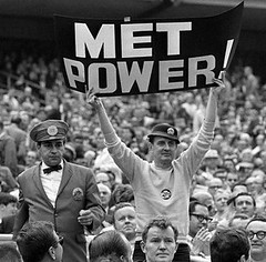
The Pro Bowl, an annual Uni Watch bête noir, took place yesterday, but I’ll get to that debacle tomorrow. Today I want to take some time to address some sad news that came down over the weekend, namely that Karl Ehrhardt — better known to Mets fans as the Sign Man — had died on Thursday. You don’t have to have grown up watching Ehrhardt’s antics, as I did, to appreciate his contribution to athletics aesthetics. Although not a uni-related figure per se, he was definitely part of the Shea Stadium landscape from 1964 through 1981, just like the old Dodgers Sym-Phony was an integral part of the Ebbets Field scene.
When I went looking for photos of Ehrhardt to run with this piece, I was stunned by how few images of him were available on the web. Aside from the one shown above (here’s a larger, uncropped version, and dig that usher’s uni!), the only others I could find were this and this, along with two more recent shots taken at Ehrhardt’s home a few years ago.
But I remember plenty of other signs Ehrhardt held up over the years. When a ball went through an infielder’s legs, it was, “Look Ma, No Hands!” When Jose Cardenal struck out, it was always, “Jose, Can You See?” According to a 2006 article, “He took roughly 60 signs to each game; he once owned as many as 1,200, but only 12 remain.” Does anyone have more pics of Ehrdhardt’s work? If so, forward them my way and I’ll assemble them into a gallery.
Will the Mets memorialize Ehrhardt with a sleeve patch? I doubt it — he was never tight with the Wilpon/Doubleday ownership group (they didn’t like him holding signs that criticized the home team, although they eventually invited him back to Shea for the team’s 40th anniversary in 2002). But man, think of the graphic possibilities of an Ehrhardt patch! Consider, for example, the logo that Uni Watch’s own Scott M.X. Turner created for Jon Springer’s Mets by the Numbers site. Now imagine something like that with “Karl” or “K.E.” on the sign — would that make an awesome patch or what? And it would be especially apropos for this, Shea’s final season.
In any case, Ehrhardt will live on in the minds of all Mets fans — and, I hope, all sports aesthetes. R.I.P., Sign Man.
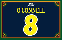
Membership News: My apologies to those of you who’ve been waiting for your membership kits. A combination of factors conspired to delay the latest batch a bit longer than usual, but a bunch of kits mailed out on Friday (including today’s showcase card, based on the Marquette hoops team), so watch your mailboxes.
Uni Watch News Ticker: “I’d heard that Babe Ruth was a catcher before he turned pro, but I had never seen a picture until now,” writes Cork Gaines. “The strange thing about the photo is that Ruth (back row, left end) is holding a right-handed catcher’s mitt. As a former catcher myself, I know there’s an advantage to being right-handed (throws to second tend to tail to the correct side of the bag, better positioned to throw out someone stealing third), but I never thought the advantage was so great that a lefty would play the position right-handed.” Anyone know more about this chapter of Ruth’s life? ”¦ The Museum of Flight in Seattle has a new exhibit devoted to flight attendants’ uniforms. Details here and here, and there’s a great photo gallery here (with thanks to Larry Draper and Brian Terreson). ”¦ Several readers are reporting that the Georgia Tech football players voted on new uniforms for next season. “They’re switching back to ‘old gold’ instead of ‘Vegas gold,'” says Ben Beck. “Word on the street is white shirt/gold pants for both home and road. Still deciding on which helmet, though.” Dan Skankar says there’s also talk of a blue pants option. ”¦ Good assortment of NBA All-Star Game uniforms on view in this video clip (with thanks to Josh Hansen). ”¦ Report from a reader who prefers to remain anonymous: “The UAB football program is officially switching to Nike for the upcoming season, and is getting a jersey redesign. I’ve seen them, and they are very similar to the Miami jerseys when they were first redone, with a gold stripe coming up the sides and meeting at a point in the middle of a green or white field. I’ll try to get some pictures of them soon.” … Fun design-your-own-uni site here (with thanks to Brennan Sullivan). ”¦ More green dots may be on the way. ”¦ Depending on how you look at it, this is either history’s worst attempt at radial arching or else an endearing case of typography illustrating the word in question. ”¦ Want a nice glove in the face? Here’s an entire article devoted to that tactic. ”¦ Incredible though it may seem, there are ways to raise cancer awareness that don’t involve the color pink. Case in point: The French rugby team wore a yellow daffodil patch on their right jersey sleeve in their 6 Nations match against Ireland on Saturday (with thanks to Ross Lake). ”¦ I think this means he’s injured, right? ”¦ Speaking of pink, check out the color-coordinated logo creep on ASU coach Charlie Turner-Thorne’s collar (awesome catch by Andres Douzoglou). … Xavier wore throwbacks yesterday — nice. ”¦ Good catch by Ben Waschman, who spotted the ACC black memorial strip for the Virginia Tech shootings on Duke’s black alternates (it’s on the upper-right chest, opposite the American flag on the left). ”¦ Reprinted from last night’s comments: This year’s Stanley Cup finals patch will apparently look like this. ”¦ Coupla soccer notes from Jeremy Brahm: First, AC Milan is partnering with the fashion label Dolce & Gabanna. And FIFA has awarded a jersey badge to AC Milan for winning the FIFA World Club Championship in Japan in December (details here and here).
I was wondering if Paul was going to write about crazy Karl.
The new was introduced sometime last week. Has there been much talk about it here? I’m not too fond of it.
link
[quote comment=”222396″]link[/quote]
Man have these logos gone down the tube lately.
In a recent book about Ruth the cather’s mitt was discussed. The reason given for the right throwing glove was there were very few left handed catchers, so manufacturers at the time simply did not make them. The Babe Ruth statue at Camden Yards also shows Babe with the right throwing glove, which most people think of as a mistake.
I’m a little confused on the Alabama blurb. ‘Bama has been with Nike since the mid-1990s, so they’re definitely not “switching to Nike.”
As for a jersey redesign, I can’t see anybody in that athletic department allowing Nike to screw up such a classic uniform (and this is coming from an Auburn grad!).
Did the NY Rangers ever wear mesh jerseys?
link
I do like that Stanley Cup patch however, still wish they’d go back to the classic….
link
[quote comment=”222401″]I’m a little confused on the Alabama blurb. ‘Bama has been with Nike since the mid-1990s, so they’re definitely not “switching to Nike.”
As for a jersey redesign, I can’t see anybody in that athletic department allowing Nike to screw up such a classic uniform (and this is coming from an Auburn grad!).[/quote]
My bad — UAB, not ‘Bama. Now fixed in text.
I just realized something…the blurb on Alabama switching to Nike is not about the University of Alabama, but rather Alabama-Birmingham (UAB). Their colors are, after all, green and gold.
Probably need to change that before Crimson Tide fans have a conniption!
[quote comment=”222397″][quote comment=”222396″]link[/quote]
Man have these logos gone down the tube lately.[/quote]
Lately they have all incorporated the red star and blue star and I’m not sure what they represent. Conferences perhaps?
They have gone way downhill of late and they all look like they were designed by the same third-grader. What’s up with that font in the XLIII logo? Horrible.
[quote comment=”222397″][quote comment=”222396″]link[/quote]
Man have these logos gone down the tube lately.[/quote]
Agreed. And the font is terrible. Looks like it is straight out of 1994. The logo itself looks unfinished.
Maybe they will have it done by next February.
Wow, no mention of Derek Anderson’s wacky Browns helmet patch on the sleeve of his Pro Bowl jersey?!?!
[quote comment=”222420″][quote comment=”222397″][quote comment=”222396″]link[/quote]
Man have these logos gone down the tube lately.[/quote]
Agreed. And the font is terrible. Looks like it is straight out of 1994. The logo itself looks unfinished.
Maybe they will have it done by next February.[/quote]
Come on…is the NFL that strapped for cash that they had one of the executives 8 year old kids design the super bowl logo?? For Tampa Bay sake, that logo makes the Rays new logo look state of the art.
If you look close it appears that the ASU coach has her fingernails color coordinated to match her outfit.
[quote comment=”222422″]Wow, no mention of Derek Anderson’s wacky Browns helmet patch on the sleeve of his Pro Bowl jersey?!?![/quote]
I agree! someone has to have a screen shot of that. How in the hell does that happen, and how could it not be caught before the game? The helmet is upside down! Maybe that’s why Anderson sucked so bad in that game!
link
[quote comment=”222422″]Wow, no mention of Derek Anderson’s wacky Browns helmet patch on the sleeve of his Pro Bowl jersey?!?![/quote]
It was mentioned in the comments last night, but I don’t think anyone has found a picture yet…..that is, until right now….
link
nice article link on karl ehrhardt
Perhaps the nadir of the whole pink jersey thing. All ECAC women’s hockey teams wore two tone pink jerseys this weekend. Here is a picture of Harvard’s: link .
Here is a link to a page where you can see the designs for all of the teams, along with pictures of the pink ties worn by the mens’ teams’ coaches: link
[quote comment=”222401″]I’m a little confused on the Alabama blurb. ‘Bama has been with Nike since the mid-1990s, so they’re definitely not “switching to Nike.”
As for a jersey redesign, I can’t see anybody in that athletic department allowing Nike to screw up such a classic uniform (and this is coming from an Auburn grad!).[/quote]
University of Alabama at Birmingham, not the Tide.
The Blazers are new converts, the Tide have beem with Team Knight since the Stalling days.
Zed’s not quite dead baby…..
link
From Richard Zednik’s throat slash the other day…
[quote comment=”222448″][quote comment=”222422″]Wow, no mention of Derek Anderson’s wacky Browns helmet patch on the sleeve of his Pro Bowl jersey?!?![/quote]
It was mentioned in the comments last night, but I don’t think anyone has found a picture yet…..that is, until right now….
link
Now this is getting really weird. I’d like to see a screen shot from the game. I swear that in the game it was the one on his right shoulder that was upside down. In that pic its on his left shoulder..and in the game that one was on correctly…hmmm
[quote comment=”222457″][quote comment=”222448″][quote comment=”222422″]Wow, no mention of Derek Anderson’s wacky Browns helmet patch on the sleeve of his Pro Bowl jersey?!?![/quote]
It was mentioned in the comments last night, but I don’t think anyone has found a picture yet…..that is, until right now….
link
Now this is getting really weird. I’d like to see a screen shot from the game. I swear that in the game it was the one on his right shoulder that was upside down. In that pic its on his left shoulder..and in the game that one was on correctly…hmmm[/quote]
Mr Anderson….
link
21’s for everyone!
21
Back in ’69, as the Miracle Mets marched to their improbable world championship, Sign Man provided the living subtitles to the drama. NBC’s cameras flashed to Sign Man after many a great play by the Amazins. His graphics added a touch of Broadway panache to the Good (Gil Hodges’ Metsies) vs. Evil (Leo Durocher’s Cubs or Earl Weaver’s Orioles) storyline. Karl’s work was so clever that you had to appreciate him even if you weren’t a Mets fan.
How about this, NYM, for a tribute to Karl? Sign Man Hat Day — give away replicas of his trademark hat, with AMAZIN’ embroidered like one of his signs?
[quote comment=”222420″][quote comment=”222397″][quote comment=”222396″]link[/quote]
Man have these logos gone down the tube lately.[/quote]
Agreed. And the font is terrible. Looks like it is straight out of 1994. The logo itself looks unfinished.
Maybe they will have it done by next February.[/quote]
And it still looks like the Bank of America logo.
The signman lives?
That wreaks of irony.
[quote comment=”222448″][quote comment=”222422″]Wow, no mention of Derek Anderson’s wacky Browns helmet patch on the sleeve of his Pro Bowl jersey?!?![/quote]
It was mentioned in the comments last night, but I don’t think anyone has found a picture yet…..that is, until right now….
link
During the game, the shoulder in question was correct. When he was sending in the plays ro Big Ben they had a closeup shot and it was corrected. I could always be wrong.
Rutgers Women’s basketball team is joining the parade of teams to wear pink in their game against Tennessee tonight. link, I’ll try to scrape an image tonight.
[quote comment=”222443″]If you look close it appears that the ASU coach has her fingernails color coordinated to match her outfit.[/quote]
It must be a trend with Hoops coaches to coordinate. Check out link, who is renowned for perpetrating such sartorial feats.
[quote comment=”222397″][quote comment=”222396″]link[/quote]
Man have these logos gone down the tube lately.[/quote]
Perhaps the NFL should look link. Not a dull design among them.
My local sports-talk morning show guy was talking about how all the other NASCAR wives are peeved with newcomer Ashley Judd for wearing dresses on Pit Road, thus breaking NASCAR etiquette of wearing pants. NASCAR officials are apparently discussing the matter.
Who knew there was a uniform for NASCAR wives?
[quote comment=”222422″]Wow, no mention of Derek Anderson’s wacky Browns helmet patch on the sleeve of his Pro Bowl jersey?!?![/quote]
I refer you to the first sentence of today’s entry.
[quote comment=”222470″]“Perhaps the NFL should look link.”[/quote]
Yeah, but they’re just as boring – if not even more boring – than the Super Bowl insignias. Same font, different year.
The LSU and Georgia women’s basketball teams wore “pink” this weekend and I saw it flipping through. On TV, it barely looked pink.
In link photo it looks like LSU has a pale purple stripe.
In link photo where they’re close together the colors look the same, but I still don’t think they look pink.
They wore link, the cheerleaders had link and link link and there were pink
link!
[quote comment=”222473″][quote comment=”222422″]Wow, no mention of Derek Anderson’s wacky Browns helmet patch on the sleeve of his Pro Bowl jersey?!?![/quote]
I refer you to the first sentence of today’s entry.[/quote]
well…there’s that and it was also mentioned in, i believe, friday’s comments, saturday’s comments and yesterday’s comments
Although not a uni-related figure per se, he was definitely part of the Shea Stadium landscape from 1964 through 1981, just like the old Dodgers Sym-Phony was an integral part of the Ebbets Field scene.
As is Wrigley Field’s own Ronnie “Woo Woo” Wickers. Legendary. Bizarre. Annoying. And Beloved. Just like the lovable losers, the Chicago Cubs themselves…
link
And live and in annoying person:
link
And Ronnie’s even annoying at 35,000 feet.
link
Wow, no mention of Derek Anderson’s wacky Browns helmet patch on the sleeve of his Pro Bowl jersey?!?!
“The Pro Bowl, an annual Uni Watch bête noir, took place yesterday, but I’ll get to that debacle tomorrow”
How can a team called the Yellow Jackets wear gold?
[quote comment=”222477″]
As is Wrigley Field’s own Ronnie “Woo Woo” Wickers. Legendary. Bizarre. Annoying. And Beloved. Just like the lovable losers, the Chicago Cubs themselves…
[/quote]
Ronnie is the most annoying thing in Chicago. On more than one occasion when I’ve been there, ushers have told him to beat it when people complain.
Pink is generally used for benefits for breast cancer awareness. The daffodil has been used for years in Canada for overall cancer awareness. Particularly in link where bunches of daffodils are sold.
As far as the question about the Rangers using mesh – they did for many years until everyone was using the Air-Knit when CCM took over the jersey supply deal in 03-04 IIRC.
“Ronnie is the most annoying thing in Chicago.”
As someone who lived there for several years until recently, I can tell you that Ronnie is annoying (though harmless), but he’s probably not in the top fifteen annoying things in Chicago.
In other news, I went to Suns/Wizards last night. When one team is wearing purple and orange and they’re the smartly dressed team, you know something’s wrong. The Wizards’ black and gold things are just…horrendous.
[quote comment=”222474″][quote comment=”222470″]“Perhaps the NFL should look link.”[/quote]
Yeah, but they’re just as boring – if not even more boring – than the Super Bowl insignias. Same font, different year.[/quote]
Perhaps they need to replace the stars with green dots.
the babe was a catcher at a time when there were simply no lefty catchers. he had to wear a right-handed mitt because there were no left handed mitts. he would actually catch the ball in his left hand, toss it up, pull off the mitt, and catch it barehanded in his left to throw.
Cubs bleachers fans have tried to replicate Karl Ehrhardt’s fame:
The Shawon-O-Meter. Dedicated to trying to get former Cubs #1 Draft pick (ugh) Shawon Dunston to hit over .300.
“It’s Gonna Happen” Last year’s misguided and terribly flawed “slogan” idea that became so polarizing, fights would break out in the bleachers from superstitious Cubs objecting to such blatant boosterism.
The Shawon-O-Meter (Harry Caray in the shot)
link
It’s Gonna Happen (Rrrrrrrrrrright).
link
On another Wrigley Field bleacher topic, the Friendly Confines can be a nice place to uni watch if the uni consists of couple of Mai Tai’s and a thong or two?
link
Sorry, it’s 26 below in Chi with the wind chill today. Therapy.
Wow. that super bowl logo is just pitiful.
paul & other met fans…
while searching for “sign man” pics, i stumbled on link showing architectural renderings of shea (notice how beautiful the surrounding area looks — HAHAHAHA…well not really)
Did anyone out there used to sit in the obstructed view seats by the left field foul pole at Candlestick (y’know, the seats they didn’t sell but would allow anyone to use-even with a cheapie pavilion ticket)?
There was a woman down there with the loudest, most grating, annoying voice I have ever heard. Since The ‘Stick was usually so empty, her voice carried and you know the players could hear her. I’ve only been to a few games at the new Corporately Named Park and have since moved away, so I don’t know if she made the transition.
Oh, and the Suns and Spurs are apparently both going to wear uniforms on March 9 that will be in Spanish. “Los Suns” and “Los Spurs.”
[quote comment=”222483″]“Ronnie is the most annoying thing in Chicago.”
As someone who lived there for several years until recently, I can tell you that Ronnie is annoying (though harmless), but he’s probably not in the top fifteen annoying things in Chicago.
.[/quote]
He drives me nuts. And the worst things is, I have started seeing him this year at BLACKHAWKS games, in his Cubs gear. How annoying and miserable. So long as he stays away from Section 329, we are ok.
As someone who lived there for several years until recently, I can tell you that Ronnie is annoying (though harmless), but he’s probably not in the top fifteen annoying things in Chicago.
One things not annoying about Chicago is our uniforms.
Cubs
White Sox
Bears
Bulls
Blackhawks
Fire
As good or better than any major cities uniforms (all four major sports) top to bottom.
The Chicago Sky does not count.
[quote comment=”222471″]My local sports-talk morning show guy was talking about how all the other NASCAR wives are peeved with newcomer Ashley Judd for wearing dresses on Pit Road, thus breaking NASCAR etiquette of wearing pants. NASCAR officials are apparently discussing the matter.
Who knew there was a uniform for NASCAR wives?[/quote]
There is a basic dress code for everyone who is allowed in the garage and pit area. I don’t believe the rules apply to basic tours of pit road for the fans.
Pants are the requirement for everyone. Women are not allowed to wear open toed shoes or sandals. Men are also not allowed to wear any cut off shirts or tank tops. I believe these rules are not only in place for safety reasons but also to keep a professional atmosphere in the garage and pit area.
I have however, seen exceptions to these rules and have wondered how they got past security.
[quote comment=”222490″]paul & other met fans…
while searching for “sign man” pics, i stumbled on link showing architectural renderings of shea (notice how beautiful the surrounding area looks — HAHAHAHA…well not really)[/quote]
who would have thunk that an area can go 50 years without any infrastructure improvements including sewage and roads and still thrive. btw, they are going to have to do something because this is right across the street from where the met offices are going to be.
Signman reminds me of a guy that I am sure Detroit uni-watchers will remember, the Brow. The Tigers gave him season tickets in 1977 in exchange for letting them use a picture of him holding a “Go Tigers!” sign on the season ticket mailer. Ernie Baker, who worked for the Tigers, remembers the Brow in link:
To me, a guy like that is what was great about Tiger Stadium and why I was lucky to have been able to go down there and watch games with my friends. My biggest memory of The Brow is that he would come around to our section and lead us in starting the wave. But you’d always see him, seemingly no matter where you sat. Joe left us right before Tiger Stadium did, interesting that Signman now goes with Shea.
I’m too young to remember Karl Ehrhardt, but I have seen Freddy Sez at tons of Yankees games. Anybody on here have any comments on him?
link
He drives me nuts. And the worst things is, I have started seeing him this year at BLACKHAWKS games, in his Cubs gear. How annoying and miserable. So long as he stays away from Section 329, we are ok.
I do NOT get Ronnie wearing his Cubs uni at a Blackhawks game?
Ronnie must “Commit to the Indian” for sure.
link
link is the reason I dislike Stadium Naming. Because like
Enronlink,MCIlink,PacBell,SBClink and many others, I can actually see this happening at some point.[quote comment=”222484″][quote comment=”222474″][quote comment=”222470″]“Perhaps the NFL should look link.”[/quote]
Yeah, but they’re just as boring – if not even more boring – than the Super Bowl insignias. Same font, different year.[/quote]
Perhaps they need to replace the stars with green dots.[/quote]
Did you really need to go there?
One fan I can’t stant is the “Trop Heckler” or link as he has dubed himself. You can hear on any televised Rays game and at the game itself. He thinks he is the greatest thing since sliced bread but he is just flat out annoying.
[quote comment=”222509″]One fan I can’t stant is the “Trop Heckler” or link as he has dubed himself. You can hear on any televised Rays game and at the game itself. He thinks he is the greatest thing since sliced bread but he is just flat out annoying.[/quote]
must be hard NOT to hear the only fan in attendance
[quote comment=”222492″]Oh, and the Suns and Spurs are apparently both going to wear uniforms on March 9 that will be in Spanish. “Los Suns” and “Los Spurs.”[/quote]
I’m sure that they will both look like MIERDA!
[quote comment=”222402″]Did the NY Rangers ever wear mesh jerseys?
link
I do like that Stanley Cup patch however, still wish they’d go back to the classic….
link
They wore mesh for quite some time, starting with the Cosby-made link in ’77 through the link worn from ’96-’99.
We’ve lost a lot of “Superfans” (for lack of a better term) in the past couple years – link, link, link, and now the original Signman. (Many others have co-opted that handle.) link just “retired” because of his ill health. link, please see your doctor for a thorough check-up.
Also, a housekeeping note: “Dolce & Gabbana” – two Bs, one N. The preferred designer of link, I hear.
[quote comment=”222508″][quote comment=”222484″][quote comment=”222474″][quote comment=”222470″]“Perhaps the NFL should look link.”[/quote]
Yeah, but they’re just as boring – if not even more boring – than the Super Bowl insignias. Same font, different year.[/quote]
Perhaps they need to replace the stars with green dots.[/quote]
Did you really need to go there?[/quote]
Need to … no. Could’ve gone farther … yes.
Seriously … the logo is plain. With this logo and the Rays debacle, is it possible that there are no good design companies in Tampa? Or is it that the design companies in Tampa are trying to revolutionize the sports logo business by being simple? And, of course, I am assuming that the Rays and Super Bowl logos were created by Tampa companies.
[quote comment=”222512″][quote comment=”222509″]One fan I can’t stant is the “Trop Heckler” or link as he has dubed himself. You can hear on any televised Rays game and at the game itself. He thinks he is the greatest thing since sliced bread but he is just flat out annoying.[/quote]
must be hard NOT to hear the only fan in attendance[/quote]
What was the name of the famous basketball heckler during the 80’s and 90’s, Robin something or other? And I don’t mean link!
Colorado had one of those “[insert school color here]-out” games Saturday vs. Oklahoma, so they wore black unis at home, while Oklahoma wore their normal road red. This idea has already jumped the shark, IMO (not to mention that black is not even one of CU’s school colors, which are silver and gold).
link
[quote comment=”222515″]We’ve lost a lot of “Superfans” (for lack of a better term) in the past couple years – link, link, link, and now the original Signman. (Many others have co-opted that handle.) link just “retired” because of his ill health. link, please see your doctor for a thorough check-up.
Also, a housekeeping note: “Dolce & Gabbana” – two Bs, one N. The preferred designer of link, I hear.[/quote]
The Giants still have the license link link!He’s not even 40, so he’ll presumably be around for awhile!
[quote comment=”222517″]
What was the name of the famous basketball heckler during the 80’s and 90’s, Robin something or other? And I don’t mean link![/quote]
Robin Ficker.
How great did Man. United look the other day paying tribute to the Munich disaster. No Nike, AIG logo or United crest. Just the simplicity of the red shirt, just like the old days. Also a great touch with the old number font.
I didn’t get a chance to watch the match but judging from the photos, it looks like Ronaldo lost his memorial armband at some point.
link
[quote comment=”222517″][quote comment=”222512″][quote comment=”222509″]One fan I can’t stant is the “Trop Heckler” or link as he has dubed himself. You can hear on any televised Rays game and at the game itself. He thinks he is the greatest thing since sliced bread but he is just flat out annoying.[/quote]
must be hard NOT to hear the only fan in attendance[/quote]
What was the name of the famous basketball heckler during the 80’s and 90’s, Robin something or other? And I don’t mean link![/quote]
Robin Ficker, I think. Wahington Bullets games.
[quote comment=”222485″]the babe was a catcher at a time when there were simply no lefty catchers. he had to wear a right-handed mitt because there were no left handed mitts. he would actually catch the ball in his left hand, toss it up, pull off the mitt, and catch it barehanded in his left to throw.[/quote]
Goodness. I think I’d have just worn a first-baseman’s mitt with a little extra padding stuffed in.
[quote comment=”222515″]We’ve lost a lot of “Superfans” (for lack of a better term) in the past couple years – link, link, link, and now the original Signman. (Many others have co-opted that handle.) link just “retired” because of his ill health. link, please see your doctor for a thorough check-up.
Also, a housekeeping note: “Dolce & Gabbana” – two Bs, one N. The preferred designer of link, I hear.[/quote]
In regards to Fireman Ed, have there been any other hecklers who have products made/sold based on them?
J-E-T-S!
[quote comment=”222522″][quote comment=”222517″][quote comment=”222512″][quote comment=”222509″]One fan I can’t stant is the “Trop Heckler” or link as he has dubed himself. You can hear on any televised Rays game and at the game itself. He thinks he is the greatest thing since sliced bread but he is just flat out annoying.[/quote]
must be hard NOT to hear the only fan in attendance[/quote]
What was the name of the famous basketball heckler during the 80’s and 90’s, Robin something or other? And I don’t mean link![/quote]
Robin Ficker, I think. Wahington Bullets games.[/quote]
When you mention the word Heckler, his face is the first thing that comes to mind. And if I recall correctly, I believe that he was an attorney.
[quote comment=”222521″]How great did Man. United look the other day paying tribute to the Munich disaster. No Nike, AIG logo or United crest. Just the simplicity of the red shirt, just like the old days. Also a great touch with the old number font.
I didn’t get a chance to watch the match but judging from the photos, it looks like Ronaldo lost his memorial armband at some point.
link[/quote]
The match commentators, John Champion and David Pleat, agreed on how refreshing it was to see the players, in Champion’s words, “looking like footballers and not like billboards.” Wonder if they’ll catch any flak from the Premier League’s corporate overlords for that one?
Actually, check what I found on Ficker’s Wickipedia page:
On June 7, 2007, the Maryland Court of Appeals suspended Ficker’s law license indefinitely (he may apply for reinstatement after one year), saying that despite four previous warnings, he ran his Bethesda law office in a slipshod way to the detriment of clients
[quote comment=”222524″][In regards to Fireman Ed, have there been any other hecklers who have products made/sold based on them?[/quote]
link
wait…what?
In regards to Fireman Ed, have there been any other hecklers who have products made/sold based on them?
J-E-T-S!
We tried to use Fireman Ed in a brochure for the New Meadowlands Stadium but it was a no go due to individual rights releases so I have a hunch there are some real licensing issues around these quasi team mascots…
The Cardinals have a Sign-Man, Marty Prather, who no doubt was inspired by the Mets’ original SignMan. link
Last couple of seasons, he wore a humongous Giants batting helmet when SF came to town, with a sign “Barry, here’s your helmet”. BB has a sense of humor–saw the helmet, laughed and asked Marty if he could buy it.
I believe that Big Dawg of Cleveland had a cereal back in the day. I’ll look for a link when I get out of all classes, Property.
In other news, I went to Suns/Wizards last night. When one team is wearing purple and orange and they’re the smartly dressed team, you know something’s wrong. The Wizards’ black and gold things are just…horrendous
why are the wizards unis SO wrong??? i actually kind of like them… they have a good look to them!
[quote comment=”222521″]How great did Man. United look the other day paying tribute to the Munich disaster. No Nike, AIG logo or United crest. Just the simplicity of the red shirt, just like the old days. Also a great touch with the old number font.
[/quote]
I agree.
Some say boring.
I say (spoiler alert) sports uniforms were boring 50 years ago(/spoiler alert).
But there’s something refreshing about this, and the appropriateness of the tribute.
Then again, it wasn’t aimed at you or me. It was aimed at Mancunians specifically, English folks secondly and fans of soccer only tangentially.
[quote comment=”222533″]why are the wizards unis SO wrong??? i actually kind of like them… they have a good look to them![/quote]
you…leave…now
Any of you Yankee fans that have ever spent time with the Rightfield “Bleacher Creatures” should recall link.
Yes, yes Insert Christopher Walken comment here!
[quote comment=”222531″]The Cardinals have a Sign-Man, Marty Prather, who no doubt was inspired by the Mets’ original SignMan. link
Last couple of seasons, he wore a humongous Giants batting helmet when SF came to town, with a sign “Barry, here’s your helmet”. BB has a sense of humor–saw the helmet, laughed and asked Marty if he could buy it.[/quote]
The Pittsburgh Pirates have a sign guy out in right field who brings at least a dozen signs with him to the games. Personally I liked the big slice of bread that said “You are toast!”.
…..sometimes it is the little things.
In other Bucs news, I am glad to see the angry Pirate get minimized and the P brought back to the forefront. Now, just ditch the red vests. The colors are black and gold….not black and gold and red…..
[quote comment=”222526″][quote comment=”222521″]How great did Man. United look the other day paying tribute to the Munich disaster. No Nike, AIG logo or United crest. Just the simplicity of the red shirt, just like the old days. Also a great touch with the old number font.
I didn’t get a chance to watch the match but judging from the photos, it looks like Ronaldo lost his memorial armband at some point.
link[/quote]
The match commentators, John Champion and David Pleat, agreed on how refreshing it was to see the players, in Champion’s words, “looking like footballers and not like billboards.” Wonder if they’ll catch any flak from the Premier League’s corporate overlords for that one?[/quote]
True that. I believe they had approval from all corporate sponsors as well as the Premier League, as they even left off the Premier League sleeve link
Hard to forget this guy…
link
The Rainbow Hair JOHN 3:16 guy would always show up behind either home plate at a World Series game or in the stands behind the goalposts with that huge JOHN 3:16 sign in his hands and that rainbow hair. Freaky dude.
[quote comment=”222533″]In other news, I went to Suns/Wizards last night. When one team is wearing purple and orange and they’re the smartly dressed team, you know something’s wrong. The Wizards’ black and gold things are just…horrendous
why are the wizards unis SO wrong??? i actually kind of like them… they have a good look to them![/quote]
To each their own.
They’re a departure, I’ll say that (which, I guess, is one point of a “third strip”).
The color scheme, which works for the New Orleans Saints, just doesn’t seem to go with the Wizards. The shininess of the gold, the white and black stuff on the top (like epaulets), the stars down the side…it just doesn’t work for me. Maybe back in the day, when uniforms were tighter-fitting and not so drape-y, it would have impressed me more.
Just doesn’t appeal to me.
Thank god the NHL got rid of the stupid “Eastern Western” writing on the Stanley Cup logo, which is almost as bad as using a link.
Seriously, I can’t buy any Colts championship gear because of the hideous Super Bowl XLI logo.
Super Bowl XLIII
Man have these logos gone down the tube lately.
Agreed. And the font is terrible. Looks like it is straight out of 1994. The logo itself looks unfinished.
Maybe they will have it done by next February.
Come on…is the NFL that strapped for cash that they had one of the executives 8 year old kids design the super bowl logo?? For Tampa Bay sake, that logo makes the Rays new logo look state of the art
Don’t mean to get on my soap box but I’ve been calling out this trend to take high level logo branding in-house (NFL, NBA, NHL and MLB) for about 3 years and the effects are coming into full focus…Not good and I am NOT gloating.
[quote comment=”222540″]Hard to forget this guy…
link
The Rainbow Hair JOHN 3:16 guy would always show up behind either home plate at a World Series game or in the stands behind the goalposts with that huge JOHN 3:16 sign in his hands and that rainbow hair. Freaky dude.[/quote]
Isn’t this dude still sitting in prison? I seem to remember something about kidnapping….
[quote comment=”222536″]Any of you Yankee fans that have ever spent time with the Rightfield “Bleacher Creatures” should recall link.
Yes, yes Insert Christopher Walken comment here![/quote]
Actually, remember link Lebron 5’s from a few weeks ago?
The link? on the inside of the tongue comes from the Roll Call chant that the “Bleacher Creatures” do!
Are Charlie Turner-Thorne’s nails also painted in some kind of Sun Devils color scheme, too?
[quote comment=”222521″]How great did Man. United look the other day paying tribute to the Munich disaster. No Nike, AIG logo or United crest. Just the simplicity of the red shirt, just like the old days. Also a great touch with the old number font.
I didn’t get a chance to watch the match but judging from the photos, it looks like Ronaldo lost his memorial armband at some point.
link[/quote]
Man United also went old school with the numbering system. All starters wore 1-11, like the old days when numbers were assigned by starting position. In some cases, the numbers matched what the player normally wore (C. Ronaldo – 7, R. Giggs – 11, E. Van der Sar – 1) in most cases they didn’t. Paul Scholes wore 10 instead of 18, Carlos Tevez wore 9 instead of 32. The subs wore 12-16.
Not to nitpick on dude’s Marquette jersey design (OK, yes I’m nitpicking) but shouldn’t you have an NCAA legal jersey number on a college basketball jersey design? 8 doesn’t pass the “no number higher than 5” test.
[quote comment=”222552″]Not to nitpick on dude’s Marquette jersey design (OK, yes I’m nitpicking) but shouldn’t you have an NCAA legal jersey number on a college basketball jersey design? 8 doesn’t pass the “no number higher than 5” test.[/quote]
I don’t understand this considering that there are always numbers higher than 5!
[quote comment=”222553″][quote comment=”222552″]Not to nitpick on dude’s Marquette jersey design (OK, yes I’m nitpicking) but shouldn’t you have an NCAA legal jersey number on a college basketball jersey design? 8 doesn’t pass the “no number higher than 5” test.[/quote]
I don’t understand this considering that there are always numbers higher than 5![/quote]
Basketball officials (generally) have five fingers. So, when calling out a foul they use their fingers to designate the player fouling. One finger on the right hand and 3 fingers on the left hand tells the scorer that number 13 fouled.
[quote comment=”222549″]Are Charlie Turner-Thorne’s nails also painted in some kind of Sun Devils color scheme, too?[/quote]
link
In high school and college basketball, there can be no number higher than 5 on the jersey (as either the first or second number). That wasn’t always the case (Russell wore #6 at USF), but it has been for some time.
And it was only within the past 15 years or so that HS or college players could be #1 or #2 (though you always had 10-15 and 20-25).
I agree.
Some say boring.
I say (spoiler alert) sports uniforms were boring 50 years ago(/spoiler alert).
But there’s something refreshing about this, and the appropriateness of the tribute.
Then again, it wasn’t aimed at you or me. It was aimed at Mancunians specifically, English folks secondly and fans of soccer only tangentially.
Two thoughts about the Man U jerseys
1. They were bland jerseys, about as bland as you get. If one is to judge without attached sentiment, history and nostaglia, I think this is a fair statement.
2. If there’s a case where you throw aesthetic appeal concerns out the window this would be probably right up there on the top. On such a tribute as this one, sentiment to the tragic cause far exceeds the need of looking appealing.
[quote comment=”222522″][quote comment=”222517″][quote comment=”222512″][quote comment=”222509″]One fan I can’t stant is the “Trop Heckler” or link as he has dubed himself. You can hear on any televised Rays game and at the game itself. He thinks he is the greatest thing since sliced bread but he is just flat out annoying.[/quote]
must be hard NOT to hear the only fan in attendance[/quote]
What was the name of the famous basketball heckler during the 80’s and 90’s, Robin something or other? And I don’t mean link![/quote]
Robin Ficker, I think. Wahington Bullets games.[/quote]
i actually met robin ficker at the kemper open over 10 yrs ago. he was just a regular fan that day. was very friendly, walked the 17th with him.
[quote comment=”222559″]In high school and college basketball, there can be no number higher than 5 on the jersey (as either the first or second number). That wasn’t always the case (Russell wore #6 at USF), but it has been for some time.
And it was only within the past 15 years or so that HS or college players could be #1 or #2 (though you always had 10-15 and 20-25).[/quote]
I have never thought about that before and the reasoning behind it! I guess it deal with referees and thier ability to quickly call fouls!
[quote comment=”222539″][quote comment=”222526″][quote comment=”222521″]How great did Man. United look the other day paying tribute to the Munich disaster. No Nike, AIG logo or United crest. Just the simplicity of the red shirt, just like the old days. Also a great touch with the old number font.
I didn’t get a chance to watch the match but judging from the photos, it looks like Ronaldo lost his memorial armband at some point.
link[/quote]
The match commentators, John Champion and David Pleat, agreed on how refreshing it was to see the players, in Champion’s words, “looking like footballers and not like billboards.” Wonder if they’ll catch any flak from the Premier League’s corporate overlords for that one?[/quote]
True that. I believe they had approval from all corporate sponsors as well as the Premier League, as they even left off the Premier League sleeve link[/quote]
No, I meant I wonder if Champion and Pleat would catch flak for the “billboards” remark. I knew the league had okayed the unis for Sunday.
when it comes to sign guys, i remember a sign guy who i remember first seeing at many indiana pacer games in the late 90’s. then he started popping up at high profile games, all star weekends and nba playoff and finals games.
all of his signs were done in the same font, and the guy had curly hair.
anyone remember this guy?
Yet, if you watch NBA referees (as I do – I’m strange that way as a former hoops ref), they will, for example, call a foul on number 19 by just holding up the index finger, then closing their hands and then showing all five on one hand and four on the other. Seems to work just fine. They don’t even run over to the table (or near it) like high school officials do, they just yell it from across the court.
Which is even stranger, considering your average NBA arena is way noisier than your average high school gym.
Seems to work for them.
But, yeah, that’s the reason high school uniforms can’t have any digits higher than five. And, I checked the rosters of some of the top NCAA programs (Duke, North Carolina, etc.) and was surprised to find that they don’t have anyone with a digit higher than five, either.
[quote comment=”222567″]when it comes to sign guys, i remember a sign guy who i remember first seeing at many indiana pacer games in the late 90’s. then he started popping up at high profile games, all star weekends and nba playoff and finals games.
all of his signs were done in the same font, and the guy had curly hair.
anyone remember this guy?[/quote]
I DO remember that guy! Sat courtside? Had a big plastic pink flamingo, too? Yeah, I had forgotten about him.
IIRC, he was one of those “rich guys who refused to act like it.” Just hung out, dressed however, acted crazy. He may have owned a restaurant or something, but my memory fails me on that. I can still picture him, though, from when the Pacers first got good again under Larry Brown.
Good times.
[quote comment=”222524″][quote comment=”222515″]We’ve lost a lot of “Superfans” (for lack of a better term) in the past couple years – link, link, link, and now the original Signman. (Many others have co-opted that handle.) link just “retired” because of his ill health. link, please see your doctor for a thorough check-up.
Also, a housekeeping note: “Dolce & Gabbana” – two Bs, one N. The preferred designer of link, I hear.[/quote]
In regards to Fireman Ed, have there been any other hecklers who have products made/sold based on them?
link[/quote]
The Broncos apparently did a “link” for Barrel Man:
Tow more Sun Devils, whose nails should definitely be coordinated.
Our Favorite
link
[quote comment=”222547″][quote comment=”222540″]Hard to forget this guy…
link
The Rainbow Hair JOHN 3:16 guy would always show up behind either home plate at a World Series game or in the stands behind the goalposts with that huge JOHN 3:16 sign in his hands and that rainbow hair. Freaky dude.[/quote]
Isn’t this dude still sitting in prison? I seem to remember something about kidnapping….[/quote]
3 consecutive life terms for kidnapping back in ’92.
No one seems to have mentioned Manchester City’s retro kit, which was also quality. I particularly liked the diagonal shorts stripe.
Also, I don’t have a picture, but the sponsorship stuff in European ice hockey has gone crazy. watching the Skoda Cup at the weekend, Switzerland and Slovakia, and one of the coaches had corporate logos on the wings of his collar!
In high school and college basketball, there can be no number higher than 5 on the jersey (as either the first or second number). That wasn’t always the case (Russell wore #6 at USF), but it has been for some time.
And it was only within the past 15 years or so that HS or college players could be #1 or #2 (though you always had 10-15 and 20-25).
I have never thought about that before and the reasoning behind it! I guess it deal with referees and thier ability to quickly call fouls!
Guess everytime George Mikan would be whistled for a foul the ref would just gesture to Mikan and say the big guy with the glasses…
link
link
If this was posted earlier, then I apologize for rehashing, but here’s the story from Saturday night about link.
[quote comment=”222568″]Yet, if you watch NBA referees (as I do – I’m strange that way as a former hoops ref), they will, for example, call a foul on number 19 by just holding up the index finger, then closing their hands and then showing all five on one hand and four on the other. Seems to work just fine. They don’t even run over to the table (or near it) like high school officials do, they just yell it from across the court.
Which is even stranger, considering your average NBA arena is way noisier than your average high school gym.
Seems to work for them.
But, yeah, that’s the reason high school uniforms can’t have any digits higher than five. And, I checked the rosters of some of the top NCAA programs (Duke, North Carolina, etc.) and was surprised to find that they don’t have anyone with a digit higher than five, either.[/quote]
Why is that surprising? You aren’t allowed to have a uniform numeral higher than 5 in college. Isn’t that how this discussion started?
[quote comment=”222493″][quote comment=”222483″]“Ronnie is the most annoying thing in Chicago.”
As someone who lived there for several years until recently, I can tell you that Ronnie is annoying (though harmless), but he’s probably not in the top fifteen annoying things in Chicago.
.[/quote]
He drives me nuts. And the worst things is, I have started seeing him this year at BLACKHAWKS games, in his Cubs gear. [/quote]
No, the WORST thing is that he’s been known to attend Soxfest and Sox games (even playoff games!) still in his full Cubs uniform. What the hell?
[quote comment=”222572″]Tow more Sun Devils, whose nails should definitely be coordinated.
Our Favorite
link[/quote]
Very Interesting Uni-related topic found within SI’s questions of our favorite ASU cheerleader.
Strange and unusual fact about me: I have lucky underwear for game days
Barrel Man just “retired” because of his ill health.
link
Would hypotheria be considered ill health? I mean really.
It’s been a tough year for quasi mascots for sure…Crazy Ray of the Cowboys passed away last March. I love to hate this guy when watching the dreaded Cowpoke. He was kinda funny goofy but always had the opponents plush toy on the end of a stick…
link
And of course the Hogs.
link
She got hotter as she got older IMO
Teen Barrita
link
College Hottie Barrita
link
The Mature Barrita. I mean WTF? This guy is about as funny as getting a call from the IRS.
link
[quote comment=”222588″]She got hotter as she got older IMO
The Mature Barrita. I mean WTF? This guy is about as funny as getting a call from the IRS.
link
our new home run queen
[quote comment=”222575″]No one seems to have mentioned Manchester City’s retro kit, which was also quality. I particularly liked the diagonal shorts stripe.
Also, I don’t have a picture, but the sponsorship stuff in European ice hockey has gone crazy. watching the Skoda Cup at the weekend, Switzerland and Slovakia, and one of the coaches had corporate logos on the wings of his collar![/quote]
City’s kit wasn’t retro. They just left off the sponsor on the shirt. They still had the Premier League sleeve patch and the standard Premier League numbering.
The shorts that they wore are part of a limited edition kit that they released. If City were wearing a retro kit from 1958, they would have had a white collar, no club crest, most likely alternate all blue shorts, with blue and white hooped socks.
[quote comment=”222471″]My local sports-talk morning show guy was talking about how all the other NASCAR wives are peeved with newcomer Ashley Judd for wearing dresses on Pit Road, thus breaking NASCAR etiquette of wearing pants. NASCAR officials are apparently discussing the matter.
Who knew there was a uniform for NASCAR wives?[/quote]
link
[quote comment=”222547″][quote comment=”222540″]Hard to forget this guy…
link
The Rainbow Hair JOHN 3:16 guy would always show up behind either home plate at a World Series game or in the stands behind the goalposts with that huge JOHN 3:16 sign in his hands and that rainbow hair. Freaky dude.[/quote]
Isn’t this dude still sitting in prison? I seem to remember something about kidnapping….[/quote]
His name is Rollen Stewart, and here’s a link about his “rise and fall”.
[quote comment=”222492″]Oh, and the Suns and Spurs are apparently both going to wear uniforms on March 9 that will be in Spanish. “Los Suns” and “Los Spurs.”[/quote]
“spanish” wouldn’t that be “el sol” and “los espuelas”??
[quote comment=”222425″][quote comment=”222420″][quote comment=”222397″][quote comment=”222396″]link[/quote]
Man have these logos gone down the tube lately.[/quote]
Agreed. And the font is terrible. Looks like it is straight out of 1994. The logo itself looks unfinished.
Maybe they will have it done by next February.[/quote]
Come on…is the NFL that strapped for cash that they had one of the executives 8 year old kids design the super bowl logo?? For Tampa Bay sake, that logo makes the Rays new logo look state of the art.[/quote]
This is a great logo! not all sports logs have to be trimmed oin black and look the same, you know… But for the record, the last one did suck – I never even noticed the Arizona in the background – couldn’t figure out what that was!
[quote]Why is that surprising? You aren’t allowed to have a uniform numeral higher than 5 in college. Isn’t that how this discussion started?[/quote]
It’s not surprising now. I don’t follow college basketball closely enough to know that that same rule applied. Somewhere I guess I figured I knew that, but somewhere else I figured I didn’t really care. But then I checked anyway.
[quote comment=”222580″]No, the WORST thing is that he’s been known to attend Soxfest and Sox games (even playoff games!) still in his full Cubs uniform. What the hell?[/quote]
Isn’t he…you know…[i]special?[/i] I mean, isn’t he developmentally not all there (ignoring the fact he’s a Cub fan, we’ve all got issues, obviously). But I got the feeling Ronnie’s challenged.
[quote comment=”222602″][quote comment=”222492″]Oh, and the Suns and Spurs are apparently both going to wear uniforms on March 9 that will be in Spanish. “Los Suns” and “Los Spurs.”[/quote]
“spanish” wouldn’t that be “el sol” and “los espuelas”??[/quote]
I mean in that kind of Gringoese “We’re going to deign to recognize you once a year in that condescending way that we do, without unnecessarily troubling our lilly-white fanbase by making them think and like that.”
Wait, so D&G are sponsoring Milan’s shirts..but Adidas is still going to make the shirts?
*confusion*
Hey has anyone mentioned the sign guy in Philly? Appearances at 2:34 and 3:33….
link
[quote comment=”222567″]when it comes to sign guys, i remember a sign guy who i remember first seeing at many indiana pacer games in the late 90’s. then he started popping up at high profile games, all star weekends and nba playoff and finals games.
all of his signs were done in the same font, and the guy had curly hair.
anyone remember this guy?[/quote]
link
[quote comment=”222605″][quote comment=”222580″]No, the WORST thing is that he’s been known to attend Soxfest and Sox games (even playoff games!) still in his full Cubs uniform. What the hell?[/quote]
Isn’t he…you know…[i]special?[/i] I mean, isn’t he developmentally not all there (ignoring the fact he’s a Cub fan, we’ve all got issues, obviously). But I got the feeling Ronnie’s challenged.[/quote]
then wouldn’t he wear a helmet?
link
OLD GOLD
GEORGIA TECH – Thank Heavens !!!
Great News !!! Someone is finally ditching that piss-poor color of “Vegas Gold’ to wear OLD GOLD, the way the Good Lord, Alonzo Stagg, and the Original Saints meant it to be.
OLD GOLD
GEORGIA TECH – Thank Heavens !!!
Great News !!! Someone is finally ditching that piss-poor color of “Vegas Gold’ to wear OLD GOLD, the way the Good Lord, Alonzo Stagg, and the Original Saints meant it to be.
Not exactly uni-related, but further evidence that greed ruins everything.
link
Colorado’s school colors are silver and gold?!?! WTF are you smoking? Black is definitely one of their colors.
[quote comment=”222612″]Hey has anyone mentioned the sign guy in Philly? Appearances at 2:34 and 3:33….
link
Dave Leonardo; a Philly Spectrum favorite.
The Phillies had a guy in the final years at the Vet who sat near the Phillies dugout, near the field mic – and would incessantly yell “Everybody Hits! Woo Hoo”, loud enough that it got picked up on TV broadcasts. Thankfully, he either doesn’t have season tix at the new park or they moved him away from the mics.
[quote comment=”222616″][quote comment=”222605″][quote comment=”222580″]No, the WORST thing is that he’s been known to attend Soxfest and Sox games (even playoff games!) still in his full Cubs uniform. What the hell?[/quote]
Isn’t he…you know…[i]special?[/i] I mean, isn’t he developmentally not all there (ignoring the fact he’s a Cub fan, we’ve all got issues, obviously). But I got the feeling Ronnie’s challenged.[/quote]
then wouldn’t he wear a helmet?
link[/quote]
The best Oregon Uniform Combinations ever!
link
link
link
And the true definition of a Logo Creep, Check out who one of the five people she would like to have dinner with is, Take a guess, it’s not LI Phil, Stuby, Rick from Cedar Park, Dane, Teebz, or Krevanchi
link
[quote]Why is that surprising? You aren’t allowed to have a uniform numeral higher than 5 in college. Isn’t that how this discussion started?[/quote]
It’s not surprising now. I don’t follow college basketball closely enough to know that that same rule applied. Somewhere I guess I figured I knew that, but somewhere else I figured I didn’t really care. But then I checked anyway.
(And I’m starting to see how duplicate posts happen.)
[quote comment=”222607″][quote comment=”222602″][quote comment=”222492″]Oh, and the Suns and Spurs are apparently both going to wear uniforms on March 9 that will be in Spanish. “Los Suns” and “Los Spurs.”[/quote]
“spanish” wouldn’t that be “el sol” and “los espuelas”??[/quote]
I mean in that kind of Gringoese “We’re going to deign to recognize you once a year in that condescending way that we do, without unnecessarily troubling our lilly-white fanbase by making them think and like that.”[/quote]
They’re still gonna look like “MIERDA”.
Jesucristo, the back office software on this blog is maddening sometimes.
CU’s official school colors are silver and gold. Not black. Black’s not one of the school colors, okay?
link and another page at cubuffs.com that this frigging blog won’t let me link to without making every frigging character that comes after it be a hyperlink.
Here it is anyway, good luck:
link
[quote comment=”222620″]Colorado’s school colors are silver and gold?!?! WTF are you smoking? Black is definitely one of their colors.[/quote]
Dude, I work for the university. It’s silver and gold. Look at the sidebar on the left of this page.
link
[quote comment=”222620″]Colorado’s school colors are silver and gold?!?! WTF are you smoking? Black is definitely one of their colors.[/quote]
according to the link on this page:
What? Black is not an official CU color, what are the official colors?
The official colors of CU are silver and gold. According to the book Glory Colorado, these colors were adopted by the class of 1888, as a symbol of the mineral wealth of this state. But in 1921, as football became more popular, there were complaints from the students that silver and gold did not look good on football jerseys. In fact, silver and gold ended up looking like dirty gray and dark yellow. It wasn’t until 1959 that the football team changed its jerseys to black with yellow. And although the football team seems to have set the trend with its color choice, CU still has the official colors of silver and gold.
[quote comment=”222623″][quote comment=”222616″][quote comment=”222605″][quote comment=”222580″]No, the WORST thing is that he’s been known to attend Soxfest and Sox games (even playoff games!) still in his full Cubs uniform. What the hell?[/quote]
Isn’t he…you know…[i]special?[/i] I mean, isn’t he developmentally not all there (ignoring the fact he’s a Cub fan, we’ve all got issues, obviously). But I got the feeling Ronnie’s challenged.[/quote]
then wouldn’t he wear a helmet?
link[/quote]
The best Oregon Uniform Combinations ever!
link
link
link
And the true definition of a Logo Creep, Check out who one of the five people she would like to have dinner with is, Take a guess, it’s not LI Phil, Stuby, Rick from Cedar Park, Dane, Teebz, or Krevanchi[/quote]
That’s funny, she’s seventh on my list of who to have dinner with too. What a coincidence!
well shit…looks like i need to hit “refresh” more often
/good work to those who posted above me
I went to the SMU-Rice basketball game here in Dallas on Saturday night and it was “Pony Up for the Cure” night. As you can imagine, there was much pink. Pink “Pony Up for the Cure” t shirts were on sale. SMU players on the bench were wearing the pink t shirts instead of their normal warm up shirts and Coach Matt Doherty was rocking the pink dress shirt with tie. I looked for a photo, but since it was SMU-Rice, there wasn’t much in the way of photographers at the game.
[quote comment=”222630″][quote comment=”222620″]Colorado’s school colors are silver and gold?!?! WTF are you smoking? Black is definitely one of their colors.[/quote]
Dude, I work for the university. It’s silver and gold. Look at the sidebar on the left of this page.
link
Ever notice that the fight song ends with “Hurrah for the silver and the gold”?
My Dad went to Colorado A&M (now CSU) in Fum McGraw’s day and so always changed it to “To hell with the nickel and the brass”.
[quote comment=”222633″][quote comment=”222623″][quote comment=”222616″][quote comment=”222605″][quote comment=”222580″]No, the WORST thing is that he’s been known to attend Soxfest and Sox games (even playoff games!) still in his full Cubs uniform. What the hell?[/quote]
Isn’t he…you know…[i]special?[/i] I mean, isn’t he developmentally not all there (ignoring the fact he’s a Cub fan, we’ve all got issues, obviously). But I got the feeling Ronnie’s challenged.[/quote]
then wouldn’t he wear a helmet?
link[/quote]
The best Oregon Uniform Combinations ever!
link
link
link
And the true definition of a Logo Creep, Check out who one of the five people she would like to have dinner with is, Take a guess, it’s not LI Phil, Stuby, Rick from Cedar Park, Dane, Teebz, or Krevanchi[/quote]
That’s funny, she’s seventh on my list of who to have dinner with too. What a coincidence![/quote]
Now I’m curious, who are the remaining 6?
[quote comment=”222636″]I went to the SMU-Rice basketball game here in Dallas on Saturday night and it was “Pony Up for the Cure” night. As you can imagine, there was much pink. Pink “Pony Up for the Cure” t shirts were on sale. SMU players on the bench were wearing the pink t shirts instead of their normal warm up shirts and Coach Matt Doherty was rocking the pink dress shirt with tie. I looked for a photo, but since it was SMU-Rice, there wasn’t much in the way of photographers at the game.[/quote]
Perhaps all of the fans at the SMU-Rice game!
[quote comment=”222638″][quote comment=”222633″][quote comment=”222623″][quote comment=”222616″][quote comment=”222605″][quote comment=”222580″]No, the WORST thing is that he’s been known to attend Soxfest and Sox games (even playoff games!) still in his full Cubs uniform. What the hell?[/quote]
Isn’t he…you know…[i]special?[/i] I mean, isn’t he developmentally not all there (ignoring the fact he’s a Cub fan, we’ve all got issues, obviously). But I got the feeling Ronnie’s challenged.[/quote]
then wouldn’t he wear a helmet?
link[/quote]
The best Oregon Uniform Combinations ever!
link
link
link
And the true definition of a Logo Creep, Check out who one of the five people she would like to have dinner with is, Take a guess, it’s not LI Phil, Stuby, Rick from Cedar Park, Dane, Teebz, or Krevanchi[/quote]
That’s funny, she’s seventh on my list of who to have dinner with too. What a coincidence![/quote]
Now I’m curious, who are the remaining 6?[/quote]
Perhaps all of the fans at the SMU-Rice game!
[quote comment=”222613″][quote comment=”222567″]when it comes to sign guys, i remember a sign guy who i remember first seeing at many indiana pacer games in the late 90’s. then he started popping up at high profile games, all star weekends and nba playoff and finals games.
all of his signs were done in the same font, and the guy had curly hair.
anyone remember this guy?[/quote]
link[/quote]
thats him! i remembered that his signs folded over like that in the middle.
anyone know the particulars about him?
The Super Bowl patches need to have more emphasis on the venue and WAY less emphasis on the Roman numerals. The linkis a perfect example of how it should be done.
[quote comment=”222610″]Wait, so D&G are sponsoring Milan’s shirts..but Adidas is still going to make the shirts?
*confusion*[/quote]
yeah, D and G are just going to have their name/logo on the front of the shirt made by adidas. like how the chicago fire are sponsored by best buy, but their shirts are made by adidas
[quote comment=”222610″]Wait, so D&G are sponsoring Milan’s shirts..but Adidas is still going to make the shirts?
*confusion*[/quote]
no, D&G are not kit sponsers, they are gold sponsers. which, means they pay alot of money to, umm, have their name beside milan on the screen behind the coach during press conferences. umm, they may also provide suits to the players for team events. but thats it. the coach even says that “after the shirt sponser, gold sponser is the next most important”. nothing to do with the kit. just D&G paying milan money.
most likely something to counter Inter’s strong connection with Armani, who i believe is a small owner of the nerazurri, and is the name sponser of Armani Jeans milano, the milan basketball team that has some connection to Inter.
[quote comment=”222632″][quote comment=”222620″]Colorado’s school colors are silver and gold?!?! WTF are you smoking? Black is definitely one of their colors.[/quote]
according to the link on this page:
What? Black is not an official CU color, what are the official colors?
The official colors of CU are silver and gold. According to the book Glory Colorado, these colors were adopted by the class of 1888, as a symbol of the mineral wealth of this state. But in 1921, as football became more popular, there were complaints from the students that silver and gold did not look good on football jerseys. In fact, silver and gold ended up looking like dirty gray and dark yellow. It wasn’t until 1959 that the football team changed its jerseys to black with yellow. And although the football team seems to have set the trend with its color choice, CU still has the official colors of silver and gold. [/quote]
If it’s not “official” it’s link anyways.
not the milan coach, the director of the club. said that D&G wasnt the shirt sponsor in the link. my mistake
[quote comment=”222637″][quote comment=”222630″][quote comment=”222620″]Colorado’s school colors are silver and gold?!?! WTF are you smoking? Black is definitely one of their colors.[/quote]
Dude, I work for the university. It’s silver and gold. Look at the sidebar on the left of this page.
link
Ever notice that the fight song ends with “Hurrah for the silver and the gold”?
My Dad went to Colorado A&M (now CSU) in Fum McGraw’s day and so always changed it to “To hell with the nickel and the brass”.[/quote]
They switched to sky blue for a few years in the early 80s, as seen here:
link
Bad move, as you can see, and it didn’t last long.
[quote comment=”222648″][quote comment=”222637″][quote comment=”222630″][quote comment=”222620″]Colorado’s school colors are silver and gold?!?! WTF are you smoking? Black is definitely one of their colors.[/quote]
Dude, I work for the university. It’s silver and gold. Look at the sidebar on the left of this page.
link
Ever notice that the fight song ends with “Hurrah for the silver and the gold”?
My Dad went to Colorado A&M (now CSU) in Fum McGraw’s day and so always changed it to “To hell with the nickel and the brass”.[/quote]
They switched to sky blue for a few years in the early 80s, as seen here:
link
Bad move, as you can see, and it didn’t last long.[/quote]
I love it that they’ve added the silver to the uni’s the last few years. With the recent recruiting in football not only will they look good, but they will challenge OU & Texas for the Big XII championship every year.
Most………Ironic…..link………EVER!!!!!!!!!
at Ehrhardt’s home
Most………Ironic…..link………EVER!!!!!!!!!
link
[quote comment=”222591″][quote comment=”222575″]No one seems to have mentioned Manchester City’s retro kit, which was also quality. I particularly liked the diagonal shorts stripe.
Also, I don’t have a picture, but the sponsorship stuff in European ice hockey has gone crazy. watching the Skoda Cup at the weekend, Switzerland and Slovakia, and one of the coaches had corporate logos on the wings of his collar![/quote]
City’s kit wasn’t retro. They just left off the sponsor on the shirt. They still had the Premier League sleeve patch and the standard Premier League numbering.
The shorts that they wore are part of a limited edition kit that they released. If City were wearing a retro kit from 1958, they would have had a white collar, no club crest, most likely alternate all blue shorts, with blue and white hooped socks.[/quote]
They also removed the link from the link Here is the third kit that shows the link
[quote comment=”222638″][quote comment=”222633″][quote comment=”222623″][quote comment=”222616″][quote comment=”222605″][quote comment=”222580″]No, the WORST thing is that he’s been known to attend Soxfest and Sox games (even playoff games!) still in his full Cubs uniform. What the hell?[/quote]
Isn’t he…you know…[i]special?[/i] I mean, isn’t he developmentally not all there (ignoring the fact he’s a Cub fan, we’ve all got issues, obviously). But I got the feeling Ronnie’s challenged.[/quote]
then wouldn’t he wear a helmet?
link[/quote]
The best Oregon Uniform Combinations ever!
link
link
link
And the true definition of a Logo Creep, Check out who one of the five people she would like to have dinner with is, Take a guess, it’s not LI Phil, Stuby, Rick from Cedar Park, Dane, Teebz, or Krevanchi[/quote]
That’s funny, she’s seventh on my list of who to have dinner with too. What a coincidence![/quote]
Now I’m curious, who are the remaining 6?[/quote]
1. Jimmy Stewart (yeah, I know, I missed that one)
2. Catherine Zeta-Jones
3. Rebecca Gayheart (Been there, got the t-shirt)
4. Anthony Hopkins
5. Johhny Bench
6. Philadelphia Eagles Cheerleaders
I’m sure Mets fans see this guy around Shea a lot. Cow-Bell-Man:
link
I’m shocked MPowers didn’t link to Robin Ficker’s hot daughter, Desiree, who’s a top female professional triathlete:
link
Aside from being a golf pro, I am also a captain of a trivia team (it would take me a while to explain all the logistics of it), but I was wondering if there is anyone on here who would be willing to design a new or alternate logo for our team for this years competition coming up in April?
We have used link for about the last five years and are in need of something new. (The original design is basically a photo shop job of our hometown’s beer company link. As of right now I am not sure of how much we can pay to the designer since most of the team is still in college and doesn’t have a ton of money. But we can work that out later.
I did forget to mention, our team name is “Festivus For the Rest of Us” based on the Seinfeld episode. And yes, we have had an actual and authentic Festivus every year since Dec. 23, 1999.
[quote comment=”222630″][quote comment=”222620″]Colorado’s school colors are silver and gold?!?! WTF are you smoking? Black is definitely one of their colors.[/quote]
Dude, I work for the university. It’s silver and gold. Look at the sidebar on the left of this page.
link
Yeah, but just in a general sense, what are you smoking?
[quote comment=”222658″]I’m sure Mets fans see this guy around Shea a lot.
Cow-Bell-Man:
link
I’m shocked MPowers didn’t link to Robin Ficker’s hot daughter, Desiree, who’s a top female professional triathlete:
link
thanks joey…thanks a lot
[quote comment=”222480″]How can a team called the Yellow Jackets wear gold?[/quote]
They weren’t Yellow Jackets until after the colors were decided upon.
link
Here’s hoping they go with the white helmet.
~E~
[quote comment=”222665″][quote comment=”222480″]How can a team called the Yellow Jackets wear gold?[/quote]
They weren’t Yellow Jackets until after the colors were decided upon.
link
Here’s hoping they go with the white helmet.
~E~[/quote]
Even Penn State’s colors used to be something different…..
“The school’s official colors were originally black and pink, but the baseball team’s uniforms faded to dark blue and white, so the school permanently changed the colors to the now-familiar blue and white.”
link
[quote]”…The school’s official colors were originally black and pink…”[/quote]
Making Penn State the first to ever do the pink uniform bit.
There, sorted.
Johnny O
Check the uniwatch membership program, I think if you go for one of the higher level sponsorships Scott Turner will design your logo for you as part of the deal, you get a t-shirt thrown in as well.
Plus, I assume you guys all covered Zorn’s plans to change the colors of the Redskins to Maroon and Black but did you know the Redskins edited the answer out of the recording of the press conference on their website?
I can’t believe only one person mentioned that the yellow daffodil stands for all cancer research, while the pink is specifically breast cancer. Seems like a sorta big oversight…
[quote comment=”222667″][quote comment=”222665″][quote comment=”222480″]How can a team called the Yellow Jackets wear gold?[/quote]
They weren’t Yellow Jackets until after the colors were decided upon.
link
Here’s hoping they go with the white helmet.
~E~[/quote]
Even Penn State’s colors used to be something different…..
“The school’s official colors were originally black and pink, but the baseball team’s uniforms faded to dark blue and white, so the school permanently changed the colors to the now-familiar blue and white.”
link
And if Wikipedia says it, it is the link.
[quote comment=”222670″]Plus, I assume you guys all covered Zorn’s plans to change the colors of the Redskins to Maroon and Black but did you know the Redskins edited the answer out of the recording of the press conference on their website?[/quote]
[Carson]I did not know that.[/Carson]
True or false: Jim Zorn was a replacement player during the 1987 games.
That would be true (so was Sean Payton, as most know).
I’m guessing most NFL players don’t know that and don’t care. I don’t think NFL guys, as vehement as they were about crapping on the replacement guys at the time, hold grudges for that long (nor do I think most pro sports have very long institutional memories). As opposed to, say, baseball players, who still sh** on Damian Miller and people like him for something that happened 13 years ago.
Sorry for the bad posts, I was having a hard time linking.
[quote comment=”222671″]I can’t believe only one person mentioned that the yellow daffodil stands for all cancer research, while the pink is specifically breast cancer. Seems like a sorta big oversight…[/quote]
Not really, he said it was for raising cancer awareness. I believe, he was simply pointing out that you can use something besides a terrible looking pink uniform and still raise awareness about a cause, cancer in this case.
[quote comment=”222642″][quote comment=”222613″][quote comment=”222567″]when it comes to sign guys, i remember a sign guy who i remember first seeing at many indiana pacer games in the late 90’s. then he started popping up at high profile games, all star weekends and nba playoff and finals games.
all of his signs were done in the same font, and the guy had curly hair.
anyone remember this guy?[/quote]
link[/quote]
thats him! i remembered that his signs folded over like that in the middle.
anyone know the particulars about him?[/quote]
I remember going to the Mets 2000 NLCS game and seeing him, then seeing him at a 2001 Nets playoff game….Where does he live?
[quote]I remember going to the Mets 2000 NLCS game and seeing him, then seeing him at a 2001 Nets playoff game….Where does he live?[/quote]
in a van down by the river
[quote comment=”222495″]There is a basic dress code for everyone who is allowed in the garage and pit area. I don’t believe the rules apply to basic tours of pit road for the fans.
Pants are the requirement for everyone. Women are not allowed to wear open toed shoes or sandals. Men are also not allowed to wear any cut off shirts or tank tops. I believe these rules are not only in place for safety reasons but also to keep a professional atmosphere in the garage and pit area.
[/quote]
I don’t think it has anything to do with professionalism in the least; it’s the presence of gasoline and oil and heat. NASCAR pit reporters wear their fire suits all the time; used to be that they’d wear suits and shirts like Pole Day at the Indy 500. But a fire can happen at any time.
[quote comment=”222621″][quote comment=”222612″]Hey has anyone mentioned the sign guy in Philly? Appearances at 2:34 and 3:33….
link
Dave Leonardo; a Philly Spectrum favorite.
[/quote]
I used to do that at Harvard hockey games in the 1980s. Now I play bagpipes at soccer matches …
[quote comment=”222690″][quote comment=”222495″]There is a basic dress code for everyone who is allowed in the garage and pit area. I don’t believe the rules apply to basic tours of pit road for the fans.
Pants are the requirement for everyone. Women are not allowed to wear open toed shoes or sandals. Men are also not allowed to wear any cut off shirts or tank tops. I believe these rules are not only in place for safety reasons but also to keep a professional atmosphere in the garage and pit area.
[/quote]
I don’t think it has anything to do with professionalism in the least; it’s the presence of gasoline and oil and heat. NASCAR pit reporters wear their fire suits all the time; used to be that they’d wear suits and shirts like Pole Day at the Indy 500. But a fire can happen at any time.[/quote]
Oh yeh, I definately know of one fire…..in my pants…
ow!
link
[quote comment=”222636″]I went to the SMU-Rice basketball game here in Dallas on Saturday night and it was “Pony Up for the Cure” night. As you can imagine, there was much pink. Pink “Pony Up for the Cure” t shirts were on sale. SMU players on the bench were wearing the pink t shirts instead of their normal warm up shirts and Coach Matt Doherty was rocking the pink dress shirt with tie. I looked for a photo, but since it was SMU-Rice, there wasn’t much in the way of photographers at the game.[/quote]
link has pictures of both coaches wearing pink, but not the bench jockeys.
How did I get dragged into being one of the five people that Oregon cheerleader would like to go to dinner with? She’s nice looking, but I’d have nothing to talk about since I don’t follow college football nor live on the west coast.
[quote comment=”222456″]Zed’s not quite dead baby…..
link [/quote]
Please tell me you didn’t just make a joke out of someone nearly getting killed.
Fan-fucking-tastic!!! Rick Pitino says on PTI the real reason he changed suits is because people could see his blue boxers inside his white pants once he started sweating!!!
[quote comment=”222707″][quote comment=”222636″]I went to the SMU-Rice basketball game here in Dallas on Saturday night and it was “Pony Up for the Cure” night. As you can imagine, there was much pink. Pink “Pony Up for the Cure” t shirts were on sale. SMU players on the bench were wearing the pink t shirts instead of their normal warm up shirts and Coach Matt Doherty was rocking the pink dress shirt with tie. I looked for a photo, but since it was SMU-Rice, there wasn’t much in the way of photographers at the game.[/quote]
link has pictures of both coaches wearing pink, but not the bench jockeys.[/quote]
what does #0 have in his right hand in pic #2?
[quote comment=”222711″]How did I get dragged into being one of the five people that Oregon cheerleader would like to go to dinner with? She’s nice looking, but I’d have nothing to talk about since I don’t follow college football nor live on the west coast.[/quote]
The sarcasm reads that I’d be drooling as I stare at her while talking in nothing more than “goo goo ga ga”. College football chatter be damned… I’m on a date with a cheerleader! :o)
[quote comment=”222715″][quote comment=”222707″][quote comment=”222636″]I went to the SMU-Rice basketball game here in Dallas on Saturday night and it was “Pony Up for the Cure” night. As you can imagine, there was much pink. Pink “Pony Up for the Cure” t shirts were on sale. SMU players on the bench were wearing the pink t shirts instead of their normal warm up shirts and Coach Matt Doherty was rocking the pink dress shirt with tie. I looked for a photo, but since it was SMU-Rice, there wasn’t much in the way of photographers at the game.[/quote]
link has pictures of both coaches wearing pink, but not the bench jockeys.[/quote]
what does #0 have in his right hand in pic #2?[/quote]
I’m guessing tape or a wristband wrapped around his hand.
[quote comment=”222718″][quote comment=”222711″]How did I get dragged into being one of the five people that Oregon cheerleader would like to go to dinner with? She’s nice looking, but I’d have nothing to talk about since I don’t follow college football nor live on the west coast.[/quote]
The sarcasm reads that I’d be drooling as I stare at her while talking in nothing more than “goo goo ga ga”. College football chatter be damned… I’m on a date with a cheerleader! :o)[/quote]
That’s the spirit, Teebz. Just havin a little fun givin props to some of the better known and well-respected Uni-Watchers!
[quote comment=”222722″][quote comment=”222718″][quote comment=”222711″]How did I get dragged into being one of the five people that Oregon cheerleader would like to go to dinner with? She’s nice looking, but I’d have nothing to talk about since I don’t follow college football nor live on the west coast.[/quote]
The sarcasm reads that I’d be drooling as I stare at her while talking in nothing more than “goo goo ga ga”. College football chatter be damned… I’m on a date with a cheerleader! :o)[/quote]
That’s the spirit, Teebz. Just havin a little fun givin props to some of the better known and well-respected Uni-Watchers![/quote]
The last time I dated a cheerleader was never. But there’s always room for firsts. :o)
[quote comment=”222658″]I’m sure Mets fans see this guy around Shea a lot.
Cow-Bell-Man:
link
[/quote]
The problem with Cow-Bell Man is that “cowbell” is one word — one NON-HYPHENATED word — godammit.
[quote comment=”222657″][quote comment=”222638″][quote comment=”222633″][quote comment=”222623″][quote comment=”222616″][quote comment=”222605″][quote comment=”222580″]No, the WORST thing is that he’s been known to attend Soxfest and Sox games (even playoff games!) still in his full Cubs uniform. What the hell?[/quote]
Isn’t he…you know…[i]special?[/i] I mean, isn’t he developmentally not all there (ignoring the fact he’s a Cub fan, we’ve all got issues, obviously). But I got the feeling Ronnie’s challenged.[/quote]
then wouldn’t he wear a helmet?
link[/quote]
The best Oregon Uniform Combinations ever!
link
link
link
And the true definition of a Logo Creep, Check out who one of the five people she would like to have dinner with is, Take a guess, it’s not LI Phil, Stuby, Rick from Cedar Park, Dane, Teebz, or Krevanchi[/quote]
That’s funny, she’s seventh on my list of who to have dinner with too. What a coincidence![/quote]
Now I’m curious, who are the remaining 6?[/quote]
1. Jimmy Stewart (yeah, I know, I missed that one)
2. Catherine Zeta-Jones
3. Rebecca Gayheart (Been there, got the t-shirt)
4. Anthony Hopkins
5. Johhny Bench
6. Philadelphia Eagles Cheerleaders[/quote]
All kidding aside, do you remember the Kentucky Hockey Posters…one of our Uni-Watch brothers married into Gayheart’s family…We might actually be able to hook that up
No, the WORST thing is that he’s been known to attend Soxfest and Sox games (even playoff games!) still in his full Cubs uniform. What the hell?
Isn’t he…you know…[i]special?[/i] I mean, isn’t he developmentally not all there (ignoring the fact he’s a Cub fan, we’ve all got issues, obviously). But I got the feeling Ronnie’s challenged.
I wish I was so fuckin’ “challenged” as Ronnie Woo Woo Wickers. Woo Woo has been getting into Cubs games for free for the last 25 years (while dumbshits like me pay $45 bucks to sit in a bleacher seat without a back?); Ronnie had his dautgher’s college education paid in part by the Tribune Co. McCormick Fund Foundation and five years ago they fixed Woo Woo’s teeth for him. Check out the grillwork!!!
We all should be so challenged…and did I mention Ronnie never met a girl he never groped? Just type in Ronnie Woo Woo on You Tube and watch the boy do his magic…
As we say in the RF bleachers… Chicks Dig the Woo Woo…
[quote comment=”222731″][quote comment=”222658″]I’m sure Mets fans see this guy around Shea a lot.
Cow-Bell-Man:
link
[/quote]
The problem with Cow-Bell Man is that “cowbell” is one word — one NON-HYPHENATED word — godammit.[/quote]
That just reinforces the correlation between Mets fandom and illiteracy thus mental instability
[quote comment=”222627″][quote comment=”222607″][quote comment=”222602″][quote comment=”222492″]Oh, and the Suns and Spurs are apparently both going to wear uniforms on March 9 that will be in Spanish. “Los Suns” and “Los Spurs.”[/quote]
“spanish” wouldn’t that be “el sol” and “los espuelas”??[/quote]
I mean in that kind of Gringoese “We’re going to deign to recognize you once a year in that condescending way that we do, without unnecessarily troubling our lilly-white fanbase by making them think and like that.”[/quote]
They’re still gonna look like “MIERDA”.
[/quote]
They are gonna look dumb like every other team that slaps “Los” infront of their name and thinks thats enough. That’s why I liked when the Giants went all out and did it right by putting Gigantes on their jersey. For the record it would be “Soles” and “Espuelas”, their would be no need for the Los (for the suns) or “Las” for the Spurs since those team don’t wear “the” infront of their nicknames on their regular jerseys.
The favorite basketball team of Don Imus is going with the Pink this evening!
link
link
NFLs best selling jerseys—-Romo #1
[quote comment=”222690″][quote comment=”222495″]“There is a basic dress code for everyone who is allowed in the garage and pit area. I don’t believe the rules apply to basic tours of pit road for the fans.
“Pants are the requirement for everyone. Women are not allowed to wear open toed shoes or sandals. Men are also not allowed to wear any cut off shirts or tank tops. I believe these rules are not only in place for safety reasons but also to keep a professional atmosphere in the garage and pit area.”[/quote]
“I don’t think it has anything to do with professionalism in the least; it’s the presence of gasoline and oil and heat. NASCAR pit reporters wear their fire suits all the time; used to be that they’d wear suits and shirts like Pole Day at the Indy 500. But a fire can happen at any time.”[/quote]
Every network BUT FOX!
[quote comment=”222742″]“The Suns and Spurs are apparently both going to wear uniforms on March 9 that will be in Spanish. ‘Los Suns’ and ‘Los Spurs.'”[/quote]
More like “Los Rangers” and “Los Mets”.
[quote comment=”222581″][quote comment=”222572″]Tow more Sun Devils, whose nails should definitely be coordinated.
Our Favorite
link[/quote]
Very Interesting Uni-related topic found within SI’s questions of our favorite ASU cheerleader.
Strange and unusual fact about me: I have lucky underwear for game days[/quote]
Wouldn’t any underwear she wears be considered lucky?
[quote comment=”222663″][quote comment=”222658″]I’m sure Mets fans see this guy around Shea a lot.
Cow-Bell-Man:
link
I’m shocked MPowers didn’t link to Robin Ficker’s hot daughter, Desiree, who’s a top female professional triathlete:
link
thanks joey…thanks a lot[/quote]
Here’s another one of her:
link
She must get her looks from her mom!
[quote comment=”222621″][quote comment=”222612″]Hey has anyone mentioned the sign guy in Philly? Appearances at 2:34 and 3:33….
link
Dave Leonardo; a Philly Spectrum favorite.
The Phillies had a guy in the final years at the Vet who sat near the Phillies dugout, near the field mic – and would incessantly yell “Everybody Hits! Woo Hoo”, loud enough that it got picked up on TV broadcasts. Thankfully, he either doesn’t have season tix at the new park or they moved him away from the mics.[/quote]
He shows up at spring training — small ballpark, very annoying.
On Gilbert Arenas’ link he wrote the following in reference to David West making the All Star team ”
That’s going to be the coolest jersey ever though … that David West jersey for being a Western Conference All-Star … West on the front, West on the back. That’s going to be the bomb jersey.” Just thought that was interesting.
[quote comment=”222706″]link[/quote]
i swear shaq thinks he is still one of the top players in the league…
Back to the firesuits in NASCAR and IRL/Champ Car for a moment.
When will FOX start to spend the cash monies and shell out almost $600/each for the damn fire suits, when there is a fire on pit road and Dr. Dirt Bergeren (sp?) gets third-degree burns? Fire suits for everyone in the media covering the sport are to be made as a requirement by NASCAR.
[quote comment=”222784″]On Gilbert Arenas’ link he wrote the following in reference to David West making the All Star team ”
That’s going to be the coolest jersey ever though … that David West jersey for being a Western Conference All-Star … West on the front, West on the back. That’s going to be the bomb jersey.” Just thought that was interesting.[/quote]
Not surprisingly, he probably never heard of Jerry West. I think he made an all-star team or two with Los Angeles.
[quote comment=”222732″][quote comment=”222657″][quote comment=”222638″][quote comment=”222633″][quote comment=”222623″][quote comment=”222616″][quote comment=”222605″][quote comment=”222580″]No, the WORST thing is that he’s been known to attend Soxfest and Sox games (even playoff games!) still in his full Cubs uniform. What the hell?[/quote]
Isn’t he…you know…[i]special?[/i] I mean, isn’t he developmentally not all there (ignoring the fact he’s a Cub fan, we’ve all got issues, obviously). But I got the feeling Ronnie’s challenged.[/quote]
then wouldn’t he wear a helmet?
link[/quote]
The best Oregon Uniform Combinations ever!
link
link
link
And the true definition of a Logo Creep, Check out who one of the five people she would like to have dinner with is, Take a guess, it’s not LI Phil, Stuby, Rick from Cedar Park, Dane, Teebz, or Krevanchi[/quote]
That’s funny, she’s seventh on my list of who to have dinner with too. What a coincidence![/quote]
Now I’m curious, who are the remaining 6?[/quote]
1. Jimmy Stewart (yeah, I know, I missed that one)
2. Catherine Zeta-Jones
3. Rebecca Gayheart (Been there, got the t-shirt)
4. Anthony Hopkins
5. Johhny Bench
6. Philadelphia Eagles Cheerleaders[/quote]
All kidding aside, do you remember the Kentucky Hockey Posters…one of our Uni-Watch brothers married into Gayheart’s family…We might actually be able to hook that up[/quote]
Actually, I’m that guy. When Rebecca was in Steel Magnolias on Broadway, my wife and I went up to see her. It was the first time I’d met her. She is a really sweet girl.
[quote comment=”222751″]The favorite basketball team of Don Imus is going with the Pink this evening![/quote]
I think I just went blind after I turned on that Rutgers-Tenn women’s game and saw Rutgers in those hot pink jerseys in high def! WOW
[quote comment=”222789″][quote comment=”222706″]link[/quote]
i swear shaq thinks he is still one of the top players in the league…[/quote]
link
That doesn’t make him any more faster or agile… but it doesn’t hurt.
[quote comment=”222791″][quote comment=”222784″]On Gilbert Arenas’ link he wrote the following in reference to David West making the All Star team ”
That’s going to be the coolest jersey ever though … that David West jersey for being a Western Conference All-Star … West on the front, West on the back. That’s going to be the bomb jersey.” Just thought that was interesting.[/quote]
Not surprisingly, he probably never heard of Jerry West. I think he made an all-star team or two with Los Angeles.[/quote]
Coaches say that yoy should play for the name on the front of the jersey, not the back of the jersey. David West can do both.
[quote comment=”222808″][quote comment=”222789″][quote comment=”222706″]link[/quote]
i swear shaq thinks he is still one of the top players in the league…[/quote]
link
That doesn’t make him any more faster or agile… but it doesn’t hurt.[/quote]
It’s really wonderful he has a reason to play hard again! (sarcasm)
[quote comment=”222813″][quote comment=”222791″][quote comment=”222784″]On Gilbert Arenas’ link he wrote the following in reference to David West making the All Star team ”
That’s going to be the coolest jersey ever though … that David West jersey for being a Western Conference All-Star … West on the front, West on the back. That’s going to be the bomb jersey.” Just thought that was interesting.[/quote]
Not surprisingly, he probably never heard of Jerry West. I think he made an all-star team or two with Los Angeles.[/quote]
Coaches say that yoy should play for the name on the front of the jersey, not the back of the jersey. David West can do both.[/quote]
I don’t think that was what he was referring to.
[quote comment=”222784″]On Gilbert Arenas’ link he wrote the following in reference to David West making the All Star team ”
That’s going to be the coolest jersey ever though … that David West jersey for being a Western Conference All-Star … West on the front, West on the back. That’s going to be the bomb jersey.” Just thought that was interesting.[/quote]
The new third baseman for Philadelphia will have ‘Phillies’ on the front of his jersey and ‘Feliz’ on the back. Don’t know if that’s bomb-worthy but its pretty funny.
[quote comment=”222646″][quote comment=”222632″][quote comment=”222620″]Colorado’s school colors are silver and gold?!?! WTF are you smoking? Black is definitely one of their colors.[/quote]
according to the link on this page:
What? Black is not an official CU color, what are the official colors?
The official colors of CU are silver and gold. According to the book Glory Colorado, these colors were adopted by the class of 1888, as a symbol of the mineral wealth of this state. But in 1921, as football became more popular, there were complaints from the students that silver and gold did not look good on football jerseys. In fact, silver and gold ended up looking like dirty gray and dark yellow. It wasn’t until 1959 that the football team changed its jerseys to black with yellow. And although the football team seems to have set the trend with its color choice, CU still has the official colors of silver and gold. [/quote]
If it’s not “official” it’s link anyways.[/quote]
I have (had) a 1930’s Colorado Football uniform, Old Gold jersey and pants with silver gray stripes, with black felt numbers. Hurricane Katrina got to my house where I believe it was stored and that was that.
Colorado letter sweaters and jackets for decades were silver/gray with a Gold “C”.
They would do well to use those colors again, but they too have succumbed to the piss-poor “Vegas Gold” lemming trend, and how can you get them to ditch the black when everyone except Alabama and the Packers have incorporated some black into their market-tested, over-acessorized unis !!!!!
[quote comment=”222789″][quote comment=”222706″]link[/quote]
i swear shaq thinks he is still one of the top players in the league…[/quote]
how long till Shaq gets traded to the Knicks.. then retires as a Knick.
[quote comment=”222673″][quote comment=”222670″]Plus, I assume you guys all covered Zorn’s plans to change the colors of the Redskins to Maroon and Black but did you know the Redskins edited the answer out of the recording of the press conference on their website?[/quote]
[Carson]I did not know that.[/Carson]
True or false: Jim Zorn was a replacement player during the 1987 games.
That would be true (so was Sean Payton, as most know).
I’m guessing most NFL players don’t know that and don’t care. I don’t think NFL guys, as vehement as they were about crapping on the replacement guys at the time, hold grudges for that long (nor do I think most pro sports have very long institutional memories). As opposed to, say, baseball players, who still sh** on Damian Miller and people like him for something that happened 13 years ago.[/quote]
TRUE, and ironically he QB’d for the Tampa Bay Bucs, the team that joined the league with his Seahawks in 1976.
[quote comment=”222841″][quote comment=”222789″][quote comment=”222706″]link[/quote]
i swear shaq thinks he is still one of the top players in the league…[/quote]
how long till Shaq gets traded to the Knicks.. then retires as a Knick.[/quote]
good god no
NO NO NO NO NO
[quote comment=”222778″][quote comment=”222663″][quote comment=”222658″]I’m sure Mets fans see this guy around Shea a lot.
Cow-Bell-Man:
link
I’m shocked MPowers didn’t link to Robin Ficker’s hot daughter, Desiree, who’s a top female professional triathlete:
link
thanks joey…thanks a lot[/quote]
Here’s another one of her:
link
She must get her looks from her mom![/quote]
Me-ow. That’s all, just me-ow.
[quote comment=”222827″][quote comment=”222784″]On Gilbert Arenas’ link he wrote the following in reference to David West making the All Star team ”
That’s going to be the coolest jersey ever though … that David West jersey for being a Western Conference All-Star … West on the front, West on the back. That’s going to be the bomb jersey.” Just thought that was interesting.[/quote]
The new third baseman for Philadelphia will have ‘Phillies’ on the front of his jersey and ‘Feliz’ on the back. Don’t know if that’s bomb-worthy but its pretty funny.[/quote]
Now that Tampa Bay has changed their unis, if they acquire Chris Ray will he be allowed the change the front to “Ray’s”?
[quote comment=”222784″]On Gilbert Arenas’ link he wrote the following in reference to David West making the All Star team ”
That’s going to be the coolest jersey ever though … that David West jersey for being a Western Conference All-Star … West on the front, West on the back. That’s going to be the bomb jersey.” Just thought that was interesting.[/quote]
link never played for the name on the front OR the back of the jersey
[quote comment=”222656″][quote comment=”222591″][quote comment=”222575″]No one seems to have mentioned Manchester City’s retro kit, which was also quality. I particularly liked the diagonal shorts stripe.[/quote]
City’s kit wasn’t retro. They just left off the sponsor on the shirt. They still had the Premier League sleeve patch and the standard Premier League numbering.
The shorts that they wore are part of a limited edition kit that they released. If City were wearing a retro kit from 1958, they would have had a white collar, no club crest, most likely alternate all blue shorts, with blue and white hooped socks.[/quote]
They also removed the link from the link Here is the third kit that shows the link[/quote]
They also replaced the manufacturer’s logo with a black ribbon and “Manchester Remembers” underneath.
[quote comment=”222795″][quote comment=”222751″]The favorite basketball team of Don Imus is going with the Pink this evening![/quote]
I think I just went blind after I turned on that Rutgers-Tenn women’s game and saw Rutgers in those hot pink jerseys in high def!
WOW[/quote]
link
[quote comment=”222866″][quote comment=”222795″][quote comment=”222751″]The favorite basketball team of Don Imus is going with the Pink this evening![/quote]
I think I just went blind after I turned on that Rutgers-Tenn women’s game and saw Rutgers in those hot pink jerseys in high def!
WOW[/quote]
link[/quote]
I actually like them…and the “Think Pink” PE Nike Huarache Elite 2 kicks complete with matching pink laces are the key.
And No, ze goggles don’t work!
[quote comment=”222860″][quote comment=”222656″][quote comment=”222591″][quote comment=”222575″]No one seems to have mentioned Manchester City’s retro kit, which was also quality. I particularly liked the diagonal shorts stripe.[/quote]
City’s kit wasn’t retro. They just left off the sponsor on the shirt. They still had the Premier League sleeve patch and the standard Premier League numbering.
The shorts that they wore are part of a limited edition kit that they released. If City were wearing a retro kit from 1958, they would have had a white collar, no club crest, most likely alternate all blue shorts, with blue and white hooped socks.[/quote]
They also removed the link from the link Here is the third kit that shows the link[/quote]
They also replaced the manufacturer’s logo with a black ribbon and “Manchester Remembers” underneath.[/quote]
yeah i couldn’t find a picture of the ribbon by itself to link too.
regarding the baseball uni builder, there is one exactly like it for football. Here’s the link.
and on a completely random subkect, the only way i would approve of a title sponsor for the super bowl is if Campbell’s soup sponsored it.
*subject my bad.
On Gilbert Arenas’ blog he wrote the following in reference to David West making the All Star team ”
That’s going to be the coolest jersey ever though … that David West jersey for being a Western Conference All-Star … West on the front, West on the back. That’s going to be the bomb jersey.” Just thought that was interesting.
Not surprisingly, he probably never heard of Jerry West. I think he made an all-star team or two with Los Angeles.
And i wonder if Gilbert knows he plays with a ball that has Jerry West’s silhouette on it…
link
link
IDK
link rocked the retro’s tonight
[quote comment=”222893″]On Gilbert Arenas’ blog he wrote the following in reference to David West making the All Star team ”
That’s going to be the coolest jersey ever though … that David West jersey for being a Western Conference All-Star … West on the front, West on the back. That’s going to be the bomb jersey.” Just thought that was interesting.
Not surprisingly, he probably never heard of Jerry West. I think he made an all-star team or two with Los Angeles.
And i wonder if Gilbert knows he plays with a ball that has Jerry West’s silhouette on it…
link
Why are we hating Agent Zero on a smart, Uni Watch-esque comment? I agree, the David West WEST jersey would be pretty ballin’. (My word, not his.) Much like that Astros pitcher, last name Houston, or the Redskins linebacker, #53, Marcus Washington.
By the way, did Jerry West’s All-Star jersey have his NOB? Because if not, then that jersey wouldn’t be as bomb or ballin’ as we’d like to think it would be. Regardless, David West’s LNOF&B will be pretty nifty.
(Bonus comment: Jerry West had his last name in his college jersey as well, as he went to West Virginia. Probably not very interesting Uni-wise, but it’s something.)
[quote comment=”222794″][quote comment=”222732″][quote comment=”222657″][quote comment=”222638″][quote comment=”222633″][quote comment=”222623″][quote comment=”222616″][quote comment=”222605″][quote comment=”222580″]No, the WORST thing is that he’s been known to attend Soxfest and Sox games (even playoff games!) still in his full Cubs uniform. What the hell?[/quote]
Isn’t he…you know…[i]special?[/i] I mean, isn’t he developmentally not all there (ignoring the fact he’s a Cub fan, we’ve all got issues, obviously). But I got the feeling Ronnie’s challenged.[/quote]
then wouldn’t he wear a helmet?
link[/quote]
The best Oregon Uniform Combinations ever!
link
link
link
And the true definition of a Logo Creep, Check out who one of the five people she would like to have dinner with is, Take a guess, it’s not LI Phil, Stuby, Rick from Cedar Park, Dane, Teebz, or Krevanchi[/quote]
That’s funny, she’s seventh on my list of who to have dinner with too. What a coincidence![/quote]
Now I’m curious, who are the remaining 6?[/quote]
1. Jimmy Stewart (yeah, I know, I missed that one)
2. Catherine Zeta-Jones
3. Rebecca Gayheart (Been there, got the t-shirt)
4. Anthony Hopkins
5. Johhny Bench
6. Philadelphia Eagles Cheerleaders[/quote]
All kidding aside, do you remember the Kentucky Hockey Posters…one of our Uni-Watch brothers married into Gayheart’s family…We might actually be able to hook that up[/quote]
Actually, I’m that guy. When Rebecca was in Steel Magnolias on Broadway, my wife and I went up to see her. It was the first time I’d met her. She is a really sweet girl.[/quote]
I hope she wasn’t driving.
[quote comment=”222623″][quote comment=”222616″][quote comment=”222605″][quote comment=”222580″]No, the WORST thing is that he’s been known to attend Soxfest and Sox games (even playoff games!) still in his full Cubs uniform. What the hell?[/quote]
Isn’t he…you know…[i]special?[/i] I mean, isn’t he developmentally not all there (ignoring the fact he’s a Cub fan, we’ve all got issues, obviously). But I got the feeling Ronnie’s challenged.[/quote]
then wouldn’t he wear a helmet?
link[/quote]
The best Oregon Uniform Combinations ever!
link
link
link
And the true definition of a Logo Creep, Check out who one of the five people she would like to have dinner with is, Take a guess, it’s not LI Phil, Stuby, Rick from Cedar Park, Dane, Teebz, or Krevanchi[/quote]
Easily one of the more amazing parts of being a part of the Oregon Athletic Bands program is getting to travel/stare at/hold doors for and try to act suave in a marching band uniform with our cheerleaders. Nicest group of people ever, and the hottest cheer squad in the Pac-10, yes hotter then the Song Girls. I stand by my decision.
long live link!
Woldn’t it be great if Dallas Drake was traded to the Stars? He could also play for the name on both sides… And when he turned around, you could read his whole name. Not a FNOB, but surely a FNOJ…
I watched the Oregon-Wazzu hoop game this weekend, saw Oregon’s unis and the first thought I has was “Paul is gonna rip these guys, they look awful”. The tragedy is that I like green and yellow (well, Packers green and gold). I’m not a Packers fan or an Oregon fan, I’m just saying the color scheme can look so good and Oregon’s teams keep looking so bad (except for the track team, they still look great, yellow singlet with OREGON in green block, green running or compression shorts, always classy).
Keep up the good work.