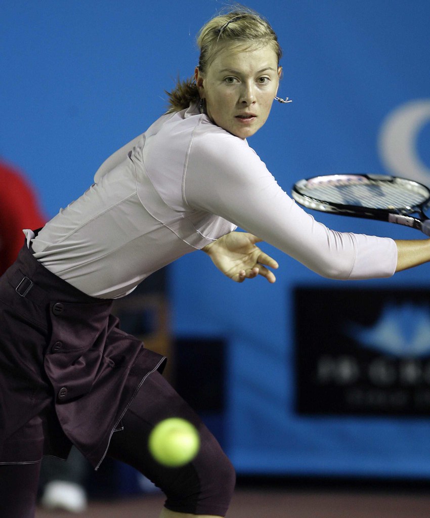
Alternate title: “It must have been kinda cold because Maria — and others — were wearing long sleeves and knickers (ending just past the knee, but too short to be capri-length) under their tennis skirts.” Haven’t seen that before.
But while it was chilly in Hong Kong on Friday, an obnoxious front was moving through India, courtesy of these guys. It’s still, however, slightly better than this, retro or otherwise … says the guy who’s going to put on tight shorts and go ride his bike for three hours … — Bryan
holy christ you got this post up early bry…(it’s 1:25 am as i type this)
good to see some tennis
i been kinda-sorta following the tennis, gettin a tad pumped for the oz open next week…the women have all been wearing long stuff all week (well the one’s playing north of the tropic of cancer at least)
link link link link
fine…it must be cold…but link is wearing long sleeves in AUSTRALIA! i don’t know the temp, but it’s usually pretty warm down under these days…
so…
im guessing the long sleeves are part of the “new” tennis dress, for the women at least, for ’08
great…way to ruin it
Doesn’t look like Maria is dressed for an athletic event at all…what is that anyway, suede?
James blake appears to be wearing the link throwback uni.
[quote comment=”198289″]James blake appears to be wearing the link throwback uni.[/quote]
So it does, but some genius at Nike decided to enlarge the design roughly by a factor of two. I guess they figured that was was big and ugly enough for the 80s (?) wasn’t quite big and ugly enough for the new millennium.
Went to the Niagara at Cornell men’s hockey game last night. Niagara, the Purple Eagles, have without a doubt the worst road uniforms in college link.
I’m usually not a fan of Nike’s footwear, but what Pau Gasol and a few other Grizzlies (Gay and Miller) were wearing last night were pretty nice.
[quote comment=”198293″][quote comment=”198289″]James blake appears to be wearing the link throwback uni.[/quote]
So it does, but some genius at Nike decided to enlarge the design roughly by a factor of two. I guess they figured that was was big and ugly enough for the 80s (?) wasn’t quite big and ugly enough for the new millennium.[/quote]
the blake throwback was worn during th 06 us open as he honored the retiring agassi. i always got a chuckle from that as andre had since left nike for adidas and his visual tribute was done in all nike.
[quote comment=”198306″][quote comment=”198293″][quote comment=”198289″]James blake appears to be wearing the link throwback uni.[/quote]
So it does, but some genius at Nike decided to enlarge the design roughly by a factor of two. I guess they figured that was was big and ugly enough for the 80s (?) wasn’t quite big and ugly enough for the new millennium.[/quote]
the blake throwback was worn during th 06 us open as he honored the retiring agassi. i always got a chuckle from that as andre had since left nike for adidas and his visual tribute was done in all nike.[/quote]
Agassi might have gone Adidas, but his heyday was defitely Nike.
[quote comment=”198306″][quote comment=”198293″][quote comment=”198289″]James blake appears to be wearing the link throwback uni.[/quote]
So it does, but some genius at Nike decided to enlarge the design roughly by a factor of two. I guess they figured that was was big and ugly enough for the 80s (?) wasn’t quite big and ugly enough for the new millennium.[/quote]
the blake throwback was worn during th 06 us open as he honored the retiring agassi. i always got a chuckle from that as andre had since left nike for adidas and his visual tribute was done in all nike.[/quote]
With a shirt like that, it’s no wonder why he left for adidas, lol.
[quote comment=”198299″]I’m usually not a fan of Nike’s footwear, but what Pau Gasol and a few other Grizzlies (Gay and Miller) were wearing last night were pretty nice.[/quote]
gasol wore a pair of Nike Air Max Elite II PE
while gay wore Nike Vis Air Sweet Elite II PE
[quote comment=”198308″][quote comment=”198306″][quote comment=”198293″][quote comment=”198289″]James blake appears to be wearing the link throwback uni.[/quote]
So it does, but some genius at Nike decided to enlarge the design roughly by a factor of two. I guess they figured that was was big and ugly enough for the 80s (?) wasn’t quite big and ugly enough for the new millennium.[/quote]
the blake throwback was worn during th 06 us open as he honored the retiring agassi. i always got a chuckle from that as andre had since left nike for adidas and his visual tribute was done in all nike.[/quote]
With a shirt like that, it’s no wonder why he left for adidas, lol.[/quote]
His wife, Steffi Graf, is a longtime Adidas billboard, so Agassi switched so his children’s clothing (Nike or Adidas) would be a moot point.
[quote comment=”198296″]Went to the Niagara at Cornell men’s hockey game last night. Niagara, the Purple Eagles, have without a doubt the worst road uniforms in college link.[/quote]
They look like the LA Kings black jersey
She’s lost her hotness. Ack!
Re-sent from yesterday’s comments: (Serves me right for missing UniWatch and doing work instead!)
Mike Engle said re: Kansas’ red jerseys in the Orange bowl: I always thought red Kansas jerseys had a bit of bad karma to them. Who wants to conjure up memories of Bleeding Kansas?
Why, link, of course! (Yes, this shirt is in terrible taste, and the University stopped their sale ASAP, as they should have.)
On a related note, I remain firmly convinced that my Tigers “jinxed” themselves against Oklahoma in the Big XII title game when they went link… the Tigers wore their link in their wins at Kansas and in the Cotton Bowl against Arkansas
Serves me right for “skipping” UniWatch Friday… only to find out I instigated the lead story! Great memories!
“(ending just past the knee, but too short to be capri-length)”
Not something I would have picked out at first sight. . .
So in other words, Mizzou goes Harry High School all blck against Oklahoma and lost their BCS spot. Makes me wanna…cry.
What? Were you expecting me to regurgitate in my mouth a little?
[quote comment=”198229″]holy christ you got this post up early bry…(it’s 1:25 am as i type this)
[/quote]
1:25? Interesting … I set it to post at 7 est. You’re not in Hawaii are you?
[quote comment=”198313″]She’s lost her hotness. Ack![/quote]
i wouldn’t go link link
but fear not, there’s always link and link (on left) to enjoy for their off-court skills as well as on
I bumped this up from yesterday’s comments for Paul and all purple-haters to see!
[quote comment=”198244″]Paul, I know this against your beliefs, but I will now and forever be a supporter of purple. Here’s why:
My school Prairie View A&M (the one with the link) ditched purple home unis about 3 years ago (and somehow ditched white aways as well…) So for my first 2 years of college I was forced to see them in link and link We switched to link and link this year and posted our first winning season since 1976, and our best record since 1964. I think I appreciate purple now.[/quote]
[quote comment=”198323″][quote comment=”198229″]holy christ you got this post up early bry…(it’s 1:25 am as i type this)
[/quote]
1:25? Interesting … I set it to post at 7 est. You’re not in Hawaii are you?[/quote]
most bizarre thing evar…i was set to post something on yesterday’s board, and the computer went funky, and THIS page came up…so i typed what i typed and hit “Say It!” and it came back as a 404 error and the ‘old’ page (yesterday’s thread) then came back on a refresh…i thought my post was lost to cyberspace…but look at the time it’s dated (first post)
so it (your morning thread) was “up” at 1:15 last night (EST) and then gone…did you load the page at around 1:14 am (EST) this mornin?
[quote comment=”198296″]Went to the Niagara at Cornell men’s hockey game last night. Niagara, the Purple Eagles, have without a doubt the worst road uniforms in college link.[/quote]
If those are college hockey’s worst then I would be very content. You are probably just spoiled by all the good east coast sweaters. Other than the purple and black, i think they look pretty good.
Ohio State’s nike swift jersey is my vote for the worst. [link]
kansas and BC are going Blue vs. gold repectively
[quote comment=”198326″][quote comment=”198323″][quote comment=”198229″]holy christ you got this post up early bry…(it’s 1:25 am as i type this)
[/quote]
1:25? Interesting … I set it to post at 7 est. You’re not in Hawaii are you?[/quote]
most bizarre thing evar…i was set to post something on yesterday’s board, and the computer went funky, and THIS page came up…so i typed what i typed and hit “Say It!” and it came back as a 404 error and the ‘old’ page (yesterday’s thread) then came back on a refresh…i thought my post was lost to cyberspace…but look at the time it’s dated (first post)
so it (your morning thread) was “up” at 1:15 last night (EST) and then gone…did you load the page at around 1:14 am (EST) this mornin?[/quote]
I put it up — and set the timestamp — around 10:45 est. There was a server error around 1 or 1:15, so that probably did it. Still … interesting.
Did you have a good ride today Bry? It’s 66 degrees where I am, barely needed my link…
I don’t care what anyone says, I love the Agassi retros. Agassi’s link in pink and black is like my holy grail of sneakers.
Mike Teel, Ray Rice, and Kenny Britt are wearing mostly white cleats against Ball State today for Rutgers who are wearing the all whites.
[quote comment=”198329″][quote comment=”198326″][quote comment=”198323″][quote comment=”198229″]holy christ you got this post up early bry…(it’s 1:25 am as i type this)
[/quote]
1:25? Interesting … I set it to post at 7 est. You’re not in Hawaii are you?[/quote]
most bizarre thing evar…i was set to post something on yesterday’s board, and the computer went funky, and THIS page came up…so i typed what i typed and hit “Say It!” and it came back as a 404 error and the ‘old’ page (yesterday’s thread) then came back on a refresh…i thought my post was lost to cyberspace…but look at the time it’s dated (first post)
so it (your morning thread) was “up” at 1:15 last night (EST) and then gone…did you load the page at around 1:14 am (EST) this mornin?[/quote]
I put it up — and set the timestamp — around 10:45 est. There was a server error around 1 or 1:15, so that probably did it. Still … interesting.[/quote]
UniWatch Night Crew
inspired by the *cough* success of this link, the lake show have decided to dress link for their newest promotion…”turn back the clock (to when we were one year olds)”
on a unrelated note, i think link should be played outdoors, with cfl rules, and teams dressed link
[quote comment=”198345″]inspired by the *cough* success of this link, the lake show have decided to dress link for their newest promotion…”turn back the clock (to when we were one year olds)”
on a unrelated note, i think link should be played outdoors, with cfl rules, and teams dressed link[/quote]
I really, really do not like Winnepeg’s gold jerseys.
[quote comment=”198331″]Did you have a good ride today Bry? It’s 66 degrees where I am, barely needed my link…[/quote]
Whoa whoa whoa. Arm warmers in the 60s? That’s crazy talk. 60s=summer kit. I actually ran today with some friends. I’m hitting the bike tomorrow with a bigger group. It’ll be in the upper 30s. That’s arm-warmer weather. And knee warmers. And shoe covers. Full-finger gloves … etc.
The Niagara road sweaters looked really cheap. There simply wasn’t enough contrast between the colors. The numbers and letters aren’t white, but link.
The Niagara road sweaters look terrible. I sit in the second row and had to look at them from a close distance. There is simply not enough contrast between the purple, black and the numbers and letters, which are in link.
just browsing thru some FA cup footy photos, and i noticed link and link both look like they took their uni inspiration from link…or is it vice versa?
[quote comment=”198350″]just browsing thru some FA cup footy photos, and i noticed link and link both look like they took their uni inspiration from link…or is it vice versa?[/quote]
Most likely vice versa. Premiership football has been around a long time. That particular Phillies jersey? Not so much…
[quote comment=”198349″]The Niagara road sweaters look terrible. I sit in the second row and had to look at them from a close distance. There is simply not enough contrast between the purple, black and the numbers and letters, which are in link.[/quote]
So Niagra has no substitutes?
quote comment=”198348″]The Niagara road sweaters looked really cheap. There simply wasn’t enough contrast between the colors. The numbers and letters aren’t white, but link.[/quote]
On the contrary, the best uniforms in college hockey IMO are those of the north dakota fighting sioux: link. link.
link. link didnt go through first time
Bryan: what, no wool jersey? Totally Uni-Watch approved, I’m sure!
Our club just did a wool “retro” (for a club which started in the late 80s…) link. Our regular synthetic jerseys are link. The logo creep is a feature, not a bug.
im watching the under armou high school bowl game on ABC and all of the kids have shutt DNAS or the brand new IONS
Another number change, this time it’s Dallas Cowboy Roy Williams. He’s going back to #38, which he wore at Oklahoma. He says he’s waiting to do it next year in order to help Jerry Jones not lose money on the surplus of #31 jerseys already being sold.
I agree . . . play the Int’l Bowl in the stadium where FC Toronto plays. It would go over quite well today, seeing how FC Toronto, Ball State, and Rutgers all have the same color scheme
holy fck batman…link is in teh house
[quote comment=”198333″]I don’t care what anyone says, I love the Agassi retros. Agassi’s link in pink and black is like my holy grail of sneakers.[/quote]
Yeah you’re right about that. I wore alternating the pink/black or the blue/orange..and had all that agassi tennis stuff. loved the demin shorts with compression shorts.
Or THIS shoe; man did i wear these forever. wish they still made them.
link
[quote comment=”198328″]kansas and BC are going Blue vs. gold repectively[/quote]
not a link by any means…but DAMN that trajan font
[quote comment=”198388″][quote comment=”198333″]I don’t care what anyone says, I love the Agassi retros. Agassi’s link in pink and black is like my holy grail of sneakers.[/quote]
Yeah you’re right about that. I wore alternating the pink/black or the blue/orange..and had all that agassi tennis stuff. loved the demin shorts with compression shorts.[/quote]
damn, =bg=, that takes me back…i so rocked the andre kicks in the early 90s…back in HS (early 80s) if mac wore sneaks (nike) and clothes (tacchini), so did i…then nike made tennis clothes and andre got hot, so i was the only one at the club to sport the black/pink ATCIIs…with pink compression shorts ever so barely visible under my (mandatory) whites…never rocked the denims tho
Not sure why but what is normally referred to as “CLaret and Blue” is a very traditional combination of colours in English football. No Idea where it comes from though.
Any clue why the Stars are wearing their whites at home today against the Red Wings (who are in 100% red)? I thought they HAD to wear their darks, which in Dallas’s case are all black…
[quote comment=”198395″]Any clue why the Stars are wearing their whites at home today against the Red Wings (who are in 100% red)? I thought they HAD to wear their darks, which in Dallas’s case are all black…[/quote]
Home team wears whatever they want (colored or white) away team does the opposite.
just browsing thru some FA cup footy photos, and i noticed west ham united and aston villa both look like they took their uni inspiration from these guys…or is it vice versa?
My favorite color combination for uniforms…
OK, so I jsut looked it up – apparently Villa adopted Choclate and Sky in 1886, which changed to Clarest and Sky at some point in the 1890s. In 1899 a Villa player settled a bet with the father of a West Ham player by giving him a full set of Villa’s uniforms which he had been given to wash – reporting them missing. link
[quote comment=”198333″]I don’t care what anyone says, I love the Agassi retros. Agassi’s link in pink and black is like my holy grail of sneakers.[/quote]
Those kicks go well with the link.
SB
Wow…check out that GREEN accent on the shoes of the Seahawks!!
Redskins are wearing their all burgandy socks again instead of link.
Congrats to the kids from Canada on winning their 4th straight WJHC (U20) Gold Medal. Way to go, boys!
link
I missed the post yesterday, but in reading through the comments, and seeing today’s post about the Agassi throwback look, I’ve come to the conclusion that the 80s and 90s were dead years in Uni fashion. I think in normal fashion, too. I hope that we don’t return to the garish designs, and we stay classic, like many teams have already done. We have seen numerous examples of teams ditching the Nike template and going back to an old, traditional design.
[quote comment=”198333″]I don’t care what anyone says, I love the Agassi retros. Agassi’s link in pink and black is like my holy grail of sneakers.[/quote]
I’m with ya there my good man! They are “fresh ta def”.
I’m loving the neon green accessories on and off the field at Qwest field. I just wish the Redskins brought along their striped road socks and not the solid joints.
[quote comment=”198324″][quote comment=”198313″]She’s lost her hotness. Ack![/quote]
i wouldn’t go link link
but fear not, there’s always link and link (on left) to enjoy for their off-court skills as well as on[/quote]
Sorry fellas but neither of these chicks are hot what so ever….in my opinion.
[quote comment=”198410″]Redskins are wearing their all burgandy socks again instead of link.[/quote]
Is Clinton Portis wearing SHIN GUARDS!? I never would have suspected that.
[quote comment=”198369″]quote comment=”198348″]The Niagara road sweaters looked really cheap. There simply wasn’t enough contrast between the colors. The numbers and letters aren’t white, but link.[/quote]
On the contrary, the best uniforms in college hockey IMO are those of the north dakota fighting sioux: link. link.[/quote]
I don’t care for them too much. I find them to be a bit busy with the shoulder patch, word mark, and logo. I think they would be a bit better if it was just the work mark (plus a number perhaps) or the logo. That being said, I love their colors.
[quote comment=”198408″]Wow…check out that GREEN accent on the shoes of the Seahawks!![/quote]
the neon is going to cause me to rip out my eyes it’s what the hell are the ‘hawks thinking?
The neon-green shoes on the Seahawks are blinding my eyes, which already were sore after seeing the amount of mascara the play-by-play announcer had on
Mike Engle said re: Kansas’ red jerseys in the Orange bowl: I always thought red Kansas jerseys had a bit of bad karma to them. Who wants to conjure up memories of Bleeding Kansas?
Why, Mizzou fans, of course! (Yes, this shirt is in terrible taste, and the University stopped their sale ASAP, as they should have.)
This is a joke, right? If not it’s PC gone insane.
Last month there was the post on link. Looks like Iona used to have argyle back in link.
Also, nice yellow laces Portis…
I kind of like the ‘Hawks look. I think they did “modern” in a good way. I liked their old look as well. Good colors.
How close is UW to Qwest field?
Are Portis’ laces a fineable offense?
[quote comment=”198369″]quote comment=”198348″]The Niagara road sweaters looked really cheap. There simply wasn’t enough contrast between the colors. The numbers and letters aren’t white, but link.[/quote]
On the contrary, the best uniforms in college hockey IMO are those of the north dakota fighting sioux: link. link.[/quote]
North Dakota’s black alts are horrible!
The Seahawks’ neon gloves are interesting too. I don’t hate the neon green if for any other reason that it is unique in the NFL.
On a side note from Paul’s memorial patch article the other day… the initials of the Tom and Jean Yawkey are listed, in Morse Code mind you, vertically on the edges of the manual scoreboard on the Green Monster at Fenway. That is an example of a stadium memorial!
[quote comment=”198428″][quote comment=”198410″]Redskins are wearing their all burgandy socks again instead of link.[/quote]
Is Clinton Portis wearing SHIN GUARDS!? I never would have suspected that.[/quote]
He’s been wearing them for years, back to his Broncos days. I’m surprised more football players don’t do this. Seems like you’d get a LOT of bruised shins out there….
[quote comment=”198437″]I kind of like the ‘Hawks look.
I think they did “modern” in a good way. I liked their old look as well.
Good colors.
How close is UW to Qwest field?
Are Portis’ laces a fineable offense?[/quote]
5-10 miles…you have to go past downtown and Lake Union
There definitely used to be a Neon Green piping on the Seahawks jerseys which is where it’s use on accessories comes from. AS for the Socka, I’m sure I read somewhere that the long team colour sock with a short white oversock is now NFL regulation, which I think is pretty poor, plus the idea of fining players for where the white one comes to seems very stupid, and unevenly applied – I noticed that infraction a lot on the Titans team last week.
[quote comment=”198437″]I kind of like the ‘Hawks look.
I think they did “modern” in a good way. I liked their old look as well.
Good colors.
How close is UW to Qwest field?
Are Portis’ laces a fineable offense?[/quote]
Couple miles away
[quote comment=”198324″][quote comment=”198313″]She’s lost her hotness. Ack![/quote]
i wouldn’t go link link
but fear not, there’s always link and link (on left) to enjoy for their off-court skills as well as on[/quote]
Good lord! Gotta love Hantchukova’s jeans. How long’s the zipper? An inch?
WANTED – MLB Dot Sleeve Undershirts
I’m looking for a Nike black and orange dot sleeve undershirt from the 2006 MLB baseball season to add to my collection. Please reply if you know where one in this color scheme can be found. See example of the style link
I’m late to the party, since they are more than a year old and nearly impossible to find, but the black and orange (Orioles /Astros/Giants) will match the uniform for my adult weekend league baseball team.
Regarding this particular style, I think it’s sharp without being overbearing or over designed. Unlike the Nike Tri Bolt design or asymmetric design compression shirts with mismatched sleeves and such, this one seems less “high tech” and more applicable to baseball. The actually design is a series diamonds in various sizes and the sleeve material underneath the screen print creates the dot pattern. Clever huh? I read recently Nike introduced a new compression shirt during the World Series with mesh vents on the forearms and elbows, but I wish they would include this unique design and make it more accessible.
The dotted sleeves are banned by MLB aren’t they? At least for pitchers anyways…
[quote comment=”198457″]The dotted sleeves are banned by MLB aren’t they? At least for pitchers anyways…[/quote]
Pitchers need solid sleeves. Other positions do not have this restriction.
Side note: pitchers’ gloves may not be white or gray. The spirit of the rule is probably “don’t blend the glove into the jersey, because the batter needs to see hands.” Nowadays, with alternate jerseys, use your imagination…real pet peeve of mine. Does this particularly bug anybody else?
[quote comment=”198408″]Wow…check out that GREEN accent on the shoes of the Seahawks!![/quote]
I actually like those alot but they had a close up on one of the lineman and his paint seemed to be coming off
Laron (sp?) Landry for the ‘skins is wearing purple shoulder pads, probably from his LSU Days (aka last year)
[quote comment=”198346″][quote comment=”198345″]inspired by the *cough* success of this link, the lake show have decided to dress link for their newest promotion…”turn back the clock (to when we were one year olds)”
on a unrelated note, i think link should be played outdoors, with cfl rules, and teams dressed link[/quote]
I really, really do not like Winnepeg’s gold jerseys.[/quote]
I love this quote from the Int. Bowl website: “The International Bowl features a match-up of teams from the Mid-American Conference (MAC) and the Big East, two of the NCAA’s powerhouse conferences.”
Powerhouse conferences???
[quote comment=”198466″][quote comment=”198346″][quote comment=”198345″]inspired by the *cough* success of this link, the lake show have decided to dress link for their newest promotion…”turn back the clock (to when we were one year olds)”
on a unrelated note, i think link should be played outdoors, with cfl rules, and teams dressed link[/quote]
I really, really do not like Winnepeg’s gold jerseys.[/quote]
I love this quote from the Int. Bowl website: “The International Bowl features a match-up of teams from the Mid-American Conference (MAC) and the Big East, two of the NCAA’s powerhouse conferences.”
Powerhouse conferences???[/quote]
OK, sugarcoating is one thing…but WHAT?!?!?!?
[quote comment=”198466″][quote comment=”198346″][quote comment=”198345″]inspired by the *cough* success of this link, the lake show have decided to dress link for their newest promotion…”turn back the clock (to when we were one year olds)”
on a unrelated note, i think link should be played outdoors, with cfl rules, and teams dressed link[/quote]
I really, really do not like Winnepeg’s gold jerseys.[/quote]
I love this quote from the Int. Bowl website: “The International Bowl features a match-up of teams from the Mid-American Conference (MAC) and the Big East, two of the NCAA’s powerhouse conferences.”
Powerhouse conferences???[/quote]
Well, it didn’t say powerhouse football conferences.
The Edmonton Oilers have an feature up on their website talking to link.
Obviously, refs wearing black pants with white stripes to differentiate from the Jags’ tights look.
[quote comment=”198484″]Obviously, refs wearing black pants with white stripes to differentiate from the Jags’ tights look.[/quote]
I wonder if those cold weather ref pants would look any better if they were white with a black stripe. Right now they kind of look like prisoners who pick up roadside trash.
[quote comment=”198369″]quote comment=”198348″]The Niagara road sweaters looked really cheap. There simply wasn’t enough contrast between the colors. The numbers and letters aren’t white, but link.[/quote]
On the contrary, the best uniforms in college hockey IMO are those of the north dakota fighting sioux: link. link.[/quote]
Not just the best uni in college hockey – the best uni in all of sports.
link a purdy road uni…im not generally a fan of green, but that’s a awesum shade and it goes great with the black
pantsbreezersin contrasts nicely with teh gold goalie pads
[quote comment=”198496″]link a purdy road uni…im not generally a fan of green, but that’s a awesum shade and it goes great with the black
pantsbreezersin contrasts nicely with teh gold goalie pads[/quote]
which is why i think im one of the few who prefers the link
[quote comment=”198496″]link a purdy road uni…im not generally a fan of green, but that’s a awesum shade and it goes great with the black
pantsbreezersin contrasts nicely with teh gold goalie pads[/quote]
Great jersey. Horrible material. Get rid of that friggin’ dazzle shtuff and get mesh!
I would love to see the seahawks wear neon green jerseys. That would be one of the best looks ever in the history of football.
The shoes they were wearing, looked awsome and so did the green hats the fans were wearing.
[quote comment=”198500″]I would love to see the seahawks wear neon green jerseys. That would be one of the best looks ever in the history of football.
The shoes they were wearing, looked awsome and so did the green hats the fans were wearing.[/quote]
I’m normally against women’s jerseys in stupid girlie colors (it’s the ultimate sign of fashion over fandom, and it’s a huge turnoff to me), but the more I think about it, I JUST might be able to make an exception for lime green Seahawks jerseys.
[quote comment=”198501″][quote comment=”198500″]I would love to see the seahawks wear neon green jerseys. That would be one of the best looks ever in the history of football.
The shoes they were wearing, looked awsome and so did the green hats the fans were wearing.[/quote]
I’m normally against women’s jerseys in stupid girlie colors (it’s the ultimate sign of fashion over fandom, and it’s a huge turnoff to me), but the more I think about it, I JUST might be able to make an exception for lime green Seahawks jerseys.[/quote]
as much as people beat up oregon for their unis (and rightly so…they’re wayyyyyyy over the top)…i AM intrigued with someone ELSE coming out with a neon yellow uni (prolly just keep it to pants or jersey…not both), but without all that other crap oregon uses (piping, shoulders, the shit ON the shoulders…the shit on the knees)…just a neon yellow…combine it with a matte black and no other colors
i’d love to see something like that, at least in theory…perhaps not in actual use, but i’d at least like to SEE it
as far as the lime or neon green…lemme get back to ya on that one
[quote comment=”198502″][quote comment=”198501″][quote comment=”198500″]I would love to see the seahawks wear neon green jerseys. That would be one of the best looks ever in the history of football.
The shoes they were wearing, looked awsome and so did the green hats the fans were wearing.[/quote]
I’m normally against women’s jerseys in stupid girlie colors (it’s the ultimate sign of fashion over fandom, and it’s a huge turnoff to me), but the more I think about it, I JUST might be able to make an exception for lime green Seahawks jerseys.[/quote]
as much as people beat up oregon for their unis (and rightly so…they’re wayyyyyyy over the top)…i AM intrigued with someone ELSE coming out with a neon yellow uni (prolly just keep it to pants or jersey…not both), but without all that other crap oregon uses (piping, shoulders, the shit ON the shoulders…the shit on the knees)…just a neon yellow…combine it with a matte black and no other colors
i’d love to see something like that, at least in theory…perhaps not in actual use, but i’d at least like to SEE it
as far as the lime or neon green…lemme get back to ya on that one[/quote]
It’s just that lime green is actually really close to a Seattle team color. For that reason, I’d probably love to see a girl in a powder blue Chargers jersey, tolerate a lime green Jets jersey (wrong shade), and lose my appetite over, say, a pink Raiders jersey (I don’t know what would be more off the mark).
I really like the all-black pants with the Jags road jerseys. I wish the Vikes had went with an all-purple pants with their road jerseys.
[quote comment=”198503″]It’s just that lime green is actually really close to a Seattle team color. For that reason, I’d probably love to see a girl in a powder blue Chargers jersey, tolerate a lime green Jets jersey (wrong shade), and lose my appetite over, say, a pink Raiders jersey (I don’t know what would be more off the mark).[/quote]
seahawks colors are:
“Seahawks Blue”, a darker “Seahawks Navy” and neon green piping.
not sure if ‘neon green’ is an official color but that would make for an interesting jersey
[quote comment=”198500″]I would love to see the seahawks wear neon green jerseys. That would be one of the best looks ever in the history of football.
The shoes they were wearing, looked awsome and so did the green hats the fans were wearing.[/quote]
You link want to see the Seahawks in neon or lime green? This would probably give you a little of an idea.
Watching “we are marshall” right now and a uniwatch moment occured. After the article a few days ago on uniform memorials I’m wondering if the following (taken from wikipedia) actually occured or was made up for the film- In memory of the victims of the crash, Mountaineers players put green crosses and the initials “MU” on their helmets.
in my search for an answer just found the following history-The Thundering Herd has added award stickers to the helmets for the first time in many years for outstanding play. Mark Snyder has dipped into Herd history to begin awarding “Herd Horns,” or stickers that look like the horns of the Buffalo, or American Bison, the Herd’s mascot. Jack Lengyel gave a similar award while coaching the “Young” Thundering Herd from 1971-74, as the stickers go up the back of the helmet to form a pair of horns with every two given. The last time MU used stickers was 1988, when then head coach George Chaump gave “Hammers and Washboards,” awards for working out in the weight room over the summer. In 1976, then MU coach Frank Ellwood gave American Flag stickers to players for outstanding plays to put on the “Ohio State” style helmets of that year’s Herd, who had no logo on the side of that helmet. Marshall returned to a “M” in 1977 and, except for the 1984-85 green helmet of former coach Stan Parrish, has had a “M” or logo with a “M” in it since.
Ben
George Chaump is my cousin – he is currently coaching high school football at a AAAA school in Harrisburg after his stint at Navy years ago. It was nice to see his name – he did a nice job at Marshall.
[quote comment=”198333″]I don’t care what anyone says, I love the Agassi retros. Agassi’s link in pink and black is like my holy grail of sneakers.[/quote]
They DID reissue my holy grail sneakers. But look at the price.
link
[quote comment=”198519″][quote comment=”198333″]I don’t care what anyone says, I love the Agassi retros. Agassi’s link in pink and black is like my holy grail of sneakers.[/quote]
They DID reissue my holy grail sneakers. But look at the price.
link
Check link out.
[quote comment=”198516″]Ben
George Chaump is my cousin – he is currently coaching high school football at a AAAA school in Harrisburg after his stint at Navy years ago. It was nice to see his name – he did a nice job at Marshall.[/quote]
wow!
then art, you have a true coaching legend for a cousin as george has certainly made a great name for himself in the annals of pennsylvania coaching.
i hope that you were able to view the pbs documentary, football legends of pennsylvania. its a great doumentary narrated by harry kalas, and it includes a feature on your cousin.
You link want to see the Seahawks in neon or lime green? This would probably give you a little of an idea.[/quote]
Those jerseys look awsome.
sorry about messing up the formating in my last post
[quote comment=”198542″]
Check link out.[/quote]
A shame those were butchered and the color choice was poor.
What’s with the constant Nike-bashing here? =\
I wore link in high school. It was an amazingly light and responsive shoe.