[Editor’s Note: Although intern emeritus Vince Grzegorek has moved on to greener pastures, he’s still going to contribute occasional entries — like today’s, for example.]
By Vince Grzegorek
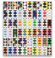
A few weeks ago, there was a mention in the Ticker of the Slipstream cycling team’s search for a new uniform for next season. They invited fans to submit designs, leading to over 600 entries, including some, er, interesting versions (Drew McKay‘s favorite). The important thing here is that Slipstream is pretty famous for its use of argyle patterns, going so far as to call their fanbase the Argyle Armada, so almost all of the proposed versions included variations on this design motif.
All of which got me thinking: How often does argyle show up in uniforms? As Slipstream shows, it can look pretty sharp. I figured there had to be some great examples in other sports.
First, a word on the origins of the pattern itself. According to Wikipedia, “The argyle pattern is said to have been derived from the tartan of Clan Campbell, of Argyll in western Scotland.” It was basically a re-appropriation of the pattern that gave birth to argyle socks and, in turn, argyle sweaters, hats, vests, and the whole preppy wardrobe. The elite began to wear the style in their leisure activities, which included sitting around at their clubs, watching horses, and playing golf, marking the evolution of argyle from casual dress to (somewhat) active dress.
When it comes to uniforms, golf is a great place to start, since it that was the sport that brought argyle into the mainstream in America. According to legend, the president of Brooks Brothers saw golfers in Scotland wearing argyle socks and began selling them back on our side of the pond. Argyle socks went from fashionable links attire to a trendy and dressy hosiery option for the masses.
Of course, argyle is still a common sight in golf today (although not as common as it once was). It’s also made its mark in a variety of other sports — and not just in predictable country club pursuits like tennis and horse racing.
In fact, it seems that virtually every sport has dallied with argyle at one time or another. Given all the emphasis on handsome hosiery during the early period of baseball, for example, it’s no surprise that this 1874 Ontario team was sporting argyle hose.
Over on the soccer field, we’re all probably familiar with this example of argyle socks, thanks to a concerted effort by Boca Juniors to bring back classy. But would you guess that argyle socks also showed up in track and field? American sprinter DeAna Carson wore argyle socks while running the 200-meter dash at the Simplot Games in 2006, garnering my nomination for Best Dressed Female Athlete of the Year (the ESPY’s should include this, no?).
On the hardcourt, the most obvious example is the UNC basketball uniform, which in 2000 began featuring an argyle pattern running down the sides — a classic look. While looking for UNC photos, I stumbled upon this gallery — check out Shaw University’s uniforms! More argyle!
I couldn’t find a football example, but I’m betting there’s got to be one out there waiting to be found. I think there’s another database in our future. Post any suggestions in the comments section or e-mail them our way.
Unfinished Business: (Shivering) Working for Paul Lukas has been good. He is a nice man. Um. I never felt overworked. And every task he assigned me was worthwhile and rewarding. Yeah. The last year has felt like being imprisoned in research hell it went by in the blink of an eye. (Nervously looking over shoulder.)
Seriously, everything was great — Paul was a blast to work for on every project, I loved what I was doing, and whether he admits it or not, he had a lot to do with the progress I made over the last year that has now translated into a full-time writing job. Due to the new employment, the holidays, and an ill-timed and lengthy internet outage at my house, I never got a chance to say that. One other thing I never got to say was congrats to Bryan, who is obviously filling my massive size 10s quite well.
I’m not going anywhere, and as you can see I’ll still be contributing material, at least as much as I can. You guys have been too great and this has been too fun to just stop all together. So, consider me your Senior Assistant Editor (at least that’s the title I’m going to demand if Paul asks). In short, or, at this point, long — thank you for all the support and patience you’ve shown me over the past year.
Call for Research: I’m working on a piece about CFL uniforms and would welcome any suggestions on what to cover. Neither Paul nor I have much expertise in that domain, so any input would be appreciated. One specific question: Anyone know when and why the Canadian flag started showing up as a helmet decal? Pre/post 9/11? E-mail all contributions to me at vincegrzegorek [at] gmail [dot] com. Thanks.
And now over to Paul for the rest of today’s material….

Pennant Grace: Victory Pennants, one of the fine vendors hyped in yesterday’s ESPN column, is offering a 15% discount to readers of this site from now through next Friday, the 14th. When checking out, use the coupon code “UNIWATCH001.” Big thanks to company prexy Morris Levin for extending this benefit to Uni Watch readers.
Boston Reminder: Remember, Uni Watch party tonight, 8:30 p.m., at the Boston Beer Works.
Uni Watch News Ticker: Check out what Mississippi State’s football uniform used to look like (great find by Scott Turner). ”¦ The Mets and White Sox will be playing the Civil Rights game next March 29th. Let’s hope the uniforms are better than last time around. ”¦ Big package on goalie masks in yesteray’s USA Today. Look here, here, and here. ”¦ Tons of great old White Sox photos here (with thanks to Eriq Jaffe). ”¦ Excellent question from Jon Blake, who writes: “This article ranks Floyd Mayweather’s ‘five key fights.’ For his 1998 matchup with Genaro Hernandez, it says, ‘Mayweather, at 17-0, was challenging for his first world title (WBC super featherweight) and was so cocky that he wore a WBC championship patch on his trunks into the ring.’ My question is, who else has worn something commemorating an achievement yet to happen? My friend and I recalled Clemens wearing the ‘300 Wins’ patch against Boston when he got yanked in the 3rd, but who else has done something similar?” Please, let’s not have a jillion comments about “Buffalo Bills Super Bowl Champions” post-game T-shirts and the like — this question is about things worn during the game or match. Anyone..? ”¦ The Celtics and Sixers wore throwbacks last night. Note that Boston appeared to have matte jerseys and shiny shorts, just like back in the day. Plus there were retro shooting shirts (complete with retro Adidas logo) and championship patches on their warm-up jackets. ”¦ Double play from Frank Mercogliano, who writes: “Pocatello High School [in Idaho] is wearing new racer-back jerseys from Russell, so I snapped a picture of #4 on the bench, who has a horrible off-center number. Sorta like killing two birds with one stone. The JV game was funnier because one of the girls attempted to iron her shorts and burned a huge imprint of the iron on the back of her red shorts. It was priceless.” … The Royals will unveil their powder blue alternate jersey today.
Housekeeping Note: I’ll be off the grid for most of today and tomorrow. If you have any site-related issues (abusive comments, spam filter problems, etc.), please e-mail Bryan. Ticker contributions can still come to me.
I’ve wanted the Celts to go back to the BOSTON on the front of the away jerseys for years now. Nothing wrong with the current design, it would just look really cool to have a tiny difference in the away look.
The Russell-era jerseys are just phenomenal.
Vince are you serious about a football example?????
Hawaii’s pants!
link
Argyle! On one of the few days I’m not wearing argyle socks, oh dear.
Celts looked great last night, and having the championship banners embroidered on the warmups was a nice touch.
Here are some good examples of an argyle hockey jersey.
link
link
did we talk about this on this site. spotted on: link
“During their WHA days, the team was called the Alberta Oilers and instead of individual names it simply said “ALBERTA” on the back of the jerseys”
link
Great views of all the powder blues in MLB history: link
[quote comment=”182272″]Great views of all the powder blues in MLB history: link
Good stuff. And I agree with the writer that that White Sox’ red and blues from the early 1970s are the only powder blues that I like. The photo of Dick Allen is fantastic.
[quote comment=”182265″]Vince are you serious about a football example?????
Hawaii’s pants!
link
interesting call on hawai’i…if you check out link, you can see that while the hawai’i pattern isn’t argyle (it’s more like little triangles), when you put the two triangular shapes together, it does seem to form an argylesque pattern
/good catch
I wish the sixers would go back to those 80’s uniforms. None of the jerseys they’ve worn since have measured up.
“who else has worn something commemorating an achievement yet to happen?”
In 1997 Ian Wright wasn’t a loudmouthed BBC pundit, he was a loudmouthed footballer instead, and was only a handful of goals away from becoming Arsenal’s record goalscorer. 3 goals in the opening 2 games of the 1997/98 season brought him to just one goal away from equalling the record. Against Bolton, in September 1997, Wright scored, and lifted up his shirt to reveal a Nike t-shirt underneath with “179 – Just done it” written on it. The only problem was that he hadn’t – he had only equalled Cliff Bastin’s record of 178 goals. Moreover, since those 2 goals at the start of the season, Wright hadn’t scored for three successive games, meaning he had been wearing that shirt for a month’s worth of matches.
Five minutes after equalling the record, he scored possibly his easiest goal in an Arsenal shirt to break the record. A good job he did, or his face may well have been as red as his Arsenal shirt.
link
almost forgot…link fancied the argyle look in the 80s
almost forgot…link fancied the argyle look in the 80s
Here’s one place where I’m sure Nike is not happy to see their link. You also gotta feel for Kansas State.
“Come to our university, Fred Phelps supports us.”
If these NBA teams are going to wear throwbacks I think they should really wear throwbacks–I want to see which teams has the balls (no pun intended)to wear the little short shorts too! How funny would that look?!
North Carolina hoops had argyle long before 2000. It goes back to 1991 according to this article:
link
Here’s a pic of George Lynch, who graduated from Carolina in 1993:
link
2000 was the year they went back to “North Carolina” on the front after the one-year stint using the interlocking NC logo.
Good catch on the UNC argyle pattern going back to 1991.
Hawaii is one of those that come close to argyle, but aren’t really. Kind of like the link.
and of course, depending on your ekin leanings…here’s link in non-nike (gasp) argyle
Re: The Celts retro warm up jackets.
Why are some of the NBA logos solid green, with white lettering while others are the reverse, on the championship patches?
The second photo on link features the almost-argyle pattern seen on the sleeves of the Kyoto Purple Sanga jerseys until recently. I think whoever made their jerseys used it for some of their templates.
(And purple-fearers can go ahead and click; it’s a whilte home kit and shouldn’t send you into any convulsions.)
Good argyle article. I rock the argyle socks EVERYDAY at work.
[quote comment=”182274″]The photo of Dick Allen is fantastic.[/quote]link
Juggling baseballs in the dugout with a cigarette hanging from his mouth. It’s all kinds of awesome.
[quote comment=”182269″]Here are some good examples of an argyle hockey jersey.
link
link
those are awesome. i particularly like the argyle-patterned pads. what team is that?
[quote comment=”182298″][quote comment=”182274″]The photo of Dick Allen is fantastic.[/quote]link
Juggling baseballs in the dugout with a cigarette hanging from his mouth. It’s all kinds of awesome.[/quote]
I must agree. And when you toss in a high point of White Sox unis, it is all the better. Also, how much do you miss the no-flap batting helmets? They looked so much cooler, particularly on a ‘fro.
Hey guys…just got back from the Winter Meetings and saw a couple uni related things at the Trade Show that I knew would start some conversations.
First…a company that makes and markets team logo stirrups to Major and Minor League teams:
link
And then there’s the old school throwback jersey that this company wore. The company has a pitching game that you can install in your stadium and used the uniforms to catch people’s eyes.
link
Once again I apologize for the quality…I go to these events with only my phone.
Enjoy!
I love the old Sixers uniforms from the early 80s. So sharp, so crisp. Just oozing class.
[quote comment=”182281″]almost forgot…link fancied the argyle look in the 80s[/quote]
Good Memory, LI Phil. Here’s a shot of Lendl’s argyle link.
Musing on the Civil Rights Game…
The Sox gotta go with an link uniform, or something similar.( I really like this one no matter what. Change the late 70’s uniform from leisure suit to button-down, pinstripe it and slap the AG logo on the arm, and you’re there)
With the Black Yankees out, the Mets should go with a link-like jersey.
Too bad the Rangers aren’t in it, they should go for link…
..But ANY effort put into the jerseys will be better than last year.
Stirrup Alert! If you look at picture #7 in this gallery, you can see the ref wearing stirrups. Is that standard practice in the CFL?
link
I was pretty sure UNC motif was older than Y2K. Here’s another linkexample, from Euroleague. linkversion.
How is it that link in England has never worn any argyle pattern on their kits or even their socks?!?
link
[quote comment=”182274″][quote comment=”182272″]Great views of all the powder blues in MLB history: link
Good stuff. And I agree with the writer that that White Sox’ red and blues from the early 1970s are the only powder blues that I like. The photo of Dick Allen is fantastic.[/quote]
The KC Royals are set to debut their powder blue alternates tonight on their Hot Stove Show on local sports-talk 610 Sports, KCSP. How you debut a new (old?) uniform on the radio, though, I have no idea. Hopefully there will be pics tomorrow.
[quote comment=”182306″]Hey guys…just got back from the Winter Meetings and saw a couple uni related things at the Trade Show that I knew would start some conversations.
First…a company that makes and markets team logo stirrups to Major and Minor League teams:
link
And then there’s the old school throwback jersey that this company wore. The company has a pitching game that you can install in your stadium and used the uniforms to catch people’s eyes.
link
Once again I apologize for the quality…I go to these events with only my phone.
Enjoy![/quote]
Those St. Louis Stirr-ups are awsome. As are the Pirates.
The basis of the argyle pattern for the UNC jerseys was Alexander Julian, a Chapel Hill native and UNC grad.
Oklahoma mens basketball unveiled their alternate jersey at home last night against Tulsa.
link
[quote comment=”182321″]Oklahoma mens basketball unveiled their alternate jersey at home last night against Tulsa.
link
Gray? Why would someone mess with the classic, sharp home white?
Doing some research on the CFL, I found the Edmonton Eskimos Wall of Honour page. Three of the guys from the 50s look like they are wearing some kind of team bowling shirt in their photo.
link.
[quote comment=”182313″]Stirrup Alert! If you look at picture #7 in this gallery, you can see the ref wearing stirrups. Is that standard practice in the CFL?
link
Yes, the CFL referees still wear stirrups.
[quote comment=”182326″][quote comment=”182313″]Stirrup Alert! If you look at picture #7 in this gallery, you can see the ref wearing stirrups. Is that standard practice in the CFL?
link
Yes, the CFL referees still wear stirrups.[/quote]
That’s yet another reason to enjoy the Canadian game!!! Yes, they’ve always kept this well after the NFL officials stopped wearing the stirrups, which was sometime in the early 80s I believe.
I really wish they’d go back to that. I’d like to have the NFL do some sort of retro day for the officials. I can’t remember if they did this back in the 75th season or not. Maybe they’ll do something when the league turns 100.
Regarding the Canadian flag question in today’s post, I believe that is something that started during the gulf war when the American flags first made their appearance on NFL helmets. I think they just copied it, but I believe the imports (i.e. American players) would sport both US and Canadian flags.
I’m not 100% sure on this, I need to do more research on this.
There’s a high school in Indiana called Madison Grant (because its between Madison and Grant Counties) nicknamed the Argylls. I know they used to wear argyle socks a lot in volleyball, football and softball but I couldn’t find any pictures.
The goalie wearing the Argyle was actually the head of R&D for the goalie equipment department at Mission Hockey. I beleive those jerseys were for the Mission Pro team at NARCH of ’06. Pretty much the biggest roller hockey tornament in the world.
I bought the pads from him and this is another picture of them.
link
the Slipstream contest required that the designs include argyle, so hence why they all include it.
this is the winner of the contest:
link
[quote comment=”182318″][quote comment=”182274″][quote comment=”182272″]Great views of all the powder blues in MLB history: link
Good stuff. And I agree with the writer that that White Sox’ red and blues from the early 1970s are the only powder blues that I like. The photo of Dick Allen is fantastic.[/quote]
The KC Royals are set to debut their powder blue alternates tonight on their Hot Stove Show on local sports-talk 610 Sports, KCSP. How you debut a new (old?) uniform on the radio, though, I have no idea. Hopefully there will be pics tomorrow.[/quote]
Justin –
With any luck the Royals will stream it on their website like the Blue Jays did on Monday.
And there will be pictures.
And something new (and powder blue) to commemorate the event at link
[quote comment=”182322″][quote comment=”182321″]Oklahoma mens basketball unveiled their alternate jersey at home last night against Tulsa.
link
Gray? Why would someone mess with the classic, sharp home white?[/quote]
Plus, against the gray in those photos, the crimson looks almost “burnt orange”. If enough of those Sooners see that the alternates will be burned in a huge bonfire tonight.
[quote comment=”182332″]the Slipstream contest required that the designs include argyle, so hence why they all include it.
this is the winner of the contest:
link
At their recent team presentation, link that they did not even use the design of the “winner.” (Click on the third photo.) Kind of disappointing neh? Reminds me of when Iowa State decided to have fans vote on the helmet color and ended up not using it.
[quote comment=”182332″]the Slipstream contest required that the designs include argyle, so hence why they all include it.
this is the winner of the contest:
link
Mmmm….Chipotle
[quote comment=”182291″]Good catch on the UNC argyle pattern going back to 1991.
Hawaii is one of those that come close to argyle, but aren’t really. Kind of like the link.[/quote]
I believe that Hawaii’s design is based on traditional Hawaiian tattooing. Check out the pictures in this link. In the traditional style sets of triangles seem to be a common theme and the tattoos are done by tapping not by a modern tattoo machine.
Some good up to date uni related (and other) items for college hoops this year link.
I didn’t realize Kansas had switched it’s jersey font this year. And love the socks on Joey Dorsey…
[quote comment=”182339″]
I believe that Hawaii’s design is based on traditional Hawaiian tattooing. Check out the pictures in this link. In the traditional style sets of triangles seem to be a common theme and the tattoos are done by tapping not by a modern tattoo machine.[/quote]
wow that leg “stripe” that runs from hip to ankle is amazing!
[quote comment=”182295″]Re: The Celts retro warm up jackets.
Why are some of the NBA logos solid green, with white lettering while others are the reverse, on the championship patches?[/quote]
Because that’s what they link in the rafters. I was actually looking to make sure they did that last night. I’m assuming they remade the banners to look like the original banners (which hang in their practice facility in Waltham).
I had heard they were going “throwback” with the warmups too. But I guess “retro” or “stupid” was all they could come up with. I would have loved to have seen link jacket. Oh well.
Great post! I definitely loves me some argyle.
An argyle band around the waist of a trad-cut hockey sweater would look great, as would argyle baseball socks. Argyle probably wouldn’t work well for hockey socks, though it would probably look great for UCLA football socks. Actually the AAA Colorado Springs Sky Sox could do a sky blue, black and gray argyle that would capture the major colors of the sky.
If I ever get lots of money, I’d like to buy a minor league baseball team and make them the (Location to be determined) Argyles.
[quote comment=”182339″][quote comment=”182291″]Good catch on the UNC argyle pattern going back to 1991.
Hawaii is one of those that come close to argyle, but aren’t really. Kind of like the link.[/quote]
I believe that Hawaii’s design is based on traditional Hawaiian tattooing. Check out the pictures in this link. In the traditional style sets of triangles seem to be a common theme and the tattoos are done by tapping not by a modern tattoo machine.[/quote]
That’s correct…Hawaii’s design is not argyle. According to link about their rebranding back in 2000, the pattern is “Hawaiian kapa — triangles symbolizing body, mind and spirit.”
Great column Vince. Nobody knows how to pronounce your last name though, please tell us.
[quote comment=”182343″][quote comment=”182295″]Re: The Celts retro warm up jackets.
Why are some of the NBA logos solid green, with white lettering while others are the reverse, on the championship patches?[/quote]
Because that’s what they link in the rafters. I was actually looking to make sure they did that last night. I’m assuming they remade the banners to look like the original banners (which hang in their practice facility in Waltham).
I had heard they were going “throwback” with the warmups too. But I guess “retro” or “stupid” was all they could come up with. I would have loved to have seen link jacket. Oh well.[/quote]
link would have been great also, although it’s probably made of wool.
Doing a search for that photo, I came up with link jersey. Was this a one time jersey made especially for Cousy? Ugly as hell.
[quote comment=”182342″][quote comment=”182339″]
I believe that Hawaii’s design is based on traditional Hawaiian tattooing. Check out the pictures in this link. In the traditional style sets of triangles seem to be a common theme and the tattoos are done by tapping not by a modern tattoo machine.[/quote]
wow that leg “stripe” that runs from hip to ankle is amazing![/quote]
how’s link for some ink?
me loves argyle, and i have one tat (an ankh), but i can’t see having that for my tribal band
Here’s some more info about link. He’s got a bit of side business designing uniforms (and sails apparently)–just click on the “sports” tab.
[quote comment=”182340″]Some good up to date uni related (and other) items for college hoops this year link.
I didn’t realize Kansas had switched it’s jersey font this year. And love the socks on Joey Dorsey…[/quote]
wow. talk about ganking some of the content from PL and his staff… in support of this blog, i left a polite comment about crediting sources when using material (the mayo bit was almost identical!).
paul ALWAYS credits his sources. be it a media source or a reader.
perhaps we need an update to this site
uniwatch: where you hear what you’ll see, first.
uniwatch: the OFFICIAL uniform information site
uniwatch: the ultimate online uniform site
When friends ask what building I work in in downtown Dallas, I like to tell them, link. It’s a bit of a stretch, but more fun than saying “the square one” or “the one with white spires.”
link next to the green outlined one
link
[quote comment=”182348″]Great column Vince. Nobody knows how to pronounce your last name though, please tell us.[/quote]
Just ignore the Z in the last name and say it like Gregorek. Good polish name confuses everybody.
Can’t believe I just read the words “Boca Juniors” and “classy” in the same sentence. Boca are the Oakland Raiders of Argentine Football . . .
My question is, who else has worn something commemorating an achievement yet to happen?
Ummmm, how bout everyone wearing “New Millennium” crap around New Year’s 2000 when anyone with any intelligence knew it wasn’t til 2001?
[quote comment=”182319″][quote comment=”182306″]Hey guys…just got back from the Winter Meetings and saw a couple uni related things at the Trade Show that I knew would start some conversations.
First…a company that makes and markets team logo stirrups to Major and Minor League teams:
link
And then there’s the old school throwback jersey that this company wore. The company has a pitching game that you can install in your stadium and used the uniforms to catch people’s eyes.
link
Once again I apologize for the quality…I go to these events with only my phone.
Enjoy![/quote]
Those St. Louis Stirr-ups are awsome. As are the Pirates.[/quote]
Looks like the Mets stirrups are black. all i want for Christmas…
[quote comment=”182361″]Ummmm, how bout everyone wearing “New Millennium” crap around New Year’s 2000 when anyone with any intelligence knew it wasn’t til 2001?[/quote]
and yet…according to the ticker, “this question is about things worn during the game or match”
i don’t recall anyone in the sporting world wearing “new millennium crap” during a game/match
[quote comment=”182332″]the Slipstream contest required that the designs include argyle, so hence why they all include it.
this is the winner of the contest:
link
Did they also require 5 Chipotle logos?
[quote comment=”182354″][quote comment=”182340″]Some good up to date uni related (and other) items for college hoops this year link.
I didn’t realize Kansas had switched it’s jersey font this year. And love the socks on Joey Dorsey…[/quote]
wow. talk about ganking some of the content from PL and his staff… in support of this blog, i left a polite comment about crediting sources when using material (the mayo bit was almost identical!).
paul ALWAYS credits his sources. be it a media source or a reader.
perhaps we need an update to this site
uniwatch: where you hear what you’ll see, first.
uniwatch: the OFFICIAL uniform information site
uniwatch: the ultimate online uniform site[/quote]
I know we’re not supposed to use “tool” anymore but…. …well, nevermind!!!!
Really?!?! What is your definition of “almost identical”? It was a tiny blurb (just as the other ones were). It simply reported that he wore armor on his arms and legs. I’m not sure that is the same as not crediting a source.
This is simple reporting of something that happened is it not? How different would it be if another media outlet said that Sean Taylor wore a lot of stripes on his socks? That’s general news, something that can be observed plainly.
I can see if someone would rip off stuff that would be exclusive to uniwatch, for example, like the info Paul gained from the Giants’ equipment manager.
Content use without permission is a serious accusation but this is something that could have been seen by the naked eye. Heck, the SI page didn’t even use the same photo that ran on uniwatch.
Newsflash folks: there are people outside of the uniwatch world that may be paying attention to uniforms. Sometimes I feel there is some hubris in here. Don’t get me wrong, Paul and his staff do a great job and we have some real knowledgable posters but sometimes there is an “outsiders don’t know anything about this” mentality.
Personally, I thought the style guide was pretty good, except I hope that he doesn’t give Gavin Grant credit for starting the Bron”X”. Everyone knows that was Carl Krauser at Pitt that started that.
I like that chris mason nashville mask. I think white cages look the best. It seems like all goalies have gone to chrome, and i’m not sure why i don’t like the chrome look as much
Hell, anytime a team that is hosting the All-Star Game trots out the first half of the season wearing an All-Star Game patch on their sleeve, they are commemorating an event that hasn’t happened yet. Sorry, it’s the best example I could come up with other than the Desmond Howard Heisman pose, which had nothing to do with wearing something on his uniform.
A few years ago Libertyville HS wore argyle socks in their football game against Lake Forest HS.
Libertyville was trying to make the statement that LF was “preppy”.
I think the Preppies won.
Lesson One, when mocking your opponents: If they beat you, they can say “The wimps/pansies/sissies won! — you lost to a team of wimps/pansies/sissies!”
do commemorative baseballs count?
didnt this trend start with cal ripkens special black and orange laced baseballs that were used during the 2130 and 2131 games? essentially for the first 5 innings they were commemorating an event yet to happen.
and now during “commemorative hit” games, the specially marked balls for authenticity purposes can be used for many games commemorating a moment yet to happen.
THebiglead.com does a little bit of Uniwatch bashing right now.
Not only are the KC Royals unveiling their “new” powder blues today, but according to the Kansas Ctiy Star, there will be several players and former players on hand to model the new unis. Guess who one of the former players wil be? None other than John Mayberry. The same John Mayberry who is also a former Blue Jay who was on hand to model the Jays “new” powder blues a few days ago. Mayberry is apparently the official powder blue former player model now. I think we should start calling the shade of powder blue that KC and Toronto are bringing back “Mayberry Blue”.
there has GOT to be an example of a ‘sporting event yet to happen’ in fake professional wrestling, no?
During yesterday’s AC Milan/Celtic Champions League game, AC Milan had on a different Champions League patch. It was blue with writing in the middle instead of the normal white ones. Could some one shed some light on this for me?
Thanks in Advance.
*what happened to the “strikethru” feature? the word “fake” was supposed to be stricken in my last post…it even showed it in the preview
/strikethru
Why can’t the masks of baseball catchers be as interesting looking as the goalie masks?
[quote comment=”182365″][quote comment=”182361″]Ummmm, how bout everyone wearing “New Millennium” crap around New Year’s 2000 when anyone with any intelligence knew it wasn’t til 2001?[/quote]
and yet…according to the ticker, “this question is about things worn during the game or match”
i don’t recall anyone in the sporting world wearing “new millennium crap” during a game/match[/quote]
Sorry, looks like I completely biffed and left out what I meant to get at with that year 2000 comment. That being all the teams that wear 50th anniversary patches, etc, when it’s actually their 50th year of existence, not the actually anniversary. It’s a technicality sure, but true.
I’m a little confused by this guy’s link. The Giants were champions of nothing but mediocrity in 1977, finishing 23 games behind the Dodgers. Where the hell did he get that patch?
[quote comment=”182385″]During yesterday’s AC Milan/Celtic Champions League game, AC Milan had on a different Champions League patch. It was blue with writing in the middle instead of the normal white ones. Could some one shed some light on this for me?
Thanks in Advance.[/quote]
Its the “badge of honor” for teams that have won 5 or more titles.
From wikipedia:
The “badge of honour” was introduced for the start of the 2000-01 competition[6]. The badge itself adorns the left sleeve of the team’s shirt during Champions League and UEFA Cup matches. It is oval shaped, with an outline of the current Champions League trophy in white on a navy blue background. Above the trophy is the total number of titles held by the club.
[quote comment=”182396″]I’m a little confused by this guy’s link. The Giants were champions of nothing but mediocrity in 1977, finishing 23 games behind the Dodgers. Where the hell did he get that patch?[/quote]
I have no idea. I thought the Dodgers won the NL in 1977. link. He probably bought the jacket with the patches already on it I’m sure.
From the road…I am in Atlanta for a business meeting, and had some free time – so I dropped by Distant Replay’s retail store. Very cool place, and nice people.
Picked up a tasty Browns tee with the Brownie, a Cleveland Crusaders tee on blow out, and, er, a No-Mas BALCO shirt as well.
If you haven’t looked at their site, it’s great – and stop by their store if you’re in Atlanta (it’s in a pretty classy neighborhood, too.)
ed
link has the most difficult to read basketball jerseys I’ve seen in a while. If they got rid of that red background behind the ‘Duquesne’, they would be fine. I saw the highlights on TV and it looked like a blob.
Not uni-specific, but relevant…
In 2004 The Michigan State Basketball team had a chance to clinch a share of the Big Ten Championship with a win against Wisconsin at home. The MSU athletic department made the ill-fated decision to have a “Big Ten Champions” banner hanging in the rafters, ready to unfurl with a win:
“No. 6: Wisconsin 68, MSU 64 (OT)
March 2, 2004
Breslin Center
On a list of most painful losses of the past decade, this would have to be No. 1. The Spartans had a chance to clinch a share of a Big Ten championship in their own building and had it snatched away at the last minute.
MSU officials prepared for a coronation that night, placing a championship banner in the rafters to be unfurled after the win. Problem was, ESPN located the banner and showed it. And the Badgers used it as motivation.”
[quote comment=”182403″][quote comment=”182396″]I’m a little confused by this guy’s link. The Giants were champions of nothing but mediocrity in 1977, finishing 23 games behind the Dodgers. Where the hell did he get that patch?[/quote]
I have no idea. I thought the Dodgers won the NL in 1977. link. He probably bought the jacket with the patches already on it I’m sure.[/quote]
the one possible explanation could be that the yomiuri giants DID win the title in 1977, defeated by the hankyu braves 4-1 in the japan WS…however, there is NO “national league” (as the patch on the guy’s jacket shows) in japan…or at least there wasn’t in 1977…the giants (yomiuri) play in the ‘central league’ (the other being the ‘pacific league’)
it gets curiouser and curiouser
[quote comment=”182388″]Why can’t the masks of baseball catchers be as interesting looking as the goalie masks?[/quote]
Because MLB won’t allow it – plus whoever is now the official mask provider (Wilson?) would have to have the designs vetted by MLB first.
[quote comment=”182313″]Stirrup Alert! If you look at picture #7 in this gallery, you can see the ref wearing stirrups. Is that standard practice in the CFL?
link
Someone else is posting here under the handle “Philly Bill”! I’m horrified.
[quote comment=”182410″][quote comment=”182403″][quote comment=”182396″]I’m a little confused by this guy’s link. The Giants were champions of nothing but mediocrity in 1977, finishing 23 games behind the Dodgers. Where the hell did he get that patch?[/quote]
I have no idea. I thought the Dodgers won the NL in 1977. link. He probably bought the jacket with the patches already on it I’m sure.[/quote]
the one possible explanation could be that the yomiuri giants DID win the title in 1977, defeated by the hankyu braves 4-1 in the japan WS…however, there is NO “national league” (as the patch on the guy’s jacket shows) in japan…or at least there wasn’t in 1977…the giants (yomiuri) play in the ‘central league’ (the other being the ‘pacific league’)
it gets curiouser and curiouser[/quote]
Did the SF Giants have a minor league affiliate at the time that was also known as the Giants?
[quote comment=”182408″]Not uni-specific, but relevant…
In 2004 The Michigan State Basketball team had a chance to clinch a share of the Big Ten Championship with a win against Wisconsin at home. The MSU athletic department made the ill-fated decision to have a “Big Ten Champions” banner hanging in the rafters, ready to unfurl with a win:
“No. 6: Wisconsin 68, MSU 64 (OT)
March 2, 2004
Breslin Center
On a list of most painful losses of the past decade, this would have to be No. 1. The Spartans had a chance to clinch a share of a Big Ten championship in their own building and had it snatched away at the last minute.
MSU officials prepared for a coronation that night, placing a championship banner in the rafters to be unfurled after the win. Problem was, ESPN located the banner and showed it. And the Badgers used it as motivation.”
[/quote]
They also had confetti ready to spray down from the rafters………..dont mess with Bucky people!!!
During yesterday’s AC Milan/Celtic Champions League game, AC Milan had on a different Champions League patch. It was blue with writing in the middle instead of the normal white ones. Could some one shed some light on this for me?
The blue patch was indicating that they are the reigning champions. They also had the regular patch on the other (right) sleeve.
[quote comment=”182413″][quote comment=”182313″]Stirrup Alert! If you look at picture #7 in this gallery, you can see the ref wearing stirrups. Is that standard practice in the CFL?
link
Someone else is posting here under the handle “Philly Bill”! I’m horrified.
[quote comment=”182410″][quote comment=”182403″][quote comment=”182396″]I’m a little confused by this guy’s link. The Giants were champions of nothing but mediocrity in 1977, finishing 23 games behind the Dodgers. Where the hell did he get that patch?[/quote]
I have no idea. I thought the Dodgers won the NL in 1977. link. He probably bought the jacket with the patches already on it I’m sure.[/quote]
the one possible explanation could be that the yomiuri giants DID win the title in 1977, defeated by the hankyu braves 4-1 in the japan WS…however, there is NO “national league” (as the patch on the guy’s jacket shows) in japan…or at least there wasn’t in 1977…the giants (yomiuri) play in the ‘central league’ (the other being the ‘pacific league’)
it gets curiouser and curiouser[/quote]
Did the SF Giants have a minor league affiliate at the time that was also known as the Giants?[/quote]
Looks like the Phoenix Giants (AAA) won the Pacific Coast League championship in 1977. But that’s not the National League. Good thinking, though.
I’m a little confused by this guy’s jacket. The Giants were champions of nothing but mediocrity in 1977, finishing 23 games behind the Dodgers. Where the hell did he get that patch?
I have no idea. I thought the Dodgers won the NL in 1977. Confirmed. He probably bought the jacket with the patches already on it I’m sure.
I think it’s a mistake. There are other patches on the jacket commemorating Division Titles so it could be that this patch is supposed to say “1971” not “1977”.
[quote comment=”182424″]I think it’s a mistake. There are other patches on the jacket commemorating Division Titles so it could be that this patch is supposed to say “1971” not “1977”.[/quote]
pretty big fckn mistake
[quote comment=”182426″][quote comment=”182424″]I think it’s a mistake. There are other patches on the jacket commemorating Division Titles so it could be that this patch is supposed to say “1971” not “1977”.[/quote]
pretty big fckn mistake[/quote]
They didn’t win the NL in 1971 either, just the division. I bet it’s some Little League team that guy coached.
[quote comment=”182424″]I’m a little confused by this guy’s jacket. The Giants were champions of nothing but mediocrity in 1977, finishing 23 games behind the Dodgers. Where the hell did he get that patch?
I have no idea. I thought the Dodgers won the NL in 1977. Confirmed. He probably bought the jacket with the patches already on it I’m sure.
I think it’s a mistake. There are other patches on the jacket commemorating Division Titles so it could be that this patch is supposed to say “1971” not “1977”.[/quote]
Is it just my eyes, or does the upper left corner patch look like it says “2008 National League Champions”?
It’s not an official “Giants” logo
[quote comment=”182433″][quote comment=”182424″]I’m a little confused by this guy’s jacket. The Giants were champions of nothing but mediocrity in 1977, finishing 23 games behind the Dodgers. Where the hell did he get that patch?
I have no idea. I thought the Dodgers won the NL in 1977. Confirmed. He probably bought the jacket with the patches already on it I’m sure.
I think it’s a mistake. There are other patches on the jacket commemorating Division Titles so it could be that this patch is supposed to say “1971” not “1977”.[/quote]
Is it just my eyes, or does the upper left corner patch look like it says “2008 National League Champions”?[/quote]
I believe it says ‘2002’.
here are some great old hockey masks:
link
link
The Nationals are rumored to be changing their logo. See the new one here:
link
Those hockey masks look alot like Mexican wrestling masks.
[quote comment=”182446″]The Nationals are rumored to be changing their logo. See the new one here:
link
:) Good one!
Logo talk worthy of a drink
link
[quote comment=”182449″]Logo talk worthy of a drink
link
Oh FFS.
More on UNC–the argyle deployed in 1991 is not quite the same as it is today.
In the uniforms introduced in 1991, the strip with the argyle pattern had a white background with diamonds in two shades of blue. This white-background strip was used on both the white home and light blue road unis. (The Lynch picture linked above shows the white; an SI cover shows Eric Montross wearing the blue in a shot from the 1993 link.)
In the current uniforms, the background on the argyle pattern contrasts with the jersey color. So the home whites have a blue strip with white diamonds, while the road blues have a white strip with blue diamonds.
On the whole, I think the best iteration of the argyle-sided uniforms was the original Alexander Julian design from 1991. The various tweaks and modifications since then have taken the edge off what was initially a really sharp outfit.
[quote comment=”182447″]Those hockey masks look alot like Mexican wrestling masks.[/quote]
I’d love to see Paul do a story about some of the great Lucha Libre masks worn in Mexico.
Who agrees that the modern hockey goalie mask usually has so much “stuff” painted on it that they all look very generic and none are particularly unique. The old masks, before the cage fronts, were painted with more individualism than the boring mask designs of today.
[quote comment=”182415″]During yesterday’s AC Milan/Celtic Champions League game, AC Milan had on a different Champions League patch. It was blue with writing in the middle instead of the normal white ones. Could some one shed some light on this for me?
The blue patch was indicating that they are the reigning champions. They also had the regular patch on the other (right) sleeve.[/quote]
The patch on their right sleeve was the one I was questioning. They have the 6x champion (oval) patch on the left sleeve.
[quote comment=”182343″][quote comment=”182295″]Re: The Celts retro warm up jackets.
Why are some of the NBA logos solid green, with white lettering while others are the reverse, on the championship patches?[/quote]
Because that’s what they link in the rafters. I was actually looking to make sure they did that last night. I’m assuming they remade the banners to look like the original banners (which hang in their practice facility in Waltham).
I had heard they were going “throwback” with the warmups too. But I guess “retro” or “stupid” was all they could come up with. I would have loved to have seen link jacket. Oh well.[/quote]
Thanks for clearing this up. Any idea why the banners themselves have this odd mix & match of NBA logos?
The Brookstone mail-order company obviously link
[quote comment=”182413″][quote comment=”182313″]Stirrup Alert! If you look at picture #7 in this gallery, you can see the ref wearing stirrups. Is that standard practice in the CFL?
link
Someone else is posting here under the handle “Philly Bill”! I’m horrified.
[quote comment=”182410″][quote comment=”182403″][quote comment=”182396″]I’m a little confused by this guy’s link. The Giants were champions of nothing but mediocrity in 1977, finishing 23 games behind the Dodgers. Where the hell did he get that patch?[/quote]
I have no idea. I thought the Dodgers won the NL in 1977. link. He probably bought the jacket with the patches already on it I’m sure.[/quote]
the one possible explanation could be that the yomiuri giants DID win the title in 1977, defeated by the hankyu braves 4-1 in the japan WS…however, there is NO “national league” (as the patch on the guy’s jacket shows) in japan…or at least there wasn’t in 1977…the giants (yomiuri) play in the ‘central league’ (the other being the ‘pacific league’)
it gets curiouser and curiouser[/quote]
Did the SF Giants have a minor league affiliate at the time that was also known as the Giants?[/quote]
Sorry – didn’t know you were using that. I’ll go more formal.
[quote comment=”182466″]The Brookstone mail-order company obviously link[/quote]
Wow, that’s pretty dumb. As many replica Yankee jerseys with names I’ve seen, though, I would say that most Yankee fans don’t GET IT either.
And you’d think they could have gotten a photo without a Red Sox pitcher featured prominently in the foreground.
[quote comment=”182470″][quote comment=”182466″]The Brookstone mail-order company obviously link[/quote]
Wow, that’s pretty dumb. As many replica Yankee jerseys with names I’ve seen, though, I would say that most Yankee fans don’t GET IT either.
And you’d think they could have gotten a photo without a Red Sox pitcher featured prominently in the foreground.[/quote]
That makes it better.
You just scored on the hated Red Sox
[quote comment=”182473″][quote comment=”182470″][quote comment=”182466″]The Brookstone mail-order company obviously link[/quote]
Wow, that’s pretty dumb. As many replica Yankee jerseys with names I’ve seen, though, I would say that most Yankee fans don’t GET IT either.
And you’d think they could have gotten a photo without a Red Sox pitcher featured prominently in the foreground.[/quote]
That makes it better.
You just scored on the hated Red Sox[/quote]
i think a-god has one of those
[quote comment=”182464″][quote comment=”182343″][quote comment=”182295″]Re: The Celts retro warm up jackets.
Why are some of the NBA logos solid green, with white lettering while others are the reverse, on the championship patches?[/quote]
Because that’s what they link in the rafters. I was actually looking to make sure they did that last night. I’m assuming they remade the banners to look like the original banners (which hang in their practice facility in Waltham).
I had heard they were going “throwback” with the warmups too. But I guess “retro” or “stupid” was all they could come up with. I would have loved to have seen link jacket. Oh well.[/quote]
Thanks for clearing this up. Any idea why the banners themselves have this odd mix & match of NBA logos?[/quote]
I am not 100% sure on this. But, if I had to take a guess I would say it’s just some sort of oversight on the designer’s fault. I’ve asked my dad (a season ticket holder since 1973) that question before. The man knows more about Celtics history than anyone, maybe including Tommy Heinsohn. And he can’t answer the question for me.
[quote comment=”182358″][quote comment=”182348″]Great column Vince. Nobody knows how to pronounce your last name though, please tell us.[/quote]
Just ignore the Z in the last name and say it like Gregorek. Good polish name confuses everybody.[/quote]
Ahhhh. That ol’ “silent Z” will trip you up every time……
[quote comment=”182476″][quote comment=”182358″][quote comment=”182348″]Great column Vince. Nobody knows how to pronounce your last name though, please tell us.[/quote]
Just ignore the Z in the last name and say it like Gregorek. Good polish name confuses everybody.[/quote]
Ahhhh. That ol’ “silent Z” will trip you up every time……[/quote]
link
[quote comment=”182478″][quote comment=”182476″][quote comment=”182358″][quote comment=”182348″]Great column Vince. Nobody knows how to pronounce your last name though, please tell us.[/quote]
Just ignore the Z in the last name and say it like Gregorek. Good polish name confuses everybody.[/quote]
Ahhhh. That ol’ “silent Z” will trip you up every time……[/quote]
link[/quote]
Most beautiful baseball uniform ever worn.
[quote]Not only are the KC Royals unveiling their “new” powder blues today, but according to the Kansas Ctiy Star, there will be several players and former players on hand to model the new unis. Guess who one of the former players wil be? None other than John Mayberry. The same John Mayberry who is also a former Blue Jay who was on hand to model the Jays “new” powder blues a few days ago. Mayberry is apparently the official powder blue former player model now. I think we should start calling the shade of powder blue that KC and Toronto are bringing back “Mayberry Blue”.[/quote]
anyone gonna be on hand for link
[quote]Players scheduled to model the uniforms are John Buck, David DeJesus, Alex Gordon, Gil Meche and Mark Teahen. Also participating will be alumni John Mayberry, Fred Patek and Frank White.[/quote]
Speaking of those aficionados of argyle at UNC, the men’s rowing team had an link on their unisuits (certainly an inspiration of the hoops unis)
[quote comment=”182446″]The Nationals are rumored to be changing their logo. See the new one here:
link
It would be better to copy the Reds’ logo instead of the W from Walgreens, as they do now.
link
[quote comment=”182470″][quote comment=”182466″]The Brookstone mail-order company obviously link[/quote]
Wow, that’s pretty dumb. As many replica Yankee jerseys with names I’ve seen, though, I would say that most Yankee fans don’t GET IT either.[/quote]
You can’t blame the fans – they don’t sell the replicas any other way.
If they want to support a particular player, unless they want to shell out money for an authentic, the options are a blank replica or a replica with name and number.
“We’re not tryin’ to cause no hustle, we’re just gettin’ down to the Super Bowl Shuffle.”
Recorded week 12, right after they lost to the Dolphins, and released at the start of the playoffs.
[quote comment=”182469″][quote comment=”182413″][quote comment=”182313″]Stirrup Alert! If you look at picture #7 in this gallery, you can see the ref wearing stirrups. Is that standard practice in the CFL?
link
Someone else is posting here under the handle “Philly Bill”! I’m horrified.
[quote comment=”182410″][quote comment=”182403″][quote comment=”182396″]I’m a little confused by this guy’s link. The Giants were champions of nothing but mediocrity in 1977, finishing 23 games behind the Dodgers. Where the hell did he get that patch?[/quote]
I have no idea. I thought the Dodgers won the NL in 1977. link. He probably bought the jacket with the patches already on it I’m sure.[/quote]
the one possible explanation could be that the yomiuri giants DID win the title in 1977, defeated by the hankyu braves 4-1 in the japan WS…however, there is NO “national league” (as the patch on the guy’s jacket shows) in japan…or at least there wasn’t in 1977…the giants (yomiuri) play in the ‘central league’ (the other being the ‘pacific league’)
it gets curiouser and curiouser[/quote]
Did the SF Giants have a minor league affiliate at the time that was also known as the Giants?[/quote]
Sorry – didn’t know you were using that. I’ll go more formal.[/quote]
that jacket defintely didn’t come with the patches. i’ve seen that jacket before and it just comes with the big giants logo on the back.
[quote comment=”182493″][quote comment=”182470″][quote comment=”182466″]The Brookstone mail-order company obviously link[/quote]
Wow, that’s pretty dumb. As many replica Yankee jerseys with names I’ve seen, though, I would say that most Yankee fans don’t GET IT either.[/quote]
You can’t blame the fans – they don’t sell the replicas any other way.
If they want to support a particular player, unless they want to shell out money for an authentic, the options are a blank replica or a replica with name and number.[/quote]
totally true chance…same holds true for link jerseys
Thanks to Oklahoma’s alternate uniforms…a video editorial on the link
I agree with him, at least OU didn’t wear black.
[quote comment=”182496″][quote comment=”182469″][quote comment=”182413″][quote comment=”182313″]Stirrup Alert! If you look at picture #7 in this gallery, you can see the ref wearing stirrups. Is that standard practice in the CFL?
link
Someone else is posting here under the handle “Philly Bill”! I’m horrified.
[quote comment=”182410″][quote comment=”182403″][quote comment=”182396″]I’m a little confused by this guy’s link. The Giants were champions of nothing but mediocrity in 1977, finishing 23 games behind the Dodgers. Where the hell did he get that patch?[/quote]
I have no idea. I thought the Dodgers won the NL in 1977. link. He probably bought the jacket with the patches already on it I’m sure.[/quote]
the one possible explanation could be that the yomiuri giants DID win the title in 1977, defeated by the hankyu braves 4-1 in the japan WS…however, there is NO “national league” (as the patch on the guy’s jacket shows) in japan…or at least there wasn’t in 1977…the giants (yomiuri) play in the ‘central league’ (the other being the ‘pacific league’)
it gets curiouser and curiouser[/quote]
Did the SF Giants have a minor league affiliate at the time that was also known as the Giants?[/quote]
Sorry – didn’t know you were using that. I’ll go more formal.[/quote]
that jacket defintely didn’t come with the patches. i’ve seen that jacket before and it just comes with the big giants logo on the back.[/quote]
Could the patch be a mistake that should read 1937 instead of 1977? The Giants did link.
whatsup with Notre Dame’s mens basketball team wearing linknowadays? Since when did notre have link as a color? It brings up a good argument. . . . . . . Is black a neutral color like white when it comes to uniforms?
[quote comment=”182502″][/quote]
Could the patch be a mistake that should read 1937 instead of 1977? The Giants did link.[/quote]
pretty big fckn mistake
[quote comment=”182407″]link has the most difficult to read basketball jerseys I’ve seen in a while. If they got rid of that red background behind the ‘Duquesne’, they would be fine. I saw the highlights on TV and it looked like a blob.[/quote]
I worked in the athletic department at Duquesne for eight years, they just dont get it.
JP Losman-era Tulane football sported an argyle pattern around the neck of the football jersey.
link
Temple football kind of does currently – but it looks more like diamonds than full-on argyle.
link
Since we’re talking about argyle uniforms, I will present you the Chorale Roanne from France
link
Oklahoma’s alternate uniform looks a lot like what Ohio State’s did last year before they made the switch to the T-shirt Esque jerseys and capri pants they wear now.
link
the interlocking “uk” logo on the victoy pennant for the 96 basketball championship didnt exist in 1996. the interlocking “uk” started on kentucky’s 1997 football helmet.
[quote comment=”182353″]Here’s some more info about link. He’s got a bit of side business designing uniforms (and sails apparently)–just click on the “sports” tab.[/quote]
The sail picture is hilarious — I’m a career sailmaker and can testify that the spinnaker pictured is a “sailmaker’s special”. That’s the sort of sail that gets made when the sailmaker gathers up all the end rolls of cloth and cuts the panels (typically 50+ for a spinnaker of that size) mulitple lots of cloth. Mr. Julian may have designed the color layout, but didn’t design the cut of the sail — and I’m sure the sailmakers who then built it cursed him every single minute. The boat pictured is an Ensign class one design and the sails were built by Sobstad — by the looks of it in about 1990.
[quote comment=”182518″][quote comment=”182353″]Here’s some more info about link. He’s got a bit of side business designing uniforms (and sails apparently)–just click on the “sports” tab.[/quote]
The sail picture is hilarious — I’m a career sailmaker and can testify that the spinnaker pictured is a “sailmaker’s special”. That’s the sort of sail that gets made when the sailmaker gathers up all the end rolls of cloth and cuts the panels (typically 50+ for a spinnaker of that size) mulitple lots of cloth. Mr. Julian may have designed the color layout, but didn’t design the cut of the sail — and I’m sure the sailmakers who then built it cursed him every single minute. The boat pictured is an Ensign class one design and the sails were built by Sobstad — by the looks of it in about 1990.[/quote]
Is that argyle on Mario Andretti? Julian reminds me of a college roommate I had once who used to marked all of his property in a spiral pattern with black electrical tape – from his ski poles to his bong.
Argyle, everything must have Argyle!!!
[quote comment=”182515″]Oklahoma’s alternate uniform looks a lot like what Ohio State’s did last year before they made the switch to the T-shirt Esque jerseys and capri pants they wear now.
link
Yes, but scarlet and gray are Ohio State’s colors, so it made sense for them.
Does link show that UNC had argyle before 1991, or was this just a promotional ad.
Sorry to double post, but I just saw that he was wearing Jordan’s so it could not have been from his playing time.
I’m covering the Butler-Detroit men’s game and Butler’s Mike Green (No. 10) has his name in much larger letters than the rest of his teammates. No pics, sorry.
link
[quote comment=”182502″][quote comment=”182496″][quote comment=”182469″][quote comment=”182413″][quote comment=”182313″]Stirrup Alert! If you look at picture #7 in this gallery, you can see the ref wearing stirrups. Is that standard practice in the CFL?
link
Someone else is posting here under the handle “Philly Bill”! I’m horrified.
[quote comment=”182410″][quote comment=”182403″][quote comment=”182396″]I’m a little confused by this guy’s link. The Giants were champions of nothing but mediocrity in 1977, finishing 23 games behind the Dodgers. Where the hell did he get that patch?[/quote]
I have no idea. I thought the Dodgers won the NL in 1977. link. He probably bought the jacket with the patches already on it I’m sure.[/quote]
the one possible explanation could be that the yomiuri giants DID win the title in 1977, defeated by the hankyu braves 4-1 in the japan WS…however, there is NO “national league” (as the patch on the guy’s jacket shows) in japan…or at least there wasn’t in 1977…the giants (yomiuri) play in the ‘central league’ (the other being the ‘pacific league’)
it gets curiouser and curiouser[/quote]
Did the SF Giants have a minor league affiliate at the time that was also known as the Giants?[/quote]
Sorry – didn’t know you were using that. I’ll go more formal.[/quote]
that jacket defintely didn’t come with the patches. i’ve seen that jacket before and it just comes with the big giants logo on the back.[/quote]
Could the patch be a mistake that should read 1937 instead of 1977? The Giants did link.[/quote]
The Yomiuri Giants did win it all in 1977, and I guess one could consider NPB a “national league” in a literal sense.
[quote comment=”182530″]link[/quote]
You know, I haven’t seen him in over 20 years…
Yeah, Lendl looked cool in the argyle. One ugly dude, but a killer forehand, and a good look that year or two. Of course, Adidas could come up with some Lendl turkeys, too- one with eyes and a nose comes to mind. Hideous.
[quote comment=”182539″]Yeah, Lendl looked cool in the argyle. One ugly dude, but a killer forehand, and a good look that year or two. Of course, Adidas could come up with some Lendl turkeys, too- one with eyes and a nose comes to mind. Hideous.[/quote]
the worst were what they dressed edberg and graf in
link, link, link
of course, the best outfit ever is found on link
[quote comment=”182541″][quote comment=”182539″]Yeah, Lendl looked cool in the argyle. One ugly dude, but a killer forehand, and a good look that year or two. Of course, Adidas could come up with some Lendl turkeys, too- one with eyes and a nose comes to mind. Hideous.[/quote]
the worst were what they dressed edberg and graf in
link, link, link
of course, the best outfit ever is found on link[/quote]
Best tennis wardrobe malfunction: most likely.
It pains me to say this (as a traditionalist, definitely not as a young bachelor), but I have a soft spot for link.
[quote comment=”182384″]there has GOT to be an example of a ‘sporting event yet to happen’ in fake professional wrestling, no?[/quote]
No, but something like that did happen once in actual professional wrestling. Back in the early days of WCW, they used to pre-record weeks worth of matches at the Walt Disney World Studios. It was a great way to keep costs down, but it made for an odd scene whenever a wrestler would perform in a taping carrying a title he hadn’t “won” yet. There was also a case where a wrestler was fired after all the post-championship stuff had been filmed but before he won the title.
It seems that The College of William & Mary had 12 logos in use and decided to redesign their logo to simplify things. Oh… And the NCAA found their feathers to be “hostile and offensive.”
Article:
link
Feathers:
link
Alex Brown of Da Bears has some serious problems with the “C” on the lest side of the helmet. Haven’t Da Bears been having problems with this in recent weeks? Why can’t their decals stick correctly?
link
[quote comment=”182541″][quote comment=”182539″]Yeah, Lendl looked cool in the argyle. One ugly dude, but a killer forehand, and a good look that year or two. Of course, Adidas could come up with some Lendl turkeys, too- one with eyes and a nose comes to mind. Hideous.[/quote]
the worst were what they dressed edberg and graf in
link, link, link
of course, the best outfit ever is found on link[/quote]
Best tennis line ever, and it’s not close.
link
[quote comment=”182481″][quote comment=”182478″][quote comment=”182476″][quote comment=”182358″][quote comment=”182348″]Great column Vince. Nobody knows how to pronounce your last name though, please tell us.[/quote]
Just ignore the Z in the last name and say it like Gregorek. Good polish name confuses everybody.[/quote]
Ahhhh. That ol’ “silent Z” will trip you up every time……[/quote]
link[/quote]
Most beautiful baseball uniform ever worn.[/quote]
Get rid of those UGLY stirups and they would look ALOT better!!
[quote comment=”182559″]Best tennis line ever, and it’s not close.
link
tacchini was close, but i’ll give you fila
[quote comment=”182561″][quote comment=”182559″]Best tennis line ever, and it’s not close.
link
tacchini was close, but i’ll give you fila[/quote]
Anyone remember that Fila rip-off in the 80s called Todd1? They made those shiny sweatsuits and the logo was eerily similar to Fila.
[quote comment=”182563″][quote comment=”182561″][quote comment=”182559″]Best tennis line ever, and it’s not close.
link
tacchini was close, but i’ll give you fila[/quote]
Anyone remember that Fila rip-off in the 80s called Todd1? They made those shiny sweatsuits and the logo was eerily similar to Fila.[/quote]
oh shit … stuby, yer bring me back down memory lane…im pretty sure i HAD at least one “todd” warmup, if not more…and yes…the logo was almost exactly like fila…except, as im sure you remember, it was a T with like a lowercase i (no serif) under the right bar of the T, instead of the F
The Celtics didn’t wear the link on black sneakers. I always liked those, and wonder what year they stopped wearing them.
[quote comment=”182564″][quote comment=”182563″][quote comment=”182561″][quote comment=”182559″]Best tennis line ever, and it’s not close.
link
tacchini was close, but i’ll give you fila[/quote]
Anyone remember that Fila rip-off in the 80s called Todd1? They made those shiny sweatsuits and the logo was eerily similar to Fila.[/quote]
oh shit … stuby, yer bring me back down memory lane…im pretty sure i HAD at least one “todd” warmup, if not more…and yes…the logo was almost exactly like fila…except, as im sure you remember, it was a T with like a lowercase i (no serif) under the right bar of the T, instead of the F[/quote]
Exactly as I remember. Man, if anyone has one of those hidden away somewhere take a picture of the logo.
[quote comment=”182566″][/quote]
Exactly as I remember. Man, if anyone has one of those hidden away somewhere take a picture of the logo.[/quote]
link
The new Royals powder blue link
[quote comment=”182558″]Alex Brown of Da Bears has some serious problems with the “C” on the lest side of the helmet. Haven’t Da Bears been having problems with this in recent weeks? Why can’t their decals stick correctly?
link[/quote]
More ripped decals in the Bears/’Skins game
link
link
[quote comment=”182569″]The new Royals powder blue link[/quote]
I like… a lot actually
My high school’s girls basketball team uses the North Carolina uni template. Same colors too, except that the away uniform is navy blue.
I’m watching the LSU/’Nova game, and it’s pretty clear to me that LSU’s jerseys are two diferent shades of purple. The front half of the jersey is lighter than the back half, most likely due to the difference in materials on each side. Just another strike against the SOD.
[quote comment=”182566″][quote comment=”182564″][quote comment=”182563″][quote comment=”182561″][quote comment=”182559″]Best tennis line ever, and it’s not close.
link
tacchini was close, but i’ll give you fila[/quote]
Anyone remember that Fila rip-off in the 80s called Todd1? They made those shiny sweatsuits and the logo was eerily similar to Fila.[/quote]
oh shit … stuby, yer bring me back down memory lane…im pretty sure i HAD at least one “todd” warmup, if not more…and yes…the logo was almost exactly like fila…except, as im sure you remember, it was a T with like a lowercase i (no serif) under the right bar of the T, instead of the F[/quote]
Exactly as I remember. Man, if anyone has one of those hidden away somewhere take a picture of the logo.[/quote]
Ellesse was also really great. Promounced “L.S.”
I think the guy who started it was Leonardo Servadio or like that, and if you tnoice their logo is a tennis ball with red on the sides and orange in the middle..the ‘sides’ of the ball stand for ski tips. I had a ton of the Borg and Vilas Fila stuff late 70’s -early 80’s- they even made terrific wooden tennis racquets. But sometime in the 90’s the quality dropped way off and it became co-opted by the mass merchandisers as opposed to the tennis clubs (in my case, Harpers Pt Racquet Club in Cincinnati) where it was sold.
I had this one in cobalt and a couple of the Vilas styles..never could find it in green or red which I really wanted..
link
PS and I have to admit..I was a REAL tennis snob back then. If you were wearing Todd1…I’d probably just snicker at you hehe. At least back then I DID have a forehand to back up my ‘tude…
[quote comment=”182577″][quote comment=”182566″][quote comment=”182564″][quote comment=”182563″][quote comment=”182561″][quote comment=”182559″]Best tennis line ever, and it’s not close.
link
tacchini was close, but i’ll give you fila[/quote]
Anyone remember that Fila rip-off in the 80s called Todd1? They made those shiny sweatsuits and the logo was eerily similar to Fila.[/quote]
oh shit … stuby, yer bring me back down memory lane…im pretty sure i HAD at least one “todd” warmup, if not more…and yes…the logo was almost exactly like fila…except, as im sure you remember, it was a T with like a lowercase i (no serif) under the right bar of the T, instead of the F[/quote]
Exactly as I remember. Man, if anyone has one of those hidden away somewhere take a picture of the logo.[/quote]
Ellesse was also really great. Promounced “L.S.”
I think the guy who started it was Leonardo Servadio or like that, and if you tnoice their logo is a tennis ball with red on the sides and orange in the middle..the ‘sides’ of the ball stand for ski tips. I had a ton of the Borg and Vilas Fila stuff late 70’s -early 80’s- they even made terrific wooden tennis racquets. But sometime in the 90’s the quality dropped way off and it became co-opted by the mass merchandisers as opposed to the tennis clubs (in my case, Harpers Pt Racquet Club in Cincinnati) where it was sold.
I had this one in cobalt and a couple of the Vilas styles..never could find it in green or red which I really wanted..
link
Yeah, Chris Evert used to wear that link gear. If I recall correctly, Borg used a Donnay wood racket. Do they still make rackets?
Thank you, thank you, so much for writing about argyle. I am an addict.
Notre Dame and the black jerseys don’t mix and I wish we didn’t spring for those. We have plenty of color choices not named black (blue, green, even yellow).
all this talk brings me back to my days working at footlocker and what was called “the 4th down” section. this was made of kicks on their last legs.
it was all european tennis stuff
fila
ellesse (which i always pronounced el-LESSAY)
diadora (they had some really awesome tennis styles in the late 80’s)
le coq sportif
i wasnt familiar with todd 1 as a clothing line so much as i was with him as a dj at the time.
any of you guys remember TROOP gear?
Here’s a picture concerning NOB.
link He’s a redshirted freshman at Western Carolina.