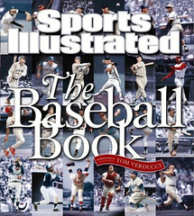
Last month I wrote about all the great uni-related photos in Sports Illustrated’s The Football Book. Now I’ve gotten myself a copy of The Baseball Book, which has a slightly smaller but still significant trove of uni details. Let’s take a look:
• Here’s a 1950s shot of Nellie Fox. Note that the Sox insignia is a patch, not embroidered. Never noticed that before.
• Another Chisox shot, this one showing Luis Aparacio during the 1959 World Series, when the White Sox actually wore white socks.
• Next time we debate the pros and cons of base coaches wearing helmets, think about this photo. Can you believe how close to home plate those shutterbugs were allowed to get?
• This is an 1896 shot of the New York Giants, and I absolutely must have one of those sweaters.
• Couple of interesting things here, beginning with the Cards’ heavily ribbed stirrups. Also, look closely Bob Bowman’s (No. 26) right toe. Looks like he’s got a little metal plate and strip of leather there to keep the tip of his shoe from wearing through. And that leads us to”¦
• ”¦this shot of Satchel Paige’s cleats, with a great view of precisely the same toe accessory.
• Amazing old Boston Braves jacket here.
• Decent view here of the yellow batting helmets that the A’s wore in 1967 (when they were still in Kansas City).
• Best uni-related prank ever. According to the caption, the player on the ground was actually an actor named Lou Archer, “who appeared in Babe Comes Home, Ruth’s second Hollywood feature.”
Loads of other great photography here — recommended.
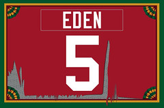
Membership News: Got a brilliant card design request the other day from Robert Eden. He originally joined up back when the membership program was first announced, choosing the basic Uni Watch colors. But once he heard we were now accepting NCAA-themed design requests, he put in an order for an additional card (which anyone can get for $15, by the way) patterned after a Nebraska Cornhuskers tearaway jersey. As I think you’ll agree, Scott executed the concept quite nicely.
Meanwhile, Nina has finished adding all the Charter Membership code to the membership roster. If you’re a Charter Member, your number on the roster should be shown in bold. If we somehow missed anyone, let me know.
Uni Watch News Ticker: Yesterday’s post about uni numbers on pants prompted a response from Aaron Stilley, who pointed out a baseball example I’d forgotten about: the Kansas City Monarchs (additional views here, here, here, and here). “I agree it’s usually a bad idea, but for some reason I actually think it looked nice on the Monarchs’ unis,” writes Aaron, and I’m inclined to agree. ”¦ By now I think most of you are aware of the Minnesota high school hockey jerseys that are on display at the Xcel Center. But what you might not know — and what I didn’t know myself until Jeff Barak forwarded me some pics — is that the display also includes an incredible 1940s Coast Guard team jersey with a gorgeous chenille crest. Further info here. ”¦ The woman who designed the Lambeau Field 50th-anniversary patch is profiled here. ”¦ Alejandro Marci reports that Argentina has new soccer uniforms. “The jersey has a hidden drawing on the front,” he writes, “inspired by a traditional Buenos Aires decorative painting art form called Fileteado, which is most commonly used to decorate buses. That technique is also in a small patch located on the back of the neck. There’s also an awful colored field in the back, as a background for the numbers. Apparently it’s some new FIFA regulation for NTs.” ”¦ “As you know, the Giants typically apply each player’s last name to his batting helmet in large white letters,” writes Jason Taylor. “Until August, it appeared that Barry Bonds was no different. But I just noticed that his last name appeared in two other styles on the back of his helmet within about a week’s time. I’m guessing that it had something to do with him donating his 755 and 756 helmets to the Hall of Fame.” ”¦ Genius find by Jere Smith, who’s turned up a video clip from the 1988 NBA Legends Game, in which every single player wore FNOB — and in a totally weird format to boot. Details and full video clip here. ”¦ Several readers have noticed a subtle change made by the Bruins, but Paul Pokaski sums it up best: “The Bruins started the season with double-outlined lettering on their nameplates. This style was worn as recently as October 22 on the road against the Canadiens. Recently, however, the Bruins have been using single-outlined names on their road whites. They wore this style November 3 at Ottawa, and in their most recent game, at Toronto.” Very odd to see a team make this sort of change in the middle of a season. … You’ve gotta be kidding me. … Reprinted from last night’s comments: Lots of good uni-related soccer Q&A action here. … And The London Times‘s picks for the top 50 soccer kits of all time here (with thanks to Iain Landon).

Holiday Schedule: We’ll have open chatter tomorrow. Maybe Friday too, or maybe I’ll put up some real content — not sure yet. And our usual open chatter for the weekend. Happy Thanksgiving to one and all, and remember, white meat’s for suckers — dark meat’s where it’s at.
Are those jerseys in the Xcel Center college ones or are them HS sprinkled in with them? I see Denver, Minnesota, North Dakota and St. Cloud.
[quote comment=”174758″]Are those jerseys in the Xcel Center college ones or are them HS sprinkled in with them? I see Denver, Minnesota, North Dakota and St. Cloud.[/quote]
That should read “…or are there HS sprinkled…”
unfortunately, the picture of the hockey jerseys at the xcel center are all college teams. it appears to be all the WCHA teams
though i have been told the HS display is pretty cool…at least that is what i am told by friends who played HS hockey in MN
Yup, those are most definitely college hockey jerseys. Oops.
“As you know, the Giants typically apply each player’s last name to his batting helmet in large white letters,” writes Jason Taylor. “Until August, it appeared that Barry Bonds was no different. But I just noticed that his last name appeared in two other styles on the back of his helmet within about a week’s time. I’m guessing that it had something to do with him donating his 755 and 756 helmets to the Hall of Fame.”
— That, or his head is finally getting smaller again.
[quote]Next time we debate the pros and cons of base coaches wearing helmets, think about this photo. Can you believe how close to home plate those shutterbugs were allowed to get?[/quote]
i remember when ‘the natural’ first came out, and there are a few scenes where the photogs get real close to roy hobbs…most poignantly in the “you OK fella?” stomach bleed scene during the final at bat…i said to my dad, “that’s such hollywood BS…photographers aren’t allowed on the field!”
he was like, ‘oh no..yes they were’
always wondered when this practice started and when it (mercifully?) ended…and i was also led to believe they were only allowed there for BP, but this appears to be a live action shot
anyone?
[quote comment=”174764″]- Best uni-related prank ever. According to the caption, the player on the ground was actually an actor named Lou Archer, “who appeared in Babe Comes Home, Ruth’s second Hollywood feature.”[/quote]
lou archer huh? i thought it was vince coleman!
[quote comment=”174764″]Happy Thanksgiving to one and all, and remember, white meat’s for suckers – dark meat’s where it’s at.[/quote]
sign me up as a sucker then!
Isn’t the second White Sox picture Luis Aparicio, not Nellie Fox? Aparicio wore #11.
Sorry for the overflow from yesterday’s comment but a big THANK YOU to the person who posted the Curtis Dickey photo. Hardly anyone remembers this guy. At Texas A&M, in the late 70’s, Dickey was an All-American (Heisman canidate) tailback for the Aggies and a NCAA sprint champion in track and field. I remember Keith Jackson in his nasal tone calling “Currrr-tis Dickey on the carry and boy can he really go!”
[quote comment=”174770″]Isn’t the second White Sox picture Luis Aparicio, not Nellie Fox? Aparicio wore #11.[/quote]
You’re right. I’ll fix it.
[quote]white meat’s for suckers – dark meat’s where it’s at.[/quote]
False. And everyone knows the skin is where it’s at. White and dark is just a means to get there.
After seeing those White Sox white socks, I was looking through some of the old Tigers photos the Detroit News has online, because while the uniform has been pretty constant, they have changed sock styles from time to time.
So I was looking at link, first noticing the single striped sock, then how it looked like both players didn’t have their jersey fully buttoned up. What actually creates that effect is that those uniforms are piped differently than any other Tigers unis I have noticed. The side with the D doesn’t usually have a piped edge. Compare to link or a fighting link.
A minor detail, but what is uni watch if not minor details.
[quote comment=”174758″]Are those jerseys in the Xcel Center college ones or are them HS sprinkled in with them? I see Denver, Minnesota, North Dakota and St. Cloud.[/quote]
The Xcel Energy Center has all the high school sweaters on display on the main level. I love the display, but a number of the sweaters are out dated as teams have gotten new ones, but haven’t sent one along for the display. The jersey on deisplay for the team I helped coach the past 4 years is a good 5-6 years old and we’ve worn two different styles since the one on display was worn.
On the upper level they have college sweaters from the WCHA, as well as the DIII Minnesota Intercolegiate Athletic Conference (MIAC).
What’s the deal with the “TV number” on the sleeve of the Aparicio jersey? This is something I’ve never noticed before.
Yes, link for everyone.
This may sound snobby and elitist but I think charter members should have their names bold instead of the numbers. No biggie, just an opinion.
What’s the deal with all hat style/color inconsistency in the 1896 giants photo? Othere than that it looks great.
The new Prudential Center in Newark has borrowed the Xcel Energy Center’s idea and displayed all of New Jersey’s high school hockey jerseys. A nice idea and worth copying.
Also, from an interview with Martin Brodeur in today’s Star-Ledger:
What is the best jersey design ever in the history of the NHL?
Chicago Blackhawks. It’s just great with the tomahawks on the shoulders. The best colors are the Original Six teams. That red in Montreal, with the blue pants. The blue of the Toronto Maple Leafs, the red of Detroit. It’s just something that characterized them a lot differently than the new jerseys that we have.
The piece of material on Satchell Paige’s shoe is called a Pitcher’s Toe. It helps protect the shoe of the pitcher’s pivot foot from wearing quickly from the friction with pivoting.
link a picture of part of the High School Hockey jersey display at Xcel Energy Center.
[quote comment=”174800″]The new Prudential Center in Newark has borrowed the Xcel Energy Center’s idea and displayed all of New Jersey’s high school hockey jerseys. A nice idea and worth copying.[/quote]
A few weeks back I posted my gallery of the HS jerseys in Pittsburgh at Mellon Arena. Today’s post brings up a few questions:
1. Is this something that is at most NHL arenas as part of some standard community outreach program?
2. Was Minnesota first and are the other arenas copying?
3. Does anyone know for sure how many NHL arenas display jerseys in such a manner.
Depending on what the answers to those questions are, it might be a topic worth having a post on and comparing jerseys from state to state.
Re: The Bruins changing the names from three layer to two layer.
When the Flames first introduced their red jerseys a few years ago, the name was black with white trim to start, but it was difficult to read the name on the back. So about a couple of weeks after they debuted, they changed it to white with black trim. Somewhere in Calgary, there’s probably about 1,000 jerseys with black names that were sold the first week or two because of the hype surrounding them when they were unveiled.
– Best uni-related prank ever. Ruth’s second Hollywood feature
Babe Ruth appeared in movies? whoa, had no idea. I did the old click the pic before reading and laughed my a** off after I read what was going on, classic picture.
– dark meat’s where it’s at. –
..I prefer the white part of the turkey, I slice it up add gravy, fresh ground pepper and feast. The wing is my 2nd favorite. mmm, my mouth is like Niagara Falls right now!
It’s been said already, but those are indeed the WCHA jerseys in the picture there. It should be noted that there is also a display of the Division 3 Minnesota Hockey jerseys (MIAC) at the south end of the main level. They also have a tribute to the Hobey award in the same corner on the main level where the WCHA jerseys are (The entrance also has a replica Broadmore Trophy.)The high school jerseys are actually in the ring where the club seats are and go almost all the way around as is shown in post #19. Most of them are outdated as they are the designs that were used the first season the X was played in.
In 1959, the White Sox wore black socks during the regular season and switched to white socks for the World Series.
[quote comment=”174810″][quote comment=”174800″]The new Prudential Center in Newark has borrowed the Xcel Energy Center’s idea and displayed all of New Jersey’s high school hockey jerseys. A nice idea and worth copying.[/quote]
A few weeks back I posted my gallery of the HS jerseys in Pittsburgh at Mellon Arena. Today’s post brings up a few questions:
1. Is this something that is at most NHL arenas as part of some standard community outreach program?
2. Was Minnesota first and are the other arenas copying?
3. Does anyone know for sure how many NHL arenas display jerseys in such a manner.
Depending on what the answers to those questions are, it might be a topic worth having a post on and comparing jerseys from state to state.[/quote]
To answer question #2, its because the Minnesota Wild have taken up the marketing idea that, “Minnesota is the state of hockey.” I would completely agree with this and many others would too if anyone has seen the Boys State Hockey Tourney here in early spring (they sell out Xcel for High School games), ever seen a high school game in a number of the great, smaller iron range towns in Northern Minnesota or been to Mariucci Arena to watch a U of M game.
[quote comment=”174802″]The piece of material on Satchell Paige’s shoe is called a Pitcher’s Toe. It helps protect the shoe of the pitcher’s pivot foot from wearing quickly from the friction with pivoting.
[/quote]
I’ve always seen it referred to as a “toe plate”. Pitchers still wear them.
Here is my high school’s hockey sweater at the Excel:
link
Good luck next season, Jacobs Field link.
Does the change in the Bruins’ lettering coincide with Reebok’s providing jerseys that aren’t completely made of the new moisture-repelling fabric?
[quote comment=”174810″]
A few weeks back I posted my gallery of the HS jerseys in Pittsburgh at Mellon Arena. Today’s post brings up a few questions:
1. Is this something that is at most NHL arenas as part of some standard community outreach program?
2. Was Minnesota first and are the other arenas copying?
3. Does anyone know for sure how many NHL arenas display jerseys in such a manner.
Depending on what the answers to those questions are, it might be a topic worth having a post on and comparing jerseys from state to state.[/quote]
IIRC the Verizon Center in DC is extremely boring. There might be a Wizards and Caps Wall of Fame, but that’s about it in terms of “local sports” flavor. It’s mostly Verizon logos everywhere.
Of course, hockey isn’t a big college thing around here. Maybe not even HS. Plenty of youth hockey though.
[quote comment=”174773″]Sorry for the overflow from yesterday’s comment but a big THANK YOU to the person who posted the Curtis Dickey photo. Hardly anyone remembers this guy. At Texas A&M, in the late 70’s, Dickey was an All-American (Heisman canidate) tailback for the Aggies and a NCAA sprint champion in track and field. I remember Keith Jackson in his nasal tone calling “Currrr-tis Dickey on the carry and boy can he really go!”[/quote]
Why you’re welcome.
[quote comment=”174823″][quote comment=”174810″][quote comment=”174800″]The new Prudential Center in Newark has borrowed the Xcel Energy Center’s idea and displayed all of New Jersey’s high school hockey jerseys. A nice idea and worth copying.[/quote]
A few weeks back I posted my gallery of the HS jerseys in Pittsburgh at Mellon Arena. Today’s post brings up a few questions:
1. Is this something that is at most NHL arenas as part of some standard community outreach program?
2. Was Minnesota first and are the other arenas copying?
3. Does anyone know for sure how many NHL arenas display jerseys in such a manner.
Depending on what the answers to those questions are, it might be a topic worth having a post on and comparing jerseys from state to state.[/quote]
To answer question #2, its because the Minnesota Wild have taken up the marketing idea that, “Minnesota is the state of hockey.” I would completely agree with this and many others would too if anyone has seen the Boys State Hockey Tourney here in early spring (they sell out Xcel for High School games), ever seen a high school game in a number of the great, smaller iron range towns in Northern Minnesota or been to Mariucci Arena to watch a U of M game.[/quote]
I am a Wild season ticket holder. I have been to Mariucci to see the Gophers and to se various other hockey games. Part of the high school tourney is played there. We also have tickets to the boy’s state tourney. I have been up to Warroad to see high school games.
I do not care if anyone else agrees but it is a great sport and a great tradition in Minnesota.
[quote comment=”174810″][quote comment=”174800″]The new Prudential Center in Newark has borrowed the Xcel Energy Center’s idea and displayed all of New Jersey’s high school hockey jerseys. A nice idea and worth copying.[/quote]
A few weeks back I posted my gallery of the HS jerseys in Pittsburgh at Mellon Arena. Today’s post brings up a few questions:
1. Is this something that is at most NHL arenas as part of some standard community outreach program?
2. Was Minnesota first and are the other arenas copying?
3. Does anyone know for sure how many NHL arenas display jerseys in such a manner.
Depending on what the answers to those questions are, it might be a topic worth having a post on and comparing jerseys from state to state.[/quote]
I don’t think it’s that common. A majority of the teams in the NHL probably don’t even have high school hockey.
[quote comment=”174810″][quote comment=”174800″]The new Prudential Center in Newark has borrowed the Xcel Energy Center’s idea and displayed all of New Jersey’s high school hockey jerseys. A nice idea and worth copying.[/quote]
A few weeks back I posted my gallery of the HS jerseys in Pittsburgh at Mellon Arena. Today’s post brings up a few questions:
1. Is this something that is at most NHL arenas as part of some standard community outreach program?
2. Was Minnesota first and are the other arenas copying?
3. Does anyone know for sure how many NHL arenas display jerseys in such a manner.
Depending on what the answers to those questions are, it might be a topic worth having a post on and comparing jerseys from state to state.[/quote]
I’ll report on the Shark Tank on Sunday, but since no high schools play ice hockey in the Bay Area (I don’t even think it’s a sanctioned sport in the state), I doubt it.
It’s shocking how high the Times ranked the US jerseys from the 94 World Cup. Eww.
[quote comment=”174840″][quote comment=”174810″][quote comment=”174800″]The new Prudential Center in Newark has borrowed the Xcel Energy Center’s idea and displayed all of New Jersey’s high school hockey jerseys. A nice idea and worth copying.[/quote]
A few weeks back I posted my gallery of the HS jerseys in Pittsburgh at Mellon Arena. Today’s post brings up a few questions:
1. Is this something that is at most NHL arenas as part of some standard community outreach program?
2. Was Minnesota first and are the other arenas copying?
3. Does anyone know for sure how many NHL arenas display jerseys in such a manner.
Depending on what the answers to those questions are, it might be a topic worth having a post on and comparing jerseys from state to state.[/quote]
I’ll report on the Shark Tank on Sunday, but since no high schools play ice hockey in the Bay Area (I don’t even think it’s a sanctioned sport in the state), I doubt it.[/quote]
I know the United Center where the Hawks play don’t have a display, but maybe we can change that.
There is an hour long show called ‘Ice Dreams’ that has been showing on FSN North lately. It is about the history of the Minnesota State HS Hockey Tournament. Some great interviews and stories, not to mention fabulous uni shots from past years. Lots of Cooperall clad teams shown.
How long has the C in UCLA been a different color on their basketball uni’s? Am I just now noticing this?
Forgot the link.
link
link
– Decent view here of the yellow batting helmets that the A’s wore in 1967 (when they were still in Kansas City).
Still among my favorite all-time baseball uniforms. Dig the green shoe laces, too.
The Bruins white jerseys look good but I still wish they had completely reverted to the early 70’s style of broad yellow shoulder bar with black trim, instead of the current reversed style. Also, in that Bruins’ goalie pic, those Ottawa Senator socks are the most hideous thing I’ve ever seen.
I’m sure it’s been brought up before, but while we’re talking about high school team displays at professional sports arenas/stadiums, might as well bring up Qwest Field’s…
link
My HS is the fourth one below the E in “State” which they were so nice to play diagonal from our arch-rivals.
[quote comment=”174810″]2. Was Minnesota first and are the other arenas copying?[/quote]
I haven’t been to a Red Wings game in awhile, so I don’t know.
This is unrelated, but a few years back my cousin gave me his tickets to the season ticket holder open house at Joe Louis Arena. We got to walk through the locker room, sit in the broadcast booth and stuff like that. When you get to the inner non-public concourse area they have the old huge Olympia Stadium exit sign from the freeway hanging from the ceiling. I didn’t expect to see that there, I wish I took a picture.
Interesting link about the Carolina Hurricanes switching to the old material, but keeping the new cut of the Reebok jerseys.
[quote comment=”174845″]How long has the C in UCLA been a different color on their basketball uni’s? Am I just now noticing this?
[/quote]
They’re doing it for this season to mark the fact that UCLA recently became the first school to acheive 100 NCAA Championships.
C = 100
link that I mentioned earlier. Simple and nice.
[quote comment=”174811″]Re: The Bruins changing the names from three layer to two layer.
When the Flames first introduced their red jerseys a few years ago, the name was black with white trim to start, but it was difficult to read the name on the back. So about a couple of weeks after they debuted, they changed it to white with black trim. Somewhere in Calgary, there’s probably about 1,000 jerseys with black names that were sold the first week or two because of the hype surrounding them when they were unveiled.[/quote]
Longtime lurker, first time poster
If I recall correctly, the original lettering had the same three layers as the numbering (black-white-yellow) and was changed after only a couple of games because the names were absolutely unreadable.
The Flames-owned stores around the city offered free re-lettering to anyone who had bought custom jerseys with the old lettering.
[quote comment=”174810″][quote comment=”174800″]The new Prudential Center in Newark has borrowed the Xcel Energy Center’s idea and displayed all of New Jersey’s high school hockey jerseys. A nice idea and worth copying.[/quote]
A few weeks back I posted my gallery of the HS jerseys in Pittsburgh at Mellon Arena. Today’s post brings up a few questions:
1. Is this something that is at most NHL arenas as part of some standard community outreach program?
2. Was Minnesota first and are the other arenas copying?
3. Does anyone know for sure how many NHL arenas display jerseys in such a manner.
Depending on what the answers to those questions are, it might be a topic worth having a post on and comparing jerseys from state to state.[/quote]
No photos, but I noticed that the Coyotes have hung up some local College and HS sweaters in the Jobing.com Arena. As the Sting have ceased operations(and the Coyotes are too expensive), it is unlikely that I will be back this season to get any phots.
Here’s a 1950s shot of Nellie Fox. Note that the Sox insignia is a patch, not embroidered. Never noticed that before.
Back in 1975 when the O’s wore link the bird was sewn on as a patch. They cut them off of link and then applied them to a blank orange paneled hat.
You can kind of see around the bird that they edges are fuzzy and not clean…how they would be if it was embroidered into the hat directly.
[quote comment=”174841″]It’s shocking how high the Times ranked the US jerseys from the 94 World Cup. Eww.[/quote]
Holy crap. At first I thought you were joking and I got a morning laugh. But then I wondered if you were serious and went and looked again. Ugh. I definitely missed that the first time. The British sense of anything is, well, uhh…
[quote comment=”174860″][quote comment=”174811″]Re: The Bruins changing the names from three layer to two layer.
When the Flames first introduced their red jerseys a few years ago, the name was black with white trim to start, but it was difficult to read the name on the back. So about a couple of weeks after they debuted, they changed it to white with black trim. Somewhere in Calgary, there’s probably about 1,000 jerseys with black names that were sold the first week or two because of the hype surrounding them when they were unveiled.[/quote]
Longtime lurker, first time poster
If I recall correctly, the original lettering had the same three layers as the numbering (black-white-yellow) and was changed after only a couple of games because the names were absolutely unreadable.
The Flames-owned stores around the city offered free re-lettering to anyone who had bought custom jerseys with the old lettering.[/quote]
Also, in 1991-92, the North Stars had to remove link due to their being unreadable on TV broadcasts.
When the Flames made the change in ’03, I found it odd that they came up with white letters to go along with the black numbers. Have any other teams used both white and black text on the same jersey (esp. cases where the material colour is the same behind the name & numbers)?
It’s time for the White Sox to wear white socks again. They wore white socks from 1901 to 1949, in the ’59 series, as noted, and in ’69 and ’70, they wore white stirrups with blue sanitaries. Now that sanitaries are all but gone, (none of the current Sox wear ’em, not even Ozzie) and high cuffs are in, pale hose for the Pale Hose would look great.
I’m glad someone brought up the cartoon bird. It’s time for his comeback as well. For the 20 or so years the Os used him, they were, hands down, the best team in baseball, and a total embarassment without him. Bring him back.
Does anyone know for sure how many NHL arenas display jerseys in such a manner.
Not done at Madison Square Garden or Nassau Coliseum. It was not done at Brendan Byrne/Continental/Izod when the Devils played there.
I suspect that one reason it is done at XCel, Prudential and Jobing is that the NHL team is the primary tenant (or owner). MSG and the Meadowlands (and the United Center, Verizon Center, etc.) are or were the home arena for both an NHL and an NBA franchise. Now you are looking at putting up not just hockey jerseys, but hundreds of high school basketball jerseys (for the NY-metro arenas) if you are going to remain even-handed.
Just to really beat a dead horse…
At the X, in addition to the WCHA jerseys on the main level, the high school jerseys on the suite level, and the MIAC jerseys on the upper level, there are also three other college jerseys on the upper level.
It’s the 3 MN teams who don’t play in the WCHA or MIAC. Bemidji State in the CHA, St. Scholastica in the NCHA and MN-Crookston in the MCHA.
[quote comment=”174826″]Good luck next season, Jacobs Field link.[/quote]
Good call; that’s the first thing I thought, too.
[quote comment=”174868″][quote comment=”174841″]It’s shocking how high the Times ranked the US jerseys from the 94 World Cup. Eww.[/quote]
Holy crap. At first I thought you were joking and I got a morning laugh. But then I wondered if you were serious and went and looked again. Ugh. I definitely missed that the first time. The British sense of anything is, well, uhh…[/quote]
Die Oranje at 4? Should be #1.
And The London Times’s picks for the top 50 soccer kits of all time link
Wow, did anyone see who they picked as #24 of link link?
[quote comment=”174871″]
When the Flames made the change in ’03, I found it odd that they came up with white letters to go along with the black numbers. Have any other teams used both white and black text on the same jersey (esp. cases where the material colour is the same behind the name & numbers)?[/quote]
No, but as far as different colors for the nameplate and numbers go, there’s a couple of examples:
Sabres – Home blues (yellow numbers, white nameplate)
Flames – as discussed on the home reds (black numbers, white nameplates)
Wild – Road Whites (Red numbers, green nameplates)
Senators – Road whites (red numbers, black nameplates)
Flyers – road whites (orange numbers, black nameplate)
Blues – home blues (yellow numbers, white nameplates)
Regarding: US 94 Unis as #24
I think they just scream America to the rest of the world. They may not be aesthetically pleasing to uni-watchers but they achieve their intended result.
The link: Supposed to appear denim while incorporating the stars.
The link: Wavy stripes are supposed to be representing the American Flag waving in the air. I thought it was a new twist on plain stripes and it is still one of my favorite US kits.
Outsiders don’t view the US as a “traditional” soccer nation, so they are able to accept the non-traditional kits from us.
[quote comment=”174840″][quote comment=”174810″][quote comment=”174800″]The new Prudential Center in Newark has borrowed the Xcel Energy Center’s idea and displayed all of New Jersey’s high school hockey jerseys. A nice idea and worth copying.[/quote]
A few weeks back I posted my gallery of the HS jerseys in Pittsburgh at Mellon Arena. Today’s post brings up a few questions:
1. Is this something that is at most NHL arenas as part of some standard community outreach program?
2. Was Minnesota first and are the other arenas copying?
3. Does anyone know for sure how many NHL arenas display jerseys in such a manner.
Depending on what the answers to those questions are, it might be a topic worth having a post on and comparing jerseys from state to state.[/quote]
I’ll report on the Shark Tank on Sunday, but since no high schools play ice hockey in the Bay Area (I don’t even think it’s a sanctioned sport in the state), I doubt it.[/quote]
Last year 2 private schools (Bellarmine & Valley Christian) played the 1st High School Ice hockey game in NorCal. Hockey is not a sanctioned sport in California, alot of schools play roller hockey as a club sport but this was the 1st Ice Hockey game.
Spectacular site here
link
[quote comment=”174899″]Spectacular site here
link
The Aud looks in mint condition compared to Ralph Wilson Stadium. Another dive in Buffalo.
I had a pitcher’s toe plate playing Pony League back in the 1960’s. I remember seeing quite a few of them.
[quote comment=”174790″]After seeing those White Sox white socks, I was looking through some of the old Tigers photos the Detroit News has online, because while the uniform has been pretty constant, they have changed sock styles from time to time.
So I was looking at link, first noticing the single striped sock, then how it looked like both players didn’t have their jersey fully buttoned up. What actually creates that effect is that those uniforms are piped differently than any other Tigers unis I have noticed. The side with the D doesn’t usually have a piped edge. Compare to link or a fighting link.
A minor detail, but what is uni watch if not minor details.[/quote]
That’s an outstanding observation. Nice.
[quote comment=”174810″][quote comment=”174800″]The new Prudential Center in Newark has borrowed the Xcel Energy Center’s idea and displayed all of New Jersey’s high school hockey jerseys. A nice idea and worth copying.[/quote]
A few weeks back I posted my gallery of the HS jerseys in Pittsburgh at Mellon Arena. Today’s post brings up a few questions:
1. Is this something that is at most NHL arenas as part of some standard community outreach program?
2. Was Minnesota first and are the other arenas copying?
3. Does anyone know for sure how many NHL arenas display jerseys in such a manner.
Depending on what the answers to those questions are, it might be a topic worth having a post on and comparing jerseys from state to state.[/quote]
The “New” NHL… where individuality is CONDEMMED.
All teams websites must be from template.
No variations in rink sizes.
All arenas must be exact copies of each other.
Must use the color black in every uniform.
Bah!
Turn on the NHL NETWORK and see how great this league used to be as recent at the early 90s.
Stirrups-wearing catcher Johnny Estrada is now a Met. He doesn’t pull them up quite high enough for Paul’s tastes, but stirrups are stirrups.
And Goergia’s Coach Mark Richt was joking with the media again about what colors the Dawgs are wearing Saturday, before admitting they’ll wear their traditional silver.
[quote comment=”174794″]What’s the deal with the “TV number” on the sleeve of the Aparicio jersey? This is something I’ve never noticed before.[/quote]They wore numbers on their sleeve from the 1950’s all the way through the red uniforms of the early 1970’s. From what I can find, they ditched them in the very late ’60s (when they wore the blue sanitaries), but brought them back for the red uniforms.
Incidentally, link is all kinds of awesome.
If you take a look at the ‘before’ and ‘after’ pics of the Bruins uniforms, you’ll also notice on the white jerseys that the white (inner) outline is now thinner and the yellow (outer) outline is thicker.
[quote comment=”174825″]Here is my high school’s hockey sweater at the Excel:
link[/quote]
I think I’ve posted this once or twice before, so I apologize to duplicating, but just as a point of clarification, the photo referenced in the Ticker are the WCHA jerseys (as was already mentioned), all of the high school jerseys on display can be seen link (including that of my link!)
How ya like that, Tom? 2 Eastside UniWatchers. Should have had Paul come out to Tin Cup when he was in town!
When the Flames first introduced their red jerseys a few years ago…
Reintroduced? The Flames are among the teams that ruined a great look by adding black.
Back in 1975 when the O’s wore this hat the bird was sewn on as a patch. They cut them off of this hat and then applied them to a blank orange paneled hat.
When the O’s wore that 1975 hat (which I had as a kid), did they wear a matching batting helmet or did they just wear the white one? They have a couple of hats now but only one helmet.
[quote comment=”174921″]The “New” NHL… where individuality is CONDEMMED.
All teams websites must be from template.
No variations in rink sizes.
All arenas must be exact copies of each other.
Must use the color black in every uniform.
[/quote]
all fair points, but i don’t believe the uniform rink size is either new or a bad thing…
be funny though, if you could make rinks like baseball stadia…bruins could have really high boards jutting into the middle of the ice (a la fenway), detroit could have an olympic size rink (a la comerica)…you could put a small igloo-type structure underneath one of the nets to give a slight rise (a la Tal’s hill in minute maid)
ok…maybe that wouldn’t be so good
of course…ANY improvement, no matter how garish or unsafe, would be an upgrade to the nassau mausoleum
[quote comment=”174888″]Regarding: US 94 Unis as #24
I think they just scream America to the rest of the world. They may not be aesthetically pleasing to uni-watchers but they achieve their intended result.
The link: Supposed to appear denim while incorporating the stars.
The link: Wavy stripes are supposed to be representing the American Flag waving in the air. I thought it was a new twist on plain stripes and it is still one of my favorite US kits.
Outsiders don’t view the US as a “traditional” soccer nation, so they are able to accept the non-traditional kits from us.[/quote]
I agree. I always liked those US uniforms. They screamed early-90’s but in a good way… somehow. Plus the font they used for the numbers was link. link didn’t do it for me quite as much as the red striped ones but they still had a cool vibe going on. Looking at the blue field of stars while it’s waving in the wind.
[quote comment=”174921″]
The “New” NHL… where individuality is CONDEMMED.
All teams websites must be from template.
No variations in rink sizes.
All arenas must be exact copies of each other.
Must use the color black in every uniform.
Bah!
Turn on the NHL NETWORK and see how great this league used to be as recent at the early 90s.[/quote]
Great commentary.
Geez, I thought I’d be one of the first couple people to mention the jerseys being college and not high school, but I saw about 20 others.
The jersey for Champlin Park (where I played), is pretty old. They’ve had 3 new sets since that one (and a 4th on the way, I heard).
The hour long piece about the State Hockey Tournament is great. Real interesting and the old uniforms are something to look at.
[quote comment=”174841″]It’s shocking how high the Times ranked the US jerseys from the 94 World Cup. Eww.[/quote]
Agreed. It seems some of their picks were not necessarily for aesthetic reasons but more for goofiness or because something fascinating happened in association with a pariticular kit.
Can’t complain too much though with Liverpool at #5.
Good luck next season, Jacobs Field hot dog vendors.
Good call; that’s the first thing I thought, too.
My first reaction was: Did Keyser Soze buy the team?
Did anyone notice in last nights UCLA vs. Mich. St. game that Josh Ship,number 3, had his name sewen on crooked! I don’t have any screen grabs but it was pretty obvious when looking how it tilted up toward the end.
Anyone?
“and remember, white meat’s for suckers – dark meat’s where it’s at”….Paul, my Cuban girlfriend would agree with you.
Reminds me of the line from the movie Airplane though:
Young Boy with Coffee: Excuse me, I happened to be passing, and I thought you might like some coffee.
Little Girl: Oh, that’s very nice of you, thank you.
Young Boy with Coffee: Cream?
Little Girl: No, thank you, I take it black, like my men.
Syracuse wears numbers on link.
IIRC the Verizon Center in DC is extremely boring. There might be a Wizards and Caps Wall of Fame, but that’s about it in terms of “local sports” flavor. It’s mostly Verizon logos everywhere.
Ah, but the amazing subtelties of the Verizon Center. When I lived in the area I loved that all the concession stands had some cool D.C. themed name. My favorite was “E Pluribus Mmm Mmm”
In addition to the ring of high school jerseys on the suite level of the Xcel, which are quite visible from the main concourse, they also have many other separate displays of jerseys throughout the arena other levels.
The main concourse alone has the WCHA collection, a trio of display cases that rotate every year. This year they have that awesome Coast Guard hockey team display, (in the past it’s been “Wild Captian’s” since we’ve so many, and Minnesota born Olympic hockey players), a pair of Minnesotan’s picked in the first round of the NHL draft, Eric Johnson and Mike Ramsey (the classic Sabres with NHL 75th patch, wow…) and the current Mr. & Ms. Hockey for the best high school players. Previously they had a display of the old St. Paul Vulcans junior team.
In another corner there are recent Hobey Baker award winners for the best men’s college hockey players as well as the woman’s best player if I recall correctly.
They even usually have something interesting in a case as you enter the team store, The Hockey Lodge.
That’s just the main level. On the club level they have reproductions of old turn of the century St. Paul Athletic club, minor league Minneapolis Millers & St. Paul Saints as well as the Minnesota Iron Rangers.
In 2004 they had the countries jerseys that were part of the 2004 World Cup of Hockey, which was held at the X, the only US venue for the tournament, over the main entrance in the lobby. Man did I want that set when they were done with them. I love my international hockey.
As stated above, there are also other displays of other Minnesota college teams on the upper level.
If you get the chance, I recommend getting up to the club level and checking out the reproductions of the old time jerseys. They are a treat to see, but it’s the ‘exclusive’ area on game nights, despite the fact I’ve made in there a time or two.
JeffB
[quote comment=”174983″]IIRC the Verizon Center in DC is extremely boring. There might be a Wizards and Caps Wall of Fame, but that’s about it in terms of “local sports” flavor. It’s mostly Verizon logos everywhere.
Ah, but the amazing subtelties of the Verizon Center. When I lived in the area I loved that all the concession stands had some cool D.C. themed name. My favorite was “E Pluribus Mmm Mmm”[/quote]
You must have sat in a much more original section than me. Near my seat is the unoriginal “Capital Grille”, Miller Lite Beer Station, Pizza Hut and the Dippin’ Dots cart.
Photographers were allowed on the field during games. You can see them in film footage.
The picture on the main page was shot using a long lens ( long lenses compress the image ) … the photographers werent as close to the batter as it appears… still closer than I’d want to get.
Don’t forget “Filler up, buster” by the cheap seats at the phonebooth.
It looks like the Lions and Packers are wearing their normal uniforms on Thursday [no throwbacks]. Anybody else hear different?
[quote comment=”174922″
And Goergia’s Coach Mark Richt was joking with the media again about what colors the Dawgs are wearing Saturday, before admitting they’ll wear their traditional silver.[/quote]
Back in the day, Georgia did, in fact, sport some silver: red jerseys and silver helmets. Overall, a nice combination.
Back in the day, Georgia did, in fact, sport some silver: red jerseys and silver helmets, no black in evidence, as I recall. Overall, a nice combination.
{Kindly ignore my earlier, fouled-up post.}
Is that a IIHF wordmark on Tukka Rask’s link?
[quote comment=”174849″]The Bruins white jerseys look good but I still wish they had completely reverted to the early 70’s style of broad yellow shoulder bar with black trim, instead of the current reversed style. Also, in that Bruins’ goalie pic, those Ottawa Senator socks are the most hideous thing I’ve ever seen.[/quote]
Agreed 100% on all counts.
Like the new nameplate look; simple and bold, and easier to read. Yes, they did appear with the “new” old fabric jerseys, as far as I can tell.
If they are going to go with black shoulders on the road jerseys, then they should at least wear black helmets too. Had seen a pic when they announced the new unis, and it had a black helmet, but turns out that was a fluke.
Also, still peeved by the fact that the home socks (gold-white-black-white-gold) don’t match the jersey striping (gold-black-white-black-gold) correctly.
But still like these unis way better than the previous set.
[quote comment=”175042″]Is that a IIHF wordmark on Tukka Rask’s link?[/quote]
Could be – Rask uses a “Montreal” stick, made in Finland his home country. Their website has a link to IIHF on its home page.
Fix bold now.
While I’m at it, Paul’s exactly right on the dark meat.
Oklahoma State is wearing orange against Illinois today. They normally don’t wear this jersey so I guess it’s a special occasion
Browns will be wearing their way cool throwbacks this Sunday: link
link
I like the new / old block “C”.
Apologies if this has been posted already.
[quote comment=”175075″]Browns will be wearing their way cool throwbacks this Sunday: link
God those are great.
I am pleasantly surprised at how many of us Minnesotans there are here!!!
And I might be biased but link is my high school’s jersey (Duluth Marshall Hilltoppers), which I think not only has a pretty unique nickname but is a classy looking jersey.
BTW I know that Hilltoppers is not original, however it is not your standard “Patriots, Warriors, Cougars or Wildcats” and I like it!
The Hurricanes will be changing to the old jersey material and the Rangers will go with new material on the front and old material on the back…more/all teams will be switching very soon
Check out the zebra halfway down on this ebay jersey. I saw that someone has taken credit for me posting messages about ads on EU hockey jerseys, so here is another one from Andy.
Hope you like it.
link
HaHAHA…TSN just mentioned it as well as calling the experiment a “DISASTER”!
Looks like the Wizards have changed the design of the nameplates on the back of their jersey. The switch to gold was hard to read. Looks like its outlined in white and black to distinguish it better. No pictures yet.
the IIHF on Raska stick is International Ice Hockey Federation. The people that run the Olympic Hockey program and all the international tournaments. This stick will be one that he used sometime during IIHF play. Equipment has to be stamped for approval. Hockey questions? Send ’em my way.-Andy
I watched the Isles and Oilers in a playoff game from 1981 today on the NHLN. It looked like the Oilers road jerseys had the names on the back embroidered right into the jersey. No nameplate. And the lettering was very thin. Can anyone confirm this?
I saw 4 things in that game that brought a tear to me eye…
1- The old white home Islanders jerseys.
2- No ads on the boards at the Coliseum.
3- An actual fight in a playoff game (Bob Bourne vs. Paul Coffey…no decision…there was another.. Garry Howatt vs. Dave Semenko and Howatt got his ass kicked)
4- Actual passing and room on the ice to make plays.
high school hockey jerseys: mellon arena in pittsburgh displays the local jerseys! i’ll snap a few shots next time i’m there…
Was anyone surprised that Engalnd gave David Beckham’s #7 to Gareth Barry and gave Beckham #17? Maybe the added “1” was meant to represent “1 cap short of 100”.
[quote comment=”174800″]The new Prudential Center in Newark has borrowed the Xcel Energy Center’s idea and displayed all of New Jersey’s high school hockey jerseys. A nice idea and worth copying.
Also, from an interview with Martin Brodeur in today’s Star-Ledger:
What is the best jersey design ever in the history of the NHL?
Chicago Blackhawks. It’s just great with the tomahawks on the shoulders. The best colors are the Original Six teams. That red in Montreal, with the blue pants. The blue of the Toronto Maple Leafs, the red of Detroit. It’s just something that characterized them a lot differently than the new jerseys that we have.[/quote]
Nationwide Arena in Columbus does the same thing, and has been ever since it opened.
[quote comment=”175118″]I watched the Isles and Oilers in a playoff game from 1981 today on the NHLN. It looked like the Oilers road jerseys had the names on the back embroidered right into the jersey. No nameplate. And the lettering was very thin. Can anyone confirm this?
I saw 4 things in that game that brought a tear to me eye…
1- The old white home Islanders jerseys.
2- No ads on the boards at the Coliseum.
3- An actual fight in a playoff game (Bob Bourne vs. Paul Coffey…no decision…there was another.. Garry Howatt vs. Dave Semenko and Howatt got his ass kicked)
4- Actual passing and room on the ice to make plays.[/quote]
The room on the ice is very deceiving and it looks that way for a few reasons. It’s just an illusion set up by a few of the thing you actualy mentioned.
1. only 3 officials
2. the lack of ads on the boards make the ice look extended and because of the camera angle, longer. (as mirrors make a room look bigger)
3. the older buildings had higher camera stoops and showed much more of the ice.
4. Like you said, it is more wide open for passing etc…this is because the players are far more spread out (they were slower and had to cheat in positioning )
5.The cameras today tend to focus more on close ups on smaller areas of the ice
6. the difference between the best players and the worst was far more evident back then, this caused MANY MANY odd man rushes with only 5 men showing up on half the ice/your screen.
7. the nets were moved up to shrink the nuetral zone
8. No logos/ad on the ice make it look huge
9. players were smaller and thier equiptment was waaaaaay smaller
10.no netting and shorter glass, so it look less claustrophobic thus making everything below bigger
bold fixed
[quote comment=”175087″]link
I like the new / old block “C”.
Apologies if this has been posted already.[/quote]
yeah, it was, but was still good to take another look…cheers
btw…when the slide show first appeared, the last slide had coach skinner misidentified as “coach sinner”…this has now been corrected
heh
The new/old INDIANS jersey and cap is very comforting.
[quote comment=”175118″]I watched the Isles and Oilers in a playoff game from 1981 today on the NHLN. It looked like the Oilers road jerseys had the names on the back embroidered right into the jersey. No nameplate. And the lettering was very thin. Can anyone confirm this?
I saw 4 things in that game that brought a tear to me eye…
1- The old white home Islanders jerseys.
2- No ads on the boards at the Coliseum.
3- An actual fight in a playoff game (Bob Bourne vs. Paul Coffey…no decision…there was another.. Garry Howatt vs. Dave Semenko and Howatt got his ass kicked)
4- Actual passing and room on the ice to make plays.[/quote]
the islanders never played the oilers in the 1981 playoffs, or even the 1982 playoffs (i was at a bunch of those games…sigh..the good old days)…they DID, however, meet in the 1983 playoffs (following the 82-83 season), with the isles kicking the oilers asses 4-0
of course, the ‘drive for five’ would end in the 1984 finals…no one had yet coined the term “threepeat”, but i do remember having a great bumper sticker proudly stating “bring fourth the cup”
/now the mausoleum is a dump and the icelanders continue to be the butt of ranger and steve somers jokes
//best islander-ranger taunts back then too, with isle fans chanting “nineteen-forty” and “shoot the puck barry (beck), shoot the puck”; ranger fans countered with the ever classy slogan “beat your wife potvin, beat your wife”
F=CK
AS SOON as i posted that…i realized that the isles prolly DID play the oilers in 1981…they hadn’t realigned the divisions yet and/or reorganized the playoff formats
sure enough, i checked and sure enough, they DID play the oilers in 1981
MY BAD
link is pretty cool, but if anyone brings up Brady Quinn’s sister I’m gonna have to scream.
Why are soccer uniforms called kits?
Cowboys going retro tomorrow?
Yesterday, Duke wore their black alts in their game against Illinois. Were they wearing the black strip for VA Tech or did they not even bother with it?
[quote comment=”175150″]link is pretty cool, but if anyone brings up Brady Quinn’s sister I’m gonna have to scream.[/quote]
You mean link?
[quote comment=”175096″]I am pleasantly surprised at how many of us Minnesotans there are here!!!
And I might be biased but link is my high school’s jersey (Duluth Marshall Hilltoppers), which I think not only has a pretty unique nickname but is a classy looking jersey.
BTW I know that Hilltoppers is not original, however it is not your standard “Patriots, Warriors, Cougars or Wildcats” and I like it![/quote]
I actually saw Duluth Marshall play at the X during the state tournament last spring…as they were getting defeated by the undefeated Hermantown Hawks in the state championship game. Great to see so many teams from northern Minnesota having good showings on the big stage though. (Grand Rapids and Roseau included)
THIS is pretty cool, but if anyone brings up Brady Quinn’s sister I’m gonna have to scream.
link
[quote comment=”175118″]I watched the Isles and Oilers in a playoff game from 1981 today on the NHLN. It looked like the Oilers road jerseys had the names on the back embroidered right into the jersey. No nameplate. And the lettering was very thin. Can anyone confirm this?
I saw 4 things in that game that brought a tear to me eye…
1- The old white home Islanders jerseys.
2- No ads on the boards at the Coliseum.
3- An actual fight in a playoff game (Bob Bourne vs. Paul Coffey…no decision…there was another.. Garry Howatt vs. Dave Semenko and Howatt got his ass kicked)
4- Actual passing and room on the ice to make plays.[/quote]
The Oilers jerseys would’ve had nameplates; in the 1981 playoffs they wore Sandow SK mesh jerseys like link. The team only used embroidered nameplates for the latter half of the 1980-81 season. The Winnipeg Jets also used a link in the early 80s, from the same customizing shop, I believe.
[quote comment=”175167″][quote comment=”175150″]link is pretty cool, but if anyone brings up Brady Quinn’s sister I’m gonna have to scream.[/quote]
You mean link?[/quote]
hot
[quote comment=”175172″][quote comment=”175167″][quote comment=”175150″]link is pretty cool, but if anyone brings up Brady Quinn’s sister I’m gonna have to scream.[/quote]
You mean link?[/quote]
hot[/quote]
so i haven’t been on since 10:34, but still, AHHHHHHHHHHHHH!!!! OHMYGOD!!!! hot as in brady quinn with a wig and eyeliner
[quote comment=”175167″][quote comment=”175150″]link is pretty cool, but if anyone brings up Brady Quinn’s sister I’m gonna have to scream.[/quote]
You mean link?[/quote]
I’d hit it.
[quote comment=”175075″]Browns will be wearing their way cool throwbacks this Sunday: link
I was expecting a link to the Browns in their normal unis.
I was looking around the MLB shop online, and what the hell is link? Looks like a Turn-Back-The-Clock-To-Turn-Ahead-The-Clock shirt.
[quote comment=”175164″]Cowboys going retro tomorrow?[/quote]
Nope, they’re wearing their normal home whites today. Throwbacks against the Packers next Thursday though.
Regarding the picture of Satchel Paige’s cleats, and the toe accessory. As similar item is still for sale these days.
Link.link
As to the FIFA regulations, it only counts for teams that wear stripes. FIFA says back numbers don’t show up well enough on striped jerseys (and if you’ve ever seen Juventus, you’d agree), so they mandated that the numbers would need to be on a solid patch of color on the jersey.