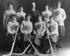
A couple of Sunday nights ago at about 10 p.m., someone posted a comment that read, “Women’s Nazi Hockey Team.” It linked to the photo shown at right (here’s a larger view). Since Sunday night is a low-traffic period for the site, nobody responded and the whole thing passed unnoticed.
Coupla things here: First of all, this is not a Nazi team. In fact, this is an Edmonton team called the Swastikas, which played in 1916 — four years before the National Socialist German Workers Party (i.e., the Nazis) adopted the swastika as its symbol. And the Edmonton gals were hardly the only group to make pre-Nazi use of the swastika, which was a fairly common graphic symbol a century ago. It was used by, among many others, the Finnish Air Force, the Boy Scouts (Girl Scouts too, although I can’t find a web reference to it), and many groups that produced good luck promotions or talismans. (For more on the swastika’s background, which dates back to the Stone Age and spans many different socio-ethnic cultures, look here.)
My research on the Edmonton photo led me to this book, written by the Canadian artist/mystic known as ManWoman, who’s spent years trying to rescue the swastika’s image its association with the Nazis. After I got in touch with him, he was kind enough to provide me with several additional examples of pre-Nazi swastika-clad teams:
• Here we have the Windsor Swastikas, circa 1909, who played in Nova Scotia. Note the varied swastika styles on the homemade crests. Here’s a slightly later version of the team.
• The Fernie Swastikas played in British Columbia in the 1920s. If team’s use of the swastika itself doesn’t make you uneasy, then the Golliwogg mascot doll being held by the Fernie player in this photo probably will. (If you’re not familiar with Golliwoggs, look here.)
• Hockey isn’t the only sport with swastikas in its past. Here’s a baseball uniform, which was worn by a 1920s team in Swastika, Ontario. (Yes, there’s actually a town called Swastika, Ontario — look.)
• ManWoman says this baseball cap was originally worn by the 1917 Canyon City Swastikas.
• And here’s a swastika-stamped golf club — not sure of the date.
There are several other books out there that examine the swastika’s graphic history. This one, by the design historian Steve Heller (who happens to be a friend of mine), is particularly good, although it doesn’t have any non-Nazi sports examples.
As Steve and many other writers have noted, the swastika is a spectacularly successful piece of design — elegant, balanced, solid yet fluid. But it’s become so inextricably associated with one particular chapter of history that it’s hard to conceive of it in any other context. In a way, this reaffirms one of Uni Watch’s underlying premises: the notion that logos and symbols can pack an emotional punch that goes beyond any rational reckoning. Intellectually, I know the swastika worn by those Edmonton girls had nothing to do with the Nazis, just as I know the Mets I grew up watching in the early 1970s had nothing to do with the Mets of today. Emotionally, however, the connections seem obvious in both cases, even though the only real connection involves a swastika in one instance and the Mets’ logo and colors in the other. That’s the power of design for ya.
To see how complicated the swastika’s history really is, check out this 1931 photo, which I found while doing photo research for this entry. It shows the basketball team from Freedom High School in Freedom, Pennsylvania, and was published in the school’s yearbook. And what did a town called Freedom use for the title of its high school yearbook in 1931? As you can see if you scroll down beneath the photo, it was called The Swastika.
Research Request: I’m compiling college hoops uni changes for an ESPN column next week. This is always the toughest column of the year, because there’s no single resource or office that keeps track of the college basketball changes. I’ve compiled a pretty good list, but feel free to let me know about any changes you’re aware of. Thanks.
HOLIDAY SALE: Face it, holiday gifts have nothing to do with the recipients. If you’re giving a gift, it’s all about you. And there’s no better way to show how cool you are — and spread the Uni Watch gospel in the process — than to give someone a Uni Watch membership.
With that in mind, I’m offering a discount on gift memberships for the next month. Instead of the usual pricing structure ($25, $60, $100, $250, $500, $1000), you can give the gift of Uni Watch for $20, $50, $90, $225, $450, or $900. These rates are only good for gift memberships, so the name on the card has to be different from your name. They must be ordered by November 15th to ensure delivery in time for Hanukkah, or by December 1st for Christmas.
Allow me to anticipate some of your questions:
Why not extend the discount to all memberships, not just gifts?
I thought about doing that, but I think it wouldn’t be fair to the people who’ve already paid full price.
Will the membership materials be sent to me, or to the gift recipient?
To you. It would get too logistically crazy if I had to keep track of multiple addresses, “Please send it to him exactly three days before the holiday” requests, and so on. I’ll just have everything sent to you, and then you can send or present it to the lucky giftee.
I don’t want the giftee to know about his gift ahead of time. Can you leave his name off of the membership roster and his card design out of the card gallery until after the holiday?
Yes. If you want me to keep the gift membership “private” until a certain date, just say so when placing the order.
For further details, look here.
In other membership news, new Uni Watch assistant Nina Dubin is already paying dividends. She found all the missing names on the membership roster, which is now back up-to-date.
Uni Watch News Ticker: The Gamecocks will memorialize the students killed in that beach house fire with a helmet decal. Details here (with thanks to Mike Orr). ”¦ Latest evidence that the pink thing has gotten out of hand: Pilot Point High School in Texas wore pink spats the other night (as spotted by Brian Thompson). ”¦ Yet another pink-clad team: the Middlesex Cricket Club (courtesy of Jordan Owen). ”¦ Reprinted from yesterday’s comments: Good article and video here about the Penguins’ masks. ”¦ Jonathan Papelbon is apparently a Dropkick Murphys fan, at least judging by the embroidery at the base of his victory parade kilt (good spot by webmaster John Ekdahl). ”¦ The Huntsville Stars have a new logo (with thanks to Zack Bennett). ”¦ For a second there, I thought the headband on this baseball card said, “Tits” (a characteristically excellent find by the Rev. Nørb). ”¦ Got a note yesterday from Bill Turianski, who specializes in making sports-based maps (a few dozen of which are showcased on his site). Most of them are devoted to soccer, but there’s some baseball, football, and hockey content too. Worth exploring. ”¦ Holy-moly! ”¦ Several people have written to alert me to this Sports Illustrated photo of Clinton Portis, because it shows that he doesn’t wear socks (or, more likely, wears “no show” socks inside his cleats) and that his football “socks” are actually leg warmers. True enough, but it’s nothing new — he was doing the same thing two years ago (although he obviously had some other sock issues in that infamous game). ”¦ Other SI tidbits (courtesy of Greg Riffenburgh): the disturbing ascendance of neon mucous in Seattle and an even more disturbing photo. ”¦ The Lakewood Blue Claws have a new alternate logo (with thanks to Ted Kerwin). … I’m gonna be busy for most of today and on the road tomorrow, so if you have any site-related issues (spam filter acting up, abusive commenter, etc.), please tell Vince. Ticker contributions and membership orders can still come to me.
I was looking at the playboy all American photo’s from yesterdays comments and I was wondering why there were no face masks in most of the photos from the sixties. I thought they started being used in the fifties. The 1960 team photo shows 9 out of 11 with masks but the rest of the decade has very few.
does anyone know why?
Look at this amazing hosiery!
link
Long live the Babe!
Also, you mention the Jonathon Papelbon kilt, apparently they (Dropkick Murphys) had brought along an extra one for Theo Epstein and Big Papi Ortiz to wear and dance with them, but since they were on a car far ahead they were never given the chance.
What a shame, I was hoping to see Papi dance in a kilt! The unintentional humor of that just amuses me to no end….
Poor Marge. She was a misunderstood soul.
I was working the door at a party last night. A girl came in wearing an “OCHO CINCO” Bengals jersey. I’d meant to snap a picture of it, but forgot to.
I didn’t know they were actually selling them, figured it was just a one-off thing.
With regard to the Tito Fuentes baseball card, there is other cards dating from him time with the Giants and Padres that further demonstrated how much he loved headbands.
link
link
Relating to the Seahawks and the lime-green thing. They give credit to Branch for the trend, but I really feel like the lime-green glove accents were something that had started up the year before with certain Reebok gloves. I’m almost positive that it was something I kind of expected Deion to be wearing once he started with the Seahawks, so I’m sure there was a precedent.
Great shot of a couple of Russian hockey players going “visor to visor”..pays to wear your chinstrap.
link
As to the Papelbon/Dropkick Mrurphys thing, Pap warms up when he takes the mound for home games to ‘I’m Shipping Up To Boston,’ after coming out of the pen to ‘Wild Thing,’ which while it’s not original, is damn cool when you’re in the ballpark.
From what I’ve heard, Pap has struck up a decent friendship with the guys in DKM and has turned into another ‘celebrity’ fan of the band, which has made its presence pretty strongly felt for both the Sox (with Tessie first), the Bruins (Time To Go, a cover of Nutrocker, which was used as the TV38 Bruins song for years) and even from what I’ve heard, the Revolution.
It’s an exceedingly weird thing to see a band I was going to see in high school at small clubs and high school gyms performing these things on huge stages and getting pretty famous. But I definitely don’t begrudge them their success…it’s nice to see an underdog succeed like they have.
[quote comment=”164158″]Poor Marge. She was a misunderstood soul.[/quote]
as quoted by eric davis and dave parker
For the first time ever, I’m a day behind reading UniWatch. I loved the Little Fenway and Little Wrigley, and wanted a better sense of the fields. Here is a link to Micro$oft Live Search Birdseye view of link under construction next to it. Click on the curly arrows on the bottom of the right nav bar to sort of spin around and get other views of the site. Great job on those fields.
Now here is a uniform modification that I am willing to support:
link
oops, wrong link. This is the link to the Birdseye view of link. sorry about previous bonehead link.
[quote comment=”164170″][quote comment=”164158″]Poor Marge. She was a misunderstood soul.[/quote]
as quoted by eric davis and dave parker[/quote]
Dave Parker and Barry Larkin are all on the record as being very fond of Marge. Aside from the Reds being cheap with Eric Davis after he got hurt in the 1990 World Series, Davis has said that he liked her as well.
NCAA basketball exhibitions have begun, and George Washington made slight uni changes:
link
This year
(Piece of red tape on jersey from last year was to honor Red Auerbach, who played for GW and received undergrad and grad degrees from there.)
The Chunichi Dragons just clinched the Japan Series today with a combined perfect game.
During the post-game celebrations there are numerous chances to spot obscure team staff, who don’t usually step on the field during games, and their outrageous jersey numbers.
Here’s #118 Nagata:
link
[quote comment=”164177″]NCAA basketball exhibitions have begun, and George Washington made slight uni changes:
link
This year
(Piece of red tape on jersey from last year was to honor Red Auerbach, who played for GW and received undergrad and grad degrees from there.)[/quote]
I’m compiling college hoops uni changes for an ESPN column next week. This is always the toughest column of the year, because there’s no single resource or office that keeps track of the college basketball changes. I’ve compiled a pretty good list, but feel free to contribute any that you know of, either here in the comments or by emailing me directly.
Here’s a picture in the Lawrence KS paper of the 1896 KU football team. Check out the stripped socks and turtle necks.
link
[quote comment=”164169″]As to the Papelbon/Dropkick Mrurphys thing, Pap warms up when he takes the mound for home games to ‘I’m Shipping Up To Boston,’ after coming out of the pen to ‘Wild Thing,’ which while it’s not original, is damn cool when you’re in the ballpark.
From what I’ve heard, Pap has struck up a decent friendship with the guys in DKM and has turned into another ‘celebrity’ fan of the band, which has made its presence pretty strongly felt for both the Sox (with Tessie first), the Bruins (Time To Go, a cover of Nutrocker, which was used as the TV38 Bruins song for years) and even from what I’ve heard, the Revolution.
It’s an exceedingly weird thing to see a band I was going to see in high school at small clubs and high school gyms performing these things on huge stages and getting pretty famous. But I definitely don’t begrudge them their success…it’s nice to see an underdog succeed like they have.[/quote]
It is a weird phenomenon to see the Murphys being nationally recognized. I remember watching them right went the Gangs All here came out (a little late to the party I know), but still way before this whole thing. I love seeing them have success, but I’ll tell you, if I see Papelbon force another dance or hear that damn Shipping Up to Boston song (which was great until about a month ago) one more time I may go crazy.
I did think the whole making a kilt for Pap, Beckett, Theo and Ortiz thing was funny though.
regarding yesterday’s photo featuring the 1916 bosox (and the babe)…here’s what dressed to the nines has for their uni…guess those are road grays
link
Great job on the swastika phenomenon.
There is a volunteer firehouse around the corner from my house that was built around 1904. At the very top of the false front there is a swastika made from bricks set in mortar. A number of years ago people began to stage protests in front of the firehouse because of the swastika and the fire company’s refusal to remove it, for the very reasons cited by Manwoman. To counter the protests the firemen installed a large bronze plaque that details the history of the swastika and what it actually stands for.
The protests have since dried up and people have become educated as to why there is a giant swastika peering down from the top of a local firehouse.
The Basketball list could be pretty long. It looks like a lot of teams have switched out of that nike template from last year, that had the odd shoulder stripe.
[quote comment=”164163″]I was working the door at a party last night. A girl came in wearing an “OCHO CINCO” Bengals jersey. I’d meant to snap a picture of it, but forgot to.
I didn’t know they were actually selling them, figured it was just a one-off thing.[/quote]
You can custom order any jersey you want (with many notable exceptions) from the NFL.com shop. I would assume she got it that way.
We’ve talked about punk rock and unis for the past two days. Let’s keep it going!
Dropkick also seem to have a close alliance with Celtic FC in Scotland (who have one of the link in soccer). Celtic invited them to play before a game a few years back, and the Murphys have been sporting Celtic gear ever since.
I did a little hunting around on the internet to find the date on the link Paul mentioned.
According to link, if you look at items 139.28 and 139.93, it appears the clubs were made in 1925.
link a pic from the pre-game, you can see Marc Orell rocking out a special Celtic away shirt.
University of Oklahoma completely changed their men’s basketball uniforms this year, Sooners instead of Oklahoma on front, no names on back and a promised 3rd alternate jersey. Images of the home can be seen below.
link
[quote comment=”164180″]Here’s a picture in the Lawrence KS paper of the 1896 KU football team. Check out the stripped socks and turtle necks.
link[/quote]
Awsome! I love old football pics.
link
and link is that team playing in the first game.
interesting copy today.
i can remember in elementary and middle school drawing the swastika on my book covers. i just thought it was a cool looking design that was easy to draw. back then i had no idea what it meant or sybolized, it was just cool looking and easy…
[quote comment=”164183″][quote comment=”164169″]As to the Papelbon/Dropkick Mrurphys thing, Pap warms up when he takes the mound for home games to ‘I’m Shipping Up To Boston,’ after coming out of the pen to ‘Wild Thing,’ which while it’s not original, is damn cool when you’re in the ballpark.
From what I’ve heard, Pap has struck up a decent friendship with the guys in DKM and has turned into another ‘celebrity’ fan of the band, which has made its presence pretty strongly felt for both the Sox (with Tessie first), the Bruins (Time To Go, a cover of Nutrocker, which was used as the TV38 Bruins song for years) and even from what I’ve heard, the Revolution.
It’s an exceedingly weird thing to see a band I was going to see in high school at small clubs and high school gyms performing these things on huge stages and getting pretty famous. But I definitely don’t begrudge them their success…it’s nice to see an underdog succeed like they have.[/quote]
It is a weird phenomenon to see the Murphys being nationally recognized. I remember watching them right went the Gangs All here came out (a little late to the party I know), but still way before this whole thing. I love seeing them have success, but I’ll tell you, if I see Papelbon force another dance or hear that damn Shipping Up to Boston song (which was great until about a month ago) one more time I may go crazy.
I did think the whole making a kilt for Pap, Beckett, Theo and Ortiz thing was funny though.[/quote]
i dont know how anyone couldnt be a fan of the dropkicks!
i got on board with dkm when “do or die” came out. even when al barr replaced mike mccolgan on lead vocals, they really didnt miss a beat. in fact mccolgans current band “street dogs” has a great cover of “power in a union” (billy bragg’s original version is played prior to all dkm shows in addition to “foggy dew”).
dkm is by far my favorite band. and is a fantastic live show… best live dkm show ive ever seen? 2006 st. patty’s day weekend avalon ballroom in boston. earlier in the day they got thrown out of the south boston st pats parade!
id recommend this band to anyone!
seeing them blow up with national acclaim always reminds of ken casey saying “ahhh, waddaya think punk rockers make a million bucks?”
you guys have come a long way!
An added note to the Papelbon/Dropkick Murphy discussion:
Papelbon rode on a flatbed with the Dropkick Murphy’s during the parade. Before the parade, the band presented Paps with the kilt. I believe they made one for Mike Timlin and Theo Epstein as well.
Great post, but I think I might wait until I get home before checking out all the pictures. I work for the government, and I would rather not have 20 swastika related web hits showing up on my computer haha.
[quote comment=”164202″][quote comment=”164180″]Here’s a picture in the Lawrence KS paper of the 1896 KU football team. Check out the stripped socks and turtle necks.
link[/quote]
Awsome! I love old football pics.
link[/quote]
And the 1893 link
Here’s a short but sweet write up about the University of Michigan hockey team’s sweaters. [link]
[quote comment=”164214″]Here’s a short but sweet write up about the University of Michigan hockey team’s sweaters. [link][/quote]
Hmmm…that vertical arch looks more like the Avalanche, not the Red Wings.
[quote comment=”164202″][quote comment=”164180″]Here’s a picture in the Lawrence KS paper of the 1896 KU football team. Check out the stripped socks and turtle necks.
link[/quote]
Awsome! I love old football pics.
link[/quote]
Needs more diamondplate.
[quote comment=”164172″]Now here is a uniform modification that I am willing to support:
link
Amen, but who’s got dibs on the girl in the back is what’s important here…..
I keed, I keed.
There is some great Orioles uni discussion here:
link
As some of you might now, what we call the swastika is actually a reversed swastika. The original was very important in Asian art, and it link. It is a shame that it has been so corrupted and coopted.
[quote comment=”164216″][quote comment=”164202″][quote comment=”164180″]Here’s a picture in the Lawrence KS paper of the 1896 KU football team. Check out the stripped socks and turtle necks.
link[/quote]
Awsome! I love old football pics.
link[/quote]
Needs more diamondplate.[/quote]
and Belotti Bold
[quote comment=”164195″]University of Oklahoma completely changed their men’s basketball uniforms this year, Sooners instead of Oklahoma on front, no names on back and a promised 3rd alternate jersey. Images of the home can be seen below.
link
As an OU alum, this makes me very sad. I always loved the “Oklahoma” across the front of the basketball jerseys. The “Sooners” that are one there now just look tiny across the chest and doesn’t even look like the proper font. Boo on the new uni’s!
Wow. I just read yesterday’s entry (yeah, I get behind sometimes. So sue me), and Little Fenway and Little Wrigley blew my mind. I love miniatures, especially since my mom uses thousands of them as a sand play therapist.
It looks like they were having so much fun. What a great event for a great cause.
[quote comment=”164224″]…a sand play therapist…[/quote]
Off to Google I go. I love the internet, just about every day I hear about something I knew nothing about before.
[quote comment=”164223″][quote comment=”164195″]University of Oklahoma completely changed their men’s basketball uniforms this year, Sooners instead of Oklahoma on front, no names on back and a promised 3rd alternate jersey. Images of the home can be seen below.
link
As an OU alum, this makes me very sad. I always loved the “Oklahoma” across the front of the basketball jerseys. The “Sooners” that are one there now just look tiny across the chest and doesn’t even look like the proper font. Boo on the new uni’s![/quote]
Small arm holes. System of Dress?
I remembered from World Soccer magazine, the same one (not the same issue) that had the photo of the players in Spain wearing a fan’s name on the back of their uniforms, that Fiorentina had a contract with Lotto to supply their uniforms in the early 1990s. In the magazine they mentioned that Fiorentina opened their season wearing a pattern that was completely chosen at random by a computer. The computer was on Lotto’s end, but the pattern that came out was a swastika. Surprisingly this pattern, which was only on their away shirts, made it into their early games before being changed.
I’ve been looking for a picture of this shirt, just to see how over the top the swastika’s were (godly large or small). Having lived in Japan and seeing the reverse swastika’s for Buddhist temples, I was surprised to find a picture of it this morning.
link
I would say the design had plus signs and arrows, but where they intersected, they became swastikas.
[quote comment=”164224″]Wow. I just read yesterday’s entry (yeah, I get behind sometimes. So sue me), and Little Fenway and Little Wrigley blew my mind.
I love miniatures, especially since my mom uses thousands of them as a sand play therapist.
It looks like they were having so much fun. What a great event for a great cause.[/quote]
im in pa, and one of my slow pitch teammates who also reads the blog is going to try to drum up interest among the rest of the team to get in that tourney. i hope that yesterdays article does the same for others.
perhaps a new england conglomerate of uniwatch readers could enter as “team uniwatch”?
use the event as a mini-uniwatch summit!
That’s a terrible looking shirt, regardless of swastikas. Eep. Fiorentina usually look pretty good, for wearing mostly purple.
link!
[quote comment]The Lakewood Blue Claws have a new alternate logo [/quote]
In the story below the alternate logo story, they talk about their PA announcer getting a job with the NHL Devils. Yet for some reason they have the link logo pictured. Weird.
Nice piece on the swastika.
Look at the quote from Mushin Muhammad on the front page at link
Feel free to roll your eyes as much as you’d like.
link makes it sound like some might already be on the ice.
[quote comment=”164169″]As to the Papelbon/Dropkick Mrurphys thing, Pap warms up when he takes the mound for home games to ‘I’m Shipping Up To Boston,’ after coming out of the pen to ‘Wild Thing,’ which while it’s not original, is damn cool when you’re in the ballpark.
From what I’ve heard, Pap has struck up a decent friendship with the guys in DKM and has turned into another ‘celebrity’ fan of the band, which has made its presence pretty strongly felt for both the Sox (with Tessie first), the Bruins (Time To Go, a cover of Nutrocker, which was used as the TV38 Bruins song for years) and even from what I’ve heard, the Revolution.
It’s an exceedingly weird thing to see a band I was going to see in high school at small clubs and high school gyms performing these things on huge stages and getting pretty famous. But I definitely don’t begrudge them their success…it’s nice to see an underdog succeed like they have.[/quote]
It’s about time I’ve heard someone echo this sentiment. Too many times I’ve heard people say ” They’re getting too big, They’re sellouts.” What people don’t understand is that these bands livelihood is their music. Why people hold musicians to another standard is beyond me.
I was in the town of Swastika, Ontario on Oct.24.2007 underwriting business. Gorgeous, fresh air and great fishing. I now feel privlidged seeing that it made headlines..[it is terr 17 for insurance purposes].. Also, didn’t Saturday Night Live perform a skit featuring the Golliwogg?
Casper Rockies have become….. link. (groan)
It’s good to see the Portsmouth Spartans get some love in today’s post.
Steelers link again?
Ok guys. Big Papa Pap is not, in fact wearing a kilt. (Technically it is, but its missing quite a few bits.) Unless he adds:
1: Kilt pin
2: Kickass tall socks and flashes
3: Brogues
4: (MOST IMPORTANT) Sporran.
see this classy guy: link
link:
Ok guys. Big Papa Pap is not, in fact wearing a kilt. (Technically it is, but its missing quite a few bits.) Unless he adds this crap, its just a cool plaid skirt like my sister wears to school:
1: Kilt pin
2: Kickass tall socks and flashes
3: Brogues
4: (MOST IMPORTANT) Sporran.
see this classy guy: link
take care, go blues baby!
Regarding the pre-Nazi use of swastika’s, Arizona link used the symbol until the 40’s.
Here’s a example of permanent link.
And that Casper Ghosts logo is terrible.
[quote comment=”164164″]With regard to the Tito Fuentes baseball card, there is other cards dating from him time with the Giants and Padres that further demonstrated how much he loved headbands.
link
link
That picture does NOT say ‘Tits’, but Tito… c’mon guys.. that was too easy to miss like that.
The swastika was even used on American soldiers. Here is one example:
link
[quote comment=”164243″]Steelers link again?
[/quote]
The throwback helmets they wore earlier this year sure link and not link to me.
Yellow is not always gold.
[quote comment=”164251″]Here’s a example of permanent link.
And that Casper Ghosts logo is terrible.[/quote]
Apparently their unis are glow-in-the-dark. I am not sure how that will be worked into a game.
[quote comment=”164252″][quote comment=”164164″]With regard to the Tito Fuentes baseball card, there is other cards dating from him time with the Giants and Padres that further demonstrated how much he loved headbands.
link
link
That picture does NOT say ‘Tits’, but Tito… c’mon guys.. that was too easy to miss like that.[/quote]
Um, no one said that it said “Tits.”
[quote comment=”164212″][quote comment=”164202″][quote comment=”164180″]Here’s a picture in the Lawrence KS paper of the 1896 KU football team. Check out the stripped socks and turtle necks.
link[/quote]
Awsome! I love old football pics.
link[/quote]
And the 1893 link[/quote]
Baseball or stickball?? Check out those bats!
[quote comment=”164239″]I was in the town of Swastika, Ontario on Oct.24.2007 underwriting business. Gorgeous, fresh air and great fishing. I now feel privlidged seeing that it made headlines..[it is terr 17 for insurance purposes].. Also, didn’t Saturday Night Live perform a skit featuring the Golliwogg?[/quote]
17? what fire protection class?
[quote comment=”164244″]Ok guys. Big Papa Pap is not, in fact wearing a kilt. (Technically it is, but its missing quite a few bits.) Unless he adds:
1: Kilt pin
2: Kickass tall socks and flashes
3: Brogues
4: (MOST IMPORTANT) Sporran.
see this classy guy: link
Ok, so what are Brogues, and Sporran. I figures flashes were those tassels thingys, right?
[quote comment=”164234″]Look at the quote from Mushin Muhammad on the front page at link
Feel free to roll your eyes as much as you’d like.[/quote]
thats a reference to undershirt sleeves.
[quote comment=”164195″]University of Oklahoma completely changed their men’s basketball uniforms this year, Sooners instead of Oklahoma on front, no names on back and a promised 3rd alternate jersey. Images of the home can be seen below.
link
Huge downgrade.
link were some really nice uniforms. Why change that?
I just went back and looked at the Papelbon pic because I was curious as to whether he was doing one specific thing correctly. I hadn’t seen a pic of him wearing the kilt until now. I had seen him wearing jeans on early stages of the parade and was curious how he got into the kilt. But what surprised me was that the Murphys allowed him to put on his kilt with the jeans on underneath. Myth is that underwear is not to be worn underneath a kilt but, that is not exactly true. You are allowed (although, not exactly encouraged) to wear underwear, usually black cotton underwear. But there are no pants allowed under the kilt.
This is, as was pointed out earlier, not proper wearing of the kilt. Which, if you ask me, fails the “is it good or is it stupid test” miserably.
[quote comment=”164257″]Baseball or stickball?? Check out those bats![/quote]
perhaps that was the oregon fungo team…
[quote comment=”164240″]Casper Rockies have become….. link. (groan)[/quote]
I wonder if that’s not a Halloween promo. The link announcing them seems legit, but it also looks like a big joke. Cool logo though.
[quote comment=”164259″]
Ok, so what are Brogues, and Sporran. I figures flashes were those tassels thingys, right?[/quote]
Sporran is the willy warmer.
[quote comment=”164259″][quote comment=”164244″]Ok guys. Big Papa Pap is not, in fact wearing a kilt. (Technically it is, but its missing quite a few bits.) Unless he adds:
1: Kilt pin
2: Kickass tall socks and flashes
3: Brogues
4: (MOST IMPORTANT) Sporran.
see this classy guy: link
Ok, so what are Brogues, and Sporran. I figures flashes were those tassels thingys, right?[/quote]
link
I was the one that originally posted that image. I can’t remember where I found it, but it was forwarded to me and labeled as such. I wasn’t trying to stir up anything; thanks for the clarification!
Bah! I hate the Dropkick Murphy’s so much. They’re like Boston’s worst coverband, only overexposed to the enth degree. Plus they have a major history with people who dress alot like those Edmonton Swastikas.
[quote comment=”164262″]I just went back and looked at the Papelbon pic because I was curious as to whether he was doing one specific thing correctly. I hadn’t seen a pic of him wearing the kilt until now. I had seen him wearing jeans on early stages of the parade and was curious how he got into the kilt. But what surprised me was that the Murphys allowed him to put on his kilt with the jeans on underneath. Myth is that underwear is not to be worn underneath a kilt but, that is not exactly true. You are allowed (although, not exactly encouraged) to wear underwear, usually black cotton underwear. But there are no pants allowed under the kilt.
This is, as was pointed out earlier, not proper wearing of the kilt. Which, if you ask me, fails the “is it good or is it stupid test” miserably.[/quote]
I was at a luncheon after a funeral once and there was a Scottish bagpiper there. One of my friends went up to him and said he was wearing a kilt to a wedding . There were two adjustment straps on one side and one on the other and he wanted to know which side should be where. The guy said “just remember, pleats in back! I was once at a wedding and the groom had his on backwards. I walked up to him and said ‘look at my kilt, look at yours. Notice anything different?'”
Then one of the girls there asked the guy what my friend should wear under the kilt. He laughed and said “Ah, there’s a question I’ve been asked many a time. And I always answer madam, there’s nothing worn beneath the kilt. Everything is in perfect working condition!”
another swastika item: until the middle 1950s New Mexico State’s yearbook was also called The Swastika. Yes, the middle 50s. I’ve got one of my mom’s old yearbooks with “The Swastika” in huge letters across the front.
What is that Devils logo in the article about the Blue Claws??
[quote comment=”164223″][quote comment=”164195″]University of Oklahoma completely changed their men’s basketball uniforms this year, Sooners instead of Oklahoma on front, no names on back and a promised 3rd alternate jersey. Images of the home can be seen below.
link
As an OU alum, this makes me very sad. I always loved the “Oklahoma” across the front of the basketball jerseys. The “Sooners” that are one there now just look tiny across the chest and doesn’t even look like the proper font. Boo on the new uni’s![/quote]
I don’t see the swoosh on the front of the OU unis, am I wrong? Is NIKE content with only being on the shorts (and shoes and scoks and sweatbadns)?
[quote comment=”164177″]NCAA basketball exhibitions have begun, and George Washington made slight uni changes:
link
This year
(Piece of red tape on jersey from last year was to honor Red Auerbach, who played for GW and received undergrad and grad degrees from there.)[/quote]
Also – changes in side piping and trim.
[quote comment=”164269″]Bah! I hate the Dropkick Murphy’s so much. They’re like Boston’s worst coverband, only overexposed to the enth degree. Plus they have a major history with people who dress alot like those Edmonton Swastikas.[/quote]
agreed that they do have large number of their songs in their collection which are covers.
wild rover,
finnegans wake
black velvet band
but i would hardly call them a cover band.
[quote comment=”164254″][quote comment=”164243″]Steelers link again?
[/quote]
The throwback helmets they wore earlier this year sure link and not link to me.
Yellow is not always gold.[/quote]
But that yellow is – it’s known as “athletic gold,” as worn by the Packers.
The rocket and the tracjectory in the link looks very similar to that of the old link of the late ’90s
[quote comment=”164245″]link:
[/quote]
It means they’ll have one of the best-funded club soccer teams in St. Pete.
[quote comment=”164245″]link:
[/quote]
A British accent? What the hell is that?
Interesting, though. We’ve already seen Ajax America (now defunct), and Chivas USA. The Colorado Rapids almost became Arsenal Colorado after signing a deal with the North London club.
I’ve long thought that when MLS finally brings the second club to NYC, they should build a stadium on one of the piers and call it Chelsea FC. :D
[quote comment=”164284″][quote comment=”164254″][quote comment=”164243″]Steelers link again?
[/quote]
The throwback helmets they wore earlier this year sure link and not link to me.
Yellow is not always gold.[/quote]
But that yellow is – it’s known as “athletic gold,” as worn by the Packers.[/quote]
I don’t care what it’s called…it’s yellow
[quote comment=”164292″][quote comment=”164284″][quote comment=”164254″][quote comment=”164243″]Steelers link again?
[/quote]
The throwback helmets they wore earlier this year sure link and not link to me.
Yellow is not always gold.[/quote]
But that yellow is – it’s known as “athletic gold,” as worn by the Packers.[/quote]
I don’t care what it’s called…it’s yellow[/quote]
I’m with you on that one, but you won’t win that argument on this site.
mo williams still rocking the “kevlar”
link
[quote comment=”164282″][quote comment=”164269″]Bah! I hate the Dropkick Murphy’s so much. They’re like Boston’s worst coverband, only overexposed to the enth degree. Plus they have a major history with people who dress alot like those Edmonton Swastikas.[/quote]
agreed that they do have large number of their songs in their collection which are covers.
wild rover,
finnegans wake
black velvet band
but i would hardly call them a cover band.[/quote]
Some of their so called cover songs are actualy traditional Irish songs. To call them cover songs would be saying Elvis sang a cover of Silent Night.
I (a Chicago native) got turned onto DKM through a friend in high school in the late 90s and now they’re all over my iPod. I simply love any rock/punk band that has the bagpipes.
A blogger’s opinion of link. Discuss…
[quote comment=”164292″][quote comment=”164284″][quote comment=”164254″][quote comment=”164243″]Steelers link again?
[/quote]
The throwback helmets they wore earlier this year sure link and not link to me.
Yellow is not always gold.[/quote]
But that yellow is – it’s known as “athletic gold,” as worn by the Packers.[/quote]
I don’t care what it’s called…it’s yellow[/quote]
Words mean things. Teal is not blue.
The linkisn’t immune from The Amazing Race Goth…
hey minna,
rick fox is a fan!
link
[quote comment=”164297″][quote comment=”164282″][quote comment=”164269″]Bah! I hate the Dropkick Murphy’s so much. They’re like Boston’s worst coverband, only overexposed to the enth degree. Plus they have a major history with people who dress alot like those Edmonton Swastikas.[/quote]
agreed that they do have large number of their songs in their collection which are covers.
wild rover,
finnegans wake
black velvet band
but i would hardly call them a cover band.[/quote]
Some of their so called cover songs are actualy traditional Irish songs. To call them cover songs would be saying Elvis sang a cover of Silent Night.
I (a Chicago native) got turned onto DKM through a friend in high school in the late 90s and now they’re all over my iPod. I simply love any rock/punk band that has the bagpipes.[/quote]
what he said!
[quote comment=”164258″][quote comment=”164239″]I was in the town of Swastika, Ontario on Oct.24.2007 underwriting business. Gorgeous, fresh air and great fishing. I now feel privlidged seeing that it made headlines..[it is terr 17 for insurance purposes].. Also, didn’t Saturday Night Live perform a skit featuring the Golliwogg?[/quote]
17? what fire protection class?[/quote]
Hydrant believe it or not..
[quote comment=”164277″][quote comment=”164223″][quote comment=”164195″]University of Oklahoma completely changed their men’s basketball uniforms this year, Sooners instead of Oklahoma on front, no names on back and a promised 3rd alternate jersey. Images of the home can be seen below.
link
As an OU alum, this makes me very sad. I always loved the “Oklahoma” across the front of the basketball jerseys. The “Sooners” that are one there now just look tiny across the chest and doesn’t even look like the proper font. Boo on the new uni’s![/quote]
I don’t see the swoosh on the front of the OU unis, am I wrong? Is NIKE content with only being on the shorts (and shoes and scoks and sweatbadns)?[/quote]
For NCAA basketball only one manufacturers logo is allowed on the shorts, no logos on the jersey. Look at any teams uni.
[quote comment=”164275″]What is that Devils logo in the article about the Blue Claws??[/quote]
Go back and re-read the comments today.
[quote comment=”164257″][quote comment=”164212″][quote comment=”164202″][quote comment=”164180″]Here’s a picture in the Lawrence KS paper of the 1896 KU football team. Check out the stripped socks and turtle necks.
link[/quote]
Awsome! I love old football pics.
link[/quote]
And the 1893 link[/quote]
Baseball or stickball?? Check out those bats![/quote]
Here’s what I dont understand about these pictures. What is everyone looking around at? Where you not able to look directly into the camera? Was the flash too bright? Anybody?
in that amazing race link, is that a guy or girl?
either way im scared!!!
[quote comment=”164264″][quote comment=”164257″]Baseball or stickball?? Check out those bats![/quote]
perhaps that was the oregon fungo team…[/quote]
Above you see 2 ignoramuses that have found each other
[quote comment=”164303″][quote comment=”164258″][quote comment=”164239″]I was in the town of Swastika, Ontario on Oct.24.2007 underwriting business. Gorgeous, fresh air and great fishing. I now feel privlidged seeing that it made headlines..[it is terr 17 for insurance purposes].. Also, didn’t Saturday Night Live perform a skit featuring the Golliwogg?[/quote]
17? what fire protection class?[/quote]
Hydrant believe it or not..[/quote]
i had it pegged at 9, prob a 5 or 6 though…
[quote comment=”164310″][quote comment=”164264″][quote comment=”164257″]Baseball or stickball?? Check out those bats![/quote]
perhaps that was the oregon fungo team…[/quote]
Above you see 2 ignoramuses that have found each other[/quote]
interesting. i always thought that personal invective wasnt welcome here… apparently you feel otherwise.
link
Yes, the Packers are Green and Gold, as opposed to Oregon’s Thunder Green and Lightning Yellow.
[quote comment=”164315″][quote comment=”164310″][quote comment=”164264″][quote comment=”164257″]Baseball or stickball?? Check out those bats![/quote]
perhaps that was the oregon fungo team…[/quote]
Above you see 2 ignoramuses that have found each other[/quote]
interesting. i always thought that personal invective wasnt welcome here… apparently you feel otherwise.[/quote]
—-
The invective began with the comments I quoted – dead people can’t defend themselves – so let’s see, those guys you thought were so funny played a game with a ball just about as hard as today’s -with no batting helmets. A little historical research on your part might enlighten you as to the shape fo the bats.
[quote comment=”164298″]A blogger’s opinion of link. Discuss…[/quote]
Lukewarm hockey fan here, but i appreciate the history . . . almost every list like this that i see has cheevers listed first. Is that simply because his mask was one of the first with art? I have seen a lot of masks with better artwork on them, but cheevers always trumps them. in that list, the gilles graton mask would be my top choice.
There is a uniform design contest being held at the web site for EA Sports that is somehow related to the forthcoming NBA Live 08. I would enjoy seeing the entry of one Paul Lukas.
JV
[quote comment=”164310″]The invective began with the comments I quoted – dead people can’t defend themselves – so let’s see, those guys you thought were so funny played a game with a ball just about as hard as today’s -with no batting helmets. A little historical research on your part might enlighten you as to the shape fo the bats.[/quote]
Calling a bat a name isn’t invective. It’s a bat.
[quote comment=”164318″]Yes, the Packers are Green and Gold, as opposed to Oregon’s Thunder Green and Lightning Yellow.[/quote]
If one really wants to get technical, the Packers official colors (I believe) are Athletic Gold and Hunter Green, but of course are referred to commonly as green and gold.
(according to link article)
I know it’s a couple of days late, but I wanted to comment about the NBA team anniversary patches as described on the ESPN column.
Note that the Pistons and Lakers can’t figure out how to do math. Detroit’s “50 Seasons” patch should have been used LAST year, their 50th season (first season 1957-58, 50th season 2006-07. 2007-08 will be their 51st). Similarly with the Lakers, who started play in 1947-48.
The Bucks and Heat got this right, in that the Bucks started play in the 1968-69 season, and the Heat started play in the 1988-89 season. Suns and Spurs, also correct.
I guess the new math really is better than the old math.
[quote comment=”164323″][quote comment=”164298″]A blogger’s opinion of link. Discuss…[/quote]
Lukewarm hockey fan here, but i appreciate the history . . . almost every list like this that i see has cheevers listed first. Is that simply because his mask was one of the first with art? I have seen a lot of masks with better artwork on them, but cheevers always trumps them. in that list, the gilles graton mask would be my top choice.[/quote]
As a hockey fan and goalie, I think many people pick Cheevers because of what his mask represented.
The first goalie to paint his mask was a Detroit goalie whose name escapes me at the moment, but the team trainer took some red paint and painted little wings over the eye holes to resemble the wing on the wheel in the team’s logo.
Cheevers though added a stich mark each time he got hit in the face as he noted that he probably would have ended up with a scar. This was at a time when some goalies were going maskless and others were jsut trying out the mask. So, I think Cheevers mask gets high regards from fans becasue it showed how important the mask was.
Iinterestingly enough, it was Tony-O of the Blackhawks that started adding some wire caging around the eyes to reinfoce the mask, spurning the evolution to the modern day mask.
Interesting swastika post.
Semi-related: I went thru some of my movie history, and my best guess is that(Adolph) link may be as close as we can get to a uni with “Adolf” on it.
[quote comment=”164178″]The Chunichi Dragons just clinched the Japan Series today with a combined perfect game.
During the post-game celebrations there are numerous chances to spot obscure team staff, who don’t usually step on the field during games, and their outrageous jersey numbers.
Here’s #118 Nagata:
link
In link, there appears to be another triple-digit number. Sakata’s number clearly starts with ’11,’ but it’s tough to make out if the third number is a 2, 3, 6, 9 or 0.
[quote comment=”164329″]The first goalie to paint his mask was a Detroit goalie whose name escapes me at the moment, but the team trainer took some red paint and painted little wings over the eye holes to resemble the wing on the wheel in the team’s logo.[/quote]
I don’t know much about masks, but link.
The Indiana University Men’s Gymnasium, built in 1917, has some tile work in the entrance foyers which depicts various religious symbols including, surprise, the swastika. There are also crosses, stars of david, and other various symbols.
In other IU news, we’ll still have one of the two best unis in college basketball (the other being UCLA, of course).
Some great hockey mask stuff link.
As a University of Pittsburgh Panthers football fan, I am hoping that the school does away with the current uniforms. Please go back to the classic PITT uniforms of the Marino era uniforms with the classic blue and mustard colors along with the PITT script on the helmets !!!!!!!!!!!
[quote comment=”164195″]University of Oklahoma completely changed their men’s basketball uniforms this year, Sooners instead of Oklahoma on front, no names on back and a promised 3rd alternate jersey. Images of the home can be seen below.
link
who cares about OU, good to see my alma mater Rockhurst showing up
[quote comment=”164325″][quote comment=”164310″]The invective began with the comments I quoted – dead people can’t defend themselves – so let’s see, those guys you thought were so funny played a game with a ball just about as hard as today’s -with no batting helmets. A little historical research on your part might enlighten you as to the shape fo the bats.[/quote]
Calling a bat a name isn’t invective. It’s a bat.[/quote]
_______________________________________
“Baseball or stickball??……
perhaps that was the oregon fungo team…”
That is the “invective” I was referring to. Those guys didn’t play stick ball – they were hard-asses plating real baseball with considerably less protective equipment than players today.
Here is some additional information on the “Casper Ghosts.” They really are trying to stay true to Wyoming’s western heritage. Too bad “ghost” fails in that regard. Some good logo sketches here, though.
link
When I was home yesterday with my son (feeling under the weather), I flipped on the NHL Network that is now being carried by DirecTV. They were showing the final game of the 1983 finals between the Oilers and Islanders from Nassau Coliseum and every close up shot of Billy Smith showed that he had at least one (if not two) NY Jets helmet stickers on the front of his helmet.
Couldn’t get a photo while holding my son, but don’t remember seeing that before and I have had zero luck finding pics of it–anyone else see that or have a pic?
[quote comment=”164337″]Those guys didn’t play stick ball – they were hard-asses plating real baseball with considerably less protective equipment than players today.[/quote]
Did you know that there are guys across the country playing by the 1800s rules today? I have watched the Greenfield Village (Dearborn, MI) link play a couple of times and it is pretty fun to go see a game. They do a good job of explaining the differences between the modern game and the rules they are using. Greenfield Village has even hosted a tournament that they call the link.
According to the recent SI the Pistons 50th anniversary thing is wrong that its actually their 51st season.
[quote comment=”164342″]When I was home yesterday with my son (feeling under the weather), I flipped on the NHL Network that is now being carried by DirecTV. They were showing the final game of the 1983 finals between the Oilers and Islanders from Nassau Coliseum and every close up shot of Billy Smith showed that he had at least one (if not two) NY Jets helmet stickers on the front of his helmet.
Couldn’t get a photo while holding my son, but don’t remember seeing that before and I have had zero luck finding pics of it–anyone else see that or have a pic?[/quote]
I remember seeing this watchign the Isles on Classic Sports. As a goalie myself (I think I was maybe 13 at the time) I went to the sticker machie at the grocery store and got myself a Bears helmet sticker for my helmet and promptly placed it in the same spot.
[quote comment=”164329″][quote comment=”164323″][quote comment=”164298″]A blogger’s opinion of link. Discuss…[/quote]
Lukewarm hockey fan here, but i appreciate the history . . . almost every list like this that i see has cheevers listed first. Is that simply because his mask was one of the first with art? I have seen a lot of masks with better artwork on them, but cheevers always trumps them. in that list, the gilles graton mask would be my top choice.[/quote]
As a hockey fan and goalie, I think many people pick Cheevers because of what his mask represented.
The first goalie to paint his mask was a Detroit goalie whose name escapes me at the moment, but the team trainer took some red paint and painted little wings over the eye holes to resemble the wing on the wheel in the team’s logo.
Cheevers though added a stich mark each time he got hit in the face as he noted that he probably would have ended up with a scar. This was at a time when some goalies were going maskless and others were jsut trying out the mask. So, I think Cheevers mask gets high regards from fans becasue it showed how important the mask was.
Iinterestingly enough, it was Tony-O of the Blackhawks that started adding some wire caging around the eyes to reinfoce the mask, spurning the evolution to the modern day mask.[/quote]
Call me crazy, but I think it would’ve been cool (had the technology existed at the time) to take a photograph of one’s face and have it printed on a plain-white, old-fashioned goalie mask.
Creepy, maybe. Cool definitely.
[quote comment=”164343″][quote comment=”164337″]Those guys didn’t play stick ball – they were hard-asses plating real baseball with considerably less protective equipment than players today.[/quote]
Did you know that there are guys across the country playing by the 1800s rules today? I have watched the Greenfield Village (Dearborn, MI) link play a couple of times and it is pretty fun to go see a game. They do a good job of explaining the differences between the modern game and the rules they are using. Greenfield Village has even hosted a tournament that they call the link.[/quote]
___
Of course, a lot of this activity is highlighted in Uniwatch
[quote comment=”164334″]Some great hockey mask stuff link.[/quote]
Nice shot in there of Billy Smith’s cage. There is a small Jets sticker on the front of the helmet. He also wore a white helmet with that cage mask and the Jets sticker was on the back.
I can’t think of any other instance where a player in one sport wore a logo sticker of a team from another sport on his equipment.
[quote comment=”164342″]When I was home yesterday with my son (feeling under the weather), I flipped on the NHL Network that is now being carried by DirecTV. They were showing the final game of the 1983 finals between the Oilers and Islanders from Nassau Coliseum and every close up shot of Billy Smith showed that he had at least one (if not two) NY Jets helmet stickers on the front of his helmet.
Couldn’t get a photo while holding my son, but don’t remember seeing that before and I have had zero luck finding pics of it–anyone else see that or have a pic?[/quote]
link is a shot from around that time, but you can’t see any Jets decals in it.
I have no problem about the labelling of yellow as “gold” in athletics. It can be either gold as in link or gold as in link.
[quote comment=”164350″][quote comment=”164334″]Some great hockey mask stuff link.[/quote]
Nice shot in there of Billy Smith’s cage. There is a small Jets sticker on the front of the helmet. He also wore a white helmet with that cage mask and the Jets sticker was on the back.
I can’t think of any other instance where a player in one sport wore a logo sticker of a team from another sport on his equipment.[/quote]
Ah yeah, you are link.
[quote comment=”164351″][quote comment=”164342″]When I was home yesterday with my son (feeling under the weather), I flipped on the NHL Network that is now being carried by DirecTV. They were showing the final game of the 1983 finals between the Oilers and Islanders from Nassau Coliseum and every close up shot of Billy Smith showed that he had at least one (if not two) NY Jets helmet stickers on the front of his helmet.
Couldn’t get a photo while holding my son, but don’t remember seeing that before and I have had zero luck finding pics of it–anyone else see that or have a pic?[/quote]
link is a shot from around that time, but you can’t see any Jets decals in it.[/quote]
I watched the same “Vintage Game” yesterday too on the NHLN. The Jets sticker (or stickers) were on the lower back of the helmet.
The closest thing I can think of is Payne Stewart wearing NFL team colors when he played in PGA events. That was an endorsement deal though, and not really the same as what Smith was doing.
[quote comment=”164343″][quote comment=”164337″]Those guys didn’t play stick ball – they were hard-asses plating real baseball with considerably less protective equipment than players today.[/quote]
Did you know that there are guys across the country playing by the 1800s rules today? I have watched the Greenfield Village (Dearborn, MI) link play a couple of times and it is pretty fun to go see a game. They do a good job of explaining the differences between the modern game and the rules they are using. Greenfield Village has even hosted a tournament that they call the link.[/quote]
I play on a team that plays by 1886 rules and a team that plays by 1861 rules.
[quote comment=”164354″][quote comment=”164351″]
link is a shot from around that time, but you can’t see any Jets decals in it.[/quote]
I watched the same “Vintage Game” yesterday too on the NHLN. The Jets sticker (or stickers) were on the lower back of the helmet.[/quote]
Actually, now that I saw a better shot of the Jets sticker on the blue helmet, he could have those on the front sides in that SI shot. I was looking for the sort of decal the Jets have on their helmet, not a decal of a Jets helmet.
[quote comment=”164357″]I play on a team that plays by 1886 rules and a team that plays by 1861 rules.[/quote]
as one who plays this style of baseball did you feel i was abusive, insulting or vehemently denouncing you when i mentioned that the bats pictured in the oregon team photo were fungoes?
[quote comment=”164356″]
The closest thing I can think of is Payne Stewart wearing NFL team colors when he played in PGA events. That was an endorsement deal though, and not really the same as what Smith was doing.[/quote]
Not exactly the same thing, but they Milwaukee Admirals are in the second year of a cross-promostion deal with the Brewers, wearing Brewers logo on thier jerseys. link, link, and link.
[quote comment=”164348″][quote comment=”164329″][quote comment=”164323″][quote comment=”164298″]A blogger’s opinion of link. Discuss…[/quote]
Lukewarm hockey fan here, but i appreciate the history . . . almost every list like this that i see has cheevers listed first. Is that simply because his mask was one of the first with art? I have seen a lot of masks with better artwork on them, but cheevers always trumps them. in that list, the gilles graton mask would be my top choice.[/quote]
As a hockey fan and goalie, I think many people pick Cheevers because of what his mask represented.
The first goalie to paint his mask was a Detroit goalie whose name escapes me at the moment, but the team trainer took some red paint and painted little wings over the eye holes to resemble the wing on the wheel in the team’s logo.
Cheevers though added a stich mark each time he got hit in the face as he noted that he probably would have ended up with a scar. This was at a time when some goalies were going maskless and others were jsut trying out the mask. So, I think Cheevers mask gets high regards from fans becasue it showed how important the mask was.
Iinterestingly enough, it was Tony-O of the Blackhawks that started adding some wire caging around the eyes to reinfoce the mask, spurning the evolution to the modern day mask.[/quote]
Call me crazy, but I think it would’ve been cool (had the technology existed at the time) to take a photograph of one’s face and have it printed on a plain-white, old-fashioned goalie mask.
Creepy, maybe. Cool definitely.[/quote]
Haha VERY creepy…sorta Leatherfaceish. Of course, all the other goalies looked liked serial killers…You just coudlnt play goalie in those days and not look like you should be in an insane asylum.
[quote comment=”164339″]Here is some additional information on the “Casper Ghosts.” They really are trying to stay true to Wyoming’s western heritage. Too bad “ghost” fails in that regard. Some good logo sketches here, though.
link
Not to mention great lettering. Also the “ghost rider” and, on the other side, the Ghost Dance do tie in to local heritage. Actually a lot of ghost towns near Casper too. Not completely sold on the cap logo, but absolutely have to get at least one cap and probably more merch as well as making the roadie up there. Probably cheaper than next year’s Rockies’ prices even with a 13 hour round trip by car.
what bruin goalie had boston sports heroes painted on his mask
didnt he have
bird,
ted (or was it yaz?)
on his mask?
remember terry glenn with the buckeye on his cowboy helmet which is somewhat of a crossover
Not sure if these have been posted yet…the new “Feather” design for FSU Basketball. One thing that is strange is the very small design (looks like a logo) that you can see in the action shots but not in the other.
link
link
link
link
[quote comment=”164333″]The Indiana University Men’s Gymnasium, built in 1917, has some tile work in the entrance foyers which depicts various religious symbols including, surprise, the swastika. There are also crosses, stars of david, and other various symbols.
[/quote]
I remember the first time I saw those. It was confusing to say the least, until I learned when it was built.
[quote comment=”164374″]Not sure if these have been posted yet…the new “Feather” design for FSU Basketball. One thing that is strange is the very small design (looks like a logo) that you can see in the action shots but not in the other.
link
link
link
link[/quote]
Those are hideous!
[quote comment=”164363″][quote comment=”164357″]I play on a team that plays by 1886 rules and a team that plays by 1861 rules.[/quote]
as one who plays this style of baseball did you feel i was abusive, insulting or vehemently denouncing you when i mentioned that the bats pictured in the oregon team photo were fungoes?[/quote]
No, I just thought it was a bad joke. And there is nothing wrong with bad jokes in my book.
A skeleton walks into a bar and says “Barkeep, I’ll have a beer and a mop.”
A guy walks into a bar and says… “Ouch”
See… bad jokes are great.
Honestly though, you have to be pretty thick skinned to play vintage base ball (actually 2 words prior to the 20th century). Not only do we not use a batting helmet or any sort of protection at the plate (in 1861 it was no big deal since they were throwing underhand, but in 1886 they threw overhand… and hard) but most of the players, at least on my team, never wear a glove. In 1886 you can wear a glove, but it’s more like a gardening glove type of thing than a webbed glove.
Plus, the abuse we take from wearing the uniforms in public, whether it be during games or public appearances. Most of us brush it right off, so a couple jokes about funny looking equipment here and there doesn’t bother me, or any vintage players for the most part.
[quote comment=”164284″][quote comment=”164254″][quote comment=”164243″]Steelers link again?
[/quote]
The throwback helmets they wore earlier this year sure link and not link to me.
Yellow is not always gold.[/quote]
But that yellow is – it’s known as “athletic gold,” as worn by the Packers.[/quote]
My biggest uni pet peeve. Yellow is yellow, gold is gold. Whoever made up the term “athletic gold” is, well, a moron.
It would like the Colorado Rockies saying they wear “athletic blue” colored jerseys.
Gold is a mineral with a specific color that, heck, barely has any yellow in it.
The New Orleans Saints wear gold. The Packers wear yellow. End of story.
[quote comment=”164326″][quote comment=”164318″]Yes, the Packers are Green and Gold, as opposed to Oregon’s Thunder Green and Lightning Yellow.[/quote]
If one really wants to get technical, the Packers official colors (I believe) are Athletic Gold and Hunter Green, but of course are referred to commonly as green and gold.
(according to link article)[/quote]
According to link, the official colors are Dark Green (PMS 5535-C), Gold (PMS 1235-C) and White.
[quote comment=”164363″][quote comment=”164357″]I play on a team that plays by 1886 rules and a team that plays by 1861 rules.[/quote]
as one who plays this style of baseball did you feel i was abusive, insulting or vehemently denouncing you when i mentioned that the bats pictured in the oregon team photo were fungoes?[/quote]
—-
OK – let me just say, in a civil manner, that the 2 comments upon which I previously commented were “uninformed”. By the wasy- those were not fungoes. Look up ring bats.
[quote comment=”164382″]
My biggest uni pet peeve. Yellow is yellow, gold is gold. Whoever made up the term “athletic gold” is, well, a moron.
It would like the Colorado Rockies saying they wear “athletic blue” colored jerseys.
Gold is a mineral with a specific color that, heck, barely has any yellow in it.
The New Orleans Saints wear gold. The Packers wear yellow. End of story.[/quote]
There are myriad shades of gold – Vegas gold is very white, athletic gold doesn’t have a metallic sheen.
Athletic is too orange to be termed yellow, and is the representation for gold without using metallic pigments.
What’s the problem with that?
Re: Hockey Masks
Legend has it (so please correct me if any of the details are off) that Doug Favell of the Philadelphia Flyers in the late-60s/early-70s was the first to have his mask painted. As a Halloween prank, an equipment manager painted his entire mask orange and Favell wore it in a game.
My personal favorite is link of Gilles Meloche, then of the Cleveland Barons.
Want more hockey masks? link.
The link behind the Doug Favell mask.
re: uni colors
normally im pretty anal about using the “official” team colors when describing their palatte, and pantone is pretty much the official color chart…it does bother me when a team makes up its ‘own’ color — astrored…WTF is that? at least ‘cardinal red’ has a basis in ornithology…
but…ifn someone wants to say the packers wear ‘yellow and green’…i don’t think it’s really necessary to whip out the color wheel and correct them with ‘technically, it’s PMS 1325 gold’
on another note…my pet peeve is teams like the “reds” and “royals” (both actual colors) wearing BLACK uni’s a couple years ago…im pretty sure paul has done a column on this too
Someone on Long Island still has love for the “Gortons Fisherman” logo!!
link
My post got eaten, but Joe Girardi picked jersey #27 because he wants to lead the Yankees to their 27th World Series title.
[quote comment=”164393″]Someone on Long Island still has love for the “Gortons Fisherman” logo!!
link[/quote]
Sorry, that should read “Wade Dubielewicz”. My apologies to the Dubielewicz family (and any Denver Pioneers Fans) for the misspelling.
Found this on CBSSportsline.com
link
you can vote for the best NHL jersey, it is down to Montreal or Chicago. I like when you can go in and see the breakdown of the jersey for all the teams and they have a guys poitn of view, a girls point of view and a collectors point of view. The women, she just doesn’t get it.
Just to clarify through all of the hooplah in here surrounding the Dropkick Murphys.
The band had kilts made for team members, including Jonathan Papelbon (the only one to actually wear it), David Ortiz, and Josh Beckett. Papelbon’s was made because he rode on the flat bed truck with the band, doing his now-famous dancing. Josh Beckett’s was made because he was quoted as saying he would dance with Papelbon (but did not). One was made for Ortiz because, as the band said, “why not?”.
Team members to ride on the flat bed with Papelbon and the band were Mike Timlin and Hideki Okajima (as well as Oki’s interpreter).
Ah yeah, you are link.[/quote]
Further proof of how much I hate the Icelanders. Rooting for the Jests makes them suck even more.
If you look closely at this week’s Sports Illustated, you can clearly see that Jonathan Papelbon has “Cinco Ocho” embroidered on the tongue flaps on his cleats…
There’s a rumor going around one of the Georgia Tech message boards that the navy alternates will be making an appearance tonight against the Hokies.
[quote comment=”164352″]I have no problem about the labelling of yellow as “gold” in athletics. It can be either gold as in link or gold as in link.[/quote]
I went to Warwick Valley High School, in Orange County, NY…our colors were unfortunately PURPLE and GOLD….but the gold was mostly yellow, as seen on our link,our link (boys and link), and link. So for the posters above, yes, “gold” can look yellow”, but for purposes of athletics, just stick to what the team calls it.
This is from the comments section yesterday- the “Start Wearing Purple” stencil is a reference to a Gogol Bordello song- they were in N.O. on 10/20, and are the kind of band who’s fans (or themselves) would engage in gorilla marketing like stencils.
Also, You tube has several videos of Papelbon doing his jig. That dude is crazy- I love it.
My post got eaten, but Joe Girardi picked jersey #27 because he wants to lead the Yankees to their 27th World Series title.
He also wore #27 in stint #2 with the flubadubs.
Oh my goodness… heard of this in high school sports, but never in college:
4 starters’ jerseys were stolen from the VT locker room at Georgia Tech, so those 4 players are wearing Gerogia Tech away jerseys with their names Shapie’d on the back.
Four VT starters are wearing GT jerseys tonight with their last names handwritten on the nameplates.
They were either lost/stolen. Wow.
HA! Virginia Tech had four jerseys stolen from their locker room at Bobby Dodd Stadium and those four players (the #1 and #2 quarterbacks who both play, Glennon and Taylor, and two other starters) are going to wear old Georgia Tech jerseys.
tyrod taylor and sean glennon’s jerseys were missing for tonights game and they are wearing georgia tech’s old ones…
they even drew in a swoosh with sharpie. :(
Gallery on SI.com of goalie masks
link
Tech has to wear the navy — Va Tech didn’t have the right jerseys or something. It was just on ESPN, but I missed part of it.
Holy Crap, so if anyone is watching the VT – Georgia Tech game on ESPN, they just announced that several VT players will be forced to wear old georgia tech jerseys tonight because their jerseys were “lost”. They announced that their names will be written in sharpie and a swoosh will be sharpied on as well. Wow.
nevermind. I’m way too slow.
Paul’s going to have a field day with this one: 4 players on VT “lost” their uniforms. They are wearing old GT unis with names in markers on the back. And they marked in the Nike swoosh.
the uniwatch board is going to explode if VaTech players actually play wearing GaTech jerseys that have been magic marker’d.
Erin Andrews just reported that 4 Virginia Tech jerseys have been stolen from their locker room, including the starting and backup quarterbacks. There is some confusion of whether the jerseys were truly stolen, or simply misplaced. Either way, the 4 players are being forced to wear 3 year old Georgia Tech jerseys. They took Sharpies to the jerseys and wrote the player’s named on the back. For those Nike haters out there, you will be happy to know that they are putting fake swooshes on the jersey, though it seemed to be more in a joking manner.
im watching the va tech and ga tech game, and tyrod taylor, sean glennon, kam chancellor and some other player are wearing gt jerseys because they dont have thier va tech jerseys for tonights game
ill post pics when i can find some
ESPN is broadcasting uni hell right now. they’ve got a VaTech team with 4 players wearing Gatech jerseys, and then they show OREGON HIGHLIGHTS. if this isn’t an argument for the days of b/w TV what is?
I thought that that logo on the Tulane shoulder was just for the LSU game?
link
Nate Davis (Ball State QB) wears gloves on both hands
link
oh man vt guys wearing gt jerseys…
The Rockies playoff run was the most incredible in Sept.-Oct. baseball history until the Red Sox cut the hot streak like a buzz saw. Such luck has to involve uni superstition, and this one did.
For 2007 the Rockies had 5 regular jerseys, more than any other MLB club. Includes a white jersey and white vest (home only), black vest and purple jersey (home or road) and grey jersey (road only). They always wore white pants and all black cap at home, and grey pants with black cap with purple bill on the road.
All season the Rockies would generally wear the same jersey the next day if they won and change jerseys the next game if they lost. Exception if they were in white and went on the road the next day for example. When they won 10 in a row on the 21 of 22 streak, they started in white vests, switched to grey on the road. The one loss of 22 was in white vests, so they wore black vests the next day. This was suddenly the “lucky jersey” they wore for the last two regular season games, the one game playoff with San Diego, the three game Phillies NLDS sweep and game one of the NLCS. Arizona tried to psych the Rockies by wearing their blacks for game two. Apparently by rule, the road team must wear a different color, so the Rockies wore grey that game. This didn’t stop the streak, then the Rocks went right back to black vests at home for games 3 and 4.
Entering the World Series, they clearly believed the black vest was the hot jersey. Obviously game 1 cooled off the Rox despite the black. They switched to grey jerseys the next night. In game three it was back to black (another blowout) and finally back to white for game 4. No World Series luck in any of those.
Interestingly, the Rockies two wins in Fenway in June ‘07 were performed in purple jerseys (I know Paul Lucas blood will boil if he reads this). The purple was mothballed well before the hot streak, but due to the earlier season Boston luck I thought they might have tried the purple again in the World Series. I mean, why not? They didn’t beat Boston in any color except purple this year!
[quote comment=”164448″]Tech has to wear the navy — Va Tech didn’t have the right jerseys or something. It was just on ESPN, but I missed part of it.[/quote]
They’re wearing their usual gold, no navy tonite.
[quote comment=”164449″]Gallery on SI.com of goalie masks
link
In my opinion Ryan Miller has the best mask in the league.
[quote comment=”164460″]I thought that that logo on the Tulane shoulder was just for the LSU game?
link
Maybe becuase that pic is from the LSU game…LSU wore purple, Tulane white.
Anyone seen Sean Glennon’s jersey it has a black # and a written on nameplate
[quote comment=”164472″]Anyone seen Sean Glennon’s jersey it has a black # and a written on nameplate[/quote]
Jerseys came up missing in the VT locker room last night. Those are GT jerseys modified by the players. They just got done talking about one of the guy’s backwards Nike swoosh. Bullshit.
[quote comment=”164472″]Anyone seen Sean Glennon’s jersey it has a black # and a written on nameplate[/quote]
Yeah, 4 guys are wearing Tech’s away jerseys.
[quote comment=”164471″][quote comment=”164460″]I thought that that logo on the Tulane shoulder was just for the LSU game?
link
Maybe becuase that pic is from the LSU game…LSU wore purple, Tulane white.[/quote]
Um…no. Look at the opposing player in the background. LSU wore white helmets and pants with purple jerseys in that game.
Erin Andrews gives more reporting on the jersey disaster at VaTech-GaTech. who was the guy who magic markered the swoosh BACKWARDS?
Here is the information on the VT jersey fiasco:
link
Erin reports 4 VaTech jerseys are on the way.
The announcers have gone on to discuss whether Glennon should have used capital letters for his name, maybe a larger marker. You can clearly see where the GT nameplate was removed as well as the “Yellow Jackets” on the front that’s been blacked out.
A VT booster was supposed to come down from Blacksburg today with another set of shirts. I wouldn’t be surprised to see them wearing the real colors next half.
The ESPN guys are all over the “home-made” jerseys the VT players are wearing:
– Backwards Nike swoosh
– Lowercase lettering on the back, when VT users uppercase
– Poor attempt at blacking out the Russell Athletic logo
This is awesome, some Virginia Tech players are wearing inside out Georgia Tech jerseys because a booster was supposed to pick up the uni’s that never arrived. The name is blacked out in front and best of all, and much to the chagrin of Mr. Lukas, is that they drew an Orange swoosh on the GT jerseys that VT is using. Hilarious. Too early to post a pic. Oh yeah, and the names are sharpied in.
Yep, They’re discussing it right now. Says booster with extra jerseys was late to game and equipment guy didn’t want to take them out of the jersey. Bet they won’t have them on after the half.
Number 5, Tyrod Taylor and Glennon, number 7, both are wearing Georgia Tech jerseys; with hand-written names on the back, the Gerogia Tech name and Russell marks are scribbled out in marker.
Taylor’s even has a hand-written (and backwards) Nike swoosh on the front of his jersey.
What is really interesting is that it really isn’t that obvious that the QB is wearing a GaTech jersey in the TV long shots. shows in the close ups but otherwise it’s pretty okay. you’d think it would be much more noticeable.
[quote comment=”164477″][quote comment=”164471″][quote comment=”164460″]I thought that that logo on the Tulane shoulder was just for the LSU game?
link
Maybe becuase that pic is from the LSU game…LSU wore purple, Tulane white.[/quote]
Um…no. Look at the opposing player in the background. LSU wore white helmets and pants with purple jerseys in that game.[/quote]
I apologize, when I first looked at the picture all I saw was blurr, I didn’t even notice the other player
Wow. I guess nobody on this board reads previous posts before writing their own. LOL.
I can’t believe one of the big uni stories of the college fb season is unfolding before our eyes and no Paul …
someone flash the Bat Signal and summon him at once!
So Tyrod Taylor drew his swoosh on backwards — maybe some type of anti-Nike statement?
Also, the announcers are talking about loose threads and whatnot but I guess they don’t understand those are likely left over from when someone ripped the old nameplate off in a hurry to get it ready.
[quote comment=”164491″]Wow. I guess nobody on this board reads previous posts before writing their own. LOL.[/quote]
everyone wants to “break” the story. but you got to be pretty fast with big uni news like this!
Snapped a screen shot with my iphone
link
You know, I think it was Flutie who commented that once Glennon gets on the field he doesn’t know what jersey he’s wearing. Well I’m a Hokies fan and it looks like ass. Hopefully the maroon and orange come in later.
The real question of the night is, are those GT jerseys gold, yellow, athletic canary, or Vegas marigold?
[quote comment=”164497″]Snapped a screen shot with my iphone
link
NICE Shot!!!
I’m a VT Alum, and this just kills me.
VT has sold its soul to Nike on their way to becoming a major football-factory university. The logo is frickin’ everywhere on campus and their althetic website. They wore those ridiculous one-color shoulder uni’s a couple of years ago. … AND THEY COULDN’T GET A FEW EXTRA JERSEYS?
Nike couldn’t fly in a few on the corporate jet?
There’s a VT airport, barely off the campus, for cryin’ out loud. They could have air-dropped them into the middle of the stadium!
[quote comment=”164496″][quote comment=”164491″]Wow. I guess nobody on this board reads previous posts before writing their own. LOL.[/quote]
everyone wants to “break” the story. but you got to be pretty fast with big uni news like this![/quote]
Yeah, I luckily had my laptop in hand as they explained it just by coincidence.
And I thought the same thing about the Bat Signal. I figured every Uniwatcher in creation would be on here.
Just think, right now, some GT frat boys are having a helluva time as they strut around in the “missing” jerseys, and saying “Bruh, it was so AWESOME! We like, broke in, and just stole ’em! BEER BONG!”
[quote comment=”164471″][quote comment=”164460″]I thought that that logo on the Tulane shoulder was just for the LSU game?
link
Maybe becuase that pic is from the LSU game…LSU wore purple, Tulane white.[/quote]
Check the background. Black jerseys with metallic gold helmets and pants. Best guess is Army. Definitely NOT LSU, which would have had purple jerseys with white helmets and pants.
[quote comment=”164365″][quote comment=”164356″]
The closest thing I can think of is Payne Stewart wearing NFL team colors when he played in PGA events. That was an endorsement deal though, and not really the same as what Smith was doing.[/quote]
Not exactly the same thing, but they Milwaukee Admirals are in the second year of a cross-promostion deal with the Brewers, wearing Brewers logo on thier jerseys. link, link, and link.[/quote]
Just to clarify, this is at least the third year of sponsorship – those pictures are at at least three years old, two years old, and from last year, respectively.
The Admirals, along with the rest of the AHL, switched to link for this season.
Interestingly, the Brewers use their retro Friday logo exclusively for Admirals promotions, including arena signage and promotional gievaways.
The most amazing thing to me about this VT deal is that there are so many players on the sideline, several of whom are guaranteed not to see any playing time tonight, who have jerseys that could be used.
I know the numbers won’t match, but it just seems weird to me.
They also just showed a shot of a fan in the stands wearing a replica jersey (home maroon though). There’s gotta be a fan in the stands who can provide a jersey, something other than this pos that Glennon is being forced to sport.
[quote comment=”164511″]They also just showed a shot of a fan in the stands wearing a replica jersey (home maroon though). There’s gotta be a fan in the stands who can provide a jersey, something other than this pos that Glennon is being forced to sport.[/quote]
HA! Excellent idea. Bit of a twist on the ultimate fan’s dream: being spotted in the stands with your jersey on and called upon to go in and play, with the obligatory last second TD pass to win the game.
Kansas University has ditched their famous “Jayhawk font” for the Trajan font. also other adjustments made to the jerseys which includes side piping. i dont know if they have always worn it, but there is an american flag patch on their left shoulder as well
thats their basketball jerseys im talking about. they switched to the same font as their football jerseys.
I’d give it hard to Erin Andrews.
Twice.
-BBL58
Great to see everyone, including Erin Andrews, was right on top of the Va Tech uni problems tonight.
Casper Ghosts hats are a disaster. But just think of all the publicity the team got today.
The Montreal Canadiens are still wearing the “Hockey Fights Cancer” logos on their helmets, despite it not being October any more. The Philadelphia Flyers no longer have the logo on their helmets.
Glennon’s still wearing the modified GT jersey.
Awesome.
Glennon, yes…but Flowers and Chancellor are wearing their regular ones now. This has got to be one of the best publicized uni events all year.
[quote comment=”164548″]Glennon, yes…but Flowers and Chancellor are wearing their regular ones now. This has got to be one of the best publicized uni events all year.[/quote]
And now we learn that they couldn’t find Glennon’s jersey in Blackburg. This is getting quite interesting.
…and ha, Taylor refused to change! :)
So the word is that the booster flew in 3 jerseys…they could not find Glennon’s in Blacksburg either. Tyrod Taylor (backup QB) opted not to change, Glennon didn’t have a choice.
Edit: Blacksburg. No need to look like a bigger fool than usual.
Glennon’s still missing…good job VT and nike. Still, I like the quirkiness of what’s going on here. I can’t help but laugh when one of the biggest uni contracts in the nation absolutely FAILS!
Are there any VT Michael Vick jerseys laying around in Atlanta? They could just tape over the name or something and give it to glennon, who also wears #7.
A handful of things:
link – why wouldn’t they turn the thing around so it made a “C” from the claw? Seems like a simple step totally missed.
#45 – link – a total clusterfuck by the club. Quickly replaced and apolog offered. Especially touchy subject in Italy where there are some clubs with decidedly fascist-leaning fan bases. link
#137. I’m pretty sure Smitty also wore Jets stickers on a link, on the sides whre you see the (can’t believe the logo creep wsn’t mentioned) link stickers are displayed. Patrick had absolutely zero hockey content, to my knowledge.
#145 – I like the feather.
SB
[quote comment=”164554″]Glennon’s still missing…good job VT and nike. Still, I like the quirkiness of what’s going on here. I can’t help but laugh when one of the biggest uni contracts in the nation absolutely FAILS![/quote]
VT should be allowed to wear a black bar over the swoosh for their next game as recompense for this.
Forget the Tech on Tech jersey fiasco. What’s Erin Andrews wearing?
Heres a pic of the Virginia Tech QB from ESPN.com
link
On his borrowed GaTech jersey Glennon wrote his name with a capital “G” and lower case “lennon.” Are there any teams that use this first letter capitalization format on their regular jerseys?
what do you think the lead story will be for paul’s blog tomorrow?
the execs at Nike have to be going crazy. Russell got big time promos tonight being worn by a Nike team, and the Nike swoosh is backward — not to mention VaTech not having enough jerseys…. what a fiasco for our favorite sportswear company!
Man, I was not even close in thinking I had breaking news.
[quote comment=”164569″]what do you think the lead story will be for paul’s blog tomorrow?[/quote]
I’m gonna be busy for most of today and on the road tomorrow, so if you have any site-related issues (spam filter acting up, abusive commenter, etc.), please tell Vince. Ticker contributions and membership orders can still come to me.
That’s from today’s post. So maybe we’ll hear about this on Monday as a lead story by Paul and not a ticker item or story by Vince
[quote comment=”164568″]On his borrowed GaTech jersey Glennon wrote his name with a capital “G” and lower case “lennon.” Are there any teams that use this first letter capitalization format on their regular jerseys?[/quote]
link does. Bayern Munich used to too (sorry, no pic)
[quote comment=”164193″]link a pic from the pre-game, you can see Marc Orell rocking out a special Celtic away shirt.[/quote]
Wow, that’s an old one…
I guess they needed a band to replace the Wolfe Tones and their link, whose pro-IRA hook (ooh, ahh, up the ‘RA) doesn’t really fit with their fight against sectarianism.
‘Mon the Hoops!
[quote comment=”164561″]Heres a pic of the Virginia Tech QB from ESPN.com
link
I know there will be a lot of pics posted on this subject, but I just snapped a few good ones from the opening from SportsCenter so I thought I would post them.
link
link
You guys obviously have not the slightest clue how major sports teams operate. Nike does not bring the jerseys to the stadium for each game. They provide the team (pro and college) with a certain number of jersey sets at the start of the season. The exact number of sets depends on the sport, team, and sometimes individual player. These sets include jerseys for all the players on the team.
This is not Nike’s problem, it falls squarely on the shoulders of the Hokies’ equipment manager. And if you think Nike cares that Tyrod Taylor drew their swoosh backwards…well, that’s just foolish. Its not a wordmark, its equally identifiable backwards or forwards. Do you really think less people noticed that VT normally wears Nike? The announcers still talked about it for half the first quarter. It amazes me how people on here hate corporations so much that they jump on them for any little thing, responsibility be damned.
Last post[quote comment=”164560″]Forget the Tech on Tech jersey fiasco. What’s Erin Andrews wearing?[/quote]
She had on a white button up underneath one of those “turtleneck” sweaters” that look like George Costanza tried it on and a leather belt. I couldn’t see the bottom half. Dead sexy.
On SportsCenter after the game, they did a quick bit about other jersey mishaps. Ones of note:
2/14/90 Jordan wears #12 NNOB in Orlando due to #23 getting stolen.
10/30/97 Gretzky wearing Gretkzy for NYR (way to almost make the 10 yr anniversary Paul).
8/8/03 Adam Riggs of the Angees…er, Angels.
That’s it for me, time to have sweet dreams of that Hokies victory.
[quote comment=”164593″]You guys obviously have not the slightest clue how major sports teams operate. Nike does not bring the jerseys to the stadium for each game. They provide the team (pro and college) with a certain number of jersey sets at the start of the season. The exact number of sets depends on the sport, team, and sometimes individual player. These sets include jerseys for all the players on the team.
This is not Nike’s problem, it falls squarely on the shoulders of the Hokies’ equipment manager. And if you think Nike cares that Tyrod Taylor drew their swoosh backwards…well, that’s just foolish. Its not a wordmark, its equally identifiable backwards or forwards. Do you really think less people noticed that VT normally wears Nike? The announcers still talked about it for half the first quarter. It amazes me how people on here hate corporations so much that they jump on them for any little thing, responsibility be damned.[/quote]
ditto
[quote comment=”164334″]Some great hockey mask stuff link.[/quote]
link looks amazingly like link.
[quote comment=”164593″]You guys obviously have not the slightest clue how major sports teams operate. Nike does not bring the jerseys to the stadium for each game. They provide the team (pro and college) with a certain number of jersey sets at the start of the season. The exact number of sets depends on the sport, team, and sometimes individual player. These sets include jerseys for all the players on the team.
This is not Nike’s problem, it falls squarely on the shoulders of the Hokies’ equipment manager. And if you think Nike cares that Tyrod Taylor drew their swoosh backwards…well, that’s just foolish. Its not a wordmark, its equally identifiable backwards or forwards. Do you really think less people noticed that VT normally wears Nike? The announcers still talked about it for half the first quarter. It amazes me how people on here hate corporations so much that they jump on them for any little thing, responsibility be damned.[/quote]
thanks for that insightful look into the world of a major sports corporation. first, I don’t think anyone said it was Nike’s fault but some might perceive it that way. the announcers even talked about “What? Don’t they have more jerseys?” like the jersey company (that’d be Nike) shorted them.
and you can be sure that Nike DOES care any time their logo isn’t done right. they don’t spend millions of dollars advertising it correctly to suddenly decide “who cares?” when in it is drawn backwards as a major competitor gets the props due them.
will Nike cave in tomorrow as a result of this? of course not. but I’ll bet they take steps to see to it that this kind of thing is dealt with better next time. maybe provide blank jerseys and an extra number/letter set or two (or four!) so that jerseys can be fixed/made on the spot.
Nike pays big bucks to have THEIR logo on the teams they sponsor. they’ll do what it takes to get that swoosh on there right! that may even include “visiting” with an equipment manager!
im surprised no one has photoshopped the swoosh into the shape of a swastika
…yet
I created a slide show of the VT jersey mishaps from this evening, along with the uni mishaps that were on SportsCenter tonight as well. If you want to view the pics outside the slide show, feel free to browse around my photo bucket album.
link
It’s not that huge of a deal; Georgia Tech does have Russell as it’s jersey sponsor, but they all wear Nike gloves and cleats, so it’s not like “Oh, the Russell squad is better than Nike” because GT uses Nike as well.
Seriously, the backwards swoosh is not a big deal. They do the swoosh right to left all the time, especially on shoes.
(posting from Ga. Tech … pretty bad to get smoked by a team whose quarterback is wearing your jersey)
[quote comment=”164393″]Someone on Long Island still has love for the “Gortons Fisherman” logo!!
link[/quote]
And after the way the team played on Saturday night (I was at the game), they might have looked better with the fish sticks logo.
[quote comment=”164405″]Ah yeah, you are link.[/quote]
Further proof of how much I hate the Icelanders. Rooting for the Jests makes them suck even more.[/quote]
At the time, both teams were on Long Island. I think the comraderie is kind of cool.
#241, Maybe you didn’t suggest it, but others said this would be really embarrassing for Nike. Maybe it would be seen that way, but I think it will be seen as more of an oddball fluke thing.
Obviously something happened with these jerseys. Maybe the equipment manager left them at home, maybe they were stolen, maybe they are in some bag that got left on the bus. Whatever happened to them has nothing to do with Nike. The angle that I think is funny is the drawn on swooshes. Maybe the players did that on their own. Honestly I am surprised (at least what I gather from what was posted here) that the players customized the borrowed jerseys themselves with markers. You’d think that the team would figure out who has pretty neat handwriting and have them write out the names in simple block letters. But obviously they must not have had a lot of time.
Anyways, getting back to the swoosh, If the players were told to scrawl them on, then that is stupid.
All in all, I think it is an interesting and sort of cool event (after all, GT was nice enough to supply some old duds on the fly). Maybe I don’t get school pride, but I don’t know why they’d waste money on flying in more jerseys when they’d come up with something that would work for the game.
Also it is interesting that there were apparently no other players wearing these numbers (we’ve talked about the college duplicates here before). If there’d been another 7, I am sure the guy riding the bench would have had to cough up his jersey and wear the borrowed one. But who knows, it is possible that there were more jerseys missing and that happened with those.
[quote comment=”164387″]Want more hockey masks? link.[/quote]
Wow. Jason LaBarbera has link on his mask.
i don’t remember this being posted before but the University of Kansas’ new logo looks a little (and by “a little,” i mean exactly) like Kutztown University’s. third pic
link
[quote comment=”164670″]i don’t remember this being posted before but the University of Kansas’ new logo looks a little (and by “a little,” i mean exactly) like Kutztown University’s. third pic
link
Wow! Nice find.
It’s the fourth picture, but you are link
link logo’s are very similar.
And according to link, KUTZTOWN started using that KU style logo in 2004.
I liked the block style better anyway but now I’ll never look at KU (Kansas) the same again.
252? huh…
I’m surprised that there weren’t 2500 comments today. With the Tech Bowl jersey incident.
I bet Paul didn’t even sleep last night, he must’ve been so excited to wake up and write about Va Tech!
Somebody needs to capitilize on this and make replicas of those jerseys to sell on Va. Tech’s campus. I think they’d be a hit for a few weeks anyway.
Not to be an ass, but just for clarification, the white GT jerseys sport navy numbers and trim, not black.
And, as a GT fan, what is worse than being destroyed at home? Being destroyed at home on prime-time TV with the opposing team wearing your jerseys. Oy…
~E~
There was also an African American basketball team from Ohio called the Swastika Athletic Club of Cleveland (unfortunately no photo). In fact they played against link, the all-black Company E, 372nd Colored Regiment basketball team whose photo you posted in Uniwatch a while back.
Thanks!