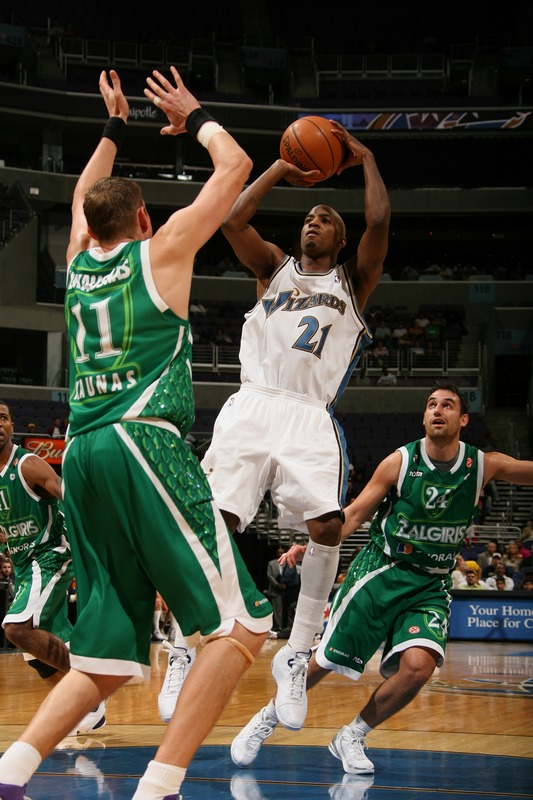
After I got over the initial shock of looking at Zalgiris Kaunas’ uniforms (that’s the team name, not the player, for those who were curious), the first thing I thought of was this, immediately followed by this (just for the color, not for the exact sign). And then I started looking at the strange scaly design running down the sides of the jersey and shorts. Very fish-like, don’t you think?
I’m sure the design is supposed to be really cool and meaningful, but that’s all lost on me. At the moment, I’m pretty sure this basketball team is best represented by green neon signs in the shape of drunken fish. That’s probably not what they were going for, that’s just what the uni’s are telling me. And I’m hungry for Malaysian cuisine. Strange. —Vince
It gives me a Casino like feeling for some reason. Probably the green felt of the tables, but the side panel pattern as well. Weird.
Continuing on the white out discussion from yesterday..
Penn State sells white out tshirts (obviously made my nike) at the student bookstore. Last year it said white out 2006, this year it doesnt have the phrase “white out” on it at all. I think Penn State is actually calling it the white house now, although everyone else still calls it a white out. There’s going to be another white out for the Ohio State game, and there’s a bunch of students that want to bring blue glow sticks to the game to try to be more of a distraction.
And I would have thought that the Green Unis would have reminded you of link
Isn’t Zalgirls like Wizards backwards or something?
Reminds of the old link from the J-League.
For a good part of their existence, they were sponsored by Japan Airlines, and the uniforms had a globe-themed design, as well as an unexplained fallen leaf motif. Alas, the club got a new primary sponsor and now goes with a link.
Oh, and Vince, if you’re ever in NYC and you haven’t gotten over the Malysian craving, you can’t go wrong with link.
Aren’t the Zalgirls opening for Hannah Montana this fall?
Sorry, all I can see in that picture is Donell Taylor’s socks and the sweetness of the new gold trim replacing the copperish trim on the Wizards jersey.
I was at the game and I can tell you that they were very shimmery, leading most of the hecklers to wonder why they had sequins on their uniforms.
The Wizards need new unis, for real. The stripe down one side of the shorts, rather than both, reminds me of that fad from the mid 90s. Of all the NBA teams they (along with Minn.) should be next to get new unis. At least the Hawks have gotten rid of those hideous threads from last year.
Paul ( or anyone else out there )-
Do you know of any places besides ebay that still sell that old school Islanders jersey with the fisherman logo on it? My buddy and I have been looking for one for years.
Lithuanian uniforms have always leaned toward the garish. Those are actually quite tasteful in comparison to the tie-dyes in the ’92 Olympics.
[quote comment=”158933″]Paul ( or anyone else out there )-
Do you know of any places besides ebay that still sell that old school Islanders jersey with the fisherman logo on it? My buddy and I have been looking for one for years.[/quote]
Here’s link of them.
I wonder how many people would notice what’s wrong with link if you wore it around for a day..
I whipped up a quick photoshop of what The Pats unis would look like minus the HORRENDOUS pipping on the side of the jersey and pants….
The Chargers PANTS minus the pointless stripe surrounding the “Bolt”
AND FINALLY scrapping the HIDEOUS Dolphins Orange Alternate jersey and replacing it with an effective Navy Jersey
Next up the Texans new pants and eventually a RE-DESIGN OF THE CARDINALS AND BILLS UNIS.
HOME (NO STRIPES ON PANTS, JUST METALLIC SILVER)
AWAY
ALTERNATE 1 (NO MORE SILER JERSEY)
ALTERNATE 2
CHARGERS WITHOUT THE STRIPE ON PANTS & STRIPES ON SOCKS (NOW HOW MUCH BETTER DOES THAT LOOK?!)
CHARGERS ALTERNATE MINUS STRIPE ON PANT (LOOKING REALLY GOOD!!!)
MIAMI DOLPHINS IN A REFRESHING NEW NAVY ALTERNATE JERSEY
[quote comment=”158956″]I wonder how many people would notice what’s wrong with link if you wore it around for a day..[/quote]
YEAH! I saw this too the other day at Lids, there’s a Cubs, Yankees, & White Sox version as well…I love the OG A’s cap but that right there is just down right wrong!
[quote comment=”158914″]Continuing on the white out discussion from yesterday..
Penn State sells white out tshirts (obviously made my nike) at the student bookstore. Last year it said white out 2006, this year it doesnt have the phrase “white out” on it at all. I think Penn State is actually calling it the white house now, although everyone else still calls it a white out. There’s going to be another white out for the Ohio State game, and there’s a bunch of students that want to bring blue glow sticks to the game to try to be more of a distraction.[/quote]
Would glow sticks even glow under stadium lights?
Whatever happens, the Australian men’s basketball team had better not adopt the skintight unitard that the women wear
I whipped up a quick photoshop of what The Pats unis would look like minus the HORRENDOUS pipping on the side of the jersey and pants….
The Chargers PANTS minus the pointless stripe surrounding the “Bolt”
AND FINALLY scrapping the HIDEOUS Dolphins Orange Alternate jersey and replacing it with an effective Navy Jersey
Next up the Texans new pants and eventually a RE-DESIGN OF THE CARDINALS AND BILLS UNIS.
HOME (NO STRIPES ON PANTS, JUST METALLIC SILVER)
AWAY
ALTERNATE 1 (NO MORE SILER JERSEY)
ALTERNATE 2
CHARGERS WITHOUT THE STRIPE ON PANTS & STRIPES ON SOCKS (NOW HOW MUCH BETTER DOES THAT LOOK?!)
CHARGERS ALTERNATE MINUS STRIPE ON PANT (LOOKING REALLY GOOD!!!)
MIAMI DOLPHINS IN A REFRESHING NEW NAVY ALTERNATE JERSEY
I think the chargers white jersey would look better if it was paired with the white pants that go with the alternate.
Didn’t looking for a photo on this but the Army- Georgia Tech game is an eyesore. Ga Tech has gold jersey- white pants and Army is wearing white jersey-gold pants. It’s so hard to follow clearly.
[quote comment=”158963″][quote comment=”158914″]Continuing on the white out discussion from yesterday..
Penn State sells white out tshirts (obviously made my nike) at the student bookstore. Last year it said white out 2006, this year it doesnt have the phrase “white out” on it at all. I think Penn State is actually calling it the white house now, although everyone else still calls it a white out. There’s going to be another white out for the Ohio State game, and there’s a bunch of students that want to bring blue glow sticks to the game to try to be more of a distraction.[/quote]
Would glow sticks even glow under stadium lights?[/quote]
yea i was wondering that too, it might make a difference if everyone had a glowstick but i dont think its gonna work
I’m not a fan of any of those teams, but very nice work on those alt mock-ups, Nate, especially MIA, much easier on the eyes. It’s too bad that they never ask what the fans think, or even consider good taste for that matter.
I enjoy the Scales on the side panels, it is clever, but not too tacky.
I’m not a fan of any of those teams, but very nice work on those alt mock-ups, Nate, especially MIA, much easier on the eyes. It’s too bad that they never ask what the fans think, or even consider good taste for that matter.
If your thanking me for the phtotshop unis, I didn’t do them. Pretty Boy Paulie did.
Just announced on WVU’s radio pre-game show….WVU will be breaking out the link jersey’s for the first time since 1964 today. Presumably with their blue pants (kinda Cal like, no?)…
Having only seen the replica’s of these jersey’s for sale around here I will say I am NOT a fan. Just another excuse for Nike to milk money out of diehard fans who’ll buy ANYTHING with a flying WV on it.
And they look horrible too!
/will retract this statement if the actual onfield jersey’s look good. but, I don’t think that’s going to happen.
i was looking around on the internet and I found an awesome uniform designing machine.
link
link
OSU TO WEAR DECAL FOR FORMER CAPT
ITS THE GUY FROM DALLAS IN THE COMA
When I was in Lithuania a couple years I looked everywhere for a national team basketball jersey. There were none to be found, for any basketball team, really. I’m going back to Vilnius in a couple weeks, I wonder if that will have changed.
I was checking around the u of m football roster and found this guy.
logan u’u
link
[quote comment=”158956″]I wonder how many people would notice what’s wrong with link if you wore it around for a day..[/quote]
So, is this the link of baseball caps?
[quote comment=”158956″]I wonder how many people would notice what’s wrong with link if you wore it around for a day..[/quote]
That hat reminds me of one my Dad bought in Italy about 20 years ago. It was the A’s color scheme, but had the Giants ‘SF’ on it. I’ve always wondered if it was a screwup at the factory, and instead of scrapping them they shipped them overseas. Sort of like all the kids in Third World Nations wearing Buffalo Bills Super Bowl Championship T-Shirts.
[quote comment=”159002″][quote comment=”158956″]I wonder how many people would notice what’s wrong with link if you wore it around for a day..[/quote]
So, is this the link of baseball caps?[/quote]
“link … link … link … link?”
(Sorry no uni-related content; just couldn’t resist …)
I was watching the Wisconsin/Northern Illinois game and during a commercial on the Big Ten Network they showed a shot of a Michigan basketball game and some of the students had a yellow shirt with the words “Maize Out” on them. I just thought this would be good follow up from yesterday’s comments. It kind of seems that every team does some sort of “color out” every once in a while.
Even better than the green jerseys and the gold pants . . . Notre Dame is wearing some sweet sock stripes with its throwbacks.
as I mentioned earlier, WVU is breaking out the gold jerseys for the first time since the 60’s today and that they’d probably pair them with the blue pants.
I was right.
They don’t look bad per se….it just looks way to much like Cal for my taste.
And, to expand on an earlier comment…THIS is the link to hit up;
link
totally customizable football, basketball AND hockey jerseys.
Good stuff…and a hell of fun way to kill some time getting creative.
[quote comment=”158991″]http://www.dispatch.com/live/content/football/stories/2007/10/20/osufb_notes20.ART_ART_10-20-07_C5_7Q882LU.html?sid=101
OSU TO WEAR DECAL FOR FORMER CAPT
ITS THE GUY FROM DALLAS IN THE COMA[/quote]
The Buckeyes are currently wearing three different memorial number decals on their helmets.
#23 for Springs
#24 for Tyson Gentry, a walk-on punter who’s recovering from a spinal cord injury
#32 for I don’t remember who.
Three’s not very many, but can anybody think of an instance when a team’s worn more?
The announcers in the USC-Notre Dame game just said that although Joe McKnight wears #4 normally, he wears #40 when he’s on punt coverage (presumably because there is another #4 on the punt coverage team). Does anybody know how he switches numbers? His jersey looks pretty tight to his pads, so I would imagine it would be sort of a pain to take it off and put another one on.
I have a mental image of the trainers just velcro-ing an “0” to his jersey, but I don’t think that’s how they do it…
Wow I hadn’t realized that Notre Dame was the 1994 Oregon Ducks
D’oh… make that “velcroing a ‘0’”… I had originally written “an extra ‘0’” but deleted the extra when I realized he didn’t have any zeroes on his jersey to start with.
The Pitt Panthers wore their link today in their upset over cincy for the first time in a few years.
Killer socks on ND, but wow there are far too many pairs of yellow pants on that field.
Ugly jerseys for ND today. Should have stuck with their usual green jerseys.
The USC-Notre Dame game has become unwatchable (not just because of the ND offense). Both teams pants are way too yellow. I like the throwbacks being worn by ND, but I’d rather watch it in black and white so i dont go blind.
link
Heres to hoping this never catches on in the states
link
And yes that is the AOL logo on the helmets
[quote comment=”159006″][quote comment=”158956″]I wonder how many people would notice what’s wrong with link if you wore it around for a day..[/quote]
That hat reminds me of one my Dad bought in Italy about 20 years ago. It was the A’s color scheme, but had the Giants ‘SF’ on it. I’ve always wondered if it was a screwup at the factory, and instead of scrapping them they shipped them overseas. Sort of like all the kids in Third World Nations wearing Buffalo Bills Super Bowl Championship T-Shirts.[/quote]
link sells baseball hats in every color scheme imaginable, not too hard to find.
I thought that FSU was going all black versus Miami???
link
[quote comment=”159045″]I thought that FSU was going all black versus Miami???
link[/quote]
from yesterday:
Florida State will be wearing their black uniforms against Duke next weekend. …
Can’t quite make out that Michael Guilford memorial decal that Florida is wearing on the back of its helmets. It doesn’t appear a simple sticker with just his number or initials.
[quote comment=”159047″][quote comment=”159045″]I thought that FSU was going all black versus Miami???
link[/quote]
from yesterday:
Florida State will be wearing their black uniforms against Duke next weekend. … [/quote]
10-4… thanks David. Just got my weekends messed up.
The Buckeyes are currently wearing three different memorial number decals on their helmets.
#23 for Springs
#24 for Tyson Gentry, a walk-on punter who’s recovering from a spinal cord injury
#32 for I don’t remember who.
Three’s not very many, but can anybody think of an instance when a team’s worn more?
I’m an idiot, the third number is the players number.
The Wizards need new unis, for real. The stripe down one side of the shorts, rather than both, reminds me of that fad from the mid 90s. Of all the NBA teams they (along with Minn.) should be next to get new unis. At least the Hawks have gotten rid of those hideous threads from last year.
The Wizars asymmetric uniform is officially the most underrated jersey in the NBA. Clean, classy with some flavor for the team nickname. It’s perfect.
Watching the Kansas-Colorado game; couldn’t help but notice that KU’s trajan font hasn’t made its way onto either the front or rear bumpers of the helmets or the players’ rear nameplates.
The Wizards need new unis, for real. The stripe down one side of the shorts, rather than both, reminds me of that fad from the mid 90s. Of all the NBA teams they (along with Minn.) should be next to get new unis. At least the Hawks have gotten rid of those hideous threads from last year.
The Wizards white and blue asymmetric uniforms are officially the most underrated jerseys in the NBA. Clean, classy with some flavor for the team’s own nickname. It’s perfect, really. Tailor, sorry.
[quote comment=”159042″][quote comment=”159006″][quote comment=”158956″]I wonder how many people would notice what’s wrong with link if you wore it around for a day..[/quote]
That hat reminds me of one my Dad bought in Italy about 20 years ago. It was the A’s color scheme, but had the Giants ‘SF’ on it. I’ve always wondered if it was a screwup at the factory, and instead of scrapping them they shipped them overseas. Sort of like all the kids in Third World Nations wearing Buffalo Bills Super Bowl Championship T-Shirts.[/quote]
link sells baseball hats in every color scheme imaginable, not too hard to find.[/quote]
Here is the link some are cool but now they need matching jerseys!
Classic USFL matchup on ESPN Classic right now, from 1983: Chicago Blitz vs. Arizona Wranglers. These are the two teams that switched places the next year (i.e., one became the other and vice-versa); Arizona got the better of that deal, both performance-wise and uni-wise; their link were one of the league’s best. Only the outstanding copper-shelled helmet and branding-iron logo carried over from link
The link uniforms look rather like the link of that time, with silver helmets and pants instead of white; their unis were also somewhat better in link
Some noticeable details on the broadcast:
– The jerseys have sleeves! In fact, they go all the way down to the elbow.
– Very large shoulder pads, even on skill-position players.
– The numerals on the jerseys seem taller proportionately than the ones we see today.
– Facemask bars are much thicker, on both on the Schutt and Riddell models, than what we see today. The familiar Schutt design was still a year or two away. (I played high school football from 1984-87; we had a good many of the “thicker” Schutt cages in ’84, but I don’t think we had any of the “thinner” versions until ’86.)
– Not visible in any of the linked photos, the Wranglers have the Arizona state flag on the backs of their helmets.
– Both teams have very cool striped socks; Mr. Lukas would approve.
Put on ESPN Classic and check it out.
It seems that USC’s Mark Sanchez’s mouthguard is in the colors of the Mexican flag, it even has the coat of arms in middle.
Looks like Oregon is trotting out the All White look…including helmets.
Man, Oregon would actually look pretty good if they had just gone with the black pants a la Holiday Bowl 2005 and skipped the long white socks. Instead, we’ve got a whiteout in Seattle
Good grief – are the Ducks wearing pajamas? Horrific…
what’s up with #5 on michigan st. not having a nameplate?
Was watching the Temple game today, and the nose bumpers said finish on them. Sorry No photo
Andy from KC,
I get your posting…Linger longer.
Indians pitcher had a cardboard tag hanging out from under the collar of his jersey while on the mound, and the silver holograhpic sticker under the bill of his cap.
Paul, show these guys how to dress..looks like a game 7 for sure.
First, Carmona’s tag is visible on every close up on him. Sorry no screen shot but it was like this in his game vs. the Yankees and also Game 2 of this series vs. the Red Sox.
[quote comment=”158957″]I whipped up a quick photoshop of what The Pats unis would look like minus the HORRENDOUS pipping on the side of the jersey and pants….
The Chargers PANTS minus the pointless stripe surrounding the “Bolt”
AND FINALLY scrapping the HIDEOUS Dolphins Orange Alternate jersey and replacing it with an effective Navy Jersey
Next up the Texans new pants and eventually a RE-DESIGN OF THE CARDINALS AND BILLS UNIS.
HOME (NO STRIPES ON PANTS, JUST METALLIC SILVER)
AWAY
ALTERNATE 1 (NO MORE SILER JERSEY)
ALTERNATE 2
CHARGERS WITHOUT THE STRIPE ON PANTS & STRIPES ON SOCKS (NOW HOW MUCH BETTER DOES THAT LOOK?!)
CHARGERS ALTERNATE MINUS STRIPE ON PANT (LOOKING REALLY GOOD!!!)
MIAMI DOLPHINS IN A REFRESHING NEW NAVY ALTERNATE JERSEY[/quote]
Secondly, shouldn’t the outline surrounding the bolt on the shoulders be removed then too for continuity’s sake?
[quote comment=”158956″]I wonder how many people would notice what’s wrong with link if you wore it around for a day..[/quote]
ACK! The Atlanta A’s. Or Oakland Braves.
And, to expand on an earlier comment…THIS is the link to hit up;
**CLICK**
totally customizable football, basketball AND hockey jerseys.
Good stuff…and a hell of fun way to kill some time getting creative.
That’s basically what I linked to…..oh well.
Looks like Trot Nixon is wearing earplugs.
Watching LSU-Auburn on ESPN, the mandatory Aflac trivia question was:
What school(s) other than LSU primarily wear white jerseys at home?
Answer: none.
Is this true?
Watching LSU-Auburn on ESPN, the mandatory Aflac trivia question was:
What school(s) other than LSU primarily wear white jerseys at home?
Answer: none.
Is this true?
Texas needs to. we always loose when we’re wearing burnt orange.
[quote comment=”159010″]I was watching the Wisconsin/Northern Illinois game and during a commercial on the Big Ten Network they showed a shot of a Michigan basketball game and some of the students had a yellow shirt with the words “Maize Out” on them. I just thought this would be good follow up from yesterday’s comments. It kind of seems that every team does some sort of “color out” every once in a while.[/quote]
Maize outs (and, less frequently, blue outs) are common at UM football and basketball games.
I keep trying to post a link but it won’t post. I was reading Friday’s blog and there was a 1942 picture showing an NFL referee wearing a beret/flat cap. The NFL brought those back in 1994 when they had their Throwback games. The 1994 version had the NFL’s 75th Anniversary logo on the back.
heres a better shot of link
[quote comment=”159093″][quote comment=”159010″]I was watching the Wisconsin/Northern Illinois game and during a commercial on the Big Ten Network they showed a shot of a Michigan basketball game and some of the students had a yellow shirt with the words “Maize Out” on them. I just thought this would be good follow up from yesterday’s comments. It kind of seems that every team does some sort of “color out” every once in a while.[/quote]
Maize outs (and, less frequently, blue outs) are common at UM football and basketball games.[/quote]
and hockey games
[quote comment=”159096″]I keep trying to post a link but it won’t post. I was reading Friday’s blog and there was a 1942 picture showing an NFL referee wearing a beret/flat cap. The NFL brought those back in 1994 when they had their Throwback games. The 1994 version had the NFL’s 75th Anniversary logo on the back.[/quote]
link
[quote comment=”159106″][quote comment=”159096″]I keep trying to post a link but it won’t post. I was reading Friday’s blog and there was a 1942 picture showing an NFL referee wearing a beret/flat cap. The NFL brought those back in 1994 when they had their Throwback games. The 1994 version had the NFL’s 75th Anniversary logo on the back.[/quote]
link
I loved link uniforms today! The only thing wrong is the stupid armpit patches. They serve no purpose and look ugly.
[quote comment=”159081″]First, Carmona’s tag is visible on every close up on him. Sorry no screen shot but it was like this in his game vs. the Yankees and also Game 2 of this series vs. the Red Sox.
[quote comment=”158957″]I whipped up a quick photoshop of what The Pats unis would look like minus the HORRENDOUS pipping on the side of the jersey and pants….
The Chargers PANTS minus the pointless stripe surrounding the “Bolt”
AND FINALLY scrapping the HIDEOUS Dolphins Orange Alternate jersey and replacing it with an effective Navy Jersey
Next up the Texans new pants and eventually a RE-DESIGN OF THE CARDINALS AND BILLS UNIS.
HOME (NO STRIPES ON PANTS, JUST METALLIC SILVER)
AWAY
ALTERNATE 1 (NO MORE SILER JERSEY)
ALTERNATE 2
CHARGERS WITHOUT THE STRIPE ON PANTS & STRIPES ON SOCKS (NOW HOW MUCH BETTER DOES THAT LOOK?!)
CHARGERS ALTERNATE MINUS STRIPE ON PANT (LOOKING REALLY GOOD!!!)
MIAMI DOLPHINS IN A REFRESHING NEW NAVY ALTERNATE JERSEY[/quote]
Secondly, shouldn’t the outline surrounding the bolt on the shoulders be removed then too for continuity’s sake?[/quote]
I say keep the outline on the shoulder “bolt”. It doesn’t look bad (in my opinion). The Pants and the Navy socks are the only thing bothering me from the Chargers unis.
Regarding NCAA teams wearing white at home: LSU is now the only team that does it. Georgia Tech did it for a while when the NCAA started allowing teams to do it (again), but they’ve since gone to yellow jerseys at home. Interestingly, Tech played LSU in what was then known as the Peach Bowl a few years back. Tech was still wearing white at home, and they were the home team for that game, so LSU had to wear purple. LSU won that game. That may have been the last time GT wore white as the home team.
[quote comment=”159076″]what’s up with #5 on michigan st. not having a nameplate?[/quote]
thats MSU WR Devin Thomas. He was also wearing some tape across his thigh to cover a rip in his pants from early in the game.
For their home opener tonight in the AHL, Hershey wore 70th anniversary sweaters. They auctioned them off after the game for charity for CRAZY money. I think the cheapest went for like $1300.
TOM IZZO with some interesting Midnight Madness attire…. the event had a “300” theme:
link
[quote comment=”159053″]Can’t quite make out that Michael Guilford memorial decal that Florida is wearing on the back of its helmets. It doesn’t appear a simple sticker with just his number or initials.[/quote]
I still haven’t found a pic, but the sticker does say Guilford’s nickname of “Sunshine” on it.
link
[quote comment=”159080″]Indians pitcher had a cardboard tag hanging out from under the collar of his jersey while on the mound, and the silver holograhpic sticker under the bill of his cap.
Paul, show these guys how to dress..looks like a game 7 for sure.[/quote]
Carmona’s been doing this all season, at least, and I seem to remember him doing it last year as well.
[quote comment=”159064″][quote comment=”159042″][quote comment=”159006″][quote comment=”158956″]I wonder how many people would notice what’s wrong with link if you wore it around for a day..[/quote]
That hat reminds me of one my Dad bought in Italy about 20 years ago. It was the A’s color scheme, but had the Giants ‘SF’ on it. I’ve always wondered if it was a screwup at the factory, and instead of scrapping them they shipped them overseas. Sort of like all the kids in Third World Nations wearing Buffalo Bills Super Bowl Championship T-Shirts.[/quote]
link sells baseball hats in every color scheme imaginable, not too hard to find.[/quote]
Here is the link some are cool but now they need matching jerseys![/quote]
How come LIDS always uses the old Mariners logo for those “Twisted” caps, but current logo for everry other team?
[quote comment=”159165″][quote comment=”159064″][quote comment=”159042″][quote comment=”159006″][quote comment=”158956″]I wonder how many people would notice what’s wrong with link if you wore it around for a day..[/quote]
That hat reminds me of one my Dad bought in Italy about 20 years ago. It was the A’s color scheme, but had the Giants ‘SF’ on it. I’ve always wondered if it was a screwup at the factory, and instead of scrapping them they shipped them overseas. Sort of like all the kids in Third World Nations wearing Buffalo Bills Super Bowl Championship T-Shirts.[/quote]
link sells baseball hats in every color scheme imaginable, not too hard to find.[/quote]
Here is the link some are cool but now they need matching jerseys![/quote]
How come LIDS always uses the old Mariners logo for those “Twisted” caps, but current logo for everry other team?[/quote]
They also used the old Brewers Pepsi/ball-in-glove logo.