[Editor’s Note: I was out of town with no internet access for the past three days and am still catching up on stuff, so Vince is gonna pinch-hit for today’s main entry. He’s got a really interesting topic, so check that out, and then I’ll meet you further down with today’s Ticker and other stuff. — Paul]
By Vince Grzegorek
A couple of weeks ago, the “hidden arrow” in the FedEx logo started a discussion in the comments section about sports-related design that make creative use of negative space or figure/ground ambiguity, so I asked Paul if I could whip up an entry devoted to that topic, and he readily agreed.
Judging by some of the posts from that initial discussion, more than a few people were unaware of the FedEx arrow (look in between the e and the x), so we’ll start with a few easy examples. Take the Big Ten logo, for example, which clearly displays the number “11” flanked around the letter “T” to acknowledge that the conference actually has 11 teams. Subtle? No, it practically smacks you in the face with the obvious. Give the Big Ten credit for trying to be creative because, like this logo, it ties together the name with some extra information about the product. It might take you a second to name all the teams in the Big Ten, but you certainly know that there are eleven of them.
But that’s the whole point of some of these more creative designs — to give you a little more information, to make the design mean something more. But not every example is so easy to spot. At first glance, the old Hartford Whalers logo clearly shows a whale’s tail and a green W. Look closer, though, and you’ll see that the white space forms an H, for Hartford. Another example: the Iowa Hawkeyes logo, where you can kind of see a lowercase i made up by the eye and jowl of the bird (although this is actually a repurposing of positive space) — a little too sloppy to be impressive to me, but still better than some uses of negative space by other organizations.
Then there are designs that aren’t necessarily built around negative space but still have hidden, incognito elements. One of the best examples, in my humble opinion, is the old ball-in-glove Milwaukee Brewers logo, which initially looks like just a ball in a mitt. On second glance, though — or at least when someone tells you what to look for — you can see the lowercase letters m and b, for Milwaukee Brewers. Another fantastic example is the old Vancouver Canucks stick and rink logo with the stick creating the letter C in the ice.
The Washington State logo that creatively forms a cougar’s head with a stylized “W”, “S”, and “U”, and the Falcons’ logo that forms the letter “F” fall into a separate but equally interesting category of design. [My own favorite for typographic cleverness is the completely ingenious Sun Microsystems logo, one of the last and best designs created by the late, great Paul Rand. — PL] Feel free to post any designs that I forgot to mention in the comments section, along with any corrections/additions to my very basic understanding of graphic design.
And now over to Paul, fresh off his Finger Lakes weekend getaway…
Help Wanted: If anyone out there is an attorney with specific expertise in internet and intellectual property issues, or if you know someone who fits that description, please get in touch (don’t worry, nobody’s suing me and the site isn’t in any sort of trouble — just a private matter). Thanks.
Uni Watch News Ticker: I’ve been saying for months now that the Mets were a flawed team that would probably be picked off in the first round of the playoffs. Turns out I was half-right. ”¦ According to a small item on this page, many of the Rangers are so unhappy with the NHL’s new slim-fit unis that they’ve asked for oversized jerseys (with thanks to Jesse Spector). … Still more complaints about the new NHL jerseys can be found by scrolling down to the “Guaranteed to Tear” section of this page ”¦ Check out the striped shoulder yokes worn by Ray High School in Corpus Christi, Texas (great find by Warren Thompson). ”¦ According to an item on this page (scroll down the “The Red Tide” section), several Texas Rangers players are lobbying for the team to restore red as the club’s primary color for 2009, as was the case for much of the 1990s (with thanks to Jason Elliot). ”¦ Cool weekend for the Astros, who honored Craig Biggio’s final games by dressing like this on Friday and like this on Saturday. Plus he played catcher, complete with a personalized chest protector and uni-numbered mask. Note the circa-’97 Jackie Robinson sleeve patch, too. ”¦ Susan Freeman attended the Friday Astros game and notes that the giveaway throwback T-shirt was all wrong (incorrect stripe pattern, and the stripes should’ve gone down through the sleeves). She also reports, “I spoke with Woody Williams about how sweet the unis were, and he said, ‘Yeah, these are way better. I am so sick of those pinstripes!’ ” ”¦ Two items of note from yesterday’s Lions/Bears game (both courtesy of Scott Yager): 1) Yikes. 2) What’s the story here? Like, is the jersey bolted to his pants or what? ”¦ Here’s a purple uni even I can love. Can’t they just go back to that design? ”¦ High-larity. ”¦ A trader on the Chicago Mercantile Exchange apparently likes to wear a vintage football helmet (with thanks to John Muir). ”¦ Want to knit someone a football-related scarf, sweater, or whatever? Knitting blogger Holly Bee has matched each NFL team’s colors to specific yarns (as forwarded by John Kailukaitis). ”¦ No photo, but I’m told that Rashad Johnson’s “9” decal — the one that was knocked off his helmet a few weeks back — was still missing as of last Saturday. ”¦ Ken Clark was doing some research on his hometown of Tustin, California, and found this great 1926 photo of the local high school baseball team and this 1924 shot of the school’s football team. ”¦ Not sure if this has been discussed elsewhere, but John McClanahan sent me a note on Friday about LSU’s special Katrina uniforms, which were worn on Saturday: “I have an equipment manager friend who tells me that when LSU got the jerseys in, all of the single-digit players’ jerseys had a zero in front — 01, 02, etc. As of Thursday night, replacements for these jerseys had not arrived.” If the replacements hadn’t arrived in time for Saturday, the team was supposedly prepared to wear its regular jerseys with the white helmets and pants. But, obviously, that turned out not to be necessary. ”¦ Hey, speaking of that photo: Vince says, “Look at the tape on the LSU player’s hands. The right one has a horseshoe and the number 9, and it looks like the left hand has another horseshoe and another number. Is there any chance he’s honoring or paying tribute to Anthony McFarland, number 92 of the Colts, who’s currently on injured reserve but also holds numerous defensive records at LSU?” ”¦ Also from Vince: a very odd rear-jersey design; USF kicker Delbert Alvarado’s haircut message; tons of great White Sox photos here; Omar Vizquel’s orange shoelaces; and “What’s worse, Charlie Manuel in a wet T-shirt, or that Majestic logo on his belly?'” ”¦ We’ve talked a lot about MLB players wearing flag designs on their equipment. But Stuart Greenlee notes that Giants pitcher Travis Blackey has the flag of his native Australia tattooed on his forearm. ”¦ Here’s a facet of the pink knapsack ritual you might not be aware of: At the end of the season, the rookies burn the accursed thing (yet another contribution from Vince). … Josh Towers wore this cap yesterday, while the rest of the Blue Jays wore this one. … I’ll be discussing the new NHL unis on XM’s “NHL Home Ice” show this Wednesday, 11:05 a.m. eastern.
Click on my name to check out my NFL Uniform Tournament! Make sure to vote for all 16 match-ups in round 1. Thanks!
That was a great tribute to Craig Biggio this past weekend by wearing the throwbacks and by letting him play catcher one last time.
Perhaps the Big 10 got their inspiration from link.
[quote comment=”150510″]What’s the story link? Like, is the jersey bolted to his pants or what?[/quote]
Those are indeed snaps and the pants have the matching set to keep the jersey “tucked” in. I remember many years ago during a Houston Oilers game the announcers talked about such a thing, they may have been talking about Bruce Matthews.
Awesome topic!
The Fed Ex logo is one the best corporate logos ever designed.
The link airlines logo is one of my favorites. The logo was designed to reflect a clever, yet split apart, N and W (north west) as well as the location pointed to by the red triangle in the upper left corner. The redesign lost the charm of the original.
(I’m a gradute of the School Of Visula Arts and have been a professional in the field of promotional marketing as a Creative Concept Director for almost 20 years)
…another cool logo is the link.
The logo at first glance appears to show an eagle in motion. As you look at the head of the eagle you can see a hand holding an envelope (notice the thumb in blue which makes up the eagles beak) the white head of the eagle highlights what appears top be a envleope. The thumb somewhat outlines the closed flap of the envelope.
ok, ok… My last “cool logo”
The patch worn by link astronauts is beautiful in it’s simplicity.
The patch’s outline reflects that of the Apollo Capsule.
The flights path (from the earth to the moon) traces a red outline of the #8.
The triangular shape of the insignia symbolizes the shape of the Apollo command module. It shows a red figure 8 looping around the earth and moon representing the mission number as well as the circumlunar nature of the mission. On the red number 8 are the names of the three astronauts.
The initial design of the insignia was developed by Jim Lovell. Lovell reportedly sketched the initial design while riding in the backseat of a T-38 flight from California to Houston, shortly after learning of the re-designation of the flight to become a circumlunar mission.
Not a bad design for an untrained artist… Later in the Apollo program, NASA started designing the logos and the beagn to look no different than what passes for other government insignias.
Isn’t the Washington State logo a “W”, “S” and “T” for Washington St? I always thought the little dot at the bottom was the lower column of the “T” and the part Vince pointed out as the “U” was the top bar of the “T”? No?
how about the old Expos logo? How many letters can you see in it? M? C? B? E?
While watching the Dallas Cowboys play yesterday, I noticed Julius Jones of the Cowboys wearing a helmet I have never seen before.
The helmet he was wearing appeared to be a Schutt helmet, but it was not a DNA or the new ION.
The helmet looked like a cross between an Air-advantage, a DNA, and an ION helmet.
The helmet had a standard Pro-Guard facemask on it that is used for the Air-advantage helmet.
Any information on this helmet from anyboby?
Paul – drop me an email about your intellectual property matter – I’m a partner in a very good firm that does a lot of that work.
Carrying over from yesterday about the Saints and their retired numbers: The numbers of Archie Manning (8) and Rickey Jackson (57) are not retired by the team. They, rather, hang in the rafters of the Superdome as part of the Dome’s “wall of honor,” alongside banners for Dave Dixon (the businessman who dreamed up the Dome), Eddie Robinson (the Grambling football coach who coached in the Bayou Classic, held in the Dome), Pete Maravich, Jim Finks (the Saints GM who built the franchise into a winner the first time) and possibly some other folks (Pope John Paul II may be up there, and Jim Mora should be, though I don’t think he is).
Atkins and Taylor’s numbers are officially retired by the team, as per the NFL Website. Their numbers don’t hang in the Dome because they never played there.
Does anyone know when / where the auction for the LSU / Tulane uniforms is happening? Would love to get one of those jerseys or a helmet if they’re being auctioned off.
One last Saints/Superdome post: Sam Mills’s name was supposed to be added to the Superdome wall, but apparently those plans were put off link. I don’t know if the Saints ever got around to rescheduling.
HA HA HA HA HA HA HA HA 7 Game Lead, 17 to go…to one out…
oh but the disadvantaged will look stylish in there overhyped, out before it was actual hats though…
link
I have to say it may make NY’er forget our choke to Red Sux in 04!
That link looks awesome!
Another team that wore it recently is Rutgers. Last year when RU was finally playing well and we were talking about their great uniforms (and terrible team) of the late 1990s, we found photos of their link, which look great, but before that, around 1995-96 or so, they used this “Gothic” font. I love it.
Some other examples are link and link.
This is a standard NCAA font, but almost nobody uses it.
Also, when the 1997 Cubs wore ~1910 deep blue throwback uniforms for their inaugural interleague series with the White Sox, they needed to put numbers on the backs, and they used this font. I would have paid good money for one of those jerseys.
I think the White Sox also used it when they had to put numbers on their original 1917 throwback jersey that they wore when Comiskey Park closed around 1990. This was when throwbacks and alternates were just about unheard-of.
You forgot about the Minnesota Wild logo in the shape of a bears head. If you look at it link you can see the shape. It is facing to the left with the river forming its mouth.
[quote comment=”150521″]…another cool logo is the link.
The logo at first glance appears to show an eagle in motion. As you look at the head of the eagle you can see a hand holding an envelope (notice the thumb in blue which makes up the eagles beak) the white head of the eagle highlights what appears top be a envleope. The thumb somewhat outlines the closed flap of the envelope.[/quote]
Really cool topic today. But I’m not seeing this one, I dont doubt that its there but I cant trick my mind into seeing it…
[quote]I’ll be discussing the new NHL unis on XM’s “NHL Home Ice” show this Wednesday, 11:05 a.m. eastern.[/quote]
Some of us don’t have a receiver with the record feature. Will you, or some other fine person, be supplying a clip to the masses?
i really do love those old viking unis.
i mean, just seeing them make me think of fran t. just scrambling away…
I always liked this link for the university of alaska-southeast…the whale fluke in the “A” obviously
Current link logo takes a cue from the Canucks.
The old link logo was a 3D ‘L’ that, with a stretch of the imagination, could possess some ‘V’-like qualities.
The Tiger Hawk logo actually spells “Fry” as in Hayden Fry, the legendary coach who helped design the logo.
I think the FIA was still using link as a logo when the Big Ten added a team. The newer F1 logo is great though.
[quote comment=”150544″][quote comment=”150521″]…another cool logo is the link.
The logo at first glance appears to show an eagle in motion. As you look at the head of the eagle you can see a hand holding an envelope (notice the thumb in blue which makes up the eagles beak) the white head of the eagle highlights what appears top be a envleope. The thumb somewhat outlines the closed flap of the envelope.[/quote]
Really cool topic today. But I’m not seeing this one, I dont doubt that its there but I cant trick my mind into seeing it…[/quote]
I’m really not seeing a thumb either, I even brought over a coworker to check it out. If it was their intention to make it look that way, then they did a really poor job of it. All I see is the eagle.
oh.
did anyone else mention that the celtics have updated their white jerseys at all?
i saw some pix in the globe of the media photo session and it looks like the striping around the collar is different and there’s a boarder to the words/numbers as well now.
hard to tell, its a black and white pic…
The horseshoe with the number 9 is not a tribute to Anthony McFarland. It is the greek letter “omega”, which is the symbol for the National Black Fraternity, Omega Psi Phi. You’ll notice that many players that are in Omega have a brand on their arms. The Omega symbol is also referenced by Steve McNair whenever he throws a TD pass, he “throws up the hooks”, link I can’tfind any off the top of my head, but MANY NFL players have the Omega symbol branded on their arm.
This was mentioned late Saturday in the comments, but I thought it was interesting enough to mention again.
For Saturday’s middleweight title fight, Kelly Pavlik, a Youngstown, Ohio native, showed off some link while Jermain Taylor, from Little Rock, featured the link.
Expos
you will see the M … E … B for Montreal Expos Baseball
link
[quote comment=”150546″][quote]I’ll be discussing the new NHL unis on XM’s “NHL Home Ice” show this Wednesday, 11:05 a.m. eastern.[/quote]
Some of us don’t have a receiver with the record feature. Will you, or some other fine person, be supplying a clip to the masses?[/quote]
I don’t subscribe to XM myself. But I’ll see if they can provide a web-archived clip.
Minnesota link just can’t seem to get anything link.
Except for link of course.
And this, mind you, is coming from a die hard Packer fan! It was great watching those two classic uni’s against each other yesterday. And, of course, I am glad the came out victorious.
link
[quote comment=”150554″]The horseshoe with the number 9 is not a tribute to Anthony McFarland. It is the greek letter “omega”, which is the symbol for the National Black Fraternity, Omega Psi Phi. You’ll notice that many players that are in Omega have a brand on their arms. The Omega symbol is also referenced by Steve McNair whenever he throws a TD pass, he “throws up the hooks”, link I can’tfind any off the top of my head, but MANY NFL players have the Omega symbol branded on their arm.[/quote]
MJ has an Omega tattoo over his heart. Not too clear here but it’s the best picture I could find
[quote comment=”150559″]Minnesota link just can’t seem to get anything link.
Except for link of course.
And this, mind you, is coming from a die hard Packer fan! It was great watching those two classic uni’s against each other yesterday. And, of course, I am glad the came out victorious.
link[/quote]
*I am glad we came out victorious
link
In that link, it is cool that a couple of the guys aren’t wearing their jersey so you can also see what the shirt with the striped sleeves looks like. It actually seems pretty similar to their link.
[quote comment=”150554″]The horseshoe with the number 9 is not a tribute to Anthony McFarland. It is the greek letter “omega”, which is the symbol for the National Black Fraternity, Omega Psi Phi. You’ll notice that many players that are in Omega have a brand on their arms. The Omega symbol is also referenced by Steve McNair whenever he throws a TD pass, he “throws up the hooks”, link I can’tfind any off the top of my head, but MANY NFL players have the Omega symbol branded on their arm.[/quote]
It may be representing the Omega Psi Phi fraternity, but the “hooks” that are being shown look more like the Greek letter Psi…
ed
[quote comment=”150564″][quote comment=”150554″]The horseshoe with the number 9 is not a tribute to Anthony McFarland. It is the greek letter “omega”, which is the symbol for the National Black Fraternity, Omega Psi Phi. You’ll notice that many players that are in Omega have a brand on their arms. The Omega symbol is also referenced by Steve McNair whenever he throws a TD pass, he “throws up the hooks”, link I can’tfind any off the top of my head, but MANY NFL players have the Omega symbol branded on their arm.[/quote]
It may be representing the Omega Psi Phi fraternity, but the “hooks” that are being shown look more like the Greek letter Psi…
ed[/quote]
…but the original photo is indeed an Omega.
ed
OH MY GOD!! The University of Minnesota unis Saturday were absolutely hideous!!! They should be forced to forfeit any game in which they come out with those things on.
[quote comment=”150559″]Minnesota link just can’t seem to get anything link.
Except for link of course.
And this, mind you, is coming from a die hard Packer fan! It was great watching those two classic uni’s against each other yesterday. And, of course, I am glad the came out victorious.
link[/quote]
link?!
One of my favorite graphics is the cover of The Police’s “Ghost in the Machine” record. On the face of it, it appears to be just a bunch of random Chinese looking symbols. On further reflection, it is the digital “faces” of each of the band members.
link.
[quote comment=”150521″]…another cool logo is the link.
The logo at first glance appears to show an eagle in motion. As you look at the head of the eagle you can see a hand holding an envelope (notice the thumb in blue which makes up the eagles beak) the white head of the eagle highlights what appears top be a envleope. The thumb somewhat outlines the closed flap of the envelope.[/quote]
I’m sorry. I see what you are saying, but I’m not buying the hand-and-the-envelope thing.
[quote comment=”150568″][quote comment=”150564″][quote comment=”150554″]The horseshoe with the number 9 is not a tribute to Anthony McFarland. It is the greek letter “omega”, which is the symbol for the National Black Fraternity, Omega Psi Phi. You’ll notice that many players that are in Omega have a brand on their arms. The Omega symbol is also referenced by Steve McNair whenever he throws a TD pass, he “throws up the hooks”, link I can’tfind any off the top of my head, but MANY NFL players have the Omega symbol branded on their arm.[/quote]
It may be representing the Omega Psi Phi fraternity, but the “hooks” that are being shown look more like the Greek letter Psi…
ed[/quote]
…but the original photo is indeed an Omega.
ed[/quote]
Well, that doesn’t fully explain why he’s got the number 9 and another number written inside the Omega. There is obviously some fraternity brother he is honoring, right?
The Expos logo also uses negative space, with the white lower-case “L”, giving “E L B” for Baseball Les Expos. (I’m assuming it makes more sense in French, where the CFL is LFC, I think.)
It looks to me like the logo for the link, particularly the I and G looks somewhat like the number 16, which is the number of schools in the conference. Agree or disagree?
[quote comment=”150553″]oh.
did anyone else mention that the celtics have updated their white jerseys at all?
i saw some pix in the globe of the media photo session and it looks like the striping around the collar is different and there’s a boarder to the words/numbers as well now.
hard to tell, its a black and white pic…[/quote]
No update to the Celtics uniform. If you google “Celtics Media Day 07” and click the first link you can see some media day photos. The Celtics should and, hopefully, will never change their uniforms. I hate those Green/Black alternates and hope they get rid of them. Also, I don’t know if these are real or not but supposedly link is what they will be wearing in Italy this preseason.
[quote comment=”150539″]That link looks awesome!
Another team that wore it recently is Rutgers. Last year when RU was finally playing well and we were talking about their great uniforms (and terrible team) of the late 1990s, we found photos of their link, which look great, but before that, around 1995-96 or so, they used this “Gothic” font. I love it.
Some other examples are link and link.
This is a standard NCAA font, but almost nobody uses it.
Also, when the 1997 Cubs wore ~1910 deep blue throwback uniforms for their inaugural interleague series with the White Sox, they needed to put numbers on the backs, and they used this font. I would have paid good money for one of those jerseys.
I think the White Sox also used it when they had to put numbers on their original 1917 throwback jersey that they wore when Comiskey Park closed around 1990. This was when throwbacks and alternates were just about unheard-of.[/quote]
We can thank Nike for the resurrection of this font. Many teams used it in the late 50s and early 60s. It was probably the other option uniform suppliers had besides the standard block font. With the exception of the Chicago Bears, chances are that any team with rounded numbers during this area was using this NCAA/Nike Gothic font.
Nike started to bring it back about 5 or so years ago. I first saw it in basketball, then in football. There were a lot of teams using it in recent memory, such as Montana and UNH.
If you download any of the Nike Team pdf catalogs you can see the full number set.
Biggio’s catching helmet had a lot of detail on it. Right side had the current Astros script and a drawing of Minute Maid Park. The right side had the 1989 Astros font with rainbow design and the Astrodome. The back of it said “1989-2007 3000 Club” He had two of these helmuts, I guess one for him and one for Cooperstown. Apparently he was using a different bat for every at bat. Without him knowing it Carlos Lee used his bat a few times. It was a funny scene when Lee scored Biggio, and Biggio picked up his own bat that Lee used.
It was a fun and sad weekend for the Astros.
[quote comment=”150575″][quote comment=”150568″][quote comment=”150564″][quote comment=”150554″]The horseshoe with the number 9 is not a tribute to Anthony McFarland. It is the greek letter “omega”, which is the symbol for the National Black Fraternity, Omega Psi Phi. You’ll notice that many players that are in Omega have a brand on their arms. The Omega symbol is also referenced by Steve McNair whenever he throws a TD pass, he “throws up the hooks”, link I can’tfind any off the top of my head, but MANY NFL players have the Omega symbol branded on their arm.[/quote]
It may be representing the Omega Psi Phi fraternity, but the “hooks” that are being shown look more like the Greek letter Psi…
ed[/quote]
…but the original photo is indeed an Omega.
ed[/quote]
Well, that doesn’t fully explain why he’s got the number 9 and another number written inside the Omega. There is obviously some fraternity brother he is honoring, right?[/quote]
This might be completely wrong but I know in some fraternities (a guy in black frat told me) that you have a line number, as part of your pledge class– 9 could be his.
[quote comment=”150550″]The Tiger Hawk logo actually spells “Fry” as in Hayden Fry, the legendary coach who helped design the logo.[/quote]
I don’t buy it. I see a couple places that could be an ‘F’, but I think if you look hard enough, you could see just about any 3 letters in that logo.
[quote comment=”150527″]how about the old Expos logo? How many letters can you see in it? M? C? B? E?[/quote]
That’s why I always thought it was a terrible logo. I love the use of hidden letters, but once found they have to actualy be clear.
[quote comment=”150570″]OH MY GOD!! The University of Minnesota unis Saturday were absolutely hideous!!! They should be forced to forfeit any game in which they come out with those things on.[/quote]
No way they were SWEET!!! I loved them.
[quote comment=”150576″]The Expos logo also uses negative space, with the white lower-case “L”, giving “E L B” for Baseball Les Expos. (I’m assuming it makes more sense in French, where the CFL is LFC, I think.)[/quote]
CFL in Frence is actually LCF, and the National Hockey League is LNH, they don’t totally invert it.
That Hartford Whaler logo also made for a nice double duty effect when they were affiliated with Binghamton in the AHL. Simply turn the W onto it’s side, it becomes a B and voilà , instant logo
Link failure! Take two:
link
MY interpretation of the University of Iowa’s Tiger Hawk is that if you turn your head 90 degrees or see the logo with the back of the birds’ head facing up, it looks remarkably like Fred Flintstone. Not an intentional look, but since I live in Iowa and don’t drink the Hawkeye kool-aid, it strikes me as funny.
The Whalers logo is simply beautiful.
For that reason, if no other, the NHL needs to put a team back in Hartford. It’s a crime that log isn’t being used.
Darn.
It’s a crime that logo isn’t being used.
Even cleverer than the Hartford Whalers, IMHO
link
[quote comment=”150604″]Even cleverer than the Hartford Whalers, IMHO
link
How come? it’s just turning an existing logo on it’s side.
[quote comment=”150592″][quote comment=”150570″]OH MY GOD!! The University of Minnesota unis Saturday were absolutely hideous!!! They should be forced to forfeit any game in which they come out with those things on.[/quote]
No way they were SWEET!!! I loved them.[/quote]
Agreed – I hope MIZZOU does the same thing vs. Nebraska for the Gold Rush game Saturday.
[quote comment=”150575″][quote comment=”150568″][quote comment=”150564″][quote comment=”150554″]The horseshoe with the number 9 is not a tribute to Anthony McFarland. It is the greek letter “omega”, which is the symbol for the National Black Fraternity, Omega Psi Phi. You’ll notice that many players that are in Omega have a brand on their arms. The Omega symbol is also referenced by Steve McNair whenever he throws a TD pass, he “throws up the hooks”, link I can’tfind any off the top of my head, but MANY NFL players have the Omega symbol branded on their arm.[/quote]
It may be representing the Omega Psi Phi fraternity, but the “hooks” that are being shown look more like the Greek letter Psi…
ed[/quote]
…but the original photo is indeed an Omega.
ed[/quote]
Well, that doesn’t fully explain why he’s got the number 9 and another number written inside the Omega. There is obviously some fraternity brother he is honoring, right?[/quote]
It could be some “inside” Fraternity thing. I go to LSU and the Omega’s wear t-shirts and jackets that have all sorts of obscure numbers on them. My best guess is that the numbers are some sort of traditional thing.
HA HA HA HA HA HA HA HA 7 Game Lead, 17 to go…to one out…
oh but the disadvantaged will look stylish in there overhyped, out before it was actual hats though…
link…
I have to say it may make NY’er forget our choke to Red Sux in 04!
Looks like Logo Creep isn’t the only kind of creep in this here blog.
Impressive that with the 1967 throwbacks last year, they included the single maroon sock stripe, albeit a bit thick.
[quote comment=”150592″][quote comment=”150570″]OH MY GOD!! The University of Minnesota unis Saturday were absolutely hideous!!! They should be forced to forfeit any game in which they come out with those things on.[/quote]
No way they were SWEET!!! I loved them.[/quote]
In all fairness, I feel it should be noted that the Gophers made themselves link to their younger fans before the game.
I’ve always liked this Chicago Cubs patch, with the two eyes of the cub forming two C’s.
link
Since someone already brought up Formula 1, Red Bull driver David Coulthard honored fellow link by wearing link in place of his traditional link for the Grand Prix in Japan this weekend. McRae, the 1995 World Rally Champion, was killed in a helicopter crash on September 15, along with his five year old son and two family friends.
Coulthard planned to have link autographed by the entire grid and presented to McRae’s family.
US Postal logo: Took a couple of looks but the envelope is there. The beak of the eagle is also the thumb and the rectangle attached is the envelope.
[quote comment=”150592″][quote comment=”150570″]OH MY GOD!! The University of Minnesota unis Saturday were absolutely hideous!!! They should be forced to forfeit any game in which they come out with those things on.[/quote]
No way they were SWEET!!! I loved them.[/quote]
I never caught the reason why Univ.Minn. wore those uniforms this weekend. Were they throwbacks? was there an occasion? thanks in advance.
I used to work with a couple of Omega Psis. They get the Omega, Psi, and Phi, for each year they are active members. At least that’s how it was explained to me for UNC-Charlotte’s chapter. But I’m just the white stoner kid that dropped out. No matter who you are, branding has got to hurt like a bitch.
Farewell to the Astros’ pinstripes! link approves.
I was lucky enough to be at the Packers/Vikings game yesterday and noticed link Don’t see it? link I hope he didn’t pay full price for that!
(Warning: not uni-related) By the way, I’m a Packer fan so when Brett broke the record of course I was cheering, but he also got a really nice standing ovation from the Minnesota crowd. Very classy, Minnesota!
That is funny. I was distracted by the god-awful pink Packers jersey in the first image.
No word on the LSU Auction? That would be a great way to get my hands on a great helmet or jersey. Anyone have any information? Thanks.
[quote comment=”150611″]HA HA HA HA HA HA HA HA 7 Game Lead, 17 to go…to one out…
oh but the disadvantaged will look stylish in there overhyped, out before it was actual hats though…
link…
I have to say it may make NY’er forget our choke to Red Sux in 04!
Looks like Logo Creep isn’t the only kind of creep in this here blog.[/quote]
Sore Mess Fan arent you John?
The reason I think it is funny isnt just the collapse, but the outright STUPIDITY of Bud and Co to have the nerve to offer something for sale which isnt correct!
[quote comment=”150628″]I was lucky enough to be at the Packers/Vikings game yesterday and noticed link Don’t see it? link I hope he didn’t pay full price for that!
(Warning: not uni-related) By the way, I’m a Packer fan so when Brett broke the record of course I was cheering, but he also got a really nice standing ovation from the Minnesota crowd. Very classy, Minnesota![/quote]
Oh yeah, and his other sleeve was correct. Perhaps this is similar to the link debate – it must be proper to have the 8 facing forward.
Sunday’s 23-3 loss to Seattle marked the first time link wore the suit and recorded a loss.
[quote comment=”150633″]
That is funny. I was distracted by the god-awful pink Packers jersey in the first image.[/quote]
Yeah, I despise those things. They also make them in powder blue. Come on ladies, if you don’t want to wear the team colors, just don’t.
Farewell to the Astros’ pinstripes! Joba approves.
in this link it says his dob as 9-23-95!!!
Best 13 year old Ever
[quote comment=”150628″]I was lucky enough to be at the Packers/Vikings game yesterday and noticed link Don’t see it? link I hope he didn’t pay full price for that!
[/quote]
The links are no longer working for me, so in case that is happening to others, lets try link and link.
Well, that doesn’t fully explain why he’s got the number 9
LSU’s current #9 is Early Doucet, who have been out for the last 3 games with a sore groin.
re: minnesotas unis.
the jerseys were great. id like to see that more often, however i didnt like it paired with the yellow pants.
Was at a party yesterday with some Browns fans. One of them had on an old #2 COUCH jersey. He had voluntarily removed the first C, so it said OUCH on the back. Didn’t think to snap a camera phone pic, though.
[quote comment=”150636″]Sore Mess Fan arent you John?
The reason I think it is funny isnt just the collapse, but the outright STUPIDITY of Bud and Co to have the nerve to offer something for sale which isnt correct![/quote]
I’m not sure what’s so stupid about it. Correct me if I’m wrong, but it’s not like they advertised the links for division champ hats and t-shirts for teams that didn’t win, people just found them. And if you did order them, they’re just going to cancel your order, they won’t send them. I can’t blame them for having links up, if a team won late at night or on a weekend or something, they’d want to get the page up as quickly as possible, and having it already exist is probably the easiest way.
Trying to find pictures now but the White Sox all wore pants at the knee for Saturday nights game against the Tigers. They honored Jim Thome before the game and did the high knee pants as a show of appreciation for him as well. Sadly, they went with his solid black socks instead of stirrups. If anyone locates a good shot or two, post ’em up!
Was in Seattle this past weekend and went to a Mariners game…after the game I was listening to the post-game show and they interviewed young reliever Sean Green. At the end, the interviewer noticed that he was wearing his wedding ring and he said that he always pitched while wearing it because he’d lose it if he took it off (ie his wife would castrate him).
The Vikes throwbacks looked great. LOVE the sleeve stripes. I wish they would go back to the 1963 unis.
link
The Gophers all yellow looked like urine to me.
The Vikes looked sooo good yesterday. Maybe if they went back to this they wouldn’t be parked in the cellar.
And the old Brewers “Glove” logo and that of the Whale are probably my two all-time favorite logos.
Wow… I never even noticed the FedEx arrow. But then again, it took me years before I realized that the Flyers’ logo wasn’t just some sort of a winged icon, but actually a flying “P.”
link
Also from Vince: link
This is link and as you can see the jersey looks like this on the front, too. They’ve had this design link (see section called “The Red Stripe”).
Arrowheads in Wisconsin’s Motion W negative space…
The odd soccer shirt happens to be one of the most mythic ones: River Plate in Argentina !
the last great player to have worn it is Higuain (link)(now in real Madrid), but check out the list of great players from this legendary club link.
One of its great rivals has, maybe, the most beautiful shirt in all soccer and was wonr by the bets of all: Check link out ! Now link
You are so right about the Vikes unis–it made me cry to see the old, great uniforms which they had worn for so many years. The current unis are so awful, and I even like purple!
[quote comment=”150657″]
And the old Brewers “Glove” logo and that of the Whale are probably my two all-time favorite logos.[/quote]
I never noticed the H before today, but I’ve always loved that logo. Not too surprising considering I didn’t notice the ball and glove was ‘mb’ until I was about 18 years old. (I was walking behind someone with their mb hat on backwards and it just jumped out at me: “Holy crap, that’s an ‘mb’!” All my frieds: “no shit.”)
Also from Vince: link
This is link and as you can see the jersey looks like this on the front, too. They’ve had this design link (see section called “The Red Stripe”).
[quote comment=”150661″]Arrowheads in Wisconsin’s Motion W negative space…[/quote]
Sorry, I think that is just a result of the serifs on the W. I can’t imagine that was by design. Especially considering they are the badgers. I’ve never seen a bow-and-arrow wielding badger.
My all-time favorite logo would have to be link. Great use of both positive and negative space (for the horse’s head and knight’s helmet). And through it all, it still preserves the character “K.” Good topic today, Vince.
Please notice the “W” as the body of the Washington Wizards logo.
link
And the “WSU” as the Cougars head in the Washington State logo are both good examples:
link
I watched the entire Packers-Vikings game and it never occurred to me that the Vikings were wearing their throwbacks. To me, that is how the Vikings are supposed to look. If it ain’t broke, don’t fix it.
Some pictures of the new Capitals uniforms in action. link
Did anybody ever notice that baseball’s divisions were inconsistently named? “central” in this case is an adjective, while “east” and “west” are nouns. It should either be East, West and Center, or Eastern, Western and Central.
possible NLCS matchup:
link vs. link
The interesting thing about the Washington State logo is that it was originally developed as a ‘WSC,’ when the school was known as Washington State College.
Randall Johnson, who was a WSC undergrad at the time, designed the logo in 1936. In 1958, when WSC became WSU, he did the redesign, and he sold the logo (which has become one of the most recognizable in all of college sports) to the school for just $1.
Sadly, Johnson passed away earlier this year. I can’t find a good photo of the original, but you can see a couple small versions of it in this story:
link
Did anyone else notice that Strahan was wearing red shoe laces in the game last night. I saw them early in the game.
[quote comment=”150679″]possible NLCS matchup:
link vs. link[/quote]
Except one has been red for a lot longer.
[quote comment=”150683″]Did anyone else notice that Strahan was wearing red shoe laces in the game last night. I saw them early in the game.[/quote]
I couldn’t see his shoelaces from the upper deck. Unfortunately, I was able to see that my Eagles don’t have a left side of an offensive line after Tre Thomas was injured.
*happiness and anger at the same time*
Not exactly uni-related, but on topic today. Check out the album cover of, “Nina Simone and Piano”.
link
[quote comment=”150596″]MY interpretation of the University of Iowa’s Tiger Hawk is that if you turn your head 90 degrees or see the logo with the back of the birds’ head facing up, it looks remarkably like Fred Flintstone. Not an intentional look, but since I live in Iowa and don’t drink the Hawkeye kool-aid, it strikes me as funny.[/quote]
yea, got to agree with you…I think a lot of you are giving the Hawkeyes way too much credit. They’re really not that smart, especially since a Hawkeye isn’t a bird, its actually link.
[quote comment=”150526″]Isn’t the Washington State logo a “W”, “S” and “T” for Washington St? I always thought the little dot at the bottom was the lower column of the “T” and the part Vince pointed out as the “U” was the top bar of the “T”? No?[/quote]
Nope. Definitely W, S, and U. link
Don’t forget the link, with its batter image that allows the viewer to see either a right or left-handed batter.
[Have I been blocked?]
[quote comment=”150611″]HA HA HA HA HA HA HA HA 7 Game Lead, 17 to go…to one out…
oh but the disadvantaged will look stylish in there overhyped, out before it was actual hats though…
link…
I have to say it may make NY’er forget our choke to Red Sux in 04!
Looks like Logo Creep isn’t the only kind of creep in this here blog.[/quote]
I think it’s unfortunate, and more than a bit sadistic, that fans of the Yankees and the team-which-must-not-be-named seem to enjoy each other’s pain so much. I understand the compulsion to taunt, and to kick someone when he’s down in retaliation for past taunting, but the joy with which fans of the team-which-must-not-be-named regard the occasional (albeit rare) Yankee struggles or failures, and the glee with which Yankee fans celebrate the TWMNBN’s persistent futility is a sad commentary on the state of sports fandom.
Now, fans of each team will inevitably argue that fans of the other are “much worse” in this respect than they and their fellows are. Yankee fans will whine about how tough it is to be hated by everyone else, and TWMNBN fans will excuse themselves by pointing out the steep disparity in the teams’ relative fortunes, both recently and historically. Yet the reality is they can both be just as immature and sadistic when it comes to the completely irrational desire to see the other team fail, celebrate when they do, and rub salt in other fans’ wounds.
The reality, which I shouldn’t need to point out, is that each team succeeds and fails on its own, without any help from the other nor any benefit or detriment to the other, except when they play each other. A Yankee win costs the TWMNBN nothing, nor does a TWMNBN loss gain anything for the Yankees. I know it makes us feel better, but my point is that it shouldn’t.
Sports fans live vicariously through their teams, feel joy when they win and pain when they lose, which is fine. It’s when we start thinking that our favorite team’s success or failure reflects on us as individuals — my team wins, so I’m a better person than you because your team loses — that we lose our perspective and act irrationally. The only thing that reflects on us as fans is how we behave as fans. Being a fan of a successful team doesn’t make you a better person; being mature, rational, gracious and humble when they win, and being thoughtful, reflective and faithful when they lose, does.
You can root for your own team, cheer when they succeed and disparage them when they fail (such as by, for example, refusing to mention their name). But I, for one, have never taken pleasure in others’ misery, even when they have done the same to me. It’s uncivilized.
[quote comment=”150693″]Don’t forget the link, with its batter image that allows the viewer to see either a right or left-handed batter.[/quote]
I’ve always thought he was a lefty. Then again, so am I!
anybody else notice that the logos of every AL playoff team features Navy and Red?
[quote comment=”150678″]Did anybody ever notice that baseball’s divisions were inconsistently named? “central” in this case is an adjective, while “east” and “west” are nouns. It should either be East, West and Center, or Eastern, Western and Central.[/quote]
It’s not too uncommon to see them called “American League Eastern Division” (etc), but you’re right, it seems odd that the east and west have two forms of their name, but the central doesn’t.
[quote comment=”150610″][quote comment=”150575″][quote comment=”150568″][quote comment=”150564″][quote comment=”150554″]The horseshoe with the number 9 is not a tribute to Anthony McFarland. It is the greek letter “omega”, which is the symbol for the National Black Fraternity, Omega Psi Phi. You’ll notice that many players that are in Omega have a brand on their arms. The Omega symbol is also referenced by Steve McNair whenever he throws a TD pass, he “throws up the hooks”, link I can’tfind any off the top of my head, but MANY NFL players have the Omega symbol branded on their arm.[/quote]
It may be representing the Omega Psi Phi fraternity, but the “hooks” that are being shown look more like the Greek letter Psi…
ed[/quote]
…but the original photo is indeed an Omega.
ed[/quote]
Well, that doesn’t fully explain why he’s got the number 9 and another number written inside the Omega. There is obviously some fraternity brother he is honoring, right?[/quote]
It could be some “inside” Fraternity thing. I go to LSU and the Omega’s wear t-shirts and jackets that have all sorts of obscure numbers on them. My best guess is that the numbers are some sort of traditional thing.[/quote]
fraternities assign you a pin number when you become a full brother. it means that he is the (number)th person to join that chapter.
also, with the interesting logos, my fraternity (Sigma Nu) has a party in the fall called maze. We tilt it about 45 degrees with the MA on top and the ZE on the bottom. If you rotate it the other way it has our letters (the M and Z turned 90 degrees). we’ve gotten a lot of complements on it.
[quote comment=”150558″][quote comment=”150546″][quote]I’ll be discussing the new NHL unis on XM’s “NHL Home Ice” show this Wednesday, 11:05 a.m. eastern.[/quote]
Some of us don’t have a receiver with the record feature. Will you, or some other fine person, be supplying a clip to the masses?[/quote]
I don’t subscribe to XM myself. But I’ll see if they can provide a web-archived clip.[/quote]
Paul (and others):
NHL.com streams the “Home Ice” program every day I believe.
[quote comment=”150697″][quote comment=”150693″]Don’t forget the link, with its batter image that allows the viewer to see either a right or left-handed batter.[/quote]
I’ve always thought he was a lefty. Then again, so am I![/quote]
Funny — I always thought he was just a righty. Not surprisingly, I’m a righty.
some lehigh valley iron pigs stadium logo information. scroll to bottom for stadium logo
link
Not really uni-related, but I have noticed the past few days that Marc Bulger has been wearing a “RBK hockey” baseball cap for interviews. No pictures unfortunately.
This never showed up, but the comment box is calling it a duplicate, weird. If there is some logjam and it pops up, sorry about the double.
The Detroit Pistons have a “50 Seasons” logo that is showing up on link. 50 years ago, they moved from Ft. Wayne to Detroit.
link. It is also link, but I can’t tell yet if we’ll see it on the court or the unis.
As posted here a few weeks ago, the linkhas a black “S” (side fine and back of body) and “J” (top fin).
Also, I like how the Phoenix Suns link spelled “suns” no matter which side of the court you were sitting on.
Finally, linkis my favorite. To me, with the strategic underline, it says “Win Twins”, paying homage to link.
[quote comment=”150636″][quote comment=”150611″]HA HA HA HA HA HA HA HA 7 Game Lead, 17 to go…to one out…
oh but the disadvantaged will look stylish in there overhyped, out before it was actual hats though…
link…
I have to say it may make NY’er forget our choke to Red Sux in 04!
Looks like Logo Creep isn’t the only kind of creep in this here blog.[/quote]
Sore Mess Fan arent you John?
The reason I think it is funny isnt just the collapse, but the outright STUPIDITY of Bud and Co to have the nerve to offer something for sale which isnt correct![/quote]
The class, or lack thereof, of some people is amazing.
Unfortunately, no one is ever going to forget the monumental choke job the Yankees pulled in 2004. Ever. That was one for the ages.
And for the record, that link has since been changed with the actual division champs. MLB always makes caps and t-shirts for every team, not just the champs. The link was up because someone at mlb.com didn’t realize it was still up, and they since corrected it. You wouldn’t have been able to buy one of those.
[quote comment=”150713″]As posted here a few weeks ago, the linkhas a black “S” (side fine and back of body) and “J” (top fin).
Also, I like how the Phoenix Suns link spelled “suns” no matter which side of the court you were sitting on.
Finally, linkis my favorite. To me, with the strategic underline, it says “Win Twins”, paying homage to link.[/quote]
linkisn’t that clever or hidden, but it does show both a nature scene and a wild animal, depending on how you look at it.
link is the logo for the Pittsburgh Zoo. It took me five years to spot the gorilla and lion.
#163 by SWC Susan (aka Tex) on 09.28.07 3:06 pm | Quote
paul thank you for running the article on the Black Lion. The award has nothing to do with switch ing positions it is about putting team first and your needs second. Don Hollender who played at Army also served and died in service dieing while saving his fellow service men.
Also am I the only one that likes the Eagles throwback unis. A lot of is it is the helmet. I like the old school helmets b/c the are based off the old leather helmets. Teams would die the helmets in different patterns so the QBs could tell who to throw to. That is how the so called Michagan wing helmet came from, which started at Princton. I wish the Eagles would wear them for the rest of the year.
That is amazing… is that really true? I always wondered where thewings came from!
Sorry for the late reply but check this link out
link
[quote comment=”150701″][quote comment=”150610″][quote comment=”150575″][quote comment=”150568″][quote comment=”150564″][quote comment=”150554″]The horseshoe with the number 9 is not a tribute to Anthony McFarland. It is the greek letter “omega”, which is the symbol for the National Black Fraternity, Omega Psi Phi. You’ll notice that many players that are in Omega have a brand on their arms. The Omega symbol is also referenced by Steve McNair whenever he throws a TD pass, he “throws up the hooks”, link I can’tfind any off the top of my head, but MANY NFL players have the Omega symbol branded on their arm.[/quote]
It may be representing the Omega Psi Phi fraternity, but the “hooks” that are being shown look more like the Greek letter Psi…
ed[/quote]
…but the original photo is indeed an Omega.
ed[/quote]
Well, that doesn’t fully explain why he’s got the number 9 and another number written inside the Omega. There is obviously some fraternity brother he is honoring, right?[/quote]
It could be some “inside” Fraternity thing. I go to LSU and the Omega’s wear t-shirts and jackets that have all sorts of obscure numbers on them. My best guess is that the numbers are some sort of traditional thing.[/quote]
fraternities assign you a pin number when you become a full brother. it means that he is the (number)th person to join that chapter.
also, with the interesting logos, my fraternity (Sigma Nu) has a party in the fall called maze. We tilt it about 45 degrees with the MA on top and the ZE on the bottom. If you rotate it the other way it has our letters (the M and Z turned 90 degrees). we’ve gotten a lot of complements on it.[/quote]
Where do you go to school?
[quote comment=”150722″]link is the logo for the Pittsburgh Zoo. It took me five years to spot the gorilla and lion.[/quote]
And I dont see them. Help?
[quote comment=”150609″][quote comment=”150592″][quote comment=”150570″]OH MY GOD!! The University of Minnesota unis Saturday were absolutely hideous!!! They should be forced to forfeit any game in which they come out with those things on.[/quote]
No way they were SWEET!!! I loved them.[/quote]
Agreed – I hope MIZZOU does the same thing vs. Nebraska for the Gold Rush game Saturday.[/quote]
Oh, Dear Lord, NO! Mizzou tried the “all-gold” look once in the 80s… the team looked like a school-bus parking lot! As an alum (B.J. 1975), I personally prefer black jerseys with real “Old Gold”-colored pants… NOT freakin’ yellow, either!
Oh, well, “diff’rent strokes for diff’rent folks”, I guess… GO MIZZOU!
Wow, the FedEx logo. I had always thought they were subliminally advertisting for soup or cereal in the lower portion of their first ‘e’.
[quote comment=”150727″][quote comment=”150722″]link is the logo for the Pittsburgh Zoo. It took me five years to spot the gorilla and lion.[/quote]
And I dont see them. Help?[/quote]
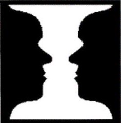
Same concept as the picture at the top of the blog – faces and the vase.
This is the logo for the Pittsburgh Zoo. It took me five years to spot the gorilla and lion.
And I dont see them. Help?
Also the fish. But the Gorilla and lion check the tree trunk, a lot like the vase.
[quote comment=”150725″][quote comment=”150701″][quote comment=”150610″][quote comment=”150575″][quote comment=”150568″][quote comment=”150564″][quote comment=”150554″]The horseshoe with the number 9 is not a tribute to Anthony McFarland. It is the greek letter “omega”, which is the symbol for the National Black Fraternity, Omega Psi Phi. You’ll notice that many players that are in Omega have a brand on their arms. The Omega symbol is also referenced by Steve McNair whenever he throws a TD pass, he “throws up the hooks”, link I can’tfind any off the top of my head, but MANY NFL players have the Omega symbol branded on their arm.[/quote]
It may be representing the Omega Psi Phi fraternity, but the “hooks” that are being shown look more like the Greek letter Psi…
ed[/quote]
…but the original photo is indeed an Omega.
ed[/quote]
Well, that doesn’t fully explain why he’s got the number 9 and another number written inside the Omega. There is obviously some fraternity brother he is honoring, right?[/quote]
It could be some “inside” Fraternity thing. I go to LSU and the Omega’s wear t-shirts and jackets that have all sorts of obscure numbers on them. My best guess is that the numbers are some sort of traditional thing.[/quote]
fraternities assign you a pin number when you become a full brother. it means that he is the (number)th person to join that chapter.
also, with the interesting logos, my fraternity (Sigma Nu) has a party in the fall called maze. We tilt it about 45 degrees with the MA on top and the ZE on the bottom. If you rotate it the other way it has our letters (the M and Z turned 90 degrees). we’ve gotten a lot of complements on it.[/quote]
Where do you go to school?[/quote]
Case Western in cleveland
I’ve also heard that the negative space between the link resembles an aerial view of link
[quote comment=”150684″][quote comment=”150679″]possible NLCS matchup:
link vs. link[/quote]
Except one has been red for a lot longer.[/quote]
I think the comment pertained to the jersey lettering (the double “a,” the triple “l”), not the colors.
[quote comment=”150701″][quote comment=”150610″][quote comment=”150575″][quote comment=”150568″][quote comment=”150564″][quote comment=”150554″]The horseshoe with the number 9 is not a tribute to Anthony McFarland. It is the greek letter “omega”, which is the symbol for the National Black Fraternity, Omega Psi Phi. You’ll notice that many players that are in Omega have a brand on their arms. The Omega symbol is also referenced by Steve McNair whenever he throws a TD pass, he “throws up the hooks”, link I can’tfind any off the top of my head, but MANY NFL players have the Omega symbol branded on their arm.[/quote]
It may be representing the Omega Psi Phi fraternity, but the “hooks” that are being shown look more like the Greek letter Psi…
ed[/quote]
…but the original photo is indeed an Omega.
ed[/quote]
Well, that doesn’t fully explain why he’s got the number 9 and another number written inside the Omega. There is obviously some fraternity brother he is honoring, right?[/quote]
It could be some “inside” Fraternity thing. I go to LSU and the Omega’s wear t-shirts and jackets that have all sorts of obscure numbers on them. My best guess is that the numbers are some sort of traditional thing.[/quote]
fraternities assign you a pin number when you become a full brother. it means that he is the (number)th person to join that chapter.
also, with the interesting logos, my fraternity (Sigma Nu) has a party in the fall called maze. We tilt it about 45 degrees with the MA on top and the ZE on the bottom. If you rotate it the other way it has our letters (the M and Z turned 90 degrees). we’ve gotten a lot of complements on it.[/quote]
That is cool. I was a Sig. Nu at UNCC where are you at.
[quote comment=”150702″][quote comment=”150558″][quote comment=”150546″][quote]I’ll be discussing the new NHL unis on XM’s “NHL Home Ice” show this Wednesday, 11:05 a.m. eastern.[/quote]
Some of us don’t have a receiver with the record feature. Will you, or some other fine person, be supplying a clip to the masses?[/quote]
I don’t subscribe to XM myself. But I’ll see if they can provide a web-archived clip.[/quote]
Paul (and others):
NHL.com streams the “Home Ice” program every day I believe.[/quote]
Yeah, but getting it at work is a whole other issue.
[quote comment=”150727″][quote comment=”150722″]link is the logo for the Pittsburgh Zoo. It took me five years to spot the gorilla and lion.[/quote]
And I dont see them. Help?[/quote]
The tree forms them in white. They’re looking at each other, essentially. Similar to the image used in Vince’s article above.
Whitey Ashburn. Old school.
link
[5th try:]
[quote comment=”150611″]HA HA HA HA HA HA HA HA 7 Game Lead, 17 to go…to one out…
oh but the disadvantaged will look stylish in there overhyped, out before it was actual hats though…
link…
I have to say it may make NY’er forget our choke to Red Sux in 04!
Looks like Logo Creep isn’t the only kind of creep in this here blog.[/quote]
I think it’s unfortunate, and more than a bit sadistic, that fans of the Yankees and the team-which-must-not-be-named seem to enjoy each other’s pain so much. I understand the compulsion to taunt, and to kick someone when he’s down in retaliation for past taunting, but the joy with which fans of the team-which-must-not-be-named regard the occasional (albeit rare) Yankee struggles or failures, and the glee with which Yankee fans celebrate the TWMNBN’s persistent futility is a sad commentary on the state of sports fandom.
Now, fans of each team will inevitably argue that fans of the other are “much worse” in this respect than they and their fellows are. Yankee fans will whine about how tough it is to be hated by everyone else, and TWMNBN fans will excuse themselves by pointing out the steep disparity in the teams’ relative fortunes, both recently and historically. Yet the reality is they can both be just as immature and sadistic when it comes to the completely irrational desire to see the other team fail, celebrate when they do, and rub salt in other fans’ wounds.
The reality, which I shouldn’t need to point out, is that each team succeeds and fails on its own, without any help from the other nor any benefit or detriment to the other, except when they play each other. A Yankee win costs the TWMNBN nothing, nor does a TWMNBN loss gain anything for the Yankees. I know it makes us feel better, but my point is that it shouldn’t.
Sports fans live vicariously through their teams, feel joy when they win and pain when they lose, which is fine. It’s when we start thinking that our favorite team’s success or failure reflects on us as individuals — my team wins, so I’m a better person than you because your team loses — that we lose our perspective and act irrationally. The only thing that reflects on us as fans is how we behave as fans. Being a fan of a successful team doesn’t make you a better person; being mature, rational, gracious and humble when they win, and being thoughtful, reflective and faithful when they lose, does.
You can root for your own team, cheer when they succeed and disparage them when they fail (such as by, for example, refusing to mention their name). But I, for one, have never taken pleasure in others’ misery, even when they have done the same to me. It’s uncivilized.
[quote comment=”150724″]#163 by SWC Susan (aka Tex) on 09.28.07 3:06 pm | Quote
That is amazing… is that really true? I always wondered where thewings came from!
Sorry for the late reply but check this link out
link
[/quote]
it’s actually not wings. the “wings” are the tiger’s ears pulled back (as he is ready to strike) and the stripes are self-explanatory. the princeton tiger is represented on the michigan wolverine’s and delaware blue hen’s helmets. now that’s interesting.
I remember the first time I noticed the Brewers glove logo. Must have been 6th grade, or so, and I was thumbing through my baseball cards. For some reason that day, they M and B just stuck out at me. I thought that was the coolest thing in the world. I think I even went out to show my mom. Uni-Dork even back then!
Although I’ve never seen it confirmed, the rumor I heard when Oregon came out with it’s link is that it combines the outlines of Autzen Stadium (outer) and Hayward Field (inner, where the football team first played). But since it’s used by all sports, I’m not sure of that.
And Paul, or any Mets fan, as much as I dislike the franchise (Giants, Mets, Yankees…in that order) it was really hard for me to watch this weekend. Maybe because I don’t dislike any of the players (maybe Alou) just the team, history, etc. Maybe your Mets, and my Dodgers will make it in 2008. Sigh…
[quote comment=”150722″]link is the logo for the Pittsburgh Zoo. It took me five years to spot the gorilla and lion.[/quote]
Beautiful.
[quote comment=”150722″]link is the logo for the Pittsburgh Zoo. It took me five years to spot the gorilla and lion.[/quote]
This is so cool that I actually said, “Awesome!” out loud to nobody but my office walls. This is one of those that once you see it, it’s hard not to (if that makes any sense.)
The Bengals are scheduled to wear their orange jerseys tonight against New England on MNF. They are undefeated wearing the orange jerseys. 3-0 with black pants and link. I believe that they are wearing the white pants tonight.
Sorry. Read every day, but do not post much. What am I doing wrong if I post something but it doesn’t show up?
Thanks.
[quote comment=”150722″]link is the logo for the Pittsburgh Zoo. It took me five years to spot the gorilla and lion.[/quote]
Off-topic, so please skip by.
Eephus, do you guys sell embroidered badges there that can be sewn on to clothes/bags? I’d totally get one of those badges.
Sharing nice logos, I’ve always been a fan of the link logo for the San Francisco Municipal Railway.
If you can’t see it at first, the swirling lines spell M-U-N-I.
[quote comment=”150755″][quote comment=”150722″]link is the logo for the Pittsburgh Zoo. It took me five years to spot the gorilla and lion.[/quote]
Off-topic, so please skip by.
Eephus, do you guys sell embroidered badges there that can be sewn on to clothes/bags? I’d totally get one of those badges.[/quote]
Better yet, I shouldn’t have assumed you work there, but I jumped the gun. :o)
Ok, do you know if the Zoo sells them?
The Texas Rangers shouldn’t go back to red, they looked like shit in red. Besides the current look was based on a movement back to blue. Damn crazy players when they get shit in their heads.
Anyone see the Auburn game? The kicker who kicked the game winner was number 18. The first guy that hugged him was also number 18. Haven’t looked yet this morning for an explanation.
DJ Gallo clearly does not “get it”. From Page 2:
“Throwback Vikings Uniforms versus Current Vikings Uniforms
You be the judge. But for my money, it’s a tie. They look pretty much the same to me. Seems like a waste of a throwback uniform.”
Does any one know why the AHL Worcester Sharks are still using the old Sharks logo on their new RBK Edge sweaters?
link
Sharks RBK Edge sweater
link
Remember when the first Batman movie came out (Tim Burton/Michael Keaton)… I remember reading stories about people who saw some cartoonish yellow teeth instead of a fearsome bat.
link
[quote comment=”150751″]Sorry. Read every day, but do not post much. What am I doing wrong if I post something but it doesn’t show up?
Thanks.[/quote]
Sometimes posts get eaten for a variety of reasons by our spam monster. Just post a comment to the effect that it was eaten, or email me or Paul and we will restore it for you.
I restored yours.
[quote comment=”150713″]As posted here a few weeks ago, the linkhas a black “S” (side fine and back of body) and “J” (top fin).
[/quote]
Is this a documented fact? I did a quick search on here and couldn’t find what you are referring to, but either way, I’m not sure I buy it. I see what you are saying is an S and J, but I’m not 100% convinced it was intentional. If there is something to back it up, I am very interested in learning.
Did anyone notice in the picture of the guys from Toronto holding the pink backpack that it appears as if the guy on the right without the bag seems to be wearing a Syracuse Chiefs hat, Toronto’s AAA team
[quote comment=”150622″]US Postal logo: Took a couple of looks but the envelope is there. The beak of the eagle is also the thumb and the rectangle attached is the envelope.[/quote]
Still not seeing this at all. Anyone else, is it some kind of magic eye book thing, do I need to cross my eyes and look past the logo?
[quote comment=”150764″]DJ Gallo clearly does not “get it”. From Page 2:
“Throwback Vikings Uniforms versus Current Vikings Uniforms
You be the judge. But for my money, it’s a tie. They look pretty much the same to me. Seems like a waste of a throwback uniform.”[/quote]
DJ Gallo never gets it.
[quote comment=”150739″][quote comment=”150701″][quote comment=”150610″][quote comment=”150575″][quote comment=”150568″][quote comment=”150564″][quote comment=”150554″]The horseshoe with the number 9 is not a tribute to Anthony McFarland. It is the greek letter “omega”, which is the symbol for the National Black Fraternity, Omega Psi Phi. You’ll notice that many players that are in Omega have a brand on their arms. The Omega symbol is also referenced by Steve McNair whenever he throws a TD pass, he “throws up the hooks”, link I can’tfind any off the top of my head, but MANY NFL players have the Omega symbol branded on their arm.[/quote]
It may be representing the Omega Psi Phi fraternity, but the “hooks” that are being shown look more like the Greek letter Psi…
ed[/quote]
…but the original photo is indeed an Omega.
ed[/quote]
Well, that doesn’t fully explain why he’s got the number 9 and another number written inside the Omega. There is obviously some fraternity brother he is honoring, right?[/quote]
It could be some “inside” Fraternity thing. I go to LSU and the Omega’s wear t-shirts and jackets that have all sorts of obscure numbers on them. My best guess is that the numbers are some sort of traditional thing.[/quote]
fraternities assign you a pin number when you become a full brother. it means that he is the (number)th person to join that chapter.
also, with the interesting logos, my fraternity (Sigma Nu) has a party in the fall called maze. We tilt it about 45 degrees with the MA on top and the ZE on the bottom. If you rotate it the other way it has our letters (the M and Z turned 90 degrees). we’ve gotten a lot of complements on it.[/quote]
That is cool. I was a Sig. Nu at UNCC where are you at.[/quote]
What year? I used to run with some guys from UNCC’s SigNu in the late 90s.
[quote comment=”150703″][quote comment=”150697″][quote comment=”150693″]Don’t forget the link, with its batter image that allows the viewer to see either a right or left-handed batter.[/quote]
I’ve always thought he was a lefty. Then again, so am I![/quote]
Funny — I always thought he was just a righty. Not surprisingly, I’m a righty.[/quote]
I always thought it was fitting that you could see the batter as left- or right-handed because I always thought the silhouette kinda looked like Pete Rose (a switch-hitter). Maybe it’s the flapless helmet?
[quote comment=”150766″](Worchester) Sharks RBK Edge sweater
link[/quote]
That’s really interesting. Surprised that they didn’t adopt the new San Jose logo.
[quote comment=”150762″]Anyone see the Auburn game? The kicker who kicked the game winner was number 18. The first guy that hugged him was also number 18. Haven’t looked yet this morning for an explanation.[/quote]
College teams frequently have more than one player wearing a number due to the size of the rosters (100+ at d-1 schools). The only rule regarding them is no two players with the same number can be on the field at the same time. Usually one plays defense and one plays offense. Even on special teams there can only be one of a number on the field, so the 18 who was not the kicker must’ve been on the sidelines somewhere.
Homerun on the topic Vince!
Was it mentioned a few weeks back that some teams (Bengals, Texans maybe) have a page on their webste that says which unis they will be wearing? Thanks in advance.
[quote comment=”150523″]ok, ok… My last “cool logo”
The patch worn by link astronauts is beautiful in it’s simplicity.
The patch’s outline reflects that of the Apollo Capsule.
The flights path (from the earth to the moon) traces a red outline of the #8.
The triangular shape of the insignia symbolizes the shape of the Apollo command module. It shows a red figure 8 looping around the earth and moon representing the mission number as well as the circumlunar nature of the mission. On the red number 8 are the names of the three astronauts.
The initial design of the insignia was developed by Jim Lovell. Lovell reportedly sketched the initial design while riding in the backseat of a T-38 flight from California to Houston, shortly after learning of the re-designation of the flight to become a circumlunar mission.
Not a bad design for an untrained artist… Later in the Apollo program, NASA started designing the logos and the beagn to look no different than what passes for other government insignias.[/quote]
Crews have the choice who designs the mission patches, sometimes a crew member, family member, friend, or even a commissioned artist on occasion.
Not so hidden in the pink but Baskin-Robbins has their 31 incorporated into their link…
I know I am obsessed with Uni Watch when watching the Packers/VIkings game yesterday, all I could think of was the Minna H. was in heaven over the Vikings purple throwbacks plus the fact Mr. Ed Hochuli was reffing the game. Am I correct in assuming this?
[quote comment=”150765″]Does any one know why the AHL Worcester Sharks are still using the old Sharks logo on their new RBK Edge sweaters?
link[/quote]
They are trying to establish a distinctive brand for San Jose with the new logo. Having Worcester wear it would diminish the impact of people saying “that’s San Jose’s logo” instead of “that’s one of the Sharks’ logos”.
Thanks for restoring it Vince. Good to know for the future.
Duckstyle, you are not the only one not seeing the USPS logo. I can usually spot things like this fairly quickly, but am not getting this one. And I’m sure I’ll try throughout the day until I do. :-)
[quote comment=”150775″][quote comment=”150703″][quote comment=”150697″][quote comment=”150693″]Don’t forget the link, with its batter image that allows the viewer to see either a right or left-handed batter.[/quote]
I’ve always thought he was a lefty. Then again, so am I![/quote]
Funny — I always thought he was just a righty. Not surprisingly, I’m a righty.[/quote]
I always thought it was fitting that you could see the batter as left- or right-handed because I always thought the silhouette kinda looked like Pete Rose (a switch-hitter). Maybe it’s the flapless helmet?[/quote]
I thought the MLB logo was link…although the wikipedia page says it has only been suggested
[quote comment=”150714″][quote comment=”150636″][quote comment=”150611″]HA HA HA HA HA HA HA HA 7 Game Lead, 17 to go…to one out…
oh but the disadvantaged will look stylish in there overhyped, out before it was actual hats though…
link…
I have to say it may make NY’er forget our choke to Red Sux in 04!
Looks like Logo Creep isn’t the only kind of creep in this here blog.[/quote]
Sore Mess Fan arent you John?
The reason I think it is funny isnt just the collapse, but the outright STUPIDITY of Bud and Co to have the nerve to offer something for sale which isnt correct![/quote]
The class, or lack thereof, of some people is amazing.
Unfortunately, no one is ever going to forget the monumental choke job the Yankees pulled in 2004. Ever. That was one for the ages.
And for the record, that link has since been changed with the actual division champs. MLB always makes caps and t-shirts for every team, not just the champs. The link was up because someone at mlb.com didn’t realize it was still up, and they since corrected it. You wouldn’t have been able to buy one of those.[/quote]
Dude:
A) Get a life
B) Support a real team
C) MLB SHOULDNT sell crap that isnt TRUE YET!
here we go…
its only monday and the flare ups are starting…
[quote comment=”150724″]#163 by SWC Susan (aka Tex) on 09.28.07 3:06 pm | Quote
Also am I the only one that likes the Eagles throwback unis. A lot of is it is the helmet. I like the old school helmets b/c the are based off the old leather helmets. Teams would die the helmets in different patterns so the QBs could tell who to throw to. That is how the so called Michagan wing helmet came from, which started at Princton. I wish the Eagles would wear them for the rest of the year.
That is amazing… is that really true? I always wondered where thewings came from!
Sorry for the late reply but check this link out
link
[/quote]
No. I also like the Eagles’ throwbacks. The Columbia blue and yellow look much better than their current ones. And the old Kelly and silver wasn’t bad, either.
BTW are you a Texan living in Texas?
I think it seems like a stretch, but link in the USPS logo.
Sufferin’ Pete! How’d my post above end up underlined?
The Canadian National Railway link has been praised in the past for its simple, clean look, while evoking a stretch of railroad to create the letters.
I swear yesterday there was a link to a gallery of the yankees rookie hazing pictures someone posted. Anybody have it?
link Uses negative space to make white and black faces.
By the way Paul, How bout those Mets? LOL (From a St. Louis Cardinals fan)
for those having trouble seeing the “hand w/ envelope” in the usps logo:
dmOOn did it better with photoshop above, but here’s my puny attempt at outlining it for you in good ol’ MSPaint. It took me forever to see it too.
The envelope is in red, and the thumb in black.
link
[quote comment=”150803″]
I think it seems like a stretch, but link in the USPS logo.[/quote]
Thanks for that. I was feeling like the guy in “Mallrats” staring at the magic eye poster — “It’s a schooner!”
Now more than ever, I want one of link.
What about the Diamondbacks secondary logo?
link
i think this is what you were looking for…
link
quote comment=”150797″][quote comment=”150775″][quote comment=”150703″][quote comment=”150697″][quote comment=”150693″]Don’t forget the link, with its batter image that allows the viewer to see either a right or left-handed batter.[/quote]
I’ve always thought he was a lefty. Then again, so am I![/quote]
Funny — I always thought he was just a righty. Not surprisingly, I’m a righty.[/quote]
I always thought it was fitting that you could see the batter as left- or right-handed because I always thought the silhouette kinda looked like Pete Rose (a switch-hitter). Maybe it’s the flapless helmet?[/quote]
I thought the MLB logo was link…although the wikipedia page says it has only been suggested[/quote]
Not according to link:
The MLB logo:
No one player has ever been identified as the model of the 1969 Major League Baseball batter logo.
[quote comment=”150798″]
A) Get a life
B) Support a real team
[/quote]
Both of these are just another way of saying “Be like me.” Whether it’s out of pathological narcissism or just plain obnoxiousness, that’s what these expressions mean.
Wouldn’t the sports world be a rather dull place if everyone supported the same team?
[quote comment=”150821″]quote comment=”150797″][quote comment=”150775″][quote comment=”150703″][quote comment=”150697″][quote comment=”150693″]Don’t forget the link, with its batter image that allows the viewer to see either a right or left-handed batter.[/quote]
I’ve always thought he was a lefty. Then again, so am I![/quote]
Funny — I always thought he was just a righty. Not surprisingly, I’m a righty.[/quote]
I always thought it was fitting that you could see the batter as left- or right-handed because I always thought the silhouette kinda looked like Pete Rose (a switch-hitter). Maybe it’s the flapless helmet?[/quote]
I thought the MLB logo was link…although the wikipedia page says it has only been suggested[/quote]
Not according to link:
The MLB logo:
No one player has ever been identified as the model of the 1969 Major League Baseball batter logo.[/quote]
I had heard it was Kilebrew as well. The NBA has never come out and said that Jerry West was the subject for it’s logo but it’s well known that he is.
[quote comment=”150810″]for those having trouble seeing the “hand w/ envelope” in the usps logo:
dmOOn did it better with photoshop above, but here’s my puny attempt at outlining it for you in good ol’ MSPaint. It took me forever to see it too.
The envelope is in red, and the thumb in black.
link
Yeah…after seeing those two I’m pretty convinced that there isnt any meaningful symbolism in that logo. It’s just an eagle.
This one is a bit of a stretch, but growing up in the Charlotte area, I remember them debuting the Carolina Panthers logo and mentioning that they modeled the shape after the combined maps of North and South Carolina.
Carolina Panthers Head – link
Map of the Carolinas – link
Subtle, but nice in my opinion
[quote comment=”150779″]Was it mentioned a few weeks back that some teams (Bengals, Texans maybe) have a page on their webste that says which unis they will be wearing? Thanks in advance.[/quote]
Texans do.
[quote comment=”150722″]link is the logo for the Pittsburgh Zoo. It took me five years to spot the gorilla and lion.[/quote]
That is really cool.
[quote comment=”150682″]The interesting thing about the Washington State logo is that it was originally developed as a ‘WSC,’ when the school was known as Washington State College.
Randall Johnson, who was a WSC undergrad at the time, designed the logo in 1936. In 1958, when WSC became WSU, he did the redesign, and he sold the logo (which has become one of the most recognizable in all of college sports) to the school for just $1.
Sadly, Johnson passed away earlier this year. I can’t find a good photo of the original, but you can see a couple small versions of it in this story:
link
Also, the top of the S combined with the U as the lower jaw suggests the original ‘C’, which is nice. It can also stand for ‘Cougars’, too.
[quote comment=”150832″][quote comment=”150779″]Was it mentioned a few weeks back that some teams (Bengals, Texans maybe) have a page on their webste that says which unis they will be wearing? Thanks in advance.[/quote]
Texans do.[/quote]
I must be really dumb, but I can’t find it there.
[quote comment=”150818″]i think this is what you were looking for…
link
Here’s Auburn’s roster. #18 is a kicker and the other #18 is a QB. Interestingly enough, there are two #16’s and one is a kicker and one is a QB.
link
Penn State has a few players with the same number that are even on the same side of the ball, but most likely, a lot of these guys are redshirts.
link
[quote comment=”150838″][quote comment=”150832″][quote comment=”150779″]Was it mentioned a few weeks back that some teams (Bengals, Texans maybe) have a page on their webste that says which unis they will be wearing? Thanks in advance.[/quote]
Texans do.[/quote]
I must be really dumb, but I can’t find it there.[/quote]
link
I just spent a few minutes looking through the logos of the Minor Leagues, I think the link might have the best logo in the Minors (or baseball in general). I guess it is a variation of the Texas Rangers logo, but it actually came out looking better. link too. The backs just have the player number.
link.
[quote comment=”150837″][quote comment=”150682″]The interesting thing about the Washington State logo is that it was originally developed as a ‘WSC,’ when the school was known as Washington State College.
Randall Johnson, who was a WSC undergrad at the time, designed the logo in 1936. In 1958, when WSC became WSU, he did the redesign, and he sold the logo (which has become one of the most recognizable in all of college sports) to the school for just $1.
Sadly, Johnson passed away earlier this year. I can’t find a good photo of the original, but you can see a couple small versions of it in this story:
link
Also, the top of the S combined with the U as the lower jaw suggests the original ‘C’, which is nice. It can also stand for ‘Cougars’, too.[/quote]
That’s what I always thought it was
[quote comment=”150823″][quote comment=”150798″]
A) Get a life
B) Support a real team
[/quote]
Both of these are just another way of saying “Be like me.” Whether it’s out of pathological narcissism or just plain obnoxiousness, that’s what these expressions mean.
Wouldn’t the sports world be a rather dull place if everyone supported the same team?[/quote]
Yes, but it would be outstanding if everyone vehemently opposed the D-baags and the Red Sox!
[quote comment=”150821″]quote comment=”150797″][quote comment=”150775″][quote comment=”150703″][quote comment=”150697″][quote comment=”150693″]Don’t forget the link, with its batter image that allows the viewer to see either a right or left-handed batter.[/quote]
I’ve always thought he was a lefty. Then again, so am I![/quote]
Funny — I always thought he was just a righty. Not surprisingly, I’m a righty.[/quote]
I always thought it was fitting that you could see the batter as left- or right-handed because I always thought the silhouette kinda looked like Pete Rose (a switch-hitter). Maybe it’s the flapless helmet?[/quote]
I thought the MLB logo was link…although the wikipedia page says it has only been suggested[/quote]
Not according to link:
The MLB logo:
No one player has ever been identified as the model of the 1969 Major League Baseball batter logo.[/quote]
I could be mistaken, but I’m pretty sure I linked to pretty much the same thing
[quote comment=”150801″][quote comment=”150724″]#163 by SWC Susan (aka Tex) on 09.28.07 3:06 pm | Quote
Also am I the only one that likes the Eagles throwback unis. A lot of is it is the helmet. I like the old school helmets b/c the are based off the old leather helmets. Teams would die the helmets in different patterns so the QBs could tell who to throw to. That is how the so called Michagan wing helmet came from, which started at Princton. I wish the Eagles would wear them for the rest of the year.
That is amazing… is that really true? I always wondered where thewings came from!
Sorry for the late reply but check this link out
link
[/quote]
No. I also like the Eagles’ throwbacks. The Columbia blue and yellow look much better than their current ones. And the old Kelly and silver wasn’t bad, either.
BTW are you a Texan living in Texas?[/quote]
Me or CJ?
[quote comment=”150675″]I watched the entire Packers-Vikings game and it never occurred to me that the Vikings were wearing their throwbacks. To me, that is how the Vikings are supposed to look. If it ain’t broke, don’t fix it.[/quote]
This was exactly what I thought the moment it was pointed out that the Vikes were wearing throwbacks. And when the Patriots appear in the red jerseys in a couple of years, I won’t notice that either – it’s just how they’re supposed to look. Of course, I still think “Colts” when I think “Baltimore”.
I’m losing my mind and I’m only 38. Sigh.
[quote comment=”150713″]As posted here a few weeks ago, the linkhas a black “S” (side fine and back of body) and “J” (top fin).
Also, I like how the Phoenix Suns link spelled “suns” no matter which side of the court you were sitting on.
Finally, linkis my favorite. To me, with the strategic underline, it says “Win Twins”, paying homage to link.[/quote]
Don’t buy the SJ at all, never noticed the Twins underline,and that SUNS trick is wicked! Thanks for sharing!
[quote comment=”150842″][quote comment=”150838″][quote comment=”150832″][quote comment=”150779″]Was it mentioned a few weeks back that some teams (Bengals, Texans maybe) have a page on their webste that says which unis they will be wearing? Thanks in advance.[/quote]
Texans do.[/quote]
I must be really dumb, but I can’t find it there.[/quote]
[quote comment=”150838″][quote comment=”150832″][quote comment=”150779″]Was it mentioned a few weeks back that some teams (Bengals, Texans maybe) have a page on their webste that says which unis they will be wearing? Thanks in advance.[/quote]
Texans do.[/quote]
I must be really dumb, but I can’t find it there.[/quote]
link[/quote]
Thanks, for the link and the insult. :)
[quote comment=”150856″][quote comment=”150713″]As posted here a few weeks ago, the linkhas a black “S” (side fine and back of body) and “J” (top fin).
Also, I like how the Phoenix Suns link spelled “suns” no matter which side of the court you were sitting on.
Finally, linkis my favorite. To me, with the strategic underline, it says “Win Twins”, paying homage to link.[/quote]
Don’t buy the SJ at all, never noticed the Twins underline,and that SUNS trick is wicked! Thanks for sharing![/quote]
Yea, I definitely don’t buy the SJ either. That is what I like to call a stretch.
[quote comment=”150803″]
I think it seems like a stretch, but link in the USPS logo.[/quote]
Nice work. Unfortunitly you did a lot better job than they did, if that truly was what they were goin for.
Remember the logo of the old Seattle Center Coliseum (now Key Arena at Seattle Center), with the initials (SCC) crammed into one logo? Very 70’s like–can’t find a pic or screen grab to save my life.
[quote comment=”150827″][quote comment=”150810″]for those having trouble seeing the “hand w/ envelope” in the usps logo:
dmOOn did it better with photoshop above, but here’s my puny attempt at outlining it for you in good ol’ MSPaint. It took me forever to see it too.
The envelope is in red, and the thumb in black.
link
Yeah…after seeing those two I’m pretty convinced that there isnt any meaningful symbolism in that logo. It’s just an eagle.[/quote]
I’m not totally sold on that one either. I can see what’s being pointed out and why one would think it’s intentional, but I still think that it’s a pretty big stretch. The same goes for the San Jose logo. I’ve made logos and designs for projects and then, well after the fact, found little quirks like “Oh, I think I see an K in there….” , but they definitely weren’t intentional.
One more non-sports related logo… for City Harvest:
link
check the c/h/building/heart. Pretty tight, I see it on trucks all the time.
[quote comment=”150668″][quote comment=”150661″]Arrowheads in Wisconsin’s Motion W negative space…[/quote]
Sorry, I think that is just a result of the serifs on the W. I can’t imagine that was by design. Especially considering they are the badgers. I’ve never seen a bow-and-arrow wielding badger.[/quote]
Close..
no love for the houston gamblers and their negaative space??
link
It’s funny, I just walked outside to get the mail and a Goodwill truck drove by with link on it. Seems appropriate for the conversation.
…and for some reason, a picture of a little mountain on Charlie Manuel belly button seems link too.
[quote comment=”150537″]HA HA HA HA HA HA HA HA 7 Game Lead, 17 to go…to one out…
oh but the disadvantaged will look stylish in there overhyped, out before it was actual hats though…
link
I have to say it may make NY’er forget our choke to Red Sux in 04![/quote]
Please, have you heard anything about the Phils collapse in ’64 before this season?. You won’t hear about this year’s Met team for a long time after next season. Just keep your mouth shut, you have the easiest team to root for.
[quote comment=”150876″]It’s funny, I just walked outside to get the mail and a Goodwill truck drove by with link on it. Seems appropriate for the conversation.[/quote]
For the record: That logo was in Vince’s original entry, but it got left on the cutting room floor when I was editing his text. Meant to restore it but forgot. Mea culpa.
Can I throw something in here? The FedEx arrow is completely intentional due to its understated value for the brand. I’ve been looking around the Net today, and it seems that FedEx uses the arrow everywhere.
In Argentina, FedEx apparently used the slogan “If you want to export, follow the arrow”. Or something like that. In any case, the guy who designed the logo, Lindon Leader, was asked about not emphasizing the arrow in the logo.
“The power of the hidden arrow is simply that it is a ‘hidden bonus.’ It is a positive-reverse optical kind of thing: either you see it or you don’t. Importantly, not ‘getting the punch line’ by not seeing the arrow, does not reduce the impact of the logo’s essential communication. The power of the logo and the FedEx marketing supporting the logo is strong enough to convey clearly FedEx brand positioning. On the other hand, if you do see the arrow, or someone points it out to you, you won’t forget it. I can’t tell you how many people have told me how much fun they have asking others ‘if they can spot ‘something’ in the logo.’ To have filled in the arrow, or to somehow make it more ‘visible’ would have been like Henny Youngman saying ‘Please take my wife’ instead of ‘Take my wife. Please.’ Punch lines that need to be explained are neither funny nor memorable.”
It appears that he “Gets It” when it comes to marketing.
[quote comment=”150875″]no love for the houston gamblers and their negaative space??
link
and the gamblers used the predominant nike font. anyone know what font that is? i love it
Oh, and while I’m at it…
link.
Eh, what the Hell. How about my own company’s link? Sorry…cheesy self promotion. :-)
When designing it, this would have been a very good place to get feedback though (although, not uni related).
To the comments regarding the Carolina Panthers logo being somewhat shaped like the Carolinas, I wonder why stuff like this does not happen more often. Is it too much of a simple idea? Been used too much in the past? I don’t know. Take West Virginia’s logo. That could have easily been shaped more like the state, and could have been pretty cool looking. Or for some of the “State” schools, why not have the shape of the state somehow included? Like Oregon State’s football helmet could have, say, a orange state of Oregon with a black S in the middle. For example…
Saw an unusual uni in the Premier League today. Tottenham Hotspur (or Spurs) debuted a new away strip that had a neat feature. The shirt was half and half baby blue and white. What made it unusual was the sleeves. On the blue side of a short sleeve shirt, the sleeve was blue. The same held for the white side, with a white sleeve. Strangely, if the player wore a long sleeve shirt, the sleeve was the same color as the body side to the elbow and then the other color from the elbow to the wrist. Here’s a link:
link
I originally saw this for the ugly socks, but check out the inapropriate butt grabbing.
link
I am not seeing the left handed batter in the MLB logo at all.
I haven’t had a chance to read all the comments ‘cuz I’ve been at work all day, so sorry, if this hads been posted.
It’s not really uni-realted, but a few weeks ago I complained that the NHL team websites had gone from distinctive to a cookie-cutter format. I figured the teams had collectively decided to do this, but apparently I was wrong- read link. After that article, I like the Ranger’s a little more.
[quote comment=”150900″]I am not seeing the left handed batter in the MLB logo at all.[/quote]
If you see the right handed batter you are looking at his back. Now just picture that you are looking at his chest and he is left handed.
My post just got eaten…twice.
[quote comment=”150900″]I am not seeing the left handed batter in the MLB logo at all.[/quote]
If you’re behind him, he’s righthanded. If you’re facing him, he’s lefthanded.
[quote comment=”150896″]Saw an unusual uni in the Premier League today. Tottenham Hotspur (or Spurs) debuted a new away strip that had a neat feature. The shirt was half and half baby blue and white. What made it unusual was the sleeves. On the blue side of a short sleeve shirt, the sleeve was blue. The same held for the white side, with a white sleeve. Strangely, if the player wore a long sleeve shirt, the sleeve was the same color as the body side to the elbow and then the other color from the elbow to the wrist. Here’s a link:
link
Blackburn has a similar effect for the shortsleeve but the sleeve color remains consistent for the longsleeve…
link
Anyone else notice the logo made just for the playoff today?
link
link
/link. Oops.
[quote comment=”150916″]http://i192.photobucket.com/albums/z93/ravenmasterq/NLWildCardTiebreakerlogo.jpg
/link. Oops.[/quote]
Interesting that the background references the home team but the foreground uses the visiting team’s colors.
interesting article concerning wild card hat yankees style
link
link
I previously brought up the idea that the Carolina Panthers logo is based on the map of the Carolinas. I forgot to add a very cool non-sports map-based logo.
This logo is for the state-wide community service project originally called “Service Raleigh” (started at N.C. State) and later expanded to be called “Service North Carolina”
Check out the sweet logo at the upper left in the link below:
link
For some reason this logo is no longer prominently used.
Chipping in my 2 cents worth…
If you rotate the USPS logo clockwise 90 degrees it looks like an envelope
Nomination from my backyard: my alma mater, link, found a good way to work the “F” into the logo they borrowed from the City of Bondurant.
Logo creep on the palms of gloves now?
link
Good view of I35W patch on ugly Minnesota jersey
link
[quote comment=”150922″]I previously brought up the idea that the Carolina Panthers logo is based on the map of the Carolinas. I forgot to add a very cool non-sports map-based logo.
This logo is for the state-wide community service project originally called “Service Raleigh” (started at N.C. State) and later expanded to be called “Service North Carolina”
Check out the sweet logo at the upper left in the link below:
link
For some reason this logo is no longer prominently used.[/quote]
For some reason, like maybe the creepiness of the raggedly amputated forearm?
The old linkis an example it took me years a s child to notice it I never knew what it was
One more thing: Don’t know if this was Oregon’s intention, but the O contains the shapes of Autzen Stadium (Football) and the track at Hayward Field (Track and Field), representing the 2 sports they are best known for. If that was their intention, then it’s a neat way to represent the Place Pre Built.
Why is Pac Man crying?
[quote comment=”150527″]how about the old Expos logo? How many letters can you see in it? M? C? B? E?[/quote]
I was very confused with the Expos logo. I always thought it was an ELB. Makes no sense. It took me some time to realize it was an “M”
link
[quote comment=”150931″]The old linkis an example it took me years a s child to notice it I never knew what it was[/quote]
Wow! I think I see a letter and a thumb in there…
[quote comment=”150932″]One more thing: Don’t know if this was Oregon’s intention, but the O contains the shapes of Autzen Stadium (Football) and the track at Hayward Field (Track and Field), representing the 2 sports they are best known for. If that was their intention, then it’s a neat way to represent the Place Pre Built.[/quote]
I thought that was a joke when that was mentioned earlier….
I think this is the best logo. It is very old school yet it gets the point across. This is the old logo for the University of Illinois Chicago. When they played in the CCHA (college hockey) they had this logo on their uniforms.
link
[quote comment=”150940″]I thought that was a joke when that was mentioned earlier….[/quote]
No joke. :-) Something I heard when they came out with the new logo. Like I said, not sure if I buy that it was the intention, but I like the idea. It definitely makes sense if you look at both fields from the air.
Not that hidden, but my friends never see it…
link
We also have a Pho 21 that the steam rising from the bowl forms the 21. Sorry – no pic for that one.
I haven’t seen this one mentioned yet, but on the New San Jose Sharks new primary logo–the main jersey crest–there is a hidden SJ near the shark’s fin. A full discussion about this can be seen on the Creamer boards.
[quote comment=”150550″]The Tiger Hawk logo actually spells “Fry” as in Hayden Fry, the legendary coach who helped design the logo.[/quote]
I think this might be a stretch. I love this logo and am a lifelong Hawkeye fan and I have never once heard any reference to “Fry” in the design nor have I heard that the lower-case “i” is intentional.
I have heard the Fred Flinstone description before though. Actually, I think it was Barney Rubble.
[quote comment=”150934″]
Why is Pac Man crying?[/quote]
Yeah as a kid I always thought it had something to do with Pac-Man
link
The Hawks’ new identity was unveiled at a press conference in Boise Wednesday. Rahr acknowledged that the team had considered changing its name from the Hawks, but ultimately that never came to fruition.
As part of their agreement with the NBA’s Atlanta Hawks franchise, the Boise Hawks must specifically incorporate the word “baseball” into their logo.
Rahr said the NBA’s Hawks, commonly one of the weaker franchises in the sport, put forth no pressure on the Boise club to change its name.
“As far as our logo goes, as long as it’s associated with baseball, we’re fine,” he said. “Really, it comes down more to merchandising than anything else. We can’t just print a t-shirt that only says ‘Hawks’ across the front.”
I know at some point somebody asked about the Pistons anniversary logo, specifically if it would be on the unis. If you scroll down to the bottom of link, you can see the logo on the unis.
Colorado and San Diego both have horrible uniforms. Watching this game hurts my eyes.
Great topic today, and so many negative space logos I never noticed before (Hawks, Goodwill)! Awesome entry.
Ok, I’m posting this and hoping the third time will be the charm and it won’t get eaten…
I complained a few weeks ago that all the NHL teams’ websites had gone from distinct styles to a cookie-cutter format. I figured they had all just agreed to change cuz, well, they’re stupid. But link, I was wrong.
After reading that, I like the rangers a little more.
[quote comment=”150575″][quote comment=”150568″][quote comment=”150564″][quote comment=”150554″]The horseshoe with the number 9 is not a tribute to Anthony McFarland. It is the greek letter “omega”, which is the symbol for the National Black Fraternity, Omega Psi Phi. You’ll notice that many players that are in Omega have a brand on their arms. The Omega symbol is also referenced by Steve McNair whenever he throws a TD pass, he “throws up the hooks”, link I can’tfind any off the top of my head, but MANY NFL players have the Omega symbol branded on their arm.[/quote]
It may be representing the Omega Psi Phi fraternity, but the “hooks” that are being shown look more like the Greek letter Psi…
ed[/quote]
…but the original photo is indeed an Omega.
ed[/quote]
Well, that doesn’t fully explain why he’s got the number 9 and another number written inside the Omega. There is obviously some fraternity brother he is honoring, right?[/quote]
The number 9 is probably his line number. Your line number is assigned by hieght. This means there was 8 people who crossed (entered into the frat) with him who were shorter. The player is 6-3 and large universites such as LSU can have 10-12 people cross at a time.
linkoutline has two angry men facing off. Representing the history of turmoil between French and English (that is what I was taught anyway)
Forgive me if I missed this one scrolling through the responses, but the Carolina Panthers logo mirrors the outer borders of North and South carolina combined.
PL, find a photo of the other side of Biggio’s catcher’s mask from this past weekend.
[quote comment=”150759″]Sharing nice logos, I’ve always been a fan of the link logo for the San Francisco Municipal Railway.
If you can’t see it at first, the swirling lines spell M-U-N-I.[/quote]
Ah yes. It particularly looks retroish when done in orange.
PS- the Expos logo always drove me crazy.
uh..where did the EYE talics come from?
[quote comment=”150862″][quote comment=”150856″][quote comment=”150713″]As posted here a few weeks ago, the linkhas a black “S” (side fine and back of body) and “J” (top fin).
Also, I like how the Phoenix Suns link spelled “suns” no matter which side of the court you were sitting on.
Finally, linkis my favorite. To me, with the strategic underline, it says “Win Twins”, paying homage to link.[/quote]
Don’t buy the SJ at all, never noticed the Twins underline,and that SUNS trick is wicked! Thanks for sharing![/quote]
Yea, I definitely don’t buy the SJ either. That is what I like to call a stretch.[/quote]
I do buy it. The link just happen to be in all the right places. Too much of a coincidence.
Status of Angry Homeless Man:
Hoody ( x )
No Hoody ( )
Uh..a CREWNECK hoody.
As I remember my Marketing teacher saying back in college, if it looks like it was supposed to be there, no matter how subtle, it probably was meant to be there.
End Italics!!!!!
Also;
Aren’t the Pats socks a remnant of when Adidas did their unis? There is no other three stripe component to their look.
Italics gone?
[/quote][/quote][/quote][/i][/i][/i]
How about now?
[/quote][/quote][/quote][/quote][/quote][/quote][/quote][/quote][/quote][/quote][/quote][/quote][/quote][/quote][/quote][/quote][/quote][/quote][/quote][/quote][/quote][/quote][/quote][/quote][/quote][/quote][/quote][/quote][/quote][/quote][/quote][/quote][/quote][/quote][/quote]
Last try!
Don’t think I’ve seen this anywhere, but Maryland men’s hoops is getting new unis for this season – apparently they’re just like the ones Nike rolled out for the NCAAs last year.
On the team’slink, each of the profile picture has them wearing uniforms that are without the black-and-gold checker border that Terp fans have come to love.
Hopefully I can grab pictures for you at a later point.
fixed?
Anyway, I think Randy Moss’s 8 is upside down on the back of his 81 jersey.
link
i was at the Virginia Tech vs. ECU game and a guy in front of me was wearing an old Micheal Vick tech jersey..but it had the name MEXICO on the back…
didnt think to take a pic of it though
[quote comment=”150972″]Colorado and San Diego both have horrible uniforms. Watching this game hurts my eyes.[/quote]
Agreed. Not a fan of the Padres’ urine-soaked road unis, and as for Colorado, what’s the point of wearing a black vest over a black undershirt? (What’s the point of wearing a vest anyway? The only vests that EVER looked good in baseball were link.)
I feel I should point out that that’s the only gripe I have with the Rockies’ uniforms. I for one love purple, and I think they wear it well.
Ocho cinco is wearing the black chinstrap again.
[quote comment=”150529″]While watching the Dallas Cowboys play yesterday, I noticed Julius Jones of the Cowboys wearing a helmet I have never seen before.
The helmet he was wearing appeared to be a Schutt helmet, but it was not a DNA or the new ION.
The helmet looked like a cross between an Air-advantage, a DNA, and an ION helmet.
The helmet had a standard Pro-Guard facemask on it that is used for the Air-advantage helmet.
Any information on this helmet from anyboby?[/quote]
Just got around to reading the comments.
link Julius did have on a new helmet. Maybe the next generation “standard issue” Schutt?
[quote comment=”150955″][quote comment=”150550″]The Tiger Hawk logo actually spells “Fry” as in Hayden Fry, the legendary coach who helped design the logo.[/quote]
I think this might be a stretch. I love this logo and am a lifelong Hawkeye fan and I have never of the honce heard any reference to “Fry” in the design nor have I heard that the lower-case “i” is intentional.
I have heard the Fred Flinstone description before though. Actually, I think it was Barney Rubble.[/quote]
That’s a first for me, hearing the Flintstones comparison. I think I can kinda see it … sorta.
My folks both went to Iowa, and it was many, many years before I saw the Tiger Hawk logo the right way. As a kid, I always saw the beak as a left eye (upper and lower eyelids), the cheek as a big nose, and the rest as an arm covering the forehead (as if in embarrassment). It made sense to me — I mean, the Hawks sucked when I was little!
Honestly, to me the FedEx logo is bland and boring, when considered with or without the arrow. To top it off, it is usually rendered in the hideous combination of purple and orange.
Wow, I don’t think in the past two years I’ve ever posted anything that got this much play…
Thanks guys!
[quote comment=”150816″][quote comment=”150803″]
I think it seems like a stretch, but link in the USPS logo.[/quote]
Thanks for that. I was feeling like the guy in “Mallrats” staring at the magic eye poster — “It’s a schooner!”
Now more than ever, I want one of link.[/quote]
Many states tend to look like ill-defined blobs or weird geometric shapes, not the best basis for a logo. Some state shapes (a/k/a Texas) are visually distinctive, but over-used.
Did I see this right? Coach Bill’s sweatshirt read “QUIPMENT”. Was there a missing ”E”…
[quote comment=”150678″]Did anybody ever notice that baseball’s divisions were inconsistently named? “central” in this case is an adjective, while “east” and “west” are nouns. It should either be East, West and Center, or Eastern, Western and Central.[/quote]
Being that it is the east division and west divsion, wouldn’t “division” be the noun, and the “east” and “west” describing the location of the divisions, and therefore make them adjectives?
Or for example American League East: “League” would be the noun and “American” and “East” be the adjectives describing the “League”?
From dictionary.com:
“link:…
—adjective 5. directed or proceeding toward the east.
6. coming from the east: an east wind.
7. lying toward or situated in the east: the east side”
“link :…
—adjective 6. directed or proceeding toward the west.
7. coming from the west: a west wind.
8. lying toward or situated in the west.”
[quote comment=”150656″]The Vikes throwbacks looked great. LOVE the sleeve stripes. I wish they would go back to the 1963 unis.
link
The Gophers all yellow looked like urine to me.[/quote]
Funny, the first thing I noticed on that linked site was that they had ‘San Francisco’ spelled incorrectly.
[quote comment=”150823″][quote comment=”150798″]
A) Get a life
B) Support a real team
[/quote]
Both of these are just another way of saying “Be like me.” Whether it’s out of pathological narcissism or just plain obnoxiousness, that’s what these expressions mean.
Wouldn’t the sports world be a rather dull place if everyone supported the same team?[/quote]
Again, the lack of class of some people is amazing. That, and what a huge set of balls they grow when ripping people anonymously on the internet.
link is Moss’s upside down 8. Clearly larger on top versus bottom.
there will be purple in the nl postseason.
colorado nips the pads 9-8 in 13.
ex-met clint hurdle ledes the rockies, winnin gtheir last 14 of 15, into their first postseason since 1995. they’ll play the phils.
as a met fan, who do i root for?
play it safe and lose the curse of the goat, the shea black cat and bartman. GO CUBS!
Cubs-Red Sox WS.
ROCKIEEEEEESSSSSSSSSSSSSSSSSSSSSSSSSSSS!!!!!!!!!!!!!!!!!!!!!!!!
I heard a radio interview today with Minnesota Football coach Tim Brewster saying they wore the all gold uniforms because they were honoring the 1967(?) Gopher Football Championship team. Yeah what a way to honor a team by looking urine. Why wouldn’t they were throwbacks from last year? The throwbacks they wore last year were gorgeous.
just to be accurate, paul rand did not design the sun microsystems logo.
…all weekend, everyone has comparing the Minnesota uniforms urine. Since it’s the basis of their comparison, I would hope that no Uni Watch visitor’s pee is link acidic and I remind everyone to drink lots of water every day. Or else I’m going to worry…
…it’s late.
[quote comment=”151061″][quote comment=”150823″][quote comment=”150798″]
A) Get a life
B) Support a real team
[/quote]
Both of these are just another way of saying “Be like me.” Whether it’s out of pathological narcissism or just plain obnoxiousness, that’s what these expressions mean.
Wouldn’t the sports world be a rather dull place if everyone supported the same team?[/quote]
Again, the lack of class of some people is amazing. That, and what a huge set of balls they grow when ripping people anonymously on the internet.[/quote]
Hey James:
A) IT IS NOT ANONYMOUSLY…and i would tell you the same thing in person
[quote comment=”150823″][quote comment=”150798″]
A) Get a life
B) Support a real team
[/quote]
Both of these are just another way of saying “Be like me.” Whether it’s out of pathological narcissism or just plain obnoxiousness, that’s what these expressions mean.
Wouldn’t the sports world be a rather dull place if everyone supported the same team?[/quote]
You know what else…you peoople on this thing are too sensative and dont think…and you dont read…i didnt say be like me…the original post of my reply was to a guy who couldnt even NAME is own team, he had to put some idiotic acronym for it.
[quote comment=”151214″][quote comment=”150823″][quote comment=”150798″]
A) Get a life
B) Support a real team
[/quote]
Both of these are just another way of saying “Be like me.” Whether it’s out of pathological narcissism or just plain obnoxiousness, that’s what these expressions mean.
Wouldn’t the sports world be a rather dull place if everyone supported the same team?[/quote]
You know what else…you peoople on this thing are too sensative and dont think…and you dont read…i didnt say be like me…the original post of my reply was to a guy who couldnt even NAME is own team, he had to put some idiotic acronym for it.[/quote]
Of course you didn’t say it, but that is essentially what those expressions mean. People who say such things may not realize it, but that’s what they’re really saying.
“Get a life” — What exactly is a “life?” What is it the addressee is supposed to “get?” People say this because there is something about the other person’s thinking, behavior, tastes, habits, etc. of which the speaker disapproves, does not understand, has no experience, finds contrary to his tastes, or in any case is not a characteristic of the speaker’s “life.” Therefore the speaker admonishes the addressee to adjust his or her thinking, behavior, tastes, etc. to something resembling that of the speaker.
“Support a real team” — Define “real.” As far as I can tell, both New York ballclubs, as well as the other 28 major league teams, are “real;” they’re not imaginary or fictitious. I don’t suppose there are many fans of the New York Knights of Bernard Malamud’s novel (and the much-inferior film version of) The Natural, or the New York Mammoths of Bang the Drum Slowly. By using the word “real” to refer to the speaker’s favorite team, in admonishing the addressee to support said team, it implies that any team which is not the speaker’s favorite is not “real.” Therefore in this context, “real” can only mean “the team that I support,” that only said team and no other is “real.”
And as for the “idiotic acronym,” you might consider the fact that many of us use tongue-in-cheek humor as a means of coping with disappointment.
The Bowling Green Falcon logo is one that I have a hard time seeing.
Once you start looking at negative space and hidden elements, you realize that the stirrup sock makes it look a lot like “UNIT WATCH.” Or maybe that’s just me.
[quote comment=”151018″]link[/quote]
They just need to switch back to “THE CITY” jerseys forever and be done with it.
A few logos…
Montreal Expos – It’s the letter “M”, but it’s former by a “e”, “d”, and “b”… which I beleive stands for equip de baseball, from French for “Baseball Team”
Carolina Panthers – Forms the shape of the Carolina (NC and SC) region
NY Mets – Not really a hidden logo, but it’s interesting that they are an amalgamation of the 3 NY baseball teams from the area – Yankee stripes, Dodger blue and Giant logo.
As a Packers fan, I want to thank the Vikings for choosing to wear their professional football uniform instead of their arena league version on the day Brett Favre broke the touchdown record. If only the Seahawks would have been so kind to Emmitt Smith.
you forgot Colorado University the buff logo has the c and the u in its logo