I didn’t intend to use the same headline for the third consecutive Monday, but it’s not often that a simple mid-season NFL gameday offers as many uni-related observations as yesterday did.
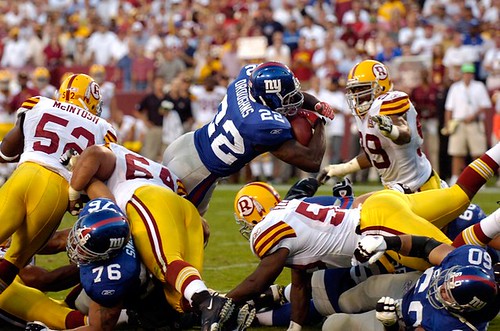
• Loved those Redskins throwbacks, especially the nice, thin pants piping and, of course, the striped socks. And lookie here — an actual sleeve! But why was Clinton Portis wearing white shoes?
• I’m more conflicted about the Eagles’ throwbacks. I loved the striped hose, natch (although a few players took them a bit too far), and I like the basic graphic scheme, but I’ve gotta believe this design looked a lot better when it wasn’t rendered in shiny fabric. Also, it’s hard not to notice that a uniform with such pale colors works a lot better when worn by someone with, um, pale skin. Compare this to this and you’ll see what I mean. Remember, these uniforms were based on a design created back in the 1930s, when the league was almost completely white. Also, the color scheme was based on the Philadelphia city flag, which was in turn based on the Swedish national flag, and Swedes are pretty much the palest people on earth. No surprise, then, that the design looks a bit odd on black players, who currently comprise about 70 percent of the league. (And please: I know there are some people who can’t read anything about any aspect of race without getting bent out of shape, but there’s absolutely nothing in the preceding paragraph that’s even remotely racist.)
• Speaking of striped socks, good to see the Browns going with this look again. Additional views here, here, here, and — just barely, but effectively — here.
• The Patriots wore those stupid silver alternates yesterday, which just look like they need another spin in the washing machine.
• The Rams broke out their rarely seen white pants. And so did the Bucs. In the same game (which also featured an interesting hosiery malfunction).
• At first I thought Marvin Harrison had a little piece of black tape on his lower-right chinstrap hookup (his right, our left). Then I looked at photos from last week and saw that it’s actually a little pice of rubber tubing with either “89” or “68” written on it. Anyone know what that’s about?
• Another week, another game with LaDainian Tomlinson not wearing the American flag on his helmet (it’s tough to see there, but trust me). Willie Parker, however, appears to be back among the flag-clad.
• Chad Johnson, who wore black chinstraps for the season’s first two games, went with standard white yesterday.
• As expected, Morten Andersen made his 2007 debut with his old Dungard facemask present and accounted for.
• Antonio Pierce usually wears a red “ny” on his chinstrap. Yesterday it was blue (“Just to change it up,” says Jints equipment director Joe Skiba). No photo yet.
Membership News: Some new designs in the membership card gallery, with more to follow later today. Incidentally, if you’re looking for something unique, the following numbers aren’t yet represented on the membership roster: 48, 62, 64, 69 (!), 70, 73, 74, 82, 84, 85, 90, 91, 95, and 96.
Research Project: I’m thinking of doing a column that will basically be a Uni Watch glossary — definitions and explanations of uni-related terminology. Entries could include everything from fabric and embroidery terms (tackle twill, soutache) to striping designations (UCLA inserts, Northwestern stripes), typographic terms (vertical arching), uniform and equipment element names (nose bumper, nameplate), and slang-ish terms that have gained parlance here on Uni Watch (logo creep, Ree-box). Most of these are already familiar to people who read this site ,natch, but I think it’ll make a good topic for the larger ESPN audience, which isn’t quite as savvy (yet).
If you’d like to nominate a term for inclusion in the glossary, let me know. Please don’t invent any new terms — what I’m looking for here are words and terms that are already somewhat established. Thanks.
Uni Watch News Ticker: “I was watching Little Big League (the movie where the kid inherits the Twins from his dead grandfather) on cable the other day,” writes Matt Usedom. “I noticed that they actually made a ‘TH’ sleeve patch for their ‘dead owner,’ Thomas Heywood.” ”¦ Decent article on jersey-wearing protocol here (with thanks to Alan Kreit). ”¦ Several readers have noted that Nike’s recent NFL-related commercials (first the one with the Chargers and the Bears, and now the “Leave Nothing” clip with Shane Merriman and Stephen Jackson) are very strange, because the Reebok logo is clearly visible on the uniforms. Now Austin Cochoon has picked up another uni-related oddity: “In the ‘Leave Nothing’ spot [available on YouTube here], at about the 47-second mark, while Jackson is running against the Seahawks, the second Seahawks player coming off the block is wearing #80. It’s hard to see in the YouTube version, but trust me, it’s clearly visible on the television [indeed it is — PL]. ARE YOU KIDDING ME? The only person allowed to wear number 80 for the Seahawks is Steve Largent. I don’t count the brief Jerry Rice stint. Not only is the number 80 retired for the Seahawks, but he player appears to be a defensive back, which makes the number choice even more ludicrous.” ”¦ “There’s a change in the official patch licensee for MLB,” reports patch maven Brad Bierman. “The new company is a Dallas company called the Emblem Source [taking over for National Emblem — PL]. They work directly with Majestic, and did the RFK stadium-closing patch, for example. I have assisted them in lending original patches from my collection that are being replicated to the exact detail.” ”¦ Here’s something the NHL and Reebok apparently didn’t count on: Many of the Penguins (and, presumably, other teams) are complaining that the new water-resistant jerseys are repelling moisture so well that all the sweat and ice spray ends up in the players’ gloves and skates. Details here. ”¦ Still more NHL problems: The red part of Scott Gomez’s “A” began peeling off and then vanished completely the other night. ”¦ And speaking of the Rangers, what’s with the inconsistent name typography? Also, note that Steve Hutchinson and Mike Rupp are wearing tape on their socks — wasn’t that supposed to be unnecessary with the new hose? (With thanks to Jesse Spector, who took that photo himself.) ”¦ Remember the upside-down 8 on Fenway Park’s exterior wall? Greg Niforos reports that it’s now missing. Maybe someone in the Sox front office is a Uni Watch reader..? … No photo, but Joe Skiba reports that USC linebacker Keith Rivers was wearing a “10” helmet decal the other night, presumably in honor of injured teammate Brian Cushing.
In those Nike ads featuring LT and Stephen Jackson, the officials are wearing their “old” (pre-2006) uniforms.
Also in the Stephen Jackson commercial, one of the Pittsburgh “defenders” is wearing number 4.
Clinton Portis is actually wearing soccer shoes. They are the white version of the Nike Total 90 Laser. I’ve noticed several players wearing soccer boots this season, but can’t think of any off the top of my head…
Someone (not me, I’m a poor college kid) really needs to get a 69 card with “Chamberlain” on the back. just sayin…
[quote comment=”146887″]Clinton Portis is actually wearing soccer shoes. They are the white version of the Nike Total 90 Laser. I’ve noticed several players wearing soccer boots this season, but can’t think of any off the top of my head…[/quote]
Maybe he should switch back before he throws any more handoffs at the defensive line. Seriously, man…that stuff made me sick.
…uniforms looked good, though.
I was watching the USF-North Carolina game on TV Saturday. Did anyone else notice what looked like black tape on the back of the NC jersey’s. They are at the very top, above the name plate.
It looked as though NC was blocking out some insignia that was not suppose to be seen.
What gives?
[quote comment=”146892″]I was watching the USF-North Carolina game on TV Saturday. Did anyone else notice what looked like black tape on the back of the NC jersey’s. They are at the very top, above the name plate.
It looked as though NC was blocking out some insignia that was not suppose to be seen.
What gives?[/quote]
I didn’t see what you are referring to, but this is probably the Virginia Tech memorial stripe that all of the ACC schools are wearing this year.
Most are wearing it on the front of their jerseys, but perhaps UNC has it on the back? Seems like an odd location for it, but it is possible.
[quote comment=”146892″]I was watching the USF-North Carolina game on TV Saturday. Did anyone else notice what looked like black tape on the back of the NC jersey’s. They are at the very top, above the name plate.
It looked as though NC was blocking out some insignia that was not suppose to be seen.
What gives?[/quote]
All ACC teams are wearing them as a tribute to the VaTech massacre victims.
I was watching the USF-North Carolina game on TV Saturday. Did anyone else notice what looked like black tape on the back of the NC jersey’s. They are at the very top, above the name plate.
It looked as though NC was blocking out some insignia that was not suppose to be seen.
What gives?
I didn’t see what you are referring to, but this is probably the Virginia Tech memorial stripe that all of the ACC schools are wearing this year.
Most are wearing it on the front of their jerseys, but perhaps UNC has it on the back? Seems like an odd location for it, but it is possible.
I saw that game, it was the VT mark. So far, I have seen that FSU is wearing it above their jersey branding (I think, it’s been a while since I saw that), BC is wearing it above their Eagle on the Shoulder, and those are all that I remember. Paul, could you help with that one? There seem to be a lot of questions/comments about it.
Also, I don’t think that hockey tape will ever completely go away. I’m sure that the socks fit tighter, but even so, I know I like having my shin guards cinched down pretty tight. Makes me feel a little more protected, and more stable when sccelerating.
Still don’t like the Washington throwbacks. ‘Do you want some fries with that?’
I never thought I’d say this (because silver is my second favorite color), but those New England throwbacks are hideous. They look like giant reflectors. As for the Iggles, I find it hard to believe those would look good even if they were in matte. All the throwbacks I’ve seen this season thus far need to be thrown away.
I didn’t see what you are referring to, but this is probably the Virginia Tech memorial stripe that all of the ACC schools are wearing this year.
Most are wearing it on the front of their jerseys, but perhaps UNC has it on the back? Seems like an odd location for it, but it is possible.
All ACC teams are wearing them as a tribute to the VaTech massacre victims.
Thanks.
I am surprised they did not just use the ribbon with the Va Tech colors like we have seen on a number of occasions.
And yes…the placement is very odd.
[quote comment=”146898″]Still don’t like the Washington throwbacks. ‘Do you want some fries with that?’
I never thought I’d say this (because silver is my second favorite color), but those New England throwbacks are hideous. They look like giant reflectors. As for the Iggles, I find it hard to believe those would look good even if they were in matte. All the throwbacks I’ve seen this season thus far need to be thrown away.[/quote]
You missed the Cards-Niners game in Week 1 I take it? The Niners were in the throwbacks, not the Cardinals.
Maybe I’m just jaded from my teenage employment years but I always thought that they link always reminded me of link.
Two things:
[quote comment=”146898″]Still don’t like the Washington throwbacks. ‘Do you want some fries with that?'[/quote]
-I hate that, like somehow McDonalds has a monopoly on the colors red and yellow. I’m fairly certain the ‘skins had those colors before MickyD’s. They look classy together and it looks even better when the yellow is more prominent, like with those throwbacks. I’m a Giants fan and I can say I love those uni’s.
About the Eagles jerseys thing: I always thought that simple white jerseys especially when paired with white pants (like Texas) looked better on black players just to show this definately goes both ways.
Since we are talking about the NFL Unis:
(1) Giving the Eagles a pass since it is a replica of their 1930’s uniform. If that were their “real” uniforms I would ranked them right up there with the Bengals as the ugliest…especially the color scheme.
(2) Love the Redskins throwbacks (and, no, I am not a Redskins fan)
(3) Hate the Pats and Belicheat…but I love their uniforms. Not big on the way the Patriot is on the helmet, but still think they have a great uniform. Even the silver is ok.
On a seperate note (not really uni related). I was praying in temple on Saturday (for Yom Kippur) and couldn’t even escape visions of UniWatch while there.
For those of you who don’t know it is custom to wear comfortable shoes during Yom Kippur due to the walking to temple and the many hours on your feet while there. So I’m in the middle of temple and all day I’m seeing grown men in $1k suits with there Nike sneakers on. The swoosh followed me into temple!!! Is nothing sacred?
New sweaters do their job, but designers didn’t think about side effects. link
Speaking of silver, the NZ All-Blacks had their link jerseys this weekend. Not that bad of jerseys in themselves…but man…their the all-blacks…their supposed to be all black
I like the Redskin’s throwbacks quite a bit. However, every time I saw highlights I thought they were the Packers.
I didn’t think the Eagles looked good at all. The socks were good but that was about it. I think they would have looked better if the jerseys were mostly blue which may not be historically accurate.
I thought the Skins throwbacks looked just like the Packers road uniform (with red instead of green of course)
I love the Redskins’ throwbacks. Aside from sticking with the dark helmet, I would make the throwbacks their primary uni.
gotta love the eagles uniforms this weekend maybe they should keep them and they will keep winning…maybe?
A couple of things I noticed this weekend watching sports (sorry if these were posted over the weekend, I did a quick search and didn’t see them):
Oklahoma wears white shoes but there kicker wears one black shoe, weird thing is its on his non-kicking foot: link
And this one I couldn’t get a picture of but if anyone has mlb.tv and can get a screen grab it was in the 7th inning of Saturday’s game vs Tampa Bay. On Mike Timlin’s sleeve were the Majestic logo is the piping on the bottom of his sleeve actually went over the logo. I looked for pictures and he didn’t have the problem before so maybe it was a one time thing.
[quote comment=”146905″]On a seperate note (not really uni related). I was praying in temple on Saturday (for Yom Kippur) and couldn’t even escape visions of UniWatch while there.
For those of you who don’t know it is custom to wear comfortable shoes during Yom Kippur due to the walking to temple and the many hours on your feet while there. So I’m in the middle of temple and all day I’m seeing grown men in $1k suits with there Nike sneakers on. The swoosh followed me into temple!!! Is nothing sacred?[/quote]
It may be that you are supposed to walk to temple (as you are for Shabbat as well), but one of the reasons to wear athletic shoes is because you are not supposed to wear leather shoes:
link
Five prohibitions are traditionally observed, as detailed in the Jewish oral tradition (Mishnah tractate Yoma 8:1):
1. Eating and drinking
2. Wearing leather shoes
3. Bathing/washing
4. Anointing oneself with perfumes or lotion
5. Marital relations
More NFL Uni quick thoughts:
Redskins throwbacks: Kind of a dilemma, because up close they are beautiful. From far away they look too much like the Green Bay unis (even with the Vince Lom. story behind it). As a throwback or fullly used alternate jersey though, it’s a good choice.
Eagles throwbacks: ditto the previous remarks of different time, different era.
Rams: White pants look sharp with the blue jersey
Finally in baseball, it was disappointing to see the Nats close out their final RFK game wearing their red alts. instead of their normal whites. With it being billed a such a “formal” (maybe that word’s too strong) occasion, wear the traditional home gear.
You note Chad Johnsons change back to the standard white chinstrap, but looks like he also changed from a Scutt to Riddell Revolution helmet
Speaking of silver, the NZ All-Blacks had their silver jerseys this weekend. Not that bad of jerseys in themselves…but man…their the all-blacks…their supposed to be all black
Most of all it was virtually impossible to distinguish them from their opponents during the game. both jerseys used gray and navy/black prominently and both teams wore dark shorts and socks.
[quote comment=”146919″][quote comment=”146905″]On a seperate note (not really uni related). I was praying in temple on Saturday (for Yom Kippur) and couldn’t even escape visions of UniWatch while there.
For those of you who don’t know it is custom to wear comfortable shoes during Yom Kippur due to the walking to temple and the many hours on your feet while there. So I’m in the middle of temple and all day I’m seeing grown men in $1k suits with there Nike sneakers on. The swoosh followed me into temple!!! Is nothing sacred?[/quote]
It may be that you are supposed to walk to temple (as you are for Shabbat as well), but one of the reasons to wear athletic shoes is because you are not supposed to wear leather shoes:
link
Five prohibitions are traditionally observed, as detailed in the Jewish oral tradition (Mishnah tractate Yoma 8:1):
1. Eating and drinking
2. Wearing leather shoes
3. Bathing/washing
4. Anointing oneself with perfumes or lotion
5. Marital relations[/quote]
I wasn’t really looking to get into all of it, but yes you are correct. I was merely noting that even in temple I couldn’t escape the swoosh.
focussing more on the merriman/jackson nike football commercial. you guys are missing the commercials biggest flaw.
steven jackson scores a touchdown in it…
its the only touchdown that fantasy owners who took him 2nd overall this year have gotten to see him score…
was great to see that mike nolan actually wore shirt and tie yesterday UNDER his “officially licensed reebok sideline gear”… it proves that coaches can still look professional even with the ridiculous reebok/NFL rule about team gear…
as a suit-wearing football coach myself, cheers coach nolan!
Sorry about mentioning something Paul covers. I saw it and went straight to the comments without reading. Shame on me.
In regards to the tape on the socks, I have a few theories. It could be habbit, some players like their equipment very secure, not just held on by some streatch socks, or the socks aren’t doing the job they’re intended to.
[quote comment=”146911″]I thought the Skins throwbacks looked just like the Packers road uniform (with red instead of green of course)[/quote]
Well, that was the general idea….
[quote comment=”146923″][quote comment=”146919″][quote comment=”146905″]On a seperate note (not really uni related). I was praying in temple on Saturday (for Yom Kippur) and couldn’t even escape visions of UniWatch while there.
For those of you who don’t know it is custom to wear comfortable shoes during Yom Kippur due to the walking to temple and the many hours on your feet while there. So I’m in the middle of temple and all day I’m seeing grown men in $1k suits with there Nike sneakers on. The swoosh followed me into temple!!! Is nothing sacred?[/quote]
It may be that you are supposed to walk to temple (as you are for Shabbat as well), but one of the reasons to wear athletic shoes is because you are not supposed to wear leather shoes:
link
Five prohibitions are traditionally observed, as detailed in the Jewish oral tradition (Mishnah tractate Yoma 8:1):
1. Eating and drinking
2. Wearing leather shoes
3. Bathing/washing
4. Anointing oneself with perfumes or lotion
5. Marital relations[/quote]
I wasn’t really looking to get into all of it, but yes you are correct. I was merely noting that even in temple I couldn’t escape the swoosh.[/quote]
To follow up on that, you had it lucky if all you saw was the swoosh. If I see one more pair of crocs, especially on a man, I will lose my friggin mind. But I couldn’t help but laugh at the combo of expensive suit/cheap shoes.
I think the Eagles throwbacks (while a good color combination) proves that in football, you just can’t go back to some random uniform in history and that it’ll work.
Seems like the better football throwbacks are those that reflect uniforms of the 60’s and 70’s. Which when you think about it, is more of the NFL’s (and AFL’s) ‘Golden Age’.
Baseball can go deeper to the 30’s and 40’s before they start to look ridiculous, because that’s generally the MLB ‘Golden Age’.
[quote comment=”146929″][quote comment=”146923″][quote comment=”146919″][quote comment=”146905″]On a seperate note (not really uni related). I was praying in temple on Saturday (for Yom Kippur) and couldn’t even escape visions of UniWatch while there.
For those of you who don’t know it is custom to wear comfortable shoes during Yom Kippur due to the walking to temple and the many hours on your feet while there. So I’m in the middle of temple and all day I’m seeing grown men in $1k suits with there Nike sneakers on. The swoosh followed me into temple!!! Is nothing sacred?[/quote]
It may be that you are supposed to walk to temple (as you are for Shabbat as well), but one of the reasons to wear athletic shoes is because you are not supposed to wear leather shoes:
link
Five prohibitions are traditionally observed, as detailed in the Jewish oral tradition (Mishnah tractate Yoma 8:1):
1. Eating and drinking
2. Wearing leather shoes
3. Bathing/washing
4. Anointing oneself with perfumes or lotion
5. Marital relations[/quote]
I wasn’t really looking to get into all of it, but yes you are correct. I was merely noting that even in temple I couldn’t escape the swoosh.[/quote]
To follow up on that, you had it lucky if all you saw was the swoosh. If I see one more pair of crocs, especially on a man, I will lose my friggin mind. But I couldn’t help but laugh at the combo of expensive suit/cheap shoes.[/quote]
Our rabbi actually was encouraging people to wear crocs “of any color” because it fit all of the requirements. Didn’t bother me a bit, neither did the swoosh, it just reminded me of uniwatch.
I hope everyone had an easy fast.
Can’t defend the Nats’ red alts, but they traditionally wear them every Sunday… here’s hoping they get left behind at RFK.
[quote comment=”146930″]I think the Eagles throwbacks (while a good color combination) proves that in football, you just can’t go back to some random uniform in history and that it’ll work.
Seems like the better football throwbacks are those that reflect uniforms of the 60’s and 70’s. Which when you think about it, is more of the NFL’s (and AFL’s) ‘Golden Age’.
Baseball can go deeper to the 30’s and 40’s before they start to look ridiculous, because that’s generally the MLB ‘Golden Age’.[/quote]
I think that is pretty accurate and mostly because of the equipment being used now versus then. In baseball, with the exception of the fabric the uniforms are pretty much the same and have to deal with the same t-shirts and underwear. Whereas in the NFL, the pads are bigger, the helmets are plastic (not leather) and the material is much much different. So even if the scheme is similar (as the eagles were) the effect could be completely different than the past.
Over the weekend several Penn State players were wearing the Schutt Ion helmut, there the first team besides the Giants I’ve seen wearing them, there may be more but I haven’t noticed.
[quote comment=”146922″]Speaking of silver, the NZ All-Blacks had their silver jerseys this weekend. Not that bad of jerseys in themselves…but man…their the all-blacks…their supposed to be all black
Most of all it was virtually impossible to distinguish them from their opponents during the game. both jerseys used gray and navy/black prominently and both teams wore dark shorts and socks.[/quote]
I didn’t see the match but from the pics thats one of the first things i noticed. musta been a total bitch, especially with rugby being a game of such wildness
[quote comment=”146886″]Also in the Stephen Jackson commercial, one of the Pittsburgh “defenders” is wearing number 4.[/quote]
I noticed this awhile ago too, but when it ran last night that poor kicker in their on goal line defense was no longer there. It looked like they digitally altered the number on that guy. I can’t remember what number it was changed to, but it was definitely not 4.
[quote comment=”146917″]A couple of things I noticed this weekend watching sports (sorry if these were posted over the weekend, I did a quick search and didn’t see them):
Oklahoma wears white shoes but there kicker wears one black shoe, weird thing is its on his non-kicking foot: link
[/quote]
Wierder, those are the same shoe, just different color schemes.
On a seperate note (not really uni related). I was praying in temple on Saturday (for Yom Kippur) and couldn’t even escape visions of UniWatch while there.
For those of you who don’t know it is custom to wear comfortable shoes during Yom Kippur due to the walking to temple and the many hours on your feet while there. So I’m in the middle of temple and all day I’m seeing grown men in $1k suits with there Nike sneakers on. The swoosh followed me into temple!!! Is nothing sacred?
It may be that you are supposed to walk to temple (as you are for Shabbat as well), but one of the reasons to wear athletic shoes is because you are not supposed to wear leather shoes:
Wiki Link
Five prohibitions are traditionally observed, as detailed in the Jewish oral tradition (Mishnah tractate Yoma 8:1):
1. Eating and drinking
2. Wearing leather shoes
3. Bathing/washing
4. Anointing oneself with perfumes or lotion
5. Marital relations
I wasn’t really looking to get into all of it, but yes you are correct. I was merely noting that even in temple I couldn’t escape the swoosh.
To follow up on that, you had it lucky if all you saw was the swoosh. If I see one more pair of crocs, especially on a man, I will lose my friggin mind. But I couldn’t help but laugh at the combo of expensive suit/cheap shoes.
Our rabbi actually was encouraging people to wear crocs “of any color” because it fit all of the requirements. Didn’t bother me a bit, neither did the swoosh, it just reminded me of uniwatch.
I hope everyone had an easy fast.
I’ve been wearing my Chuck Taylor hi-tops on Yom Kippur for 30 years and I suddenly found myself to actually be wearing something that is in style.
In that Auxerre soccer game with the borrowed uniforms, did those alternates have player names on them? Were guys running around the pitch with the same names as their opponents?
And if they only had numbers, how did they decide who got what number? Surely the sizes wouldn’t match up. Was it just arbitrary?
I think the Pats looked great yesterday. I was at the game and loved seeing the Silver unis. I am not really a big fan of their blue jerseys so this was a welcome change from what I was expecting. I was especially pleased with this change because it meant a change from their link that they usually where at home to the link that they usually where on the road.
To the guy who above called Bill Belichick Belicheat (very original by the way, where do you come up with this stuff?) what is wrong with the way the Patriots where the “Patriot” on their helmet?
Shaun Alexander had American flags on both elbow pads. Never noticed it before, but it could be normal…
[quote comment=”146919″][quote comment=”146905″]On a seperate note (not really uni related). I was praying in temple on Saturday (for Yom Kippur) and couldn’t even escape visions of UniWatch while there.
For those of you who don’t know it is custom to wear comfortable shoes during Yom Kippur due to the walking to temple and the many hours on your feet while there. So I’m in the middle of temple and all day I’m seeing grown men in $1k suits with there Nike sneakers on. The swoosh followed me into temple!!! Is nothing sacred?[/quote]
It may be that you are supposed to walk to temple (as you are for Shabbat as well), but one of the reasons to wear athletic shoes is because you are not supposed to wear leather shoes:
link
Five prohibitions are traditionally observed, as detailed in the Jewish oral tradition (Mishnah tractate Yoma 8:1):
1. Eating and drinking
2. Wearing leather shoes
3. Bathing/washing
4. Anointing oneself with perfumes or lotion
5. Marital relations[/quote]
So were they canvas nikes?
[quote comment=”146928″][quote comment=”146911″]I thought the Skins throwbacks looked just like the Packers road uniform (with red instead of green of course)[/quote]
Well, that was the general idea….[/quote]
Yes, Lombardi actually designed those when he came to the Skins (at least that is what Buck and Aikmen were saying).
[quote comment=”146949″][quote comment=”146928″][quote comment=”146911″]I thought the Skins throwbacks looked just like the Packers road uniform (with red instead of green of course)[/quote]
Well, that was the general idea….[/quote]
Yes, Lombardi actually designed those when he came to the Skins (at least that is what Buck and Aikmen were saying).[/quote]
That’s also in the book When Pride Still Mattered. Great book by the way, this from a Bears fan.
Visanthe Shiancoe of the Vikes took a shot to the coconut yesterday that peeled part the horn off the side of his helmet, but I can’t seem to find a pic of it.
[quote comment=”146947″][quote comment=”146919″][quote comment=”146905″]On a seperate note (not really uni related). I was praying in temple on Saturday (for Yom Kippur) and couldn’t even escape visions of UniWatch while there.
For those of you who don’t know it is custom to wear comfortable shoes during Yom Kippur due to the walking to temple and the many hours on your feet while there. So I’m in the middle of temple and all day I’m seeing grown men in $1k suits with there Nike sneakers on. The swoosh followed me into temple!!! Is nothing sacred?[/quote]
It may be that you are supposed to walk to temple (as you are for Shabbat as well), but one of the reasons to wear athletic shoes is because you are not supposed to wear leather shoes:
link
Five prohibitions are traditionally observed, as detailed in the Jewish oral tradition (Mishnah tractate Yoma 8:1):
1. Eating and drinking
2. Wearing leather shoes
3. Bathing/washing
4. Anointing oneself with perfumes or lotion
5. Marital relations[/quote]
So were they canvas nikes?[/quote]
Nah, still leather. Our temple is like a fall fashion show. If it doesn’t look good, they don’t wear it. (I’m not saying I don’t think the canvas looks good, but I don’t think they give quite the same fashion statement to these people).
Although the color scheme of the Eagles was good, I agree that the Sateen sheen thing made it look bad. I like that the cheerleaders and some of the sideline gear (most notably the hats) and the field were in the old scheme. athe team made a full concerted effort to commemorate 75 years of Eagles football. The Redskins cheerleaders and staff didn’t appear to have throwback stuff on, though.
Didn’t see this posted before, and I apologize if I missed it….
Looks like Scott Gomez’s ‘A’ partially dismantled itself in Saturday’s preseason game.
link
link
It looks to me like a number 88 on Marvin’s chinstrap, which makes a lot more sense.
There was an interesting note about a practical joke being played on Norris Hopper of the Reds yesterday. His baggy pants were hidden by teammates and replaced with a tight pair, which he wore for the first few innings of the game.
Here is the link. I’ll try to find a photo.
link
Paul raised an interesting point this morning about the Eagles throwbacks looking better on a caucasian player versus a black player.
My question is: do you think that was by design as Paul alludes to or just coincidence? I can’t imagine that manufactureres then or now would take that into their thought pattern when designing a new uni/color scheme. Anyone out there who can confirm or deny this?
The inconsistent typography on the Rangers’ jerseys probably has something to do with the fact that they use screen printed names on their preseason uniforms. If they are still doing this perhaps they just have a habit of getting careless when screening on the names since the uniforms are only for preseason anyway. I am not sure if they are still doing this with the new RBK jerseys but I know that they did this in the past and then switched to sewn on names once the season started.
What is wrong with the way the Patriots where the “Patriot” on their helmet?
I don’t know what the proper name is, I just don’t like the way there is a sort of “tail” after the Patriots head. For my tastes, it is just an odd look.
The patriots silver jerseys are not throwbacks, they are alternates.
[quote comment=”146970″]The inconsistent typography on the Rangers’ jerseys probably has something to do with the fact that they use screen printed names on their preseason uniforms. If they are still doing this perhaps they just have a habit of getting careless when screening on the names since the uniforms are only for preseason anyway. I am not sure if they are still doing this with the new RBK jerseys but I know that they did this in the past and then switched to sewn on names once the season started.[/quote]
Could it have something to do with the players who are vetrans vs those that are tring out. My guess would be that the equipment guy wouldn’t want to vertically arch the names of some guys who are going to get cut in a couple weeks.
I was watching the Carolina-Atlanta game yesterday, and it seems that the Panthers wear their NFL logo a bit more link than most other teams. Compare that to link.
~E~
[quote comment=”146968″]There was an interesting note about a practical joke being played on Norris Hopper of the Reds yesterday. His baggy pants were hidden by teammates and replaced with a tight pair, which he wore for the first few innings of the game.
Here is the link. I’ll try to find a photo.
link
I can’t find any photos. Dang it. And I already deleted the game from my Tivo too.
Morten Anderson was not the only facemask oddity of the weekend. As mentioned last week, the Browns signed Scott Player to fill-in as punter and FG holder this week, and he brought his legacy single bar mask. The bizarre blocked FG at the end of the game could be used as a link that want the retro single bar (note the single bar smooshed up near his forehead!)
[quote comment=”146917″]A couple of things I noticed this weekend watching sports (sorry if these were posted over the weekend, I did a quick search and didn’t see them):
Oklahoma wears white shoes but there kicker wears one black shoe, weird thing is its on his non-kicking foot: link
And this one I couldn’t get a picture of but if anyone has mlb.tv and can get a screen grab it was in the 7th inning of Saturday’s game vs Tampa Bay. On Mike Timlin’s sleeve were the Majestic logo is the piping on the bottom of his sleeve actually went over the logo. I looked for pictures and he didn’t have the problem before so maybe it was a one time thing.[/quote]
I think I remember seeing something like that during a Yankees-Sox series with Timlin, the majestic logo was underneath the red piping on his sleeve, just about as far down on the bottom of the sleeve as you can go. There may not be a screen grab of it yet, but at least you have a witness…
[quote comment=”146969″]Paul raised an interesting point this morning about the Eagles throwbacks looking better on a caucasian player versus a black player.
My question is: do you think that was by design as Paul alludes to or just coincidence?[/quote]
I don’t think it was by design. I think it was just the way things happened (and by “things,” I mean the Swedish settlement of Philly, the use of the flag colors, etc.). I don’t think anyone consciously thought about race when designing the uniforms back in the ’30s. I think they said, “Hey, these uniforms look good,” but they might NOT have said that at the time if there had been lots of black players.
The Redskins throwbacks are great. Please, no more burgundy pants. ever. ..reminds me of bad 70s leisure suits. I agree w/ previous post that these throwbacks, but w/ the dark helmets, should be the primary uniform.
Pats silver alts suck. look bad on TV. ..and I am a Pats fan. Why not red? I heard Bob Kraft doesn’t like the team in red, as he changed their primary color to blue when he took ownership. Can anyone confirm?
[quote comment=”146981″][quote comment=”146917″]A couple of things I noticed this weekend watching sports (sorry if these were posted over the weekend, I did a quick search and didn’t see them):
Oklahoma wears white shoes but there kicker wears one black shoe, weird thing is its on his non-kicking foot: link
And this one I couldn’t get a picture of but if anyone has mlb.tv and can get a screen grab it was in the 7th inning of Saturday’s game vs Tampa Bay. On Mike Timlin’s sleeve were the Majestic logo is the piping on the bottom of his sleeve actually went over the logo. I looked for pictures and he didn’t have the problem before so maybe it was a one time thing.[/quote]
I think I remember seeing something like that during a Yankees-Sox series with Timlin, the majestic logo was underneath the red piping on his sleeve, just about as far down on the bottom of the sleeve as you can go. There may not be a screen grab of it yet, but at least you have a witness…[/quote]
Thanks for the backup
Check out the link on Newport Harbor High. I caught their game on FSN Friday and I thought these were fantastic (although I can’t decide whether the flag should be flipped on the right side of the helmet).
The link goes to a gallery page and when you click a gallery it has an embedded Flash application to view the photos.
Is it just me or is that an extra-large nameplate on link (as mentioned in reference to uniform #80) above????
Seems that such a short, four-lettered name as “Rice” wouldn’t need such a large nameplate, but maybe they’re all made from one standard size?
[quote comment=”146989″]Is it just me or is that an extra-large nameplate on link (as mentioned in reference to uniform #80) above????
Seems that such a short, four-lettered name as “Rice” wouldn’t need such a large nameplate, but maybe they’re all made from one standard size?[/quote]
For reasons that aren’t clear to me, NFL nameplates almost always run shoulder-to-shoulder, regardless of the length of the name. We’ve followed this protocol when designing the link.
Caught some hilites of Sunday action in the NFL and noticed the Lions still have black on their uniforms. Wasn’t it reported here that they were getting rid of the black?
[quote comment=”146994″]Caught some hilites of Sunday action in the NFL and noticed the Lions still have black on their uniforms. Wasn’t it reported here that they were getting rid of the black?[/quote]
I never heard any such report (unfortunately).
[quote comment=”146982″][quote comment=”146969″]Paul raised an interesting point this morning about the Eagles throwbacks looking better on a caucasian player versus a black player.
My question is: do you think that was by design as Paul alludes to or just coincidence?[/quote]
I don’t think it was by design. I think it was just the way things happened (and by “things,” I mean the Swedish settlement of Philly, the use of the flag colors, etc.). I don’t think anyone consciously thought about race when designing the uniforms back in the ’30s. I think they said, “Hey, these uniforms look good,” but they might NOT have said that at the time if there had been lots of black players.[/quote]
But that is kind of my point. I don’t know if the manufacturers actully think about what would look good on a player or not. Do they just mock it up and look at it against a table or do you think they have different color mannequins that they compare and contrast with?
I am stunned by how horrible the shirttail of the NY Rangers jersey looks with that white strip. Completely unnecessary.
I think the exact opposite about the Eagles throwback colors. Light pastels like that look great on darker complexions and tend to make pastier people (like me) look washed out and pale.
I read somewhere that there is paranoia developing because of the new Tampa Bay (Devil) Rays unis. Since they removed the region name from the jersey, they’re worried that they could be in the beginning steps of relocating. Similar to what the North Stars did before heading to Dallas.
Questions for you guys:
1. Do you think people should actually be worried about this?
2. Where would they move to? Portland? Vegas? Virginia? ..Orlando?
3. Anyone know what kind of lease they have with Tropicana Field?
[quote comment=”146999″]I am stunned by how horrible the shirttail of the NY Rangers jersey looks with that white strip. Completely unnecessary.[/quote]
I was looking at some of the Blackhawks game photo galleries this weekend and while I didn’t pay attention to the back of the jersey as there weren’t any good shots of them, I could hardly notice the rounded hemline on the front.
The Rangers jerseys just look like the arch the names if they are too long to go straight across. Weird, but that seems to be what is happening in the picture.
I am stunned by how horrible the shirttail of the NY Rangers jersey looks with that white strip. Completely unnecessary.
I agree. The white tail on the Rangers and Black Hawks home jersey’s looks like a diaper.
Now with Uni-Mania sweeping the nation, it looks like link into one of their columns.
“Ugly uni alert: Apparently, there will be a weekly mention in this space of attire. Here’s hoping the references to hideous jerseys are kept to a minimum.”
I don’t think Paul has much to fear here.
I hate when the Rams where white pants, simply because their dark jersey/gold pants combo is my favorite NFL uni. I think the solid pants with no stripes also look alot better. I think my favorite team, the Vikings, would have looked alot better with solid color pants as opposed to the odd stripe they have on them. I’ve come to not hate the Vikings jerseys, but the pants royally suck. The only redeaming quaility was the purple pants on the road, but now they don’t wear them much which sucks.
Surprised a footballer would wear Nike soccer cleats. There was a spate of high-profile injuries for guys wearing new Nike cleats last year (Rooney, C. Ronaldo). I’d imagine that an NFL puts even more stress on his feet, with greater likelihood of contact with another player…
[quote comment=”146988″]Check out the link on Newport Harbor High. I caught their game on FSN Friday and I thought these were fantastic (although I can’t decide whether the flag should be flipped on the right side of the helmet).
The link goes to a gallery page and when you click a gallery it has an embedded Flash application to view the photos.[/quote]
im guessing that this is the same Newport Harbor High School which is the focus of “Newport Harbor: The Real Orange County” on MTV which has taken over for Laguna Beach…
Check out Sevilla’s uniform for their Saturday match at Barca (not you, Minna):
link
[quote comment=”146999″]I am stunned by how horrible the shirttail of the NY Rangers jersey looks with that white strip. Completely unnecessary.[/quote]
I watched the Maple Leafs and Bruins, the Leafs were in white with no striping on the bottom and the Bruins in black, Boston’s patch was good but the Maple Leafs jersey had the ‘horrible shirttails’ flowing in the wind. It was an awful site. I felt like grabbing a paper cutter and slicing it off. With Toronto’s white jerseys the numbers are blue but are outlined with blue-white-blue, unnecessary, should just have went with plain blue numbers, there is a lot of shoulda coulda woulda with these new jerseys.
[quote comment=”147004″]I read somewhere that there is paranoia developing because of the new Tampa Bay (Devil) Rays unis. Since they removed the region name from the jersey, they’re worried that they could be in the beginning steps of relocating. [/quote]
The Devil Rays link still contain the words Tampa Bay.
Corrected link to the link. My bad.
Scott Player sporting the single bar for the Browns…classic… Like Hulk Hogan circa 1960’s
Thankfully the days of the Rangers wearing link in the preseason are long gone, a peeling “A” would’ve been the least of their concerns back then.
I’ve a request for all my fellow readers with local retailers now stocking the authentic Rbk Edge hockey jerseys. Take a look next time you’re there and see if all of said jerseys have the fight straps sewn in. The big hockey retailer here in Edmonton just started selling their first shipment, and of 30-40 pro models, about 8-10 were strap-free. Mostly size 52.
The Devil Rays road uniforms still contain the words Tampa Bay.
That is this year’s jersey. Next year “Rays” will be on the front of both the home and away jersey.
[quote comment=”146988″]Check out the link on Newport Harbor High. I caught their game on FSN Friday and I thought these were fantastic (although I can’t decide whether the flag should be flipped on the right side of the helmet).
The link goes to a gallery page and when you click a gallery it has an embedded Flash application to view the photos.[/quote]
While those helmets do look good, they shouldn’t even exist.
There was discussion on here last week (I think) about the US flag appearing on sports uniforms. Federal law is pretty clear about it….
link
Regarding the disappearing A, maybe the Red Wings have been vindicated in the issue of what happens when you sew over the seam. Or maybe they just didn’t like the look (they use a thin typeface, one layer A & C. Might have just looked weird with the kink caused by the seam in the middle).
[quote comment=”146984″]The Redskins throwbacks are great. Please, no more burgundy pants. ever. ..reminds me of bad 70s leisure suits. I agree w/ previous post that these throwbacks, but w/ the dark helmets, should be the primary uniform.
Pats silver alts suck. look bad on TV. ..and I am a Pats fan. Why not red? I heard Bob Kraft doesn’t like the team in red, as he changed their primary color to blue when he took ownership. Can anyone confirm?[/quote]
REDSKINS THROWBACKS ARE GREAT.
Very well done – though I prefer the Maroon Helmet, with these same unis (George Allen era) but I’ll take these over the modern unis.
The Eagles’ Throwbacks were good, interesting, but nothing we’d want to have to look at for 16 straight weeks. Can you imagine these every week? My kudos to the Eagles for stretching out and using the different 1933 color scheme, down to the endzone graphics (!!!), etc. to get as close and true to that era as they could.
Not long ago the Jets, Bills and Cowboys were going retro “on the cheap” and wearing wrong color helmets and reverse/erroneous decals.
The NFL 1930’s era can be done well is it is a good effort and the right uni. I still believe that the BEST NFL throwbacks of ALL-TIME were the 1933 Steeler’s throwback jerseys, with the Red Grange-era stripes and emblems on the chest. There is a reason that those 1933 Steelers jerseys are the most sought after and most expensive when they rarely do come up on EBAY or in an auction – that is because they are GREAT !!!!
The Patriot’s Silver alts – Whats the point?
They look like white jerseys in need of bleach.
Kudos to Bob Kraft for not having the ghetto-inspired/Foot Locker-concocted obligitary Black alt jersey !!!
Pat’s, do a Red alt – which is your true second color – and make it a real alt.
If not, leave well-enough (mediocrity) alone.
[quote comment=”146899″]I didn’t see what you are referring to, but this is probably the Virginia Tech memorial stripe that all of the ACC schools are wearing this year.
Most are wearing it on the front of their jerseys, but perhaps UNC has it on the back? Seems like an odd location for it, but it is possible.
All ACC teams are wearing them as a tribute to the VaTech massacre victims.
Thanks.
I am surprised they did not just use the ribbon with the Va Tech colors like we have seen on a number of occasions.
And yes…the placement is very odd.[/quote]
The equipment managers in the ACC received a memo from the ACC Home office stating that we would honor the victims of the Virginia Tech tragedy. We would do this by placing black patches on Jerseys. The patches are to be placed on the jerseys of the following sports:
Men’s and Women’s Basketball
Field Hockey
Football
Men’s and Women’s Lacrosse
Men’s and Women’s Soccer
Softball
Volleyball
It was also suggested that the Head coach and Equipment manager decide between the following locations for each patch:
Location 1- Left Sleeve
Location 2- Right Sleeve
Location 3- Left Chest
Location 4- Right Chest
Location 5- Back Neck of Jersey
As for the Virginia Tech Colors, the was done in the Spring immediately after the shootings. At Maryland we were given helmet stickers in ribbon form in the colors of Virginia Tech.They were distributed to all of the athletes as well as given to the athletes to give out on Campus.
[quote comment=”147013″]Surprised a footballer would wear Nike soccer cleats. There was a spate of high-profile injuries for guys wearing new Nike cleats last year (Rooney, C. Ronaldo). I’d imagine that an NFL puts even more stress on his feet, with greater likelihood of contact with another player…[/quote]
I do not think the cleats had anything to do with the injuries to C. Ronaldo and Rooney. Rooney broke his foot after colliding with the keeper, whci i think would have happened if he was wearing work boots. I think the American Footballers are wearing the soccer style because they are lighter and engineered for a player to be wearning them for 90 minutes of running. They are a little more comfortable and you can also tailor them to the different playing surfaces. The firm ground soccer boots are molded to the base, not screw in studs like most football cleats. Lots of people hate the feel of studs on their feets, so they go with the molded style, especially on the new field turf surfaces.
The only thing better would be if Scott Player were permitted to go maskless, much like Don Cockroft (the old Browns punter/kicker who was the last maskless player, I believe).
That photo of Player getting nailed reminds me of a Redskins-Cowboys game in 2002 (it may have been Thanksgiving), the year the Skins wore the spear helmets. Something went awry, and Bryan Barker, the Washington punter, got hit. Next thing you know, the camera zooms in on him, and he has a broken nose. And Barker didn’t even have a single bar(ker), so I’m always a bit concerned about Player’s safety.
[quote comment=”146994″]Caught some hilites of Sunday action in the NFL and noticed the Lions still have black on their uniforms. Wasn’t it reported here that they were getting rid of the black?[/quote]
They should. The Lion’s black trim and piping are Horrible, and their black alt jerseys belong on an internet concept team and need to stay there !!!
RE: the new NHL socks
Tape might not be necessary for most of the players, but some of them are probably using it to keep their shinguards in place rather than having straps under the socks (from experience I can say that some shinguard straps are horribly uncomfortable when they dig into the back of your knee).
[quote comment=”147032″]Scott Player sporting the single bar for the Browns…classic… Like Hulk Hogan circa 1960’s[/quote]
link
link
While on the subject of uni colors and skin color. I have a friend that’s in her last year of clothing design school. She mentioned recently that they have mannequins of every possible skin-tone just in case a color combo might look great one color and terrible on another. She said that she has has to start over with different fabrics before for that reason. I’m sure with the actual(non-alternate or throwback) jerseys, someone designing them must take that into account. Especially with jersey sales being so lucrative. But then again I’m sure some old coot owner might give a thumbs down to common sense like that.
[quote comment=”147044″][quote comment=”147013″]Surprised a footballer would wear Nike soccer cleats. There was a spate of high-profile injuries for guys wearing new Nike cleats last year (Rooney, C. Ronaldo). I’d imagine that an NFL puts even more stress on his feet, with greater likelihood of contact with another player…[/quote]
I do not think the cleats had anything to do with the injuries to C. Ronaldo and Rooney. Rooney broke his foot after colliding with the keeper, whci i think would have happened if he was wearing work boots. I think the American Footballers are wearing the soccer style because they are lighter and engineered for a player to be wearning them for 90 minutes of running. They are a little more comfortable and you can also tailor them to the different playing surfaces. The firm ground soccer boots are molded to the base, not screw in studs like most football cleats. Lots of people hate the feel of studs on their feets, so they go with the molded style, especially on the new field turf surfaces.[/quote]
Nice points, Doc.
Just to add some, though. Soccer cleats/boots are also engineered better to distribute the weight, even with the screw in/clip in kind. They pioneered the use of composites in the soles to make it seem almost like you were wearing ‘flat’ shoes.
Also in soccer all the attention of play is around the feet, exposing a player to injuries at the feet. A tackle can cause harm to a player’s foot, as well as a player extending his leg and foot in order to get to the ball. In football, the foot is nearly the farthest thing from the action (unless you’re talking about a diving shoestring tackle), but most of the action is in the upper torso.
[quote comment=”147051″][quote comment=”147032″]Scott Player sporting the single bar for the Browns…classic… Like Hulk Hogan circa 1960’s[/quote]
link
link[/quote]
Are facemasks suppose to be hinged like that? Ouch, babe.
They could have an immediate improvement just by changing the facemasks from black back to blue.
[quote comment=”147004″]I read somewhere that there is paranoia developing because of the new Tampa Bay (Devil) Rays unis. Since they removed the region name from the jersey, they’re worried that they could be in the beginning steps of relocating. Similar to what the North Stars did before heading to Dallas.
Questions for you guys:
1. Do you think people should actually be worried about this?
2. Where would they move to? Portland? Vegas? Virginia? ..Orlando?
3. Anyone know what kind of lease they have with Tropicana Field?[/quote]
I don’t think this is a parallel to the Minnesota North Stars changing their name to the Minnesota Stars.
The North Stars invoked imagery of Minnesota and the northern climate. Dropping the Devil in Devil Rays doesn’t seem to have the same connotation.
Maybe if they had dropped the “Rays” it could cause some concern as now the team would be the Tampa Bay Devils, and no longer have a mascot linked to water.
Chalk one up for link.
It was posted on the Baseball Fever messageboard, but the poster didn’t say where it came from.
We’ll have to wait and see if this is a sign of good things to come…
[quote comment=”146970″]The inconsistent typography on the Rangers’ jerseys probably has something to do with the fact that they use screen printed names on their preseason uniforms. If they are still doing this perhaps they just have a habit of getting careless when screening on the names since the uniforms are only for preseason anyway. I am not sure if they are still doing this with the new RBK jerseys but I know that they did this in the past and then switched to sewn on names once the season started.[/quote]
I agree. I’ve noticed this in some Sports Illustrated issues a few years back, yet they thankfully go sewn for the regular season. Sounds a lot like the Red Wings and their horrible tease to go to straight name plates and that link.
Even worse, they use the link on customizable posters.
Paul- You should see if Joe Skibahas any contact with the equipment people for the Bengals. Chad Johnson is probably the most interesting player to watch with regard to his equipment preferences. He constantly changes chinstraps, helmet types, facemask types. I mean, does he just have a stock of everything and change it on a whim? Does he use a Revolution helmet if he feels the D will be hitting harder? It really gets me thinking.
[quote comment=”147039″][quote comment=”146988″]Check out the link on Newport Harbor High. I caught their game on FSN Friday and I thought these were fantastic (although I can’t decide whether the flag should be flipped on the right side of the helmet).
The link goes to a gallery page and when you click a gallery it has an embedded Flash application to view the photos.[/quote]
While those helmets do look good, they shouldn’t even exist.
There was discussion on here last week (I think) about the US flag appearing on sports uniforms. Federal law is pretty clear about it….
link[/quote]
Sorry thats not a law, the flag code has no criminal or civil penalties for ignoring it. Its just a guide as to what the writers of the code considered correct. you can wipe your ass with the flag and the flag code can’t stop you.
[quote comment=”147060″]Chalk one up for link.
It was posted on the Baseball Fever messageboard, but the poster didn’t say where it came from.
We’ll have to wait and see if this is a sign of good things to come…[/quote]
I’ve actually seen that kind of jersey worn by fans already. I think it’s just a random jersey being made, but I agree, it would be much better than their black. The thing I don’t understand is why baseball teams are allowed to have as many as 3 different alternates in the first place. The Mets have their link, link and link. Shouldn’t it just be one alt?
[quote comment=”146976″][quote comment=”146970″]The inconsistent typography on the Rangers’ jerseys probably has something to do with the fact that they use screen printed names on their preseason uniforms. If they are still doing this perhaps they just have a habit of getting careless when screening on the names since the uniforms are only for preseason anyway. I am not sure if they are still doing this with the new RBK jerseys but I know that they did this in the past and then switched to sewn on names once the season started.[/quote]
Could it have something to do with the players who are vetrans vs those that are tring out. My guess would be that the equipment guy wouldn’t want to vertically arch the names of some guys who are going to get cut in a couple weeks.[/quote]
Bill is correct, through last year the Rangers have used screened on nameplates for years during the preseason. I assumed they would stick with this but don’t know the practicality of doing it on the new Edge shirts. Also, the names are always vertically arched, I don’t know why Avery’s isn’t in that shot. Its not like he was a recent pickup. And even with recent pickups, I’ve always seen them follow the same “template.”
I think the Rousson jersey linked elsewhere was a Binghamton Rangers jersey with the screened on #s. Also, the tails look ridiculous.
[quote]The Patriot’s Silver alts – Whats the point?
They look like white jerseys in need of bleach.
Kudos to Bob Kraft for not having the ghetto-inspired/Foot Locker-concocted obligitary Black alt jersey !!!
Pat’s, do a Red alt – which is your true second color – and make it a real alt.
If not, leave well-enough (mediocrity) alone. [/quote]
Having a red alternate is just as cliche and common place as having a black alternate, which I dispute is “ghetto-inspired”. I don’t feel like looking up photos but check out how many teams have had red alternates in the past few years. Sixers, Nets, Nationals, Diamondbacks, Trailblazers, Giants, Red Sox, Reds, Phillies… I could go on but I think you get the point. I think the silver is at least original at least. I have never been a huge fan of the Patriots uniforms in general but I think the silver looks better than the blue.
A couple of more observations from the Nike Merriman/Jackson commercial (of which I’m sure someone has already mentioned):
(1) The Vikings are wearing white cleats instead of their usual black
(2) The Steelers are wearing black cleats instead of their usual white
Also, Paul made mention of Clinton Portis’ white cleats. Just the reverse for the Dolphins’ Chris Chambers; in yesterday’s game he wore a pair of cleats that have a huge navy-blue “highlight”, kind of like the reverse of Portis’ design (white on top/tongue of the shoe, blue on the bottom); it almost looked like he was wearing black cleats while the rest of the team had white.
Additionally, in last week’s Giants’ report Paul stated that the NFL has mandated that teams go with one accent color on their shoes this year: apparently the Dolphins did not get the memo because 98% of the team went with the usual white/orange cleats, but Chambers and one other player (whose name skips me right now)went with white/navy-blue…..
I posted this over the weekend, but who reads that. Northern Illinois University debuted their new road jerseys Saturday in Idaho. They added a needless black half moon strip over the shoulders of the white jersey. This wasn’t the big news though. Seems that they got the jerseys late and since it was the first road game they have not checked them, many of the jerseys did not fit the players. There are at least a half dozen players wearing the wrong numbers since they were switching with each other to find ones that fit.
Did anyone else see Scott Player on the Browns with his one bar moveable facemask…. he puts the one bar like a chinstrap when punting, then puts it back up to his face to go make the tackle
[quote comment=”147066″][quote comment=”147039″][quote comment=”146988″]Check out the link on Newport Harbor High. I caught their game on FSN Friday and I thought these were fantastic (although I can’t decide whether the flag should be flipped on the right side of the helmet).
The link goes to a gallery page and when you click a gallery it has an embedded Flash application to view the photos.[/quote]
While those helmets do look good, they shouldn’t even exist.
There was discussion on here last week (I think) about the US flag appearing on sports uniforms. Federal law is pretty clear about it….
link[/quote]
Sorry thats not a law, the flag code has no criminal or civil penalties for ignoring it. Its just a guide as to what the writers of the code considered correct. you can wipe your ass with the flag and the flag code can’t stop you.[/quote]
I just moved to Califronia and caught this game on TV. While the use of the american flag as a primary helmet log caught me off-guard, it did not bother me. I do offer a few small adjustments to make it better. First of all, flip the right side flag to the standard orientation. Regrdless of of whether the current orientation is is acceptable, it still looked awkward to me everytime. Second, make the flags slightly smaller allowing them to move forward on the helmet avoiding a strange rearview of the helmet. Lastly, add a single thin white helmet stripe and the result is a sharp looking helmet. Check out the stiped socks as well…
[quote comment=”147066″][quote comment=”147039″][quote comment=”146988″]Check out the link on Newport Harbor High. I caught their game on FSN Friday and I thought these were fantastic (although I can’t decide whether the flag should be flipped on the right side of the helmet).
The link goes to a gallery page and when you click a gallery it has an embedded Flash application to view the photos.[/quote]
While those helmets do look good, they shouldn’t even exist.
There was discussion on here last week (I think) about the US flag appearing on sports uniforms. Federal law is pretty clear about it….
link[/quote]
Sorry thats not a law, the flag code has no criminal or civil penalties for ignoring it. Its just a guide as to what the writers of the code considered correct. you can wipe your ass with the flag and the flag code can’t stop you.[/quote]
Regardless of whether a team should have the flag on a helmet or not, the flag on the right should definitely be reversed. From Army.com: The regulation states that when authorized for application to the proper uniform the American flag patch is to be worn, right or left shoulder, so that “the star field faces forward, or to the flag’s own right. When worn in this manner, the flag is facing to the observer’s right, and gives the effect of the flag flying in the breeze as the wearer moves forward. The appropriate replica for the right shoulder sleeve is identified as the ‘reverse side flag’.”
The Patriot’s Silver alts – Whats the point?
They look like white jerseys in need of bleach.
Kudos to Bob Kraft for not having the ghetto-inspired/Foot Locker-concocted obligitary Black alt jersey !!!
Pat’s, do a Red alt – which is your true second color – and make it a real alt.
If not, leave well-enough (mediocrity) alone.
Having a red alternate is just as cliche and common place as having a black alternate, which I dispute is “ghetto-inspired”. I don’t feel like looking up photos but check out how many teams have had red alternates in the past few years. Sixers, Nets, Nationals, Diamondbacks, Trailblazers, Giants, Red Sox, Reds, Phillies… I could go on but I think you get the point. I think the silver is at least original at least. I have never been a huge fan of the Patriots uniforms in general but I think the silver looks better than the blue.
I don’t recall the Phillies having a red alternate jersey. They do have red BP jerseys though, but I’ve never seen them worn during a regular season game.
On Saturday, looks like Scott Gomez’s “A” fell off against the Flyers:
link
Oh, and here is Gomez before the “A” fell off:
link
I noticed in one of those nike commercials that Merriamn sacks a New Englnd QB wearing #4 so maybe Nike just said “f it”
[quote comment=”147069″][quote comment=”147060″]Chalk one up for link.
It was posted on the Baseball Fever messageboard, but the poster didn’t say where it came from.
We’ll have to wait and see if this is a sign of good things to come…[/quote]
I’ve actually seen that kind of jersey worn by fans already. I think it’s just a random jersey being made, but I agree, it would be much better than their black. The thing I don’t understand is why baseball teams are allowed to have as many as 3 different alternates in the first place. The Mets have their link, link and link. Shouldn’t it just be one alt?[/quote]
I just bought myself a blank one. It arrived Friday, and I plan on debuting it tomorrow night at Shea.
Rick V., Washington may have had the colors first, but that look just reminds me of link. It’s not just the colors–it’s the stripes, too, the overall look. As I said last night, I hate clowns. Plus, I am not a big fan of yellow (sorry, Paul).
Mike, I am just pretending the link NEVER HAPPENED.
Bring Back the link!
As for pastels, I don’t think they look good on anyone, but they are definitely better on blonds than brunettes.
The redwings use a different font during the preseason as well. They’ve done this for atleast ten year, probably much longer.
In other hockey news: I don’t like the linkon their classic looking hockey gloves
link? What’s the point?
[quote comment=”147078″][quote comment=”147066″][quote comment=”147039″][quote comment=”146988″]Check out the link on Newport Harbor High. I caught their game on FSN Friday and I thought these were fantastic (although I can’t decide whether the flag should be flipped on the right side of the helmet).
The link goes to a gallery page and when you click a gallery it has an embedded Flash application to view the photos.[/quote]
While those helmets do look good, they shouldn’t even exist.
There was discussion on here last week (I think) about the US flag appearing on sports uniforms. Federal law is pretty clear about it….
link[/quote]
Sorry thats not a law, the flag code has no criminal or civil penalties for ignoring it. Its just a guide as to what the writers of the code considered correct. you can wipe your ass with the flag and the flag code can’t stop you.[/quote]
Regardless of whether a team should have the flag on a helmet or not, the flag on the right should definitely be reversed. From Army.com: The regulation states that when authorized for application to the proper uniform the American flag patch is to be worn, right or left shoulder, so that “the star field faces forward, or to the flag’s own right. When worn in this manner, the flag is facing to the observer’s right, and gives the effect of the flag flying in the breeze as the wearer moves forward. The appropriate replica for the right shoulder sleeve is identified as the ‘reverse side flag’.”[/quote]
I just realized that my comment might not make sense – I mean to say that I like it how the team currently has it; with the star-field in front on each side. It always bothers me when I see uniforms of various sorts (civilian) with the flag facing the wrong way on the right sleeve. It should be like link.
It is also supposed to be reversed on vehicles and I know I’v seen commercial planes with it the wrong way, but couldn’t find a picture.
[quote comment=”147079″]The Patriot’s Silver alts – Whats the point?
They look like white jerseys in need of bleach.
Kudos to Bob Kraft for not having the ghetto-inspired/Foot Locker-concocted obligitary Black alt jersey !!!
Pat’s, do a Red alt – which is your true second color – and make it a real alt.
If not, leave well-enough (mediocrity) alone.
Having a red alternate is just as cliche and common place as having a black alternate, which I dispute is “ghetto-inspired”. I don’t feel like looking up photos but check out how many teams have had red alternates in the past few years. Sixers, Nets, Nationals, Diamondbacks, Trailblazers, Giants, Red Sox, Reds, Phillies… I could go on but I think you get the point. I think the silver is at least original at least. I have never been a huge fan of the Patriots uniforms in general but I think the silver looks better than the blue.
I don’t recall the Phillies having a red alternate jersey. They do have red BP jerseys though, but I’ve never seen them worn during a regular season game.[/quote]
I thought I might have imagined that one. But it doesn’t really take away from the fact that there are a ton of red alternates out there.
link
In regard to the “Leave Nothing” Nike spot, the problem can probably be attributed to a non-sports savvy producer working on the commercial. Advertising/film world people are not always the biggest sports fans and wouldn’t know Steve Largent from Steve Garvey, let alone that his number was retired. Chances are they needed one more guy in the shot and the guy they chose was wearing #80.
I actually like those Nike commercials, uniform number problems be damned.
Regarding the disappearing A, maybe the Red Wings have been vindicated in the issue of what happens when you sew over the seam. Or maybe they just didn’t like the look (they use a thin typeface, one layer A & C. Might have just looked weird with the kink caused by the seam in the middle).
I don’t think it was the Red Wings issue. Just like the nameplates (see the discussion in prior posts), the “A” is not sewn on the Rangers jerseys during the pre-season.
A few thoughts from this weekend…….
First off, the Badgers were back in their white pants for their night game vs Iowa and looked great. I was there and have seen the all red unis in person as will and it woulda looked wierd to be in all red under the lights at Camp Randall. Good look for Bucky and a nice win vs the Hawks!! Second, I love the Lambeau Field Patch the Packers are wearing on their home jerseys…and i love the stripes in the endzone as well!! The Redskins throwbacks look too much like the Packers uni’s with the yellow (but wern’t they from the Lombardi era in DC??) and that pic of Scott Player on the Browns is simply a classic.
[quote comment=”147088″]The redwings use a different font during the preseason as well. They’ve done this for atleast ten year, probably much longer.
In other hockey news: I don’t like the linkon their classic looking hockey gloves[/quote]
The new CCm logo is terrible. There was nothing wrong with the old one. It was a classic logo for hockey, but that’s what happens when you’re bought by RBK. I noticed this new logo months ago, but forgot to mention it.
I was wondering over the weekend why there are so many colleges that use a simple Red/White color scheme (or a variation of red) but so few teams use a Blue/White color scheme. Penn State and BYU are the only major programs I could think of off hand, but there’s probably a few more. Meanwhile, in the Red/White camp there is Alabama, Arkansas, Oklahoma, Wisconsin, Nebraska, Rutgers & Mississippi St.
Anyone have any reason for this or insight into how schools originally came up with their colors?
[quote comment=”146890″]Someone (not me, I’m a poor college kid) really needs to get a 69 card with “Chamberlain” on the back. just sayin…[/quote]
A “Chamberlain 20,000” card would be awesome.
[quote comment=”147110″]I was wondering over the weekend why there are so many colleges that use a simple Red/White color scheme (or a variation of red) but so few teams use a Blue/White color scheme. Penn State and BYU are the only major programs I could think of off hand, but there’s probably a few more. Meanwhile, in the Red/White camp there is Alabama, Arkansas, Oklahoma, Wisconsin, Nebraska, Rutgers & Mississippi St.
Anyone have any reason for this or insight into how schools originally came up with their colors?[/quote]
Quoting myself, I guess Kentucky should be considered a major program :^}
From Paul’s post on Friday…
Good info here about the Redskins’ throwbacks, which they’ll be wearing this weekend while pounding the living shit out of playing the Giants.
Looks like the strikethrough was appropriate, as there was no pounding going on yesterday.
The quote actually looked like this…hopefully this works.
Good info here about the Redskins’ throwbacks, which they’ll be wearing this weekend while
pounding the living shit out ofplaying the Giants.On a hockey note, is Eric Lindros’ #88 no longer considered one of the NHL’s “untouchable” numbers (like Gretzky’s 99 was before it was retired, Mario’s 66 or Jagr’s 68)?
I noticed in this years World Junior Hockey championships that Coyote’s draft pick and Team USA forward Peter Mueller was wearing 88, and that he was now continued wearing 88 during the preseason. link
Are there any non-retired sweater numbers that are off limits these days?
If it works, wear it.
No one has noted that for the last 2 weeks, teams wearing yellow helmets have been dominating the NFL.
Pittsburg (throwback)
Philiadelphia (throwback)
Green Bay (usual)
Only Washington failed to make it a clean yellow sweep.
So maybe Donovan McNabb’s miraculous turnaround is because he can see his receivers better. They’re sure hard to miss now.
[quote comment=”146953″][quote comment=”146949″][quote comment=”146928″][quote comment=”146911″]I thought the Skins throwbacks looked just like the Packers road uniform (with red instead of green of course)[/quote]
Well, that was the general idea….[/quote]
Yes, Lombardi actually designed those when he came to the Skins (at least that is what Buck and Aikmen were saying).[/quote]
That’s also in the book When Pride Still Mattered. Great book by the way, this from a Bears fan.[/quote]
Yep, Vince redesigned the uniforms when he got to Washington to emulate his Packers design (too bad Curly Lambeau didn’t do the same thing, putting the Skins in burgandy jerseys with gold shoulder yokes and numbers).
The story goes that he lightened the burgandy because he ordered from his brother’s company, and they didn’t make the exact same color. Hence the reddish tone.
The one bar mask worn by Scott Player / Browns has two screws on each side that hold it into place. If only the screw which has the chin strap snap is put in place the bar with swivel up or down. Also, I seem to remember a discussion about Clinton Portis not wearing socks (just leg warmers) in his shoes and it seems like he is still doing it. Finally, I am not sure but a lot of the the fabric from the forties, fifties and sixties was a shiny type material called durene but I don’t know if this would have been the case with the Eagles throwbacks.
[quote comment=”147123″]On a hockey note, is Eric Lindros’ #88 no longer considered one of the NHL’s “untouchable” numbers (like Gretzky’s 99 was before it was retired, Mario’s 66 or Jagr’s 68)?
I noticed in this years World Junior Hockey championships that Coyote’s draft pick and Team USA forward Peter Mueller was wearing 88, and that he was now continued wearing 88 during the preseason. link
Are there any non-retired sweater numbers that are off limits these days?[/quote]
this year’s #1 overall pick by the Blackhawks, patrick Kane also wears #88 becasue he was born in 1988.
Are link becoming the norm in the NFL? All three guys in this shot are wearing biker shorts instead of pants.
Zigmund Palffy wore 68 for a half a season with the Islanders, I believe, but I don’t know of any other player using that number.
No mention of the texans rocking all navy unitards, clearly Paul must be in denial…
[quote comment=”147087″]Rick V., Washington may have had the colors first, but that look just reminds me of link. It’s not just the colors–it’s the stripes, too, the overall look. As I said last night, I hate clowns. Plus, I am not a big fan of yellow (sorry, Paul).
Mike, I am just pretending the link NEVER HAPPENED.
Bring Back the link!
As for pastels, I don’t think they look good on anyone, but they are definitely better on blonds than brunettes.[/quote]
I mean seriously, how fucking cool is link. The Australians look so terrified. Damn i want to go back to New Zealand.
[quote comment=”147136″]No mention of the texans rocking all navy unitards, clearly Paul must be in denial…[/quote]
Paul pointed out in the preseason that the Texans are one of the few teams in the NFL (along with the Bengals) who post on their team website what uniform jerseys they’ll be wearing for each game this season. Unfortunately the team does not specify ahead of time what color pants they’re going to wear.
I think the Texans went with the all blue look this time because they wore the same combination last December during their Christmas Eve 27-24 win over the Colts. That is pure speculation on my part, but it seems logical.
[quote comment=”147131″]Are link becoming the norm in the NFL? All three guys in this shot are wearing biker shorts instead of pants.[/quote]
Number 73 at far left is wearing pants.
Love those Iggles throwbacks! Inspired me to wear a yellow polo shirt to work. The fact that so many of the worst media blowhards apparently hate them (assuming last night’s comments are accurate) is all the better.
[quote comment=”147110″]I was wondering over the weekend why there are so many colleges that use a simple Red/White color scheme (or a variation of red) but so few teams use a Blue/White color scheme. Penn State and BYU are the only major programs I could think of off hand, but there’s probably a few more. Meanwhile, in the Red/White camp there is Alabama, Arkansas, Oklahoma, Wisconsin, Nebraska, Rutgers & Mississippi St.
Anyone have any reason for this or insight into how schools originally came up with their colors?[/quote]
For whatever reason, many “blue” schools (Michigan, Cal, Notre Dame, and so on) seem to use gold/yellow as their “secondary” color. Others (Kansas and Ole Miss come to mind) use a blue/white/red scheme… the Rebels even have sets of red football jerseys and blue football jerseys.
School “colors” were usually (depending upon the age of the school) selected ‘way “back in the day” (as in the late 19th-century) by a vote of the student body.
And referring to Mississippi State’s unis as “red” could get thee in serious trouble in Starkville and environs… those uniforms are Maroon, suh!
Me? I wear the Black and Old Gold proudly as a “son of Ol’ Mizzou”! (grin)
[quote comment=”147129″][quote comment=”147123″]On a hockey note, is Eric Lindros’ #88 no longer considered one of the NHL’s “untouchable” numbers (like Gretzky’s 99 was before it was retired, Mario’s 66 or Jagr’s 68)?
I noticed in this years World Junior Hockey championships that Coyote’s draft pick and Team USA forward Peter Mueller was wearing 88, and that he was now continued wearing 88 during the preseason. link
Are there any non-retired sweater numbers that are off limits these days?[/quote]
this year’s #1 overall pick by the Blackhawks, patrick Kane also wears #88 becasue he was born in 1988.[/quote]
I beleive that this would be the first season then that someone besides Lindros has worn 88 since Joe Sakic wore it during his rookie season.
[quote comment=”147066″][quote comment=”147039″][quote comment=”146988″]Check out the link on Newport Harbor High. I caught their game on FSN Friday and I thought these were fantastic (although I can’t decide whether the flag should be flipped on the right side of the helmet).
The link goes to a gallery page and when you click a gallery it has an embedded Flash application to view the photos.[/quote]
While those helmets do look good, they shouldn’t even exist.
There was discussion on here last week (I think) about the US flag appearing on sports uniforms. Federal law is pretty clear about it….
link[/quote]
Sorry thats not a law, the flag code has no criminal or civil penalties for ignoring it. Its just a guide as to what the writers of the code considered correct. you can wipe your ass with the flag and the flag code can’t stop you.[/quote]
Sorry Joe, but it is a law.
link
The Office of the Law Revision Counsel prepares and publishes the United States Code, which is a consolidation and codification by subject matter of the general and permanent laws of the United States.
Breaking that law may not carry any form of penalty, but it is law just the same.
Here’s what 4 USC Sec. 8, paragraph (j) says…
(j) No part of the flag should ever be used as a costume or athletic uniform.
However, a flag patch may be affixed to the uniform of military personnel, firemen, policemen, and members of patriotic organizations.
The flag represents a living country and is itself considered a living thing. Therefore, the lapel flag pin being a replica, should be worn on the left lapel near the heart.
Ugh, the Philly outfits were terrible. The yellow and powder blue just sorta blended together in a confusing mess. About the skin color: I think if done right, African Americans look great in pastels. I love the contrast. I mean, look at the Chargers when they’re in their powder blues: LaDanian Thomlinson looks especially sharp. But the Philly outfits provided no neutral colors (like white) to help sort out the mess.
LSU has unveiled the special uniforms they are going to wear against Tulane this Saturday. You can get some good views here.
Another observation from the Merriman/Jackson commercial. The first player that Merriman sacks appears to be a Patriot wearing #4. That number, of course, was last worn by Adam Vinatieri.
I personally like the white helmets and I LOVE the eye of the tiger patch on the pants. My only complaint is the 1/3 stripe on the shoulders.I think the pelican patch should be on the front of the jersey like the “SEC 75th” patch. But all in all, I think the new set will look good for one game.
[quote comment=”147123″]Are there any non-retired sweater numbers that are off limits these days?[/quote]
I believe link is off-limits in Philly. No one’s worn 4 in Edmonton since Lowe retired, though that’s likely a formality which will soon be made official.
I hate that, like somehow McDonalds has a monopoly on the colors red and yellow. I’m fairly certain the ’skins had those colors before MickyD’s. They look classy together and it looks even better when the yellow is more prominent, like with those throwbacks. I’m a Giants fan and I can say I love those uni’s.
Some colors just get attached to a brand or event and there’s no getting away from it.
Devils- Early ’90s’ green & red. Merry Christmas!
Flyers- Black & orange. Trick or Treat!
Atl Hawks- Red & Yellow. Where’s the Beef Wendy?
It’s just a pop cultural thing that is nearly impossible to reverse. I dislike the Wild colors for just that red and green reason.
[quote comment=”147129″][quote comment=”147123″]On a hockey note, is Eric Lindros’ #88 no longer considered one of the NHL’s “untouchable” numbers (like Gretzky’s 99 was before it was retired, Mario’s 66 or Jagr’s 68)? [/quote]
Jagrs 68 was already worn by someone else. Ziggy Palffy. I doubt you’ll see too many other 68s, though. It’s not a very glamourous number with cache.
Other than Mario’s 66, I don’t think there’s a number with a league wide “hands off” sign. And I don’t think the world would stop spinning if someone donned the double 6.
SB
[quote comment=”147158″][quote comment=”147123″]Are there any non-retired sweater numbers that are off limits these days?[/quote]
I believe link is off-limits in Philly. No one’s worn 4 in Edmonton since Lowe retired, though that’s likely a formality which will soon be made official.[/quote]
No one has worn #8 on the mets since Gary Carter.
[quote comment=”147150″]Ugh, the Philly outfits were terrible. The yellow and powder blue just sorta blended together in a confusing mess. About the skin color: I think if done right, African Americans look great in pastels.[/quote]
What about Africans? Jamaicans? Black Canadians?
Big 12/Mizzou fans:
There were rumors circulating last year that MU was going to come out wearing all-gold against someone. (I forget, but it was the annual “Gold Rush” game.) I have a buddy on the team that said the team was fitted for new uniforms for that game, but they just never came to fruition.
With the Nebraska game now on ESPN with a national audience, has anyone heard of the “All-Gold” making an appearance?
Can anyone do a mock up?
Thanks.
Interesting about the “10” being worn in honor of Brian Cushing because I went to High School with him. Sadly my claim to fame is that he once made fun of me in the library.
[quote comment=”147158″][quote comment=”147123″]Are there any non-retired sweater numbers that are off limits these days?[/quote]
I believe link is off-limits in Philly. No one’s worn 4 in Edmonton since Lowe retired, though that’s likely a formality which will soon be made official.[/quote]
Correct — not retired but off limits in perpetuity for Pelle. In fact, 31 is link, but he wears 30 with the link.
And I guess you can count all the Maple Leafs’ “Honoured Numbers,” as they don’t officially retire jersey numbers.
[quote comment=”147147″][quote comment=”147066″][quote comment=”147039″][quote comment=”146988″]Check out the link on Newport Harbor High. I caught their game on FSN Friday and I thought these were fantastic (although I can’t decide whether the flag should be flipped on the right side of the helmet).
The link goes to a gallery page and when you click a gallery it has an embedded Flash application to view the photos.[/quote]
While those helmets do look good, they shouldn’t even exist.
There was discussion on here last week (I think) about the US flag appearing on sports uniforms. Federal law is pretty clear about it….
link[/quote]
Sorry thats not a law, the flag code has no criminal or civil penalties for ignoring it. Its just a guide as to what the writers of the code considered correct. you can wipe your ass with the flag and the flag code can’t stop you.[/quote]
Sorry Joe, but it is a law.
link
The Office of the Law Revision Counsel prepares and publishes the United States Code, which is a consolidation and codification by subject matter of the general and permanent laws of the United States.
Breaking that law may not carry any form of penalty, but it is law just the same.
Here’s what 4 USC Sec. 8, paragraph (j) says…
(j) No part of the flag should ever be used as a costume or athletic uniform.
However, a flag patch may be affixed to the uniform of military personnel, firemen, policemen, and members of patriotic organizations.
The flag represents a living country and is itself considered a living thing. Therefore, the lapel flag pin being a replica, should be worn on the left lapel near the heart.[/quote]
And straight from the flag code: “While the Code empowers the President of the United States to alter, modify, repeal or prescribe additional rules regarding the Flag, no federal agency has the authority to issue ‘official’ rulings legally binding on civilians or civilian groups. Consequently, different interpretations of various provisions of the Code may continue to be made”.
I am starting to wonder just how many jerseys there are for football players to wear. There appear to be quite a few depending on how they want their sleeves to wrap around their pads and arms. You can really notice it on the chad johnson picture with him wearing the white chinstrap. The uniforms look totally different.
Come on, can we bury the flag talk for good? I think people are now beating a dead horse with the carcass of a dead horse.
[quote comment=”147142″][quote comment=”147136″]No mention of the texans rocking all navy unitards, clearly Paul must be in denial…[/quote]
Paul pointed out in the preseason that the Texans are one of the few teams in the NFL (along with the Bengals) who post on their team website what uniform jerseys they’ll be wearing for each game this season. Unfortunately the team does not specify ahead of time what color pants they’re going to wear.
I think the Texans went with the all blue look this time because they wore the same combination last December during their Christmas Eve 27-24 win over the Colts. That is pure speculation on my part, but it seems logical.[/quote]
I thought about that too, but let me throw this out there. Do the stripes on the pants neglect the uni-tard effect? Take the Saints, Ravens, Etc, no striping on the pants which accentuates the uni-tard effect. I will now go to rehab for uni-watch abusers – the new UA -Uniholics Anonymous.
[quote comment=”147166″][quote comment=”147150″]Ugh, the Philly outfits were terrible. The yellow and powder blue just sorta blended together in a confusing mess. About the skin color: I think if done right, African Americans look great in pastels.[/quote]
What about Africans? Jamaicans? Black Canadians?[/quote]
Bah, fine: Black people. When did the term “African Americans” become politically incorrect, anyway? :p (I jest of course.)
[quote comment=”147123″]On a hockey note, is Eric Lindros’ #88 no longer considered one of the NHL’s “untouchable” numbers (like Gretzky’s 99 was before it was retired, Mario’s 66 or Jagr’s 68)? [/quote]
Jagrs 68 was already worn by someone else. Ziggy Palffy. I doubt you’ll see too many other 68s, though. It’s not a very glamourous number with cache.
Other than Mario’s 66, I don’t think there’s a number with a league wide “hands off” sign. And I don’t think the world would stop spinning if someone donned the double 6.
SB[/quote]
Yes, Palffy wore 68 from 93-96. Does anyone know why he switched to #16? Brian Mullen stopped wearing 16 for the Isles in 93…
As far as I know, Gino Odjick of the Canucks was the only player to wear 66 since Mario, when he donned 66 as a rookie, but he was asked to switch numbers.
Tonight’s Mets infield is an odd one.
1 Castillo 2B
3 Easley 1B
5 Wright 3B
7 Reyes SS
9 DiFelice C
HAHAHA… not all Jamaicans or African are black. Those are nationalities, not races.
And anyway, those unis look bad on any and every skin color. Isn’t that what these posts are supposed to be about anyway??
[quote comment=”147185″]HAHAHA… not all Jamaicans or African are black. Those are nationalities, not races.
And anyway, those unis look bad on any and every skin color. Isn’t that what these posts are supposed to be about anyway??[/quote]
Dave Matthews is African.
So is the great kicker Gary Anderson.
[quote comment=”147094″]
I don’t recall the Phillies having a red alternate jersey. They do have red BP jerseys though, but I’ve never seen them worn during a regular season game.[/quote]
They wore their batting practice jersey in 1992 for the second game of a DH in San Diego.
link
Sorry for the blurry shot.
[quote comment=”147183″][quote comment=”147123″]On a hockey note, is Eric Lindros’ #88 no longer considered one of the NHL’s “untouchable” numbers (like Gretzky’s 99 was before it was retired, Mario’s 66 or Jagr’s 68)? [/quote]
Why was Lindros’ #88 ever “untouchable”? He doesn’t seem to be even near the caliber of player of Gretzky, Mario or Jagr. (or 95% of the league for that matter)
Alright, so last night during the Cowboys Bears game I was looking at the differences in sleeves for running backs, wide receivers, and offensive/defensive line. I was just looking for length differences but saw big differences in stripes on the Cowboys uniforms.
It seems to me that all link, link or link (bad picture but you can see it), only have 1 stripe while all the other players have 2.
At first I thought this was probably just a sleeve length problem, not being able to fit the 2 stripes on the shortened sleeve. But if they can fit 2 stripes on sleeves like link and link they should be able to fit it on a lineman’s jersey.
Is this something that is common to the Cowboys and I just didn’t know about? Is it like Trent Green having the sleeve stripes on his uniform and no other Dolphin on his? Are down lineman jersey really that much smaller and an outside lineback pass rush specialist like Damarcus Ware?
interesting article
link
[quote comment=”147185″]HAHAHA… not all Jamaicans or African are black. Those are nationalities, not races.
And anyway, those unis look bad on any and every skin color. Isn’t that what these posts are supposed to be about anyway??[/quote]
Oh, I’m just goofing around. I’m a medical editor/writer, and one of our rules is to use “black” instead of “African American” because obviously not all black people are of the same nationality.
[quote comment=”147194″][quote comment=”147185″]HAHAHA… not all Jamaicans or African are black. Those are nationalities, not races.
And anyway, those unis look bad on any and every skin color. Isn’t that what these posts are supposed to be about anyway??[/quote]
Oh, I’m just goofing around. I’m a medical editor/writer, and one of our rules is to use “black” instead of “African American” because obviously not all black people are of the same nationality.[/quote]
I’m an editor, too, and I agree with you. We’re instructed to use African-American, which doesn’t fit my family at all, and we’re ‘black.’
[quote comment=”147184″]Tonight’s Mets infield is an odd one.
1 Castillo 2B
3 Easley 1B
5 Wright 3B
7 Reyes SS
9 DiFelice C[/quote]
Shouldn’t that be 4, 3, 5, 6 and 2???
[quote comment=”147151″]LSU has unveiled the special uniforms they are going to wear against Tulane this Saturday. You can get some good views here.[/quote]
*Sigh*
I thought I sent Paul a few messages about this last week as soon as I found out about the unis – I guess the purple scared him away.
Also, it’s not just LSU wearing special uniforms for the game, Tulane will also be wearing some. It’s a collaborative effort between the 2 schools and Nike to raise money for youth sports in the New Orleans area.
You can buy merchandise – hats, shirts and such – for both schools and the game-worn jerseys will be auctioned off to raise money. I’ll be at the game with camera in hand.
What does the green dot on the back of the helmets in the NFL mean?
[quote comment=”147202″]What does the green dot on the back of the helmets in the NFL mean?[/quote]
MT, it’s a new thing this year where those helmets have a radio transmitter in them. Teams are only allowed I a certain number, I belive it’s one of those helmets in play at a time, so to govern it, they added green dots to the helmet.
[quote comment=”147104″]A few thoughts from this weekend…….
First off, the Badgers were back in their white pants for their night game vs Iowa and looked great. I was there and have seen the all red unis in person as will and it woulda looked wierd to be in all red under the lights at Camp Randall. Good look for Bucky and a nice win vs the Hawks!! .[/quote]
The red with the white pants looked SOOOOO much classier than the all red. Hopefully they keep the classic look going and bury the all red.
Whoever posted that pic of Ronald McDonald was classic. I always think the Chiefs uniforms look too much like ketchup and mustard too.
[quote comment=”147200″][quote comment=”147184″]Tonight’s Mets infield is an odd one.
1 Castillo 2B
3 Easley 1B
5 Wright 3B
7 Reyes SS
9 DiFelice C[/quote]
Shouldn’t that be 4, 3, 5, 6 and 2???[/quote]
That’s uniform numbers not position numbers
[quote comment=”147200″][quote comment=”147184″]Tonight’s Mets infield is an odd one.
1 Castillo 2B
3 Easley 1B
5 Wright 3B
7 Reyes SS
9 DiFelice C[/quote]
Shouldn’t that be 4, 3, 5, 6 and 2???[/quote]
Those are their uni numbers , what are you talking about?
[quote comment=”147202″]What does the green dot on the back of the helmets in the NFL mean?[/quote]
Well played!!
[quote comment=”147206″][quote comment=”147200″][quote comment=”147184″]Tonight’s Mets infield is an odd one.
1 Castillo 2B
3 Easley 1B
5 Wright 3B
7 Reyes SS
9 DiFelice C[/quote]
Shouldn’t that be 4, 3, 5, 6 and 2???[/quote]
Those are their uni numbers , what are you talking about?[/quote]
Forget it, I saw the post above. Dumb Shaftman, dumb.
[quote comment=”147170″][quote comment=”147158″][quote comment=”147123″]Are there any non-retired sweater numbers that are off limits these days?[/quote]
I believe link is off-limits in Philly. No one’s worn 4 in Edmonton since Lowe retired, though that’s likely a formality which will soon be made official.[/quote]
Correct — not retired but off limits in perpetuity for Pelle. In fact, 31 is link, but he wears 30 with the link.
And I guess you can count all the Maple Leafs’ “Honoured Numbers,” as they don’t officially retire jersey numbers.[/quote]
The difference is that the Leafs will still issue those numbers, despite their being honoured.
#11 was off-limits in Vancouver in honour of Wayne Maki, althuogh it was never officially retired. It was, with some consternation, given to Mark Messier when he signed with the Canucks. Since he departed, I think it’s gone back out of circulation.
[quote comment=”147205″][quote comment=”147200″][quote comment=”147184″]Tonight’s Mets infield is an odd one.
1 Castillo 2B
3 Easley 1B
5 Wright 3B
7 Reyes SS
9 DiFelice C[/quote]
Shouldn’t that be 4, 3, 5, 6 and 2???[/quote]
That’s uniform numbers not position numbers[/quote]
Yup, I know they’re uni numbers (especially Reyes’), was just trying to introduce another variation.
i remember a conversation i had with a few coworkers about 2 or 3 years ago before a team meeting began.
one guy was really going to town. he was an older guy which is to say he grew up in the 60s and had a lot of, lets say “opinions” about people.
he was complaining about imigration and the like, and he said, “look at all those european countries. you dont see a lot of african americans from france or england, do you?”
literally as he made that statement, our general manager walks in, hears it and says, “no dave, you dont, and do you know why?”
dave, anticipating a political answer says, no, why?
our gm replies, “because those who live in and are from france and england are french and english.”
that was the last out of dave.
but i remember thinking to myself that the term “african american” is so overused by so many people in the common lexicon that its definition has changed from “an american citizen of african heritage” to “any black looking person no matter where in the world you live or are from”.
david ortiz? african american… although from the DR
thierry henry? african american… although from france
john amaechi? african american… although from england
…and so on…
I don’t recall the Phillies having a red alternate jersey. They do have red BP jerseys though, but I’ve never seen them worn during a regular season game.
They wore their batting practice jersey in 1992 for the second game of a DH in San Diego.
link…
Sorry for the blurry shot.
According to the Baseball Almanac.com, the Phillies and Padres did not play any doubleheaders in 1992. I doubt that those red alts were ever worn in a regular season game. Probably just spring training.
Why was Lindros’ #88 ever “untouchable”? He doesn’t seem to be even near the caliber of player of Gretzky, Mario or Jagr. (or 95% of the league for that matter)
At this point, no, were Lindros to formally announce his retirement today, he will likely be a borderline HOF candidate, if that.
However, during his Junior days, through the ’91 Canada Cup and first few seasons in the NHL, Lindros was the “Next One” and for 13+ years, he was synonymous with the number 88, much like Wayne and Mario were with their numbers. As a long time hockey fan, I had to double take when I saw another player wearing that number.
Don’t quote me on this but the Nike commercials do not have the reebok vector hidden because the vector is partially owned by the NFL. My guess would be if you’re going to give permission to a company to use your jerseys they must be exactly as they appear.
What? The NFL owns reebok? Well sort of. Reebok was in a whole lotta trouble a while back and then they got the NBA, NFL and NHL contracts. Now part of what made the deals really sweet for the pro-leagues was the fact that reebok offered the leagues a 5% stake in their company on top of the deal to produce the products for the leagues (so basically they collect twice). I know some of those is not exat information but I attended a presentation when a recent sports store opened here where I live and they had a nike rep discuss how and why Nike wouldn’t be seen in the pro-leagues as a uniform supplier.
Any pictures of Scott Player yesterday?
[quote comment=”147151″]LSU has unveiled the special uniforms they are going to wear against Tulane this Saturday. You can get some good views here.[/quote]
Pelican kind of looks like the Caps new “W” eagle….
*Any more i mean
I’m surprised there’s no positive feedback for the Philly throwbacks. I can see where the shiny material was a bit of an issue, but it was a good and honest effort. No ’30s era uniform is really going to work; there were sleeves back then, leather helmets, no facemasks, smaller pads, and the uniforms were probably made out of wool or something. I think Philly made a risky and good effort.
It only seems the universally positive feedback was about Philly’s throwback socks. I’m sorry, but I don’t hold the same esteem for socks as most others on this site. My view is that socks ought to produce symmetry with the rest of the uniform. If a team (like the Eagles’ real uniform) have no stripes on their “sleeves”, then there should be no stripes on the socks. If they do (like, say, the Steelers), then the socks should have the same stripe pattern as the sleeves. I personally don’t hold onto the idea that striped socks are categorically better than non-striped socks, or that, for example, baseball stirrups (while better looking than no stirrups) are high fashion and proper-fitting full length pants are to be avoided. All I really care about is that the uniform fits and doesn’t look stupid.
Just my thoughts, hope all is well.
[quote comment=”147088″]The redwings use a different font during the preseason as well. They’ve done this for atleast ten year, probably much longer.
In other hockey news: I don’t like the linkon their classic looking hockey gloves[/quote]
Anyone else notice that the Rangers pants still have the old NHL orange and black logo on them?
[quote comment=”147231″][quote comment=”147088″]The redwings use a different font during the preseason as well. They’ve done this for atleast ten year, probably much longer.
In other hockey news: I don’t like the linkon their classic looking hockey gloves[/quote]
Anyone else notice that the Rangers pants still have the old NHL orange and black logo on them?[/quote]
I know they aren’t pants, BTW…hockey pants are Cooperalls, those are breezers, but for those who aren’t hockey fans, I just wanted to make sure you knew what I was talking about…
[quote comment=”147125″][quote comment=”146953″]Yep, Vince redesigned the uniforms when he got to Washington to emulate his Packers design (too bad Curly Lambeau didn’t do the same thing, putting the Skins in burgandy jerseys with gold shoulder yokes and numbers).
The story goes that he lightened the burgandy because he ordered from his brother’s company, and they didn’t make the exact same color. Hence the reddish tone.[/quote]
Jerry Kramer tells the story in his book about Lombardi. Joe Lombardi worked for Rawlings and got the order. Vince liked the design and said “I want ’em in burgundy and gold.”
Joe said he couldn’t have burgundy, he could have cardinal or scarlet or…
“I want burgundy,” Vince said.
Joe, no dummy, agreed. The order form read “Color: Lombardi Burgundy (Cardinal)”
[quote comment=”147177″][quote comment=”147142″][quote comment=”147136″]No mention of the texans rocking all navy unitards, clearly Paul must be in denial…[/quote]
Paul pointed out in the preseason that the Texans are one of the few teams in the NFL (along with the Bengals) who post on their team website what uniform jerseys they’ll be wearing for each game this season. Unfortunately the team does not specify ahead of time what color pants they’re going to wear.
I think the Texans went with the all blue look this time because they wore the same combination last December during their Christmas Eve 27-24 win over the Colts. That is pure speculation on my part, but it seems logical.[/quote]
I thought about that too, but let me throw this out there. Do the stripes on the pants neglect the uni-tard effect? Take the Saints, Ravens, Etc, no striping on the pants which accentuates the uni-tard effect. I will now go to rehab for uni-watch abusers – the new UA -Uniholics Anonymous.[/quote]
Only slightly. In football, solid colors just doesn’t look very good to me. The crazy thing is that it looks great in other sports (like baseball, basketball, and soccer). The Saints all black look to me is just nauseating, especially given how good the gold pants with black stripe looked. I also kind of wish they had kept the Louisiana patch somewhere ont he uniform (it was on the shoulder last year, in years before it as on the pants, at the top of the striping near the hip).
[quote comment=”147232″][quote comment=”147231″][quote comment=”147088″]The redwings use a different font during the preseason as well. They’ve done this for atleast ten year, probably much longer.
In other hockey news: I don’t like the linkon their classic looking hockey gloves[/quote]
Anyone else notice that the Rangers pants still have the old NHL orange and black logo on them?[/quote]
I know they aren’t pants, BTW…hockey pants are Cooperalls, those are breezers, but for those who aren’t hockey fans, I just wanted to make sure you knew what I was talking about…[/quote]
Opening a can of worms here. Most of North America refer to them as hockey pants, while the minority refer to them as breezers. Look in the majority of hockey equipment websites and they’re called pants by the companies that make them. Cooperalls are Cooperals no matter who makes them. My understanding is a shell that goes over a girdle is a breezer, but the one piece short is known as hockey pants.
Either way, I think if you refer to them as breezers or hockey pants, people will know what you’re talking about.
[quote comment=”147170″][quote comment=”147158″][quote comment=”147123″]Are there any non-retired sweater numbers that are off limits these days?[/quote]
I believe link is off-limits in Philly. No one’s worn 4 in Edmonton since Lowe retired, though that’s likely a formality which will soon be made official.[/quote]
Correct — not retired but off limits in perpetuity for Pelle. In fact, 31 is link, but he wears 30 with the link.
And I guess you can count all the Maple Leafs’ “Honoured Numbers,” as they don’t officially retire jersey numbers.[/quote]
Which really begs the question – why won’t the Flyers retire it? Is it too late (emotionally) to do so?
[quote comment=”147230″]I’m surprised there’s no positive feedback for the Philly throwbacks. I can see where the shiny material was a bit of an issue, but it was a good and honest effort. No ’30s era uniform is really going to work; there were sleeves back then, leather helmets, no facemasks, smaller pads, and the uniforms were probably made out of wool or something. I think Philly made a risky and good effort.
[/quote]
I wouldn’t say that was no positive feedback. Some people commented how they appreciated the effort. And, you know, I kinda liked it when they first debuted.
However, in actual action I just couldn’t stand the uniforms. The colors began to blend together in the daylight, unlike when I originally saw them under the studio lights. And maybe I’m a little colorblind, but the colors also started to blend in with the turf. Brilliant strategic advantage, I admit, but it does nothing to improve the aesthetic of the uniform.
Anyway, here’s a thought that might have improved it (albeit only by a little): why not paint the helmets brown to match the old leather helmets? It clashes, yes — but it’s closer to matching the original palette and signals, to the fans, that this is indeed a throwback look to the early days of football.
Problem with that is that the leather helmets were painted in the colors you saw yesterday. They did match the original palette.
I’ll contribute some positive feedback on the Eagles throwbacks: I really liked them. They had personality, which is more than I can say for their regular merchandise-friendly too-tough black/green uniforms.
[quote comment=”147212″][quote comment=”147170″][quote comment=”147158″][quote comment=”147123″]Are there any non-retired sweater numbers that are off limits these days?[/quote]
I believe link is off-limits in Philly. No one’s worn 4 in Edmonton since Lowe retired, though that’s likely a formality which will soon be made official.[/quote]
Correct — not retired but off limits in perpetuity for Pelle. In fact, 31 is link, but he wears 30 with the link.
And I guess you can count all the Maple Leafs’ “Honoured Numbers,” as they don’t officially retire jersey numbers.[/quote]
The difference is that the Leafs will still issue those numbers, despite their being honoured.
#11 was off-limits in Vancouver in honour of Wayne Maki, althuogh it was never officially retired. It was, with some consternation, given to Mark Messier when he signed with the Canucks. Since he departed, I think it’s gone back out of circulation.[/quote]
This would be a good Uni Watch article, wouldn’t it?
When Rickey Henderson signed with the Mariners he couldn’t wear his preferred 24 because it had belinged to Ken Griffey Jr. To my knowledge, the M’s have not reissued 19 (Jay Buhner) or 11 (Edgar Martinez), either.
[quote comment=”147237″][quote comment=”147125″][quote comment=”146953″]Yep, Vince redesigned the uniforms when he got to Washington to emulate his Packers design (too bad Curly Lambeau didn’t do the same thing, putting the Skins in burgandy jerseys with gold shoulder yokes and numbers).
The story goes that he lightened the burgandy because he ordered from his brother’s company, and they didn’t make the exact same color. Hence the reddish tone.[/quote]
Jerry Kramer tells the story in his book about Lombardi. Joe Lombardi worked for Rawlings and got the order. Vince liked the design and said “I want ’em in burgundy and gold.”
Joe said he couldn’t have burgundy, he could have cardinal or scarlet or…
“I want burgundy,” Vince said.
Joe, no dummy, agreed. The order form read “Color: Lombardi Burgundy (Cardinal)”[/quote]
Thanks – that’s what I remembered!
[quote comment=”147246″][quote comment=”147212″][quote comment=”147170″][quote comment=”147158″][quote comment=”147123″]Are there any non-retired sweater numbers that are off limits these days?[/quote]
I believe link is off-limits in Philly. No one’s worn 4 in Edmonton since Lowe retired, though that’s likely a formality which will soon be made official.[/quote]
Correct — not retired but off limits in perpetuity for Pelle. In fact, 31 is link, but he wears 30 with the link.
And I guess you can count all the Maple Leafs’ “Honoured Numbers,” as they don’t officially retire jersey numbers.[/quote]
The difference is that the Leafs will still issue those numbers, despite their being honoured.
#11 was off-limits in Vancouver in honour of Wayne Maki, althuogh it was never officially retired. It was, with some consternation, given to Mark Messier when he signed with the Canucks. Since he departed, I think it’s gone back out of circulation.[/quote]
This would be a good Uni Watch article, wouldn’t it?
When Rickey Henderson signed with the Mariners he couldn’t wear his preferred 24 because it had belinged to Ken Griffey Jr. To my knowledge, the M’s have not reissued 19 (Jay Buhner) or 11 (Edgar Martinez), either.[/quote]
And yet he got 24 with the Mets (Both times) even though it had not been reissued since Willie Mays retired in ’74.
[quote comment=”147127″]The one bar mask worn by Scott Player / Browns has two screws on each side that hold it into place. If only the screw which has the chin strap snap is put in place the bar with swivel up or down. Also, I seem to remember a discussion about Clinton Portis not wearing socks (just leg warmers) in his shoes and it seems like he is still doing it. Finally, I am not sure but a lot of the the fabric from the forties, fifties and sixties was a shiny type material called durene but I don’t know if this would have been the case with the Eagles throwbacks.[/quote]
link
Which really begs the question – why won’t the Flyers retire it? Is it too late (emotionally) to do so?
I beleive it has something to do with Ed Parvin Jr., one of the passengers in the car at the time.
[quote comment=”147123″]On a hockey note, is Eric Lindros’ #88 no longer considered one of the NHL’s “untouchable” numbers (like Gretzky’s 99 was before it was retired, Mario’s 66 or Jagr’s 68)?
I noticed in this years World Junior Hockey championships that Coyote’s draft pick and Team USA forward Peter Mueller was wearing 88, and that he was now continued wearing 88 during the preseason. link
Are there any non-retired sweater numbers that are off limits these days?[/quote]
Given that Eric wasn’t half the player he was expected to be, I didn’t realize that 88 ever became “untouchab;e”
Does anyone have pictures of the new UCLA basketball jerseys for this season? Apparently the “C” in UCLA will be the opposite color of whatever the other colors are in celebration of the university’s 100th NCAA championship. I couldn’t find any pictures of it but the “C” in UCLA in one of the Rose Bowl’s end-zones is already sporting this alternative color. In addition, it’s going to be on every other school uniform/jersey that says UCLA.
[quote comment=”147072″]A couple of more observations from the Nike Merriman/Jackson commercial (of which I’m sure someone has already mentioned):
(1) The Vikings are wearing white cleats instead of their usual black
(2) The Steelers are wearing black cleats instead of their usual white
Also, Paul made mention of Clinton Portis’ white cleats. Just the reverse for the Dolphins’ Chris Chambers; in yesterday’s game he wore a pair of cleats that have a huge navy-blue “highlight”, kind of like the reverse of Portis’ design (white on top/tongue of the shoe, blue on the bottom); it almost looked like he was wearing black cleats while the rest of the team had white.
Additionally, in last week’s Giants’ report Paul stated that the NFL has mandated that teams go with one accent color on their shoes this year: apparently the Dolphins did not get the memo because 98% of the team went with the usual white/orange cleats, but Chambers and one other player (whose name skips me right now)went with white/navy-blue…..[/quote]
Isn’t the real problem with this commercial the glorification of Shawne “I love steroids” Merriman? While I have no love for Barry Bonds, seems silly that Merriman gets a pass while Bonds gets flogged. It is a little less than a year since he was suspended for steroid use but already he is in a national campaign. And Bonds was never suspended (not defending, just saying)
[quote comment=”147263″][quote comment=”147072″]A couple of more observations from the Nike Merriman/Jackson commercial (of which I’m sure someone has already mentioned):
(1) The Vikings are wearing white cleats instead of their usual black
(2) The Steelers are wearing black cleats instead of their usual white
Also, Paul made mention of Clinton Portis’ white cleats. Just the reverse for the Dolphins’ Chris Chambers; in yesterday’s game he wore a pair of cleats that have a huge navy-blue “highlight”, kind of like the reverse of Portis’ design (white on top/tongue of the shoe, blue on the bottom); it almost looked like he was wearing black cleats while the rest of the team had white.
Additionally, in last week’s Giants’ report Paul stated that the NFL has mandated that teams go with one accent color on their shoes this year: apparently the Dolphins did not get the memo because 98% of the team went with the usual white/orange cleats, but Chambers and one other player (whose name skips me right now)went with white/navy-blue…..[/quote]
Isn’t the real problem with this commercial the glorification of Shawne “I love steroids” Merriman? While I have no love for Barry Bonds, seems silly that Merriman gets a pass while Bonds gets flogged. It is a little less than a year since he was suspended for steroid use but already he is in a national campaign. And Bonds was never suspended (not defending, just saying)[/quote]
i think its more b/c merriman wasn’t going after a record. and i guess some people expect it more from football players than baseball, and also merriman at least admitted to using(not saying bonds did them and hasn’t confirmed it) and served his punishment.
[quote comment=”147245″]Problem with that is that the leather helmets were painted in the colors you saw yesterday. They did match the original palette.
I’ll contribute some positive feedback on the Eagles throwbacks: I really liked them. They had personality, which is more than I can say for their regular merchandise-friendly too-tough black/green uniforms.[/quote]
Pink “My Little Pony” themed uniforms would also have personality.
They should have added some kind of shadowing to the helmet paint-jobs to make them look more like leather. Michigan should do the same.
[quote comment=”147263″][quote comment=”147072″]A couple of more observations from the Nike Merriman/Jackson commercial (of which I’m sure someone has already mentioned):
(1) The Vikings are wearing white cleats instead of their usual black
(2) The Steelers are wearing black cleats instead of their usual white
Also, Paul made mention of Clinton Portis’ white cleats. Just the reverse for the Dolphins’ Chris Chambers; in yesterday’s game he wore a pair of cleats that have a huge navy-blue “highlight”, kind of like the reverse of Portis’ design (white on top/tongue of the shoe, blue on the bottom); it almost looked like he was wearing black cleats while the rest of the team had white.
Additionally, in last week’s Giants’ report Paul stated that the NFL has mandated that teams go with one accent color on their shoes this year: apparently the Dolphins did not get the memo because 98% of the team went with the usual white/orange cleats, but Chambers and one other player (whose name skips me right now)went with white/navy-blue…..[/quote]
Isn’t the real problem with this commercial the glorification of Shawne “I love steroids” Merriman? While I have no love for Barry Bonds, seems silly that Merriman gets a pass while Bonds gets flogged. It is a little less than a year since he was suspended for steroid use but already he is in a national campaign. And Bonds was never suspended (not defending, just saying)[/quote]
Finally… someone said it. I was appalled when I saw ‘Roid Merriman in that commercial as well. He was suspended just last year from being found guilty of steroids. Bonds gets all the shit for it, and nothing technically has been proven yet. (And this is coming from a guy who HATES Bonds) And Merriman was allowed to play in the Pro Bowl (if I remember correctly) and many sports announcers praise him for his defenses greatness even though it was all steroid enhanced last year. They call them performance enhancing drungs for a reason. Merriman should have been kicked out of the league, and instead he is praised as one of their best defenders… that is bush league.
Also, in those NIke commercials, LT goes up against a Bear defender wearing 83. This is also prominently featured in their print ad. By the way, a “unitard” sounds like someone whoe doesnt “get it.” Like…Some unitards have put together new tampa bay baseball uniforms.
[quote comment=”147260″][quote comment=”147123″]On a hockey note, is Eric Lindros’ #88 no longer considered one of the NHL’s “untouchable” numbers (like Gretzky’s 99 was before it was retired, Mario’s 66 or Jagr’s 68)?
I noticed in this years World Junior Hockey championships that Coyote’s draft pick and Team USA forward Peter Mueller was wearing 88, and that he was now continued wearing 88 during the preseason. link
Are there any non-retired sweater numbers that are off limits these days?[/quote]
Given that Eric wasn’t half the player he was expected to be, I didn’t realize that 88 ever became “untouchab;e”[/quote]
Perhaps not recently, but during the late 80’s-90’s craze where players were donning 77’s, 55’s, 44’s etc. like never before, why did no player besides Lindros wear #88? Even Odjick wore #66 for a game. I think Higgins in Montreal wore #88 in ’03-’04 but by then Lindros’ career continueing wasn’t even a certainty, and he didn’t wear it for long. Why did it take from 1988 when Sakic wore it, to nearly 2004 and now this season with Kane and Meuller for someone to wear #88? Are you telling me in nearly 15 years it was as simple as no one wanting #88?
Army player with “C” on jersey
link
I would love to see the Browns go with a white helmet for a throwback. That would look sweet!
[quote comment=”147217″]I don’t recall the Phillies having a red alternate jersey. They do have red BP jerseys though, but I’ve never seen them worn during a regular season game.
They wore their batting practice jersey in 1992 for the second game of a DH in San Diego.
link…
Sorry for the blurry shot.
According to the Baseball Almanac.com, the Phillies and Padres did not play any doubleheaders in 1992. I doubt that those red alts were ever worn in a regular season game. Probably just spring training.[/quote]
They definately wore the red BP jerseys for at least a few regular season games in ’92 & ’93. I think they wore them for home Sunday day games.
BTW, the Phils and the Padres played a doubleheader on July 2, 1993.
While not entirely Uni related (it’s more logo related), check out these link.
Back to colors for a moment. The Fly Guys aren’t the only team in sports to wear orange and black, mind you.
The NY/SF Giants have had them since 1948, and the Baltimore Orioles have worn them since moving from St. Louis in 1954 when they were the Browns (and wore brown and orange), lest we forget Princeton (remember Penn fans doing their Joanne Worley impression before the shot clock was made legal in 1985-86 with their “BOR-ING!” chant?) since forever, the Anaheim Ducks have had those colors with gold trim (and won the Cup in them) for over a year now, while football’s all-time UniWatch Hall of Shame team, the Bengals have worn orange and black as well, as did the Baltimore Bullets for a time before moving to Washington and becoming the Wizards.
And as far as red and green, the Devils wore them from 1981 until 1992, as they were chosen by Mrs. John McMullen. I’ll wager she was colorblind.
[quote comment=”147013″]Surprised a footballer would wear Nike soccer cleats. There was a spate of high-profile injuries for guys wearing new Nike cleats last year (Rooney, C. Ronaldo). I’d imagine that an NFL puts even more stress on his feet, with greater likelihood of contact with another player…[/quote]
The foot injury for Rooney was due to an older nike model (he actually wears the pictured boot now, sometimes in a link). They were “not supportive” enough and flexed to the point he fractured a metatarsal. But soccer players run a LOT more than american footballers.
C. Ronaldo’s got an ankle injury, which is pretty hard to blame on a low-cut shoe (not designed to prevent ankle contact).
[quote comment=”147227″]
Pelican kind of looks like the Caps new “W” eagle….[/quote]
a few things on the new LSU:
1. what’s up with the crazy (but cool!) iconography within the L S U lettering above the pelican?! reminds me of Lance Armstrong’s bike iconography as he raced in the final 2 seasons, and that now can be seen in some of his 10//2 clothing line.
2. in the flavor of the “negative space” FedEx arrow icon,
it looks like the pelican is wearing a long, blonde wig! complete with curls.
3. the pelican appears to be a hybrid with a phoenix (bird), obviously a reference to New Orleans rising from the (katrina) ashes.
::john
did anyone post pics yet of the tulane uniform for this saturday? i can’t seem to find these.
[quote comment=”147046″]The only thing better would be if Scott Player were permitted to go maskless, much like Don Cockroft (the old Browns punter/kicker who was the last maskless player, I believe).
That photo of Player getting nailed reminds me of a Redskins-Cowboys game in 2002 (it may have been Thanksgiving), the year the Skins wore the spear helmets. Something went awry, and Bryan Barker, the Washington punter, got hit. Next thing you know, the camera zooms in on him, and he has a broken nose. And Barker didn’t even have a single bar(ker), so I’m always a bit concerned about Player’s safety.[/quote]
Tommy McDonald is regarded as the lask maskless player with the Browns in 1968. link. Don Cockroft, who played in the 80’s, may have the distinction of being the last non-soccer style kicker, having played after Mark Moseley retired.
The Redskins looked awesome yesterday; sartorially, anyway. Liked how they went to effort of getting the numbers on the helmets accurate.
This will pain Paul and others…
I teach high school students. One soccer player showed up to class today with a swoosh shaved into his head. This was not part of hazing; he did it on his own. The team does wear nike jerseys.
I might ask him to take pics tomorrow.
[quote comment=”147275″][quote comment=”147260″][quote comment=”147123″]On a hockey note, is Eric Lindros’ #88 no longer considered one of the NHL’s “untouchable” numbers (like Gretzky’s 99 was before it was retired, Mario’s 66 or Jagr’s 68)?
I noticed in this years World Junior Hockey championships that Coyote’s draft pick and Team USA forward Peter Mueller was wearing 88, and that he was now continued wearing 88 during the preseason. link
Are there any non-retired sweater numbers that are off limits these days?[/quote]
Given that Eric wasn’t half the player he was expected to be, I didn’t realize that 88 ever became “untouchab;e”[/quote]
Perhaps not recently, but during the late 80’s-90’s craze where players were donning 77’s, 55’s, 44’s etc. like never before, why did no player besides Lindros wear #88? Even Odjick wore #66 for a game. I think Higgins in Montreal wore #88 in ’03-’04 but by then Lindros’ career continueing wasn’t even a certainty, and he didn’t wear it for long. Why did it take from 1988 when Sakic wore it, to nearly 2004 and now this season with Kane and Meuller for someone to wear #88? Are you telling me in nearly 15 years it was as simple as no one wanting #88?[/quote]
In my opinion a lot of hockey players wear the numbers of their “hockey hero” (Gretzky couldn’t get 9 – Gordie Howe – so he wore 2 nines). Higher numbers were really rare in hockey 20 years ago (and still somewhat today).
I know a lot of kids who play now who grew up watching Lindros and wear 88 now, so we may see a lot of 88’s in the upcoming years, as well as when we get guys born in 88 starting to play, as I believe Kane was born in 88 (I could be wrong) a la Sydney Crosby: 8-7-87
Also, that Unitard comment made me laugh real hard, political incorrectedness and all. (#215)
Patrick Kane born 11/19/88
Peter Mueller born 4/14/88
paul in those two chad johnson photos he has 2 differetn face masks, he has a revolution in one and a regular one in the other. whats going on?
[quote comment=”147272″]By the way, a “unitard” sounds like someone whoe doesnt “get it.” Like…Some unitards have put together new tampa bay baseball uniforms.[/quote]
I hate when people throw out the LOL’s, but that was damn funny.
#1 – Desi Relaford wore #8 for the Mets in 2001.
#2 – The Tulane’s jerseys for the LSU game are being held underwraps under orders from the head coach.
[quote comment=”147200″][quote comment=”147184″]Tonight’s Mets infield is an odd one.
1 Castillo 2B
3 Easley 1B
5 Wright 3B
7 Reyes SS
9 DiFelice C[/quote]
Shouldn’t that be 4, 3, 5, 6 and 2???[/quote]
Uni numbers -from a bosox fan
Just heard this mentioned on the Iowa State coaches call-in show: they will have a Press Conference Wednesday to reveal the new look for the Cyclones football team. As mentioned on here a few weeks ago, ISU had the fans vote on what helmet design they should use.
[quote comment=”147209″][quote comment=”147202″]What does the green dot on the back of the helmets in the NFL mean?[/quote]
Paul, I got an aide for a new site feature:
SEARCH ENGINE!!!!!!!!
This way newbie or lazy people can search that days entry and comments or the site in general.
O[quote comment=”147314″][quote comment=”147209″][quote comment=”147202″]What does the green dot on the back of the helmets in the NFL mean?[/quote]
Paul, I got an aide for a new site feature:
SEARCH ENGINE!!!!!!!!
This way newbie or lazy people can search that days entry and comments or the site in general.[/quote]
OPS(trying to think of a recovery…)
That was meant as a hint to the newbies/lazies to use the Google search at the top of the page.
* OOPS(trying to think of a recovery…)
That was meant as a hint to the newbies/lazies to use the Google search at the top of the page.
Sorry, to worried about covering myself to care about my typing.
[quote comment=”147314″][quote comment=”147209″][quote comment=”147202″]What does the green dot on the back of the helmets in the NFL mean?[/quote]
Paul, I got an aide for a new site feature:
SEARCH ENGINE!!!!!!!!
This way newbie or lazy people can search that days entry and comments or the site in general.[/quote]
Is there a way to group all these comments? It will be easy to navigate through topics that are most interesting. If you want to talk NHL jerseys, click there. You want to get into Captain’s C on NFL jerseys click here, Green dot on NFL Helmets go there. I think it would be much better if it is streamlined like that.
[quote comment=”146898″]Still don’t like the Washington throwbacks. ‘Do you want some fries with that?’
I never thought I’d say this (because silver is my second favorite color), but those New England throwbacks are hideous. They look like giant reflectors. As for the Iggles, I find it hard to believe those would look good even if they were in matte. All the throwbacks I’ve seen this season thus far need to be thrown away.[/quote]
I propose that the Pats go to a red alternate to be worn with silver pants. I have gone through concepts trying to figure out exactly how to do the side stripes (no piping or red and silver to run into the pants). I believe this would tie in the Pats history and look much better than dirty white uni’s on TV. Any thoughts?
[quote comment=”147314″][quote comment=”147209″][quote comment=”147202″]What does the green dot on the back of the helmets in the NFL mean?[/quote]
Paul, I got an aide for a new site feature:
SEARCH ENGINE!!!!!!!!
This way newbie or lazy people can search that days entry and comments or the site in general.[/quote]
Dude! Just use Ctrl + F.
There’s already a search engine there. It’s called Google on the upper right of the home page.
[quote comment=”147252″][quote comment=”147246″][quote comment=”147212″][quote comment=”147170″][quote comment=”147158″][quote comment=”147123″]Are there any non-retired sweater numbers that are off limits these days?[/quote]
I believe link is off-limits in Philly. No one’s worn 4 in Edmonton since Lowe retired, though that’s likely a formality which will soon be made official.[/quote]
Correct — not retired but off limits in perpetuity for Pelle. In fact, 31 is link, but he wears 30 with the link.
And I guess you can count all the Maple Leafs’ “Honoured Numbers,” as they don’t officially retire jersey numbers.[/quote]
The difference is that the Leafs will still issue those numbers, despite their being honoured.
#11 was off-limits in Vancouver in honour of Wayne Maki, althuogh it was never officially retired. It was, with some consternation, given to Mark Messier when he signed with the Canucks. Since he departed, I think it’s gone back out of circulation.[/quote]
This would be a good Uni Watch article, wouldn’t it?
When Rickey Henderson signed with the Mariners he couldn’t wear his preferred 24 because it had belinged to Ken Griffey Jr. To my knowledge, the M’s have not reissued 19 (Jay Buhner) or 11 (Edgar Martinez), either.[/quote]
And yet he got 24 with the Mets (Both times) even though it had not been reissued since Willie Mays retired in ’74.[/quote]
Mays retired in ’73, not ’74. More importantly, the Mets did indeed issue 24 in between the Mays and Rickey eras — Kelvin Torve wore it in 1990.
[quote comment=”147239″][quote comment=”147232″][quote comment=”147231″][quote comment=”147088″]The redwings use a different font during the preseason as well. They’ve done this for atleast ten year, probably much longer.
In other hockey news: I don’t like the linkon their classic looking hockey gloves[/quote]
Anyone else notice that the Rangers pants still have the old NHL orange and black logo on them?[/quote]
I know they aren’t pants, BTW…hockey pants are Cooperalls, those are breezers, but for those who aren’t hockey fans, I just wanted to make sure you knew what I was talking about…[/quote]
Opening a can of worms here. Most of North America refer to them as hockey pants, while the minority refer to them as breezers. Look in the majority of hockey equipment websites and they’re called pants by the companies that make them. Cooperalls are Cooperals no matter who makes them. My understanding is a shell that goes over a girdle is a breezer, but the one piece short is known as hockey pants.
Either way, I think if you refer to them as breezers or hockey pants, people will know what you’re talking about.[/quote]
I agree pants are pants, the shell is breezer, and cooperalls are cooperalls or rollerhockey pants. (from michigan)
I’m not sure if this has been mentioned before, or if it’s relevant to what was being discussed, but minor league teams will set aside the jerseys of certain players from the parent club before the season. For instance, the Media Relations guy for the Iowa Cubs, Jeff Lantz, makes sure to keep a #22 in his office for when Mark Prior needs to make a rehab start. I also remember when Jordan did his stint with the White Sox organization he went with 45 because Robin Ventura had 23.
MNF: Saints wearing grotesque and trendy (and somewhat effeminate) all-black uniform.
Titans wearing beyond hideous light blue plants.
This may be the ugliest NFL game I have ever seen.
MNF: Saints wearing grotesque and trendy (and somewhat effeminate) all-black uniform.
Titans wearing beyond hideous light blue plants.
This may be the ugliest NFL game I have ever seen.
What’s wrong with light blue? I actually like them.
As for the Saints black pants, all they need is gold-white-gold striping.
[quote comment=”147339″]I’m not sure if this has been mentioned before, or if it’s relevant to what was being discussed, but minor league teams will set aside the jerseys of certain players from the parent club before the season. For instance, the Media Relations guy for the Iowa Cubs, Jeff Lantz, makes sure to keep a #22 in his office for when Mark Prior needs to make a rehab start. I also remember when Jordan did his stint with the White Sox organization he went with 45 because Robin Ventura had 23.[/quote]
I’m sure that MJ could have link with Robin to get number 23.
The Saints llok amazing in the all black unis, some guys even have gold on their shoes
The number 10 on the back of USC’s Rivers helmet is not for Brian Cushing. It is for an award that player receives at the begging of the season, in honor of a past wide receiver who wore number 10. I forget the wide receivers name but the decal goes to the person who displays the traits of the old wide receiver. I will try to find out the whole story and post a link.
[quote comment=”147340″]MNF: Saints wearing grotesque and trendy (and somewhat effeminate) all-black uniform.
Titans wearing beyond hideous light blue plants.
This may be the ugliest NFL game I have ever seen.[/quote]
The Titans light blue pants are amazing!
MJ would’ve just challenged Robin to a game of Blackjack on the team bus ;)
When did the All-blacks start playing in the NFL? Maybe they are killing time between games of the rugby world cup…..
I’d pay good money to see Drew Brees and Reggie Bush do the Haka.
big fan of the tennessee light blue pants. i believe they wore them for the first time last season in the same game mcnabb went down, making that the only redeeming part of that game for me.
i also agree that the saints should have some kind of striping down their pants.
thanks for the tulane uni info. looking forward to at least seeing highlights of this game.
Love the lt blue Titans pants
Dislike (no hate for) the all black Saints unis
Hate the white Rams pants.
Whoever posted the idea of the Browns wearing an all-white throwback helmet…that was a great idea. Love it!
The one shot of Scott Player holding for the kicker threw me off. His facemask was completely hidden in front of his shoulder and made it look like he wasn’t wearing a facemask at all.
i think the Titans look much better with the columbia blue pants than the navy. Nice contrast with the navy socks. I wish they would wear the columbia blue jerseys with white pants instead of the navy.
Count me in for liking the Titans’ light blue pants.
Best looks for Tennessee:
Home: Navy jerseys/white pants
Road: White jerseys/light blue pants
As for New Orleans’ black pants, get some stripes. This isn’t college or high school.
I like the Titans’ light blue pants. It makes them look a lot like the Oilers.
I like these looks on the Titans:
Navy jersey/nave pants
Navy jersey/white pants
White Jersey/Titans blue pants
White Jersey/White Pants
Titans Blue jersey/Titans blue pants
I don’t like the white/navy look, and I’d like too see the titans blue jersey with the navy pants, as well as the white.
so basically, i like all combos except the white/navy one.
Ohohohohoh…. link.
Two late points on previously mentioned topics.
1. Jerseys with a small group of players in mind, not the whole team.
Ever notice how the Falcons’ new uniforms looked really “next-generation” cool on Michael Vick, but horrendous on the fat linemen? Just saying…
2. Specific reasons for college colors.
I’ll give you the one example I know. Louisiana State University, when buying its first athletic uniforms, wanted purple, green, and gold fabric to make Mardi Gras uniforms. At that particular time of purchase, green was unavailable, so LSU settled on purple and gold.
[quote comment=”147123″]On a hockey note, is Eric Lindros’ #88 no longer considered one of the NHL’s “untouchable” numbers (like Gretzky’s 99 was before it was retired, Mario’s 66 or Jagr’s 68)?
I noticed in this years World Junior Hockey championships that Coyote’s draft pick and Team USA forward Peter Mueller was wearing 88, and that he was now continued wearing 88 during the preseason. link
Are there any non-retired sweater numbers that are off limits these days?[/quote]
The Red Wings have never officially retired number 6 for Larry Aurie, yet no one is allowed to wear it. link
Also, number 16 from the Red Wings (Vladimir Konstantinov) hasn’t been used since he last played in 1997.
[quote comment=”147384″][quote comment=”147123″]On a hockey note, is Eric Lindros’ #88 no longer considered one of the NHL’s “untouchable” numbers (like Gretzky’s 99 was before it was retired, Mario’s 66 or Jagr’s 68)?
I noticed in this years World Junior Hockey championships that Coyote’s draft pick and Team USA forward Peter Mueller was wearing 88, and that he was now continued wearing 88 during the preseason. link
Are there any non-retired sweater numbers that are off limits these days?[/quote]
The Red Wings have never officially retired number 6 for Larry Aurie, yet no one is allowed to wear it. link
Also, number 16 from the Red Wings (Vladimir Konstantinov) hasn’t been used since he last played in 1997.[/quote]
Wow, my gut wants to say that Pat Verbeek wore #16 there, forcing Brett Hull to wear #17.
[quote comment=”147387″][quote comment=”147384″][quote comment=”147123″]On a hockey note, is Eric Lindros’ #88 no longer considered one of the NHL’s “untouchable” numbers (like Gretzky’s 99 was before it was retired, Mario’s 66 or Jagr’s 68)?
I noticed in this years World Junior Hockey championships that Coyote’s draft pick and Team USA forward Peter Mueller was wearing 88, and that he was now continued wearing 88 during the preseason. link
Are there any non-retired sweater numbers that are off limits these days?[/quote]
The Red Wings have never officially retired number 6 for Larry Aurie, yet no one is allowed to wear it. link
Also, number 16 from the Red Wings (Vladimir Konstantinov) hasn’t been used since he last played in 1997.[/quote]
Wow, my gut wants to say that Pat Verbeek wore #16 there, forcing Brett Hull to wear #17.[/quote]
Yikes. No. Verbeek wore #16 with Dallas, forcing Hull to wear #22, but Verbeek was indeed #15 for Detroit, apparently deferring to Konstantinov’s #16.
Moral of story to all Uni Watchers, young and old: you’re never too smart to link before posting. Sorry, Hockeytown.
Here’s a thought on the retired/semi-retired/reserved numbers topic: I think more teams should do what the Iowa State basketball team does with the #40. When a player for the University of Iowa, Chris Street, died back in 1993, the ISU program decided to honor him by establishing criteria for wearing #40 in the Cyclone program. To this day only Iowa-born players who exude the spirit of Chris Street can wear the 40, and they can only wear it for one year.
Here’s my story on LSU’s special edition uniforms for Saturday vs. Tulane. It includes player reaction: link
[quote comment=”147392″]Here’s a thought on the retired/semi-retired/reserved numbers topic: I think more teams should do what the Iowa State basketball team does with the #40. When a player for the University of Iowa, Chris Street, died back in 1993, the ISU program decided to honor him by establishing criteria for wearing #40 in the Cyclone program. To this day only Iowa-born players who exude the spirit of Chris Street can wear the 40, and they can only wear it for one year.[/quote]
Not uncommon.
Simeon (Illinois) High School basketball #25: I forget the story and the player’s name, but there is a story. I heard it when I was watching bits and pieces of a game of theirs on ESPN.
Ole Miss #38 for Chucky Mullins: Until recently, a senior defensive player would always wear #38 to symbolize Chucky Mullins, who was paralyzed against Vanderbilt in 1989. Recently, these players grew attached to their own numbers and seemed unwilling to wear a new number, so #38 is now a retired number (along with Archie Manning’s #18). Instead of wearing a #38 jersey, a senior defensive player gets the honor of wearing a #38 helmet sticker.
In Tampa Monday night, the Lightning wore their away white uniforms and the Red Wings wore their home red uniforms. Anyone know why?
Also, does anyone else think that at quick glance the Lightning’s new home black uniforms look a little too much like the “Hawks” from the Mighty Ducks movie?
I’m not entirely sure I like the Canucks going back to green and blue. Whenever I see their jerseys from the side or behind I always think of the Whalers.
[quote comment=”147310″]#1 – Desi Relaford wore #8 for the Mets in 2001.
Cookie Rojas also wore #8 during his 3rd base coaching days with the Mets. I remember that from his argument/suspension in the ’99 playoffs.
Regarding the NHL and uniform #68, Ziggy Palffy did wear it with the Islanders during his 1st couple of seasons in the league, before switching to #16. While #68 has special significance to many Czech players (the link in 1968), Palffy was apparently tired of the Jagr comparisons, which I guess comes with the territory in those circumstances.
Re #265:
Chris,
Nice job, but why the shot of the swoosh?
And those fractional sleeve stripes are awful.
[quote comment=”147133″]Zigmund Palffy wore 68 for a half a season with the Islanders, I believe, but I don’t know of any other player using that number.[/quote]
link Jagr
[quote comment=”147284″][quote comment=”147217″]I don’t recall the Phillies having a red alternate jersey. They do have red BP jerseys though, but I’ve never seen them worn during a regular season game.
They wore their batting practice jersey in 1992 for the second game of a DH in San Diego.
link…
Sorry for the blurry shot.
According to the Baseball Almanac.com, the Phillies and Padres did not play any doubleheaders in 1992. I doubt that those red alts were ever worn in a regular season game. Probably just spring training.[/quote]
They definately wore the red BP jerseys for at least a few regular season games in ’92 & ’93. I think they wore them for home Sunday day games.
BTW, the Phils and the Padres played a doubleheader on July 2, 1993.[/quote]
Had a few posts eaten with a correction.
That is a Sunday game on July 9, 1992. I was confused because the Phils and Dodgers had some games cancelled due to the Rodney King riots in April of 1992.
July 9, 1992 was the only time they wore them in a regular season game.
The Padres and Phillies don’t play in Spring Training. Pads in AZ – Phils in FL.
Forget the Rangers’ inconsistant typography, why do their stupid white shirttails appear to be even longer than the Devils’ shirttails? The bottom-most stripe is in the same place on both jerseys, but there’s a lot more white on the Rangers. I thought all the teams were working off the same template?
Observation on the(i.e., replica) road (white) Flyers jersey. I noticed that the bottom hem on the replica jersey has a notch/cut-out that separates the front from the back hems. I checked the photos fro mthe Flyers vs. Devils preseason game and the authentic Edge jerseys have a complete (i.e., un-notched) rounded hemline. Just another distinction to be noted.
Kinda like how the replica (i.e. screenprinted) “on field” RBK football jerseys have a back hem that is 2″ longer than the front hem (whereas authentics have even front and back hems). Guess RBK doesn’t want us to make the Premier “authentic” by simply removing the alpha jocktag (not on the authentics) and sewing in a fight strap.
[quote comment=”146887″]Clinton Portis is actually wearing soccer shoes. They are the white version of the Nike Total 90 Laser. I’ve noticed several players wearing soccer boots this season, but can’t think of any off the top of my head…[/quote]
i thought thats what those were and sent a link to paul @ his espn email. while im normally against the cross sport cleating i thought those looked dyn-O-mite!
[quote comment=”147263″][quote comment=”147072″]A couple of more observations from the Nike Merriman/Jackson commercial (of which I’m sure someone has already mentioned):
(1) The Vikings are wearing white cleats instead of their usual black
(2) The Steelers are wearing black cleats instead of their usual white
Also, Paul made mention of Clinton Portis’ white cleats. Just the reverse for the Dolphins’ Chris Chambers; in yesterday’s game he wore a pair of cleats that have a huge navy-blue “highlight”, kind of like the reverse of Portis’ design (white on top/tongue of the shoe, blue on the bottom); it almost looked like he was wearing black cleats while the rest of the team had white.
Additionally, in last week’s Giants’ report Paul stated that the NFL has mandated that teams go with one accent color on their shoes this year: apparently the Dolphins did not get the memo because 98% of the team went with the usual white/orange cleats, but Chambers and one other player (whose name skips me right now)went with white/navy-blue…..[/quote]
Isn’t the real problem with this commercial the glorification of Shawne “I love steroids” Merriman? While I have no love for Barry Bonds, seems silly that Merriman gets a pass while Bonds gets flogged. It is a little less than a year since he was suspended for steroid use but already he is in a national campaign. And Bonds was never suspended (not defending, just saying)[/quote]
This has been said ad nauseum. He was suspended 4 games per NFL drug policy. What is a free pass? He got caught and was punished.
[quote comment=”147025″][quote comment=”146988″]Check out the link on Newport Harbor High. I caught their game on FSN Friday and I thought these were fantastic (although I can’t decide whether the flag should be flipped on the right side of the helmet).
The link goes to a gallery page and when you click a gallery it has an embedded Flash application to view the photos.[/quote]
im guessing that this is the same Newport Harbor High School which is the focus of “Newport Harbor: The Real Orange County” on MTV which has taken over for Laguna Beach…[/quote]
It is.