Even as the NHL’s popularity and media profile have done their death spiral into the crapper, I’ve continued to treat hockey as the fourth major sport. But it’s getting harder and harder to do that as each miserable new uniform design gets unveiled. There two more yesterday. One at a time:
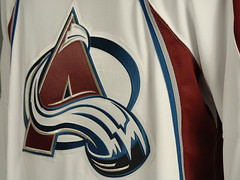
• Avalanche. Chalk up another one for the apron string template. It’s pretty much the same design as the Panthers, right down to the idiotic Ree-box on the back. And it’s not like I can’t deal with any kind of modern hockey treatment — I still say the Blue Jackets new uni is really sharp. Over on the Chris Creamer board, someone whipped up a Photoshop version of how the Columbus approach could have worked for the Avs — so much better than what we’re all now stuck looking at. (And in case you’re wondering: Back when the Panthers originally unveiled their design, I mentioned that there would be another team, which I couldn’t name, using precisely the same design. This is not that team, which means there’s yet another iteration of this crappy template still to come.)
• Maple Leafs. Simple to a fault. No extraneous piping, thank the lordy, but also no hemline striping, no shoulder patches, no contrasting shoulder yoke, no visual interest of any kind except for those sleeve stripes. I’m okay with the road version, since there’s inherent contrast in the white-blue-white sequence of the jersey, breezers, and socks. But the home design’s solid blue cries out for hemline sripes, or breezer stripes, or something to break up to solid wall of cyan. Otherwise, we’re essentially left with this. Meanwhile, that rounded shirttail looks really, um, suave.
In addition, there were sneak peeks of the new designs from the Ducks (whose official unveiling is slated for today) and the Sabres (Saturday), but I’ll hold off on those until I see the full treatment.
I can already hear some of you saying, “Lukas, you’re impossible to please. You say the Avs’ design is too busy, too cluttered, and then you slam the Leafs for being the exact opposite.” Okay, so maybe I am hard to please, but there’s something to be said a middle ground between super-busy and super-minimalist. A few teams, like the Blue Jackets, have gotten this right. Most of the others have blown it.

Old Glory Update: Yesterday I reported that LaDainian Tomlinson and Willie Parker had both played without the American flag decal on their helmets (Tomlinson just for one game, Parker for more than a full season). It didn’t occur to me that there might be more than a coincidental connection between those two players, but now I’ve gotta wonder after seeing this article (great find by Doug Leake).
Meanwhile, as I also mentioned yesterday, I contacted the NFL to inquire about the flag’s status as part of the league’s uniform specs. Here’s the response I got from a league spokesperson:
The American flag decal on the helmet is a part of the NFL uniform specs. If it was not on Willie Parker’s helmet, it will be moving forward. (I spoke with the Steelers. They said that if it was not on there, it will be.)
I have a feeling this means at least three people are now gonna be annoyed at me: Willie Parker, the Steelers’ equipment manager, and the NFL spokesguy. New slogan: Uni Watch, the Official Pain in the Assâ„¢ of the National Football League.
Uni Watch News Ticker: You know those Optimus Prime helmets the Giants have been wearing? Bill Blewett thinks he’s found a prototype version. ”¦ Yesterday I referred to USF’s memorial decals but didn’t have a photo. Now, thanks to Randy Miller, I do. ”¦ Vince found this video of Canucks players weighing in on the team’s new uniforms. ”¦ Really interesting photo submitted by Jeremy Brahm, who sent along this shot of Japan Railways East’s uniform. Never seen text on the pants like that. And I love the “JR” chest logo. ”¦ Also from Jeremy: a very baggy pullover. ”¦ Amazing old youth football team photo from Doug Mooney. Check out the shoes on No. 14! ”¦ Reprinted from yesterday’s comments: Aaron Rowand wearing “Beer Pong Champ” armbands. And if there’s such a thing as a beer pong uniform, I’m not sure I wanna know. ”¦ You probably know that former 49ers lineman Steve Wallace wore the ProCap helmet attachment. What you might not have known — and what I didn’t know myself until William Weir brought me up to speed yesterday — is that the ProCap didn’t hold up too well under game action. ”¦ Did you know that the Library of Congress has a huge baseball card collection? I didn’t, until Bo Baize mentioned it to me yesterday. Loads of great stuff — look here. ”¦ Reprinted from yesterday’s comments: The Atlanta Journal-Constitution ran an item on the ten best Georgia high school football helmets (including the Johnson-Savannah Atom Smashers, who wear “nuclear orange”). Details here. ”¦ The New Era folks have officially lost their fucking minds (as spotted over on the Chris Creamer boards). … Good catch by Greg Riffenburgh, who writes: ” I found this picture of Sweden’s Caroline Seger wearing two different colored shoes at the Women’s World Cup in China. The shoes are Nike’s Mercurial Vapor III.” ”¦ The Titans’ light-blue yoke tapers down the sleeve — except on offensive lineman Michael Roos’s jersey, where the light-blue panel seems to bulge and get wider on the sleeve. He’s at far left in this photo (good spot by Raleigh McCool). ”¦ The Dodgers have unveiled a 50th-anniversary logo (that’s 50 years in L.A., natch), which I assume will be used as a sleeve patch next year. ”¦ Logo creep alert from David Cline, who says, “Can’t we ogle the babes without having to be subjected to the swoosh?” … I’ll be spending tomorrow afternoon at Giants stadium, where I’ll be interviewing Jints equipment manager Joe Skiba. If you have any questions you’d like me to pass along, let me know.
Any idea why the three dudes in link have three different brands of breezers?
First of I would like to thank the Colorado Avalanche for making me puke in my own mouth with their recent jersey release. God awful, way to go. Also, why do they have a Colorado Rockies Jersey next to the Avs Jerseys? Who failed to tell them that the Rockies have nothing to do with their franchise’s history? Wonder is the New Jersey Devils’ faithful were pissed to see that…..
I like how the Maple Leafs Jerseys are plain, but I agree with Paul where the home jersey (Blue) is in need of some sort of hemline piping. Also nice pic of the blue footsie PJs! Am I the only person that misses those things? Ok maybe I am………
Paul, don’t forget about my beloved link when mentioning the apron effect. *shakes head in shame*
Paul, don’t get me worried that the Stars are that “other team” wearing an apron this season!
I always wondered, and there needs to be a list, of how many times Uni Watch has actually changed policy or started the enforcement of policy in a league. Is the American flag deal the first time?
[quote comment=”141768″]Any idea why the three dudes in link have three different brands of breezers?[/quote]
Breezers are part of the players equipment choice, not the team issued uniform. So they pick the brand.
[quote comment=”141775″][quote comment=”141768″]Any idea why the three dudes in link have three different brands of breezers?[/quote]
Breezers are part of the players equipment choice, not the team issued uniform. So they pick the brand.[/quote]
I thought the breezers were part of the “Edge system”. Am I wrong in thinking this?
Alright, I admit that I know NOTHING about hockey, and could really be less interested in learning much more than that. I was however wondering what uniform the kid on the right in link is wearing. Is this a minor league team or something kind of like the Providence Bruins?
From our friends in the AHL… I think I’ll just let this photo speak for itself:
link
Sandisk annouced a new line of flash drive to support Alzheimer’s. The Alzheimer’s people decided on purple as their color.
link
Good cause, bad color.
[quote comment=”141777″]Alright, I admit that I know NOTHING about hockey, and could really be less interested in learning much more than that. I was however wondering what uniform the kid on the right in link is wearing. Is this a minor league team or something kind of like the Providence Bruins?[/quote]
Its Toronto’s minor league team. I really have no idea why they were at the unveiling.
Looks like we have a new item for the daily Post-It note of FAQs!
I have tickets to the NFL game in London. Is there any way of finding out the uniforms that will be worn during the game? I have some vague recollection that the home team (Miami in this case) have to tell the NFL before the season whether they want to wear white or coloured for each of their home games.
As Miami are frequent white wearers at home (although the game will be evening in the UK) this might further complicate matters. If anyone has a definite answer that would be great, otherwise I’d be interested in what everyone thinks is most likely.
If the Avs had just taken the apron striping and moved it to the arms to serve as the border between the maroon and blue (or white and maroon), it would be a lot better.
Lukas, you’re impossible to please. You say the Avs’ design is too busy, too cluttered, and then you slam the Leafs for being the exact opposite.
[quote comment=”141780″][quote comment=”141777″]Alright, I admit that I know NOTHING about hockey, and could really be less interested in learning much more than that. I was however wondering what uniform the kid on the right in link is wearing. Is this a minor league team or something kind of like the Providence Bruins?[/quote]
Its Toronto’s minor league team. I really have no idea why they were at the unveiling.
Looks like we have a new item for the daily Post-It note of FAQs![/quote]
I apologize if that was mentioned yesterday. I couldn’t keep up with the comments after about noon. I really like that chest logo though.
I remember Steve Wallace’s ProCap helmet thingie popping off his head once during a game and rolling around on the ground. Looked like a link trying to avoid getting stepped on.
[quote comment=”141784″]Lukas, you’re impossible to please. You say the Avs’ design is too busy, too cluttered, and then you slam the Leafs for being the exact opposite.[/quote]
He preemptively replied to your comment in the blog.
[quote comment=”141780″][quote comment=”141777″]What’s with the tags on the bottom left (as you’re wearing it) of the new jerseys. Some teams are tryinig to keep the tradition of stripes on the hemline, but these tags just cover them up. I think the worst is the tag sitting on top of the hurricane flags at the bottom of Carolina’s sweaters.
link… [/quote]
The “Premier” jerseys are Reebok’s fancy new name for NHL replicas. The patch probably isn’t on the authentics.
[/quote]
Even so, the fact that they exist is a tragedy. Whether the players are skating around with them, or the fans are walking around with them, it’s still an abomination.
[quote comment=”141788″][quote comment=”141784″]Lukas, you’re impossible to please. You say the Avs’ design is too busy, too cluttered, and then you slam the Leafs for being the exact opposite.[/quote]
He preemptively replied to your comment in the blog.[/quote]
I’m pretty sure the comment poster was joking.
Does anyone else find it odd that USF had two players die this offseason in training related incidents and nothing was made of it?
[quote comment=”141790″][quote comment=”141788″][quote comment=”141784″]Lukas, you’re impossible to please. You say the Avs’ design is too busy, too cluttered, and then you slam the Leafs for being the exact opposite.[/quote]
He preemptively replied to your comment in the blog.[/quote]
I’m pretty sure the comment poster was joking.[/quote]
You’re probably right, since it was copied verbatim from the blog. My bad.
Way to start it off! The Mapleleaf in the middle (RBK) breezer is pulling away!
Let me be the first to (sadly) speculate that the Dodgers will probably at least petition MLB to have gold trim added to their unis for next season.
And don’t tell me their uni’s are too “timeless” to mess with … have you noticed how much tweeking has been done in the past 4-5 years in LA? Not to mention … Los Angeles, the secondary home of “sparkle” (Vegas being the first) … It all makes sense in a sad sort of way.
Re: Logo Creep
OK, this logo creep thing is beginning to turn into a witch hunt.
I understand the complaints when Reebok puts a big honkin’ logo on the new NHL jerseys, then interrupts a shoulder color panel to draw it out. I also understand them when Reebok enlarges the logo on the sleeves of NFL jerseys, especially compared to what Nike used to stitch.
But a Nike swoosh on a swimsuit top does NOT represent “logo creep,” IMO. The logo is understated and matches the colors in the suit, so it’s simple branding, nothing more. Speedo has included their logo on virtually every suit they’ve ever done, and no one screams “LOGO CREEP!” about it. No one screams about it when Izod puts an alligator on a shirt, when Levi’s stitches the chevron on a pocket, or when Titleist stamps their name on a golf ball or bag. And if they do scream, they should probably cry “WOLF!” right after that.
I am glad the Leafs kept is simple, but there needs to be some kind of striping at the hem line. No striping makes it look like a practice jersey to me. Tampa Bay and Ottawa have the same problem.
[quote comment=”141768″]Any idea why the three dudes in link have three different brands of breezers?[/quote]
Thanks for asking this question, it is the first thing i noticed as well. I too thought that the breezers were part of the edge system as well. i always thought i was detail oriented, but this site has made me darn near neurotic about this stuff . . .
NHL, I’m kinda worried that the Flyers are pulling away from “The orange and black” to “Black with a bit of orange”
link
[quote comment=”141796″]Let me be the first to (sadly) speculate that the Dodgers will probably at least petition MLB to have gold trim added to their unis for next season.
And don’t tell me their uni’s are too “timeless” to mess with … have you noticed how much tweeking has been done in the past 4-5 years in LA? Not to mention … Los Angeles, the secondary home of “sparkle” (Vegas being the first) … It all makes sense in a sad sort of way.[/quote]
I don’t think so – the recent changes have all been about moving away from the trendy “improvements” previously made to the uniforms.
The Sweden player is wearing link shin guards under her Umbro sox so you get a double logo creep on one shin in that picture.
I means “socks”…
[quote comment=”141780″][quote comment=”141777″]Alright, I admit that I know NOTHING about hockey, and could really be less interested in learning much more than that. I was however wondering what uniform the kid on the right in link is wearing. Is this a minor league team or something kind of like the Providence Bruins?[/quote]
Its Toronto’s minor league team. I really have no idea why they were at the unveiling.
[/quote]
They were unveiling their new RBK Edge uniforms at the same time. They’re owned by the Leafs, and the parent company apparently “bundles” them together for hockey fans.
In the NHL players are allowed to wear the equipment they choose. The only pieces of equipment/uniform they’re required to stick to one brand is obviosly the jersey and socks. Helmet, gloves, breezers, shin gards, skates, elbow pads, shoulder pads, helmet visor, slash garuds (they go on the wrist) and sticks are all up to the player to descide what they want to wear.
If you look at breezers and think they can’t be that different from brand to brand you’re very wrong. Some have a snug fit, some are loose. Some have higher hip flaps that extend up the torso, some have very little. Some have a larger butt bad, soome a narrow one. Some zip along the inner thigh, some don’t. I’ll stop now.
[quote comment=”141803″]The Sweden player is wearing link shin guards under her Umbro sox so you get a double logo creep on one shin in that picture.[/quote]
She’s also got two different colored shoes, the right one looking almost spray-painted. Did we talk about this already?
Anyone else find it a little strange that “East Japan” is written in English and not Japanese? or am I missing something.
[quote comment=”141779″]Sandisk annouced a new line of flash drive to support Alzheimer’s. The Alzheimer’s people decided on purple as their color.
link
Good cause, bad color.[/quote]
Actually, I don’t think it looks all that bad. I mean, it’s portable memory, for crying out loud. Is this what it’s come to, people critiquing USB sticks and SD cards? Those are designed for function, not visual appeal. If you don’t like the purple one, don’t buy it. Personally, I don’t buy SanDisk USB sticks because I don’t like the slider design.
That said, the Vikings current jersey gets uglier every time I see it…
Not uni-related at all, but nice socks the other day on the girl from Big Brother 8:
link
[quote comment=”141810″]Not uni-related at all, but nice socks the other day on the girl from Big Brother 8:
link
She’s been wearing those pretty much all season.. and every week i think uniwatch.. they must be “in” because i also say several pairs at the local gentleman’s establishment for a bachelor party last weekend…
From the “Funny b/c it’s true” dept. courtesy of Dan O’neil of the St. Louis Post Dispatch:
“It has become obvious to me that we have been looking at this steroids thing all wrong. If Major League Baseball truly wants to do away with performance-enhancing drugs, it would make their use mandatory, just like it made the pantlegs gathered atop the shoes mandatory.”
[quote comment=”141778″]From our friends in the AHL… I think I’ll just let this photo speak for itself:
link
isn’t it a bad sign when you can’t even get one of your paid players to put on your ugly jersey?
[quote comment=”141812″][quote comment=”141810″]Not uni-related at all, but nice socks the other day on the girl from Big Brother 8:
link
She’s been wearing those pretty much all season.. and every week i think uniwatch.. they must be “in” because i also say several pairs at the local gentleman’s establishment for a bachelor party last weekend…[/quote]
Wow. More than one person admits to watching that!
How about the fact that the Avalanche’s old unis looked like they were made for the new Rbk template? No reason to change a thing. Except maybe their hideous not-quite-Aston Villa color scheme. Ew.
[quote comment=”141806″]In the NHL players are allowed to wear the equipment they choose. The only pieces of equipment/uniform they’re required to stick to one brand is obviosly the jersey and socks. Helmet, gloves, breezers, shin gards, skates, elbow pads, shoulder pads, helmet visor, slash garuds (they go on the wrist) and sticks are all up to the player to descide what they want to wear.
If you look at breezers and think they can’t be that different from brand to brand you’re very wrong. Some have a snug fit, some are loose. Some have higher hip flaps that extend up the torso, some have very little. Some have a larger butt bad, soome a narrow one. Some zip along the inner thigh, some don’t. I’ll stop now.[/quote]
IIRC, each company had to pay the NHL a fee for each piece of equipment their logo appeared on – gloves, helmets, sticks, masks, visors, skates, etc. It was $10K about 10 years I think. Because when Mission first came on the scene, their helmets (the concussion helmets) did not have any logos on them whatsoever.
On another note, they are not breezers, any hockey player or Canadian knows that they are hockey PANTS, not breezers or shorts.
Paul,
The big questions that I’d have for the Giants equipment manager is what testing did the team see done on the new helmets, how pleased was the team with the testing, and why only the Giants?
I was cleaning out my inbox and found this article about the Canucks jerseys from February 2007. Doesn’t it seem silly now?
…The modern day Canucks’ marketing machine has instructed its large army of merchandising retailers to stand by for an announcement on Aug. 1.
“Right now we’re ordering next year’s inventory blindly,” says the owner of a sporting goods outlet in North Vancouver. “All we’ve been told is that the colours of the uniforms will be blue, green and white, but we don’t know what the crest is going to look like. The current killer whale [or orca] jersey, as we understand it, will be kept in reserve and occasionally be used as a ‘classic’ uniform.”
In this era of a high-profile law firm (Fasken Martineau DuMoulin) being appointed “official legal counsel” to the Canucks and GM Place, leaks from within the Orca Bay pond are all but impossible to uncover. Extreme paranoia has set in among the front-office disciples. The standard on-the-record response goes something like: “I’ll lose my job if anything is traced back to me. You’ll just have to wait until the 1st of August.”
Paul…
You spelled it “ProCap hemet” not “helmet”
[quote comment=”141821″]Paul…
You spelled it “ProCap hemet” not “helmet”[/quote]
Maybe they’re made link
[quote comment=”141821″]Paul…
You spelled it “ProCap hemet” not “helmet”[/quote]
Fixed. Thanks!
[quote comment=”141814″][quote comment=”141778″]From our friends in the AHL… I think I’ll just let this photo speak for itself:
link
isn’t it a bad sign when you can’t even get one of your paid players to put on your ugly jersey?[/quote]
Jerseys? There were jerseys in the picture?
[quote comment=”141819″]Paul,
The big questions that I’d have for the Giants equipment manager is what testing did the team see done on the new helmets, how pleased was the team with the testing, and why only the Giants?[/quote]
And what size jersey Lorenzen wears!!
[quote comment=”141805″][quote comment=”141780″][quote comment=”141777″]Alright, I admit that I know NOTHING about hockey, and could really be less interested in learning much more than that. I was however wondering what uniform the kid on the right in link is wearing. Is this a minor league team or something kind of like the Providence Bruins?[/quote]
Its Toronto’s minor league team. I really have no idea why they were at the unveiling.
[/quote]
They were unveiling their new RBK Edge uniforms at the same time. They’re owned by the Leafs, and the parent company apparently “bundles” them together for hockey fans.[/quote]
I kind of figured it was just another opportunity for them to trot out Justin Pogge. If they just want to show off the jerseys, it makes no sense to have a goalie get all bundled up in his gear. Its just a little bit of a bone thrown to Leafs fans….’We have a future, just wait for this guy.’
No gloves. No skates. Why can’t the Leafs do anything right? The players look ridiculous standing around in there jogging shoes. Gloves would at least complete the look and make the blue unitard effect less apparent.
I was going to say the new sweaters look like practice jerseys but the standard Reebok practice jersey from last year had way more going on. link
[quote comment=”141826″][quote comment=”141805″][quote comment=”141780″][quote comment=”141777″]Alright, I admit that I know NOTHING about hockey, and could really be less interested in learning much more than that. I was however wondering what uniform the kid on the right in link is wearing. Is this a minor league team or something kind of like the Providence Bruins?[/quote]
Its Toronto’s minor league team. I really have no idea why they were at the unveiling.
[/quote]
They were unveiling their new RBK Edge uniforms at the same time. They’re owned by the Leafs, and the parent company apparently “bundles” them together for hockey fans.[/quote]
I kind of figured it was just another opportunity for them to trot out Justin Pogge. If they just want to show off the jerseys, it makes no sense to have a goalie get all bundled up in his gear. Its just a little bit of a bone thrown to Leafs fans….’We have a future, just wait for this guy.'[/quote]
Makes sense as well. There’s a benefit to having your farm club in the same town.
Can someone tell me what the purpose is of the ProCap Helmet? I have never seen or heard of the thing until today.
[quote comment=”141825″][quote comment=”141819″]Paul,
The big questions that I’d have for the Giants equipment manager is what testing did the team see done on the new helmets, how pleased was the team with the testing, and why only the Giants?[/quote]
And what size jersey Lorenzen wears!![/quote]
I hope Lorenzen gets to play and does really well. That way he can be known for something other than being a big QB.
OK, maybe big is an understatement but my point still stands.
OT, is the NHL Network finally launching in the US this season? It was part of Comcast’s contract that it must launch on at least their own systems this season, or else they have to pay the league a hefty fine…
[quote comment=”141800″][quote comment=”141768″]Any idea why the three dudes in link have three different brands of breezers?[/quote]
Thanks for asking this question, it is the first thing i noticed as well. I too thought that the breezers were part of the edge system as well. i always thought i was detail oriented, but this site has made me darn near neurotic about this stuff . . .[/quote]
The maple leaf player in the middle (Tomas Kaberle) is wearing the correct pants I believe. They probably didn’t have enough pants to give to the other two (Darcy Tucker and Jason Blake). The PANTS are part of the RBK system. Along with jersey and socks.
Have heard a rumor from inside MLB that MLB is looking at what they can do to end the trend of wearing pants the way most of the MLB currently does (big and baggy)…this in a non-direct way is also why they are getting on coaches about proper uniforms this year…to set the presedent for the rule changes to come…wont be a rule where everyone has to wear them just below their knee with stirrups but a rule where they will have to show at least a certain amount of sock.
Paul, are you excited when each new NHL uniform comes out, or is it getting to the point where you’re saying “enough already”? This has to be the busiest offseason for jersey changes probably ever, since we’re used to getting only a few major uni changes over the course of a year in all the major sports. I still love seeing when teams come out with new jerseys. But are some of them so bad that we’re seeking the end of all these unveilings?
[quote comment=”141832″][quote comment=”141800″][quote comment=”141768″]Any idea why the three dudes in link have three different brands of breezers?[/quote]
Thanks for asking this question, it is the first thing i noticed as well. I too thought that the breezers were part of the edge system as well. i always thought i was detail oriented, but this site has made me darn near neurotic about this stuff . . .[/quote]
The maple leaf player in the middle (Tomas Kaberle) is wearing the correct pants I believe. They probably didn’t have enough pants to give to the other two (Darcy Tucker and Jason Blake). The PANTS are part of the RBK system. Along with jersey and socks.[/quote]
The pants are NOT part of the mandatory uniform and are still the choice of the player…they do have to follow the new stream lined look but can be from whatever approved companies the player desires
[quote comment=”141832The maple leaf player in the middle (Tomas Kaberle) is wearing the correct pants I believe. They probably didn’t have enough pants to give to the other two (Darcy Tucker and Jason Blake). The PANTS are part of the RBK system. Along with jersey and socks.[/quote]
As has been stated previously, the players pick thier own pants based on thier equipment contracts. Reebok has a pant which is part of the edge system. I’m sure that is what Kaberle is wearing.Funny that it’s the Reebok pant losing it’s Leaf logo.[/quote]
Reebok might like the pants to be part of the system, but all a team can do is say what the pants can look like, its up to the player what brand he wears (or is paid to wear).
[quote comment=”141835″]Paul, are you excited when each new NHL uniform comes out, or is it getting to the point where you’re saying “enough already”? This has to be the busiest offseason for jersey changes probably ever, since we’re used to getting only a few major uni changes over the course of a year in all the major sports. I still love seeing when teams come out with new jerseys. But are some of them so bad that we’re seeking the end of all these unveilings?[/quote]
I think that is what he was getting at with the headline today.
[quote comment=”141839″][quote comment=”141835″]Paul, are you excited when each new NHL uniform comes out, or is it getting to the point where you’re saying “enough already”? This has to be the busiest offseason for jersey changes probably ever, since we’re used to getting only a few major uni changes over the course of a year in all the major sports. I still love seeing when teams come out with new jerseys. But are some of them so bad that we’re seeking the end of all these unveilings?[/quote]
I think that is what he was getting at with the headline today.[/quote]
Things are starting to look a little interesting … accidental or intentional?
Paul, you also wrote that Aaron Rowland is wearing “Bear Pong Champ” armbands.
I stand by my assessment that the Wild! will be one of the better-dressed hockey teams next season.
As for non-pink women’s tennies,I had to get mine on-line. They are New Balances, and I LOVE them (black, of course).
[quote comment=”141836″][quote comment=”141832″][quote comment=”141800″][quote comment=”141768″]Any idea why the three dudes in link have three different brands of breezers?[/quote]
Thanks for asking this question, it is the first thing i noticed as well. I too thought that the breezers were part of the edge system as well. i always thought i was detail oriented, but this site has made me darn near neurotic about this stuff . . .[/quote]
The maple leaf player in the middle (Tomas Kaberle) is wearing the correct pants I believe. They probably didn’t have enough pants to give to the other two (Darcy Tucker and Jason Blake). The PANTS are part of the RBK system. Along with jersey and socks.[/quote]
The pants are NOT part of the mandatory uniform and are still the choice of the player…they do have to follow the new stream lined look but can be from whatever approved companies the player desires[/quote]
The pants do have to follow the new stream line made by RBK. Having other names on is something I have never heard of before, but makes sense for player endoresment reasons, but I doubt RBK will allow.
This website shows how RBK designed the jersey, pants and socks. All players must wear this ‘system’ as RBK puts it.
Aaron Rowland? Paul, you need to speak to your equipment manager about that misspelling.
The ProCap, aka the “Gonzo”, is designed to lessen the impact of hits on the football field. It was designed to be used by players who have a history of concussions.
link
God…….I hope not!!!!!
Don’t know what I did but sorry.
[/quote]
Did anyone else notice that the before and after pics of the ProCap are not from the same game? The first pic was from Sunday night with the B.W. Throwbacks, and the 2nd pic was from who knows when.
I am certainly not arguing the ProCap’s effectiveness… (i mean… I wear one during conference calls and board meetings and its always getting dinged, cracked, and is very prone to slipping off of my head)… but i was just stating that the way it was worded above could be kind’ve confusing for those of you who don’t wear a cranium-hugging ProCap to your workplace.
Ok… thats all i got.
[quote comment=”141816″][quote comment=”141812″][quote comment=”141810″]Not uni-related at all, but nice socks the other day on the girl from Big Brother 8:
link
She’s been wearing those pretty much all season.. and every week i think uniwatch.. they must be “in” because i also say several pairs at the local gentleman’s establishment for a bachelor party last weekend…[/quote]
Wow. More than one person admits to watching that![/quote]
I admit to watching it as well. It’s pretty darn good if you ask me. Anyways, I love it because there absolutely zero logo creep! I don’t know if it is something special with CBS, but no one can have any logos whatsoever on their clothing. However, the brands/logos can be on the food they eat. And yes, Daniele’s socks are amazing, and she has been wearing them almost all season. She is a Hooters waitress from Cali. I think they should make those socks part of the uniform with the orange short-shorts and the tank top
Re-posting my post:
Paul, you also wrote that Aaron Rowland is wearing “Bear Pong Champ” armbands.
I stand by my assessment that the Wild! will be one of the better-dressed hockey teams next season.
As for non-pink women’s tennies,I had to get mine on-line. They are New Balances, and I LOVE them (black, of course).
Sorta uni-related. Top 10 worst team names:
link
Anyone catch link?
I see the Leafs are sticking with the 3 stripes on their socks. Why not put 3 stripes on the sweater or two on the socks so they, you know, match?
[quote comment=”141850″]Did anyone else notice that the before and after pics of the ProCap are not from the same game? The first pic was from Sunday night with the B.W. Throwbacks, and the 2nd pic was from who knows when.
I am certainly not arguing the ProCap’s effectiveness… (i mean… I wear one during conference calls and board meetings and its always getting dinged, cracked, and is very prone to slipping off of my head)… but i was just stating that the way it was worded above could be kind’ve confusing for those of you who don’t wear a cranium-hugging ProCap to your workplace.
Ok… thats all i got.[/quote]
The picture is of former 49er Steve Wallace. THe picture is not from Sunday night. (Note: that is Steve Young raising his hands.)
[quote comment=”141780″][quote comment=”141777″]Alright, I admit that I know NOTHING about hockey, and could really be less interested in learning much more than that. I was however wondering what uniform the kid on the right in link is wearing. Is this a minor league team or something kind of like the Providence Bruins?[/quote]
Its Toronto’s minor league team. I really have no idea why they were at the unveiling.
Looks like we have a new item for the daily Post-It note of FAQs![/quote]
No doubt, that makes what five daily post it FAQ’s? still kinda funny though. I’m undecided about the rbk Maple Leafs. I wish they used link 1920-1940 era. They’ve normally had just plain original six jerseys, except when they added the TML shoulder patches a few years back.
So when are they opening the NFL history books and inserting an asterisk on the Patriots’ 3 Superbowls. How could anyone feel good about cheating. Maybe that’s why coach B. dresses like he does, so he can steer the attention to him and away from the sideline cameras.
[quote comment=”141851″][quote comment=”141816″][quote comment=”141812″][quote comment=”141810″]Not uni-related at all, but nice socks the other day on the girl from Big Brother 8:
link
She’s been wearing those pretty much all season.. and every week i think uniwatch.. they must be “in” because i also say several pairs at the local gentleman’s establishment for a bachelor party last weekend…[/quote]
Wow. More than one person admits to watching that![/quote]
I admit to watching it as well. It’s pretty darn good if you ask me. Anyways, I love it because there absolutely zero logo creep! I don’t know if it is something special with CBS, but no one can have any logos whatsoever on their clothing. However, the brands/logos can be on the food they eat. And yes, Daniele’s socks are amazing, and she has been wearing them almost all season. She is a Hooters waitress from Cali. I think they should make those socks part of the uniform with the orange short-shorts and the tank top[/quote]
yeah i started watching it to appease the g/f but its only half bad. If you can get past the obvious editing and slanting the producers do.
i second that idea about the hooters uni.
[quote comment=”141835″]Paul, are you excited when each new NHL uniform comes out, or is it getting to the point where you’re saying “enough already”? This has to be the busiest offseason for jersey changes probably ever, since we’re used to getting only a few major uni changes over the course of a year in all the major sports. I still love seeing when teams come out with new jerseys. But are some of them so bad that we’re seeking the end of all these unveilings?[/quote]
Personally, I’m getting sick of it. Yeah, most likely because there is more crap than good.
They should have phased this over two years, I think. And, do unveilings spread out over the entire year (like the NFL logo- unveiled now, used next year).
You’d end up having one per month or so- much easier to digest, and a lot more publicity for the failing sport.
[quote comment=”141855″]Anyone catch link?[/quote]
Donald is a dick…
[quote comment=”141855″]Anyone catch link?[/quote]
That just made me a Ducks fan. Awesome.
[quote comment=”141782″]I have tickets to the NFL game in London. Is there any way of finding out the uniforms that will be worn during the game? I have some vague recollection that the home team (Miami in this case) have to tell the NFL before the season whether they want to wear white or coloured for each of their home games.
As Miami are frequent white wearers at home (although the game will be evening in the UK) this might further complicate matters. If anyone has a definite answer that would be great, otherwise I’d be interested in what everyone thinks is most likely.[/quote]
Lucky git!!! Who did you have to sleep with to get tickets???
When the international game was announced they received over half a million registrations to buy tickets. They’ve had 3 random lotteries for fans to buy tickets. I missed out on the first two, but got selected for the third, which was yesterday. They sold out that batch of 10,000 tickets in 5 minutes, and I wasn’t one of them.
However, in the mail, I did get my ticket for the second of the two NHL games in London at the end of this month between the Ducks and the Kings. According to link, the Kings are the home team for Game 1 and the Ducks are the home team for Game 2, so are they bringing both sets of uniforms over with them?
So the rounded hemlines are just gonna be breezing around when the players are skating. They’re gonna look like burly figure skaters with skirts on, sad.
[quote comment=”141855″]Anyone catch link?[/quote]
The guy who played my high school’s mascot would stage “fights” like that with the rival team’s mascot at football games. It was a great way to get the crowd into the game.
[quote comment=”141857″][quote comment=”141850″]Did anyone else notice that the before and after pics of the ProCap are not from the same game? The first pic was from Sunday night with the B.W. Throwbacks, and the 2nd pic was from who knows when.
I am certainly not arguing the ProCap’s effectiveness… (i mean… I wear one during conference calls and board meetings and its always getting dinged, cracked, and is very prone to slipping off of my head)… but i was just stating that the way it was worded above could be kind’ve confusing for those of you who don’t wear a cranium-hugging ProCap to your workplace.
Ok… thats all i got.[/quote]
The picture is of former 49er Steve Wallace. THe picture is not from Sunday night. (Note: that is Steve Young raising his hands.)[/quote]
Also the Niners wore the throwbacks Monday Night.
I know many of you hated the old Av’s sweater. I loved it. Thought it was one of the best in the league…unusual striping that worked well, and the maroon and blue is nice. So that is why I apologize for the new one, which I would argue is the worst in the league. Why Avs WHY?
[quote comment=”141842″]The pants do have to follow the new stream line made by RBK. Having other names on is something I have never heard of before, but makes sense for player endoresment reasons, but I doubt RBK will allow.
This website shows how RBK designed the jersey, pants and socks. All players must wear this ‘system’ as RBK puts it.[/quote]
Yes, but most hockey pants are made with shells that go over the padding. That’s how player’s end up with the right colour of pants for the All-Star game without having to break in a new pair. Most often with goalies, you can see the old pants sticking out of the new shell.
I can’t see Bauer and Nike’s spokesmen throughout the league wearing Reebok shells. I can see them wearing the new RBK pants with either Nike shells or generic shells.
[quote comment=”141862″][quote comment=”141855″]Anyone catch link?[/quote]
Donald is a dick…[/quote]
I thought Donald was a duck.
[quote comment=”141855″]Anyone catch link?[/quote]
I think Donald is just projecting his anger at Nike towards the opposing mascot.
Did any of you actually see why the fight between the “Duck” and “Cougar” started? The Cougar was imitating the Duck’s pushup routine after a touchdown. The Duck came over and kicked him in the ribs while he was doing the pushups, and then proceeded to hit him with an elbow smash and puch him in the head before the fight moved to the sidelines.
The guy in the Duck costume has been suspended one game, and Disney is pissed about the whole thing. They allow the Ducks to use Donald’s image for their mascot.
I’m pretty sure that the other team using that template (kinda) will be St. Louis. If some of the guesses that I’m seeing are any indication, the new unis are going to suck. Oh well. As long as they don’t have any red on them (or some cartoon cats), I should probably be thankful.
Hockey players can wear whoever’s girdles and shells that they want (that’s what the edge system is for the hockey pants, girdle and shell, instead of the older style padding integrated into the pants with a looser fit). Other companies, notably takla (the guy to the right in that picture) has made girdles and shells for a while now. As long as the styling matches the team uniform, they can wear whichever company shell they want.
[quote comment=”141880″]Hockey players can wear whoever’s girdles and shells that they want (that’s what the edge system is for the hockey pants, girdle and shell, instead of the older style padding integrated into the pants with a looser fit). Other companies, notably takla (the guy to the right in that picture) has made girdles and shells for a while now. As long as the styling matches the team uniform, they can wear whichever company shell they want.[/quote]
How will this work for goalies though? I’m a goalie and am very much into equipment, what works, what doesn’t. I remember there being a goalie girdle once a few years back but goalies hated it because it was too restricting. Sure some may say it doesn’t matter because most of them don’t wear socks under their leg pads, but I’m one of those goalies who wears what the team wears becasue that’s what I feel you should do. If your part of the team, look the part. Back to the topic though. How will those goalies who wear socks fit in? I’ve always wore a garter belt as those compression shorts with velcro just don’t work well and they’re alil restricting in a certain way.
Please pay attention people. This will be posted every day.
A. The Tampa Bay Buccaneers wore the odd font numbers on their practice jerseys only.
They are not for regular game use.
B. The new NFL logo starts NEXT year.
C. The green dot on an NFL players helmet means there’s a radio in the helmet.
D. If you think you are posting a new jersey here for the first time; no, you are not 99.999% of the time. Somebody has already beat you to it and we are seeing it for the 100th time. Very seldom is there “Breaking News” here in the Comments.
E. The home NHL jerseys/sweaters this year will be the dark jersey, not the white one. And NHL teams won’t have a third jersey this year.
F. For Hispanic Tribute Nights around MLB, the Giants wore uniforms with Gigantes on them. The Mets wore Los Mets on theirs, and the Rangers wore Los Rangers on theirs. The Padres wore camafloge uniforms as a tribute to the military population in San Diego.
G. The black strip worn by ACC football teams this year is for Virginia Tech.
H. What was once known as Division I-AA is now The Championship Subdivision.
I. The Devil Rays will be dropping the “Devil” from the name and the new colors HAVE NOT been officially released yet.
[quote comment=”141869″]I know many of you hated the old Av’s sweater. I loved it. Thought it was one of the best in the league…unusual striping that worked well, and the maroon and blue is nice. So that is why I apologize for the new one, which I would argue is the worst in the league. Why Avs WHY?[/quote]
I didn’t hate or love the old Avs sweater. As an Avs fan I’ve always thought the colors and logo were fairly dull. That begin said I always thought their 3rd jersey was the best. These new ones, however, are a disaster. I’m going to go bye a replica old one while they are on sale and before they are over-priced nostalgia.
and by “bye” I of course mean “buy”
re:Amazing old youth football team photo from Doug Mooney. Check out the shoes on No. 14!
what’d he do, steal those saddle oxfords from a cheerleader?
[quote comment=”141810″]Not uni-related at all, but nice socks the other day on the girl from Big Brother 8:
link
I noticed that as well, and almost mentioned it here. I was afraid, however, that I would be mocked for watching that show.
[quote comment=”141870″][quote comment=”141842″]The pants do have to follow the new stream line made by RBK. Having other names on is something I have never heard of before, but makes sense for player endoresment reasons, but I doubt RBK will allow.
This website shows how RBK designed the jersey, pants and socks. All players must wear this ‘system’ as RBK puts it.[/quote]
Yes, but most hockey pants are made with shells that go over the padding. That’s how player’s end up with the right colour of pants for the All-Star game without having to break in a new pair. Most often with goalies, you can see the old pants sticking out of the new shell.
I can’t see Bauer and Nike’s spokesmen throughout the league wearing Reebok shells. I can see them wearing the new RBK pants with either Nike shells or generic shells.[/quote]
Agreed
Paul, I think I can help a bit on the NHL uniforms deal.
NHL 08 was just released for the PS3 and the XBox 360. Since not all uniforms have been released, EA decided to have a code that they would release after all the jerseys were unveiled, so that all jerseys would be updated to the correct new ones. Of course, it took some kid all of one day to crack the XBox code.
For those who want to know the code:
h3oyxpwksf8ibcg
For those who want to see some of the pics:
link
I don’t have an XBox, so I can’t verify that this is true. but based on the posters involved, I’d say it is.
Good news: Blackhawks got it right, IMO.
Bad news: Most of the rest (including the Oilers and my beloved Blues) got it wrong to varying degrees.
Anyone have an XBox and want to reveal the rest of the jerseys, so we can end this God-forsaken journey?
Looks like Ohio State and Nike have signed a link with $26 million.
Arrrgh, I meant “worth $26 million.”
To follow up on University of Wisconsin’s “tampon” uniforms they will be wearing at home this year… Head Coach Bret Bielema has stated that he wants everyone for all remaining home games to wear all red just like the players. I read somewhere that AD Barry Alverez hates the new uni combo, and has stated that they look like a team from the Championship Sub Division or the SWAC (no offense to those people in that fine part of our country)So we shall see how long these uni’s last.
I will be at the game this Saturday and will be taking ample pictures of the sea of red in the stands, and of the football players as well. There is no place like game day in Madison. (Especially in the student section)
link
[quote comment=”141889″]Paul, I think I can help a bit on the NHL uniforms deal.
NHL 08 was just released for the PS3 and the XBox 360. Since not all uniforms have been released, EA decided to have a code that they would release after all the jerseys were unveiled, so that all jerseys would be updated to the correct new ones. Of course, it took some kid all of one day to crack the XBox code.
For those who want to know the code:
h3oyxpwksf8ibcg
For those who want to see some of the pics:
link
I don’t have an XBox, so I can’t verify that this is true. but based on the posters involved, I’d say it is.
Good news: Blackhawks got it right, IMO.
Bad news: Most of the rest (including the Oilers and my beloved Blues) got it wrong to varying degrees.
Anyone have an XBox and want to reveal the rest of the jerseys, so we can end this God-forsaken journey?[/quote]
Looks like it’s the Oilers going with the Florida template.
(sigh)
link
aaand nevermind. Didn’t realize the Oil were included in that other gallery.
[quote comment=”141889″]Paul, I think I can help a bit on the NHL uniforms deal.
NHL 08 was just released for the PS3 and the XBox 360. Since not all uniforms have been released, EA decided to have a code that they would release after all the jerseys were unveiled, so that all jerseys would be updated to the correct new ones. Of course, it took some kid all of one day to crack the XBox code.
For those who want to know the code:
h3oyxpwksf8ibcg
For those who want to see some of the pics:
link
I don’t have an XBox, so I can’t verify that this is true. but based on the posters involved, I’d say it is.
Good news: Blackhawks got it right, IMO.
Bad news: Most of the rest (including the Oilers and my beloved Blues) got it wrong to varying degrees.
Anyone have an XBox and want to reveal the rest of the jerseys, so we can end this God-forsaken journey?[/quote]
OK… someone has to seriously get the game, put in the code, and put all the screen caps on here so we can end the waiting on all the remaining unveilings. Thanks in advance!
[quote comment=”141801″]NHL, I’m kinda worried that the Flyers are pulling away from “The orange and black” to “Black with a bit of orange”
link[/quote]
I share your concern. Hopefully they will retain some orange stripes on their link, although I expect the best-case scenario will be a wide single band of orange that mirrors the link. If they trot out those terrible Olympic-style socks (like the link wear), I’m gonna hork.
Regardless, I’m sure Jim Jackson will continue to loyally refer to them as “the Orange and Black.”
[quote comment=”141787″]I remember Steve Wallace’s ProCap helmet thingie popping off his head once during a game and rolling around on the ground. Looked like a link trying to avoid getting stepped on.[/quote]
I swear that Don Beebe’s did once, also, while playing for the Bills… as for photographic evidence, well, perhaps someone can find it…
[quote comment=”141818″]
IIRC, each company had to pay the NHL a fee for each piece of equipment their logo appeared on – gloves, helmets, sticks, masks, visors, skates, etc. It was $10K about 10 years I think. Because when Mission first came on the scene, their helmets (the concussion helmets) did not have any logos on them whatsoever.[/quote]
There were a couple of years (at leat 1989-90 I think) where players would have the company names blacked out with spray paint or whatnot if said company didn’t cough up the cash. (See Cloutier’s blocker, link) IIRC, there was a rule that if a non-licensed brand was showing, the player had to leave the ice until it was covered up. As kids, we spray painted the logos off of our sticks and gloves too, because we thought we were cool!
The Avs blog MileHighHockey dissects the new Avalanche jerseys link, and their tone is not overly supportive, let’s say.
The general reaction among Avs’ fans has been pretty hostile, and rightly so.
[quote comment=”141893″]To follow up on University of Wisconsin’s “tampon” uniforms they will be wearing at home this year… Head Coach Bret Bielema has stated that he wants everyone for all remaining home games to wear all red just like the players. I read somewhere that AD Barry Alverez hates the new uni combo, and has stated that they look like a team from the Championship Sub Division or the SWAC (no offense to those people in that fine part of our country)So we shall see how long these uni’s last.
I will be at the game this Saturday and will be taking ample pictures of the sea of red in the stands, and of the football players as well. There is no place like game day in Madison. (Especially in the student section)
link[/quote]
Should a school or the coach need to have to ask fans to wear a particular color to the game? I read about such requests frequently these days.
Shouldn’t the fans already be doing it if it really to matter? Manufactured traditions just don’t have the same zip as those that come about naturally.
Back when the Panthers originally unveiled their design, I mentioned that there would be another team, which I couldn’t name, using precisely the same design. This is not that team, which means there’s yet another iteration of this crappy template still to come.)
According to the RBK Edge uniforms you can unlock in NHL08 it appears that the Oilers have the same template as well as one of the Thrashers jerseys.
[quote comment=”141801″]NHL, I’m kinda worried that the Flyers are pulling away from “The orange and black” to “Black with a bit of orange”
link[/quote]
chris, I gotta say it-the more black, the better. Welccome to the dark side.
[quote comment=”141867″][quote comment=”141855″]Anyone catch link?[/quote]
The guy who played my high school’s mascot would stage “fights” like that with the rival team’s mascot at football games. It was a great way to get the crowd into the game.[/quote]
This one obviously isn’t staged. The particular duck (there are several who where the costume – first I had heard of that)was disciplined and missed last weeks game.
[quote comment=”141876″]Did any of you actually see why the fight between the “Duck” and “Cougar” started? The Cougar was imitating the Duck’s pushup routine after a touchdown. The Duck came over and kicked him in the ribs while he was doing the pushups, and then proceeded to hit him with an elbow smash and puch him in the head before the fight moved to the sidelines.
The guy in the Duck costume has been suspended one game, and Disney is pissed about the whole thing. They allow the Ducks to use Donald’s image for their mascot.[/quote]
Shasta has ALWAYS done pushups, one for each point scored!
Bielema wants everyone to wear red
Should a school or the coach need to have to ask fans to wear a particular color to the game? I read about such requests frequently these days.
Shouldn’t the fans already be doing it if it really to matter? Manufactured traditions just don’t have the same zip as those that come about naturally.
Usually it’s a tossup between red and white (at least until it gets cold and they wear whatever jacket is handy). I don’t think there’s anything manufactured about the coach expressing a preference in this case. As long as idiots don’t wear green and yellow, I don’t mind. Blaze orange is always a nice dash of variety, but that’s rare in the student section.
[quote comment=”141885″]re:Amazing old youth football team photo from Doug Mooney. Check out the shoes on No. 14!
what’d he do, steal those saddle oxfords from a cheerleader?[/quote]
Guess his folks may not have been able to afford cleats or sneakers for the guy. By the way, you think anyone wanted to mess with the kid to right of #14?
Paul,
Did I miss your commentary on the Penguins’ new sweaters? If so, can you link it?
I was doing a little research on the guy from Big Brother 8 who played “professional” football and found out he played in a european league with a team from Finland (I think). I found the teams website and it is a riot. link Helmets with mismatched face masks, pants with advertising on them and jerseys that would make NASCAR drivers jealous.
[quote comment=”141905″][quote comment=”141801″]NHL, I’m kinda worried that the Flyers are pulling away from “The orange and black” to “Black with a bit of orange”
link[/quote]
chris, I gotta say it-the more black, the better. Welccome to the dark side.[/quote]
All-black unis are so last century. I’m a Flyers lifer and would prefer they designated their past/future orange 3rd jersey with the ‘3-D’ logo as their home uni, along with the white with the traditional logo.
Did anyone see the leaked Thrasher pic from EA Sports NHL ’08? The left sleave, which has that dark blue and “ATLANTA” spelled out, doesn’t have the piping going all the way to the top of the collar! WHAT?! See it here: nhllogos.blogspot.com
[quote comment=”141881″]How will this work for goalies though? I’m a goalie and am very much into equipment, what works, what doesn’t. I remember there being a goalie girdle once a few years back but goalies hated it because it was too restricting. Sure some may say it doesn’t matter because most of them don’t wear socks under their leg pads, but I’m one of those goalies who wears what the team wears becasue that’s what I feel you should do. If your part of the team, look the part. Back to the topic though. How will those goalies who wear socks fit in? I’ve always wore a garter belt as those compression shorts with velcro just don’t work well and they’re alil restricting in a certain way.[/quote]
It won’t impact goalies who wear socks in any way. They’ll still wear the pants the way they want to, and socks if they choose to. With this new ‘system’, the pants and socks are not an integrated unit. Or, if the socks do attach directly to the RBK pants for skaters, goalies could either wear them the same way, or use garter belts. It isn’t a huge change, its just cosmetic. They aren’t going back to Cooperalls.
Oh link…….. Oh link!
[quote comment=”141908″][quote comment=”141876″]Did any of you actually see why the fight between the “Duck” and “Cougar” started? The Cougar was imitating the Duck’s pushup routine after a touchdown. The Duck came over and kicked him in the ribs while he was doing the pushups, and then proceeded to hit him with an elbow smash and puch him in the head before the fight moved to the sidelines.
The guy in the Duck costume has been suspended one game, and Disney is pissed about the whole thing. They allow the Ducks to use Donald’s image for their mascot.[/quote]
Shasta has ALWAYS done pushups, one for each point scored![/quote]
There are a lot of schools that have this tradition. The Duck wasn’t mad because the Cougar was ‘imitating’ him like the article indicates…he’s just a dick. Typical Oregon garbage.
[quote comment=”141791″]Does anyone else find it odd that USF had two players die this offseason in training related incidents and nothing was made of it?[/quote]
Bendert,
while true two players associated with USF have died in recent months. Keeley Dorsey died after a workout and after an autopsy they still haven’t got a definate answer but possible QT sydrome.
Javan Camon is the other player on the Bulls’ helmet. He died during a World Indoor Football Leauge game.. still no definate cause of death for Camon that I can find right now.
[quote comment=”141864″]
Lucky git!!! Who did you have to sleep with to get tickets???
When the international game was announced they received over half a million registrations to buy tickets. They’ve had 3 random lotteries for fans to buy tickets. I missed out on the first two, but got selected for the third, which was yesterday. They sold out that batch of 10,000 tickets in 5 minutes, and I wasn’t one of them.
[/quote]
I was part of the 10am stampede yesterday morning. From what I’ve read on the nfluk forums it wasn’t even a 5 minute thing for a lot of the tickets, although some single ones took longer to sell. Some people who were on at 10 pretty much exactly didn’t even manage to get anything.
Paul, if no-one else knows maybe you could ask the NYG equipment manager what the uniform plan for the London game is.
Here is another link with the images of all AHL and NHL Jersey’s from NHL 08.
Paul, as an extra to that, I’d be interested in hearing whether the logistics of getting all the uniform and equipment to London are expected to be significantly more complicated than for a normal road game.
[quote comment=”141830″][quote comment=”141825″][quote comment=”141819″]Paul,
The big questions that I’d have for the Giants equipment manager is what testing did the team see done on the new helmets, how pleased was the team with the testing, and why only the Giants?[/quote]
And what size jersey Lorenzen wears!![/quote]
I hope Lorenzen gets to play and does really well. That way he can be known for something other than being a big QB.
OK, maybe big is an understatement but my point still stands.[/quote]
The Giants are the only NFL team I have seen testing it, but I’ve seen it on a few squads in the college ranks and even saw it on a few players at a high school game last Friday.
link
St.Louis Blues link – link
DW youre awesome pal keep persevering
Good news: Blackhawks got it right, IMO.
Hawks GM Dale Tallon was quoted early this week as saying that the new uniforms would be almost identical to the old.
[quote comment=”141918″]Oh link…….. Oh link![/quote]
Just look at the link and ignore the fact that it’s a size too small and it’s on a mannequin without pads. I love the sleeve stripes! Among the NHL uni overhauls (ie, not counting Minnesota since their new home unis are the old alternates), I’d put this one in second place behind the Blue Jackets.
Would like to get a closer look at that shoulder patch, though.
[quote comment=”141930″][quote comment=”141918″]Oh link…….. Oh link![/quote]
Just look at the link and ignore the fact that it’s a size too small and it’s on a mannequin without pads. I love the sleeve stripes! Among the NHL uni overhauls (ie, not counting Minnesota since their new home unis are the old alternates), I’d put this one in second place behind the Blue Jackets.
Would like to get a closer look at that shoulder patch, though.[/quote]
I personally really like the black Dallas uniform. They are simple, but not not too simple with contrasting collars, sleeve stripes, and a hemline stripe. Furthermore, the style has worked for a few college teams, and its something different in the NHL. And if you ask me, it beats that star designed hemline disaster they had before.
[quote comment=”141931″][quote comment=”141930″][quote comment=”141918″]Oh link…….. Oh link![/quote]
Just look at the link and ignore the fact that it’s a size too small and it’s on a mannequin without pads. I love the sleeve stripes! Among the NHL uni overhauls (ie, not counting Minnesota since their new home unis are the old alternates), I’d put this one in second place behind the Blue Jackets.
Would like to get a closer look at that shoulder patch, though.[/quote]
I personally really like the black Dallas uniform. They are simple, but not not too simple with contrasting collars, sleeve stripes, and a hemline stripe. Furthermore, the style has worked for a few college teams, and its something different in the NHL. And if you ask me, it beats that star designed hemline disaster they had before.[/quote]
I agree, Dallas has a pass from me both home and away. At least you don’t need a map to get to the centre of the jersey. I wouldn’t count on EA Sports as official though.
[quote comment=”141918″]Oh link…….. Oh link![/quote]
Scroll further, and link – could be P. Lukas’ dream girl ;-)
Intresting write up about female fans of NFL teams. As you might imagine one of the pics in the slide show shows the dreaded pink jerseys.
link
[quote comment=”141933″][quote comment=”141931″][quote comment=”141930″][quote comment=”141918″]Oh link…….. Oh link![/quote]
Just look at the link and ignore the fact that it’s a size too small and it’s on a mannequin without pads. I love the sleeve stripes! Among the NHL uni overhauls (ie, not counting Minnesota since their new home unis are the old alternates), I’d put this one in second place behind the Blue Jackets.
Would like to get a closer look at that shoulder patch, though.[/quote]
I personally really like the black Dallas uniform. They are simple, but not not too simple with contrasting collars, sleeve stripes, and a hemline stripe. Furthermore, the style has worked for a few college teams, and its something different in the NHL. And if you ask me, it beats that star designed hemline disaster they had before.[/quote]
I agree, Dallas has a pass from me both home and away. At least you don’t need a map to get to the centre of the jersey. I wouldn’t count on EA Sports as official though.[/quote]
All the others are exact matches. Oh, I found the link to the Dallas home jersey… is there even any green on that stupid jersey? And did they get confused… why is there just DALLAS on the HOME jersey?
[quote comment=”141834″]Have heard a rumor from inside MLB that MLB is looking at what they can do to end the trend of wearing pants the way most of the MLB currently does (big and baggy)…this in a non-direct way is also why they are getting on coaches about proper uniforms this year…to set the presedent for the rule changes to come…wont be a rule where everyone has to wear them just below their knee with stirrups but a rule where they will have to show at least a certain amount of sock.[/quote]
Man o man, do I hope you’re right.
Where is Terri, damn it?!? She will agree with me…
[quote comment=”141908″][quote comment=”141876″]Did any of you actually see why the fight between the “Duck” and “Cougar” started? The Cougar was imitating the Duck’s pushup routine after a touchdown. The Duck came over and kicked him in the ribs while he was doing the pushups, and then proceeded to hit him with an elbow smash and puch him in the head before the fight moved to the sidelines.
The guy in the Duck costume has been suspended one game, and Disney is pissed about the whole thing. They allow the Ducks to use Donald’s image for their mascot.[/quote]
Shasta has ALWAYS done pushups, one for each point scored![/quote]
So if Disney decides to tell Oregon that they can’t use Donald Duck anymore, will Oregon have to go that that horrible Extreeeeeme Duck mascot that they unveiled back in the day when Nike was just unveiling the new uniforms?
Would like to get a closer look at that shoulder patch, though.
For the Stars away jersey shoulder patch, I think they retain the map of Texas with the white Western-font “D.”
linkis why baseball should not be played in Dolphin Stadium!
I saw a story that mentioned that a season ticket holder was thrown out of the game for heckling the home plate ump too loudly, but that is the first picture I have seen today of exactly how uncrowded it was.
Is it possible that you can ask the uni-manager guy what the policy the NFL has set on locations of the “C” patch? Eli seemed to wear his a lot lower than anybody else in the NFL does? link, link.
[quote comment=”141944″]linkis why baseball should not be played in Dolphin Stadium!
I saw a story that mentioned that a season ticket holder was thrown out of the game for heckling the home plate ump too loudly, but that is the first picture I have seen today of exactly how uncrowded it was.[/quote]
Oh, and the announced attendance was 10,121…
[quote comment=”141943″]Would like to get a closer look at that shoulder patch, though.
For the Stars away jersey shoulder patch, I think they retain the map of Texas with the white Western-font “D.”[/quote]
That doesn’t look like the Texas-shaped patch. Its orientation is too vertical, and the link doesn’t match the link.
Agreed: the link, while not a total atrocity, should be green, not black.
[quote comment=”141944″]linkis why baseball should not be played in Dolphin Stadium!
I saw a story that mentioned that a season ticket holder was thrown out of the game for heckling the home plate ump too loudly, but that is the first picture I have seen today of exactly how uncrowded it was.[/quote]
If that was yesterday’s game, there was an announced attendance of 10,121. Uh, nope.
[quote comment=”141944″]linkis why baseball should not be played in Dolphin Stadium!
I saw a story that mentioned that a season ticket holder was thrown out of the game for heckling the home plate ump too loudly, but that is the first picture I have seen today of exactly how uncrowded it was.[/quote]
I think that picture is a great example of how Florida MLB expansion has proved to be nothing less than a disaster.
[quote comment=”141915″][quote comment=”141905″][quote comment=”141801″]NHL, I’m kinda worried that the Flyers are pulling away from “The orange and black” to “Black with a bit of orange”
link[/quote]
chris, I gotta say it-the more black, the better. Welccome to the dark side.[/quote]
All-black unis are so last century. I’m a Flyers lifer and would prefer they designated their past/future orange 3rd jersey with the ‘3-D’ logo as their home uni, along with the white with the traditional logo.[/quote]
Hank, all-black unis are timeless.
All these jersey leaks keep making me want to yell “Another Festivus MIRACLE!”
Thrashers unis are pretty decent
[quote comment=”141798″]Re: Logo Creep
OK, this logo creep thing is beginning to turn into a witch hunt.
I understand the complaints when Reebok puts a big honkin’ logo on the new NHL jerseys, then interrupts a shoulder color panel to draw it out. I also understand them when Reebok enlarges the logo on the sleeves of NFL jerseys, especially compared to what Nike used to stitch.
But a Nike swoosh on a swimsuit top does NOT represent “logo creep,” IMO. The logo is understated and matches the colors in the suit, so it’s simple branding, nothing more. Speedo has included their logo on virtually every suit they’ve ever done, and no one screams “LOGO CREEP!” about it. No one screams about it when Izod puts an alligator on a shirt, when Levi’s stitches the chevron on a pocket, or when Titleist stamps their name on a golf ball or bag. And if they do scream, they should probably cry “WOLF!” right after that.[/quote]
Amen.
While I’m loath to disagree with Paul on most things, I gotta say I like the Maple Leaf jerseys. I guess I’m just a sucker for streamlined, simple and uncluttered….
[quote comment=”141934″][quote comment=”141918″]Oh link…….. Oh link![/quote]
Scroll further, and link – could be P. Lukas’ dream girl ;-)[/quote]
Thank you Metsfan, Thank you.
[quote comment=”141898″][quote comment=”141787″]I remember Steve Wallace’s ProCap helmet thingie popping off his head once during a game and rolling around on the ground. Looked like a link trying to avoid getting stepped on.[/quote]
I swear that Don Beebe’s did once, also, while playing for the Bills… as for photographic evidence, well, perhaps someone can find it…
[/quote]
I don’t remember Beebe having the Procap, but Mark Kelso did, and I remember him having issues keeping it on.
Two good uniforms in action this weekend. Nebraska and USC. Let’s go Huskers.
Please get some good pics and info on the new Schutt helmet. I noticed some Penn State players wearing them against Notre Dame, but so far they are the only other team I have noticed wearing them.
[quote comment=”141964″][quote comment=”141898″][quote comment=”141787″]I remember Steve Wallace’s ProCap helmet thingie popping off his head once during a game and rolling around on the ground. Looked like a link trying to avoid getting stepped on.[/quote]
I swear that Don Beebe’s did once, also, while playing for the Bills… as for photographic evidence, well, perhaps someone can find it…
[/quote]
I don’t remember Beebe having the Procap, but Mark Kelso did, and I remember him having issues keeping it on.[/quote]
Paul has talked about this on the blog before. Kelso wore one and Beebe wore one briefly (I didn’t remember it either), and there is probably a photo or two to be found if you search.
And in non-uni news, my employer grossly over-catered an event upstairs and I just scored a free plate of tacos. link!
[quote comment=”141963″][quote comment=”141934″][quote comment=”141918″]Oh link…….. Oh link![/quote]
Scroll further, and link – could be P. Lukas’ dream girl ;-)[/quote]
Thank you Metsfan, Thank you.[/quote]
YW
[quote comment=”141933″][quote comment=”141931″][quote comment=”141930″][quote comment=”141918″]Oh link…….. Oh link![/quote]
Just look at the link and ignore the fact that it’s a size too small and it’s on a mannequin without pads. I love the sleeve stripes! Among the NHL uni overhauls (ie, not counting Minnesota since their new home unis are the old alternates), I’d put this one in second place behind the Blue Jackets.
Would like to get a closer look at that shoulder patch, though.[/quote]
I personally really like the black Dallas uniform. They are simple, but not not too simple with contrasting collars, sleeve stripes, and a hemline stripe. Furthermore, the style has worked for a few college teams, and its something different in the NHL. And if you ask me, it beats that star designed hemline disaster they had before.[/quote]
I agree, Dallas has a pass from me both home and away. At least you don’t need a map to get to the centre of the jersey. I wouldn’t count on EA Sports as official though.[/quote]
I agree. Dallas did a good job. So did Phoenix, I always liked the link. Hopefully the Leafs bring that logo back in some way when they bring back third sweaters next year.
The Pittsburgh Penguins could have the ugliest, cheapest, simplest patch ever: link
Beavers to stay Beavers. Best news of the day.
Oops, heres the link…
ok, having trouble. One more attempt…
link
If this doesn’t work, you can see what I’m talking about by visitng the Portland Beavers website.
A little credit to the Maple Leafs. Judging by that picture of the rollout, it appears that they had a store full of merchandise to sell to fans.
Too often, a team rolls out something, and says “you can pre-buy it and get it in a few months” Nice to see the grab and go process up in T.O.
Love the new link jerseys/sewaters. Easily the best redesign IMO
From my dad…
DMN Quote from the Stars, “These uniforms are very impressive when you see them in person, and we’re very excited about them.”
…we’ll see. He thinks they won’t sell either!
link
Odd little combination there. Clearly an old style (CCM) practice jersey with the new template of pants.
link
Clearly Easton pants on Kariya, although they appear to be a slimmer style.
Leave it to the Blues to be all muddled up.
A couple of points, I apologize in advanced if this is being repeated. Did not go through all the posts.
-In addition to Steve Wallace wearing the ProCap. link
-The San Francisco Giants should also be celebrating their 50th Year in San Francisco. Both the Dodgers and Giants move to California at the same time.
-Re: NHL uniforms revealed thus far. The original six are fine. I anticipate the Blackhawks will be fine.
Of the new ones Colorado could be better. I like Calgary’s but with the Provincial Flags, should rival Edmonton follow suit? Calgary is not the only Alberta team.
-I have feeling on Monday, the Sharks will have that Reebok template people are talking about. And will be third team in the Bay Area with orange in their colors. Giants and Warriors being the other two.
[quote comment=”141947″][quote comment=”141943″]Would like to get a closer look at that shoulder patch, though.
For the Stars away jersey shoulder patch, I think they retain the map of Texas with the white Western-font “D.”[/quote]
That doesn’t look like the Texas-shaped patch. Its orientation is too vertical, and the link doesn’t match the link.
Agreed: the link, while not a total atrocity, should be green, not black.[/quote]
It is a link. You can see the one edge looks relatively flat.
Maple Leaf Sports & Entertainment is the owner and operator of the Toronto Maple Leafs, here are their assets:
Toronto Maple Leafs 2006 value: $332 million USD (1st in the NHL)
Toronto Raptors 2006 value: $315 million USD (17th in the NBA)
Air Canada Centre ($265 million CAD)
Toronto Marlies American Hockey League
Leafs TV (Toronto Maple Leafs 24 hour television network and the only network in North America dedicated to one sports team)
Raptors NBA TV (Toronto Raptors 24 hour television network)
Toronto FC Major League Soccer team (2006 value: $10 million USD (expansion franchise fee))
In 2003, MLSE was internally valued at over $1 billion by the Ontario Teachers’ Pension Plan in its annual report.
according to this article in the Cleveland Plain Dealer, taping over the swoosh could cost Ohio State…
“According to a copy of the contract, if more than five football players tape over or otherwise block out the Nike logo on their shoes, Nike can take back $11,880 for each shoe, up to a maximum of $59,400. And if it happens another time, the penalty is $23,760 per shoe.”
link
Check out this photo gallery of where the Edmonton Oilers recently held rookie camp. You gotta love that Yellowknife jersey.
link
[quote comment=”141974″]Please get some good pics and info on the new Schutt helmet. I noticed some Penn State players wearing them against Notre Dame, but so far they are the only other team I have noticed wearing them.[/quote]
Travis, Do you happen to know which players were wearing different helmets? As far as I know all the PSU players wear the shutt DNA. However, Justin King was wearing a helmet that had a notch behind the ear, that was different. Also did you notice the new kicker facemasks the last 2 weeks, with the pointed corner. That seems dangerous doesn’t it? I’ll try to find some pics.
Heres a gallery of every team from NHL 08
link
GREAT LINK TO ALL NEW NHL UNIFORMS…thank you EASports
link
[quote comment=”141998″][quote comment=”141947″][quote comment=”141943″]Would like to get a closer look at that shoulder patch, though.
For the Stars away jersey shoulder patch, I think they retain the map of Texas with the white Western-font “D.”[/quote]
That doesn’t look like the Texas-shaped patch. Its orientation is too vertical, and the link doesn’t match the link.
Agreed: the link, while not a total atrocity, should be green, not black.[/quote]
It is a link. You can see the one edge looks relatively flat.[/quote]
link
[quote comment=”141882″]Please pay attention people. This will be posted every day.
A. The Tampa Bay Buccaneers wore the odd font numbers on their practice jerseys only.
They are not for regular game use.
B. The new NFL logo starts NEXT year.
C. The green dot on an NFL players helmet means there’s a radio in the helmet.
D. If you think you are posting a new jersey here for the first time; no, you are not 99.999% of the time. Somebody has already beat you to it and we are seeing it for the 100th time. Very seldom is there “Breaking News” here in the Comments.
E. The home NHL jerseys/sweaters this year will be the dark jersey, not the white one. And NHL teams won’t have a third jersey this year.
F. For Hispanic Tribute Nights around MLB, the Giants wore uniforms with Gigantes on them. The Mets wore Los Mets on theirs, and the Rangers wore Los Rangers on theirs. The Padres wore camafloge uniforms as a tribute to the military population in San Diego.
G. The black strip worn by ACC football teams this year is for Virginia Tech.
H. What was once known as Division I-AA is now The Championship Subdivision.
I. The Devil Rays will be dropping the “Devil” from the name and the new colors HAVE NOT been officially released yet.[/quote]
Don’t you think this reminder might be more effective if it wasn’t posted at noon EDT and almost 100 posts into the day’s comments? If anyone read far enough into the comments to find this, they probably wouldn’t need to ask any of those questions. Good intentions, but I wonder, “What’s the point?”
[quote comment=”141996″]-In addition to Steve Wallace wearing the ProCap. link[/quote]
anyone else think that mark kelso and steve tasker were the same person all those years in buffalo like i did?
that looks an awful lot like john franco in the stands (first row, first from left, red sweats)
[quote comment=”141926″]St.Louis Blues link – link[/quote]
I’ve seen a new Blues jersey … and it doesn’t look like that. It looks pretty much like the old one, without the hem striping.
[quote comment=”141882″]F. For Hispanic Tribute Nights around MLB, the Giants wore uniforms with Gigantes on them. The Mets wore Los Mets on theirs, and the Rangers wore Los Rangers on theirs. The Padres wore camafloge uniforms as a tribute to the military population in San Diego.
[/quote]
And the Brewers become Cerveceros.
[quote comment=”141944″]linkis why baseball should not be played in Dolphin Stadium!
I saw a story that mentioned that a season ticket holder was thrown out of the game for heckling the home plate ump too loudly, but that is the first picture I have seen today of exactly how uncrowded it was.[/quote]
That’s an unfair picture … you’re being blocked of the tens of fans sitting directly behind home plate.
The Toronto jerseys definitely need the waist stripe. At least they didn’t totally screw it up like some teams. The “TML” shoulder patches weren’t as nice as the Maple Leafs ones so I can live without them and I never liked the silver trim. As far as the pants go, it was just the photo op, they probably were wearing pants left over from last season.
And the Vancouver uniforms would be okay if they didn’t have the VANCOUVER across the top. Total overkill.
Did anyone else pick up that one of the ten coolest highschool helmets (Twiggs Co. Cobras) is a rip off of the old Arena Football League team the Carolina Cobras?
[quote comment=”142003″][quote comment=”141974″]Please get some good pics and info on the new Schutt helmet. I noticed some Penn State players wearing them against Notre Dame, but so far they are the only other team I have noticed wearing them.[/quote]
Travis, Do you happen to know which players were wearing different helmets? As far as I know all the PSU players wear the shutt DNA. However, Justin King was wearing a helmet that had a notch behind the ear, that was different. Also did you notice the new kicker facemasks the last 2 weeks, with the pointed corner. That seems dangerous doesn’t it? I’ll try to find some pics.[/quote]
I found some pics.
Here is link with that helmet with the notch that I said I saw Justin King wearing. It is different than the Schutt DNA that most other link are wearing. It could be the same prototype the giants players have been seen wearing, but I couldn’t get a good look at the front, plus it is not shown on the Schutt website.
Also, link of the kickers facemask with the pointy corner.
Yeah, Paul. That’s not a new Sabres design. It’s just a link “demonstrating” the new fabric they’re using in the jerseys this year. Something about it being water-repelant.
[quote comment=”141926″]St.Louis Blues link – link[/quote]
I miss the hint of red accents from the late 80’s jerseys. Though I don’t miss the super primary color angled jersey with the music bar stripes of the Gretzky era there…
[quote comment=”141882″]
H. What was once known as Division I-AA is now The Championship Subdivision.
[/quote]
No.
[quote comment=”142006″]Heres a gallery of every team from NHL 08
link
Looking at how bad some of the uniforms are (Nashville, Florida, Edmonton, Atlanta, Colorado), I think that some are looking much better to me. The islanders don’t look bad at all (front number will hurt it), the flames looks better than I remembered, and the Flyers look much better than the previous leaks. The combo of a shoulder yoke and newer sleeve stripes works very well.
But obviously certain teams are light years beyond the rest (Phoenix, Minnesota, Rangers, Devils, Chicago, Montreal, San Jose, Detroit, Columbus)
The Reebok code is gone now, they leaked it on accident and have since pulled it from the site. Someone at Reebok is probably without a job now.
[quote comment=”142008″][quote comment=”141998″][quote comment=”141947″][quote comment=”141943″]Would like to get a closer look at that shoulder patch, though.
For the Stars away jersey shoulder patch, I think they retain the map of Texas with the white Western-font “D.”[/quote]
That doesn’t look like the Texas-shaped patch. Its orientation is too vertical, and the link doesn’t match the link.
Agreed: the link, while not a total atrocity, should be green, not black.[/quote]
It is a link. You can see the one edge looks relatively flat.[/quote]
link[/quote]
At least the stripes match on the Away jerseys and socks… not that I will EVER see those!
[quote comment=”141982″]The Pittsburgh Penguins could have the ugliest, cheapest, simplest patch ever: link[/quote]
This is for the 250th anniversary of Pittsburgh
[quote comment=”142025″]The Reebok code is gone now, they leaked it on accident and have since pulled it from the site. Someone at Reebok is probably without a job now.[/quote]
Isn’t it in the above post? h3oyxpwksf8ibcg
[quote comment=”142025″]The Reebok code is gone now, they leaked it on accident and have since pulled it from the site. Someone at Reebok is probably without a job now.[/quote]
A shame it’s not the guy who came up with the Edge jersey idea.
just looked at all the EA jerseys, AHL and NHL of the ones not previously known.
I love the new Sharks (see i don’t hate all new), Chicago great, New Jersey great.
EVERYTHING else is an embarrassment to the NHL and the game of Hockey. Thank god i have a closet full of classic jerseys.
The guys at profootballtalk.com have designed a new Patriots logo.
link
[quote comment=”142006″]Heres a gallery of every team from NHL 08
link
I like both Dallas unis. Although, only if they don’t put the number on the front of the home one. That would look kind of dumb, like when they made the football-like NBA jersey thingies.
Love the new Sharks unis. The new logo is great, and adding orange into the color scheme was brilliant.
I can’t stand the new Blues uniforms. Those dumb looking upside-down horn looking things are really pointless and remind me too much of link.
And, contrary to popular comment, I am a fan of the Islander’s uni. The hemline especially. I think it’s better to embrace the new hemline in the RBK jersey like the Islanders have rather than try and hide it like the Canadiens, and Bruins (who have the best new uni, despite their horizontal hemline stripe) did.
ugggggh Oilers you had my favorite jersey every up until you lost that classic orange shoulder yolk. Now i can’t even look at you.
Anaheim jersey: Swirly lines have never done it for me. That style is already 10 years out of date. I actually really like the color scheme of Black, Copper and Orange. It’s different than Red and, pick your color. However the typed out Ducks logo on the jersey does look weak. Why not just use the D, with the webbed foot in it. On it own, not too bad of a logo. The type just looks wimpy and small. I’m just glad they went away from the corny disney inspired logos of the past. This jersey may not be the best, but it sure has been worse.
[quote comment=”141825″][quote comment=”141819″]Paul,
The big questions that I’d have for the Giants equipment manager is what testing did the team see done on the new helmets, how pleased was the team with the testing, and why only the Giants?[/quote]The New York Giants players are testing the new helmet for Schutt, the University of Memphis, and University of Georgia are also in on the testing of this newly redesigned DNA helmet now called the Ion. These are the only three teams I know of that are in on the testing of this helmet, but there are more than likely more teams involved. This new helmet is basically a DNA helmet so it is already a proven helmet. Schutt just designed an innovative new facemask and mounting system and upgraded the shell design.
And what size jersey Lorenzen wears!![/quote]
-The San Francisco Giants should also be celebrating their 50th Year in San Francisco. Both the Dodgers and Giants move to California at the same time.
Yes they will, but this is a departure from their usual M.O. In the past (1982 & 1997, for example) they have celebrated the anniversary seasons, not the year. Probably too many sleeve patches with the All-Star Game there this year and the team coming out with a new damn logo everytime Bonds passes a milestone.
[quote comment=”141915″][quote comment=”141905″][quote comment=”141801″]NHL, I’m kinda worried that the Flyers are pulling away from “The orange and black” to “Black with a bit of orange”
link[/quote]
chris, I gotta say it-the more black, the better. Welccome to the dark side.[/quote]
All-black unis are so last century. I’m a Flyers lifer and would prefer they designated their past/future orange 3rd jersey with the ‘3-D’ logo as their home uni, along with the white with the traditional logo.[/quote]
I was at the Flyers/caps rookie scrimmage yesterday and the Flyers wore all black and had weird white shin guards on. they also had no names on the back of the sweaters (the caps did), so it was a guessing game who was who (although we had handouts with the name/number on them).
anyone else think it’s strange the linkkept the old logo?
Loving the Sharks new look.
[quote comment=”141946″][quote comment=”141944″]linkis why baseball should not be played in Dolphin Stadium!
I saw a story that mentioned that a season ticket holder was thrown out of the game for heckling the home plate ump too loudly, but that is the first picture I have seen today of exactly how uncrowded it was.[/quote]
Oh, and the announced attendance was 10,121…[/quote]
That means they sold/gave away 10,121 tickets. It doesn’t say anything about how many people actually attended the games.
Looks like the Thrashers are the other apron team I was afraid of that
link
Alot of people don’t seem to like piping no matter how it is used, I don’t mind it. It looks clean, sort of sleak… It can easily be overdone.
People hate change, this whole Rbk EDGE switch has sort of proven that. Maybe people will feel a little different once the teams get on the ice.
I do remember Donald being escorted out of the Rose Bowl the last two times I’ve seen him at the UCLA/Oregon game. Always seems to play a little too rough with opposing mascots.
[quote comment=”141862″][quote comment=”141855″]Anyone catch link?[/quote]
Donald is a dick…[/quote]
[quote comment=”142046″][quote comment=”141946″][quote comment=”141944″]linkis why baseball should not be played in Dolphin Stadium!
I saw a story that mentioned that a season ticket holder was thrown out of the game for heckling the home plate ump too loudly, but that is the first picture I have seen today of exactly how uncrowded it was.[/quote]
Oh, and the announced attendance was 10,121…[/quote]
That means they sold/gave away 10,121 tickets. It doesn’t say anything about how many people actually attended the games.[/quote]
I know that, I was just stating what they announced vs. the actual.
[quote comment=”142012″][quote comment=”141926″]St.Louis Blues link – link[/quote]
I’ve seen a new Blues jersey … and it doesn’t look like that. It looks pretty much like the old one, without the hem striping.[/quote]
Just out of curiosity, where did you see the new jersey? Why would NHL08 go to the trouble of redesigning a jersey for the video game if it wasn’t the real thing? I guess we will find out Saturday for sure.
[quote comment=”141992″]From my dad…
DMN Quote from the Stars, “These uniforms are very impressive when you see them in person, and we’re very excited about them.”
…we’ll see. He thinks they won’t sell either![/quote]
“Black is the new green” – are you kidding me? So there is no green on the home jersey – the trim must be gold. The article is link.
Damn Terri, you picked a bad day to not log on!
[quote comment=”142039″][quote comment=”141825″][quote comment=”141819″]This new helmet is basically a DNA helmet so it is already a proven helmet.
[/quote][/quote]
Schutt might want to talk with Drew Stanton about that.
damn, can’t find a pic. Any help?
[quote comment=”142051″]I do remember Donald being escorted out of the Rose Bowl the last two times I’ve seen him at the UCLA/Oregon game. Always seems to play a little too rough with opposing mascots.
[quote comment=”141862″][quote comment=”141855″]Anyone catch link?[/quote]
Donald is a dick…[/quote][/quote]
The Vic the Demon (NSU) vs The Indian from NLU(now ULM) fight was 1992 is still the best mascot fight ever.
I have a link, but it won’t post here as evident of the three comments I tried making here with none of them showing up…
[quote comment=”142057″][quote comment=”141992″]From my dad…
DMN Quote from the Stars, “These uniforms are very impressive when you see them in person, and we’re very excited about them.”
…we’ll see. He thinks they won’t sell either![/quote]
“Black is the new green” – are you kidding me? So there is no green on the home jersey – the trim must be gold. The article is link.
Damn Terri, you picked a bad day to not log on![/quote]
Sorry, I’m here! Blame it on my professor and the hundreds of pages of reading I have.
Anyway, I agree with you 110% on the black jersey. I’ve said it from when it was first leaked- it belongs on the mavericks, not the stars; it looks like a basketball jersey. Trust me, everyone who lives in Dallas knows they live in Dallas; they’re actually quite loud about it. As for the “it works on college jerseys,” argument- I would much prefer the Stars looked and played like a professional team, thanks.
As for the white jersey, I don’t think it’s that bad. It has green and gold, and the star logo, and I’m gonna go ahead and guess that the shoulder patch is the state of Texas with the star and “D” where Dallas is. While it’s not the Star hemline pattern, which I loved, I can live with it.
[quote comment=”141902″][quote comment=”141893″]
I will be at the game this Saturday and will be taking ample pictures of the sea of red in the stands, and of the football players as well. There is no place like game day in Madison. (Especially in the student section)
link[/quote]
Should a school or the coach need to have to ask fans to wear a particular color to the game? I read about such requests frequently these days.
Shouldn’t the fans already be doing it if it really to matter? Manufactured traditions just don’t have the same zip as those that come about naturally.[/quote][/quote]
This is how I see it: I don’t see the big deal in a school pushing for it’s fans to wear all one color if that schools colors are just -Enter color here- and white; they don’t have much of a choice. Watching Nebraska play with a sea of red fans is a pretty intimidating and cool sight because Nebraska and red are synonymous with each other. But when you start getting into schools that use two or more colors plus white, dressing up your fans in just one of them all the time isn’t so gravy. I say that because once fans start getting in the groove of wearing one color all the time, it usually is at the expense of the color people aren’t wearing. And ‘manufactured’ is the perfect word to describe it; it’s all marketing jarble in my opinion. After all, a real fan has to go out and drop $17.50 to buy this year’s official link merchandise. *…groan*
[quote comment=”141926″]St.Louis Blues link – link[/quote]
I must say I’m shocked at how much everyone else seems to like the Blues’ new sweaters. It’s not like I HATE them, but I’m just not such a big fan of the yellow stripes and LACK of horizontal striping around the bottom.
Yet, on nhllogos.blogspot.com (admittedly the same site that thinks the Canucks logo is better than both the Red Wings’ and Blues’ logos), multiple people have said that they not only LIKE the new sweater, they think it’s now their FAVORITE. I’m stunned.
VERY curious as to what Paul will say, whenever he decides he’s got the energy to review the last 10 sweaters (especially since these aren’t exactly official).
[quote comment=”142014″][quote comment=”141944″]linkis why baseball should not be played in Dolphin Stadium!
I saw a story that mentioned that a season ticket holder was thrown out of the game for heckling the home plate ump too loudly, but that is the first picture I have seen today of exactly how uncrowded it was.[/quote]
That’s an unfair picture … you’re being blocked of the tens of fans sitting directly behind home plate.[/quote]
400 PEOPLE at that one.
[quote comment=”142068″][quote comment=”141902″][quote comment=”141893″]
I will be at the game this Saturday and will be taking ample pictures of the sea of red in the stands, and of the football players as well. There is no place like game day in Madison. (Especially in the student section)
link[/quote]
Should a school or the coach need to have to ask fans to wear a particular color to the game? I read about such requests frequently these days.
Shouldn’t the fans already be doing it if it really to matter? Manufactured traditions just don’t have the same zip as those that come about naturally.[/quote][/quote]
This is how I see it: I don’t see the big deal in a school pushing for it’s fans to wear all one color if that schools colors are just -Enter color here- and white; they don’t have much of a choice. Watching Nebraska play with a sea of red fans is a pretty intimidating and cool sight because Nebraska and red are synonymous with each other. But when you start getting into schools that use two or more colors plus white, dressing up your fans in just one of them all the time isn’t so gravy. I say that because once fans start getting in the groove of wearing one color all the time, it usually is at the expense of the color people aren’t wearing. And ‘manufactured’ is the perfect word to describe it; it’s all marketing jarble in my opinion. After all, a real fan has to go out and drop $17.50 to buy this year’s official link merchandise. *…groan*[/quote]
The link which is now pretty popular and well know is not that old. It didn’t start till my senior year (2004) (It could have been my junior year, 2003, but I’m pretty sure it started in 2004). The block S in the student section has been around longer though. Howver, the point I’m getting to is after the first successfull white-out, they tried to have the students do a blue-out. It just didn’t work though. I think you need a light or bright color to make it pop. Navy blue just didn’t work.
[quote comment=”142068″][quote comment=”141902″][quote comment=”141893″]
I will be at the game this Saturday and will be taking ample pictures of the sea of red in the stands, and of the football players as well. There is no place like game day in Madison. (Especially in the student section)
link[/quote]
Should a school or the coach need to have to ask fans to wear a particular color to the game? I read about such requests frequently these days.
Shouldn’t the fans already be doing it if it really to matter? Manufactured traditions just don’t have the same zip as those that come about naturally.[/quote][/quote]
This is how I see it: I don’t see the big deal in a school pushing for it’s fans to wear all one color if that schools colors are just -Enter color here- and white; they don’t have much of a choice. Watching Nebraska play with a sea of red fans is a pretty intimidating and cool sight because Nebraska and red are synonymous with each other. But when you start getting into schools that use two or more colors plus white, dressing up your fans in just one of them all the time isn’t so gravy. I say that because once fans start getting in the groove of wearing one color all the time, it usually is at the expense of the color people aren’t wearing. And ‘manufactured’ is the perfect word to describe it; it’s all marketing jarble in my opinion. After all, a real fan has to go out and drop $17.50 to buy this year’s official link merchandise. *…groan*[/quote]
Odd. The website defaults to purchasing a XXL t-shirt.
[quote comment=”142048″]Looks like the Thrashers are the other apron team I was afraid of that
link
I think the apron-jersey Paul is fretting over is that of the Oilers. That thing looks awful. At least the Panthers can say “Well, we have the contrasting color that go down the sleeve. That’s why we didn’t make the stripes wrap all the way around the arm.” The Oiler’s take on the template makes it look like they ran out of material to make stripes and then said “Screw it. Let’s have tacos.” What’s the point of even having stripes?
I must say I’m shocked at how much everyone else seems to like the Blues’ new sweaters. It’s not like I HATE them, but I’m just not such a big fan of the yellow stripes and LACK of horizontal striping around the bottom.
No, you’re dead on Kyle, the new Blues jersey are horrific. Lines going everywhere and again vertical stripes for players that play a “horizontal” game.
Horrific. Somewhere, Garry Unger and Red Berenson are barfing…
[quote comment=”142058″][quote comment=”142039″][quote comment=”141825″][quote comment=”141819″]This new helmet is basically a DNA helmet so it is already a proven helmet.
[/quote][/quote]
Schutt might want to talk with Drew Stanton about that.
damn, can’t find a pic. Any help?[/quote]
Maybe I should have said that the DNA has been on the market for awhile, Instead of saying that the DNA is a proven helmet. Many equipment managers that I have talked to say that most players do not like the DNA helmet. Many players say the DNA is like having a big bucket on your head. I have held the new Schutt Ion in my hand and the padding on the inside of the Ion is identical to the DNA. I have a up close picture of the new Schutt Ion I took with my cell phone, while I was in an equipment room but don’t know how to post it. Any help?
[quote comment=”142020″][quote comment=”142003″][quote comment=”141974″]Please get some good pics and info on the new Schutt helmet. I noticed some Penn State players wearing them against Notre Dame, but so far they are the only other team I have noticed wearing them.[/quote]
Travis, Do you happen to know which players were wearing different helmets? As far as I know all the PSU players wear the shutt DNA. However, Justin King was wearing a helmet that had a notch behind the ear, that was different. Also did you notice the new kicker facemasks the last 2 weeks, with the pointed corner. That seems dangerous doesn’t it? I’ll try to find some pics.[/quote]
I found some pics.
Here is link with that helmet with the notch that I said I saw Justin King wearing. It is different than the Schutt DNA that most other link are wearing. It could be the same prototype the giants players have been seen wearing, but I couldn’t get a good look at the front, plus it is not shown on the Schutt website.
Also, link of the kickers facemask with the pointy corner.[/quote]
[quote comment=”142074″][quote comment=”142014″][quote comment=”141944″]linkis why baseball should not be played in Dolphin Stadium!
I saw a story that mentioned that a season ticket holder was thrown out of the game for heckling the home plate ump too loudly, but that is the first picture I have seen today of exactly how uncrowded it was.[/quote]
That’s an unfair picture … you’re being blocked of the tens of fans sitting directly behind home plate.[/quote]
400 PEOPLE at that one.[/quote]
We get more people than that… at our women’s professional football games! And we have no tv contracts!
[quote comment=”142080″]I think the apron-jersey Paul is fretting over is that of the Oilers.[/quote]
Nope.
If we take the NHL ’08 leaks to be be legit, the only “apron teams” yet to have their unveilings are St. Louis and Atlanta, which is a “partial apron team.”
link
link
Click on my name above to re-live the aesthetic glory of the Stars’ old uniforms, courtesy of Uni Watch and Scott M.X. Turner.
This is criminal.
link
Maybe would be singlehandedly the WORST change in the history of sports.
The Blackhawks jersey is like the Guggenheim Museum or the Statue of Liberty…it’s perfect.
Thanks Reebok you suck.
[quote comment=”142096″]This is criminal.
link
Maybe would be singlehandedly the WORST change in the history of sports.
The Blackhawks jersey is like the Guggenheim Museum or the Statue of Liberty…it’s perfect.
Thanks Reebok you suck.[/quote]
Ugh. Lemme guess, you’ve got a question about the football helmets with the green dot too?
We need to come up with a name for these types of posts. Open mouth, insert striped sock…
[quote comment=”141882″]Please pay attention people. This will be posted every day.
A. The Tampa Bay Buccaneers wore the odd font numbers on their practice jerseys only.
They are not for regular game use.
B. The new NFL logo starts NEXT year.
C. The green dot on an NFL players helmet means there’s a radio in the helmet.
D. If you think you are posting a new jersey here for the first time; no, you are not 99.999% of the time. Somebody has already beat you to it and we are seeing it for the 100th time. Very seldom is there “Breaking News” here in the Comments.
E. The home NHL jerseys/sweaters this year will be the dark jersey, not the white one. And NHL teams won’t have a third jersey this year.
F. For Hispanic Tribute Nights around MLB, the Giants wore uniforms with Gigantes on them. The Mets wore Los Mets on theirs, and the Rangers wore Los Rangers on theirs. The Padres wore camafloge uniforms as a tribute to the military population in San Diego.
G. The black strip worn by ACC football teams this year is for Virginia Tech.
H. What was once known as Division I-AA is now The Championship Subdivision.
I. The Devil Rays will be dropping the “Devil” from the name and the new colors HAVE NOT been officially released yet.[/quote]
bump
[quote comment=”142100″][quote comment=”142096″]This is criminal.
link
Maybe would be singlehandedly the WORST change in the history of sports.
The Blackhawks jersey is like the Guggenheim Museum or the Statue of Liberty…it’s perfect.
Thanks Reebok you suck.[/quote]
Ugh. Lemme guess, you’ve got a question about the football helmets with the green dot too?
We need to come up with a name for these types of posts. Open mouth, insert striped sock…[/quote]
When will people realize fan art is not legitimate?
I mean, had you read the comments even sparingly, the NHL 08 game has leaked the uniforms for all the teams, Blackhawks included.
We need to come up with a name for these types of posts. Open mouth, insert striped sock…
I criticizing the potential change of the Blackhawks jersey, opps, you must be from Philly. My bad.
[quote comment=”142087″][quote comment=”142074″][quote comment=”142014″][quote comment=”141944″]linkis why baseball should not be played in Dolphin Stadium!quote]
That photo is proof that baseball should be played in South Florida!
Barring a mandatory evacuation of Miami (in which case, that photo would be a sign of fan commitment), there is no excuse for that few people attending a Major League Baseball game. There are probably more people working at the stadium than watching the game!
Unless they lower ticket prices to $5 a pop, a new stadium is not going to solve the Marlins attendance problem.
That’s a disgrace.
The Devil Rays draw more away fans than that!
Chad G (post #184), AJ Wallace is definitely wearing the Schutt Ion, which is the same prototype the Giants are wearing. (I can tell by the side clips for the mask.)I know that one tight end from the Georgia Bulldogs is wearing one and I believe someone said some Wyoming Cowboys are wearing them as well.
link looks like he’s ready for some hot manlove. Are the link finaly ‘coming out’ in honor of Pittsburgh’s 250th?
That Maryland football blackout night looks awesome! I don’t know about the uniforms though
[quote comment=”142105″][quote comment=”142087″][quote comment=”142074″][quote comment=”142014″][quote comment=”141944″]linkis why baseball should not be played in Dolphin Stadium!quote]
That photo is proof that baseball should be played in South Florida!
Barring a mandatory evacuation of Miami (in which case, that photo would be a sign of fan commitment), there is no excuse for that few people attending a Major League Baseball game. There are probably more people working at the stadium than watching the game!
Unless they lower ticket prices to $5 a pop, a new stadium is not going to solve the Marlins attendance problem.
That’s a disgrace.
The Devil Rays draw more away fans than that![/quote]
I personally find it hard to understand why baseball does not draw well in Florida. The Marlins are a good team and deserve better fans for support. It’s sad to see this type of attendance for a good team. Grant it is not the same team as in year’s past but this team did win two World Series for the South Florida area.
[quote comment=”142112″]link looks like he’s ready for some hot manlove. Are the link finaly ‘coming out’ in honor of Pittsburgh’s 250th?[/quote]
Its Steely McBeam, not McBeamy. Perhaps you’ve been watching too much Grey’s Anatomy. Hilarious though, Dude.
The yellow stripes on the front of West Virginia’s jerseys sort of make a ‘W’. Intentional?
[quote comment=”141934″][quote comment=”141918″]Oh link…….. Oh link![/quote]
Scroll further, and link – could be P. Lukas’ dream girl ;-)[/quote]
Yeah, but I lost some respect for Scarlett Johansson when she decided to do that album of Tom Waits covers.
And apparently the Maryland coaching staff didn’t get the memo about the blackout. But I guess Ralph didn’t want people confusing him for Andy Reid.
With regards to the Marlin’s attendance.
Sizzler did have an early, early, early, earlybird buffet that day
I’m just catching up on yesterday’s blog, so I apologize if someone has already addressed this (I didn’t have time to read the previous 558 comments that beat me to it): I think the dark-uniformed mystery hockey team may have been the old Colorado Rockies (formerly the Kansas City Scouts, and now the Jersey Devils).
When will people realize fan art is not legitimate?
I mean, had you read the comments even sparingly, the NHL 08 game has leaked the uniforms for all the teams, Blackhawks included.
Hey, it’s not about fan art(?) or NHL 08(?) or other nonsensical crap a small number of Uni readers dredge up to try and one up each other with… I
This is about the felony crime of the change to the Blackhawks jerseys maybe the most classic jersey in sports. This makes the Buffaslug look like the Mona Lisa for chrissakes…
This is a;; about pointing your angst at the Wirtz Family / Blackhawks owners (and without question the worst owners in sports) not pissing on each other on a blog.
The change must be stopped.
NHL 08 was just released for the PS3 and the XBox 360. Since not all uniforms have been released, EA decided to have a code that they would release after all the jerseys were unveiled, so that all jerseys would be updated to the correct new ones. Of course, it took some kid all of one day to crack the XBox code.
For those who want to know the code:
h3oyxpwksf8ibcg
Reebok deserves to have all these jerseys leaked.
Awesome. What goes around comes around…this is great.
[quote comment=”142104″]We need to come up with a name for these types of posts. Open mouth, insert striped sock…
I criticizing the potential change of the Blackhawks jersey, opps, you must be from Philly. My bad.[/quote]
That link is not a potential change – it is a VERY old fan drawing. link is the jersey. So far all leaks from NHL2K8 has been exact.
The flyers actually look good imo, its a slight downgrade from their old ones, but still one of the better edge jerseys, in the faq on the flyers site they do say a 3rd orange will be released next year, PLEASE be the same template, and not some weird ass one like the last orange alt was, I would buy one in orange. Oh and also I really like the sharks new jersey, definate upgrade.
Anyone else sick of Chad Johnson? For one thing 85 translated to Spanish is “ochenta cinco”, if I’m not mistaken. The guy makes one catch a game and acts likes he’s cured cancer.
[quote comment=”142136″][quote comment=”142104″]We need to come up with a name for these types of posts. Open mouth, insert striped sock…
I criticizing the potential change of the Blackhawks jersey, opps, you must be from Philly. My bad.[/quote]
That link is not a potential change – it is a VERY old fan drawing. link is the jersey. So far all leaks from NHL2K8 has been exact.[/quote]
[geek]
It’s NHL 08. Different Game.
[/geek]
[quote comment=”142133″]When will people realize fan art is not legitimate?
I mean, had you read the comments even sparingly, the NHL 08 game has leaked the uniforms for all the teams, Blackhawks included.
Hey, it’s not about fan art(?) or NHL 08(?) or other nonsensical crap a small number of Uni readers dredge up to try and one up each other with… I
This is about the felony crime of the change to the Blackhawks jerseys maybe the most classic jersey in sports. This makes the Buffaslug look like the Mona Lisa for chrissakes…
This is a;; about pointing your angst at the Wirtz Family / Blackhawks owners (and without question the worst owners in sports) not pissing on each other on a blog.
The change must be stopped.[/quote]
1.) The change is happening.
2.) link
That is the result.
3.) The fan art creation, never a legitimate idea, you linked to was not real. I apologize, but I’m personally tired of people linking to fan created templates as the real thing. That abomination (we can all agree on) you linked to wasn’t leaked, it was made by a fan.
4.) I’m cranky, and I apologize.
I just broke the comments width. The link didn’t hyperlink.
[quote comment=”141952″][quote comment=”141944″]linkis why baseball should not be played in Dolphin Stadium!
I saw a story that mentioned that a season ticket holder was thrown out of the game for heckling the home plate ump too loudly, but that is the first picture I have seen today of exactly how uncrowded it was.[/quote]
I think that picture is a great example of how Florida MLB expansion has proved to be nothing less than a disaster.[/quote]
Yeah, the Marlins have only won two championships in ten years of existence. That’s an unmitigated disaster for you.
Iowa State has 2 primary colors: Cardinal and Gold. During football season they declare each home game to either be Cardinal Rules or Golden Rules, with a relatively even distribution.
A little closer to my heart, my hometown alma mater has the colors of Blue and White. Unless we are told otherwise, it is understood that everyone will be wearing blue to every sporting event our Jays ever participate in. The only deviation is when we play a home basketball game against a school who also wears blue, at which point we declare a white out. I can speak from experience that it is an incredible rush to walk into the State Tournament and see one entire side as nothing but a sea of blue.
I guess the point I’m getting to is that single color fanbases aren’t just manufactured marketing to the players on the field/court.
Bad day for Angry Homeless Man:
Sept. 13 (Bloomberg) — New England Patriots coach Bill Belichick was fined $500,000 and the team another $250,000 for videotaping New York Jets coaches during a game, the National Football League said in a statement. The team also may lose a first-round draft pick.
[quote comment=”142149″][quote comment=”141952″][quote comment=”141944″]linkis why baseball should not be played in Dolphin Stadium!
I saw a story that mentioned that a season ticket holder was thrown out of the game for heckling the home plate ump too loudly, but that is the first picture I have seen today of exactly how uncrowded it was.[/quote]
I think that picture is a great example of how Florida MLB expansion has proved to be nothing less than a disaster.[/quote]
Yeah, the Marlins have only won two championships in ten years of existence. That’s an unmitigated disaster for you.[/quote]
Exactly. My team hasn’t won since ’54 and has been run over by the Marlins in the playoffs each time the Marlins won the World Series.
Blaming the team or the stadium is the easy way out.
[quote comment=”142124″][quote comment=”142112″]link looks like he’s ready for some hot manlove. Are the link finaly ‘coming out’ in honor of Pittsburgh’s 250th?[/quote]
Its Steely McBeam, not McBeamy. Perhaps you’ve been watching too much Grey’s Anatomy. Hilarious though, Dude.[/quote]
Looks like one of the Village People, I think.
[quote comment=”141972″]Two good uniforms in action this weekend. Nebraska and USC. Let’s go Huskers.[/quote]
Right on brother!, but i have one thing to add.
link > link
[quote comment=”142158″][quote comment=”141972″]Two good uniforms in action this weekend. Nebraska and USC. Let’s go Huskers.[/quote]
Right on brother!, but i have one thing to add.
link > link[/quote]
That’s one nice Booty. Sorry.
[ What’s the point of even having stripes?[/quote]
I wonder the same thing about NFL uniforms.
[quote comment=”142149″][quote comment=”141952″][quote comment=”141944″]linkis why baseball should not be played in Dolphin Stadium!
I saw a story that mentioned that a season ticket holder was thrown out of the game for heckling the home plate ump too loudly, but that is the first picture I have seen today of exactly how uncrowded it was.[/quote]
I think that picture is a great example of how Florida MLB expansion has proved to be nothing less than a disaster.[/quote]
Yeah, the Marlins have only won two championships in ten years of existence. That’s an unmitigated disaster for you.[/quote]
No kidding. I would kill for my favorite team to have had such a disastrous ten years.
[quote comment=”142095″]
Click on my name above to re-live the aesthetic glory of the Stars’ old uniforms, courtesy of Uni Watch and Scott M.X. Turner.[/quote]
It would be perfect, Bill, if it didn’t have the black in the middle of the “D” and “O”.
Scott and Paul, you have a correction to make. ;o)
[quote comment=”142170″][quote comment=”142095″]
Click on my name above to re-live the aesthetic glory of the Stars’ old uniforms, courtesy of Uni Watch and Scott M.X. Turner.[/quote]
It would be perfect, Bill, if it didn’t have the black in the middle of the “D” and “O”.
Scott and Paul, you have a correction to make. ;o)[/quote]
Is that an error, or are the letters and borders correctly to scale, yet on too small of a canvas, thus creating an apparent black splotch?
Breezers? I have played hockey all my life and never heard of a breezer before. They are simply called pants.
[quote comment=”142141″]Anyone else sick of Chad Johnson? For one thing 85 translated to Spanish is “ochenta cinco”, if I’m not mistaken. The guy makes one catch a game and acts likes he’s cured cancer.[/quote]
Actually, he often times refers to himself as eight five. Therefore, ocho cinco would be correct. When you think about it, all his antics are pretty much harmless. They are also always somewhat funny and done in a light-hearted manner, never mean spirited. He’s never been anything other than a team player and he is a top five receiver every year. I don’t see what’s not to like unless you are the fan of an opposing team.
I didn’t start calling them ‘Breezers’ until I became a regular on this site and everyone called them that. Henceforth, I shall call them ‘pants’.
[quote comment=”142172″]
Is that an error, or are the letters and borders correctly to scale, yet on too small of a canvas, thus creating an apparent black splotch?[/quote]
There’s no black in the letter outline for the Dallas Stars. It shouldn’t appear black at all.
Watching the Yankee-Jays game I noticed something interesting: While most of the Jays players were wearing the cool-flo helmets, Russ Adams was wearing the normal helmet, like the ones all of the Yankees wear. Don’t entire teams have to either wear Cool-flo or normal helmets?
[quote comment=”142181″][quote comment=”142141″]Anyone else sick of Chad Johnson? For one thing 85 translated to Spanish is “ochenta cinco”, if I’m not mistaken. The guy makes one catch a game and acts likes he’s cured cancer.[/quote]
Actually, he often times refers to himself as eight five. Therefore, ocho cinco would be correct. When you think about it, all his antics are pretty much harmless. They are also always somewhat funny and done in a light-hearted manner, never mean spirited. He’s never been anything other than a team player and he is a top five receiver every year. I don’t see what’s not to like unless you are the fan of an opposing team.[/quote]
Personal taste, I guess. Give me Barry Sanders, Jerry Rice and Marvin Harrison over clowns like Chad Johnson or Terrell Owens anyday. Has nothing to do with which team I root for.
[quote comment=”142009″][quote comment=”141882″]Please pay attention people. This will be posted every day.
[/quote]
Don’t you think this reminder might be more effective if it wasn’t posted at noon EDT and almost 100 posts into the day’s comments? If anyone read far enough into the comments to find this, they probably wouldn’t need to ask any of those questions. Good intentions, but I wonder, “What’s the point?”[/quote]
Can you absolutely guarantee that you will be at any given place and time every day of the week?
If you are, you are Superman.
I can’t and I post ’em when I can.
What’s the point you ask? People get sick of getting the same questions asked every day over and over and over…That’s why.
Here’s the AHL Peoria team’s new jerseys: link
Is this an indicator of what the St. Louis jerseys will look like? I hope not.
[quote comment=”142190″]Here’s the AHL Peoria team’s new jerseys: link
Is this an indicator of what the St. Louis jerseys will look like? I hope not.[/quote]
Ok, I’m a mental defective by not seeing that their’s were already leaked, my mistake.
[quote comment=”142186″][quote comment=”142181″][quote comment=”142141″]Anyone else sick of Chad Johnson? For one thing 85 translated to Spanish is “ochenta cinco”, if I’m not mistaken. The guy makes one catch a game and acts likes he’s cured cancer.[/quote]
Actually, he often times refers to himself as eight five. Therefore, ocho cinco would be correct. When you think about it, all his antics are pretty much harmless. They are also always somewhat funny and done in a light-hearted manner, never mean spirited. He’s never been anything other than a team player and he is a top five receiver every year. I don’t see what’s not to like unless you are the fan of an opposing team.[/quote]
Personal taste, I guess. Give me Barry Sanders, Jerry Rice and Marvin Harrison over clowns like Chad Johnson or Terrell Owens anyday. Has nothing to do with which team I root for.[/quote]
I see your point. However, I don’t think the comparison of TO to Chad Johnson is a good one. TO has proven time and again that his behavior can be very detrimental to a team while Johnson has never showed this sort of behavior. I can’t stand TO and have the opposite opinion of Chad Johnson. I also have a lot of respect for the other guys you mentioned. It’s great to see Marvin Harrison turn in the performances he does and then act like he’s done it before. However, it also brings an entertaining aspect to the game to see what Chad Johnson does after he scores touchdowns as long as his behavior doesn’t affect the team or the game in a negative way.
[quote comment=”142006″]Heres a gallery of every team from NHL 08
link
Glad to see Chicago and my Rangers didn’t change. Also, it looks as if there’s a patch on Chicago’s jersey, on the right shoulder: link
[quote comment=”142187″][quote comment=”142009″][quote comment=”141882″]Please pay attention people. This will be posted every day.
[/quote]
Don’t you think this reminder might be more effective if it wasn’t posted at noon EDT and almost 100 posts into the day’s comments? If anyone read far enough into the comments to find this, they probably wouldn’t need to ask any of those questions. Good intentions, but I wonder, “What’s the point?”[/quote]
What’s the point you ask? People get sick of getting the same questions asked every day over and over and over…That’s why.[/quote]
And boy, your post at noon sure stopped people from asking those same questions over and over.
All I was saying is for this to work, this should be a permanent post at the top of the comments page or down by the comment box. If people post without reading the other comments and ask repetitive questions (which is getting people so bent out of shape), then no one is going to sort through the comments to find your post about what not to post about. Do I agree that 400 posts asking about the green dots are annoying? Yes, but I don’t think your post no matter how badly it is needed will work without some help from the higher ups. Paul, Vince, Ek, what do you say?
[quote comment=”142190″]Here’s the AHL Peoria team’s new jerseys: link
Is this an indicator of what the St. Louis jerseys will look like? I hope not.[/quote]
Take a look at the players’ elbows in the picture. Where they have what looks like a sort of normal Northwestern stripe from the front, spreads with the elbows bent so the middle section is super wide. I assume this is part of the fabric make-up of the new Edge jerseys, but it looks pretty silly. I guess these are going to be like most everything else, they’ll look a lot different in use than they do on a dummy or on a runway.
[quote comment=”142157″][quote comment=”142124″][quote comment=”142112″]link looks like he’s ready for some hot manlove. Are the link finaly ‘coming out’ in honor of Pittsburgh’s 250th?[/quote]
Its Steely McBeam, not McBeamy. Perhaps you’ve been watching too much Grey’s Anatomy. Hilarious though, Dude.[/quote]
Looks like one of the Village People, I think.[/quote]
or Bill Cowher
[quote comment=”142095″]If we take the NHL ’08 leaks to be be legit, the only “apron teams” yet to have their unveilings are St. Louis and Atlanta, which is a “partial apron team.”
link
link
Click on my name above to re-live the aesthetic glory of the Stars’ old uniforms, courtesy of Uni Watch and Scott M.X. Turner.[/quote]
I’m sorry, I DO NOT like that.
[quote comment=”141944″]linkis why baseball should not be played in Dolphin Stadium!
I saw a story that mentioned that a season ticket holder was thrown out of the game for heckling the home plate ump too loudly, but that is the first picture I have seen today of exactly how uncrowded it was.[/quote]
I just got home from work.. I work 2nd shift now… so i was catching up on post since I left … The marlins need to be pulled out of Miami right now… It looks like NOBODY is there… I thought The Devil Rays games were low on attendance… those games look like sellouts compared to this
What’s the point you ask? People get sick of getting the same questions asked every day over and over and over…That’s why.
then either leave, or don’t answer.
I’ve been getting my NHL uni updates here
link
it seems to have the best collection of recent pictures and or leaks.
(caveat – I can’t remember how I found the site, so if I found it here, sorry)
the avs jerseys are atrocious. it seems like they just handed the reigns over to an intern at reebok and told them to do whatever they wanted. horrible.
link
I’m not sure about this one, and I can’t find a good picture, but it seems to me that Landon Donovan’s captain’s armband has the Galaxy’s old logo on it. Looks like the old, somewhat triangular galaxy in yellow on a royal blue armband. My admittedly brief research shows that he wore a simple black armband with a white “C” before LA changed their strip mid-season, so I’m not sure why the new one would have an outdated logo. Help?
[quote comment=”142197″][quote comment=”142187″][quote comment=”142009″][quote comment=”141882″]Please pay attention people. This will be posted every day.
[/quote]
Don’t you think this reminder might be more effective if it wasn’t posted at noon EDT and almost 100 posts into the day’s comments? If anyone read far enough into the comments to find this, they probably wouldn’t need to ask any of those questions. Good intentions, but I wonder, “What’s the point?”[/quote]
What’s the point you ask? People get sick of getting the same questions asked every day over and over and over…That’s why.[/quote]
And boy, your post at noon sure stopped people from asking those same questions over and over.
All I was saying is for this to work, this should be a permanent post at the top of the comments page or down by the comment box. If people post without reading the other comments and ask repetitive questions (which is getting people so bent out of shape), then no one is going to sort through the comments to find your post about what not to post about. Do I agree that 400 posts asking about the green dots are annoying? Yes, but I don’t think your post no matter how badly it is needed will work without some help from the higher ups. Paul, Vince, Ek, what do you say?[/quote]
Then why didn’t you say that in the first place?
Lighten up, Francis.
[quote comment=”142123″][quote comment=”142105″][quote comment=”142087″][quote comment=”142074″][quote comment=”142014″][quote comment=”141944″]linkis why baseball should not be played in Dolphin Stadium!quote]
That photo is proof that baseball should be played in South Florida!
Barring a mandatory evacuation of Miami (in which case, that photo would be a sign of fan commitment), there is no excuse for that few people attending a Major League Baseball game. There are probably more people working at the stadium than watching the game!
Unless they lower ticket prices to $5 a pop, a new stadium is not going to solve the Marlins attendance problem.
That’s a disgrace.
The Devil Rays draw more away fans than that![/quote]
I personally find it hard to understand why baseball does not draw well in Florida. The Marlins are a good team and deserve better fans for support. It’s sad to see this type of attendance for a good team. Grant it is not the same team as in year’s past but this team did win two World Series for the South Florida area.[/quote]
Well the answer to that question is quite simple really. Have you ever attended a baseball game at Dolphin Stadium?
It’s a terrific place to watch a football game (although I’m not a big fan of my alma mater moving there next year) but for baseball, now that Olympic Stadium is gone it’s gotta be among the worst stadiums in the game
[quote comment=”141845″]http://nhldigest.com/chicago-blackhawks-new-reebok-jersey/
God…….I hope not!!!!![/quote]
Oh please lord I beg of you, please do not let the idiots in charge of my favorite hockey team do that to the best uniform in hockey. The sweater is the only thing about the team that doesn’t suck. I would rather have rusty, salt encrusted nails hammered into my eyeballs and set on fire then to see that ever again. If they do that I will no longer be a fan, and that will leave 14 hawks fans left.
[quote comment=”142226″]
Lighten up, Francis.[/quote]
I think you just dated yourself. Might not even be of the CE variety.
According to the Los Angeles Dodgers website, Derek Lowe wore a red Dodgers jersey reminiscent of a QB redshirt. Story behind the jersey here (sorry, haven’t found a picture yet) :
link
I don’t know if anybody here is a reader of The Dugout, but their last “farewell to worduptome.com” column just got posted, including a small Uni Watch. Unless you’re a regular there you’ll never understand the storyline, but you can see the reference at link
Here are my Questions for Mr.Joe Skiba:
1) When the helmet decals are applied,does he start with the “Y” and then carefully position
the “n” to be close to the “y”? I find that it is a very time consuming process to apply this decal.
2)Are the Giants jerseys made to fit tighter than other NFL game jerseys? I find that the Giants uniforms resemble speed skating outfits
[quote comment=”142185″]Don’t entire teams have to either wear Cool-flo or normal helmets?[/quote]
No. Some teams only stick with one, but lots of teams are mixed (the White Sox for sure).
[quote comment=”142064″][quote comment=”142051″]I do remember Donald being escorted out of the Rose Bowl the last two times I’ve seen him at the UCLA/Oregon game. Always seems to play a little too rough with opposing mascots.
[quote comment=”141862″][quote comment=”141855″]Anyone catch link?[/quote]
Donald is a dick…[/quote][/quote]
The Vic the Demon (NSU) vs The Indian from NLU(now ULM) fight was 1992 is still the best mascot fight ever.
I have a link, but it won’t post here as evident of the three comments I tried making here with none of them showing up…[/quote]
I saw the Pitt Panther fight the Navy goat back in the early nineties. The Navy Goat had jokingly carried off one of the Pitt cheerleaders as though he was kidnapping her – carrying her in a sack-of-potatoes-like fashion, one armed and over his shoulder. The Pitt Panther chased him down, and once the Navy Goat put the cheerleader down, the Panther proceeded to pummel the Goat. The police on the sidelines had to pull him off and both of them lost their mascot heads in the fracas. Of course, this is a cardinal sin in the mascot world, one usually worthy of excommunication.
3.) The fan art creation, never a legitimate idea, you linked to was not real. I apologize, but I’m personally tired of people linking to fan created templates as the real thing. That abomination (we can all agree on) you linked to wasn’t leaked, it was made by a fan.
This is the essence of the idiocy that permiates some (not all, just some) of the Chris Creamer web site. Young men, please get a life. Date. Go Bowling. Exercise. Join the Military… But for chrisakkes stop making fake jerseys (art creations?) once and for all. It’s embarassing.
Sandy Alomar switched numbers with Jeff Conine. Alomar now wears No. 28 and Conine will wear get No. 19, which he has worn his entire career.
link
Just as I was beginning to forgive Hicks for doing NOTHING this offseason, I see the Stars new unis. I thought they had learned their lesson with those terrible alternates with a bull logo, but Nooooo.
The Japan Railways “JR” logo strikes me as very similar in design to the CN logo — link — which is seen all over the United States on the side of railway freight cars. Maybe it’s just a matter of time until my Sox play the Canadian National Blue Jays 19 times a year?
[quote comment=”141818″][quote comment=”141806″]
On another note, they are not breezers, any hockey player or Canadian knows that they are hockey PANTS, not breezers or shorts.[/quote]
WHY? Is that opinion or fact? Where do you know it to say that they are hockey pants and not breezers? Why do people use the word breezers? Where did this term come from and why does everyone know the term breezers if they are hockey pants and not breezers?