The question of who does and doesn’t Get Itâ„¢ rarely comes up in my social circle. That’s because for better or worse (probably a bit of both), very few of my friends are sports fans to begin with. Most of them are artists, designers, or writers, and my experience, generally speaking, is that most creative or alterna-type folks view sports as just another facet of the mainstream culture they’ve largely rejected, not much different from American Idol (which I’ve never seen) or Wal-Mart (where I’ve never shopped).
Fortunately, there are exceptions. One of them is Neil Jenney, a painter based here in New York. I wasn’t familiar with him until last month, when a friend in Connecticut e-mailed to tell me that Jenney’s show at the Aldrich Contemporary Art Museum included some drawings of baseball uniform prototypes, along with an actual cap, all of which had apparently been part of a presentation Jenney had made to the Mets back in the mid-1980s.
I was intrigued, natch, so I called the Aldrich’s director, Harry Philbrick, who happily provided me with photos of the uniform sketches. When I asked if he could put me in touch with Jenney, he said he’d check first to make sure Jenney was willing to talk. He must have been joking, because talking, as I soon learned, is what Neil Jenney does best.
I ended up interviewing Jenney on two occasions: once on the phone last month, shortly before my vacation, and again yesterday at his studio. As you’ll see, he’s a man of strong opinions (some of them rooted in faulty premises) and few inhibitions, a combination that made him pretty amusing to interview. Not all of his loopy energy — call it an endearing belligerence, if you can imagine such a thing — comes through in the printed transcript, but trust me, I found him very entertaining. I also came to respect his eye for uniform details. Although he’s factually wrong about several things, he definitely Gets Itâ„¢.
Here’s the record of our interviews, beginning with a phone chat a few weeks ago.
Uni Watch: So what’s the story behind these uniform drawings you did?
Neil Jenney: I did them for Frank Cashen, who was the general manager of the Mets. I was gonna do a new Mets uniform. I drew it up in 1984. But I didn’t get to talk to Frank Cashen until 1987. And they had won the World Series the year before, and he says, “Well, we just won the Series — we can’t change our uniform now.” So that’s the story.
UW: Yeah, otherwise I’m suuuuure he would have taken your idea and run with it. Did he say, “Well, if you’d come to me a few years ago we might have considered it”?
NJ (somewhat petulantly): Yes, he did. Hey, those pants are still ahead of their time.
UW: Tell me about the pants.
NJ: They basically have sliding protection for the knees. Which, you don’t realize, to slide every day, you get open sores, and they never have time to close. I can’t believe baseball pants are so primitive. I also put padding on the rear end, which you really do need as well.
UW: Well, a lot of players wear sliding pants…
NJ: Yeah, but I’ve built them into the regular pants. And the reason is, sliding pants stink! They’re too tight! I play baseball in an over-38 league, so I know. I’m a pitcher.
UW: Now, for the jersey, you’ve essentially got a tank top.
NJ: It’s sleeveless, yes. That’s the uniform that real ballplayers prefer. You see these guys come up to the plate and they’re grabbing their sleeve, they’re pulling up their sleeves — it’s uncomfortable. It brings tension to your upper torso.
UW: So getting rid of the sleeves helps eliminate that.
NJ: Yes. Now if you notice, it says “Metropolitans” on the uniform. They’ve never had that kind of uniform. But if you can have “Cincinnati,” you can have “Metropolitans.”
UW: You mean if you can fit all the letters of “Cincinnati”?
NJ: Yeah, yeah. Right.
UW: Now you’ve got the uniform number on the pant leg, which back in 1984, when you designed this, was a feature used by the Astros.
NJ: Yes, and I think it was also used by…
UW: The White Sox.
NJ: No, no. Maybe by the White Sox, but it was used by Montreal.
UW: No, I don’t think the Expos ever did that. I’m pretty certain of that.
NJ: You may be right. You may be right. That wasn’t an original feature, but I did like it.
UW: Let’s talk about the cap, because if the tailoring and features of the pants and jersey are futuristic, the cap is the exact opposite. It’s really old-school.
NJ: Right, right.
UW (waiting for more info): So you were, uh, going for an old-school look there.
NJ (refusing to budge): Yes.
UW: I see that you actually had a prototype cap made.
NJ (proudly): I made it myself.
UW: You constructed it yourself! What about the pants and jer–
NJ: I shouldn’t say I made it myself. I designed the cap myself. I had it made by a manufacturer.
UW: Did you ever have samples made of the pants and jersey?
NJ: I did not, no.
UW: After Cashen turned you down, did you ever approach any other team?
NJ: No, I didn’t. I didn’t have access to other GMs. I had access to Cashen through a photographer who I must tell you about, named Susan Grayson. She was a photographer for the Daily News, and she did a sports documentation project that lasted 12 years, and I assisted her. I used to schlep her equipment around to Yankee Stadium and Shea Stadium. So through her, I had an in with Frank Cashen, because she knew him. But he was the only one. I wasn’t going to go knocking on the door of other teams — I had other things to do. So it just sat there. But I have shown the drawings several times before, including at the Queens Museum.
UW: Do you have any rough sketches or developmental thumbnails, in addition to these finished drawings?
NJ: To be perfectly honest, no. That’s it.
UW: Aside from what you said about the pants being primitive, do you have any other strong feelings about–
NJ: Uniforms?!
UW: Yeah.
NJ: Absolutely! Get rid of the belt!
UW: Get rid of the belt?
NJ: Absolutely! It fucks up your breathing. There’s tension in the torso. I’m a pitcher, right? So it’s very critical, the tension that I have on my belt. And I’ve gotta have the right pants. I’ve played on teams with the wrong pants, and I’ve realized what a difference that can make.
UW: So…
NJ (plunging ahead): So anyway, the point I’m trying to make is this: Hockey players wear suspenders. Because you’ve gotta breathe when you play hockey. But when you pitch, you’ve gotta breathe too. Interior suspenders, I’ve got a design for that, too! I can show you a book that was published back in the ’70s that shows me playing softball with suspenders.
UW: But in your concept drawings, you included a belt.
NJ: Yes I did, because I couldn’t be too radical. I couldn’t go too far pushing the, uh…
UW: Envelope?
NJ: Yeah, the envelope, whatever it is.
UW: Your drawings also show the pants hiked up to…
NJ: That’s right, that’s right! I hate the long pants, and I’ll tell you why: You don’t want weight in your lower legs — it slows you down! Also, it confuses the umpire. You want the umpire to be able to read the knees, OK? Those low strikes, I hate that shit! And I’m a pitcher myself, I don’t want that low shit! Y’know what I mean?
UW: So when you play, you wear your pants hiked up?
NJ: Absolutely, just like A-Rod, just like, uh, well, Manny doesn’t do it. Anyway, I love anyone who wears the old-style knickers.
UW: Now, do you wear actual stirrups, or do you just wear solid-colored socks?
NJ: Stirrups are antiquated. First of all, stirrups were there to give protection to the ankle [as I hope all of you know, this is incorrect — PL]. You show me a stirrup that really gives that kind of protection. Maybe A-Rod’s give protection, because he wears a full stirrup, is that right?
UW: No, he just wears a solid sock.
NJ (undaunted): Well, the thing is this: Those stirrups were originally there to protect the ankles. And then, they stylistically transmutated into the absurdity. It’s like Chinese women’s feet, y’know what I mean? It’s a little over the top, boys! So it doesn’t protect the ankle and it’s just a stylistic, uh, it’s past its useful stage.
UW (exhibiting supreme restraint): An anachronism.
NJ: Yes, that’s right. That’s what it is.
* * *
At this point I had to go. But Neil wanted me to come by his place so I could see some of the photos from Susan Grayson’s documentary project, so we agreed to get back in touch after my vacation. Sure enough, he called the day after my return, and yesterday I found myself at his studio — one of those massive Soho lofts that could easily house half a dozen New York apartments. He sat me down at a small table and then rolled and held a joint (but, oddly, didn’t light it) as we resumed our discussion:
NJ: So I’ve been thinking that what I really wanted to tell you is that the best kind of baseball jersey is sleeveless mesh.
UW: Sleeveless mesh?
NJ: Yeah. I had a jersey like that in ’93. I feel that the sleeveless jersey is really the best, because it reduces the tension in the upper body. There was a power hitter back in the ’50s, which is when I was a kid — I was born in ’45 — named Ted Kluszewski.
UW: Yeah, he cut off his slee–
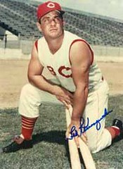
NJ: He ripped ’em off! They were, like, shredded [um, no — PL]! Because those sleeves just drove him crazy!
UW: And he wanted to show off his pipes.
NJ (steadfastly): Y’know, I think having the sleeves there was just so annoying, so uncomfortable. I think that was the motivation. And I believe that that was the beginning of sleeveless uniforms. Then the Pirates did it…
UW: Actually, the Cubs were the first ones, in 1940.
NJ (ignoring me): Well, I remember the Kluszewski issue. And finally Cincinnati said, “That’s it, get rid of the sleeves!” Anyway, attached sleeves [he means set-in sleeves — PL], like a regular T-shirt, are the most uncomfortable. If you have to have sleeves, raglan sleeves are much more comfortable. Dodger uniforms have attached sleeves. The Mets have both raglan sleeves and attached sleeves [actually, the Mets only use set-in — PL]. Red Sox, Yankees, they have raglan sleeves. But I really think sleeveless is the way to go.
UW: Gotcha.
NJ: One time back when I was playing softball in Central Park, I saw a guy with a jersey that was sleeveless, but it had raglan seams.
UW: A raglan vest?
NJ (very excited): Yes! Yes!! And it had a zipper! I said, “Where did you get that?” So my theory was that somebody ordered, y’know, regular jerseys and cut off the sleeves. And I thought, “Y’know, that would even be more comfortable, with the seams that way.” But hey, I’ve noticed that the vests nowadays are cut a little differently — they’ve got, like, a little wing at the top. And can get tagged out on that wing!
UW: Yeah, but you could also get clipped by a pitch and get a free base, so maybe it evens out.
NJ (clearly unhappy with this response): Okay, hmmmm…
UW: But you’re basically right. If you look at the old vest photos, from the Bill Mazeroski era, you’ll see that the vests were tailored much narrower across the shoulders. They were designed with a completely different pattern than the regular jerseys, almost like tank tops…
NJ: That is correct.
UW: But today’s vests are just regular jerseys with no sleeves added to them, so they’re fuller across the shoulders.
NJ: That’s right. And I like the tank top style better. I don’t like this extra stuff hanging over the edge. It gets caught on the locker. Shit like that happens — seriously! And it doesn’t need to be there. It’s another thing to tag, y’know what I mean?
UW: Mmmm-hmmm.
NJ: Now there’s another thing I want to bring up, and that would be the uniform of the ’61 Yankees.
UW: Roger Maris had very short sleeves.
NJ (bursting with excitement): That’s right! Those sleeves were two inches!
NJ: It was the length of a frill. That was a unique uniform, and I don’t think the Yankees repeated it in ’62 or ’63. But that is what I call a mock-sleeveless. It is just a gesture of a sleeve.
UW: Almost vestigial.
NJ (missing the pun): That’s right. And my thinking, back in ’61 when I first saw it, was, “Hey, this is a way that the Yankees can modify their uniform. This is how they can go sleeveless.”
UW: You were thinking that at the time?
NJ: Yeah!
UW: So you were thinking about this stuff as a kid.
NJ: I delivered the papers, and I’d read the sports pages before I delivered them.
UW: Where was this?
NJ: In Westfield, Massachusetts.
UW: And you were thinking about uniforms the whole time.
NJ: Well, it wasn’t just me — it was an issue in baseball, these sleeveless uniforms. And I thought this little vestige of a sleeve was the Yankees’ way of modifying their uniform while staying with their tradition as best they could.
UW: Yeah, but Maris was the only one who did that, right? The other players on the ’61 Yankees didn’t wear them that short.
NJ: I believe that’s how the uniforms were made. I could be wrong.
UW: I think Mantle’s were a little short but Maris’s were very short. Are you aware of what happened with the Reds in 1997?
NJ: No.
UW: Deion Sanders cut his sleeves on his road jersey very short, supposedly to honor Jackie Robinson. But the league office said he couldn’t do that, because all the players’ sleeves on a given team had to match, so the rest of the Reds all had their sleeves tailored extra-short, to match up with Deion. And they had sleeve patches that year, which had to move up onto the shoulder area.
At this point Neil wanted to show me Susan Grayson’s photos, so he brought me over to a gorgeous lithograph that showed a series of sequential Yaz photos. He sent me home with it and asked that I show it to “the people in Bristol,” with hopes that ESPN would do a story on Susan’s project (the full scope of which I still don’t fully understand, but I’ll call Neil back to get more info). Right around then the phone rang and it was Neil’s 19-year-old, who apparently was angling to “stop by and smoke some weed with his old man,” which appeared to be my cue to leave. And so home I went, bringing with me a huge lithograph and a head ringing with Neil Jenney quotes.
Uni Watch News Ticker: Uni Watch got a shout-out in this web chat with Washington Post baseball scribe Dave Sheinin (with thanks to Matt Schudel). … Robert Eden notes that Mike Piazza had an errant tag on Tuesday night (and gee, do you think he has trouble finding his own shoes?). … You can chart the increased pant leg length and bagginess of Barry Bonds’s uniform over the years (along with, y’know, other changes) here (as forwarded by Phil Johnson). … Some town in New Hampshire is all worked up about the school colors for a high school that hasn’t even opened yet (with thanks to Erik Little, who adds, “Believe it or not, this was one of the top stories on the news around here”). … Here’s a real novel concept. … Steve Shanabruch notes that Alaska Airlines’ 75th-anniversary logo owes a certain stylistic debt to the NHL. … Jon Eisen provided this nice shot of the “100” decals that NCAA teams wore in 1969 (and, yes, the photo also shows USC and UCLA both wearing their home jerseys, but we’ve covered that many times already). … Reprinted from yesterday’s comments: Bizarre eBay auction of SF Giants nameplates here. … This PDF file will provide you with the UEFA’s official kit guidelines for the coming European soccer season (excellent find by Denis Hurley). … More NHL unveilings coming soon: The Senators on August 22nd, and the Lightning on the 25th. … I’ll be watching this afternoon’s Mets/Braves game at Shea with Watch Your Back impresario Brian Corrigan (the rare creative type who likes sports) and then heading to Prospect Park to catch The Hold Steady with Hodge Podge Farm executrix Cal Patch (who’s über-creative and gives not a single hoot about sports), so talk amongst yourselves. Back in the saddle tomorrow.
Yikes!!!
Great interview. Talk about a hidden gem.
On a related note, Paul’s mentioning of his artist/writer/designer circle of friends and their non-sportiness fascinates me. Sociologists need to do some work in this area.
Yeah, Jenney is an “exception” all right…
Detroit Red Wings new jersey…
Not a huge fan of the minor changes.
New link for Illinois this year.
They’re much better than the link of a few years ago.
I guess my artistic pedigree and love of sports puts me in that “rare creative type” category
1930 Montana football jersey on link
Dennis
Jason Kendell had a Jackie Robinson decal on the back of his Cubs helmet last night. I’m sure he’s had it there the whole series with the Astros, and it’s probably Barrett’s old helmet, but you would think it would have been removed by now…
Sorry wrong link
1930 Montana jersey on link
Dennis
[quote comment=”130390″]Detroit Red Wings new jersey…
Not a huge fan of the minor changes.[/quote]
Could’ve been much worse
“Almost vestigial.”
Gold. Made even better by the ‘whoosh’ of it soaring over his head.
I’m trying to get the support for stirrups for our fencing team, so I’ll keep Uni Watch up to date (and hopefully eventually provide pictures).
The Hold Steady’s frontman Craig Finn wore a Ron Gardenhire Twins jersey during their Saturday performance at Lollapalooza in Chicago.
I don’t think the guy who did that 10 best NFL uni’s gets it. Am I wrong? If so, i will stand corrected.
… Here’s a real link. …
Take a look at the Cowboys’ pictures on this link.
We all know (I assume) that the Cowboys have two different colored “silver pants”–one that is a true silver that is worn with the rarely seen dark blue jerseys, and one “blue-silver” that is worn with the common white jerseys.
Please tell me it’s the lighting…am I the only one that thinks the helmets appear to have the same coloring differences in these two pictures? Surely my eyes are playing tricks on me. Someone please stop my inner insanity!
I love that they had Ted Kluszewski minus sleeves for his statue outside of the GABP. There really is no other way to remember him
link
FYI, not really uni related, but the Steelers came out with the name of the new mascot, wait for it……………..link. God help us all.
Regarding the notion that all players like the sleeveless unis….This is a repost from a couple of weeks ago when I got to hang out with Boog Powell.
———————
I was lucky enough to spend some time with link, and I asked his about any uni-related tidbits from his career. First off he said he hated the switch from wool to knit polyesther. Although wool was heavier, he said it kept the players skin cool, which helped in the summer.
Then he talked about his shirt sleeves. He would have his cut down the seam and through the arm pit, then have a piece of elastic fabric sewn in because his arms were so big. He didn’t feel like he had any freedom of motion in the basic wool jersey.
This led him in 1966 to request that the team use a vest style jersey so he could wear a t-shirt. I was surprised that players had that kind of pull with the uni-decisions and he said, “We’ll I did hit 34 home runs, so they better listen.â€Â
In link but it only lasted 1 year (despite what the HOF site says) because the pitchers, led by Jim Palmer, hated them. He was sad to see them go.
————
First hand account that not all players like them, so it surprises me that Mr. Jenney prefers them…being a pitcher and all.
[quote comment=”130407″]I don’t think the guy who did that 10 best NFL uni’s gets it. Am I wrong? If so, i will stand corrected.[/quote]
How can you leave the Steelers off that list? I’m sorry, but the Tamba Bay Bucs unis don’t make me think about great players. I guess the Steelers unis aren’t “flashy” enough.
The Bears should probably be on that list too. And I’d have put the Cowboys higher on the list.
[quote comment=”130408″]… Here’s a real link. …
Take a look at the Cowboys’ pictures on this link.
We all know (I assume) that the Cowboys have two different colored “silver pants”–one that is a true silver that is worn with the rarely seen dark blue jerseys, and one “blue-silver” that is worn with the common white jerseys.
Please tell me it’s the lighting…am I the only one that thinks the helmets appear to have the same coloring differences in these two pictures? Surely my eyes are playing tricks on me. Someone please stop my inner insanity![/quote]
Who is this ‘Beast’ guy and where does he get his weed? The Broncos get a ‘9’ for tradition? What a ridiculous list. No Bears or Browns to be found, either.
I’m happy with the wings jerseys. I can tell there is something slightly differnt, but I’m not quite sure what. Could just be the new fit of the jersey.
[quote comment=”130392″]New link for Illinois this year.
They’re much better than the link of a few years ago.[/quote]
Ugh. I am not a fan of the Illinois Broncos look at all. The normally-striped pants were so much better.
I’m sure everyone knows this, but “Mets” is not short for anything, including “Metropolitans.” It’s just Mets. So I don’t know if the home design that spells out METROPOLITANS would really have been acceptable to the club.
I laughed at the football uni link. 1. the bandwagon is full with bashing the old buc unis, but i loved them. 2. he says he likes the classics then chases it with the broncos. 3. the old ram and niner unis are better than their current versions. 4. the falcons have no right being in the top 10.
loved the Yaz photos. When I was a kid growing up in the Boston burbs, we would mimic Yaz’s famous, pre-pitch, bounce on his front foot, while slowly rotating the bat toward the pitcher, warmup. (This while the pitcher was probably mimicking Tiant’s “Back to the batter” windup.) The photos capture Yaz’ warmup perfectly.
[quote comment=”130414″][quote comment=”130407″]I don’t think the guy who did that 10 best NFL uni’s gets it. Am I wrong? If so, i will stand corrected.[/quote]
How can you leave the Steelers off that list? I’m sorry, but the Tamba Bay Bucs unis don’t make me think about great players. I guess the Steelers unis aren’t “flashy” enough.
EXACTLY!!! I also agree the Bears should be on there. I think maybe even the Jets too. The Falcons uni’s should be thrown to the dogs. What, too soon?
The Bears should probably be on that list too. And I’d have put the Cowboys higher on the list.[/quote]
[quote comment=”130425″][quote comment=”130414″][quote comment=”130407″]I don’t think the guy who did that 10 best NFL uni’s gets it. Am I wrong? If so, i will stand corrected.[/quote]
How can you leave the Steelers off that list? I’m sorry, but the Tamba Bay Bucs unis don’t make me think about great players. I guess the Steelers unis aren’t “flashy” enough.
EXACTLY!!! I also agree the Bears should be on there. I think maybe even the Jets too. The Falcons uni’s should be thrown to the dogs. What, too soon?
The Bears should probably be on that list too. And I’d have put the Cowboys higher on the list.[/quote][/quote]
I screwed-up my last post like an idiot. The second to last paragraph is my post, the last one is part of the quoted post. Sorry, I’m going to sit in a corner and think of what i just did.
[quote comment=”130407″]I don’t think the guy who did that 10 best NFL uni’s gets it. Am I wrong? If so, i will stand corrected.[/quote]
I agree with you 100%, his run down of top 15 college unis was just as bad.
[quote comment=”130421″][quote comment=”130392″]New link for Illinois this year.
They’re much better than the link of a few years ago.[/quote]
Ugh. I am not a fan of the Illinois Broncos look at all. The normally-striped pants were so much better.[/quote]
That’s actually the pant that Nike first rolled out with the Terps (before MD bailed for Under Armour). When the Terps left that design…Nike used if for UMass. Just another case of change the color and re-issue the uniform.
[quote comment=”130433″][quote comment=”130421″][quote comment=”130392″]New link for Illinois this year.
They’re much better than the link of a few years ago.[/quote]
Ugh. I am not a fan of the Illinois Broncos look at all. The normally-striped pants were so much better.[/quote]
That’s actually the pant that Nike first rolled out with the Terps (before MD bailed for Under Armour). When the Terps left that design…Nike used if for UMass. Just another case of change the color and re-issue the uniform.[/quote]
link
[quote comment=”130390″]Detroit Red Wings new jersey…
link
Not a huge fan of the minor changes.[/quote]
I’m waiting until I see the real thing. Those are replica jerseys which don’t follow the Rbk Edge template. The logo is far bigger than anything seen to date, and there are no seams on the front where the piping comes in to make it appear that the players are wearing aprons.
[quote comment=”130408″]… Here’s a real link. …
Take a look at the Cowboys’ pictures on this link.
We all know (I assume) that the Cowboys have two different colored “silver pants”–one that is a true silver that is worn with the rarely seen dark blue jerseys, and one “blue-silver” that is worn with the common white jerseys.
Please tell me it’s the lighting…am I the only one that thinks the helmets appear to have the same coloring differences in these two pictures? Surely my eyes are playing tricks on me. Someone please stop my inner insanity![/quote]
I have thought the same thing before, but wrote it off as a contrast with the navy or white jersey, so along w/ Ryan B., someone confirm.
By the way, I am a Mizzou fan, but I still liked the Orange Illini gear.
I’m gonna go out on a limb and say that Mr. Cashen was just trying to be diplomatic to Mr. Jenney. Those unis are just plain weird.
[quote comment=”130421″][quote comment=”130392″]New link for Illinois this year.
They’re much better than the link of a few years ago.[/quote]
Ugh. I am not a fan of the Illinois Broncos look at all. The normally-striped pants were so much better.[/quote]
I don’t much care for the new striping either, but that orange jersey-white pants combo is pretty good looking. They haven’t worn that combo in years, if ever.
[quote comment=”130422″]I’m sure everyone knows this, but “Mets” is not short for anything, including “Metropolitans.” It’s just Mets. So I don’t know if the home design that spells out METROPOLITANS would really have been acceptable to the club.[/quote]
Uh if you look at the charter of the National League when they got the franchise in NY, the team was called the NY Metropolitan Baseball Club…thus there name METS is from “Metropolitans”
I mean, if not what the F is a Met?
[quote comment=”130444″][quote comment=”130422″]I’m sure everyone knows this, but “Mets” is not short for anything, including “Metropolitans.” It’s just Mets. So I don’t know if the home design that spells out METROPOLITANS would really have been acceptable to the club.[/quote]
Uh if you look at the charter of the National League when they got the franchise in NY, the team was called the NY Metropolitan Baseball Club…thus there name METS is from “Metropolitans”
I mean, if not what the F is a Met?[/quote]
A Met is a person who has a head that has swollen to an enormous size and now resembles a baseball, stictes and all. Fortunatly the condition also means you’ve got a perminant simle.
Uh Paul, when Neil Jenney mentions Klu ripping his sleeves off and you correct him and say he did not, in fact the image you show shows zero evidence of this. You show an image of the Jersey, which was sleeveless to begin with, the only alteration Klu made was to the shirt he wore underneath, something which can be proven in the SI cover with the other Reds. The image you show does not prove or negate Jenney’s claim.
Did all schools wear the 100th decal on their helmets that year of just USC and UCLA. I dont remember seeing any Notre Dame helmets with that on it. Any one with information on the decals would be helpful.
some truly wacky (and eye-hurting) baseball caps:
[quote comment=”130449″]Uh Paul, when Neil Jenney mentions Klu ripping his sleeves off and you correct him and say he did not, in fact the image you show shows zero evidence of this. You show an image of the Jersey, which was sleeveless to begin with, the only alteration Klu made was to the shirt he wore underneath, something which can be proven in the SI cover with the other Reds. The image you show does not prove or negate Jenney’s claim.[/quote]
Does the baseball card have to show the evidence? Is it not enough to know that Paul has done his research like a good writer does, and we should be willing to refute his findings instead of calling him out because of a baseball card image?
Look it up yourself if you don’t believe him.
[quote comment=”130450″]Did all schools wear the 100th decal on their helmets that year of just USC and UCLA. I dont remember seeing any Notre Dame helmets with that on it. Any one with information on the decals would be helpful.[/quote]
I know that link did as well.
[/quote]I mean, if not what the F is a Met?[/quote]
official definition: A met is a baseball player in New York who tries his ass off to be better than a Yankee.
[quote comment=”130458″][quote comment=”130450″]Did all schools wear the 100th decal on their helmets that year of just USC and UCLA. I dont remember seeing any Notre Dame helmets with that on it. Any one with information on the decals would be helpful.[/quote]
I know that link did as well.[/quote]
And link too.
I was looking for more examples of the college centennial helmet and stumbled upon this link design. I never knew they used that color in a uniform. Frightening.
[quote comment=”130457″][quote comment=”130449″]Uh Paul, when Neil Jenney mentions Klu ripping his sleeves off and you correct him and say he did not, in fact the image you show shows zero evidence of this. You show an image of the Jersey, which was sleeveless to begin with, the only alteration Klu made was to the shirt he wore underneath, something which can be proven in the SI cover with the other Reds. The image you show does not prove or negate Jenney’s claim.[/quote]
Does the baseball card have to show the evidence? Is it not enough to know that Paul has done his research like a good writer does, and we should be willing to refute his findings instead of calling him out because of a baseball card image?
Look it up yourself if you don’t believe him.[/quote]
I never said I did not believe him. I said the image he showed was a picture from a Museum of just the vest part of Klu’s jersey. Which I then said did neither prove nor negate either of their statements. Had you have read my post, you would have seen that.
[quote comment=”130444″][quote comment=”130422″]I’m sure everyone knows this, but “Mets” is not short for anything, including “Metropolitans.” It’s just Mets. So I don’t know if the home design that spells out METROPOLITANS would really have been acceptable to the club.[/quote]
Uh if you look at the charter of the National League when they got the franchise in NY, the team was called the NY Metropolitan Baseball Club…thus there name METS is from “Metropolitans”
I mean, if not what the F is a Met?[/quote]
Obviously it’s derived from “Metropolitan.” The Mets say it’s a “natural shortening of the corporate name,” New York Metropolitan Baseball Club, Inc. But the actual team nickname is NOT short for Metropolitans. It’s just Mets.
And Nebraska, though they placed it on the front of the helmet.
link
link also used the decal.
Among others with the 100 logo…
link
link; link
link
link
link
link
Noob here. Why did USC and UCLA play colour against colour in 1969?
Oh my God, what the hell is link?
Its as bad as link
wow… what a guy!!!
i think we all know someone “like that”, whether it be someone from our past, or a current acquaintance…
interesting sidenote…
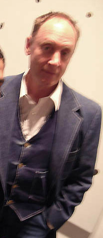
as i saw the headline pic today of mr. jenney, i couldnt help but notice his similarities with actor jk simmons of the closer
so in my mind im picturing PL in the movie role of this interview…
link
oh, and is that pic featuring him with a denim suit on?
Uniwatch’s first mention of Westfield, Massachusetts! Had no idea Neil Jenney was from my hometown.
While watching the Cubs-Astros game on WGN last night, I noticed two things. 1. DeRosa is back to having a smaller E on the back of his road jersey. 2. The Cubs were using a bat weight that had Braves written on it. It was shown late in the game, 7th or later. sorry, I can’t remember exactly.
[quote comment=”130450″]Did all schools wear the 100th decal on their helmets that year of just USC and UCLA. I dont remember seeing any Notre Dame helmets with that on it. Any one with information on the decals would be helpful.[/quote]
Browse through link and you can see all the teams that wore the “100” helmet.
Looks like Omar Vizquel is using his old Rawlings model glove with an SSK patch.
link
Here’s an additional view with the SSK patch clearly over the wrist.
This is the actual Rawlings model that he used.
[quote comment=”130464″]
I never said I did not believe him. I said the image he showed was a picture from a Museum of just the vest part of Klu’s jersey. Which I then said did neither prove nor negate either of their statements. Had you have read my post, you would have seen that.[/quote]
Had you read my response, you’re asking him to prove or disprove Jenney’s claim. You said, and I quote, “[t]he image you show does not prove or negate Jenney’s claim“, indicating that there is doubt about Paul’s statement. You never said anything about proving or disproving either of their statements, only Jenney’s statement. Only in that last comment did you bring up the validity of either statement with the line “[w]hich I then said did neither prove nor negate either of their statements“.
Semantics go a long way in this world.
More 100 Decals
link
Virginia Military Institute
[quote comment=”130489″]More 100 Decals
link
Virginia Military Institute[/quote]
Nice old Davidson pic, I didn’t know they had a team back then. I live about 20 minutes from their campus.
Mr. Jenney certainly is eccentric….
The new White Red Wings jerseys are not all that great, I liked on the old ones how the White shoulder panel overlapped into the red sleeve, now its just too straight. Other than that they seem identical.
So, according to Mr. Jenney, ballplayers would either be covered from head-to-toe in padding, or nude. What a hoot! I am of the artistic bent myself as well as a (waning) sports fan, and a female to boot. Let’s just say I confuse people.
As for the Flying Wheels jerseys, what is different, please? They look the same to me.
Off topuc for today, but i have yet to see mention on this site about the jets wearing alternate unis this upcoming year. i found them for sale on the nfl shop site, link.
they also have pics of the vikings throwbacks, which were mentioned here before, but never linked with link, i don’t believe
That was me, I’m the guy that mentioned Uniwatch in Dave Sheinen’s Wash Post Q&A.
I know it’s been mentioned here, but as of yesterday umpire Bruce Froemming is still wearing the “All Star game” patch on his hat.
link
A new NFL league policy requires all sideline journalists to wear orange vests with the NFL logo and that of the Camera maker Cannon as the crest.
[quote comment=”130485″]While watching the Cubs-Astros game on WGN last night, I noticed two things. 1. DeRosa is back to having a smaller E on the back of his road jersey. 2. The Cubs were using a bat weight that had Braves written on it. It was shown late in the game, 7th or later. sorry, I can’t remember exactly.[/quote]
In addition, relief pitcher Will Ohman wears last years New Era cap.
[quote comment=”130495″]So, according to Mr. Jenney, ballplayers would either be covered from head-to-toe in padding, or nude. What a hoot! I am of the artistic bent myself as well as a (waning) sports fan, and a female to boot. Let’s just say I confuse people.
As for the Flying Wheels jerseys, what is different, please? They look the same to me.[/quote]
Looks like the major change is the neckline on the white jersey. The red collar tapers more than it used to, to accomodate the NHL shield on the neck area.
While watching the Cubs-Astros game on WGN last night, I noticed two things. 1. DeRosa is back to having a smaller E on the back of his road jersey. 2. The Cubs were using a bat weight that had Braves written on it. It was shown late in the game, 7th or later. sorry, I can’t remember exactly.
In addition, relief pitcher Will Ohman wears last years New Era cap.
Not anymore, he just got demoted to AAA Iowa.
[quote comment=”130503″][quote comment=”130485″]While watching the Cubs-Astros game on WGN last night, I noticed two things. 1. DeRosa is back to having a smaller E on the back of his road jersey. 2. The Cubs were using a bat weight that had Braves written on it. It was shown late in the game, 7th or later. sorry, I can’t remember exactly.[/quote]
In addition, relief pitcher Will Ohman wears last years New Era cap.[/quote]
DeRosa flips between E and e…i think whatever uniform is laid out for him, he wears. Ohman got sent down to AAA with Sean Gallagher being called up.
I may have a family member going to the Senators’ jersey unveiling party. I’ll confirm today, but my email included the words “take your digital camera with you” about three dozen times.
Anyone else going?
Paul, when describing Mr. Jenney, did you substitute “endearing belligerence” for “complete douchebaggery”?
I just want to say that as a hockey player I have NEVER worn suspenders. Always had a belt of some sort or used skate laces. Suspenders are the worst invention ever.
[quote comment=”130498″]Off topuc for today, but i have yet to see mention on this site about the jets wearing alternate unis this upcoming year. i found them for sale on the nfl shop site, link.
they also have pics of the vikings throwbacks, which were mentioned here before, but never linked with link, i don’t believe[/quote]
Thanks for those links, Aaron. Both of those jerseys look good, despite what Paul might say about the Vikings one…. ;0)
[quote comment=”130513″]I just want to say that as a hockey player I have NEVER worn suspenders. Always had a belt of some sort or used skate laces. Suspenders are the worst invention ever.[/quote]
Suspenders work well, but you need to make improvements to them. When I play, I wear the same shirt over and over as I’ve attached velcro to the shoulders and straps so that the suspender straps don’t slide around. That was my number one complaint as a kid.
The lacing also helps keep the pants tight to the hips, and should not be overlooked or forgotten if one is wearing suspenders. All the suspenders do is keep your pants in place in terms of their vertical height – crucial for those sensitive areas under the pants.
“But I didn’t get to talk to Frank Cashen until 1987. And they had won the World Series the year before, and he says, “Well, we just won the Series — we can’t change our uniform now.†So that’s the story.”
Cashen sure had a diplomatic response, because the Mets actually did change their unis immediately after winning the World Series (the road ones at least).
I’m having link issues today (possibly because of the ridiculously long URL), but if you go to Dressed to the Nines and then run a 1986 and ’87 comparison, it’s pretty clear.
The reason I remember this is because it just felt like bad karma to change something right after winning. Unfortunately, they haven’t won the whole thing since.
[quote comment=”130476″]Oh my God, what the hell is link?[/quote]
Whoever came up with that helmet is obviously not a Michigan or Ohio State fan. Otherwise, he would have known that the two should never touch.
Either way, the creator must be shot.
[quote comment=”130517″][quote comment=”130513″]I just want to say that as a hockey player I have NEVER worn suspenders. Always had a belt of some sort or used skate laces. Suspenders are the worst invention ever.[/quote]
Suspenders work well, but you need to make improvements to them. When I play, I wear the same shirt over and over as I’ve attached velcro to the shoulders and straps so that the suspender straps don’t slide around. That was my number one complaint as a kid.
The lacing also helps keep the pants tight to the hips, and should not be overlooked or forgotten if one is wearing suspenders. All the suspenders do is keep your pants in place in terms of their vertical height – crucial for those sensitive areas under the pants.[/quote]
I didn’t used to wear the suspenders…but no matter how tightly I tie the laces and the “belt” on the shorts, they would still slide down a little. I got tired of having to constantly pull them back up at faceoffs…So I caved and started using the suspenders.
Okay…I was looking at that page with the top ten football uniforms…..and HOW CAN THE RAIDERS NOT BE ON THE LIST!?….In my opinion they should be in the top five at least….maybe top three.
[quote comment=”130503″][quote comment=”130485″]While watching the Cubs-Astros game on WGN last night, I noticed two things. 1. DeRosa is back to having a smaller E on the back of his road jersey. 2. The Cubs were using a bat weight that had Braves written on it. It was shown late in the game, 7th or later. sorry, I can’t remember exactly.[/quote]
In addition, relief pitcher Will Ohman wears last years New Era cap.[/quote]
As I stated earlier, Kendall’s Hill’s catcher’s mask still had a Jackie Robinson 42 decal on the back plate.
Noob here. Why did USC and UCLA play colour against colour in 1969?
For many years, both USC and UCLA played their home games at the Coliseum. Thus, when they played against each other, both teams wore their home jerseys. When UCLA moved to the Rose Bowl (sorry, can’t remember the exact year), the visiting team began wearing white.
[quote comment=”130517″][quote comment=”130513″]I just want to say that as a hockey player I have NEVER worn suspenders. Always had a belt of some sort or used skate laces. Suspenders are the worst invention ever.[/quote]
Suspenders work well, but you need to make improvements to them. When I play, I wear the same shirt over and over as I’ve attached velcro to the shoulders and straps so that the suspender straps don’t slide around. That was my number one complaint as a kid.
The lacing also helps keep the pants tight to the hips, and should not be overlooked or forgotten if one is wearing suspenders. All the suspenders do is keep your pants in place in terms of their vertical height – crucial for those sensitive areas under the pants.[/quote]
didnt charles ingalls and isaiah edwards wear suspenders in the baseball episode of “little house on the prarie” when walnut grove faced the sleepy eye green stockings?
[quote comment=”130471″]Among others with the 100 logo…
link
link; link
link
link
link
link[/quote]
link
link
todd mcfarlane was just on the herd talking about the commemorative bonds figure he had made and all of the research he did to appropriately uniform bonds for the final piece.
according to what he described on the radio the figure was long sleeved, with a mock t under the home uni, however on spawn.com it shows the short sleeved bonds, with a pair of all black filas.
[quote comment=”130538″][quote comment=”130503″][quote comment=”130485″]While watching the Cubs-Astros game on WGN last night, I noticed two things. 1. DeRosa is back to having a smaller E on the back of his road jersey. 2. The Cubs were using a bat weight that had Braves written on it. It was shown late in the game, 7th or later. sorry, I can’t remember exactly.[/quote]
In addition, relief pitcher Will Ohman wears last years New Era cap.[/quote]
As I stated earlier, Kendall’s Hill’s catcher’s mask still had a Jackie Robinson 42 decal on the back plate.[/quote]
Interesting…I posted this with “Kendall’s” with the strikethru…and it didn’t take…much like one of my posts this morning…
[quote comment=”130476″]Oh my God, what the hell is link?
Its as bad as link[/quote]
I had a feeling what that 2nd link was going to be. JUST a feeling.
[quote comment=”130550″][quote comment=”130476″]Oh my God, what the hell is link?
Its as bad as link[/quote]
I had a feeling what that 2nd link was going to be. JUST a feeling.[/quote]
Woof.
[quote comment=”130498″]Off topuc for today, but i have yet to see mention on this site about the jets wearing alternate unis this upcoming year. i found them for sale on the nfl shop site, link.
they also have pics of the vikings throwbacks, which were mentioned here before, but never linked with link, i don’t believe[/quote]
Ah, the old New York Titans jerseys…
Re: Colorado’s color scheme–for three years, the Buffaloes wore blue as part of their color scheme. You can find more info on the evolution of the Colorado football jersey–as well as their new jersey, which has been already discussed on this forum–link.
[quote comment=”130488″][quote comment=”130464″]
I never said I did not believe him. I said the image he showed was a picture from a Museum of just the vest part of Klu’s jersey. Which I then said did neither prove nor negate either of their statements. Had you have read my post, you would have seen that.[/quote]
Had you read my response, you’re asking him to prove or disprove Jenney’s claim. You said, and I quote, “[t]he image you show does not prove or negate Jenney’s claim“, indicating that there is doubt about Paul’s statement. You never said anything about proving or disproving either of their statements, only Jenney’s statement. Only in that last comment did you bring up the validity of either statement with the line “[w]hich I then said did neither prove nor negate either of their statements“.
Semantics go a long way in this world.[/quote]
I would have to agree with Alex. Teebz I think you get a little caught up in trying to defend Paul all the time even when he might have made a mistake. This is my first post but I read this site almost daily.
I noticed the same thing right away. If Paul is going to put his note in after the fact saying “um, no.” Then he should prove that what Jenney said was indeed incorrect. The picture linked doesn’t prove at all, and I can’t tell either way from any of those pictures. Alex is not trying to disprove Paul’s knowledge, just that he called Jenney out on a fact but didn’t show proof that it was incorrect.
Actually, as an addendum, blue remained on the Colorado football jerseys as late as 1988.
[quote comment=”130550″][quote comment=”130476″]Oh my God, what the hell is link?
Its as bad as link[/quote]
I had a feeling what that 2nd link was going to be. JUST a feeling.[/quote]
Sorry. I tried to find a pic of one of those lame split A’s-Giants caps but came up with nuthin’. That was the next best thing.
It’s funny that with the special attention the Reds equipment guys needed to pay to the jerseys in the Deion era, they still couldn’t get the front number placement consistent (though covered in a previous post, the pictures put it fresh in my mind).
Steve Shanabruch notes that Alaska Airlines’ 75th-anniversary logo owes a certain stylistic debt to the NHL.
… as does the NHL 75th logo to the Province of Alberta.
Also, the Wing’s shoulder yoke on the white jersey has not changed, it’s just hard to see in that photo. I agree that this is a nice feature of the Jersey and I’m glad RBK didn’t mess with it. I’m sure they would have recieved a prompt Gordie Howe elbow to the chops if they had.
[quote comment=”130553″]
I would have to agree with Alex. Teebz I think you get a little caught up in trying to defend Paul all the time even when he might have made a mistake. This is my first post but I read this site almost daily.
I noticed the same thing right away. If Paul is going to put his note in after the fact saying “um, no.” Then he should prove that what Jenney said was indeed incorrect. The picture linked doesn’t prove at all, and I can’t tell either way from any of those pictures. Alex is not trying to disprove Paul’s knowledge, just that he called Jenney out on a fact but didn’t show proof that it was incorrect.[/quote]
I have no problem with Paul being wrong. It shows he’s human, and that’s a good trait. :o)
In fact, I appreciate Alex questioning the validity of the statement. Please don’t think I am, in any way, trying to tell Alex he’s wrong. Jenney may very well be right, although from photo evidence about Klu’s jersey, cutting is the only acceptable answer.
In the photos that Paul has linked, the seams are very much intact which is what one would expect from a sleeve that’s been cut. Tearing the sleeves off would stress the seam and result in some of the stitching to be broken aound the seam where the sleeve meets the shoulder.
The uniformity of the circular opening where the sleeve is also suggests cutting. If you’ve ever torn a shirt, you’ll notice that the tears rarely follow a seam so uniformly.
Since the discussion was about the jersey that Klu wore, and not the T-shirt, cutting is the only answer acceptable. None of the photos even come close to having Klu in a ragged baseball jersey.
link, showing the other members of the Reds wearing sleeves, is where I founded my side of the entire discussion. I don’t think Jenney is correct in his assessment of the torn sleeves as the proof of the Reds’ jerseys with sleeves is in the photo that is linked on the words “ripped them off”. Klu’s jersey is neatly trimmed to the sleeve on that photo with no raggedy threads hanging off.
I meant no disrespect to Alex in any way in this entire discussion. Alex, if I have offended you, I humbly apologize as it was not what I had intended. You started a good discussion, and I never meant for it to be anything but a great discussion.
Thanks for calling me on the possible tone of my comment, BK. As I’ve stated, I wasn’t trying to take a shot at anyone. Sorry to anyone else that may have taken offence at my previous comments as well.
[quote comment=”130564″]Klu’s jersey is neatly trimmed to the sleeve on that photo…[/quote]
… neatly trimmed to the seam…
[quote comment=”130411″]FYI, not really uni related, but the Steelers came out with the name of the new mascot, wait for it……………..link. God help us all.[/quote]
Any resemblance to a certain Steelers coach, living or dead, is purely coincidental.
ed
link in the Lehigh Valley
More link(thankfully not based o nthe RBK Edge system)
[quote comment=”130564″][quote comment=”130553″]
I would have to agree with Alex. Teebz I think you get a little caught up in trying to defend Paul all the time even when he might have made a mistake. This is my first post but I read this site almost daily.
I noticed the same thing right away. If Paul is going to put his note in after the fact saying “um, no.” Then he should prove that what Jenney said was indeed incorrect. The picture linked doesn’t prove at all, and I can’t tell either way from any of those pictures. Alex is not trying to disprove Paul’s knowledge, just that he called Jenney out on a fact but didn’t show proof that it was incorrect.[/quote]
I have no problem with Paul being wrong. It shows he’s human, and that’s a good trait. :o)
In fact, I appreciate Alex questioning the validity of the statement. Please don’t think I am, in any way, trying to tell Alex he’s wrong. Jenney may very well be right, although from photo evidence about Klu’s jersey, cutting is the only acceptable answer.
In the photos that Paul has linked, the seams are very much intact which is what one would expect from a sleeve that’s been cut. Tearing the sleeves off would stress the seam and result in some of the stitching to be broken aound the seam where the sleeve meets the shoulder.
The uniformity of the circular opening where the sleeve is also suggests cutting. If you’ve ever torn a shirt, you’ll notice that the tears rarely follow a seam so uniformly.
Since the discussion was about the jersey that Klu wore, and not the T-shirt, cutting is the only answer acceptable. None of the photos even come close to having Klu in a ragged baseball jersey.
link, showing the other members of the Reds wearing sleeves, is where I founded my side of the entire discussion. I don’t think Jenney is correct in his assessment of the torn sleeves as the proof of the Reds’ jerseys with sleeves is in the photo that is linked on the words “ripped them off”. Klu’s jersey is neatly trimmed to the sleeve on that photo with no raggedy threads hanging off.
I meant no disrespect to Alex in any way in this entire discussion. Alex, if I have offended you, I humbly apologize as it was not what I had intended. You started a good discussion, and I never meant for it to be anything but a great discussion.
Thanks for calling me on the possible tone of my comment, BK. As I’ve stated, I wasn’t trying to take a shot at anyone. Sorry to anyone else that may have taken offence at my previous comments as well.[/quote]
Understood. From the other picture shown of all the Reds in sleeveless jerseys I was under the impression that we were talking about the undershirt itself. Obviously he didn’t rip his sleeves off of a sleeveless jersey. And the only photo that shows him with other Reds in home unis is with them all with sleeveless jerseys. Surprisingly enough I don’t have my 1950’s Reds uniform history so I was assuming the time period being referred to used only sleeveless jerseys at home. This makes one think that they were referring to the undershirt since no mention of the actual “jersey sleeve” being cut/torn. Just some confusing circumstances I suppose. I would agree that the jersey itself does not look “shredded.”
[quote comment=”130570″]link in the Lehigh Valley[/quote]
im actually working on getting time off of work to make it there…
[quote comment=”130527″]Okay…I was looking at that page with the top ten football uniforms…..and HOW CAN THE RAIDERS NOT BE ON THE LIST!?….In my opinion they should be in the top five at least….maybe top three.[/quote]
Agreed. That list is full of crap. Even raider haters admit their uniform is pretty dope.
[quote comment=”130569″][quote comment=”130411″]FYI, not really uni related, but the Steelers came out with the name of the new mascot, wait for it……………..link. God help us all.[/quote]
Any resemblance to a certain Steelers coach, living or dead, is purely coincidental.
ed[/quote]
That looks like purdue pete.
[quote comment=”130402″]The Hold Steady’s frontman Craig Finn wore a Ron Gardenhire Twins jersey during their Saturday performance at Lollapalooza in Chicago.[/quote]
Is that what he’s wearing link? (Also, saw them in Cincy on Sunday, and I’m pretty sure it was the greatest moment of my life to this point.)
NATCH
Pronunciation: ‘nach
Function: adverb
Etymology: by shortening & alteration from naturally
slang : of course : NATURALLY
Just thought I would clear that up for you loyal readers. He throws that out there like parsley.
[quote comment=”130402″]The Hold Steady’s frontman Craig Finn wore a Ron Gardenhire Twins jersey during their Saturday performance at Lollapalooza in Chicago.[/quote]
OK, last post got eaten (which was for the better in retrospect), but whose jersey is he wearing link? Just curious since I don’t know my Twins numbers. (Also, saw them in Cincy on Sunday, and I’m pretty sure it was the greatest moment in my life to this point.)
Interesting series link with all the NBA Rookies. Pretty funny that a few of them don’t even have numbers sewn on their jerseys yet.
link designs were based on concepts that “leaked” prior to the unveiling of the new Ducks logo last summer. Have a look and be impressed. link Looks better than the wording they currently have.
[quote comment=”130586″]link designs were based on concepts that “leaked” prior to the unveiling of the new Ducks logo last summer. Have a look and be impressed. link Looks better than the wording they currently have.[/quote]
HUUUUUUGE improvement
[quote comment=”130495″]
As for the Flying Wheels jerseys, what is different, please? They look the same to me.[/quote]
On the White jersey the upper half of the red sleeve goes all the way to the shoulder seam, while on the previous, a white shoulder panal over lapped, leaving a half cirlce indent on the sleeve.
[quote comment=”130586″]link designs were based on concepts that “leaked” prior to the unveiling of the new Ducks logo last summer. Have a look and be impressed. link Looks better than the wording they currently have.[/quote]
I kind of like that tertiary logo in the first link. Don’t really dig the green/black color scheme though. Too Dallas Stars-ish
[quote comment=”130588″][quote comment=”130586″]link designs were based on concepts that “leaked” prior to the unveiling of the new Ducks logo last summer. Have a look and be impressed. link Looks better than the wording they currently have.[/quote]
HUUUUUUGE improvement[/quote]
wow! that mallard concept is really amazing! whomever created that did a phenomenal job with a duck to work with…
“smoke some weed with his old man” ? Are you kidding me? My dad would have broken my face & my ass would have hit the curb. But on another topic, if I’m allowed to critique those Mets concepts, they look like early New York Giants ripoffs and look way too Yankee-esque. Overall I think it sucks.
[quote comment=”130593″]”smoke some weed with his old man” ? Are you kidding me? My dad would have broken my face & my ass would have hit the curb. [/quote]
funny enough it happens. a guy who occasionally goes to my regular bar is kinda like this…
his occupation, sells flowers on the street corner of gas stations.
2 years ago he walked into the bar on fathers day. told us his son gave him a bag of hash for fathers day…
we didnt believe him…
until he left to meet his son and partake, and proceeded to forget his bag of hash on one of the tables surrounding the bar…
now thats what you call love.
[quote comment=”130575″][quote comment=”130570″]link in the Lehigh Valley[/quote]
im actually working on getting time off of work to make it there…[/quote]
If you guys dont know DeSales University’s sports management department got to name this team and lots more stuff. Heres a video about it.Its pretty interesting.
link
[quote comment=”130423″]I laughed at the football uni link. 1. the bandwagon is full with bashing the old buc unis, but i loved them. 2. he says he likes the classics then chases it with the broncos. 3. the old ram and niner unis are better than their current versions. 4. the falcons have no right being in the top 10.[/quote]
Yup, you gotta love how he says he LOVES tradition, then has the Broncos and Falcons on there. I wonder if he even knows his uniform history well because he talks about the Niners current unis as if they’re the same ones that Montana and Rice wore in the 80’s.
I like how he also talks about the Packers unis having flash and the Cowboys unis not having flash when the uniform designs are actually very similar, just different colors.
[quote comment=”130596″][quote comment=”130575″][quote comment=”130570″]link in the Lehigh Valley[/quote]
im actually working on getting time off of work to make it there…[/quote]
If you guys dont know DeSales University’s sports management department got to name this team and lots more stuff. Heres a video about it.Its pretty interesting.
link
there was a large contest for naming in the morning call. im assuming that these results were from the final group of names.
[quote comment=”130586″]link designs were based on concepts that “leaked” prior to the unveiling of the new Ducks logo last summer. Have a look and be impressed. link Looks better than the wording they currently have.[/quote]
thats pretty ill.
with regards to the high school mascot deal– chapel hill, nc is much worse. the all white school was the chapel hill wildcats and the black school was the lincoln tigers– when the two schools merged, it became the the chapel hill tigers. unfortunately, when time came to build a new high school, east chapel hill high, the mascot of wildcat was chosen. offensive to say the least, when the redistricting put the majority of the towns rich white family’s into that schools district. now the district has a third mascot named the jaguars. where as chapel hill (gold and black) and east (silver and black) have a metallic color, the third high school decided on (you guessed it, purple).
[quote comment=”130595″][quote comment=”130593″]”smoke some weed with his old man” ? Are you kidding me? My dad would have broken my face & my ass would have hit the curb. [/quote]
funny enough it happens. a guy who occasionally goes to my regular bar is kinda like this…
his occupation, sells flowers on the street corner of gas stations.
2 years ago he walked into the bar on fathers day. told us his son gave him a bag of hash for fathers day…
we didnt believe him…
until he left to meet his son and partake, and proceeded to forget his bag of hash on one of the tables surrounding the bar…
now thats what you call love.[/quote]
Growing up on LI, i knew quite a few parents who smoked the herb. The funny thing is, there seems ot be no corollation between job/socioeconomic status etc. One of my friends father’s worked at a well respected law firm as a lawyer, another was a shoe salesmen… Its just one of those things.
[quote comment=”130614″][quote comment=”130595″][quote comment=”130593″]”smoke some weed with his old man” ? Are you kidding me? My dad would have broken my face & my ass would have hit the curb. [/quote]
funny enough it happens. a guy who occasionally goes to my regular bar is kinda like this…
his occupation, sells flowers on the street corner of gas stations.
2 years ago he walked into the bar on fathers day. told us his son gave him a bag of hash for fathers day…
we didnt believe him…
until he left to meet his son and partake, and proceeded to forget his bag of hash on one of the tables surrounding the bar…
now thats what you call love.[/quote]
Growing up on LI, i knew quite a few parents who smoked the herb. The funny thing is, there seems ot be no corollation between job/socioeconomic status etc. One of my friends father’s worked at a well respected law firm as a lawyer, another was a shoe salesmen… Its just one of those things.[/quote]
and yet I still find myself thinking less of people that can’t grow up and leave things like that to the younger generations…maybe that’s just me.
[quote comment=”130604″][quote comment=”130586″]link designs were based on concepts that “leaked” prior to the unveiling of the new Ducks logo last summer. Have a look and be impressed. link Looks better than the wording they currently have.[/quote]
thats pretty ill.
with regards to the high school mascot deal– chapel hill, nc is much worse. the all white school was the chapel hill wildcats and the black school was the lincoln tigers– when the two schools merged, it became the the chapel hill tigers. unfortunately, when time came to build a new high school, east chapel hill high, the mascot of wildcat was chosen. offensive to say the least, when the redistricting put the majority of the towns rich white family’s into that schools district. now the district has a third mascot named the jaguars. where as chapel hill (gold and black) and east (silver and black) have a metallic color, the third high school decided on (you guessed it, purple).[/quote]
On the high school/junior high front, when I coached football, our junior high had a different color scheme and mascot than the high school. That changed, but the district was too cheap to buy new uniforms for a couple of years, so the junior high was wearing blue & white when all the painting around the school and the coaching staffs wore yellow & black (the original scheme was yellow & brown, which changed obviously) . . . new uniforms were eventually purchased.
anyone know what is up with these Tampa Bay practice jerseys?
link
about halfway down the page
[quote comment=”130590″][quote comment=”130586″]link designs were based on concepts that “leaked” prior to the unveiling of the new Ducks logo last summer. Have a look and be impressed. link Looks better than the wording they currently have.[/quote]
I kind of like that tertiary logo in the first link. Don’t really dig the green/black color scheme though. Too Dallas Stars-ish[/quote]
from Wikipedia: “The breeding male is unmistakable with a green head, black rear end and a yellow bill with a black tip”,,,link I think the Ducks can legally claim these colors from the Stars.
[quote comment=”130450″]Did all schools wear the 100th decal on their helmets that year of just USC and UCLA. I dont remember seeing any Notre Dame helmets with that on it. Any one with information on the decals would be helpful.[/quote]
Not all schools did; just some of them. link that did in 1969 according to link. Other schools that wore the decals that he does not have enough information on include: Michigan State, Memphis State, Tulsa and Colorado State.
link
Awesome Mr. Redlegs chest logo!!!!
[quote comment=”130619″]anyone know what is up with these Tampa Bay practice jerseys?
link
about halfway down the page[/quote]
Haha i thought i knew what was coming, but thats actually a good question, what happened to the jerseys that we all hear so much about?
[quote comment=”130619″]anyone know what is up with these Tampa Bay practice jerseys?
link
about halfway down the page[/quote]
Well played, sir.
[quote comment=”130616″][quote comment=”130614″][quote comment=”130595″][quote comment=”130593″]”smoke some weed with his old man” ? Are you kidding me? My dad would have broken my face & my ass would have hit the curb. [/quote]
funny enough it happens. a guy who occasionally goes to my regular bar is kinda like this…
his occupation, sells flowers on the street corner of gas stations.
2 years ago he walked into the bar on fathers day. told us his son gave him a bag of hash for fathers day…
we didnt believe him…
until he left to meet his son and partake, and proceeded to forget his bag of hash on one of the tables surrounding the bar…
now thats what you call love.[/quote]
Growing up on LI, i knew quite a few parents who smoked the herb. The funny thing is, there seems ot be no corollation between job/socioeconomic status etc. One of my friends father’s worked at a well respected law firm as a lawyer, another was a shoe salesmen… Its just one of those things.[/quote]
and yet I still find myself thinking less of people that can’t grow up and leave things like that to the younger generations…maybe that’s just me.[/quote]
There are many many people who can smoke as adults, lead productive lives, and contribute to society. Unfortunately people like Mr Janney make all us heads look like idiots.
[quote comment=”130621″][quote comment=”130450″]Did all schools wear the 100th decal on their helmets that year of just USC and UCLA. I dont remember seeing any Notre Dame helmets with that on it. Any one with information on the decals would be helpful.[/quote]
Not all schools did; just some of them. link that did in 1969 according to link. Other schools that wore the decals that he does not have enough information on include: Michigan State, Memphis State, Tulsa and Colorado State.[/quote]
link is Louisiana Tech and East Tenn. St.
Sometimes suspenders are a good idea on uniforms, link and link
[quote comment=”130527″]Okay…I was looking at that page with the top ten football uniforms…..and HOW CAN THE RAIDERS NOT BE ON THE LIST!?….In my opinion they should be in the top five at least….maybe top three.[/quote]
cuz the guy is an idiot that’s how…he left off a lot of unis that should be on there…plus he put the Rams as #1…gimme a break
[quote comment=”130487″]Looks like Omar Vizquel is using his old Rawlings model glove with an SSK patch.
link
Here’s an additional view with the SSK patch clearly over the wrist.
This is the actual Rawlings model that he used.[/quote]
Wow, never saw that with a fielder’s glove before.
[quote comment=”130629″][quote comment=”130527″]Okay…I was looking at that page with the top ten football uniforms…..and HOW CAN THE RAIDERS NOT BE ON THE LIST!?….In my opinion they should be in the top five at least….maybe top three.[/quote]
cuz the guy is an idiot that’s how…he left off a lot of unis that should be on there…plus he put the Rams as #1…gimme a break[/quote]
Would’ve been better if he had said ‘Here are the 10 uniforms I like’ instead of trying to come up with some quantitative ranking system with no basis in logic or reality.
i posted this back in april…
was curious if you guys were able to come up with anything
folks, maybe you can help me out…
im trying to put together a folder of bookmarks for team merchandise stores…
not the high end stuff you can get off of nfl, mlb, or nba.com, but the good stuff like the red sox have here
link
i know a lot of you have looked at fitzy’s townie news site, and you’ll find that his sponsors sell cool fan stuff as well as seen here
link
link
link
since you folks are spread out nationally and you have your favorite teams, i figured you might know the good underground online places to shop for team gear.
just respond with team name and online store address…
thanks.
krvanch
[quote comment=”130624″][quote comment=”130619″]anyone know what is up with these Tampa Bay practice jerseys?
link
about halfway down the page[/quote]
Well played, sir.[/quote]
Ha. Finally a “new” question about the jerseys. They are actually wearing normal practice tops… seems weird to have them look so, well, “uniform” with the rest of the league
Not sure if this has evern been covered here, but I was on the website for the Sugar Bowl and saw link with the apparent logo for the BCS Championship game to be played in New Orleans come January.
[quote comment=”130638″]Not sure if this has evern been covered here, but I was on the website for the Sugar Bowl and saw link with the apparent logo for the BCS Championship game to be played in New Orleans come January.[/quote]
Fox Network is televising the BCS Championship I believe.
Here’s a link at the BCS Championship Game logo.
Cool looking unis on link
[quote comment=”130627″][quote comment=”130621″][quote comment=”130450″]Did all schools wear the 100th decal on their helmets that year of just USC and UCLA. I dont remember seeing any Notre Dame helmets with that on it. Any one with information on the decals would be helpful.[/quote]
Not all schools did; just some of them. link that did in 1969 according to link. Other schools that wore the decals that he does not have enough information on include: Michigan State, Memphis State, Tulsa and Colorado State.[/quote]
link is Louisiana Tech and East Tenn. St.[/quote]
That’s pretty interesting. Looking linkfrom a picture on the site, you can see that LaTech actually used its traditional logo decal on the right side of the helmets with the “100” decal on the left.
Also, looking link and link, it seems that ETSU did the same thing.
Paul, did you actually trademark Gets it and Get it? or do you just put the (TM) there for fun?
Blog ‘Kissing Suzy Kolber’ weighed in on the new Steelers mascot and it’s pretty priceless, although they make fun of the name a little more than the actual mascot.
link
Some pretty NSFW language in there, so you might want to be careful where you read it.
[quote comment=”130645″]Cool looking unis on link[/quote]
Not a fan of the “shinguard” look on the socks.
[quote comment=”130586″]link designs were based on concepts that “leaked” prior to the unveiling of the new Ducks logo last summer. Have a look and be impressed. link Looks better than the wording they currently have.[/quote]
I absoloutley love those ducks jerseys, get the owner on the phone immediatley…i also have seen this ducks link which isnt as good, but still better than what they have now and what they have had in the link
I’m not here 4ur entertainment. link.
How about link (or “braces”) on a uniform (Leyton Orient)?
[quote comment=”130646″][quote comment=”130627″][quote comment=”130621″][quote comment=”130450″]Did all schools wear the 100th decal on their helmets that year of just USC and UCLA. I dont remember seeing any Notre Dame helmets with that on it. Any one with information on the decals would be helpful.[/quote]
Not all schools did; just some of them. link that did in 1969 according to link. Other schools that wore the decals that he does not have enough information on include: Michigan State, Memphis State, Tulsa and Colorado State.[/quote]
link is Louisiana Tech and East Tenn. St.[/quote]
That’s pretty interesting. Looking linkfrom a picture on the site, you can see that LaTech actually used its traditional logo decal on the right side of the helmets with the “100” decal on the left.
Also, looking link and link, it seems that ETSU did the same thing.[/quote]
I actually pointed that fact out in a comment earlier this morning that apparently was eaten by the comment monster.
I am wondering if the 100 decal was worn as the school saw fit. When you see Texas’s helmet, the decal is added to the longhorn, but in Nebraska’s it is on the front of the helmet. Helmet Hut also has thair 1969 helmets with them on both sides for those schools they sell, but seeing Tech and the now defunct ET St. teams with their normal decal on the opposite side of the helmet as the 100 decal, I really wonder what was the rule/suggestion for wearing them.
Paul, maybe you can do an entry on this someday?
[quote comment=”130444″][quote comment=”130422″]I’m sure everyone knows this, but “Mets” is not short for anything, including “Metropolitans.” It’s just Mets. So I don’t know if the home design that spells out METROPOLITANS would really have been acceptable to the club.[/quote]
Uh if you look at the charter of the National League when they got the franchise in NY, the team was called the NY Metropolitan Baseball Club…thus there name METS is from “Metropolitans”
I mean, if not what the F is a Met?[/quote]
There was an old team way back about 100 years ago that was actually called The Metropolitans during their brief existence. The current team is just called the Mets. Officially, it isn’t short for anything else.
[quote comment=”130463″]I was looking for more examples of the college centennial helmet and stumbled upon this link design. I never knew they used that color in a uniform. Frightening.[/quote]
You should’ve seen their marching band during that period. Light blue western-style uniforms with yellow fringe. It was like 250 Conway Twitty clones on a football field.
If those Duck designs were actually presented to the the Anaheim Ducks, and they chose to go with the current Work Mark logo, well then my mind is blown.
According to the official web site of the Ottawa Senators, we can expect to see new uniforms on Wednesday, link.
[quote comment=”130628″]Sometimes suspenders are a good idea on uniforms, link and link[/quote]
link Of course, I’m biased. That’s me in the middle with no hat.
While NBA VP/Creative Director in the late ninties, we developed (what seemed to be a minor innovation at the time) the tailoered V-neck collar for the Golden State Warriors.
link
Today, V-neck tapered collars are all the rage and while I think they work, it’s become a bit overkilled already.
Any thoughts?
[quote comment=”130646″]That’s pretty interesting. Looking linkfrom a picture on the site, you can see that LaTech actually used its traditional logo decal on the right side of the helmets with the “100” decal on the left.
[/quote]
surprisingly enough no one mentioned that the qb in question is terry bradshaw…
nice ad on ebay’s home page…
link
[quote comment=”130616″][quote comment=”130614″][quote comment=”130595″][quote comment=”130593″]”smoke some weed with his old man” ? Are you kidding me? My dad would have broken my face & my ass would have hit the curb. [/quote]
funny enough it happens. a guy who occasionally goes to my regular bar is kinda like this…
his occupation, sells flowers on the street corner of gas stations.
2 years ago he walked into the bar on fathers day. told us his son gave him a bag of hash for fathers day…
we didnt believe him…
until he left to meet his son and partake, and proceeded to forget his bag of hash on one of the tables surrounding the bar…
now thats what you call love.[/quote]
Growing up on LI, i knew quite a few parents who smoked the herb. The funny thing is, there seems ot be no corollation between job/socioeconomic status etc. One of my friends father’s worked at a well respected law firm as a lawyer, another was a shoe salesmen… Its just one of those things.[/quote]
and yet I still find myself thinking less of people that can’t grow up and leave things like that to the younger generations…maybe that’s just me.[/quote]
Maybe you guys should look in the mirror the next time you are having a few drinks.
[quote comment=”130667″]nice ad on ebay’s home page…
link
sorry…
link
[quote comment=”130668″][quote comment=”130616″][quote comment=”130614″][quote comment=”130595″][quote comment=”130593″]”smoke some weed with his old man” ? Are you kidding me? My dad would have broken my face & my ass would have hit the curb. [/quote]
funny enough it happens. a guy who occasionally goes to my regular bar is kinda like this…
his occupation, sells flowers on the street corner of gas stations.
2 years ago he walked into the bar on fathers day. told us his son gave him a bag of hash for fathers day…
we didnt believe him…
until he left to meet his son and partake, and proceeded to forget his bag of hash on one of the tables surrounding the bar…
now thats what you call love.[/quote]
Growing up on LI, i knew quite a few parents who smoked the herb. The funny thing is, there seems ot be no corollation between job/socioeconomic status etc. One of my friends father’s worked at a well respected law firm as a lawyer, another was a shoe salesmen… Its just one of those things.[/quote]
and yet I still find myself thinking less of people that can’t grow up and leave things like that to the younger generations…maybe that’s just me.[/quote]
Maybe you guys should look in the mirror the next time you are having a few drinks.[/quote]
something illegal i have to buy illegally vs. something i can buy in a store…
apples and oranges my friend.
[quote comment=”130657″][quote comment=”130646″][quote comment=”130627″][quote comment=”130621″][quote comment=”130450″]Did all schools wear the 100th decal on their helmets that year of just USC and UCLA. I dont remember seeing any Notre Dame helmets with that on it. Any one with information on the decals would be helpful.[/quote]
Not all schools did; just some of them. link that did in 1969 according to link. Other schools that wore the decals that he does not have enough information on include: Michigan State, Memphis State, Tulsa and Colorado State.[/quote]
link is Louisiana Tech and East Tenn. St.[/quote]
That’s pretty interesting. Looking linkfrom a picture on the site, you can see that LaTech actually used its traditional logo decal on the right side of the helmets with the “100” decal on the left.
Also, looking link and link, it seems that ETSU did the same thing.[/quote]
I actually pointed that fact out in a comment earlier this morning that apparently was eaten by the comment monster.
I am wondering if the 100 decal was worn as the school saw fit. When you see Texas’s helmet, the decal is added to the longhorn, but in Nebraska’s it is on the front of the helmet. Helmet Hut also has thair 1969 helmets with them on both sides for those schools they sell, but seeing Tech and the now defunct ET St. teams with their normal decal on the opposite side of the helmet as the 100 decal, I really wonder what was the rule/suggestion for wearing them.
Paul, maybe you can do an entry on this someday?[/quote]
I don’t believe there was mandate by the NCAA to wear the decals. The fact is that the majority of college schools did NOT wear any sort of commemorative decal. So I think it was displayed as the team saw fit. Also, as we see with Navy and Purdue, some teams came up with their own decals.
[quote comment=”130647″]Paul, did you actually trademark Gets it and Get it? or do you just put the (TM) there for fun?[/quote]
Having zero clue on what Paul does. . .
As long as a phrase or logo or other insignia identifies the source of your goods or services as yours, it is a trademark. When you see (R) (full-circle or not), that just means it’s a registered trademark (registered federally with the US Patent and Trademark Office. When you see TM, it means that the mark isn’t registered, but other state laws MIGHT (but usually don’t) apply. It still is being used as a trademark to identify goods or services as coming from the company/source.
[quote comment=”130673″][quote comment=”130657″][quote comment=”130646″][quote comment=”130627″][quote comment=”130621″][quote comment=”130450″]Did all schools wear the 100th decal on their helmets that year of just USC and UCLA. I dont remember seeing any Notre Dame helmets with that on it. Any one with information on the decals would be helpful.[/quote]
Not all schools did; just some of them. link that did in 1969 according to link. Other schools that wore the decals that he does not have enough information on include: Michigan State, Memphis State, Tulsa and Colorado State.[/quote]
link is Louisiana Tech and East Tenn. St.[/quote]
That’s pretty interesting. Looking linkfrom a picture on the site, you can see that LaTech actually used its traditional logo decal on the right side of the helmets with the “100” decal on the left.
Also, looking link and link, it seems that ETSU did the same thing.[/quote]
I actually pointed that fact out in a comment earlier this morning that apparently was eaten by the comment monster.
I am wondering if the 100 decal was worn as the school saw fit. When you see Texas’s helmet, the decal is added to the longhorn, but in Nebraska’s it is on the front of the helmet. Helmet Hut also has thair 1969 helmets with them on both sides for those schools they sell, but seeing Tech and the now defunct ET St. teams with their normal decal on the opposite side of the helmet as the 100 decal, I really wonder what was the rule/suggestion for wearing them.
Paul, maybe you can do an entry on this someday?[/quote]
I don’t believe there was mandate by the NCAA to wear the decals. The fact is that the majority of college schools did NOT wear any sort of commemorative decal. So I think it was displayed as the team saw fit. Also, as we see with Navy and Purdue, some teams came up with their own decals.[/quote]
Considering teams wore football shaped decal–some in their team’s colors, and some not–I find it hard to believe that the NCAA or some other group would not have some type of plan for the teams to wear them.
Noob here. Why did USC and UCLA play colour against colour in 1969?
For many years, both USC and UCLA played their home games at the Coliseum. Thus, when they played against each other, both teams wore their home jerseys. When UCLA moved to the Rose Bowl (sorry, can’t remember the exact year), the visiting team began wearing white.
That would be 1982 — my frosh year at UCLA and the first we played at the Rose Bowl. (Well, apart from the very occasional post-season appearance.) After all those years of watching the game seeing the hated Trojans come out in white was really disappointing. The big game had lost one of its coolest (to an aspiring uni connoisseur) aspects; I know dozens of fans from both schools who’d love to bring this back.
Paul: thanks for the link to the gorgeous 1969 pic. Hadn’t seen the ‘100’ logo on both teams in action before.
[quote comment=”130645″]Cool looking unis on link[/quote]
If by cool you mean shitty.
[quote comment=”130679″][quote comment=”130645″]Cool looking unis on link[/quote]
If by cool you mean shitty.[/quote]
I dunno, I kinda like the vertical strips on the sox and sleeves. Kinda remind me of link .
I meant “stripes” on the socks…..
Whats with all the talk about the USA hockey UNI’s. They’re exactly the same as the ones they wore for the Turino Winter Olympics in early 2006. They are older than this blog.
[quote comment=”130682″][quote comment=”130679″][quote comment=”130645″]Cool looking unis on link[/quote]
If by cool you mean shitty.[/quote]
I dunno, I kinda like the vertical strips on the sox and sleeves. Kinda remind me of link .[/quote]
Just not a fan of the sock stripes. Too distracting, for the wrong reasons.
[quote comment=”130685″][quote comment=”130682″][quote comment=”130679″][quote comment=”130645″]Cool looking unis on link[/quote]
If by cool you mean shitty.[/quote]
I dunno, I kinda like the vertical strips on the sox and sleeves. Kinda remind me of link .[/quote]
Just not a fan of the sock stripes. Too distracting, for the wrong reasons.[/quote]
Quick thought, i was never a fan of any ‘USA’ logo for the jersey. They just always look, I don’t know, lets say un-hockey like. I think we should use something more hockeycentric. Maybe the link, with blue and white jerseys. or put ‘United States’ diagonal going down the jersey, like new yorks. Just a thought.
[quote comment=”130677″][quote comment=”130673″][quote comment=”130657″][quote comment=”130646″][quote comment=”130627″][quote comment=”130621″][quote comment=”130450″]Did all schools wear the 100th decal on their helmets that year of just USC and UCLA. I dont remember seeing any Notre Dame helmets with that on it. Any one with information on the decals would be helpful.[/quote]
Not all schools did; just some of them. link that did in 1969 according to link. Other schools that wore the decals that he does not have enough information on include: Michigan State, Memphis State, Tulsa and Colorado State.[/quote]
link is Louisiana Tech and East Tenn. St.[/quote]
That’s pretty interesting. Looking linkfrom a picture on the site, you can see that LaTech actually used its traditional logo decal on the right side of the helmets with the “100” decal on the left.
Also, looking link and link, it seems that ETSU did the same thing.[/quote]
I actually pointed that fact out in a comment earlier this morning that apparently was eaten by the comment monster.
I am wondering if the 100 decal was worn as the school saw fit. When you see Texas’s helmet, the decal is added to the longhorn, but in Nebraska’s it is on the front of the helmet. Helmet Hut also has thair 1969 helmets with them on both sides for those schools they sell, but seeing Tech and the now defunct ET St. teams with their normal decal on the opposite side of the helmet as the 100 decal, I really wonder what was the rule/suggestion for wearing them.
Paul, maybe you can do an entry on this someday?[/quote]
I don’t believe there was mandate by the NCAA to wear the decals. The fact is that the majority of college schools did NOT wear any sort of commemorative decal. So I think it was displayed as the team saw fit. Also, as we see with Navy and Purdue, some teams came up with their own decals.[/quote]
Considering teams wore football shaped decal–some in their team’s colors, and some not–I find it hard to believe that the NCAA or some other group would not have some type of plan for the teams to wear them.[/quote]
But I think the issue is the NCAA TODAY versus the NCAA in prior years. The NCAA was not NEARLY as involved in matters like this in 1969. I really think that someone came up with the decal that many teams decided to use in their own colors.
[quote comment=”130686″][quote comment=”130685″][quote comment=”130682″][quote comment=”130679″][quote comment=”130645″]Cool looking unis on link[/quote]
If by cool you mean shitty.[/quote]
I dunno, I kinda like the vertical strips on the sox and sleeves. Kinda remind me of link .[/quote]
Just not a fan of the sock stripes. Too distracting, for the wrong reasons.[/quote]
Quick thought, i was never a fan of any ‘USA’ logo for the jersey. They just always look, I don’t know, lets say un-hockey like. I think we should use something more hockeycentric. Maybe the link, with blue and white jerseys. or put ‘United States’ diagonal going down the jersey, like new yorks. Just a thought.[/quote]
I think the Seal of the United States is a little busy for a sports uniform, but I like the originality of it.
Rick Ankiel has made it back to the majors as an outfielder.
link
Here’s hoping he sports the same bitchin socks he did as a pitcher in the bigs: link
And yes I realize those are fake stirrups, but they’re better than nothing.
[quote comment=”130690″]Rick Ankiel has made it back to the majors as an outfielder.
link
Here’s hoping he sports the same bitchin socks he did as a pitcher in the bigs: link
And yes I realize those are fake stirrups, but they’re better than nothing.[/quote]
what I don’t understand is why teams can’t get normal socks (i.e. no fake stirrup, just a solid color) with stripes on them and distribute them to the players. That way we get to see the socks look as they should be on teams like the red socks and braves. I hate looking at Jason Varitek in those solid red socks. He looks like a clown.
[quote comment=”130693″][quote comment=”130690″]Rick Ankiel has made it back to the majors as an outfielder.
link
Here’s hoping he sports the same bitchin socks he did as a pitcher in the bigs: link
And yes I realize those are fake stirrups, but they’re better than nothing.[/quote]
what I don’t understand is why teams can’t get normal socks (i.e. no fake stirrup, just a solid color) with stripes on them and distribute them to the players. That way we get to see the socks look as they should be on teams like the red socks and braves. I hate looking at Jason Varitek in those solid red socks. He looks like a clown.[/quote]
Agreed. And while I love it when Hunter Pence, Lance Berkman, and Roy Oswalt wear the high socks, it’s still a step below the stirrup and can even look horrible in some cases (like Varitek). It does seem to me though that more players are willing to go long socks or stirrups than was the case 10 years ago. Back then it seemed like Mike Benjamin was the only one rocking the striped socks.
[quote comment=”130560″][quote comment=”130550″][quote comment=”130476″]Oh my God, what the hell is link?
Its as bad as link[/quote]
I had a feeling what that 2nd link was going to be. JUST a feeling.[/quote]
Sorry. I tried to find a pic of one of those lame split A’s-Giants caps but came up with nuthin’. That was the next best thing.[/quote]
Once saw a small U-haul truck going down the road. The city on the truck was some Ohio town and the picture was a football player catching a pass. However the colors were Michigan’s maize and blue. This could NOT have been an accident. Pretty funny, at least to me.
link
Notice the strange patch on the back of Matt Treanor’s left thigh. Anyone have idea what that is?
[quote comment=”130701″]http://sportsillustrated.cnn.com/multimedia/photo_gallery/0708/photos.week0730-0805.mlb/content.3.html
Notice the strange patch on the back of Matt Treanor’s left thigh. Anyone have idea what that is?[/quote]
My guess is he tore the pants and that is a patch to cover it.
[quote comment=”130435″][quote comment=”130390″]Detroit Red Wings new jersey…
link
Not a huge fan of the minor changes.[/quote]
I’m waiting until I see the real thing. Those are replica jerseys which don’t follow the Rbk Edge template. The logo is far bigger than anything seen to date, and there are no seams on the front where the piping comes in to make it appear that the players are wearing aprons.[/quote]
Thanks for mentioning that, Teebz. I was going to point out that any of the new jerseys that have ‘Premier’ in the name are replicas. The authentics will cost you at least $250 from what I’ve seen. My Predators authentic I ordered was $275 without customization. (I still can’t believe I paid that much for an ugly jersey. I was running a high fever that day though)
As for the Red Wings…the jerseys appear to look just like the previous ones. However, there is something a bit odd that I can’t put my finger on. I’ll wait for the real deal to pass final judgement.
[quote comment=”130651″]I’m not here 4ur entertainment. link.[/quote]
Hey Ben, here’s a news flash…yes you are.
Also, can anyone explain why he’s wearing a shower cap?
Stirup alert on ESPN, Ga LL team wearing them.
Everyone turn on ESPN right now. Little League Baseball. Look at the team from Georgia.
[quote comment=”130584″]Interesting series link with all the NBA Rookies. Pretty funny that a few of them don’t even have numbers sewn on their jerseys yet.[/quote]
(Unless this was within say last week)Most likely at the time of the photo shoot, a few of these guys were (and a few still are) un-signed. Therefore, no number for them.
the usc-ucla pix was taken at a perfect angle to show both teams’ 100 logos. for usc wore the 100 logo on the left side of the helmet ONLY. and ucla wore their 100 logo on the right side of the helmet ONLY. southern california’s right side of the helmet was bare, as was ucla’s left side. in 1970, southern california went back to a plain cardinal helmet and ucla reverted back to a plain gold helmet.
and yes, the should both still wear their darks when playing each other.
btw, my nittany lions did NOT wear a 100 logo on their helmet in 1969.
Too bad with all the stirrups, theres 2 red teams playing each other and theres a red umpire. That was by far the first thing I noticed.
Watching the Cubs and Rockies. The Rockies pitcher, Jiminez, is wearing stirrups….but backwards I think…anyone get a screen shot? Also, their catcher is a ‘swoosh’ billboard, catch the logo on his chest protector, it is ubersized…screen shots?
[quote comment=”130727″]Watching the Cubs and Rockies. The Rockies pitcher, Jiminez, is wearing stirrups….but backwards I think…anyone get a screen shot?[/quote]
Can we please either:
A) File this under the category of Kenny Roger’s Hat, Tampa Bay Buccaneer’s Training Camp number font and Washington Captials photoshopped new sweaters.
Or
B) Draft a letter/petition/style guide to Ubaldo Jimenez both commending his decision to wear stirrups and instruct him how to wear them correctly.
The Fresno Grizzlies (AAA-San Francisco) have announced that they will ditch their “unpopular” logo and green/brown color palette for something new. This comes on the heals of losing a significant share of their fanbase after switching from the franchise’s original PURPLE and black a few years ago.
[quote comment=”130723″]Too bad with all the stirrups, theres 2 red teams playing each other and theres a red umpire. That was by far the first thing I noticed.[/quote]
Are they real stirrups? They look like the fake stirrup socks to me but it still looks nice.
[/quote]Who is this ‘Beast’ guy and where does he get his weed? [/quote]
My guess is from Neil Jenney… or his son.
the usc-ucla pix was taken at a perfect angle to show both teams’ 100 logos. for usc wore the 100 logo on the left side of the helmet ONLY. and ucla wore their 100 logo on the right side of the helmet ONLY. southern california’s right side of the helmet was bare, as was ucla’s left side. in 1970, southern california went back to a plain cardinal helmet and ucla reverted back to a plain gold helmet.
Thanks for the info. I was only aware of the SC “blank” — you might want to alert link about UCLA. (Click on Pac 10; they note the SC issue.) They’re great sticklers for detail and an oft-used Uni source.
[quote comment=”130645″]Cool looking unis on link[/quote]
keep your stinking vertical soccer stripes off my hockey sweaters…
Ya also gotta love the modular uniforms for each country
[quote comment=”130690″]Rick Ankiel has made it back to the majors as an outfielder.
link
Here’s hoping he sports the same bitchin socks he did as a pitcher in the bigs: link
And yes I realize those are fake stirrups, but they’re better than nothing.[/quote]
for whatever reason, Babe Rick has gone to pajama pants and jersey #24. Ick.
44 cursed for the Red Sox — Orlando Cabrera thinks so. link
[quote comment=”130713″][quote comment=”130651″]I’m not here 4ur entertainment. link.[/quote]
Hey Ben, here’s a news flash…yes you are.
Also, can anyone explain why he’s wearing a shower cap?[/quote]
its not a shower cap… its one of those helmet covers that have been discussed here for the last week or so… he just put in on for some “funny” effect.
The new hockey jerseys seem pretty european looking….the picture of that detroit redwings jersey seemed neat, but $130!! yikes!
Someone posted in the July 21 article about the phoenix coyotes jersey at link and they seem to have all jerseys much cheaper
Everyone turn on ESPN right now. Little League Baseball. Look at the team from Georgia.
Yea…It made me kind of sick noticing that the whole Georgia team had their stirrups on BACKWARDS! Not one kid had them on the right way! Cmon now…
[quote comment=”130669″][quote comment=”130667″]nice ad on ebay’s home page…
link
sorry…
link
Yeah, so eBay can get a hefty percentage from the sale of the ball.
[quote comment=”130751″]The new hockey jerseys seem pretty european looking….the picture of that detroit redwings jersey seemed neat, but $130!! yikes!
Someone posted in the July 21 article about the phoenix coyotes jersey at link and they seem to have all jerseys much cheaper[/quote]
That’s because they’re the jerseys that are about to be obsolete
[quote comment=”130521″][quote comment=”130476″]Oh my God, what the hell is link?[/quote]
Whoever came up with that helmet is obviously not a Michigan or Ohio State fan. Otherwise, he would have known that the two should never touch.
Either way, the creator must be shot.[/quote]
Yeah just like the dopes at espn who had Big Papi put a YANKEES hat on with his SUX Uniform in the commercial
[quote comment=”130728″][quote comment=”130727″]Watching the Cubs and Rockies. The Rockies pitcher, Jiminez, is wearing stirrups….but backwards I think…anyone get a screen shot?[/quote]
Can we please either:
A) File this under the category of Kenny Roger’s Hat, Tampa Bay Buccaneer’s Training Camp number font and Washington Captials photoshopped new sweaters.
Or
B) Draft a letter/petition/style guide to Ubaldo Jimenez both commending his decision to wear stirrups and instruct him how to wear them correctly.[/quote]
excuuuuuuuussssseme…..tightas*! I’ve been reading this blog for two years and, although the other commnents you made I was aware of, the jiminez one I wasn’t. Lighten up or take pill.
[quote comment=”130789″][quote comment=”130728″][quote comment=”130727″]Watching the Cubs and Rockies. The Rockies pitcher, Jiminez, is wearing stirrups….but backwards I think…anyone get a screen shot?[/quote]
Can we please either:
A) File this under the category of Kenny Roger’s Hat, Tampa Bay Buccaneer’s Training Camp number font and Washington Captials photoshopped new sweaters.
Or
B) Draft a letter/petition/style guide to Ubaldo Jimenez both commending his decision to wear stirrups and instruct him how to wear them correctly.[/quote]
excuuuuuuuussssseme…..tightas*! I’ve been reading this blog for two years and, although the other commnents you made I was aware of, the jiminez one I wasn’t. Lighten up or take pill.[/quote]
I need to lighten up?? Wow . . .
[quote comment=”130732″][/quote]Who is this ‘Beast’ guy and where does he get his weed? [/quote]
My guess is from Neil Jenney… or his son.[/quote]
Now that’s funny!!!
[quote comment=”130592″][quote comment=”130588″][quote comment=”130586″]link designs were based on concepts that “leaked” prior to the unveiling of the new Ducks logo last summer. Have a look and be impressed. link Looks better than the wording they currently have.[/quote]
HUUUUUUGE improvement[/quote]
wow! that mallard concept is really amazing! whomever created that did a phenomenal job with a duck to work with…[/quote]
Two thoughts: #1 – reminds me of the Wild
#2 – Could they incorporate the dog from Duck Hunt somehow?
[quote comment=”130670″][quote comment=”130668″][quote comment=”130616″][quote comment=”130614″][quote comment=”130595″][quote comment=”130593″]”smoke some weed with his old man” ? Are you kidding me? My dad would have broken my face & my ass would have hit the curb. [/quote]
funny enough it happens. a guy who occasionally goes to my regular bar is kinda like this…
his occupation, sells flowers on the street corner of gas stations.
2 years ago he walked into the bar on fathers day. told us his son gave him a bag of hash for fathers day…
we didnt believe him…
until he left to meet his son and partake, and proceeded to forget his bag of hash on one of the tables surrounding the bar…
now thats what you call love.[/quote]
Growing up on LI, i knew quite a few parents who smoked the herb. The funny thing is, there seems ot be no corollation between job/socioeconomic status etc. One of my friends father’s worked at a well respected law firm as a lawyer, another was a shoe salesmen… Its just one of those things.[/quote]
and yet I still find myself thinking less of people that can’t grow up and leave things like that to the younger generations…maybe that’s just me.[/quote]
Maybe you guys should look in the mirror the next time you are having a few drinks.[/quote]
something illegal i have to buy illegally vs. something i can buy in a store…
apples and oranges my friend.[/quote]
Eh, more like apples and, well, illegal apples.