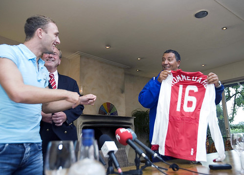
Dennis Rommedahl was presented with his Ajax Amsterdam jersey this week. It still appears that the kit was poorly designed for players with long last names, with the white letters overflowing onto the white fabric, despite the fact that similar problems have happened before. Not to mention, it will probably look illegible from a good distance, reading something like “squiggle-OMMEDAH-squiggle.” —Vince
Seems like Ajax should have gone link route in order to fit in the name.
man, that looks like drew brees at that press conference…
OMG, Sergio Garcia is wearing a red & orange hat, orange sweater (think Tennessee Vols) and red pants. Ouch!
Sergio is dressed to coach the special teams for Joe Gibbs in a few weeks.
In yesterday’s column the Maple Leafs came up in discussion. I understand ‘the buds’ are ditching the silver and sticking with the blue & white which is good. But somebody linked link stating the Leafs went cartoonish over the years, for the record I hope the Maple Leafs go with the 1927 Leaf, with Toronto Maple Leafs going in the upwards direction, something you don’t see very often. Interesting though, Nashville has their city name over top their new logo and it’s drawing a negative buzz from people, but the Maple Leafs have had their entire team name from day one and I love it, which is probably why I don’t really mind Nashville’s name on their sweater. Also, just confirming that the Maple Leafs will be removing the link shoulder patch, which is also good. I’m not sure if all these facts are true or false, but I’ve read them on here a few days back.
link
link
link
I really wish London would have come with something a little more ‘Olympic’.
As a fan of Charlton Athletic – Dennis Rommedahl’s previous club – I was pretty surprised to see Rommers on the front of Uni Watch this morning! The last three years he’s worn a solid red jersey with white lettering for Charlton or the Danish national team, so the white letters on white are a new thing for Romm.
Another thing about Rommedahl: he also previously played for link, who use a link to avoid the white on white problem that their rivals at Ajax have.
[quote comment=”122429″]OMG, Sergio Garcia is wearing a red & orange hat, orange sweater (think Tennessee Vols) and red pants. Ouch![/quote]
I’m guessing Sergio’s wearing the colours of Spain’s flag.
[quote comment=”122462″][quote comment=”122429″]OMG, Sergio Garcia is wearing a red & orange hat, orange sweater (think Tennessee Vols) and red pants. Ouch![/quote]
I’m guessing Sergio’s wearing the colours of Spain’s flag.[/quote]
link is most definitely not this
[quote comment=”122458″]link
link
link
I really wish London would have come with something a little more ‘Olympic’.[/quote]
Not an offical Olympic logo but link was Tampa’s logo when it was a candidate. The worst i’ve seen.
[quote comment=”122468″][quote comment=”122458″]link
link
link
I really wish London would have come with something a little more ‘Olympic’.[/quote]
Not an offical Olympic logo but link was Tampa’s logo when it was a candidate. The worst i’ve seen.[/quote]
Yeah, that’s insipid, but at least it doesn’t trigger epileptic episodes for little British kids like the London logo does.
[quote comment=”122469″][quote comment=”122468″][quote comment=”122458″]link
link
link
I really wish London would have come with something a little more ‘Olympic’.[/quote]
Not an offical Olympic logo but link was Tampa’s logo when it was a candidate. The worst i’ve seen.[/quote]
Yeah, that’s insipid, but at least it doesn’t trigger epileptic episodes for little British kids like the London logo does.[/quote]
I really liked the link.
[quote comment=”122475″][quote comment=”122469″][quote comment=”122468″][quote comment=”122458″]link
link
link
I really wish London would have come with something a little more ‘Olympic’.[/quote]
Not an offical Olympic logo but link was Tampa’s logo when it was a candidate. The worst i’ve seen.[/quote]
Yeah, that’s insipid, but at least it doesn’t trigger epileptic episodes for little British kids like the London logo does.[/quote]
I really liked the link.[/quote]
That Houston logo is mighty sharp. It gets enough of a Texas reference in there without being link.
Having been only a year-and-a-half old when Calgary hosted the Olympics, I had never seen that logo. I love the way they envoke the Maple Leaf with the rings.
I liked these olympic logos
1968 Mexico
link
2016 Chicago Bid
link
[quote comment=”122475″][quote comment=”122469″][quote comment=”122468″][quote comment=”122458″]link
link
link
I really wish London would have come with something a little more ‘Olympic’.[/quote]
Not an offical Olympic logo but link was Tampa’s logo when it was a candidate. The worst i’ve seen.[/quote]
Yeah, that’s insipid, but at least it doesn’t trigger epileptic episodes for little British kids like the London logo does.[/quote]
I really liked the link.[/quote]
The Houston one is simple and makes sense. London looks like a Bulimic Lisa Simpson. Tamps looks like a poster for the world jazzercise competition.
[quote comment=”122487″]I liked these olympic logos
1968 Mexico
link
2016 Chicago Bid
link
I think/thought Chicago isn’t going to be allowed to use that logo cuz it uses the torch
check out this guys shoes, ball & backboard as he dunks
link
heres another first pitch photo
link
[quote comment=”122453″]In yesterday’s column the Maple Leafs came up in discussion. I understand ‘the buds’ are ditching the silver and sticking with the blue & white which is good. But somebody linked link stating the Leafs went cartoonish over the years, for the record I hope the Maple Leafs go with the 1927 Leaf, with Toronto Maple Leafs going in the upwards direction, something you don’t see very often. Interesting though, Nashville has their city name over top their new logo and it’s drawing a negative buzz from people, but the Maple Leafs have had their entire team name from day one and I love it, which is probably why I don’t really mind Nashville’s name on their sweater. Also, just confirming that the Maple Leafs will be removing the link shoulder patch, which is also good. I’m not sure if all these facts are true or false, but I’ve read them on here a few days back.[/quote]
#1, That 1927 logo looks like crap. I strongly prefer the 30s/40s leaf that they used on the alts the last few years, or stick with the Ballard Leaf.
#2, The reason people don’t mind the Leafs’ name in the logo is that it’s part of the logo, it fits so well, and it’s historical. Nashville’s name is not in their logo, and it looks like they just threw it on there after the fact. Looks really bad.
I think/thought Chicago isn’t going to be allowed to use that logo cuz it uses the torch
Correct. They will unveil a new one in the fall, presumably around the time that they officially submit their bid to the IOC.
[quote comment=”122487″]I liked these olympic logos
1968 Mexico
link
2016 Chicago Bid
link
I think ‘Adidas’ when I see the Mexico City logo; Chicago is pretty classy. I don’t see why they wouldn’t be able to use a torch in the logo since link did.
The only thing that i see wrong with the Chicago logo is that it doesn’t use the 5 rings. Most of the other logos have a rendition of a torch in theirs, including Houston’s
the tigers-royals game today will feature both teams wearing negro leagues uniforms.
the royals will be wearing the kansas city monarchs, and the tigers will be wearing the detroit stars.
I believe I remember reading that bid logos are not allowed to include the torch in an article about Chicago’s logo. However, should they win the games, they would then be able to use the rings or torch.
There’s actually, as with most logos, a lot of symbolism in that link. The “flame” represents the Chicago Skyline while the base is supposed to represent the color of Lake Michigan.
Nice ebay auction going on here:
link
could this be the new sharks’ unis?
link
Little help here from the denizens of Uniwatch….what is the general consensus on the quality and fidelity of the reproduction jerseys from Ebbets and M&N? TIA.
On Tuesday, the Royals will commemorate the link episode with a special powder blue T-shirt night. That, coupled with the blues in this season’slink slogan makes me think that a new road uniform may be in the future.
[quote comment=”122530″]Little help here from the denizens of Uniwatch….what is the general consensus on the quality and fidelity of the reproduction jerseys from Ebbets and M&N? TIA.[/quote]
Can’t speak to M&N, but the quality of Ebbets’ work is very, very high.
Some of their designs are a little off, but on the whole they’re really close to the mark. And a great company from which to order.
For anyone who ever wanted the Coyotes old jersey, here ya go:
link
[quote comment=”122537″]On Tuesday, the Royals will commemorate the link episode with a special powder blue T-shirt night. That, coupled with the blues in this season’slink slogan makes me think that a new road uniform may be in the future.[/quote]
I don’t mean to be overly negative, but I don’t think the link they’re giving away is all that. It’s exactly like a previously-given-away Brett t-shirt, with the addition of some smudges. I would rather have seen some sort of commemorative logo or picture of Brett’s conniption, but that’s just my $0.02.
do dice on the sharks uni i posted today?
Mitchell & Ness has been usually pretty solid as far as quality goes. I have quite a collection M&N basketball and football jerseys and they are one of, if not the best, retro jersey companies out there.
However, I have noticed a drop in quality since they went overseas for their production. (Example #1; I have a M&N Joe Namath / NY Jets jersey, made of durene fabric, that was made in Ripon, Wisconsin which is incredible. I also have a Don Maynard/NY Titans jersey, made of polyester fabric, that was made overseas and it is not quite as nice in terms of fabric.)
One other thing, M&N seems to have started to overlook details that make the difference in a jersey in my opinion. (Example #2; I have a Harold Carmichael / Philadelphia Eagles jersey, made of polyester fabric and made overseas. The problem with this one is that Philly used the fishnet / wide hole mesh for the body of the jerseys and the normal / small hole mesh for the sleeves. M&N did the whole jersey in the normal/small hole material.)
The second example was an atrocity considering that M&N is based in Philly and had supplied unis to the Eagles years ago.
Overall, M&N is top quality but they may be slipping a bit.
at some point Sergio link.
link
sharks’ 07/08 uni?
fuck, I can’t get thaht link to work
link
[quote comment=”122564″]at some point Sergio link.[/quote]
He also, at one point, pulled off the orange sweater to reveal an orange short sleeved shirt over red long-sleeved undershirt. I think he had those black pants on at that point, though.
Found a pic of Sergio with the link.
[quote comment=”122453″]In yesterday’s column the Maple Leafs came up in discussion. I understand ‘the buds’ are ditching the silver and sticking with the blue & white which is good. But somebody linked link stating the Leafs went cartoonish over the years, for the record I hope the Maple Leafs go with the 1927 Leaf, with Toronto Maple Leafs going in the upwards direction, something you don’t see very often. Also, just confirming that the Maple Leafs will be removing the link shoulder patch, which is also good. I’m not sure if all these facts are true or false, but I’ve read them on here a few days back.[/quote]
The simple beauty of the Maple Leafs sweaters are something to behold. I like the 1967 leaf the best and put that with the alt white sweater, the one with the blue shoulders, and you have one that rivals the Blackhawks as the perfect hockey sweater.
[quote comment=”122569″]fuck, I can’t get thaht link to work
link
That’s fake, NHL has no third jerseys this year
It appears that Shelley Duncan, a recent call-up of the Yankees has something written under his cap. Can’t make out what it is, but being that it is one of the new caps, it is written in silver on the black underbrim
Thanks to Chance and Jeff for the feedback.
man, that faulty button on scott olsen’s uniform has really put him into a tailspin!
link
[quote comment=”122601″]man, that faulty button on scott olsen’s uniform has really put him into a tailspin!
link
Missed it by that much.
Am I the only one who sees a Distant Replays banner ad at the top of the page? It has a Yankees’ road jersey with “Mattingly” on the back. Kind of funny.
[quote comment=”122638″]Am I the only one who sees a Distant Replays banner ad at the top of the page? It has a Yankees’ road jersey with “Mattingly” on the back. Kind of funny.[/quote]
You’re definitely not the only one who sees that and thinks its kind of odd.
[quote comment=”122587″][quote comment=”122569″]fuck, I can’t get thaht link to work
link
That’s fake, NHL has no third jerseys this year[/quote]
Not to mention it’s the old Lightning logo….
[quote comment=”122517″]I believe I remember reading that bid logos are not allowed to include the torch in an article about Chicago’s logo. However, should they win the games, they would then be able to use the rings or torch.[/quote]
I commented on this before, but it got eaten.
You’re absolutely right – Chicago has to redesign its bid logo. Had Houston’s bid gotten any further, they would have had to re-design as well.
Somebody mentioned Atlanta, but that was after they had been awarded the Games, which has a completely different set of rules.
I noticed in the Chelsea v Beckham friendly that Chelsea had a very Adidasy number style rather than the normal Premier League one. Do they always do this for friendlies or is it special for this very Adidas-centric game?
the galaxy-chelsea match just ended. The teams were swapping jerseys left and right. the goal keepers met at midfield shook hands, swapped shirts and ran off. landon donovan ran off field shirtless carrying a chelsea jersey. is this common for friendlies?
[quote comment=”122695″]I noticed in the Chelsea v Beckham friendly that Chelsea had a very Adidasy number style rather than the normal Premier League one. Do they always do this for friendlies or is it special for this very Adidas-centric game?[/quote]
No. Not special. Universal number font for Adidas national teams for the 2006 world cup. Chelsea, when playing a Premiership game, uses the standard EPL font. As an Adidas team playing a non-EPL match, Chelsea is using the “Toronto Blue Jays-esque” (for a lack of a better term) font, as they are not allowed to use the EPL numbers in a situation such as a friendly against an American team. Notice that the LA Galaxy, as a MLS team, is using the standard league font.
[quote comment=”122686″][quote comment=”122517″]I believe I remember reading that bid logos are not allowed to include the torch in an article about Chicago’s logo. However, should they win the games, they would then be able to use the rings or torch.[/quote]
I commented on this before, but it got eaten.
You’re absolutely right – Chicago has to redesign its bid logo. Had Houston’s bid gotten any further, they would have had to re-design as well.
Somebody mentioned Atlanta, but that was after they had been awarded the Games, which has a completely different set of rules.[/quote]
Thats a bizarre rule by the IOC. If Chicago eventually has the winning bid, they will have had to come up with 3 different logos. I guess they could go back to the torch design if they win.
[quote comment=”122702″]the galaxy-chelsea match just ended. The teams were swapping jerseys left and right. the goal keepers met at midfield shook hands, swapped shirts and ran off. landon donovan ran off field shirtless carrying a chelsea jersey. is this common for friendlies?[/quote]
Norwich playing say Charlton in a pre season game probably not, but I’m guessing the Galaxy players were all over the chance to get a Chelsea souviner.
Todays Tour de France had some amazing cycling uniforms. Love or hate cycling its hard not to appreciate Vinokourov’s uniform and bike that he wore and rode for today’s time trial.
Oh heres the link…
link
“Throwback” Night for a college summer league???
My summer league team, The Holyoke Giants of the NECBL paid homage to a minor league team that used to play at the same field in the 80’s by wearing some of the best/worst depending on your taste ever seen…
link
[quote comment=”122702″]the galaxy-chelsea match just ended. The teams were swapping jerseys left and right. the goal keepers met at midfield shook hands, swapped shirts and ran off. landon donovan ran off field shirtless carrying a chelsea jersey. is this common for friendlies?[/quote]
Yes. after international friendies, whether they be national or club matches, the custom is for players to swap jerseys with players from the opposing side.
link
Thats a bizarre rule by the IOC. If Chicago eventually has the winning bid, they will have had to come up with 3 different logos. I guess they could go back to the torch design if they win.
The Chicago ’16 logo is a very impractical design. It is way too vertical for the large percentage of applications needed to be TV-ratio and merchandise friendly. The designers obviously have never worked in the sports branding arena…
[quote comment=”122759″]http://www.spudart.org/blog/images/2006/2016-chicago-olympics-logo.gif
Thats a bizarre rule by the IOC. If Chicago eventually has the winning bid, they will have had to come up with 3 different logos. I guess they could go back to the torch design if they win.
The Chicago ’16 logo is a very impractical design. It is way too vertical for the large percentage of applications needed to be TV-ratio and merchandise friendly. The designers obviously have never worked in the sports branding arena…[/quote]
Thanks, TOG. I guess I don’t know that much about sports branding either.
[quote comment=”122759″]http://www.spudart.org/blog/images/2006/2016-chicago-olympics-logo.gif
Thats a bizarre rule by the IOC. If Chicago eventually has the winning bid, they will have had to come up with 3 different logos. I guess they could go back to the torch design if they win.
The Chicago ’16 logo is a very impractical design. It is way too vertical for the large percentage of applications needed to be TV-ratio and merchandise friendly. The designers obviously have never worked in the sports branding arena…[/quote]
I’ve yet to encounger a logo that was radio friendly…
ratio, not radio. he’s talking about a television’s aspect ratio. apparently the IOC wants a logo that fits on a tv screen without a bunch of filler colors on either side of it.