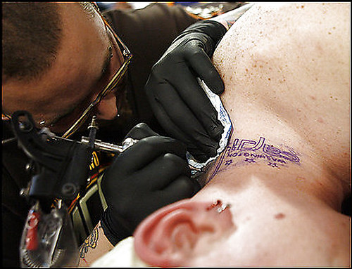
Apparently this fan, seen getting the new Capitals’ logo tattooed on his neck during a draft party at the Kettler Capitals Iceplex, doesn’t agree with Paul about the pointed p or the height of the lower case i in the design. –Vince
Tired of seeing annoying ads (like this one!) on Uni Watch? There’s a simple solution: Join Uni Watch Plus. You’ll get an ad-free site experience, plus exclusive access to our UW+ discussion forums, push notifications whenever a new blog post has been published, a special UW+ badge accompanying all your comments on the blog, and a 20% discount on our Teespring merchandise.
Already a member? Sign in here.
Apparently this fan, seen getting the new Capitals’ logo tattooed on his neck during a draft party at the Kettler Capitals Iceplex, doesn’t agree with Paul about the pointed p or the height of the lower case i in the design. –Vince
any images of the two throwback baseball games played yesterday?
[quote comment=”107745″]any images of the two throwback baseball games played yesterday?[/quote]
I don’t have any, but check yesterday’s comments, there were alot in there.
Here’s a link from the WNT game against Brazil yesterday. Most of the pics don’t do them justice (or is it injustice?) but you can see the new shirts are link. Too bad Andy Gibb is dead. I think he could’ve found himself some new Solid Gold dancers yesterday.
I didn’t think the socks were too bad although I don’t think the swoosh on the back is necessary. And when paired with some of the player’s shoe choices the combo can be link. There were also a lot of link shorts since many player fold over the link (which is gold on the inside). The woman behind me commented that the combo of the dark blue gold and red on the shorts and socks made them look like United Airline stewardesses. All in all, not a very good reaction from the crowd in my section. Although I did see plenty of parents buying the shirts for their kids (even boys) at the souvenir stands.
What do you guys think about the new Atlanta Bobca…er, I mean…Hawks unis? I really wish they would had done something like the Sonics did a few years ago and taken cues from their old uniform style, which like the Hawks, I thought was a classic look!
But hey, it doesn’t seem like these teams listen to the fans anymore, anyway…
i think the hawks uniforms are horrible. They have had great uniforms in the past, and a great color scheme IMO, its a shame to see them move away from them.
Saw a guy yesterday out and about with a new Caps hat on. I stopped him and asked if he had gone to the unveiling (he had). We both expressed our mutual excitement for the new jerseys. But really, I think it was more about our excitement that the old jerseys are gone. He also said that the photos don’t make the jerseys look as red as they truly are. For what it’s worth, his hat was very red.
Also, the caps have a neat flash opener on link, showing off the new jersey.
[quote comment=”107756″]What do you guys think about the new Atlanta Bobca…er, I mean…Hawks unis? I really wish they would had done something like the Sonics did a few years ago and taken cues from their old uniform style, which like the Hawks, I thought was a classic look!
But hey, it doesn’t seem like these teams listen to the fans anymore, anyway…[/quote]
I think someone said it best yesterday when they said it looked like the Hawks’ new unis came from the Safe Uniform Generator (TM). When I think of the Hawks (not that I ever do), I picture the red-and-gold from Dominique Wilkins’ heyday. They should have gone with something along those lines instead of the 99,000th red/white/blue color scheme in pro sports. It’s not that they’re bad looking, they’re just freakin BORING. (But then, why am I surprised? This is the NBA we’re talking about.)
The tattoo got got his paid for by Caps owner Ted Leonsis. In the end Ted paid for three tatoos, this guy, an arm and a leg…..on three seperate people.
the new red caps jersey makes me think of michal pivonka. i’m from detroit. i NEVER think of michal pivonka.
[quote comment=”107750″]Here’s a link from the WNT game against Brazil yesterday. Most of the pics don’t do them justice (or is it injustice?) but you can see the new shirts are link. Too bad Andy Gibb is dead. I think he could’ve found himself some new Solid Gold dancers yesterday.
I didn’t think the socks were too bad although I don’t think the swoosh on the back is necessary. And when paired with some of the player’s shoe choices the combo can be link. There were also a lot of link shorts since many player fold over the link (which is gold on the inside). The woman behind me commented that the combo of the dark blue gold and red on the shorts and socks made them look like United Airline stewardesses. All in all, not a very good reaction from the crowd in my section. Although I did see plenty of parents buying the shirts for their kids (even boys) at the souvenir stands.[/quote]
They just don’t look like they’re Americans.
Oy. Never make a wordmark into a patch. Ink.
link
I hope that someone uploads some good pics of the throwbacks worn last night in TB v LA and particularly Mil v KC.
im starting to get anxious about the new stars sweaters. the old ones are real nice but i think these can go either way
link @ link
link @ link
Sorry but I am reposting from the bottom of yesterdays comments.
Even though I always associate the Hawks unis as being predominately red (late 70’s) and later red and yellow (early 80’s and beyond). I have to revaluate after looking through some old basketball cards / photos. It seems like Atlanta has used most of the rainbow in their unis. Consider the Lou Hudson era, baby blue with red and royal blue trim (late 60’s) and the Pete Maravich era lime green and royal blue (early 70’s). My point is change is nothing new for the Hawks. As a matter of fact they began as the Milwaukee Hawks (any idea what those uni colors were ?) who became the St. Louis Hawks (ditto as above ?)and finally the Atlanta Hawks.
link from the Milwaukee Journal Sentinel of Milwaukee Brewers wearing their Bears Negro League throwbacks (I particularly love the black outer pockets on the players backsides).
link from the Kansas City Star has another photo of the Brewers, and their stories link to photos posted yesterday.
I know this is a big topic here, so:
watching A’s @ Mets- Mets in the classic 60’s home pinstripe look, all blue caps.
Then we have the other NY team here this afternoon- Yanks @ Giants. THERE is a classic uni matchup.
[quote comment=”107822″]im starting to get anxious about the new stars sweaters. the old ones are real nice but i think these can go either way[/quote]
I wouldn’t worry too much, Tom. The only thing that I have been told is that the Stars were forced to remove the star design from the jersey. Other than that, their logo was ok’d by Reebok for the new jerseys.
In any case, they’ll look a little different next season. However, it remains to be seen whether they try to do too much.
For those wondering where the one-hit-wonder link…
(cool story, totally independent of the photo)..
You know… as an aside, why do teams have a MySpace page? The link linked off their website.
[sarcasm]
Can’t wait for the first NHL Facebook team.
[/sarcasm]
actually the jerseys are supposedly based off of the st louis hawks jerseys, which were red white and blue, but had royal blue instead of navy. Now, one thing that i love about the new jerseys is that we finally get to see ATLANTA on a jersey. Both of our jerseys said hawks last year and maybe even frther back than that. I wish they had completely redone the logo, instead of just changing the colors for the primary, but the secondary logo(the one on the blue jerseys) is nice. Ive never particularly liked the hawks unuiforms, but now i do
as the MLB uniform guidelines remain a mess and players continue to wear their pants “business casual” style, SOMETHING has to be done about teams wearing their “high school” sunday alternate solid-color jerseys on the same day.
the first two games of the astro-ranger series looked more like Arlington High School hosting Houston East.
today, St. Paul High is visiting Pompano High School somewhere near miami…
the navy versus black looks terrible! maybe if we’re lucky the next time the mets and marlins meet we will see a color explosion of black vs. black. I remember last season when texas and KC met both teams had their blue HS jerseys on and even with grey vs. white pants it still looked like a bad intra-squad scrimmage.
as much as some players and uni fans rail against the NFL for its strict guidelines, maybe some oversight by MLB would “dress” things up a bit.
on a side note, murray chass in today’s NY Times has a short blurb on the disgrace that is the manager smock/fleece look. its the first time I’ve seen it addressed in the mainstream press.
and, on that note, the Blue Jays are in black hosting the Grape-Ape Rockies in purple. Add the green astroturf to the equation and you have perfect bruise colors. Yaaay.
link
Leaping lizards! The Mets in the “classic combo*” two nights in a row! Eureka! Amazing! Incredible! Yay!
*”Classic combo”=blue hats, pinstripes, blue undershirts, blue socks–>minimal black.
[quote comment=”107832″]For those wondering where the one-hit-wonder link…
(cool story, totally independent of the photo)..[/quote]
Those guys look way too jolly to be hauling a dead guy around.
Ive just noticed linkthat shows hanley ramirez with a helmet sticker…
Ive looked at other marlins photos and they all look painted on but its hard to tell. Anyone know if most mlb teams wear stickers, i always thought they were painted?
The only other one im sure of is the cubs
The only stickered helmet team im sure of is the cubs*
[quote comment=”107864″]The only stickered helmet team im sure of is the cubs*[/quote]
I would imagine that if its a detailed logo like the Marlins it would be a sticker.
ok can someone correct this list of teams with new logos/jerseys for me, if its not right? there have been so many its hard to keep up
blue jackets
bruins
capitals
hurricanes
pitt panthers
chargers
hawks
i like the new hawks secondary logo/jersey..while it is safe, better safe than sorry…b/c they have gone really wrong in the past. notice that the primary logo also has those stupid triangles removed from its chest which looks a lot better… i wouldn’t be surprised if the secondary logo is turned into a primary later on.
[quote comment=”107893″][quote comment=”107864″]The only stickered helmet team im sure of is the cubs*[/quote]
I would imagine that if its a detailed logo like the Marlins it would be a sticker.[/quote]
and the Cubs’ helmet emblem is an link, as previously discussed.
[quote comment=”107905″]ok can someone correct this list of teams with new logos/jerseys for me, if its not right? there have been so many its hard to keep up
blue jackets
bruins
capitals
hurricanes
pitt panthers
chargers
hawks[/quote]
Oregon State
Michigan State
Colorado Buffs
South Carolina
[quote comment=”107906″]i like the new hawks secondary logo/jersey..while it is safe, better safe than sorry…b/c they have gone really wrong in the past. notice that the primary logo also has those stupid triangles removed from its chest which looks a lot better… i wouldn’t be surprised if the secondary logo is turned into a primary later on.[/quote]
It would be cool if they used link as an alternate sometime. Maybe they already have. Admittedly I don’t watch the Hawks very much (does anyone?).
ok can someone correct this list of teams with new logos/jerseys for me, if its not right? there have been so many its hard to keep up
blue jackets
bruins
capitals
hurricanes
pitt panthers
chargers
hawks
Depends on which Hurricanes you mean, cause other than “The U” (Hokie here) Carolina got new uniforms as well (even though they just added a stripe for the sake of adding a stripe.)
*First comment on Uni Watch after reading for so long. Love the site, Paul!
[quote comment=”107855″]link[/quote]
The ’57s is ok, but don’t like the bue piping; the ’61s are a classic look, standard but fitting; hate the 68s and DEFINATELY the 70s; 72s aren’t that great either; the 82s remind me of link; the 92s aren’t good; 94s are pretty good, like the color combo; I like the 95s because of the way the red blends into the black; 99 is a simple look; 2005–UGH; nonetheless, the ’07s are the two best, with the home unis looking better IMO
[quote comment=”107940″][quote comment=”107855″]link[/quote]
The ’57s is ok, but don’t like the bue piping; the ’61s are a classic look, standard but fitting; hate the 68s and DEFINATELY the 70s; 72s aren’t that great either; the 82s remind me of link; the 92s aren’t good; 94s are pretty good, like the color combo; I like the 95s because of the way the red blends into the black; 99 is a simple look; 2005–UGH; nonetheless, the ’07s are the two best, with the home unis looking better IMO[/quote]
The back logo is SO DUMB! It in itself is bad enough, but THE DUMB STOOPING REAR WHITE BORDER IS TERRIBLE!
I took a ton of pics at last night’s Rays-LA throwback game.
link
[quote comment=”107819″]link[/quote]
This has Charlotte Bobcats written all over it. Although, it could have been link.
Tight shot of Rodridguez’s shoes in the NY-SF game- shoes A-ROD on the heel just below the swoosh.
[quote comment=”107948″][quote comment=”107819″]link[/quote]
This has Charlotte Bobcats written all over it. Although, it could have been link.[/quote]
Gotta disagree. LOVE those unis, and I hate probably 90% of all basketball unis.
Very 70s, but also pretty nice and simple. Yeah, they were not timeless, but that doesn’t bother me.
[quote comment=”107948″][quote comment=”107819″]link[/quote]
This has Charlotte Bobcats written all over it. Although, it could have been link.[/quote]
if by “worse”, you mean “way better than what they actually ARE changing to.”
holy shit. link died.
I got a new Nebraska New Era cap yesterday, and started to perform surgery on it until I realized it was 100% cotton. I wasn’t sure if cotton would do the same thing wool does when wet. Does anyone know if i should keep going, or just try to break it in naturally? Thanks.
Speaking of the Capitals, link for a look at the Caps’ uniforms through the years, and an analysis of the new RBK Edge designs. You know, if you’re interested.
[quote comment=”107945″]I took a ton of pics at last night’s Rays-LA throwback game.
link[/quote]
Looks like the Rays made a good effort to puff out the pants flannel-style and show some sock.
I’m sure someone noticed this on the new Washington Caps jerseys, but it’s been bugging me a little. On the home jersey, the puck touches the stick. On the away jersey, it looks like the puck is off the stick. What gives?
[quote comment=”107968″]I’m sure someone noticed this on the new Washington Caps jerseys, but it’s been bugging me a little. On the home jersey, the puck touches the stick. On the away jersey, it looks like the puck is off the stick. What gives?[/quote]
The puck touches on both. The white outline against the white jerseys doesn’t show up very well. However, it’s there.
[quote comment=”107968″]I’m sure someone noticed this on the new Washington Caps jerseys, but it’s been bugging me a little. On the home jersey, the puck touches the stick. On the away jersey, it looks like the puck is off the stick. What gives?[/quote]
It’s just duplicating the white outline on the road whites; the puck is still the same width away as the homes.
[quote comment=”107963″]holy shit. link died.[/quote]
At 38. Wow. RIP.
[quote comment=”107864″]The only stickered helmet team im sure of is the cubs*[/quote]
And an embroidered sticker on the Cubs at that.
Rays pitching coach Jim Hickey had some sort of clip on his jersey last night. It was orange and halfway down the button line. If I was to guess he was holding his jersey closed but not sure.
[quote comment=”107982″]Rays pitching coach Jim Hickey had some sort of clip on his jersey last night. It was orange and halfway down the button line. If I was to guess he was holding his jersey closed but not sure.[/quote]
Almost certainly a pen.
[quote comment=”107982″]Rays pitching coach Jim Hickey had some sort of clip on his jersey last night. It was orange and halfway down the button line. If I was to guess he was holding his jersey closed but not sure.[/quote]
Hickey wears that all the time. Nobody’s been able to tell yet what it is. I think it’s a voice recorder of some sort.
went to the brewers game yesterday, was too far away to get good pictures, but we all got a milwaukee bears tribute hat. its nice.
cant waite for the new New York Rangers jerseys
There’s a real picture of the new Caps’ jersey’s typography in this gallery (its the 4th pic).
link
The “C” designation for captains link. Might.
[quote]Several ideas are being discussed, including captain identification on game uniforms[/quote]
Oregon State is wearing the hideous Nike World gear again. Something just looks like its missing with that white lettering. Color perhaps.
Craptasitc.
Craptacular.
Crapadoodledoo!
Nice to see Yvon Labre’, Rod Langway, and Mike Gartner back in the original stars and stripes. Still hate the new ones, although the white is slightly more tolerable. That font set is weak.
re Caps slideshow: what’s with the different left leg logos on the breezers? Three of the four are wearing wordmarks while Clark has a circular logo.
NHL logo on the back of the right leg? Wha?
[quote comment=”108026″]Nice to see Yvon Labre’, Rod Langway, and Mike Gartner back in the original stars and stripes. Still hate the new ones, although the white is slightly more tolerable. That font set is weak.[/quote]
Dammit. Strike that – Langway is in a name-number customized replica with the dreaded patch front. I’m gonna hurl.
Saw the NFL Tampa Bay Buccaneers mini-camp on TV this week. Their practice jerseys are pretty stylish with a very fancy numbering font – it looks similar to their wriiten font – very detailed and “piratey”. They are a bit too fancy, but would probably look cool as a change of pace.
Any idea if this means they are changing game jersey number fonts this season?
[quote comment=”108036″]Saw the NFL Tampa Bay Buccaneers mini-camp on TV this week. Their practice jerseys are pretty stylish with a very fancy numbering font – it looks similar to their wriiten font – very detailed and “piratey”.
They are a bit too fancy, but would probably look cool as a change of pace.
Any idea if this means they are changing game jersey number fonts this season?[/quote]
no they’ve been doing this for years
I was at the Met game today and I was glad to see the blue hats and socks. However I almost threw up when I saw a guy in an early ’80’s jersey with “RYAN” and his number 30.
Hello???? Nolan Ryan was traded 10 years before that and also never had his name on his Met jersey.
The new Hawks uniforms are certainly not bad, but they’re not great, either. They’re so… blasé. The fact that the alternate logo and some of the jersey detailing resembles those of the Charlotte Bobcats just complicates matters.
I imagine these new uniforms would have looked a lot better with the red and gold color palette from the previous ones.
[quote comment=”108028″]re Caps slideshow: what’s with the different left leg logos on the breezers? Three of the four are wearing wordmarks while Clark has a circular logo.
NHL logo on the back of the right leg? Wha?[/quote]
The circular logo is just the Easton equipment logo.
Went to two Brewers games this weekend and of course the one I didn’t get tickets to was the most unirific of them all. I did watch some on TV and grabbed a few screen shots. Check them out: link
Maybe this’ll go through without the link:
Was anyone else reminded of Arizona when they saw the new Hawks jersey? If you just switch the “tlant” to “rizon” no one would be the wiser (aside from us crazies).
[quote comment=”107975″][quote comment=”107963″]holy shit. link died.[/quote]
At 38. Wow. RIP.[/quote]
Will the Giants do a patch? Both sleeves are already taken.
PS Danny Haren was wearing a sweatband or something in the A’s dugout with that biking company logo.
[quote comment=”108062″]PS Danny Haren was wearing a sweatband or something in the A’s dugout with that biking company logo.[/quote]
link
That secondary Hawks logo looks eerily similar to link. Not a whole lot of originality or creativity was required to come up with those unis.
[quote comment=”108061″][quote comment=”107975″][quote comment=”107963″]holy shit. link died.[/quote]
At 38. Wow. RIP.[/quote]
Will the Giants do a patch? Both sleeves are already taken.[/quote]
I don’t believe they’ve done anything for the death of Jose Uribe yet, have they?
If a ceremonial first pitch topic ever comes up, this pic can be used.
link
Future NBA star Kevin Durant with last year’s Phillies hat.
link
[quote comment=”108070″]If a ceremonial first pitch topic ever comes up, this pic can be used.
link
I like his hat.
Is this worst uniforms list new? I hadn’t seen it before, but that doesn’t mean it’s new….
link
[quote comment=”107945″]I took a ton of pics at last night’s Rays-LA throwback game.
link[/quote]
Excellent gallery. Thanks for linking us to it.
One observation that you can’t really see from the pictures is the heathered gray of the Dodgers’ throwbacks. That’s something I’d like to see some team do on their regular unis. It adds some texture and visual interest that isn’t there with the flat gray.
I watched a part of the Dodgers-Rays’ game on MLB.TV and it was quite visible in the closeups of players.
[quote comment=”108070″]If a ceremonial first pitch topic ever comes up, this pic can be used.
link
Best First-Pitch-Thrower-Outer I ever saw was Willie Mays at the last game at Candlestick. At 68 years old, Dude had his cleats on and fired a heater from the pitching rubber, I think from the wind-up. He raised the bar pretty high for future Thrower-Outers.
[quote comment=”108028″]re Caps slideshow: what’s with the different left leg logos on the breezers? Three of the four are wearing wordmarks while Clark has a circular logo.
NHL logo on the back of the right leg? Wha?[/quote]
The wordmark is on the other 3 guys is just the RBK logo
[quote comment=”108063″][quote comment=”108062″]PS Danny Haren was wearing a sweatband or something in the A’s dugout with that biking company logo.[/quote]
link[/quote]
Bingo.
[quote comment=”108073″]Is this worst uniforms list new?
I hadn’t seen it before, but that doesn’t mean it’s new….
link
I don’t know if that’s new or not. They include some good pictures I hadn’t seen before. Pretty weak that they couldn’t find an actual pic of a ’70s Indians bloodclot uni, though.
[quote comment=”108073″]Is this worst uniforms list new?
I hadn’t seen it before, but that doesn’t mean it’s new….
link
No, it has been linked to before. You know, just one of the hundreds of worst unis lists.
The Indiana and Kentucky high school basketball all-stars played the second of their annual two-game series. Here are galleries:
link
link
Both Indiana teams used the same basic template with the main difference being the block letter wordmark on the boys uniforms and the script wordmark on the girls uniforms.
The Kentucky teams looked pretty plain. The boys looked pretty much like the University of Kentucky men’s team.
I hope Paul says something about the Royals/Brewers Negro League unis being 100,000% better than the craptastic Civil Rights Game unis the Cards and the Tribe wore…
…and for the record, the I think the Rays should have wore link unis…
[quote comment=”108089″][quote comment=”108073″]Is this worst uniforms list new?
I hadn’t seen it before, but that doesn’t mean it’s new….
link
No, it has been linked to before. You know, just one of the hundreds of worst unis lists.[/quote]
But enjoyable, nonetheless.
Looks like youc an add Duke to the list of schools getting new football uniforms this year (at least according to Eastbay.) Surprisingly, Nike went all minimalist. Kinda look like the pre-black basketball jerseys…
link
[quote comment=”108121″]I hope Paul says something about the Royals/Brewers Negro League unis being 100,000% better than the craptastic Civil Rights Game unis the Cards and the Tribe wore…
…and for the record, the I think the Rays should have wore link unis…[/quote]
I love that jersey. They definitely should’ve worn it, but I guess because the stadium is technically in St. Pete, they felt like wearing that jersey instead…..
This is probably too late for anyone to see, but, speaking of tattooes, and the recent column (or note…?) on them, did anyone post a link to link?
[quote comment=”108143″][quote comment=”108121″]I hope Paul says something about the Royals/Brewers Negro League unis being 100,000% better than the craptastic Civil Rights Game unis the Cards and the Tribe wore…
…and for the record, the I think the Rays should have wore link unis…[/quote]
I love that jersey.
They definitely should’ve worn it, but I guess because the stadium is technically in St. Pete, they felt like wearing that jersey instead…..[/quote]
The Rays wore Tampa Tarpons last year and University of Tampa Spartans (Piniella’s school) the year before. It was the St. Pete Saints’ turn.
[quote comment=”108056″]Maybe this’ll go through without the link:
Was anyone else reminded of Arizona when they saw the new Hawks jersey? If you just switch the “tlant” to “rizon” no one would be the wiser (aside from us crazies).[/quote]
Yeah, after awhile. I first thought of the Iowa Hawkeyes’ link.
[quote comment=”107964″]I got a new Nebraska New Era cap yesterday, and started to perform surgery on it until I realized it was 100% cotton. I wasn’t sure if cotton would do the same thing wool does when wet. Does anyone know if i should keep going, or just try to break it in naturally? Thanks.[/quote]
Assuming he hasn’t done anything: I wouldn’t. I did it on my new Royals hat and it’s very…loose up top.