Man, talk about Getting Itâ„¢.
The Bruins hit a home run, scored a hat trick, bowled a turkey, [insert next cliché here] with their new uniforms, which were unveiled yesterday. In an era when I almost always have some quibble about a team’s new design, I have exactly zero bad things to say about this one.
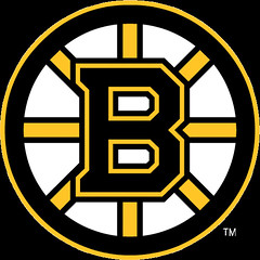
Let’s start with the logo. As most of you know by now, they took their old spoke/hub logo and added some serifs to the B. Was this necessary? No. But is it problematic? Also no — it looks fine. Joe Hilseberg argued in yesterday’s comments section that the new logo would have looked better without the black outline around the B, but I disagree. In the end, is it good or is it stupid? I suppose you could argue that it’s stupid because it appears to be a minor change solely for change’s sake, but it’s not a bad change. More like a lateral move that’s no better but also no worse than the previous design.
Anyway, all those deliberations are pretty much blown away by what they’ve done with the logo: Behold, home and road. Do those look totally classic or what? The sleeve stripes, the hem stripes, the shoulder yokes, the lace-up collars — check, check, check, and quadruple fucking check! Even in a close-up view, Reebok’s fabric/mesh panel construction is hard to discern. In other words, it looks like an old-school sweater.
Even better: the totally boss shoulder patch, which harkens back to the team’s late-1920s logo. There’s also an alternate version of the new patch logo, with “Boston” and “Bruins” reversed — not sure what this will be used for, but apparently it won’t appear on any of the jerseys. Personally, I slightly prefer the alternate version, but that’s like saying I prefer a ribeye over a porterhouse — they’re both pretty damn tasty, and I sure wouldn’t kick either of them out of bed (and if you think I’m mixing metaphors there, well, you’ve clearly never seen me around a steak).
As for the rest of the uniform, all we have for now is this mock-up — not ideal, but enough to be able to tell that they’re not experimenting with any “creative” ideas for the socks. (The same illo appears as part of this visual timeline, plus there’s some additional info here and here, and a handy Bruins logo timeline here.)
When you think back to how stressed out we all were about what Reebok was gonna do to the NHL’s unis, it’s no small irony that the Bruins have just unveiled the league’s most traditional look in ages. So clearly, there’s nothing about the new uni “system” that precludes a classic look.
Which brings us, unfortunately, to the Capitals. Although their official unveiling isn’t until tonight, I now have persmission to run this photo (you can see larger versions of it here and here, and there’s additional info here), and I can’t say I’m thrilled. Yeah, it’s better than what they had before, but that’s not saying much. Here’s what I like:
• The three stars, which mimic the Washington flag.
• The way the word “Washington” nests between the stars and the larger part of the insignia.
• The way the hockey stick t projects at a 3-D angle. I kinda dig the simple, almost minimalist puck, too.
And here’s the bad news:
• The Rangers notwithstanding, wordmarks on hockey jerseys are never the best way to go.
• How can a team called the Capitals have its logo rendered exclusively in non-capital letters?
• Can’t stand how the letter i was reduced to match the x-height of the other letters. Classic “because we can” digital-typography maneuver. Why not have the O in “Washington” dotting the i, or something like that? A lowercase i is an opportunity for a clever graphic solution. Presented with that opportunity, these designers chose to punt.
• Sorry to go all typography geek here, but in a logo filled with curvilinear forms, why did they choose to impose a pointed corner on the p? Another pointless digital exercise. Makes no sense. In fact, if they’d let the bowl of the p be ovoid, they could have evoked the shape of a hockey rink, like the old Canucks logo used to do.
• I’ll reserve judgment until I see the full jersey, but all that piping on the sleeves does not bode well.
• It’s all very nice to have a shoulder patch that simultaneously looks like an eagle, the letter W, and the capital dome. But did it occur to anyone that it (a) looks a lot like the Pontiac Firebird logo, and (b) looks even more like a bird with an oil can shoved up its ass? Just askin’.
OK, that’s enough piling on for now. Let’s hope team spokesman Nate Ewell, who’s been a very good friend to Uni Watch, doesn’t revoke Mike Forgy‘s media credentials from tonight’s unveiling in retaliation.

Raffle Results: Our randomly chosen winner of the 2001 MLB Style Guide is Jesse Gavin, who just signed up for membership yesterday, entitling him to the three bonus raffle entries that helped pave his way to victory. Hang tight, Jesse — the guide is in the mail.

Meet Me in St. Louie: I’ll be St. Louis in a few weeks and would like to convene a Uni Watch party on the evening of July 10th. That happens to be the night of the MLB All-Star Game, which is always a snooze anyway. As for the venue, I’m open to suggestions. By now I think everyone knows the type of place I prefer — semi-divey, sports-friendly but not an actual sports bar, live polka band (or, failing that, a good jukebox). What say you, St. Louisans?
The occasion for my trip, incidentally, is pretty exciting: I’m going to spend a day at Liebe Athletic Lettering, which used to do the sewing and embroidery for most MLB teams. The Liebe archives are full of old sewing patterns, lettering templates, and related ephemera, and they’ve agreed to let me sift through some of it (eat your heart out, Joe Hilseberg!). Best of all, I’ll have a video crew with me, and when the dust settles we hope to have the first-ever Uni Watch video column, which will stream on ESPN.
As long we’re talking about travel: I’m also tentatively planning on a Uni Watch party in Toronto for July 24th. The venue has already been chosen, but I can’t seem to find the scrap of paper where I wrote it down. Further details to follow.
Uni Watch News Ticker: Check out questions 8 and 9 in this Q&A session with Orlando Hudson. ”¦ Yesterday I mentioned that I wasn’t sure which uniforms the Carolina and California Leagues wore in their interleague all-star game in 2006. Potomac Nationals spokesman Andrew Bashuk reports that the players wore their regular team unis, and adds the following: “We finished the first half of the season on the road, so our two all-star players were supposed to bring their white uniforms with them because they’d be going straight from Frederick, where we finished the first half, to Salem, where the all-star game was. But one of them forgot his white jersey. So while the rest of the Carolina League wore white, there we were, wearing our blue BP jerseys.” ”¦ The U.S. uniforms for the upcoming Women’s World Cup have been unveiled (home, road). ”¦ Reprinted from yesterday’s comments: Add So Taguchi to the list of Japanese players wearing toe socks. ”¦ The Atlanta Hawks new uniforms will be revealed this Sunday. ”¦ John Cropp was poking through the University of Georgia archives (where he found an awesome shot of the school’s 1895 football squad) when he came across this shot, which dates back to 1910. According to the archive listing, the game being played is called pushball, which is beautifully, almost poetically, self-explanatory. If you do a Google image search on the game’s name, you come up with some amazing stuff (although not much uni-related action). There’s even this. Not bad for a game that, according to this Wikipedia entry, “never attained any considerable vogue.” ”¦ The Harrisburg Senators wore Parrothead-themed jerseys last night. ”¦ Alain Nana-Sinkam recently visited the Iowa Hall of Pride, where he photographed some cool uni-related stuff, including a very primitive football helmet and — the real prize — an incredibly basketball referee’s cardigan (which would be worth the price of admission even without the accompanying stirrups). ”¦ Bit of a cock-up on the shirt-tag front yesterday in Arlington, where Vicente Padilla’s tag was flapping in the breeze (further embarrassing views here, here, and here). “The Comcast broadcasters even drew attention to it,” writes the pseudonymous Texas Gal, “wondering if the Rangers had a fashion consultant, and saying the other team should complain and make him fix it.” ”¦ Also at Arlington yesterday: Apparently the scoreboard operator ran out of 7s.
Paul:
The three stars on the Capitals uniform are for Virginia, Maryland, and DC.
Those road womenn’s World Cup uniforms are terrible. Gold for the main body of the jersey?
I hate the NHL logo ABOVE THE LACE-UP. It’s awful! It destroys the purpose of the laces (to keep the jersey’s collar shut).
Yuck. Otherwise it’s very good. Loving the shoulder logo.
link
Also at Arlington yesterday: Apparently the scoreboard operator ran out of 7s.
I don’t think so. The final score of the M’s-Pirates game was 3-0, so that was a case of the “2” being upside-down. It has to be yesterday’s game because Felix Hernandez pitched and he is #34. (You can see the “4” next to “SEA”.) The game the M’s actually won Wednesday (7-0) was pitched by Jeff Weaver, wearing #36.
check, check, check, and quadruple fucking check!
That made me LOL. Swearing is FUNNY.
Am I the only one who is bothered by the black lower sleeves on the white Bruins uni?
As a born-and-bred Washingtonian and lifetime Capitals fan, I’d like to offer a rebuttal on the new jerseys:
1. Red, white, and blue — kudos to the Caps for going back to the tried-and-true colors
2. The “Capitals” wordmark — This is a *great* update of the old uniforms, which had a real ’70s vibe to them. The typography reminds me of the old sweaters. It’s updated nicely, with the 3-D effect on the hockey stick.
3. The shoulder patch — I like the idea of an eagle on the shoulder, and how it integrates the shadow of the Capitol building dome and the “W” for Washington. The first thing I thought of too was the Trans-Am logo. This may be a *good* thing…
4. My only complaint–there are only three stars on the jersey (supposedly representing Maryland, Virginia, and DC). The “old” jerseys had 16–I miss them.
Paul, if the Capitals send you a jersey and you don’t want to wear it, I would be happy to. I would pass you any comments from passerby or family that I received about it. (I am sure that my three year-old would be game.)
[quote comment=”106246″]Am I the only one who is bothered by the black lower sleeves on the white Bruins uni?[/quote]
Most of it will be covered by the gloves, so there’ll only be a short block of black visible.
I was cursing your name before I even got the the “eat your heart out, Joe Hilseberg!”
Bruins did great, Capitals did OK, US womens soccer did terrible. If these were siblings in high school, the Bruins would be the star quarterback (or in this case Captain of the hockey team), the Caps would be the C average class clown, and the womens soccer team would be the drop-out meth addict.
The more I see the new Bruins crest on the actual jersey it starts to grow on me.
Also I will wait to comment on the Caps uni until I see the full system.
It looks to me like the base of the bird on the capitals jersey is the capital building, it’s got that sort of shape to it.
Just got link in the mail…ugghhhh
Was wondering if the Caps uniform would be open game today…
As a kid, the thing that annoyed me about the Caps original jerseys was the lack of, I guess, a real logo. I admired jerseys like the Bruins one because of the nice B as the logo, the CH of the Habs, even the styled up P of the Flyers. Plus red as main color of the Capitals never thrilled me.
I was glad when they changed their uniforms in ’96 (right year?), finally there was a logo instead of lettering as their main idenifer. I could of gone with more basic colors, but I honestly enjoyed it, the the black based jersey I felt was one of the most underrated jerseys out there. The Capital Dome was very nice as a logo (all the other stuff such as the sticks and stars around it didn’t bug me much, the dome and nice stripping style made the jersey work for me).
For whatever reason I guess a lot of fans really enjoyed the older logo and jerseys. While I wouldn’t mind it as a retro jersey now and then, I think it would get boring quick.
Which brings us to what they have now, basically an update of the old jersey. I’m sure for a year or two it’ll have a nice “old school coolness” to it, but after that, it’ll be like the old jersey, no real logo and a lot of “noise” on it. And how far off from a template format was this jersey? Doesn’t seem like it was too far off.
After seeing the new Bruins jersey and how nice it is, I just lament, wishing the Caps could of taken a somewhat traditional striping and basic logo approach.
PL,
Id like to thank you for using my old neighbor (and my parents current neighbor) anthony recker’s picture yesterday as the headline.
It was announced that he was promoted to AA Midland yesterday.
Coincidence?
[quote comment=”106257″]It looks to me like the base of the bird on the capitals jersey is the capital building, it’s got that sort of shape to it.[/quote]
It is
Also with all the talk of the “new” hockey sweaters/jerseys they’ve looked pretty “old school” (for the lack of a better word)…nice to see they aren’t too crazy…so far
..”The Bruins hit a home run, scored a hat trick,
scored a hat trick?? you don’t score three goals at once..
sorry,
the link.
link
[quote comment=”106246″]Am I the only one who is bothered by the black lower sleeves on the white Bruins uni?[/quote]
The Senators have had the same look on their white jerseys since the beginning.
And it’s along the lines of some of the older Bruins’ jerseys of the 70’s.
I think the “p” through the “a” in the logo
are meant to evoke the image of a goal. That
explains the shrunken “i” and the point corner
in the “p.”
Paul, totally concur on the new Boston uniforms. They couldn’t have done a better job.
I posted an analysis last night with visual examples of past logos and jersey styles that the Bruins obviously called upon when considering the changes they made.
It can be found link if anyone is interested.
[quote comment=”106253″]Bruins did great, Capitals did OK, US womens soccer did terrible. If these were siblings in high school, the Bruins would be the star quarterback (or in this case Captain of the hockey team), the Caps would be the C average class clown, and the womens soccer team would be the drop-out meth addict.[/quote]
hahahaha great analogy. love the bruins changes, undecided on the caps, and the women’s new jerseys make me want to choke someone. they wonder why womens sports dont get respected. im not saying that some guys teams dont look shitty, but a vast majority of the womens teams look like they belong at the circus, not on the field. in example, the entire wnba
[quote comment=”106271″][quote comment=”106246″]Am I the only one who is bothered by the black lower sleeves on the white Bruins uni?[/quote]
The Senators have had the same look on their white jerseys since the beginning.
And it’s along the lines of some of the older Bruins’ jerseys of the 70’s.[/quote]
I didn’t even notice the black on the sleeves at first. And like paul said, I think once the black gloves are on it will flow nicely. Only a few more months to find out for sure though.
Hey now, there’s nothing wrong with the Screaming Chicken logo.
link
I have a feeling that the NHL/RBK uniform debuts during tonight’s draft could lead to the most active weekend in Uni Watch history.
And I can’t wait. Bring it on!
The print edition of the Washington Post has a picture of the Caps white road jersey.
It is very reminiscent of a long sleeved white New England Revolution jersey.
And that ‘W’ Eagle logo is horrid. It looks like they’ve taken the DC United logo and set it to Abu Gharib. Very minor league to make it look like a W, looks more like a lacrosse (Philadelphia Wings)logo.
The colored stripes down the sleeve is awkward for a hockey jersey, why not put a stripe or two around the arm and make it look like it belongs in a rink.
The Padres and Red Sox are wearing 1982 uniforms tonight. I’ll be there with the camera to take some pictures. Hopefully the Padres do those crazy scoreboard photos again, giving all the players 80’s haircuts.
There’s also an alternate version of the new patch logo, with “Boston†and “Bruins†reversed — not sure what this will be used for, but apparently it won’t appear on any of the jerseys.
I can imagine the Bruins using it in a couple of years for an alternate jersey, with striping like the 20s (No alternates anywhere in the NHL for the upcoming season).
I gotta say I like both of these sweaters. The only part of either of them I’m not sure about is the white stripes on the sleeves of the Capital’s sweaters. I need a better picture to see what’s going on there.
Kudos to the Bruins. Solid jerseys…although I have to agree…it’s odd to have laces and a neck logo plate, but it doesn’t bother me that much.
As for my Caps. You know…the text-based logo isn’t my favorite, but I like what I’ve seen so far. I’m guessing that there’ll be hats & t-shirts available with the secondary logo (the eagle/W)…as well as ones with the word-mark Capitals logo.
I like the white trim going down the underside of the sleeves. I just like the whole jersey…overall. I’ll happily plunk down some cash and get one.
I think that what I like…they’re the Caps again. Sure, in the blue/black era, they won several division titles, and made their only appearance in the Stanley Cup Finals…but this just feels right to me. (Can;t wait to see Ovechkin flying up the ice in this!)
I think the shoulder logo on the Caps jerseys is fantastic.
They managed to incorporate the eagle, the capitol building, and a W into one logo. That should take over as the team’s primary logo.
The Caps ‘W’ looks like it came from a bad video game.
Sure it has good elements, the Dome, an Eagle, and a W. But the execution is lousy.
Beautiful, just beautiful…but I am a Newcastle supporter….
[quote comment=”106243″]link[/quote]
Is it just me, or is the red surrounding the capital’s logo a different red than the rest of the jersey?
if they’d let the bowl of the p be ovoid, they could have evoked the shape of a hockey rink, like the old Canucks logo used to do.
If you look again, the middle letters (other than the t) kind of do shape the end of a rink. I think that’s why they did the goofy p and i. It doesn’t work as well as one might hope, though.
Guess I’m in the minority re: the US Womens’ team unis… I really like ’em. They actually look better when you see them in combination with the shorts and socks. You can see a whole raft of pix here:
Check out goalie Hope Solo in the green goalie jesrey and blue shorts. Rowwrrr.
That Dijon mustard color for the women’s soccer jersey is the worst color in all sports to me. Far more offensive than purple. The NL jerseys in the 2002 All Star game were that hideous color. Seemed like for a few years, they were purposely trying to find the ugliest colors out there for NL’s jerseys.
I came across a pretty sweet website that features, well, nearly every football helmet out there (NFL, CFL, AFL, WFL, College). Shows a lot of really old logos…
Three stars is supposed to symbolize George Washington’s coat of arms, as explained link.
One star representing DC, MD and VA is lame, and everybody knows it. Who has the best city flag again?
The black on the sleves of the white B’s sweater won’t exaclt be covered by the gloves unless a player goes old school and wears a pair of link. Today’s hockey gloves have a much lower cuff, alowing for more movement of the wrist. Players wishing for more protection from slashing generaly wear link under the sweater.
In reference to the Caps sweater. I like the move back to the old school logo. It’s the one I grew up with. I have to admit though, I kinda liked the eagle and capitol dome jerseys. I actualy have a white eagle jersey. Maybe they should have kept that old eagle for the schoulder patch? I understand their idea of trying to incorperate the W for Washington, the eagle for the national bird and the capitol dome, but that;s shoving 10 lbs of shit in a 1 lb bag.
two things about the new Bruins logo:
1) The serifs on the B are great. The reason for this is they close the small gap between the top/bottom left corners of the B and the left-side diagonal spokes, which always bugged me. Also, the top and bottom corners of each serif line up with the outer edge of the spokes, and in fact the diagonal inside line of the serif lines up with the edge line of the spoke. Very well done on this front. At the same time, they also cleaned up the right side of the B as well, more-central-to-the-horizontal edges of the diagonal spokes line up with the rounded corners on the B. The old logo had those link on the right side, which were SO F’N CLOSE and it made me scream because they obviously could spent the extra 10 minutes to make it line up. All in all, a HUGE victory on this front.
2) The black outer edge of the B now cuts across the spokes. I can’t decide if I like it yet or not. The old logo made it look like the yellow border of the B and the spokes were all part of the same flowing entity. The new logo makes a clear differentiation between the spokes and the B, as if the B were sitting atop the spokes (though somehow rendering the spokes invisible through the holes in the B… magic?). I think the new logo looks a bit bolder. However, what bugs me about it is that on 5 sides, the B overlaps the spokes at a right angle, on the center right spoke it overlaps with a V shape due to the conversion of the rounded halves of the B but in a nice symmetrical way, and then the serifs cut across the spoke at a diagonal. It looks cluttered to me in those left corners, and the diagonal creates an inconsistency that I don’t like. The serif areas are what make me prefer the old style where the spokes connect into the B’s yellow outline, but I like the newer “overlay” look otherwise. I’m torn.
I’d like to see the Cap’s uniform in full, but I like it so far. Personally, I think the ‘W’ on the shoulder is better than the other link logo across the street.
[quote comment=”106302″]I gotta say I like both of these sweaters. The only part of either of them I’m not sure about is the white stripes on the sleeves of the Capital’s sweaters. I need a better picture to see what’s going on there.[/quote]
I want to see the Capitals white version…me thinks it will be the better of the two
[quote comment=”106322″]The black on the sleves of the white B’s sweater won’t exaclt be covered by the gloves unless a player goes old school and wears a pair of link. Today’s hockey gloves have a much lower cuff, alowing for more movement of the wrist. Players wishing for more protection from slashing generaly wear link under the sweater.
In reference to the Caps sweater. I like the move back to the old school logo. It’s the one I grew up with. I have to admit though, I kinda liked the eagle and capitol dome jerseys. I actualy have a white eagle jersey. Maybe they should have kept that old eagle for the schoulder patch? I understand their idea of trying to incorperate the W for Washington, the eagle for the national bird and the capitol dome, but that;s shoving 10 lbs of shit in a 1 lb bag.[/quote]
I don’t think that the black will be covered but if the player is wearing black gloves, the color should flow and be uninterupted. I think it will look nice on the ice, even if it’s a look that I wouldn’t necessarily like on its own.
[quote comment=”106321″]Three stars is supposed to symbolize George Washington’s coat of arms, as explained link.
One star representing DC, MD and VA is lame, and everybody knows it. Who has the best city flag again?[/quote]
The answer is linko as it not only looks great, but is jam packed with meaning. The Chicago Fire even had link that mimicked it for a while.
Also, I generally enjoy the Cap’s new jersey there, except for the W/eagle/capitol dome logo, which is clearly just a lame attempt to be clever and wildly fails the Good or Stupid Test. Otherwise, it’s a nice nod to the past with a slightly updated style.
It really could have been much, much, MUCH worse and you know it.
I was never a fan of the text “Capitals” logo either, but this is a good version of it. Paul, I think you’re overanalyzing it a tad. Which is what we read you for, but this:
A lowercase i is an opportunity for a clever graphic solution. Presented with that opportunity, these designers chose to punt.
… seems hypercritical. The text is complicated enough without adding further interactive details that won’t be visible from section 306 anyway.
I like the way the logo correlates to DCU’s emblem, but in the end it falls short for me – I think the Caps should donate this logo to Phoenix and try again.
[quote comment=”106329″]Otherwise, it’s a nice nod to the past with a slightly updated style.
[/quote]
Obviously, I meant the jersey is a nice updated nod, not the logo.
I love the Capitals logo! I like the i shortened to fit in and the pointed p cleans that area up nicely. If it were rounded, there would be open, awkward space… try it! You will see. The designers did a great job!
So Kobe Bryant is having a basketball camp for kids. Nice idea. He’s charging $600 for each kid, and you’re allowed to have one item signed by Kobe. The only problem? He REFUSES to sign any #8 jerseys. Are you kidding me?
link (last paragraph)
[quote comment=”106237″]Paul:
The three stars on the Capitals uniform are for Virginia, Maryland, and DC.[/quote]
The three stars do represent MD, VA and DC, and they also mimic George Washingtons coat of arms.
link
[quote comment=”106321″] Who has the best city flag again?[/quote]
I like link.
The 3 white bars stand for the north side, south side, and west side, the 4 stars represent the 4 big historical points in the history of the city (Ft. Dearborn massacre, the fire, and the two World’s Fairs), and the two blue bars represent the north and south branch of the Chicago River.
[quote comment=”106248″]As a born-and-bred Washingtonian and lifetime Capitals fan, I’d like to offer a rebuttal on the new jerseys:
1. Red, white, and blue — kudos to the Caps for going back to the tried-and-true colors
2. The “Capitals” wordmark — This is a *great* update of the old uniforms, which had a real ’70s vibe to them. The typography reminds me of the old sweaters. It’s updated nicely, with the 3-D effect on the hockey stick.
3. The shoulder patch — I like the idea of an eagle on the shoulder, and how it integrates the shadow of the Capitol building dome and the “W” for Washington. The first thing I thought of too was the Trans-Am logo. This may be a *good* thing…
4. My only complaint–there are only three stars on the jersey (supposedly representing Maryland, Virginia, and DC). The “old” jerseys had 16–I miss them.
Paul, if the Capitals send you a jersey and you don’t want to wear it, I would be happy to. I would pass you any comments from passerby or family that I received about it. (I am sure that my three year-old would be game.)[/quote]
Oh, and I love the W eagle too! Hmmmm…. “W” And for the record, the Trans Am logo never came to mind – of course, I am a girl…
[quote comment=”106329″]Also, I generally enjoy the Cap’s new jersey there, except for the W/eagle/capitol dome logo, which is clearly just a lame attempt to be clever and wildly fails the Good or Stupid Test. Otherwise, it’s a nice nod to the past with a slightly updated style.
It really could have been much, much, MUCH worse and you know it.[/quote]
Unfortunately I think that is going to be the theme for most of these new sweaters. I think we’re all going to be glad that they are no horrible and only merely bad. (except for those awesome Bruins sweaters.)
[quote comment=”106284″]There’s also an alternate version of the new patch logo, with “Boston†and “Bruins†reversed — not sure what this will be used for, but apparently it won’t appear on any of the jerseys.
I can imagine the Bruins using it in a couple of years for an alternate jersey, with striping like the 20s (No alternates anywhere in the NHL for the upcoming season).[/quote]
i’m willing to bet that the patches will be switched up on the road and home jerseys. boston on road, bruins on home.
[quote comment=”106311″]Beautiful, just beautiful…but I am a Newcastle supporter….
[quote comment=”106243″]link[/quote][/quote]
Helllllooooo Colorodo link.
Ok, the asymmetric bits aren’t as visible on the Colorado kit, but it’s the same jersey/light blue color.
Not saying it’s a bad change kit, just the same/similar color as the Rapids.
Heres a look at what the Islanders jerseys might look like. Could be worse, but there is a bit too much orange for me. link
I like the Capitals logo as well. I understand Paul’s criticisms and agree a bit on some (the corner in the “P” mainly), but overall, I think it is well designed and a major improvement.
[quote comment=”106321″]Three stars is supposed to symbolize George Washington’s coat of arms, as explained link.
One star representing DC, MD and VA is lame, and everybody knows it. Who has the best city flag again?[/quote]
CHICAGO
The hockey stick and “t” at least is corrected, check out link
[quote comment=”106316″]Guess I’m in the minority re: the US Womens’ team unis… I really like ’em. They actually look better when you see them in combination with the shorts and socks. You can see a whole raft of pix here:
Check out goalie Hope Solo in the green goalie jesrey and blue shorts. Rowwrrr.[/quote]
To be fair, the whites are not that bad, the gold is just too much. Plus, whats the deal with the triangular stripe on their socks (look at the Abby Wambach pic)? Not good, not good at all.
front torso torso jersey numbers on hockey jerseys suck…
they clutter the front, throw off the symmetry, and look out of place, as if randomly dropped there.
it looks bush on buffalo, and it looks bush on that isles mock up.
[quote comment=”106345″]Heres a look at what the Islanders jerseys might look like. Could be worse, but there is a bit too much orange for me. link
I might have to hurt myself if they skate out with those on. That is not good. It’s STUPID!!! aaahhrrrr….freakin’ RBK
[quote comment=”106321″]Three stars is supposed to symbolize George Washington’s coat of arms, as explained link.
One star representing DC, MD and VA is lame, and everybody knows it. Who has the best city flag again?[/quote]
Pittsburgh does, link
I only moved to DC and started following the Caps only in the last few years and so have never seen them (a) be good or (b) wear red. But this new jersey feels right to me nonetheless – except for the logo. I understand what they’re trying to do with it, but I wish the Capital Dome silhouette hadn’t been incorporated. It looks a bit awkward.
[quote comment=”106345″]Heres a look at what the Islanders jerseys might look like. Could be worse, but there is a bit too much orange for me. link
Damn, they crammed a lot of shit on the front of those Islander jerseys
Wow, I really like those Capitals jerseys. Its nearly exactly what I was hoping for. While I would have prefered maybe Royal blue, we all know that color is just allowed anymore for new jerseys.
In regards to the Caps, I can’t wait to see the FINAL product. Where are the numbers going, what will the font be, what color are the gloves (blue like the piping I would imagine), how do the socks loog with the pants…..and of course, what does it look like in white! I really liked the black and the Dome logo, but i am slowly coming around. I can’t imagine what a pain in the ass it will be to shoot all new videos…..
[quote comment=”106353″][quote comment=”106321″]Three stars is supposed to symbolize George Washington’s coat of arms, as explained link.
One star representing DC, MD and VA is lame, and everybody knows it. Who has the best city flag again?[/quote]
Pittsburgh does, link[/quote]
OK, just so i don’t get yelled at, link is the link to the actual flag. GOD we love black and gold.
Nice entry today. I’m impressed that you had the integrity to give the Caps jersey a completely honest review with the higher-up’s giving you special privileges.
Can’t wait to see the video blog in the future. Keep up the great work, Paul.
[quote comment=”106340″][quote comment=”106329″]Also, I generally enjoy the Cap’s new jersey there, except for the W/eagle/capitol dome logo, which is clearly just a lame attempt to be clever and wildly fails the Good or Stupid Test. Otherwise, it’s a nice nod to the past with a slightly updated style.
It really could have been much, much, MUCH worse and you know it.[/quote]
Unfortunately I think that is going to be the theme for most of these new sweaters. I think we’re all going to be glad that they are no horrible and only merely bad. (except for those awesome Bruins sweaters.)[/quote]
I don’t know…. the new template might just be waht saves the NHL unis. Because everyone was so overly concerned (warranted) with the hockey look being ruined, the teams have made a concerted effort to GO OLD SCHOOL. even with goofy verticle sleeve stripes, the caps jersey has a hint of old school.
I love the Bruins new look, and the Caps return to their roots. If I had to pick though, why reverse the yoke and highlight on the Bruin’s white jerseys, and same thing with the striping on the white? if you’re going with the classic look, why switch that? I’m sure the shoulder patch will set off nice against the black, but I’m not sure I like it. It looks a bit like they went to the classic style, but retained the changes they made with the white jerseys from 1996-2006.
[quote comment=”106355″][quote comment=”106345″]Heres a look at what the Islanders jerseys might look like. Could be worse, but there is a bit too much orange for me. link
Damn, they crammed a lot of shit on the front of those Islander jerseys[/quote]
They’ve completely ruined a classic look, but when you’ve had the fisherman, it’s hard to ever be that ugly again. They are close though.
Any word on the unveil date on the rest of the NHL’s new uniforms? We’ve already got Boston, and Washington and Columbus are officially tonight. Has anyone heard any announcements from other teams? I’d really like to know what my Pens are going to look like this year.
[quote comment=”106350″][quote comment=”106316″]Guess I’m in the minority re: the US Womens’ team unis… I really like ’em. They actually look better when you see them in combination with the shorts and socks. You can see a whole raft of pix here:
Check out goalie Hope Solo in the green goalie jesrey and blue shorts. Rowwrrr.[/quote]
To be fair, the whites are not that bad, the gold is just too much. Plus, whats the deal with the triangular stripe on their socks (look at the Abby Wambach pic)? Not good, not good at all.[/quote]
My football team now wears link like that – I absolutely hate them! Of course, I don’t have to tell you who makes them…
Those new Bruins uni’s make the latest Sabres/Ducks/ Caps offerings look even more craptacular.
That will not be the Islanders jersey, I’ll tell ya that right now…..! [I hope it’s not.]
[quote comment=”106361″][quote comment=”106340″][quote comment=”106329″]Also, I generally enjoy the Cap’s new jersey there, except for the W/eagle/capitol dome logo, which is clearly just a lame attempt to be clever and wildly fails the Good or Stupid Test. Otherwise, it’s a nice nod to the past with a slightly updated style.
It really could have been much, much, MUCH worse and you know it.[/quote]
Unfortunately I think that is going to be the theme for most of these new sweaters. I think we’re all going to be glad that they are no horrible and only merely bad. (except for those awesome Bruins sweaters.)[/quote]
I don’t know…. the new template might just be waht saves the NHL unis. Because everyone was so overly concerned (warranted) with the hockey look being ruined, the teams have made a concerted effort to GO OLD SCHOOL. even with goofy verticle sleeve stripes, the caps jersey has a hint of old school.[/quote]
I think for some “old school” teams you may be right…but this could just be the “calm before the storm”.
If you take the front number off of the Islanders jersey it’s not that bad. But it’s way too busy with it and the white piping on there.
Question on the Bruins new togs: Did they keep the typography the same for the BACKS of the jerseys? I hope they do…if they go to some funky type like the Ducks or Kings that will totally fuck things up.
[quote comment=”106313″]Is it just me, or is the red surrounding the capital’s logo a different red than the rest of the jersey?[/quote]
That’s because they stiched the elements onto a red backing plate and then stiched it to the red jersey. Probably the same color, but a different kind of material, so there will be a little bit of a difference.
Maybe I am weird, but I also like the women’s soccer jerseys. The gold doesn’t bother me at all, and I usually hate gold/yellow as a jersey color.
But I have to say, that Harrisburg Senators Parrothead thing should be an instant entry into the Worst Minor League Jerseys collection. Wow.
I love the link flag personally. Even though the Pittsburgh one is impressive.
Hey Paul when and where on Sunday will the Atlanta Hawks uniforms be unveiled on Sunday? I am going to the Georgia Force game that Sunday at Philips Arena so if they are doing it at the CNN Center I can attend and take some pictures if it is opened to the public.
Actually, the new Caps “W” logo reminds me of link…
Totally dig the Bruins new jersey(ies). As stated, you can do a classic look with modern materials if someone puts a bit of thought behind the idea. Shoulder patch is very cool.
(Now if the Flyers can only do away with their black unis, that would be a step in the right direction.)
[quote comment=”106374″][quote comment=”106361″][quote comment=”106340″][quote comment=”106329″]Also, I generally enjoy the Cap’s new jersey there, except for the W/eagle/capitol dome logo, which is clearly just a lame attempt to be clever and wildly fails the Good or Stupid Test. Otherwise, it’s a nice nod to the past with a slightly updated style.
It really could have been much, much, MUCH worse and you know it.[/quote]
Unfortunately I think that is going to be the theme for most of these new sweaters. I think we’re all going to be glad that they are no horrible and only merely bad. (except for those awesome Bruins sweaters.)[/quote]
I don’t know…. the new template might just be waht saves the NHL unis. Because everyone was so overly concerned (warranted) with the hockey look being ruined, the teams have made a concerted effort to GO OLD SCHOOL. even with goofy verticle sleeve stripes, the caps jersey has a hint of old school.[/quote]
I think for some “old school” teams you may be right…but this could just be the “calm before the storm”.[/quote]
Absolutely, there’s 30 teams we’ve seen two. One nailed it, the other didn’t. I don’t see a positive trend yet.
seriously gold ?? US soccer is going close to an all time low with these
cant wait to see the Hawks new jersey, after what they’ve done in the past
[quote comment=”106395″]Totally dig the Bruins new jersey(ies). As stated, you can do a classic look with modern materials if someone puts a bit of thought behind the idea. Shoulder patch is very cool.
(Now if the Flyers can only do away with their black unis, that would be a step in the right direction.)[/quote]
I agree. I hate seeing those black sweaters. I love the old orange. The alternate orange with the goofy logo is unneccesary.
How about a UNC pitcher (I don’t remember his name) and their thirdbaseman wearing mouth guards. Not typically seen in baseball.
And is it too much to ask that they be Carolina Blue? They were royal blue.
[quote comment=”106372″]Those new Bruins uni’s make the latest Sabres/Ducks/ Caps offerings look even more craptacular.[/quote]
Seems to me that from our informal straw poll here…more people seem to be in favor of the new Caps design than on the ‘it’s “craptacular” boat.
I think that some teams steaped in tradition (Wings, Rangers, Habs, Leafs, Bruins) need to keep their feet firmly rooted in tradition and the past…and that’s good, because it’ll always mean that hockey will keep that legacy and old-school feel alive. But teams like the Caps and Ducks and Coyotes…that don’t really have that deep, rich tradition, they have more freedom to explore the modern design elements. Some work, some don’t. But the ones that work…that’s where the fresh air comes in. And there’s a balance.
What I like about the Caps stuff (at least from what I have seen) is that even though there are stripes down the sleeves…it’s very clean. The lines are clean and un-cluttered. It’s sharp and somewhat minimalist…to me (after seeing all the stars and cluttered piping and color panels on the All-Star jerseys) that’s the kind of modern fresh air that’s a good development.
I also like that they’ve kind of done what the Pens have done. They’ve returned to their roots, but given it a modern twist.
[quote comment=”106344″][quote comment=”106311″]Beautiful, just beautiful…but I am a Newcastle supporter….
[quote comment=”106243″]link[/quote][/quote]
Helllllooooo Colorodo link.
Ok, the asymmetric bits aren’t as visible on the Colorado kit, but it’s the same jersey/light blue color.
Not saying it’s a bad change kit, just the same/similar color as the Rapids.[/quote]
I have a hard time calling any uniform with a large corporate logo “beautiful”. Maybe as an American I’m just not used to the sports-unis-as-billboards look that is prevalent in Europe. It’s not the soccer/football unis I hate – I loved all the World Cup uniforms – but I’m so glad I don’t have to wear “ABN AMRO” or “FLY EMIRATES” on a jersey to support my team.
[quote comment=”106377″][quote comment=”106313″]Is it just me, or is the red surrounding the capital’s logo a different red than the rest of the jersey?[/quote]
That’s because they stiched the elements onto a red backing plate and then stiched it to the red jersey. Probably the same color, but a different kind of material, so there will be a little bit of a difference.[/quote]
Which is so lazy and 100% lame it hurts…I know I said I wasn’t going to comment on the Caps today, but that crest patch for a word-mark logo is driving me nuts. link is how it should be done. Come on Reebok, take the time to sew on each letter. And on a side note, I used to love just how huge the word-mark was…new one looks small.
[quote comment=”106379″]I love the link flag personally. Even though the Pittsburgh one is impressive.[/quote]
I don’t know about cities…but I’ve always though this was the coolest of the state flags:
link
[quote comment=”106409″][quote comment=”106379″]I love the link flag personally. Even though the Pittsburgh one is impressive.[/quote]
I don’t know about cities…but I’ve always though this was the coolest of the state flags:
link
Really…. You know better than bringing the link into this arguement… Now look what you have done!
wow. the bruins have really taken a gigantic step forward, here.
someone in their offices finally “get it” at least on the clothing end.
i would like them to go w/ a third jersey at some point w/ the alternate shoulder patch logo as their main logo.
wow. i can’t wait to buy some new bruins gear…just wish they had some players i wouldn’t mind plunking $180 down on for their jersey…
[quote comment=”106410″][quote comment=”106409″][quote comment=”106379″]I love the link flag personally. Even though the Pittsburgh one is impressive.[/quote]
I don’t know about cities…but I’ve always though this was the coolest of the state flags:
link
Really…. You know better than bringing the link into this arguement… Now look what you have done![/quote]
Texas has a nice flag as well…something about the connection to the heraldic coats of arms in the Maryland flag…it’s just always stood out, for me at least, above all the other states.
[quote comment=”106403″][quote comment=”106372″]Those new Bruins uni’s make the latest Sabres/Ducks/ Caps offerings look even more craptacular.[/quote]
Seems to me that from our informal straw poll here…more people seem to be in favor of the new Caps design than on the ‘it’s “craptacular” boat.
I think that some teams steaped in tradition (Wings, Rangers, Habs, Leafs, Bruins) need to keep their feet firmly rooted in tradition and the past…and that’s good, because it’ll always mean that hockey will keep that legacy and old-school feel alive. But teams like the Caps and Ducks and Coyotes…that don’t really have that deep, rich tradition, they have more freedom to explore the modern design elements. Some work, some don’t. But the ones that work…that’s where the fresh air comes in. And there’s a balance.
What I like about the Caps stuff (at least from what I have seen) is that even though there are stripes down the sleeves…it’s very clean. The lines are clean and un-cluttered. It’s sharp and somewhat minimalist…to me (after seeing all the stars and cluttered piping and color panels on the All-Star jerseys) that’s the kind of modern fresh air that’s a good development.
I also like that they’ve kind of done what the Pens have done. They’ve returned to their roots, but given it a modern twist.[/quote]
You hit the nail on the head with newer/moved teams having an opportunity to test the waters with change. Phoenix tried it with the picoso, but then changed to one of the nicest “new” unis in a long time. It’s classic with a killer logo and great color combinations to reflect the Phoenix area. I love their red. They even went with an unconventional, but sharp font for numbers and names. I wonder if they’ll change any of that up now?
Throw me in with the minority that likes the Caps jersey-sweaters. And I like the trans-am shoulder patch too.
Overall, I think it’s a simplified version of the new rbk template, thereby balancing new shapes and forms with more of a classic mentality.
And I’m glad they went with the lower-cap wordmark because that’s what they had with their originals, though I would’ve kept the reverse italics as well.
The one other thing that bothers me a little is the dip between the ‘a’ and the ‘p’ but that’s seriously nit-picking at this stage.
Can’t wait for the draft.
[quote comment=”106403″][quote comment=”106372″]
I think that some teams steaped in tradition (Wings, Rangers, Habs, Leafs, Bruins) need to keep their feet firmly rooted in tradition and the past…[/quote]
I guess the Blackhawks don’t get included…even though that organization BLOWS now
As a Caps fan, I really like the new jerseys. I don’t love wordmarks-as-logos in general, but I think the Caps get a pass since they’re returning to (or echoing, at least) a look that they wore for so many years. I had a few of the same problems with the specifics of the design of the new logo that Paul does (the “p,” the “i”), but I hadn’t previously noticed that the “p” through “a” do seem to form the shape of a goal, or the endboards. That actually improves it quite a bit, in my book. And I like the shoulder logo – I’m glad that, even with all of the elements (the bird, the W, the negative space dome), it’s still relatively simple. I’m glad it’s not some snarling cartoon.
Also, while the Bruins do look really great, I think they did have it bit easy, in that they had a long history of “classic” jersey and logo designs to draw upon. I’m glad that there are teams like the Bruins that will embrace traditional hockey looks, but I’m also glad that there are teams that are trying something new.
[quote comment=”106377″][quote comment=”106313″]Is it just me, or is the red surrounding the capital’s logo a different red than the rest of the jersey?[/quote]
That’s because they stiched the elements onto a red backing plate and then stiched it to the red jersey. Probably the same color, but a different kind of material, so there will be a little bit of a difference.[/quote]
I figured that, but I still don’t like it…two diff. shades of the same color up against each other is a pet peeve of mine.
[quote comment=”106410″][quote comment=”106409″][quote comment=”106379″]I love the link flag personally. Even though the Pittsburgh one is impressive.[/quote]
I don’t know about cities…but I’ve always though this was the coolest of the state flags:
link
Really…. You know better than bringing the link into this arguement… Now look what you have done![/quote]
Haha, that was my thought exactly…don’t mess with our flag, no other state can beat it.
[quote comment=”106414″][quote comment=”106410″][quote comment=”106409″][quote comment=”106379″]I love the link flag personally. Even though the Pittsburgh one is impressive.[/quote]
I don’t know about cities…but I’ve always though this was the coolest of the state flags:
link
Really…. You know better than bringing the link into this arguement… Now look what you have done![/quote]
Texas has a nice flag as well…something about the connection to the heraldic coats of arms in the Maryland flag…it’s just always stood out, for me at least, above all the other states.[/quote]
DO NOT MESS WITH THE GREAT NATION OF TEXAS!!!!!
Unfortunately, I can’t find any good pictures (though scouring facebook might help), but at my school, Macalester, pushball is a big annual tradition dating back to the school’s founding. This year there was a big snowstorm immediately predating it and I missed the actual game, but it’s usually played between classes or between professors and students.
Here’s a news bulletin about it… link
Sorry Orlando, you’re not the only player to pack your bag or use clips. If you ever go to a team like the Royals or Devil Rays, you’ll see a lot of the new guys using clips. Kyle Farnsworth is someone that comes to mind that packs his own bag too.
I guess that is a tough question though, “I am the only Major League Baseball player who…” It’ll be hard to know what 1000 other ball players do and don’t do.
[quote comment=”106428″][quote comment=”106414″][quote comment=”106410″][quote comment=”106409″][quote comment=”106379″]I love the link flag personally. Even though the Pittsburgh one is impressive.[/quote]
I don’t know about cities…but I’ve always though this was the coolest of the state flags:
link
Really…. You know better than bringing the link into this arguement… Now look what you have done![/quote]
Texas has a nice flag as well…something about the connection to the heraldic coats of arms in the Maryland flag…it’s just always stood out, for me at least, above all the other states.[/quote]
DO NOT MESS WITH THE GREAT NATION OF TEXAS!!!!![/quote]
especially not theses guys…scaryyyyy
link
[quote comment=”106421″][quote comment=”106403″][quote comment=”106372″]
I think that some teams steaped in tradition (Wings, Rangers, Habs, Leafs, Bruins) need to keep their feet firmly rooted in tradition and the past…[/quote]
I guess the Blackhawks don’t get included…even though that organization BLOWS now[/quote]
My bad. Didn’t mean to slight the hawks…was just kind of free-forming.
Is link one of the dummy drawing talked about earlier? I hope this is just a board individuals with a graphics program!
[quote comment=”106336″]
I like link.
The 3 white bars stand for the north side, south side, and west side, the 4 stars represent the 4 big historical points in the history of the city (Ft. Dearborn massacre, the fire, and the two World’s Fairs), and the two blue bars represent the north and south branch of the Chicago River.[/quote]
There’s been talk (as recently as today’s newspaper) of adding a 5th star if Chicago gets the 2016 Olympics.
[quote comment=”106246″]Am I the only one who is bothered by the black lower sleeves on the white Bruins uni?[/quote]
[quote comment=”106285″]The Padres and Red Sox are wearing 1982 uniforms tonight. I’ll be there with the camera to take some pictures. Hopefully the Padres do those crazy scoreboard photos again, giving all the players 80’s haircuts.[/quote]
Unfortunately, the Padres logo for the Retro Night has the link – they put it between the number zero and the letter “s” instead of before the number eight like this: ’80s.
Oh, well, at least they didn’t use the open quotation mark.
[quote comment=”106438″]Is link one of the dummy drawing talked about earlier? I hope this is just a board individuals with a graphics program![/quote]
No no no no no, please no.
[quote comment=”106438″]Is link one of the dummy drawing talked about earlier? I hope this is just a board individuals with a graphics program![/quote]
I have issues typing… don’t I?
[quote comment=”106441″][quote comment=”106438″]Is link one of the dummy drawing talked about earlier? I hope this is just a board individuals with a graphics program![/quote]
No no no no no, please no.[/quote]
Further down on the board I saw, someone said it was just a guess. However, a DMN reporte’s name was used (but I did not check the source at DMN).
[quote comment=”106441″][quote comment=”106438″]Is link one of the dummy drawing talked about earlier? I hope this is just a board individuals with a graphics program![/quote]
No no no no no, please no.[/quote]
And to add to my intense hope that that’s not the real thing, why would a team use the alternate captain A to show the new jersey? You’d think they’d either use the captain C or just a regular jersey.
Observations from the Gold Cup matches last night.
Both the USA and Mexico had issues with the Gold Cup shoulder patch coming off the sleeve. Seen somewhat here.
The Guadalupe squad was wearing Umbro shirts and shorts with Addidas Socks and Nike shoes, and the Goalie was wearing an addidas kit fully.
Guess this small nation takes what it can get.
This other related piece.
Wednesday, June 20 @ 3:38 p.m. –
Dear taxi-cab riding citizens of Chicago,
We are reaching out to you in hopes that you can help us find two very important members of our family that have gone missing and are nowhere to be found – Landon’s boots. They were last seen in a taxi just outside of Gate 14 at Soldier Field, where Landon left them on his way to a press conference. The boots are navy blue with a large white swoosh on the side and Donovan written just below the top edge. They are size nine, and can normally be found streaking towards a goal or pounding the the heck out of a soccer ball. They respond to intelligence, grace and speed. If any of you should run across these boots, please write to us at link so they can be reunited with their family.
(oh yes, this really happened.)
Finally, there seems to be some tradition of wearing golden spikes by certain players on the USA squad, can’t find an explanation.
[quote comment=”106445″][quote comment=”106441″][quote comment=”106438″]Is link one of the dummy drawing talked about earlier? I hope this is just a board individuals with a graphics program![/quote]
No no no no no, please no.[/quote]
And to add to my intense hope that that’s not the real thing, why would a team use the alternate captain A to show the new jersey? You’d think they’d either use the captain C or just a regular jersey.[/quote]
And why would the home dark jersey have “DALLAS” across the front.
These are not real.
About those Islanders jerseys: link
Looks like its a set of prototypes for Wang to choose from. I’m guessing its Wang’s office because of the Chinese on the wall.
Observations of the differences in jerseys:
– Theres one at the far left with vertical piping (and now that I look at it, looks like its the Isles current 3rd and the white jersey right next to it is a white version of the Isles current 3rd)
– Theres one in the middle of the rack with orange lace ups instead of white
– Theres one hat on the top of the rack with more white in the NYI logo than the other logos
– Theres a royal blue jersey in the rack
– The vintage jersey that they wore once this year is off to the bottom right
[quote comment=”106378″]Maybe I am weird, but I also like the women’s soccer jerseys. The gold doesn’t bother me at all, and I usually hate gold/yellow as a jersey color.[/quote]
agreed. i like the gold jersey. its not an obnoxious gold, but more of a flat gold.
[quote comment=”106392″]Actually, the new Caps “W” logo reminds me of link…[/quote]
ok, so its a cartoon picture, but would ya?
the link reminds me of a conglomeration of these 3 logos…
link
link
link
Dale Jr. to be sponsored by Sony – NOT BUD!!!!!
link
oh, and to the dude rocking the capitals jersey in the pic?
nice pair of seersucker shorts…
[quote comment=”106439″][quote comment=”106336″]
I like link.
The 3 white bars stand for the north side, south side, and west side, the 4 stars represent the 4 big historical points in the history of the city (Ft. Dearborn massacre, the fire, and the two World’s Fairs), and the two blue bars represent the north and south branch of the Chicago River.[/quote]
There’s been talk (as recently as today’s newspaper) of adding a 5th star if Chicago gets the 2016 Olympics.[/quote]
I understand the logic, but I would hate to see that. The city would pay tons in replacing patches for police and fire, and they’d have to come up with meanings for each of the six points on the new star. If you scroll down on the wikipida article you’ll see what they mean on the current 4 stars.
I’m rather upset to see the league logo in one of those stupid fabric-triangle-thingies at the collar on both jerseys. It looks especially bad behind those Bruins laces. I can only assume that will be on every jersey rolled out this year. Just because two other major sports do it, it’s not a good idea. Thumbs down!
I mocked up the new Caps jersey with the new and improved link…I like it better.
[quote comment=”106456″]oh, and to the dude rocking the capitals jersey in the pic?
nice pair of seersucker shorts…[/quote]
But how do you know they are shorts? Maybe my man is rocking out a whole seersucker suit!
[quote comment=”106455″]Dale Jr. to be sponsored by Sony – NOT BUD!!!!!
link
Read the article (can’t link to the ESPN page – but you can find it linked on the NASCAR ESPN page)… just an endorsement deal.
Any idea on a time for the St. Louis party? I’ve been waiting for one of these for a while and I’m stuck working until 8pm on the 10th…
[quote comment=”106447″]Observations from the Gold Cup matches last night.
Both the USA and Mexico had issues with the Gold Cup shoulder patch coming off the sleeve. Seen somewhat here.
The Guadalupe squad was wearing Umbro shirts and shorts with Addidas Socks and Nike shoes, and the Goalie was wearing an addidas kit fully.
Guess this small nation takes what it can get.
This other related piece.
Wednesday, June 20 @ 3:38 p.m. –
Dear taxi-cab riding citizens of Chicago,
We are reaching out to you in hopes that you can help us find two very important members of our family that have gone missing and are nowhere to be found – Landon’s boots. They were last seen in a taxi just outside of Gate 14 at Soldier Field, where Landon left them on his way to a press conference. The boots are navy blue with a large white swoosh on the side and Donovan written just below the top edge. They are size nine, and can normally be found streaking towards a goal or pounding the the heck out of a soccer ball. They respond to intelligence, grace and speed. If any of you should run across these boots, please write to us at link so they can be reunited with their family.
(oh yes, this really happened.)
Finally, there seems to be some tradition of wearing golden spikes by certain players on the USA squad, can’t find an explanation.[/quote]
In my house, soccer is practically a religion so, I don’t know how much of the Gold Cup you’ve watched, but the patches have been coming undone in every match. Also, you said they wore Nike shoes, however, the player chooses whichever brand he wants. Also, in response to the US uniform article a few days ago, I mocked up what I’d want to be our uniforms, they are just like the 1950 ones except on the current template, ie. with rounded collar and the little shapes on the sleeves.
link
link
link
For the away kit, I’d use the red DTOM kit.
link
Any news on the Hawks colors? Heard tell they would be blue and red…
Fresno flag is best. LOL
link
[quote comment=”106328″][quote comment=”106321″]Three stars is supposed to symbolize George Washington’s coat of arms, as explained link.
One star representing DC, MD and VA is lame, and everybody knows it. Who has the best city flag again?[/quote]
The answer is linko as it not only looks great, but is jam packed with meaning. The Chicago Fire even had link that mimicked it for a while.[/quote]
link, this one could actually win a hockey game, or at least maul people in one.
[quote comment=”106455″]Dale Jr. to be sponsored by Sony – NOT BUD!!!!!
link
It’s not a sponsorship for his car, but for them to use his image and name in advertising.
I’m going to break ranks here and criticize the new Bruins unis. Given some of the sartorial abortions the marketing wankers who control the leagues come up with, I greet news that a team is “redesigning” their uniforms with the same enthusiasm that I usually reserve for a colonoscopy. True, they’re not gag a maggot ugly like Buffalo, but to me they look like a cheap knock off of a jersey you see at a souvenir store, you know, where the stripes and logos don’t quite match the real ones. I was never a fan of the sweaters they’ve been wearing since they moved into the FleetCenter (now the Garden), but they’re still to much of a mish mash rather than a nice, clean, traditional design. I’d also lose the shoulder patches, you only need them if you don’t have contrasting colored shoulders (like their 1980s jerseys and the bear head or the Blackhawks and their crossed tomahawks and C). Does Reebok plan to make every team in the NHL look like Roller Hockey? Who looks better, the Chicago Blackhawks or the Atlanta Thrashers? The Yankees or the Diamondbacks? The Celtics or…well, just about every other NBA team? Like I said, it could have been worse, but it could have been a lot better. They should have used the new material but kept the design of the “Vintage” jerseys they wore this season (and the white version a while back). I hope New York, Chicago (especially Chicago) and Montreal don’t go the same route.
[quote comment=”106470″]I’m going to break ranks here and criticize the new Bruins unis. Given some of the sartorial abortions the marketing wankers who control the leagues come up with, I greet news that a team is “redesigning” their uniforms with the same enthusiasm that I usually reserve for a colonoscopy. True, they’re not gag a maggot ugly like Buffalo, but to me they look like a cheap knock off of a jersey you see at a souvenir store, you know, where the stripes and logos don’t quite match the real ones. I was never a fan of the sweaters they’ve been wearing since they moved into the FleetCenter (now the Garden), but they’re still to much of a mish mash rather than a nice, clean, traditional design. I’d also lose the shoulder patches, you only need them if you don’t have contrasting colored shoulders (like their 1980s jerseys and the bear head or the Blackhawks and their crossed tomahawks and C). Does Reebok plan to make every team in the NHL look like Roller Hockey? Who looks better, the Chicago Blackhawks or the Atlanta Thrashers? The Yankees or the Diamondbacks? The Celtics or…well, just about every other NBA team? Like I said, it could have been worse, but it could have been a lot better. They should have used the new material but kept the design of the “Vintage” jerseys they wore this season (and the white version a while back). I hope New York, Chicago (especially Chicago) and Montreal don’t go the same route.[/quote]
Just to add a little something to your rant. As much as I do like the Bruin’s sweater, it remains to be seen if they are as tight as the All-Star sweaters. If so, this is all for naught as every sweater will then be “stupid”.
link
Detroit’s flag is CRAZY!
link
[quote comment=”106245″]Also at Arlington yesterday: Apparently the scoreboard operator ran out of 7s.
I don’t think so. The final score of the M’s-Pirates game was 3-0, so that was a case of the “2” being upside-down. It has to be yesterday’s game because Felix Hernandez pitched and he is #34. (You can see the “4” next to “SEA”.) The game the M’s actually won Wednesday (7-0) was pitched by Jeff Weaver, wearing #36.[/quote]
Sorry, but there’s no way that the scoreboard operator meant to use that number as a “7” nor a “2.” Last night’s Pirates – M’s game (which I attended) started at 7:05 PT (9:05 CT), after the Cubs – Rangers matinee was long over.
link
Those Caps jerseys in white look better than the dark ones. That being said I wish the red was more red.
You know as I sit here and file away legal papers I’ve been thinking about the Caps sweaters. Knowing the NHL is trying to change things up, I view them as not bad. But when I step back and really look at them, had they been introduced say 3 years ago I’d say their hideous.
There are aspects I like. I enjoy the change back to the capitals wordmark, but as I mentioned before, I also liked the eagle. I really like that they went back to the red-white-blue.
What I don’t like – the W patch. As I mentined before, they tried too hard. Less is more people. I’m not crazy about the sweater template/stripes (whatever you want to call it) becasue it’s too red. We need some blue in there other than the piping.
[quote comment=”106474″]link[/quote]
Interesting….not sure about the red at the bottom though…
do parents have any power anymore?
this is unfortunate…
link
[quote comment=”106503″]do parents have any power anymore?
this is unfortunate…
link
The parents signed the concent form for her marriage. It is extremely unfortunate…
[quote comment=”106273″]I think the “p” through the “a” in the logo
are meant to evoke the image of a goal. That
explains the shrunken “i” and the point corner
in the “p.”[/quote]
Wow…great catch. Put that into the category of not seeing something the first time you look at a logo, but then once you know about it – it’s ALL you can see.
[quote comment=”106505″][quote comment=”106503″]do parents have any power anymore?
this is unfortunate…
link
The parents signed the concent form for her marriage. It is extremely unfortunate…[/quote]
but seriously. the article made it out to be like they had no choice but to sign. as though the child snatched the power right out from them.
St. Louis party venue suggestions:
link
link
link
Of the three O’Connell’s is my favorite and definitely the most “neighborhood”/”dive” in atmosphere. You can’t beat Schlafly for beer selection, though.
Last nites MNT game versusCanada, all the strikers were wearing “gold” boots.
[quote comment=”106399″]seriously gold ?? US soccer is going close to an all time low with these
cant wait to see the Hawks new jersey, after what they’ve done in the past
[/quote]
[quote comment=”106503″]do parents have any power anymore?
this is unfortunate…
link
Another great story from North Carolina. I am ashamed.
[quote comment=”106509″][quote comment=”106505″][quote comment=”106503″]do parents have any power anymore?
this is unfortunate…
link
The parents signed the concent form for her marriage. It is extremely unfortunate…[/quote]
but seriously. the article made it out to be like they had no choice but to sign. as though the child snatched the power right out from them.[/quote]
I know what you’re saying. I think it’s crap. My point was just that they HAD the power to stop it, and gave up. Probably decided that they would alienate their child and only be postponing this until she’s 18. That’s more than likely what I would have done.
[quote comment=”106509″][quote comment=”106505″][quote comment=”106503″]do parents have any power anymore?
this is unfortunate…
link
The parents signed the concent form for her marriage. It is extremely unfortunate…[/quote]
but seriously. the article made it out to be like they had no choice but to sign. as though the child snatched the power right out from them.[/quote]
Even worse..look to the right…Girl Loses Feet in Amusement Park Ride!!!!!
Schlafy and O’Connell’s are both good… As is link
What about McGurks Adam? I sent that suggestion to Paul. Be sure to wear your SLHC gear!
Slainte’
Mike
[quote comment=”106511″]St. Louis party venue suggestions:
link
link
link
Of the three O’Connell’s is my favorite and definitely the most “neighborhood”/”dive” in atmosphere. You can’t beat Schlafly for beer selection, though.[/quote]
[quote comment=”106511″]St. Louis party venue suggestions:
link
You can’t beat Schlafly for beer selection, though.[/quote]
I second the Schlafly Tap Room!
[quote comment=”106512″]Last nites MNT game versusCanada, all the strikers were wearing “gold” boots.
[quote comment=”106399″]seriously gold ?? US soccer is going close to an all time low with these
cant wait to see the Hawks new jersey, after what they’ve done in the past
[/quote][/quote]
theyve been wearing them the entire gold cup…. I like it, its a sort of bond, god knows the US has struggled with forwards, if it brings them together (a la mets shaving heads) then im all for it. I think dempsey is going to answer a lot of problems…. the boy loves to go forward and is so imaginative… like a brazilian trapped in an americasn body.
Oh yeah, Llywellyn’s and McGurk’s are fantastic.
It’s too bad Texas isn’t it’s own nation, then we would have never had to deal the mess in the White House.
[quote comment=”106528″]It’s too bad Texas isn’t it’s own nation, then we would have never had to deal the mess in the White House.[/quote]
And we wouldn’t have to hear this “America’s Team” B.S. out of Dallas!! (I’m ALL for that!)
For some reason, when I first saw the “p” in the Caps’ new logo, it reminded me of link
I do like that they went back to the red, white, and blue, and it is kind of interesting that they modernized the traditional wordmark logo. I also agree with everyone who is reminded of a Trans-Am logo on the shoulder.
I can’t say I’m thrilled about the striping though, based on what I’ve seen at least.
[quote comment=”106530″][quote comment=”106528″]It’s too bad Texas isn’t it’s own nation, then we would have never had to deal the mess in the White House.[/quote]
And we wouldn’t have to hear this “America’s Team” B.S. out of Dallas!! (I’m ALL for that!)[/quote]
This is a uni blog, not political. I know we get off topic here very often, but politics is a very touch subject with people and I don’t want us to drive anybody away so I am going to toss out a civil plea to leave the two hot topics you’re to never discuss in public out of conversation here – politics and religion.
As to the “America’s Team” comment. – LOL
OK, I’m no sneez, I can just see how some people would get going one way or the other with the politic thing and I’d hat to see that happen on a day filled with my favorite sport, hockey.
[quote comment=”106528″]It’s too bad Texas isn’t it’s own nation, then we would have never had to deal the mess in the White House.[/quote]
I’m still waiting for California to secede.
[quote comment=”106530″][quote comment=”106528″]It’s too bad Texas isn’t it’s own nation, then we would have never had to deal the mess in the White House.[/quote]
And we wouldn’t have to hear this “America’s Team” B.S. out of Dallas!! (I’m ALL for that!)[/quote]
And WE would not have to deal with all the pork in D.C.!
Just making a joke. No intention to offend. Back to Unis…
[quote comment=”106537″][quote comment=”106530″][quote comment=”106528″]It’s too bad Texas isn’t it’s own nation, then we would have never had to deal the mess in the White House.[/quote]
And we wouldn’t have to hear this “America’s Team” B.S. out of Dallas!! (I’m ALL for that!)[/quote]
This is a uni blog, not political. I know we get off topic here very often, but politics is a very touch subject with people and I don’t want us to drive anybody away so I am going to toss out a civil plea to leave the two hot topics you’re to never discuss in public out of conversation here – politics and religion.
As to the “America’s Team” comment. – LOL
OK, I’m no sneez, I can just see how some people would get going one way or the other with the politic thing and I’d hat to see that happen on a day filled with my favorite sport, hockey.[/quote]
Agreed – i will back off… until the Stars jerseys are revealed at least!
Those white Caps jerseys really remind of the Team USA olympic jersyes from last olympics. But I supposed thats unavoidable with red/white/blue, and a word logo.
The more and more I look at these Caps jerseys the more I love them. Those guys are going to look slick as hell out on the ice. The white jerseys really pop with the red stipes down the arms and all. I also imagine fans will buy those in droves.
Its retro enough to spark the memories of the people who were fallowing the team way back when, and new and sharp enough for kids to like. Plus I would say the W logo is real nice for a marketing stant point, especially since they have a Worded main logo. Its something to throw on hat, or a bumper sitcker.
Well, this St. Louisian love the idea of Llywellyn’s but I’d like to throw
Paul, don’t be thrown off by the jerseys at the top of the page. I wouldn’t call it a “sports bar” but it is definitely on the masculine side.
Here’s the thing that confuses me regarding the proposed link jerseys from a few posts ago.
In the link that Paul linked in his column, it mentioned that six teams other than the Caps…Boston (already shown), Columbus, Ottawa, San Jose, Tampa Bay, and Vancouver are making uniform changes.
Wouldn’t such alterations to the Islanders’ design qualify as a uniform change as well? Or is the article using different criteria, such as an actual logo change?
Oops, something messed up there. The suggestion was Tom’s Bar and Grill, but Schlafly Tap Room is great!
[quote comment=”106544″]Here’s the thing that confuses me regarding the proposed link jerseys from a few posts ago.
In the link that Paul linked in his column, it mentioned that six teams other than the Caps…Boston (already shown), Columbus, Ottawa, San Jose, Tampa Bay, and Vancouver are making uniform changes.
Wouldn’t such alterations to the Islanders’ design qualify as a uniform change as well? Or is the article using different criteria, such as an actual logo change?[/quote]
I don’t think it’s necceisarily uniform changes, but image changes with new logos to go with the revamped unis. We’ll find out tonight though.
I never thought that Drug Testing could be uni-related, but the link has proven me wrong. Damn.
[quote comment=”106544″]Here’s the thing that confuses me regarding the proposed link jerseys from a few posts ago.
In the link that Paul linked in his column, it mentioned that six teams other than the Caps…Boston (already shown), Columbus, Ottawa, San Jose, Tampa Bay, and Vancouver are making uniform changes.[/quote]
That article must be refering to official Logo changes or something maybe. Because the owner of the Minnesota Wild has made it clear that they will be changing their jerseys to Red. Wether or not they are just going to use the current 3rd jersey, or take that jersey and put the full Bear head on it like the Green jersey (the current red has a circle around it, with Minnesota Wild spelled out in the ring) has yet to be seen.
Also, anyone else see the current “Frozen Moment” picture on the NHL website? If not here is the link: link
They clearly have the “new” Columbus logo on the board, and it looks like its the new Boston logo on there as well. But the Caps is the old logo, and same with everyone else. I would have assumed that this would squash any chances of surprise draft day unveilings. But then again the Caps have new jerseys today, with old logo on board. But they also announced their unveling already. So…yeah.
[quote comment=”106547″]I never thought that Drug Testing could be uni-related, but the link has proven me wrong. Damn.[/quote]
Funny – after the comments the other day relating Tiger’s shirt tightness to the new PGA steroids testing I was expecting something related to jersey tightness…
[quote comment=”106550″][quote comment=”106544″]Here’s the thing that confuses me regarding the proposed link jerseys from a few posts ago.
In the link that Paul linked in his column, it mentioned that six teams other than the Caps…Boston (already shown), Columbus, Ottawa, San Jose, Tampa Bay, and Vancouver are making uniform changes.[/quote]
That article must be refering to official Logo changes or something maybe. Because the owner of the Minnesota Wild has made it clear that they will be changing their jerseys to Red. Wether or not they are just going to use the current 3rd jersey, or take that jersey and put the full Bear head on it like the Green jersey (the current red has a circle around it, with Minnesota Wild spelled out in the ring) has yet to be seen.
Also, anyone else see the current “Frozen Moment” picture on the NHL website? If not here is the link: link
They clearly have the “new” Columbus logo on the board, and it looks like its the new Boston logo on there as well. But the Caps is the old logo, and same with everyone else. I would have assumed that this would squash any chances of surprise draft day unveilings. But then again the Caps have new jerseys today, with old logo on board. But they also announced their unveling already. So…yeah.[/quote]
I noticed that too, but since the new logos are one’s we’ve already covered, I didn’t mention it. Wouldn’t that have been a nice accidential leak.
[quote comment=”106542″]Plus I would say the W logo is real nice for a marketing stant point, especially since they have a Worded main logo. Its something to throw on hat, or a bumper sitcker.[/quote]
Nobody would buy a hat or bumper sticker with that logo on it is the consensus of this board….a good bit which seem to be Caps fans.
Personally, I would never wear that logo out in public. There was nothing wrong with the old black jersey chest logo…they should have retooled that into a sleeve patch.
[quote comment=”106539″][quote comment=”106530″][quote comment=”106528″]It’s too bad Texas isn’t it’s own nation, then we would have never had to deal the mess in the White House.[/quote]
And we wouldn’t have to hear this “America’s Team” B.S. out of Dallas!! (I’m ALL for that!)[/quote]
And WE would not have to deal with all the pork in D.C.![/quote]
“OINK OINK” , baby! I’ve got the John Riggins show starting in and hour and a half. LOVE those hogs!
link
[quote comment=”106538″][quote comment=”106528″]It’s too bad Texas isn’t it’s own nation, then we would have never had to deal the mess in the White House.[/quote]
I’m still waiting for California to secede.[/quote]
Or it breaks off and floats off into the Pacific
[quote comment=”106242″]I hate the NHL logo ABOVE THE LACE-UP. It’s awful! It destroys the purpose of the laces (to keep the jersey’s collar shut).
Yuck. Otherwise it’s very good. Loving the shoulder logo.[/quote]
Agreed re: neckline. Not only does the logo look awful, but the concept of that traingle of red within the blue border is also misguided at best. The Eagle reminds me of either the link or link. I don’t know why, and the Caps version isn’t nearly as effective looking. That, and even though the fabric is obviously folded a bit, it looks as though those stars aren’t evenly spaced. link seems like it may confirm this idea. I’m predicting those stars make an appearance on the shorts as well, which will have to be really cool to help the look.
However, if that shot of the Isles jersey is real, these Capitals jerseys are fucking Monets no matter what the shorts look like. I love the Isles’ jerseys right now. Why change the entire look just because the jerseys are changing? Just re-make the look they have now. I like orange, but as an accent. Those things look terrible.
[quote comment=”106552″][quote comment=”106550″][quote comment=”106544″]Here’s the thing that confuses me regarding the proposed link jerseys from a few posts ago.
In the link that Paul linked in his column, it mentioned that six teams other than the Caps…Boston (already shown), Columbus, Ottawa, San Jose, Tampa Bay, and Vancouver are making uniform changes.[/quote]
That article must be refering to official Logo changes or something maybe. Because the owner of the Minnesota Wild has made it clear that they will be changing their jerseys to Red. Wether or not they are just going to use the current 3rd jersey, or take that jersey and put the full Bear head on it like the Green jersey (the current red has a circle around it, with Minnesota Wild spelled out in the ring) has yet to be seen.
Also, anyone else see the current “Frozen Moment” picture on the NHL website? If not here is the link: link
They clearly have the “new” Columbus logo on the board, and it looks like its the new Boston logo on there as well. But the Caps is the old logo, and same with everyone else. I would have assumed that this would squash any chances of surprise draft day unveilings. But then again the Caps have new jerseys today, with old logo on board. But they also announced their unveling already. So…yeah.[/quote]
I noticed that too, but since the new logos are one’s we’ve already covered, I didn’t mention it. Wouldn’t that have been a nice accidential leak.[/quote]
Does this mean that Nashville traded for their pick with themselves? Or does TFR mean something else?
As a lifetime Massachusetts native (circa 1979), i must say these new uniforms for the Boston Bruins pleasantly surprised me. I had heard they were going to go retro, but i just didnt know they were gonna hit all the eras of Bruin Hockey.
Sorry for no photos, but Mr. Lukas was correct on all accounts.
The updated logo looks like a mesh between the modernized “hub” logo, with the classic B logo from the late 30s.
… And respectfully modernizing the 1920’s Prowling Bruin design was decadent.
They included the hem stripes from the Ray Bourque, Cam Neely, and Terry O’Reilly days.
The shoulder yoke BLEEDS Bobby Orr’s 1970 Stanley Cup Winning Goal.
The only thing i wish they did was incorporate a little bit of brown ( like the very first bruins unis ) into the retro logo; kinda like how the chargers made powder blue a teritary color now.
I know exactly what im saying here is just echoing Mr. Lukas, but as a Massachusett, his satisfaction has also reached the Charles River.
If only we had some talent to fill those jerseys hahaha….
Just a friendly historical reminder that Texas was actually its own nation, 1836-1845. And that its annexation agreement with the United States gave it the right to split into as many as five states.
Not that it would ever be deemed binding, of course.
Why is link in the MLB shop?
[quote comment=”106553″][quote comment=”106542″]Plus I would say the W logo is real nice for a marketing stant point, especially since they have a Worded main logo. Its something to throw on hat, or a bumper sitcker.[/quote]
Nobody would buy a hat or bumper sticker with that logo on it is the consensus of this board….a good bit which seem to be Caps fans.
Personally, I would never wear that logo out in public. There was nothing wrong with the old black jersey chest logo…they should have retooled that into a sleeve patch.[/quote]
You would’nt think anyone would wear the “Charging Slug” Buffalo Sabres logo on anything, and yet they out sold everyone in the leauge for merch. The new Caps Eagle is about 700 times better than that “Darting Toupe”, I assume everyone would agree with that.
Didn’t know this, but according to NHLuniforms.com, the Capitals were going to change their uniforms in 2000-01 but backed out at the last second. They were going to look like this:
[quote comment=”106563″][quote comment=”106552″][quote comment=”106550″][quote comment=”106544″]Here’s the thing that confuses me regarding the proposed link jerseys from a few posts ago.
In the link that Paul linked in his column, it mentioned that six teams other than the Caps…Boston (already shown), Columbus, Ottawa, San Jose, Tampa Bay, and Vancouver are making uniform changes.[/quote]
That article must be refering to official Logo changes or something maybe. Because the owner of the Minnesota Wild has made it clear that they will be changing their jerseys to Red. Wether or not they are just going to use the current 3rd jersey, or take that jersey and put the full Bear head on it like the Green jersey (the current red has a circle around it, with Minnesota Wild spelled out in the ring) has yet to be seen.
Also, anyone else see the current “Frozen Moment” picture on the NHL website? If not here is the link: link
They clearly have the “new” Columbus logo on the board, and it looks like its the new Boston logo on there as well. But the Caps is the old logo, and same with everyone else. I would have assumed that this would squash any chances of surprise draft day unveilings. But then again the Caps have new jerseys today, with old logo on board. But they also announced their unveling already. So…yeah.[/quote]
I noticed that too, but since the new logos are one’s we’ve already covered, I didn’t mention it. Wouldn’t that have been a nice accidential leak.[/quote]
Does this mean that Nashville traded for their pick with themselves? Or does TFR mean something else?[/quote]
The Flyers traded Forsberg last season to Nashville for a couple of players and Nashville’s first round pick. They they traded Nashville’s first round pick to Nashville in order to get the rights to Timonnen and Hartnell who they then signed. So in the end Nashville has their pick back.
[quote comment=”106563″]
Does this mean that Nashville traded for their pick with themselves? Or does TFR mean something else?[/quote]
Nashville traded that pick to the Flyers in the Forsberg deal. Flyers sent it back to them in the Timonen deal earlier this week. I guess since it was unused by the Flyers, it was technically still traded from Nashville to Nashville.
[quote comment=”106567″]Why is link in the MLB shop?[/quote]
Possibly because of the affiliation the HAD with the Yankees. Just a guess.
helps to post a link…
Again, uniforms the Caps were supposed to switch to in 2000-01
link
[quote comment=”106574″]helps to post a link…
Again, uniforms the Caps were supposed to switch to in 2000-01
link
It’s my understanding they actualy wore them for a game as well.
DO NOT MESS WITH THE GREAT NATION OF TEXAS!!!!![/quote]
Ahh, Texas. Where a sister and a wife are one in the same.
Wow, its a good thing the Caps did not change to that logo. Guh, its like a ECHL or Euro team. Plus thats a really fast logo turn around 1996-2000. Sure everyone remarks on the Islanders one season of the Fisherman, but thats the most extreme case. But 4 years is a bit quick.
[quote comment=”106586″]DO NOT MESS WITH THE GREAT NATION OF TEXAS!!!!![/quote]
Ahh, Texas. Where a sister and a wife are one in the same.[/quote]
And the ‘De-Pelter 2000 Turbo’ is legal!
[quote comment=”106563″]Does this mean that Nashville traded for their pick with themselves? Or does TFR mean something else?[/quote]
The pick was originally traded to the Flyers as part of the Forsberg deal. Philly traded the pick back to the Preds in return for the rights to Timmonen and Hartnell (who they promptly signed to long-term deals). Basically, yes, they traded it to themselves (via the Flyers). :)
[quote comment=”106585″][quote comment=”106574″]helps to post a link…
Again, uniforms the Caps were supposed to switch to in 2000-01
link
It’s my understanding they actualy wore them for a game as well.[/quote]
Joe, I don’t recall them ever actually wearing those uniforms…
Also, what’s everyone’s take on the ‘fake’ Caps jerseys that were floating around. I rather liked those, though the actual new jerseys have grown on me quite a bit. Can’t wait to see the whole setup…
Caps Uni’s in WHITE…with NUMBERS!
link
[quote comment=”106573″][quote comment=”106567″]Why is link in the MLB shop?[/quote]
Possibly because of the affiliation the HAD with the Yankees. Just a guess.[/quote]
Actually I searched the MLB shop and you can find any link team. Also any link. NBA isn’t there. Also you can’t go to the NFL or NHL shops and look for another sport.
Just nice to know that I can get my Jagr, Strawberry, and my Jets warm up all in the same shop.
The Caps definitely did not wear those jerseys.
[quote comment=”106591″][quote comment=”106585″][quote comment=”106574″]helps to post a link…
Again, uniforms the Caps were supposed to switch to in 2000-01
link
It’s my understanding they actualy wore them for a game as well.[/quote]
Joe, I don’t recall them ever actually wearing those uniforms…
Also, what’s everyone’s take on the ‘fake’ Caps jerseys that were floating around. I rather liked those, though the actual new jerseys have grown on me quite a bit. Can’t wait to see the whole setup…[/quote]
You’re right. I was thinking of Buffalo when they unveiled their Black unis by wearing them for a game late in the season before they were unveiled.
[quote comment=”106596″][quote comment=”106591″][quote comment=”106585″][quote comment=”106574″]helps to post a link…
Again, uniforms the Caps were supposed to switch to in 2000-01
link
It’s my understanding they actualy wore them for a game as well.[/quote]
Joe, I don’t recall them ever actually wearing those uniforms…
Also, what’s everyone’s take on the ‘fake’ Caps jerseys that were floating around. I rather liked those, though the actual new jerseys have grown on me quite a bit. Can’t wait to see the whole setup…[/quote]
You’re right. I was thinking of Buffalo when they unveiled their Black unis by wearing them for a game late in the season before they were unveiled.[/quote]
That would be BLUE Sabres unis. :)
[quote comment=”106513″][quote comment=”106503″]do parents have any power anymore?
this is unfortunate…
link
Another great story from North Carolina. I am ashamed.[/quote]
Thank God it’s not a story from Utah!
On the Bruins – I really like the redesign. Very simple understated and like Paul said, classic. It gives me hope for the rest of the league. I like the revised, serifed logo. And I like that they cleaned up the black outline in the spokes. That always bugged me.
Now the Caps – I’m not impressed. I like the wordmark as it does invoke the old logo, however I don’t care for the ‘Washington’ above it. It seems very much an after thought to just simply stick it in there. Or lazy. It reminds me of when the Jazz moved to Utah and they just stuck link in where it used to say link. I also do NOT like the white sleeve striping at all. It’s very lacrosse to me. Hockey sweaters/jerseys were meant to have hemline stripes. Also the red seems a touch orangey (although that could just be my work moniter). And why so little use of the blue?
[quote comment=”106567″]Why is link in the MLB shop?[/quote]
Speaking of MLB shops. Is it common practice in MLB for a home team to carry the team merchandise of opposing teams? I’ve read where the Phillies sell team merch of other teams at their in-stadium fan store. I haven’t seen it myself as the few times I’ve been to CBP I didn’t visit the store. I do recall seeing it when they played at the Vet. Just the opposite at Eagles games you never find for sale hats, jersies, etc from other teams.
[quote comment=”106604″][quote comment=”106513″][quote comment=”106503″]do parents have any power anymore?
this is unfortunate…
link
Another great story from North Carolina. I am ashamed.[/quote]
Thank God it’s not a story from Utah!
On the Bruins – I really like the redesign. Very simple understated and like Paul said, classic. It gives me hope for the rest of the league. I like the revised, serifed logo. And I like that they cleaned up the black outline in the spokes. That always bugged me.
Now the Caps – I’m not impressed. I like the wordmark as it does invoke the old logo, however I don’t care for the ‘Washington’ above it. It seems very much an after thought to just simply stick it in there. Or lazy. It reminds me of when the Jazz moved to Utah and they just stuck link in where it used to say link. I also do NOT like the white sleeve striping at all. It’s very lacrosse to me. Hockey sweaters/jerseys were meant to have hemline stripes. Also the red seems a touch orangey (although that could just be my work moniter). And why so little use of the blue?[/quote]
I’m going to guess that the breezers will be blue. I like the road whites much more than the home reds. I love red, and it just seems like there is too much there.
I understand the logic, but I would hate to see that. The city would pay tons in replacing patches for police and fire, and they’d have to come up with meanings for each of the six points on the new star. If you scroll down on the wikipida article you’ll see what they mean on the current 4 stars.
Easy, just replace the patches as the uniforms wear out and 5 of the points of the star can represent the olympic rings and the sixth can represent the flame. Easy.
[quote comment=”106605″][quote comment=”106567″]Why is link in the MLB shop?[/quote]
Speaking of MLB shops. Is it common practice in MLB for a home team to carry the team merchandise of opposing teams? I’ve read where the Phillies sell team merch of other teams at their in-stadium fan store. I haven’t seen it myself as the few times I’ve been to CBP I didn’t visit the store. I do recall seeing it when they played at the Vet. Just the opposite at Eagles games you never find for sale hats, jersies, etc from other teams.[/quote]
I know the Giants used to do it at Candlestick – don’t know if they still do. I’ve never understood that, though. So, you get to the game and decide you’ll be a fan of the opposing team and need a cap or jersey? Why would anyone buy that overpriced stadium stuff anyway?
[quote comment=”106566″]Just a friendly historical reminder that Texas was actually its own nation[/quote]
For the record, so were Vermont and Hawaii….
That isn’t official. Not all teams have even decided what their final jersey changes will be. We already know that Calgary, Edmonton and St. Louis are making tweaks to their secondary logos and/or jersey designs.
I walked by the Bruins pro shop today on the way through North Station. They had a sign on the door about free shipping if you order the new shirts. The sign had a b/w graphic of the home jersey with name and numbers. Looks like gold numbers with single layer white trim, and the font looks like the standard font from the 70’s. really a classic look….with the shoulder patches I think they’re similar to 73-74 with the 50th anniversary patch.
[quote comment=”106620″]That isn’t official. Not all teams have even decided what their final jersey changes will be. We already know that Calgary, Edmonton and St. Louis are making tweaks to their secondary logos and/or jersey designs.[/quote]
This was in response to the guy who said only 6 teams are changing their jerseys. The quote function failed me :(
Here is a nice link of Arizona State baseball coach Pat Murphy’s hat (from the current leading article on espn.com). No one is gonna grab that hat by accident!
[quote comment=”106593″]Caps Uni’s in WHITE…with NUMBERS!
link
OK, the only thing I don’t like about the Capital’s jerseys/sweaters is the fact that the logo border doesn’t match the jersey material. It sticks out like a sore thumb too. Is it that hard to put letters on individually?
[quote comment=”106616″][quote comment=”106566″]Just a friendly historical reminder that Texas was actually its own nation[/quote]
For the record, so were Vermont and Hawaii….[/quote]
As was California, but unless we have a championship with state representatives )oh how I wish the states had jerseys and played each other) This is a non-issue.
[quote comment=”106630″][quote comment=”106616″][quote comment=”106566″]Just a friendly historical reminder that Texas was actually its own nation[/quote]
For the record, so were Vermont and Hawaii….[/quote]
As was California, but unless we have a championship with state representatives (oh how I wish the states had jerseys and played each other) This is a non-issue.[/quote]
Wanted to fix my parentheses.
[quote comment=”106589″][quote comment=”106586″]DO NOT MESS WITH THE GREAT NATION OF TEXAS!!!!![/quote]
Ahh, Texas. Where a sister and a wife are one in the same.[/quote]
And the ‘De-Pelter 2000 Turbo’ is legal![/quote]
Niiiiiice. Live the squirrel!
[quote comment=”106620″]That isn’t official. Not all teams have even decided what their final jersey changes will be. We already know that Calgary, Edmonton and St. Louis are making tweaks to their secondary logos and/or jersey designs.[/quote]
I noticed on the phot of the Draft Board thats the current NHL.com “Frozen Moment” that the Calgary “C” is black. I know they have been using that on their Home Color jersey for a few seasons, but was not sure if it was their Official Logo now. If not, I wonder if it will now carry over to the White jersey.
[quote comment=”106593″]Caps Uni’s in WHITE…with NUMBERS!
link
I can’t complain.
Oh, and if they are tweaking their secondary logos lets hope that Calgary ditches that Horse head, ugly as sin.
Also hoping the Edmonton “Oily Gear” 3rd jersey logo gets ditched, and they put more emphasis on the Oil Rigger dude they currently have on the shoulder.
(maybe return to royal blue as well!!)
[quote comment=”106605″][quote comment=”106567″]Why is link in the MLB shop?[/quote]
Speaking of MLB shops. Is it common practice in MLB for a home team to carry the team merchandise of opposing teams? I’ve read where the Phillies sell team merch of other teams at their in-stadium fan store. I haven’t seen it myself as the few times I’ve been to CBP I didn’t visit the store. I do recall seeing it when they played at the Vet. Just the opposite at Eagles games you never find for sale hats, jersies, etc from other teams.[/quote]
White Sox shops do. And, please, no jokes about how the White Sox have no fans.
Photos of the Iowa State football team’s new yellow pants can be found link.
Still ugly.
Go Hawkeyes!
[quote comment=”106280″]The print edition of the Washington Post has a picture of the Caps white road jersey.
It is very reminiscent of a long sleeved white New England Revolution jersey.
And that ‘W’ Eagle logo is horrid. It looks like they’ve taken the DC United logo and set it to Abu Gharib. Very minor league to make it look like a W, looks more like a lacrosse (Philadelphia Wings)logo.
The colored stripes down the sleeve is awkward for a hockey jersey, why not put a stripe or two around the arm and make it look like it belongs in a rink.[/quote]
Very much agree regarding the sleev striping schemes. Weird sleeve and hem stripes are preventing alot of modern nhl jerseys from looking great (i.e. Fla., Ott., Cal.)
Nix that link just go to the homepage.
link
[quote comment=”106589″][quote comment=”106586″]DO NOT MESS WITH THE GREAT NATION OF TEXAS!!!!![/quote]
Ahh, Texas. Where a sister and a wife are one in the same.[/quote]
And the ‘De-Pelter 2000 Turbo’ is legal![/quote]
Nice reference to “Over the Hedge”!
Best state flag: Hawaii
[quote comment=”106593″]Caps Uni’s in WHITE…with NUMBERS!
link
I don’t know if you all agree…but one thing on the white jersey that I think is cool (and I can’t tell if the red jersey has the same effect, because I haven’t gotten an angle that shows)…the red stripe running down the sleeve flanked on each side by white…kind of has that US flag effect. (I realize that the strip of blue trim breaks that up…but it’s what jumps out to my eye.)
Hawaiilink
[quote comment=”106641″]Oh, and if they are tweaking their secondary logos lets hope that Calgary ditches that Horse head, ugly as sin.
Also hoping the Edmonton “Oily Gear” 3rd jersey logo gets ditched, and they put more emphasis on the Oil Rigger dude they currently have on the shoulder.
(maybe return to royal blue as well!!)[/quote]
Doesn’t Todd McFarlane have a piece of the Oilers? (ownership?) I believe he designed the Oily Gear logo…so I’d imagine it’ll remain. (I actually like that one. But you can’t scrap the logo that won 5 cup!)
this may be too much info but..
Significant Notes About Washington Capitals Uniforms
1974-75 The team wears red, white and blue uniforms during its inaugural year in the NHL.
1980-81 The “WASHINGTON†above the Capitals wordmark logo is reduced in size.
1983-84 The number of stars on the sleeves is reduced from five to four
1985-86 The number of stars on the sleeves is increased back to five.
June 22, 1995 The team changes its colors and uniforms to blue, black and bronze
1995-96 The first year of the blue, black and bronze jerseys. The word “CAPITALS” appears below the eagle the home and road jerseys.
1997-98 The word “CAPITALS” only appears on the road jerseys. A black third jersey is added and is worn for the first time on Jan. 25, 1998. The jersey, which is worn nine times during the season, has arched letters for the nameplate.
2000-01 The black jersey replaces the road blue jersey and team now only has two jerseys. The nameplate letters on the black jersey are no longer arched.
2003-04 The team switches to wear black jerseys at home and white jerseys on the road.
June 22, 2007 The team changes its colors and uniforms back to red, white and blue.
What stuck out to me was in 2000-01 the nameplate letters on the black jersey were no longer arched. I never knew that..
[quote comment=”106641″]Oh, and if they are tweaking their secondary logos lets hope that Calgary ditches that Horse head, ugly as sin.
Also hoping the Edmonton “Oily Gear” 3rd jersey logo gets ditched, and they put more emphasis on the Oil Rigger dude they currently have on the shoulder.
(maybe return to royal blue as well!!)[/quote]
Oily gear confirmed to be gone. They are also getting rid of their Oilman secondary logo
Calgary is said to be getting rid of their horse head logo. Also a leak came out of their new AHL team’s jersey and they have a tweaked version of the flames current jerseys which incorporates vertical piping. I’m guessing a small city AHL team can’t afford to pay RBK to redesign their jersey so this is likely the Flames new jersey design:
link
link
link
this is the same arsenal jersey that popped up a while ago, but it’s a better pic of it:
link,
I think, unless there’s been a change in plans all teams are only going to have two uniforms this year. Due to the redesign, Reebok couldn’t guarantee three for teams that used them. That’s why the Wild announced they were going to the alternate red jersey as their regular home and Columbus changed their home to what was their alternate.
So you shouldn’t have to worry about any hideous horse heads or crazy gears.
[quote comment=”106376″]Question on the Bruins new togs: Did they keep the typography the same for the BACKS of the jerseys? I hope they do…if they go to some funky type like the Ducks or Kings that will totally fuck things up.[/quote]
i read somewhere (probably one of the many links here) that the font is very visible from the top of the arena….look for something duck-ish. in that case, as long as the colors are right, idc, i’ll take it.
overall: bruins A
caps C
oh, and anyone else notice the giant seam going across the top of the shoulders in the bruins jersey? link that’s a total change i nthe construction of a jersey, and i guess the whole shoulder look is just pasted on…very interesting indeed
[quote comment=”106659″]this may be too much info but..
Significant Notes About Washington Capitals Uniforms
1974-75 The team wears red, white and blue uniforms during its inaugural year in the NHL.
1980-81 The “WASHINGTON†above the Capitals wordmark logo is reduced in size.
1983-84 The number of stars on the sleeves is reduced from five to four
1985-86 The number of stars on the sleeves is increased back to five.
June 22, 1995 The team changes its colors and uniforms to blue, black and bronze
1995-96 The first year of the blue, black and bronze jerseys. The word “CAPITALS” appears below the eagle the home and road jerseys.
1997-98 The word “CAPITALS” only appears on the road jerseys. A black third jersey is added and is worn for the first time on Jan. 25, 1998. The jersey, which is worn nine times during the season, has arched letters for the nameplate.
2000-01 The black jersey replaces the road blue jersey and team now only has two jerseys. The nameplate letters on the black jersey are no longer arched.
2003-04 The team switches to wear black jerseys at home and white jerseys on the road.
June 22, 2007 The team changes its colors and uniforms back to red, white and blue.
What stuck out to me was in 2000-01 the nameplate letters on the black jersey were no longer arched. I never knew that..[/quote]
I’m a more visual person…
link
I am off to the uniform unvieling!!!!!
[quote comment=”106664″]I think, unless there’s been a change in plans all teams are only going to have two uniforms this year. Due to the redesign, Reebok couldn’t guarantee three for teams that used them. That’s why the Wild announced they were going to the alternate red jersey as their regular home and Columbus changed their home to what was their alternate.
So you shouldn’t have to worry about any hideous horse heads or crazy gears.[/quote]
This sounds right when you see evidence like this:
link “jersey” shirt for the Rangers vs. link version.
I am so tired of the link and I absolutely hate link. So I couldn’t be more thrilled to see the end of thirds.
[quote comment=”106677″][quote comment=”106664″]I think, unless there’s been a change in plans all teams are only going to have two uniforms this year. Due to the redesign, Reebok couldn’t guarantee three for teams that used them. That’s why the Wild announced they were going to the alternate red jersey as their regular home and Columbus changed their home to what was their alternate.
So you shouldn’t have to worry about any hideous horse heads or crazy gears.[/quote]
This sounds right when you see evidence like this:
link “jersey” shirt for the Rangers vs. link version.
I am so tired of the link and I absolutely hate link. So I couldn’t be more thrilled to see the end of thirds.[/quote]
It also makes sense of a report/rumor that came out of St. Louis a few months ago that teams would be going back to white at home and dark on the road. The whole reason for changing the established color system in the first place was so teams could wear their third jersey at home without having the visitors bring two sets of uniforms on road trips.
[quote comment=”106665″][quote comment=”106376″]Question on the Bruins new togs: Did they keep the typography the same for the BACKS of the jerseys? I hope they do…if they go to some funky type like the Ducks or Kings that will totally fuck things up.[/quote]
i read somewhere (probably one of the many links here) that the font is very visible from the top of the arena….look for something duck-ish. in that case, as long as the colors are right, idc, i’ll take it.
overall: bruins A
caps C
oh, and anyone else notice the giant seam going across the top of the shoulders in the bruins jersey? link that’s a total change i nthe construction of a jersey, and i guess the whole shoulder look is just pasted on…very interesting indeed[/quote]
I noticed that in the linkCaps images.
[quote comment=”106679″][quote comment=”106677″][quote comment=”106664″]I think, unless there’s been a change in plans all teams are only going to have two uniforms this year. Due to the redesign, Reebok couldn’t guarantee three for teams that used them. That’s why the Wild announced they were going to the alternate red jersey as their regular home and Columbus changed their home to what was their alternate.
So you shouldn’t have to worry about any hideous horse heads or crazy gears.[/quote]
This sounds right when you see evidence like this:
link “jersey” shirt for the Rangers vs. link version.
I am so tired of the link and I absolutely hate link. So I couldn’t be more thrilled to see the end of thirds.[/quote]
It also makes sense of a report/rumor that came out of St. Louis a few months ago that teams would be going back to white at home and dark on the road. The whole reason for changing the established color system in the first place was so teams could wear their third jersey at home without having the visitors bring two sets of uniforms on road trips.[/quote]
That rumor is not true. Dark jerseys will remain the home jersey and whites for the road.
[quote comment=”106680″][quote comment=”106665″][quote comment=”106376″]Question on the Bruins new togs: Did they keep the typography the same for the BACKS of the jerseys? I hope they do…if they go to some funky type like the Ducks or Kings that will totally fuck things up.[/quote]
i read somewhere (probably one of the many links here) that the font is very visible from the top of the arena….look for something duck-ish. in that case, as long as the colors are right, idc, i’ll take it.
overall: bruins A
caps C
oh, and anyone else notice the giant seam going across the top of the shoulders in the bruins jersey? link that’s a total change i nthe construction of a jersey, and i guess the whole shoulder look is just pasted on…very interesting indeed[/quote]
I noticed that in the linkCaps images.[/quote]
link
The diagram of the new Bruins jersys points out that some key, higher-impact areas will have “heavy duty fabric”…so maybe that seam in the shoulder area is part of that. (Because on the Caps whites, it doesn’t extend doen below the eagle patch).
During Rod Brind’Amour’s Frank J. Selke Trophy acceptance speech he asked someone to “please come back stage and explain to my son why I cannot buy him an Alexander Ovechkin jersey to were to my home games.” Pretty funny.
The Atlanta Hawks will be having their new uniform unveiling on Sunday
link
Looks like Jeff Bagwell might petition MLB to let him wear his uniform in the dugout so he can be in uniform when Biggio hits 3000
link
So I was listening to the radio here in DC, and these idiots (I’m not saying that without grounds here…they said that their favorite Caps jersey was the all link) on the local sports talk station. And so as a loyal Uni Watch devotee I decided to call in give my two cents and try get Paul a plug.
So I got on and they were ranting about how they didn’t like that there were only three stars on the jersey (tlink) and they were saying something stupid about how they “probably took the stars off because it cost too much to buy the uniform” so I wanted to set the record straight. So I was only able to get out the bit about the DC Flag out, and then they hung up on me.
So I failed to get the Uni Watch word out, but not for lack of trying.
new Bruins jersey is awesome! Caps jersey is very good. This gives me hope for the new Leafs jerseys…. Perhaps these new jerseys will not be the trainwreck I have predicted after all!!!!!
The Blue Jackets’ link are up
[quote comment=”106664″]I think, unless there’s been a change in plans all teams are only going to have two uniforms this year. Due to the redesign, Reebok couldn’t guarantee three for teams that used them. That’s why the Wild announced they were going to the alternate red jersey as their regular home and Columbus changed their home to what was their alternate.
So you shouldn’t have to worry about any hideous horse heads or crazy gears.[/quote]
Well the NHL has already said that no team will have a 3rd jersey. Which is good for the Oilers, since the Oily Gear was only on the 3rd. But with the Flames that horse head was their shoulder patch, they had ditched the Horse Head 3rd jersey entirly last season, or the one before.
Draft Note: Black Hawks and Flyers used their old jerseys for their draft picks. Only two so far.
[quote comment=”106745″]The Blue Jackets’ link are up[/quote]
geeze! why did they have to f*** with the stripes?! that was a perfect third jersey, all they had to do was change the navy blue to white…and they screwed it up.
…at least they have a hemline stripe…even if it is teeny….
link
here is an awesome gallery of the new Blue Jackets uni’s
Only thing I love about the new Jackets Jerseys is that shoulder patch, and they already had that. The main Logo is way better than the “CB” Ribbon and Stick, but its still not great. I think the star itself is too funky, the swooping flag is nice, but would be better around a nicer star.
The stripes along the shoulder and sleeve make it look like a long sleeve T-Shirt or something. Or even like a Womens shirt. Its just…bluh, boring as all get out and not what any fan would actually want.
But overall, I think this is more what everyone was sort of expecting from the new NHL jerseys.
[quote comment=”106700″]Looks like Jeff Bagwell might petition MLB to let him wear his uniform in the dugout so he can be in uniform when Biggio hits 3000
link
If the 42 tribute fest and the Virgina Tech hats are any indication of a trend, perhaps Bud is becoming more tolerant of unique short-term tributes. I say there’s a good chance Bagwell could be in uniform for the 3000th, if he wants to do that.
capitals white sweaters would look way better if it had red shoulder caps. too much white.
also, kenny rogers was wearing a new BP cap in warmups today, and is wearing the new game cap as well. i’m pretty surprised by this, because he had been wearing the old BP cap with the brimline darkened in the dugout pretty much all year so far.
The Brewers are wearing some cool pinstriped throwbacks vs. the Royals tonight. (This would have been a great time for KC to get the powder blues out of mothballs … sigh.)
Not to double-post or anything, but link is what the Brewers are wearing tonight. Why in the hell don’t they just go back to this full-time? Does anyone actually like their current unis? They can’t hold a candle to the old ones, imho.
[quote comment=”106591″]Also, what’s everyone’s take on the ‘fake’ Caps jerseys that were floating around. I rather liked those, though the actual new jerseys have grown on me quite a bit. Can’t wait to see the whole setup…[/quote]
Are you talking about the ones that had the top of the Capitol building popping out of the name “Capitals?” I thought it was sort of boring. But more importantly, I really hated that the name of the team is the links but the building is actually the link.
That difference would have bugged me to no end any time I saw that jersey.
[quote comment=”106776″]Not to double-post or anything, but link is what the Brewers are wearing tonight. Why in the hell don’t they just go back to this full-time? Does anyone actually like their current unis? They can’t hold a candle to the old ones, imho.[/quote]
Oh oh, this is the answer to that question someone asked a few days ago. Baseically, which team that is not yours do you wish you could root for because of their uniform.
I LOVE LOVE LOVE that Brewers logo with the m and b combination in the baseball glove. It’s so classic and looks so good on a hat. I want so badly to be able to buy and wear that hat proudly.
OK, just one more comment about the Brewers before I drop it … seeing link on a Cool-Flo helmet is a bit of a mind-fuck.
I am not liking the trend of no stripes at the bottom of the hockey sweaters. They look street hockey-ish
[quote comment=”106706″]So I was listening to the radio here in DC, and these idiots (I’m not saying that without grounds here…they said that their favorite Caps jersey was the all link) on the local sports talk station. And so as a loyal Uni Watch devotee I decided to call in give my two cents and try get Paul a plug.
So I got on and they were ranting about how they didn’t like that there were only three stars on the jersey (tlink) and they were saying something stupid about how they “probably took the stars off because it cost too much to buy the uniform” so I wanted to set the record straight. So I was only able to get out the bit about the DC Flag out, and then they hung up on me.
So I failed to get the Uni Watch word out, but not for lack of trying.[/quote]
I really liked that black jersey *duck*
The Panthers have a little snippet of a newish looking jersey on their link (on the right-hand side), claiming to be coming in September. It’s all scrunched to tell which part of the jersey it is, but they appear to be spacing the stripes out and eliminating a lot of white on the blue jerseys.
The Dodgers and Devil Rays will wear throw back unis on Saturday night to commemorate the 1955 Brooklyn Dodgers. The Dodgers will wear 1955 Brooklyn unis and the D-Rays will wear St. Petersburg Saints unis from the same era. The weird thing is that it will be in Tampa Bay…
Apparently, since Don Zimmer is part of the Devil Rays staff and played on the ’55 Dodgers team, they will celebrate the Brooklyn WS team in Tampa.
Here is the article (about halfway down)
link
The future is bright. I went to a AAA game last night, the New Orleans Zephyrs vs. the Omaha Royals and link on the field was wearing link. Even though the Zephyrs wore the solid soccer socks, the Royals even wore link (sorry, all I had was my cell phone camera).
Any word on whether or not the “stars and bars” pants will make a triumphant return to DC? I’m assuming it must…right?
Great game tonight in St. Louis asthetically, especially for Paul. It’s Anthony Reyes (stirrups plus striped socks) vs. Jamie Moyer (stirrups with the Liberty Bell).
if you look at the way padilla’s tag is sticking out, it appears that he’s wearing his undershirt inside out.
The Dodgers and Devil Rays will wear throw back unis on Saturday night to commemorate the 1955 Brooklyn Dodgers. The Dodgers will wear 1955 Brooklyn unis and the D-Rays will wear St. Petersburg Saints unis from the same era. The weird thing is that it will be in Tampa Bay…
Apparently, since Don Zimmer is part of the Devil Rays staff and played on the ‘55 Dodgers team, they will celebrate the Brooklyn WS team in Tampa.
You know a franchise is in trouble when one of their promotional nights commemorates the other team. That said, though, I wish I was in Florida so I could go, if for no other reason than to get that cool bobblehead.
Of course, the Dodger unis will be the same throwbacks they wore several times two years ago when they celebrated the 50th anniversary of that championship. They looked pretty cool in person, although several of the players insisted on ruining the effect by refusing to go high-cuffed. But at least Juan Pierre will do it justice.
[quote comment=”106750″][quote comment=”106745″]The Blue Jackets’ link are up[/quote]
geeze! why did they have to f*** with the stripes?! that was a perfect third jersey, all they had to do was change the navy blue to white…and they screwed it up.
…at least they have a hemline stripe…even if it is teeny….[/quote]
Something is wrong with these sweaters, although I can’t quite put my finger on it. I hate to bring up the “s” word, but they look a little like the Nike Swift jerseys from the Olympics. Hoping I’m just seeing things (I’d like to see what they look like on the players in full gear).
Maybe it’s because it looks like an Avs jersey from the shoulder to the elbow, but then doesn’t widen toward the cuff like theirs do.
I like the gentleman’s comment above about re-using last year’s alt design. Those would have looked awesome!
Bars in St Louis…hmmmm….there’s Al Hrabosky’s Ballpark Saloon, but it is indeed very much a sports bar. There’s Tom’s in the Central West End…
link And oh happy day, he answered my question! (Among others, of course.) I asked him what his favorite MLB hat (current or vintage) is. His answer to that one is sort of in the middle of the page.
Red Sox with a giant gap between the ‘S’ and ‘T’ in BOSTON on their throwbacks..looks like: BOS TON
A full look at the Blue Jackets new blue uni:
link
link
Wow. As an old school Caps fan I’m kinda disgusted.
First, I can’t believe they actually incorporated the old wordmark style into a single patch, which is one of the reasons they went away from the original clown suits in the first place – replica makers couldn’t handle the individually-patched letters and resorted to link, although usually with a smaller patch. Validating that cheap tactic in a redesign doesn’t work for me at all.
The Albany Firebirds shoulder patches can go away too. Wow.
At some point I’ll post some detail pictures of my actual road red 1991 Caps sweater for comparison .
[quote comment=”106824″]A full look at the Blue Jackets new blue uni:
link
link[/quote]
So what exactly is that shoulder patch? I can’t figure it out, but it looks like a baseball cap with hockey sticks on it.
[quote comment=”106776″]Not to double-post or anything, but link is what the Brewers are wearing tonight. Why in the hell don’t they just go back to this full-time? Does anyone actually like their current unis? They can’t hold a candle to the old ones, imho.[/quote]
As a lifelong Brewer fan, I hate the current uniforms. The Retro Friday set is so much better.
Rumor has it that the new owner doesn’t want to be too hasty, so he is using the throwbacks to test the waters. I really hope so.
Then again, I’m saving a lot of money on Brewers gear these days, if they go back to the old uniforms I’ll have to re-budget.
[quote comment=”106827″][quote comment=”106824″]A full look at the Blue Jackets new blue uni:
link
link[/quote]
So what exactly is that shoulder patch? I can’t figure it out, but it looks like a baseball cap with hockey sticks on it.[/quote]
It’s a Civil War cap (Union, natch) with crossed sticks in place of rifles.
I love it.
[quote comment=”106789″]Any word on whether or not the “stars and bars” pants will make a triumphant return to DC? I’m assuming it must…right?[/quote]
Nothing on the new pants. Now that I have seen the entire uniform including pants and socks, I love the capitals new look. The white jersey is better than the red.
[quote comment=”106316″]Guess I’m in the minority re: the US Womens’ team unis… I really like ’em. They actually look better when you see them in combination with the shorts and socks. You can see a whole raft of pix here:
Check out goalie Hope Solo in the green goalie jesrey and blue shorts. Rowwrrr.[/quote]
Ugh. I just realized that one shoulder is red and one shoulder is white on the women’s national team jerseys. HORRIBLE! And did you see the socks, with that stupid gold V on the front? EEk.
So gang, I took a few minutes and wrote a review on the Blue Jackets new unis over on link. I would appreciate any comments from you and Paul (if you are reading).
On another note, the kid pitching for the Mariners against my Reds is named Feierabend, and his name is spaced rather weird on the back of his jersey. I can’t find a pic, but it looks like his name is three separate words.
And on a side note, I used to love just how huge the [Capitals’] word-mark was…new one looks small
Because of the construction of the sweaters (panels of different materials, etc.), team crests will be slightly smaller on the new NHL sweaters.
Watching the Giants and the Yankees on YES…one TV guy asked, “How often do you see two teams play each other without names on the uniforms?” Then they remembered that when the Yankees go to Fenway to play the Red Sox, there are no names. So it’s not that uncommon, but it’s always nice, and kudos to have that get mentioned on TV.
i haven’t read all of the comments, but i get the feeling that i’m really the minority when i say that i absolutely LOVE the new capitals uniforms.
I usually hate it when hockey teams use wordplates instead of logos, but I really like the Caps’ new uniforms.
I like how the space between the legs of the eagle on their shoulder patch form the shape of the Capitol building. I love the color scheme, and I love that they were able to revive the throwback unis without bringing all the gaudiness with it.
The only thing I really dislike about the Caps’ new sweaters are the hemlines on the home jerseys. That tiny stripe is just pointless.
The Blue Jackts’ new uniforms are pretty decent, too – but I’m starting to get worried about the lack of sleeve stripes on their’s and the Capitals’ new sweaters. I don’t mind it if only a few teams do it, but I don’t want it to become pandemic.
Heres all of the official info of jerseys released so far (that post + the 2 after it):
link
Also shows the new Hurricanes jerseys.
New Kings jerseys also up at above link
[quote comment=”106866″]Heres all of the official info of jerseys released so far (that post + the 2 after it):
link
Also shows the new Hurricanes jerseys.[/quote]
My first reaction- the hurricane warning flag all around the bottom of the new Canes’ jersey is too much, and I don’t like “Los Angeles” acroos the bottom of the Kings’ jerseys…it looks kind of like they said “Hey, we don’t have anything to put on the bottom, let’s throw the city name down there”
And clearly Dallas is torturing me…how are there not even any leaks or hints about their new design?!
[quote comment=”106871″][quote comment=”106866″]Heres all of the official info of jerseys released so far (that post + the 2 after it):
link
Also shows the new Hurricanes jerseys.[/quote]
My first reaction- the hurricane warning flag all around the bottom of the new Canes’ jersey is too much, and I don’t like “Los Angeles” acroos the bottom of the Kings’ jerseys…it looks kind of like they said “Hey, we don’t have anything to put on the bottom, let’s throw the city name down there”
And clearly Dallas is torturing me…how are there not even any leaks or hints about their new design?![/quote]
I will use my fist comment ever to clarify, the Canes jerseys have always had the hurricane warning flag all around the bottom. The only difference on that jersey is the white stripe around the shoulders, which I think is a silly change.
The Kings jerseys are also bascially the same as they were, with the exception of the lack of the link that it used to be link by.
[quote comment=”106877″][quote comment=”106871″][quote comment=”106866″]Heres all of the official info of jerseys released so far (that post + the 2 after it):
link
Also shows the new Hurricanes jerseys.[/quote]
My first reaction- the hurricane warning flag all around the bottom of the new Canes’ jersey is too much, and I don’t like “Los Angeles” acroos the bottom of the Kings’ jerseys…it looks kind of like they said “Hey, we don’t have anything to put on the bottom, let’s throw the city name down there”
And clearly Dallas is torturing me…how are there not even any leaks or hints about their new design?![/quote]
I will use my fist comment ever to clarify, the Canes jerseys have always had the hurricane warning flag all around the bottom. The only difference on that jersey is the white stripe around the shoulders, which I think is a silly change.
The Kings jerseys are also bascially the same as they were, with the exception of the lack of the link that it used to be link by.[/quote]
why is everyone getting rid of as much bottom striping as possible? just itty bitty stripes. what IS this?! are they working towards tucked in jerseys?
[quote comment=”106877″][quote comment=”106871″][quote comment=”106866″]Heres all of the official info of jerseys released so far (that post + the 2 after it):
link
Also shows the new Hurricanes jerseys.[/quote]
My first reaction- the hurricane warning flag all around the bottom of the new Canes’ jersey is too much, and I don’t like “Los Angeles” acroos the bottom of the Kings’ jerseys…it looks kind of like they said “Hey, we don’t have anything to put on the bottom, let’s throw the city name down there”
And clearly Dallas is torturing me…how are there not even any leaks or hints about their new design?![/quote]
I will use my fist comment ever to clarify, the Canes jerseys have always had the hurricane warning flag all around the bottom. The only difference on that jersey is the white stripe around the shoulders, which I think is a silly change.
The Kings jerseys are also bascially the same as they were, with the exception of the lack of the link that it used to be link by.[/quote]
Yep, my bad. Unfortunately, although I’m a huge hockey fan, I don’t get versus, so I only get to see local teams (philly and pittsburgh) on tv…I listen to the rest on the radio…I feel like I’m living in the 30s.
[quote comment=”106670″][quote comment=”106659″]this may be too much info but..
Significant Notes About Washington Capitals Uniforms
1974-75 The team wears red, white and blue uniforms during its inaugural year in the NHL.
1980-81 The “WASHINGTON†above the Capitals wordmark logo is reduced in size.
1983-84 The number of stars on the sleeves is reduced from five to four
1985-86 The number of stars on the sleeves is increased back to five.
June 22, 1995 The team changes its colors and uniforms to blue, black and bronze
1995-96 The first year of the blue, black and bronze jerseys. The word “CAPITALS” appears below the eagle the home and road jerseys.
1997-98 The word “CAPITALS” only appears on the road jerseys. A black third jersey is added and is worn for the first time on Jan. 25, 1998. The jersey, which is worn nine times during the season, has arched letters for the nameplate.
2000-01 The black jersey replaces the road blue jersey and team now only has two jerseys. The nameplate letters on the black jersey are no longer arched.
2003-04 The team switches to wear black jerseys at home and white jerseys on the road.
June 22, 2007 The team changes its colors and uniforms back to red, white and blue.
What stuck out to me was in 2000-01 the nameplate letters on the black jersey were no longer arched. I never knew that..[/quote]
I’m a more visual person…
link
I am off to the uniform unvieling!!!!![/quote]
Excellent pics of the Capitals in uniform. Actually, I just copy/pasted mine.
How long before Reebok changes the NHL shield at the base of the necks on those sweaters to “NHL Equipment”……?
[quote comment=”106887″]How long before Reebok changes the NHL shield at the base of the necks on those sweaters to “NHL Equipment”……?[/quote]
That’ll be the day..on a side note, the “Los Angeles” just seems to fit in place on the Kings jersey.
[quote comment=”106776″]Not to double-post or anything, but link is what the Brewers are wearing tonight. Why in the hell don’t they just go back to this full-time? Does anyone actually like their current unis? They can’t hold a candle to the old ones, imho.[/quote]
There current unis are one of the best in baseball. True, I love the throwbacks, but the current ones are fantastic.
Well, first off, Bruins jersey is fantastic, of course… The Capitals jersey is ok, I guess, the shoulder logo just doesn’t make sense, it’s too much and contrasts the wordmark primary logo way too much… The Bluejackets jersey is an improvement, the star logo is much better then the CB ribbon one, but I wish they would have tweeked it a bit so it didn’t look so “Action 90’s” esque… The Kings jersey is still bad, the logo sucks and the “Los Angelas” on the bottom isn’t great also… The Canes didn’t do too bad besides the piping on the shoulder… The Islanders, I need to see one seperated from the rest, the oranges keep merging from one jersey to the next… Ummm, I think that’s it… Ohhh, Maryland’s flag is best, and I don’t know which city has the best flag, but I’m pretty sure who has the link *gag*
[quote comment=”106410″][quote comment=”106409″][quote comment=”106379″]I love the link flag personally. Even though the Pittsburgh one is impressive.[/quote]
I don’t know about cities…but I’ve always though this was the coolest of the state flags:
link
Really…. You know better than bringing the link into this arguement… Now look what you have done![/quote]
Yeah. This is not the way to challenge a Texan. Pick something you can actually win with. Like a game against the Houston Texans.
just came across this- link they’re filming a movie about some mexican little league team. based on the poster the uniforms look very much like brooklyn dodgers (though that may be because those uniforms on my mind. The devil rays and dodgers are doing a turn back the clock night tonight where the Dodgers will be wearing their old brooklyn uniforms)
To continue the state flag argument, here’s a
link
to a survey of the best state flags in the US and Canada. (Personal fave is Alaska)
The United can’t be too thrilled with the Caps new eagle. They look link.
My St. Louis neighborhood bar suggestions:
link: Serves only canned beer…..with koozies!
link: Paul’s favorite color abounds.
link: True neighborhood bar with fantastic pizza.
[quote comment=”107530″]My St. Louis neighborhood bar suggestions:
link: Serves only canned beer…..with koozies!
link: Paul’s favorite color abounds.
link: True neighborhood bar with fantastic pizza.[/quote]
Forgot the Blackthorn… I’d vote for that. Also, Dressel’s, a fine Welsh pub in the CWE.
I think the new sweaters are a great move for both Boston and Washington. It’s nice to see teams go back to their days of yore (esp. Boston shoulder patch, albeit updated). The Caps should have gone with a more classic striped pattern, esp. on the bottom (the little blue stripe hardly breaks up the vast field of red on the home sweater), but is that what we sacrifice for the new Rbk design? I’m also not the biggest fan of the shoulder patch, but overall it’s definitely a vast improvement for Washington. Goodbye purple and black!
Paul,
I thought I had already posted this, but I guess it did not get through…
You mention the “alternate” alternate logo for the bruins new threads; this is by design. The BOSTON patch is on the Road White jersey, the BRUINS patch on the Home Blacks. Might be an issue if they reverse back to White at Home in the next year or two, as rumored.
Also, they already have a third jersey designed, I hear; gold, black shoulders, same basic striping in black/white, with the logos reversed.
The black lower sleeves on the Road jersey is traditional; all the uniforms in the 60’s, 70’s, and 80’s had that.
The only thing I do not like is the white below the lower striping on the Road jersey; I think that would flow much mire nicely if it were black. It would match the sleeves well, and blend into the black pants, like the home jerseys do. But, based on the way they reversed the white/black portions of the striping on the two jerseys, I am guessing they were going for a sort of New York Rangers look there…