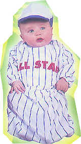
Several people have contributed good info about the College World Series, but I’m gonna save that until tomorrow or Thursday. Today we’re going to look back a bit further than college baseball — all the way back to Little League.
That topic was inspired by a note I got last week from reader Wally Steidley, who said he coached Little League in Wylie, Texas. “My assistant coach and I are huge fans of Uni Watch,” he wrote, “so we took it upon ourselves to spend a little extra and get our boys outfitted like real baseball players. We have some limitations from the league but put together a pretty nice combo, including stirrups and sanitary socks. All the other teams went with the one-color soccer sock, so we really stood out as the finest uni’ed team in the entire league.”
Cool, I thought — teach ”˜em young and all that. So when Steidley offered to send me some photos, I said, “Sure, let’s have ”˜em.” That’s when I discovered that he’d left out one pertinent detail. He hadn’t just dressed up his team like real ballplayers — he’d dressed them as one of history’s most idiosyncratic teams: the A’s. Here’s Steidley‘s rundown:
We had some challenges getting the kids to wear everything correctly, but it was worth it, as everyone in the league noticed our classic stirrups and gold sanitary socks. We did have to explain the stirrup and how to wear them to the kids, but the parents thought it was a cool look, so they helped us out by requiring that they wear them correctly. You will also note the white cleats, which were difficult to find, but we talked the parents into them.
The gold belts were used because last year we were the Pirates, and the parents didn’t want to have to buy more belts. I gave in because my assistant coach and I had already purchased helmets, with MLB sticker packs, and fronted the money for the socks and stirrups. This is something we’ll be able to fix with next year’s team.
Amazing. So now there’s a bunch of nine-year-olds in Texas who think “real” ballplayers wear yellow sanitaries and white cleats. That should warp their little minds quite nicely. Still, Steidley’s devotion to uniform protocol is admirable. After Jason Giambi arranges to have Bud Selig bumped off, could we maybe get Steidley in line to take over the Commissioner’s chair?
Research Project — Last Call: If anyone wants to tip me wise to any bizarro minor league uniforms, I’m still taking submissions — hit me.

Membership Update: I’ve added about two dozen more rear-card designs to the membership roster and to the card gallery (including, as you can see at right, our first referee-based design). My continued thanks to all who’ve joined.
Remember that members get three bonus entries in this week’s raffle, which is for a copy of the 2001 MLB Style Guide. If you haven’t already entered, send an e-mail to uniraffle at earthlink dot net.
Uni Watch News Ticker: One of the San Diego Union-Tribune columnists wrote a bit of a Padres uniform manifesto yesterday (with thanks to Josh Berliner). ”¦ And a St. Looie columnist has weighed in on the suits-on-the-sidelines situation (with thanks to Luke Pellegra). ”¦ Good photo here (helpfully provided by Tom Konecny of the Toledo Mud Hens’ uni-laundering scene. The accompanying article isn’t really about uniforms, though. ”¦ One last Father’s Day oddity: Ray Durham wore one of those light blue wristbands on his head during BP (with thanks to Bosox blogger Jere). ”¦ Ehan Lewis notes that the NFL recently held its annual NFL Softball Challenge event. If you’ve always wanted to see Jeff Lurie swinging a bat (among other sights), a full gallery of pics is available here. ”¦ Nice find by Ethan Rowley, who came up with this portrait of Cardinals greats, which functions as a de facto timeline of the team’s uniform. According to ”¦ this article (forwarded by Wes Johnson), “[Minnesota] Gophers football coach Tim Brewster made it clear that there will be only one change in the team’s uniforms this fall: the letter ‘M’ on the helmets will be much bigger.” Which means it’ll look even more like an upside-down W than it already does. ”¦ Excellent slide-show essay on the history of — and problems with — U.S. soccer uniforms here. ”¦ Latest player spotted wearing Oakley Thumps during BP: Bartolo Colon (great shot by Zach Gibson). ”¦ Member Eric Bonus has scanned and uploaded an excellent 1987 article about hockey uniform numbers. ”¦ More really disturbing Chris Cooley hot pants pics here. ”¦ Carlos Delgado went high-cuffed last night, and it was a thing of beauty. Take note, class: His pants didn’t break right at the knees but, rather, just slightly down the shins. This is exactly — exactly — how it should be done. Such a splendid example of the form that I’m willing to overlook the lack of stirrups. ”¦ Pitt’s new secondary logo has been leaked. ”¦ Michael Maurino works for the single-A Dunedin Blue Jays and recently attended the Florida State League All-Star Game, where the teams wore East and West jerseys that almost make the Pro Bowl look good by comparison — especially when you factor in the number font — yeesh. The guy wearing double-zero in that last photo is Francisco Cervelli of the Tampa Yankees, who normally wears 34, but that was taken by Omar Malave, who managed the West team. Anyone know which other minor leagues use generic all-star unis instead of letting the players wear their regular team attire? … The Angels are giving away an item I’ve never seen before: wristbands with a built-in watch. If you haven’t seen it already, check out the super-cool animated Watch Your Back ad, now running near the top of the right column.
The President got a drawer full of new jerseys yesterday, ranging from “43” to “1”..and a huge tennis racket too…
link
Are these the new Capitals uni’s?
Whoops, lets try that again…
link
Hmmm, it isn’t working. well, cut and paste this address and you’ll see what I’m talking about…hopefully
link
That wristband watch combo could have saved one of my uncle’s a layer, he always wore a wristband (red,white,blue) under his watch.
[quote comment=”104556″]Are these the new Capitals uni’s? [/quote]
NO
You know what’s awesome? Check out that first pic of the little kids. Look at the first baseman — dude’s not even watching. That ball will be delivered in less than a second, and he’s probably looking at rocks or bugs or something. Sweeeet.
…looking through the uniform card gallery, I think I’m the only one that is identified by the “player” not the “owner”
#15 – Munson.
That’s funny.
is it me, or does Pujols look like he doesn’t want to be in that lineup?
[quote comment=”104555″]The President got a drawer full of new jerseys yesterday, ranging from “43” to “1”..and a huge tennis racket too…
link
[quote comment=”104555″]The President got a drawer full of new jerseys yesterday, ranging from “43” to “1”..and a huge tennis racket too…
link
That’s a lot of stuff to file away into storage!
[quote comment=”104566″]You know what’s awesome? Check out that first pic of the little kids. Look at the first baseman — dude’s not even watching. That ball will be delivered in less than a second, and he’s probably looking at rocks or bugs or something. Sweeeet.[/quote]
He definitely just squashed a bug or something…
Wally Steidley should be named coach of the year based on uniform alone. My 8 year old son was the ONLY kid in his little league who wore stirrups in the season, and many people thought it was a great thing to see.
Is their a stirrup revolution beginning also, based on what were seeing in the CWS?
I don’t have a pic (it’s on the front page of the Sports Section here in KC, but it’s not on the internet version), but Presdient Bush got a nice set of swim tights from the Auburn girls team (looks like they might fit a child – a small child). Be interesting to see him don those….
[quote comment=”104566″]You know what’s awesome? Check out that first pic of the little kids. Look at the first baseman — dude’s not even watching. That ball will be delivered in less than a second, and he’s probably looking at rocks or bugs or something. Sweeeet.[/quote]
And the pitcher’s foot is a good three inches off the rubber. At least he’s got a damn fine uniform on.
What’s up with the watch on those Angels watch/sweatband combos being 90 degrees off?
That secondary Pitt logo is just awful. What the hell is that thing?
[quote comment=”104555″]The President got a drawer full of new jerseys yesterday, ranging from “43” to “1”..and a huge tennis racket too…
link
This is by far the link!
Those kids look sharp, if and when I have a kid, i only hope he will be in such a well dressed league, or just team. I say wearing stirrups not only makes the kid/team look great, it gives them an edge because they will have more self confidence because they look so much better than the other team. Just a theory. Maybe the first baseman isn’t looking at bugs or dirt, i think he is admiring his fine looking duds. However, this distraction could blow holes in my theory, meaning, looking so good can draw your attention away from the game because you can’t stop thinking about how sharp you look.
[quote comment=”104579″][quote comment=”104555″]The President got a drawer full of new jerseys yesterday, ranging from “43” to “1”..and a huge tennis racket too…
link
This is by far the link![/quote]
that almost looks like my high school letter jacket. sweet looking jacket, that’s for sure!
[quote comment=”104577″]What’s up with the watch on those Angels watch/sweatband combos being 90 degrees off?[/quote]
everything is a little off center out on the West Coast…
1. No matter how you feel about Mark McGuire, how can you do a poster of “Cardinal Greats” and not include him?
2. The Pitt logo looks like a rabid pig. I’m an Auburn grad and if the AD tried something like that with Aubie…lets just say torches and pitchforks would be involved!
Notes (but unfortunately no pics) from last nights Brewer game:
Giants’ Luis Figueroa (called up yesterday) pinch-hit and had no name on his jersey.
There were game-worn jerseys for sale in the Fan Zone and I noticed that the home white and road gray had names directly sewn on, but the navy alts had name plates. From internet photos I could find it’s kind of linkto tell.
Polish Sausage was wearing faux stirrups for the Sausage Race. Next time I’ll bring my camera.
[quote comment=”104555″]The President got a drawer full of new jerseys yesterday, ranging from “43” to “1”..and a huge tennis racket too…
link
I hope the the Berkley water polo team gave him the ball and not a Speedo.
[quote comment=”104589″][quote comment=”104555″]The President got a drawer full of new jerseys yesterday, ranging from “43” to “1”..and a huge tennis racket too…
link
I hope the the Berkley water polo team gave him the ball and not a Speedo.[/quote]
Gee, thanks for that image. I might not be able to work today.
[quote comment=”104586″]1. No matter how you feel about Mark McGuire, how can you do a poster of “Cardinal Greats” and not include him?
[/quote]
If McGwire (or MC GWIRE according to the back of his jersey) was so great, his fans would know how to spell his name! hehe
[quote comment=”104579″][quote comment=”104555″]The President got a drawer full of new jerseys yesterday, ranging from “43” to “1”..and a huge tennis racket too…
link
This is by far the link![/quote]
Bush does look particularly amused by that gift.
[quote comment=”104592″][quote comment=”104586″]1. No matter how you feel about Mark McGuire, how can you do a poster of “Cardinal Greats” and not include him?
[/quote]
If McGwire (or MC GWIRE according to the back of his jersey) was so great, his fans would know how to spell his name! hehe[/quote]
Great shirt link says it all!
[quote comment=”104576″][quote comment=”104566″]You know what’s awesome? Check out that first pic of the little kids. Look at the first baseman — dude’s not even watching. That ball will be delivered in less than a second, and he’s probably looking at rocks or bugs or something. Sweeeet.[/quote]
And the pitcher’s foot is a good three inches off the rubber. At least he’s got a damn fine uniform on.[/quote]
The batting picture is nice for a couple of things: The catchers mitt looks to be a few sizes too large…maybe he will grow into it. Also, I like the catchers eyes closed, head flinching technique. I caught when I played little league and I know that look all too well.
[quote comment=”104597″][quote comment=”104576″][quote comment=”104566″]You know what’s awesome? Check out that first pic of the little kids. Look at the first baseman — dude’s not even watching. That ball will be delivered in less than a second, and he’s probably looking at rocks or bugs or something. Sweeeet.[/quote]
And the pitcher’s foot is a good three inches off the rubber. At least he’s got a damn fine uniform on.[/quote]
The batting picture is nice for a couple of things: The catchers mitt looks to be a few sizes too large…maybe he will grow into it. Also, I like the catchers eyes closed, head flinching technique. I caught when I played little league and I know that look all too well.[/quote]
I was a catcher also. I can totally relate.
Interesting batter, no batting gloves, and he’s got the eye black on……
What kind of self-respecting Cardinals greats poster DOESN’T have Enos Slaughter? Pretty major omission there.
On his radio show yesterday, Tony Kornheiser mentioned the Chris Cooley short shorts and was aghast.
Since when do the Mets wear link on the road?
[quote comment=”104599″]What kind of self-respecting Cardinals greats poster DOESN’T have Enos Slaughter? Pretty major omission there.[/quote]
Sales Clerk: This bat was made for Slaughter.
Costello: Haven’t you got one that was made for baseball?
i thought it was quite interesting how, of all the pictures of pujols to copy and draw onto that,
“greats of st louis” picture, they chose one of him the day they wore the special world series champion, gold outline cardinal unis…
[quote comment=”104586″]1. No matter how you feel about Mark McGuire, how can you do a poster of “Cardinal Greats” and not include him?[/quote]
Artist’s license… others that easily could have been included are link of the “Gas House Gang”, Hall of Famer link (shown scoring on his “Mad Dash” against the BoSox in the World Series), retired-number honoree link (shown in the rare Cards’ jersey without the “Birds On The Bat”), former MVP/batting champ link, and former MVP/batting champ link…
The Cardinals’ colorful history also includes players Leo Durocher, Johnny Mize, Orlando Cepeda, Ted Simmons, Mike Shannon, and Joaquin Andujar… where does one stop?
One problem with that Cardinals Greats photo: Bob Gibson is smiling. That never happened in real life.
And at the College World Series, it was nice to see that Oregon State hasn’t done with its home uniforms what it did with its road uniforms. Last year, the Beavers wore the same uniform design (“Beavers” in the oldish-looking font that you see everywhere) on all three jerseys (white, gray, and the third jersey, which I don’t remember if it was black or orange). For some reason, the Beavers have foolishly jettisoned the classic-looking jersey on the road. At least they retained the old whites.
Heehee, W getting visits from Madison and Berkeley delegations on the same day. How much tongue-biting was going on?
From today’s Milwaukee Journal-Sentinel
As a tribute to [rookie pitcher] Gallardo’s Mexican heritage, equipment manager Tony Migliaccio issued him uniform No. 49, worn with distinction by Teddy Higuera in the late 1980s. Gallardo never met Higuera but had spoken with him on the telephone, and appreciated the gesture.
Wow. Teddy Higuera.
There’s an advertisement in this past week’s Sports Illustrated (and thankfully, the Mets didn’t wear black on the cover) profiling the history of Tommy John surgery. There’s a picture of Tommy from what looks like the early part of his stint with the Yankees. I can’t tell if those stirrups are real or fake. I think they’re fake, but I can’t say for sure. What’s everyone’s take? And if this has been covered already, Paul, please delete!
last night in watching the CWS
i saw games featuring the beavers, the eaters and a color man named orel…
all while watching erin andrews patrol the seats.
had to laugh…
RE: Yesterday’s debate on printing out tickets on the home computer. If you have to do so, print them on high-quality photo paper. That makes them more durable and scrapbook-worthy. Just be sure to let the ink set (which really shouldn’t be a problem). I hope this isn’t a repeat. My search function locks up my computer and I don’t feel like wading through yesterday’s comments.
[quote comment=”104609″][quote comment=”104586″]1. No matter how you feel about Mark McGuire, how can you do a poster of “Cardinal Greats” and not include him?[/quote]
Artist’s license… others that easily could have been included are link of the “Gas House Gang”, Hall of Famer link (shown scoring on his “Mad Dash” against the BoSox in the World Series), retired-number honoree link (shown in the rare Cards’ jersey without the “Birds On The Bat”), former MVP/batting champ link, and former MVP/batting champ link…
The Cardinals’ colorful history also includes players Leo Durocher, Johnny Mize, Orlando Cepeda, Ted Simmons, Mike Shannon, and Joaquin Andujar… where does one stop?[/quote]
As a Giants fan, I would say the greatest Cardinal of all time is Jose Oquendo. He ripped my heart out in the ’87 playoffs.
2 things:
1. re: Printing out tickets at home. At least with that you have something to save in a scrap book. What do you do about link?
2. Have you seen the link available for all MLB teams, and even in 2007 All Star gear? Unfortunately, he has no legs, so we can’t comment on his hosiery. I’m sure he would be wearing stirrups if he could.
as a cardinal fan since the templeton for smith deal prior to the 82 season, i can say that tom lawless, hero of game 4 of the 87 series, should be on that list.
[quote comment=”104618″]2 things:
1. re: Printing out tickets at home. At least with that you have something to save in a scrap book. What do you do about link?
2. Have you seen the link available for all MLB teams, and even in 2007 All Star gear? Unfortunately, he has no legs, so we can’t comment on his hosiery. I’m sure he would be wearing stirrups if he could.[/quote]
They’ve ditched the black!
link
Does anyone have a schedule/countdown to the new NHL jerseys being introduced? The Caps on on Friday, right? Anyone know about the Canucks? Are there any other confirmed changes this summer (other than RBK Edge)?
[quote comment=”104621″][quote comment=”104618″]2 things:
1. re: Printing out tickets at home. At least with that you have something to save in a scrap book. What do you do about link?
2. Have you seen the link available for all MLB teams, and even in 2007 All Star gear? Unfortunately, he has no legs, so we can’t comment on his hosiery. I’m sure he would be wearing stirrups if he could.[/quote]
They’ve ditched the black!
link
The potato head mustache kind of reminds me of link He just needs the shades.
[quote comment=”104559″]Hmmm, it isn’t working. well, cut and paste this address and you’ll see what I’m talking about…hopefully
link
NO NO NO NO NO NO NO NOOOO PLEASE NO ONE ELSE TRY TO ASK THIS!!! PLEEEEEEEEAAAAAASEEEEE!!!!!
[quote comment=”104622″]Does anyone have a schedule/countdown to the new NHL jerseys being introduced? The Caps on on Friday, right? Anyone know about the Canucks? Are there any other confirmed changes this summer (other than RBK Edge)?[/quote]
Bruins are Thursday night…..
I was just rereading this and it occured to me, something seemed odd:
The gold belts were used because last year we were the Pirates, and the parents didn’t want to have to buy more belts
What were the Pirates uni colorscheme last year? Black jersey, white pants, gold belt?
[quote comment=”104578″]That secondary Pitt logo is just awful. What the hell is that thing?[/quote]
Looks like a pissed off sea otter
Making the little leaguers all wear the white shoes is absurd. Maybe they live in some sort of lily white surburb of affluence, but making parents buy new cleats for their kids because their coach wants to make them look like the real thing, give me a break.
[quote comment=”104631″][quote comment=”104578″]That secondary Pitt logo is just awful. What the hell is that thing?[/quote]
Looks like a pissed off sea otter[/quote]
I think you might be onto something there.
[quote comment=”104631″][quote comment=”104578″]That secondary Pitt logo is just awful. What the hell is that thing?[/quote]
Looks like a pissed off sea otter[/quote]
It kind of reminds me of link.
[quote comment=”104631″][quote comment=”104578″]That secondary Pitt logo is just awful. What the hell is that thing?[/quote]
Looks like a pissed off sea otter[/quote]
I was at Pitt from 2000 to 2003, when I got there they were just finishing changing the over to Notre Dame’s colors. Just think of all of the thing at your college or high school that were painted the school colors, and try to imagine repainting them. It’s a massive (and expensive) undertaking. They had to repain all the trucks, and the pool, the street signs had to be changed. Pretty much every thing had to be repainted, and it took them about five years to get it all done.
Now everybody wants to switch back. Somebody at the office of physical plant is going to cry.
The new logo looks similar to the 1966-1972 logo that you can see on Chris Creamers logo page, the links to the page never work. Why is that?
What does everyone link? Worth it or no?
[quote comment=”104631″][quote comment=”104578″]That secondary Pitt logo is just awful. What the hell is that thing?[/quote]
Looks like a pissed off sea otter[/quote]
I have to say, it looks better than their link, which with the jagged shading hardly resembled anything. At least this looks like some kind of animal. Eventually, they may even create a logo that looks like a panther! Baby steps.
But who am I to talk when when my team’s mascot is a link.
[quote comment=”104633″]Making the little leaguers all wear the white shoes is absurd. Maybe they live in some sort of lily white surburb of affluence, but making parents buy new cleats for their kids because their coach wants to make them look like the real thing, give me a break.[/quote]
i actually thought of that right away…
when i was in little league, teams were designated by the color stirrups, not shirts. it was less expensive for the league to buy 15 pairs of 4 different color stirrups that could be reused year after year, than to buy different t shirts on a yearly basis.
every player wore white pants and a brown shirt with the name of the jr baseball association on the front. no numbers.
you had the option to get a new shirt every year, and some did, however my parents philosophy was, you have the shirt already, if you want a new one, you can buy one with youre own money.
i can only imagine what they would have said about the shoes. they would have let me be the only kid with black shoes on a team full of white, im sure…
[quote comment=”104638″]What does everyone link? Worth it or no?[/quote]
YES! That is a cheap price for one of those.
[quote comment=”104638″]What does everyone link? Worth it or no?[/quote]
I don’t know. I’m just wary of buying something in THIS industry from eBay.
[quote comment=”104638″]What does everyone link? Worth it or no?[/quote]
That is a Majestic jersey, so it is not the actual maker of the original. I’ve seen other players in this style, their attention to detail is a little suspect; they put a name on the back of the Clemente version of that product, and the colors were off. So I would check the jersey from the season this purports to “throwback to before I bought it. However, the jersey material is close, and everything is swen on, but not with nearly the quality or attention to detail of a Mitchel & Ness throwback.
It looks alright, most people won’t know the difference, but for my $129, I would get something else.
[quote comment=”104633″]Making the little leaguers all wear the white shoes is absurd. Maybe they live in some sort of lily white surburb of affluence, but making parents buy new cleats for their kids because their coach wants to make them look like the real thing, give me a break.[/quote]
“I gave in because my assistant coach and I had already purchased helmets, with MLB sticker packs, and fronted the money for the socks and stirrups.”
In case you didn’t read the whole thing, nothing absurd when you fronted the cost of other items…
[quote comment=”104638″]What does everyone link? Worth it or no?[/quote]
Absolutely!
[quote comment=”104617″][quote comment=”104609″][quote comment=”104586″]As a Giants fan, I would say the greatest Cardinal of all time is Jose Oquendo. He ripped my heart out in the ’87 playoffs.[/quote]
Agreed, as a Cardinals fan, Jose Oquendo and Tommy Herr were gods. BTW, no one, and I mean NO ONE pulled off the baby blues like the Cardinals did.
ok, close quote
[quote comment=”104649″][quote comment=”104638″]What does everyone link? Worth it or no?[/quote]
YES! That is a cheap price for one of those.[/quote]
No way, that is full retail price.
Agreed, as a Cardinals fan, Jose Oquendo and Tommy Herr were gods. BTW, no one, and I mean NO ONE pulled off the baby blues like the Cardinals
[quote comment=”104633″]Making the little leaguers all wear the white shoes is absurd. Maybe they live in some sort of lily white surburb of affluence, but making parents buy new cleats for their kids because their coach wants to make them look like the real thing, give me a break.[/quote]
For the most part, kids need new cleats each year anyway. Their feet have a tendency to grow. So new cleats shouldnt be an issue. Finding white ones these days is another story.
Back in the 1980’s the Phillies used to give away a wristband-watch combo. The wristband was made of some sort of cheap nylon and the watch battery barely lasted the ride home. To change the watch battery you had to basically destroy the wristband. Still, as a kid, it was pretty cool to wear one of those to school.
[quote comment=”104651″][quote comment=”104638″]What does everyone link? Worth it or no?[/quote]
That is a Majestic jersey, so it is not the actual maker of the original. I’ve seen other players in this style, their attention to detail is a little suspect; they put a name on the back of the Clemente version of that product, and the colors were off. So I would check the jersey from the season this purports to “throwback to before I bought it. However, the jersey material is close, and everything is swen on, but not with nearly the quality or attention to detail of a Mitchel & Ness throwback.
It looks alright, most people won’t know the difference, but for my $129, I would get something else.[/quote]
That’s what I was thinking at first…but the only one I saw at the Cardinals Team Store was some crap Nike one…not even the right color blue
I am also having a terrible time finding a Willie McGee jersey that’s of good quality
Compare it to the link version of the same jersey. The white shading around the cardinals logo gives it away.
It does appear to be cheaper than what you would pay from the Cardinals website, but I think that is still pretty close to full retail. The Cardinals listed it as a “replica throwback”
[quote comment=”104662″]Compare it to the link version of the same jersey. The white shading around the cardinals logo gives it away.
It does appear to be cheaper than what you would pay from the Cardinals website, but I think that is still pretty close to full retail. The Cardinals listed it as a “replica throwback”[/quote]
touche…guess I’m gonna keep looking
Wally Steidley’s little league team looks fantastic. I can appreciate what he did even more after attending my nephew’s little league game and seeing every single player clad in pajama pants.
[quote comment=”104661″][quote comment=”104651″][quote comment=”104638″]What does everyone link? Worth it or no?[/quote]
That is a Majestic jersey, so it is not the actual maker of the original. I’ve seen other players in this style, their attention to detail is a little suspect; they put a name on the back of the Clemente version of that product, and the colors were off. So I would check the jersey from the season this purports to “throwback to before I bought it. However, the jersey material is close, and everything is swen on, but not with nearly the quality or attention to detail of a Mitchel & Ness throwback.
It looks alright, most people won’t know the difference, but for my $129, I would get something else.[/quote]
That’s what I was thinking at first…but the only one I saw at the Cardinals Team Store was some crap Nike one…not even the right color blue
I am also having a terrible time finding a Willie McGee jersey that’s of good quality[/quote]
That may be your only choice if your married to a blue Willie McGee jersey. I think that the price is comperable to what you pay for it at the mall, assumin you could find it.
[quote comment=”104640″][quote comment=”104631″][quote comment=”104578″]That secondary Pitt logo is just awful. What the hell is that thing?[/quote]
Looks like a pissed off sea otter[/quote]
I have to say, it looks better than their link, which with the jagged shading hardly resembled anything. At least this looks like some kind of animal. Eventually, they may even create a logo that looks like a panther! Baby steps.
But who am I to talk when when my team’s mascot is a link.[/quote]
But at least SU listens to the students. When I was there in ’97 there was an attempt to change Otto to a 3-d version. There were 3 new designs and the original, the students voted and Otto remained the same.
[quote comment=”104653″][quote comment=”104638″]What does everyone link? Worth it or no?[/quote]
Absolutely!
[quote comment=”104617″][quote comment=”104609″][quote comment=”104586″]As a Giants fan, I would say the greatest Cardinal of all time is Jose Oquendo. He ripped my heart out in the ’87 playoffs.[/quote]
Agreed, as a Cardinals fan, Jose Oquendo and Tommy Herr were gods. BTW, no one, and I mean NO ONE pulled off the baby blues like the Cardinals did.[/quote]
Cubs and the Phillies had even cooler baby blues.
If those aren’t the new capitals sweaters then what are they from?
[quote comment=”104656″]Agreed, as a Cardinals fan, Jose Oquendo and Tommy Herr were gods. BTW, no one, and I mean NO ONE pulled off the baby blues like the Cardinals[/quote]
I am gonna have to say the Brew Crew gave the Cards a run for their money in this department.
link
[quote comment=”104669″][quote comment=”104656″]Agreed, as a Cardinals fan, Jose Oquendo and Tommy Herr were gods. BTW, no one, and I mean NO ONE pulled off the baby blues like the Cardinals[/quote]
I am gonna have to say the Brew Crew gave the Cards a run for their money in this department.
link[/quote]
No way. The link had the best, with the white numbers and script.
Nike has been making those wristband watches for a while. They are pretty sweet when you go running.
link
[quote comment=”104555″]The President got a drawer full of new jerseys yesterday, ranging from “43” to “1”..and a huge tennis racket too…
link
My favorite is the Women’s Hockey – and probably the only one he would ever wear. What do you suppose he does do with all those jerseys he gets?
[quote comment=”104658″][quote comment=”104633″]Making the little leaguers all wear the white shoes is absurd. Maybe they live in some sort of lily white surburb of affluence, but making parents buy new cleats for their kids because their coach wants to make them look like the real thing, give me a break.[/quote]
For the most part, kids need new cleats each year anyway. Their feet have a tendency to grow. So new cleats shouldnt be an issue. Finding white ones these days is another story.[/quote]
Also, aren’t these kids only nine or so? If it’s their first year in baseball, and they’re definitely going to need new cleats the next season, I guess convincing the people who don’t already have shoes to get white ones isn’t that bad. I’m assuming that if a kid played last year with black shoes he could keep them, right?
And Todd, every team’s shirts were the same color!? And no numbers on the back? Saving money is good, but you need to know who’s on what team. Did you at least have different-colored caps?
My first year in little league, they gave us T-shirts (to keep) with no numbers on the backs; instead there was an ad for a bank. It looked ridiculous. Fortunately the next year they put numbers on the back, and perhaps as a cost-saving measure, had nothing at all on the front. I’d much rather have a blank T-shirt front than a shirt with a bank ad where the number belongs!
Scoping out the MLB.com store, and spotted link – please note the discrepancy between the “authentic Nolan Ryan 1969 road jersey” and the “authentic Tom Seaver 1969 road jersey” – does this mean that Ryan didn’t deserve the piping and Seaver did? The link (as does my memory). Way out of character for Mitchell & Ness
[quote comment=”104670″][quote comment=”104669″][quote comment=”104656″]Agreed, as a Cardinals fan, Jose Oquendo and Tommy Herr were gods. BTW, no one, and I mean NO ONE pulled off the baby blues like the Cardinals[/quote]
I am gonna have to say the Brew Crew gave the Cards a run for their money in this department.
link[/quote]
No way. The link had the best, with the white numbers and script.[/quote]
AMEN. I can’t believe the discussion made it that far.
[quote comment=”104676″][quote comment=”104670″][quote comment=”104669″][quote comment=”104656″]Agreed, as a Cardinals fan, Jose Oquendo and Tommy Herr were gods. BTW, no one, and I mean NO ONE pulled off the baby blues like the Cardinals[/quote]
I am gonna have to say the Brew Crew gave the Cards a run for their money in this department.
link[/quote]
No way. The link had the best, with the white numbers and script.[/quote]
AMEN. I can’t believe the discussion made it that far.[/quote]
Agreed
[quote comment=”104595″][quote comment=”104592″][quote comment=”104586″]1. No matter how you feel about Mark McGuire, how can you do a poster of “Cardinal Greats” and not include him?
[/quote]
If McGwire (or MC GWIRE according to the back of his jersey) was so great, his fans would know how to spell his name! hehe[/quote]
Great shirt link says it all![/quote]
That was kind of harsh… I like link! Keep in mind that while McGwire is still guilty, it was before this was all made public. I feel fairly confident that if it was him in Bonds’ shoes now, he would NOT be chasing the record!
The University of Pittsburgh just sent an email to Panther Club members confirming what Paul noted in today’s notes, above.
A new, stylized panther-head logo replaces the jaggedy-edged “Dino-Cat” mark introduced in 1997.
I snapped up a tee shirt with this logo about two months ago at a Target store. I think it’s a great improvement over the previous one. Still…. wish we had something that really looked like a “felis concolor”, as they have at BYU, Houston, and that cow college in Central Pa.
I’d hate to be picky, but check out the batting helmet of the little league Athletics team featured in the article (the link with the word “link.”) The helmet is off. With the white ‘A’s,’ the green helmet should have had its brim painted yellow, or the solid green helmets should have the yellow decal. Overall, a great effort.
[quote comment=”104680″]The University of Pittsburgh just sent an email to Panther Club members confirming what Paul noted in today’s notes, above.
A new, stylized panther-head logo replaces the jaggedy-edged “Dino-Cat” mark introduced in 1997.
I snapped up a tee shirt with this logo about two months ago at a Target store. I think it’s a great improvement over the previous one. Still…. wish we had something that really looked like a “felis concolor”, as they have at BYU, Houston, and that cow college in Central Pa.[/quote]
48-14
[quote comment=”104677″][quote comment=”104676″][quote comment=”104670″][quote comment=”104669″][quote comment=”104656″]Agreed, as a Cardinals fan, Jose Oquendo and Tommy Herr were gods. BTW, no one, and I mean NO ONE pulled off the baby blues like the Cardinals[/quote]
I am gonna have to say the Brew Crew gave the Cards a run for their money in this department.
link[/quote]
No way. The link had the best, with the white numbers and script.[/quote]
AMEN. I can’t believe the discussion made it that far.[/quote]
Agreed[/quote]
You are all crazy – Maroon and Baby Blue – ugly, Blue and yellow on Baby Blue – average, Blue on Baby Blue – bland, BTW, are all you KC fans still paying Don Denkinger?
[quote comment=”104683″][quote comment=”104677″][quote comment=”104676″][quote comment=”104670″][quote comment=”104669″][quote comment=”104656″]Agreed, as a Cardinals fan, Jose Oquendo and Tommy Herr were gods. BTW, no one, and I mean NO ONE pulled off the baby blues like the Cardinals[/quote]
I am gonna have to say the Brew Crew gave the Cards a run for their money in this department.
link[/quote]
No way. The link had the best, with the white numbers and script.[/quote]
AMEN. I can’t believe the discussion made it that far.[/quote]
Agreed[/quote]
You are all crazy – Maroon and Baby Blue – ugly, Blue and yellow on Baby Blue – average, Blue on Baby Blue – bland, BTW, are all you KC fans still paying Don Denkinger?[/quote]
Don Denkinger didn’t cause Joaquin Andujar to completely lose his mind in game 7. Sour grapes, my man.
[quote comment=”104686″][quote comment=”104683″][quote comment=”104677″][quote comment=”104676″][quote comment=”104670″][quote comment=”104669″][quote comment=”104656″]Agreed, as a Cardinals fan, Jose Oquendo and Tommy Herr were gods. BTW, no one, and I mean NO ONE pulled off the baby blues like the Cardinals[/quote]
I am gonna have to say the Brew Crew gave the Cards a run for their money in this department.
link[/quote]
No way. The link had the best, with the white numbers and script.[/quote]
AMEN. I can’t believe the discussion made it that far.[/quote]
Agreed[/quote]
You are all crazy – Maroon and Baby Blue – ugly, Blue and yellow on Baby Blue – average, Blue on Baby Blue – bland, BTW, are all you KC fans still paying Don Denkinger?[/quote]
Don Denkinger didn’t cause Joaquin Andujar to completely lose his mind in game 7. Sour grapes, my man.[/quote]
Yup – but there never should have been a Game 7!!! Admit it – you stole it!
[quote comment=”104675″]Scoping out the MLB.com store, and spotted link – please note the discrepancy between the “authentic Nolan Ryan 1969 road jersey” and the “authentic Tom Seaver 1969 road jersey” – does this mean that Ryan didn’t deserve the piping and Seaver did? The link (as does my memory). Way out of character for Mitchell & Ness[/quote]
Geeze. Plus, they’re charging like $40 extra for the piping!
[quote comment=”104669″][quote comment=”104656″]Agreed, as a Cardinals fan, Jose Oquendo and Tommy Herr were gods. BTW, no one, and I mean NO ONE pulled off the baby blues like the Cardinals[/quote]
I am gonna have to say the Brew Crew gave the Cards a run for their money in this department.
link[/quote]
molitor KILLED in that series…
5 hits in game 1 .355 for the series…
big mistake for minnesota to enlarge the m (or upside-down w) on their helmets. they have great football uniforms now.
[quote comment=”104661″]
I am also having a terrible time finding a Willie McGee jersey that’s of good quality[/quote]
I would worry about finding a quality jersey…see if you can get a blank one. Then you can always find a shop to put McGee on it.
Here is the link that your original was for much less.
great 1st pic, the pitcher is not actually touching the rubber, adn the 1st baseman is looking at his feet. I love little league!
Oh, what a dilemma … I’m a die-hard Cub fan living in St. Louis, and I’ve been invited to attend my first game at Yet-Another-Stadium-Named-After-Beer this Saturday. I’ve been VERY SPECIFICALLY instructed: Wear red and support the team, or you don’t get to enjoy the luxury box buffet.
So, that said, anyone have a Phillies jersey they could loan me for the weekend?
[quote comment=”104687″][quote comment=”104686″][quote comment=”104683″][quote comment=”104677″][quote comment=”104676″][quote comment=”104670″][quote comment=”104669″][quote comment=”104656″]Agreed, as a Cardinals fan, Jose Oquendo and Tommy Herr were gods. BTW, no one, and I mean NO ONE pulled off the baby blues like the Cardinals[/quote]
I am gonna have to say the Brew Crew gave the Cards a run for their money in this department.
link[/quote]
No way. The link had the best, with the white numbers and script.[/quote]
AMEN. I can’t believe the discussion made it that far.[/quote]
Agreed[/quote]
You are all crazy – Maroon and Baby Blue – ugly, Blue and yellow on Baby Blue – average, Blue on Baby Blue – bland, BTW, are all you KC fans still paying Don Denkinger?[/quote]
Don Denkinger didn’t cause Joaquin Andujar to completely lose his mind in game 7. Sour grapes, my man.[/quote]
Yup – but there never should have been a Game 7!!! Admit it – you stole it![/quote]
Me? I’m not even a Royals fan. Be happy that you have, like, 9 or 10 WS championships, and that you won last year with barely a .500 record. My team hasn’t won since 1954.
[quote comment=”104696″]Oh, what a dilemma … I’m a die-hard Cub fan living in St. Louis, and I’ve been invited to attend my first game at Yet-Another-Stadium-Named-After-Beer this Saturday. I’ve been VERY SPECIFICALLY instructed: Wear red and support the team, or you don’t get to enjoy the luxury box buffet.
So, that said, anyone have a Phillies jersey they could loan me for the weekend?[/quote]
Go to Foot Locker and get a solid red t-shirt? They can’t be too expensive.
[quote comment=”104696″]Oh, what a dilemma … I’m a die-hard Cub fan living in St. Louis, and I’ve been invited to attend my first game at Yet-Another-Stadium-Named-After-Beer this Saturday. I’ve been VERY SPECIFICALLY instructed: Wear red and support the team, or you don’t get to enjoy the luxury box buffet.
So, that said, anyone have a Phillies jersey they could loan me for the weekend?[/quote]
Why not frost them by wearing a football Cardinals jersey? You’ll still meet the criteria, and probably piss off a couple of folks at the same time
link is not really uni-related but funny non the less. This is probably the last person i would think they would ever make a movie about
[quote comment=”104701″][quote comment=”104696″]Oh, what a dilemma … I’m a die-hard Cub fan living in St. Louis, and I’ve been invited to attend my first game at Yet-Another-Stadium-Named-After-Beer this Saturday. I’ve been VERY SPECIFICALLY instructed: Wear red and support the team, or you don’t get to enjoy the luxury box buffet.
So, that said, anyone have a Phillies jersey they could loan me for the weekend?[/quote]
Why not frost them by wearing a football Cardinals jersey? You’ll still meet the criteria, and probably piss off a couple of folks at the same time[/quote]
I actually have an old Football Cardinal T-shirt … I wore it for years on “Support the Cardinals” days here at the office. It’s getting pretty thread-bare these days though …
#100
[quote comment=”104578″]That secondary Pitt logo is just awful. What the hell is that thing?[/quote]
I am a recent Pitt alum, man i hope my money didn’t go into planning and developing that thing.
link
[quote comment=”104701″][quote comment=”104696″]Oh, what a dilemma … I’m a die-hard Cub fan living in St. Louis, and I’ve been invited to attend my first game at Yet-Another-Stadium-Named-After-Beer this Saturday. I’ve been VERY SPECIFICALLY instructed: Wear red and support the team, or you don’t get to enjoy the luxury box buffet.
So, that said, anyone have a Phillies jersey they could loan me for the weekend?[/quote]
Why not frost them by wearing a football Cardinals jersey? You’ll still meet the criteria, and probably piss off a couple of folks at the same time[/quote]
Get a Rick Ankiel jersey, haha Or a Bobby Bonilla jersey!
Graham, The Bruins are unveiling their jerseys on Thursday. The Capitals and Blue Jackets are unveiling theirs on Draft Day, aka Friday. Most other teams have said that they will have their own unveiling before training camps start.
[quote comment=”104641″][quote comment=”104633″]Making the little leaguers all wear the white shoes is absurd. Maybe they live in some sort of lily white surburb of affluence, but making parents buy new cleats for their kids because their coach wants to make them look like the real thing, give me a break.[/quote]
i actually thought of that right away…
when i was in little league, teams were designated by the color stirrups, not shirts. it was less expensive for the league to buy 15 pairs of 4 different color stirrups that could be reused year after year, than to buy different t shirts on a yearly basis.
every player wore white pants and a brown shirt with the name of the jr baseball association on the front. no numbers.
you had the option to get a new shirt every year, and some did, however my parents philosophy was, you have the shirt already, if you want a new one, you can buy one with youre own money.
i can only imagine what they would have said about the shoes. they would have let me be the only kid with black shoes on a team full of white, im sure…[/quote]
Just because your little league sucked, don’t take it out on these kids
[quote comment=”104556″]Are these the new Capitals uni’s?
[/quote]
*slits wrists*
[quote comment=”104707″]
Get a Rick Ankiel jersey, haha
[/quote]
Um, Rick Ankiel is making a return to the majors in a quick way. He just his his 19th homerun for the Redbirds the other night, leading the team in that category, and is hitting with a .286 average. His biggest flaw so far is that he only has 12 walks in 217 at-bats. His OBP and AVG could be much higher if he simply stopped whiffing at bad pitches. He is a decent outfielder as well.
last night I was watching the Reds play the A’s and I noticed on the cuff of Jason Kendall’s chest protector near the right shoulder the letters “T B”. Anyone know what that is about?
[quote comment=”104716″][quote comment=”104707″]
Get a Rick Ankiel jersey, haha
[/quote]
Um, Rick Ankiel is making a return to the majors in a quick way. He just his his 19th homerun for the Redbirds the other night, leading the team in that category, and is hitting with a .286 average. His biggest flaw so far is that he only has 12 walks in 217 at-bats. His OBP and AVG could be much higher if he simply stopped whiffing at bad pitches. He is a decent outfielder as well.[/quote]
Was Rick Ankiel a stirrups guy in the bigs? I don’t remember.
[quote comment=”104624″][quote comment=”104559″]Hmmm, it isn’t working. well, cut and paste this address and you’ll see what I’m talking about…hopefully
link
NO NO NO NO NO NO NO NOOOO
PLEASE NO ONE ELSE TRY TO ASK THIS!!! PLEEEEEEEEAAAAAASEEEEE!!!!![/quote]
Someone’s gonna blow their brains out soon if we don’t stop asking this..
[quote comment=”104720″][quote comment=”104624″][quote comment=”104559″]Hmmm, it isn’t working. well, cut and paste this address and you’ll see what I’m talking about…hopefully
link
NO NO NO NO NO NO NO NOOOO
PLEASE NO ONE ELSE TRY TO ASK THIS!!! PLEEEEEEEEAAAAAASEEEEE!!!!![/quote]
Someone’s gonna blow their brains out soon if we don’t stop asking this..[/quote]
Just a couple more days…and then this question goes away.
[quote comment=”104710″][quote comment=”104641″][quote comment=”104633″]Making the little leaguers all wear the white shoes is absurd. Maybe they live in some sort of lily white surburb of affluence, but making parents buy new cleats for their kids because their coach wants to make them look like the real thing, give me a break.[/quote]
i actually thought of that right away…
when i was in little league, teams were designated by the color stirrups, not shirts. it was less expensive for the league to buy 15 pairs of 4 different color stirrups that could be reused year after year, than to buy different t shirts on a yearly basis.
every player wore white pants and a brown shirt with the name of the jr baseball association on the front. no numbers.
you had the option to get a new shirt every year, and some did, however my parents philosophy was, you have the shirt already, if you want a new one, you can buy one with youre own money.
i can only imagine what they would have said about the shoes. they would have let me be the only kid with black shoes on a team full of white, im sure…[/quote]
Just because your little league sucked, don’t take it out on these kids[/quote]
umm, what? i made no mention of the kids, or their league. i gave a description of my experience in a similar circumstance. the only mention of the prior post even were my initial thoughts of the parental reaction for uniform requirements outside of what was issued to each player. not quite sure where the kid-bashing came into play.
I was looking through some old 70s baseball pictures and noticed that at least a few Mets wore some primitive “cool base” type jerseys, with ventilation holes under the arms similar to the holes on a baseball cap. (link, link, link) Was this an MLB-wide thing or were they specially designed?
Anybody got a pic of Patrick Kane of the London Knights? I think he’s going number 1 in this weekend’s draft. I couldn’t find a pic, there is a small one on ESPN, but I’m somewhat computer illiterate
[quote comment=”104719″][quote comment=”104716″][quote comment=”104707″]
Get a Rick Ankiel jersey, haha
[/quote]
Um, Rick Ankiel is making a return to the majors in a quick way. He just his his 19th homerun for the Redbirds the other night, leading the team in that category, and is hitting with a .286 average. His biggest flaw so far is that he only has 12 walks in 217 at-bats. His OBP and AVG could be much higher if he simply stopped whiffing at bad pitches. He is a decent outfielder as well.[/quote]
Was Rick Ankiel a stirrups guy in the bigs? I don’t remember.[/quote]
In this pic he was: link
I know about his comeback. I’m seeing the Cards-Mets twice at the end of the month. I hope he’s on the team! Although, last year’s Mets-Cards was quite amusing. Cards LF Chris Duncan had a drunk female admirer, and she kept threatening to run onto the field to hug him as he was running out to his position. It never happened though.
[quote comment=”104672″][quote comment=”104555″]The President got a drawer full of new jerseys yesterday, ranging from “43” to “1”..and a huge tennis racket too…
link
My favorite is the Women’s Hockey – and probably the only one he would ever wear. What do you suppose he does do with all those jerseys he gets?[/quote]
They’ll probably go to his presidential library at Devry University.
Wouldn’t Delgado have looked a whole lot better if he had not been wearing BLACK socks?
News from the ECHL, involving throwback jerseys:
Opening Day for the 20th Anniversary Season will be Oct. 18 when the Johnstown Chiefs host the Wheeling Nailers at Cambria County War Memorial. The game is a rematch of Game 7 from the first-ever ECHL Finals played in front of a standing-room-only crowd at Cambria County War Memorial. The two teams will wear throwback jerseys for the Opening Day game that begins at 7:30 p.m. ET and will be broadcast worldwide on B2 Networks, the “Official Broadband Broadcast Provider of the ECHLâ€Â. The remaining teams will open their seasons the weekend of Oct. 19-21.
[quote comment=”104728″][quote comment=”104672″][quote comment=”104555″]The President got a drawer full of new jerseys yesterday, ranging from “43” to “1”..and a huge tennis racket too…
link
My favorite is the Women’s Hockey – and probably the only one he would ever wear. What do you suppose he does do with all those jerseys he gets?[/quote]
They’ll probably go to his presidential library at Devry University.[/quote]
Now now, SMU is leaps and bounds ahead of any for-profit ‘university’ like Devry. So let’s not get into insulting people’s alma maters.
[quote comment=”104723″]I was looking through some old 70s baseball pictures and noticed that at least a few Mets wore some primitive “cool base” type jerseys, with ventilation holes under the arms similar to the holes on a baseball cap. (link, link, link) Was this an MLB-wide thing or were they specially designed?[/quote]
This was a league wide thin. I have an away 1966 Brooks Robinson jersey and they have these holes too. They are kind of visible link. There are four little holes with little metal rings around them
[quote comment=”104675″]Scoping out the MLB.com store, and spotted link – please note the discrepancy between the “authentic Nolan Ryan 1969 road jersey” and the “authentic Tom Seaver 1969 road jersey” – does this mean that Ryan didn’t deserve the piping and Seaver did? The link (as does my memory). Way out of character for Mitchell & Ness[/quote]
I noticed that yesterday as well, I didn’t post it thought because I couldn’t find an images of Ryan in away grays.
I bought my son stirrups for his little league this season (see here: link)
Unfortunately, halfway through the season he decided that he didnt want to be different than all the other kids so he went back to the one color look. Thats the way it is with a 9 year old. Sometimes he was sloppy, untucked shirt, leg showing between sock and pant, but at least he wore ’em high.
In my day, all the kids got the same flannel uniform which we had to return at the end of the season. The only difference between the teams were hat color and stirrup color. Since it was the ’70’s, we all had our moms sew in a little elastic so we could stretch ’em high.
link is a picutre of Brooks with them clearly visible.
Is there any possibility that the winner of the auction would also be given the password to log in to the style guide webpage if one came with it originally, since that site has all the extras like BP jerseys, Alternate jerseys and hats, ect??
link
[quote comment=”104730″]Wouldn’t Delgado have looked a whole lot better if he had not been wearing BLACK socks?[/quote]
They were wearing their two tone god awful hats with black. It would look weird if he wore blue, unless he wore the blue hat.
Paul a question.
I really like the card designed with officials in mind. I’m going to assume it would be no problem to do it without a name, but would it be possible to do the number placket as a rectangle rather than that octagonal shape?
Wow, where to begin with the putridness of link:
(1) The Mets did not use this “New York” script until 1987
(2) The Mets did not use the white outlines on the racing stripes until 1987
(3) The name on the back is missing the orange outline.
(4) The number font is all wrong.
The Mets might also have been using nameplates at this time, but I’m too lazy to double check.
All in all, how can this thing cost $199 when it was never worn by Tom Seaver? M&N really screwed the pooch on this one.
OK, or maybe it’s a circle that looks funny because of the way it lies on the stripes, but could it be rectangular?
Playing hockey last night and reading about the little league team has me interested in seeing other people’s uniform designs they use in their adult leagues. We could have a gallery going.
[quote comment=”104744″]Wow, where to begin with the putridness of link:
(1) The Mets did not use this “New York” script until 1987
(2) The Mets did not use the white outlines on the racing stripes until 1987
(3) The name on the back is missing the orange outline.
(4) The number font is all wrong.
The Mets might also have been using nameplates at this time, but I’m too lazy to double check.
All in all, how can this thing cost $199 when it was never worn by Tom Seaver? M&N really screwed the pooch on this one.[/quote]
It’s a Majestic jersey, not M&N.
[quote comment=”104724″]Anybody got a pic of Patrick Kane of the London Knights? I think he’s going number 1 in this weekend’s draft. I couldn’t find a pic, there is a small one on ESPN, but I’m somewhat computer illiterate[/quote]
the filter just had a hey-day with my post..
I couldn’t copy/paste the pic from ESPN, but in the pic the Knights uniforms resemble the Minnesota North Stars from back when they were in the Norris Division. He’s #88 in the OHL. That number seemed to have crap luck in the NHL for link.
[quote comment=”104744″]Wow, where to begin with the putridness of link:
(1) The Mets did not use this “New York” script until 1987
(2) The Mets did not use the white outlines on the racing stripes until 1987
(3) The name on the back is missing the orange outline.
(4) The number font is all wrong.
The Mets might also have been using nameplates at this time, but I’m too lazy to double check.
All in all, how can this thing cost $199 when it was never worn by Tom Seaver? M&N really screwed the pooch on this one.[/quote]
That’s Majestic (not Mitchell and Ness), and their replicas are putrid. Their fonts are too universal. For baseball jerseys, spring for authentics if you can because they are the least f*cked up. Personally, I concentrate on hats because they are cheaper, consistently better (American Needle gets it right, as does New Era when they don’t go off on “fashion” tangents), and you probably already have a nice shirt that will go well with your new hat.
News from the ECHL, involving throwback jerseys:
Opening Day for the 20th Anniversary Season will be Oct. 18 when the Johnstown Chiefs host the Wheeling Nailers at Cambria County War Memorial. The game is a rematch of Game 7 from the first-ever ECHL Finals played in front of a standing-room-only crowd at Cambria County War Memorial. The two teams will wear throwback jerseys for the Opening Day game that begins at 7:30 p.m. ET and will be broadcast worldwide on B2 Networks, the “Official Broadband Broadcast Provider of the ECHLâ€Â. The remaining teams will open their seasons the weekend of Oct. 19-21.
I recently sat behind the owner of the Chiefs on a flight from Philly to Las Vegas. The guy got so tanked he was ridiculously loud and obnoxious during the entire time.
And of course, he didn’t hesitate telling everybody around him that he was the owner of an ECHL franchise, which is pretty cool.. I guess.
[quote comment=”104744″]Wow, where to begin with the putridness of link:
(1) The Mets did not use this “New York” script until 1987
(2) The Mets did not use the white outlines on the racing stripes until 1987
(3) The name on the back is missing the orange outline.
(4) The number font is all wrong.
The Mets might also have been using nameplates at this time, but I’m too lazy to double check.
All in all, how can this thing cost $199 when it was never worn by Tom Seaver? M&N really screwed the pooch on this one.[/quote]
That one is Majestic, not M&N.
[quote comment=”104740″]link[/quote]
NICE …
New Caps jerseys have been linked. Don’t know if this is against protocol to post them here, so please delete this if it is.
link
[quote comment=”104747″][quote comment=”104744″]Wow, where to begin with the putridness of link:
(1) The Mets did not use this “New York” script until 1987
(2) The Mets did not use the white outlines on the racing stripes until 1987
(3) The name on the back is missing the orange outline.
(4) The number font is all wrong.
The Mets might also have been using nameplates at this time, but I’m too lazy to double check.
All in all, how can this thing cost $199 when it was never worn by Tom Seaver? M&N really screwed the pooch on this one.[/quote]
It’s a Majestic jersey, not M&N.[/quote]
So it is. I stand corrected.
And yes, Majestic’s replicas are rather horrible, but on the other hand, charging $79.99 for a replica is one thing; charging $199 is another.
[quote comment=”104753″]New Caps jerseys have been linked. Don’t know if this is against protocol to post them here, so please delete this if it is.
link
If that’s real, it’s a keeper.!
[quote comment=”104586″]
2. The Pitt logo looks like a rabid pig. I’m an Auburn grad and if the AD tried something like that with Aubie…lets just say torches and pitchforks would be involved![/quote]
Auburn isn’t immune to the crap-secondary logo bug, and the bug has already injected it’s venom. As recent as the late 90’s, link was introduced. Now, while I personally do not fancy this logo (…for it’s generic, link as well as manufactures recently giving it precedence over link, which is awful), I’ve accepted that it’s not going to go away anytime soon. However, the jack’ that designed the tiger face logo also came up with this, a link, around the same time.
[quote comment=”104692″][quote comment=”104661″]
I am also having a terrible time finding a Willie McGee jersey that’s of good quality[/quote]
I would worry about finding a quality jersey…see if you can get a blank one. Then you can always find a shop to put McGee on it.
Here is the link that your original was for much less.[/quote]
I saw tha shortly after
[quote comment=”104753″]New Caps jerseys have been linked. Don’t know if this is against protocol to post them here, so please delete this if it is.
link
Looks like the old orange NHL logo at the neck….meh, we’ll see Friday.
[quote comment=”104758″][quote comment=”104753″]New Caps jerseys have been linked. Don’t know if this is against protocol to post them here, so please delete this if it is.
link
Looks like the old orange NHL logo at the neck….meh, we’ll see Friday.[/quote]
If you zoom, you can see it’s indeed the old NHL colors, but the ‘NHL’ is reading upwards.
[quote comment=”104755″][quote comment=”104753″]New Caps jerseys have been linked. Don’t know if this is against protocol to post them here, so please delete this if it is.
link
If that’s real, it’s a keeper.![/quote]
You gotta be kidding me?
Are their colors orange and black now?
[quote comment=”104760″][quote comment=”104755″][quote comment=”104753″]New Caps jerseys have been linked. Don’t know if this is against protocol to post them here, so please delete this if it is.
link
If that’s real, it’s a keeper.![/quote]
You gotta be kidding me?
Are their colors orange and black now?[/quote]
Well, it’s not as if the Flyers are using orange. . .
[quote comment=”104758″][quote comment=”104753″]New Caps jerseys have been linked. Don’t know if this is against protocol to post them here, so please delete this if it is.
link
Looks like the old orange NHL logo at the neck….meh, we’ll see Friday.[/quote]
EXCEPT…you can see in the logo at the neck that NHL is going upward from lower left to upper right…which is consistant with the new NHL logo.
If that’s the new uni…I think I’m ok with it. I like the shout-out to the old uniform with the hockey stick/Capitals, I like the new font…although I’d prefer a logo that’s not a wordmark. (And actual logo, instead of letters)…but…I can live with this.
[quote comment=”104760″][quote comment=”104755″][quote comment=”104753″]New Caps jerseys have been linked. Don’t know if this is against protocol to post them here, so please delete this if it is.
link
If that’s real, it’s a keeper.![/quote]
You gotta be kidding me?
Are their colors orange and black now?[/quote]
i don’t know, but i like it..supposed to be blue red white
[quote comment=”104760″][quote comment=”104755″][quote comment=”104753″]New Caps jerseys have been linked. Don’t know if this is against protocol to post them here, so please delete this if it is.
link
If that’s real, it’s a keeper.![/quote]
You gotta be kidding me?
Are their colors orange and black now?[/quote]
I think its an orangish red…and a dark, navy blue… not orange and black.
[quote comment=”104765″][quote comment=”104760″][quote comment=”104755″][quote comment=”104753″]New Caps jerseys have been linked. Don’t know if this is against protocol to post them here, so please delete this if it is.
link
If that’s real, it’s a keeper.![/quote]
You gotta be kidding me?
Are their colors orange and black now?[/quote]
I think its an orangish red…and a dark, navy blue… not orange and black.[/quote]
I like the logo, but the colors…ick
I hope I’m not jumping the gun, but if this is gonna be like the rest of the leagues’ style, then the NHL is gonna make a killing in the merchandising dept. It looks better than that other one floating around that is being asked if it’s the new Capitals sweater. But..I don’t think it’s official-Friday it will be though.
[quote comment=”104766″][quote comment=”104765″][quote comment=”104760″][quote comment=”104755″][quote comment=”104753″]New Caps jerseys have been linked. Don’t know if this is against protocol to post them here, so please delete this if it is.
link
If that’s real, it’s a keeper.![/quote]
You gotta be kidding me?
Are their colors orange and black now?[/quote]
I think its an orangish red…and a dark, navy blue… not orange and black.[/quote]
I like the logo, but the colors…ick[/quote]
Kind of looks like an Atlanta Falcons jersey with all that sleeve flair going on.
[quote comment=”104587″]Notes (but unfortunately no pics) from last nights Brewer game:
Giants’ Luis Figueroa (called up yesterday) pinch-hit and had no name on his jersey.
link
[/quote]
[quote comment=”104771″][quote comment=”104766″][quote comment=”104765″][quote comment=”104760″][quote comment=”104755″][quote comment=”104753″]New Caps jerseys have been linked. Don’t know if this is against protocol to post them here, so please delete this if it is.
link
If that’s real, it’s a keeper.![/quote]
You gotta be kidding me?
Are their colors orange and black now?[/quote]
I think its an orangish red…and a dark, navy blue… not orange and black.[/quote]
I like the logo, but the colors…ick[/quote]
Kind of looks like an Atlanta Falcons jersey with all that sleeve flair going on.[/quote]
Ugh. I hate the new Reebok jerseys. I’m really sad that the AHL is going to adopt them as well – I’m buying as many Milwaukee Admirals sweaters as I can.
[quote comment=”104753″]New Caps jerseys have been linked. Don’t know if this is against protocol to post them here, so please delete this if it is.
link
Heres another pic:
link
^^^^^^^^
Note the nice patch on the shoulder.
link
It’s a Mets hat and it’s blue, but I guess PL hates it. Can you tell me why?
[quote comment=”104773″][quote comment=”104587″]Notes (but unfortunately no pics) from last nights Brewer game:
Giants’ Luis Figueroa (called up yesterday) pinch-hit and had no name on his jersey.
link
[/quote][/quote]
Hey, they gave him Jason Schmidt’s old number.
[quote comment=”104777″]http://sportsillustrated.cnn.com/multimedia/photo_gallery/0706/gallerycaughtintheact.0615/content.5.html
It’s a Mets hat and it’s blue, but I guess PL hates it. Can you tell me why?[/quote]
Could it be the swoosh on the side? Or the fact that Seinfeld could do a lot better than that Nike adjustable?
[quote comment=”104777″]http://sportsillustrated.cnn.com/multimedia/photo_gallery/0706/gallerycaughtintheact.0615/content.5.html
It’s a Mets hat and it’s blue, but I guess PL hates it. Can you tell me why?[/quote]
swooooooooooooooooosh
[quote comment=”104707″][quote comment=”104701″][quote comment=”104696″]Oh, what a dilemma … I’m a die-hard Cub fan living in St. Louis, and I’ve been invited to attend my first game at Yet-Another-Stadium-Named-After-Beer this Saturday. I’ve been VERY SPECIFICALLY instructed: Wear red and support the team, or you don’t get to enjoy the luxury box buffet.
So, that said, anyone have a Phillies jersey they could loan me for the weekend?[/quote]
Why not frost them by wearing a football Cardinals jersey? You’ll still meet the criteria, and probably piss off a couple of folks at the same time[/quote]
Get a Rick Ankiel jersey, haha
Or a Bobby Bonilla jersey![/quote]
Bob Horner. Andres Galarraga. Tino Martinez. Haven’t had much luck bringing in first basemen, have they? Although I guess Cepeda worked out okay. Actually right now a Dan Haren jersey would probably elicit the most pain.
[quote comment=”104775″][quote comment=”104753″]New Caps jerseys have been linked. Don’t know if this is against protocol to post them here, so please delete this if it is.
link
Heres another pic:
link
I was hoping for some white trim/stripe going horizontally across the bottom of the jersey…I dont think I’m going to like the lack of horizontal stripes on these new jerseys that’ll be coming out across the league. But overall…I can definitely get used to these!
[quote comment=”104776″]^^^^^^^^
Note the nice patch on the shoulder.[/quote]
Looks like an eagle with its wings open forming a W.
keep yanking..
Video of Caps’ new jersey’s here. Download at bottom of page (tiny link).
link
[quote comment=”104759″][quote comment=”104758″][quote comment=”104753″]New Caps jerseys have been linked. Don’t know if this is against protocol to post them here, so please delete this if it is.
link
Looks like the old orange NHL logo at the neck….meh, we’ll see Friday.[/quote]
If you zoom, you can see it’s indeed the old NHL colors, but the ‘NHL’ is reading upwards.[/quote]
The NHL logo on the color is probably still silver, it’s just harder to tell because jpeg compression does a number on small details. The pixelation causes colors the blend together to lower the overall quality of the image to save some space. Also, I’d bet the jersey itself is red and blue, just a victim of a low quality picture.
[quote comment=”104775″][quote comment=”104753″]New Caps jerseys have been linked. Don’t know if this is against protocol to post them here, so please delete this if it is.
link
Heres another pic:
link
If those are real, that’s about as good as you can do with the template. I like the nod to the old style with the hockey stick. I hope the shorts have some stars.
Let’s see if this photo of link works…
[quote comment=”104775″][quote comment=”104753″]New Caps jerseys have been linked. Don’t know if this is against protocol to post them here, so please delete this if it is.
link
Heres another pic:
link
That jersey font is horrendous and that eagle sleeve patch doesn’t look too good either…..I really hope that isn’t the jersey.
[quote comment=”104775″][quote comment=”104753″]New Caps jerseys have been linked. Don’t know if this is against protocol to post them here, so please delete this if it is.
link
Heres another pic:
link
…and why is mannequin caressing himself?
[quote comment=”104783″][quote comment=”104707″][quote comment=”104701″][quote comment=”104696″]Oh, what a dilemma … I’m a die-hard Cub fan living in St. Louis, and I’ve been invited to attend my first game at Yet-Another-Stadium-Named-After-Beer this Saturday. I’ve been VERY SPECIFICALLY instructed: Wear red and support the team, or you don’t get to enjoy the luxury box buffet.
So, that said, anyone have a Phillies jersey they could loan me for the weekend?[/quote]
Why not frost them by wearing a football Cardinals jersey? You’ll still meet the criteria, and probably piss off a couple of folks at the same time[/quote]
Get a Rick Ankiel jersey, haha
Or a Bobby Bonilla jersey![/quote]
Bob Horner. Andres Galarraga. Tino Martinez. Haven’t had much luck bringing in first basemen, have they? Although I guess Cepeda worked out okay.
Actually right now a Dan Haren jersey would probably elicit the most pain.[/quote]
As a die hard Astros fan here in StL, I can atest to being told I could only wear Cards apperal in the box. I would suggest a 1965 throwback jersey because it looks better than the average Cards jersey…or a red Astros hat, or or a Red Sox jersey. A Cards football jersey would chap them, so that’s a good option…
WEIRD thing just happened. I posted the Caps jersey link to the Caps messageboard to see if anyone else had seen that pic. The message thread had about 10 replies whem BAM! the whole thread disappears and there is no record of me ever posting there…….I think it hit too close to home…..
[quote comment=”104793″][quote comment=”104775″][quote comment=”104753″]New Caps jerseys have been linked. Don’t know if this is against protocol to post them here, so please delete this if it is.
link
Heres another pic:
link
…and why is mannequin caressing himself?[/quote]
It’s a still from the video that I posted at post #164
[quote comment=”104797″][quote comment=”104793″][quote comment=”104775″][quote comment=”104753″]New Caps jerseys have been linked. Don’t know if this is against protocol to post them here, so please delete this if it is.
link
Heres another pic:
link
…and why is mannequin caressing himself?[/quote]
It’s a still from the video that I posted at post #164[/quote]
I can’t get that video to work at all.
There has been a lot of Oriole chatter recently. I always liked this linkthe best. I think the simpler more “cartoony” design translates best on to a ball hat. I think that the modern hat is trying to do too much.
Anyway, along the same topic, is there any team whose uniforms you like so much you wish you were a fan of the team? I would put the Baltimore Orioles on that list
[quote comment=”104790″]Let’s see if this photo of link works…[/quote]
worked for me,.see the North Stars colors?
[quote comment=”104783″][quote comment=”104707″][quote comment=”104701″][quote comment=”104696″]Oh, what a dilemma … I’m a die-hard Cub fan living in St. Louis, and I’ve been invited to attend my first game at Yet-Another-Stadium-Named-After-Beer this Saturday. I’ve been VERY SPECIFICALLY instructed: Wear red and support the team, or you don’t get to enjoy the luxury box buffet.
So, that said, anyone have a Phillies jersey they could loan me for the weekend?[/quote]
Why not frost them by wearing a football Cardinals jersey? You’ll still meet the criteria, and probably piss off a couple of folks at the same time[/quote]
Get a Rick Ankiel jersey, haha
Or a Bobby Bonilla jersey![/quote]
quote]
Bobby Bo is a hero to STL fans! If he hadn’t gotten hurt in spring training a few yeards ago, they might not have brought up Pujols.
I’m a moron with this “quotes”
[quote comment=”104801″]There has been a lot of Oriole chatter recently. I always liked this linkthe best. I think the simpler more “cartoony” design translates best on to a ball hat. I think that the modern hat is trying to do too much.
Anyway, along the same topic, is there any team whose uniforms you like so much you wish you were a fan of the team? I would put the Baltimore Orioles on that list[/quote]
Jesse – Agreed on the hat! I was in a friend’s wedding in Boston and he wanted us to all wear hats of our team to the reception…that’s what I wore!
However, I think our current uni is terrible.
[quote comment=”104756″][quote comment=”104586″]
2. The Pitt logo looks like a rabid pig. I’m an Auburn grad and if the AD tried something like that with Aubie…lets just say torches and pitchforks would be involved![/quote]
Auburn isn’t immune to the crap-secondary logo bug, and the bug has already injected it’s venom. As recent as the late 90’s, link was introduced. Now, while I personally do not fancy this logo (…for it’s generic, link as well as manufactures recently giving it precedence over link, which is awful), I’ve accepted that it’s not going to go away anytime soon. However, the jack’ that designed the tiger face logo also came up with this, a link, around the same time.[/quote]
the thing is you don’t mess with tradition, that interlocked au logo is great and will always be the auburn symbol. the tiger logo is ok, but you can’t say the au logo that has been there forever is awful. war eagle!
[quote comment=”104753″]New Caps jerseys have been linked. Don’t know if this is against protocol to post them here, so please delete this if it is.
link
Ooooh, man! I was just about to chew you out for posting that until i saw it was different. But yea, i don’t think its real cuz the colors are supposedly going to be red white blue. But if its the real thing then I guess I’m okay with it.
[quote comment=”104801″]There has been a lot of Oriole chatter recently. I always liked this linkthe best. I think the simpler more “cartoony” design translates best on to a ball hat. I think that the modern hat is trying to do too much.
Anyway, along the same topic, is there any team whose uniforms you like so much you wish you were a fan of the team? I would put the Baltimore Orioles on that list[/quote]
I agree on the Orioles except I always liked link. I also think link are great link, although I’d be ashamed to claim loyalty to the team. I think link is a great number font also. I seem to have a lot of opinions, and that’s just baseball. I’m afraid this post will be eaten.
[quote comment=”104801″]There has been a lot of Oriole chatter recently. I always liked this linkthe best. I think the simpler more “cartoony” design translates best on to a ball hat. I think that the modern hat is trying to do too much.
Anyway, along the same topic, is there any team whose uniforms you like so much you wish you were a fan of the team? I would put the Baltimore Orioles on that list[/quote]
Obviously, the Royals. They’re uniforms and just so classy and awesome, and they’re the closest team to where I live, and a favorite player from my favorite college plays third base there, and even though i totally love and respect their unis, I just can’t get myself to like them. Although, just describing them to you might have just made me a fan. That’s messed up.
link
link
link
[quote comment=”104812″][quote comment=”104801″]There has been a lot of Oriole chatter recently. I always liked this linkthe best. I think the simpler more “cartoony” design translates best on to a ball hat. I think that the modern hat is trying to do too much.
Anyway, along the same topic, is there any team whose uniforms you like so much you wish you were a fan of the team? I would put the Baltimore Orioles on that list[/quote]
I agree on the Orioles except I always liked link. I also think link are great link, although I’d be ashamed to claim loyalty to the team. I think link is a great number font also. I seem to have a lot of opinions, and that’s just baseball. I’m afraid this post will be eaten.[/quote]
Hate to quote myself, but how could I forget link gems?
[quote comment=”104812″][quote comment=”104801″]There has been a lot of Oriole chatter recently. I always liked this linkthe best. I think the simpler more “cartoony” design translates best on to a ball hat. I think that the modern hat is trying to do too much.
Anyway, along the same topic, is there any team whose uniforms you like so much you wish you were a fan of the team? I would put the Baltimore Orioles on that list[/quote]
I agree on the Orioles except I always liked link. I also think link are great link, although I’d be ashamed to claim loyalty to the team. I think link is a great number font also. I seem to have a lot of opinions, and that’s just baseball. I’m afraid this post will be eaten.[/quote]
I like the Oriole Bird on the hats…but could live without the tri-color hat. I want the cartoon bird on a black hat with an orange bill…and Baltimore on the chest…and all’s good!
[quote comment=”104677″][quote comment=”104676″][quote comment=”104670″][quote comment=”104669″][quote comment=”104656″]Agreed, as a Cardinals fan, Jose Oquendo and Tommy Herr were gods. BTW, no one, and I mean NO ONE pulled off the baby blues like the Cardinals[/quote]
I am gonna have to say the Brew Crew gave the Cards a run for their money in this department.
link[/quote]
No way. The link had the best, with the white numbers and script.[/quote]
AMEN. I can’t believe the discussion made it that far.[/quote]
Agreed[/quote]
I agree link were awesome, and I’d love to see them come back. I also always loved the link when I was a kid and I still have a soft spot in my heart for those uni’s.
[quote comment=”104816″][quote comment=”104812″][quote comment=”104801″]There has been a lot of Oriole chatter recently. I always liked this linkthe best. I think the simpler more “cartoony” design translates best on to a ball hat. I think that the modern hat is trying to do too much.
Anyway, along the same topic, is there any team whose uniforms you like so much you wish you were a fan of the team? I would put the Baltimore Orioles on that list[/quote]
I agree on the Orioles except I always liked link. I also think link are great link, although I’d be ashamed to claim loyalty to the team. I think link is a great number font also. I seem to have a lot of opinions, and that’s just baseball. I’m afraid this post will be eaten.[/quote]
I like the Oriole Bird on the hats…but could live without the tri-color hat. I want the cartoon bird on a black hat with an orange bill…and Baltimore on the chest…and all’s good![/quote]
Agreed…the Oriole face with the black hat, orange bill..classic. Not a fan of the “O’s” hat, which they wore when I was at the game Friday….
[quote comment=”104816″][quote comment=”104812″][quote comment=”104801″]There has been a lot of Oriole chatter recently. I always liked this linkthe best. I think the simpler more “cartoony” design translates best on to a ball hat. I think that the modern hat is trying to do too much.
Anyway, along the same topic, is there any team whose uniforms you like so much you wish you were a fan of the team? I would put the Baltimore Orioles on that list[/quote]
I agree on the Orioles except I always liked link. I also think link are great link, although I’d be ashamed to claim loyalty to the team. I think link is a great number font also. I seem to have a lot of opinions, and that’s just baseball. I’m afraid this post will be eaten.[/quote]
I like the Oriole Bird on the hats…but could live without the tri-color hat. I want the cartoon bird on a black hat with an orange bill…and Baltimore on the chest…and all’s good![/quote]
link one?
[quote comment=”104801″]There has been a lot of Oriole chatter recently. I always liked this linkthe best. I think the simpler more “cartoony” design translates best on to a ball hat. I think that the modern hat is trying to do too much.
Anyway, along the same topic, is there any team whose uniforms you like so much you wish you were a fan of the team? I would put the Baltimore Orioles on that list[/quote]
Chicago Black Hawks, Green Bay Packers, L.A. Dodgers
[quote comment=”104820″][quote comment=”104816″][quote comment=”104812″][quote comment=”104801″]There has been a lot of Oriole chatter recently. I always liked this linkthe best. I think the simpler more “cartoony” design translates best on to a ball hat. I think that the modern hat is trying to do too much.
Anyway, along the same topic, is there any team whose uniforms you like so much you wish you were a fan of the team? I would put the Baltimore Orioles on that list[/quote]
I agree on the Orioles except I always liked link. I also think link are great link, although I’d be ashamed to claim loyalty to the team. I think link is a great number font also. I seem to have a lot of opinions, and that’s just baseball. I’m afraid this post will be eaten.[/quote]
I like the Oriole Bird on the hats…but could live without the tri-color hat. I want the cartoon bird on a black hat with an orange bill…and Baltimore on the chest…and all’s good![/quote]
link one?[/quote]
YEP! Love it! I don’t HATE the tri-color hat…I just would rather see the other one.
[quote comment=”104821″][quote comment=”104801″]There has been a lot of Oriole chatter recently. I always liked this linkthe best. I think the simpler more “cartoony” design translates best on to a ball hat. I think that the modern hat is trying to do too much.
Anyway, along the same topic, is there any team whose uniforms you like so much you wish you were a fan of the team? I would put the Baltimore Orioles on that list[/quote]
Chicago Black Hawks, Green Bay Packers, L.A. Dodgers[/quote]
As much as it pains me to say this being a die hard Dodger fan – the San Francisco Giants.
i think that link is the superior road expos jersey, despite the nostalga for the blues.
[quote comment=”104794″][quote comment=”104783″][quote comment=”104707″][quote comment=”104701″][quote comment=”104696″]Oh, what a dilemma … I’m a die-hard Cub fan living in St. Louis, and I’ve been invited to attend my first game at Yet-Another-Stadium-Named-After-Beer this Saturday. I’ve been VERY SPECIFICALLY instructed: Wear red and support the team, or you don’t get to enjoy the luxury box buffet.
So, that said, anyone have a Phillies jersey they could loan me for the weekend?[/quote]
Why not frost them by wearing a football Cardinals jersey? You’ll still meet the criteria, and probably piss off a couple of folks at the same time[/quote]
As a die hard Astros fan here in StL, I can atest to being told I could only wear Cards apperal in the box. I would suggest a 1965 throwback jersey because it looks better than the average Cards jersey…or a red Astros hat, or or a Red Sox jersey. A Cards football jersey would chap them, so that’s a good option…[/quote]
Think maybe you can get a red t-shirt with this ironed on to the front?
Too cold?
I have to say as an Alabama Fan I am not a huge fan of the “tiger eyes” or the pissed off elephant that are on the Iron Bowl logo. It needs to go back to the Auburn AU and either the new script A or the A with the elephant coming through it. As much as I dislike Auburn, the AU is a pretty classic logo.
Anyway, along the same topic, is there any team whose uniforms you like so much you wish you were a fan of the team? I would put the Baltimore Orioles on that list[/quote]
Chicago Black Hawks, Green Bay Packers, L.A. Dodgers[/quote]
Also Tigers, Bears, Red Wings.
[quote comment=”104822″][quote comment=”104820″][quote comment=”104816″][quote comment=”104812″][quote comment=”104801″]There has been a lot of Oriole chatter recently. I always liked this linkthe best. I think the simpler more “cartoony” design translates best on to a ball hat. I think that the modern hat is trying to do too much.
Anyway, along the same topic, is there any team whose uniforms you like so much you wish you were a fan of the team? I would put the Baltimore Orioles on that list[/quote]
I agree on the Orioles except I always liked link. I also think link are great link, although I’d be ashamed to claim loyalty to the team. I think link is a great number font also. I seem to have a lot of opinions, and that’s just baseball. I’m afraid this post will be eaten.[/quote]
I like the Oriole Bird on the hats…but could live without the tri-color hat. I want the cartoon bird on a black hat with an orange bill…and Baltimore on the chest…and all’s good![/quote]
link one?[/quote]
YEP! Love it! I don’t HATE the tri-color hat…I just would rather see the other one.[/quote]
Here’s the link!
Cool Base Alert!!!!!!!!!
[quote comment=”104823″][quote comment=”104821″][quote comment=”104801″]There has been a lot of Oriole chatter recently. I always liked this linkthe best. I think the simpler more “cartoony” design translates best on to a ball hat. I think that the modern hat is trying to do too much.
Anyway, along the same topic, is there any team whose uniforms you like so much you wish you were a fan of the team? I would put the Baltimore Orioles on that list[/quote]
Chicago Black Hawks, Green Bay Packers, L.A. Dodgers[/quote]
As much as it pains me to say this being a die hard Dodger fan – the San Francisco Giants.[/quote]
Detroit Red Wings. They can even make a link look good.
link
[quote comment=”104801″]Anyway, along the same topic, is there any team whose uniforms you like so much you wish you were a fan of the team? I would put the Baltimore Orioles on that list[/quote]
That’s an excellent question. And while I don’t have a definitive answer, I can say that I have no desire to buy a Nats jersey even though I live in DC because I really really really hate the gold shading they link on their jerseys. I even bought a link BP mesh hat their first year, but they have that atrocious gold on the letters. I don’t like wearing the hat unless I’m at a game. I can’t wear it proudly like a Boston “B” or a New York “NY.” I guess I could just get a “W” hat…
[quote comment=”104822″][quote comment=”104820″][quote comment=”104816″][quote comment=”104812″][quote comment=”104801″]There has been a lot of Oriole chatter recently. I always liked this linkthe best. I think the simpler more “cartoony” design translates best on to a ball hat. I think that the modern hat is trying to do too much.
Anyway, along the same topic, is there any team whose uniforms you like so much you wish you were a fan of the team? I would put the Baltimore Orioles on that list[/quote]
I agree on the Orioles except I always liked link. I also think link are great link, although I’d be ashamed to claim loyalty to the team. I think link is a great number font also. I seem to have a lot of opinions, and that’s just baseball. I’m afraid this post will be eaten.[/quote]
I like the Oriole Bird on the hats…but could live without the tri-color hat. I want the cartoon bird on a black hat with an orange bill…and Baltimore on the chest…and all’s good![/quote]
link one?[/quote]
YEP! Love it! I don’t HATE the tri-color hat…I just would rather see the other one.[/quote]
link should be the only three color cap. Why? Because it’s one of the coolest caps ever.
[quote comment=”104820″][quote comment=”104816″][quote comment=”104812″][quote comment=”104801″]There has been a lot of Oriole chatter recently. I always liked this linkthe best. I think the simpler more “cartoony” design translates best on to a ball hat. I think that the modern hat is trying to do too much.
Anyway, along the same topic, is there any team whose uniforms you like so much you wish you were a fan of the team? I would put the Baltimore Orioles on that list[/quote]
I agree on the Orioles except I always liked link. I also think link are great link, although I’d be ashamed to claim loyalty to the team. I think link is a great number font also. I seem to have a lot of opinions, and that’s just baseball. I’m afraid this post will be eaten.[/quote]
I like the Oriole Bird on the hats…but could live without the tri-color hat. I want the cartoon bird on a black hat with an orange bill…and Baltimore on the chest…and all’s good![/quote]
link one?[/quote]
Great article by Tim Kurkijan on ESPN today…says that Angelos WILL eventually sell to Ripken…Cal has the desire and the ownership group behind him to pull off the purchase. How great would THAT be? Then we might actually see Baltimore back on the jersey (the way it was in Cal Sr’s day)…and the cartoon bird back on the hat!
link
[quote comment=”104827″][quote comment=”104822″][quote comment=”104820″][quote comment=”104816″][quote comment=”104812″][quote comment=”104801″]There has been a lot of Oriole chatter recently. I always liked this linkthe best. I think the simpler more “cartoony” design translates best on to a ball hat. I think that the modern hat is trying to do too much.
Anyway, along the same topic, is there any team whose uniforms you like so much you wish you were a fan of the team? I would put the Baltimore Orioles on that list[/quote]
I agree on the Orioles except I always liked link. I also think link are great link, although I’d be ashamed to claim loyalty to the team. I think link is a great number font also. I seem to have a lot of opinions, and that’s just baseball. I’m afraid this post will be eaten.[/quote]
I like the Oriole Bird on the hats…but could live without the tri-color hat. I want the cartoon bird on a black hat with an orange bill…and Baltimore on the chest…and all’s good![/quote]
link one?[/quote]
YEP! Love it! I don’t HATE the tri-color hat…I just would rather see the other one.[/quote]
Here’s the link![/quote]
LOVE the socks
[quote comment=”104827″][quote comment=”104822″][quote comment=”104820″][quote comment=”104816″][quote comment=”104812″][quote comment=”104801″]There has been a lot of Oriole chatter recently. I always liked this linkthe best. I think the simpler more “cartoony” design translates best on to a ball hat. I think that the modern hat is trying to do too much.
Anyway, along the same topic, is there any team whose uniforms you like so much you wish you were a fan of the team? I would put the Baltimore Orioles on that list[/quote]
I agree on the Orioles except I always liked link. I also think link are great link, although I’d be ashamed to claim loyalty to the team. I think link is a great number font also. I seem to have a lot of opinions, and that’s just baseball. I’m afraid this post will be eaten.[/quote]
I like the Oriole Bird on the hats…but could live without the tri-color hat. I want the cartoon bird on a black hat with an orange bill…and Baltimore on the chest…and all’s good![/quote]
link one?[/quote]
YEP! Love it! I don’t HATE the tri-color hat…I just would rather see the other one.[/quote]
Here’s the link![/quote]
Most DEFINITELY!
[quote comment=”104827″][quote comment=”104822″][quote comment=”104820″][quote comment=”104816″][quote comment=”104812″][quote comment=”104801″]There has been a lot of Oriole chatter recently. I always liked this linkthe best. I think the simpler more “cartoony” design translates best on to a ball hat. I think that the modern hat is trying to do too much.
Anyway, along the same topic, is there any team whose uniforms you like so much you wish you were a fan of the team? I would put the Baltimore Orioles on that list[/quote]
I agree on the Orioles except I always liked link. I also think link are great link, although I’d be ashamed to claim loyalty to the team. I think link is a great number font also. I seem to have a lot of opinions, and that’s just baseball. I’m afraid this post will be eaten.[/quote]
I like the Oriole Bird on the hats…but could live without the tri-color hat. I want the cartoon bird on a black hat with an orange bill…and Baltimore on the chest…and all’s good![/quote]
link one?[/quote]
YEP! Love it! I don’t HATE the tri-color hat…I just would rather see the other one.[/quote]
Here’s the link![/quote]
Too bad theres those goofy sleaves. I wish I could get away with rooting for one of these better dressed teams, but here in Chicago I get the classic, yet boring, Cubs and Sox. It’s hard to find an interesting cap to wear. I chose link one.
[quote comment=”104831″]http://sportsillustrated.cnn.com/multimedia/photo_gallery/0706/gallerycaughtintheact.0615/content.10.html[/quote]
Yumm…The Pickle
[quote comment=”104817″][quote comment=”104677″][quote comment=”104676″][quote comment=”104670″][quote comment=”104669″][quote comment=”104656″]Agreed, as a Cardinals fan, Jose Oquendo and Tommy Herr were gods. BTW, no one, and I mean NO ONE pulled off the baby blues like the Cardinals[/quote]
I am gonna have to say the Brew Crew gave the Cards a run for their money in this department.
link[/quote]
No way. The link had the best, with the white numbers and script.[/quote]
AMEN. I can’t believe the discussion made it that far.[/quote]
Agreed[/quote]
I agree link were awesome, and I’d love to see them come back. I also always loved the link when I was a kid and I still have a soft spot in my heart for those uni’s.[/quote]
Folks, minor quibble, but it has to be said. In KC, they were known as “powder blues“, not “baby blues”. Again, minor, yet in relation to this web site and all Paul holds holy, we have to nail that detail.
i’m thinking the caps jerseys are red and navy, just however the person who ganked the pic got it had to compress it so much that the colors are a little askew…
[quote comment=”104801″]There has been a lot of Oriole chatter recently. I always liked this linkthe best. I think the simpler more “cartoony” design translates best on to a ball hat. I think that the modern hat is trying to do too much.
Anyway, along the same topic, is there any team whose uniforms you like so much you wish you were a fan of the team? I would put the Baltimore Orioles on that list[/quote]
I’m a Cardinal fan, and I think the unis are awesome, but this may be the Platonic ideal of ballplayer/uniform:
link
[quote comment=”104843″]i’m thinking the caps jerseys are red and navy, just however the person who ganked the pic got it had to compress it so much that the colors are a little askew…[/quote]
Great use of the word “gank” Jordan
[quote comment=”104825″][quote comment=”104794″][quote comment=”104783″][quote comment=”104707″][quote comment=”104701″][quote comment=”104696″]Oh, what a dilemma … I’m a die-hard Cub fan living in St. Louis, and I’ve been invited to attend my first game at Yet-Another-Stadium-Named-After-Beer this Saturday. I’ve been VERY SPECIFICALLY instructed: Wear red and support the team, or you don’t get to enjoy the luxury box buffet.
So, that said, anyone have a Phillies jersey they could loan me for the weekend?[/quote]
Why not frost them by wearing a football Cardinals jersey? You’ll still meet the criteria, and probably piss off a couple of folks at the same time[/quote]
As a die hard Astros fan here in StL, I can atest to being told I could only wear Cards apperal in the box. I would suggest a 1965 throwback jersey because it looks better than the average Cards jersey…or a red Astros hat, or or a Red Sox jersey. A Cards football jersey would chap them, so that’s a good option…[/quote]
Think maybe you can get a red t-shirt with this ironed on to the front?
Too cold?[/quote]
Forget Leon Durham. You’re my new hero.
I bought a link back in the day. *hangs head in shame* I, of course, kept it in a hard case to protect its value. I bet it’s worth at least six or seven cents today.
My buddy bought a link rookie card because he “was going to win at least a couple more Cy Youngs before the end of his career.” At least Bonilla won a World Series.
[quote comment=”104801″]There has been a lot of Oriole chatter recently. I always liked this linkthe best. I think the simpler more “cartoony” design translates best on to a ball hat. I think that the modern hat is trying to do too much.
Anyway, along the same topic, is there any team whose uniforms you like so much you wish you were a fan of the team? I would put the Baltimore Orioles on that list[/quote]
I am a diehard link fan, but I have always loved the link link link best.
I want somebody, anybody, to pick link as their favorite.
Forget Leon Durham. You’re my new hero.[/quote]
Thanks, Jim – small payback for the Cards stealing the NL pennant from my beloved Mets
Does anyone know why Alex Rodriquez is doing so well this season? Well, link, and link…quite an improvement.
(Please don’t punch me in the kidneys if this has been posted before or if you are a Yankee hater.)
#210 by Jim on 06.19.07 5:07 pm | Quote
Forget Leon Durham. You’re my new hero.[/quote]
Let’s try that again – Thanks, Jim – small payback for the Cards stealing the NL pennant from my beloved Mets
[quote comment=”104860″]Does anyone know why Alex Rodriquez is doing so well this season? Well, link, and link…quite an improvement.
(Please don’t punch me in the kidneys if this has been posted before or if you are a Yankee hater.)[/quote]
Maybe that stripper was the one who got him into the correct pants
[quote comment=”104853″][quote comment=”104801″]There has been a lot of Oriole chatter recently. I always liked this linkthe best. I think the simpler more “cartoony” design translates best on to a ball hat. I think that the modern hat is trying to do too much.
Anyway, along the same topic, is there any team whose uniforms you like so much you wish you were a fan of the team? I would put the Baltimore Orioles on that list[/quote]
I am a diehard link fan, but I have always loved the link link link best.
I want somebody, anybody, to pick link as their favorite.[/quote]
I might get shot for this…but I do like that Mighty Ducks alternate. Wait, no I don’t! I LOVE it! Personally, I think ridiculous old jerseys are awesome. For example, I love the 90’s Bucks alternate. They were hideously awesome.
Such preferences are probably due to my being a child of the 90’s. These horribly fantastic alternates of the 90’s bring me back to my childhood. Ahhh, nostalgia.
Please don’t hate me. I’m young and naive.
[quote comment=”104637″][quote comment=”104631″][quote comment=”104578″]That secondary Pitt logo is just awful. What the hell is that thing?[/quote]
Looks like a pissed off sea otter[/quote]
I was at Pitt from 2000 to 2003, when I got there they were just finishing changing the over to Notre Dame’s colors. Just think of all of the thing at your college or high school that were painted the school colors, and try to imagine repainting them. It’s a massive (and expensive) undertaking. They had to repain all the trucks, and the pool, the street signs had to be changed. Pretty much every thing had to be repainted, and it took them about five years to get it all done.
Now everybody wants to switch back. Somebody at the office of physical plant is going to cry.
The new logo looks similar to the 1966-1972 logo that you can see on Chris Creamers logo page, the links to the page never work. Why is that?[/quote]
I’m a current Pitt student, and I think it’s safe to say that the vast majority of students here want to go back to the old “Pitt script” with the old colors. All of the players were raving about the throwbacks they wore against YSU in 2005 – Tyler Palko said he wished they could’ve worn them for the rest of the season.
I really thought the old colors were going to make a comeback soon. The Pitt Pathfinders’ recently switched over to them, and the Pitt Shop has been selling a lot of throwback merchandise.
My favorite Pitt secondary logo was the original one from 1909, which resembled the link outside the WPU. This new one looks like a deformed pit bull.
I bought my son stirrups for his little league this season (see here: link…)
Unfortunately, halfway through the season he decided that he didnt want to be different than all the other kids so he went back to the one color look. Thats the way it is with a 9 year old. Sometimes he was sloppy, untucked shirt, leg showing between sock and pant, but at least he wore ‘em high.
Alan, have you considered telling the lad “tough, I don’t care that your friends are slobs, but any son of mine will look good by G*d.”? It worked with my spawn, though they of course whined a bit but now they are certainly the best put together on the field and I don’t need to say a thing.
As much as it pains me to say this being a die hard Dodger fan – the San Francisco Giants.[/quote]
Jon:
I’ll return the love by saying that even as a diehard Giants fan, I have always enjoyed the Dogers unis from a purely asthetic point.
Also a fan of the Royals, Cardinals and Red Sox unis for baseball . . .
[quote comment=”104605″]Sales Clerk: This bat was made for Slaughter.
Costello: Haven’t you got one that was made for baseball?[/quote]
And I thought I was up on my Abbott and Costello! Still waiting for the first import player to be named “Who” (or any homophone of) and gets an intro to what that means in this culture.
There’s got to be a Japanese player named Hu waiting to break into American baseball.
[quote comment=”104849″]I bought a link back in the day. *hangs head in shame* I, of course, kept it in a hard case to protect its value. I bet it’s worth at least six or seven cents today.
My buddy bought a link rookie card because he “was going to win at least a couple more Cy Youngs before the end of his career.” At least Bonilla won a World Series.[/quote]
I thought these 2 guy’s rookie cards were going to pay for my college education…….boy was I wrong…….
link
link
[quote comment=”104880″][quote comment=”104853″][quote comment=”104801″]There has been a lot of Oriole chatter recently. I always liked this linkthe best. I think the simpler more “cartoony” design translates best on to a ball hat. I think that the modern hat is trying to do too much.
Anyway, along the same topic, is there any team whose uniforms you like so much you wish you were a fan of the team? I would put the Baltimore Orioles on that list[/quote]
I am a diehard link fan, but I have always loved the link link link best.
I want somebody, anybody, to pick link as their favorite.[/quote]
I might get shot for this…but I do like that Mighty Ducks alternate. Wait, no I don’t! I LOVE it! Personally, I think ridiculous old jerseys are awesome. For example, I love the 90’s Bucks alternate. They were hideously awesome.
Such preferences are probably due to my being a child of the 90’s. These horribly fantastic alternates of the 90’s bring me back to my childhood. Ahhh, nostalgia.
Please don’t hate me. I’m young and naive.[/quote]
Nah, it makes sense. I think a lot of people on here were kids in the ’70s and early ’80s… so we like the cartoonish colors often used.
I can’t say that some of the old Padres uniforms were perfectly good, but to me they’re beautiful in the way you most likely dig the Ducks uniform there.
(BTW, that doesn’t mean youre not absolutely freaking crazy for liking that uni)
;)
Is anyone watching the ASU vs UCI game?
every night before I go to bed, I pray that the PJ pants go away and there is no more black in the mets uniform scheme.
Glad to see the black jerseys are working well tonight for the Mets………not……
[quote comment=”104746″]Playing hockey last night and reading about the little league team has me interested in seeing other people’s uniform designs they use in their adult leagues. We could have a gallery going.[/quote]
Not quite the same thing but ….
— my second year in grad school, our department made bowling shirts instead of just t-shirts
— the book store I used to work at had bowling shirts made for the staff with the store logo on the back and “wacky” names on the breastpocket
With the Reds coming here to play the M’s this weekend, there has obviously been a lot of talk about Griffey’s first trip back to Seattle since he was traded.
This led to an link in the Seattle Times today. According to the paper, this was from July 1987 and his first appearance at the Kingdome. What’s is interesting is that the Mariners changed their jerseys around that time, and according to the dressed to the nines database, 1987 was the first year without the pitchfork logo. Obviously that is wrong and they wore them in 1987 and then changed in 1988. At least that’s my guess…
[quote comment=”104840″][quote comment=”104831″]http://sportsillustrated.cnn.com/multimedia/photo_gallery/0706/gallerycaughtintheact.0615/content.10.html[/quote]
Yumm…The Pickle[/quote]
Why would someone who weighs 89 pounds soaking wet need sewn in side panels on her jersey?
[quote comment=”104906″][quote comment=”104840″][quote comment=”104831″]http://sportsillustrated.cnn.com/multimedia/photo_gallery/0706/gallerycaughtintheact.0615/content.10.html[/quote]
Yumm…The Pickle[/quote]
Why would someone who weighs 89 pounds soaking wet need sewn in side panels on her jersey?[/quote]
Those aren’t side panels, it’s a cool base jersey.
[quote comment=”104909″][quote comment=”104906″][quote comment=”104840″][quote comment=”104831″]http://sportsillustrated.cnn.com/multimedia/photo_gallery/0706/gallerycaughtintheact.0615/content.10.html[/quote]
Yumm…The Pickle[/quote]
Why would someone who weighs 89 pounds soaking wet need sewn in side panels on her jersey?[/quote]
Those aren’t side panels, it’s a cool base jersey.[/quote]
Without pinstripes?
Watching the UCI/ASU game and ASU has come out in their wonderful Retro uni’s going back to the days of Barry Lamar Bonds.
link
i do believe that the stirrups are not real but still look great.
sorry im bad with links
[quote comment=”104910″][quote comment=”104909″][quote comment=”104906″][quote comment=”104840″][quote comment=”104831″]http://sportsillustrated.cnn.com/multimedia/photo_gallery/0706/gallerycaughtintheact.0615/content.10.html[/quote]
Yumm…The Pickle[/quote]
Why would someone who weighs 89 pounds soaking wet need sewn in side panels on her jersey?[/quote]
Those aren’t side panels, it’s a cool base jersey.[/quote]
Without pinstripes?[/quote]
yeah, thats why cool base stuff is lame, its just a solid color meshy panel.
[quote comment=”104912″][quote comment=”104910″][quote comment=”104909″][quote comment=”104906″][quote comment=”104840″][quote comment=”104831″]http://sportsillustrated.cnn.com/multimedia/photo_gallery/0706/gallerycaughtintheact.0615/content.10.html[/quote]
Yumm…The Pickle[/quote]
Why would someone who weighs 89 pounds soaking wet need sewn in side panels on her jersey?[/quote]
Those aren’t side panels, it’s a cool base jersey.[/quote]
Without pinstripes?[/quote]
yeah, thats why cool base stuff is lame, its just a solid color meshy panel.[/quote]
How sad. To me that’s a worse crime than black, pink, OR purple.
And besides that … look at her chest … it’s just unnatural. I mean … so big! Why would she do that? I mean she REALLY should have gotten the Cubs logo downsized to match her frame. Something that enormous on the chest of a girl that size could never look proportionate.
[quote comment=”104911″]Watching the UCI/ASU game and ASU has come out in their wonderful Retro uni’s going back to the days of Barry Lamar Bonds.
link
i do believe that the stirrups are not real but still look great.
sorry im bad with links[/quote]
It looks like the stirrpus are real…pleasantly surprising.
Look at the cleat configuration on those Brooks Cobra is wearing.
Delgado is high cuffed again, although he is struggling to reach base like every other Met, he is hitting the ball well. Today they are wearing black so his black socks match better, although they are still black.
Gary Cohen and Ron Darling pointed out that he is seeing the ball batter and the high cuff may be here to stay, we can only hope they wear pinstripes tomorrow.
I’d like to defend the Little League first baseman who’s looking down. These kids are at the age where they know to pay attention–especially the kid they put at first. I’d say this pic is from warm-ups before the inning starts. Right after “balls in, comin’ down!” In other words, the first baseman has already thrown his final practice grounder, flipped the ball to the dugout, and is now waiting out that last warmup pitch which will be thrown and sent down to second before being thrown around the infield.
Also, the umpire’s not in ready position either, another sign this isn’t a live pitch. And about the rubber–as a former LL pitcher, I remember there was usually a huge hole in front of the rubber. You never really pushed off the rubber as much as the wall of dirt butting up against it…
Done.
[quote comment=”104853″][quote comment=”104801″]There has been a lot of Oriole chatter recently. I always liked this linkthe best. I think the simpler more “cartoony” design translates best on to a ball hat. I think that the modern hat is trying to do too much.
Anyway, along the same topic, is there any team whose uniforms you like so much you wish you were a fan of the team? I would put the Baltimore Orioles on that list[/quote]
I am a diehard link fan, but I have always loved the link link link best.
I want somebody, anybody, to pick link as their favorite.[/quote]
I too am a diehard Ranger fan, and my favorite Pittsburgh jersey has to be these 2: seen here
^^^^^
sorry:
link
anyone know where I buy a link? That logo is sweet!
[quote comment=”104882″]I bought my son stirrups for his little league this season (see here: link…)
Unfortunately, halfway through the season he decided that he didnt want to be different than all the other kids so he went back to the one color look. Thats the way it is with a 9 year old. Sometimes he was sloppy, untucked shirt, leg showing between sock and pant, but at least he wore ‘em high.
Alan, have you considered telling the lad “tough, I don’t care that your friends are slobs, but any son of mine will look good by G*d.”? It worked with my spawn, though they of course whined a bit but now they are certainly the best put together on the field and I don’t need to say a thing.[/quote]
Although I was disappointed, I was happy that he was having fun. He had a great season, and that was more important to me than his stirrups. Maybe next year.
[quote comment=”104930″]anyone know where I buy a link? That logo is sweet![/quote]
they sell them at Chicks sporting goods by me (southern California), where do you live?
New Caps Jerseys:
link
link
link
Sorry if this is old news…but first I’ve seen of it…
[quote comment=”104812″][quote comment=”104801″]There has been a lot of Oriole chatter recently. I always liked this linkthe best. I think the simpler more “cartoony” design translates best on to a ball hat. I think that the modern hat is trying to do too much.
Anyway, along the same topic, is there any team whose uniforms you like so much you wish you were a fan of the team? I would put the Baltimore Orioles on that list[/quote]
I agree on the Orioles except I always liked link. I also think link are great link, although I’d be ashamed to claim loyalty to the team. I think link is a great number font also. I seem to have a lot of opinions, and that’s just baseball. I’m afraid this post will be eaten.[/quote]
I’ve pretty much liked every alternate jersey made–from the D’Backs purples to the Rangers Liberty’s (blue AND white) to the Browns orange, I love almost all of them. But the Bruins “Pooh Bear” jersey has always been my favorite jersey (of any kind) of all time, even though I couldn’t give a rat’s patoot about the Bruins.
Also, as a die-hard Avs fan, it pains me to say that I find the Red Wings whites to be the finest regular jerseys in sports. In the MLB, I would pick Detroit (and I really hope that one day they come out with a “reverse-color” alt jersey: navy blue body with white “D” and white piping.) NFL: Patriots silver. NBA: loved the Nets grey and the Dallas green. International: Sweden’s hockey yellow.
Nevermind…didn’t see this was already posted… my bad
I work at a sports apparel store, and we have had Pitt shirts with that logo on it for over a week now. I thought that had unveiled it but I could be wrong.
Interesting note from the Yankees-Rockies game. Colorado catcher Yorvit Torreabla has “Torre” written on his chest protector.
[quote comment=”104827″][quote comment=”104822″][quote comment=”104820″][quote comment=”104816″][quote comment=”104812″][quote comment=”104801″]There has been a lot of Oriole chatter recently. I always liked this linkthe best. I think the simpler more “cartoony” design translates best on to a ball hat. I think that the modern hat is trying to do too much.
Anyway, along the same topic, is there any team whose uniforms you like so much you wish you were a fan of the team? I would put the Baltimore Orioles on that list[/quote]
I agree on the Orioles except I always liked link. I also think link are great link, although I’d be ashamed to claim loyalty to the team. I think link is a great number font also. I seem to have a lot of opinions, and that’s just baseball. I’m afraid this post will be eaten.[/quote]
I like the Oriole Bird on the hats…but could live without the tri-color hat. I want the cartoon bird on a black hat with an orange bill…and Baltimore on the chest…and all’s good![/quote]
link one?[/quote]
YEP! Love it! I don’t HATE the tri-color hat…I just would rather see the other one.[/quote]
Here’s the link![/quote]
That combination is phenomenal!
[quote comment=”104853″][quote comment=”104801″]There has been a lot of Oriole chatter recently. I always liked this linkthe best. I think the simpler more “cartoony” design translates best on to a ball hat. I think that the modern hat is trying to do too much.
Anyway, along the same topic, is there any team whose uniforms you like so much you wish you were a fan of the team? I would put the Baltimore Orioles on that list[/quote]
I am a diehard link fan, but I have always loved the link link link best.
I want somebody, anybody, to pick link as their favorite.[/quote]
Worst jersey in the history of sports.
[quote comment=”104950″][quote comment=”104853″][quote comment=”104801″]There has been a lot of Oriole chatter recently. I always liked this linkthe best. I think the simpler more “cartoony” design translates best on to a ball hat. I think that the modern hat is trying to do too much.
Anyway, along the same topic, is there any team whose uniforms you like so much you wish you were a fan of the team? I would put the Baltimore Orioles on that list[/quote]
I am a diehard link fan, but I have always loved the link link link best.
I want somebody, anybody, to pick link as their favorite.[/quote]
Worst jersey in the history of sports.[/quote]
Yet another missed opportunity to employ an infinite regression. Other examples include the Miami Dolphins (notice the helmet on the dolphin) and the Pittsburgh Penguins (if the skating penguin were to have a sweater on), and hmmm…any others? Infinite regressions are AWESOME!
[quote comment=”104682″][quote comment=”104680″]The University of Pittsburgh just sent an email to Panther Club members confirming what Paul noted in today’s notes, above.
A new, stylized panther-head logo replaces the jaggedy-edged “Dino-Cat” mark introduced in 1997.
I snapped up a tee shirt with this logo about two months ago at a Target store. I think it’s a great improvement over the previous one. Still…. wish we had something that really looked like a “felis concolor”, as they have at BYU, Houston, and that cow college in Central Pa.[/quote]
48-14[/quote]
I think there are some more recent figures here, such as 12-0 and 91-54.
But seriously, as a Pitt student, that logo is absolutely terrible. When is Jeff Long going to learn that the majority of current students, players, coaches and alumni want the script? I don’t care how much it costs to repaint/redo everything; we just raised a billion dollars. If we can afford to clean off 70 years of grime from the centerpiece of our campus, we can afford to repaint the blue and gold all over campus.
yeah the stirrups in the ASU vs. UCI game were definitely real, for both teams
[quote comment=”104801″]There has been a lot of Oriole chatter recently. I always liked this linkthe best. I think the simpler more “cartoony” design translates best on to a ball hat. I think that the modern hat is trying to do too much.
Anyway, along the same topic, is there any team whose uniforms you like so much you wish you were a fan of the team? I would put the Baltimore Orioles on that list[/quote]
I AM an O’s fan, been one since 1960 or so and nowadays our classic Brooks Robinson era unis are about all I can take any pride in.
As for unis that tempt you to be a fan…. Yanks (ducking), Dodgers, Blackhawks, Canadiens, NY Giants.
[quote comment=”104613″]last night in watching the CWS
i saw games featuring the beavers, the eaters and a color man named orel…
all while watching erin andrews patrol the seats.
had to laugh…[/quote]
And these guys are playing on Wed!!!!!!
[quote comment=”104860″]Does anyone know why Alex Rodriquez is doing so well this season? Well, link, and link…quite an improvement.
(Please don’t punch me in the kidneys if this has been posted before or if you are a Yankee hater.)[/quote]
no Yankee haters in here…..,.
First try w/links, couldn’t help myself w/these pics!!! Go BEAVS!!!!
link[quote comment=”104961″][quote comment=”104613″]last night in watching the CWS
i saw games featuring the beavers, the eaters and a color man named orel…
all while watching erin andrews patrol the seats.
had to laugh…[/quote]
And these guys are playing on Wed!!!!!![/quote]
Try again BEAVERS link
EATERS link
Nice looking A’s uni on the Little Leaguers. We went link with the team I coach in Burlington, NC (7-8 year old coach pitch) – replica Homestead Grays unis with shortened pants & piping around the jersey placket & neck. We did OK last year (8-4, 2nd in the league) with t-shirt jerseys most other teams, but link have come through for us this year as we’re 8-1 so far. We’re even in the midst of a friendly uniform arms race, as another team in our division has worn letter-perfect replicas of an link the past few years.
[quote comment=”104960″][quote comment=”104801″]There has been a lot of Oriole chatter recently. I always liked this linkthe best. I think the simpler more “cartoony” design translates best on to a ball hat. I think that the modern hat is trying to do too much.
Anyway, along the same topic, is there any team whose uniforms you like so much you wish you were a fan of the team? I would put the Baltimore Orioles on that list[/quote]
I AM an O’s fan, been one since 1960 or so and nowadays our classic Brooks Robinson era unis are about all I can take any pride in.
As for unis that tempt you to be a fan…. Yanks (ducking), Dodgers, Blackhawks, Canadiens, NY Giants.[/quote]
attempts to be a fan; Oilers (Edmonton), Red Sox, Packers, Raptors.
I guess no one mentioned this because they didnt want to be Captain Obvious, but I’ll take that one on.
We’re now on “tribute watch” in Bloomington for Coach Hoeppner. I’m assuming they’re going to do the simple black circle on the helmet that every football team does, but I’d really like to see something bigger. Coach Hep only did two years on the IU sideline, but I don’t think any of our football coaches (save maybe Bill Mallory) has meant so much to our football program. The community was steadily getting back into football here, and you’ve gotta give credit to this guy. Hopefully, whatever they put on the uniform will reflect the magnitude of his contributions.
An important detail I should have included in my last comment – each Homestead Grays replica jersey features a number significant in baseball history:
#3 – Babe Ruth, Harmon Killebrew
#5 – George Brett, Johnny Bench, Brooks Robinson
#7 – Mickey Mantle
#9 – Ted Williams
#19 – Tony Gwynn, Robin Yount
#20 – Frank Robinson, Josh Gibson
#21 – Roberto Clemente
#24 – Willie Mays, Cool Papa Bell, Tony Perez
#29 – Satchel Paige, Rod Carew
#33 – Eddie Murray, Honus Wagner
#42 – Jackie Robinson
#44 – Hank Aaron
link.
Well, Mr. Jonas you are very brave to say that about alts, because i think half of all alts suck. Even my beloved Braves. I’ve hated the pooh bear from day 1. They should have went with the olden banana-color jerseys like they did recently. Hell, i even hate the damn stripe they put on the sleeve.
Under teams that i am envious of their fans uni-wise, they would be:
Red Sox, White Sox, NY Rangers, Detroit (Wings and Tigers), Dodgers, and finally…the Yankees.
Yankees. I hate those guys.
[quote comment=”104973″]An important detail I should have included in my last comment – each Homestead Grays replica jersey features a number significant in baseball history:
#3 – Babe Ruth, Harmon Killebrew
#5 – George Brett, Johnny Bench, Brooks Robinson
#7 – Mickey Mantle
#9 – Ted Williams
#19 – Tony Gwynn, Robin Yount
#20 – Frank Robinson, Josh Gibson
#21 – Roberto Clemente
#24 – Willie Mays, Cool Papa Bell, Tony Perez
#29 – Satchel Paige, Rod Carew
#33 – Eddie Murray, Honus Wagner
#42 – Jackie Robinson
#44 – Hank Aaron
link.[/quote]
Have to say you put a lot of admirable effort into this team, and I hope you make sure the players at least recognize the meaning behind the numbers.
[quote comment=”104974″]Well, Mr. Jonas you are very brave to say that about alts, because i think half of all alts suck. Even my beloved Braves. I’ve hated the pooh bear from day 1. They should have went with the olden banana-color jerseys like they did recently. Hell, i even hate the damn stripe they put on the sleeve.
Under teams that i am envious of their fans uni-wise, they would be:
Red Sox, White Sox, NY Rangers, Detroit (Wings and Tigers), Dodgers, and finally…the Yankees.
Yankees. I hate those guys.[/quote]
Well ATLien, I agree with all of them, except the White Sox. But hate the Yankees?? ouch baby
[quote comment=”104689″][quote comment=”104669″][quote comment=”104656″]Agreed, as a Cardinals fan, Jose Oquendo and Tommy Herr were gods. BTW, no one, and I mean NO ONE pulled off the baby blues like the Cardinals[/quote]
I am gonna have to say the Brew Crew gave the Cards a run for their money in this department.
link[/quote]
molitor KILLED in that series…
5 hits in game 1 .355 for the series…[/quote]
Not to mention MVP of the 1993 WS. Go Jays!
[quote comment=”104840″][quote comment=”104831″]http://sportsillustrated.cnn.com/multimedia/photo_gallery/0706/gallerycaughtintheact.0615/content.10.html[/quote]
Yumm…The Pickle[/quote]
Be very careful. She’s dating Jordin Tootoo, who apparently lives in the same condo building.
[quote comment=”104935″][quote comment=”104930″]anyone know where I buy a link? That logo is sweet![/quote]
they sell them at Chicks sporting goods by me (southern California), where do you live?[/quote]
North Dakota, I think I’m SOL
Here[quote comment=”105090″][quote comment=”104935″][quote comment=”104930″]anyone know where I buy a link? That logo is sweet![/quote]
they sell them at Chicks sporting goods by me (southern California), where do you live?[/quote]
North Dakota, I think I’m SOL[/quote]
Here’s a link to a hat they have in the bookstore there.
It’s mesh though…
link
Don’t buy the Willie McGee jersey, you might start looking like him.
NEW BRUINS JERSEYS AND LOGO
link
link